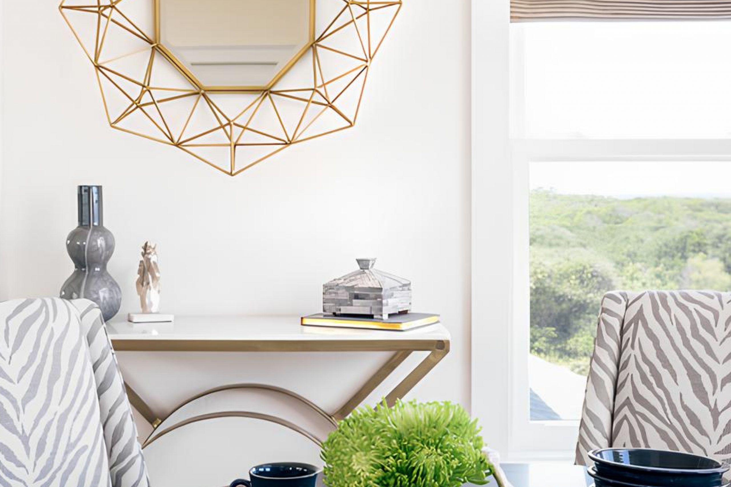
When I first came across SW 7101 Futon by Sherwin Williams, I found it to be a warm and inviting shade that immediately caught my attention. Its earthy tones suggest comfort and versatility, making it a perfect choice for anyone looking to create a cozy atmosphere at home.
This shade has a subtle richness to it, reminiscent of a well-loved piece of furniture that’s both timeless and welcoming. Its natural hue lends itself well to various styles, whether you’re aiming for a rustic feel or a more modern aesthetic. Paired with natural materials like wood or leather, SW 7101 Futon can help create a harmonious and relaxing space.
What I like most about SW 7101 Futon is its ability to act as both a standout color and a complementary tone, depending on how you use it. It can serve as the main color in your living room or bedroom, providing a neutral backdrop that allows other elements of decor to shine. Alternatively, it can be an accent color, enhancing more vibrant shades and tying different design elements together.
In my opinion, SW 7101 Futon is an excellent choice for anyone who wants to add a touch of warmth and elegance to their home without overwhelming the senses. It’s a color that feels both grounded and refreshing, making it suitable for any room.
What Color Is Futon SW 7101 by Sherwin Williams?
Sherwin Williams’ Futon (SW 7101) is a warm and inviting color that blends brown with subtle hints of beige, creating a comfortable and cozy atmosphere. This rich shade works exceptionally well in various interior styles, such as rustic, bohemian, and mid-century modern, adding a natural and earthy feel to any space. It brings a sense of warmth and comfort, perfect for living rooms, bedrooms, or any area where you want to relax and feel at ease.
Futon pairs beautifully with natural materials like wood and stone, enhancing its earthy qualities. Wooden furniture, whether light oak or deep walnut, complements the color nicely, providing a harmonious look. Textiles such as cotton, linen, and leather can add texture and depth, making the room feel more layered and inviting.
For accents, consider using soft, muted colors like sage green, cream, or dusty blue, which can balance the warmth of Futon while keeping the space light. Metal finishes such as brass or copper can add a touch of elegance, working well for fixtures or decorative elements.
Overall, Sherwin Williams’ Futon offers a versatile option for various design aesthetics, creating spaces that feel warm and welcoming without being overwhelming.
Is Futon SW 7101 by Sherwin Williams Warm or Cool color?
Futon SW 7101 by Sherwin Williams is a warm, neutral paint color that can add a cozy and inviting feel to any space in your home. This shade is versatile and pairs well with a range of other colors, making it suitable for different rooms like living rooms, bedrooms, or even kitchens. It has a soft undertone that enhances the natural light, helping make spaces appear more open and airy.
The warmth of Futon makes it a welcoming choice, and it’s an excellent backdrop for both more colorful and more muted furniture and décor. When used on walls, this shade can help create a comfortable environment, making it easier to relax or gather with friends and family.
It complements both modern and traditional styles, maintaining a timeless appeal. With its neutral base, Futon SW 7101 can seamlessly tie together diverse elements in a room, providing a harmonious and inviting atmosphere.
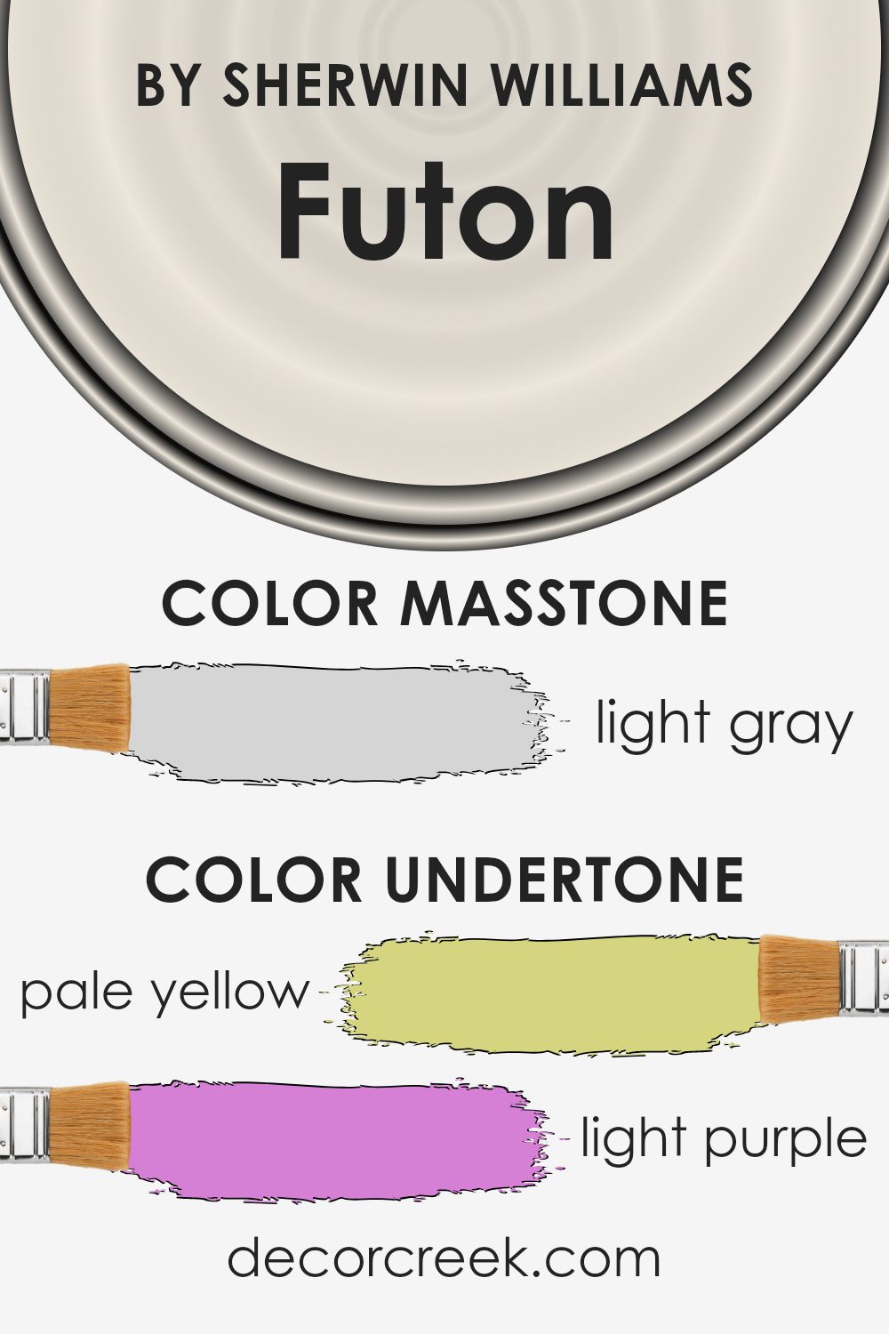
Undertones of Futon SW 7101 by Sherwin Williams
Futon SW 7101 by Sherwin Williams is a nuanced color with a unique blend of undertones that can affect how it appears in a room. Undertones are subtle colors that give depth to the main color. They can change the overall perception of a color based on lighting and surroundings.
Futon has a mix of undertones like pale yellow, light purple, light blue, pale pink, mint, lilac, and grey. These undertones add depth and complexity. The pale yellow undertone can make the color feel warm and inviting.
Light purple and lilac give a gentle touch, making the space feel calm and balanced. Light blue and mint can add a refreshing and airy feel to a room, especially in bright lighting. The pale pink gives a soft, cozy vibe, while the grey adds a neutral, grounding element.
When applied to interior walls, the color will change slightly during different times of the day. In the morning, with natural light, you might notice more of the blue and mint undertones, giving a fresh feel.
In the evening, as the lighting shifts, the warmth from the pale yellow and pale pink may become more prominent, creating a comfortable atmosphere. Understanding these undertones helps in choosing the right room and lighting to get the desired effect.
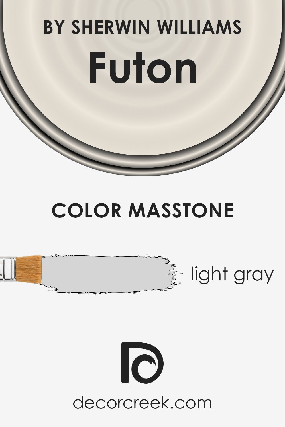
What is the Masstone of the Futon SW 7101 by Sherwin Williams?
Futon SW 7101 by Sherwin Williams is a light gray color with a masstone of #D5D5D5. This makes it a versatile choice for home interiors. Its soft and neutral tone allows it to blend well with a wide range of other colors in a room, creating a balanced and calming atmosphere.
The light gray color of Futon can make spaces feel more open and airy, which is great for smaller rooms or those that lack natural light. It provides a clean backdrop that doesn’t overpower other elements in the room, like furniture or artwork.
In living rooms, this shade can offer a modern and chic look, while in bedrooms, it can lend the space a restful and soothing vibe. Additionally, its neutral shade makes it a timeless option that can easily adapt to changing trends or personal styles, providing flexibility in home design.
How Does Lighting Affect Futon SW 7101 by Sherwin Williams?
Lighting plays a crucial role in how we perceive colors. Depending on the type, intensity, and direction of light, colors can look quite different. Futon SW 7101 by Sherwin Williams, a rich terracotta color, can vary in appearance under different lighting conditions.
In natural light, Futon can appear warmer and more earthy. Natural light brings out its true tones and enhances its depth. In a room with plenty of sunlight, this color shows its warm, inviting nature, creating a cozy atmosphere.
Artificial light, on the other hand, can alter the look of Futon quite a bit. Incandescent or warm LED lights can further warm up the color, emphasizing its reddish-brown tones. Conversely, cool fluorescent lights might make the color seem slightly duller, as they tend to have a bluer cast which can mute warm colors.
Now, let’s consider how Futon looks in rooms with different orientations. In north-facing rooms, which receive cooler and more consistent light throughout the day, Futon can appear slightly muted. The subtle, steady light in the room counteracts some of the warmth in the paint, making it seem more subdued.
South-facing rooms receive more direct sunlight, especially in the afternoon, which can make Futon look more vibrant and warm. The sunlight enhances its rich, earthy qualities, making it a warm and lively choice for these rooms. East-facing rooms get bright light in the morning and softer light later in the day.
In these spaces, Futon may appear more vibrant in the morning and softer in the afternoon as the light shifts.
West-facing rooms, conversely, receive intense warm light in the late afternoon. This can make Futon appear quite intense and warm as the day progresses, highlighting its terracotta undertones.
Understanding how this color interacts with light can help in deciding where to use it in a home setting.
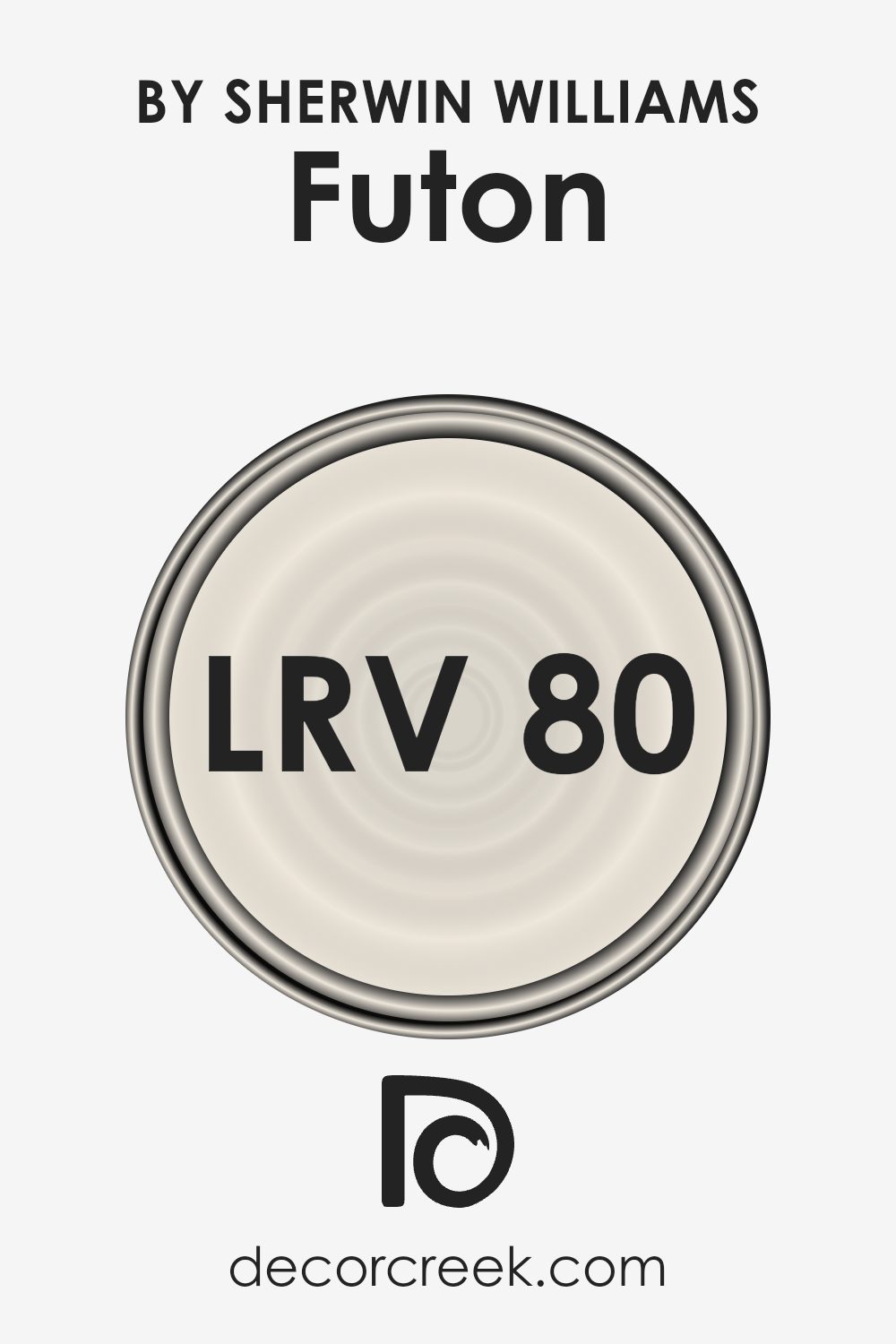
What is the LRV of Futon SW 7101 by Sherwin Williams?
LRV, which stands for Light Reflectance Value, measures the percentage of light a paint color reflects. Think of it like a scale where 0 means the color absorbs all light (like black), and 100 means the color reflects all light (like white).
This number helps you understand how bright or dark a color will look once it’s on a wall. If a color has a high LRV, it will bounce more light around a room and appear brighter and more open. On the other hand, a lower LRV means the color absorbs more light, making a room feel cozier and more intimate.
With an LRV of 79.677, the color Futon is on the lighter side of the scale. This means it will reflect a significant amount of light, making spaces feel airy and spacious. Such a high LRV is useful in small or dimly lit rooms where you want to make the most out of the available light.
It also works well as a backdrop for other colors and materials, as it won’t overshadow them. In large, well-lit areas, this light-reflecting quality keeps the atmosphere bright and welcoming, maintaining a fresh feel without overwhelming bold features.
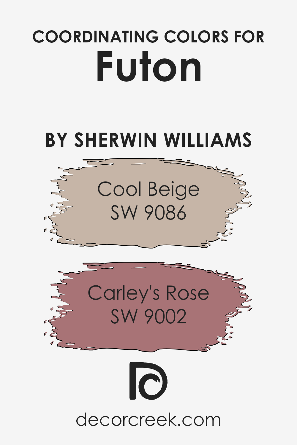
Coordinating Colors of Futon SW 7101 by Sherwin Williams
Coordinating colors are hues that complement each other and are often used together in design to create a balanced and pleasing look. When it comes to the color Futon by Sherwin Williams, choosing the right coordinating colors can make a big difference in how a space feels. SW 9086 – Cool Beige is one such coordinating color.
It has a warm, neutral tone that adds a touch of coziness to any room, making it a great backdrop or accent that doesn’t overpower the main color. Its subtle warmth can help soften the overall look of a space, creating a welcoming atmosphere.
On the other hand, SW 9002 – Carley’s Rose adds a different dimension with its gentle, rosy hue. This color is soft and muted, bringing a delicate hint of color that can make a room feel more inviting. It’s perfect for highlighting architectural features or even adding a pop of color without being too bold.
Together with Cool Beige, Carley’s Rose enhances the palette, allowing Futon to stand out while still maintaining harmony throughout the space. Using these coordinating colors effectively can help create a cohesive design that feels comfortable and stylish.
You can see recommended paint colors below:
- SW 9086 Cool Beige
- SW 9002 Carley’s Rose
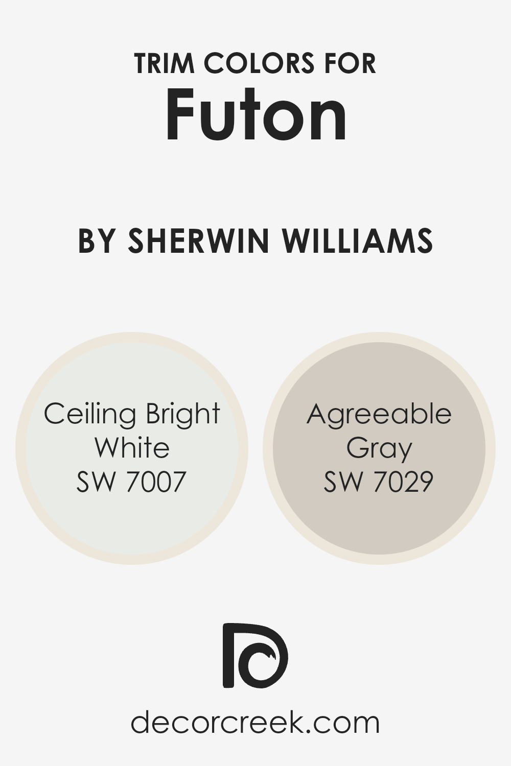
What are the Trim colors of Futon SW 7101 by Sherwin Williams?
Trim colors are used to add detail and definition to a space, highlighting the structure and features of a room. For the Futon color SW 7101 by Sherwin Williams, using the right trim colors can enhance its appearance and bring out its unique qualities.
Trim colors create visual boundaries that can make walls look distinct, emphasize architectural features, and influence the overall room vibe. Selecting crisp trim options like SW 7007 Ceiling Bright White and SW 7029 Agreeable Gray provides contrast and complements the main color, adding depth and interest.
SW 7007 Ceiling Bright White offers a clean and fresh look, serving as a bright, pure white that makes any space feel open and vibrant. It’s a classic choice for trim, helping to create a seamless frame around the room.
Meanwhile, SW 7029 Agreeable Gray is a soft, warm gray that subtly enhances a space without overpowering it. It blends well with various neutrals and adds warmth, aligning well with Futon’s softer tones, making it a versatile choice for trim work that subtly defines without being stark.
You can see recommended paint colors below:
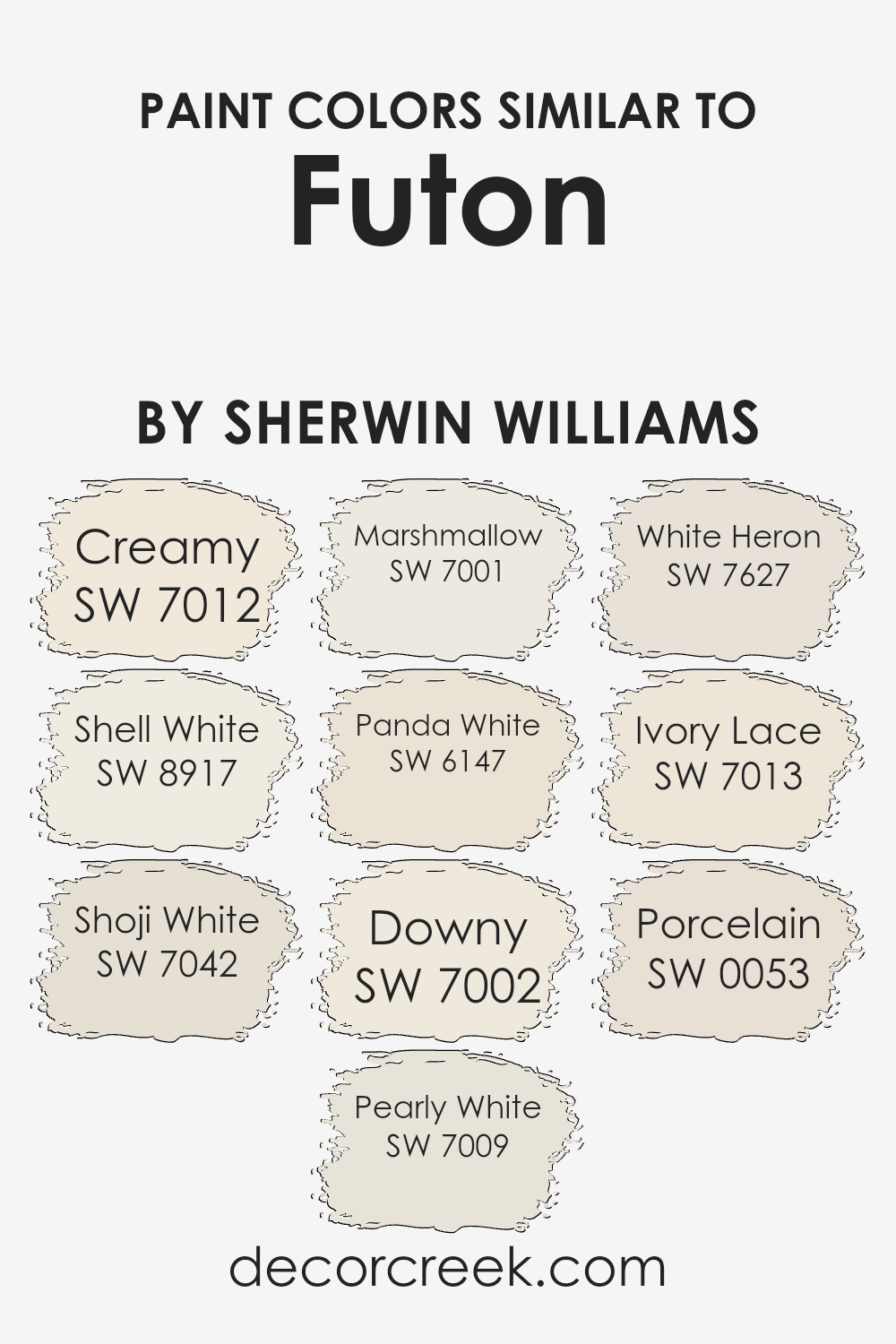
Colors Similar to Futon SW 7101 by Sherwin Williams
Similar colors play a vital role in design and decoration, creating harmony and balance in a space. When colors are visually similar, such as those related to Futon by Sherwin Williams, they blend well and provide a cohesive look. For instance, SW 7012 Creamy is a soft, warm off-white that adds a gentle glow without being stark. It pairs beautifully with SW 8917 Shell White, which offers a subtle, pearl-like warmth that feels inviting.
SW 7042 Shoji White adds a touch of elegance with its hint of gray, making it slightly cooler yet still gentle and inviting. SW 7009 Pearly White glows with a clean, smooth sheen, providing freshness to any space.
Colors like SW 7001 Marshmallow bring a soft, airy feel with their light and welcoming hue. SW 6147 Panda White adds a touch of natural warmth that resembles gentle earth tones. On the other hand, SW 7002 Downy offers a comforting, soft whiteness that feels cozy and snug. SW 7627 White Heron provides a clean and crisp white that feels modern and fresh.
SW 7013 Ivory Lace adds a hint of yellow, giving it a creamy and soft appearance. Finally, SW 0053 Porcelain’s subtle coolness adds a refined touch to a room. Each of these colors can enhance a space by bringing in subtle variations that create a soothing and visually appealing environment.
You can see recommended paint colors below:
- SW 7012 Creamy
- SW 8917 Shell White
- SW 7042 Shoji White
- SW 7009 Pearly White
- SW 7001 Marshmallow
- SW 6147 Panda White
- SW 7002 Downy
- SW 7627 White Heron
- SW 7013 Ivory Lace
- SW 0053 Porcelain
Colors that Go With Futon SW 7101 by Sherwin Williams
When selecting colors to complement Sherwin Williams’ Futon SW 7101, choosing the right shades is crucial for creating a cohesive and inviting space. Futon SW 7101 is a warm beige that pairs beautifully with other soft, warm tones. SW 7102 – White Flour, for instance, is a gentle off-white that brings a light and airy feel to any room.
It helps to brighten up the space while maintaining a subtle and elegant look. SW 7001 – Marshmallow is another excellent choice, offering a slightly creamy undertone that enhances the warmth of Futon. This color adds a cozy touch without overwhelming the senses.
SW 7002 – Downy provides a light, pastel freshness that can lighten up the entire room. This shade offers a delicate contrast to Futon’s richer hue. SW 6084 – Modest White is more muted and offers a touch of sophistication without being too bold, providing a gentle transition between colors.
When you consider SW 6098 – Pacer White, its mild beige undertone plays seamlessly with Futon, giving a subtle harmony to the palette. Lastly, SW 6091 – Reliable White brings a reassuring warmth that complements Futon beautifully, creating a welcoming and balanced feel in the room. Together, these colors help maintain a harmonious and pleasant environment, enriching the aesthetic appeal of your space.
You can see recommended paint colors below:
- SW 7102 White Flour
- SW 7001 Marshmallow
- SW 7002 Downy
- SW 6084 Modest White
- SW 6098 Pacer White
- SW 6091 Reliable White

How to Use Futon SW 7101 by Sherwin Williams In Your Home?
Futon SW 7101 by Sherwin Williams is a soft, warm neutral paint color that can work beautifully in any home. Its gentle beige tone creates a welcoming and cozy atmosphere, making it a great choice for living rooms or bedrooms.
This color pairs well with a variety of other shades, so you can mix and match furniture and décor easily. In a living room, you can use Futon to make a space feel more inviting and comfortable. It acts as a versatile backdrop, allowing you to add colorful accents through pillows or artwork. In the bedroom, Futon can help make the space feel calming and restful, perfect for relaxation.
Its neutral nature also makes it suitable for hallways and kitchens, providing a clean and classic look. Whether you’re going for a modern or traditional style, Futon SW 7101 can be a perfect choice to create a harmonious and warm environment.
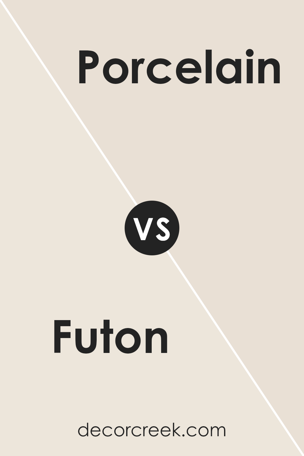
Futon SW 7101 by Sherwin Williams vs Porcelain SW 0053 by Sherwin Williams
Futon (SW 7101) by Sherwin Williams is a warm, earthy shade with a hint of brown, resembling a cozy, natural feel you might find in nature or a rustic cabin. It gives off a comfortable and inviting vibe, making spaces feel homey and grounded.
On the other hand, Porcelain (SW 0053) by Sherwin Williams offers a softer, cooler contrast with its light, subtle gray-blue tone. This shade is reminiscent of clean, crisp surroundings, like a gentle sky or a piece of delicate china. It creates a sense of openness and calmness in a room.
When comparing the two, Futon is warm and grounding, while Porcelain is cool and refreshing. Pairing them can result in a balanced and harmonious space, with one adding warmth and stability, and the other bringing lightness and a gentle cool breeze to the environment.
You can see recommended paint color below:
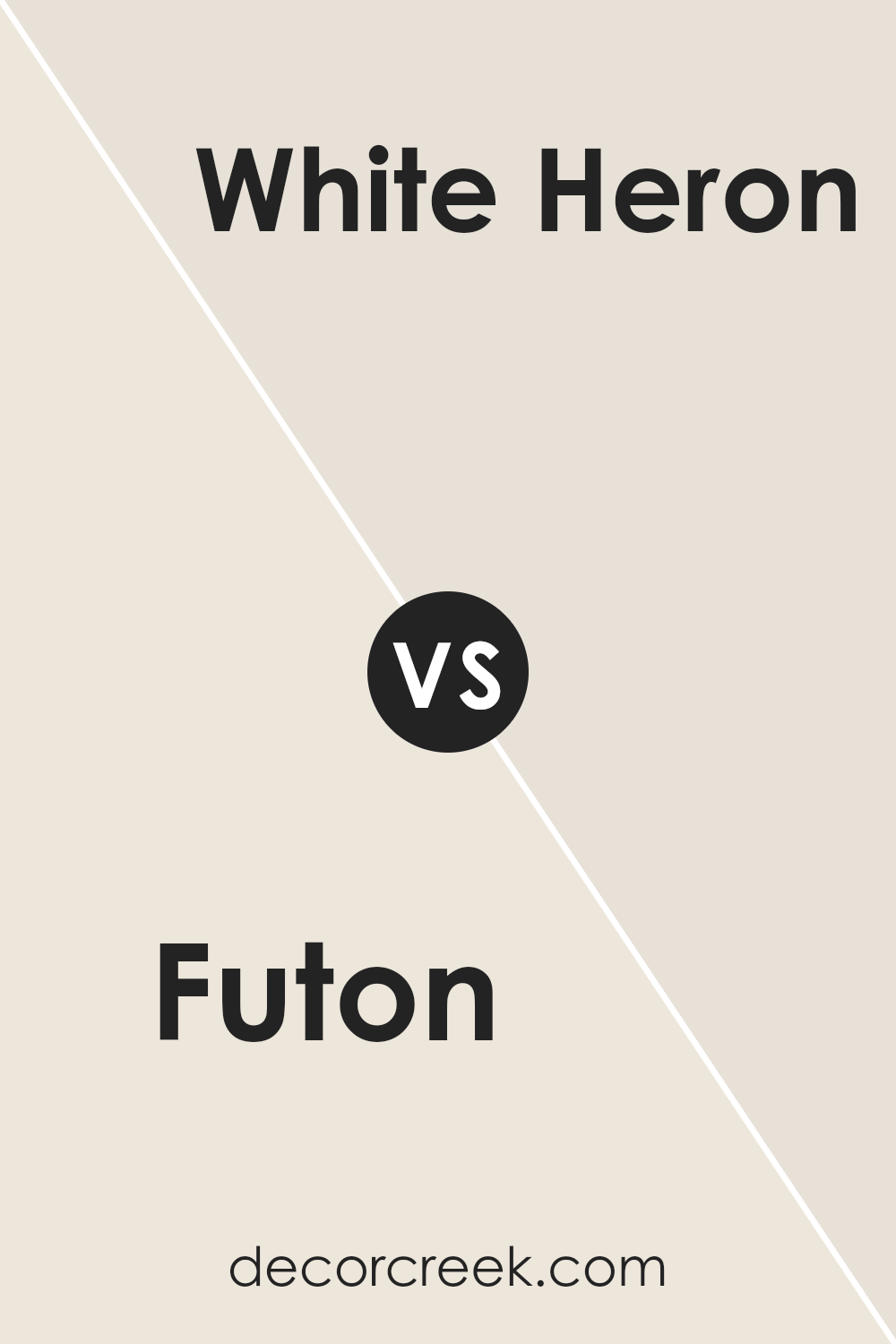
Futon SW 7101 by Sherwin Williams vs White Heron SW 7627 by Sherwin Williams
Futon by Sherwin Williams is a warm, earthy color with hints of brown and terracotta. It’s a cozy choice, often used to create a comfortable and inviting atmosphere in a room. This color can make a space feel grounded and relaxed, especially in living rooms or bedrooms.
In contrast, White Heron by Sherwin Williams is a light, crisp color. It has a touch of softness that makes it different from a stark white, offering a clean and fresh look. White Heron is versatile, providing a neutral backdrop that works well with various decor styles. It can make a room feel open and airy, perfect for smaller spaces or areas that benefit from a bright, fresh appearance.
When combined, Futon adds warmth and depth, while White Heron provides balance and lightness. Together, they create a harmonious look that pairs warmth with freshness, ideal for a cozy yet open space.
You can see recommended paint color below:
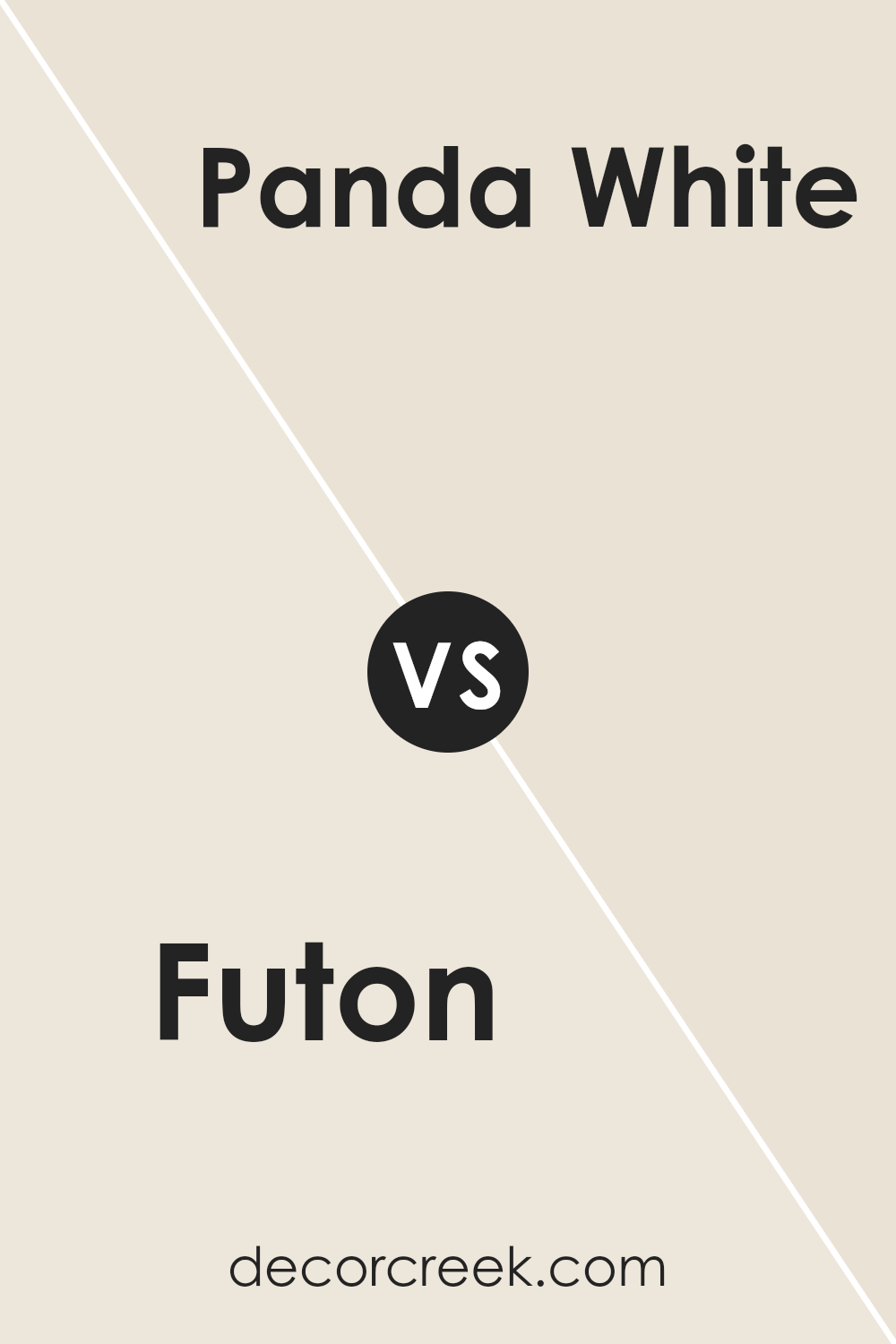
Futon SW 7101 by Sherwin Williams vs Panda White SW 6147 by Sherwin Williams
Futon and Panda White are two paint colors by Sherwin Williams that can create different moods in a space. Futon is a medium, earthy brownish color with a subtle warmth. It’s cozy and inviting, making it ideal for living rooms or spaces where you want a comfortable atmosphere. Panda White, on the other hand, is a soft, creamy off-white. It is a versatile color that can brighten a room and make it feel more open.
When these colors are compared, Futon brings depth and warmth, while Panda White offers lightness and airiness. Futon can help create a grounded and cozy environment, whereas Panda White can provide a clean and fresh backdrop.
Depending on the lighting and décor in a room, Futon might add a sense of intimacy, while Panda White can enhance natural light and give a room a more spacious feel. Together, they can complement each other, balancing warmth with brightness.
You can see recommended paint color below:
Futon SW 7101 by Sherwin Williams vs Shoji White SW 7042 by Sherwin Williams
Futon and Shoji White are two distinct colors by Sherwin Williams, each offering unique vibes. Futon is a warm, earthy brown that adds a cozy, inviting feel to a room. It creates a snug and grounded atmosphere, making it ideal for living spaces where you want to feel comfortable and relaxed.
On the other hand, Shoji White is a light, soft shade with a touch of creaminess. It provides a clean, airy look that brightens up spaces and makes them feel open and spacious. Shoji White is versatile and works well as a backdrop, allowing other colors and decor in the room to stand out.
While Futon brings warmth and depth, Shoji White offers lightness and a neutral appeal. They can even be paired together, with Shoji White on the walls and Futon used for accents or furniture, creating a balanced contrast in a room.
You can see recommended paint color below:

Futon SW 7101 by Sherwin Williams vs Pearly White SW 7009 by Sherwin Williams
Futon SW 7101 by Sherwin Williams is a warm, earthy brown with reddish undertones. It brings a cozy and inviting feel to a room, making it perfect for spaces where you want to add warmth and depth. It’s a versatile color that works well with natural materials like wood and stone, creating a rustic and homey environment.
On the other hand, Pearly White SW 7009 by Sherwin Williams is a soft, warm white. This color offers a clean and fresh look, ideal for making spaces feel larger and more open. It pairs well with almost any color, providing a clean backdrop that highlights the furnishings and decor in a room.
When paired together in a space, Futon can add grounding warmth, while Pearly White offers balance and brightness. These two colors can work in harmony to create a balanced, comfortable, and inviting atmosphere.
You can see recommended paint color below:
Futon SW 7101 by Sherwin Williams vs Downy SW 7002 by Sherwin Williams
Futon and Downy are two popular colors from Sherwin Williams, each bringing a unique atmosphere to a space. Futon is a warm, rich shade with a cozy and earthy vibe, often described as a mix of beige and light brown. It’s perfect for creating a welcoming and comfortable environment, making it a great choice for living rooms or bedrooms.
On the other hand, Downy offers a soft, clean look. It’s a light, airy shade with hints of white and a subtle touch of gray. Downy is excellent for spaces where you want to keep things bright and fresh, such as in kitchens or bathrooms. It’s versatile and pairs well with many other colors.
Together, these two colors can complement each other beautifully. Futon provides warmth and grounding, while Downy keeps a room feeling open and bright, striking a comfortable balance between cozy and airy.
You can see recommended paint color below:
Futon SW 7101 by Sherwin Williams vs Marshmallow SW 7001 by Sherwin Williams
Futon (SW 7101) and Marshmallow (SW 7001) by Sherwin Williams are two distinct colors offering unique appeal. Futon is a warm, muted shade that leans towards a blend of beige and taupe. It’s cozy and inviting, perfect for creating a comforting atmosphere in any room. This color works great in living spaces or bedrooms where a subtle backdrop is desired.
On the other hand, Marshmallow is a soft, creamy white. It’s light and airy, bringing brightness and a sense of openness to spaces.
Marshmallow is versatile and pairs well with almost any color, making it an excellent choice for walls, trim, or ceilings if you want a clean and fresh look.
While Futon adds a warm, grounded feel to interiors, Marshmallow creates a brighter, more playful ambiance. Together, they can balance each other, with Futon providing depth and Marshmallow contributing lightness.
You can see recommended paint color below:
Futon SW 7101 by Sherwin Williams vs Shell White SW 8917 by Sherwin Williams
Futon, a warm terracotta shade, presents a cozy and inviting feel. It has earthy undertones, making it perfect for creating a welcoming space with a rustic or natural vibe. The richness of the color can add depth and character to any room.
On the other hand, Shell White is a soft, creamy neutral that offers a sense of simplicity and brightness. This color can make a room feel more open and airy, serving as an excellent backdrop for bolder accents or decorations. Unlike Futon, which draws attention with its warmth, Shell White subtly complements its surroundings.
Together, Futon and Shell White work well when paired, as the boldness of Futon is balanced by the lightness of Shell White. This pairing can provide contrast, highlighting architectural features or decorative elements in a room. While Futon adds warmth, Shell White provides a clean, fresh balance, making them both versatile choices for various design styles.
You can see recommended paint color below:
Futon SW 7101 by Sherwin Williams vs Ivory Lace SW 7013 by Sherwin Williams
Futon (SW 7101) and Ivory Lace (SW 7013) are two warm and inviting colors from Sherwin Williams. Futon is a soft brown with earthy undertones, giving spaces a cozy and grounded feel. It’s versatile, working well in both traditional and modern settings. On the other hand, Ivory Lace is a gentle off-white with subtle warmth. It’s bright and airy, making rooms feel open and fresh.
When comparing the two, Futon adds depth and richness, making it suitable for accent walls or rooms where warmth is desired. Ivory Lace, being a neutral, is great for creating a clean and spacious look, ideal for larger areas or as a backdrop to highlight other decor elements.
Together, they complement each other nicely. Ivory Lace can be used to balance the richness of Futon, offering a crisp contrast. This combination can provide a harmonious yet distinctive look in any space.
You can see recommended paint color below:
Futon SW 7101 by Sherwin Williams vs Creamy SW 7012 by Sherwin Williams
Futon and Creamy are two distinct shades offered by Sherwin Williams, each lending a unique touch to spaces. Futon is a deep brown hue, rich and warm, and it can create a cozy, grounded atmosphere. It’s a versatile choice that brings depth and character to a room, making it suitable for accent walls or furniture pieces.
Creamy, on the other hand, is a soft, light color with a warm undertone. It’s perfect for creating a bright, airy feel in a room. This shade works well as a background color, allowing other elements in the space to stand out.
When used together, these colors complement each other. Futon’s depth pairs well with Creamy’s lightness, offering a balanced look. Futon adds warmth and a touch of drama, while Creamy keeps the environment fresh and inviting. Together, they can create a harmonious and inviting space suitable for various interior styles.
You can see recommended paint color below:
Conclusion
After going through the details of SW 7101 Futon by Sherwin Williams, I find myself quite fond of this color. It’s a lovely, warm, and inviting shade that reminds me of a cozy and comfortable room where you can relax and feel at ease. This color seems like it would be perfect for almost any room in a home, making everything feel more welcoming.
When I think about painting with SW 7101 Futon, I imagine how it could make a living room or bedroom look more cheerful and friendly. The color is not too bright or too dark, so it feels just right for making a space feel comfortable. It’s like having a soft, warm hug from a loved one.
I think people would really enjoy having this color on their walls because it makes a room feel happy and calm. It’s easy to picture how this shade could quickly become a favorite in any home. It’s like a favorite sweater you always want to wear.
Overall, if you’re looking for a color that can make any room feel inviting and cozy, SW 7101 Futon is a great choice. It’s simple, warm, and makes you smile when you look at it. I think it would make a beautiful addition to any room.

Ever wished paint sampling was as easy as sticking a sticker? Guess what? Now it is! Discover Samplize's unique Peel & Stick samples.
Get paint samples

