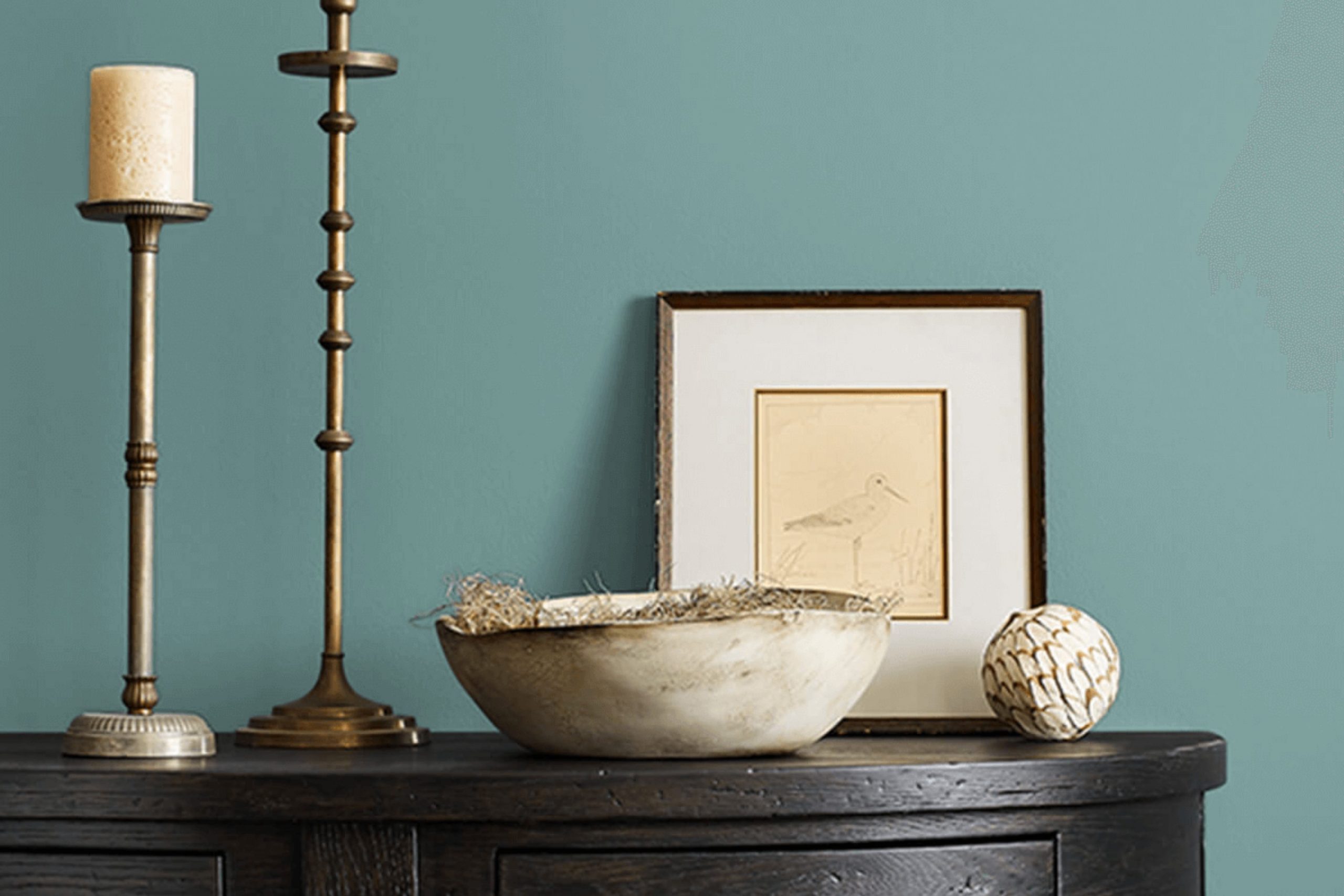
If you’re thinking about giving your room a fresh update, SW 0020 Peacock Plume by Sherwin Williams might be just the color you’re looking for. This shade brings a unique blend of vibrancy and refinement to any room. As I was searching for a hue that could both inspire and add a calm yet bold statement, Peacock Plume stood out.
Its deep, teal undertones make it perfect for creating a focal point in a room without feeling too much for the senses. I’ve noticed it pairs exceptionally well with both neutral and bold color palettes, offering flexibility in design choices.
Whether you’re looking to repaint a cozy corner or give your entire living room a new vibe, this color can handle it. In my own experience, applying Peacock Plume was a breeze, and I was impressed by how it changed the feel of the room. Let me walk you through why choosing this color could be a good decision for enhancing your home’s aesthetic.
What Color Is Peacock Plume SW 0020 by Sherwin Williams?
Peacock Plume by Sherwin Williams is an inviting shade of blue with a vibrant hint of green. This color echoes the lush tones of a peacock’s feather, bringing a lively yet still somewhat reserved atmosphere to any room. Its smooth saturation offers a fresh and modern vibe ideal for both energizing a room and creating a cozy comfort.
This adaptable hue works beautifully in various styles, particularly in coastal, contemporary, and bohemian interiors. It perfectly captures the light and airy feel of a seaside retreat when used in coastal style homes. For contemporary rooms, Peacock Plume adds a dynamic burst of color that is both playful and polished. In bohemian settings, it complements eclectic furnishings and rich textures, enhancing the unique personality of the decor.
Peacock Plume pairs well with natural materials such as light woods, wicker, and linen, adding warmth to its cool tone. It also looks stunning when contrasted with metallic accents like copper or gold, which bring out its inherent richness. Soft textiles, such as velvet or silk, in complementary colors can also increase the visual interest of the room. Whether on an accent wall, in a kitchen, or throughout a living area, Peacock Plume adds a delightful splash of color that is easy to live with and enjoy.

Is Peacock Plume SW 0020 by Sherwin Williams Warm or Cool color?
Peacock Plume is a vibrant paint color that adds a lively touch to any room. As a greenish-blue hue, it mimics the natural tones you might see on a peacock, which makes it perfect for creating a fresh and inviting area. This color is flexible enough to work well in both light-filled rooms and areas that could use a pop of color.
In a home setting, Peacock Plume can be used in many ways. It’s great for a focal point wall in the living room or as a playful color in a kid’s room. Because it’s such an active color, using it in a home office could make the room feel energetic and stimulating, which might help with productivity.
Additionally, when paired with neutral furniture and decor, Peacock Plume stands out and brings a lively contrast to the room. It works exceptionally well with whites, grays, and even some yellows or oranges, offering countless decorating options. Overall, this color brings a fun twist to traditional home colors, keeping rooms feeling fresh and alive.
Undertones of Peacock Plume SW 0020 by Sherwin Williams
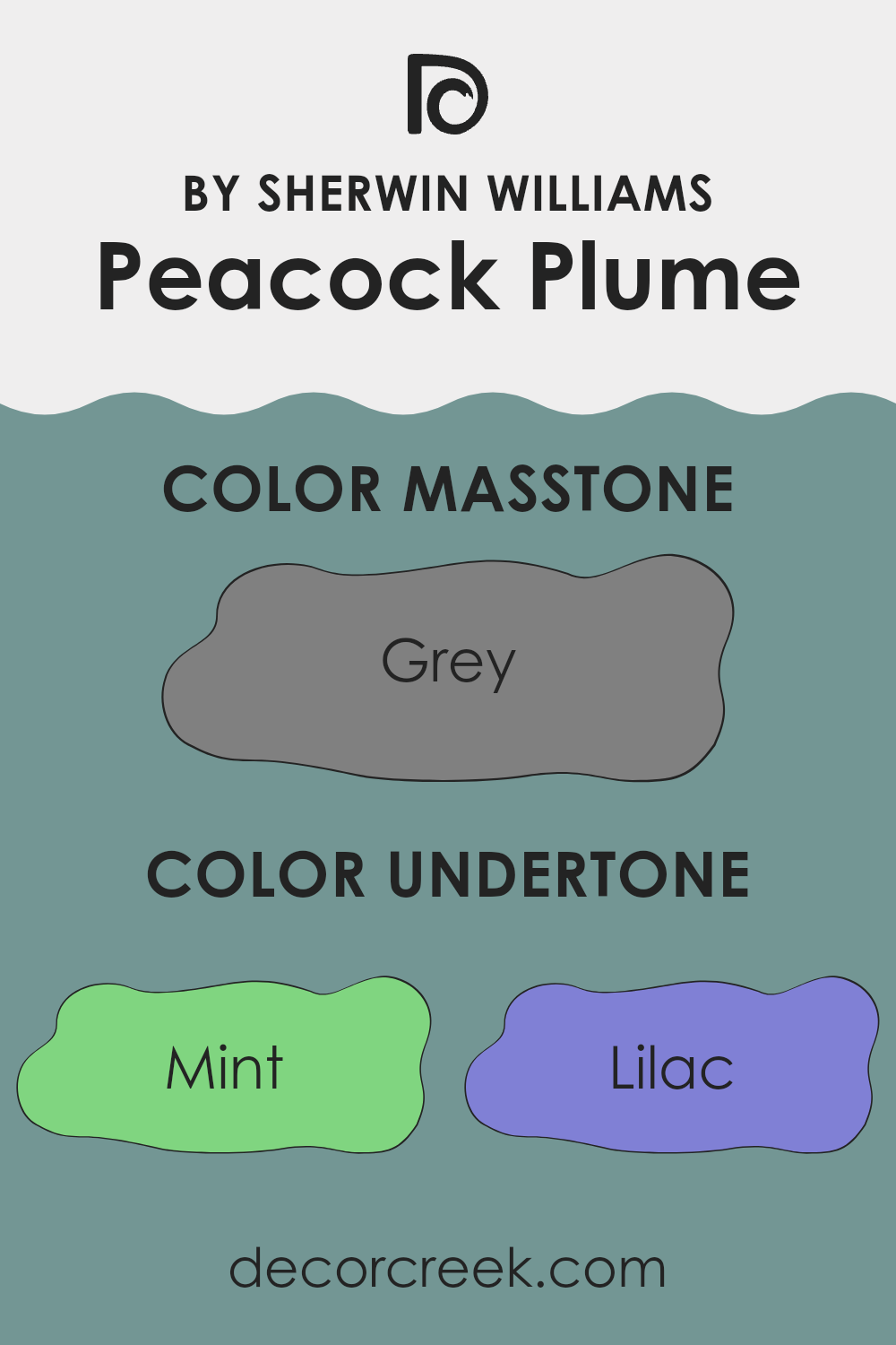
Peacock Plume is a vibrant and adaptable shade with a range of undertones that influence how it appears in different lighting conditions and surroundings. The complexity of its undertones, from mint and lilac to dark turquoise and navy, adds depth and richness to the color, making it more appealing and dynamic.
These undertones also play a significant role in how we perceive the color. For example, mint and light blue undertones bring a freshness that can make a room feel more airy and light-filled, while darker undertones like navy and dark turquoise lend a sense of groundedness and stability. When sunlight hits a wall painted in this color, the brighter undertones like light turquoise and pale yellow might become more prominent, giving the room a cheerful glow.
Additionally, the presence of undertones like pale pink and lilac can soften the overall impact of the color, making it suitable for rooms that require a gentle aesthetic touch. Conversely, undertones such as dark grey and olive provide a more mature and subdued feel which could be perfect for creating a focal point in a minimalist decor.
When used on interior walls, these undertones collectively ensure that the color adjusts subtly throughout the day with changes in natural and artificial light. This variability ensures that walls painted with this color remain interesting and engaging, potentially altering the mood of the room according to the time of day and lighting conditions. This can keep the interior environment lively and adaptable, appealing to the senses in various ways depending on the interaction with light and other colors in the room.
What is the Masstone of the Peacock Plume SW 0020 by Sherwin Williams?
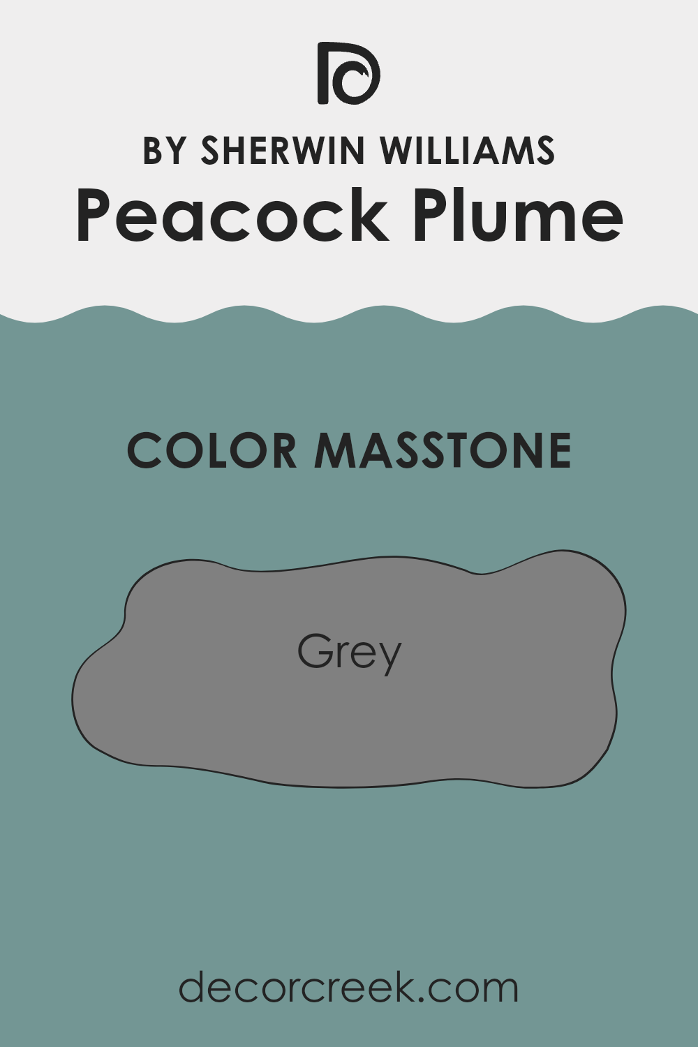
Peacock Plume SW 0020 by Sherwin Williams has a masstone of grey, specifically the shade #808080. This grey shade greatly influences how the color looks and feels in a home setting. When you use this color on walls or furniture, it adds a calm and steady feel to the room.
Because it’s a neutral tone, it works well with many other colors, making it easy to mix and match with your existing decor or bold new choices.
The grey masstone in Peacock Plume means it’s adaptable; it can fit into most design styles from modern to traditional. Additionally, the neutrality of grey helps in creating a soothing background, allowing other elements in the room, like art or brightly colored cushions, to stand out. It’s also known for its ability to hide marks and smudges better than lighter colors, making it a practical choice for high-traffic areas like living rooms or hallways.
How Does Lighting Affect Peacock Plume SW 0020 by Sherwin Williams?
Lighting plays a crucial role in how we perceive colors, affecting their brightness and hue. The color Peacock Plume by Sherwin Williams is no exception to this rule. Depending on the type of light—whether artificial or natural—the appearance of this rich, vibrant color can change significantly.
In natural light, the true essence of Peacock Plume is most accurately displayed. It appears vivid and full with a dynamic quality that can vary with the changing sunlight throughout the day. In artificial light, the type of bulb used can influence how the color is seen. Fluorescent lights might bring out the cooler tones in the paint, giving it a slightly bluer appearance, while incandescent lighting might warm it up, making it look softer and more green.
The direction a room faces can also greatly impact how Peacock Plume appears. In north-faced rooms, which often get less direct sunlight, the color might look darker and less vibrant. It can feel cooler, which can either be a drawback or a benefit depending on the intended atmosphere of the room.
South-faced rooms receive more intense, direct light, which can make Peacock Plume appear lighter and more vivid. This can enhance the liveliness of the color, making it a great choice for rooms where you want an energetic vibe.
East-faced rooms get bright light in the morning, which makes Peacock Plume look bright and cheerful initially, but the color might seem cooler and more subdued as the day progresses and the natural light diminishes.
In west-faced rooms, the color will change in the opposite way—it starts off subdued in the morning and becomes dynamically vibrant in the late afternoon to evening as the sunlight intensifies.
Understanding how lighting affects colors like Peacock Plume can help in making informed decisions about which rooms to paint and what lighting to use to achieve the desired effect with the color.

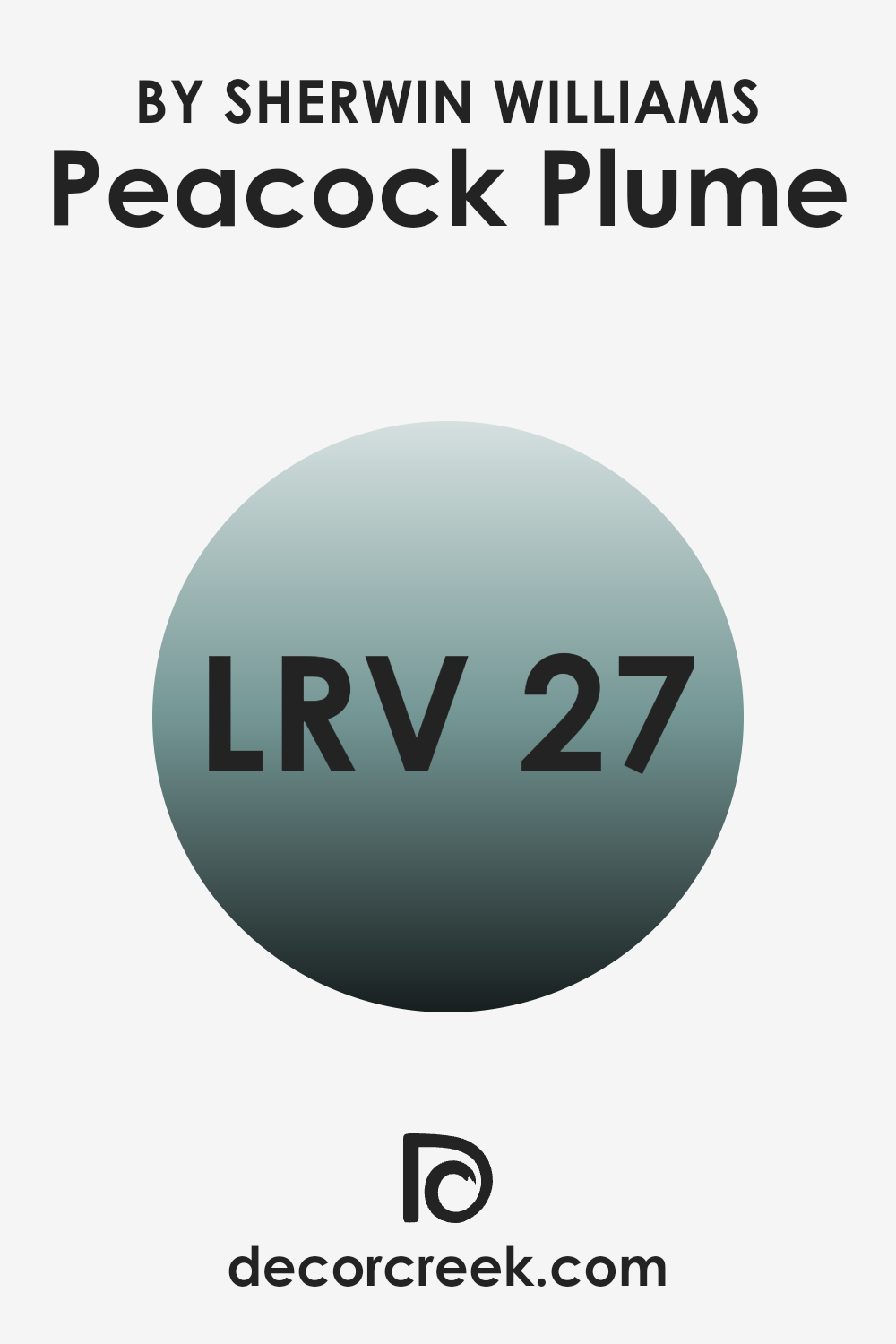
What is the LRV of Peacock Plume SW 0020 by Sherwin Williams?
Light Reflectance Value (LRV) measures the percentage of light a paint color reflects from or absorbs into a surface. It’s a handy way to determine how light or dark a color will look once it’s applied to your walls.
Higher LRV values indicate colors that reflect more light, making rooms appear brighter. Conversely, lower LRV values mean the color absorbs more light, creating a richer and deeper appearance but potentially making rooms feel smaller or more enclosed.
An LRV of 27.471, like in the case of Peacock Plume, implies that it’s on the darker side of the spectrum. This means it doesn’t reflect much light, potentially making a room feel cozy and more intimate. It’s a good choice for creating dramatic or bold statements in interiors, especially in well-lit areas or rooms that can handle darker hues without feeling cramped. However, in smaller or less-lit areas, it might make the room appear even smaller, so it’s important to consider the room’s natural and artificial lighting when deciding to use this shade.
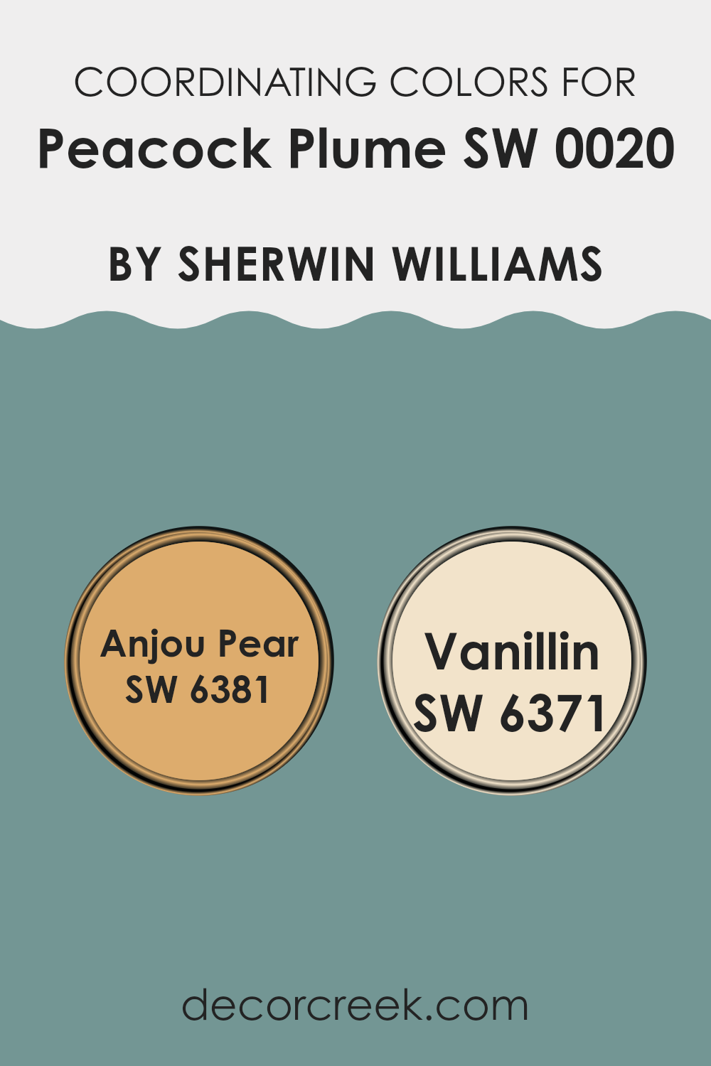
Coordinating Colors of Peacock Plume SW 0020 by Sherwin Williams
Coordinating colors are selected to complement each other and create a unified look in a room. These colors, when used together, balance visual appeal by enhancing the characteristics of each other without causing strain or feeling too intense. They often share similar tones or contrast beautifully to emphasize the unique features of each hue.
Peacock Plume, a rich and vibrant shade, pairs wonderfully with colors like Anjou Pear and Vanillin. Anjou Pear is a warm, golden yellow that brings a burst of cheerful brilliance to any interior. It’s a welcoming and lively color that works exceptionally well with the depth of Peacock Plume, offering a sunny counterbalance to its cooler tones.
Vanillin, on the other hand, is a soft, creamy white. It offers a subtle contrast that helps to soften and brighten darker colors like Peacock Plume, adding a gentle lightness to rooms without feeling too strong. Together, these colors provide a balanced and harmonious palette that enhances each interior with their combined beauty and character.
You can see recommended paint colors below:
- SW 6381 Anjou Pear
- SW 6371 Vanillin
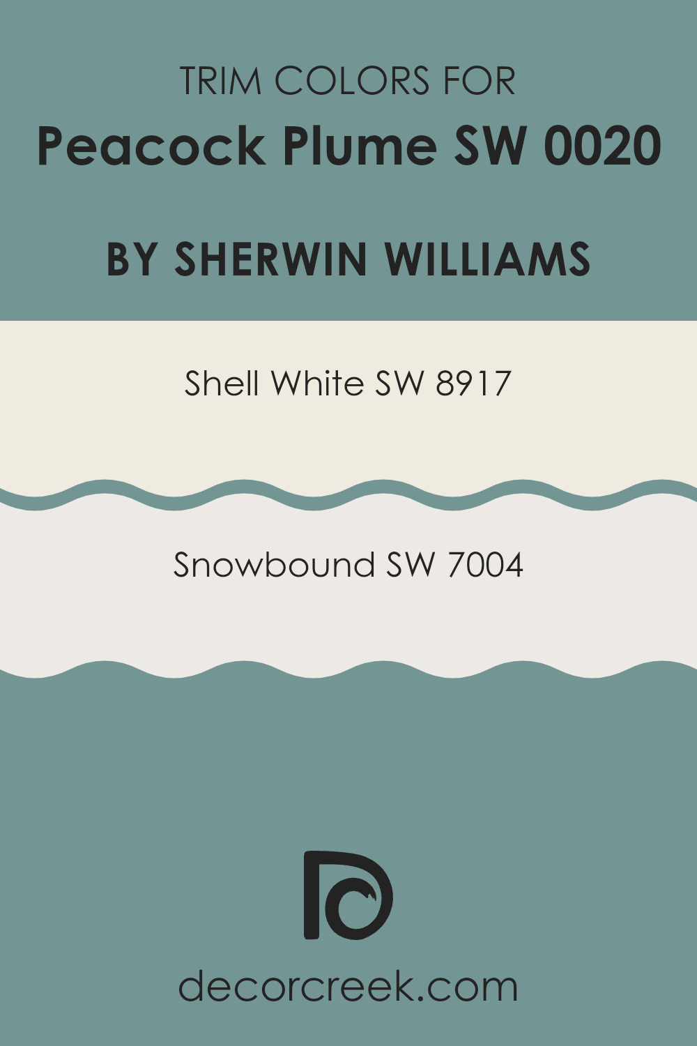
What are the Trim colors of Peacock Plume SW 0020 by Sherwin Williams?
Trim colors play a crucial role in interior design by accentuating the architectural features of a room, such as door frames, window sills, and baseboards, creating a crisp, finished look. When paired with a vibrant hue like Peacock Plume, a dark, rich teal from Sherwin Williams, selecting the right trim color can enhance the overall aesthetic and ensure that the wall color truly stands out. Trim colors work not only to frame and highlight the wall color but also to bridge the transition between walls and other elements of a room, ensuring a unified appearance that is visually appealing.
Shell White, which bears the code SW 8917, is a soft, warm white with a welcoming vibe that complements the depth of Peacock Plume by providing a gentle contrast. Its subtle warmth ensures that it does not appear too stark against the rich teal, thus maintaining an inviting atmosphere.
Snowbound, or SW 7004, on the other hand, presents itself as a cooler white with gray undertones, lending a crisp and fresh look. This trim color offers a sharper contrast to Peacock Plume, resulting in a more striking and defined boundary that can make the room appear sharper and more meticulously designed. Both of these trim colors, carefully chosen, can greatly influence the feel and cohesion of an interior decorated with Peacock Plume.
You can see recommended paint colors below:
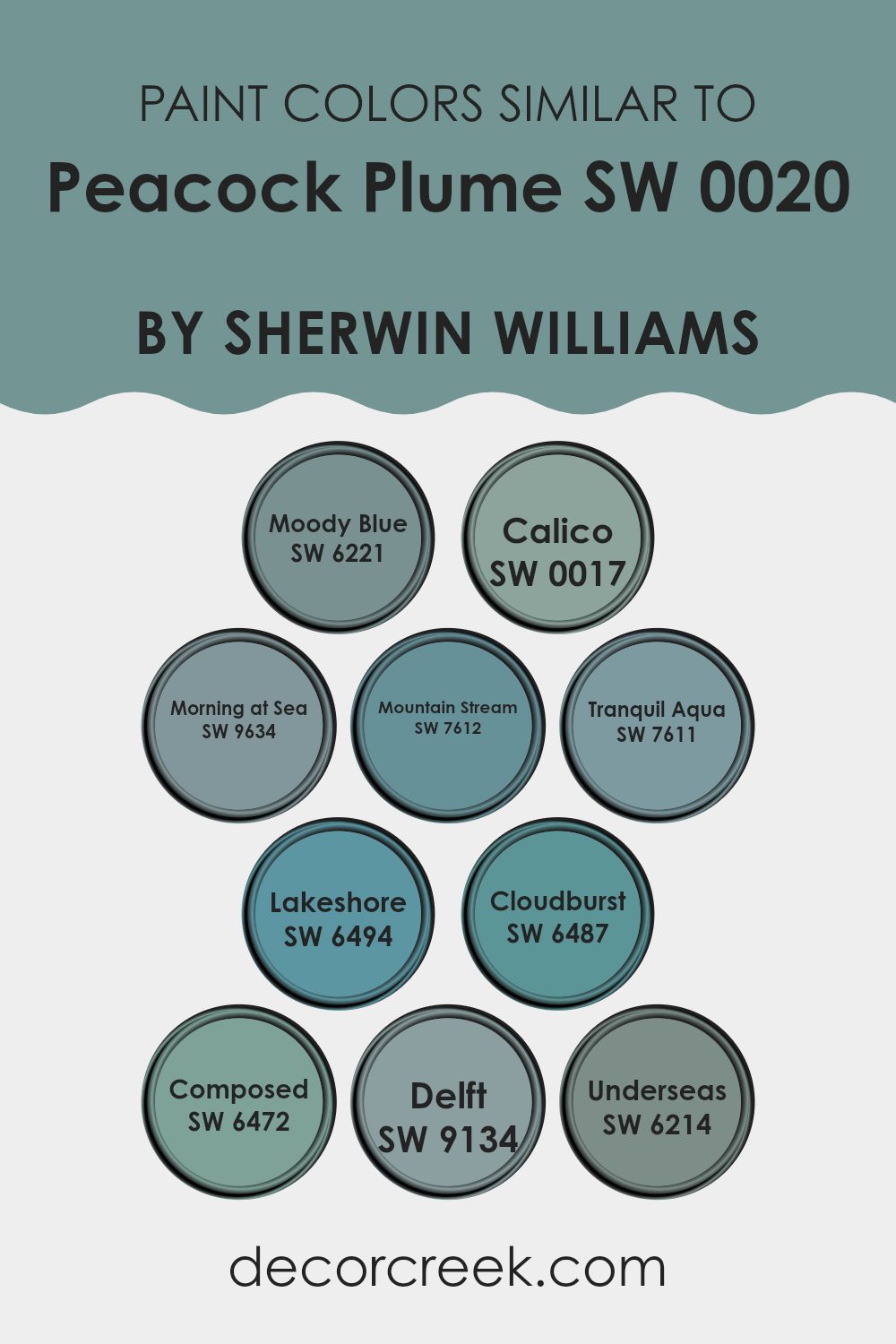
Colors Similar to Peacock Plume SW 0020 by Sherwin Williams
Similar colors are essential in design because they create harmony and balance, making rooms feel cohesive and pleasing to the eye. Colors that share similar hues or tones can be used to achieve a subtle, unified look that emphasizes textures and shapes without feeling too intense. For example, using hues like Moody Blue and Morning at Sea together can provide a smooth transition in a room that features both calm and slightly more intense shades.
Moody Blue is a deep, soothing blue that adds a touch of mystery and depth to rooms. Calico, in contrast, is a more muted, soft beige with a warm undertone that provides a perfect backdrop for richer colors. Morning at Sea offers a fresh, airy feel with its light, breezy blue tone, making it ideal for bathrooms or calm retreat rooms. Mountain Stream has a gently vibrant blue-green that mimics the natural colors of a peaceful mountain landscape.
Tranquil Aqua lives up to its name with a soft, restful aqua that is easy on the eyes and works well in rooms meant for relaxation. Lakeshore sparkles with a more vivid blue that reminds one of clear, sunlit waters, great for adding a touch of cheer. Cloudburst shows a stronger, stormier shade of blue that can anchor a room with its intensity.
Composed brings a deep, rich teal that works beautifully in refined environments or as an accent color. Delft, named after the famous Dutch pottery, reflects a classic, decorative blue that pairs well with traditional or antique styles. Lastly, Underseas is a dark, greenish-blue reminiscent of deep ocean waters, ideal for creating a dramatic and enveloping atmosphere. Using these similar colors from Sherwin Williams allows for endless possibilities in creating environments that range from relaxing to invigorating, without jarring transitions.
You can see recommended paint colors below:
- SW 6221 Moody Blue
- SW 0017 Calico
- SW 9634 Morning at Sea
- SW 7612 Mountain Stream
- SW 7611 Tranquil Aqua
- SW 6494 Lakeshore
- SW 6487 Cloudburst
- SW 6472 Composed
- SW 9134 Delft
- SW 6214 Underseas
How to Use Peacock Plume SW 0020 by Sherwin Williams In Your Home?
Peacock Plume SW 0020 by Sherwin Williams is a vibrant blue-green paint color, perfect for those who want to add a fresh splash of color to their home. It’s ideal for a feature wall in a living room or a bedroom, creating a striking focal point that draws the eye.
This shade can also be used on kitchen cabinets for a cheerful and modern look, or in a bathroom to give it a cool, refreshing vibe. Because of its boldness, pairing it with neutral colors such as white, grey, or beige helps balance the look.
Also, consider using it in small areas like an entryway or a hallway to make a memorable first impression as guests enter your home. Accessories in gold or copper can be added for a touch of luxury, while natural wood accents can keep the atmosphere grounded and warm. Peacock Plume is an adaptable color that can really liven up your room.
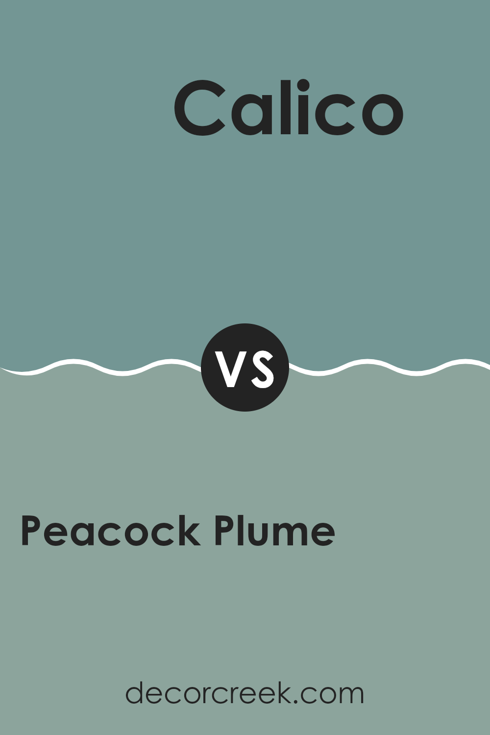
Peacock Plume SW 0020 by Sherwin Williams vs Calico SW 0017 by Sherwin Williams
Peacock Plume and Calico are two distinctive colors by Sherwin Williams that offer unique vibes to any room. Peacock Plume is a bold, deep blue with a hint of green, bringing to mind the rich colors of a peacock’s feathers.
It’s a strong color that adds a striking touch and can make a statement in a room. On the other hand, Calico is a much softer, neutral beige that offers a gentle and warm atmosphere. This color is adaptable and pairs well with many other hues, providing a calm backdrop for bolder colors or design elements.
While Peacock Plume can be the center of attention, Calico tends to fade into the background, supporting other colors. Both colors have their uses depending on the look you’re trying to achieve, whether it’s eye-catching drama or understated elegance.
You can see recommended paint color below:
Peacock Plume SW 0020 by Sherwin Williams vs Underseas SW 6214 by Sherwin Williams
Peacock Plume and Underseas are both Sherwin Williams paints, but they offer different vibes due to their hues. Peacock Plume is a vibrant teal that leans more towards blue, giving it a lively, refreshing feel.
It’s the kind of color that stands out in a room, adding a cheerfulness to the area. On the other hand, Underseas is a darker shade, more subdued, with green undertones that suggest a calm and grounded atmosphere.
It resembles the deep ocean and is perfect for those who prefer colors that aren’t too bright but still add character to a room. Both colors are great for making a statement in their own right, depending on what kind of mood or style you’re aiming for in your interior.
You can see recommended paint color below:
- SW 6214 Underseas
Peacock Plume SW 0020 by Sherwin Williams vs Tranquil Aqua SW 7611 by Sherwin Williams
Peacock Plume and Calm Aqua, both from Sherwin Williams, are distinct yet harmonious shades. Peacock Plume has a deep, intense teal tone that tends to stand out and draw attention when used in a room.
Its rich hue can make rooms feel cozy and inviting. On the other hand, Calm Aqua is a much lighter, softer shade reminiscent of a calm sea. This color is great for creating a relaxed, soothing atmosphere in any setting.
While Peacock Plume is bold and can dominate a room, Calm Aqua is gentle and tends to blend seamlessly into its surroundings. Both colors work well for creating different moods and can complement each other when used together in decor, providing a balance of vibrancy and calm.
You can see recommended paint color below:
- SW 7611 Tranquil Aqua
Peacock Plume SW 0020 by Sherwin Williams vs Mountain Stream SW 7612 by Sherwin Williams
Peacock Plume is a deep, vibrant teal with a touch of greenish-blue that adds a lively and bold touch to any room. Its richness is perfect for creating a statement in a room, whether on an accent wall or used throughout the room for a more enveloping experience.
In contrast, Mountain Stream is a softer, lighter blue that has a very calming quality to it. This color is more subdued and gentle, making it ideal for creating a relaxed atmosphere, ideal in bedrooms or bathrooms where a peaceful environment is desired.
While Peacock Plume has a more aggressive and energetic presence, Mountain Stream offers a soothing backdrop that feels airy and fresh. Overall, the choice between the two depends on whether you’re looking for a color that stands out with vibrancy or blends in with a gentle subtlety.
You can see recommended paint color below:
- SW 7612 Mountain Stream
Peacock Plume SW 0020 by Sherwin Williams vs Lakeshore SW 6494 by Sherwin Williams
Peacock Plume is a deep, vibrant teal that creates a bold statement. It leans more towards the blue side, giving it a rich, striking tone. This color has the power to dominate a room, making it an excellent choice for accent walls or decorative elements where a strong presence is desired.
On the other hand, Lakeshore is a lighter and brighter shade of teal with a more playful and refreshing vibe. It feels airy and can brighten up rooms that need a touch of cheerfulness. This color works well in areas that require a light and uplifting atmosphere, such as bathrooms or kitchens, and pairs nicely with both light and dark accents.
While both colors share a teal base, Peacock Plume is darker and more intense, whereas Lakeshore offers a softer and more relaxed feel. Each brings its unique charm to rooms depending on the mood and style you’re aiming for.
You can see recommended paint color below:
- SW 6494 Lakeshore
Peacock Plume SW 0020 by Sherwin Williams vs Cloudburst SW 6487 by Sherwin Williams
Peacock Plume and Cloudburst are two distinct colors by Sherwin Williams. Peacock Plume is a vibrant shade, blending deep blue and green tones, mimicking the rich color of a peacock’s feather. This lively hue brings energy and boldness to any room, making it suited for areas where a touch of excitement is desired.
On the other hand, Cloudburst is a much softer color, reminiscent of a stormy sky with its cool, gray tone. It delivers a calming effect, perfect for rooms where relaxation is the goal, such as bedrooms or bathrooms. Cloudburst serves as a neutral backdrop, allowing for flexibility in decor.
Both colors offer their unique aesthetic benefits: Peacock Plume stands out and commands attention, while Cloudburst provides a subtle, soothing presence. Depending on the vibe you want to achieve in a room, these colors could either energize you or help you wind down.
You can see recommended paint color below:

Peacock Plume SW 0020 by Sherwin Williams vs Delft SW 9134 by Sherwin Williams
Peacock Plume and Delft are two distinct shades offered by Sherwin Williams. Peacock Plume is a vibrant deep teal that carries a sense of boldness and energy. It stands out and adds a punch of color to any room, suitable for creating a strong and lively focal point in interiors.
On the other hand, Delft is a softer, muted blue-gray reminiscent of the classic Dutch pottery after which it’s likely named. This color is calmer and tends to blend more smoothly into a room, providing a soothing backdrop rather than demanding attention.
While both colors draw from the cooler end of the color spectrum, Peacock Plume leans towards a green influence, whereas Delft stays closer to a true soft blue, making it ideal for those looking for a more subtle and gentle room atmosphere. Their uses can vary significantly depending on the desired effect in a decorating project.
You can see recommended paint color below:
Peacock Plume SW 0020 by Sherwin Williams vs Morning at Sea SW 9634 by Sherwin Williams
Peacock Plume and Morning at Sea are two distinctive shades by Sherwin Williams, each holding its unique charm. Peacock Plume is a deep, vibrant teal that seems bold and lively. It’s a color that stands out and can give a striking accent to any room, making it feel more dynamic and full of life.
On the other hand, Morning at Sea is a much softer shade, more towards a muted blue with a hint of gray. This color is calming and gentle, perfect for creating a relaxed and peaceful atmosphere in rooms where you want to unwind.
When comparing the two, Peacock Plume typically draws in more attention due to its richer hue, which can energize a room instantly. Morning at Sea is better for those who prefer a subdued vibe, offering a fresh, airy feel. Depending on what mood you wish to set, each color serves its purpose beautifully, either by adding a splash of energy or creating a sense of calm.
You can see recommended paint color below:
Peacock Plume SW 0020 by Sherwin Williams vs Moody Blue SW 6221 by Sherwin Williams
Peacock Plume and Moody Blue are two distinct colors from Sherwin Williams. Peacock Plume is a vivid and bright shade which closely resembles the vibrant colors one might see on a peacock’s feathers. It has a lively and strong presence, making it a great choice if you want to add a pop of color to a room that really stands out.
In contrast, Moody Blue is deeper and more subdued. It offers a sense of calmness and is more reserved compared to Peacock Plume. This color works well in rooms where you want to promote a relaxed and comfortable atmosphere.
While both colors bring their own unique qualities to a room, Peacock Plume tends to draw more attention because of its brightness, whereas Moody Blue sets a more chilled backdrop.
You can see recommended paint color below:
Peacock Plume SW 0020 by Sherwin Williams vs Composed SW 6472 by Sherwin Williams
Peacock Plume and Composed, both from Sherwin Williams, are unique in their own ways. Peacock Plume is a vibrant blue with a hint of green. It’s bold and lively, making it a perfect choice for adding a splash of energy to any room.
On the other hand, Composed is a deeper teal that leans more toward a subdued, classic feel. It’s a flexible choice that works well in many settings without overpowering the room.
While Peacock Plume stands out and grabs attention, Composed offers a more reserved look that can serve as a calm backdrop for bolder decor elements. If you’re looking to create a more dynamic and cheerful atmosphere, Peacock Plume is the way to go. Meanwhile, Composed is ideal for interiors where you want a touch of color but prefer to keep the overall feel grounded and calm.
You can see recommended paint color below:
In wrapping up my thoughts about SW 0020 Peacock Plume by Sherwin Williams, I truly enjoyed getting to know this color. Peacock Plume stands out as a bright and lively blue that captures the imagination and brings a cheerful energy to any room. I realized that this shade isn’t just pretty; it also has a calming effect that makes a room feel cozy and welcoming.
When I tried it in different parts of the home like the living room and bedroom, Peacock Plume consistently added a nice touch of color without being too loud. It works really well with other colors too, like whites, grays, and even some yellows, which gives plenty of freedom to get creative with room designs.
Whether it’s for painting a whole room or just an accent wall, Peacock Plume is a great choice. It’s not just about looks; it also covered the walls smoothly and stayed looking good over time. It’s safe to say, if you want to brighten up your room with some color, SW 0020 Peacock Plume is a fantastic pick.
So, if you’re thinking about giving your room a fresh look, you might want to consider this beautiful blue. It’s fun, it feels good to be around, and it can make your room look as lovely as it feels. Job well done, Sherwin Williams, with creating a paint that’s both pretty and practical!

Ever wished paint sampling was as easy as sticking a sticker? Guess what? Now it is! Discover Samplize's unique Peel & Stick samples.
Get paint samples

