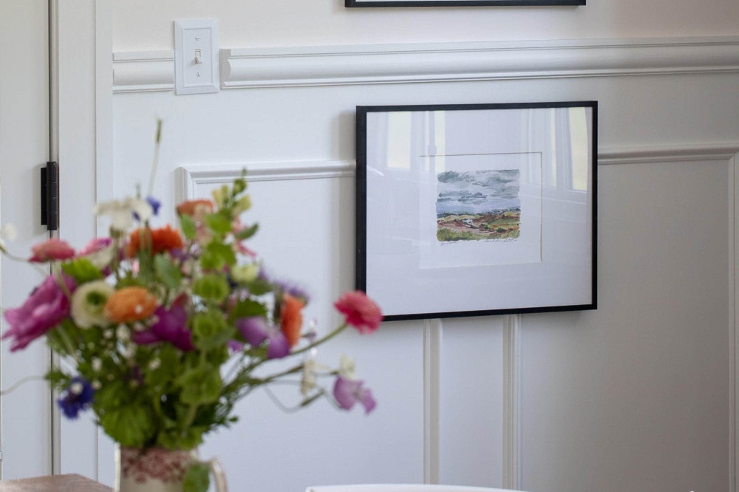
Selecting the right paint color for your home can often feel stressful with the vast array of options available. Sherwin Williams’ SW 7004 Snowbound is a popular choice for those looking to achieve a clean and bright aesthetic. Before you decide to paint your walls with this flexible shade of white, there are a few key things I recommend considering.
Firstly, consider the lighting in your room. Snowbound has a cool undertone that can be influenced by natural light. In rooms with ample sunlight, it will look vibrant and pure, while in rooms with less natural light, it may appear slightly grayer.
Also, think about your existing decor and furnishings. Snowbound pairs well with a wide range of colors and styles, but it’s particularly effective at enhancing modern, minimalist, and even rustic themes due to its subtle undertones.
Lastly, don’t forget about the finish. Depending on the use of the room, a semi-gloss might be practical for areas like kitchens and bathrooms, while living areas might benefit from a matte finish to soften the ambiance.
Choosing Snowbound by Sherwin Williams can truly refresh your room, just keep these considerations in mind to ensure it aligns perfectly with your home’s unique character and your personal style.
Is Snowbound SW 7004 Right for My Home?
I’ve always been drawn to calm and neutral colors, and Snowbound by Sherwin Williams is one of my favorites. It’s a warm, off-white shade that has just the slightest hint of gray. This softness makes it incredibly flexible and comforting. It’s the kind of color that subtly brightens up a room without feeling stark or cold, which is perfect for creating a cozy atmosphere.
Snowbound works beautifully in various interior styles, especially in modern farmhouse, minimalist, and Scandinavian designs. Its warmth pairs wonderfully with natural materials like wood and leather, bringing out their rich textures. I also love combining it with softer textiles like wool or cotton to enhance that comfy, inviting vibe.
When I use this color, I like matching it with matte finishes and mixed textures to add depth and interest to the room. For instance, a matte Snowbound wall behind a polished wooden table or a linen sofa creates a lovely balance. It also looks stunning next to large windows with lots of natural light, which helps to keep the room feeling bright and airy. Overall, Snowbound is a go-to for me when I want to create a room that’s both warm and modern. It’s a color that just makes every room look good.

What are the right undertones of Snowbound SW 7004 ?
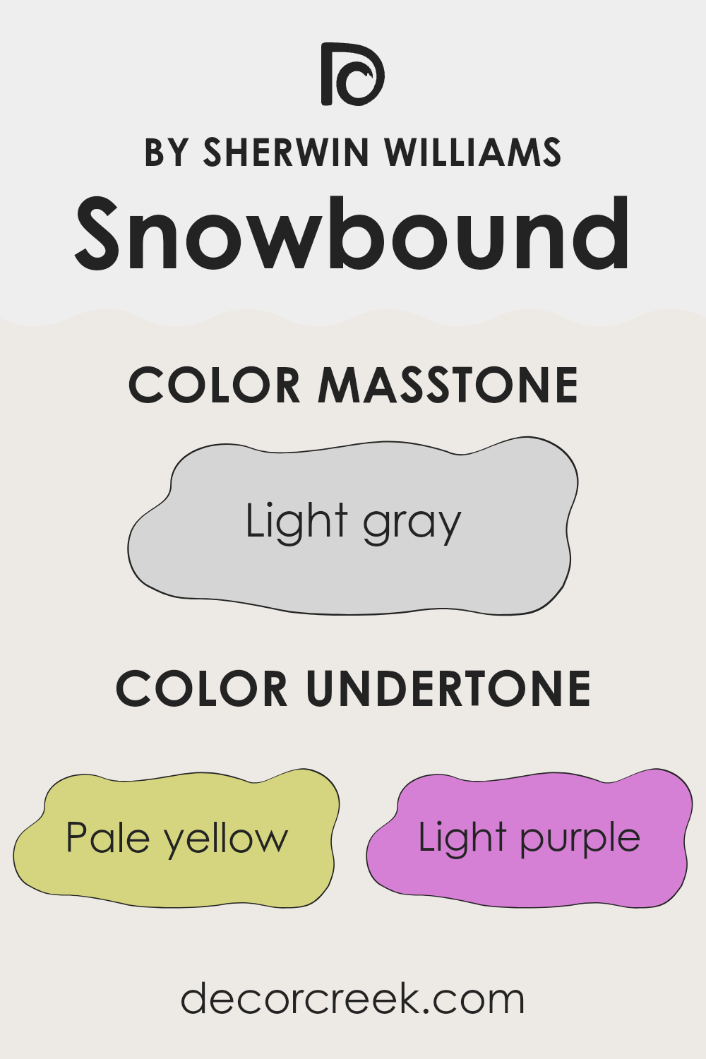
Snowbound is a popular paint color known for its flexibility and softness. It appears mainly as a clean white, but its subtle undertones add depth and complexity that influence how it looks in different settings. The undertones of Snowbound include pale yellow, light purple, light blue, pale pink, mint, lilac, and grey. These hues play a significant role in how the color is perceived.
Undertones are essentially the colors lurking beneath the surface of the main color. Even though they might not be immediately visible, they can affect the overall hue depending on the lighting and surroundings.
For instance, in a room with lots of natural light, Snowbound might bring out its cooler undertones like light blue or lilac, giving the walls a crisp, fresh look. In artificial or dim lighting, the warmer undertones such as pale yellow or pale pink might become more dominant, creating a cozier atmosphere.
When used on interior walls, the different undertones of Snowbound can make the room feel more inviting and layered. The mix of warm and cool undertones allows it to adjust to various decor styles and color palettes, making it easy to work with. Whether it’s a bedroom or a living room, the subtle complexity of Snowbound can help enhance the aesthetic of the room without feeling too strong, allowing the room’s other design elements to stand out.
decorcreek.com
Best Coordinating Colors to use with Snowbound SW 7004 by Sherwin Williams this year.
Coordinating colors are essentially shades that complement each other well and enhance the overall aesthetic of a room when used together. They work by creating a harmonious color scheme that can visually balance a room and add depth to the design. For example, if you consider pairing a base color like Snowbound, a very light, neutral shade of white with gray undertones, with other colors, you want to choose shades that will complement without feeling too heavy.
Coordinating colors are essentially shades that complement each other well and enhance the overall aesthetic of a room when used together. They work by creating a harmonious color scheme that can visually balance a room and add depth to the design. For example, if you consider pairing a base color like Snowbound, a very light, neutral shade of white with gray undertones, with other colors, you want to choose shades that will complement without feeling too heavy.
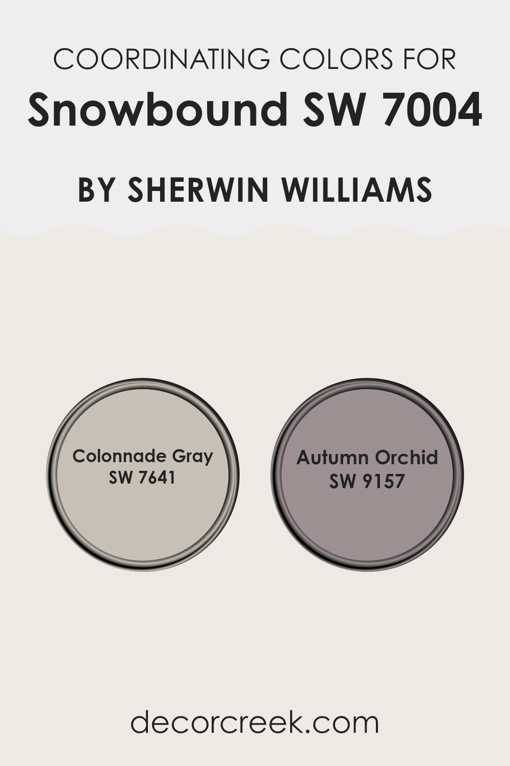
Colonnade Gray is a perfect coordinating color for such neutral whites. It is a gentle gray with warm undertones, making it a flexible choice that can lend a muted but inviting feel to rooms that aim for a more grounded ambiance. Autumn Orchid is a subtle and warm purple with a very earthy base, providing a soft contrast when used with cooler neutrals. This color adds a light splash of color, keeping the room’s atmosphere light and airy while also injecting a touch of personality and warmth. Both colors align well with Snowbound, creating a calming palette that works across many decor styles and settings.
You can see recommended paint colors below:
- SW 7641 Colonnade Gray
- SW 9157 Autumn Orchid
Trendy Trim Colors of Snowbound SW 7004 by Sherwin Williams to use this year.
Trim colors play a crucial role in enhancing the aesthetic appeal and defining the architectural elements of a room. When used with a base color like Snowbound SW 7004 by Sherwin Williams, which is a light and neutral white, selecting the right trim colors can add depth and contrast to the walls.
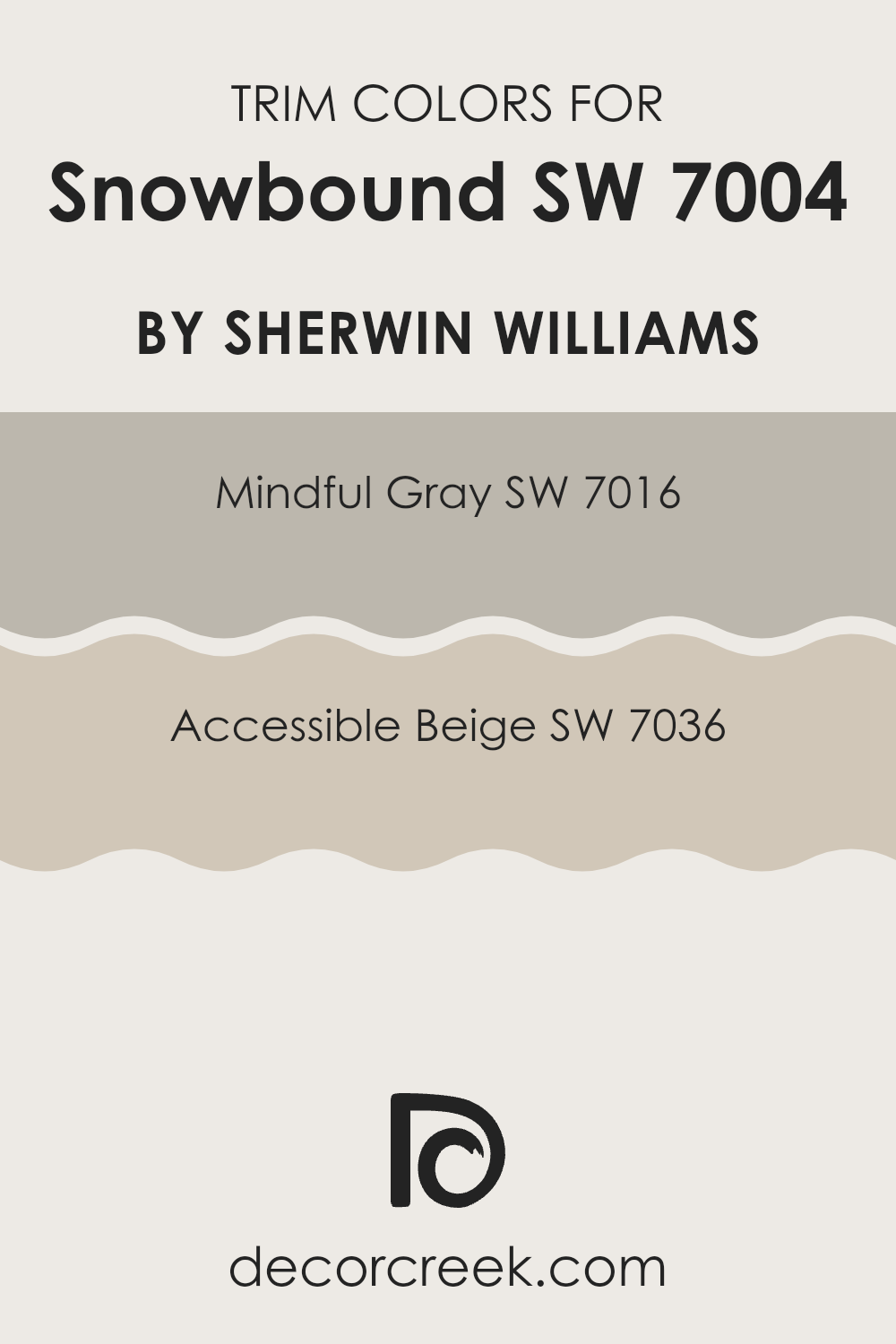
For instance, using Mindful Gray SW 7016 or Accessible Beige SW 7036 as trim colors introduces a subtle shift in tone that frames and highlights the features of a room beautifully, creating a clean and inviting atmosphere.
Mindful Gray SW 7016 is a gentle gray hue that brings a balanced neutrality when used as a trim, offering a soft contrast without feeling too heavy next to the primary color, Snowbound. It’s a flexible choice that works well in many different rooms.
On the other hand, Accessible Beige SW 7036 is a warm beige that provides a slightly richer and cozier feel to the trim, complementing the coolness of Snowbound by adding a welcoming warmth to the room. Both choices are excellent for achieving a harmonious yet distinct look between walls and trim.
You can see recommended paint colors below:
- SW 7016 Mindful Gray
- SW 7036 Accessible Beige
Evergreen Colors Similar to Snowbound SW 7004 by Sherwin Williams
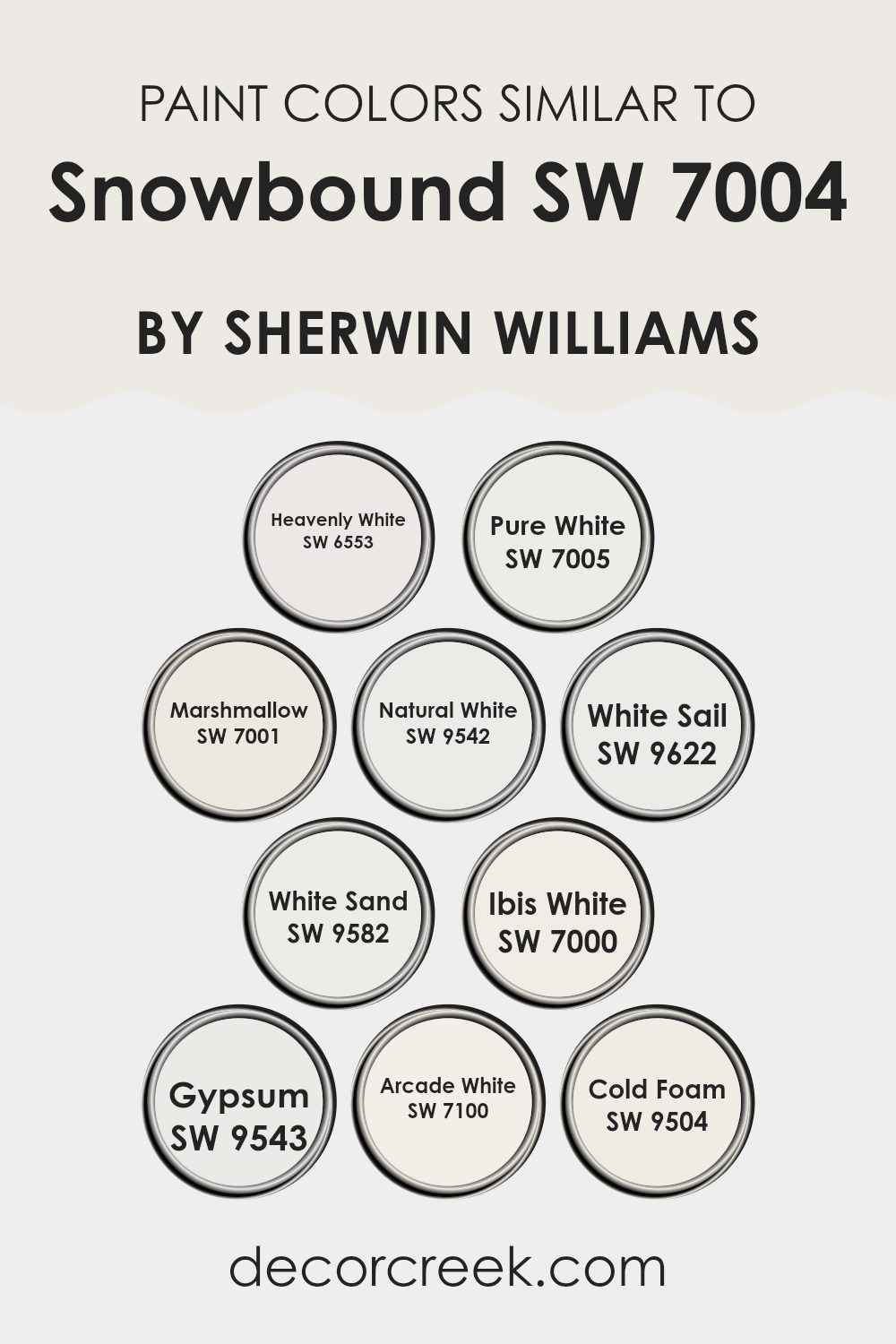
Similar colors play a critical role in creating a harmonious and cohesive look in any room. Colors like Heavenly White, Pure White, and Marshmallow by Sherwin Williams have subtle differences but share a unifying calmness that can brighten rooms while offering a slight variation in undertones that cater to different ambient lighting or decor elements.
For example, Heavenly White has a soft slightness that brings a clean and airy feel, making it perfect for creating a light, welcoming room. On the other hand, Pure White stands out with a crisp clarity that works wonderfully for trim or ceilings, enhancing other colors in the room.
Further along the spectrum, we see Natural White offering a touch of warmth, ideal for living areas where a cozy atmosphere is desired. White Sail and White Sand add nuances of peace and softness, respectively, ideal for creating a gentle and relaxing vibe in bedrooms or bathrooms.
Ibis White and Gypsum each provide a unique flair — Ibis White with its ever-so-light pinkish tone offers warmth, while Gypsum gives an almost chalky finish that pairs well with contemporary or minimalist decor.
Rounding up the palette, Arcade White brings a fresh vibrancy, and Cold Foam introduces a slightly cooler hue, resembling a touch of frost, which is excellent for modern settings or as a contrasting base for colorful artworks. All these similar shades ensure design flexibility while maintaining a visual connection, making it easier to achieve a tailored aesthetic without abrupt transitions.
You can see recommended paint colors below:
- SW 6553 Heavenly White
- SW 7005 Pure White
- SW 7001 Marshmallow
- SW 9542 Natural White
- SW 9622 White Sail
- SW 9582 White Sand
- SW 7000 Ibis White
- SW 9543 Gypsum
- SW 7100 Arcade White
- SW 9504 Cold Foam
Colors that Go With Snowbound SW 7004 by Sherwin Williams
Choosing the right colors to complement Snowbound SW 7004 by Sherwin Williams is crucial for creating a harmonious and visually appealing room. Snowbound is a warm and inviting shade of white, and when paired with appropriate colors, it can enhance the overall ambiance of a room.
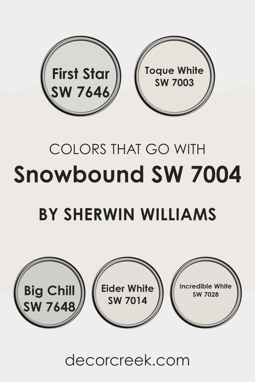
Colors like First Star, Toque White, Big Chill, Eider White, and Incredible White work well with Snowbound because they maintain a cohesive and balanced look. These colors prevent stark contrasts, promoting a soft transition between walls which can make rooms appear larger and more open.
First Star is a gentle gray that offers a light contrast to Snowbound, making it ideal for rooms that want a hint of differentiation without feeling too heavy. Toque White is another complementary color; it’s a slightly off-white tone that provides a subtle variation to keep the design interesting yet unified.
Big Chill adds a cooler tone, offering a slight blue undertone that pairs beautifully with the warm hues of Snowbound for a refreshing feel. Eider White has a hint of pink, softening interiors and adding a touch of warmth, perfect for cozy settings. Lastly, Incredible White steps in as a slightly deeper off-white that enriches the room, providing depth and a refined look to the palette. All these colors ensure a smooth visual flow that enhances the overall harmony in a room.
You can see recommended paint colors below:
- SW 7646 First Star
- SW 7003 Toque White
- SW 7648 Big Chill
- SW 7014 Eider White
- SW 7028 Incredible White
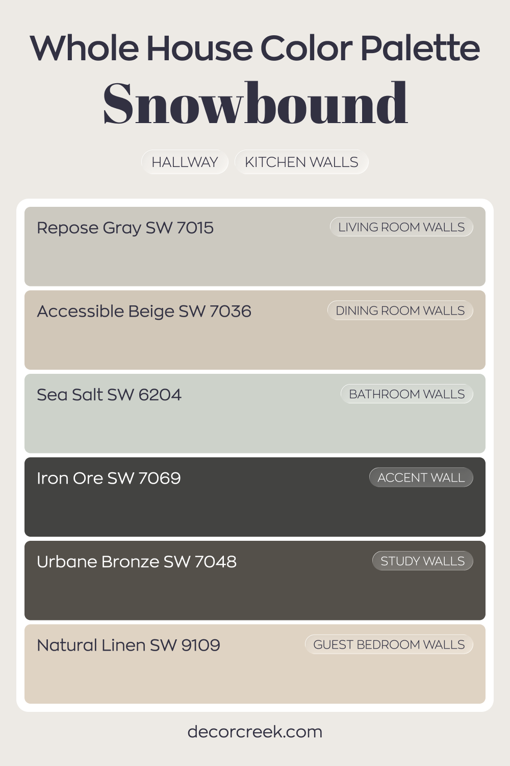
Whole House Paint Color Palette Centered On Snowbound SW 7004
Snowbound SW 7004 brightens the hallway and kitchen walls with a crisp white backdrop. Repose Gray in the living room and Accessible Beige in the dining room add warmth and balance, keeping the house from feeling too stark. The shift between cool and warm neutrals feels smooth and intentional.
Sea Salt in the bathroom introduces a soft wash of color that pairs beautifully with the surrounding whites.
Natural Linen in the guest bedroom continues the warm thread, offering comfort and depth. These tones make each room feel connected yet distinct.
Iron Ore on an accent wall and Urbane Bronze in the study bring richness and contrast. The darker shades ground the lighter walls, giving the entire palette strength and character.
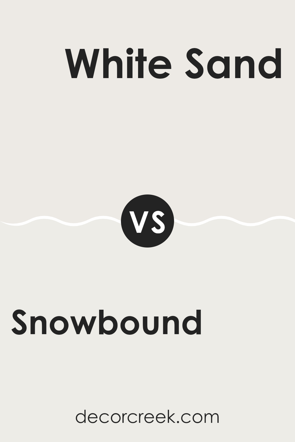
Snowbound SW 7004 by Sherwin Williams vs White Sand SW 9582 by Sherwin Williams
Snowbound and White Sand are both appealing paint colors from Sherwin Williams, but they bring different vibes to a room. Snowbound has a slightly gray undertone, making it a cooler white that can give a clean and sharp feel to rooms. It pairs well with modern or minimalistic decorations because it offers a crisp backdrop.
On the other hand, White Sand is a bit warmer due to its beige undertones. This color can make a room feel more inviting and cozy, which is great for living rooms or bedrooms where you want a softer atmosphere. It works beautifully with earth tones and natural materials like wood or linen.
Overall, if you’re looking for a cooler, sharper white, Snowbound is a good choice. If you prefer something warmer and more cozy, White Sand would be more suitable. Both colors are flexible and can be used to brighten up rooms effectively.
You can see recommended paint color below:
- SW 9582 White Sand
Snowbound SW 7004 by Sherwin Williams vs White Sail SW 9622 by Sherwin Williams
Snowbound and White Sail are both popular white paint colors from Sherwin Williams, but they have subtle differences that affect how they look in various rooms. Snowbound has a slightly gray undertone, making it appear cooler.
This quality means it can provide a clean, fresh look that is very modern but still soft enough not to feel too stark. On the other hand, White Sail leans a bit more toward a creamy tone, giving it a warmer appearance. This makes it an excellent choice for areas where you want a cozy or inviting atmosphere, as it can make rooms feel more welcoming.
In terms of brightness, White Sail is a bit lighter than Snowbound, making it potentially better for smaller or darker rooms where you want to reflect more light. Depending on the lighting and the other colors in the room, each can either blend beautifully or stand out as a gentle contrast.
You can see recommended paint color below:
- SW 9622 White Sail
Snowbound SW 7004 by Sherwin Williams vs Pure White SW 7005 by Sherwin Williams
Snowbound SW 7004 and Pure White SW 7005, both by Sherwin Williams, are subtle yet distinct shades of white. Snowbound has a soft, warm undertone that gives it a cozy and welcoming feel. This makes it ideal for rooms where you want a touch of warmth without veering away from a neutral palette.
In contrast, Pure White is brighter and crisper, leaning more toward a true white without noticeable undertones. This quality makes it an excellent choice for areas where you want to maximize light reflection, such as smaller rooms or places with less natural light.
Choosing between the two depends largely on the atmosphere you aim to create; Snowbound works wonderfully in a relaxed, inviting setting, while Pure White is perfect for achieving a clean, sharp backdrop. Both colors offer a fresh and clean aesthetic but in slightly different tones and moods.
You can see recommended paint color below:
Snowbound SW 7004 by Sherwin Williams vs Cold Foam SW 9504 by Sherwin Williams
Snowbound and Cold Foam by Sherwin Williams are two distinct paint colors, each with its unique shade and ambiance. Snowbound is a soft, warm white with subtle gray undertones. It offers a clean, inviting atmosphere, making it a great choice for walls in living areas or bedrooms, where a cozy feel is desired. This color reflects light well, brightening up rooms without feeling too stark.
On the other hand, Cold Foam is cooler and appears more neutral compared to Snowbound. It has a fresher, crisper look, leaning more toward a true white without prominent undertones. Cold Foam works excellently in modern settings or minimalistic designs, where a sharp, clear backdrop is needed.
While both colors are light and airy, Snowbound gives a warmer, more welcoming touch, whereas Cold Foam provides a sharper, cleaner aesthetic. Choosing between them depends on the mood and style you want to achieve in your room.
You can see recommended paint color below:
- SW 9504 Cold Foam
Snowbound SW 7004 by Sherwin Williams vs Marshmallow SW 7001 by Sherwin Williams
Snowbound and Marshmallow by Sherwin Williams are two popular shades of white paint that often get compared. Snowbound has a slightly gray undertone, which can make it appear a bit cooler. This makes it a great choice for modern rooms that want to maintain a crisp, clean look.
On the other hand, Marshmallow has a warmer tone due to its subtle cream undertones. This warmth makes Marshmallow ideal for creating a cozy and welcoming atmosphere in a room. When deciding between these two, consider the lighting and other colors in your room.
Snowbound might work better in well-lit or natural light-filled rooms, keeping the ambiance light and airy. Marshmallow, however, would be perfect for areas with softer lighting, adding a gentle richness to the room. Both colors are flexible but cater to different aesthetic preferences and moods.
You can see recommended paint color below:
- SW 7001 Marshmallow
Snowbound SW 7004 by Sherwin Williams vs Ibis White SW 7000 by Sherwin Williams
Snowbound and Ibis White are both popular paint colors from Sherwin Williams. Snowbound has a slightly warm tone and often appears as a soft, off-white with gentle gray undertones. This color gives a cozy and welcoming feel to rooms, making it perfect for living areas and bedrooms where comfort is key.
On the other hand, Ibis White is a cleaner, brighter white. It has a more neutral base compared to Snowbound, which means it tends not to lean too warm or too cool. This makes Ibis White incredibly flexible for different rooms and lighting conditions, often used in kitchens and bathrooms where a crisp, clean look is desired.
Both colors offer a fresh and airy feel but serve slightly different styles and preferences in interior design. Snowbound works well where a softer, more muted hue is needed, while Ibis White is great for achieving a sharp, pure white setting.
You can see recommended paint color below:
Snowbound SW 7004 by Sherwin Williams vs Gypsum SW 9543 by Sherwin Williams
Comparing Snowbound and Gypsum by Sherwin Williams reveals subtle differences. Snowbound is a soft, almost pure white with a slight gray undertone. It’s a flexible shade widely used in homes to create a bright, clean look. This color is perfect for walls in rooms where you want to enhance natural light.
On the other hand, Gypsum is also a light color, but it has a warmer tone compared to Snowbound. It offers a creamy feel that makes rooms cozy and welcoming. Ideal for living rooms and bedrooms, Gypsum can soften the ambiance of a room while still maintaining a fresh aesthetic.
Both Snowbound and Gypsum are subtle and pair well with other colors, giving you flexibility in your decor choices. However, the choice between them would depend on the mood you want to create; Snowbound is better for achieving a crisp, vibrant feel, while Gypsum is great for a softer, more relaxed environment.
You can see recommended paint color below:
- SW 9543 Gypsum
Snowbound SW 7004 by Sherwin Williams vs Natural White SW 9542 by Sherwin Williams
Snowbound and Natural White are two shades offered by Sherwin Williams that can refresh any living room. Snowbound is a soft, warm white with subtle gray undertones, giving it a cozy and inviting feel. It’s especially great in rooms where you want a gentle hint of warmth without overpowering the room.
On the other hand, Natural White is a bit closer to a pure white. It offers a clean and crisp look but still avoids the starkness associated with cooler whites. It comes with a very slight beige undertone that keeps it friendly and welcoming, perfect for rooms that benefit from a bright and airy atmosphere.
These two colors, while similar in their base hues, serve different purposes based on their undertones and warmth levels. Snowbound works well in settings where a soft, cozy vibe is desired, whereas Natural White is ideal for creating a clear, crisp backdrop that still feels homely. Each color offers a distinct mood, making it easy to choose depending on the needs of your room.
You can see recommended paint color below:
- SW 9542 Natural White
Snowbound SW 7004 by Sherwin Williams vs Arcade White SW 7100 by Sherwin Williams
Snowbound and Arcade White are both white shades offered by Sherwin Williams, but they have different undertones and vibes. Snowbound has a slightly gray undertone, making it a cooler, softer white. This quality makes it great for a room that needs a calm and clean look while still having a touch of warmth. It works well in different lighting conditions and fits easily with various decor styles.
On the other hand, Arcade White leans toward a slightly warmer tone with a hint of beige. This warmth brings a cozy and welcoming feel to rooms, especially in homes with natural light. It pairs beautifully with earthy and wood elements, creating a friendly and inviting room.
Choosing between these two depends on the mood you want to set and the other colors in your room. Snowbound is ideal for a modern, minimalistic look, while Arcade White suits a more traditional or casual setting. Both are flexible, but their subtle undertones differentiate them according to the ambiance they create.
You can see recommended paint color below:
- SW 7100 Arcade White
Snowbound SW 7004 by Sherwin Williams vs Heavenly White SW 6553 by Sherwin Williams
Snowbound and Heavenly White are two paints that offer subtly different vibes for a room. Snowbound has a clean, soft gray undertone that makes it an excellent choice for creating a calm, neutral backdrop in a room. It combines well with other colors and helps furniture and artwork stand out.
On the other hand, Heavenly White is brighter and leans toward a true white with a hint of warmth. This warmth adds a cozy, inviting feel to rooms, making it ideal for areas where you want to create a friendly and welcoming atmosphere.
While both colors are great for making small rooms appear larger and brighter, Heavenly White reflects more light due to its brighter base, potentially making it better suited for darker or north-facing rooms. In contrast, Snowbound’s subtle grayish tint offers a more grounding feel, often preferred in modern aesthetics and in areas that get plenty of sunlight. Overall, the choice between the two would largely depend on the intended feel and the specific lighting conditions of the room.
You can see recommended paint color below:
- SW 6553 Heavenly White
Concluding, SW 7004 Snowbound by Sherwin Williams is a paint color that many people find really neat. It’s a kind of white that’s not too bright and not too dull, which makes it perfect for just about any room. Whether you want your bedroom to feel cozy or your living room to look fresh and clean, Snowbound could be the right choice. I’ve talked about how it works well with other colors, so you can pair it with dark blues or soft grays, and it will still look great.
It’s also good to know that Snowbound isn’t just pretty – it’s also practical. It can hide little marks or bumps on your walls because it’s not too shiny and not too flat. That’s why lots of people like using it in busy places like hallways and kitchens. This color can also make small rooms look bigger and brighter, which is a very handy trick if you feel like your room is too cramped.
After learning more about Snowbound, I can say it’s definitely a paint color worth considering if you’re thinking of giving your room a fresh new look. It’s simple, clean, and has a softness that makes any room feel welcoming. All in all, SW 7004 Snowbound by Sherwin Williams is a solid choice for anyone looking to freshen up their home.

Ever wished paint sampling was as easy as sticking a sticker? Guess what? Now it is! Discover Samplize's unique Peel & Stick samples.
Get paint samples

