If you’re on the lookout for a versatile, timeless paint color, SW 9612 Perfect Khaki by Sherwin Williams could be just what you need. Painting a room can refresh your space in a simple way, and choosing the right shade is crucial.
Perfect Khaki adds a subtle elegance without overwhelming the senses, making it suitable for nearly any room in your home. Whether you’re thinking about a cozy, warm vibe for your living room or a sophisticated backdrop for your office, this color has a wonderful way of adapting to various styles and lighting conditions.
In my own experience, Perfect Khaki strikes a balance between being overly bold and too muted. It partners well with various decor elements, helping to unify traditional and modern pieces seamlessly.
Let’s explore the nuances that make SW 9612 Perfect Khaki by Sherwin Williams a smart choice for those looking to refresh their walls with a new coat of paint.

What Color Is Perfect Khaki SW 9612 by Sherwin Williams?
The color Perfect Khaki by Sherwin Williams is a warm and inviting shade that effortlessly brings a sense of coziness to any room. Characterized by its soft, earthy tones, this color is versatile and easy to incorporate into various decor styles. Its balanced hue strikes a pleasant middle ground, not too dark and not too light, making it an ideal choice for creating a welcoming atmosphere.
Perfect Khaki works exceptionally well in interior styles that emphasize comfort and simplicity, such as rustic, modern farmhouse, and traditional. It serves as a beautiful backdrop in living rooms and bedrooms, where its subtle warmth enhances relaxation and calm.
Moreover, it’s an excellent choice for spaces like the kitchen or the home office, promoting a light and airy feeling that boosts focus and comfort.
When it comes to pairing with materials and textures, Perfect Khaki shines alongside natural wood, from light pine to rich mahogany, highlighting its organic roots.
It also matches well with soft textiles like cotton and linen in neutral shades, contributing to a soft, layered look. Metals such as bronze or copper bring out the warmth of the color, creating a refined yet cozy space. This shade’s adaptability and earthy quality make it a go-to color for anyone looking to create a welcoming and pleasant home environment.
Is Perfect Khaki SW 9612 by Sherwin Williams Warm or Cool color?
Perfect Khaki by Sherwin Williams is a versatile paint color that offers a warm and inviting feel, making it ideal for many homes. This shade of khaki is subtle enough to serve as a neutral backdrop, yet distinct enough to add character to a room.
It works well in living areas, bedrooms, and even kitchens, pairing nicely with both dark and light furnishings. Its earthy tone brings a cozy warmth to spaces, encouraging a welcoming atmosphere where family and guests can feel at ease.
When used in smaller spaces, this color can help make the room feel larger and more open, as it reflects light better than darker shades. In larger areas, it can help unify different sections and design elements, creating a cohesive look throughout the space. Additionally, Perfect Khaki is a practical choice for homeowners, as it tends to hide minor imperfections on walls better than lighter colors, and it remains stylish over time.
Undertones of Perfect Khaki SW 9612 by Sherwin Williams
Perfect Khaki is a versatile paint color that brings a mix of warmth and subtlety to any room. Understanding the undertones of a paint color is key because they influence how the color looks under different lighting conditions and when paired with other hues in a space.
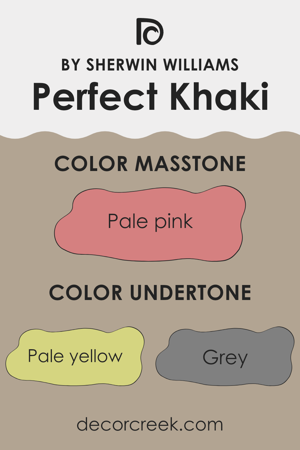
Perfect Khaki has multiple undertones that add complexity to its appearance. These undertones include pale yellow, grey, mint, and light purple, among others. For instance, the pale yellow undertone brings a subtle warmth, making the space feel more welcoming. The grey undertone adds a neutral balance, ensuring the color doesn’t lean too warm or too cool, making it easier to integrate into various decor styles.
On interior walls, these undertones interact with light in unique ways. In a room with plenty of natural light, the lighter undertones like light blue and mint might become more pronounced, giving the room a fresher, airy feel.
- In artificial light, warmer tones like orange and yellow might stand out, providing a cozy, inviting atmosphere.
Moreover, these undertones can impact color coordination within the room. For instance, furniture or decorations in shades of olive or brown will resonate well with the earthy aspect of Perfect Khaki, enhancing the overall aesthetic cohesion. Similarly, adding elements in light purple or pink can subtly highlight these undertones, creating interesting visual dynamics.
Overall, the diverse undertones of Perfect Khaki make it a flexible color choice, allowing it to adapt beautifully to various settings and styles, enhancing the aesthetic value of the space.
What is the Masstone of the Perfect Khaki SW 9612 by Sherwin Williams?
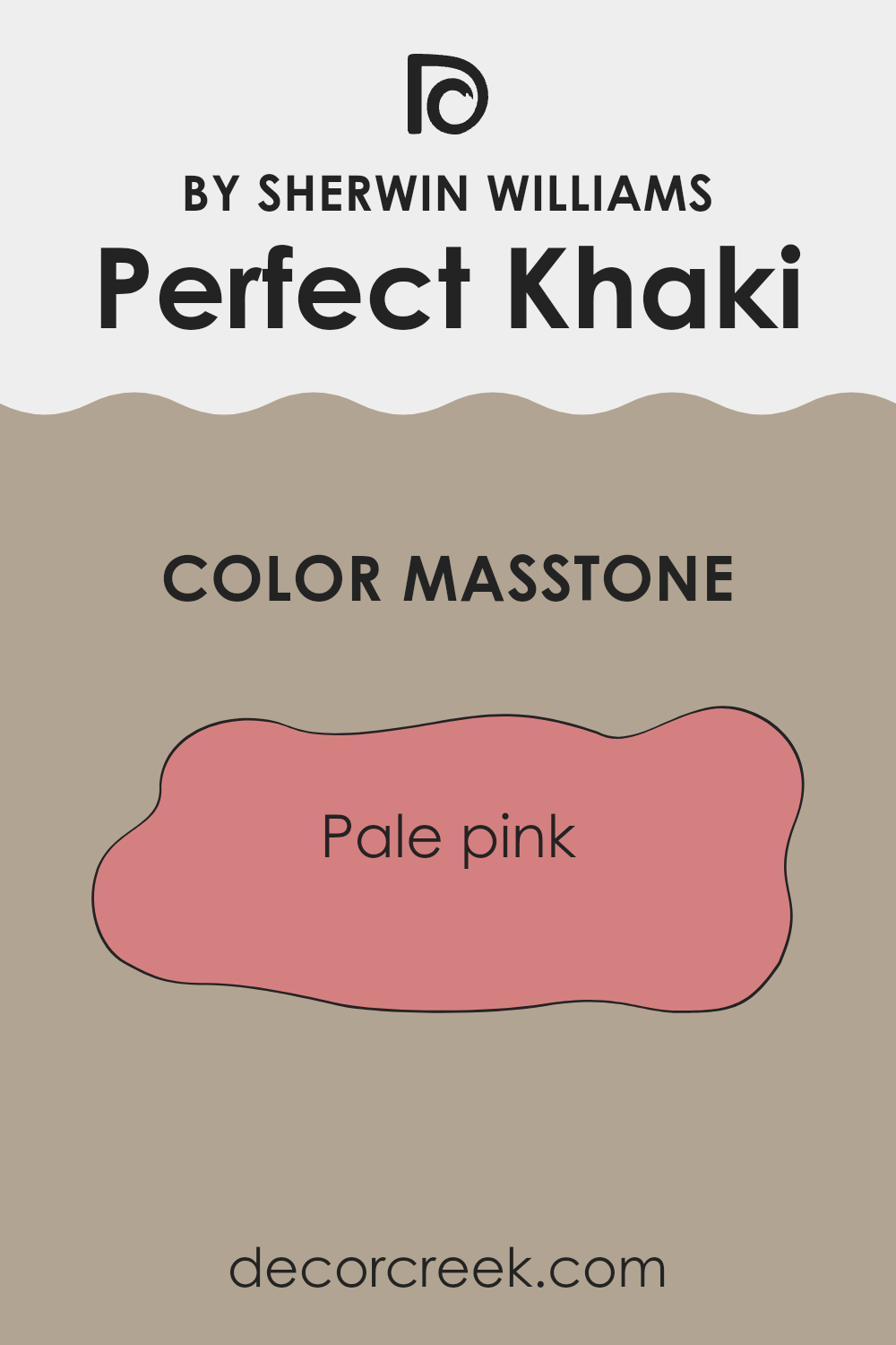
Perfect Khaki SW 9612 by Sherwin Williams has a masstone of pale pink, coded as #D58080. This gentle and soothing shade offers a subtle touch of warmth to any room, making it ideal for creating a cozy and inviting atmosphere in homes.
Its soft pink hue pairs well with a variety of decor styles and can act as a neutral backdrop, allowing other colors in the furniture and accessories to stand out. Since it doesn’t overpower, it’s perfect for spaces where you want a hint of color without it taking over the whole area.
This makes it great for living rooms, bedrooms, and even bathrooms where a touch of warmth can make a significant difference in the feel of the space. Additionally, its lightness provides a sense of freshness and light, making small rooms appear larger and more open. Overall, this pale pink creates a gentle, welcoming feel that works beautifully in many home settings.
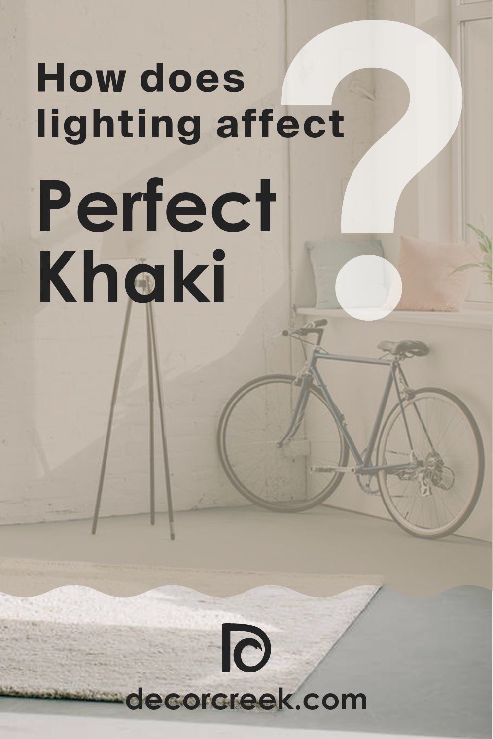
How Does Lighting Affect Perfect Khaki SW 9612 by Sherwin Williams?
Lighting plays a crucial role in how we perceive colors in our surroundings. The impact of lighting on color perception is especially evident in the paint color we choose for our interiors. For instance, Perfect Khaki is a versatile hue that can appear differently under various lighting conditions.
In artificial light, such as LED or incandescent bulbs, Perfect Khaki tends to reveal more of its warm undertones, giving a cozy and inviting feel to the room.
The intensity and type of artificial light can either enhance or mute these undertones, with warmer lights making the color look richer and cooler lights rendering it slightly more neutral.
In natural light, the appearance of Perfect Khaki shifts throughout the day as the sunlight changes.
Morning light brings out the freshness of the color, while during the late afternoon, it may appear softer and more subdued. The quality of the light on a sunny day versus a cloudy day also affects the shade, making it lighter or more shadowed, respectively.
Room orientation further influences how Perfect Khaki behaves:
1. North-Faced Rooms: These rooms get less direct sunlight, which can make colors appear slightly cooler. Perfect Khaki may look more muted and less warm in these rooms, leaning towards a more subtle, clay-like appearance.
2. South-Faced Rooms: Here, the ample sunlight can intensify the warm tones of Perfect Khaki, making the room feel warm and bright throughout most of the day.
3. East-Faced Rooms: Morning light can make Perfect Khaki look very vibrant and warm in the morning, fading as the day progresses. This change can create a welcoming effect in rooms used primarily in the morning, like kitchens and breakfast nooks.
4. West-Faced Rooms: Evening light brings warmth into west-facing rooms, and Perfect Khaki will reflect this by showing its richer, more golden tones in the afternoon and evening, perfect for living rooms or dining areas used more at these times.
Understanding these nuances can help in deciding where to use specific colors, depending on the atmosphere you want to achieve and the natural and artificial light available in your space.
What is the LRV of Perfect Khaki SW 9612 by Sherwin Williams?
LRV stands for Light Reflectance Value, which measures the percentage of light a paint color reflects from or absorbs into a painted surface. Essentially, it indicates how light or dark a color will look when applied to a wall.
Higher LRV numbers mean the color reflects more light, making it appear lighter, while lower numbers mean it absorbs more light, making the color appear darker. This value is particularly useful when choosing paint colors as it helps predict how they will look in various lighting conditions, which can dramatically impact the color’s appearance in a space.
The paint color Perfect Khaki has an LRV of 38.18, placing it in the mid-range of light reflectance. This means it won’t reflect a lot of light but isn’t extremely dark either. In practical terms, this LRV indicates that Perfect Khaki will visually alter the feel of a room depending on the amount of natural or artificial light it receives. In a well-lit room, this color might look slightly lighter and more open, while in a room with less light, it could appear more solid and grounded. This mid-range LRV makes Perfect Khaki versatile, fitting well in various lighting situations without overwhelming the space with darkness or washing out with excessive brightness.

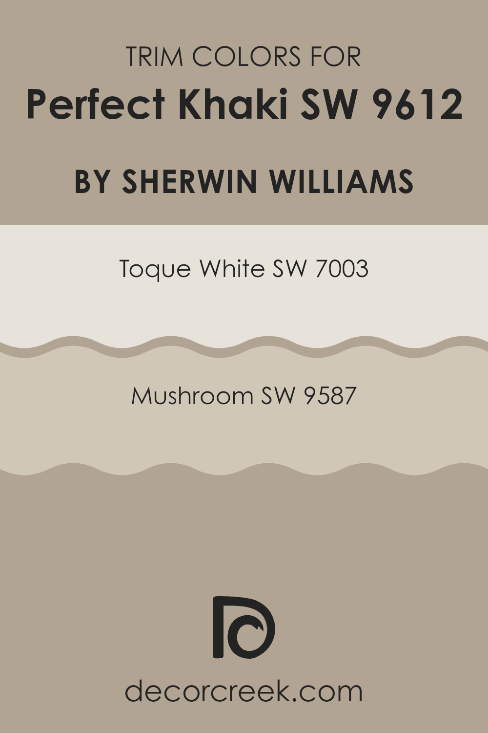
What are the Trim colors of Perfect Khaki SW 9612 by Sherwin Williams?
Trim colors are essential when painting a home because they help define and highlight the architectural features and details of a space. For example, when using a neutral shade like Perfect Khaki by Sherwin Williams, choosing the right trim color can significantly enhance the wall color and overall aesthetics of the room.
Opting for trim colors like Toque White or Mushroom from Sherwin Williams allows for a subtle yet impactful contrast that can make the walls stand out and give the entire space a clean and finished look.
SW 7003 – Toque White is a soft, warm white that brings a light and airy feel to any space, making it a popular choice for trim as it provides a gentle contrast that is not too stark against deeper or muted wall colors. On the other hand, SW 9587 – Mushroom is a richer, earthy shade that offers a stronger contrast and can add a touch of natural warmth to a room, perfect for creating a cozy atmosphere when paired with lighter wall colors like Perfect Khaki. Both colors work beautifully as trim, contributing to a well-rounded and visually pleasing environment.
You can see recommended paint colors below:
Colors Similar to Perfect Khaki SW 9612 by Sherwin Williams
Similar colors play a crucial role in interior design by creating a cohesive and harmonious look in any space. When colors like the ones similar to Perfect Khaki by Sherwin Williams are used together, they help in maintaining a fluid theme throughout the environment, making it aesthetically pleasing and comfortable. These colors are subtly different yet close enough on the color spectrum to provide a smooth visual transition from one area to another, enhancing the overall atmosphere without overwhelming the senses.
For instance, Prairie Grass is a muted green that offers a hint of earthiness, perfect for bringing a touch of nature indoors. Universal Khaki is a lighter, almost sandy color, great for brightening up spaces while maintaining warmth. Taupe Tone steps in with a deeper, warmer hue that suggests stability and grounding, which works well in study areas or lounges.
Ethereal Mood is a lighter gray that gives a soft, airy feel to any room, ideal for creating a calm gathering space. Smoky Beige adds a smokier, almost elusive touch, suitable for cozy corners. Mega Greige combines gray and beige, an excellent choice for those looking for something neutral yet strong. Tony Taupe is darker and richer, making it perfect for feature walls or furniture pieces. Stone Lion, a softer brown, offers a subtle elegance to living spaces.
Gray Area, a pure gray, provides a contemporary look that complements modern decor beautifully, whereas Morris Room Grey offers a classic, timeless shade that’s perfect for creating a grounded, established feel in older homes or studies. Together, these colors work harmoniously to create inviting, well-coordinated spaces that feel cohesive and thoughtfully designed.
You can see recommended paint colors below:
- SW 7546 Prairie Grass
- SW 6150 Universal Khaki
- SW 7633 Taupe Tone
- SW 7639 Ethereal Mood
- SW 9087 Smoky Beige
- SW 7031 Mega Greige
- SW 7038 Tony Taupe
- SW 7507 Stone Lion
- SW 7052 Gray Area
- SW 0037 Morris Room Grey

How to Use Perfect Khaki SW 9612 by Sherwin Williams In Your Home?
Perfect Khaki by Sherwin Williams is a versatile paint color that brings a warm and welcoming feel to any room. This shade of khaki is rich and smooth, making it easy to match with a variety of decor styles and furniture.
You can use this color in high-traffic areas like living rooms or hallways because it hides small marks or scuffs well. It’s also great for bedrooms, giving the space a cozy and calm atmosphere. In addition to walls, you can apply Perfect Khaki to cabinets or furniture pieces to refresh their look without overwhelming the space.
Because it’s a neutral color, it pairs well with bold accents like blues, greens, or even bright colors, allowing you flexibility in your decorating choices. Whether you’re updating a single room or repainting your entire home, Perfect Khaki offers a warm foundation that makes your home feel inviting and lived-in.
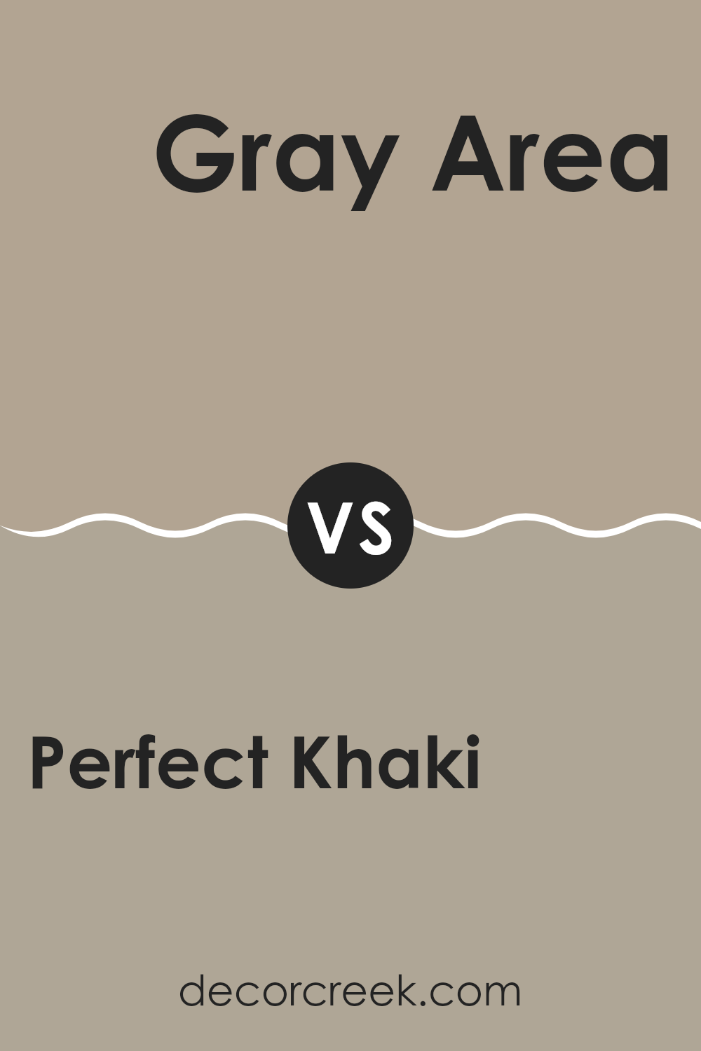
Perfect Khaki SW 9612 by Sherwin Williams vs Gray Area SW 7052 by Sherwin Williams
Perfect Khaki and Gray Area are two distinct colors that can add unique vibes to any space. Perfect Khaki is a warm, welcoming shade that leans towards beige with a slight hint of yellow. It’s great for creating a cozy and inviting atmosphere, ideal for living rooms or bedrooms where you want to feel relaxed.
On the other hand, Gray Area is a cooler tone that strikes a balance between gray and blue. This color is more subdued and neutral, making it perfect for modern spaces that aim for a clean and contemporary look. It works well in offices or kitchens where a more formal appearance is desired.
While both colors are neutral, Perfect Khaki adds warmth and comfort, making spaces feel more like home. Gray Area offers a sharper, more polished look, suitable for achieving a minimalist aesthetic. Choosing between them depends on the mood and functionality you want for your room.
You can see recommended paint color below:
- SW 7052 Gray Area
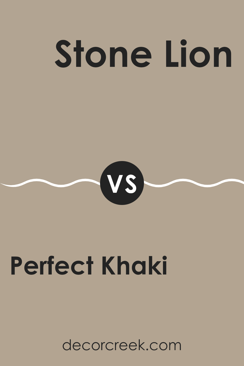
Perfect Khaki SW 9612 by Sherwin Williams vs Stone Lion SW 7507 by Sherwin Williams
Perfect Khaki and Stone Lion are two neutral paint colors from Sherwin Williams that both offer a warm, inviting feel to any room. Perfect Khaki is a softer, lighter shade that brings a gentle warmth to spaces.
It’s a great choice if you want a room to feel cozy but not too dark. On the other hand, Stone Lion has a deeper, richer tone that tends to stand out more. This color can add a bit of drama and is excellent for creating a strong presence in a space.
Both colors are versatile and work well with various decor styles, from modern to traditional. They pair nicely with many accent colors, allowing for flexibility in design schemes. Perfect Khaki might be preferable for smaller, brighter rooms, whereas Stone Lion could be a better fit for larger spaces or feature walls that need more impact.
You can see recommended paint color below:
- SW 7507 Stone Lion
Perfect Khaki SW 9612 by Sherwin Williams vs Mega Greige SW 7031 by Sherwin Williams
Perfect Khaki and Mega Greige are two popular paint colors, each offering a unique feel to a room. Perfect Khaki has a warm, welcoming tone that resembles the classic look of khaki fabric. It’s a versatile choice that can work well in living rooms, bedrooms, or offices, creating a cozy, comfortable atmosphere.
On the other hand, Mega Greige is a deeper, warmer shade that blends gray and beige. This color is great for adding a bit of depth to spaces that need a stronger, yet still neutral, color presence. It can help make large rooms feel more intimate and is excellent for entryways or dining areas where you want a touch of richness without overwhelming the space.
Both colors work well with various decor styles and can be paired with brighter colors for accents. Perfect Khaki is lighter and tends to open up spaces, while Mega Greige offers a moodier, more grounded feel.
You can see recommended paint color below:

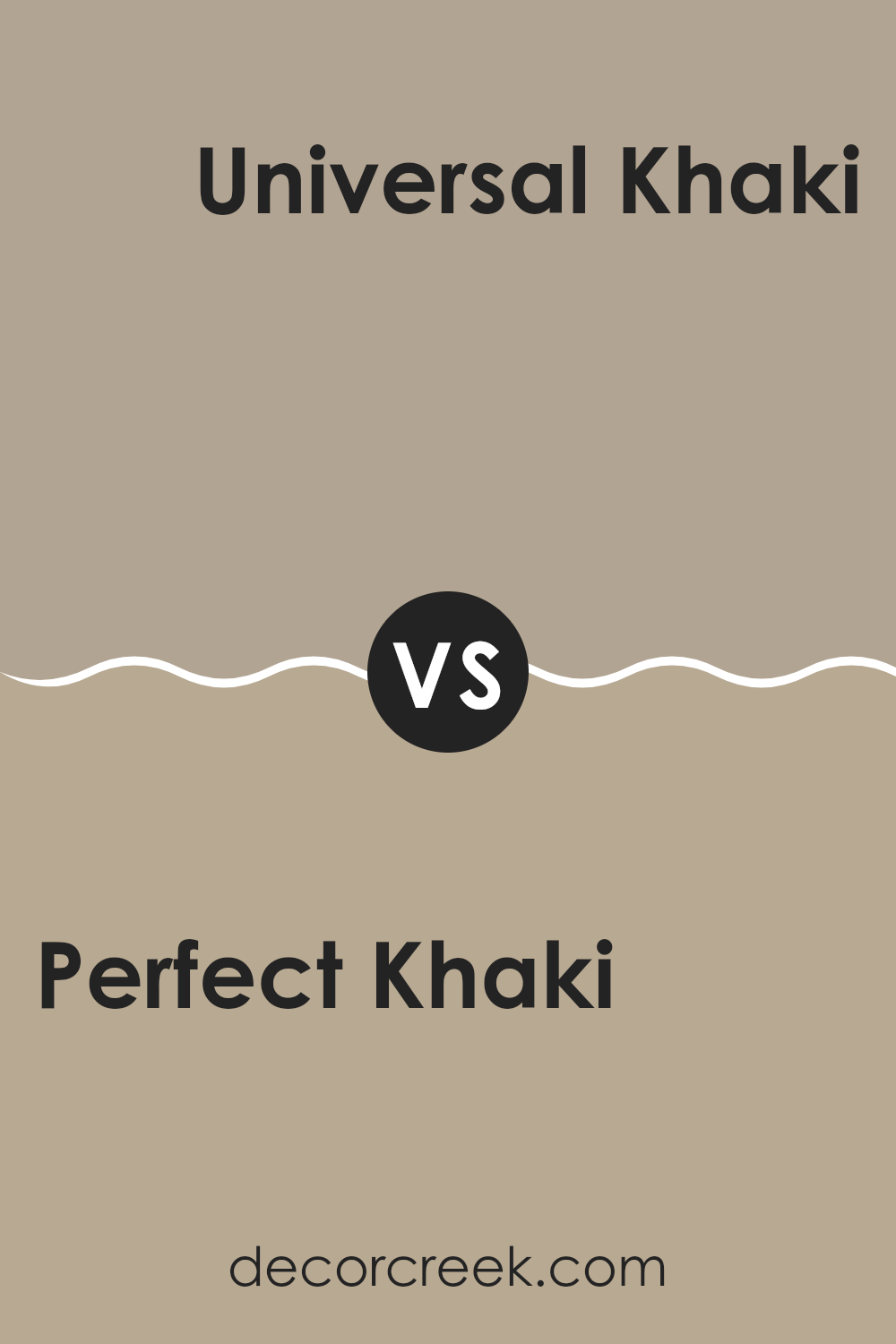
Perfect Khaki SW 9612 by Sherwin Williams vs Universal Khaki SW 6150 by Sherwin Williams
Perfect Khaki and Universal Khaki, both from Sherwin Williams, offer their unique takes on the khaki shade, often chosen for its warm, inviting feel.
Perfect Khaki is slightly lighter, providing a soft, neutral backdrop that is versatile and calming without being overpowering. It’s a great choice if you’re looking for a hint of color that still maintains a very understated and clean look in a room.
On the other hand, Universal Khaki is a bit deeper and richer, adding a touch more warmth to spaces. This color works well in areas where you want to introduce a bit more depth and warmth, yet keep the overall feel neutral and grounded.
Both colors are great for creating cozy environments and can complement a wide range of decor styles. Your choice between them could boil down to the specific mood you want to set in your space – lighter and more airy with Perfect Khaki or a tad more grounded with Universal Khaki.
You can see recommended paint color below:
- SW 6150 Universal Khaki
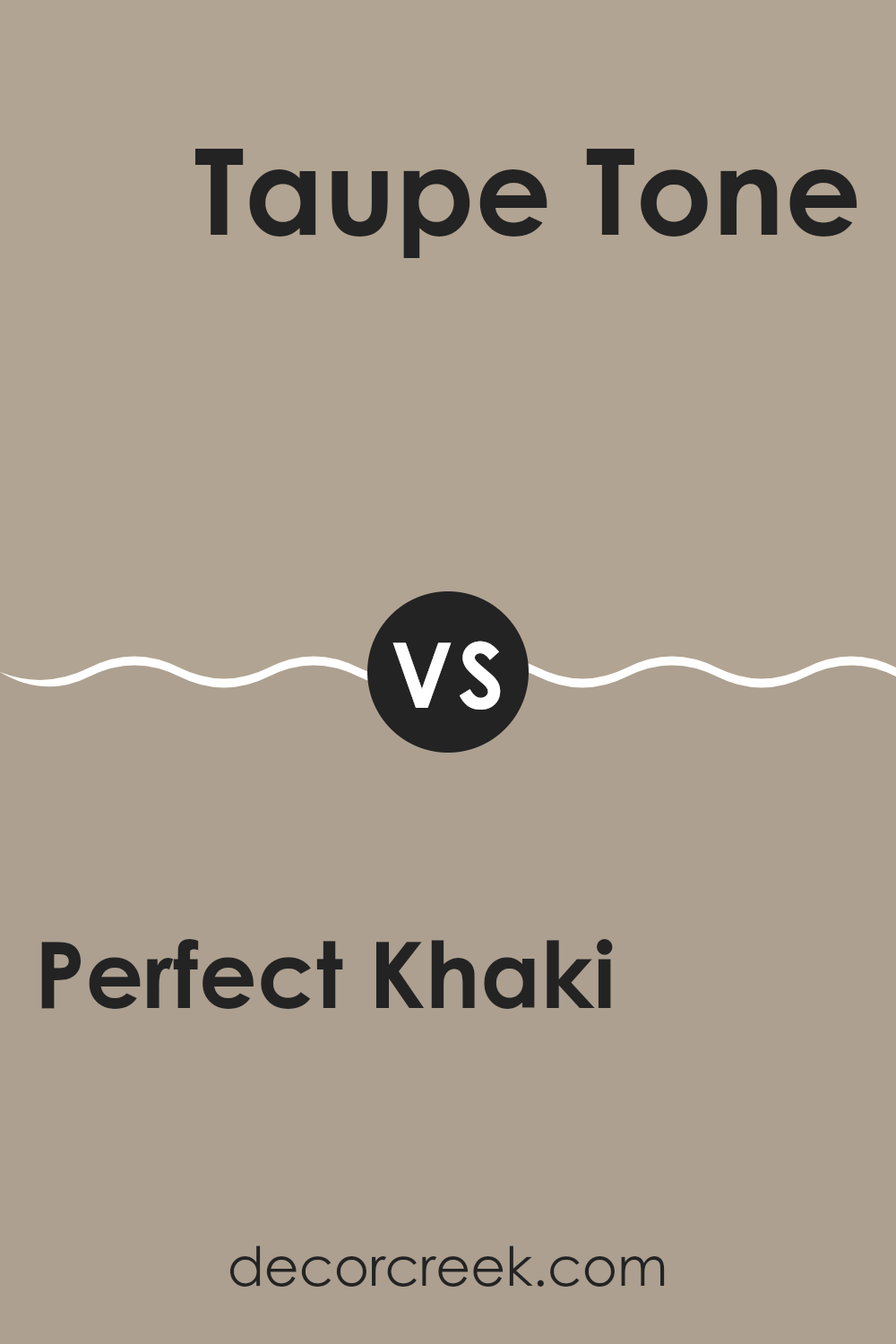
Perfect Khaki SW 9612 by Sherwin Williams vs Taupe Tone SW 7633 by Sherwin Williams
Perfect Khaki and Taupe Tone are two shades from Sherwin Williams that offer subtle, muted tones for interior spaces. Perfect Khaki has a slightly green undertone that gives it a warm and welcoming vibe, making it a great choice for living rooms and bedrooms. It’s light enough to keep spaces feeling open but has enough depth to add character.
On the other hand, Taupe Tone is a more neutral option, leaning towards a balanced beige without strong undertones. This color is incredibly versatile and works well in any area of a home, providing a clean and calm background that complements various decor styles. It can help small spaces appear larger and more airy.
When comparing the two, Perfect Khaki offers a touch of warmth due to its greenish undertone, making it more specific in its suitable environments. Meanwhile, Taupe Tone’s true neutrality makes it easier to use across various rooms and lighting conditions, serving as a go-to choice for a straightforward, classic look.
You can see recommended paint color below:
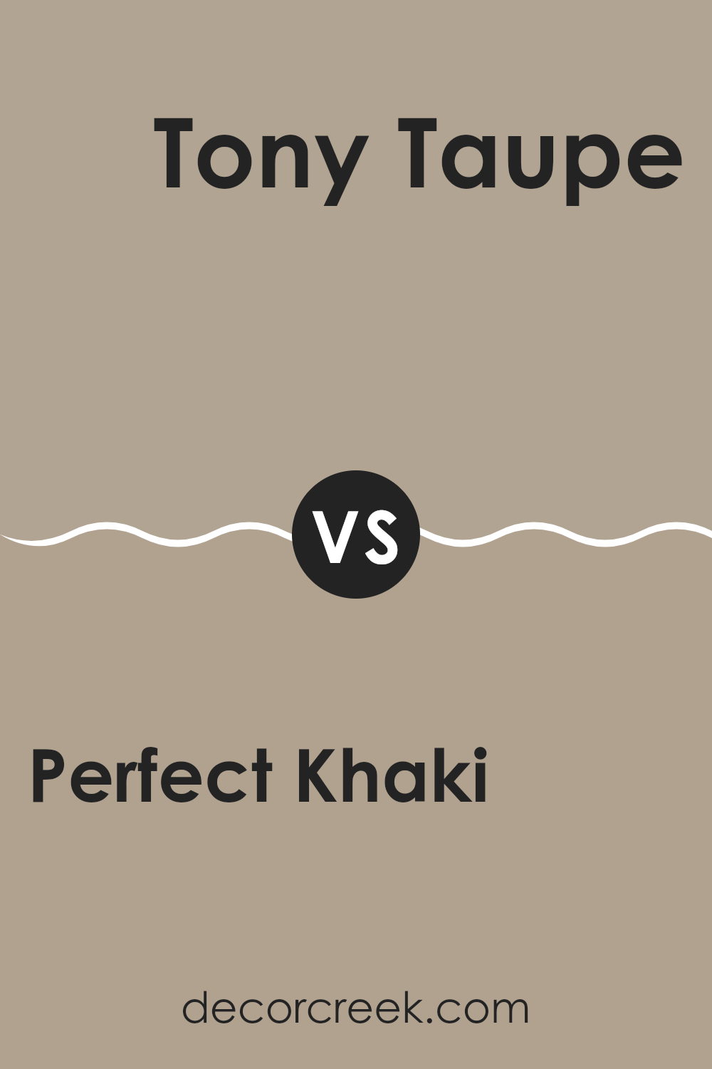
Perfect Khaki SW 9612 by Sherwin Williams vs Tony Taupe SW 7038 by Sherwin Williams
Perfect Khaki and Tony Taupe are two distinct colors that offer subtle yet different vibes for room decor. Perfect Khaki is like a soft, sandy beige that leans towards a light, warm tone. It’s great for creating a cozy and welcoming atmosphere in spaces like living rooms or bedrooms. This color pairs well with whites and greens, providing a gentle backdrop that makes the room feel inviting.
On the other hand, Tony Taupe is a deeper, gray-brown shade that gives a stronger presence in a space. It’s a bit more bold than Perfect Khaki, making it ideal for those who want to add a touch of warmth while keeping a neutral color scheme. It works well with both light and dark furniture, offering versatility in design choices.
Both colors are neutral, so they are easy to work into most color schemes, but they set different moods due to their varying depths. Perfect Khaki brightens a room, while Tony Taupe adds a cozy richness.
You can see recommended paint color below:
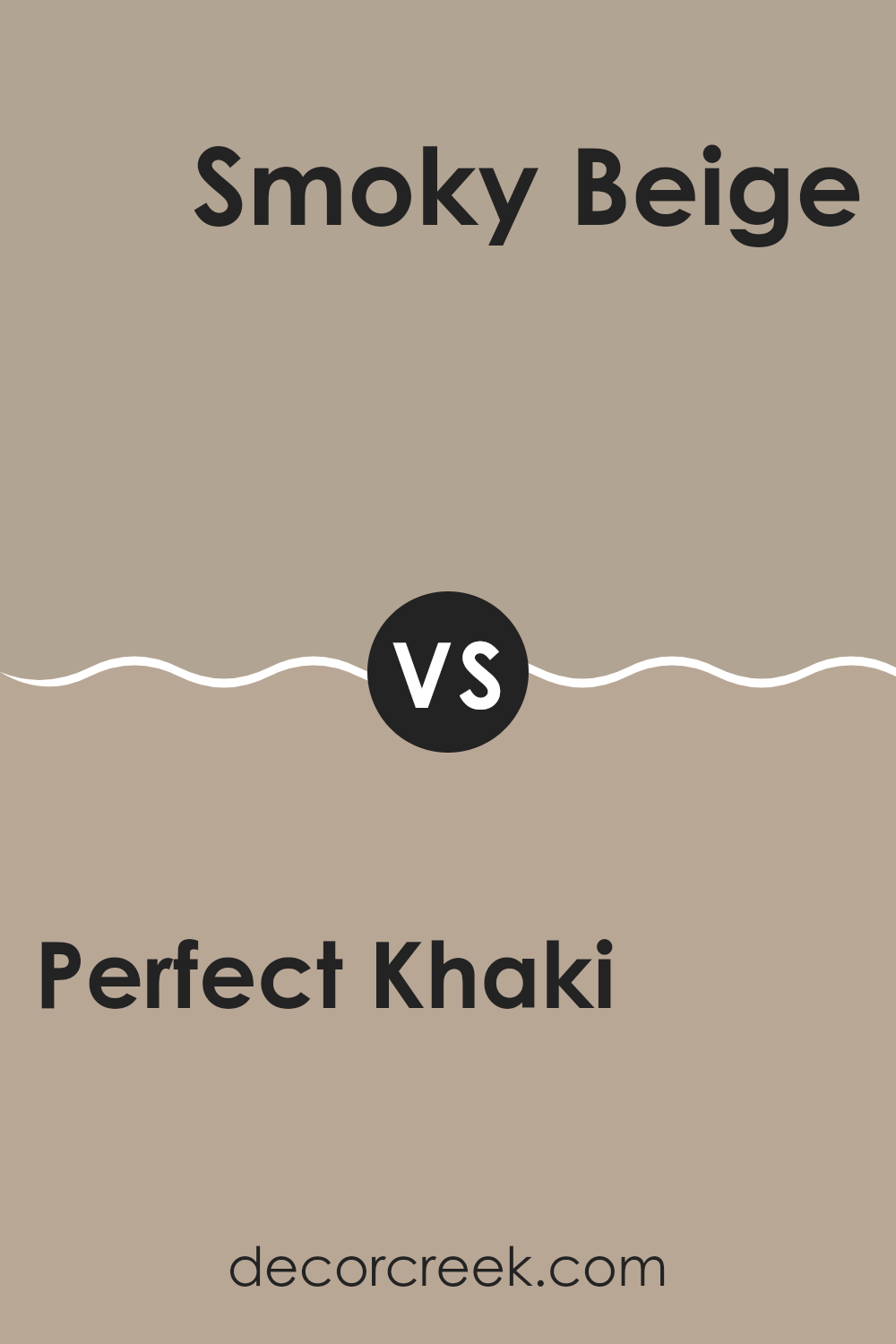
Perfect Khaki SW 9612 by Sherwin Williams vs Smoky Beige SW 9087 by Sherwin Williams
Perfect Khaki and Smoky Beige are two paint colors that can give your home a cozy and inviting feel. Perfect Khaki is a warm beige with slight yellow undertones, ideal for spaces where you want a touch of brightness without overpowering the room. It works well with natural light, giving rooms an airy yet grounded appearance.
On the other hand, Smoky Beige has a cooler, more neutral tone, leaning slightly towards gray. This color is great for creating a calm, balanced environment. It’s particularly useful in spaces that need a softer look, blending well with modern and traditional decor alike.
When comparing the two, Perfect Khaki brings a bit more warmth and is a good choice for living areas and kitchens, while Smoky Beige is perfect for bedrooms and bathrooms where a more subdued color is preferable. Both colors offer versatility and can harmonize well with a variety of furniture and accents.
You can see recommended paint color below:
- SW 9087 Smoky Beige
Perfect Khaki SW 9612 by Sherwin Williams vs Prairie Grass SW 7546 by Sherwin Williams
Perfect Khaki and Prairie Grass are two distinct colors offered by Sherwin Williams, each bringing a unique mood to a space. Perfect Khaki is a warm, soft beige with a welcoming and cozy vibe. It works beautifully in rooms where a gentle and inviting atmosphere is desired, like living rooms or bedrooms.
On the other hand, Prairie Grass is a deeper, subdued green that gives off an earthy and grounded feel. This color is ideal for those looking to add a touch of nature to their interiors, making it great for spaces that aim for a calm and collected look, such as home offices or studies.
While both colors promote a peaceful environment, Perfect Khaki leans towards a classic neutrality, and Prairie Grass offers a subtle connection to the outdoors. These colors can work separately or even together to create a harmonious and down-to-earth aesthetic.
You can see recommended paint color below:

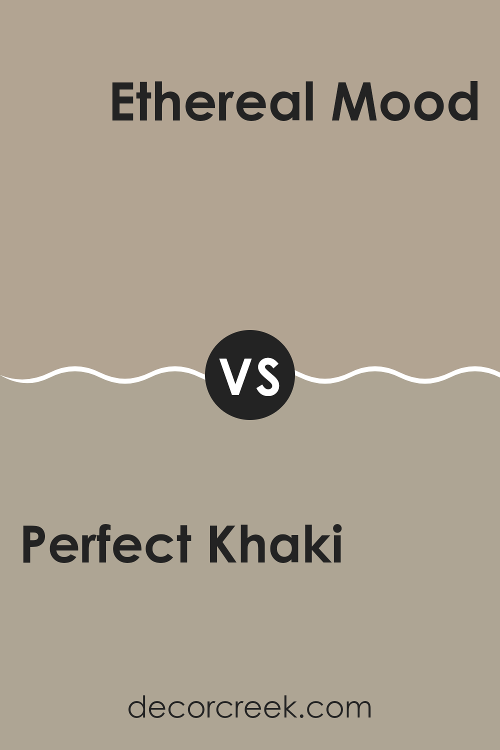
Perfect Khaki SW 9612 by Sherwin Williams vs Ethereal Mood SW 7639 by Sherwin Williams
Perfect Khaki and Ethereal Mood, both by Sherwin Williams, have unique tones that set them apart. Perfect Khaki is a warm, inviting shade that closely resembles natural clay or a soft, earthy beige. Its cozy vibe makes it an excellent choice for living rooms or bedrooms, lending a subtle and comforting atmosphere.
On the other hand, Ethereal Mood is a cooler, grayish hue, giving it a more muted and gentle feel. It’s a great option for spaces where you want a more relaxed and understated elegance, such as offices or bathrooms. This color often helps make small rooms appear more spacious.
Both colors offer a modern aesthetic but cater to different tastes and functions within home décor. Perfect Khaki adds warmth and a traditional touch, while Ethereal Mood presents a more modern, minimalistic look. So, your choice between the two would largely depend on the mood you’re hoping to create in your space.
You can see recommended paint color below:
Perfect Khaki SW 9612 by Sherwin Williams vs Morris Room Grey SW 0037 by Sherwin Williams
Perfect Khaki by Sherwin Williams is a warm, neutral shade that gives a soft, welcoming feel to any room. It has a comforting presence, making it a great choice for living areas or bedrooms where you want to create a cozy atmosphere. Its earthy tones blend well with a variety of decor styles, from rustic to modern.
On the other hand, Morris Room Grey is a cooler, more muted grey color. This shade is versatile and understated, making it easy to pair with brighter or bolder colors. It works well in spaces where you want a clean and contemporary look, such as kitchens, bathrooms, or home offices.
While both colors are neutral, Perfect Khaki offers a warmer tone that feels more inviting, whereas Morris Room Grey provides a sleeker, crisper backdrop that can help other colors in a room stand out. Both are excellent choices but serve different moods and styles in interior design.
You can see recommended paint color below:
Conclusion
Perfect Khaki is more than just a simple beige—it’s got a warm, inviting feel. This color seems cozy and friendly, and if you paint a room with it, you’ll probably get that cozy vibe too. It’s a color that can make almost any room feel just right, whether it’s your living room, kitchen, or even your bedroom.
What I also like about Perfect Khaki is that it works well with other colors. Whether you have bright, colorful pillows or a soft, light-colored rug, this paint can hold its own without making things look crowded or mismatched. It’s a straightforward choice if you’re someone who wants a color that’s easy to manage and looks good all the time.
In conclusion, if you’re thinking about repainting a room in your house and want something reliable and warm, SW 9612 Perfect Khaki is worth considering. It can make any room feel brighter and more welcoming, and it plays nicely with lots of different decorating styles and colors.
This makes it a practical choice for both new decorators and those who have been doing it for years.
Ever wished paint sampling was as easy as sticking a sticker? Guess what? Now it is! Discover Samplize's unique Peel & Stick samples.
Get paint samples

