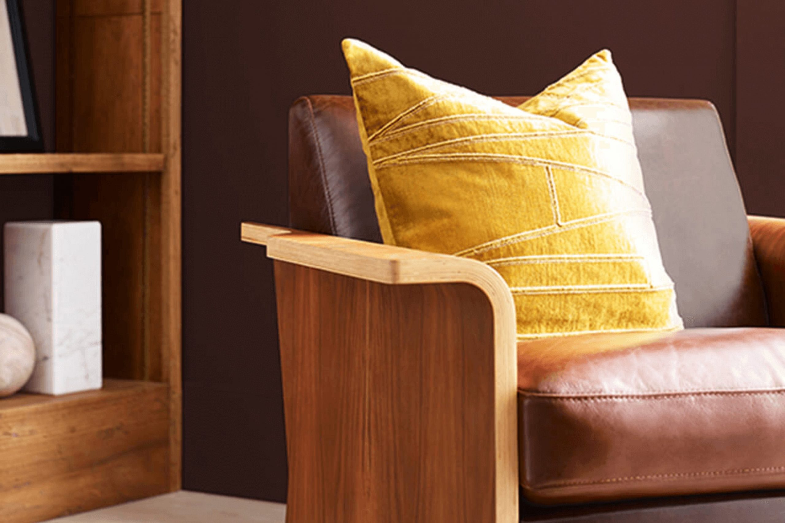
Picture walking into a room that bathes you in the warm, rich glow of a cozy, polished mahogany table. That’s the feeling you get with SW 2838 Polished Mahogany by Sherwin Williams. I recently had the chance to use this exceptional paint color in my living room, and I must say, it’s like wrapping yourself in a soft, warm blanket on a crisp fall evening.
This hue has a classic elegance that effortlessly enriches any room with its deep, welcoming tones. During my redecorating process, I learned quite a bit about how to best utilize SW 2838 Polished Mahogany to improve different areas of a home. It pairs wonderfully with soft lighting and natural materials, adding a touch of elegance without dominating the surroundings.
If you’re considering a new paint color for your home and are drawn to colors that offer both warmth and style, I can share some tips about applying Polished Mahogany and what colors and decor it pairs with best.
Whether it’s in a study, a dining area, or a cozy nook, this color turns ordinary rooms into inviting retreats.
What Color Is Polished Mahogany SW 2838 by Sherwin Williams?
Polished Mahogany is a deep, rich reddish-brown color that brings warmth and a sense of welcoming comfort to any room. This hue has an earthy vibrancy that pairs beautifully with various materials and textures, improving the overall atmosphere of a room.
When it comes to interior styles, Polished Mahogany works exceptionally well in traditional settings where its classic elegance can shine. It also fits naturally into rustic designs, complementing natural elements like wood or stone. Additionally, this color can add a dramatic flair to more modern decor, creating a striking contrast when used alongside minimalist elements.
For materials, Polished Mahogany pairs perfectly with natural wood, as it highlights the intrinsic beauty of grain patterns without dominating them. Leather furniture or accents also work well with this color, adding a touch of luxury and comfort. Textures like soft woolen throws or rich velvet cushions can also improve its rich feel, making any room more inviting.
Fabrics in lighter shades such as creamy whites or soft beiges provide a beautiful contrast, ensuring that a room feels balanced and not too dark. Metallic accents in gold or brass can add a touch of glamour to the deep, warm tones of Polished Mahogany, creating an elegant and connected look.
decorcreek.com
Is Polished Mahogany SW 2838 by Sherwin Williams Warm or Cool color?
Polished Mahogany is a rich and deep brown shade that adds a warm and cozy feel to any room. This color is perfect for creating a welcoming atmosphere in living areas.
It works wonderfully in areas that need a touch of elegance, like dining rooms or studies, and pairs well with bright accents or creamy neutrals for a balanced look. The warmth of Polished Mahogany makes smaller rooms feel inviting, while its depth can help larger areas seem more intimate and grounded.
This color can also highlight wood furniture and flooring, improving the natural beauty of the materials. Whether you’re looking to create a focal point with an accent wall or bring an overall warmth to your home, Polished Mahogany is a flexible choice that pairs well with many styles and decors.
Undertones of Polished Mahogany SW 2838 by Sherwin Williams
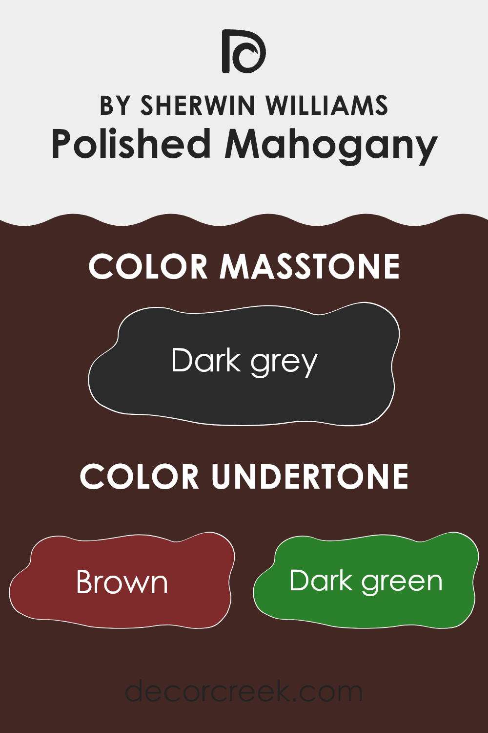
Polished Mahogany is a rich and deep color that adds warmth to any room. Understanding its undertones is key to seeing how it interacts with light and other colors in a room. Undertones are subtle colors that lie beneath the surface of the primary color, affecting how we perceive it in different settings.
In the case of Polished Mahogany, the undertones are a diverse palette that includes browns, dark greens, navy, olive, purple, dark turquoise, and grey. Each of these undertones can reveal themselves under different types of lighting. For example, in natural light, brown undertones might make the color appear warmer and more welcoming. Artificial lighting could bring out the navy or dark green, giving the walls a cooler look.
When used on interior walls, Polished Mahogany can create varying effects depending on these undertones. In a room with ample sunlight, the warmth of brown and olive can make the room feel cozy and inviting. In rooms with less light, the cooler tones like navy and dark green might be more noticeable, giving the room a more grounded feel.
Overall, the impact of Polished Mahogany’s undertones is significant in achieving the desired atmosphere in a room. By considering these undertones, you can better predict how the color will behave and decide on the appropriate decor and lighting to complement it.
decorcreek.com
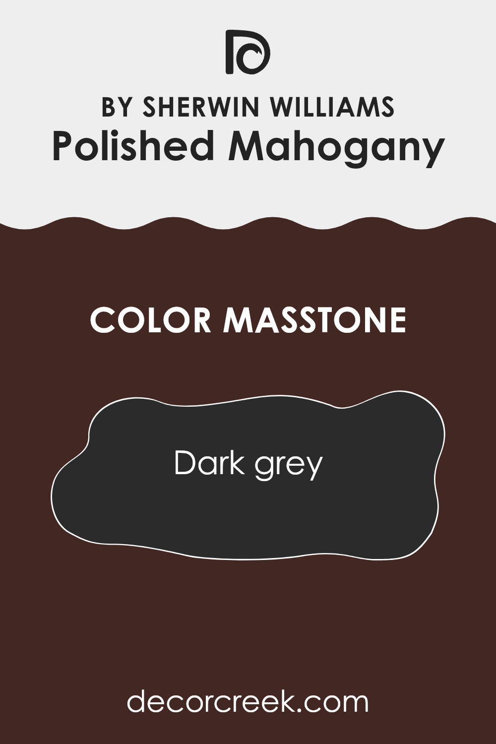
What is the Masstone of the Polished Mahogany SW 2838 by Sherwin Williams?
Polished Mahogany SW 2838 by Sherwin Williams has a masstone that looks like dark grey on first glance. This dark grey shade brings a strong and grounding presence to any room.
When used in homes, this color can make large rooms feel more intimate and cozy, perfect for living rooms or bedrooms where a sense of comfort is desired. In smaller rooms, using this color on a feature wall can add depth and interest without making the area feel too heavy.
Because it’s a neutral shade, it pairs well with a variety of other colors, from bright whites to soft creams, allowing for flexibility in decorating styles. Whether aiming for a modern or a more traditional look, this deep grey offers a solid base for various themes and accessories, making it a practical choice for many homes.
decorcreek.com
How Does Lighting Affect Polished Mahogany SW 2838 by Sherwin Williams?
Lighting plays a crucial role in how colors appear in any room, and the color Polished Mahogany by Sherwin Williams is no exception. Depending on the lighting, whether artificial or natural, this rich color can show various shades, affecting the overall mood and look of a room.
In artificial light, the deep, warm brown tones of Polished Mahogany have a cozy and welcoming effect. This type of lighting tends to bring out the richness of the color, making it more intense and vibrant. It’s perfect for evenings, creating a comfortable atmosphere, especially in living rooms or bedrooms where relaxation is key.
Natural light, however, interacts differently with this color. How Polished Mahogany looks throughout the day can change based on the direction the room faces:
- North-faced rooms: These rooms get less direct sunlight, which means Polished Mahogany might look somewhat muted and darker. This could make the room feel smaller but also more intimate.
- South-faced rooms: With more exposure to direct sunlight, this color will look lighter and more vivid throughout the day. It warms up the room and makes it feel inviting and lively, perfect for rooms like the living room or kitchen.
- East-faced rooms: These rooms catch the morning sun, meaning Polished Mahogany will appear bright and fresh in the morning, then gradually shift to a deeper tone as the day progresses. It’s ideal for rooms used mostly in the morning, like breakfast nooks.
- West-faced rooms: As sunlight fades, Polished Mahogany will glow warmly in the evening, perfect for dining rooms that are used more during the latter part of the day.
So, when choosing colors like Polished Mahogany for your room, consider the room’s orientation and how light affects the color at different times of the day. This can help you achieve the desired mood and make the most of the color’s potential in your home.
decorcreek.com
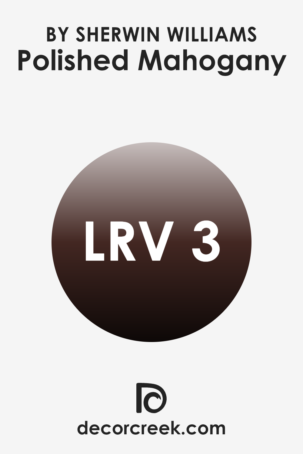
What is the LRV of Polished Mahogany SW 2838 by Sherwin Williams?
Light Reflectance Value (LRV) measures the percentage of light a paint color reflects back into a room compared to the total amount of light that falls on it. It’s a useful metric when choosing paint colors, because it helps predict how light or dark a color will look on your walls. Colors with higher LRVs are lighter and can make a room feel more open and bright because they reflect more light. Conversely, colors with lower LRVs are darker, absorb more light, and can make a room feel cozier but smaller.
In the case of the color with an LRV of 2.711, this is a very low value, indicating that it is a deeply dark color. This color will absorb most of the light that hits it, rather than reflecting it, which can significantly darken a room.
Using this color on walls might be effective for creating a bold, dramatic look, but it could also make a room appear noticeably smaller and dimly lit. Therefore, if you’re thinking about using this color, consider the size and natural light available in your room. For rooms with limited natural light or smaller rooms, you might want to balance this dark shade with lighter colors in decor or furniture.
decorcreek.com
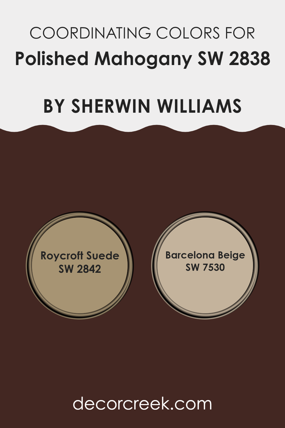
Coordinating Colors of Polished Mahogany SW 2838 by Sherwin Williams
Coordinating colors are shades that work harmoniously together to create a balanced and appealing look. When it comes to interior design, choosing coordinating colors can improve the look of a room by complementing the main color, bringing various elements of the room into a connected whole. For instance, when using a rich color like Polished Mahogany, selecting the right coordinating colors is crucial to prevent the room from feeling too intense.
Roycroft Suede and Barcelona Beige serve as excellent coordinating colors for Polished Mahogany. Roycroft Suede is a warm, earthy hue that pairs wonderfully with the depth of Polished Mahogany, providing a grounding effect that is both inviting and cozy.
This color can be particularly useful in areas like the living room or study, where a sense of warmth is often desired. On the other hand, Barcelona Beige is a lighter, neutral color that offers a subtle contrast to the darker mahogany. It works well to brighten up rooms and bring a light, airy feel when used on walls or in fabric choices. This combination ensures that the overall decor is balanced, not allowing the strong presence of Polished Mahogany to dominate the room’s look.
You can see recommended paint colors below:
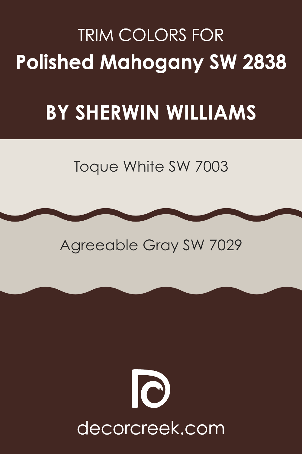
What are the Trim colors of Polished Mahogany SW 2838 by Sherwin Williams?
Trim colors are essential accents that outline and highlight the main colors used on walls, doors, and windows, improving the architectural features of a room. When paired with a deep and rich hue like Polished Mahogany by Sherwin Williams, trim colors like SW 7003 – Toque White and SW 7029 – Agreeable Gray can significantly influence the overall appearance and feel of a room.
Toque White is a soft and clean white that provides a sharp contrast, making the deep tones of Polished Mahogany pop, giving a fresh and bright look to the room. Agreeable Gray, on the other hand, is a mild and neutral gray that offers a subtle transition from the deep Polished Mahogany, contributing to a smooth and balanced atmosphere.
Using these trim colors effectively can drastically affect the visual feel of a room. Toque White, with its clear and bright qualities, can make a room appear more open and airy, which can be particularly beneficial in rooms where Polished Mahogany could otherwise feel too dominant.
Meanwhile, Agreeable Gray acts as a gentle buffer, softening the intense contrast between the trim and the wall color, and ensuring that the room maintains a balanced and inviting feel without becoming too sharp. Together, these colors support and improve the base color, fulfilling different roles depending on the effect desired, from striking contrasts to gentle transitions.
You can see recommended paint colors below:
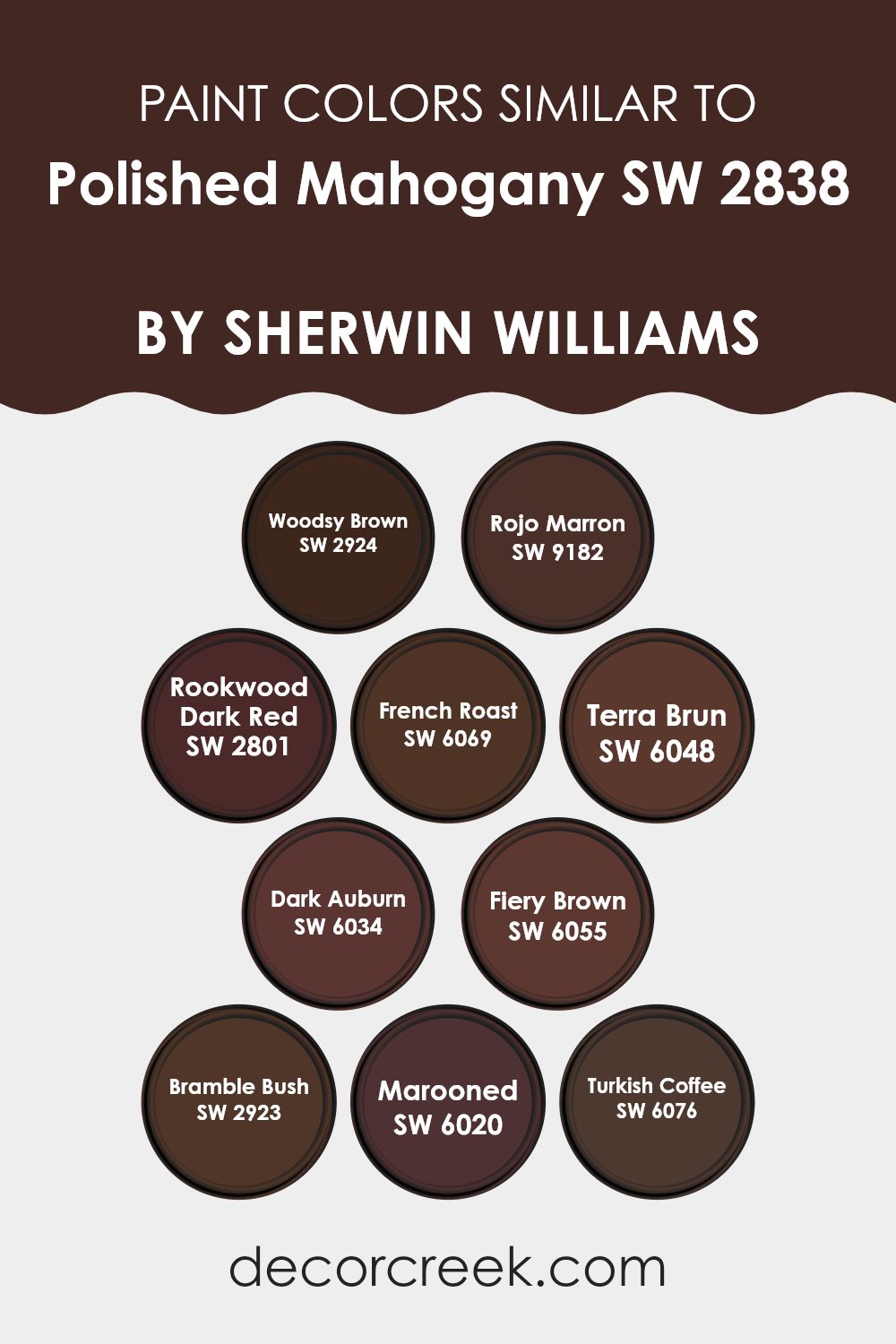
Colors Similar to Polished Mahogany SW 2838 by Sherwin Williams
Similar colors are essential in design for creating balanced and appealing visual experiences. These colors, which are variations of Polished Mahogany, offer a range of options that can complement each other beautifully. For instance, SW 2924 – Woodsy Brown is a robust and earthy color that lends a sense of stability to any room.
Close in tone is SW 9182 – Rojo Marron, a warmer hue that hints at a deep, red-clay color, making it perfect for an accent wall or to warm up a room. SW 2801 – Rookwood Dark Red offers a richer, more dramatic red which pairs nicely with lighter tones to create a striking contrast.
Continuing with the theme, SW 6069 – French Roast adds an elegant coffee-brown touch, ideal for creating a cozy, inviting room. SW 6048 – Terra Brun is slightly lighter, offering a dusty brown that works well in sunlight-filled rooms. The subtlety continues with SW 6034 – Dark Auburn, a muted red that offers depth without dominating.
On the fiery side, SW 6055 – Fiery Brown presents a bolder, more intense color, excellent for focal points. SW 2923 – Bramble Bush, with its blend of brown and subtle green undertones, adds an organic feel to the palette.
For a moodier atmosphere, SW 6020 – Marooned gives a touch of a deep maroon with hints of brown, whereas SW 6076 – Turkish Coffee rounds out the selections as the darkest, almost black hue for dramatic flair. These similar colors work together to create flexible, connected rooms.
You can see recommended paint colors below:
- SW 2924 Woodsy Brown
- SW 9182 Rojo Marron
- SW 2801 Rookwood Dark Red
- SW 6069 French Roast
- SW 6048 Terra Brun
- SW 6034 Dark Auburn
- SW 6055 Fiery Brown
- SW 2923 Bramble Bush
- SW 6020 Marooned
- SW 6076 Turkish Coffee
How to Use Polished Mahogany SW 2838 by Sherwin Williams In Your Home?
Polished Mahogany by Sherwin Williams is a rich, deep brown paint color with warm undertones. This hue works wonderfully for creating a cozy and welcoming atmosphere in any home. It is especially great in living rooms or dining areas where you want to encourage a sense of warmth and comfort.
Applying this color to an accent wall can serve as a beautiful backdrop for light-colored furniture or artwork, making them stand out. In a bedroom, Polished Mahogany can help to create a snug, relaxing environment, ideal for unwinding at the end of the day.
If your kitchen feels too bright or sterile, consider using this color for cabinets or an island to add depth and warmth. For those who have large, open rooms, Polished Mahogany can help define areas without making them feel closed off. It pairs well with soft beiges, creamy whites, or even subtle greens, allowing for flexible color schemes that appeal to various tastes and styles.
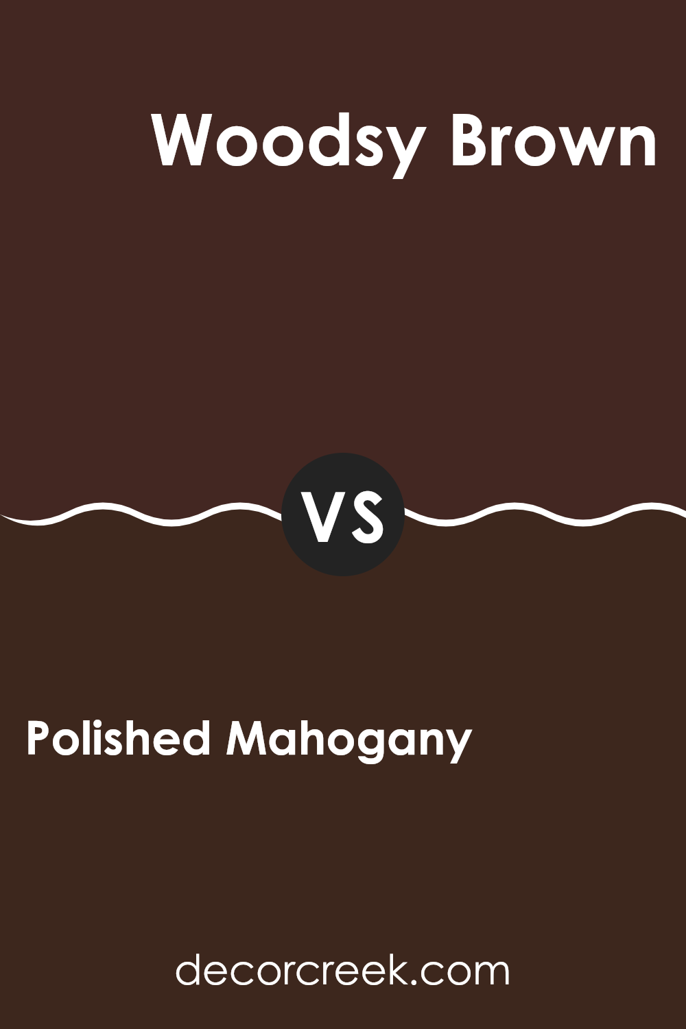
Polished Mahogany SW 2838 by Sherwin Williams vs Woodsy Brown SW 2924 by Sherwin Williams
Polished Mahogany and Woodsy Brown are both rich, earthy colors from Sherwin Williams, though they have distinct tones. Polished Mahogany leans towards a darker, red-brown hue that gives warmth. This color is great for creating a cozy and inviting atmosphere, making it a popular choice for living rooms and study areas.
On the other hand, Woodsy Brown is deeper and closer to a true brown. It lacks the red undertone found in Polished Mahogany, which gives it a purer brown appearance that is flexible and grounding. This color works well in rooms where you want to establish a strong, foundational look, such as in bedrooms or dens.
Both colors bring warmth and a natural feel to interiors, but Polished Mahogany tends to draw more attention because of its depth and slight redness. Woodsy Brown, being a more neutral brown, pairs easily with a wide range of other colors and decor styles.
You can see recommended paint color below:
- SW 2924 Woodsy Brown
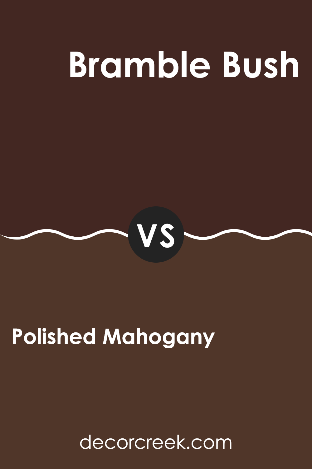
Polished Mahogany SW 2838 by Sherwin Williams vs Bramble Bush SW 2923 by Sherwin Williams
Polished Mahogany is a deep, rich brown that carries a strong presence due to its bold red undertone. It brings a classic charm that’s perfect for rooms where you want to create a feeling of warmth and coziness. This color works well in living rooms or dining areas where its depth can make the room feel more inviting.
Bramble Bush, on the other hand, is different. It’s a lighter shade of brown mixed with subtle green undertones. This gives it a more natural, earthy vibe, suitable for rooms that aim for a fresh and organic feel. It’s an excellent choice for bedrooms or study rooms where a calmer, grounded atmosphere is desired.
Both colors offer unique visual appeal and can dramatically affect the mood of a room. While Polished Mahogany sets a more classic and warm tone, Bramble Bush offers a lighter, nature-inspired touch. Depending on the room’s purpose and the mood you want to set, either of these could be a great fit.
You can see recommended paint color below:
- SW 2923 Bramble Bush
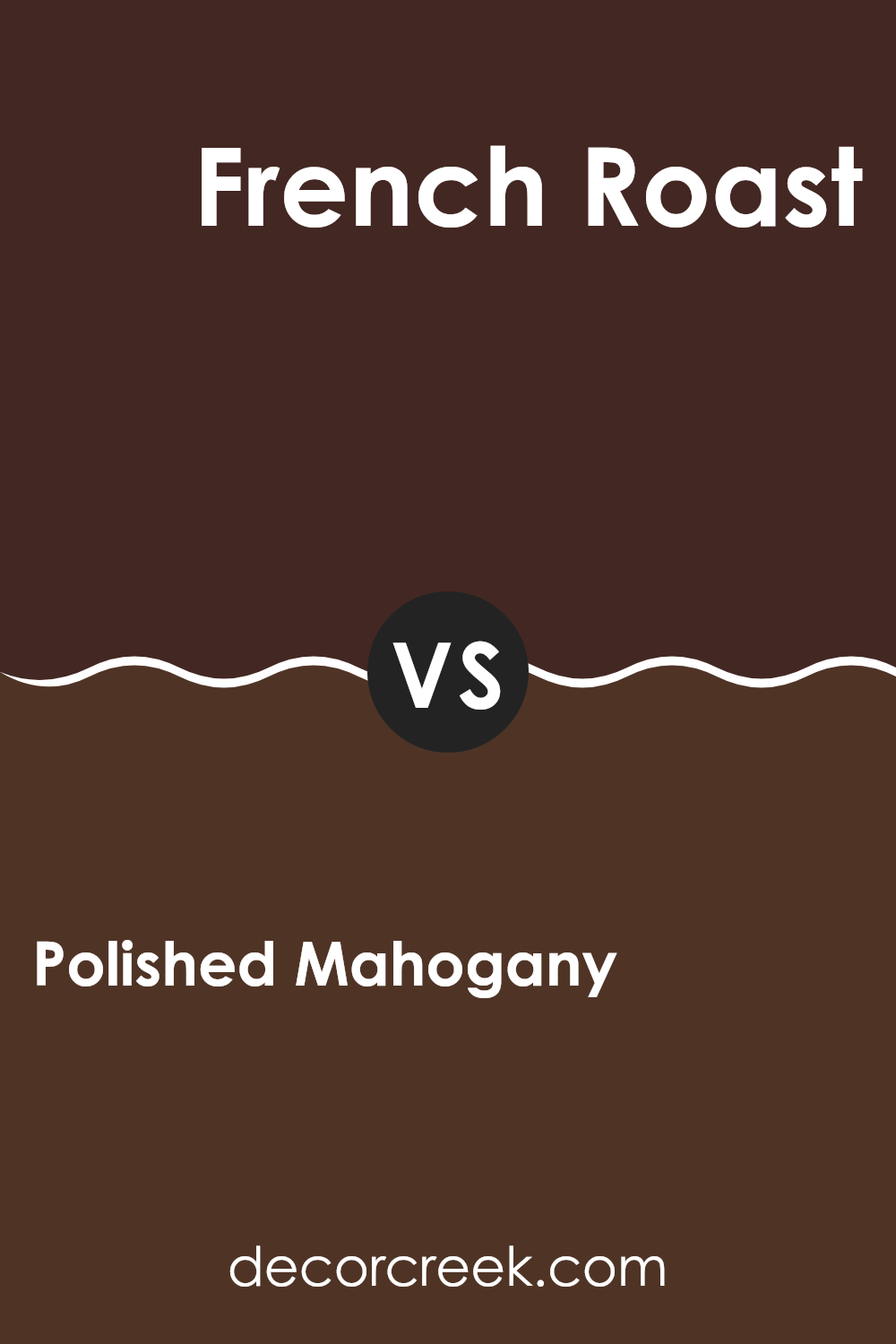
Polished Mahogany SW 2838 by Sherwin Williams vs French Roast SW 6069 by Sherwin Williams
Polished Mahogany and French Roast are two rich, inviting colors by Sherwin Williams. Polished Mahogany has a vibrant, deep red-brown tone that feels warm and welcoming. It resembles the color of a well-kept mahogany wood piece and adds a cozy, traditional look wherever it’s used.
On the other hand, French Roast is darker and less red, leaning more towards a dark coffee brown. This color gives off a strong, grounded feeling, making it perfect for rooms where you want a more muted yet deeply warm presence.
Both colors work well in rooms that aim for a classic and enduring feel, yet they set different moods because of their varying depths and undertones. Polished Mahogany is great for areas needing a pop of warmth, while French Roast suits rooms that call for a subtler, more understated charm.
You can see recommended paint color below:
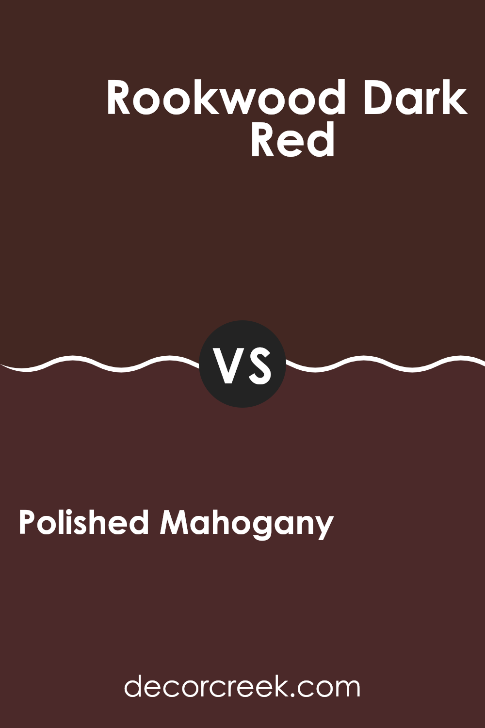
Polished Mahogany SW 2838 by Sherwin Williams vs Rookwood Dark Red SW 2801 by Sherwin Williams
The two paint colors, Polished Mahogany and Rookwood Dark Red, both from Sherwin Williams, offer distinct yet rich tones suitable for creating warm, inviting atmospheres. Polished Mahogany shines with a deep brown hue that carries subtle undertones of red, giving rooms a cozy and refined feel without being too bold. It works well in areas like living rooms or dens where you want a touch of elegance mixed with comfort.
On the other hand, Rookwood Dark Red has a darker, more intense red color that leans slightly towards brown. This color is perfect for setting a dramatic and cozy mood, ideal for accent walls or in dining rooms where a stronger presence is desired. It’s a bolder choice compared to Polished Mahogany, offering a striking visual appeal that can make any room feel more grounded and rich.
Both colors are great options for adding warmth to your home, but the choice between them depends on how dramatic you want your color impact to be. Polished Mahogany is more subdued, while Rookwood Dark Red stands out with its depth and intensity.
You can see recommended paint color below:
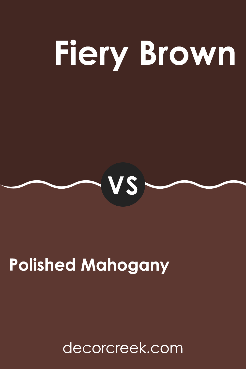
Polished Mahogany SW 2838 by Sherwin Williams vs Fiery Brown SW 6055 by Sherwin Williams
Polished Mahogany and Fiery Brown, both by Sherwin Williams, are rich, welcoming shades of brown, each creating its unique mood. Polished Mahogany is a deep, dark brown with a hint of red, reminiscent of a classic wooden finish.
It offers a traditional look, making it perfect for rooms where you want a sense of formality and warmth. Fiery Brown, on the other hand, leans towards a more vibrant, energetic brown with noticeable orange undertones.
This color is lighter than Polished Mahogany and brings more brightness and life into a room, making it ideal for areas where you want a lively, yet cozy atmosphere. Both colors provide a strong base for various room styles, but your choice would depend on the vibe you’re aiming for – classic and dignified with Polished Mahogany or vibrant and cheerful with Fiery Brown.
You can see recommended paint color below:
- SW 6055 Fiery Brown
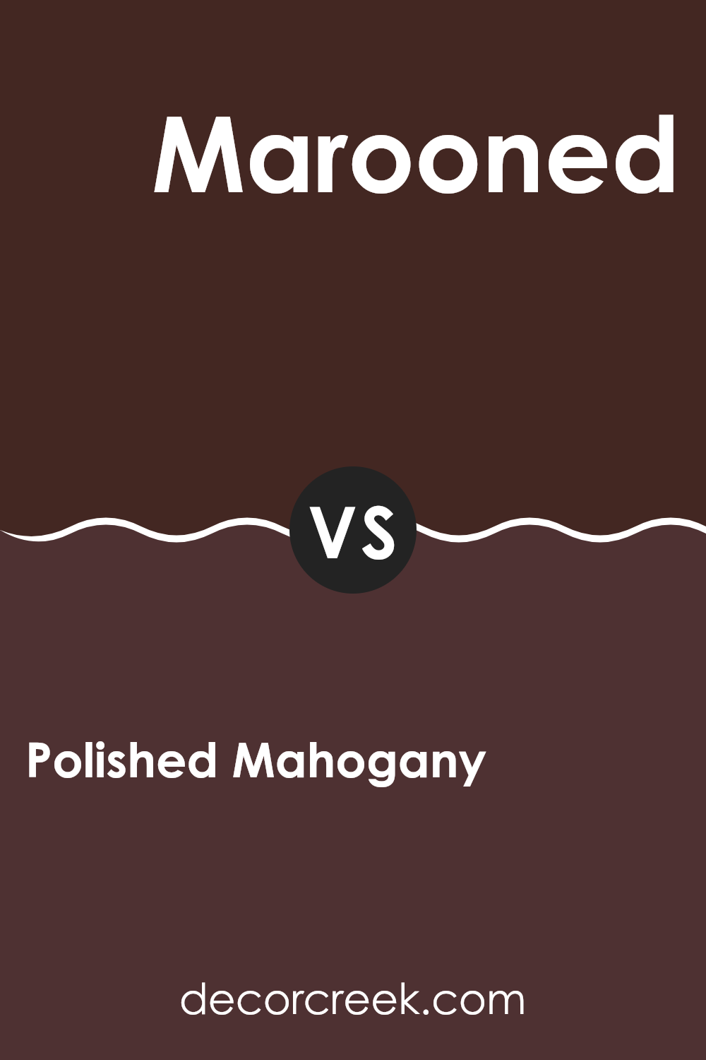
Polished Mahogany SW 2838 by Sherwin Williams vs Marooned SW 6020 by Sherwin Williams
Polished Mahogany and Marooned, both from Sherwin Williams, offer distinctive shades of deep reds that differ subtly in their undertones and overall feel. Polished Mahogany is a rich, dark red-brown, reminiscent of the classic wood for which it is named. This color provides a warm and cozy feeling, making it great for rooms where you want a traditional look with a hint of formality.
On the other hand, Marooned leans more towards a pure, deep maroon shade. It lacks the brown undertones of Polished Mahogany, presenting instead a fuller red that’s striking and bold. This makes Marooned an excellent choice for areas where you want to make a statement with color, such as accent walls or decorative elements.
While both colors bring warmth and vibrancy to a room, Polished Mahogany offers a more subdued, classic charm, whereas Marooned stands out with its vivid, dramatic flair. Choosing between them depends on the mood and style you’re aiming to achieve in your room.
You can see recommended paint color below:
- SW 6020 Marooned
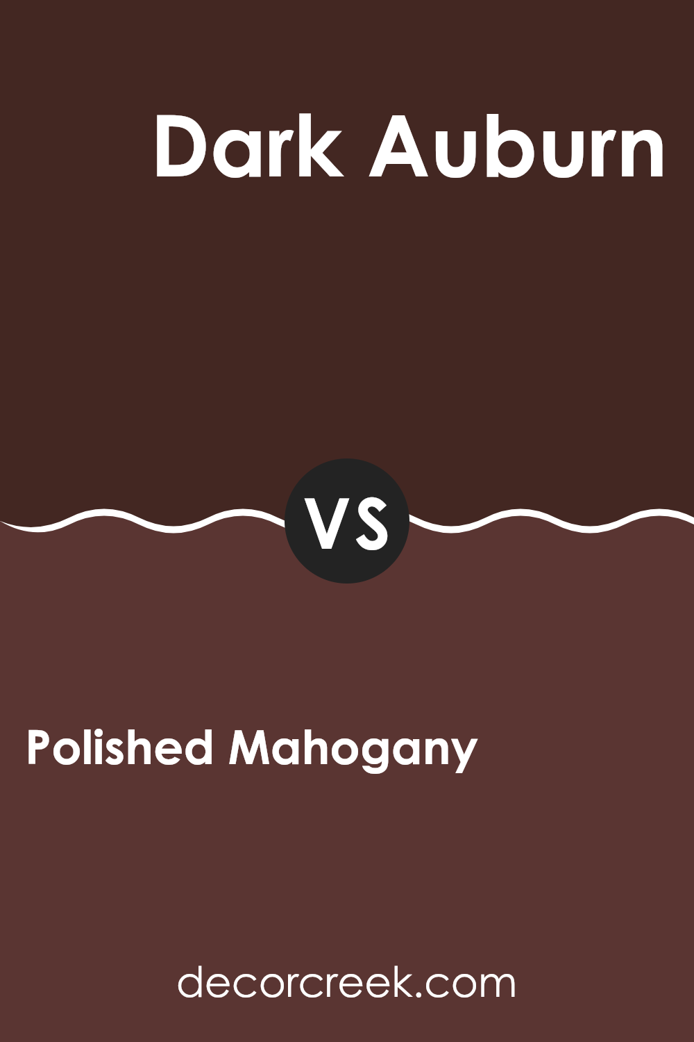
Polished Mahogany SW 2838 by Sherwin Williams vs Dark Auburn SW 6034 by Sherwin Williams
The main color, Polished Mahogany, is a rich, deep brown with a hint of red, giving it a warm and inviting appearance. This color typically gives a classic feel and is often used to create a cozy, comforting atmosphere in a room. It pairs well with soft lighting and traditional decor.
The second color, Dark Auburn, is also a dark shade, but it leans more towards a brownish-red, almost resembling the earthy tones of autumn leaves. This hue has a vibrant quality to it, despite being dark, making it ideal for rooms where a touch of energy is desired while maintaining an overall subdued mood.
Both Polished Mahogany and Dark Auburn are intense hues that can make strong statements in a room. Polished Mahogany is more subdued and traditional, whereas Dark Auburn offers a slightly more lively and energetic vibe. These colors can work well together, balancing each other’s qualities, or stand alone to define a room with their distinct characteristics.
You can see recommended paint color below:
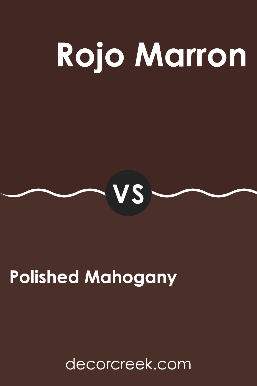
Polished Mahogany SW 2838 by Sherwin Williams vs Rojo Marron SW 9182 by Sherwin Williams
Polished Mahogany and Rojo Marron are two distinct shades by Sherwin Williams that each bring their unique attributes to the color palette. Polished Mahogany is a rich, deep brown with a subtle hint of red, making it ideal for creating a warm and inviting atmosphere in any room. Its depth adds a sense of coziness and tradition, perfect for classic settings or accents in a more modern decor.
On the other hand, Rojo Marron has a stronger red tone, giving it a bolder look compared to the more subdued Polished Mahogany. Rojo Marron stands out as a striking choice, suitable for areas where you want to make a statement or add some energy. This color can brighten a room and works well when paired with neutral tones to balance its intensity.
Choosing between them depends on the mood you’re aiming for—cozy and traditional with Polished Mahogany, or bold and energetic with Rojo Marron.
You can see recommended paint color below:
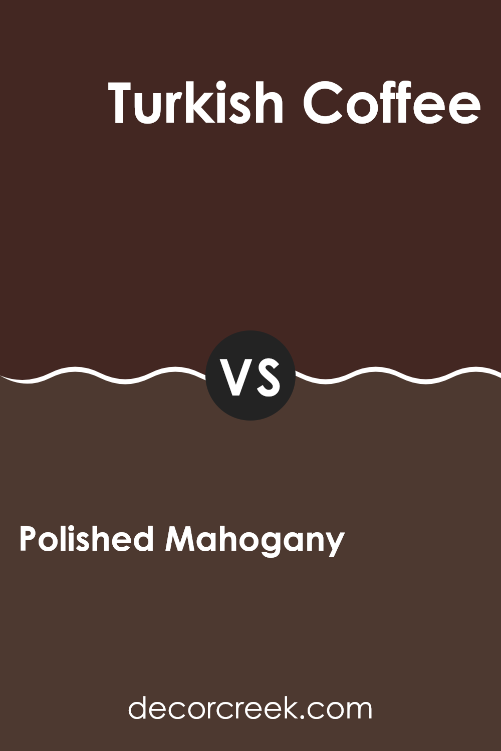
Polished Mahogany SW 2838 by Sherwin Williams vs Turkish Coffee SW 6076 by Sherwin Williams
Polished Mahogany and Turkish Coffee are both rich, deep colors from Sherwin Williams that offer warmth and elegance to any room. Polished Mahogany is a vibrant reddish-brown that resembles the classic look of well-tended mahogany wood. It carries a slightly more vibrant hue, making it ideal for rooms where you want to add a touch of color while maintaining an earthy, grounded feel.
On the other hand, Turkish Coffee is darker and leans more towards a black-brown shade. This color is excellent for creating a cozy, intimate environment due to its dark and moody tone. It works well in areas that benefit from a feeling of closeness and concentration, like studies or home theaters.
While both colors share a warmth that can make a room feel inviting, Polished Mahogany has a lighter, more lively energy, whereas Turkish Coffee offers depth and a hint of mystery due to its darker tones. They are both flexible but serve slightly different purposes depending on the atmosphere you want to create.
You can see recommended paint color below:
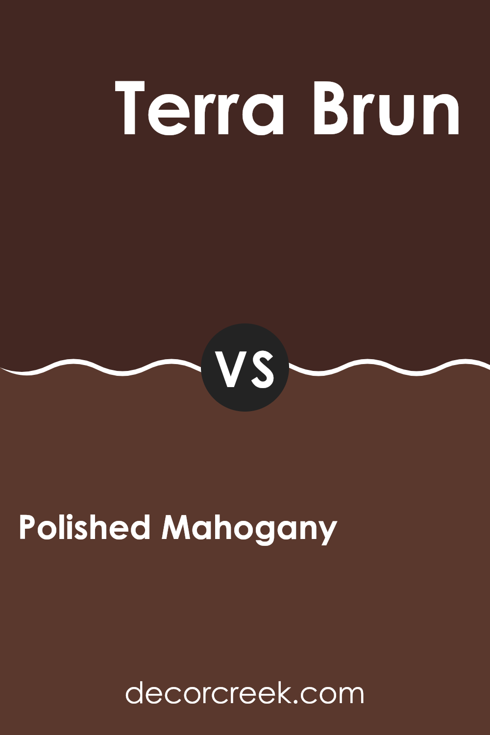
Polished Mahogany SW 2838 by Sherwin Williams vs Terra Brun SW 6048 by Sherwin Williams
Polished Mahogany and Terra Brun are two rich, warm colors from Sherwin Williams, each offering a unique charm for interior rooms. Polished Mahogany has a deeper, burgundy-brown tone, which gives it a classic, elegant feel. It is darker and can make a room feel cozy and inviting. This color works well in a study or dining area, creating a strong, traditional vibe.
On the other hand, Terra Brun sports a lighter, more earthy brown hue. It’s softer compared to Polished Mahogany, making it flexible for various rooms, from living areas to bedrooms. Terra Brun can help brighten a room while still bringing warmth and comfort.
Both colors add a touch of warmth but in distinct ways. Polished Mahogany makes a bold statement with its depth, while Terra Brun offers a softer approach with its gentler tone. Choosing between them depends on the kind of atmosphere you want to create—dramatic and cozy or soft and inviting.
You can see recommended paint color below:
- SW 6048 Terra Brun
After learning all about the paint color SW 2838 Polished Mahogany by Sherwin Williams, I felt really excited to share my thoughts. This color is like a warm, cozy hug for your room. It’s a very special shade of reddish-brown that feels like sitting by a warm fire or enjoying a yummy cup of hot cocoa.
Polished Mahogany isn’t just a brown color; it has hints of red that make it truly unique and welcoming. It turns any room into a comfy spot, perfect for reading books, playing games, or just relaxing. If you have a busy house like mine, with lots of running around, this color can help make your room feel like a quiet, peaceful spot. It’s like a little break from the busy world.
When you paint a wall or a whole room in this color, it works well with other things around like furniture and decorations. You can use light colors like white or cream, or even add some green and blue. It all looks great with Polished Mahogany!
So, if you’re thinking about giving your room a new look, Polished Mahogany by Sherwin Williams is a really great choice to consider. It will make your room feel warm and inviting, and I think it will make you smile every time you walk into the room.
decorcreek.com
Ever wished paint sampling was as easy as sticking a sticker? Guess what? Now it is! Discover Samplize's unique Peel & Stick samples.
Get paint samples

