Choosing the perfect paint color for your home can often be a challenging decision. Among the myriad of options, SW 7029 Agreeable Gray by Sherwin Williams stands out as a flexible choice for nearly any room.
Before you make the decision to paint your walls with this inviting shade of gray, it’s important to understand why it might be the right pick for you. Agreeable Gray is well known for its ability to blend with various decor styles and lighting conditions, making it a favorite among homeowners and designers alike.
Whether you’re updating your living room, bedroom, or the entire house, this neutral provides a soft, warm backdrop that complements both modern and traditional styles.
As you get ready for your next painting project, here’s a closer look at what makes Agreeable Gray a go-to color and how it can improve the overall look of your interior.

Is Agreeable Gray SW 7029 Right for My Home?
Agreeable Gray by Sherwin Williams is one of those colors that just seems to fit in effortlessly wherever you use it. It’s a warm gray with a soft, welcoming tone that strikes a perfect balance between light and cozy. I’ve found that it reflects light beautifully, making it an excellent choice for rooms that could use a brightening touch without becoming too stark.
Personally, I love how flexible this gray is. It works wonders in a variety of interior styles. Whether in a modern minimalistic apartment, a rustic farmhouse, or a classic traditional home, it holds its own with a gentle grace. The neutrality of this shade makes it an excellent backdrop for just about any decor scheme.
Regarding materials and textures, it pairs exceptionally well with natural wood, which brings out its warm undertones. I also enjoy matching it with metal finishes like brushed nickel or aged copper for a slightly industrial look.
Soft textiles in rich colors or even pastel tones enhance its warmth, making any room feel more inviting. With Agreeable Gray as a foundation, I can play around with various elements to create a room that feels both personalized and cohesive. From sleek leather to fluffy cotton, this color supports them all, making it a solid choice for someone looking to create a room that feels both stylish and homey.
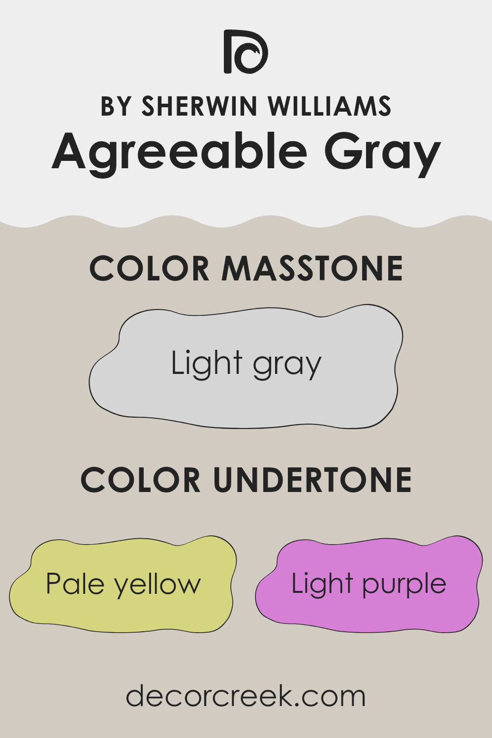
What are the right undertones of Agreeable Gray SW 7029 ?
Agreeable Gray is a popular neutral paint color often chosen for its warmth and adaptability. Unlike a stark gray, it has a comforting quality due to its mix of various undertones. Undertones can subtly influence the main hue, affecting how we perceive the color under different lighting conditions and when paired with various interior elements.
This particular shade includes undertones of pale yellow, light purple, light blue, pale pink, mint, lilac, and grey. Each of these undertones contributes to why Agreeable Gray is seen as a warm and inviting color. For example, the pale yellow undertone adds a soft glow, making a room feel cozy and cheerful. The light purple and lilac undertones bring a slight richness that keeps the color from feeling too dull.
On the other hand, undertones of light blue and mint introduce a hint of coolness, balancing the warmth to ensure the color remains neutral and flexible in many settings. The pale pink undertone adds a touch of softness, enhancing the overall welcoming feel. The base of grey helps maintain a steady neutral backdrop, making it easy to combine with different decor styles and colors.
When painted on interior walls, Agreeable Gray adapts beautifully, reflecting these undertones in varying intensities depending on the natural and artificial light it receives. This means the color can appear more muted on a cloudy day, or bright and lively when sunlit, providing a dynamic backdrop for any room. These shifting perceptions make Agreeable Gray a reliable choice for decorators seeking a flexible wall color.
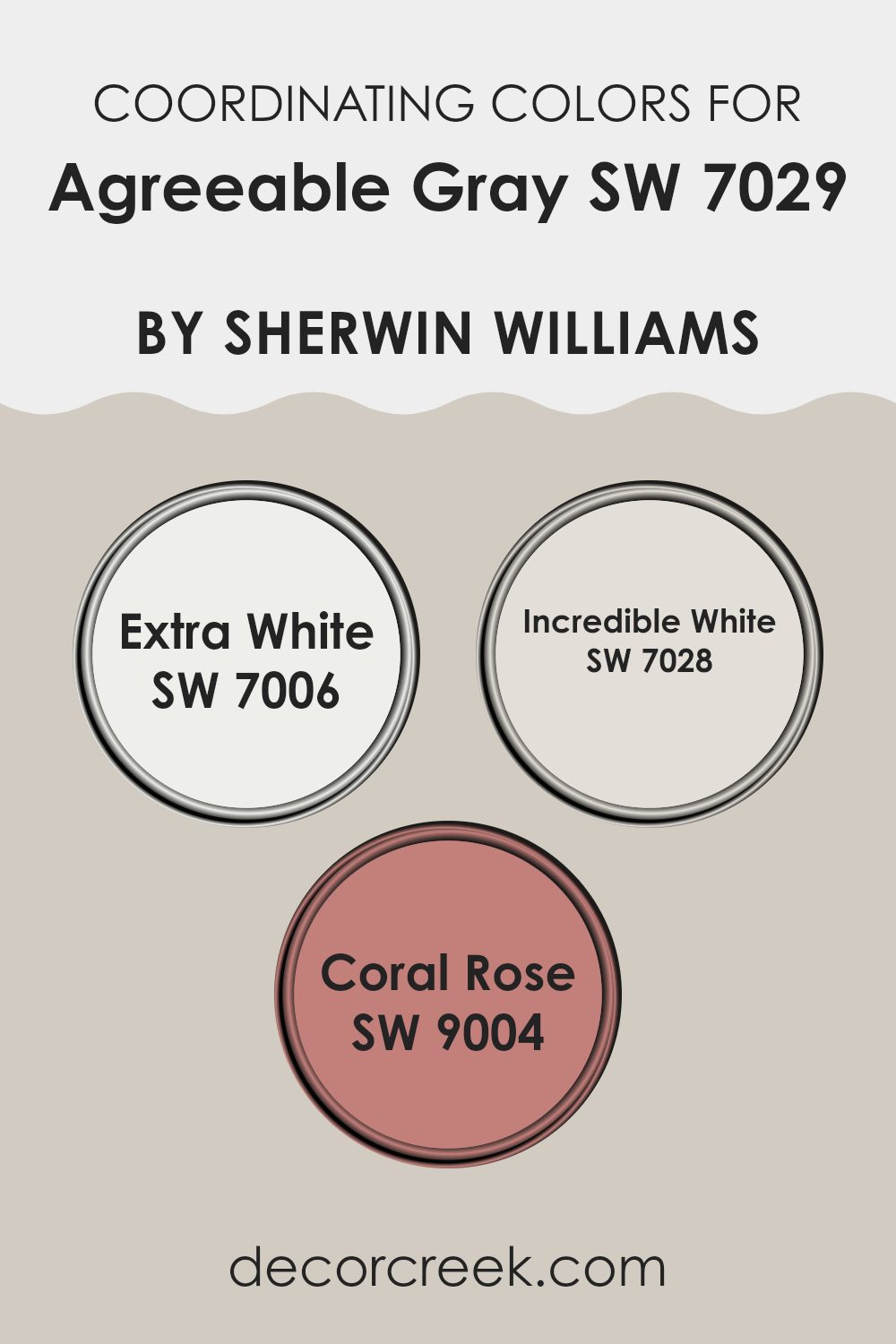
Best Coordinating Colors to use with Agreeable Gray SW 7029 by Sherwin Williams this year.
Coordinating colors are selected shades that complement or enhance the main color in a color scheme, creating a balanced and harmonious look. In the case of Agreeable Gray from Sherwin Williams, a popular neutral shade, certain colors have been chosen to work smoothly alongside it to either highlight its warmth or balance its neutrality with contrasting tones. These coordinating colors help achieve a consistent theme throughout the room while allowing for some variation and visual interest.
For instance, SW 7006 – Extra White is a clean and crisp white that works perfectly as a trim or ceiling color to provide a fresh contrast to the soft tone of Agreeable Gray. It enhances the gray’s warmth without overpowering it and keeps the room light and airy.
SW 7028 – Incredible White, another coordinating color, offers a slightly warmer tone than Extra White, which helps create a subtle yet inviting environment. It pairs well with Agreeable Gray for those who prefer a softer, unified look. Finally, SW 9004 – Coral Rose introduces a gentle pop of color. This soft coral shade adds a touch of vibrancy, providing a calm contrast to the muted gray, perfect for accents like throw pillows or decorative items. Together, these colors coordinate effectively to achieve a balanced and appealing look.
You can see recommended paint colors below:
- SW 7006 Extra White
- SW 7028 Incredible White
- SW 9004 Coral Rose
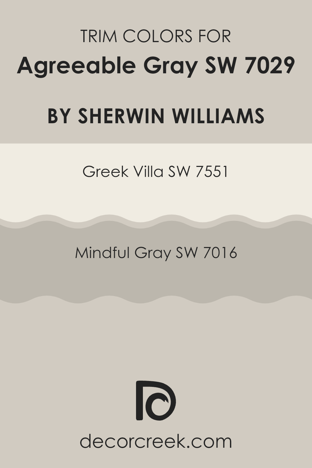
Trendy Trim Colors of Agreeable Gray SW 7029 by Sherwin Williams to use this year.
Trim colors are vital in interior design as they help define and accentuate the architectural features of a room. When paired with a flexible and popular color like Agreeable Gray by Sherwin Williams, choosing the right trim color can improve the overall look and create a seamless result. Agreeable Gray is a warm neutral that serves as a perfect backdrop for various hues; thus, selecting an appropriate trim color is essential to frame this shade effectively and highlight the room’s features.
Greek Villa (SW 7551) is a warm, off-white shade with a slight creamy undertone, making it an ideal trim color for balancing the softness of Agreeable Gray without overpowering it. It complements the warmth of Agreeable Gray while providing a gentle contrast that lightens and brightens the room.
On the other hand, Mindful Gray (SW 7016) is a mid-tone gray that is slightly cooler and deeper than Agreeable Gray, offering a subtle contrast that helps create a more defined and cohesive look. Using Mindful Gray as a trim provides a smooth transition that accentuates architectural elements without clashing with the main wall color.
You can see recommended paint colors below:
- SW 7551 Greek Villa
- SW 7016 Mindful Gray
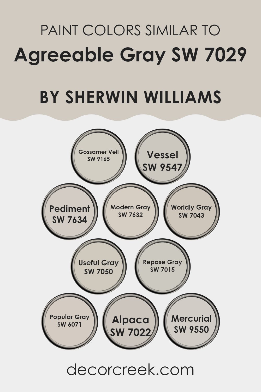
Evergreen Colors Similar to Agreeable Gray SW 7029 by Sherwin Williams
Similar colors play an important role in interior design by creating a cohesive and harmonious environment. For instance, colors like Gossamer Veil and Pediment, which are subtly different shades of gray, can help blend elements in a room without noticeable transitions, easing the visual experience. Similarly, using colors like Modern Gray and Worldly Gray, which are closely aligned with the base color of a room, allows for a nuanced approach to design that can make an area feel larger and more unified. These variations of gray provide a soft backdrop that is flexible for any setting.
Useful Gray and Repose Gray both offer slightly warmer tones, making them ideal for adding a touch of warmth to rooms that need a cozy atmosphere, while still keeping the overall look subtle and understated.
Popular Gray and Alpaca offer a muted base that works well in areas where natural light is abundant, reflecting and amplifying the light to make rooms appear brighter. Lastly, colors such as Vessel and Mercurial offer deeper shades that can be effectively used for accent walls or furniture, providing contrast without feeling too intense, and maintaining a gentle flow throughout the room.
You can see recommended paint colors below:
- SW 9165 Gossamer Veil
- SW 9547 Vessel
- SW 7634 Pediment
- SW 7632 Modern Gray
- SW 7043 Worldly Gray
- SW 7050 Useful Gray
- SW 7015 Repose Gray
- SW 6071 Popular Gray
- SW 7022 Alpaca
- SW 9550 Mercurial
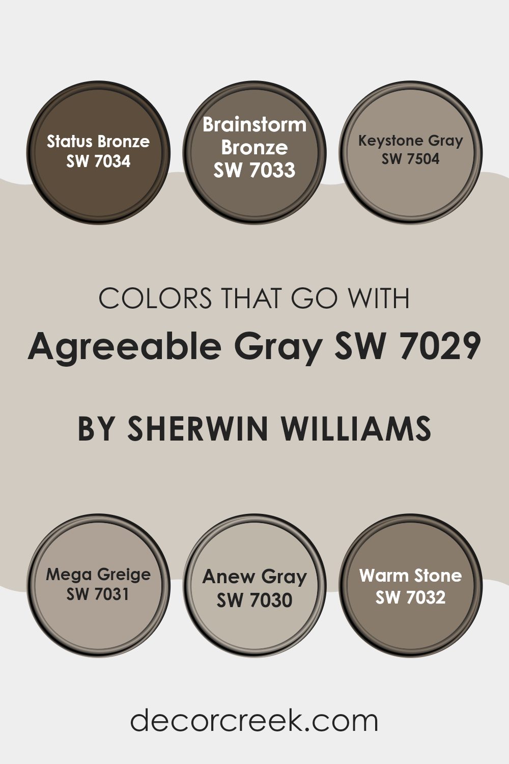
Colors that Go With Agreeable Gray SW 7029 by Sherwin Williams
Choosing the right colors to complement Agreeable Gray SW 7029 by Sherwin Williams is crucial as it helps create a cohesive and inviting atmosphere in any room. Agreeable Gray is a flexible neutral, making it an excellent base for many accent colors or unified color schemes. Pairing it with harmonious shades improves the overall look and sets a specific mood or tone in a room. For instance, pairing it with dark or warm tones like Status Bronze or Brainstorm Bronze creates a comfortable and welcoming feel, well suited for areas where you entertain guests or relax.
Status Bronze SW 7034 leans toward a rich yet understated elegance that can ground lighter grays and add a touch of formality to interiors. Brainstorm Bronze SW 7033 offers a slightly lighter and more subtle bronze tone compared to Status Bronze, giving a soft distinction while connecting smoothly with Agreeable Gray.
Keystone Gray SW 7504 is deeper than Agreeable Gray, allowing for a smooth blend that adds a more polished look without feeling too strong. Mega Greige SW 7031 deepens the palette further, offering stronger contrast that works well for adding depth to a room.
Anew Gray SW 7030 is close to Agreeable Gray but with added depth, making it ideal for creating layered gray schemes. Lastly, Warm Stone SW 7032 introduces an earthy note that balances the lightness of Agreeable Gray, adding warmth and a natural feel to the interior. Together, these colors create a range that allows decor and furniture to blend easily, supporting a well-balanced and welcoming overall atmosphere.
You can see recommended paint colors below:
- SW 7034 Status Bronze
- SW 7033 Brainstorm Bronze
- SW 7504 Keystone Gray
- SW 7031 Mega Greige
- SW 7030 Anew Gray
- SW 7032 Warm Stone
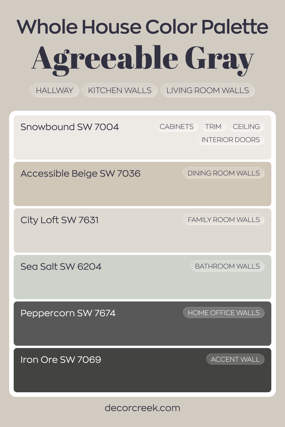
Whole House Paint Color Palette Centered Around Agreeable Gray SW 7029
Agreeable Gray SW 7029 flows through the hallway, kitchen, and living room with an easy, balanced tone. Snowbound on cabinets, trim, ceilings, and interior doors brightens the look and keeps the palette fresh. Accessible Beige in the dining room adds warmth that blends smoothly with the main gray.
City Loft in the family room brings a soft greige variation, while Sea Salt in the bathroom introduces a gentle hint of color.
Peppercorn in the house office adds depth and focus, creating a strong visual anchor. Iron Ore on an accent wall reinforces that darker contrast for a polished finish.
The result is a layered neutral house with thoughtful shifts from light to dark. Each room feels connected while still having its own personality.
Agreeable Gray SW 7029 by Sherwin Williams vs Popular Gray SW 6071 by Sherwin Williams
Agreeable Gray and Popular Gray are both shades by Sherwin Williams, but they offer different vibes. Agreeable Gray is a warm gray with beige undertones, making it really flexible for different rooms. It’s light enough to make rooms feel more open, yet it still brings a cozy warmth.
Popular Gray, on the other hand, also has warm undertones but leans slightly more toward the beige side compared to Agreeable Gray. This makes it a bit darker and warmer than Agreeable Gray. It can give a slightly more enclosed feel to a room, which might be perfect for those looking to create a cozier atmosphere.
Both are popular choices for interiors because they pair well with various decor styles and other colors. However, Agreeable Gray is often chosen for its ability to stay more neutral under varying lighting conditions, while Popular Gray can add a touch more warmth to a room. Ultimately, the choice between the two will depend on the specific needs and desired feel of your interior.
You can see recommended paint color below:
- SW 6071 Popular Gray
Agreeable Gray SW 7029 by Sherwin Williams vs Modern Gray SW 7632 by Sherwin Williams
Agreeable Gray and Modern Gray, both by Sherwin Williams, share similar qualities but also have distinct differences. Agreeable Gray is a warm gray color with a hint of beige, making it a popular choice for those looking to add a cozy, welcoming feel to any room. It’s a flexible shade that works well in various lighting conditions, helping rooms look bright and airy.
Modern Gray, on the other hand, is a bit lighter than Agreeable Gray. It leans more toward a true gray without as much beige. This gives it a cleaner look, which can make smaller rooms appear larger and more open. It’s also well suited for a minimalistic or modern aesthetic, offering a subtle backdrop that pairs nicely with bolder colors and designs.
While both colors provide a neutral palette, Agreeable Gray brings a touch of warmth and comfort, whereas Modern Gray delivers a cleaner, more straightforward gray feel.
You can see recommended paint color below:
- SW 7632 Modern Gray
Agreeable Gray SW 7029 by Sherwin Williams vs Useful Gray SW 7050 by Sherwin Williams
Agreeable Gray and Useful Gray, both by Sherwin Williams, are popular neutral colors, but they have distinct tones. Agreeable Gray tends to lean toward a soft beige with warm undertones, making it extremely flexible and a favorite for many living rooms. It provides a subtle backdrop that pairs well with both bright and muted furnishings, enhancing the overall warmth of a room.
On the other hand, Useful Gray has a cooler tone compared to Agreeable Gray. It presents more of a taupe-like shade with slight green undertones, which can sometimes give off a more austere or minimalistic vibe. This makes Useful Gray more suited for modern decor or interiors where a straightforward, uncluttered look is desired.
Both colors are soft and muted, but the choice between them can depend on the existing decor, lighting, and personal preference regarding warmth and coolness in color schemes.
You can see recommended paint color below:
- SW 7050 Useful Gray
Agreeable Gray SW 7029 by Sherwin Williams vs Pediment SW 7634 by Sherwin Williams
Agreeable Gray and Pediment by Sherwin Williams are two popular paint colors that bring a subtle yet distinct vibe to any room. Agreeable Gray is a warm gray with a slight beige undertone, making it a flexible choice that pairs well with various decor styles and colors. It’s a soft and inviting color that creates a cozy atmosphere in rooms with plenty of natural light as well as in areas with limited sunlight.
On the other hand, Pediment is a cooler gray that leans toward the taupe side. It offers a muted, understated elegance that works particularly well in modern and minimalist interiors. Although it’s cooler than Agreeable Gray, Pediment still maintains a certain warmth, preventing it from feeling cold or stark.
In essence, while both colors share a gray base, Agreeable Gray has a warmer, more neutral appeal that suits a wide range of furnishings and accents, whereas Pediment provides a chic, cooler backdrop that complements modern aesthetics.
You can see recommended paint color below:
- SW 7634 Pediment
Agreeable Gray SW 7029 by Sherwin Williams vs Alpaca SW 7022 by Sherwin Williams
Agreeable Gray and Alpaca by Sherwin Williams are both popular neutral paint colors, but they have distinct tones that set them apart. Agreeable Gray is a warm gray with beige undertones, making it a very adaptable color that feels welcoming in various rooms. It’s light enough to make rooms look spacious yet has enough warmth to make them feel cozy.
On the other hand, Alpaca is slightly cooler than Agreeable Gray, leaning more toward taupe with hints of purple and brown. This subtle mix gives it a unique shade that can add a touch of personality to any room without feeling too strong or heavy.
While both colors are flexible enough to work in many design schemes, Agreeable Gray is often preferred for its warmer tones that pair easily with a wide range of decor styles. Alpaca, with its cooler and slightly moodier feel, can be a great choice for someone looking to achieve a more distinctive look. Both offer a beautiful backdrop that can complement various furnishings and accents.
You can see recommended paint color below:
- SW 7022 Alpaca
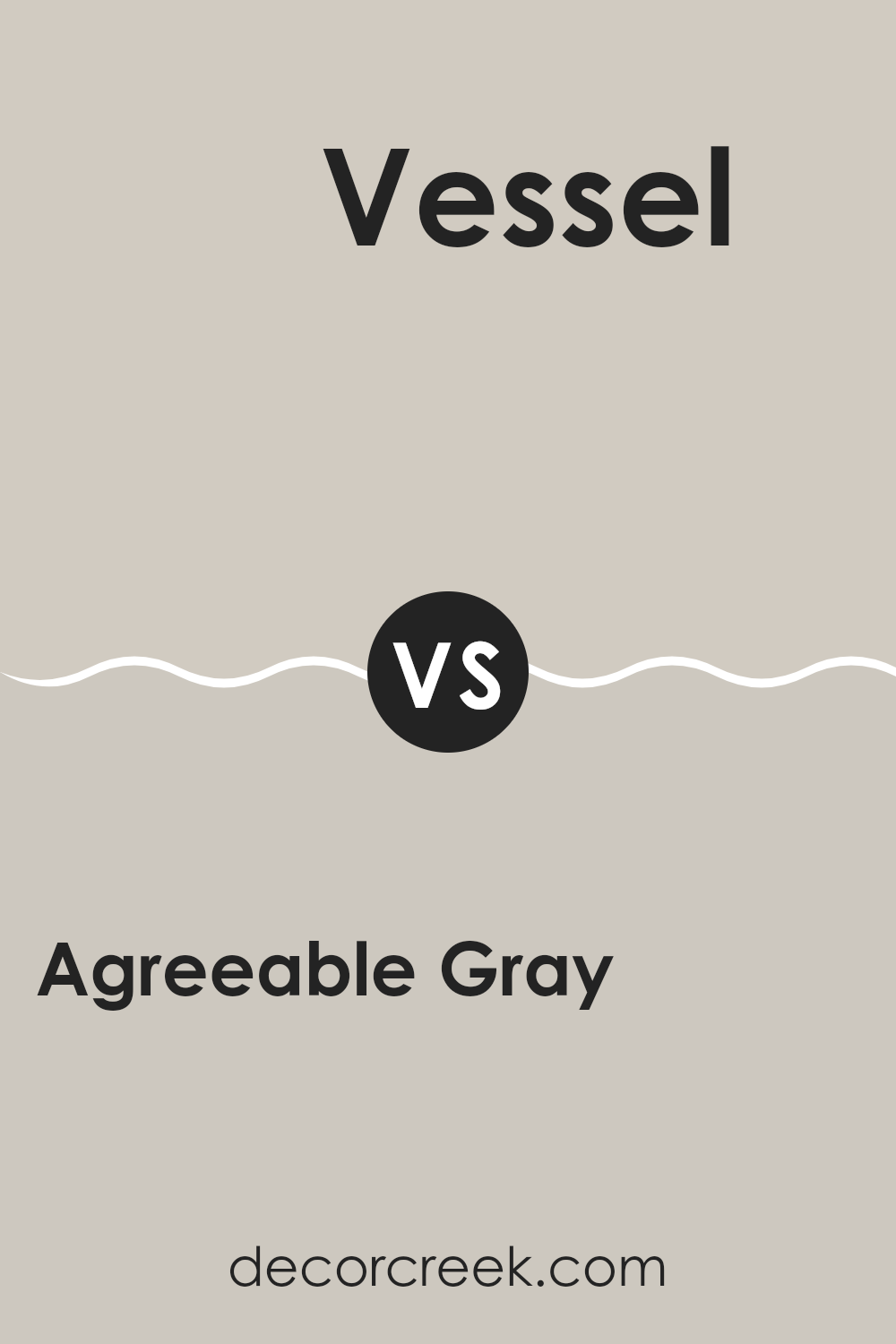
Agreeable Gray SW 7029 by Sherwin Williams vs Vessel SW 9547 by Sherwin Williams
Agreeable Gray and Vessel are two distinct paint colors by Sherwin Williams. Agreeable Gray is a warm, soft gray with a slight beige undertone, making it a highly adaptable neutral color.
It’s perfect for any room, providing a cozy backdrop that pairs well with various decor styles and other colors. On the other hand, Vessel is a deeper, more saturated gray with a hint of blue.
It gives off a stronger presence due to its darker tone, making it ideal for accent walls or rooms where you want to add a bit of drama and depth. While Agreeable Gray offers a light, airy feel, Vessel creates a more intense, bold look. Both colors can work beautifully in modern homes, but your choice would depend on the mood and impact you want to achieve in your interior.
You can see recommended paint color below:
- SW 9547 Vessel
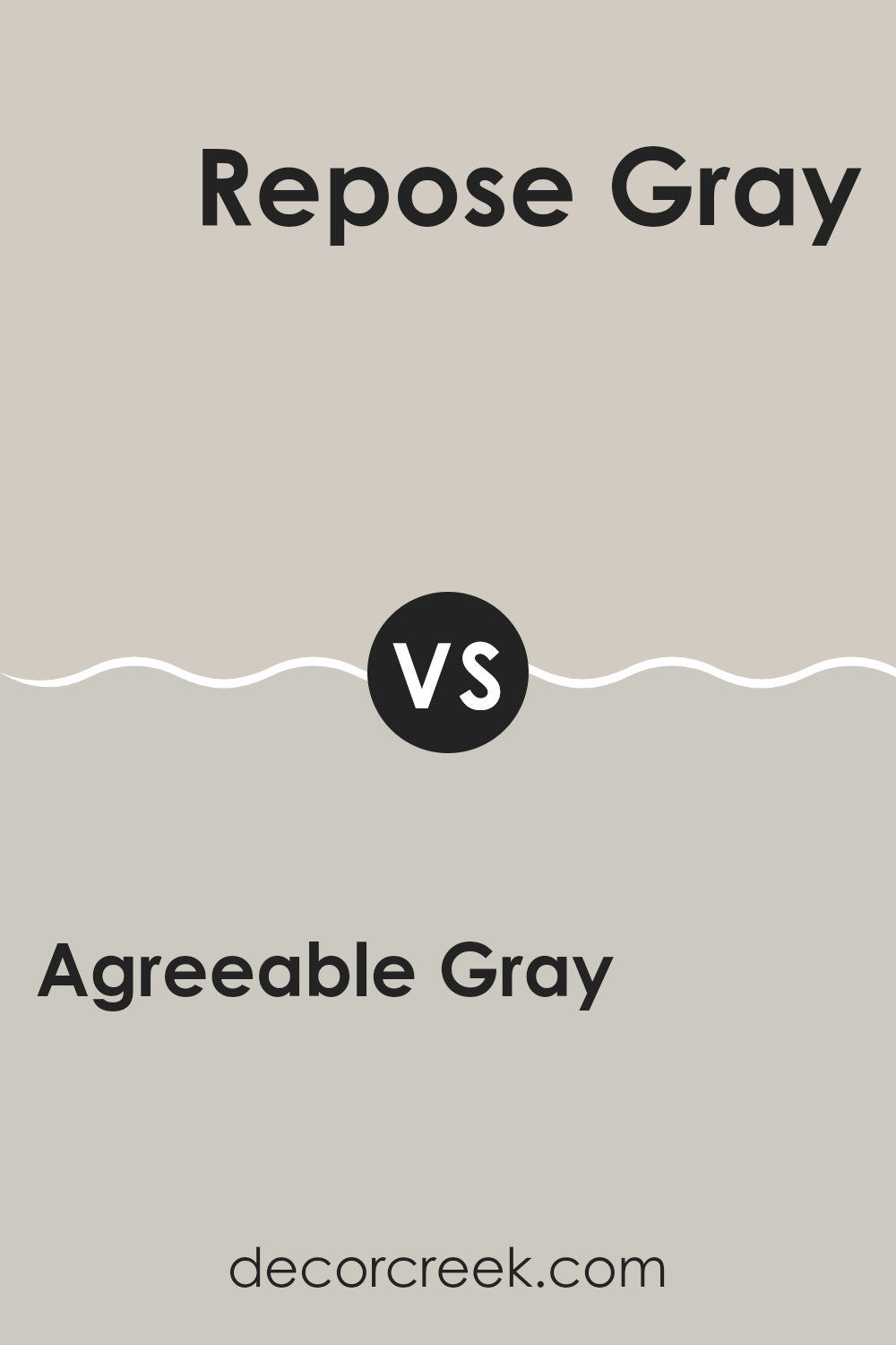
Agreeable Gray SW 7029 by Sherwin Williams vs Repose Gray SW 7015 by Sherwin Williams
Agreeable Gray and Repose Gray, both from Sherwin Williams, are popular neutral colors that offer a modern look for any room. Agreeable Gray is a warm gray with beige undertones, making it a soft and welcoming shade that’s perfect for living areas.
It bridges the gap between beige and gray beautifully, creating a cozy yet balanced aesthetic. On the other hand, Repose Gray leans cooler than Agreeable Gray due to its subtle blue undertones. This makes it a great choice for creating a more contemporary feel.
It’s ideal for those who prefer a slight crispness to their color scheme. Both colors are flexible and work well in various lighting situations, but Agreeable Gray brings a hint of warmth, while Repose Gray offers a sharper, more modern vibe. They can be used separately or even together to enhance different features and areas of a home.
You can see recommended paint color below:
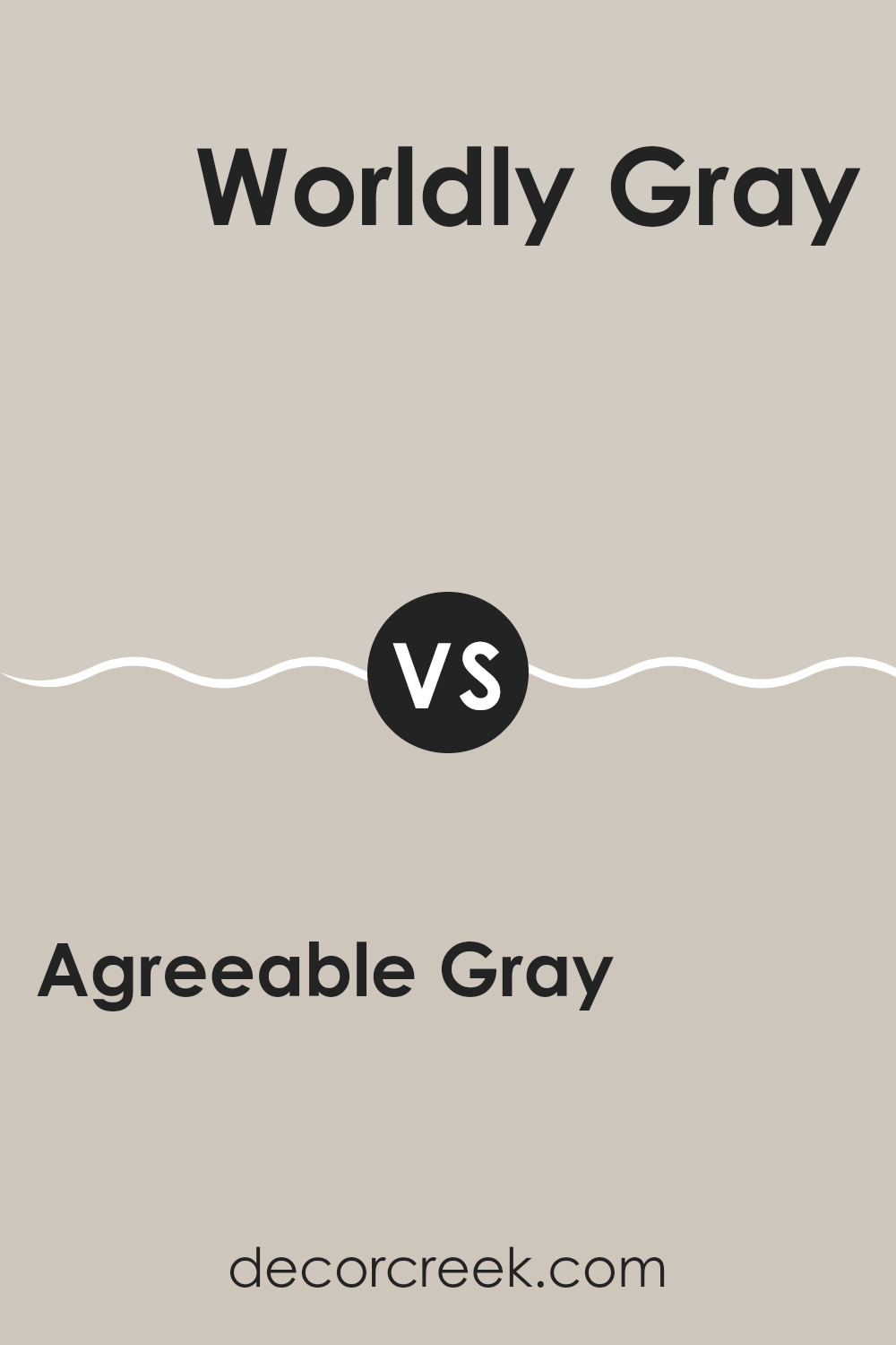
Agreeable Gray SW 7029 by Sherwin Williams vs Worldly Gray SW 7043 by Sherwin Williams
Agreeable Gray and Worldly Gray, both by Sherwin Williams, are popular choices for neutral paint colors, but they have subtle differences. Agreeable Gray tends to be a bit warmer with its slightly beige undertone, giving it a cozy and inviting feel.
On the other hand, Worldly Gray leans cooler, showing hints of a gray base which can make it feel more neutral in different lighting conditions. This cooler tone can give a crisp and more balanced foundation in a room.
Both colors are very flexible and work well in many types of rooms, from living rooms to bedrooms. Agreeable Gray may pair better with warm colors like reds and yellows, while Worldly Gray can be a stronger match for cooler tones like blues and greens. Both are popular for their ability to blend with other hues and adapt to different styles, helping any home feel modern and stylish.
You can see recommended paint color below:
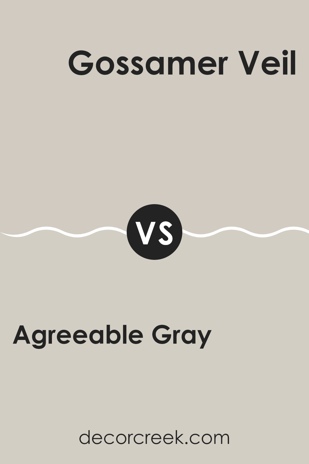
Agreeable Gray SW 7029 by Sherwin Williams vs Gossamer Veil SW 9165 by Sherwin Williams
The main color, Agreeable Gray, is a flexible and warm gray with a slight beige undertone, which makes it very adaptable to different rooms and lighting conditions. It’s commonly used because of how well it pairs with other colors and elements in a room, helping interiors feel cozy yet modern.
On the other hand, Gossamer Veil is another neutral but leans more toward a taupe-based gray. It has a cooler tone compared to Agreeable Gray, providing a more understated and subtle backdrop for interiors. While still neutral, Gossamer Veil tends to highlight modern aesthetics without making rooms feel too cold, balancing warmth with contemporary style.
Both colors offer beautiful backdrops for any room, with Agreeable Gray giving a slightly warmer feel and Gossamer Veil offering a crisper, cooler look. Each can work well with a wide range of decor styles, creating a smooth and calming effect that ties different elements together. Choosing between them depends on your preference for warmth and the type of atmosphere you want to create.
You can see recommended paint color below:
- SW 9165 Gossamer Veil
Agreeable Gray SW 7029 by Sherwin Williams vs Mercurial SW 9550 by Sherwin Williams
Agreeable Gray and Mercurial are two distinct shades offered by Sherwin Williams, each with its unique character. Agreeable Gray is a warm gray that brings a soft, neutral look to rooms, making it very flexible for different rooms and lighting conditions. It’s well loved for its ability to blend harmoniously with various decor styles and colors, providing a subtle backdrop that enhances other features in the room.
On the other hand, Mercurial is a much darker, moody gray compared to Agreeable Gray. This color has a deep, intense tone that can add drama and a modern flair to any room. It’s perfect for making a bold statement, whether used for an accent wall or throughout a room to create a strong, rich atmosphere.
In summary, while Agreeable Gray is lighter and more understated, providing a gentle warmth, Mercurial offers a striking and bold touch with its deeper gray saturation. Each color serves different moods and designs, depending on what you’re looking to achieve in your interior.
You can see recommended paint color below:
- SW 9550 Mercurial
In conclusion, SW 7029 Agreeable Gray by Sherwin Williams truly lives up to its name—it’s incredibly easy to live with. Whether I’m thinking about giving my living room or kitchen a new look, this color fits just right. It’s a warm shade of gray that works beautifully with all kinds of other colors, from bright reds to soft blues. It’s like a good friend that gets along with everyone at a party.
After trying out this color in different rooms, I noticed it also adjusts well to changing light throughout the day. In the morning light, it looks a bit softer, and by the time the sun sets, it brings a cozy feeling to the room. This makes it perfect for areas where I spend a lot of time during the day and want to feel relaxed in the evening.
Best of all, Agreeable Gray doesn’t demand attention but has a calm, gentle presence that makes the room feel warm and welcoming. It’s a great option if you’re just starting to decorate or if you’re unsure which color to choose because it works well with almost everything.
So, if you’re thinking about a new color for your room, Agreeable Gray is a choice you won’t regret—it truly makes any room feel like home.

Ever wished paint sampling was as easy as sticking a sticker? Guess what? Now it is! Discover Samplize's unique Peel & Stick samples.
Get paint samples

