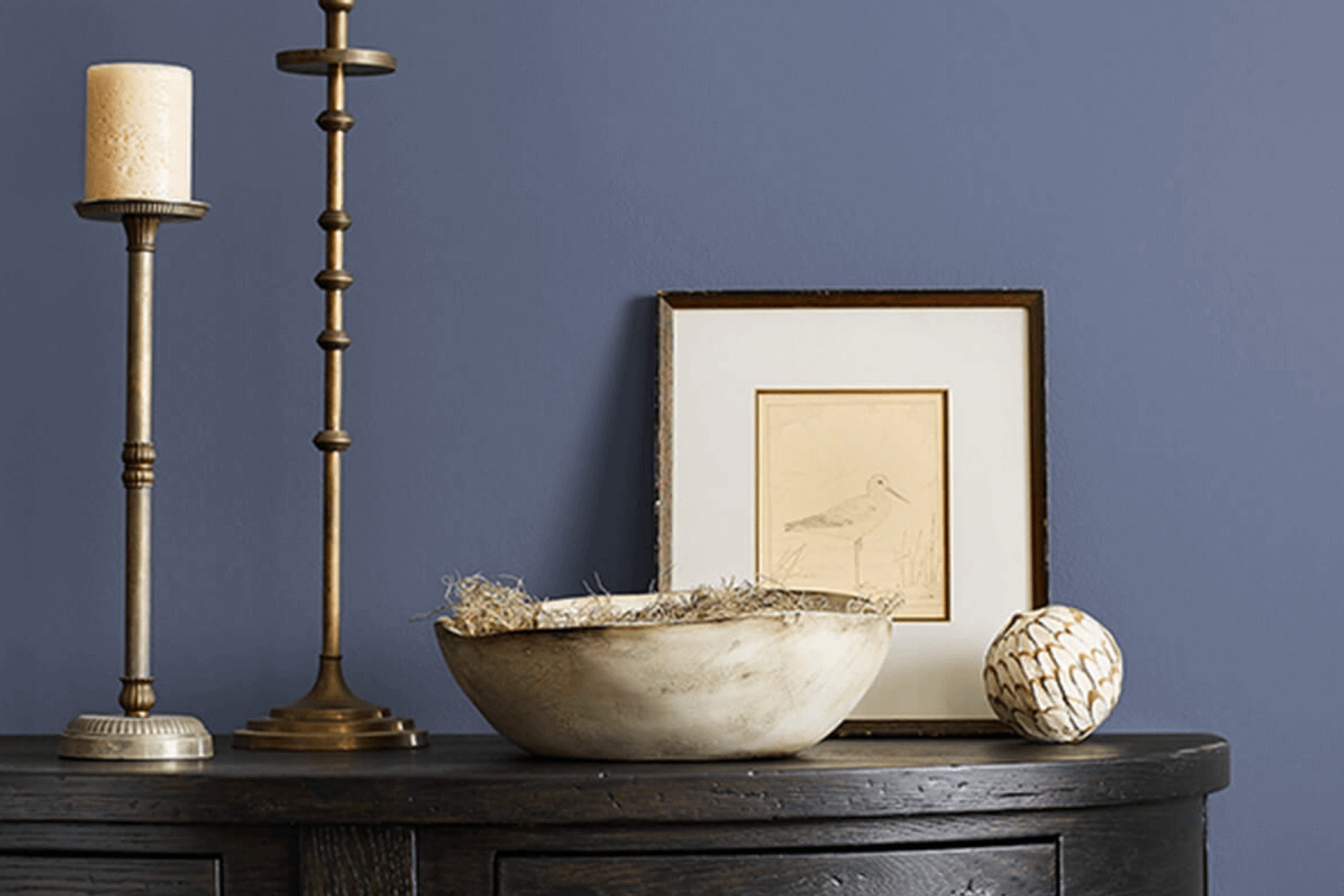
Do you want to refresh your space with a color that’s both timeless and fresh? Let me introduce you to SW 6544 Mesmerize by Sherwin Williams. I recently decided to give my living room a makeover and was looking for a shade that could really add a new dimension to my decor. That’s when I stumbled upon Mesmerize. It’s a vibrant yet soothing blue that conjures up images of a serene sea under a clear sky. It has a depth that adds sophistication to any room.
I used Mesmerize on one of the main walls of my living room, pairing it with soft whites and grays in the rest of the décor. The result was a stunning visual balance that made the room feel both cozy and expansive.
Whether you want to paint an accent wall like I did or use it for more extensive purposes, SW 6544 Mesmerize offers flexibility that works wonderfully in both well-lit areas and spaces that could use a little brightening up.
If you’re looking for a color that combines boldness with a sense of calm, this might just be the perfect pick for your next project.
What Color Is Mesmerize SW 6544 by Sherwin Williams?
Mesmerize by Sherwin Williams is a deep, striking blue color that can create a strong impression in any space. This vivid hue combines the dynamic quality of an ocean wave with the richness of a twilight sky, making it a perfect choice for adding a bold splash of color to your home.
Ideal for modern and contemporary decor, Mesmerize works exceptionally well in living rooms, bedrooms, and dining areas that aim to make a statement. It pairs beautifully with minimalist styles where its depth can stand out against clean, crisp lines. Additionally, this color fits nicely into nautical or coastal themes due to its rich blue tones.
When it comes to materials and textures, Mesmerize coordinates well with natural wood, adding warmth to the coolness of the blue. It also looks stunning when contrasted with metals like silver or brushed nickel, bringing out a more industrial vibe. For textiles, consider soft, plush fabrics like velvet or silk to create a luxurious feel, or use linen and cotton for a more relaxed and airy atmosphere. Lastly, introducing some white or light gray accents can help balance and highlight the intensity of Mesmerize, ensuring the space feels vibrant yet balanced.
Is Mesmerize SW 6544 by Sherwin Williams Warm or Cool color?
Mesmerize by Sherwin Williams is a unique shade of blue that adds a fresh and vibrant feel to any room. This color has a way of making spaces feel more inviting and alive. When used on walls, it provides a striking background that makes white trim or furniture stand out, creating a beautiful contrast.
Because of its deep yet bright tone, it works well in rooms that get plenty of natural light, enhancing the airy and open feel of the space. If you choose it for a smaller room or one with less light, it can make the area feel cozy and warm.
This color pairs nicely with light grays, softs beiges, and creamy whites for a balanced look. It’s a great choice if you want to add a touch of playfulness and energy to your home without overwhelming the senses. Overall, Mesmerize is a versatile color that can help refresh any living space.
Undertones of Mesmerize SW 6544 by Sherwin Williams
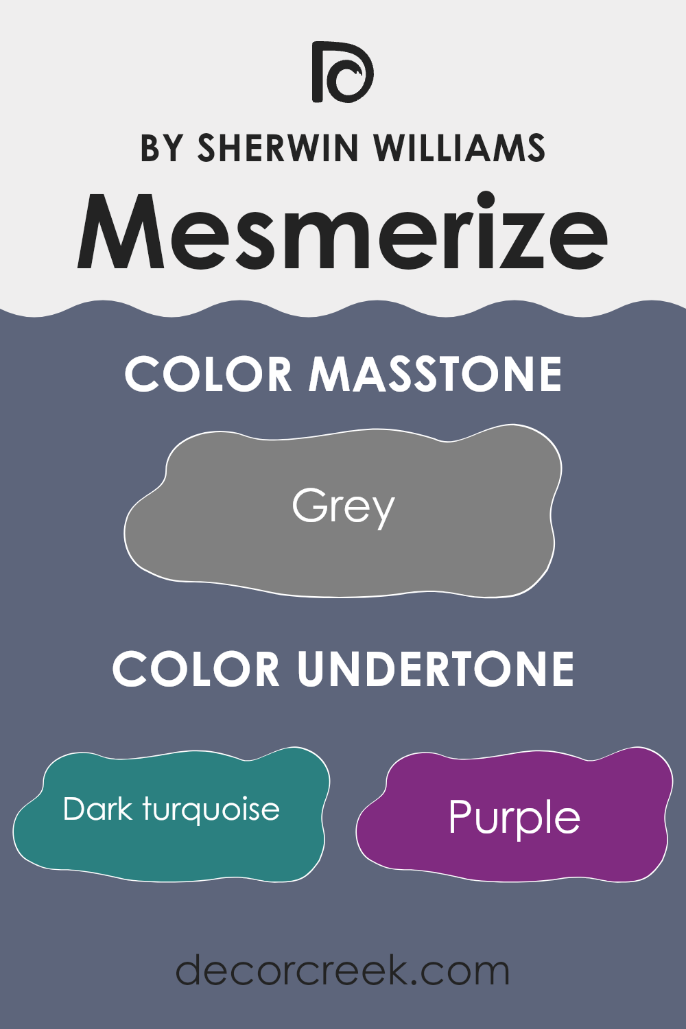
The color Mesmerize, from the paint brand Sherwin Williams, contains a complex spectrum of undertones that subtly influence how it is perceived in different settings. Undertones are the colors lurking beneath the surface of the paint that can subtly shift its appearance under various lighting conditions.
When applied on interior walls, the undertones of Mesmerize can create a dynamic and lively ambiance. For example, undertones like dark turquoise and navy can give a cool and deep effect, making a room feel more enclosed and cozy. Conversely, lighter undertones such as light turquoise and lilac can help to brighten a space, giving an airier and more open feel.
This color’s diverse undertones like olive or dark green can bring an earthy and grounding effect, which might be perfect for spaces intended to be calm and restful, like bedrooms or study rooms. Brighter undertones, such as mint and light green, can energize a space, making them ideal for areas like kitchens or home offices.
Moreover, undertones like pale pink and violet bring a touch of warmth and cheerfulness, which can make a living space feel welcoming and comfortable. Brown and dark gray undertones help provide a solid, stable feel to the room.
Overall, the way Mesmerize appears on your walls can dramatically depend on its surrounding elements and lighting, demonstrating how crucial understanding its undertones is when choosing paint colors for your home. This ensures that the color aligns with your desired mood and decor style.
What is the Masstone of the Mesmerize SW 6544 by Sherwin Williams?
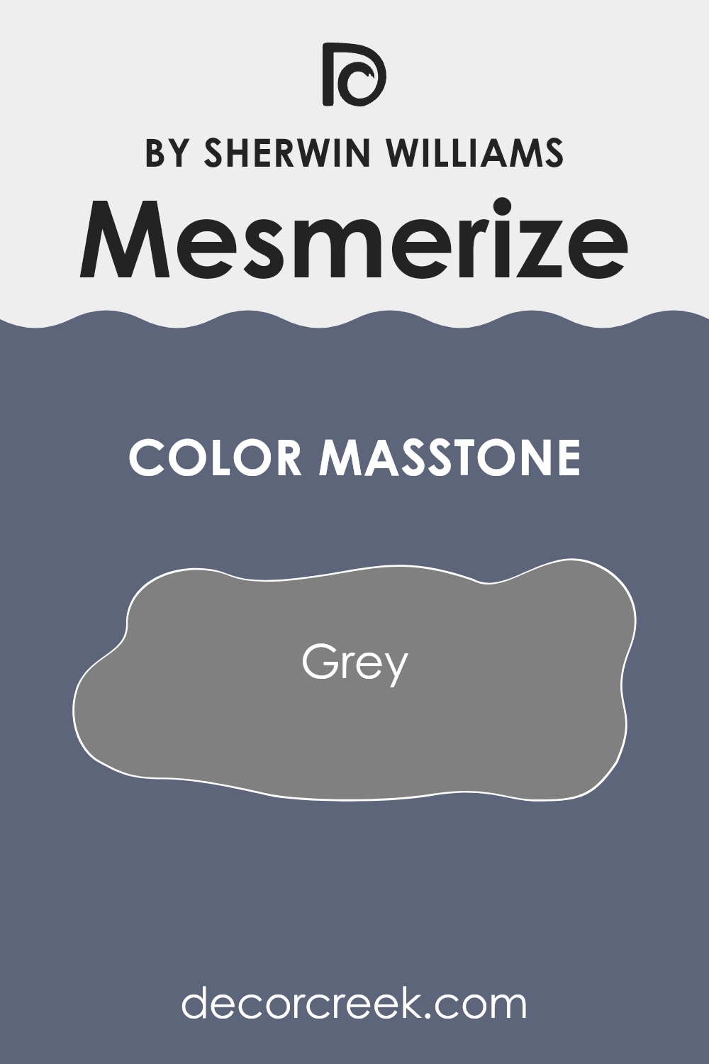
MesmerizeSW 6544 is a unique shade of grey that brings a subtle, calming feel to any room. Because its masstone is a solid grey, it serves as a neutral background that can match with various decor styles and colors.
This grey doesn’t take over a space but supports other colors, allowing for flexibility in decorating whether you want to add bright colors for a pop or other neutrals for a soft look. It’s particularly effective in rooms where you want a sense of calm, such as bedrooms or living rooms.
Additionally, its neutrality means it can bridge different textures and materials easily, from soft fabrics to harder woods and metals, creating a cohesive feel without demanding attention. This grey works well in various lighting conditions too, maintaining its true color without leaning too cold or warm, making it a reliable choice for most homes.
How Does Lighting Affect Mesmerize SW 6544 by Sherwin Williams?
Lighting plays a crucial role in how we perceive colors, as it can dramatically change their appearance depending on the type of light and its intensity. When it comes to interior paint, such as “Mesmerize” by Sherwin Williams, the color can look noticeably different under various lighting conditions.
In artificial light, “Mesmerize”, which is a vibrant hue, might appear more intense and saturated. Depending on the type of bulb (LED, fluorescent, or incandescent), the blue might shift slightly. For example, under warm yellow light typically emitted by incandescent bulbs, it might look softer and warmer, while under harsher fluorescent light, it could appear sharper and cooler.
In natural light, the true color of “Mesmerize” is more likely to show. Natural light, being broader spectrum, allows all the pigments inside the paint to be displayed more vividly. However, the amount of sunlight and the time of day will impact the color perception.
In rooms that face different directions, “Mesmerize” will also behave differently:
1. North-facing rooms: These rooms get less direct sunlight, which tends to be cooler and bluer. Here, “Mesmerize” might look more muted and subtly rich, maintaining a steadier appearance throughout the day.
2. South-facing rooms: These receive the most sunlight, which is warmer and more intense for the majority of the day. The color could appear brighter and more dynamic in these rooms, possibly showing a lighter, more glowing version at peak daylight.
3. East-facing rooms: Morning light is warm and bright, making “Mesmerize” look lively and bright in the morning. As the day progresses and the direct sunlight moves away, the color might lose some of its vibrancy and appear cooler.
4. West-facing rooms: Afternoon and evening light in these rooms can be intensely warm and golden. “Mesmerize” could be very vivid and striking in the afternoon, but may seem darker and more subdued in the morning.
Overall, the appearance of “Mesmerize” will be influenced by these many factors, making it adaptable and dynamic throughout the day and in different environments.
What is the LRV of Mesmerize SW 6544 by Sherwin Williams?
LRV stands for Light Reflectance Value and it measures the percentage of light a paint color reflects back into the room, from zero to one hundred, where zero absorbs all light and one hundred reflects all light. This value helps in predicting how light or dark a color will appear when painted on a wall.
It’s especially useful when choosing paint colors for a room, as it influences the brightness and the overall mood. Higher reflective values make a room feel more open and airy, whereas lower values can give a room a cozier and more enclosed feeling.
Considering Mesmerize, with an LRV of approximately 13, this color is on the darker end of the scale. This means it tends not to reflect much light, absorbing more instead. In a practical sense, when used on walls, Mesmerize will give the space a more intimate and dramatic look, often used to create depth or highlight accent areas within a room.
In rooms with less natural light, this color could make the space appear smaller or dimmer, so it might be ideal for large, well-lit areas or for special purposes such as accent walls or features. Additionally, pairing it with lighter colors or decor can help balance out the intensity and add some light reflectance back into the room.

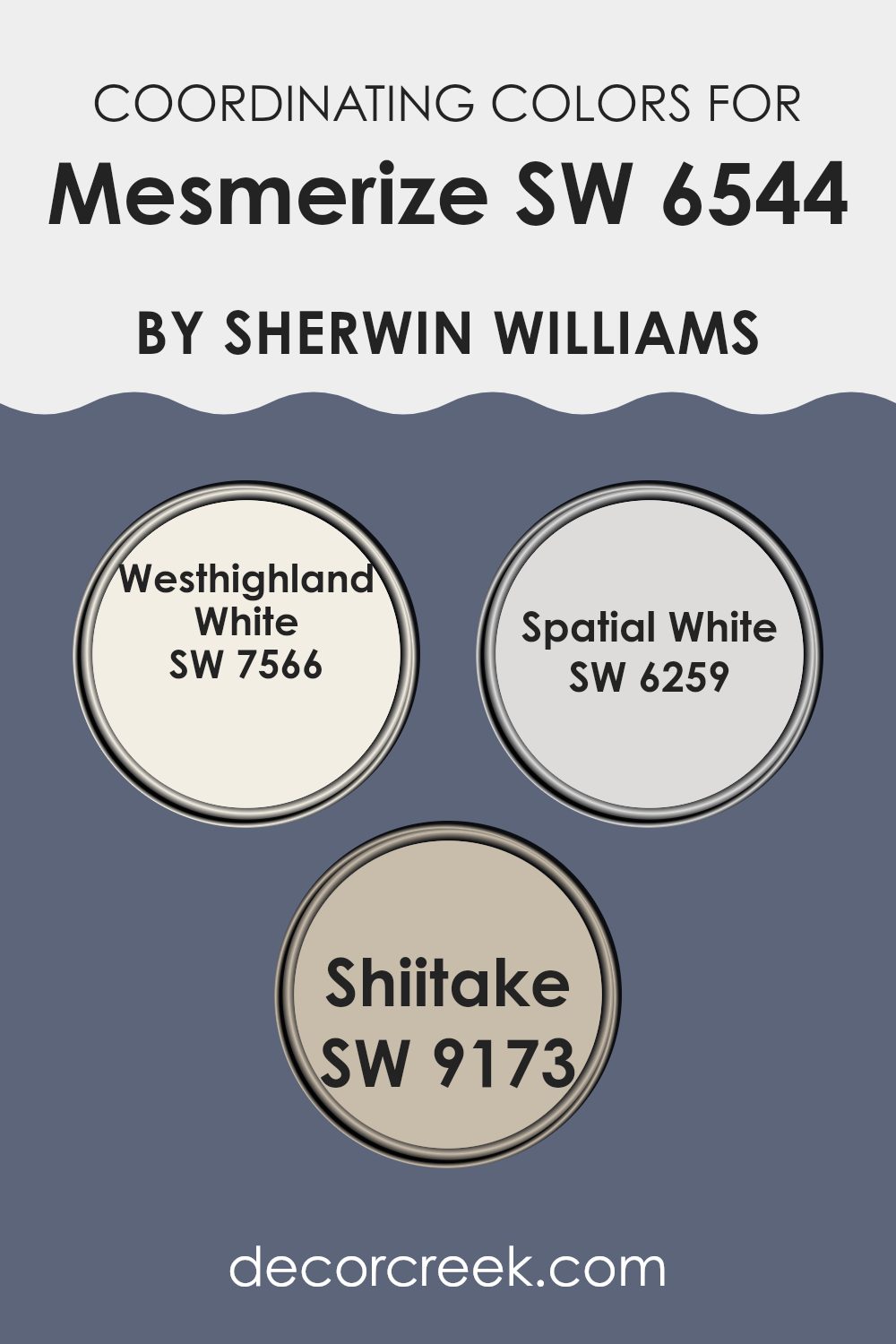
Coordinating Colors of Mesmerize SW 6544 by Sherwin Williams
Coordinating colors are complementary shades selected to enhance each other and create a harmonious color scheme when used together in decor. They often consist of the main color and additional colors that can range from neutrals to more vibrant shades, depending on the desired effect. The aim is to create a balanced visual appeal that ties different components of a room’s decor together seamlessly.
For example, when looking at colors that go well with Mesmerize by Sherwin Williams (SW 6544), a vivid blue, you’d potentially choose SW 7566 – Westhighland White, SW 6259 – Spatial White, and SW 9173 – Shiitake.
Westhighland White is a clean, bright white that offers a stark, refreshing contrast to the rich tones of Mesmerize, making it perfect for trim or ceilings to add a fresh burst to the space. Spatial White, on the other hand, is a softer white with a subtle warmth that can help soften the intensity of a bold blue, ideal for adjacent walls or larger surfaces to provide a gentle backdrop.
Lastly, Shiitake is a warm, earthy beige that adds a natural, grounding element to balance the coolness of the Mesmerize, making it ideal for incorporating wood furniture or textile elements like curtains and rugs, enhancing the overall warmth of a room. Using these coordinating colors helps to create a cohesive look that is pleasing to the eye and ensures that no element feels out of place.
You can see recommended paint colors below:
- SW 7566 Westhighland White
- SW 6259 Spatial White
- SW 9173 Shiitake
What are the Trim colors of Mesmerize SW 6544 by Sherwin Williams?
Trim colors are specific shades used to accentuate and complement the main colors on walls, door frames, windowsills, and moldings. Choosing the right trim color can significantly enhance the overall appearance of a room, making it appear more finished and cohesive.
For Mesmerize, a vibrant and distinct shade, appropriate trim colors like SW 7035 – Aesthetic White and SW 6385 – Dover White can provide a subtle balance, gracefully framing the bold wall color, thus making the space feel inviting and well-put-together.
Aesthetic White by Sherwin Williams is a soft and neutral white with a hint of warmth. This color is ideal for trims as it offers a gentle contrast against more vivid colors like Mesmerize, thereby ensuring that the room doesn’t feel overwhelming. On the other hand, Dover White is a creamy, slightly yellow-toned white that adds a touch of warmth to any space. It works beautifully as a trim color, creating a slight, yet noticeable contrast that helps highlight the architectural features of a room without competing with the main color.
You can see recommended paint colors below:

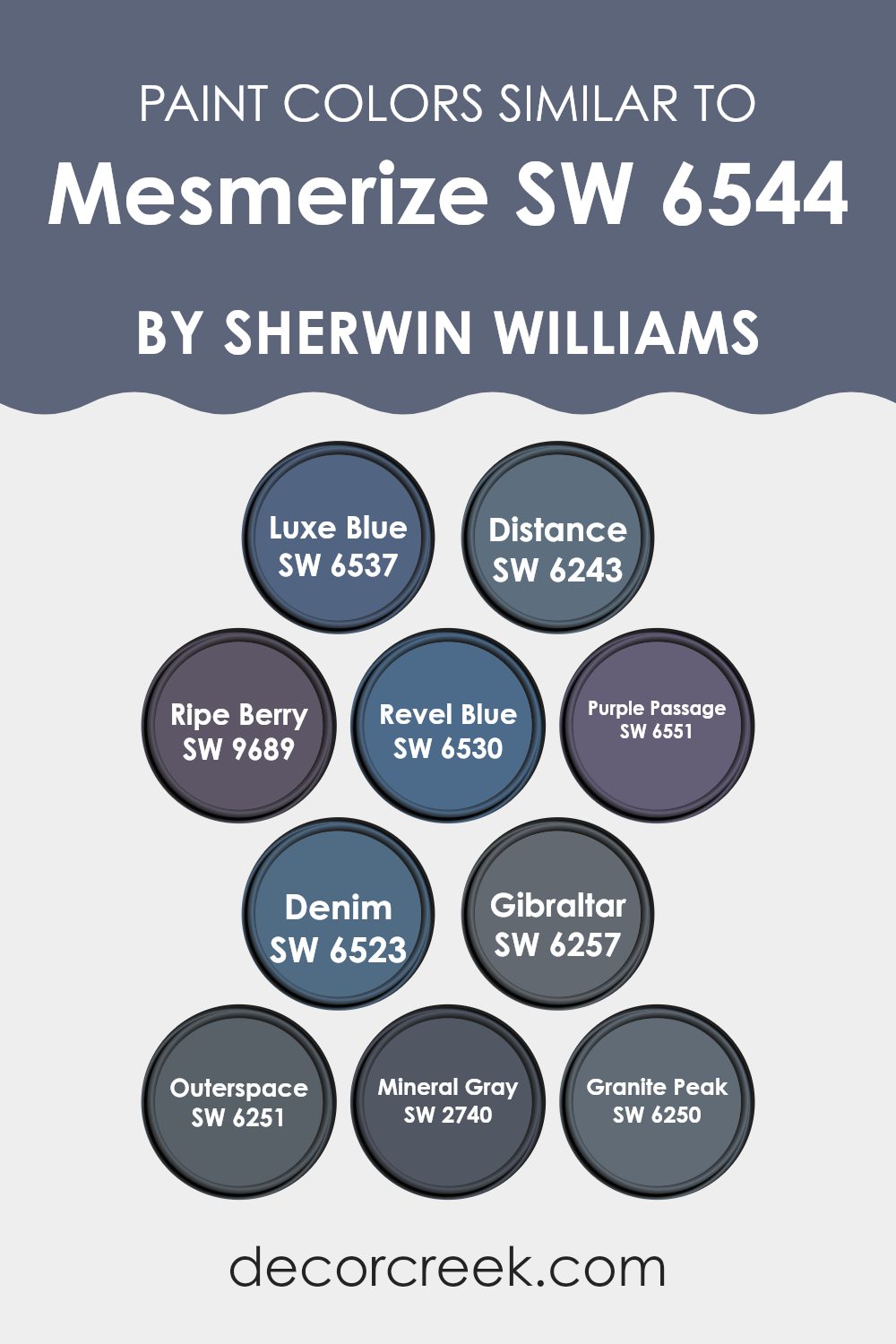
Colors Similar to Mesmerize SW 6544 by Sherwin Williams
Similar colors play a vital role in design by creating a cohesive and harmonious visual experience. When colors are close in hue, they naturally complement each other, making the space feel balanced and aesthetically pleasing. For instance, when using a palette of related shades, like those similar to Mesmerize by Sherwin Williams, designers can ensure that the environment maintains a consistent mood and style without abrupt shifts in color that might jar the eyes or disrupt the flow of the space.
For example, Luxe Blue is a deep, rich blue that exudes a quiet confidence, perfect for creating a dignified yet inviting atmosphere. Distance, on the other hand, is a shadowy blue-grey that works well as a subtle backdrop for brighter accents.
Ripe Berry introduces a playful yet deep berry hue, adding a touch of warmth and energy. Revel Blue, slightly brighter, brings vibrancy and liveliness into a room while still keeping things grounded. Purple Passage lends a mysterious, deeper tone that can make any space feel more intimate and cozy. Denim has an earthy, reliable quality, reminiscent of classic blue jeans, ideal for casual or laid-back settings.
Gibraltar offers a robust, stone-like grey that anchors spaces with its solid presence. Outerspace is a darker grey with a hint of blue, creating depth and focus in any area it adorns. Mineral Gray is a soft, natural gray that provides a subtle contrast without overwhelming with intensity.
Finally, Granite Peak is a sturdy, dark gray that acts as an excellent foundation for setting up other colors or as a standalone statement shade.
Each of these colors, while maintaining their unique qualities, shares a common link in tone or mood, making them perfect companions in creating a space that feels both connected and beautifully varied. The consistent thread they offer helps unify a room’s design while allowing each element to stand out in its right.
You can see recommended paint colors below:
- SW 6537 Luxe Blue
- SW 6243 Distance
- SW 9689 Ripe Berry
- SW 6530 Revel Blue
- SW 6551 Purple Passage
- SW 6523 Denim
- SW 6257 Gibraltar
- SW 6251 Outerspace
- SW 2740 Mineral Gray
- SW 6250 Granite Peak
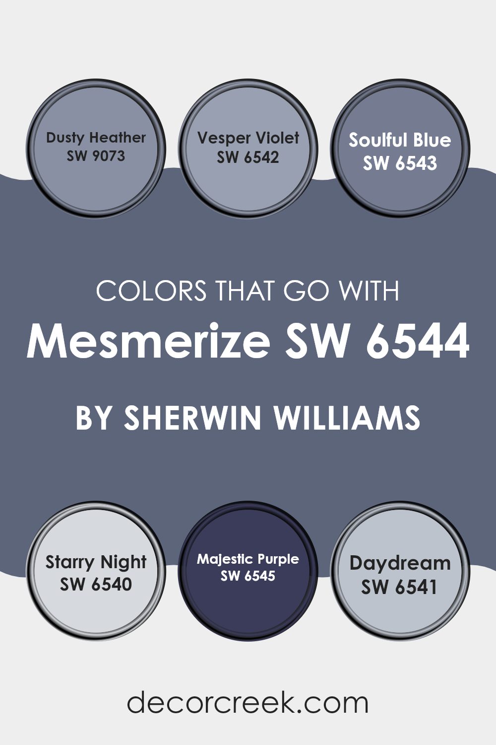
Colors that Go With Mesmerize SW 6544 by Sherwin Williams
Choosing the right colors to pair with Mesmerize SW 6544 by Sherwin Williams enhances the overall look and feel of your space. These complementary colors help create a harmonious balance, making Mesmerize SW 6544 stand out while ensuring the room feels cohesive. When selecting colors such as Dusty Heather, Vesper Violet, Soulful Blue, Starry Night, Majestic Purple, and Daydream, it is essential to consider how they will interact with Mesmerize SW 6544 and impact the room’s atmosphere.
Dusty Heather is a gentle gray with a hint of purple, offering a subtle contrast against the boldness of Mesmerize SW 6544. Vesper Violet has a deeper purple tone, providing a rich backdrop that makes lighter furnishings pop.
Soulful Blue, a soft and gentle blue, works well to create a soothing effect when used alongside the more vibrant Mesmerize. Starry Night is a darker blue, which can give a striking look when paired thoughtfully with Mesmerize’s own depth. Majestic Purple is bright and lively, perfect for adding a splash of energy into a room without overwhelming.
Lastly, Daydream offers a lighter, airy feel with its muted, dream-like quality, ensuring spaces feel open and light. Each of these colors supports Mesmerize SW 6544 in creating a distinctive but unified aesthetic in any room.
You can see recommended paint colors below:
- SW 9073 Dusty Heather
- SW 6542 Vesper Violet
- SW 6543 Soulful Blue
- SW 6540 Starry Night
- SW 6545 Majestic Purple
- SW 6541 Daydream
How to Use Mesmerize SW 6544 by Sherwin Williams In Your Home?
Mesmerize by Sherwin Williams is a vibrant, deep blue paint that can add a bold splash of color to any room in your home. It’s a perfect choice for creating a striking accent wall in your bedroom or living room that really stands out. This color pairs beautifully with bright whites or light grays, which can help to balance its intensity while keeping the space feeling airy and open.
If you appreciate a more harmonious and muted look, consider using Mesmerize on furniture pieces like a bookshelf or a cabinet for a subtle yet impactful presence. Because it’s such a strong color, it also works well in smaller doses, such as for painting door frames or the inside of a closet for a cheerful surprise.
Overall, Mesmerize can bring a fun and lively atmosphere to your space, whether you’re looking to refresh a single piece of furniture or want to make a bold statement on your walls.
Mesmerize SW 6544 by Sherwin Williams vs Revel Blue SW 6530 by Sherwin Williams
Mesmerize and Revel Blue are both vibrant shades by Sherwin Williams. Mesmerize is a calming medium blue with a slightly muted tone, creating a soothing feel that’s perfect for a peaceful vibe in any room. In contrast, Revel Blue is a bolder and brighter blue.
It stands out more and brings a cheerful energy into a space. This makes it a great choice for areas where you want to add a pop of color and liveliness. Both colors can freshen up a room, but Mesmerize leans towards a softer, cozier blue, while Revel Blue is more striking and lively.
Depending on the atmosphere you want to create, you can opt for the gentle warmth of Mesmerize or the dynamic brightness of Revel Blue.
You can see recommended paint color below:
- SW 6530 Revel Blue
Mesmerize SW 6544 by Sherwin Williams vs Distance SW 6243 by Sherwin Williams
Mesmerize is a vibrant teal blue color that instantly catches the eye and adds a lively splash to any room. On the other hand, Distance is a much darker shade of blue, leaning towards navy. It offers a moodier feel, perfect for creating a cozy and somewhat mysterious atmosphere.
Mesmerize is lighter and tends to energize spaces, making it suitable for spaces where you want to feel invigorated, like a kitchen or a home office. In contrast, Distance, with its deep tones, is ideal for areas where a calming, yet powerful impression is desired, such as bedrooms or reading nooks.
While Mesmerize seems to open up a room with its brightness, Distance adds depth and drama, potentially making spaces feel more enclosed but also warmly inviting.
You can see recommended paint color below:

Mesmerize SW 6544 by Sherwin Williams vs Mineral Gray SW 2740 by Sherwin Williams
Mesmerize is a vibrant, bright blue with a lively character. It’s a color that stands out due to its vividness and can give any space a fresh, energetic feeling. It works well in areas where you want an element of cheerfulness and excitement, such as playrooms or creative spaces.
On the other hand, Mineral Gray is a muted, darker grey that has an earthy tone. It’s subtle and unobtrusive, making it an excellent choice for those seeking a neutral backdrop that easily pairs with other colors. This color is ideal for more reserved spaces like offices or bedrooms, where a calming, understated atmosphere is preferred.
Although both colors are from the same brand, they serve very different moods and settings. Mesmerize injects a dose of brightness, whereas Mineral Gray provides a soothing, grounding effect. Their uses depend significantly on what feeling you want to achieve in your room.
You can see recommended paint color below:
- SW 2740 Mineral Gray

Mesmerize SW 6544 by Sherwin Williams vs Purple Passage SW 6551 by Sherwin Williams
Mesmerize SW 6544 and Purple Passage SW 6551 are two distinct colors by Sherwin Williams. Mesmerize is a deep, bold blue that has a vivid and dynamic feel to it. It’s the kind of color that might remind you of the ocean on a stormy day, giving a room a strong presence and can make a real statement when used on walls or accent pieces.
On the other hand, Purple Passage is a lighter, softer purple. This hue offers a gentle and airy feel, which makes it great for creating a relaxing vibe in spaces like bedrooms or bathrooms. It pairs well with light neutrals and can help brighten up a space while keeping things colorful but not overwhelmingly so.
Overall, while both colors are rich and can add a lot of character to a space, Mesmerize leans more towards a dramatic and intense aesthetic, whereas Purple Passage is more understated and soothing.
You can see recommended paint color below:
- SW 6551 Purple Passage
Mesmerize SW 6544 by Sherwin Williams vs Gibraltar SW 6257 by Sherwin Williams
Mesmerize SW 6544 is a vibrant and bold teal shade that really catches the eye. It leans more towards the blue end of the teal spectrum, giving off a cheerful and energetic vibe. This color is lively and perfect for a space that needs a pop of color to liven it up.
On the other hand, Gibraltar SW 6257 is a much darker shade, similar to a deep charcoal with a hint of blue. It’s a stronger, more reserved color that exudes a sense of calmness and stability. Gibraltar is more subtle in its impact but provides a solid, grounding presence in any room.
Both colors bring their own unique qualities to a space. Mesmerize is more outgoing and playful, making it great for a creative or social area. Gibraltar offers a more understated elegance, suitable for creating a focused or relaxing environment. Each has its charm, depending on what atmosphere you want to achieve in your space.
You can see recommended paint color below:
Mesmerize SW 6544 by Sherwin Williams vs Denim SW 6523 by Sherwin Williams
“Mesmerize” and “Denim” by Sherwin Williams are two distinctive blue shades that can give a room different vibes. “Mesmerize” is a vibrant, deep blue that really stands out on walls, perfect for creating a bold statement.
This color can make small spaces feel more inviting or add a pop of color to a muted room. On the other hand, “Denim” is a lighter shade of blue that mimics the classic blue of denim jeans. It is more subtle than “Mesmerize” and works well for a relaxed, casual feel in a room.
This shade is great for living spaces or bedrooms where you want a calm, laid-back atmosphere. Both colors are versatile and can be used in various decorating styles, but “Mesmerize” leans towards a more dynamic look, while “Denim” offers a softer touch.
You can see recommended paint color below:
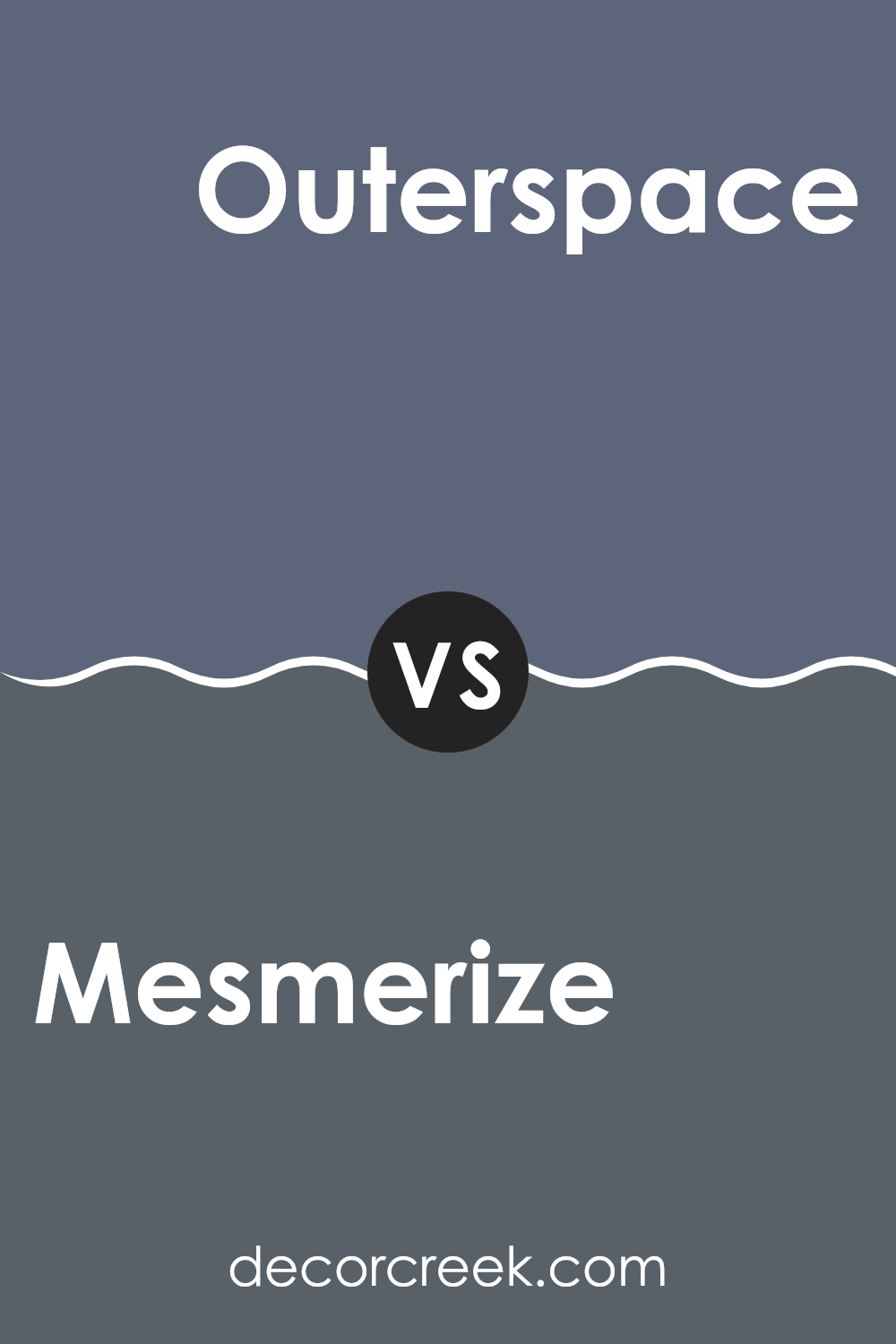
Mesmerize SW 6544 by Sherwin Williams vs Outerspace SW 6251 by Sherwin Williams
The main color, Mesmerize, is a vibrant and rich blue with a lively quality that catches the eye. It has a brightness that can liven up a space, making it feel more inviting and cheerful. In contrast, Outerspace is a much darker, almost charcoal-like blue.
It offers a more reserved and subtle approach, ideal for creating a feeling of coziness and comfort in a room. While Mesmerize can be a focal point in a design due to its brighter hue, Outerspace tends to serve as a grounding element, providing depth and balance without overwhelming a space.
These two colors could work well together in a room, with Mesmerize adding highlights and energy, and Outerspace providing a soothing backdrop or accent. The choice between them depends on the desired mood and level of drama in the decor.
You can see recommended paint color below:
Mesmerize SW 6544 by Sherwin Williams vs Ripe Berry SW 9689 by Sherwin Williams
Mesmerize is a soothing, mid-tone blue that brings to mind a calm and clear sky. Its gentle quality makes it a great choice for creating a relaxed atmosphere in a room, ideal for living spaces or bedrooms where a touch of peacefulness is welcome. It pairs well with soft whites or grays for a crisp, clean look.
In contrast, Ripe Berry is a vibrant, deep red with a hint of purple. This color is bold and packs a lot of energy, perfect for making a statement in any space. It works beautifully as an accent wall or in a room where you want to stir up excitement and enthusiasm, such as a dining room or kitchen. Together with dark woods or rich metals, Ripe Berry can create a striking and lively decor.
Both colors offer distinct vibes—Mesmerize is more about calm and coolness, while Ripe Berry is about boldness and warmth. They could complement each other in a space that balances zest and placidity.
You can see recommended paint color below:

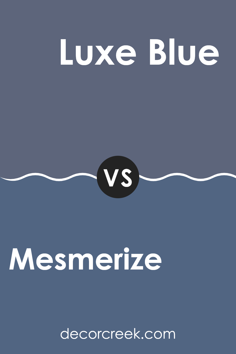
Mesmerize SW 6544 by Sherwin Williams vs Luxe Blue SW 6537 by Sherwin Williams
Mesmerize and Luxe Blue, both by Sherwin Williams, are unique shades of blue that can significantly impact the mood of a room. Mesmerize is a deep, rich teal that has a vibrant yet cozy feel to it. It tends to add a bold touch to spaces, making it great for an accent wall or a room where you want a splash of color that still feels warm.
On the other hand, Luxe Blue is a lighter, more airy blue. It has a freshness to it that can brighten up a space and give it a clean, inviting look. This color works well in bathrooms or kitchens where you want to create a light, breezy feel.
When comparing these two, the choice often comes down to the atmosphere you want to create. Mesmerize draws you in with its depth and warmth, while Luxe Blue offers a calming, open vibe. Both colors can effectively beautify a space, but their impacts are distinctly different based on their depth and brightness.
You can see recommended paint color below:
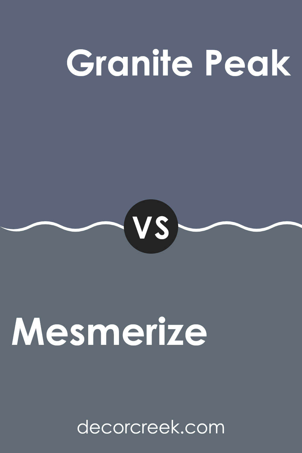
Mesmerize SW 6544 by Sherwin Williams vs Granite Peak SW 6250 by Sherwin Williams
Mesmerize is a vivid blue shade that immediately grabs attention. It’s bright and has a playful feel, perfect for adding a splash of energy to a space. On the other hand, Granite Peak is a much darker, slate-like color.
This deeper blue has a hint of gray, making it more muted and great for a subtle, calming effect in a room. While Mesmerize is lively and could be ideal for a kid’s room or a creative space, Granite Peak suits areas where you’d prefer a more understated look, such as bedrooms or offices.
Both colors offer a unique vibe, but the choice between them depends on how bold or subdued you want your space to feel.
You can see recommended paint color below:
Conclusion
One great thing about Mesmerize is that it works well with lots of other colors. Whether you pair it with soft whites for a peaceful look or bold colors like yellow for a bit more fun, it always looks good. This makes it easy to use in your home without having to change everything else around it.
Using Mesmerize can also change the mood of a room. It has a way of making a place feel more welcoming and can even make small rooms seem a bit bigger. This is really handy if you’re trying to make the most out of your living spaces.
In short, SW 6544 Mesmerize by Sherwin Williams is a great choice if you’re thinking about adding some new color to your home. It’s pretty, easy to match with other colors, and can really improve how a room feels. If you’re thinking about giving your room a new look, Mesmerize might be the perfect color to start with.
Ever wished paint sampling was as easy as sticking a sticker? Guess what? Now it is! Discover Samplize's unique Peel & Stick samples.
Get paint samples

