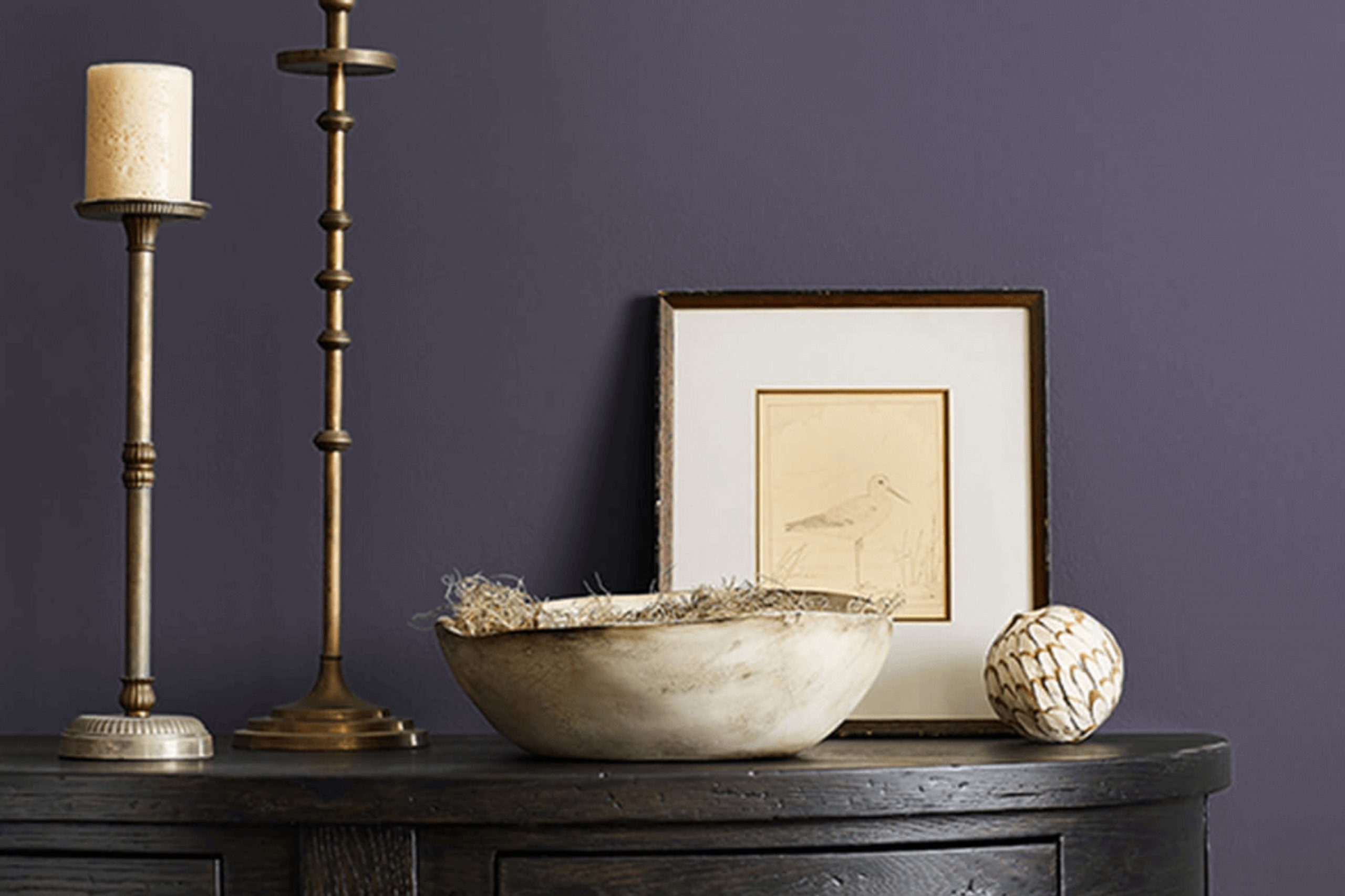
When I think about the color SW 6265 Quixotic Plum by Sherwin Williams, I imagine a shade that feels both rich and intriguing. It is not just purple; it is a color that brings a sense of mystery and coziness. This deep hue has a way of adding warmth and sophistication to any room.
Picture a room painted with Quixotic Plum. The walls seem to draw you in, offering a gentle hug that feels calming yet luxurious. It’s a shade that works well in a library or a reading nook, where the depth of the color can create an ideal backdrop for relaxation or focus.
In a dining room, it can make the atmosphere more intimate and inviting, enhancing the dining experience with friends and family. Using this color is like adding a touch of drama without overpowering the senses.
Paired with lighter accents, it stands out beautifully, while with darker shades, it almost whispers elegance. SW 6265 Quixotic Plum is more than a color; it is an experience that turns a room into a haven of comfort and class. Deploying it in your home means crafting a room filled with warmth and refined beauty.
What Color Is Quixotic Plum SW 6265 by Sherwin Williams?
Quixotic Plum by Sherwin Williams is a rich, deep shade of plum that carries a subtle hint of warmth. Its bold and confident presence makes it a fantastic choice for adding depth and character to any room. This color works particularly well in traditional, bohemian, or eclectic interior styles, where its dramatic tone can shine.
In traditional settings, Quixotic Plum can be used on walls to create a cozy, intimate atmosphere, pairing beautifully with dark woods such as mahogany or walnut. In bohemian areas, this color can be used as an accent on furniture or decor items, blending well with a mix of patterns and eclectic elements.
It also complements various textures such as velvet, leather, or linen, adding an extra layer of visual interest. This plum shade contrasts nicely with metallics like brass or gold, which can bring out its warmth.
For a softer look, materials such as woven baskets, natural fibers, and light woods can provide balance, creating a harmonious room. Quixotic Plum is flexible enough to be used in living rooms, bedrooms, or even dining areas, making it a delightful color for those wanting something rich and inviting.
Is Quixotic Plum SW 6265 by Sherwin Williams Warm or Cool color?
Quixotic Plum by Sherwin Williams is a bold, deep color that brings warmth and depth to any room. This rich plum shade can make a room feel cozy and inviting. It’s a great choice for bedrooms or living rooms where a comfortable, relaxed atmosphere is desired.
The color works well with neutral tones, such as soft grays or warm beiges, creating a balanced look that isn’t overpowering. Quixotic Plum can also add a touch of drama when used as an accent wall, paired with lighter colors to keep the room feeling open.
This hue complements various decor styles, from traditional to modern, allowing for versatility in its application. Additionally, its deep tones can enhance architectural features or artwork, drawing attention to these elements. By using Quixotic Plum strategically, homeowners can create a unique and stylish ambiance that is both welcoming and aesthetically pleasing.
Undertones of Quixotic Plum SW 6265 by Sherwin Williams
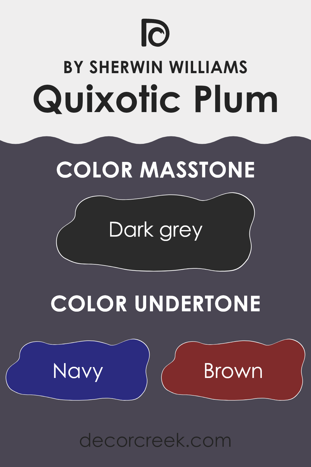
Quixotic Plum by Sherwin Williams is a unique shade that evokes a sense of depth and complexity. This paint color is primarily a deep, rich plum, but its beauty is enhanced by several subtle undertones. These include shades of navy, brown, purple, dark green, dark turquoise, olive, and grey. Each undertone interacts with the main color, influencing how it looks in different lighting and against various decor.
Undertones in paint can affect how a color is perceived in changing light conditions. For instance, a room with natural light might bring out the navy or dark turquoise undertones, giving the room a cooler feel. In contrast, warm artificial light might highlight the brown or olive tones, making the room feel cozier.
For interior walls, the undertones of Quixotic Plum play an important role. The grey undertone can help neutralize the boldness, making it more adaptable to different settings. The dark green and olive undertones add an earthy touch that can pair well with natural or organic materials.
Meanwhile, elements of purple and brown enhance the warmth and depth of the color, making it suitable for creating a comforting, enveloping atmosphere in living rooms or bedrooms. The color’s versatility means it can be both striking and harmonious, depending on how it’s used with furniture and decor.
What is the Masstone of the Quixotic Plum SW 6265 by Sherwin Williams?
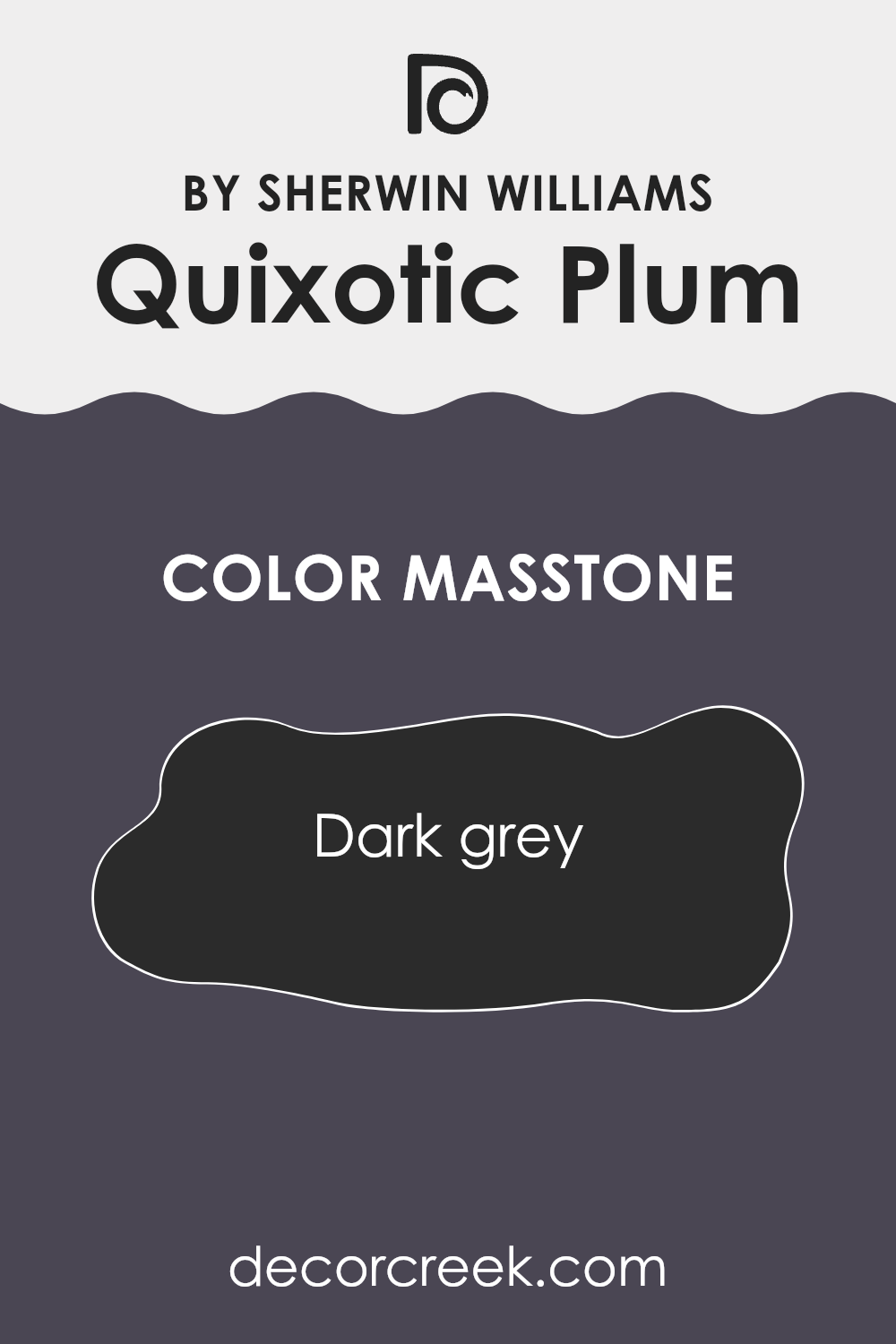
Quixotic Plum by Sherwin Williams, with its deep dark grey tone, offers a rich and moody backdrop for any room. The masstone, #2B2B2B, adds a sense of depth and can give a room a bold but calming atmosphere.
This color works well in both living rooms and bedrooms, creating a cozy environment that’s perfect for relaxation or intimate gatherings. In a living room, pairing Quixotic Plum with lighter accents or neutral furniture can create a balanced look, preventing the area from feeling too dark.
In bedrooms, this shade can make the area feel warm and snug, especially when combined with soft lighting. The dark grey undertone helps to create a neutral base, making it flexible enough to pair with a variety of colors and textures, from vibrant artwork to earthy tones
. Overall, Quixotic Plum offers homeowners a flexible option that can add character and depth to their living rooms.
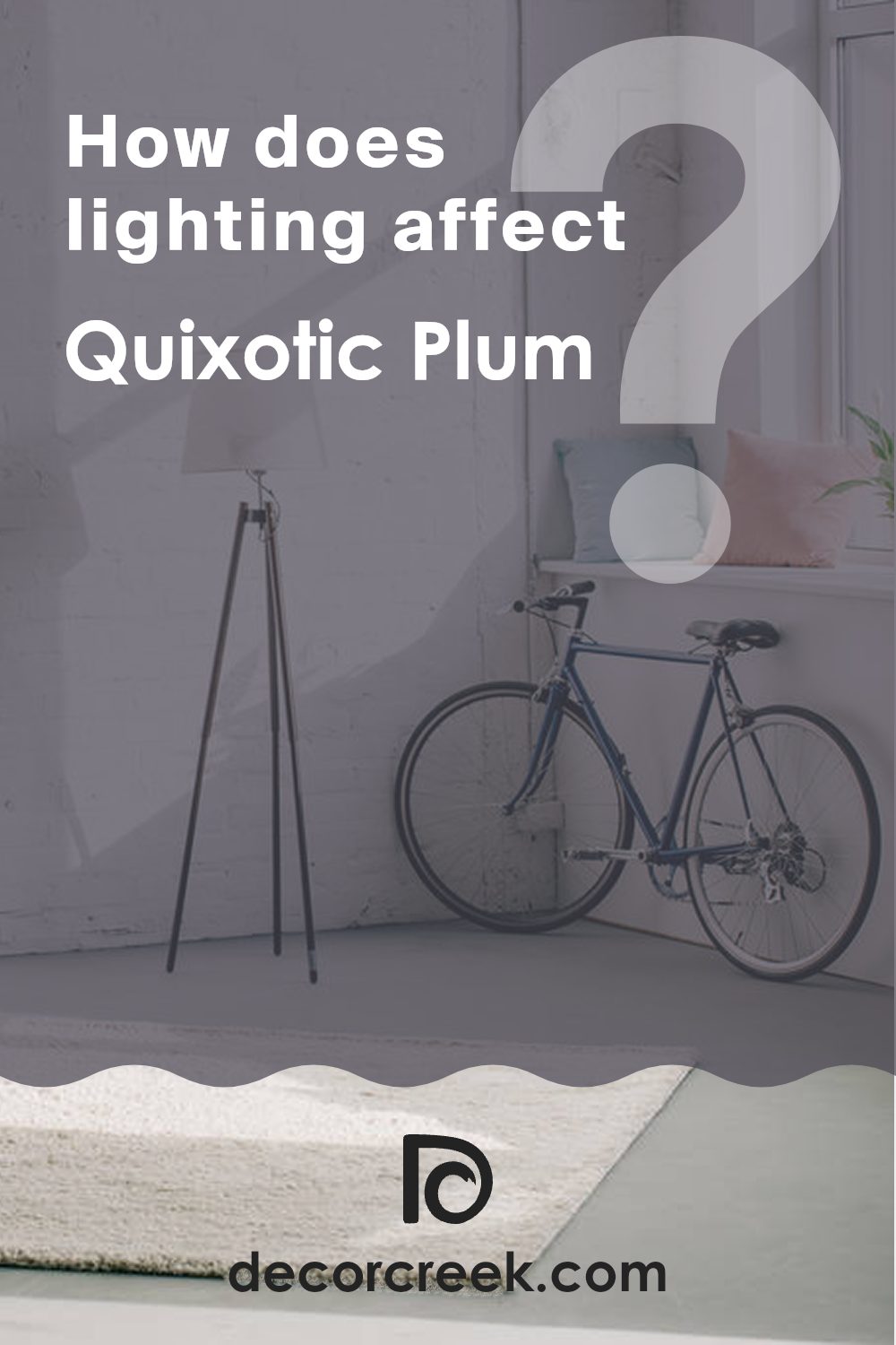
How Does Lighting Affect Quixotic Plum SW 6265 by Sherwin Williams?
Lighting plays a significant role in how we perceive colors. The color Quixotic Plum by Sherwin Williams can look quite different depending on the type of light and the room’s direction. In natural light, Quixotic Plum appears rich and full-bodied.
The depth of the color is pronounced, and it leans towards a dark, muted plum that can feel cozy and inviting. However, the effect changes with the direction of the light. In north-facing rooms, which receive cooler and less direct sunlight, colors often appear muted. Quixotic Plum can take on a slightly grayer tone in these conditions, diminishing some of its warmth and making it look more subdued.
South-facing rooms, on the other hand, are sunlit throughout most of the day. Here, Quixotic Plum is likely to appear warmer and more vibrant, with the sunlight enhancing its reddish undertones. This can make the color feel more lively during the day while maintaining its depth.
East-facing rooms get bright sunlight in the morning but become cooler and duller as the day goes on. In the mornings, you might see the true richness of Quixotic Plum, but as afternoon approaches, the color can appear darker and moodier.
West-facing rooms experience the opposite, being dimmer in the morning and becoming brighter in the afternoon and evening. In these rooms, Quixotic Plum may look less inviting in the morning but develop a rich, comforting glow later in the day as the warm afternoon light intensifies its plum tones.
Under artificial light, such as incandescent bulbs, Quixotic Plum may appear warmer and even take on a slightly reddish hue. LED lights with cooler tones can bring out the cooler aspects of the color, making it look more refined. The type and intensity of artificial lighting play a crucial role in color perception, greatly affecting how Quixotic Plum is experienced in a room.
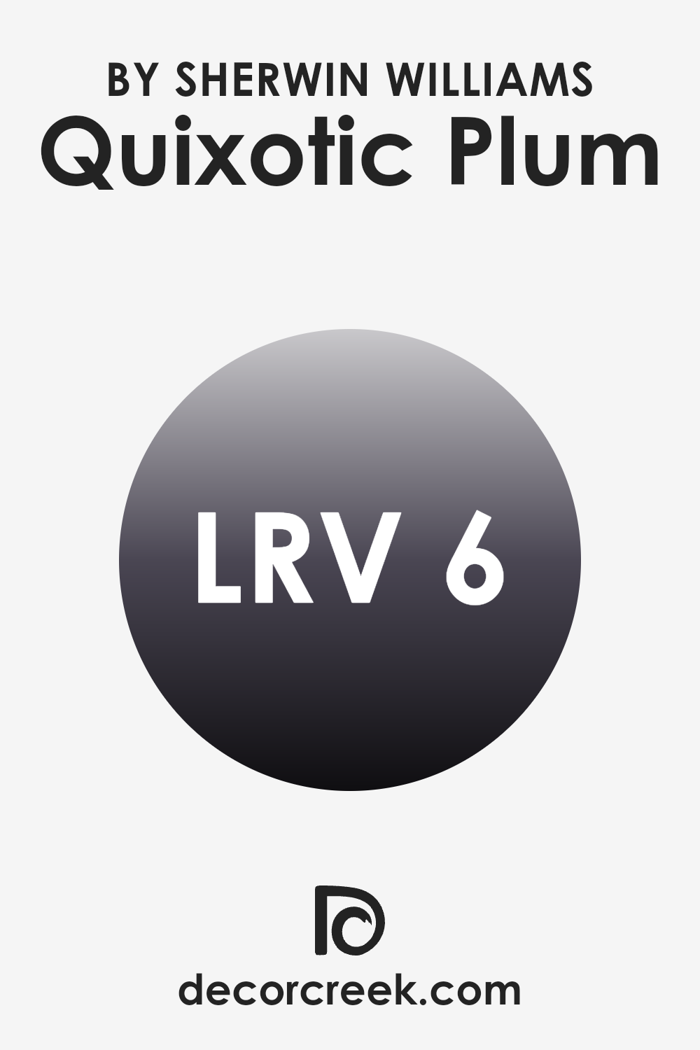
What is the LRV of Quixotic Plum SW 6265 by Sherwin Williams?
LRV, or Light Reflectance Value, is a measure that tells us how much light a color will reflect. This value ranges from 0 to 100, where 0 means the color absorbs all light and reflects none, making it very dark, and 100 means it reflects all light, making it very bright.
When it comes to painting walls, the LRV can greatly affect how a color looks in a room. Lighter colors with higher LRV values can make a room feel more open and airy because they reflect more light. In contrast, darker colors with lower LRV values absorb more light and can create a cozy or dramatic atmosphere.
For Quixotic Plum SW 6265, with an LRV of 6.47, it’s quite a dark shade. This means it will absorb most of the light in a room, making it ideal for creating a warm, intimate setting. The low LRV value indicates that this color can make a room feel more enclosed and snug, which might be an excellent choice for a cozy reading nook or a bedroom where you want to create a soothing retreat.
However, in rooms with little natural light, this color might make the feel smaller, so it’s best used in areas where lighting can be easily controlled, or with plenty of artificial lighting to balance out its depth.
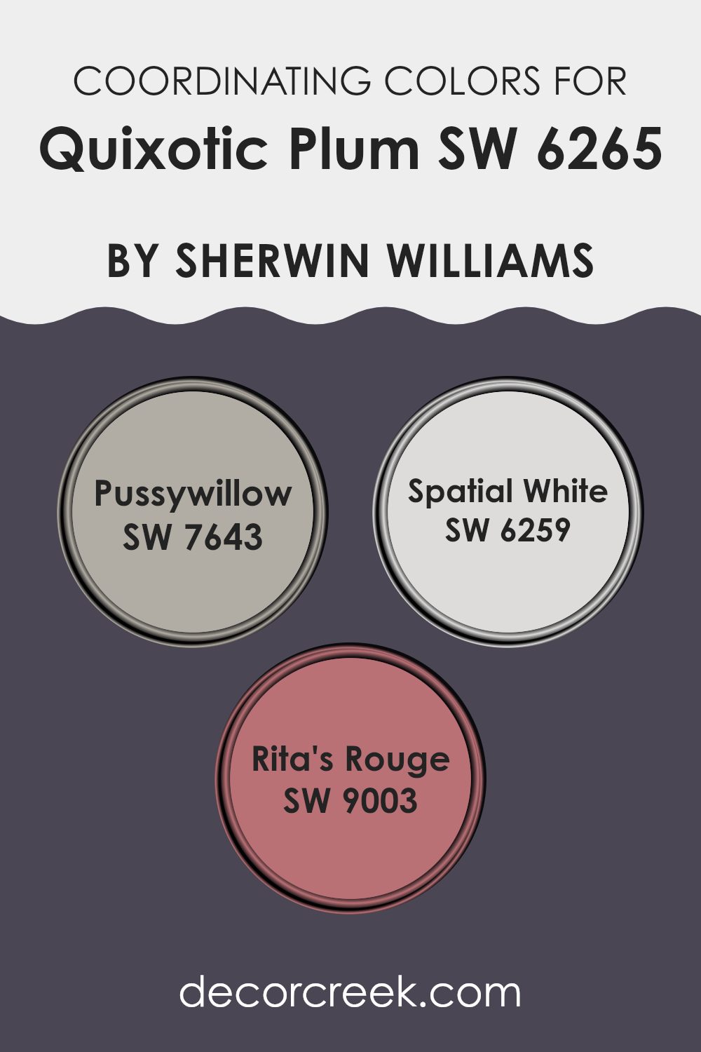
Coordinating Colors of Quixotic Plum SW 6265 by Sherwin Williams
Coordinating colors are hues that harmonize well with a dominant shade, enhancing the visual appeal of a room by complementing each other. When working with Quixotic Plum from Sherwin Williams, these coordinating colors create a balanced and cohesive design. The first coordinating color, Pussywillow, is a soft gray that brings a calm and neutral background, allowing Quixotic Plum’s rich tones to stand out without overpowering the room. This shade provides a subtle contrast and keeps the overall look grounded and refined.
Spatial White is another excellent coordinating color as it is a delicate and slightly warm white. It brightens up a room, ensuring that even with the deep tones of Quixotic Plum, the area remains open and airy. It provides a clean backdrop for more intense colors to pop. Adding a lively touch, Rita’s Rouge introduces a warm red tone that adds vibrancy and energy when used alongside Quixotic Plum.
It infuses rooms with a touch of warmth and drama, offering a lively counterpoint to the more relaxing tones. Together, these coordinating colors work in harmony, creating an inviting, well-balanced atmosphere that enhances the main color’s beauty without any single shade overpowering the others.
You can see recommended paint colors below:
- SW 7643 Pussywillow
- SW 6259 Spatial White
- SW 9003 Rita’s Rouge
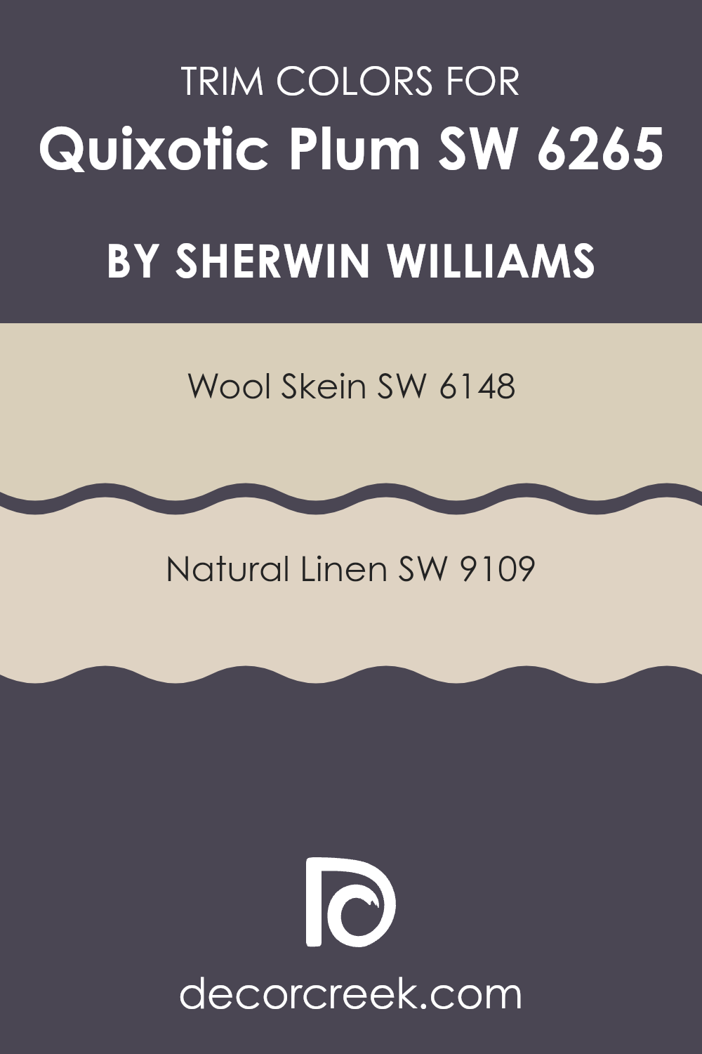
What are the Trim colors of Quixotic Plum SW 6265 by Sherwin Williams?
Trim colors are paint shades used to highlight architectural details like door frames, window sills, and baseboards. They’re key in creating contrast and depth in a room’s design. In the context of using a bold and rich color like Quixotic Plum by Sherwin Williams, picking the right trim colors can make a big difference.
A well-chosen trim color can balance the strong purple tone and enhance the visual appeal of the room. Two effective choices for this purpose are Wool Skein and Natural Linen by Sherwin Williams. These tones provide a soft border that helps the deep purple stand out while maintaining a cohesive look within the room.
Wool Skein is a warm, light beige color with slight yellow undertones that can give a soft and inviting look to any room. It pairs well with Quixotic Plum by providing a gentle contrast that highlights the darker hue. On the other hand, Natural Linen offers a more neutral beige shade that brings a subtle warmth without being overpowering.
It complements the plum color by adding a refined edge to the elegant vibe of the room. Both colors serve to define and refine, making them excellent choices for trim work that highlights the richness of walls painted in such a distinctive hue.
You can see recommended paint colors below:
Colors Similar to Quixotic Plum SW 6265 by Sherwin Williams
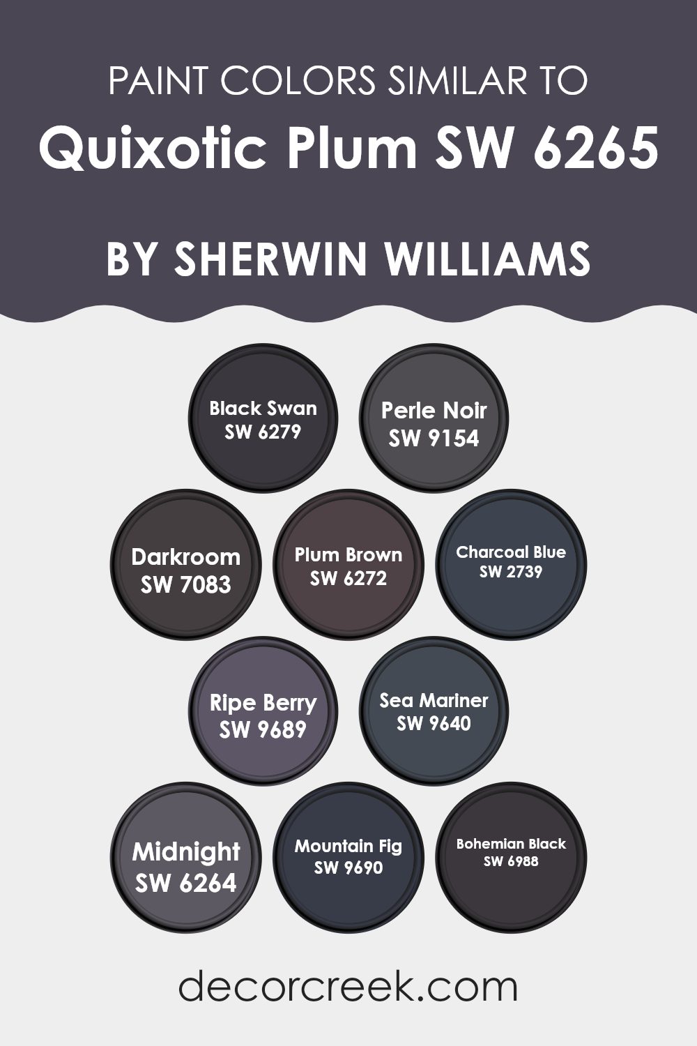
The use of similar colors around Quixotic Plum creates harmony and balance in any room. Each color brings its own unique vibe while maintaining a connection to the main hue. Quixotic Plum is a deep, rich plum that easily pairs with shades like Black Swan and Perle Noir. Black Swan leans towards a dark, soft purple, while Perle Noir offers a mysterious black with a hint of purple. These colors provide depth without overpowering a room, allowing Quixotic Plum to stand out.
Darkroom is a heavy, obscure shade that echoes the depth of a photo studio, while Plum Brown introduces earthy undertones, enhancing Quixotic Plum’s versatility. Charcoal Blue adds a subdued blue-gray, striking a balance between cool and warm.
Ripe Berry, with its lively reddish hue, provides a burst of energy, while Sea Mariner introduces a deep oceanic blue. Midnight, true to its name, is a profound and dark color that emphasizes stillness. Mountain Fig and Bohemian Black bring in subtle touches of nature and dark elegance, respectively. Together, these colors create a cohesive palette that is both expressive and grounded, offering various opportunities for design that feels connected and thoughtfully curated.
You can see recommended paint colors below:
- SW 6279 Black Swan
- SW 9154 Perle Noir
- SW 7083 Darkroom
- SW 6272 Plum Brown
- SW 2739 Charcoal Blue
- SW 9689 Ripe Berry
- SW 9640 Sea Mariner
- SW 6264 Midnight
- SW 9690 Mountain Fig
- SW 6988 Bohemian Black
Colors that Go With Quixotic Plum SW 6265 by Sherwin Williams
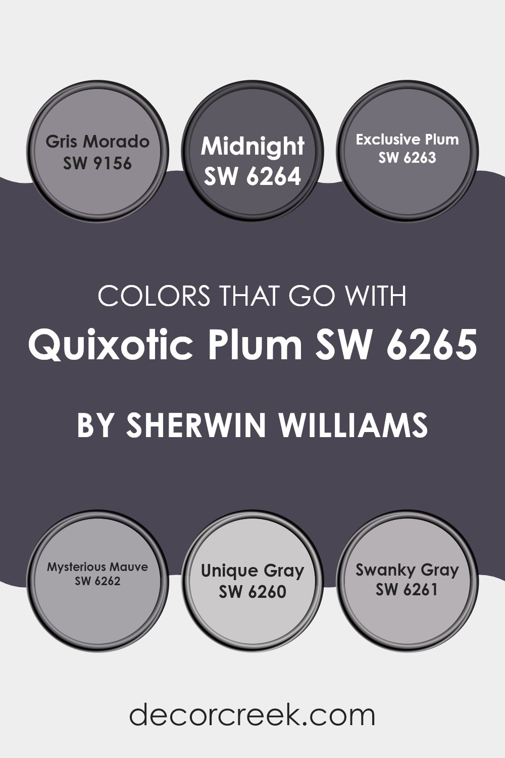
Quixotic Plum by Sherwin Williams is a deep and rich plum color that brings a warm and inviting feel to any room. The colors that pair well with it are carefully chosen to enhance its beauty and create a harmonious environment. Gris Morado is a soft gray with a hint of purple, adding depth and a subtle contrast to the strong presence of Quixotic Plum.
Midnight is a dark, inky blue that contrasts beautifully, providing a sense of drama and sophistication. Exclusive Plum is another shade of plum that complements the main color perfectly, offering a seamless transition and a uniform look. Mysterious Mauve is a lighter purple that introduces a gentle, muted effect, calming the intensity of Quixotic Plum without losing its charm.
Unique Gray is a neutral tone with slight undertones of purple that act as a balancing backdrop, enabling the plum to stand out without being overpowering. Swanky Gray leans more into warm gray, providing a cozy and welcoming atmosphere while enhancing the luxurious feel of Quixotic Plum.
Together, these colors work flawlessly to highlight the unique character of Quixotic Plum, making a room feel well-thought-out and cohesive.
You can see recommended paint colors below:
- SW 9156 Gris Morado
- SW 6264 Midnight
- SW 6263 Exclusive Plum
- SW 6262 Mysterious Mauve
- SW 6260 Unique Gray
- SW 6261 Swanky Gray
How to Use Quixotic Plum SW 6265 by Sherwin Williams In Your Home?
Quixotic Plum SW 6265 by Sherwin Williams is a rich and deep shade of purple that can add warmth and elegance to any home. It’s a flexible color that works well in different areas. In a living room, you can use this color on an accent wall to create a cozy and inviting atmosphere. Pairing it with neutral furniture and decor will make the color stand out without overpowering the room.
In a bedroom, Quixotic Plum can be used to create a calming and intimate room. Painting all the walls this rich purple, and adding soft, light-colored bedding and accessories, can make the room feel like a relaxing retreat.
In a dining room, this color can add a touch of luxury and is complemented well by metallic accents, such as gold or silver. Overall, Quixotic Plum is a bold choice that can enhance the look and feel of different areas in your home.
Quixotic Plum SW 6265 by Sherwin Williams vs Bohemian Black SW 6988 by Sherwin Williams
Quixotic Plum and Bohemian Black are two distinctive colors offered by Sherwin Williams that present unique characteristics. Quixotic Plum is a rich, deep plum that feels warm and elegant. It brings a sense of comfort and luxury to a room, making it ideal for adding a touch of color without being overpowering.
The shade works well in settings where you want to introduce a bit of drama and depth, such as a living room or bedroom accent wall. On the other hand, Bohemian Black is a bold, strong black. It provides a sleek and modern look, perfect for creating contrast or a clean backdrop.
It’s flexible and can be used to make other colors pop, or on its own for a dramatic effect. When combined, Quixotic Plum can be used to add warmth to the coolness of Bohemian Black, resulting in a stylish and refined environment.
You can see recommended paint color below:
Quixotic Plum SW 6265 by Sherwin Williams vs Midnight SW 6264 by Sherwin Williams
Quixotic Plum and Midnight are two rich colors from Sherwin Williams. Quixotic Plum is a deep, muted purple with a warm undertone, adding a cozy and welcoming feel to a room. It’s flexible and can work well in living rooms, bedrooms, or any room where you want to create a warm atmosphere.
On the other hand, Midnight is a dark navy blue. It’s cooler than Quixotic Plum, giving a room a more dramatic and bold look. Midnight is great for creating a striking feature wall or a refined room, such as an office or a modern living room.
Both colors are dark but have different vibes. Quixotic Plum is softer and warmer, while Midnight is cooler and more intense. When choosing between them, consider the mood you want to create and the existing elements in your room. Each color adds its unique character to a room.
You can see recommended paint color below:
- SW 6264 Midnight
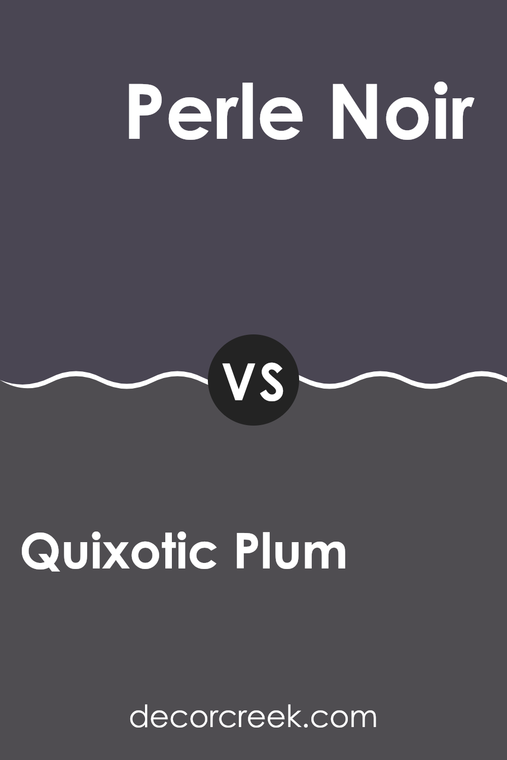
Quixotic Plum SW 6265 by Sherwin Williams vs Perle Noir SW 9154 by Sherwin Williams
Quixotic Plum and Perle Noir, both by Sherwin Williams, are rich, deep colors that can enhance any interior room with their unique qualities. Quixotic Plum is a deep, muted shade of purple that offers warmth and a touch of mystery.
It can add a cozy, inviting feel to a room, making it perfect for areas where you want relaxation and comfort. On the other hand, Perle Noir is a very dark, almost black shade with subtle undertones. This gives it a sleek, modern edge.
It’s ideal for adding drama and elegance to a room, providing sharp contrast when paired with lighter colors. While Quixotic Plum introduces a bit of color with its purple hues, Perle Noir offers a more neutral, refined backdrop. Both colors bring a distinct character to any room: Quixotic Plum is softer and inviting, whereas Perle Noir is bold and striking.
You can see recommended paint color below:
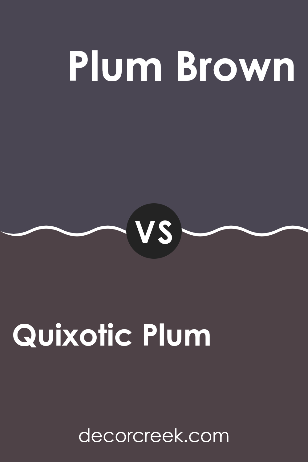
Quixotic Plum SW 6265 by Sherwin Williams vs Plum Brown SW 6272 by Sherwin Williams
Quixotic Plum (SW 6265) and Plum Brown (SW 6272) by Sherwin Williams are both deep, rich colors, but they offer different vibes. Quixotic Plum is a dark, velvety purple with a touch of blue, giving it a cool undertone. It feels dramatic and can add a moody, elegant touch to a room. It’s often used for creating a cozy atmosphere, ideal for bedrooms or living rooms.
On the other hand, Plum Brown is a warmer shade, blending brown and purple. This color brings a sense of earthiness and warmth, making it feel more inviting and grounded. It can be a good choice for areas where a welcoming and cozy atmosphere is desired, like dining rooms or offices.
While Quixotic Plum adds a touch of luxury and mystery, Plum Brown feels more intimate and comforting. Both colors complement each other well, allowing for creative combinations in interior design.
You can see recommended paint color below:
- SW 6272 Plum Brown
Quixotic Plum SW 6265 by Sherwin Williams vs Mountain Fig SW 9690 by Sherwin Williams
Quixotic Plum (SW 6265) by Sherwin Williams is a rich and deep shade of purple that exudes warmth and elegance. It has a luxurious feel, making any room feel cozy and inviting. The color is flexible, suitable for both traditional and contemporary interiors, and pairs well with neutral tones like greys and creams to create a balanced look.
Mountain Fig (SW 9690), on the other hand, is a softer and earthier hue. It has a muted quality, which brings a sense of calm and relaxation to a room. Mountain Fig leans more towards a greyish-purple, making it a great choice for creating a more understated and soothing environment.
Both colors bring distinct vibes to a room: Quixotic Plum adds drama and richness, while Mountain Fig introduces subtlety and calmness. They each offer unique ways to enhance a room, depending on whether you want a bold or tranquil atmosphere.
You can see recommended paint color below:

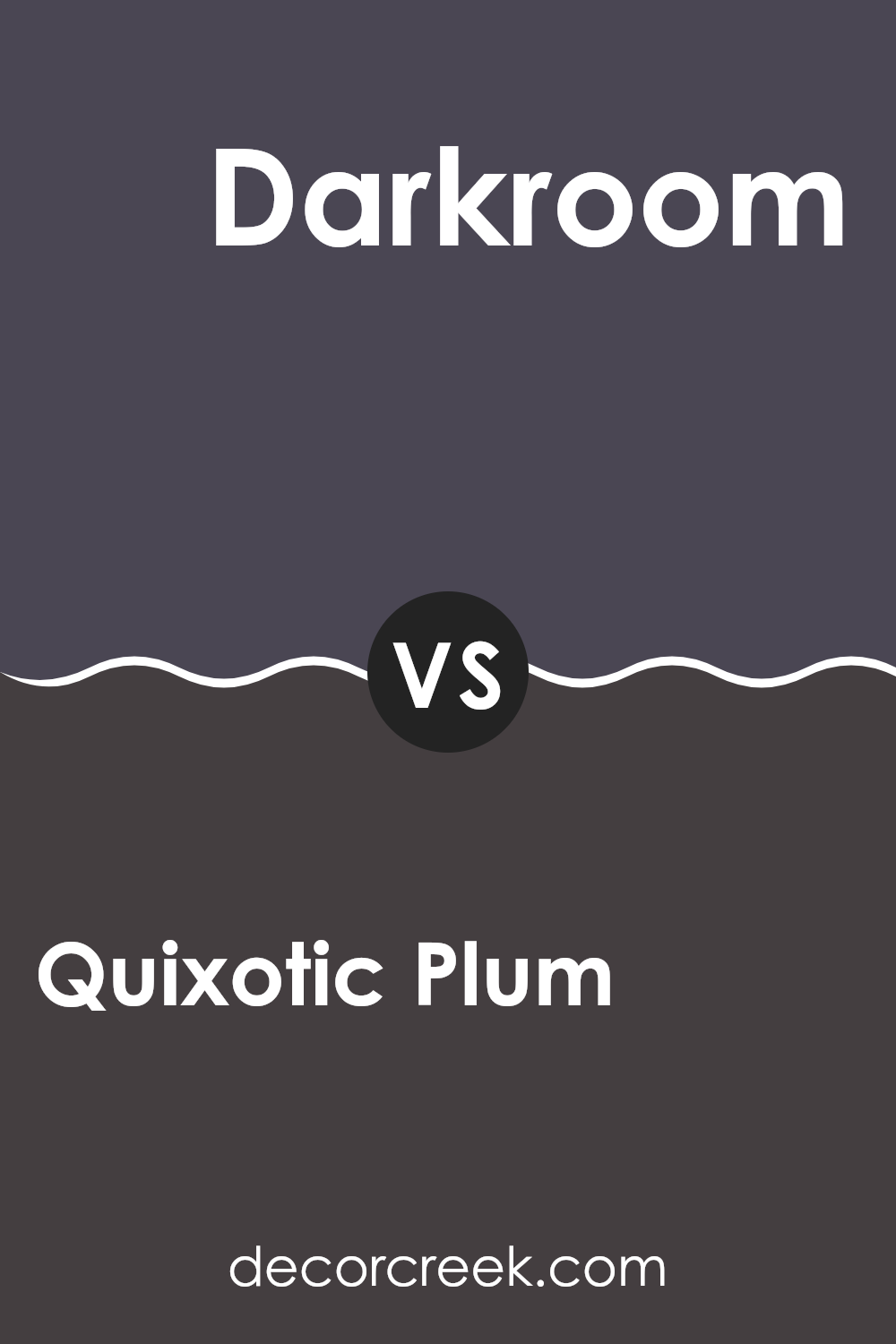
Quixotic Plum SW 6265 by Sherwin Williams vs Darkroom SW 7083 by Sherwin Williams
Quixotic Plum and Darkroom, both by Sherwin Williams, are rich and bold colors, each offering a distinct feel. Quixotic Plum is a deep, warm plum shade with purple undertones. It adds elegance and warmth to any room, creating a cozy and inviting atmosphere. Its richness can stand out in a room, making it a great choice for accent walls or furniture pieces.
Darkroom, on the other hand, is a softer black with subtle, deep undertones that make it more flexible than a pure black. It provides a modern, elegant look and can help create a dramatic effect when used on walls. Unlike the warmth of Quixotic Plum, Darkroom lends an air of coolness and depth.
Together, these colors can complement each other well. Quixotic Plum’s warmth can balance the coolness of Darkroom, creating a harmonious contrast in living rooms or bedrooms.
You can see recommended paint color below:
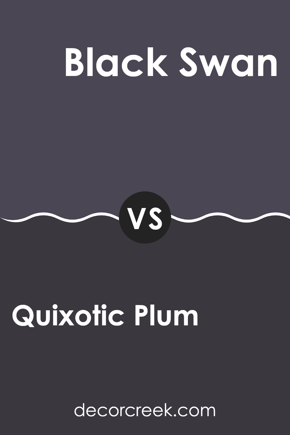
Quixotic Plum SW 6265 by Sherwin Williams vs Black Swan SW 6279 by Sherwin Williams
Quixotic Plum SW 6265 and Black Swan SW 6279 are both deep, rich colors by Sherwin Williams, but they offer distinct moods. Quixotic Plum is a dark, velvety purple that can bring a sense of coziness and warmth to a room. It’s a color that feels comforting and intimate, making it suitable for areas where you want to relax or feel at ease.
On the other hand, Black Swan is a deep, inky black with subtle undertones. It offers a bold and dramatic presence, creating a strong contrast against lighter colors. Black Swan can add a touch of elegance and modern flair to interiors, perfect for highlighting key areas or features.
Both colors are flexible but set different tones. Quixotic Plum leans towards a more inviting atmosphere, while Black Swan adds a sleek, edgy touch. Depending on your desired look, these colors can individually enhance areas in unique ways.
You can see recommended paint color below:
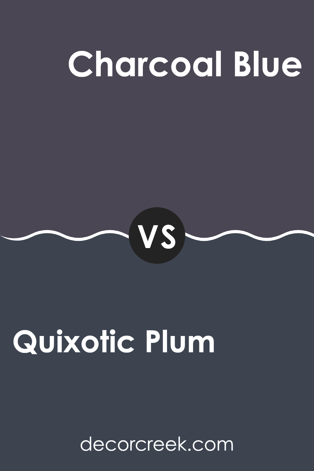
Quixotic Plum SW 6265 by Sherwin Williams vs Charcoal Blue SW 2739 by Sherwin Williams
Quixotic Plum SW 6265 and Charcoal Blue SW 2739 are both deep and rich colors by Sherwin Williams, but offer distinct vibes. Quixotic Plum is a deep, dark purple with a hint of warmth, bringing a sense of coziness and elegance to a room. This color is ideal for creating a bold statement while adding warmth to a room.
On the other hand, Charcoal Blue is more of a moody blue-gray. It has a cool undertone, giving a calm and relaxed feel to any area. This makes it flexible, as it can pair well with various other colors and styles, adding depth without overpowering a room.
While Quixotic Plum is ideal for a dramatic, warm atmosphere, Charcoal Blue offers a cooler, more subdued look. Both colors are elegant choices for someone looking to introduce a darker hue into their decor, but each has a unique personality suited to different areas and moods.
You can see recommended paint color below:
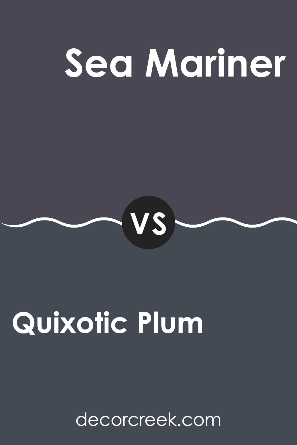
Quixotic Plum SW 6265 by Sherwin Williams vs Sea Mariner SW 9640 by Sherwin Williams
Quixotic Plum and Sea Mariner are two distinct colors by Sherwin Williams. Quixotic Plum is a rich, deep plum color that brings a sense of warmth and coziness to a room. It’s a bold color choice that can add a touch of drama and luxury to any room, making it perfect for accent walls or cozy, intimate settings.
On the other hand, Sea Mariner is a cooler, muted blue with hints of gray. This color has a calming and refreshing vibe, reminiscent of the sea. It’s flexible and can be used in various settings, such as bedrooms or bathrooms, to create a peaceful atmosphere.
While Quixotic Plum provides a cozy warmth, Sea Mariner offers cool calmness. Both colors have unique charm, and the choice between them depends on the mood you wish to create. Quixotic Plum makes a room feel rich and intimate, whereas Sea Mariner feels peaceful and airy.
You can see recommended paint color below:
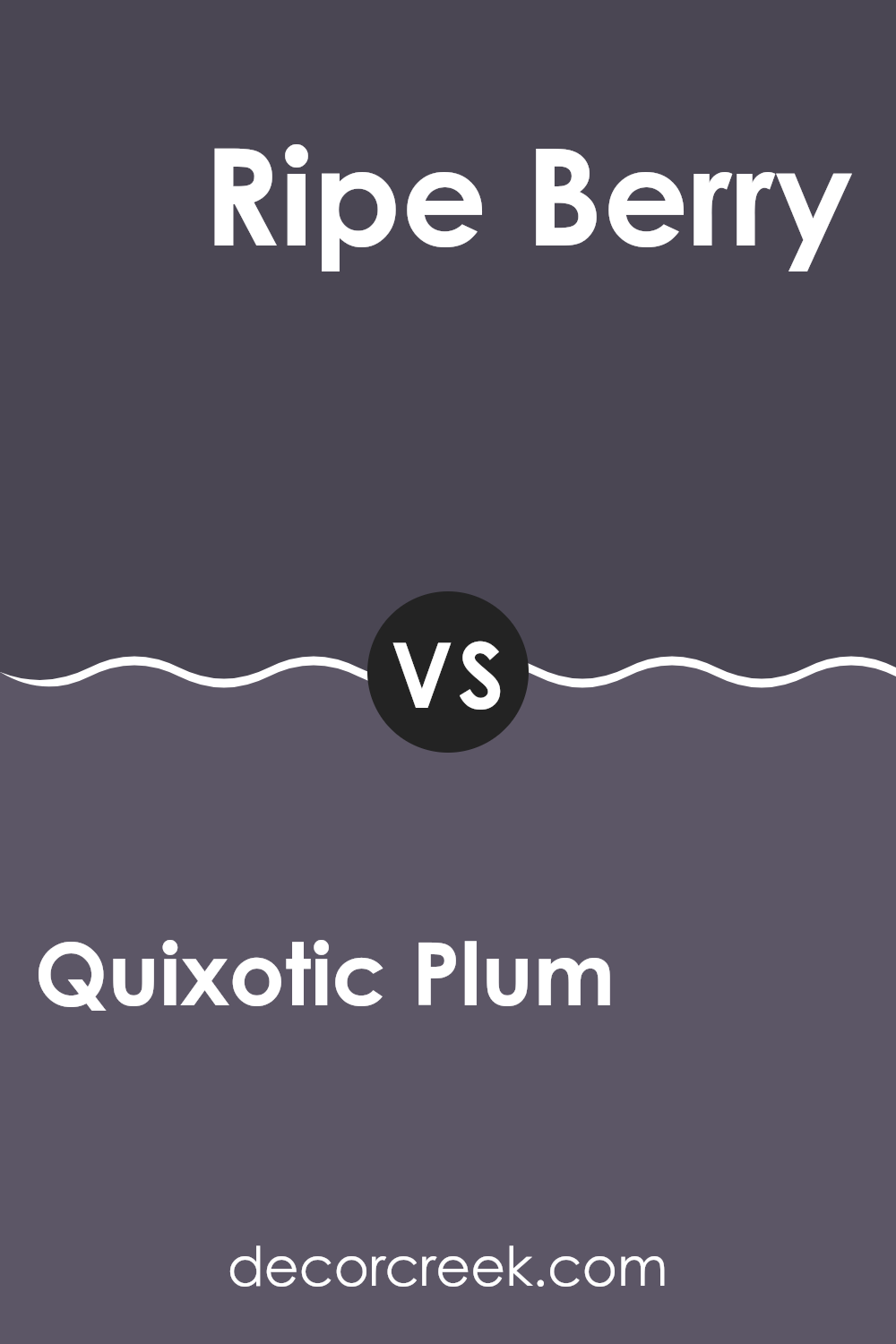
Quixotic Plum SW 6265 by Sherwin Williams vs Ripe Berry SW 9689 by Sherwin Williams
Quixotic Plum and Ripe Berry are two beautiful colors that share similar deep, rich tones but have unique characteristics. Quixotic Plum is a deep, muted purple with subtle gray undertones. It creates a sense of depth and can make a room feel cozy and warm. This color is flexible, working well in both modern and traditional settings.
On the other hand, Ripe Berry is more vibrant, with a clear, strong red undertone that makes it feel lively and energetic. It can add a pop of color to a room, drawing attention and creating a focal point.
While both colors are bold and have a certain elegance, Quixotic Plum is softer and more understated, whereas Ripe Berry is more intense and lively. When choosing between these colors, consider the mood you want to create; Quixotic Plum is calming and refined, while Ripe Berry offers warmth and energy.
You can see recommended paint color below:
After reading the piece about SW 6265 Quixotic Plum by Sherwin Williams, I feel like I’ve gained a new appreciation for colors and how they can change the feel of a room. Quixotic Plum is a rich, deep purple that brings a cozy and warm vibe. It’s a color that stands out but doesn’t shout. I imagine using it in a living room or a bedroom, where it could make the area feel inviting and comfortable, almost like a big, soft blanket.
This color seems perfect for someone looking to add a bit of elegance without going over the top. It’s like wearing a fancy dress but still feeling comfy, like pajamas. It can be paired with softer colors like light grays or whites for a nice balance. This mix would make a room feel both strong and gentle at the same time. I think such a blend can offer a lovely backdrop for family time, reading, or even just relaxing after a long day.
If you’re thinking about painting a room, Quixotic Plum might be a great choice. It’s a color that offers both warmth and style, making any wall look interesting and unique. I believe it could easily make a room feel special without being too much.
It’s like having a little piece of magic on your walls, turning an ordinary room into something memorable.
Ever wished paint sampling was as easy as sticking a sticker? Guess what? Now it is! Discover Samplize's unique Peel & Stick samples.
Get paint samples

