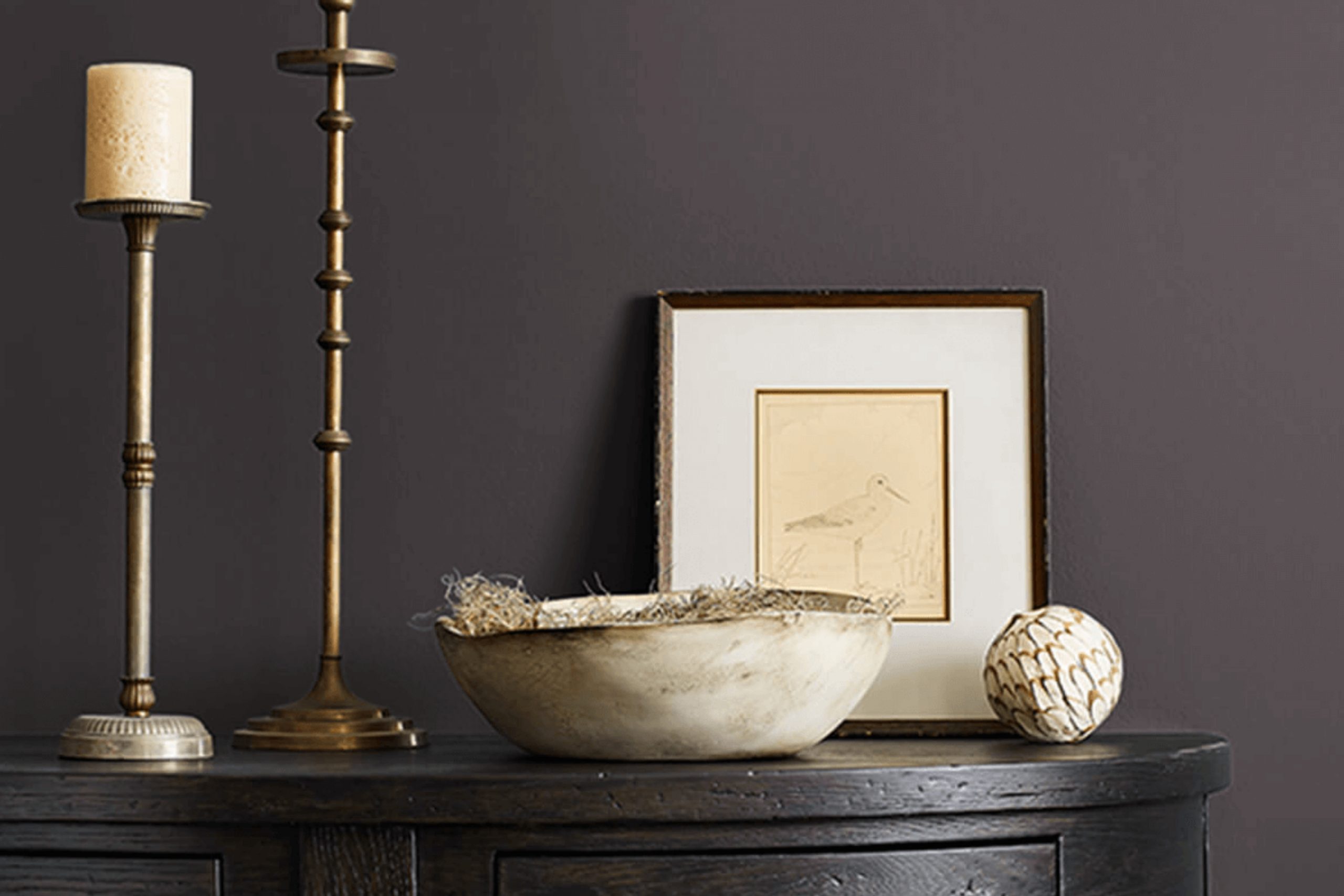
When you first come across Sherwin Williams’ SW 7083 Darkroom, it captures attention with its deep, mysterious allure. This rich and refined color, with its dark, inky tones, brings a sense of depth and intimacy to any room. It feels like a comforting cocoon that wraps around you and invites you to slow down and enjoy the moment.
Darkroom is more than just a shade; it’s a feeling. It has the power to change how you experience a room, evoking warmth and elegance. The shade pairs beautifully with lighter accents and metallics, allowing you to create a balanced and inviting atmosphere. Whether used as an accent wall or for an entire room, it creates a dramatic backdrop that makes art and furnishings stand out in striking contrast.
In rooms where you seek a calm yet striking feel – such as a study, bedroom, or a cozy corner – Darkroom offers a unique character. It fits well in modern rooms but can also blend seamlessly with more traditional or eclectic styles.
Letting the color work its magic, you find yourself drawn into a world of subtle refinement, where every detail of the room comes alive under its charm.
What Color Is Darkroom SW 7083 by Sherwin Williams?
Darkroom SW 7083 by Sherwin Williams is a deep, rich shade of black with warm undertones that creates a cozy and intimate atmosphere in any room. It’s a flexible color that can add depth and drama to a room without feeling too harsh. This elegant hue works well in a variety of interior styles, such as modern, industrial, and even traditional settings.
In modern interiors, Darkroom can be used on accent walls or cabinetry to provide contrast and interest. It pairs beautifully with natural materials like wood and stone, enhancing their textures. In industrial-style areas, this color can complement exposed brick, metal, and concrete, adding to the raw, urban vibe. In more traditional homes, Darkroom can be used in libraries or dining rooms to create a classic, enduring look.
This color also pairs effectively with different textures. Soft fabrics like velvet or linen can create a luxurious feel, while rougher textures like reclaimed wood or jute can add a rustic touch. Metallic finishes like brass or gold can provide warmth and sophistication, while cool metals like steel or chrome offer a modern twist.
Overall, Darkroom SW 7083 is a bold choice that can beautifully enhance various design styles.
Is Darkroom SW 7083 by Sherwin Williams Warm or Cool color?
Darkroom SW 7083 by Sherwin Williams is a rich, deep black that can make a bold statement in any home. This color is perfect for creating an intimate and cozy atmosphere. When used on walls, it can make a room feel enclosed and warm, providing a comforting environment. In larger rooms, Darkroom SW 7083 can add a dramatic and elegant touch without making the room feel too strong.
In homes, this color works well in places like bedrooms and living rooms where a calming and restful environment is desired. It complements lighter colors beautifully, allowing furniture and decor to stand out against its dark backdrop. Adding metallic or bright-colored accents can bring a room to life, creating a striking contrast.
Lighting plays a crucial role in how Darkroom SW 7083 appears. Natural light can soften its intensity, while dim lighting enhances its depth. Overall, it’s a flexible choice for anyone looking to add character and warmth to their home.
Undertones of Darkroom SW 7083 by Sherwin Williams
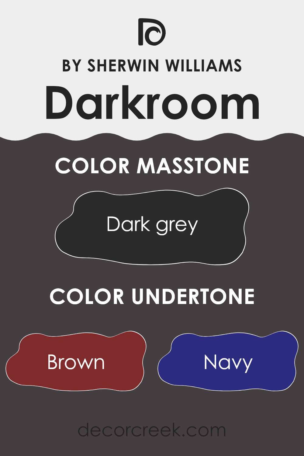
Darkroom SW 7083 by Sherwin Williams is a rich, deep color known for its complexity due to its diverse undertones. These undertones include brown, navy, dark green, purple, olive, dark turquoise, and grey. Each of these subtle hues adds depth and dimension to the paint, making it more than just a simple black or dark color.
When applied to interior walls, these undertones play a significant role in how the color is perceived. For example, in natural daylight, the brown and grey undertones might become more noticeable, giving the room a cozy and warm feel. In contrast, under artificial lighting, the navy or dark green undertones might be more prominent, lending the room a cooler, more refined atmosphere.
The versatility of this color allows it to pair well with a variety of design elements. In rooms with wooden furniture, the brown undertone can create a harmonious balance. When set against lighter, more vibrant decor, the dark green and navy undertones offer a stunning contrast, adding interest and depth to the visual experience.
In essence, the undertones in this paint color ensure that it adapts well to different settings and lighting conditions, offering a unique, dynamic look that changes subtly throughout the day.
What is the Masstone of the Darkroom SW 7083 by Sherwin Williams?
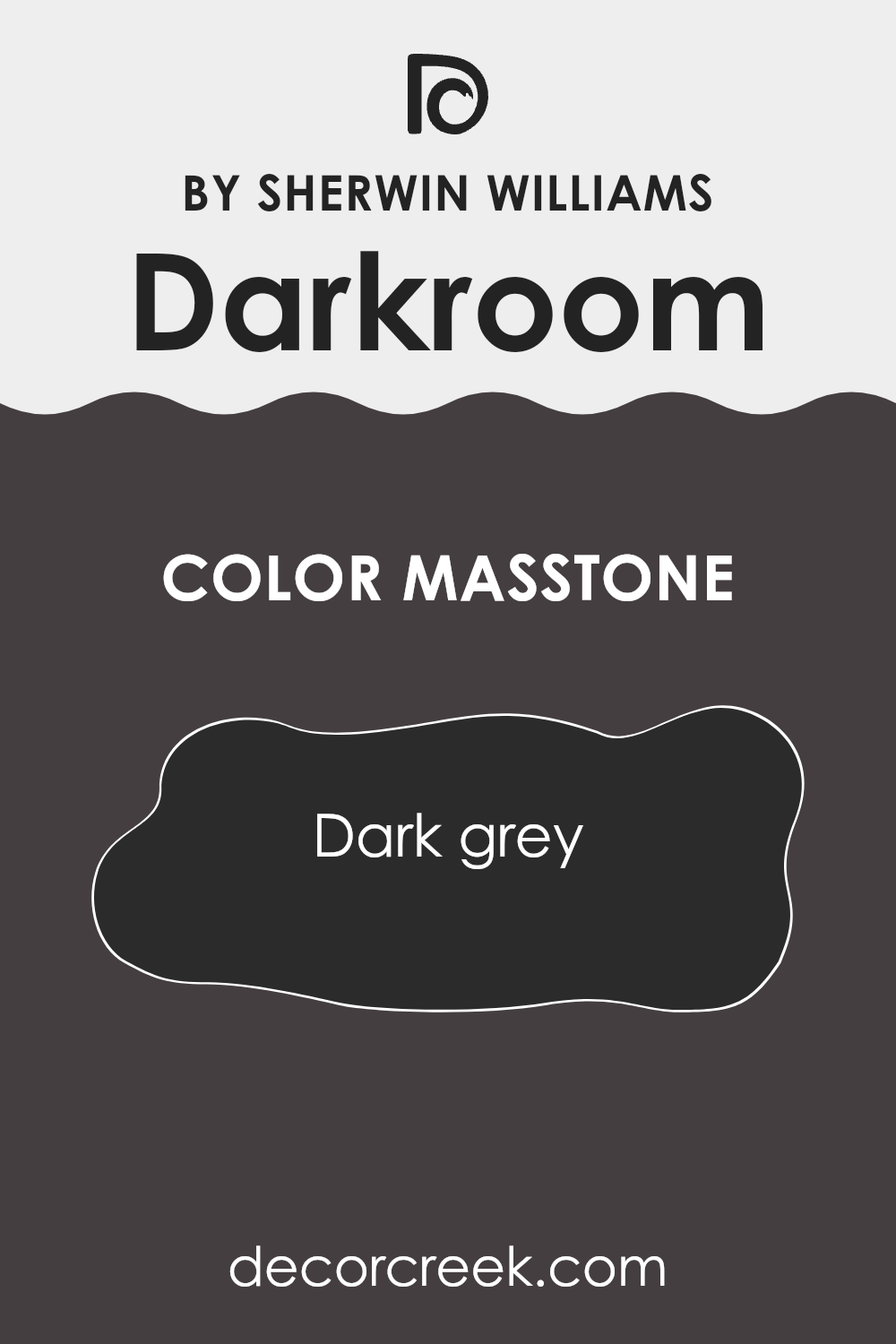
Darkroom (SW 7083) by Sherwin Williams is a dark grey color identified by the code #2B2B2B. This rich, deep hue brings a sense of coziness and warmth into homes. Its dark tone makes it excellent for creating a dramatic look in a room, particularly in areas like living rooms or bedrooms where you want a snug, enveloping atmosphere.
When used on walls, this deep grey can make large rooms feel more intimate. It pairs well with lighter furniture or accents, which stand out against the dark background, adding a striking contrast. Darkroom can be particularly effective in areas with plenty of natural light, as it absorbs excess glare and brings out softer tones.
Despite its intensity, it doesn’t overwhelm; instead, it provides a neutral canvas that supports various styles and colors. This color also works well for highlighting architectural features or as an accent wall, infusing areas with a touch of modernity and sophistication without feeling stark or cold.
How Does Lighting Affect Darkroom SW 7083 by Sherwin Williams?
Lighting plays a significant role in how we perceive colors. The same color can look different depending on the type of light it is under. “Darkroom SW 7083” by Sherwin Williams is a deep, rich color that can change its appearance based on lighting conditions.
In natural light, colors appear more true. However, the direction your room faces can dramatically affect how a color like Darkroom is perceived. In a north-facing room, natural light is cooler and darker, often bringing out the blue undertones in colors. Darkroom in a north-facing room might look deeper and grayer, adding to its moody and refined feel.
In a south-facing room, where the light is warmer and more direct, the color Darkroom will appear warmer and may show more of its red undertones. The light in these rooms tends to be the brightest, which can make the color appear slightly lighter and more dynamic over the course of the day.
East-facing rooms receive warm, soft light in the morning and cooler light in the afternoon. This means that Darkroom SW 7083 may look more vibrant with a hint of warmth in the morning, but it might shift to a cooler tone as the day progresses. This subtle shift can add interest and depth to the room’s appearance throughout the day.
In west-facing rooms, the light is cooler in the morning and becomes warmer later in the day. In these rooms, Darkroom may seem less inviting in the early hours but will glow with warmth as the afternoon sun sets, highlighting its richer tones.
Under artificial lighting, the type of bulb used can affect how Darkroom appears. Incandescent bulbs tend to bring out the warmth in colors, enhancing reds and oranges, potentially giving Darkroom a cozier appearance.
On the other hand, fluorescent lighting, with its cooler tones, may highlight the cooler aspects of the color. LED lights, which come in various tones, can be chosen to either warm up or cool down the room, affecting how the color is perceived.
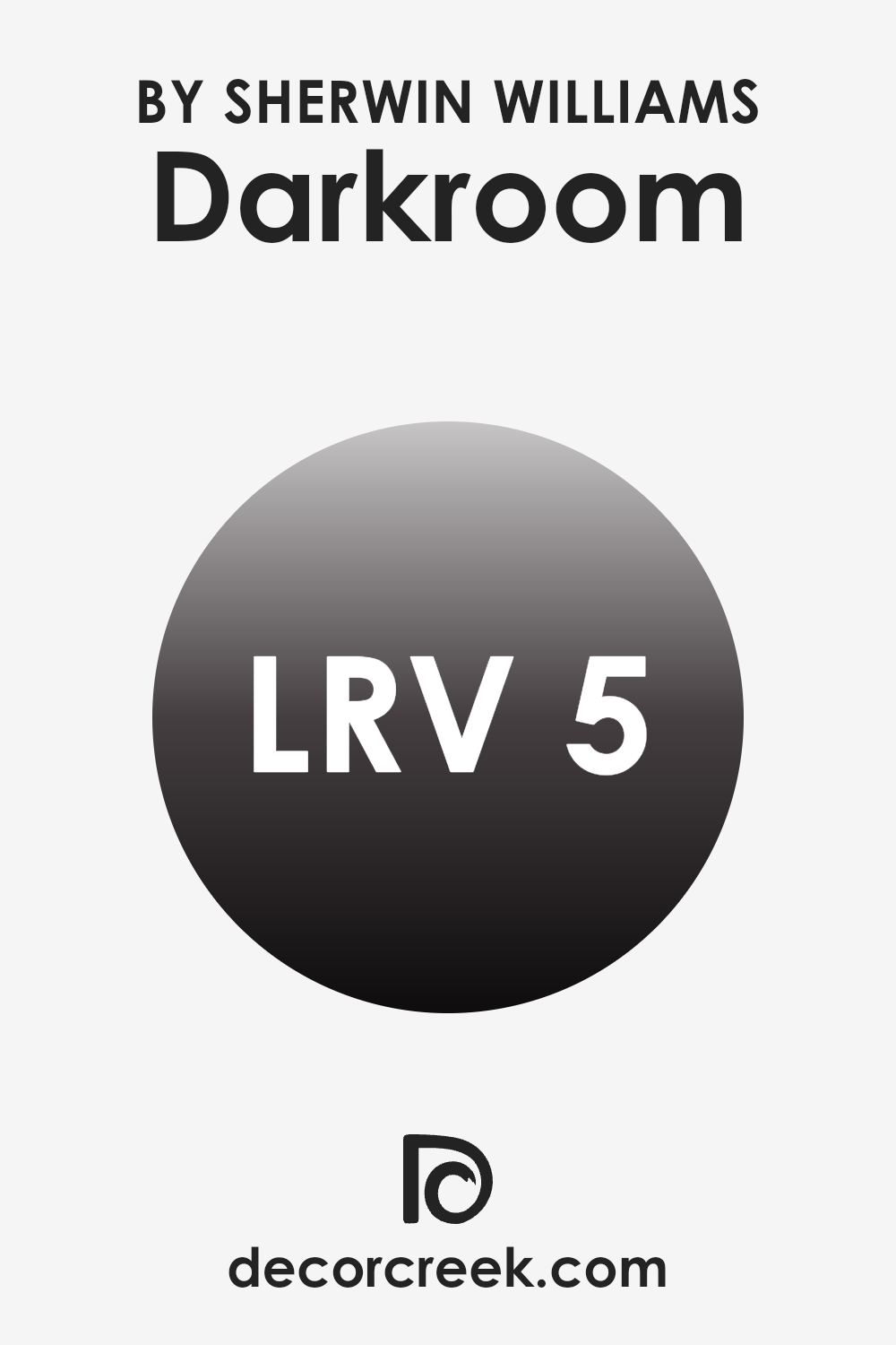
What is the LRV of Darkroom SW 7083 by Sherwin Williams?
LRV stands for Light Reflectance Value, which is a measurement that tells us how much light a paint color reflects. It’s measured on a scale of 0 to 100, where 0 means the color absorbs all light (pure black), and 100 means it reflects all light (pure white). This value is crucial because it informs us about how a paint color will behave in different lighting conditions and how it will make a room feel.
A lower LRV means the color will absorb more light, making it feel darker and sometimes more intimate or cozy. A higher LRV means the color will reflect more light, making a room feel brighter and more open.
Darkroom, with its LRV of 4.992, is a very dark paint color. This means it will absorb most of the light in a room, contributing to a cozy or dramatic mood. With such a low LRV, Darkroom will not reflect much light back into the room, so it could make a room feel smaller or more enclosed, which can be great if you’re aiming for a comfortable and snug environment.
However, in a room with limited natural light, it might feel quite shadowy. It’s important to pair it with good lighting if you don’t want the area to feel too dark, and it can look stunning when contrasted with brighter colors or lighter decor elements.
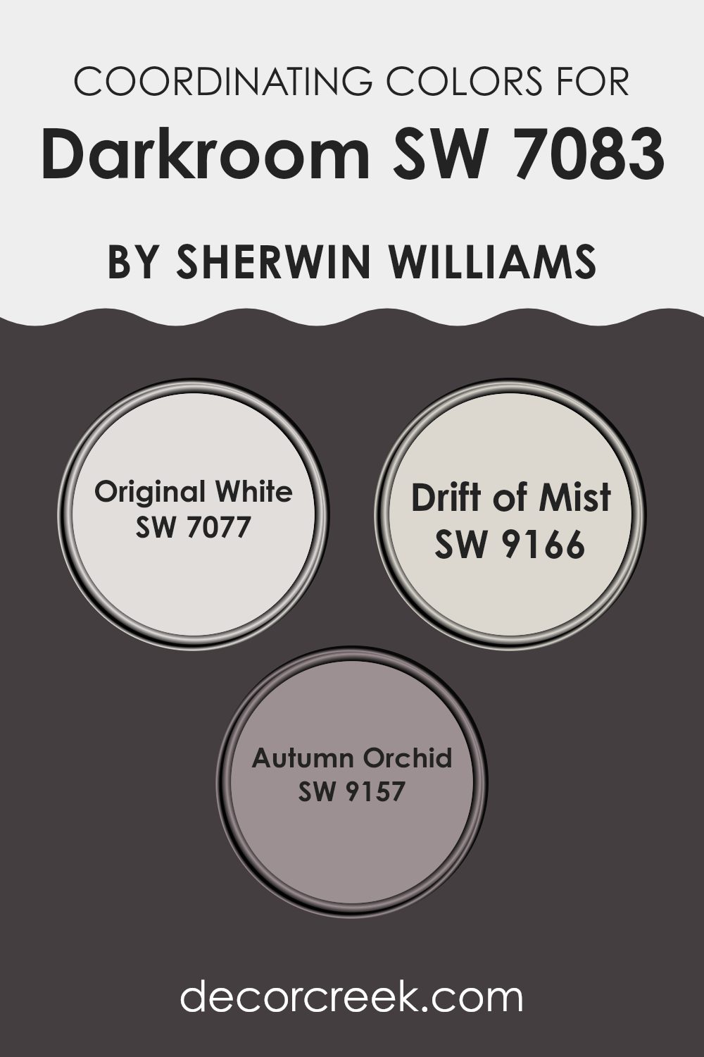
Coordinating Colors of Darkroom SW 7083 by Sherwin Williams
Coordinating colors are shades that complement each other, working together to create a harmonious look in any room. They are chosen based on their ability to bring out the best in each other, highlighting different aspects of a room without clashing.
When used around a central color, like Darkroom by Sherwin Williams, these tones can enhance the overall appearance and vibe of a room. They do this by either providing contrast or blending smoothly, depending on personal preference and the desired effect. Together, they help anchor a room and bring balance.
For this purpose, Original White, Drift of Mist, and Autumn Orchid are perfect companions to Darkroom. Original White is a pure and clean color that offers a crisp, fresh backdrop, making other colors stand out.
Drift of Mist is a soft, barely-there gray that provides a gentle, airy feel, ideal for creating lightness in conjunction with the bold Darkroom shade. Autumn Orchid, with its muted purple tones, adds a touch of warmth and depth, lending a subtle yet inviting elegance to the palette. These coordinating colors work well together, accentuating both the boldness and softness in the room.
You can see recommended paint colors below:
- SW 7077 Original White
- SW 9166 Drift of Mist
- SW 9157 Autumn Orchid
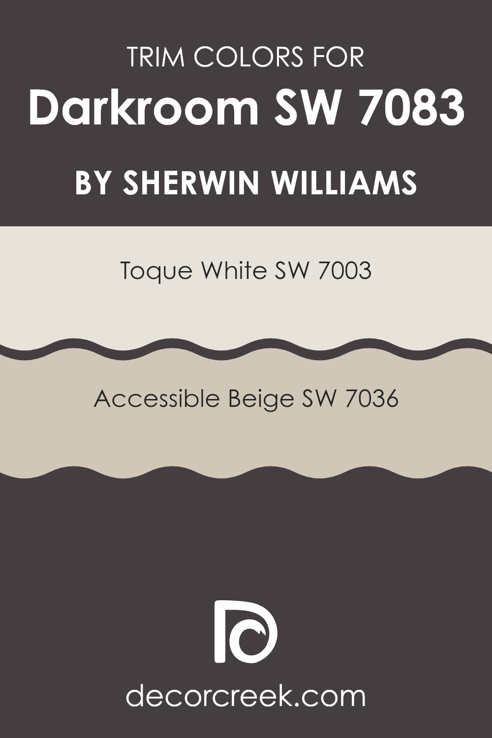
What are the Trim colors of Darkroom SW 7083 by Sherwin Williams?
Trim colors are the finishing touches that help define and highlight different parts of a room, like around windows, doors, and baseboards. They serve as a contrasting frame or border for the main wall color. In this case, we’re discussing how trim colors can complement the rich, deep tone of Darkroom SW 7083.
Using trim colors effectively means balancing the deep and cozy appearance of Darkroom with lighter shades that can provide contrast and help open up the room, ensuring it doesn’t feel too dark or enclosed. This balance can create a more inviting and comfortable mood, making the area both functional and visually appealing.
Toque White SW 7003 is a flexible off-white that brings a crisp and clean look without being too stark or harsh. It’s a soft white that allows other colors to stand out while still providing a subtle warmth to the room. Accessible Beige SW 7036, on the other hand, is a warm beige with grey undertones that provide a neutral, cozy contrast to Darkroom.
It acts as a gentle bridge between the dark wall color and various lighting conditions, maintaining a harmonious balance in the room. Both these trim colors work well with Darkroom, enhancing its depth while keeping the overall room feeling airy and well-designed.
You can see recommended paint colors below:
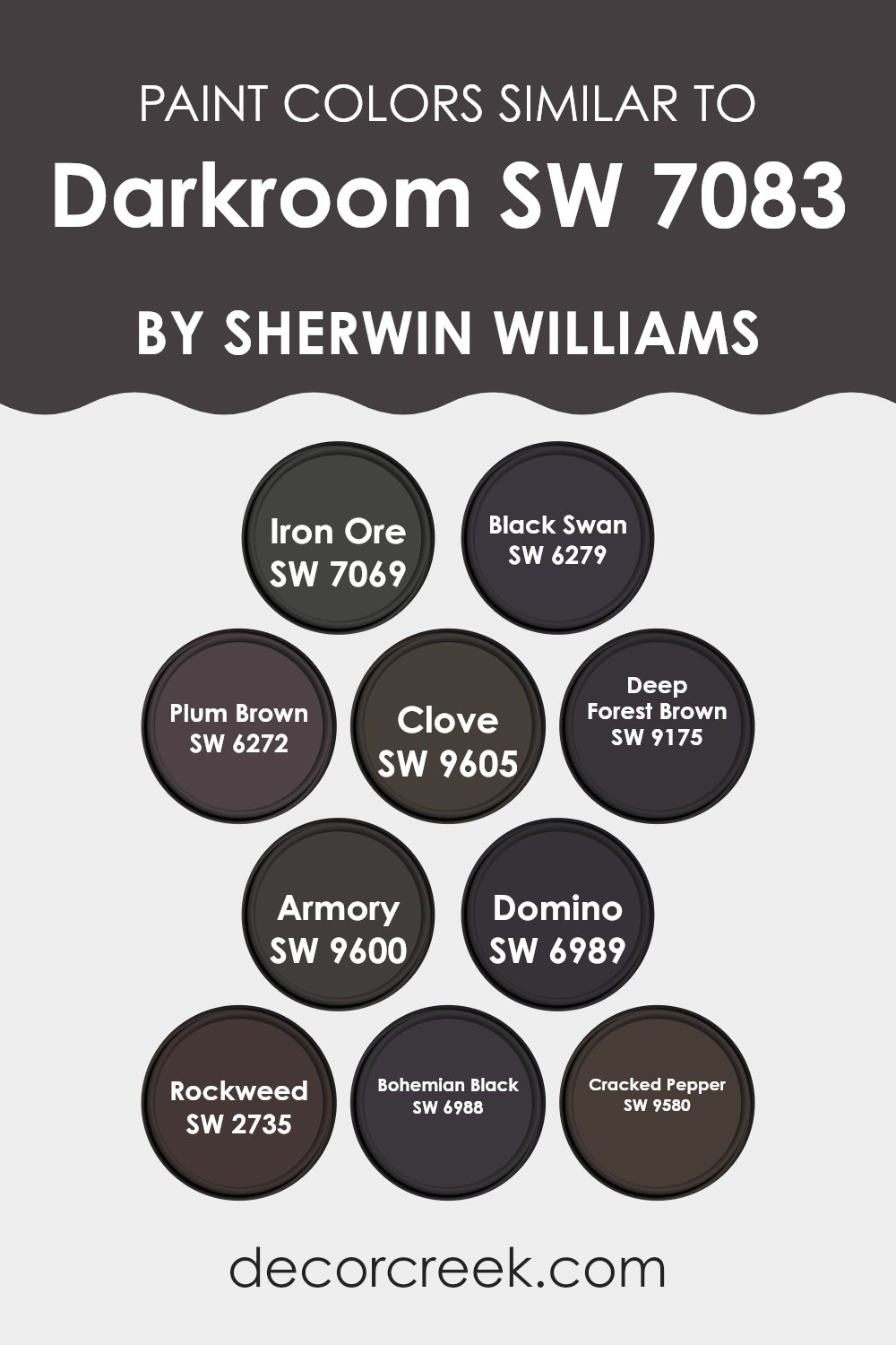
Colors Similar to Darkroom SW 7083 by Sherwin Williams
Similar colors play an important role in design by creating harmony and balance in a room. When you use colors that are close in tone and hue, like Darkroom from Sherwin Williams and its similar shades, you can achieve a cohesive and calming atmosphere. These colors tend to blend well together, enhancing the aesthetics without causing visual distraction.
For example, using SW 7069 Iron Ore, a deep and warm charcoal hue, can provide a strong grounding effect. On the other hand, SW 6279 Black Swan brings a mysterious dark purple touch that adds depth without overpowering other elements in the room.
Colors like SW 6272 Plum Brown and SW 9605 Clove offer earthy, rich tones that can bring warmth and composure to any setting. SW 9175 Deep Forest Brown has a natural feel with its deep, wooded shade. SW 9600 Armory brings in a solid, steely gray that pairs smoothly with these warmer tones.
SW 6989 Domino is a classic black offering lasting elegance, while SW 2735 Rockweed adds a muted, olive-green undertone. SW 6988 Bohemian Black gives a softer, off-black alternative, and SW 9580 Cracked Pepper is a bold, black-gray blend. All these colors are chosen to complement the rich undertones of Darkroom, creating a unified and inviting look.
You can see recommended paint colors below:
- SW 7069 Iron Ore
- SW 6279 Black Swan
- SW 6272 Plum Brown
- SW 9605 Clove
- SW 9175 Deep Forest Brown
- SW 9600 Armory
- SW 6989 Domino
- SW 2735 Rockweed
- SW 6988 Bohemian Black
- SW 9580 Cracked Pepper
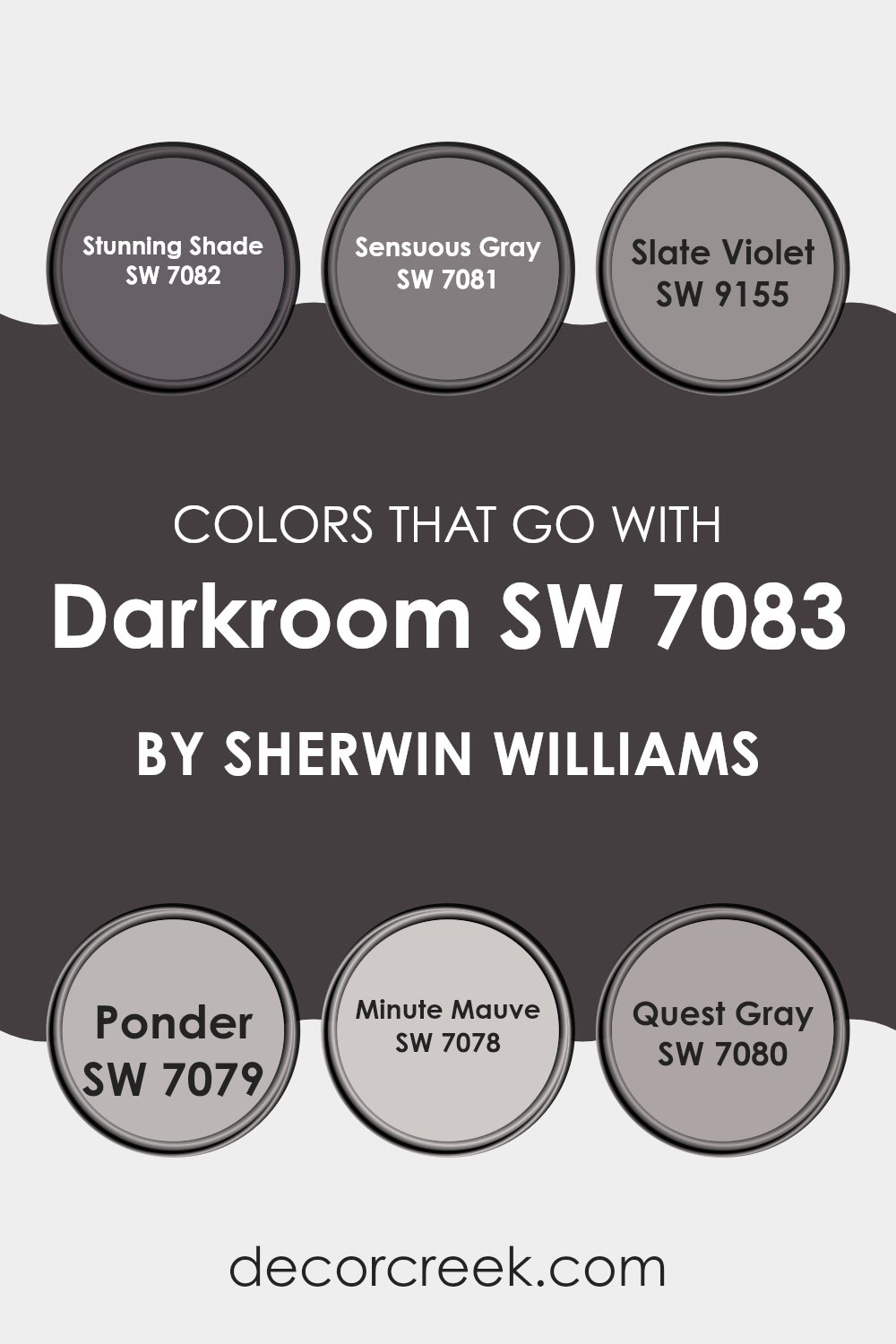
Colors that Go With Darkroom SW 7083 by Sherwin Williams
Choosing colors that work well with Sherwin-Williams’ Darkroom SW 7083 is essential for creating a balanced and harmonious area. Darkroom is a rich, bold hue that can bring a sense of depth to any room. Pairing it with SW 7082 Stunning Shade, a muted charcoal with a hint of blue, adds a cool contrast that enhances its intensity while keeping the atmosphere grounded. SW 7081 Sensuous Gray is a softer, more neutral shade that can lighten the room when used alongside Darkroom, offering a balanced touch without overpowering.
Adding SW 9155 Slate Violet, which has subtle purple undertones, introduces a hint of color and keeps the palette interesting without clashing with Darkroom’s dominant shade. SW 7079 Ponder is a soft gray with a touch of warmth, complementing Darkroom by adding a contrasting subtle warmth.
SW 7078 Minute Mauve, with its gentle, muted pink tone, brings a delicate touch that softens the boldness of Darkroom, creating a more inviting room. Finally, SW 7080 Quest Gray is a complex gray with both warm and cool undertones, which allows it to bridge all these colors together seamlessly, unifying the room’s aesthetics. When used together, these colors create a cohesive and welcoming environment.
You can see recommended paint colors below:
- SW 7082 Stunning Shade
- SW 7081 Sensuous Gray
- SW 9155 Slate Violet
- SW 7079 Ponder
- SW 7078 Minute Mauve
- SW 7080 Quest Gray
How to Use Darkroom SW 7083 by Sherwin Williams In Your Home?
Darkroom SW 7083 by Sherwin Williams is a deep, rich color perfect for adding a touch of drama and coziness to any room in your home. This dark, moody hue is great for creating an intimate atmosphere. If you’re looking to make a bold statement, consider using it in a bedroom to encourage a restful environment.
You can also use Darkroom SW 7083 to create a stylish accent wall in a living room or dining area. Pair it with lighter colors like whites or creams to balance the room and highlight the color’s depth. This shade works well with various design styles, from modern to classic, and complements metallic and wood finishes beautifully.
Another idea is to use this color in a home office or study to foster a cozy, focused room. With its flexible appeal, Darkroom SW 7083 can add character and warmth to any room in your home.
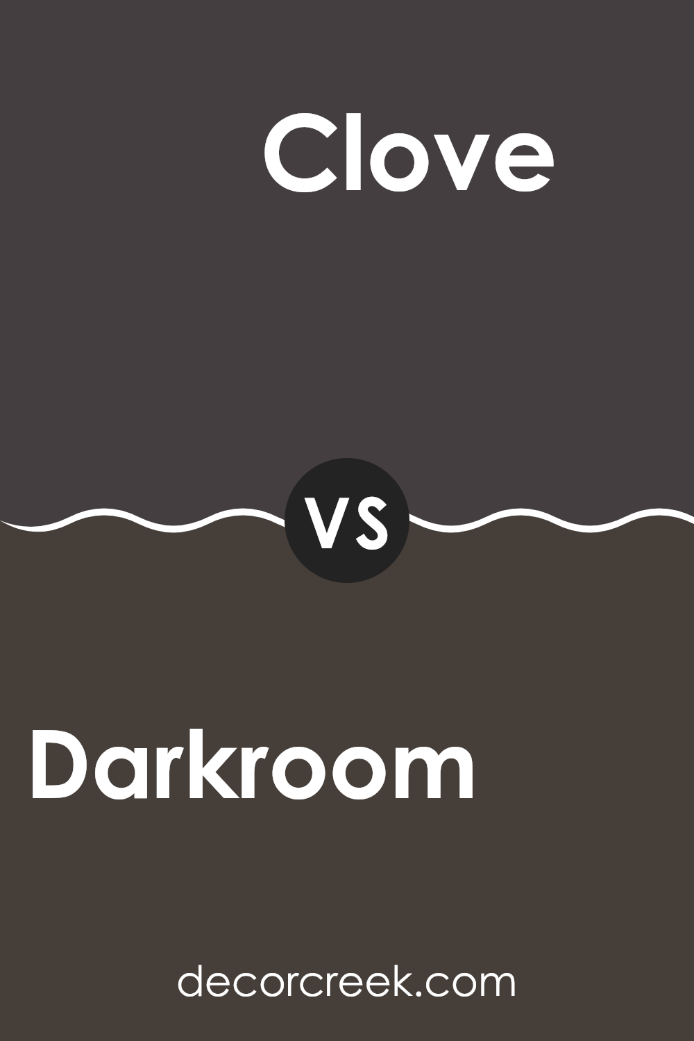
Darkroom SW 7083 by Sherwin Williams vs Clove SW 9605 by Sherwin Williams
Darkroom SW 7083 and Clove SW 9605 by Sherwin Williams are both rich, bold colors that can add depth to any room. Darkroom is a deep, moody shade of black with subtle purple undertones, creating an intimate and dramatic atmosphere. It can provide a modern and chic backdrop in any room.
On the other hand, Clove is a warm, earthy brown with reddish tones, reminiscent of spices. It brings warmth and coziness to a room, making it feel inviting and grounded. While Darkroom is more about creating contrast and drama, Clove focuses on comfort and earthiness.
When used together, Darkroom can provide a striking accent against Clove’s warm base, allowing each color to enhance the other. Both colors are adaptable for different settings, but their impact varies: Darkroom is striking and bold, while Clove feels more comforting and natural.
You can see recommended paint color below:
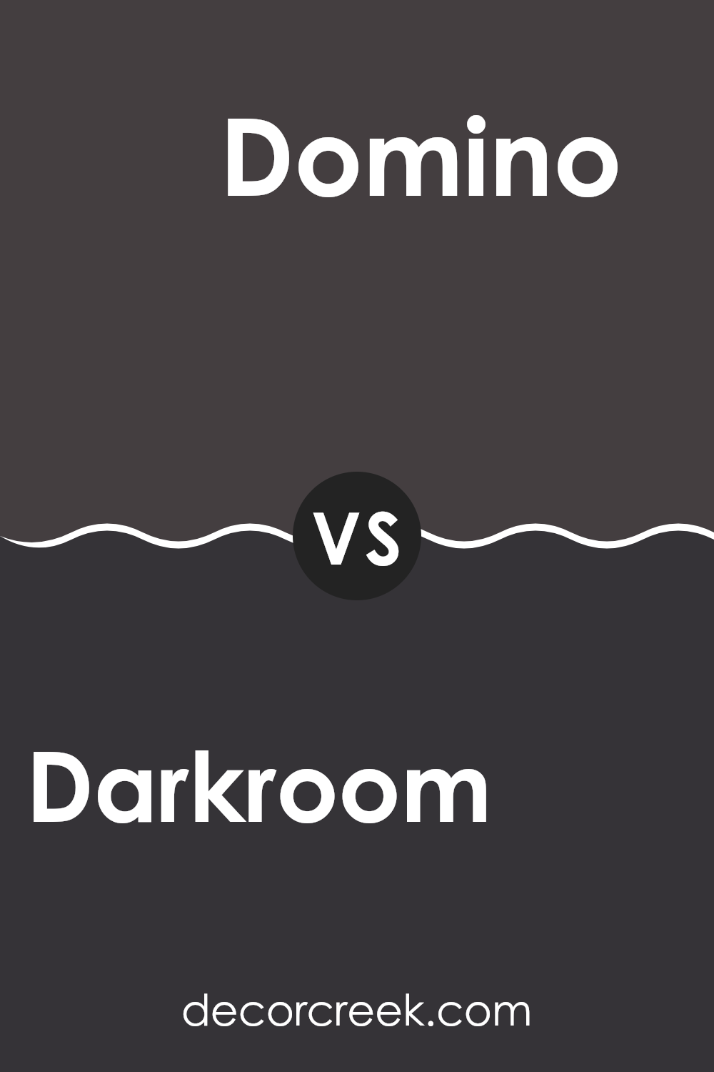
Darkroom SW 7083 by Sherwin Williams vs Domino SW 6989 by Sherwin Williams
Darkroom SW 7083 and Domino SW 6989 by Sherwin Williams are two bold, dramatic colors. Darkroom is a rich, deep plum that brings warmth and depth to a room. It’s a cozy color that works well in bedrooms or living rooms, creating a snug atmosphere.
On the other hand, Domino is a true black. It is sleek and modern, offering a clean and elegant look. Domino can make a big statement in a room, especially when used as an accent wall or in trim work. While Darkroom adds a touch of warmth and color, Domino is more about contrast and a classic feel.
Together, these colors can complement each other well, with Darkroom bringing in a warm tone and Domino providing a striking, bold contrast. Both colors are adaptable and can be used in various styles of decor, from traditional to modern.
You can see recommended paint color below:
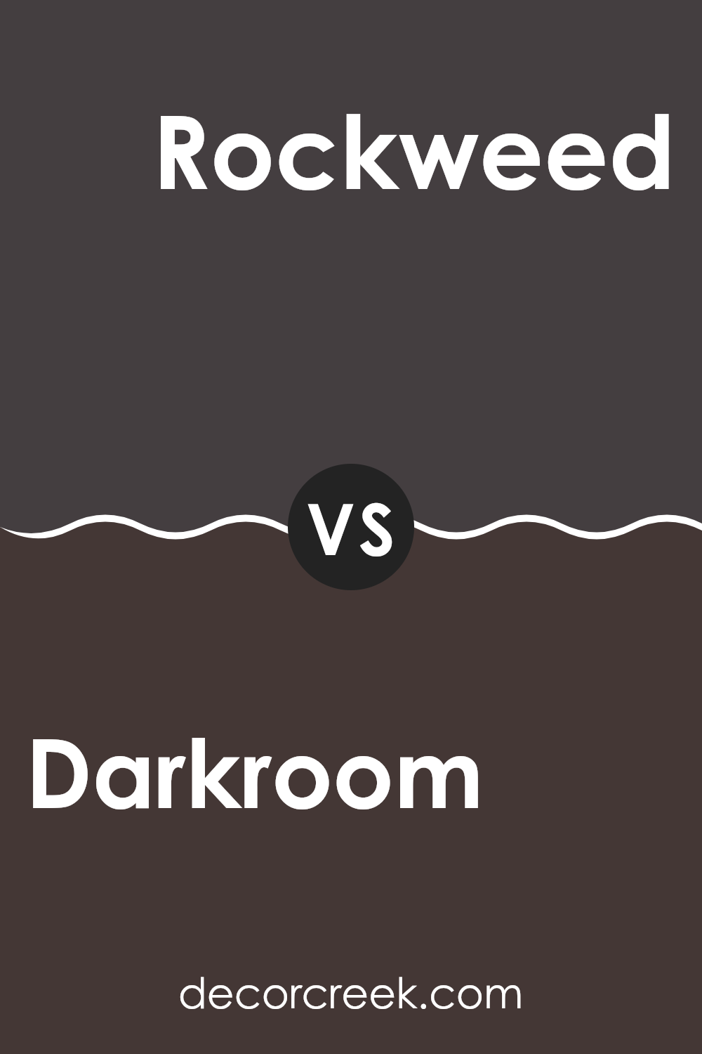
Darkroom SW 7083 by Sherwin Williams vs Rockweed SW 2735 by Sherwin Williams
Darkroom SW 7083 and Rockweed SW 2735 are both rich, deep colors by Sherwin Williams, but they have distinct characteristics. Darkroom is a very dark shade with purple undertones, giving it an almost black look with a slightly warm and moody essence.
It can make a room feel cozy and intimate. Rockweed, on the other hand, is a dark olive green with earthy brown undertones. It’s deeper and more muted, providing a natural, grounding feel. While Darkroom brings a sense of drama with its bold and mysterious vibe, Rockweed offers a more organic, calming presence, reminiscent of forested environments.
Both colors are flexible and can be used to create strong statements in a room, but the choice between them might depend on whether you prefer a hint of purple or green in your surroundings. The two complement well with light neutrals, creating balance in interior rooms.
You can see recommended paint color below:
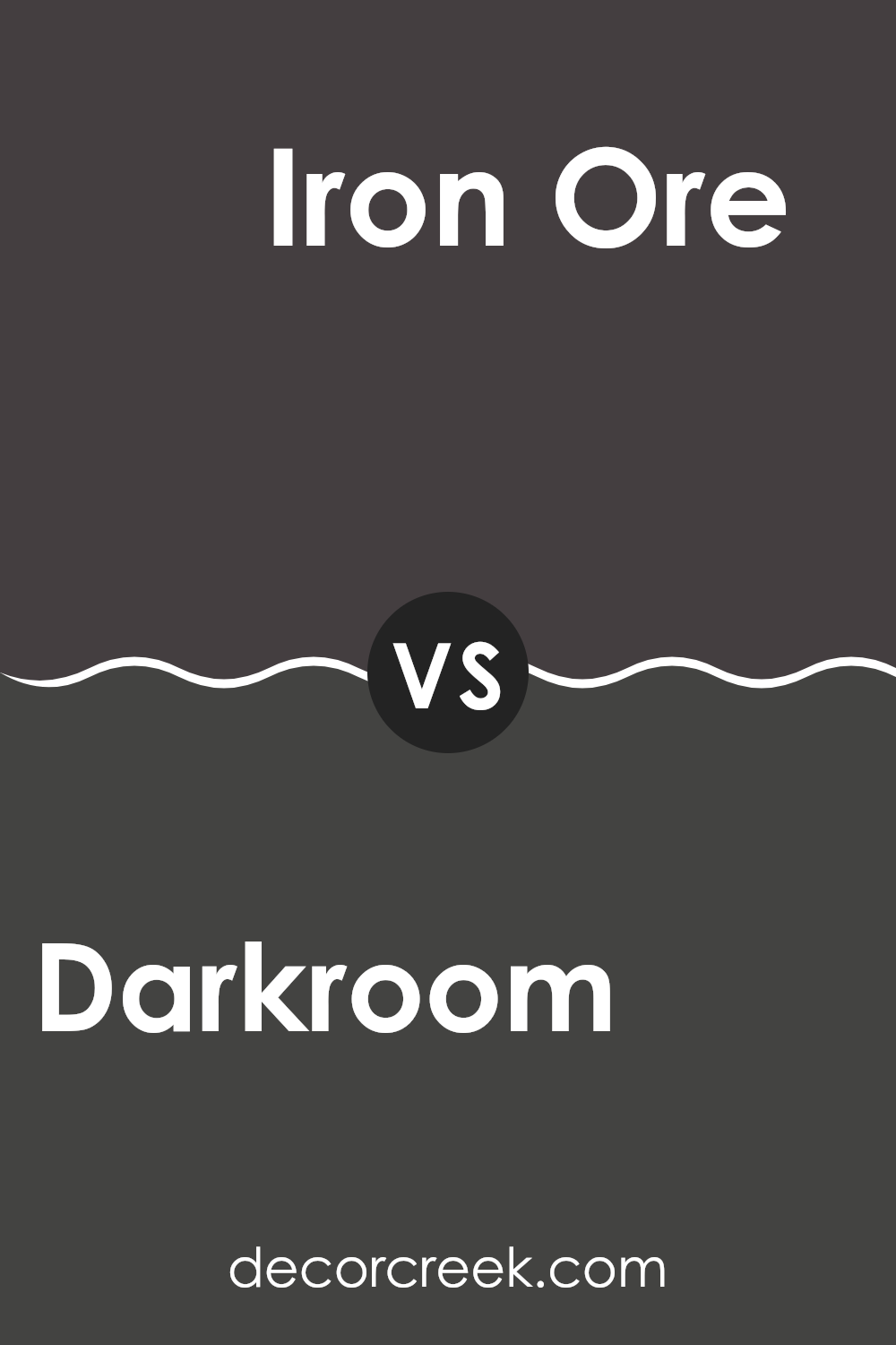
Darkroom SW 7083 by Sherwin Williams vs Iron Ore SW 7069 by Sherwin Williams
Darkroom SW 7083 and Iron Ore SW 7069 by Sherwin Williams are two distinct dark shades that add depth to any room. Darkroom is a deep, rich black with subtle hints of warmth, making it flexible for both cozy and modern settings. It offers a moody and intimate feel, ideal for a dramatic accent wall or a chic backdrop in a living area.
Iron Ore, on the other hand, is a soft black with gray undertones. It has a slightly softer appearance compared to Darkroom, providing a strong but less intense finish. This makes Iron Ore a great choice for those who want a bold color without being too overpowering.
Both colors can contrast beautifully with lighter colors, but Darkroom might be better for creating bold visual statements, while Iron Ore offers a more muted elegance. Depending on the desired feel, either color can be used to enhance different design schemes.
You can see recommended paint color below:
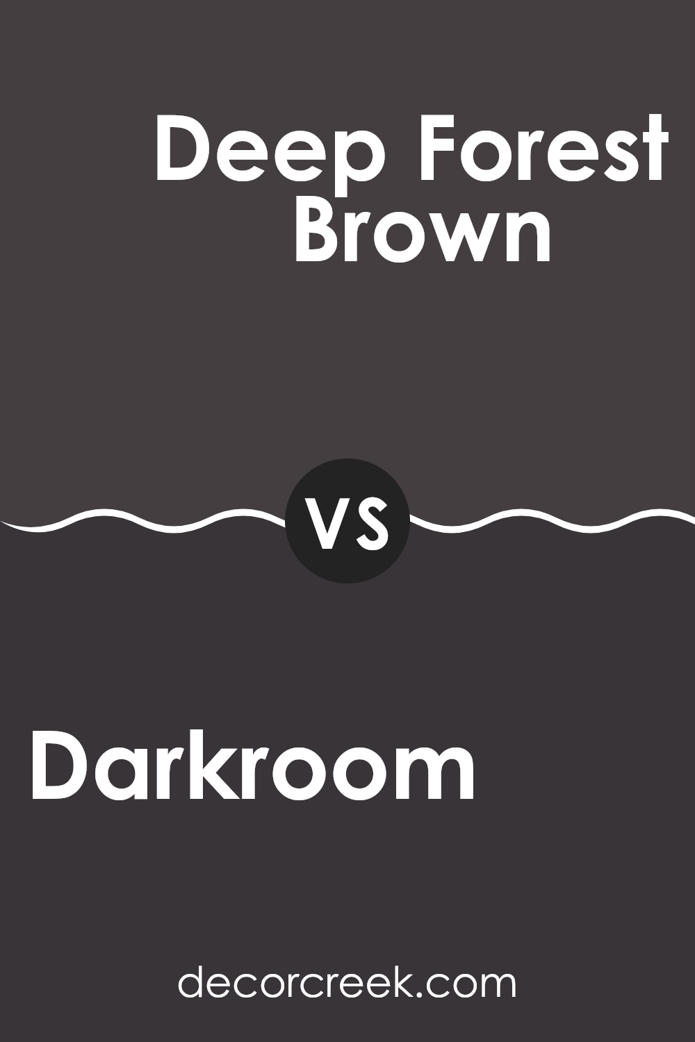
Darkroom SW 7083 by Sherwin Williams vs Deep Forest Brown SW 9175 by Sherwin Williams
Darkroom SW 7083 and Deep Forest Brown SW 9175, both by Sherwin Williams, are rich, dark shades with distinct personalities. Darkroom SW 7083 is a deep, moody color, providing a bold backdrop that adds drama to any room.
It’s a color that can create a sense of intrigue in a room. On the other hand, Deep Forest Brown SW 9175 has a rich, earthy tone that feels grounded and warm. This brown is reminiscent of the dense woods, offering a natural feel that’s comforting and inviting.
While both colors can be used to make a statement, Darkroom serves well as an accent with its slightly more mysterious edge, whereas Deep Forest Brown offers warmth and a cozy atmosphere. They both blend well with neutral tones but provide different vibes: one more bold and striking, the other soft and earthy.
You can see recommended paint color below:
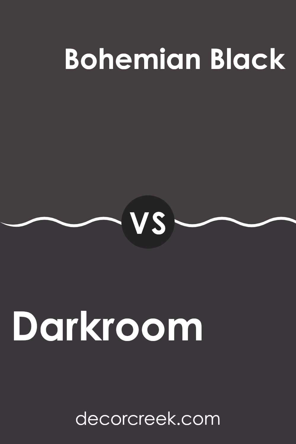
Darkroom SW 7083 by Sherwin Williams vs Bohemian Black SW 6988 by Sherwin Williams
Darkroom SW 7083 and Bohemian Black SW 6988 by Sherwin Williams are two rich, dark colors that bring drama and depth to any room. Darkroom is a deep, muted black with subtle hints of purple, which gives it a slightly warm and moody vibe. It’s great for creating a cozy, intimate atmosphere, perfect for bedrooms or living rooms.
On the other hand, Bohemian Black is a bold, pure black with a sleek and modern feel. It’s a flexible choice, suitable for accent walls, trim, and modern interiors where a strong, dramatic look is desired. It pairs well with a variety of colors, offering a sharp contrast that can make other colors pop.
While both colors are dark, their undertones and effects differ. Darkroom leans towards a softer, more comforting feel, whereas Bohemian Black delivers a striking, contemporary look. Choose Darkroom for warmth and Bohemian Black for a clean, crisp statement.
You can see recommended paint color below:
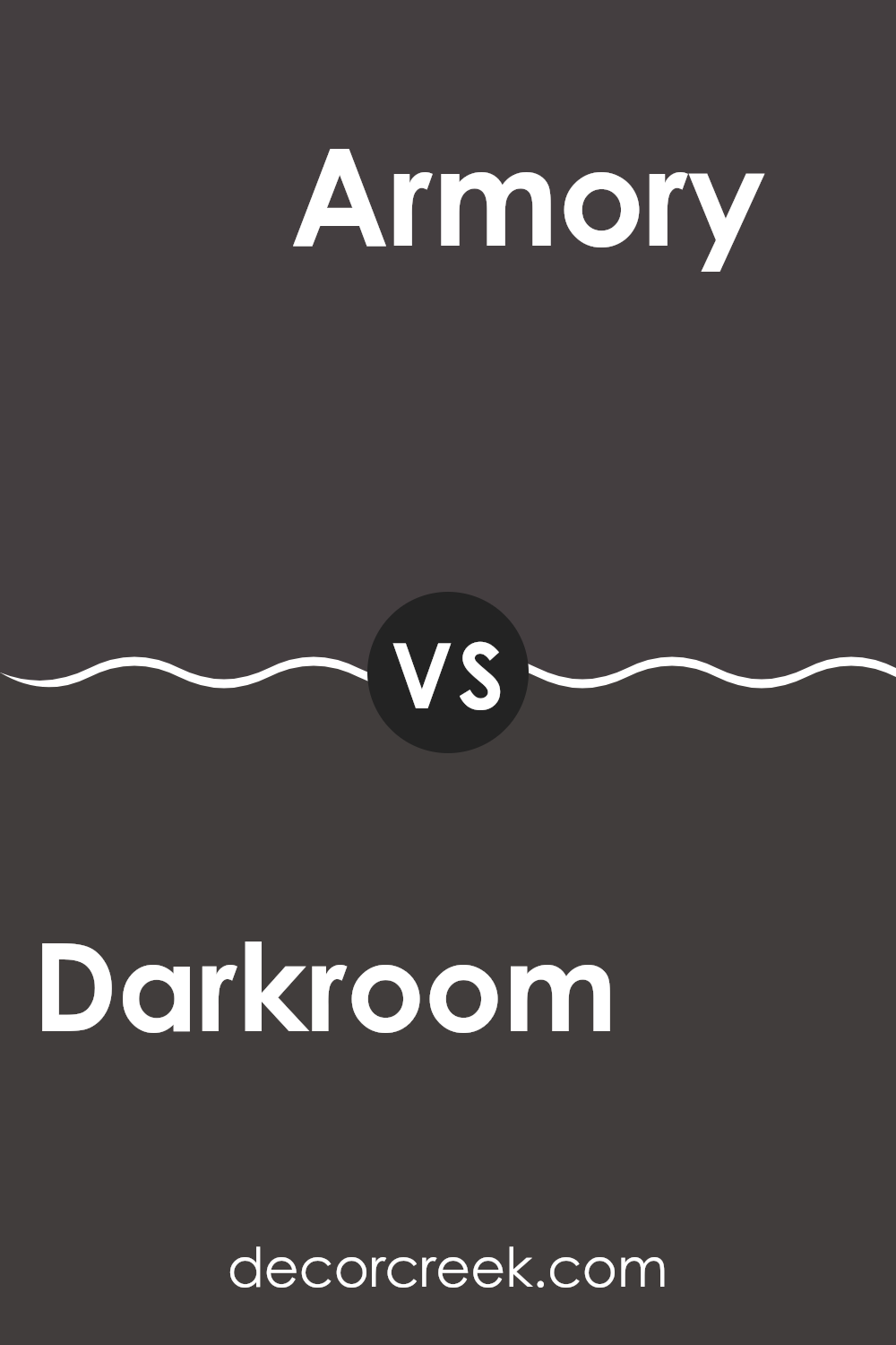
Darkroom SW 7083 by Sherwin Williams vs Armory SW 9600 by Sherwin Williams
Darkroom SW 7083 and Armory SW 9600 by Sherwin Williams are two distinct colors that offer different vibes for a room. Darkroom SW 7083 is a deep, rich shade of dark purple that can create a cozy and intimate atmosphere.
It is bold and can add a sense of drama to any room. Suitable for areas where you want to make a strong statement, it pairs well with lighter accents to balance its intensity. In contrast, Armory SW 9600 is a lighter, more muted gray with a touch of warmth.
This color can make a room feel open and airy, providing a neutral backdrop that works well with various decor styles. Armory is flexible and can be used in any room to create a calming effect. While Darkroom feels more dramatic, Armory offers simplicity and subtle elegance, making it an excellent choice for a modern and understated look.
You can see recommended paint color below:
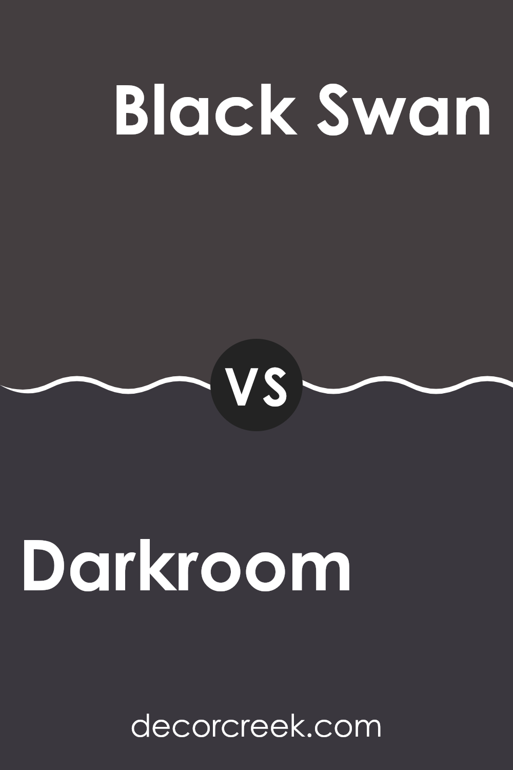
Darkroom SW 7083 by Sherwin Williams vs Black Swan SW 6279 by Sherwin Williams
Darkroom (SW 7083) by Sherwin Williams is a deep, rich hue that’s almost black with a subtle hint of warmth. It’s a bold choice that can create a cozy, intimate atmosphere in a room. Its depth makes it great for areas where you want to add a touch of drama without it feeling too stark.
On the other hand, Black Swan (SW 6279) by Sherwin Williams is also a dark color, but it carries a slight hint of purple, adding a unique twist. This gives it a softer edge compared to Darkroom, making it feel more playful and artistic.
When comparing the two, Darkroom leans more towards a classic, straightforward depth, while Black Swan adds a bit of character with its purple undertone. Both colors are perfect for making a bold statement, but the choice between them depends on whether you prefer a straightforward dark or a touch of unexpected color.
You can see recommended paint color below:
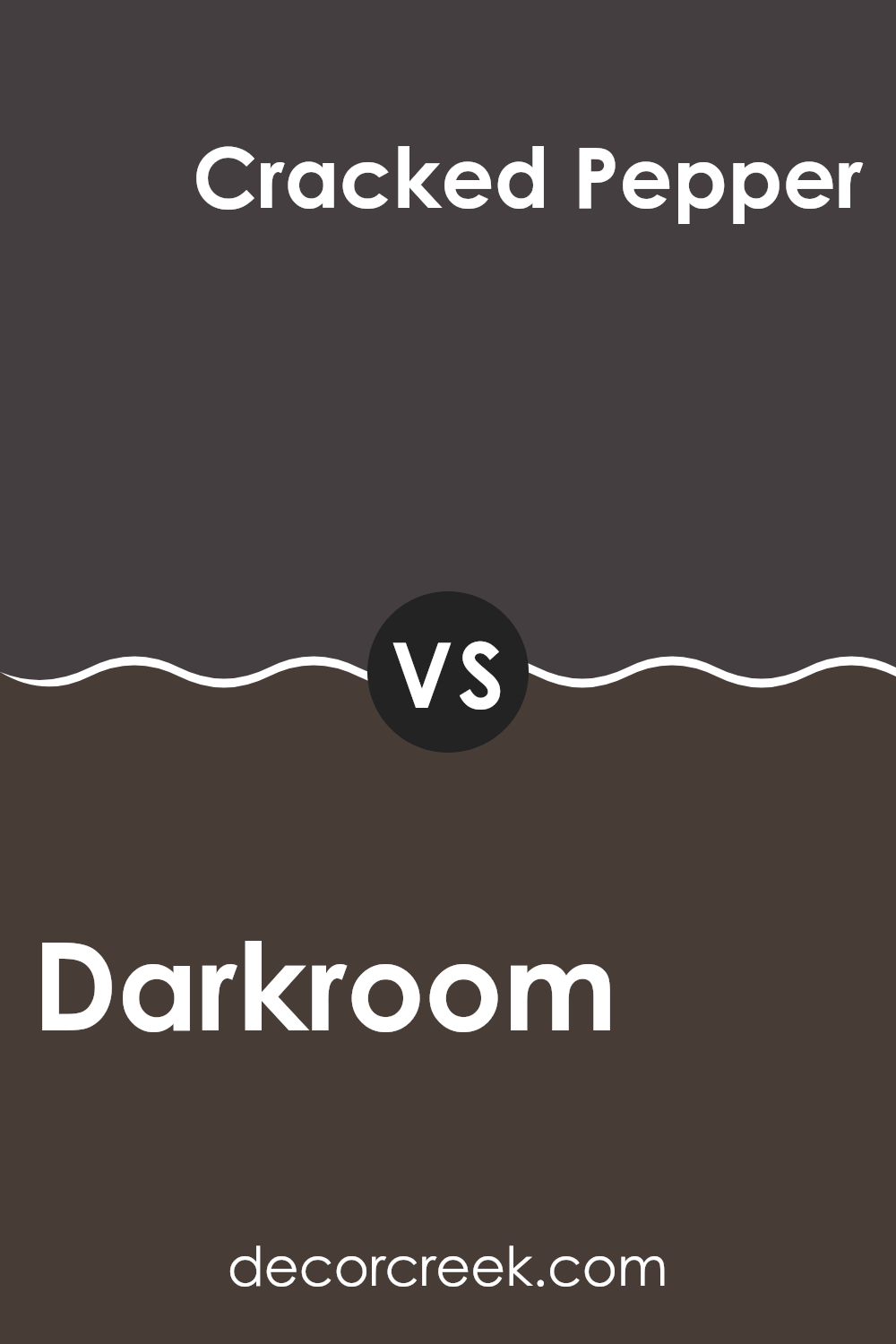
Darkroom SW 7083 by Sherwin Williams vs Cracked Pepper SW 9580 by Sherwin Williams
Darkroom (SW 7083) and Cracked Pepper (SW 9580) are two rich and deep colors from Sherwin Williams. Darkroom is a dark, almost black shade with hints of purple and brown, giving it a warm undertone. It creates a cozy and intimate mood, making it a great choice for rooms where you want to feel enveloped, like a reading nook or a bedroom.
On the other hand, Cracked Pepper is also a deep shade but leans more towards a true black with a slightly cool undertone. It brings a sense of modern elegance and works well in areas like kitchens or living rooms where a striking statement is desired.
Both colors are refined but have distinct feels; Darkroom is more warm and enveloping, while Cracked Pepper offers a crisp and clean look. Choosing between them depends on whether you’re aiming for warmth and comfort or a bold, modern vibe.
You can see recommended paint color below:
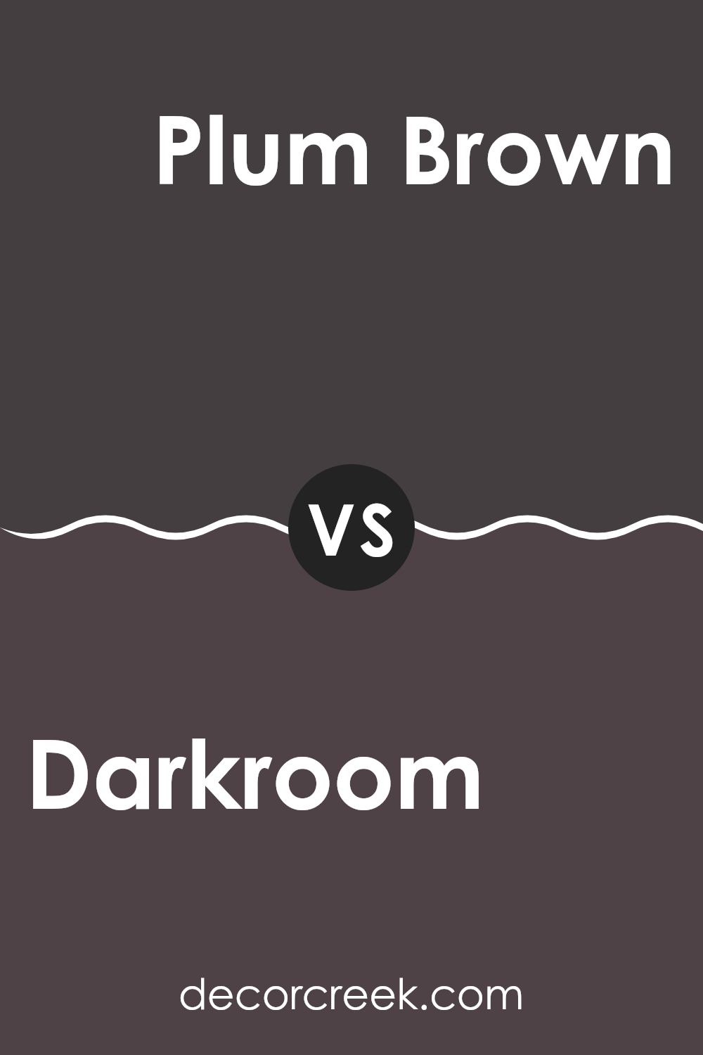
Darkroom SW 7083 by Sherwin Williams vs Plum Brown SW 6272 by Sherwin Williams
Darkroom SW 7083 and Plum Brown SW 6272 are both rich, deep colors by Sherwin Williams. Darkroom is a very dark shade with black undertones, giving it a dramatic and bold appearance. It can create a cozy, intimate atmosphere in any room.
In contrast, Plum Brown has a mix of purple and brown tones, making it a warmer and somewhat softer color. While still rich and intense, Plum Brown brings a hint of warmth and earthiness, which can make a room feel inviting and snug.
While both colors add depth and sophistication, Darkroom makes a stronger statement with its almost black presence, whereas Plum Brown might evoke a more comfortable and welcoming feel due to its warmer undertones. These colors can be used creatively in different areas depending on whether you prefer a more modern, bold look or a cozy, classic vibe.
You can see recommended paint color below:
- SW 6272 Plum Brown
As I wrap up my thoughts on SW 7083 Darkroom by Sherwin Williams, I realize just how special this paint color is. It feels like being wrapped in a cozy blanket on a chilly night. This shade of black has a warmth to it that makes any room feel snug and comforting. It’s like having your own personal retreat where you can relax.
What makes Darkroom so interesting is how it can change the mood of a room. If you add it to a bedroom, it can feel like a perfect place to get a good night’s sleep. In a living room, it can make everything feel more calm and focused. It works well with other colors, too, whether they’re bright or muted, letting you mix and match until you find what feels right to you.
Many people might think black is too strong or serious, but this shade has a gentle side. It doesn’t shout for attention, but instead makes everything look more put together. Using Darkroom can make your home feel more like you. It shows how even small color changes can make a big difference in how we feel. In all, Darkroom by Sherwin Williams is a delightful choice when looking to add a touch of comfort and charm to your home.
It’s like finding a secret ingredient to make your favorite place even better.
Ever wished paint sampling was as easy as sticking a sticker? Guess what? Now it is! Discover Samplize's unique Peel & Stick samples.
Get paint samples

