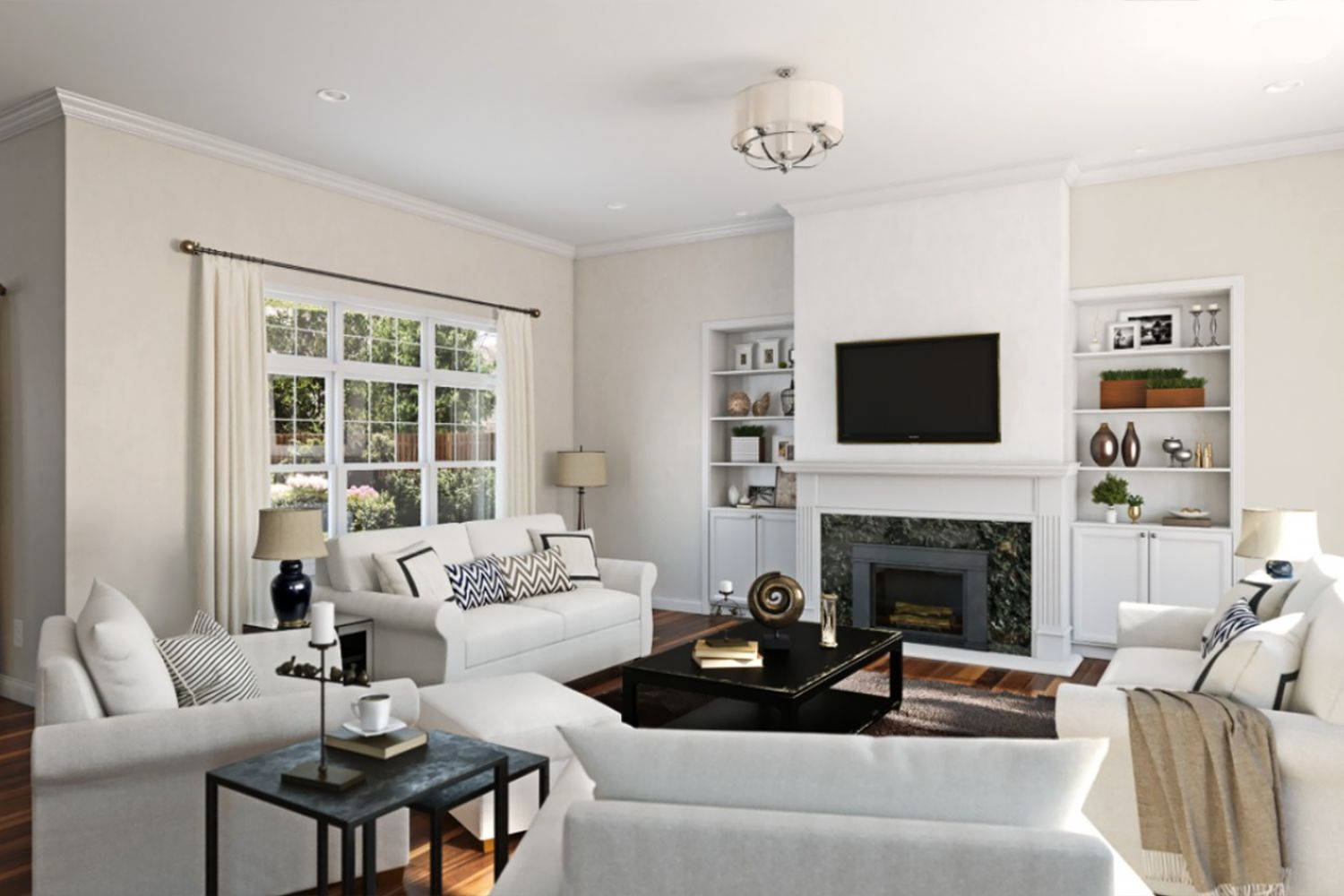
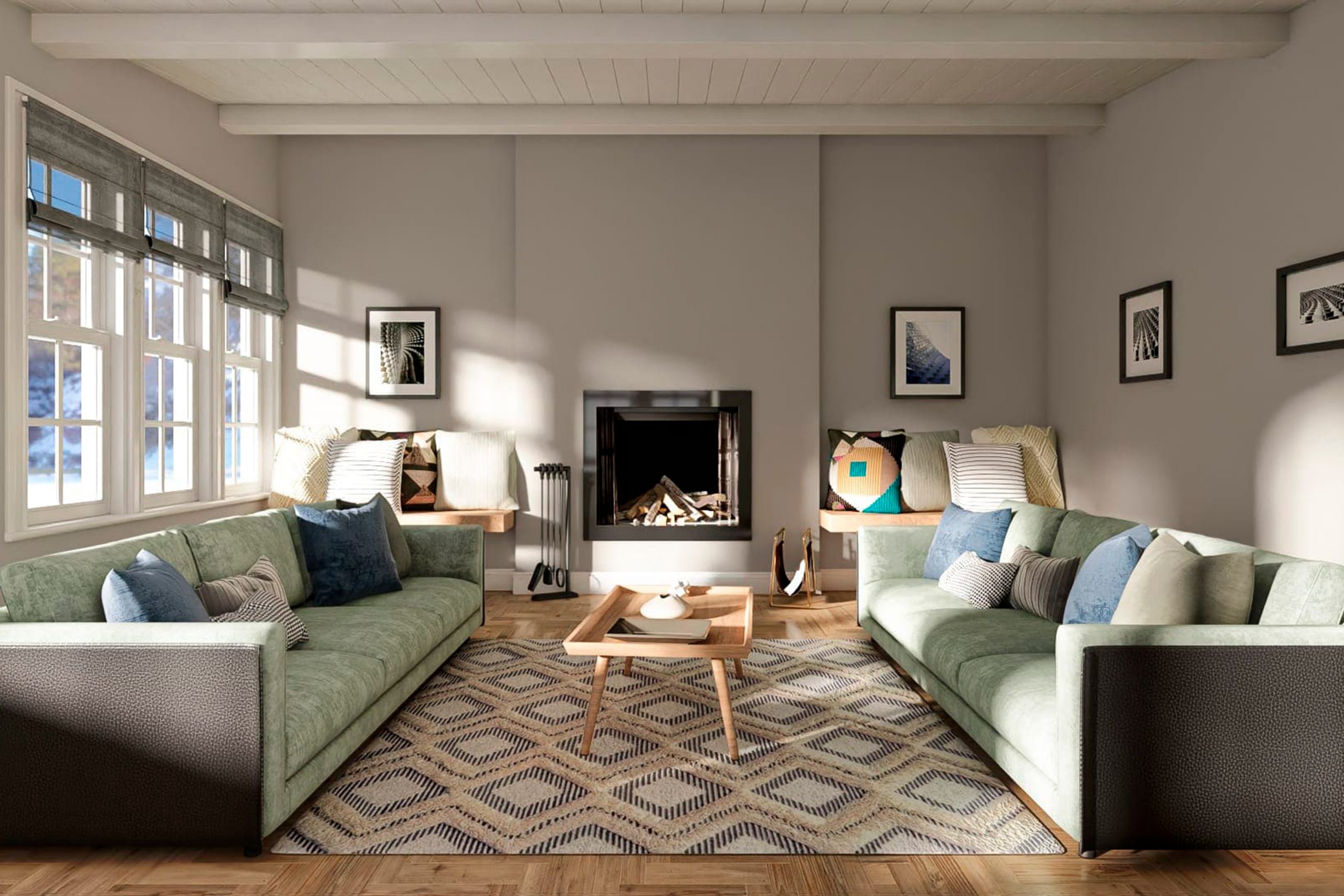
When it comes to giving your space a fresh new look, the right color can make all the difference. SW 7643 Pussywillow by Sherwin Williams is one choice that has caught the eye of many homeowners and interior designers alike.
This versatile shade falls somewhere between a soft gray and a subtle green, giving it a unique ability to blend with various styles and preferences.
Choosing a color like Pussywillow is more than just picking a paint; it’s about setting a mood and creating a background that complements your life and decor.
Whether you’re updating a cozy living room, a welcoming kitchen, or a tranquil bedroom, Pussywillow offers a modern yet timeless appeal that can fit into numerous settings.
It’s especially popular for those looking to achieve a minimalist aesthetic without the coldness often associated with more stark shades of gray.
One of the benefits of SW 7643 Pussywillow is its adaptability. This color works well with natural light, changing subtly throughout the day to create a dynamic yet harmonious atmosphere.
It pairs beautifully with a wide range of colors, from soft neutrals to bolder hues, allowing for endless decorating possibilities.
If you’re considering a change and are looking for a color that combines modern sophistication with easygoing charm, Pussywillow might just be the perfect fit for your project.
What Color Is Pussywillow SW 7643 by Sherwin Williams?
The color PussywillowSW 7643 by Sherwin Williams is a soft, versatile gray with warm undertones that give it a cozy and inviting feel. This particular shade strikes a perfect balance between light and dark, making it an excellent choice for those looking to add sophistication without overwhelming a space.
Its understated elegance allows it to work seamlessly in various interior styles, from modern minimalist to rustic farmhouse and everything in between.
This color shines when paired with natural materials and textures, bringing out its warm undertones. Wood, whether it be polished, distressed, or in its natural state, complements Pussywillow beautifully, creating spaces that feel grounded and balanced.
In rooms with ample natural light, the color will appear lighter and more airy, while in spaces with less light, it will present a deeper, more intimate vibe.
Pussywillow also pairs wonderfully with soft textiles—think plush throws, linen curtains, or wool rugs—that add layers to a room, making it feel lived-in and welcoming.
Metals like brushed nickel or aged brass bring a touch of sophistication to this color, offering a subtle contrast that highlights its depth.
Incorporating this shade into your home works well with a wide range of interior styles. It’s particularly effective in creating serene and restful bedrooms, elegant and inviting living rooms, or tranquil and productive home offices.
The flexibility of Pussywillow makes it a go-to choice for those looking to create spaces that are both stylish and comfortable.

Ever wished paint sampling was as easy as sticking a sticker? Guess what? Now it is! Discover Samplize's unique Peel & Stick samples.
Get paint samples

Is Pussywillow SW 7643 by Sherwin Williams Warm or Cool color?
Pussywillow SW 7643 by Sherwin Williams is a versatile color that brings a unique blend of warmth and sophistication to any space. This shade is a soft, muted gray with subtle undertones that can lean slightly warm or cool depending on the lighting and surrounding colors.
This adaptability makes it perfect for various home settings, from living rooms and bedrooms to kitchens and bathrooms.
When applied on walls, Pussywillow creates a calming backdrop that complements both vibrant and neutral tones, allowing for flexible decor choices. Furniture in bold colors pops against it, while lighter, creamy shades can soften the overall look, creating a cozy atmosphere.
Its understated elegance also serves as an ideal canvas for artwork and accessories, letting personal styles shine through.
In homes, this color works wonderfully to enhance natural light in well-lit spaces or add depth and interest in areas with less light.
Whether aiming for a modern, minimalist look or a more traditional vibe, Pussywillow adjusts seamlessly, making it a popular choice for homeowners looking to add a touch of sophistication without overwhelming a room’s aesthetic.
Undertones of Pussywillow SW 7643 by Sherwin Williams
Pussywillow by Sherwin Williams is a unique color that carries subtle undertones of pale pink and light gray. Understanding these undertones is key to seeing why this color appears so special.
Undertones are like secret ingredients that impact the color’s overall vibe and how it interacts with light and surrounding elements. They can make a color feel warmer or cooler and influence its compatibility with other colors.
When you paint interior walls with a color like Pussywillow, the pale pink undertone adds a soft, welcoming warmth. It’s almost like having a gentle hug from the room, making spaces feel more intimate and cozy.
This pinkish whisper beneath the main hue brings life to the walls in a subtle, almost tender manner.
On the other hand, the light gray undertone introduces a grounding effect. It ensures that the warmth from the pale pink doesn’t overwhelm the space. Instead, it balances the warmth with a touch of sophistication and neutrality.
This makes the wall color versatile, fitting beautifully in various interior styles – from modern to classic.
The blend of these undertones in Pussywillow means that as natural light changes throughout the day, so will the perception of the color. It can shift from a more pronounced cozy warmth in the morning to a refined, understated elegance by dusk.
This dynamic quality keeps the space interesting and visually inviting. Using Pussywillow on interior walls can subtly enhance the room’s ambiance, making it adaptable yet always maintaining a hint of personality.
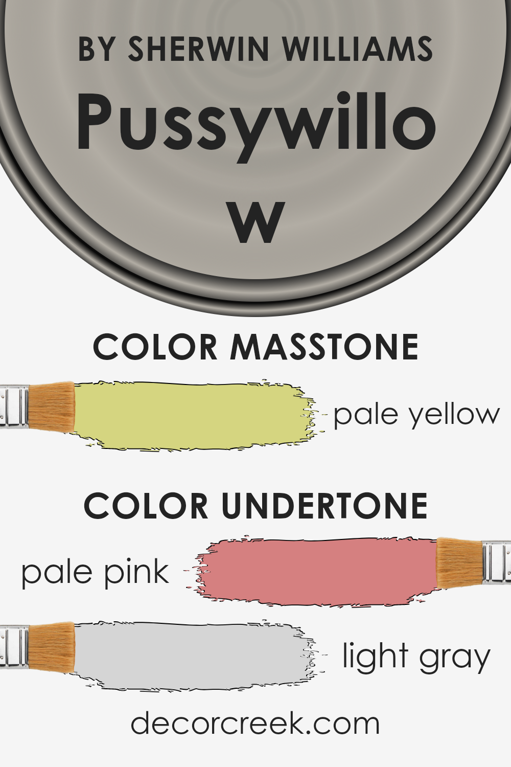
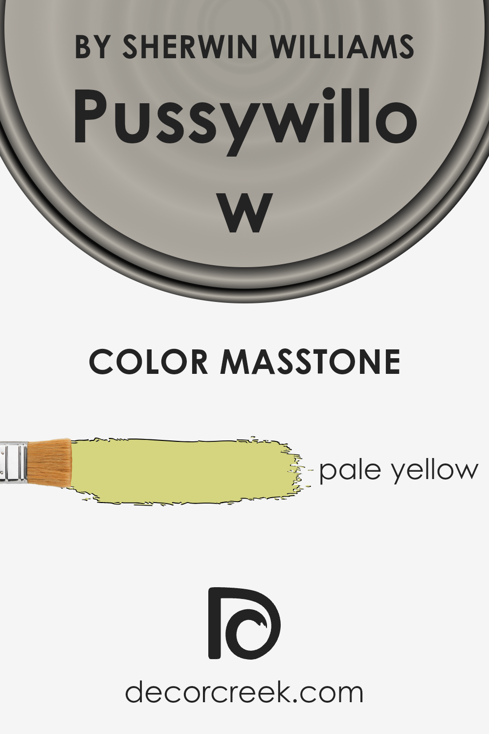
What is the Masstone of the Pussywillow SW 7643 by Sherwin Williams?
Pussywillow SW 7643 by Sherwin Williams, with its masstone of pale yellow (#D5D580), offers a soft and welcoming hue for home interiors. This shade serves as a subtle backdrop rather than dominating a space, allowing for a variety of decorating styles.
The pale yellow brings a hint of cheerfulness without the intensity that brighter yellows can sometimes impart, making it an excellent choice for creating a cozy and relaxed atmosphere.
This color works well in rooms that could benefit from a soft touch of warmth, such as living rooms, kitchens, or bedrooms, helping to brighten the space gently.
Its versatility means it pairs nicely with both bold and muted colors, from deep blues to soft grays, allowing homeowners to add personality and depth to their decor. The understated elegance of Pussywillow SW 7643 makes it a practical choice for those looking to achieve a serene and inviting home environment.
How Does Lighting Affect Pussywillow SW 7643 by Sherwin Williams?
Lighting can significantly change the way colors look in a room. It can make colors appear brighter, darker, warmer, or cooler. This is because different types of light can enhance or mute colors depending on their intensity and hue.
Take the color Pussywillow by Sherwin Williams, for example. It’s a versatile gray that can shift in appearance under different lighting conditions. When under artificial light, such as LED or incandescent bulbs, this color may look warmer and take on a more inviting and cozy feel.
This is because artificial light tends to add a yellowish hue to colors, making them appear softer and warmer.
In natural light, the appearance of Pussywillow can change throughout the day. Morning light, which is cooler, can make it look more of a true gray, while evening light, which has a warmer tone, can bring out beige undertones, making the space feel more welcoming.
Now, how does this color work in rooms with different exposures? In north-faced rooms that receive less direct sunlight, Pussywillow might appear cooler and slightly more blue-toned. This can create a serene and calm environment.
South-faced rooms, which get plenty of sun, can make Pussywillow look much warmer and lighter, highlighting its beige undertones and making the room feel brighter and more cheerful.
In east-faced rooms, the morning light can make this color look very soft and pleasant, providing a crisp and refreshing start to the day. As the day progresses, the color might lose some of its vibrancy but still maintain a clean and neutral appearance.
In west-faced rooms, the color will experience a transformation throughout the day. It will start cooler in the morning and gradually warm up as the sun sets, ending the day with a cozy and inviting glow.
Overall, the way Pussywillow looks can be highly influenced by the direction of the light and the type of lighting used, making it a very dynamic and adaptable color for any space.
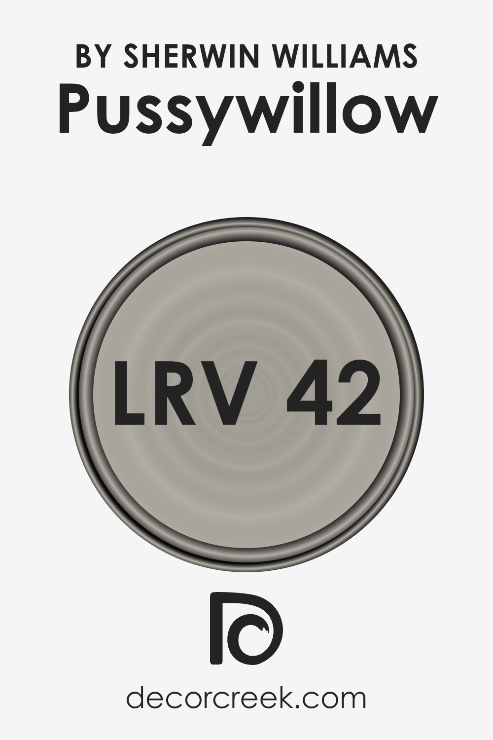
What is the LRV of Pussywillow SW 7643 by Sherwin Williams?
LRV stands for Light Reflectance Value, and it’s a measure used to describe the amount of visible and usable light that a paint color reflects or absorbs. Think of it as a scale from 0 to 100, where 0 means it’s really dark (absorbing most of the light) and 100 is super light (reflecting most of the light).
This number helps you understand how a color will look in your space. Lighter colors make rooms feel bigger and brighter because they reflect more light. Darker colors create a cozier atmosphere but can make a room feel smaller since they absorb more light.
When it comes to the color with an LRV of 42.088, this is in the middle range. It means the color isn’t too dark nor too light. In practical terms, it will reflect some light, but also absorb a fair amount.
In a well-lit room, this color can appear lighter and more vibrant, adding a soft and welcoming feel. In rooms with less natural light, it might look a bit darker, creating a snug and intimate ambiance.
This balance makes it versatile for many spaces, allowing the color to adapt somewhat to the lighting conditions, whether artificial or natural, without dominating the space or making it feel cramped.
LRV – what does it mean? Read This Before Finding Your Perfect Paint Color
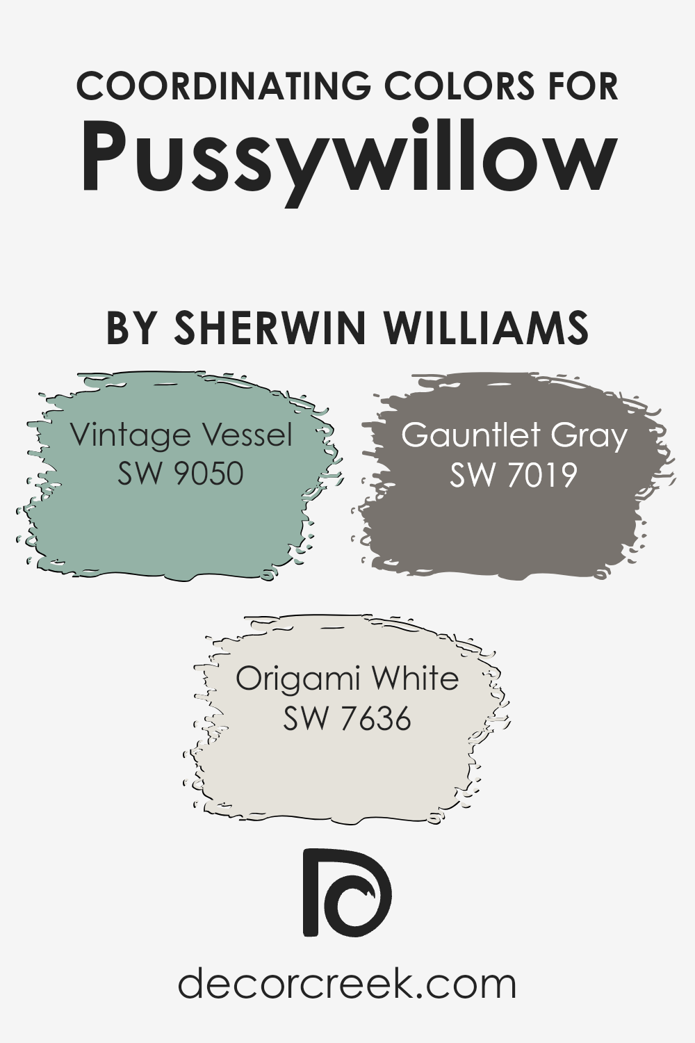
Coordinating Colors of Pussywillow SW 7643 by Sherwin Williams
Coordinating colors are shades that complement each other beautifully, working hand in hand to enhance the aesthetic appeal of any space. These colors, chosen thoughtfully, create harmony and a sense of balance.
When it comes to coordinating colors for Pussywillow by Sherwin Williams, a delicate, versatile gray, there are three specific shades that stand out to enrich this palette: Vintage Vessel, Origami White, and Gauntlet Gray. Together, these colors provide a tasteful blend, enabling you to design spaces that feel both welcoming and stylish.
Vintage Vessel is a unique color that brings a sophisticated depth to the mix, offering a muted, earthy green that pairs wonderfully with the soft neutrality of Pussywillow. It’s perfect for those looking to add a subtle hint of nature-inspired tranquility to their rooms.
Origami White, on the other hand, is a soft, warm white with just the right amount of creaminess to avoid stark contrasts. It lightens and brightens spaces in a gentle way, complementing the serene vibe of Pussywillow.
Lastly, Gauntlet Gray adds a bold yet sophisticated anchor to the palette, providing a deeper, richer contrast that allows the other colors to shine, producing a refined and cohesive look. Together, these coordinating colors create an inviting and harmonious look that is both balanced and beautiful.
You can see recommended paint colors below:
- SW 9050 Vintage Vessel
- SW 7636 Origami White
- SW 7019 Gauntlet Gray
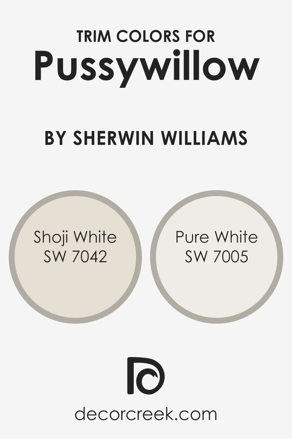
What are the Trim colors of Pussywillow SW 7643 by Sherwin Williams?
Trim colors are specifically chosen paint colors applied to the trimmings around windows, doors, and baseboards in a room. They play a crucial role in interior design by framing the spaces and accentuating the architectural details of a room.
When a trim color is selected to complement a wall color, such as Pussywillow by Sherwin Williams, it can enhance the overall aesthetic and cohesiveness of the space. A well-chosen trim color can make the wall color pop, add depth to the dimensions of a room, and elevate the visual appeal of the entire area.
This is particularly important for colors like Pussywillow, a versatile gray that can shift in hue depending on the lighting, as the right trim color can help to anchor the wall color and ensure it pairs beautifully with the rest of the room’s decor.
Shoji White SW 7042 and Pure White SW 7005 by Sherwin Williams are two trim colors that work splendidly with Pussywillow.
Shoji White is a warm, welcoming off-white with subtle beige undertones, making it an excellent choice for creating a soft transition between the wall color and the trim, giving the space a cohesive and inviting look.
Pure White, on the other hand, is a crisp, clean white with a slightly cool undertone. It offers a striking contrast to Pussywillow, defining and emphasizing architectural details while injecting brightness into the room.
Both these trim colors offer unique ways to frame Pussywillow, ensuring the space feels thoughtfully designed and visually balanced.
You can see recommended paint colors below:
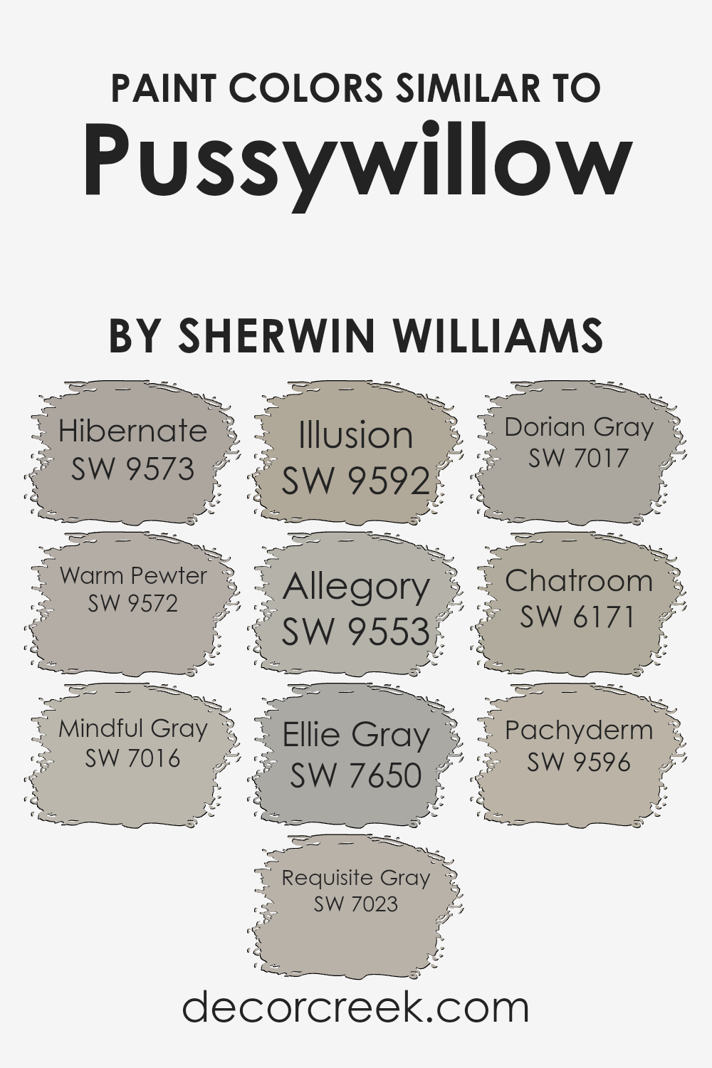
Colors Similar to Pussywillow SW 7643 by Sherwin Williams
In the world of interior design, using similar colors can create a cohesive and harmonious look that ties different spaces together seamlessly. When looking at colors similar to Pussywillow by Sherwin Williams, we find a palette that’s versatile and comforting, offering subtle variations that can cater to various tastes and design needs.
These similar shades range from warm neutrals to soft grays, each bringing its unique touch while maintaining an underlying connection that ensures they complement each other beautifully.
Starting with Hibernate, it offers a cozy warmth, perfect for creating inviting spaces. Warm Pewter then adds a slightly deeper tone, providing a solid foundation for rooms looking for a bit of depth.
Mindful Gray and Requisite Gray follow, introducing a balance of cool and warm tones, making them great for areas that need a calm and neutral backdrop. Illusion and Allegory bring more nuanced hues into the mix, with a hint of color that’s subtle yet impactful.
Ellie Gray and Dorian Gray delve into the cooler spectrum, offering sophistication and elegance. Lastly, Chatroom and Pachyderm stand out with their unique blends, adding character and dimension.
Together, these colors work harmoniously, offering a broad spectrum of possibilities that can enhance any space, making design choices less about matching and more about complementary aesthetics.
You can see recommended paint colors below:
- SW 9573 Hibernate
- SW 9572 Warm Pewter
- SW 7016 Mindful Gray
- SW 7023 Requisite Gray
- SW 9592 Illusion
- SW 9553 Allegory
- SW 7650 Ellie Gray
- SW 7017 Dorian Gray
- SW 6171 Chatroom
- SW 9596 Pachyderm
How to Use Pussywillow SW 7643 by Sherwin Williams In Your Home?
Pussywillow SW 7643 by Sherwin Williams is a versatile paint color that brings a sense of calm and sophistication to any room. This shade falls into the gray category, offering a warm, cozy feeling that can make your home feel more inviting. Because of its neutral tone, you can easily use it in various spaces such as living rooms, bedrooms, and kitchens.
It pairs beautifully with both bright colors and softer hues, allowing for a wide range of decorating styles. Whether you prefer a modern look with bold accents or a more traditional style with classic furniture, Pussywillow can create the perfect backdrop.
It’s especially helpful in rooms that need a touch of warmth without overpowering the space. You can also apply it in hallways and bathrooms to add continuity throughout your home.
This color not only enhances your decor but also adapts to changing styles and tastes over time, making it a fantastic choice for anyone looking to refresh their living spaces.
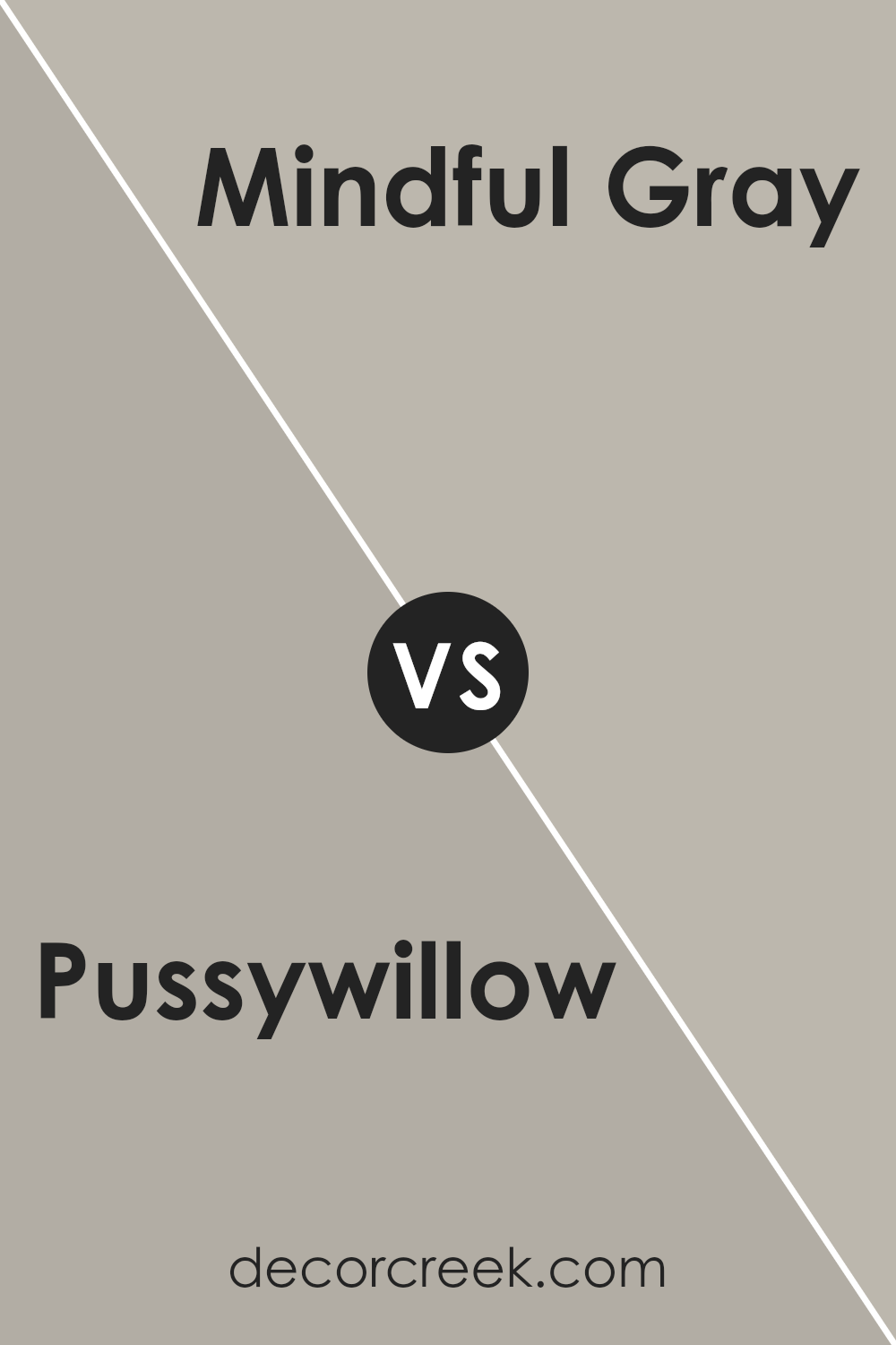
Pussywillow SW 7643 by Sherwin Williams vs Mindful Gray SW 7016 by Sherwin Williams
Pussywillow and Mindful Gray, both by Sherwin Williams, offer unique shades for those wanting to spruce up their space. Starting with Pussywillow, this color leans toward a light, soft gray with a hint of warmth.
It creates a cozy, inviting atmosphere without overpowering a room. Its subtle tone makes it versatile for various settings, whether you’re aiming for a modern look or a classic feel.
On the other hand, Mindful Gray stands a bit darker and richer. This color brings a stronger presence with its deeper shade, providing a sense of sophistication and elegance.
While still in the gray family, Mindful Gray offers a tad more intensity, making it excellent for areas where a bolder statement is desired.
Both colors work well in different contexts: Pussywillow is perfect for those seeking a gentle, airy vibe, whereas Mindful Gray suits spaces intended to have a more pronounced, chic appearance.
Ultimately, your choice depends on the mood you want to set and the statement you wish to make with your space.
You can see recommended paint color below:
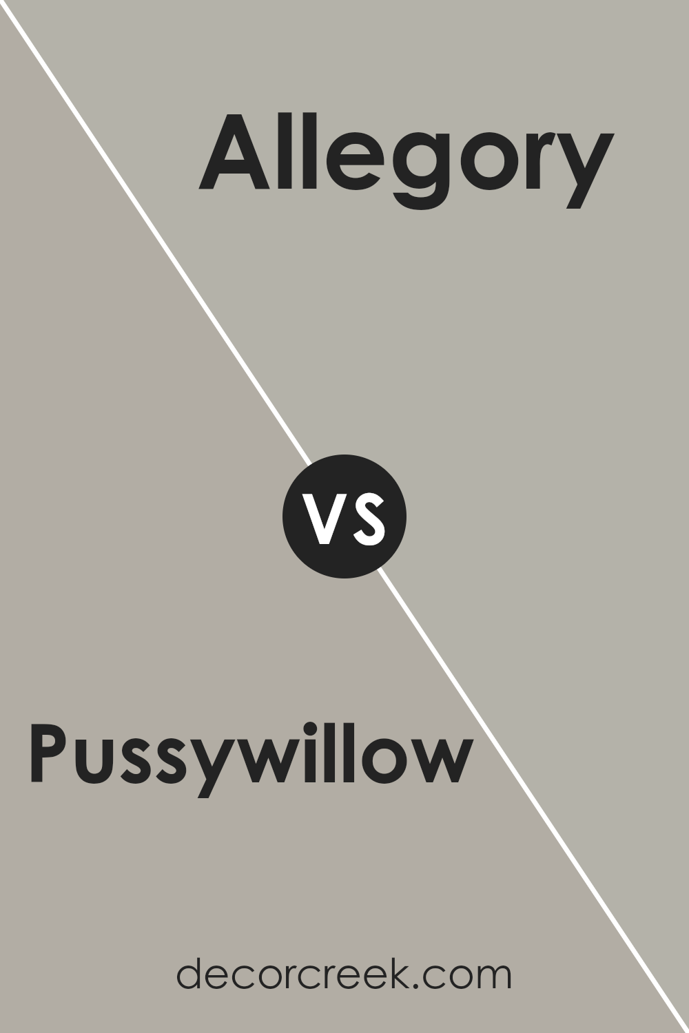
Pussywillow SW 7643 by Sherwin Williams vs Allegory SW 9553 by Sherwin Williams
Pussywillow and Allegory by Sherwin Williams are both unique, but they serve different vibes in a space. Pussywillow is like a soft, gray hug for your walls, giving off a calm and soothing effect. It’s great for a cozy, serene room where you want to relax. Imagine it like a cloudy day, but in a pleasant, snug way.
Now, Allegory steps in with a bit more personality. It’s still in the gray family but tosses in a hint of purple that brings a subtle, creative flair. This color isn’t loud, but it’s definitely more playful and imaginative than Pussywillow.
If you want a space that feels comfortable but with a sprinkle of fun, Allegory is your go-to. So, Pussywillow is your go-to for straightforward calmness, while Allegory adds a dash of whimsy to the calm. Both are elegant; it just depends on the mood you’re aiming for in your room.
You can see recommended paint color below:
- SW 9553 Allegory
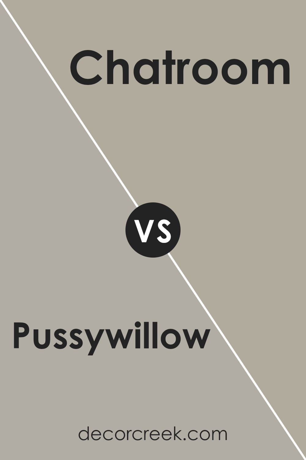
Pussywillow SW 7643 by Sherwin Williams vs Chatroom SW 6171 by Sherwin Williams
Pussywillow SW 7643 and Chatroom SW 6171, both by Sherwin Williams, are like two subtle yet distinct shades in a cozy living room. Pussywillow is a soft, warm gray that feels like a gentle hug from a cloud.
It’s light enough to make small rooms feel bigger, but its warmth keeps it from feeling cold or sterile, perfect for creating a soothing ambiance.
Chatroom, on the other hand, brings a richer, deeper green-gray vibe to the table. It’s like Pussywillow got a bit more serious, adding depth to any space without overwhelming it.
This color can transform a room into a calming retreat, offering a slightly bolder statement while still keeping things neutral.
Together, these colors complement each other beautifully. Pussywillow’s light, airy feel can brighten spaces, while Chatroom adds a touch of sophistication and grounding.
Ideal for anyone looking to mix and match neutral tones with subtle differences, these two colors work well in various combinations, from living rooms to bedrooms, offering versatility and a modern touch.
You can see recommended paint color below:
- SW 6171 Chatroom
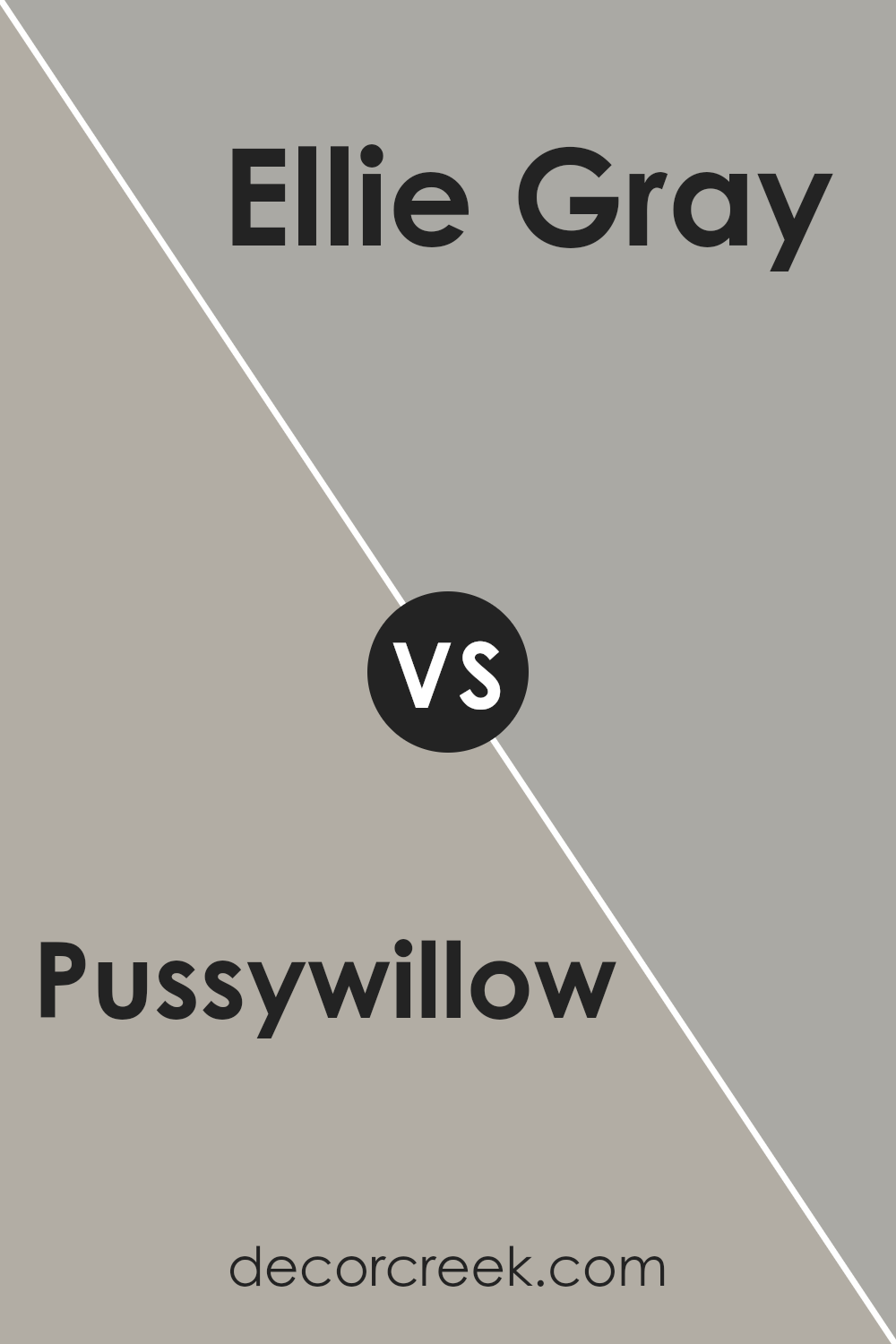
Pussywillow SW 7643 by Sherwin Williams vs Ellie Gray SW 7650 by Sherwin Williams
Pussywillow and Ellie Gray are two distinct colors by Sherwin Williams that both bring a unique vibe to any space. Pussywillow is a soft, muted greige – a blend of gray with a hint of beige.
This warm tone is versatile, making it a great choice for creating a cozy and inviting atmosphere in rooms. It pairs well with both bright and dark colors, adding a sophisticated touch to interiors.
On the other hand, Ellie Gray is a cooler shade, leaning more towards a true gray. It’s slightly deeper than Pussywillow, offering a more defined presence.
This color is perfect for those looking to create a serene, yet bold statement. It works well in spaces that receive a lot of natural light, balancing brightness with its calming hue.
Overall, although both are gray-based, Pussywillow offers a warmer, softer approach, while Ellie Gray stands out for its cool, crisp elegance.
Depending on the ambiance you’re aiming to achieve, either color can enhance your space beautifully, with Pussywillow adding warmth and Ellie Gray bringing a chic, modern feel.
You can see recommended paint color below:
- SW 7650 Ellie Gray
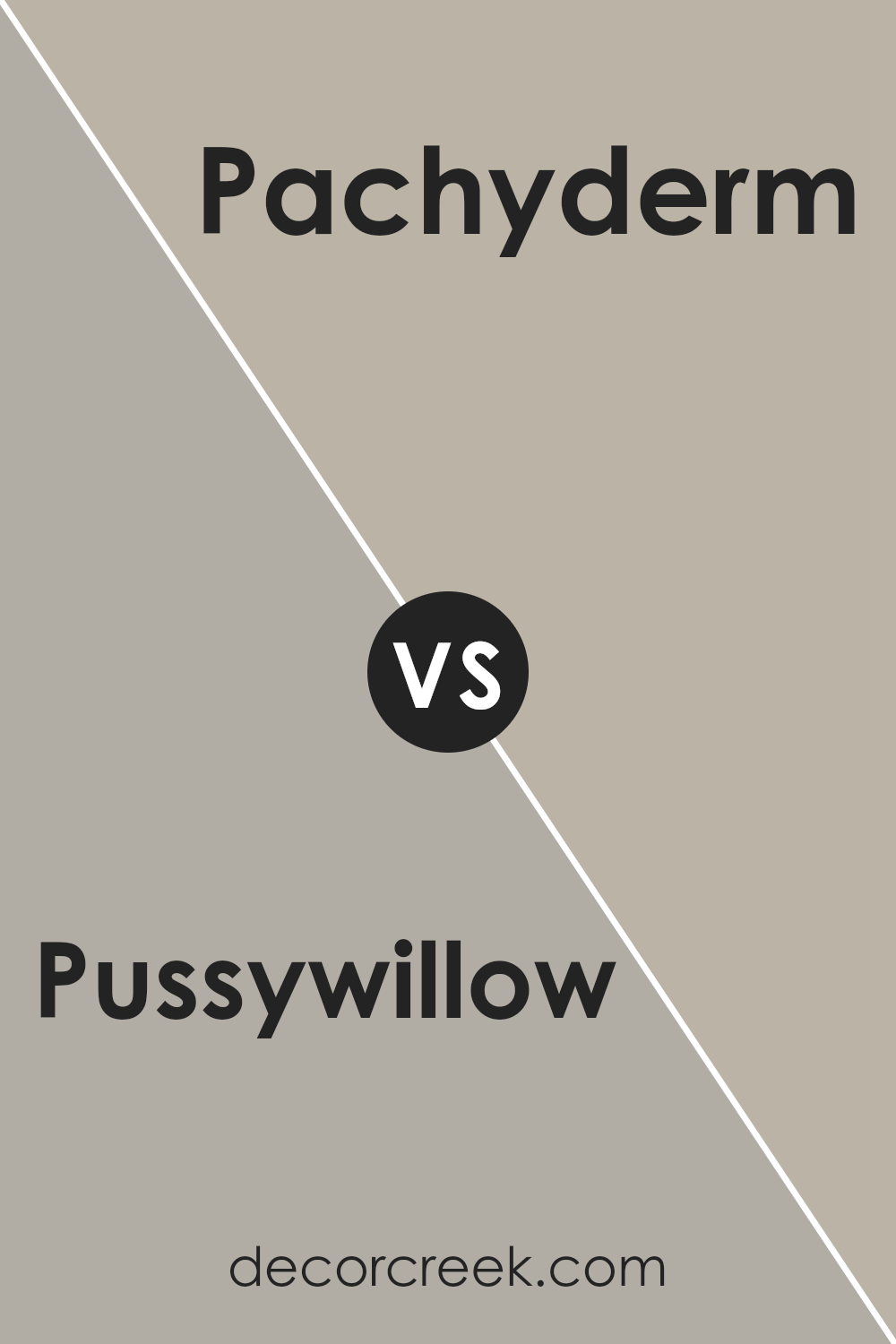
Pussywillow SW 7643 by Sherwin Williams vs Pachyderm SW 9596 by Sherwin Williams
Pussywillow and Pachyderm by Sherwin-Williams are two unique colors that serve different moods and styles for rooms. Pussywillow is a gentle gray that carries a soft, almost muted quality. It’s versatile, fitting well in spaces where a calm, soothing feel is desired, such as bedrooms and living rooms.
This color pairs nicely with a wide range of decor, adding a subtle depth to walls without overwhelming the space.
On the other hand, Pachyderm is a deeper, richer color that leans towards a grayish taupe. It’s a strong choice for creating a cozy, inviting atmosphere. Ideal for areas where a sense of warmth and sophistication is desired, Pachyderm can make a powerful statement on a feature wall or envelop a room in comfort when used on all walls.
Its depth offers a perfect backdrop for both modern and traditional styles, contrasting beautifully with lighter furnishings and decor.
While both colors share a gray base, Pussywillow offers a lighter, airier feel, and Pachyderm brings depth and warmth, making each suited to different aesthetic needs and personal preferences.
You can see recommended paint color below:
- SW 9596 Pachyderm
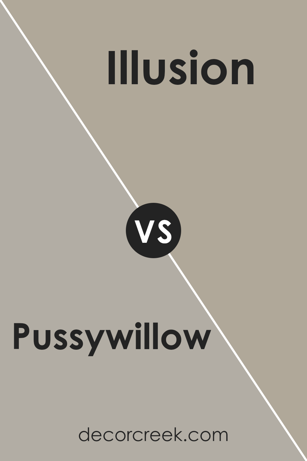
Pussywillow SW 7643 by Sherwin Williams vs Illusion SW 9592 by Sherwin Williams
Pussywillow and Illusion, both by Sherwin Williams, offer unique vibes for any space. Pussywillow is a soft, muted gray color with a warm undertone, which gives it a cozy and welcoming feel. It’s perfect for those who want a neutral backdrop that still feels inviting.
This color is versatile and can match a wide range of decor, making it an excellent choice for living rooms, bedrooms, or even home offices.
On the other hand, Illusion takes a different route with its appearance. It is a lighter, almost ethereal color with a blend of gray and pale blue tones. This gives it a fresh and airy feel, ideal for creating a tranquil and soothing atmosphere.
Illusion works wonders in spaces meant for relaxation, like bathrooms and bedrooms, offering a serene backdrop that pairs well with both contemporary and traditional styles.
While both colors hail from the same family, their unique undertones set them apart, providing two distinct options for home interiors.
Pussywillow’s warmth versus Illusion’s cool, soothing touch shows how varied neutral colors can be, offering something for every taste and setting.
You can see recommended paint color below:
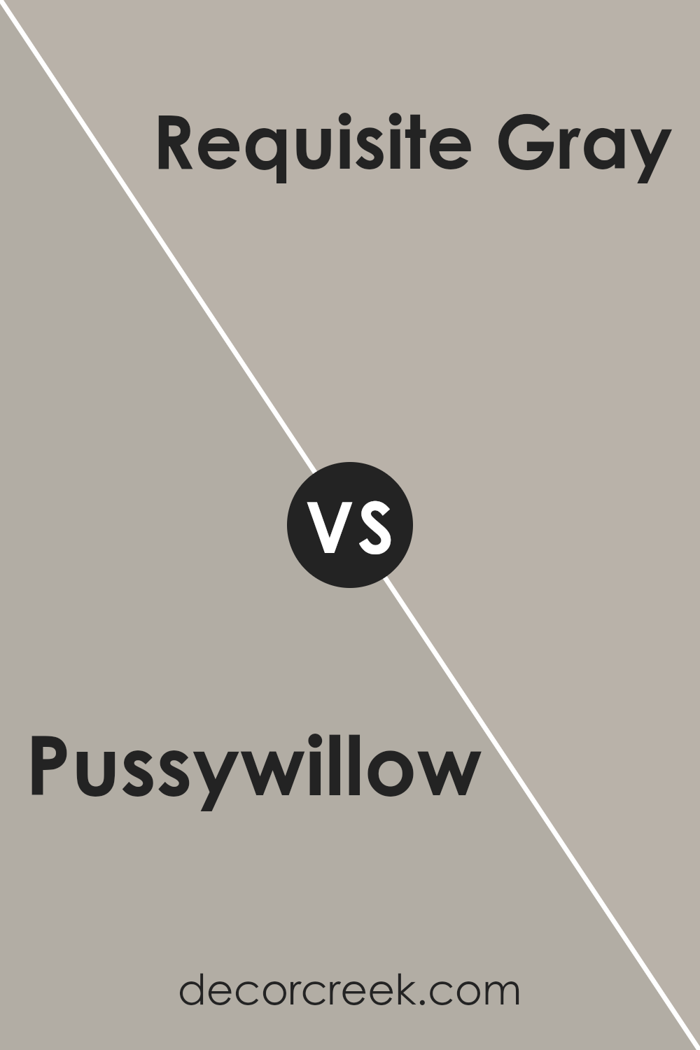
Pussywillow SW 7643 by Sherwin Williams vs Requisite Gray SW 7023 by Sherwin Williams
Sure, comparing Pussywillow and Requisite Gray by Sherwin Williams, both colors offer unique vibes for any space. Pussywillow is a soft, gentle gray with warm undertones. It’s like a cozy blanket on a rainy day, offering a soothing, calm feeling that’s perfect for creating a relaxed atmosphere.
Its warmth makes it ideal for living rooms or bedrooms where you want to feel snug and at ease.
Requisite Gray, on the other hand, is a bit darker and straddles the line between gray and beige, often called “greige.”
This color has a more sophisticated air, providing a strong yet neutral backdrop that can complement various decor styles. It holds a touch of elegance and adapts well to spaces that aim for a more refined or modern look.
While both are grays, Pussywillow leans towards a softer, warmer side, making spaces feel welcoming and intimate. Requisite Gray, however, offers a deeper, more anchor-like presence, suitable for a bold yet neutral setting.
Choosing between them depends on the ambiance you’re aiming for—cozy and nurturing or sleek and grounded.
You can see recommended paint color below:
- SW 7023 Requisite Gray
Pussywillow SW 7643 by Sherwin Williams vs Hibernate SW 9573 by Sherwin Williams
Pussywillow SW 7643 by Sherwin-Williams is a soft, muted gray that has a warm, inviting vibe. It’s like a cozy, gentle hug for your walls, giving a space a calm and peaceful feeling. This color is versatile and pairs well with many other shades, making it a solid choice for any room in your house.
On the other hand, Hibernate SW 9573, also by Sherwin-Williams, is a deeper, richer gray. It’s like the shadowy part of the forest, providing a sense of comfort and protection.
This color adds a bit of drama and depth to a room without overpowering it. It’s perfect for creating a snug and serene retreat.
Both Pussywillow and Hibernate share a gray foundation, but their vibes are quite different. Pussywillow is lighter and airier, making spaces feel open and relaxed.
Hibernate, being darker, brings a cozy, enveloping feel to rooms, perfect for snuggling up. Together, they could create a harmonious contrast in a home, balancing light and coziness.
You can see recommended paint color below:
Pussywillow SW 7643 by Sherwin Williams vs Warm Pewter SW 9572 by Sherwin Williams
Pussywillow and Warm Pewter, both from Sherwin Williams, offer unique takes for those looking to spruce up their spaces. Pussywillow is a soft, gentle gray with a cozy vibe. It’s perfect for creating a calm, soothing atmosphere in any room, making spaces feel more inviting and peaceful.
This color works well in living rooms, bedrooms, and even home offices, where a touch of serenity is always welcome.
On the other hand, Warm Pewter is a bit deeper and richer. It carries a strong presence, providing a more grounded and stable look. This color is excellent for adding depth and warmth to spaces, making it ideal for areas where you want a bit more character without overwhelming the senses.
Warm Pewter can beautifully complement living areas, kitchens, and even entryways, offering a welcoming touch with its hearty tone.
Both colors are versatile and can blend well with various decor styles, from modern to traditional. Whether you lean towards the lighter, airier feel of Pussywillow or the deeper, cozier warmth of Warm Pewter, each color offers its unique charm to make your home feel just right.
You can see recommended paint color below:
- SW 9572 Warm Pewter
Pussywillow SW 7643 by Sherwin Williams vs Dorian Gray SW 7017 by Sherwin Williams
Pussywillow and Dorian Gray, both from Sherwin Williams, are popular choices for those looking to give their spaces a modern and subtle touch. Pussywillow has a soft, light gray tone that brings a gentle and airy feel to any room.
It’s like the soft shade of gray you see on a cloudy, peaceful morning. It’s perfect for creating a calm and inviting atmosphere.
On the other hand, Dorian Gray sits deeper on the color scale, offering a stronger, more pronounced gray. While still in the gray family, it leans towards a warmer, more enveloping shade, reminiscent of the color of stones found in a shaded riverbed.
This makes it ideal for spaces where a bit more coziness and depth are desired.
When comparing the two, Pussywillow is lighter and cooler, making it great for smaller rooms or spaces with limited natural light, as it can make them appear more spacious and brighter.
Dorian Gray, with its warmer undertones, is perfect for larger spaces or areas where a more defined, sophisticated look is desired. Both colors work well with a wide range of décor styles, from modern to traditional, making them versatile choices for any home.
You can see recommended paint color below:
- SW 7017 Dorian Gray
Conclusion
Concluding, the Pussywillow color by Sherwin Williams stands out as a versatile choice for those seeking a cozy yet sophisticated hue for their spaces. This shade provides a neutral backdrop that can effortlessly complement a wide range of decor styles and color schemes.
Its muted quality allows it to serve as either a calming presence in a room or as a subtle contrast when paired with bolder colors, making it a practical choice for any area of the home.
Furthermore, the adaptability of this color enhances its appeal, as it effortlessly transitions from traditional to contemporary settings.
Whether you’re looking to refresh a living space, bedroom, or even an office, Pussywillow offers a timeless elegance that can elevate the aesthetic appeal of any environment. Its understated charm and reliability confirm why it remains a favored option among homeowners and designers alike.
Ever wished paint sampling was as easy as sticking a sticker? Guess what? Now it is! Discover Samplize's unique Peel & Stick samples.
Get paint samples