If you’re looking to add a dash of vibrant energy to your room, SW 6607 Red Tomato by Sherwin Williams might just be the perfect choice for you. I recently had the opportunity to use this bold, dynamic red paint in my kitchen, and the results were impressive. This shade is not shy; it’s a true, deep red that can create an inviting and lively atmosphere in any room.
Red Tomato stands out due to its ability to add warmth and a sense of joy. Whether you’re looking to paint a feature wall or brave enough to cover all four walls, this color provides a rich backdrop that pairs well with a variety of decor styles and color palettes.
Imagine your furniture, whether it’s rustic wood or contemporary metals, popping against this striking hue. With its superb coverage and high-quality finish, applying Red Tomato is a smooth process, leaving you with a professional look even if you’re applying it yourself.
This paint color isn’t just about aesthetics; it influences the mood of your room too. A kitchen painted in Red Tomato feels warm and welcoming, a bedroom becomes cozy and energized, and a living room turns cheerful and dynamic. Whether you’re redecorating a single room or changing your entire home, adding a touch of Red Tomato can certainly enhance your living room.

What Color Is Red Tomato SW 6607 by Sherwin Williams?
Red Tomato by Sherwin Williams is a vibrant, eye-catching shade of red that packs a punch in any room. This vivid hue mirrors the fresh, juicy color of a ripe tomato, bringing a lively burst of energy wherever it’s applied. This strong red can function beautifully as an accent wall or in smaller doses such as on a piece of furniture or within decorative accessories, making it flexible in its use.
The boldness of Red Tomato works well in interior styles that appreciate dramatic and lively aesthetics such as eclectic, modern, or even traditional settings that want a touch of flair. It goes especially well in dining areas or kitchens where it complements food-related themes but can also create a warm, welcoming vibe in living rooms or entryways.
In terms of materials, Red Tomato pairs beautifully with natural wood tones, from light oaks to rich, dark walnuts, providing a grounding effect to its intensity. Metals like brushed bronze or copper can also look stunning, adding a rustic or industrial feel. For textures, consider combining this color with soft, plush fabrics like velvet in neutral colors to balance out its boldness, or with smooth, glossy finishes that highlight its vibrancy.
Overall, Red Tomato is a strong choice for anyone looking to add a pop of color and energy to their interior without feeling too strong.
decorcreek.com
Is Red Tomato SW 6607 by Sherwin Williams Warm or Cool color?
Red Tomato by Sherwin Williams is a vibrant and bold paint color that can make a strong statement in any home. This particular shade of red has a lively and energetic feel to it, making it perfect for rooms where activity and engagement are desired.
When used in a kitchen or dining area, Red Tomato can create a sense of warmth and welcome, encouraging appetites and conversations. In a living room, adding this color on an accent wall can create a dynamic focal point, drawing the eye and sparking interest.
However, it’s important to consider the amount of natural light a room receives when choosing this color. In well-lit rooms, Red Tomato looks bright and inviting. In rooms with less light, it might come across as too heavy or too intense. Pairing it with neutral tones like whites or soft grays can help balance its intensity, ensuring it adds just the right amount of warmth and energy without taking over the room.
Undertones of Red Tomato SW 6607 by Sherwin Williams
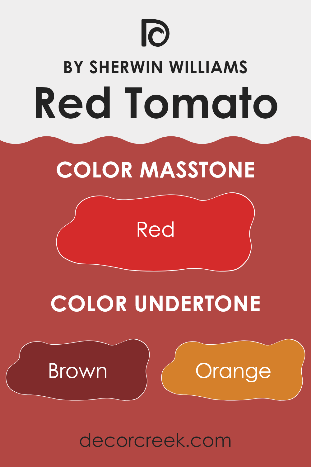
Red Tomato by Sherwin Williams is a vibrant and flexible red, thanks largely to its varied undertones. Undertones in paint colors subtly influence how we see the main hue, depending on the lighting and surrounding colors. They can either cool down or warm up a color.
Red Tomato has undertones of brown, orange, pink, olive, purple, pale pink, and grey. Each of these adds depth and richness to the paint. For instance, brown and orange undertones can make the red warmer and more welcoming, which is great for living rooms where a cozy feel is desired. Pink and pale pink undertones add a softer, slightly playful touch, ideal for rooms like kitchens or dining areas where you spend a lot of time and want a lively environment.
Conversely, olive and purple undertones bring a more grounded, rich vibe to the red, making it suitable for a study or home office. The grey undertone helps balance the brightness of the red, making it more muted and suitable for wider use, including in more formal or minimalist decor styles.
When applied to interior walls, the varying undertones of Red Tomato will make the walls look different depending on the time of day and the type of artificial light used. For example, under warm lighting, the orange and brown undertones might make the room feel more inviting, while the cooler grey may stand out under fluorescent lights, giving a more toned-down look.
This makes Red Tomato by Sherwin Williams a great choice for those who want flexibility and a bit of personality in their color choices without feeling too strong.
decorcreek.com
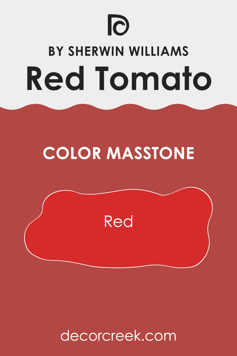
What is the Masstone of the Red Tomato SW 6607 by Sherwin Williams?
Red Tomato SW 6607 by Sherwin Williams has a masstone of Red (#D52B2B), a bold and vivid shade that brings warmth and energy to any room. This deep red hue can make large rooms feel cozier, creating a welcoming atmosphere.
In smaller rooms, it works well on an accent wall to prevent the color from feeling too strong. This shade pairs beautifully with neutral colors like white, grey, or beige, which help balance its intensity. Adding accessories or furniture in these lighter tones can also help brighten the room while allowing the red to stand out as a focal point.
In terms of lighting, natural light brightens the red, making it appear more vibrant. In artificial lighting, depending, it can look richer and deeper, adding to the cozy feel. Red Tomato is perfect for rooms where you want to add a lively touch without using overly bright colors.
decorcreek.com
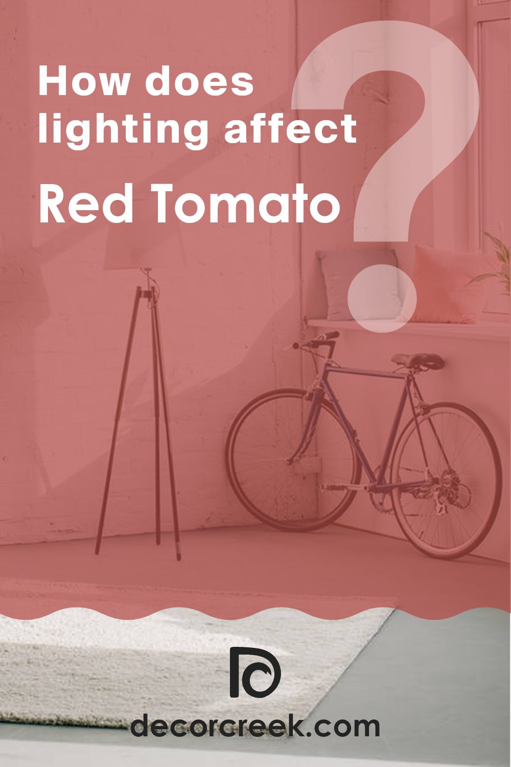
How Does Lighting Affect Red Tomato SW 6607 by Sherwin Williams?
Lighting has a major impact on how we perceive colors, especially in our homes. For instance, the color like Red Tomato SW 6607 by Sherwin Williams can look quite different depending on the light source. In artificial light, such as from LED or incandescent bulbs, this vibrant red can appear more intense and vivid, making it an ideal choice for lively rooms or accent walls designed to catch the eye.
In natural light, the perception of this red shade can change throughout the day. Under the bright mid-day sunlight, the color typically shows its truest form, appearing vivid and bright. However, during early mornings or late afternoons when the sunlight is softer and more golden, the color can take on a warmer, richer tone.
The orientation of rooms in relation to the sun also affects how this particular shade of red is seen. In north-facing rooms, which often get less direct sunlight, Red Tomato might appear slightly darker and less vibrant. This could give the room a cozier feel, especially in rooms with less natural light.
Conversely, in south-facing rooms that receive ample sunlight throughout the day, this red can be strikingly bold and dynamic. The abundant light can make the color appear lively and intense, perfect for rooms where you want to make a strong visual statement.
For east-facing rooms, the morning light can make Red Tomato look warm and inviting as the sun rises. It’s a great way to start the day with energy, especially in living areas or kitchens. In west-facing rooms, the afternoon and evening light provide a similar effect but be mindful that the color could appear very intense when the sunlight is at its peak.
Understanding these details helps in making informed decisions about paint colors and room orientation to achieve the desired mood in your room.
decorcreek.com
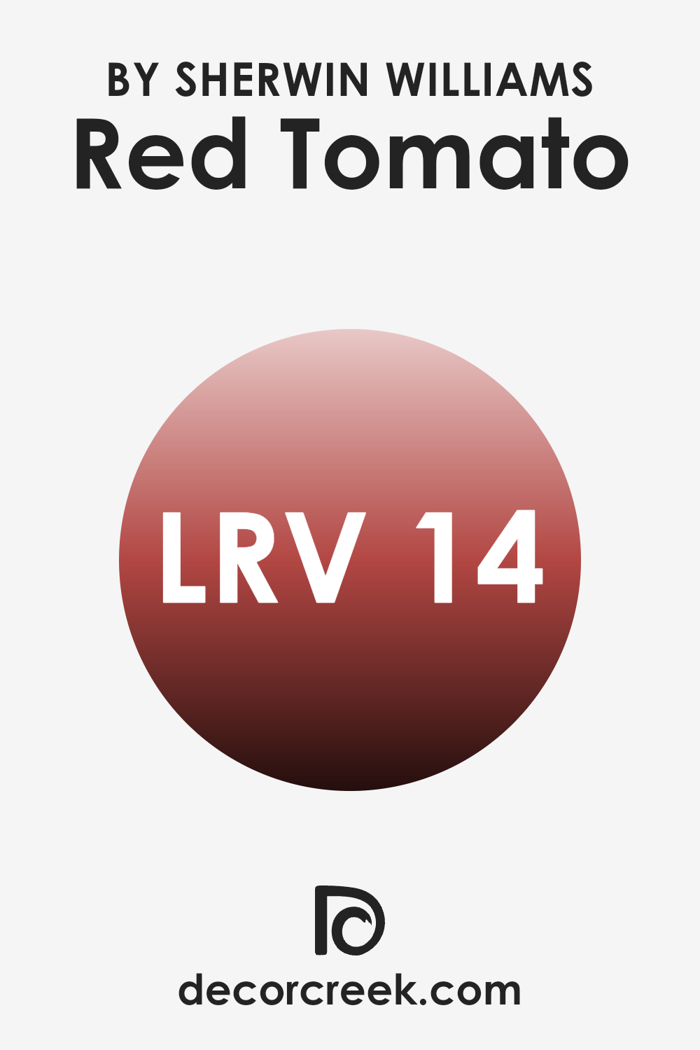
What is the LRV of Red Tomato SW 6607 by Sherwin Williams?
LRV stands for Light Reflectance Value, which is a measurement used to determine how much light a color reflects or absorbs when it’s painted on a surface. Essentially, it’s a scale from zero to one hundred, where higher values show that the paint reflects more light and appears brighter, while lower values mean the paint absorbs more light and looks darker.
This value is important for choosing paint colors because it helps you understand how a color will look in different lighting conditions and how bright or dark a room will feel once the walls are painted.
For the color Red Tomato with an LRV of 14.353, this is on the lower end of the scale, showing that it is a relatively dark shade. This means that Red Tomato will absorb more light than it reflects, making it a bold choice that can add depth and warmth to a room. However, its low LRV also means that it can make a room feel smaller or more enclosed, especially if used on all walls or in a room with limited natural light.
When using darker colors like this, it’s often helpful to have good lighting or balance the dark walls with lighter elements to prevent the room from feeling too dark or too intense.
decorcreek.com
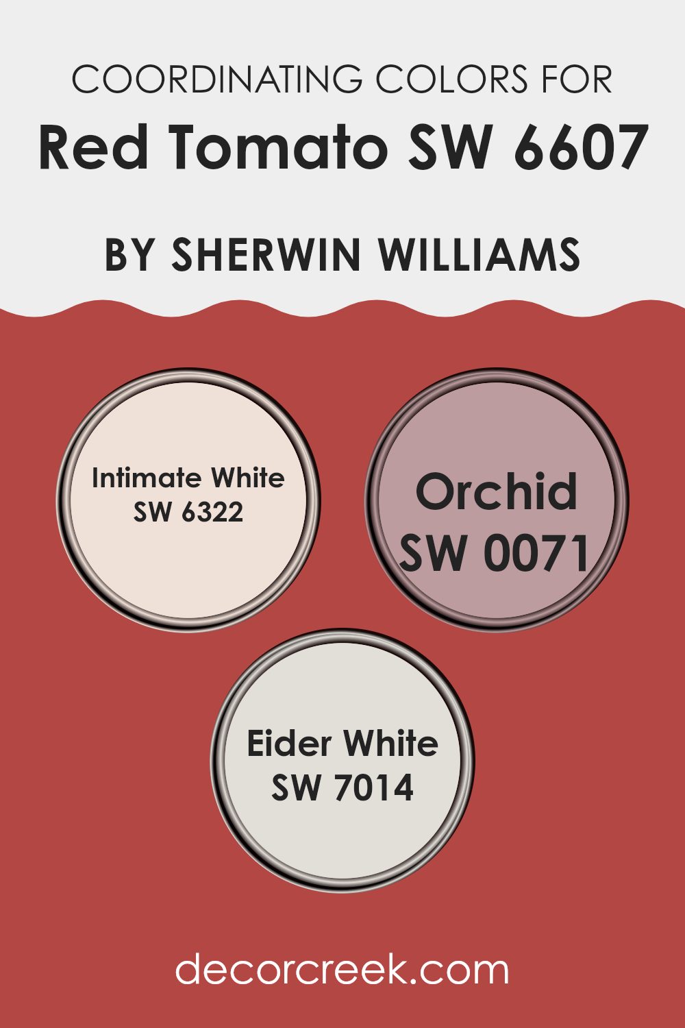
Coordinating Colors of Red Tomato SW 6607 by Sherwin Williams
Coordinating colors are those that complement a main color to create a harmonious color palette. When used together, these colors improve the overall look of a room. For example, a vibrant red like Sherwin Williams Red Tomato can be beautifully complemented by selecting the right coordinating hues that balance its boldness without taking over the room. The key is in finding colors that support the main color but also bring their own charm to the setting.
The color SW 6322, known as Intimate White, is a soft and gentle pale pink that offers a light contrast to the strong red of Red Tomato, providing a calm backdrop that allows the red to stand out while softening the overall look.
SW 0071, called Orchid, is a deeper pink with a hint of purple that echoes some of the warmth of Red Tomato, creating a sense of flow and connection across the color scheme. Lastly, SW 7014, named Eider White, is a muted gray that acts as a neutral base, making sure that the bolder colors stand out without clashing. This color not only supports but also balances the brightness of Red Tomato, making it a great choice for trims or nearby rooms.
You can see recommended paint colors below:
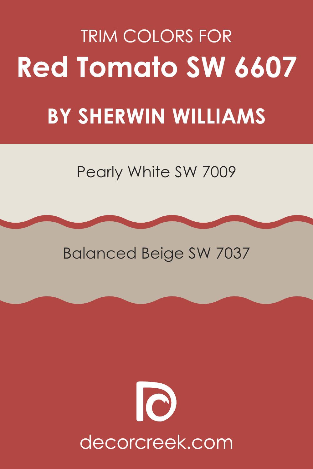
What are the Trim colors of Red Tomato SW 6607 by Sherwin Williams?
Trim colors are used to highlight the architectural features of a room, such as window frames, doorways, and moldings, providing a contrast to the main wall color.
For a vibrant color like Red Tomato by Sherwin Williams, choosing the right trim color is important to achieving a balanced and harmonious look in your room. Pearly White and Balanced Beige are both great trim choices that can complement the boldness of Red Tomato without feeling too strong.
Pearly White, a soft and subtle shade of white, offers a gentle contrast that can help make the wall color stand out while keeping the atmosphere light and airy. On the other hand, Balanced Beige provides a warmer and deeper contrast, giving the room a cozy and grounded feel. Both colors work well to frame Red Tomato, making sure the wall color remains the focal point while the trims add a clean and finished look to the overall design.
You can see recommended paint colors below:
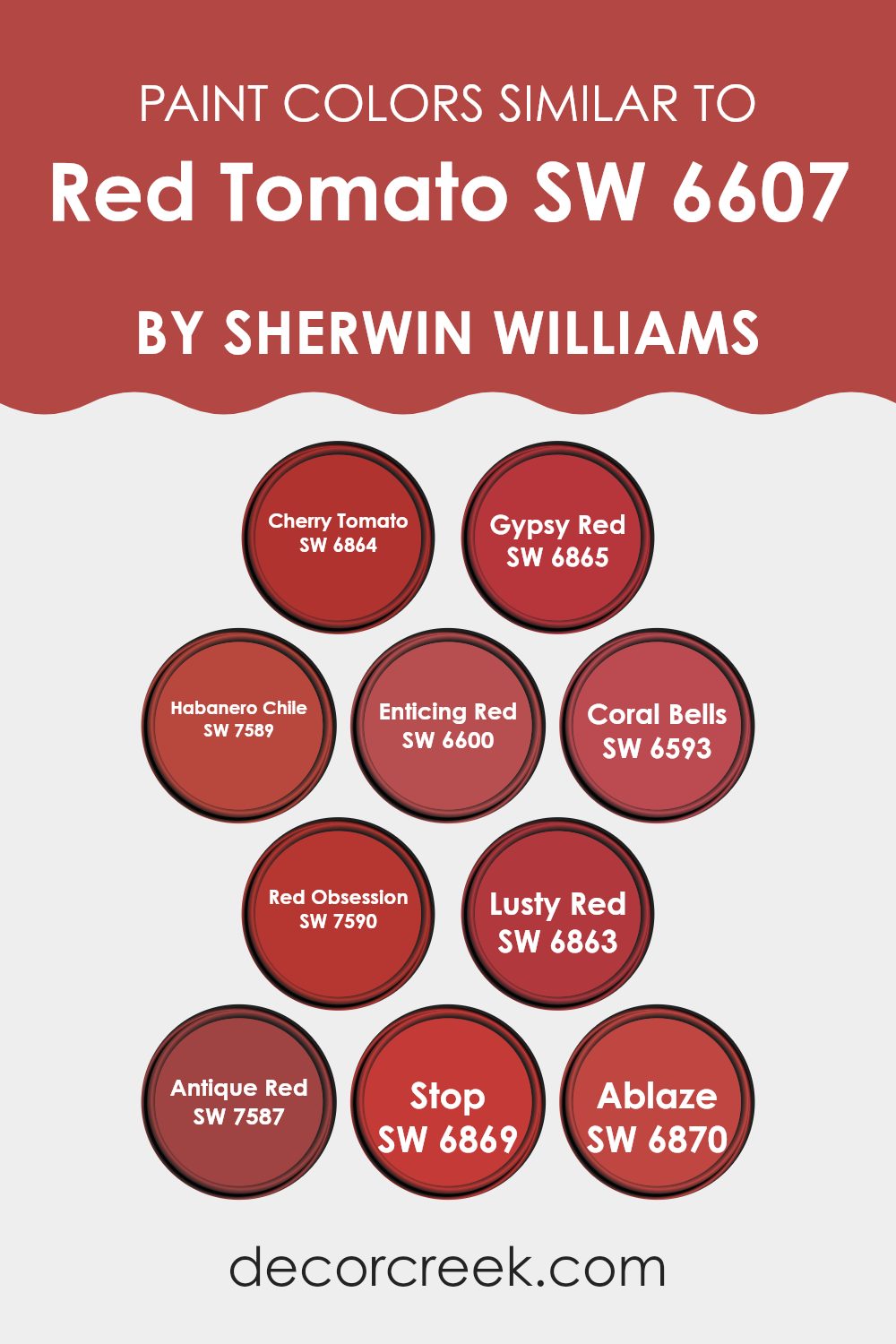
Colors Similar to Red Tomato SW 6607 by Sherwin Williams
Similar colors are crucial in design as they create visual coherence and harmony. When you work with shades closely related, like those near Red Tomato on the color wheel, you establish a seamless flow throughout the room.
This technique can improve the aesthetic unity and can also lift mood by providing a consistent and pleasing visual experience. Colors like Cherry Tomato and Gypsy Red, though distinct, share a vivid warmth that can energize a room without feeling too strong from contrast.
Cherry Tomato adds a punchy, vibrant depth, similar to the bright glow of its namesake. Gypsy Red offers a deeper, melodic warmth that hints at richness and depth. Habanero Chile brings an intense, fiery character that’s both welcoming and bold. Enticing Red, true to its name, pulls in an appealing and rich hue.
Coral Bells introduces a lighter, softer side of red, providing a gentle and fresh alternative. Red Obsession is a passionate and strong presence, drawing attention in any room. Lusty Red is full of energy and drama, making it perfect for impactful accents.
Antique Red has a traditional charm, bringing a sense of classic warmth. Stop is a commanding shade, unmissable and dynamic in its appeal. Ablaze is a wildfire of color, vibrant and lively, ideal for bringing energy into a room. Together, these colors create varied yet unified options for interesting and cohesive design schemes.
You can see recommended paint colors below:
- SW 6864 Cherry Tomato
- SW 6865 Gypsy Red
- SW 7589 Habanero Chile
- SW 6600 Enticing Red
- SW 6593 Coral Bells
- SW 7590 Red Obsession
- SW 6863 Lusty Red
- SW 7587 Antique Red
- SW 6869 Stop
- SW 6870 Ablaze
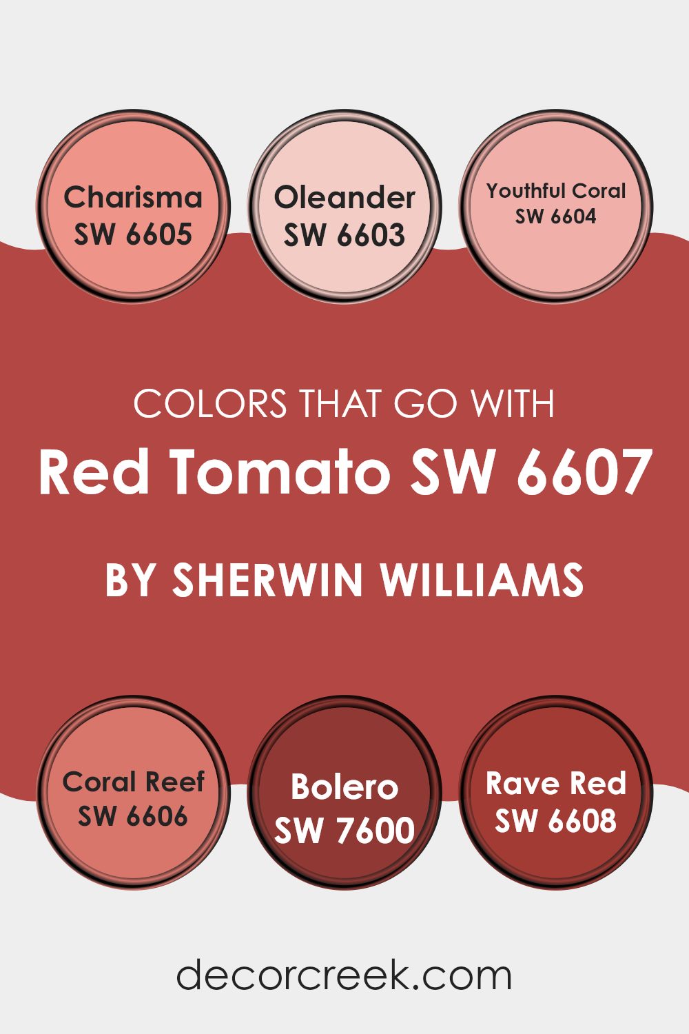
Colors that Go With Red Tomato SW 6607 by Sherwin Williams
Choosing the right colors to complement Red Tomato SW 6607 by Sherwin Williams can greatly improve the appeal and mood of any room. Red Tomato is a bold and vibrant shade of red that can act as a striking feature or accent wall in a room. When paired with the right complementary colors, it creates a balanced and harmonious look.
For example, Charisma SW 6605 offers a slightly muted yet still vibrant red tone, which can soften the intensity of Red Tomato without losing the room’s energetic feel. Similarly, Oleander SW 6603 is a soft pink that brings a gentle touch to the mix, perfect for creating a contrast that is pleasing to the eye yet not too strong.
Youthful Coral SW 6604 presents a lighter, peachier option that works well if you prefer a gentle transition from the deep tones of Red Tomato. Coral Reef SW 6606 has a slightly more intense, punchy coral tone that adds a sense of freshness and lively feel when used alongside Red Tomato.
Bolero SW 7600 shifts the palette towards a rustic, earthy red, complementing Red Tomato with its grounding effect. Lastly, Rave Red SW 6608 increases the energy with a red that’s equally bold but slightly darker, ideal for creating a dynamic and vivid color scheme. The careful selection of these hues alongside Red Tomato helps achieve a cohesive and appealing look, making sure that each color supports and enhances the other.
You can see recommended paint colors below:
- SW 6605 Charisma
- SW 6603 Oleander
- SW 6604 Youthful Coral
- SW 6606 Coral Reef
- SW 7600 Bolero
- SW 6608 Rave Red
How to Use Red Tomato SW 6607 by Sherwin Williams In Your Home?
Red Tomato SW 6607 by Sherwin Williams is a bold and vibrant red paint color that can add excitement and a pop of color to any room in your home. This shade can be used in different ways, depending on the kind of impact you want to make. For a striking feature wall, apply Red Tomato to one wall in your living room or bedroom, keeping the other walls in a neutral tone to balance the intensity of the red. This creates a focal point and adds personality into the room.
In the kitchen, cabinets painted with Red Tomato can instantly warm up the room and make it more welcoming. Pairing it with white or gray walls will help keep a fresh and clean look while allowing the red cabinets to stand out.
Additionally, Red Tomato can be used in smaller amounts, such as on a front door or on select pieces of furniture. This touch of red can bring life to exterior or interior rooms without feeling too strong. With its deep and rich hue, Red Tomato is perfect for adding warmth and a sense of cheer to any part of your home.
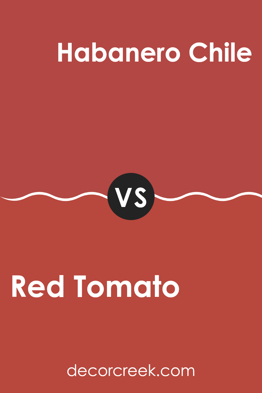
Red Tomato SW 6607 by Sherwin Williams vs Habanero Chile SW 7589 by Sherwin Williams
Red Tomato and Habanero Chile are two vibrant colors by Sherwin Williams, each offering its unique shade of red. Red Tomato is a classic, bright red that stands out with an almost pure, traditional apple red hue. It carries a fresh and energetic feel, perfect for adding a lively splash of color to any room.
In contrast, Habanero Chile is a deeper, fiery red with orange undertones. This color is bolder and can add a warm, spicy feel to the room, making it ideal for areas where you want to create a cozy, inviting atmosphere.
Both colors are great choices for anyone looking to add a strong statement to their decor, but the selection depends on the desired mood and effect—bright and cheerful with Red Tomato or warm and spicy with Habanero Chile.
You can see recommended paint color below:
- SW 7589 Habanero Chile
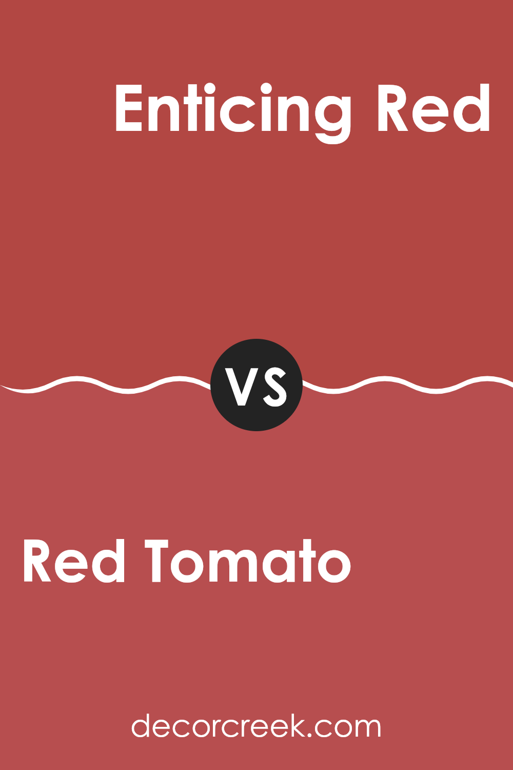
Red Tomato SW 6607 by Sherwin Williams vs Enticing Red SW 6600 by Sherwin Williams
Red Tomato and Enticing Red by Sherwin Williams are both shades of red, but they have distinct tones that set them apart. Red Tomato is a vibrant, bright red that carries a punch of energy and liveliness.
It’s the kind of red that grabs attention in any room, making it a great choice for areas where you want a lively, inviting atmosphere. On the other hand, Enticing Red has a deeper, slightly muted tone. It’s closer to a burgundy, which gives it a warm and cozy feel.
This color works well in rooms where a more subtle, yet still rich, red is desired to create a welcoming and warm environment. Both colors reflect light differently; Red Tomato tends to be more reflective, while Enticing Red offers a softer glow, making each ideal for different interior moods and settings.
You can see recommended paint color below:
- SW 6600 Enticing Red
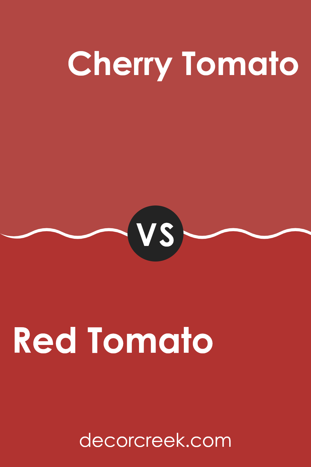
Red Tomato SW 6607 by Sherwin Williams vs Cherry Tomato SW 6864 by Sherwin Williams
Red Tomato and Cherry Tomato, both from Sherwin Williams, offer distinct takes on the vibrant red family. Red Tomato provides a rich, classic red that resonates with a slightly muted, classic appeal, making it a perfect choice for rooms where you want a touch of tradition without too much brightness.
On the other hand, Cherry Tomato is a bolder and more vivid red. It leans slightly towards a pinkish hue, giving it a fresher, more energetic feel compared to Red Tomato. This makes Cherry Tomato ideal for areas where a lively, stimulating color is desired to liven up the room.
Both colors are great for adding a splash of warmth and energy, but the choice between them depends on the specific mood and atmosphere you’re aiming to create. Red Tomato suits a more subtle, classic setting, while Cherry Tomato fits well in a dynamic, fun environment.
You can see recommended paint color below:
Red Tomato SW 6607 by Sherwin Williams vs Red Obsession SW 7590 by Sherwin Williams
Red Tomato from Sherwin Williams is a lively and vibrant shade of red. It has a bright, bold feel that can really make a room stand out. This color is like ripe tomatoes in summer – fresh and full of life. It’s perfect for areas where you want to add energy and excitement, like a kitchen or a playful living room.
Red Obsession, on the other hand, is a deeper and more intense red. It carries a sense of richness and depth, making it ideal for creating a cozy and inviting atmosphere. This color could work well in a dining room or a reading nook where the goal is to create a warm and comforting room.
Both colors are variations of red but serve different moods and settings due to their intensity and tone. Red Tomato brings freshness and vibrancy, while Red Obsession offers warmth and richness, showing how different shades of the same color can offer diverse options for decorating.
You can see recommended paint color below:
- SW 7590 Red Obsession
Red Tomato SW 6607 by Sherwin Williams vs Coral Bells SW 6593 by Sherwin Williams
Red Tomato and Coral Bells by Sherwin Williams are two distinct shades that offer different vibes for interior rooms. Red Tomato is a bold, vibrant red with a deep, rich hue that commands attention. It’s a perfect choice if you want to add a splash of energy and excitement to a room. This color can make a strong statement on an accent wall or when used to energize smaller decorative elements.
On the other hand, Coral Bells is a softer, more muted color with a blend of pink and orange tones. It has a warm, inviting quality that makes rooms feel cozy and comfortable. Coral Bells works well in living areas or bedrooms where a calming, yet cheerful atmosphere is desired.
In summary, while Red Tomato is bold and lively, Coral Bells offers a gentler touch with its warm, soothing tones. These colors can either create a strong contrast when used together or work independently to set different moods in your home.
You can see recommended paint color below:
Red Tomato SW 6607 by Sherwin Williams vs Ablaze SW 6870 by Sherwin Williams
Red Tomato and Ablaze, both by Sherwin Williams, are vibrant and warm colors but have distinct tones. Red Tomato is a more traditional red with an almost classic feel, not too bright but certainly eye-catching. It works well in rooms that aim for a cozy and inviting atmosphere.
On the other hand, Ablaze is a vivid, almost fiery orange-red. It’s much brighter and more energetic, perfect for areas where you want to add life or a bold statement.
In essence, while Red Tomato leans towards a more muted, classic red, Ablaze stands out with its intense and lively hue. Both colors can warm up a room, but the choice between them depends on how much you want the color to stand out and the overall mood you’re aiming for in your room.
You can see recommended paint color below:
- SW 6870 Ablaze
Red Tomato SW 6607 by Sherwin Williams vs Lusty Red SW 6863 by Sherwin Williams
Red Tomato and Lusty Red by Sherwin Williams are two distinct shades each with their unique flair. Red Tomato presents as a bright, vibrant red with a slight hint of orange, making it warm and inviting. This color is ideal for rooms where you want to add energy and cheerfulness without feeling too strong. It’s perfect for a kitchen or dining room, where it can help encourage conversation and appetite.
On the other hand, Lusty Red is a deeper, more intense red. It has a richness that can give a feeling of elegance and boldness to a room. This shade is more suited for areas where you want to make a strong statement, such as an accent wall in a living room or a dining area. Its depth provides a dramatic backdrop, making any room more striking and memorable.
Each color serves different purposes based on their tones and the feelings they bring, fitting different aesthetic tastes and design needs.
You can see recommended paint color below:
Red Tomato SW 6607 by Sherwin Williams vs Stop SW 6869 by Sherwin Williams
Red Tomato and Stop, both by Sherwin Williams, present variations of a vivid red hue, each with its unique charm. Red Tomato leans slightly towards an orange base, giving a warm, welcoming feel. It’s a bit softer and more muted than Stop, making it flexible for areas like living rooms or kitchens where you want a cozy atmosphere.
On the other hand, Stop is a bolder, brighter red. This color stands out more and carries an energetic punch, which can be great for accent walls or areas where you want to make a strong visual statement.
While Red Tomato is more subtle and blends easily with earthy tones, Stop pairs well with sharp contrasts like white, black, or gray, highlighting its intensity. Both colors offer a rich vibrancy, but the choice between them depends on the mood you want to set and how much attention you want the color to draw.
You can see recommended paint color below:
Red Tomato SW 6607 by Sherwin Williams vs Gypsy Red SW 6865 by Sherwin Williams
Red Tomato and Gypsy Red are two dynamic shades from Sherwin Williams, each offering a unique take on the color red. Red Tomato is a bright and lively red that resembles the fresh color of a ripe tomato. This shade is vibrant and carries a sense of energy and cheerfulness that can brighten up any room. It works very well in areas that benefit from a pop of color, like a kitchen or a dining room.
On the other hand, Gypsy Red is a deeper, more intense shade of red. This color has a richer and slightly darker tone, giving it a bold and dramatic feel. Gypsy Red is ideal for creating a statement in a room, making it perfect for an accent wall or for rooms that aim to show warmth and depth.
Overall, while both colors share the warmth and energy typical of reds, Red Tomato shines with brightness and cheer, whereas Gypsy Red offers depth and drama, making each suitable for different moods and rooms.
You can see recommended paint color below:
- SW 6865 Gypsy Red
Red Tomato SW 6607 by Sherwin Williams vs Antique Red SW 7587 by Sherwin Williams
Red Tomato SW 6607 by Sherwin-Williams is a lively and vivid red. It has a strong, bright tone that appears very energetic. It’s the kind of red you might see on a fire engine or a sports car, making it stand out in any room. This color would work well in areas of a home or office where you want to add a touch of excitement or drama.
On the other hand, Antique Red SW 7587, also by Sherwin-Williams, is a more subdued red. This color has deeper, darker tones, resembling a brick red. It’s less flashy than Red Tomato and gives a warmer, more welcoming feel. Antique Red is great for rooms where you want a hint of color but with a more understated, cozy vibe.
Overall, while both colors share a red base, Red Tomato is sharper and more eye-catching, whereas Antique Red offers a more relaxed and warmer feel.
You can see recommended paint color below:
- SW 7587 Antique Red
In conclusion, SW 6607 Red Tomato by Sherwin Williams is more than just a simple red paint. It has the power to change the feeling of any room, making it more lively and full of energy. This color is perfect if you want to make a place like a living room or kitchen feel more welcoming and fun. It’s especially good for places where families gather to share meals or play games together.
Using Red Tomato paint can also make your home stand out. If you paint your front door with this color, for example, it will catch the eyes of people passing by and make your house look unique. Inside, you could use it on one wall to make it the center of attention, adding a bold touch to a more neutral room.
Overall, SW 6607 Red Tomato is a great choice if you’re looking to add some excitement to your home with color. It’s bright and happy, and sure to make any room feel more warm and cozy.
So, if you think your room needs a splash of cheer, Red Tomato might be just the right choice.

decorcreek.com
Ever wished paint sampling was as easy as sticking a sticker? Guess what? Now it is! Discover Samplize's unique Peel & Stick samples.
Get paint samples

