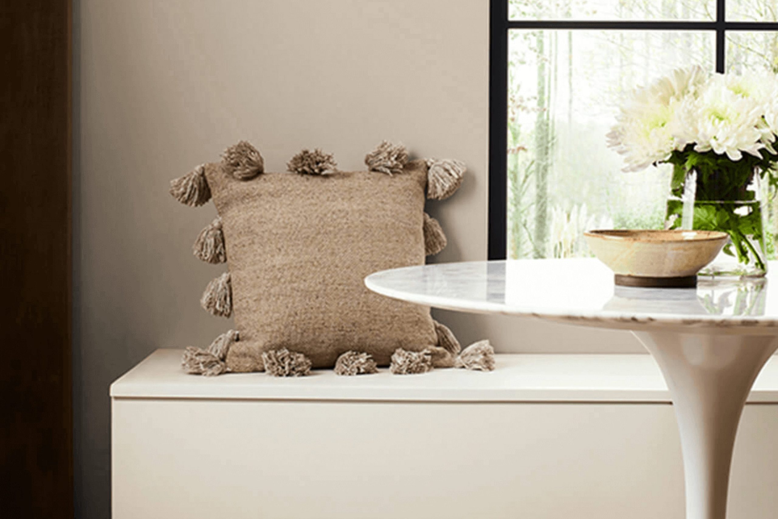
Choosing the right paint color for your home can often feel daunting, but SW 7037 Balanced Beige by Sherwin Williams might just be the shade you’re looking for. If you’re considering this particular color, let me share a few insights based on my experience.
Balanced Beige is a warm, inviting hue that strikes a perfect harmony between being distinctly present yet subtly background. This flexibility makes it an excellent choice for nearly any room, adapting beautifully to various lighting conditions and complementing an array of decor styles.
From living rooms to bedrooms, Balanced Beige offers a soothing backdrop that enhances your furnishings without competing for attention. The warmth of this color can help make large, sparse areas feel more intimate, while its softness can smooth out the harsh edges of a smaller, busier area.
Whether you are planning a major remodel or just want to refresh a room, Balanced Beige could be the calm and flexible option you need. Its ability to blend seamlessly with other colors also allows you to layer various design elements without fear of clashing. Before you make your final decision, consider testing a sample in different parts of your room to see how it changes with the light throughout the day.
Is Balanced Beige SW 7037 Right for My Home?
Balanced Beige is a warm and inviting hue that brings a cozy feel to any room. Its neutral quality makes it incredibly adaptable, fitting seamlessly into various interior styles, including modern farmhouse, rustic, and contemporary. I particularly love using this color because of its ability to blend with a wide range of materials and textures. It pairs wonderfully with natural elements like wood and stone, enhancing their earthy qualities without overpowering them.
In terms of interior styles, Balanced Beige shines in rooms aiming for a welcoming, homey atmosphere. It’s perfect for living rooms or bedrooms where comfort is a priority, and it also creates a refined background in a home office. Textiles like cotton, linen, or wool throw blankets and cushions look fantastic against this shade, as they add layers of texture that make the room feel more inviting.
Additionally, I find that metals, whether it’s brushed nickel, copper, or matte black, complement this beige beautifully. It helps ground metallic finishes, which might otherwise feel too cold or industrial. When I’m helping friends or clients design their rooms, I often recommend Balanced Beige for its adaptability and warm presence that seems to tie different elements of a room together just perfectly.
decorcreek.com
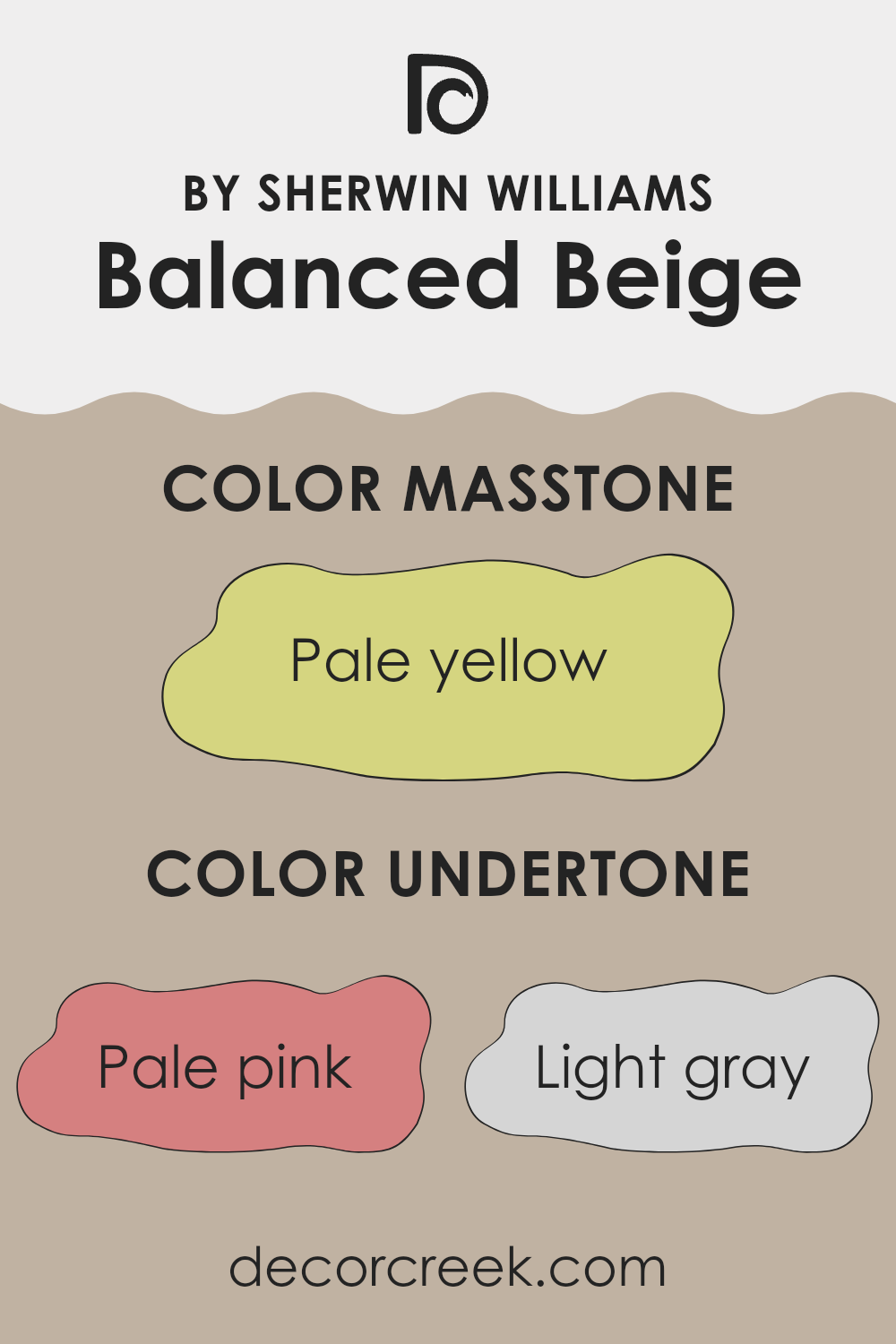
What are the right undertones of Balanced Beige SW 7037 ?
Balanced Beige is a flexible paint color that includes a range of subtle undertones. These undertones are not always immediately noticeable but play a crucial role in how the color appears in different settings. The undertones in any color can affect its warmth, depth, and how it complements other colors in a room.
Balanced Beige, in particular, includes undertones of pale pink, light gray, light purple, mint, grey, light blue, lilac, yellow, orange, light green, and olive. These undertones can cause the main beige color to shift slightly depending on the lighting and surrounding colors. For instance, in a room with a lot of natural light, the pale pink or light purple might make the walls seem warmer and more welcoming. In artificial light, the gray or blue undertones might become more dominant, giving the room a cooler feel.
Using Balanced Beige on interior walls offers a neutral backdrop that can easily harmonize with various decor styles and colors. The complexity of its undertones allows it to adjust to different rooms, making the room feel cozy and connected. For example, pairing this color with furniture in natural wood tones can enhance its warmer undertones like orange and yellow, creating a friendly, inviting atmosphere.
This makes Balanced Beige a smart choice for those looking to add a subtle depth to their walls without committing to a strong or bright color. Its ability to adjust to various lighting and settings through its nuanced undertones also means it’s less likely to clash with other elements in a room. This flexibility and subtle complexity help the color support a range of aesthetic choices and personal styles.
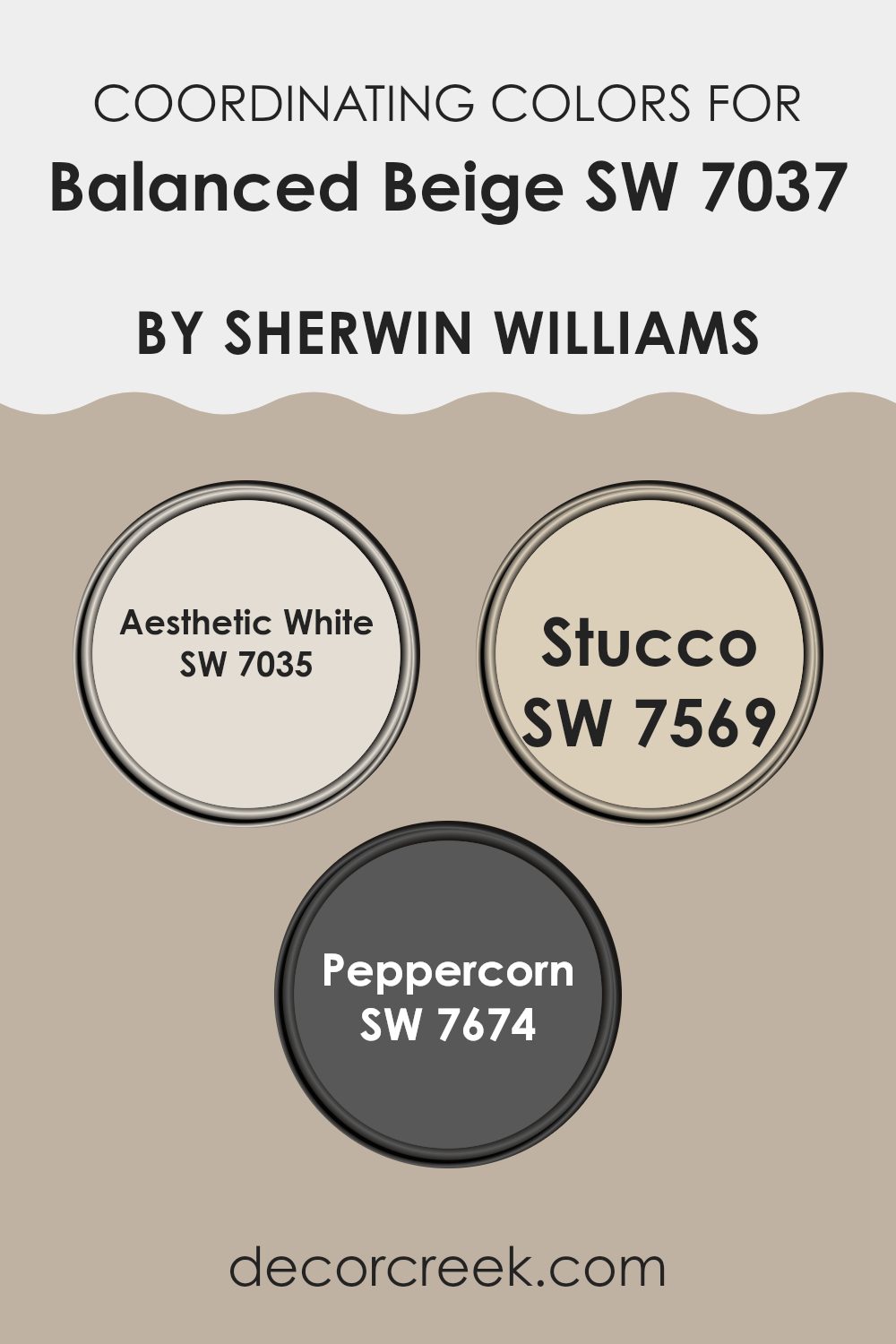
Best Coordinating Colors to use with Balanced Beige SW 7037 by Sherwin Williams this year.
Coordinating colors are shades that complement or enhance each other when used together in decor or design. They create a harmonious palette that can add depth and cohesion to a room, making it visually appealing. The idea behind coordinating colors is to pick tones that either match or contrast nicely with the primary color, ensuring that the overall appearance is balanced. For Balanced Beige, a neutral, subtle color, certain shades have been selected to complement its earthy undertones perfectly.
Aesthetic White (SW 7035) is a soft, creamy white that brings a light and airy feel when paired with Balanced Beige. It’s an ideal choice for trim and ceilings, providing a gentle contrast without overpowering the calming nature of beige.
Stucco (SW 7569) is a deeper, warmer tone that mirrors the dusty quality of Balanced Beige, making it perfect for creating a cozy and welcoming atmosphere in places like living rooms and bedrooms. Meanwhile, Peppercorn (SW 7674) offers a striking contrast; this dark, charcoal gray can lend a modern, dramatic look and is excellent for accent walls or furniture, giving a room a modern edge and drawing attention to specific areas without overpowering the overall decor. Using these coordinating colors allows for a layered look that enhances the room’s aesthetic and mood.
You can see recommended paint colors below:
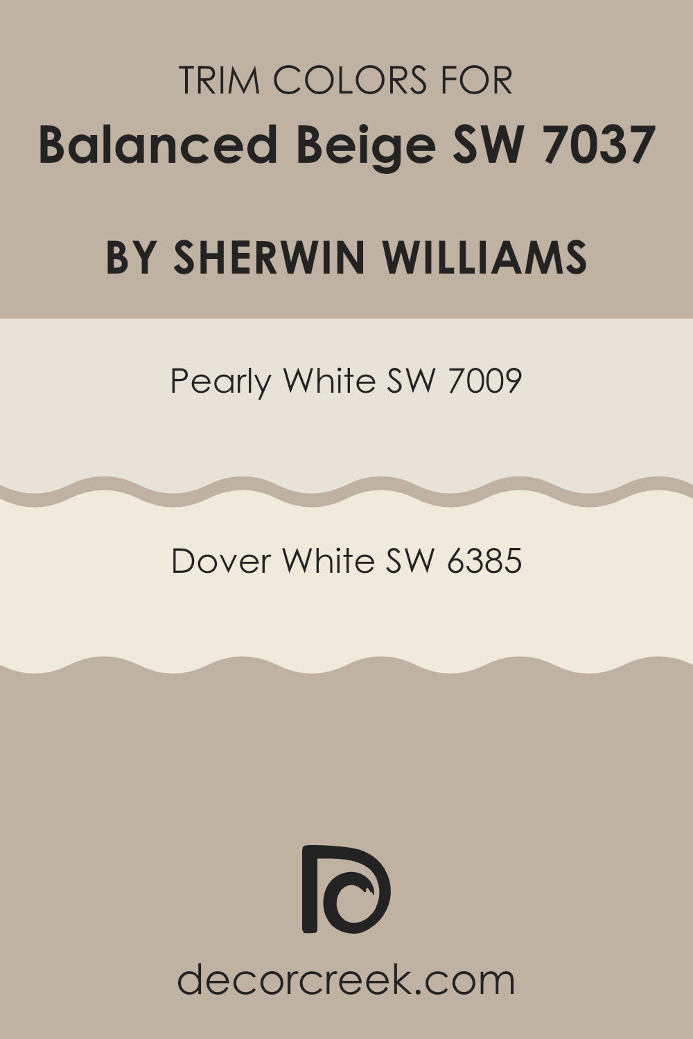
Trendy Trim Colors of Balanced Beige SW 7037 by Sherwin Williams to use this year.
Trim colors are vital in enhancing the look of a home by defining and highlighting the architectural details and elements. When used with a neutral shade like Balanced Beige, trim colors can introduce a subtle contrast that adds depth and dimension to the room.
Pearly White and Dover White are two effective trim colors that work well with Balanced Beige. These shades are light enough to provide a soft contrast without overpowering the gentle warmth of Balanced Beige, making them an excellent choice for creating a welcoming and harmoniously decorated setting.
Pearly White is a soft, off-white with a hint of warmth that complements the cozy undertones of Balanced Beige. It’s a great option for a trim color as it provides a gentle distinction against the beige without creating a stark contrast. On the other hand, Dover White has a creamier base, offering a richer and slightly more pronounced contrast against Balanced Beige. This makes it ideal for those seeking to subtly highlight architectural features while maintaining a cohesive and inviting look. Both colors enhance the overall look by providing a clean and finished appearance to the walls painted with Balanced Beige.
You can see recommended paint colors below:
Evergreen Colors Similar to Balanced Beige SW 7037 by Sherwin Williams
Having a palette of similar colors can be incredibly useful, especially for creating a cohesive look in any room. Similar shades, like those close to Balanced Beige by Sherwin Williams, are perfect for harmonizing an environment without dramatic contrasts. These colors each have subtle differences, yet share an underlying warmth that unites them, making it easy to match with furniture and decor. They lend a gentle, unobtrusive backdrop to rooms, allowing other elements to stand out or together creating a seamless look.
For example, Renwick Beige adds a slightly earthier tone, bringing a grounded feel to a room. Pavilion Beige, however, is a bit lighter, offering a fresh and airy atmosphere that can make small rooms appear larger. Amazing Gray introduces a touch of gray, acting as a modern neutral that pairs well with vibrant or subdued accents. Flexible Gray, true to its name, is adept at shifting moods depending on lighting and accessories, offering flexibility in decor choices.
Cool Beige looks crisp and clean, perfect for a minimalist approach or a sleek, modern look. Whisper is almost ethereal, providing a gentle hint of color to walls without overpowering the senses. Diverse Beige has a richer hue, creating a warm, inviting room. Loggia brings a dusty softness to settings, ideal for a relaxed, cozy corner.
Dhurrie Beige is reminiscent of sandy landscapes, evoking calm and simplicity.
Lastly, Studio Beige has a touch of elegance without going too bold, fitting well in creative rooms or studios. These color options reflect subtle variations that can amplify the visual appeal of a room while maintaining a unified look.
You can see recommended paint colors below:
- SW 2805 Renwick Beige
- SW 7512 Pavilion Beige
- SW 7044 Amazing Gray
- SW 6072 Versatile Gray
- SW 9086 Cool Beige
- SW 9591 Whisper
- SW 6079 Diverse Beige
- SW 7506 Loggia
- SW 7524 Dhurrie Beige
- SW 9602 Studio Beige

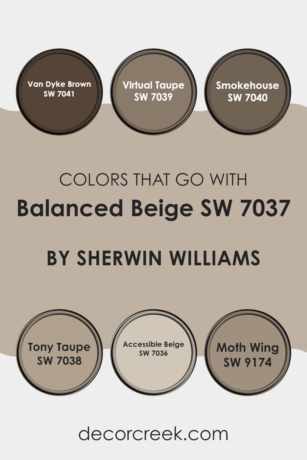
Colors that Go With Balanced Beige SW 7037 by Sherwin Williams
Choosing the right colors to pair with Balanced Beige SW 7037 by Sherwin Williams can enhance the overall look and mood of a room. Balanced Beige is a flexible color that acts as a fantastic neutral base, making it important to pair it with complementary colors for a harmonious palette. Colors like Van Dyke Brown, Virtual Taupe, Smokehouse, Tony Taupe, Accessible Beige, and Moth Wing are ideal partners as they share similar undertones that allow for a seamless blend and create a welcoming atmosphere.
Van Dyke Brown SW 7041 is a deep, rich brown that provides a strong contrast to Balanced Beige, making it great for accents like furniture or decorative trims. Virtual Taupe SW 7039 has a stronger gray influence, which gives a modern touch to rooms while keeping them warm and inviting. Smokehouse SW 7040 offers a mid-tone gray that works well in achieving a more subtle contrast, softening room features without stark shifts in color.
With a hint of green underlay, Tony Taupe SW 7038 enriches rooms with a touch of nature and depth. Accessible Beige SW 7036 is lighter and softer, perfect for creating a cohesive look in open rooms or rooms with a lot of natural light. Lastly, Moth Wing SW 9174 provides a dusky, muted brown, excellent for adding a sense of coziness and comfort to rooms. Pairing these colors with Balanced Beige creates a cohesive and inviting color scheme that enhances any room’s look and feel.
You can see recommended paint colors below:
- SW 7041 Van Dyke Brown
- SW 7039 Virtual Taupe
- SW 7040 Smokehouse
- SW 7038 Tony Taupe
- SW 7036 Accessible Beige
- SW 9174 Moth Wing
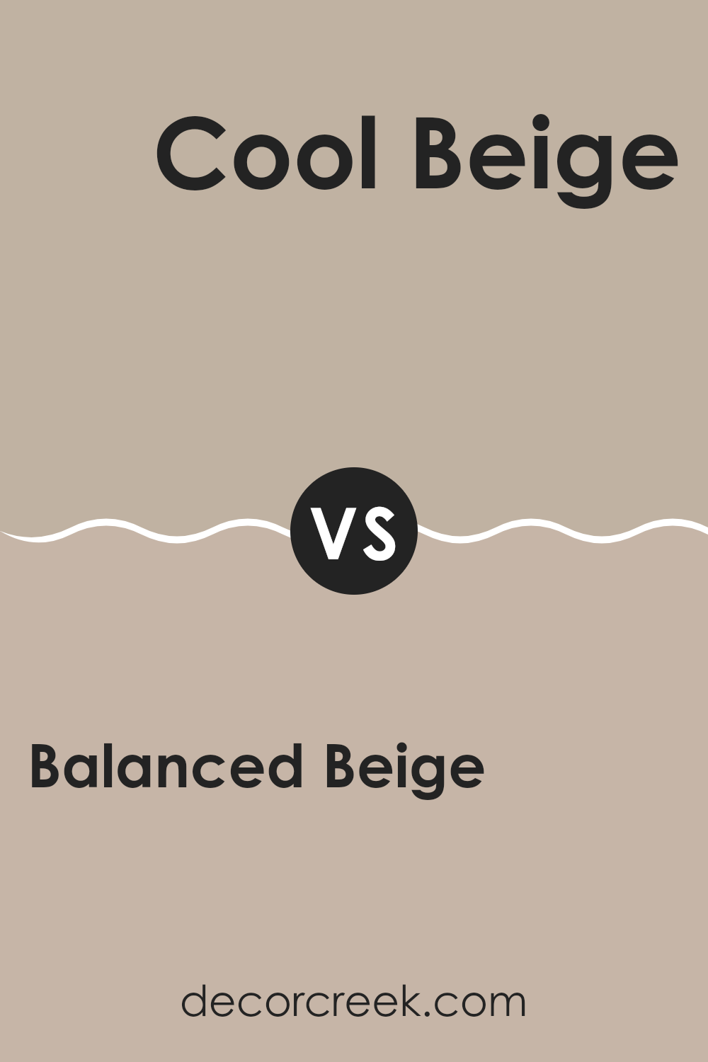
Balanced Beige SW 7037 by Sherwin Williams vs Cool Beige SW 9086 by Sherwin Williams
Balanced Beige and Cool Beige by Sherwin Williams are two neutral colors that although similar, have distinct undertones and vibes. Balanced Beige is a warm color that offers a cozy and inviting feel, perfect for creating a relaxing environment in places like living rooms or bedrooms. It has soft brown undertones that make it adaptable in pairing with various decor styles and colors.
On the other hand, Cool Beige is lighter and carries a grey undertone which gives it a fresher, more modern look. This color works well in rooms that aim for a minimalistic or contemporary look, providing a clean background that complements bolder colors and modern furniture.
While both colors provide a neutral palette, Balanced Beige leans towards a warmer, more comforting hue, whereas Cool Beige offers a crisper, cooler appearance suitable for a more modern decor. Your choice between them would depend on the mood and style you wish to achieve in your room.
You can see recommended paint color below:
- SW 9086 Cool Beige
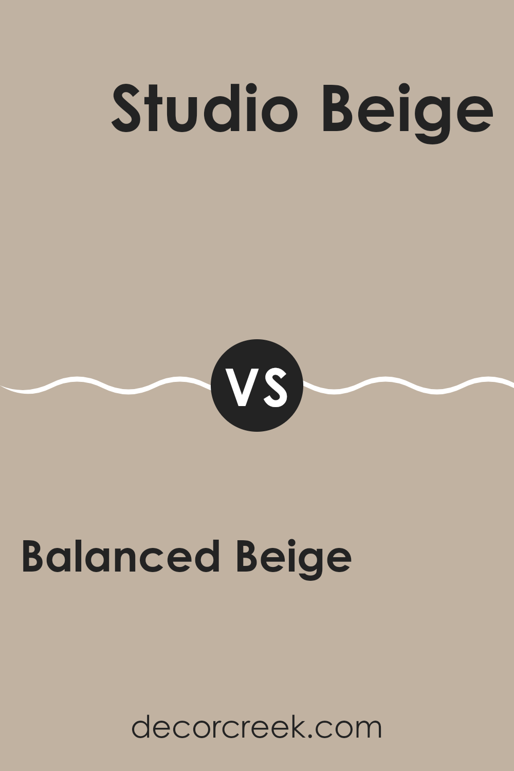
Balanced Beige SW 7037 by Sherwin Williams vs Studio Beige SW 9602 by Sherwin Williams
Balanced Beige and Studio Beige are both warm, neutral beige colors from Sherwin Williams, but they have different undertones and brightness levels that affect how they look in a room. Balanced Beige has a soft, grayish undertone, giving it a more muted appearance.
This makes it adaptable for various rooms, whether you want a cozy living room or a calm bedroom. On the other hand, Studio Beige tends to be a bit darker and warmer, with a slight golden hue that adds warmth. This color works well in areas that benefit from a cozy and inviting atmosphere, such as dining rooms or entryways.
When deciding between these two, consider the natural light in your room and the mood you want to set. Balanced Beige is better if you prefer a lighter, more subtle backdrop, while Studio Beige is ideal for a richer, warmer feel.
You can see recommended paint color below:
Balanced Beige SW 7037 by Sherwin Williams vs Whisper SW 9591 by Sherwin Williams
Balanced Beige and Whisper are both neutral colors from Sherwin Williams, but they serve different purposes in home decor based on their tones.
Balanced Beige is a warm hue with a cozy and inviting feel, perfect for living areas and bedrooms where comfort is key. Its earthy base gives a grounded effect, making it a great choice for a room you want to feel homey and welcoming.
On the other hand, Whisper is much lighter and has a clean, airy quality to it. This color works well in smaller rooms or areas with less natural light, as it helps to make them appear brighter and more open. Since Whisper is closer to white, it can also act as a subtle backdrop that allows other decorative elements to stand out. Together, these colors can be used to create a balanced look, with Balanced Beige adding warmth where needed and Whisper providing a light, refreshing touch.
You can see recommended paint color below:
Balanced Beige SW 7037 by Sherwin Williams vs Renwick Beige SW 2805 by Sherwin Williams
Balanced Beige and Renwick Beige, both by Sherwin Williams, are neutral tones, yet each has its unique appeal. Balanced Beige has a mid-tone beige color with a slightly grayish undertone, making it a flexible choice for various rooms—it provides a warm but modern look.
On the other hand, Renwick Beige is darker and warmer. It leans more towards a traditional beige, offering a cozier feel that is perfect for creating a welcoming atmosphere in homes.
When comparing these two, it’s clear that Balanced Beige is a better fit for those who prefer a more muted, contemporary look. It pairs well with both bright and subdued colors. Renwick Beige, with its richer hue, is ideal for someone looking to establish a more classic and homey environment. The choice between them depends largely on the mood and style you wish to achieve in your room.
You can see recommended paint color below:

Balanced Beige SW 7037 by Sherwin Williams vs Pavilion Beige SW 7512 by Sherwin Williams
Balanced Beige and Pavilion Beige are both neutral beige colors by Sherwin Williams, but they have distinct tones. Balanced Beige has a lighter, more subdued appearance. It quietly complements various decor styles and adds a soft background hue to a room without making a strong statement. Its flexibility makes it a popular choice for creating a cozy and welcoming atmosphere.
On the other hand, Pavilion Beige is darker and warmer. It offers a richer feel that can make rooms feel more grounded and defined. This color works well in areas where a more defined, yet still neutral and warm background is desired, like in dining rooms or living areas. It can add a sense of depth and warmth to a room without overpowering it with too much color.
Both colors are practical choices for those looking to maintain a neutral color palette, but the choice between them depends on the desired warmth and depth of the room. Pavilion Beige tends to be better for adding warmth, while Balanced Beige is great for a subtle and light feel.
You can see recommended paint color below:
Balanced Beige SW 7037 by Sherwin Williams vs Diverse Beige SW 6079 by Sherwin Williams
Balanced Beige and Diverse Beige are both beige colors by Sherwin Williams, each with its unique characteristics. Balanced Beige leans towards a slightly cooler, grayish tone, making it adaptable for rooms that might combine elements of both warm and cool decor. It provides a clean and subtle backdrop for various styles, ensuring that furniture and art pieces stand out.
On the other hand, Diverse Beige has a warmer, richer hue that feels more inviting. This warmth makes it excellent for living rooms and bedrooms where a cozy atmosphere is desired. It pairs well with soft lighting and wood finishes, enhancing the comfort level of a room.
When deciding between the two, consider the mood you want to set and the existing elements in your room. Balanced Beige works well in modern settings, while Diverse Beige suits traditional or rustic styles perfectly. Both shades offer a neutral palette, but the choice between a cooler or warmer beige can affect the overall feel of your room.
You can see recommended paint color below:
- SW 6079 Diverse Beige
Balanced Beige SW 7037 by Sherwin Williams vs Amazing Gray SW 7044 by Sherwin Williams
Balanced Beige and Amazing Gray are both popular paint colors from Sherwin Williams, each offering a unique vibe to interior rooms. Balanced Beige is a warm and welcoming color, with a sandy undertone that makes it adaptable for use in various room settings. It works beautifully in rooms that aim for a cozy and comforting atmosphere, like living rooms and bedrooms.
Amazing Gray, on the other hand, has more of a muted, cooler tone compared to Balanced Beige. It stands out as more neutral and slightly more modern, which can help it fit well in contemporary settings or where a subtle backdrop is needed. This makes it ideal for areas where you want the focus on other design elements.
In comparison, while both colors provide a solid foundation for decorating, Balanced Beige adds warmth to a room, whereas Amazing Gray offers a clean, understated look. Choosing between them depends on the mood and style you want to set in your room.
You can see recommended paint color below:

Balanced Beige SW 7037 by Sherwin Williams vs Versatile Gray SW 6072 by Sherwin Williams
Balanced Beige and Flexible Gray, both by Sherwin Williams, offer unique tones for creating warm and welcoming rooms. Balanced Beige is a soft and neutral beige with a hint of warmth, making it a perfect backdrop for various decor styles and colors. It invites a cozy atmosphere into any room, providing a subtle, soothing presence that complements wood tones and natural textures.
On the other hand, Flexible Gray is a bit deeper and has elements of both gray and beige, often referred to as “greige.” This color is excellent for those looking to add a slightly deeper yet neutral tone to their rooms, balancing between cool and warm palettes. Flexible Gray works well in areas with either low or abundant light, adjusting smoothly to different settings and enhancing other colors used in the decor.
Both colors offer flexibility and a classic appeal, making them suitable for many areas of a home, from living rooms to bedrooms. Their understated elegance ensures they can support a variety of styles without overpowering the design elements.
You can see recommended paint color below:
Balanced Beige SW 7037 by Sherwin Williams vs Loggia SW 7506 by Sherwin Williams
Balanced Beige and Loggia are two calming shades from Sherwin Williams that offer warmth and subtlety to any room. Balanced Beige is lighter and provides a neutral backdrop that’s both warm and inviting. It’s a flexible color that pairs well with various decor styles, making it ideal for living rooms or bedrooms where a calming effect is desired.
Loggia, on the other hand, is a tad darker with a slightly richer tone that also conveys warmth. This color is excellent for creating a cozy atmosphere, particularly in rooms that benefit from a more enclosed, intimate feel like studies or dining rooms.
Both colors complement a wide range of other shades and materials, making them practical choices for those looking to maintain a harmonious color palette throughout their home. While Balanced Beige offers a lighter canvas, Loggia provides depth and a hint more character due to its deeper hue. This slight difference in depth can affect the mood and visual perception of a room, giving decorators a lovely range of beige tones to work with for different effects.
You can see recommended paint color below:

Balanced Beige SW 7037 by Sherwin Williams vs Dhurrie Beige SW 7524 by Sherwin Williams
Balanced Beige and Dhurrie Beige by Sherwin Williams are two great neutral shades, but they bring their unique touches to a room. Balanced Beige is a warm color that offers a cozy feel, making it perfect for living rooms or bedrooms where you want a comforting atmosphere. It has a light touch of gray which softens the warmth slightly, giving it a flexible appeal that works well in various settings.
On the other hand, Dhurrie Beige is a bit darker and leans more towards a true beige without as much gray. This color is excellent for areas that need a little more warmth and richness, possibly working better in dining rooms or studies where a slightly more formal look is desired.
Both colors are highly adaptable and can complement various decor styles and furnishings. However, the choice between them would depend on the specific mood you’re aiming to create in your room. If you prefer a lighter, airier feel, go with Balanced Beige. If you want something with a bit more depth, Dhurrie Beige could be the better option.
You can see recommended paint color below:
In summary, SW 7037 Balanced Beige by Sherwin Williams is a really useful color for painting walls in many types of rooms. It’s not too dark or too light, making it just perfect for bringing a calm and comfy feel to a place. Whether it’s thrown on the living room walls or used in a bedroom, this color helps make things feel more warm and welcoming. It works well with lots of other colors, so you don’t have to worry about it clashing with your furniture or decorations.
If you’re thinking about giving your room a new look, Balanced Beige is a great choice. It’s easy on the eyes and fits in with many styles, from modern to classic. Plus, it’s a color that doesn’t get dirty quickly, which is good for spots like the kitchen or a kid’s playroom.
So, if you want a paint that looks good and makes decorating easy, give Balanced Beige a try. It can really change a room for the better, making it feel fresh and cozy at the same time.

Ever wished paint sampling was as easy as sticking a sticker? Guess what? Now it is! Discover Samplize's unique Peel & Stick samples.
Get paint samples

