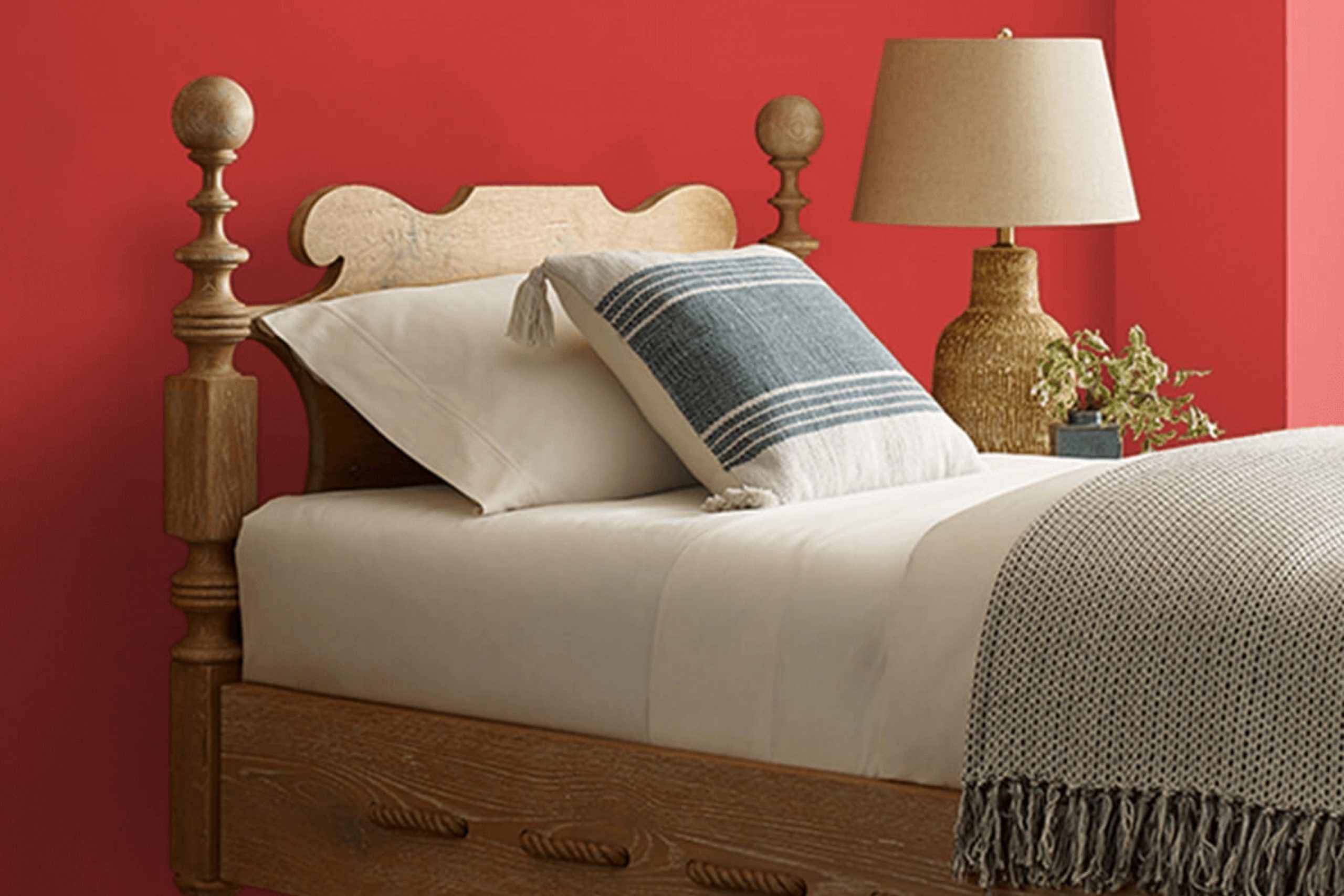
As you plan your next home makeover, consider using the bold and energetic hue of SW 6869 Stop by Sherwin Williams. This shade brings an instant pop of color to any room, perfectly suited for adding personality and pizzazz.
Whether you’re looking to freshen up your living room, kitchen, or even a small corner nook, SW 6869 Stop promises to make a striking impact. This vivid red is not only stylish but also flexible, pairing well with various decor styles, from modern to traditional.
As someone who enjoys updating their home environment, you’ll appreciate how this color can refresh an interior and reflect your vibrant personality.
Ready to introduce a lively touch to your walls? SW 6869 Stop might just be the vibrant addition your home needs.
What Color Is Stop SW 6869 by Sherwin Williams?
Stop by Sherwin Williams is a vibrant and bold red hue that packs a punch in any interior it graces. This color has an energetic vibe that can instantly liven up a room. Given its striking nature, Stop is perfect for creating a focal point in an area, whether it’s an accent wall or a piece of statement furniture.
In terms of interior styles, Stop fits wonderfully with modern and contemporary themes where strong, clean lines and bright accents are key elements. It also works well in eclectic settings where different styles and colors combine to create a unique and playful atmosphere.
For materials, Stop pairs beautifully with sleek, glossy finishes such as polished metal, glass, or lacquered wood, which help balance its intensity. Additionally, it looks stunning against neutral backgrounds like white, black, or gray, which allow it to really stand out. Soft textures like velvet or wool in furniture or throw pillows can also complement the boldness of Stop by adding a touch of comfort and warmth to the interior.
Whether you’re looking to spice up a kitchen, a living room, or even an office, incorporating Stop can make the interior more lively and memorable. Colorful art pieces, modern fixtures, or even rich wooden elements can work in harmony with this dynamic red shade to create an inviting and stylish atmosphere.
decorcreek.com
Is Stop SW 6869 by Sherwin Williams Warm or Cool color?
StopSW 6869 by Sherwin Williams is a vibrant shade of red that brings energy and warmth to any interior. This bold color can make a major impact in a home, perfect for creating a focal point in a room.
When used on a feature wall, it immediately draws the eye and sets a dynamic tone for the entire area. Since it’s such a strong color, it works well in areas that benefit from a boost of vitality, like living rooms or dining areas.
Pairing StopSW 6869 with neutral tones such as whites, grays, or beiges helps balance its intensity, ensuring that the interior remains comfortable but lively. It’s also compatible with darker hues like navy or forest green for a more dramatic look. In smaller rooms, using StopSW 6869 for accents like doors or furniture pieces can introduce a pop of color without feeling overpowering. Overall, StopSW 6869 is perfect for anyone looking to add some warmth and energy to their home.
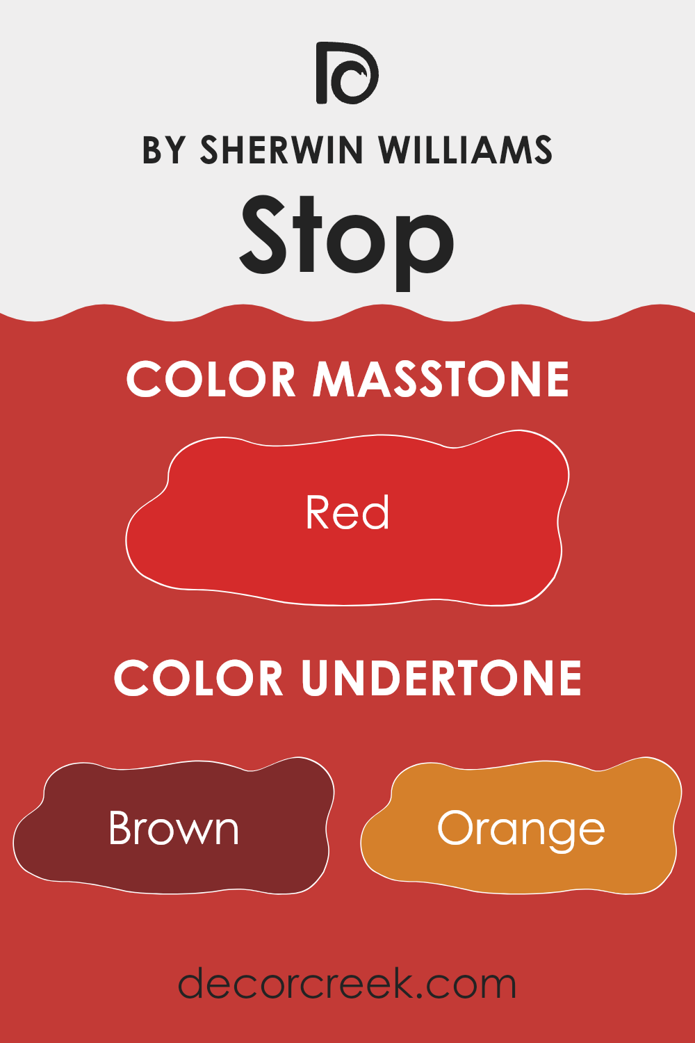
Undertones of Stop SW 6869 by Sherwin Williams
StopSW 6869 by Sherwin Williams is a unique color with a variety of undertones that can subtly influence the appearance and mood of a room. Understanding these undertones can help in choosing the right paint for your interior.
The undertones of this paint are diverse: brown, orange, pink, olive, purple, pale pink, and grey. Each undertone plays a role in how the color is perceived. For example, brown undertones can give a feeling of warmth and stability, which makes a room feel cozy and welcoming.
Orange undertones add a sense of energy and vibrancy, making an interior feel more lively. Pink undertones bring a soft, gentle touch, which can make a room feel calm and comforting.
Olive undertones contribute an earthy quality that can help an interior feel grounded and connected to nature, while purple undertones can add a touch of mystery and creativity. Pale pink undertones offer a subtle hint of sweetness and softness, enhancing the overall warmth. Lastly, grey undertones provide a neutral balance, ensuring that the color doesn’t lean too heavily towards any extreme.
When applied to interior walls, the combined effect of these undertones in StopSW 6869 can make a room more dynamic and interesting, affecting everything from the mood to the perception of interior and light. This color can adapt to different lighting conditions, showing varied aspects of its personality throughout the day.
In essence, the mix of undertones allows this color to interact uniquely with other elements in the room, such as furniture and decorations, creating a harmonious environment.
decorcreek.com
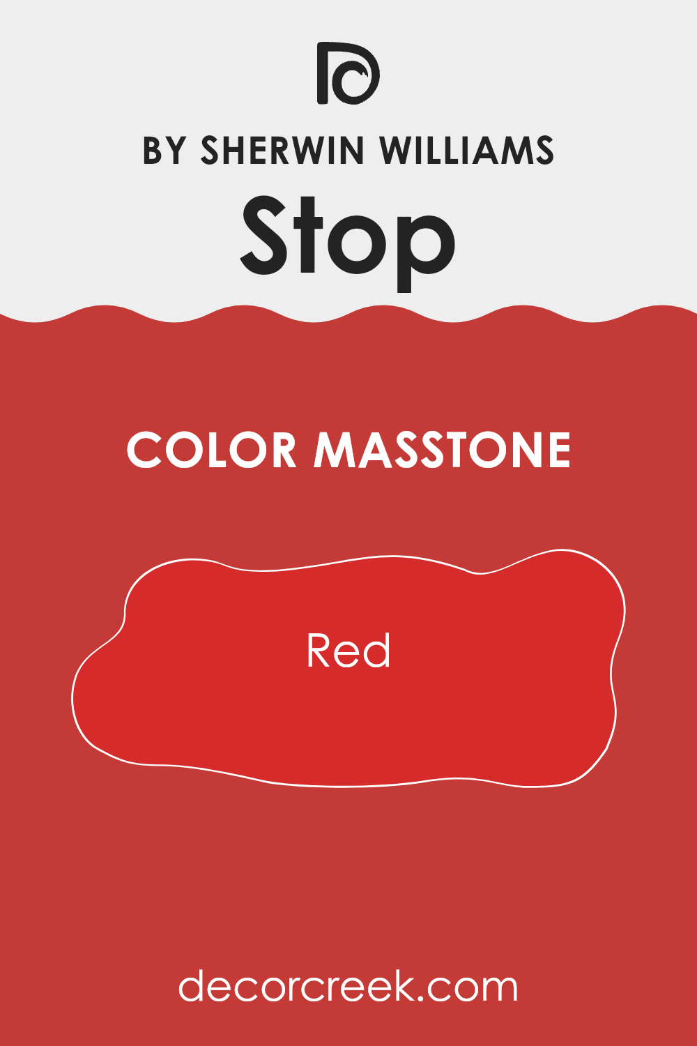
What is the Masstone of the Stop SW 6869 by Sherwin Williams?
Painting your home with StopSW 6869, a vibrant red with the masstone Red(#D52B2B), instantly adds a bold and lively atmosphere to any interior. This type of red is strong and eye-catching, ideal for creating accent walls or highlighting key features like a front door or window trims.
The masstone, which refers to the color seen when the paint is applied thickly and appears in its purest form, makes a statement and can energize a room. However, due to its intense nature, this red is best used in areas where you want to stir excitement and attract attention, such as dining areas or entertainment rooms.
When using such a vibrant red in home decor, it’s important to balance it with neutral colors such as whites, greys, or light wooden tones to prevent it from feeling overpowering. These combinations can help achieve a balanced look that allows the red to stand out without dominating the environment.
decorcreek.com
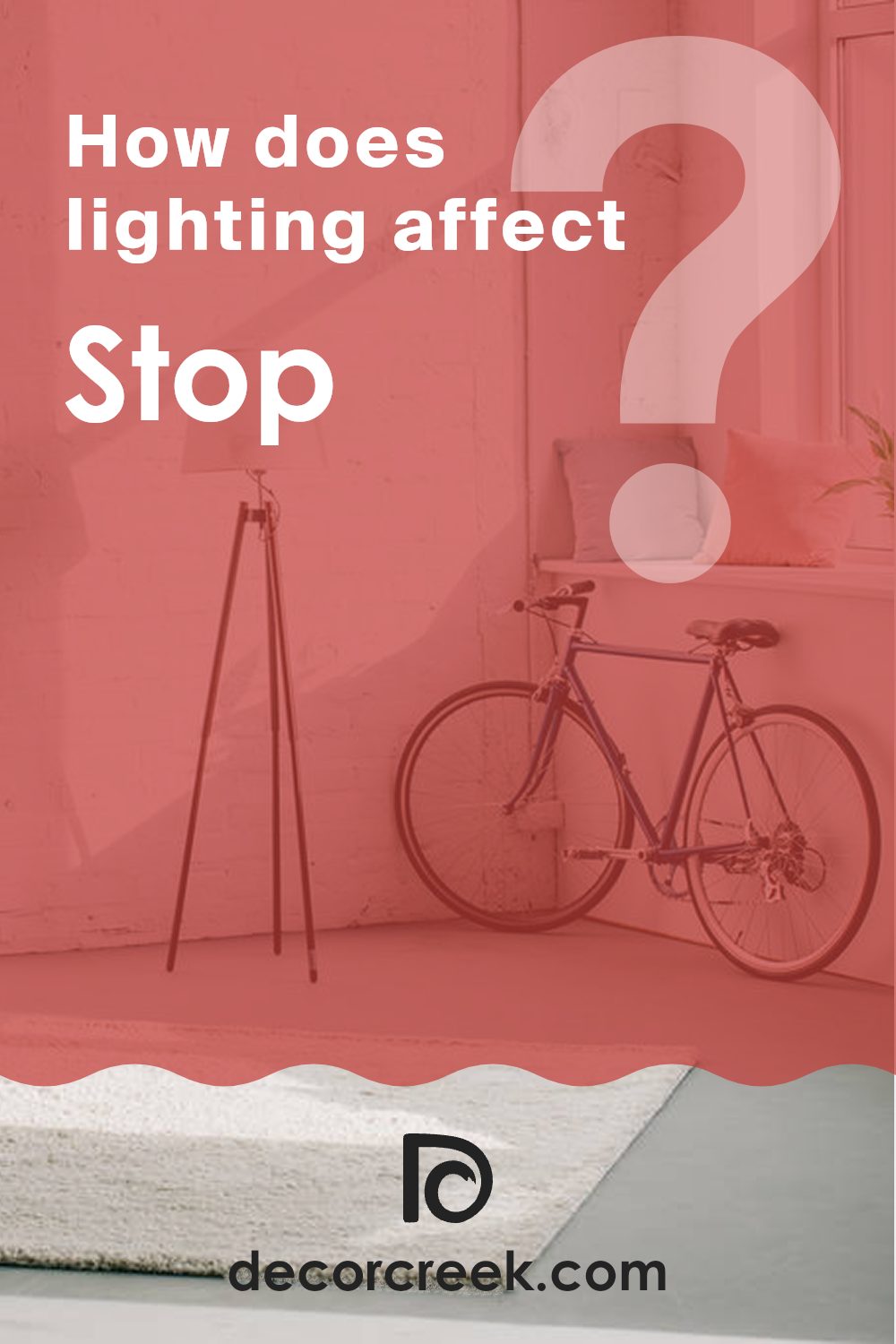
How Does Lighting Affect Stop SW 6869 by Sherwin Williams?
Lighting has a significant impact on how colors appear in different environments. When selecting a paint color for a room, such as SW 6869, it’s crucial to consider the type of light the interior receives, as it can dramatically alter the appearance of the color.
Artificial Light:Under artificial lighting, SW 6869 can take on different tones depending on the type of bulbs used. In rooms lit by incandescent bulbs, which emit warmer light, this color might appear more vibrant and intense. If the room uses cooler, fluorescent lighting, the color may seem slightly muted and cooler in tone.
Natural Light:
Natural light is by far the best for showing the truest color, but the direction of the room still plays a role.
North-Faced Rooms: North-facing rooms generally receive less direct sunlight, which can make colors appear slightly darker and cooler. SW 6869 in a north-facing room might look more subdued and less intense.
South-Faced Rooms: South-facing rooms get more direct sunlight, making colors look brighter and more vivid. Here, SW 6869 will likely appear more dynamic and lively, possibly bringing out subtle undertones in the paint.
East-Faced Rooms: Light in these rooms is brightest in the morning, with the light becoming cooler as the day progresses. SW 6869 could look very bright and energetic in the morning, gradually calming down by afternoon.
West-Faced Rooms: These rooms receive the evening light, which can be very warm. SW 6869 in a west-facing room may have a warm glow in the late afternoon and evening, enhancing its brightness and warmth.
Understanding how light affects color helps in choosing the right paint for an interior, ensuring that the color matches your vision throughout the day. By considering the direction of natural light and type of artificial light used, you can predict how colors like SW 6869 will behave in different settings.
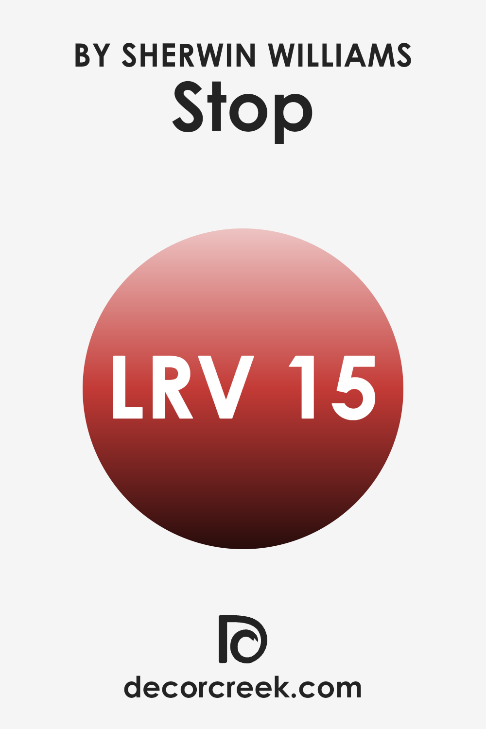
What is the LRV of Stop SW 6869 by Sherwin Williams?
LRV stands for Light Reflectance Value, which is a measure of the percentage of light a paint color reflects back into a room as compared to the amount of light it absorbs. Values are on a scale where zero suggests that the color absorbs all light (making it appear very dark), and a higher value indicates more light reflection, making the interior look brighter. This measurement helps determine how a paint color can affect the ambiance of a room, playing a key role in lighting design and overall visual impact.
The LRV of StopSW 6869, which is approximately 15, indicates that this color is quite dark, absorbing a lot of light and reflecting very little back into the room. This means that walls painted with this color will appear rich and deep, potentially making smaller areas feel even tighter and more intimate.
In larger or well-lit rooms, however, this color can add a dramatic and cozy effect, creating a strong visual statement while maintaining a comfortable atmosphere. When using this dark color, it’s important to balance it with lighter colors and good lighting to ensure the interior doesn’t feel too closed in.
decorcreek.com
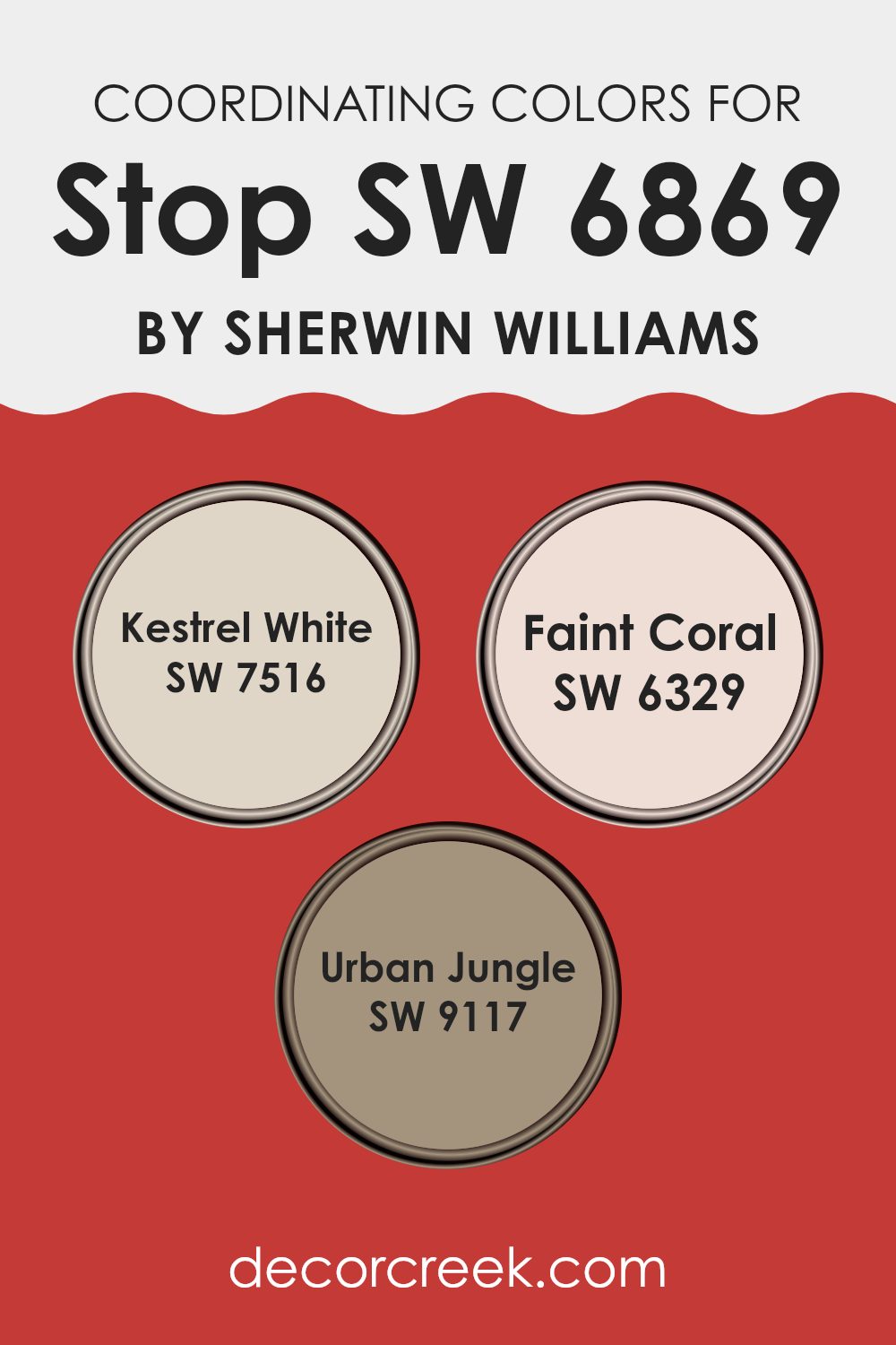
Coordinating Colors of Stop SW 6869 by Sherwin Williams
Coordinating colors are shades that complement each other when used together in design and decor. They help to create a balanced and harmonious look, enhancing the overall aesthetic without feeling overpowering. When a primary color such as Stop SW 6869 by Sherwin Williams is used, coordinating colors like SW 7516 – Kestrel White, SW 6329 – Faint Coral, and SW 9117 – Urban Jungle play a crucial role in rounding out the design palette.
Kestrel White is a soft, muted white with subtle undertones that make it an excellent backdrop for more vibrant colors. It doesn’t clash but instead supports and lifts the primary hues it accompanies, offering a calm and clean canvas. Faint Coral, on the other hand, is a gentle blend of pink and orange tones that provide a warm, inviting feel to any interior.
It’s ideal for adding a touch of color without feeling too intense. Urban Jungle is a deep, earthy green that adds depth and richness, creating a grounded, natural feel in any interior. This color works well in areas that need a touch of elegance without using darker, more intense colors. Together, these coordinating colors help achieve a balanced, pleasing look that enhances the visual appeal of the primary color.
You can see recommended paint colors below:
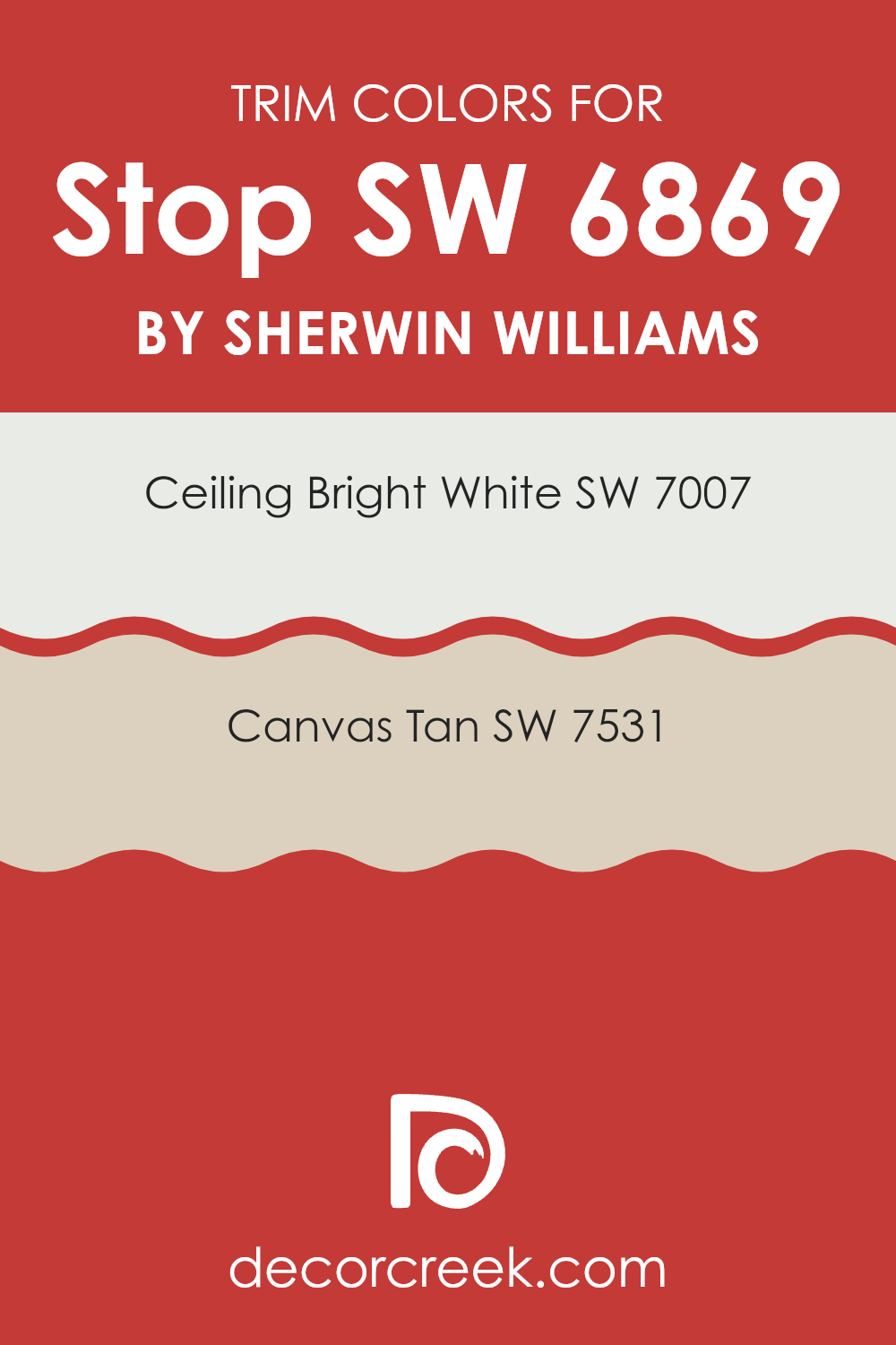
What are the Trim colors of Stop SW 6869 by Sherwin Williams?
Trim colors are those used to accentuate and frame the main colors of a room, providing definition and a polished finish. In the case of using SW 6869 Stop by Sherwin Williams, a vivid shade, selecting the right trim colors becomes essential to balance and complement the strong main color.
By choosing SW 7007 Ceiling Bright White and SW 7531 Canvas Tan as trim colors, a harmonious blend can be achieved. These colors help outline architectural features and transitions, which can make interiors visually coherent and ensure they feel thoughtfully completed.
SW 7007 Ceiling Bright White is a clean, crisp white that reflects light and offers a sharp contrast to richer, darker colors. This makes it an excellent choice for a trim color when paired with bold hues like SW 6869 Stop, as it can prevent rooms from feeling too enclosed. On the other hand, SW 7531 Canvas Tan is a warmer, neutral beige that lends a soft, yet defined edge to areas. It is particularly effective in adding a subtle distinction without competing with the primary color scheme, supporting a balanced ambiance within the room.
You can see recommended paint colors below:
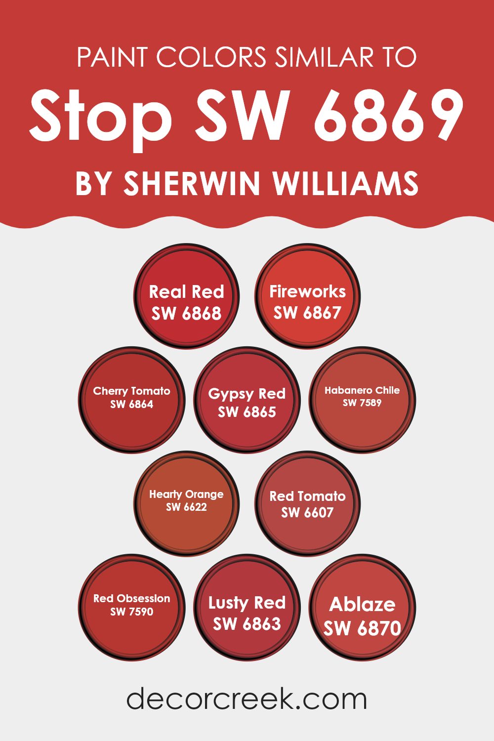
Colors Similar to Stop SW 6869 by Sherwin Williams
Using similar colors in decor and design can create a cohesive and harmonious look, helping to establish a particular mood or atmosphere. Colors like SW 6868 – Real Red and SW 6867 – Fireworks provide vivid, striking tones that can add energy and vibrancy to an interior.
These colors, alongside SW 6864 – Cherry Tomato and SW 6865 – Gypsy Red, offer variations of intensity and warmth that can be used to enhance or contrast with each other to great effect. For instance, while Cherry Tomato has a juicier, fresher hue, Gypsy Red introduces a deeper, more subdued shade.
On the warmer side of this spectrum, colors such as SW 7589 – Habanero Chile and SW 6622 – Hearty Orange present rich, full-bodied options that can warm up any area, making it feel welcoming and cozy. Moving further along the color palette, SW 6607 – Red Tomato bridges the gap between orange and red, providing a balanced and bright pop of color.
Additionally, the deeper tones of SW 7590 – Red Obsession and SW 6863 – Lusty Red showcase more dramatic and potent reds, perfect for creating focal points or accent walls. For those wanting something truly bold, SW 6870 – Ablaze offers a fiery tone that is impossible to ignore, brightening interiors with its strong presence. Each shade, while unique, supports the others, allowing for flexible yet unified design options.
You can see recommended paint colors below:
- SW 6868 Real Red
- SW 6867 Fireworks
- SW 6864 Cherry Tomato
- SW 6865 Gypsy Red
- SW 7589 Habanero Chile
- SW 6622 Hearty Orange
- SW 6607 Red Tomato
- SW 7590 Red Obsession
- SW 6863 Lusty Red
- SW 6870 Ablaze
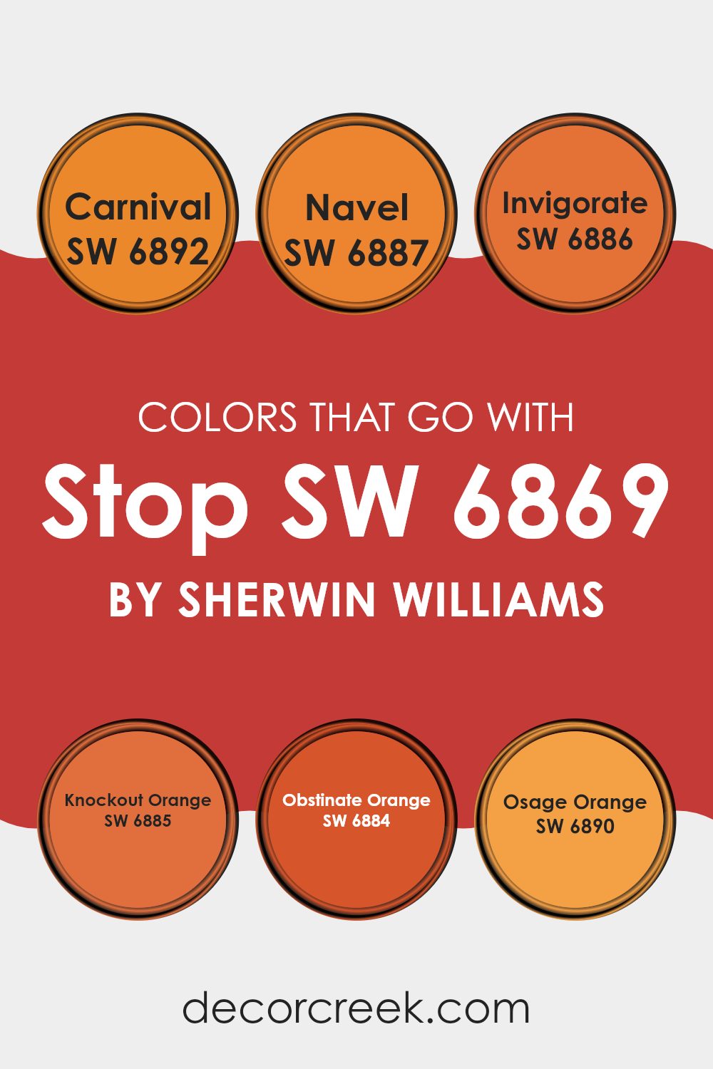
Colors that Go With Stop SW 6869 by Sherwin Williams
Choosing the right colors that work well with Stop SW 6869 by Sherwin Williams is important because it can impact the overall look and feel of an interior. Colors like SW 6892 – Carnival, SW 6887 – Navel, and SW 6886 – Invigorate bring out different aspects of Stop SW 6869, enhancing the atmosphere and mood of any room.
For instance, pairing it with SW 6892 – Carnival, a vibrant and lively pink, adds a playful touch that can make interiors feel more welcoming and fun. SW 6887 – Navel, a bright and cheerful orange, offers a fresh and energetic vibe, perfect for areas where you want to add warmth and brightness.
Similarly, SW 6886 – Invigorate, a richer and deeper orange, creates a dynamic contrast that can add depth and interest to your decor. SW 6885 – Knockout Orange has a bold and striking presence that makes it a great choice for accent walls or areas where you want to make a strong impression. SW 6884 – Obstinate Orange offers a slightly muted but still bright orange tone that pairs beautifully with neutral and earth tones, providing balance and continuity.
Lastly, SW 6890 – Osage Orange is a playful yet softer shade that complements more subdued styling, perfect for adding a pop of color without feeling too intense. Together, these colors create a palette that enhances Stop SW 6869, offering diverse options to suit any taste and interior design goal.
You can see recommended paint colors below:
- SW 6892 Carnival
- SW 6887 Navel
- SW 6886 Invigorate
- SW 6885 Knockout Orange
- SW 6884 Obstinate Orange
- SW 6890 Osage Orange
How to Use Stop SW 6869 by Sherwin Williams In Your Home?
Stop SW 6869 by Sherwin Williams is a bold and vivid red paint color that brings energy and excitement to any interior. If you’re looking to add a pop of color to your home, this shade is a great choice.
It works well on an accent wall in a living room or dining area, creating a focal point that draws the eye and spices up the décor. You can also use it in a smaller area like a powder room or on a front door for a welcoming touch of warmth.
In addition to walls, Stop SW 6869 can be used on furniture or cabinets for a striking makeover. Painting a bookshelf or a kitchen island in this intense red can add a fun burst of color and personality to your rooms. It pairs well with neutral tones like whites or grays, which help balance its intensity, making the red stand out without feeling overpowering.
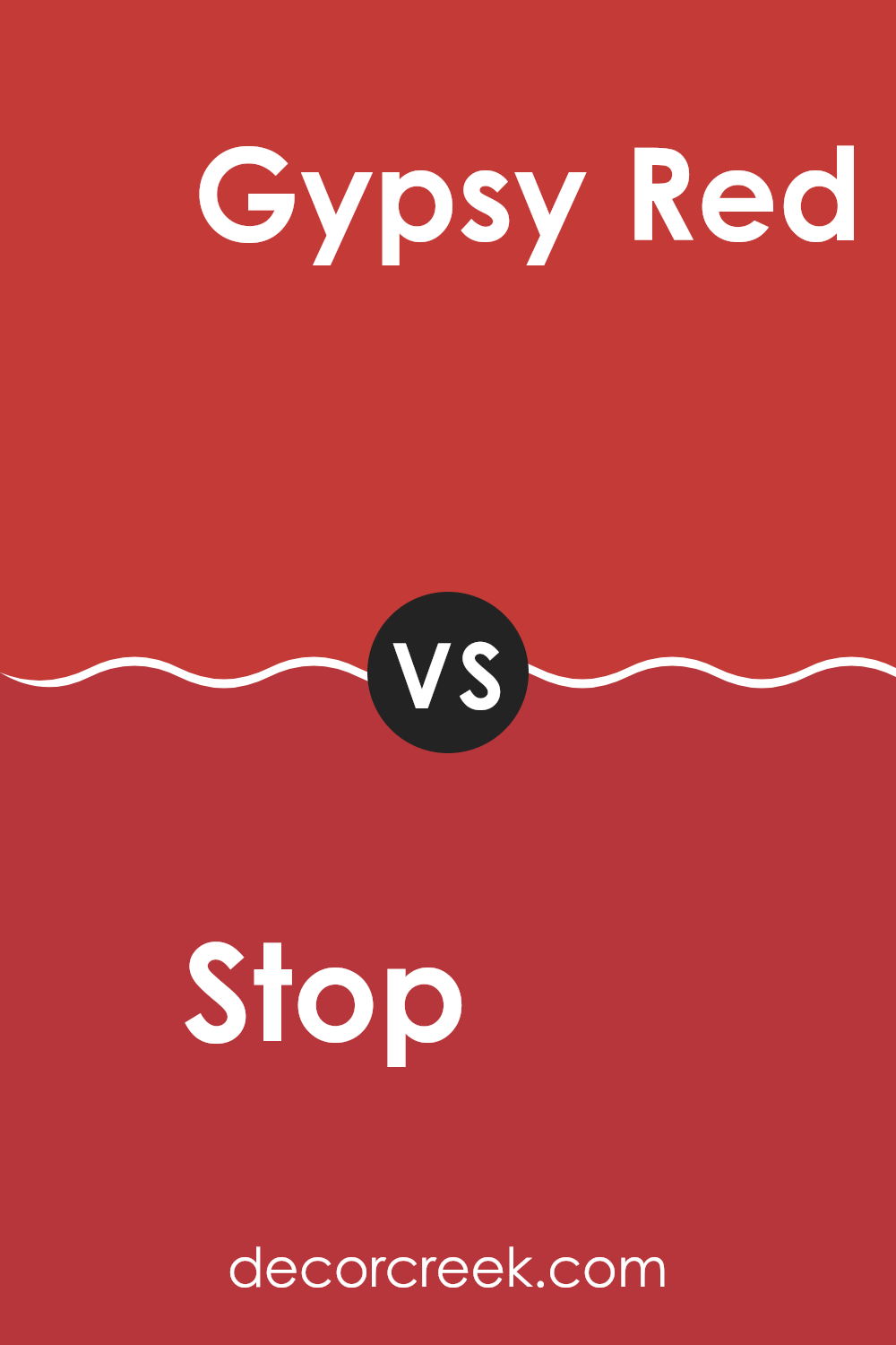
Stop SW 6869 by Sherwin Williams vs Gypsy Red SW 6865 by Sherwin Williams
Stop SW 6869 and Gypsy Red SW 6865 are both vibrant shades from Sherwin Williams, but they offer different vibes. Stop is a bright, bold red that really pops out.
It’s the kind of color that grabs your attention immediately, perfect for an accent wall or to highlight important areas like a front door. On the other hand, Gypsy Red is a deeper, slightly muted red. It has a warmer undertone, making it feel more cozy and less intense compared to Stop.
Gypsy Red works well in areas where you want a touch of warmth without feeling overpowering the room with too bright a color. Both colors can add a lot of character to an interior, but the choice between them depends on what kind of impact you want to achieve.
You can see recommended paint color below:
- SW 6865 Gypsy Red
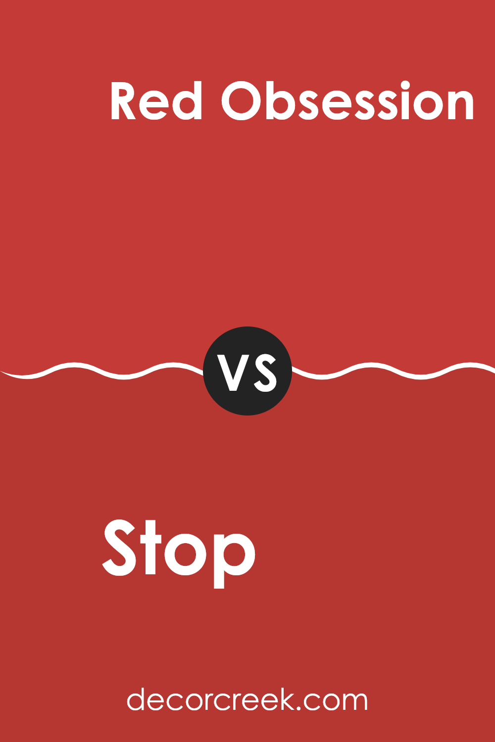
Stop SW 6869 by Sherwin Williams vs Red Obsession SW 7590 by Sherwin Williams
The main color, Stop SW 6869, is a vibrant, pure red that grabs attention and brings energy to any interior. It’s a bold choice, perfect for making a statement in an area like an accent wall or a front door.
On the other hand, Red Obsession SW 7590 has a deeper, slightly muted tone compared to Stop. It leans towards a maroon shade, offering a warmer and more subdued look. This makes Red Obsession a great option for creating a cozy and inviting atmosphere in areas like living rooms or bedrooms.
While both colors share a red base, Stop is brighter and more eye-catching, whereas Red Obsession offers a more grounded, subtle vibe. Depending on the mood you want to set and the interior’s purpose, either of these colors could be a fantastic choice.
You can see recommended paint color below:
- SW 7590 Red Obsession
Stop SW 6869 by Sherwin Williams vs Ablaze SW 6870 by Sherwin Williams
The main color, Stop, is a bold and bright red that really stands out when used in interior or exterior areas. It has a classic vibe and tends to draw attention, making it a great choice for areas where you want to make a statement, like front doors or accent walls.
On the other hand, Ablaze is one shade darker than Stop. It offers a more muted tone, which could be better for those looking for a strong color that isn’t as intense. Ablaze has a richness that provides warmth, making it suitable for cozy, inviting areas like living rooms or dining areas.
Both colors are from Sherwin Williams and share a vibrant red base. However, Stop is more of a pure, primary red, whereas Ablaze, being slightly deeper, incorporates a hint of maroon. Depending on the lighting and surrounding colors, each can offer a unique feel to a room, but both are definitely impactful choices in any decorative scheme.
You can see recommended paint color below:
- SW 6870 Ablaze
Stop SW 6869 by Sherwin Williams vs Real Red SW 6868 by Sherwin Williams
Stop SW 6869 and Real Red SW 6868, both from Sherwin Williams, are vibrant shades of red. Stop SW 6869 is a bold, bright red that pops with intensity. It’s the kind of red that stands out in an interior, often used to catch the eye and create a strong statement. This shade can work well on a front door or an accent wall where you want to draw attention.
On the other hand, Real Red SW 6868 is also a very lively red, but it leans slightly towards a deeper, slightly darker tone. This color can add a rich, warm feel to a room and is great for areas where you want a more inviting atmosphere. It’s excellent for dining areas or living rooms where you’re looking to add a touch of coziness.
While both colors are similar, the choice between them depends on the type of impact you want to achieve in your interior. Stop is brighter and more striking, while Real Red offers depth and warmth.
You can see recommended paint color below:
Stop SW 6869 by Sherwin Williams vs Habanero Chile SW 7589 by Sherwin Williams
Stop SW 6869 and Habanero Chile SW 7589, both by Sherwin-Williams, are vibrant, striking colors that stand out with their intensity. Stop SW 6869 is a pure, bright red color, which resembles the classic red used in stop signs.
It’s a bold choice that draws attention and adds energy to any interior. In contrast, Habanero Chile SW 7589 leans towards an orange-red, mimicking the fiery shade of its namesake pepper. This color is also dynamic but adds a warm and inviting undertone due to its orange hues.
While both colors are on the red spectrum, Stop is more straightforward with its cooler, primary red, whereas Habanero Chile offers a warmer tone that could be seen as more flexible in blending with earthy or autumnal schemes. Each color would create a strong impression in an interior, ideal for feature walls or decorative accents where you want to make a bold statement.
You can see recommended paint color below:
- SW 7589 Habanero Chile
Stop SW 6869 by Sherwin Williams vs Lusty Red SW 6863 by Sherwin Williams
“Stop” (SW 6869) and “Lusty Red” (SW 6863) are both vibrant reds from Sherwin Williams, but they have different vibes. “Stop” is a bold, bright red with a strong presence. It grabs attention and is perfect for creating a focal point in a room. It has a classic, almost pure red shade that makes it stand out sharply.
On the other hand, “Lusty Red” is slightly deeper and richer. It leans a bit towards a burgundy shade, giving it a warmer and somewhat more relaxed feel compared to “Stop”. This color is great for areas where you want warmth and a hint of drama without going too bright.
Both colors are vivid and energetic, but “Stop” feels full of excitement and stands out more, while “Lusty Red” offers warmth and a bit of mystery. Choosing between them depends on how much you want the color to dominate the interior and the mood you wish to set.
You can see recommended paint color below:
- SW 6863 Lusty Red
Stop SW 6869 by Sherwin Williams vs Fireworks SW 6867 by Sherwin Williams
Stop SW 6869 by Sherwin-Williams is a bold and bright red hue that really makes a statement. This color is lively and stands out, making it a great choice for areas where you want to draw attention or add a pop of intense color. It can be perfect for accent walls, doors, or furniture pieces.
On the other side, Fireworks SW 6867 is also from Sherwin-Williams, but this shade shifts slightly towards a vivid orange-red. This blend makes it less intense than Stop but still very eye-catching. Fireworks can warm up an interior without feeling too intense, which is great for living areas or kitchens where you want a cheerful and inviting atmosphere.
In comparison, both colors are bold and bright, but Stop leans more towards a pure red, while Fireworks has an orange tint. Depending on your interior and desired impact, either could work wonderfully to liven up your environment. They also pair well with neutral tones to balance their vibrancy.
You can see recommended paint color below:
- SW 6867 Fireworks

Stop SW 6869 by Sherwin Williams vs Red Tomato SW 6607 by Sherwin Williams
The main color Stop SW 6869 is a bold and vivid shade of red. It’s bright and can definitely make a statement wherever it’s used. It has a strong presence, making it a great choice for areas where you want to attract attention or add a lively burst of energy.
On the other hand, Red Tomato SW 6607 is another type of red, but it’s different from Stop. Red Tomato has a softer vibe, leaning slightly towards a warm, tomato red. This color is still noticeable but not as intense as Stop. It offers a more traditional red look, which can feel welcoming and familiar.
Both colors are variations of red but have different moods and impacts. Stop is more striking and stands out more boldly, while Red Tomato is warmer and more subdued. Depending on what feeling you want to create, you might choose one over the other. For example, Stop could be great for a focal point, whereas Red Tomato might be better for creating a cozy atmosphere.
You can see recommended paint color below:
- SW 6607 Red Tomato
Stop SW 6869 by Sherwin Williams vs Hearty Orange SW 6622 by Sherwin Williams
Both “Stop” SW 6869 and “Hearty Orange” SW 6622 by Sherwin Williams are vibrant, energetic shades but carry different tones and impacts when used in an interior. “Stop” is a strong, vivid red that stands out dramatically and tends to draw a lot of attention.
It’s the kind of color that you’d use to create a focal point in a room. On the other hand, “Hearty Orange” is a warm, inviting orange hue. It’s slightly more subdued compared to “Stop” but still quite rich and full of life.
It gives off a cozy, welcoming vibe, making it great for living areas where you want to add a touch of warmth. In comparison, if you’re aiming for a bold and exciting feel, “Stop” is your go-to. However, if you prefer something that feels warm and cozy, “Hearty Orange” might be the better choice. Both colors, though distinct, can liven up an interior depending on the atmosphere you wish to achieve.
You can see recommended paint color below:
- SW 6622 Hearty Orange
Stop SW 6869 by Sherwin Williams vs Cherry Tomato SW 6864 by Sherwin Williams
Stop SW 6869 and Cherry Tomato SW 6864 from Sherwin Williams are both vibrant, lively colors that add a punch of energy to any interior. Stop is a pure, bold red that stands out with confidence. It’s the kind of red you might find on a stop sign, full of intensity and impossible to ignore. This makes it a great choice for areas where you want to make a strong statement, like a front door or an accent wall.
On the other hand, Cherry Tomato is also a strong color, but it blends red with a hint of orange, giving it a slightly warmer and playful tone. This color feels fresh and inviting, suitable for kitchens or dining areas where it encourages a friendly, lively atmosphere.
Both colors are bright and bold, but Stop leans towards a classic red while Cherry Tomato offers a twist with its warmer, orange undertones. Depending on the mood you want to create and the interior you’re decorating, either color could be a fantastic choice.
You can see recommended paint color below:
As I finish telling you about SW 6869 Stop by Sherwin Williams, I find myself really loving this color! If you’re looking for something fun and bright to cheer up a room, this paint might be perfect. Remember, it’s a bold red, which means it can make a big difference in how a room feels. It’s like when you put on a bright red shirt and suddenly feel more cheerful.
This red can add a lot of energy to places like your living room or kitchen. But, it’s also important to think about where you use it, because it’s so bright. You wouldn’t want to put it everywhere because it can be a bit too much.
Using SW 6869 Stop, you can make just one wall stand out or paint a piece of furniture to create a fun spot in your room. Imagine having a bright red chair or table! It’s also good to mix it with softer colors to balance things out.
So, if you or your family are thinking of adding a splash of color to your home, this red from Sherwin Williams could be a fantastic choice! It’s all about making your home more lively and enjoyable. And remember, a little bit goes a long way!
decorcreek.com
Ever wished paint sampling was as easy as sticking a sticker? Guess what? Now it is! Discover Samplize's unique Peel & Stick samples.
Get paint samples

