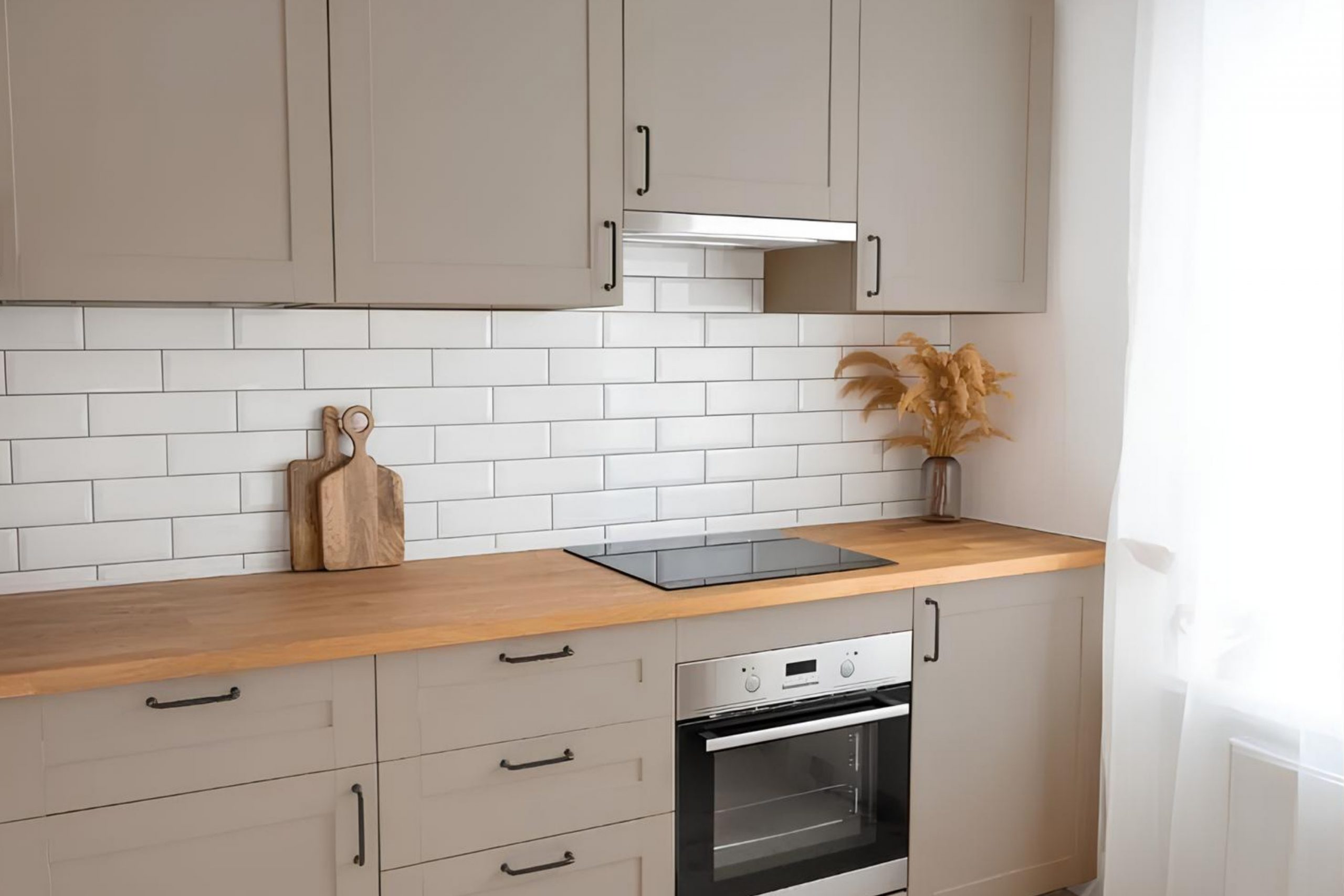
If you’re considering a fresh look for your space, you might want to check out SW 9578 Restoration by Sherwin Williams. I recently decided to give my living room a new coat of paint and stumbled upon this unique color.
Let me tell you, it did not disappoint. SW 9578 Restoration offers a soothing yet refreshing hue that brings a calm and collected atmosphere to any room. Whether you’re aiming to freshen up your kitchen, bedroom, or study, this color has the versatility to fit into various areas of your home.
What I appreciate most about this shade is how it perfectly balances between being overly bold and unnecessarily subtle, making it just right for someone looking to maintain a certain calmness without sacrificing style.
It pairs well with different decor styles and furniture, which is great if you enjoy updating your space without going through a complete overhaul.
What Color Is Restoration SW 9578 by Sherwin Williams?
The color Restoration by Sherwin Williams is a gentle and versatile hue that leans towards a soft, light gray with subtle undertones of blue and green. This muted nuance makes it an ideal choice for creating a calm and welcoming environment in any room. It’s a neutral shade that plays well with a wide range of decorating styles, from modern minimalist to cozy cottage and even industrial chic.
Restoration works beautifully in spaces aiming for a clean, crisp look while still wanting to inject some warmth. In modern and minimalist interiors, it pairs well with sleek materials like smooth metals and glossy finishes, enhancing the clean lines and uncluttered spaces. In more traditional or rustic settings, this color complements natural wood, stone, and textured fabrics like linen and wool, adding to the homey and inviting feel of the space.
Additionally, Restoration can act as a soothing backdrop in a bedroom or living room, especially when matched with soft whites or deeper shades of blue or green for a slight contrast that remains harmonious. It’s effective in kitchens and bathrooms too, where it supports a bright and airy atmosphere. Overall, Restoration is a highly adaptable color that helps unify different materials and textures, making it a smart choice for any interior design project.
Is Restoration SW 9578 by Sherwin Williams Warm or Cool color?
RestorationSW 9578 by Sherwin Williams is a versatile paint color that can have a big impact on the look and feel of a home. This shade is unique in that it works well in various settings, adapting subtly to different lighting, furnishings, and surrounding colors.
The neutral tone of Restoration makes it a good choice for living rooms and bedrooms where a calm and welcoming environment is important. It pairs beautifully with classic white trim for a crisp look or can be matched with darker colors for more drama. In smaller spaces, like a bathroom or hallway, this color can make the area appear larger and more open.
Homeowners often appreciate how well it coordinates with various decor styles, from modern to rustic. It’s also durable and easy to maintain, which is essential for busy households. Overall, Restoration sets a pleasant backdrop for everyday living.
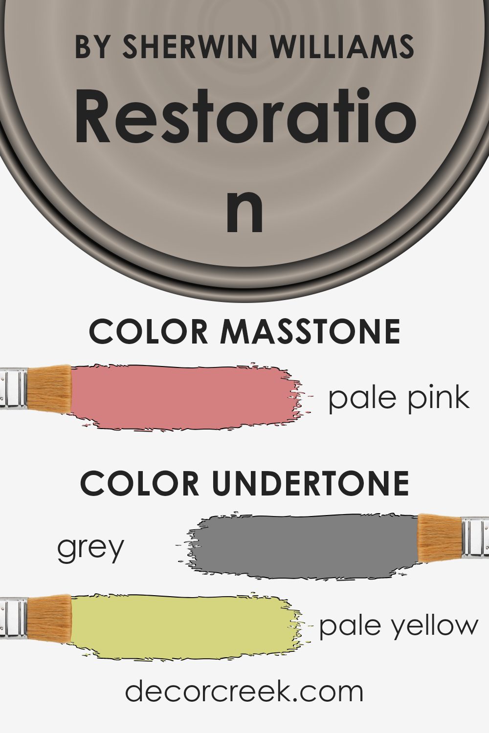
Undertones of Restoration SW 9578 by Sherwin Williams
Restoration, a paint color from Sherwin Williams, is a rich and versatile shade that can subtly influence the mood of a room based on its undertones. Undertones are the colors that are subtly mixed into a paint color, affecting how it looks under different lighting conditions, and they play a vital role in color perception.
For Restoration, the undertones include a spectrum of hues such as grey, pale yellow, mint, and more. Each undertone can bring a different feel to a space. For example, grey and light gray give a neutral and balanced backdrop, making the space feel calm. Light blue and mint can add a hint of freshness and vitality, brightening up a room subtly without overpowering it.
On the other hand, undertones like lilac or light purple add a soft, gentle touch that can make a space feel more welcoming. Yellow and pale yellow undertones can make the space feel a bit warmer and more cheerful, making it ideal for living rooms or kitchen areas.
When painted on interior walls, Restoration’s mix of undertones means it can adapt to different styles and lighting setups. In natural light, the cooler undertones like mint or light blue may become more prominent, giving the room a fresher feel. In artificial light, warmer tones like pale yellow and light purple might stand out, creating a cozier atmosphere.
Overall, the diverse undertones in Restoration make it a flexible choice for different rooms and settings, allowing it to complement a wide range of decor styles and personal tastes.
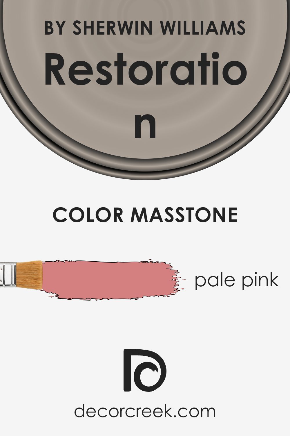
What is the Masstone of the Restoration SW 9578 by Sherwin Williams?
RestorationSW 9578 by Sherwin Williams, with its masstone of pale pink (#D58080), offers a gentle and inviting hue perfect for creating a cozy atmosphere in homes. This soft pink shade is light enough to make spaces feel more open and airy, yet it has enough warmth to add a touch of comfort and homeliness.
Ideal for rooms where relaxation is key, like bedrooms or living areas, this color mixes well with neutral tones such as whites, beiges, and light browns, which helps in achieving a balanced and harmonious look.
Additionally, since pale pink has a slightly playful character, it can also be a good choice for children’s rooms or creative spaces, adding a subtle hint of cheerfulness without being too bold or overwhelming. Overall, this shade is versatile and can help in creating a welcoming space in any home.
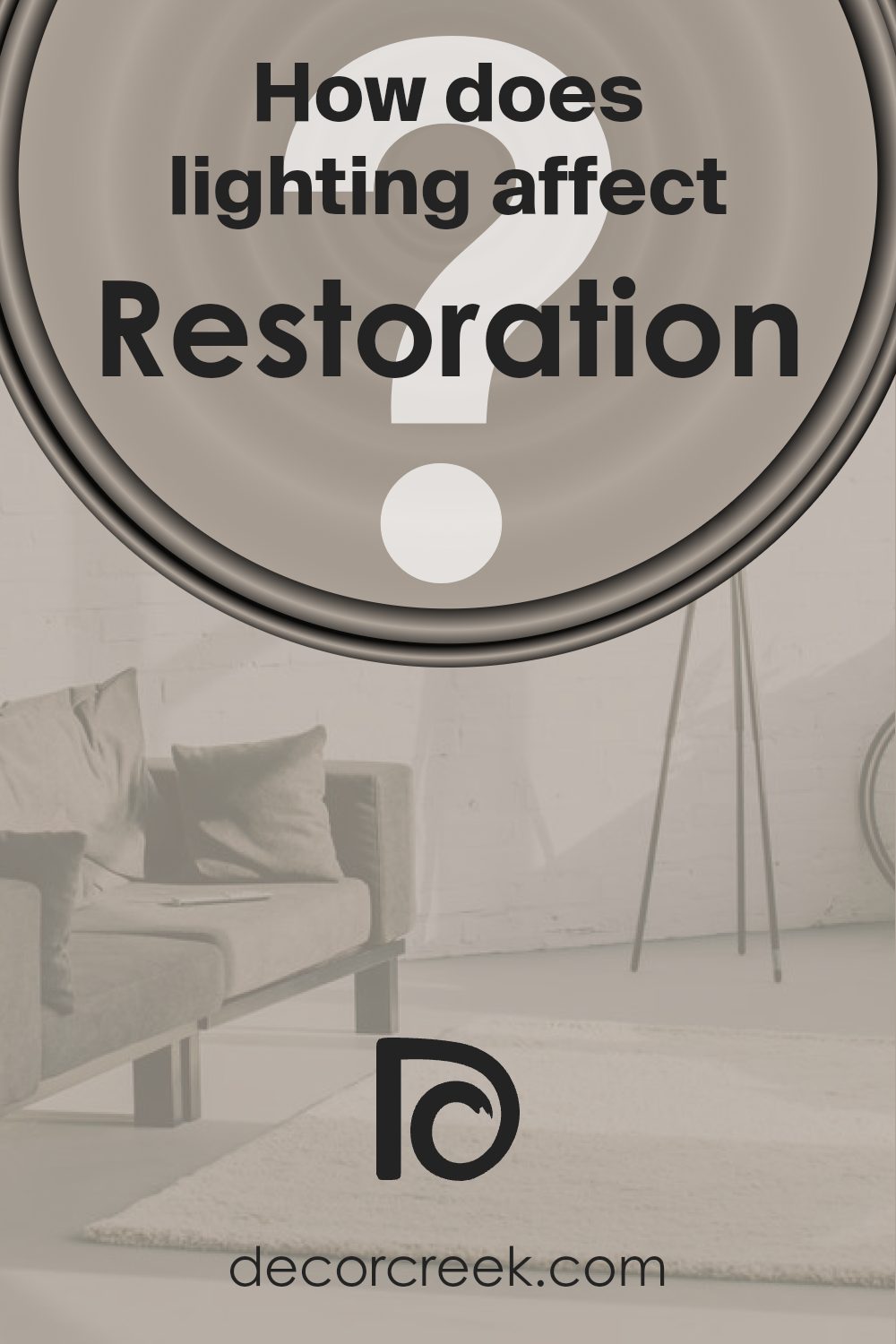
How Does Lighting Affect Restoration SW 9578 by Sherwin Williams?
Lighting plays a crucial role in how we perceive colors in any environment. Different light sources—be it natural or artificial—can dramatically change the appearance of a paint color on your walls, making it look brighter, darker, or even shifting its hue.
For instance, consider a specific paint color like RestorationSW 9578 from Sherwin Williams. In artificial light, depending on the type of bulb used, this color can vary significantly. Fluorescent bulbs, which emit a flat, cold light, might make this shade appear more muted and less vibrant. Conversely, incandescent or warm LED bulbs enhance the warmth in colors, making this particular shade appear richer and more dynamic.
In natural light, the appearance of the paint color changes throughout the day. Morning light is generally cooler, thus the color might look more vivid and fresh. As the day progresses, the light becomes warmer, especially in the late afternoon, which can make the color appear more intense and lively.
The orientation of the room also affects how this color is perceived. North-facing rooms get less direct sunlight, which can make colors appear slightly cooler and more shadowed, leading this particular shade to seem more subdued. South-facing rooms, receiving more direct and warmer sunlight, will make the color look brighter and more pronounced.
In east-facing rooms, the morning light is bright and warm, making the color lively and vibrant in the morning but cooler and more reserved as the day goes on. West-facing rooms receive strong evening light, which can make the color look very warm and welcoming in the afternoon and evening.
Overall, the perception of colors like RestorationSW 9578 can change dramatically based on the lighting conditions, impacting the mood and feel of the room.
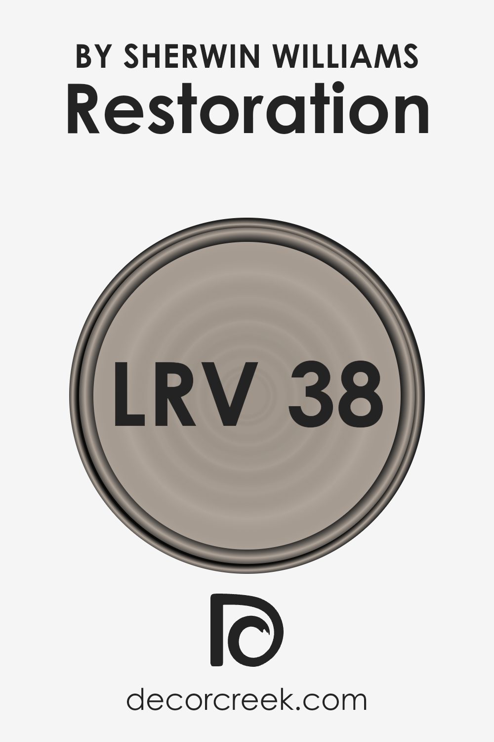
What is the LRV of Restoration SW 9578 by Sherwin Williams?
LRV stands for Light Reflectance Value, a measure used to indicate how much light a paint color can reflect. It is a scale where the higher the value, the more light the color reflects. This is important because it influences how light or dark a color appears when painted on walls.
Lighter colors, which have higher LRVs, make rooms feel brighter and more open, as they reflect more light back into the room. Conversely, darker colors, with lower LRVs, absorb more light, making a space feel cozier but smaller.
The LRV of the color in question, which is 37.912, suggests that it is on the darker side of the scale, reflecting less light. This characteristic means that when used on walls, it can make a room feel more enclosed and intimate.
This darker tone is excellent for creating a warm, inviting atmosphere in spaces intended for relaxation or gatherings. However, it might make a small room feel even smaller and less airy.
To balance this, proper lighting and contrasting with lighter colors in decor can enhance the spatial feel without compromising the rich quality of the color.
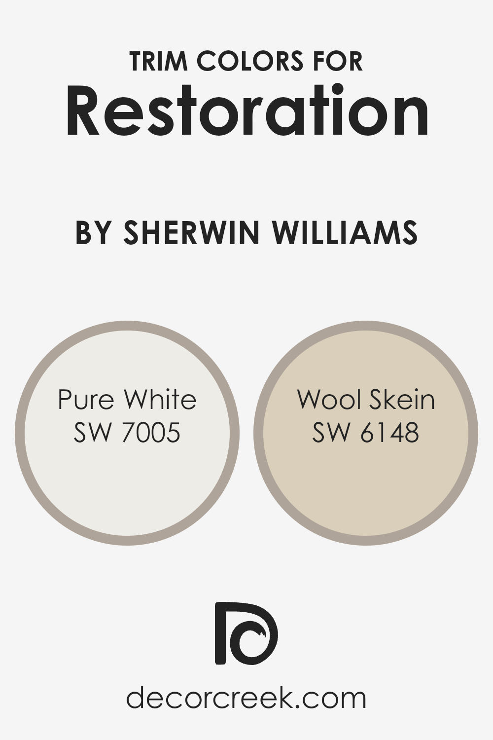
What are the Trim colors of Restoration SW 9578 by Sherwin Williams?
Trim colors play a crucial role in painting and decorating, especially when working with a base color like Sherwin Williams’ RestorationSW 9578. These are the specific shades used on elements such as door frames, moldings, window trims, and skirting boards.
Choosing the right trim color can create a beautiful contrast that highlights these features, or it can blend smoothly to extend the visual space within a room. For RestorationSW 9578, a fairly saturated hue, the selection of trim colors like SW 7005 – Pure White or SW 6148 – Wool Skein can significantly impact the aesthetic and balance of the space.
SW 7005 – Pure White is a clean and bright shade that offers a sharp contrast to richer, darker colors, making it an excellent choice for crisp, clear boundaries in a design. This color can help to break up visual space effectively, giving a neat and ordered appearance to any room.
On the other hand, SW 6148 – Wool Skein is a softer, warmer shade that blends more gently with surrounding colors. Its subtle, creamy undertones can add a touch of warmth to the environment, making the spaces feel inviting and cozy without drawing too much attention away from the main color themes.
You can see recommended paint colors below:
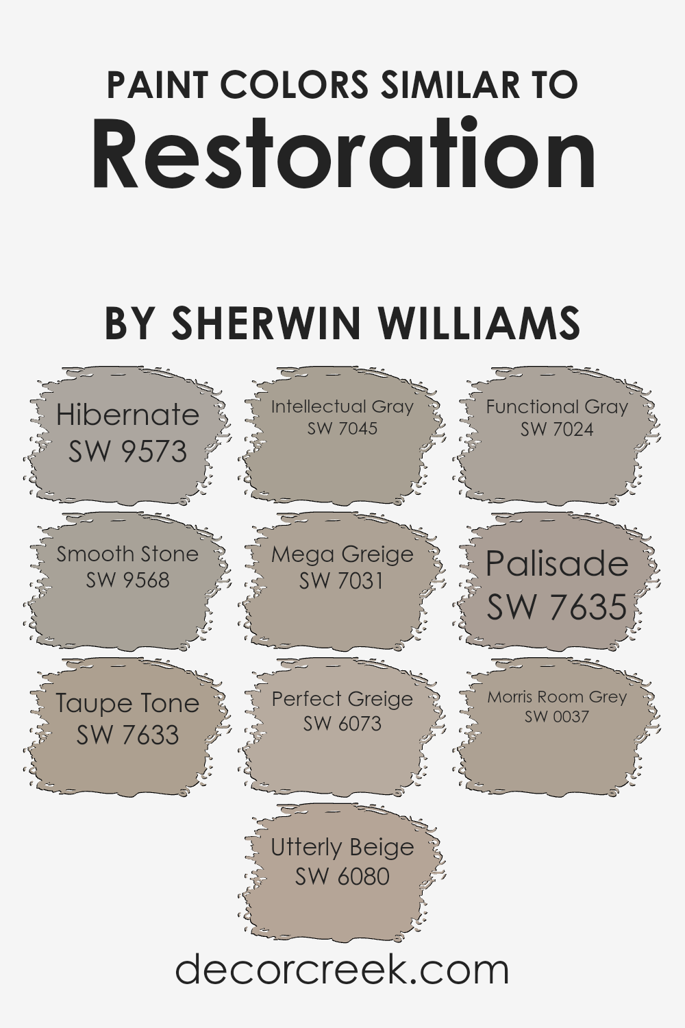
Colors Similar to Restoration SW 9578 by Sherwin Williams
Similar colors provide a seamless visual experience, establishing a cohesive and harmonious look by blending subtly from one to another. Opting for shades such as SW 9573 – Hibernate, a deep, restful taupe, or SW 9568 – Smooth Stone, a gentle gray, creates a soothing palette that’s easy on the eyes.
Including colors like SW 7633 – Taupe Tone, which is a balanced, warm gray, and SW 6080 – Utterly Beige, a soft, welcoming beige, adds a hint of warmth, making spaces feel more inviting. Through the use of related colors, areas within a home can transition smoothly, promoting a unified aesthetic without harsh contrasts.
For a more defined yet still harmonious look, SW 7045 – Intellectual Gray offers a deeper, thoughtful shade of gray, while SW 7031 – Mega Greige presents itself as a thicker gray with hints of beige, enriching spaces with a sturdier presence. SW 6073 – Perfect Greige blends gray and beige perfectly, providing a neutral background for any decor style.
The addition of SW 7024 – Functional Gray, which is a more practical, straightforward gray, and SW 7635 – Palisade, a deeper muted plum hue, introduces an element of surprise in an otherwise neutral scheme. Lastly, SW 0037 – Morris Room Grey, a robust yet understated historical gray, gives a subtle nod to traditional aesthetics, linking the present with touches of the past. These colors work collectively to create an effortlessly coordinated look, enhancing the sense of space and light in any interior.
You can see recommended paint colors below:
- SW 9573 Hibernate
- SW 9568 Smooth Stone
- SW 7633 Taupe Tone
- SW 6080 Utterly Beige
- SW 7045 Intellectual Gray
- SW 7031 Mega Greige
- SW 6073 Perfect Greige
- SW 7024 Functional Gray
- SW 7635 Palisade
- SW 0037 Morris Room Grey
How to Use Restoration SW 9578 by Sherwin Williams In Your Home?
**Restoration SW 9578 by Sherwin Williams** is a versatile paint color that can really liven up your home. This shade is perfect for anyone looking to refresh their living space. Whether you’re painting a bedroom, living room, or even a kitchen, this color offers a fresh look that can make your home feel new again.
For bedrooms, Restoration can create a calm atmosphere, perfect for relaxing after a long day. When used in a living room, it helps make the space inviting and warm, ideal for hosting friends and family. If you’re thinking about adding a splash of color to your kitchen, this shade can also do the trick, making the environment cheerful and bright.
Beyond just walls, consider using this color for cabinets or even as an accent on trim and doors to add a gentle contrast. It pairs well with many decor styles and complements other colors easily, making it a great choice for a harmonious design scheme in your home.
Restoration SW 9578 by Sherwin Williams vs Smooth Stone SW 9568 by Sherwin Williams
Restoration and Smooth Stone are both paint colors by Sherwin Williams, yet they offer distinct moods due to their tones. Restoration is a deeper, richer color that leans towards a warmer, earthy hue.
It’s an inviting color that works well in spaces like living rooms or dens where you want a cozy, welcoming environment. On the other hand, Smooth Stone has a lighter, more neutral tone. This color is great for creating a bright and airy feel, making it ideal for smaller spaces or rooms that you want to appear more spacious.
Both colors work well with a variety of decor styles, but while Restoration adds depth and warmth to a room, Smooth Stone offers a cleaner, more understated backdrop. This makes Smooth Stone a versatile option that can easily match furniture and accessories of many colors.
You can see recommended paint color below:
Restoration SW 9578 by Sherwin Williams vs Taupe Tone SW 7633 by Sherwin Williams
Restoration SW 9578 by Sherwin Williams is a soft green color that gives off a fresh and calming vibe, making it perfect for spaces where you want to add a touch of nature’s peacefulness.
On the other hand, Taupe Tone SW 7633 is a warm gray with brown undertones, creating a cozy and welcoming feel. It works well in areas where you aim to have a neutral but inviting backdrop. While Restoration breathes life into a room with its subtle green hue, Taupe Tone provides a more understated, homey feel that pairs well with various decor styles.
Both colors are versatile, but Restoration leans towards a cooler, refreshing look, and Taupe Tone offers a warmer, grounded atmosphere. These colors are ideal for different moods and settings, depending on the effect you want to achieve in your space.
You can see recommended paint color below:
Restoration SW 9578 by Sherwin Williams vs Functional Gray SW 7024 by Sherwin Williams
Restoration SW 9578 is a unique shade with a slightly cool undertone that can give a fresh and modern look to any room. Its lightness creates a bright and airy feel, making small spaces seem bigger. On the other hand, Functional Gray SW 7024 is a warmer, more grounded color.
It leans closer to a mid-tone gray, providing a cozy and inviting atmosphere that’s perfect for living rooms or bedrooms where you want to relax. While Restoration might be better suited for bathrooms or kitchens due to its crisp vibe, Functional Gray is versatile enough to work well in various areas, adding a touch of warmth without overwhelming the space.
In summary, Restoration is great for a clean, minimalistic aesthetic, whereas Functional Gray offers a warmer, more homely feel.
You can see recommended paint color below:
Restoration SW 9578 by Sherwin Williams vs Intellectual Gray SW 7045 by Sherwin Williams
Restoration SW 9578 by Sherwin Williams is a muted, soft blue with gray undertones that creates a calm and gentle backdrop suitable for many spaces. It’s light enough to make a room feel more open and airy, yet has enough depth to add character.
On the other hand, Intellectual Gray SW 7045 is a warmer, mid-tone gray with earthy undertones. This color has a more grounding effect and can give spaces a cozy, inviting feel. Compared to Restoration, Intellectual Gray is darker and leaner towards a traditional gray look, making it ideal for areas where a subtle, yet rich color is desired.
Both paints offer unique styles; Restoration is cooler and has a fresher appearance, whereas Intellectual Gray provides a more classic and homely vibe. Each works well in different environments depending on the mood you want to set.
You can see recommended paint color below:
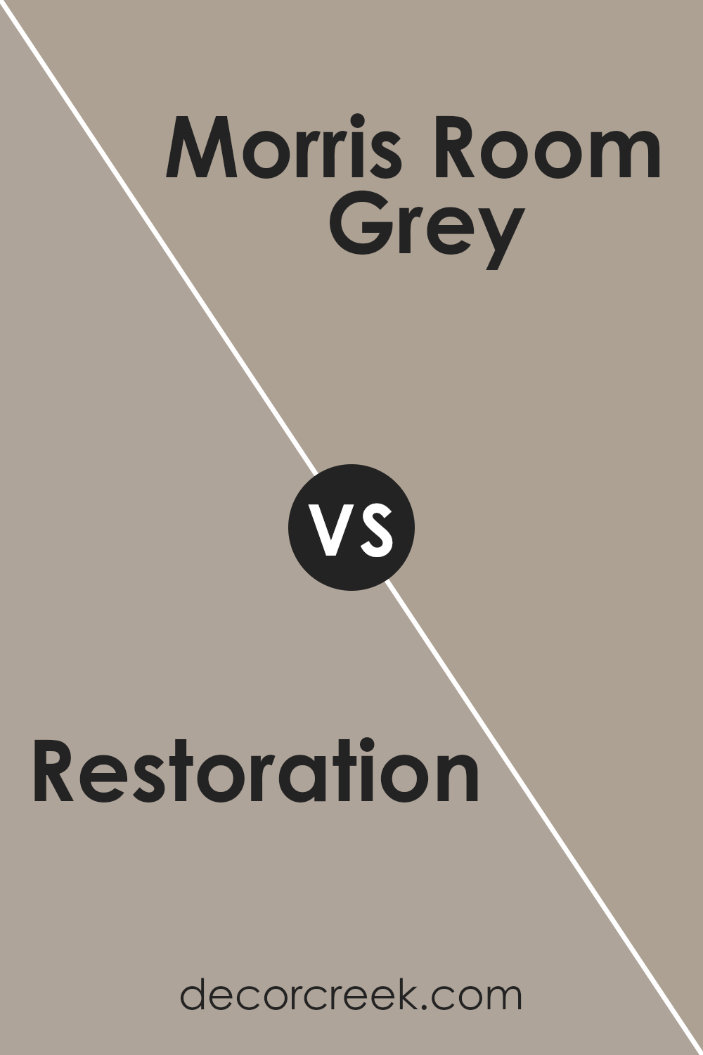
Restoration SW 9578 by Sherwin Williams vs Morris Room Grey SW 0037 by Sherwin Williams
Restoration SW 9578 by Sherwin Williams is a soft and pale gray-blue that has a calming lightness to it, making it perfect for creating a bright and airy feel in any space. It reflects light well, enhancing the openness of a room.
In contrast, Morris Room Grey SW 0037 is a deeper, warmer grey that offers a more grounded and cozy atmosphere. This color tends to absorb more light, which can make a space feel more enclosed yet inviting. While Restoration adds a breezy, fresh vibe to walls, Morris Room Grey provides a more sheltered, snug ambiance.
Both colors can complement each other beautifully in a home, with Restoration possibly serving as a main color for living spaces, and Morris Room Grey acting as a striking accent or for cozier corners like reading nooks or bedrooms. Each brings its unique characteristics to a decor scheme, depending on the mood or tone you want to set.
You can see recommended paint color below:
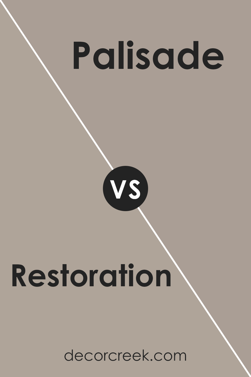
Restoration SW 9578 by Sherwin Williams vs Palisade SW 7635 by Sherwin Williams
Restoration SW 9578 is a dynamic gray shade from Sherwin Williams that has a slightly cool undertone, making it a versatile choice for rooms that aim for a more modern feel. Its neutral yet distinct quality allows it to pair well with various decor styles and colors.
On the other hand, Palisade SW 7635 is a softer, warmer gray. It’s almost like a cozy blanket, giving a welcoming and calming effect ideal for living spaces or bedrooms where comfort is key. This color tends to create a friendly atmosphere, making spaces feel more relaxed and inviting.
Both colors work well in various lighting conditions, but Restoration offers a sharper, more contemporary vibe, while Palisade leans towards a gentler and homely aura. Choosing between them depends on the mood you want to set: Restoration for a crisp, clean backdrop, or Palisade for a gentle, soothing environment.
You can see recommended paint color below:
- SW 7635 Palisade
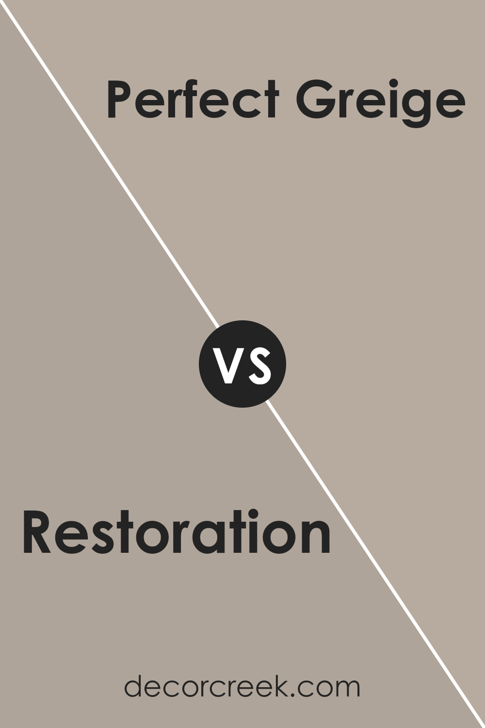
Restoration SW 9578 by Sherwin Williams vs Perfect Greige SW 6073 by Sherwin Williams
The main color, Restoration, and the second color, Perfect Greige, both by Sherwin Williams, offer distinct hues that cater to different tastes and design needs. Restoration is a fresh, clean shade of green with a hint of blue that gives off a calm and refreshing feel, making it ideal for spaces where you want to create a soothing atmosphere. This color can brighten up a room while still maintaining a cozy vibe.
On the other hand, Perfect Greige is a warm blend of beige and gray. This color is incredibly versatile and acts as a neutral backdrop that can complement various decor styles and colors. It’s a great choice for someone looking to create a cozy, inviting space that feels grounded and stable.
Both colors are well-suited for modern homes, but they serve different purposes with their undertones and overall impact. Restoration brings a vibrant yet peaceful energy, while Perfect Greige offers a subtle, understated foundation.
You can see recommended paint color below:
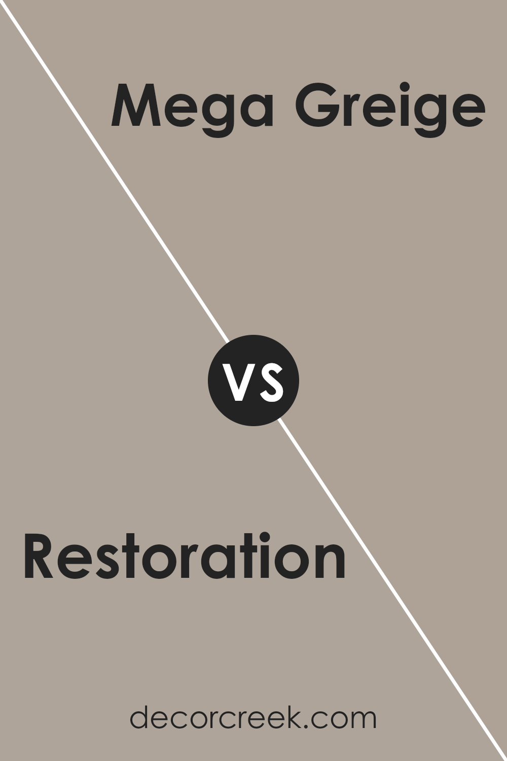
Restoration SW 9578 by Sherwin Williams vs Mega Greige SW 7031 by Sherwin Williams
Restoration SW 9578 and Mega Greige SW 7031, both by Sherwin Williams, are two distinctive hues. Restoration is a lighter, soft gray that adds a fresh, airy feeling to any space. It’s a versatile color that works well in rooms that receive plenty of natural light or in smaller areas where you want to create a sense of openness.
On the other hand, Mega Greige SW 7031 is a deeper color, a blend of gray with warm beige tones. This color is great for adding warmth to a room and works well in areas that need a cozy, inviting atmosphere. It’s especially effective in larger spaces or rooms with less natural light.
Both colors are neutral, which makes them easy to integrate into various decor styles and pair with other colors. However, the choice between the two would depend on the mood you want to set in your room – lighter and breezier with Restoration, or warmer and more grounded with Mega Greige.
You can see recommended paint color below:
Restoration SW 9578 by Sherwin Williams vs Hibernate SW 9573 by Sherwin Williams
Restoration and Hibernate, both from Sherwin Williams, are distinct yet harmonious colors. Restoration is a warm, soft gray that offers a subtle, cozy atmosphere to any room. It’s like the color of wet clay—neutral but with a hint of warmth that makes it very versatile for pairing with other colors.
On the other hand, Hibernate is a deeper, richer gray that resembles the shade of dense fog or the underbelly of a storm cloud. It provides a stronger visual impact and brings a sense of depth and calmness to spaces, making it a great option for areas where you want to add a touch of drama without going too dark.
While both colors share a gray base, Restoration is lighter and warmer, making it easier to pair with a wide range of decors. Hibernate, being darker, can serve as a striking contrast or as a comforting, enveloping presence in a room. Each can create a unique mood and style, depending on how and where they are employed.
You can see recommended paint color below:
Restoration SW 9578 by Sherwin Williams vs Utterly Beige SW 6080 by Sherwin Williams
Restoration and Utterly Beige, both from Sherwin Williams, are distinct yet harmonious shades. Restoration presents a soft, muted green that feels fresh and calming. It’s a color that pairs well with natural materials like wood and stone, giving spaces a clean, airy feel, suitable for relaxation areas like bedrooms or living rooms.
On the other hand, Utterly Beige is a warmer shade with a creamy, welcoming presence. As a versatile beige, it works excellently in various settings, enhancing the space without overpowering it. This color can help small rooms appear larger and more open, making it ideal for hallways and small offices.
When comparing these two, Restoration offers a hint of color and brings a gentle vibrancy to a room, while Utterly Beige provides a neutral backdrop that complements bolder accents and furnishings. Each creates a cozy atmosphere, with Restoration leaning towards a subtle, nature-inspired vibe and Utterly Beige offering a classic, understated look.
You can see recommended paint color below:
Conclusion
This paint isn’t just about covering up old colors; it’s like giving your room a new life. It’s smooth to apply and stands up well over time which means you don’t have to worry about redoing it every few years.
I learned that this paint can make any room feel fresh and clean, and it does a great job in covering up old marks and stains. Whether it’s a bedroom or a living room, SW 9578 Restoration has a way of making the place look neat and inviting. It helps that it comes from Sherwin Williams, a brand known for its quality products.
After trying it out in my own home, I can really see why it’s worth choosing a high-quality paint like this. The change it brings is noticeable, and it makes the environment you live in a lot nicer. It’s definitely something I would recommend to others looking for a reliable and effective way to improve their homes without getting into complicated projects.
For anyone looking to give a room a clean, new look, this paint might be the perfect starting point.

Ever wished paint sampling was as easy as sticking a sticker? Guess what? Now it is! Discover Samplize's unique Peel & Stick samples.
Get paint samples

