In the vast spectrum of colors that can transform a space, SW 9573 Hibernate by Sherwin Williams stands out as a profoundly serene and sophisticated hue. This color is part of the Sherwin Williams collection, which is renowned for its high-quality paints that offer stunning finishes and long-lasting durability.
Hibernate, with its deeply calming and inviting tone, provides a sense of warmth and tranquility that is perfect for creating a cozy atmosphere in any room.
Its versatility allows it to seamlessly blend with various decor styles, from modern minimalism to rustic charm, making it a favorite among homeowners and interior designers alike.
The unique character of SW 9573 Hibernate lies in its ability to act as both a statement and a complementary shade. Whether applied to an accent wall, paired with bold decorative elements, or used as a unifying background color throughout a home, it radiates a sense of comfort and elegance.
This article aims to explore the dynamic nature of Hibernate by Sherwin Williams, offering insights into its potential applications, tips for color pairing, and advice on achieving the perfect finish. With a focus on practicality and aesthetic appeal, we dive into the world of SW 9573 Hibernate, uncovering the secrets behind its growing popularity in interior design.

What Color Is Hibernate SW 9573 by Sherwin Williams?
Sherwin Williams’ Hibernate is a color that embodies tranquility and a deep sense of calm. This color exhibits a sophisticated blend of charcoal with an understated hint of navy blue, creating a unique hue that brings about a serene and inviting atmosphere.
It’s a rich, dark shade that serves as a stunning backdrop in any interior, drawing in depth and character while simultaneously exuding an understated elegance.
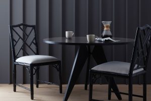
Hibernate is versatile, aligning perfectly with various interior styles, particularly well-suited for contemporary, minimalist, and industrial designs. Its profound depth enhances the sleek lines of modern furniture, creating striking contrasts in minimalist settings, and adds a refined touch to the raw textures found in industrial-themed spaces.
When it comes to pairing materials and textures, Hibernate thrives alongside natural elements. Imagine it with warm wood tones that balance its cool undertones, creating a harmonious and inviting space. Leather furniture in rich browns or tans also pairs beautifully, adding a touch of luxury and comfort.
For textiles, consider soft, plush fabrics in light neutrals or muted colors to maintain the room’s serene atmosphere while adding layers of texture. Metals, whether brushed nickel or matte black, can provide a modern twist, offering sleek accents that highlight Hibernate’s sophisticated charm.
In essence, Hibernate by Sherwin Williams is not just a color; it’s a statement of elegance and comfort that resonates through various design styles, making it a timeless choice for creating captivating and peaceful spaces.
Ever wished paint sampling was as easy as sticking a sticker? Guess what? Now it is! Discover Samplize's unique Peel & Stick samples.
Get paint samples

Is Hibernate SW 9573 by Sherwin Williams Warm or Cool color?
Hibernate, represented by the color code 9573 from Sherwin Williams, embodies a serene and comforting presence in any living space. This unique hue, subtly nestled between the realms of neutral and inviting, possesses an inherent versatility that complements a wide range of interior design styles.
Its soft, warm undertones make it an ideal choice for creating a cozy atmosphere, fostering an environment where relaxation and calm prevail.
In homes, Hibernate acts as a harmonious background, seamlessly blending with both contemporary and traditional decor, allowing furniture and art to stand out without overwhelming senses.
The beauty of this color lies in its adaptability; it can transform a room into a tranquil sanctuary or serve as a chic backdrop for more vibrant accents. Whether applied to a bedroom wall, living room, or even a home office, it facilitates a sense of spaciousness and light, making smaller rooms feel more open and airy, while adding depth and warmth to larger spaces.
The psychological impact of such a calming shade encourages a decompression from the day’s stresses, inviting inhabitants into a state of well-being and peace. Considering the ever-evolving dynamics of home aesthetics, Hibernate offers a timeless palette that endures trends, making it a wise choice for anyone looking to infuse their home with a gentle, soothing ambiance.
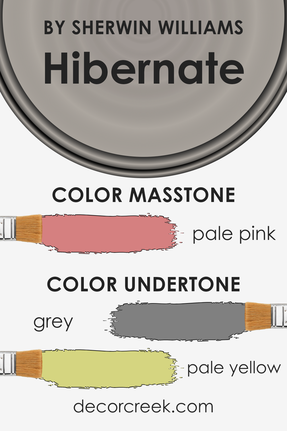
Undertones of Hibernate SW 9573 by Sherwin Williams
The subtlety of a color’s undertones can profoundly influence its perception and ambiance, especially in interior design. Hibernate, as a nuanced hue, carries undertones that add depth and complexity, enriching its primary tone beyond a simple surface appearance.
The grey (#808080) undertone introduces a soothing elegance, a timeless neutrality that makes the color adaptable to various decor styles and settings. On the other hand, the pale yellow (#D5D580) undertone adds a layer of warmth, subtly brightening the color with a hint of sunlight and cheerfulness.
Understanding these undertones is crucial in recognizing how they affect our perception of the color. Grey offers a stable foundation, implying solidity and reliability, which can make a room feel more anchored and serene.
The pale yellow, with its inherent lightness, brings an uplifting energy, gently countering the coolness of grey, making the space feel more welcoming and comfortable.
When applied to interior walls, the dual undertones of this color adapt dynamically with varying lighting conditions throughout the day. In natural sunlight, the pale yellow undertone might become more pronounced, creating a soft, warm glow that enhances the room’s coziness.
In artificial light, the grey may prevail, lending a more subdued, sophisticated aura. This interplay between warmth and neutrality allows the color to create spaces that are both comforting and refined, suitable for living areas where relaxation and elegance are desired.
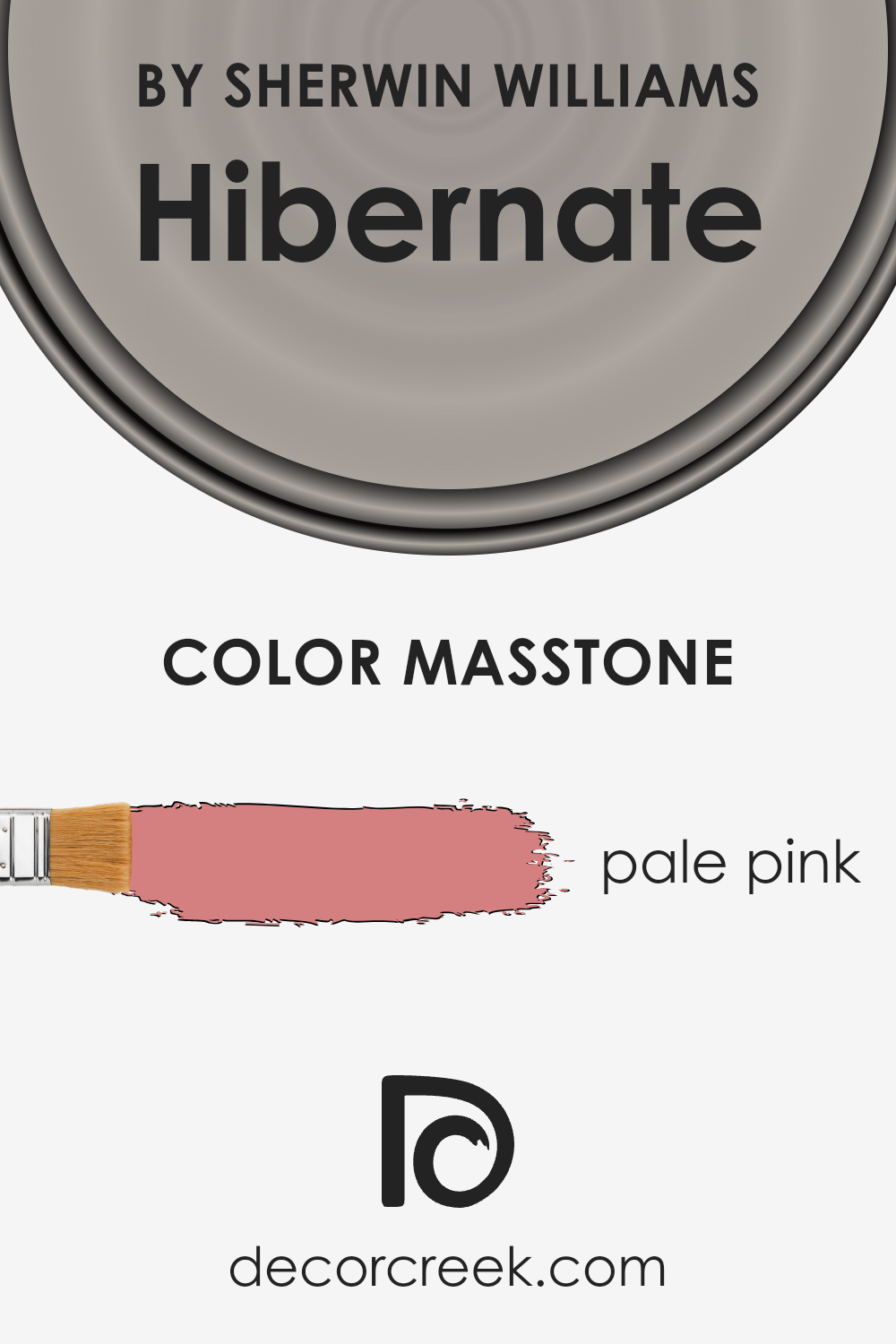
What is the Masstone of the Hibernate SW 9573 by Sherwin Williams?
The masstone of Pale Pink #D58080, as seen in the case of Hibernate, presents a warm and inviting hue that brings a subtle yet impactful aura to any home. This particular shade embodies a soft, almost ethereal quality, making it exceptionally versatile for various design concepts.
Its understated elegance provides a soothing backdrop that can either complement bold, vibrant tones or create a serene, cohesive look when paired with other muted shades.
In living spaces, this pale pink infuses a sense of calm and comfort, promoting relaxation and tranquility. In bedrooms, it can enhance the perception of light and space, making the room feel airy and more expansive.
The color’s inherent warmth works wonders in north-facing rooms, offsetting the cooler natural light, thereby creating a cozy and inviting atmosphere.
This makes it an excellent choice for homeowners looking to add a touch of sophistication without overwhelming their space with intense color saturation.
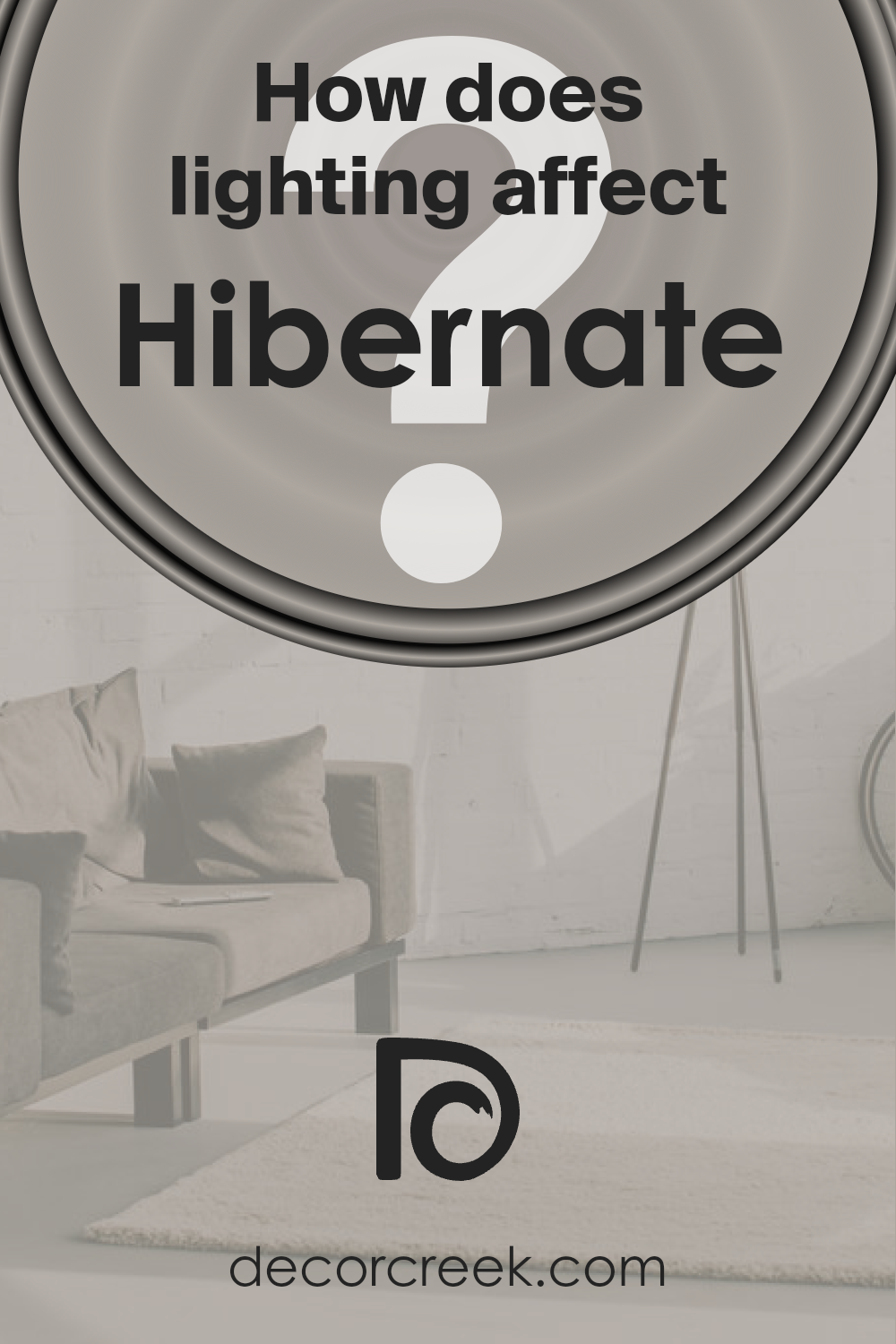
How Does Lighting Affect Hibernate SW 9573 by Sherwin Williams?
Lighting plays a pivotal role in how we perceive colors. It can significantly alter the appearance and mood a color sets in a room, influencing both its intensity and hue. Various lighting conditions, whether artificial or natural, can transform a single paint shade into a spectrum of tones.
For instance, the color Hibernate, a nuanced paint by Sherwin Williams, can exhibit a wide range of effects under different lighting conditions, reflecting the complexity and versatility of this particular shade.
In artificial light, Hibernate can appear warmer or cooler depending on the color temperature of the light source. LED or fluorescent lights that mimic daylight will present Hibernate with a truer color representation, maintaining its subtle nuances. Alternatively, incandescent bulbs, which cast a yellowish hue, tend to enhance the warmth of Hibernate, making it appear cozier and more inviting.
Natural light brings out the truest form of Hibernate, but the orientation of the room plays a significant role in its perception. In north-faced rooms, which receive cooler, indirect light throughout the day, Hibernate may manifest a slightly more muted and cooler tone, emphasizing its serene and calming qualities.
South-faced rooms, bathed in warm, direct sunlight for most of the day, can make Hibernate radiate warmth, highlighting its underlying coziness and making the space feel more vibrant.
Rooms facing east will enjoy the morning sun, which can make Hibernate appear bright and cheerful in the morning, with a subtle softness as the day progresses and the natural light diminishes. Conversely, west-faced rooms will showcase Hibernate in a different light, literally.
In the afternoon and evening, as the sun sets, the color can take on a golden quality, becoming warmer and more vivid, perfectly capturing the glow of the late-day sun.
This versatility makes Hibernate an excellent choice for various orientations and lighting conditions, adapting and transforming to complement the room’s natural and artificial lighting environment.
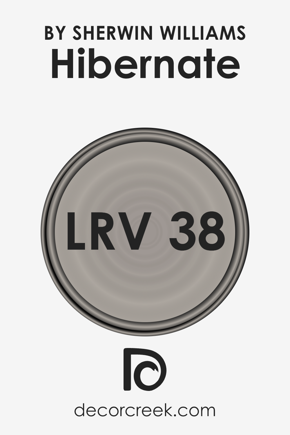
What is the LRV of Hibernate SW 9573 by Sherwin Williams?
Light Reflectance Value (LRV) measures the percentage of visible and usable light that a paint color reflects from or absorbs into a painted surface. It’s a critical factor in paint selection as it can greatly affect the ambiance and mood of a room.
LRV scores range from 0 to 100, with 0 being the most absorbent, indicating a very dark hue that could be nearly black, and 100 reflecting the brightest white, absorbing little to no light.
This scale helps in determining how light or dark a color will look and feel once applied to the walls of a space. The amount of natural and artificial light a room receives can influence the perception of the color, making the LRV a vital tool in the selection process to achieve the desired effect in a room’s decor.
With an LRV of 38.463, Hibernate falls into the medium range, meaning it neither reflects light as vibrantly as lighter shades nor absorbs light as significantly as the darker hues.
This particular LRV value suggests that Hibernate has a balanced, versatile character, capable of contributing to a cozy and inviting atmosphere in spaces with ample lighting, or creating a more intimate, subdued feel in areas with limited light.
The LRV indicates that it could perform well in a variety of settings, adding depth and interest without overpowering a room with darkness.
When considering this shade for a space, it’s essential to factor in both the room’s lighting and the desired mood, as the medium-level LRV provides a flexible yet distinctive backdrop that can complement a wide range of interior designs and styles.
LRV – what does it mean? Read This Before Finding Your Perfect Paint Color
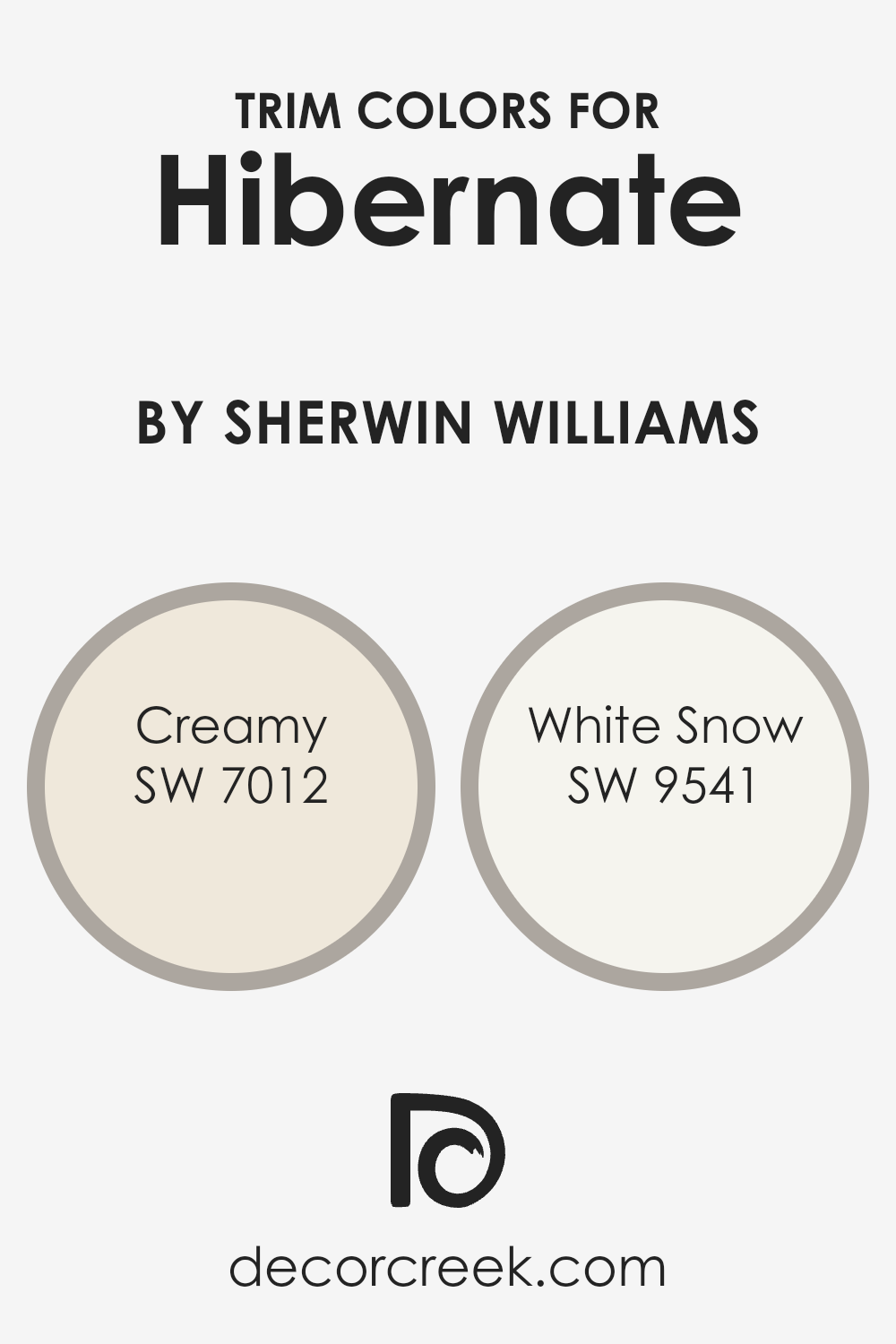
What are the Trim colors of Hibernate SW 9573 by Sherwin Williams?
Trim colors are essential elements in interior design, especially when it comes to creating a cohesive and appealing aesthetic within a space. For a sophisticated and comforting paint like Hibernate by Sherwin Williams, choosing the right trim colors can dramatically enhance the room’s appearance, accentuating its features and complementing the main color scheme.
Trim colors such as Creamy (SW 7012) and White Snow (SW 9541) by Sherwin Williams offer a subtle contrast or a bright pop against walls painted with Hibernate, making architectural details stand out and giving the space a polished look.
The right trim color not only defines spaces clearly by creating lines and boundaries that shape the room but also influences the overall mood and atmosphere, adding depth and dimension that can transform a simple room into a striking space.
Creamy (SW 7012) is a soft, warm off-white that emanates a smooth and inviting ambiance, making it an ideal trim color for creating a seamless transition between walls painted with Hibernate and the trim. Its gentle hue contributes to a sense of continuity and space, perfect for enhancing the cozy and tranquil feel that Hibernate offers.
On the other hand, White Snow (SW 9541) is a crisp, pure white that brings a fresh and clean contrast to the deeper tones of Hibernate.
It is excellent for delineating spaces and highlighting architectural features, adding a sharp and refined edge to the room’s overall aesthetic. Both Creamy and White Snow work harmoniously with Hibernate, ensuring the room feels cohesive while allowing each color to express its charm and character.
You can see recommended paint colors below:
- SW 7012 Creamy
- SW 9541 White Snow
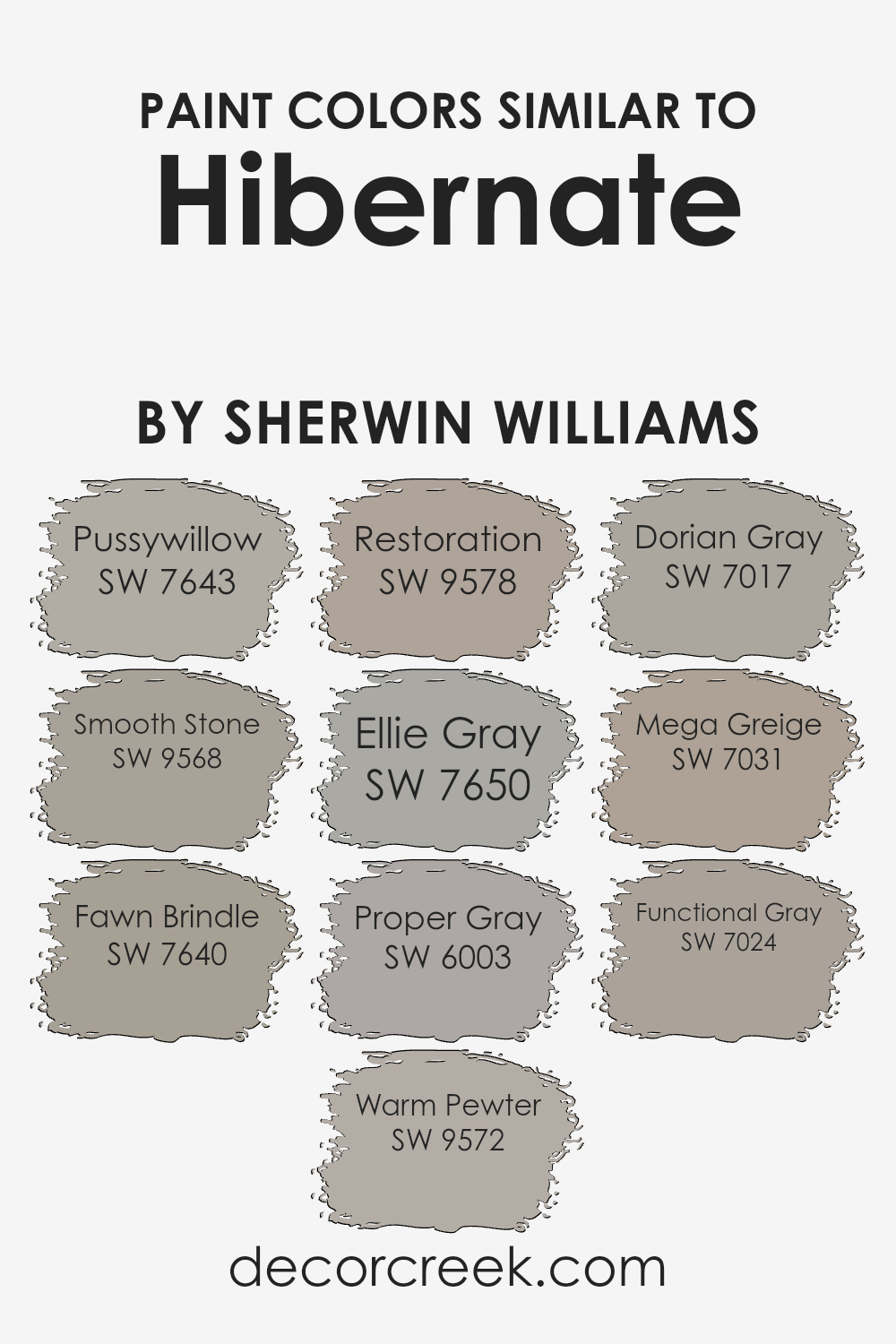
Colors Similar to Hibernate SW 9573 by Sherwin Williams
In the realm of color coordination, similar colors play a pivotal role in creating harmonious and aesthetically pleasing environments. These hues, often neighboring each other on the color wheel, provide a subtle yet impactful way to design spaces that are cohesive and calming.
By leveraging shades similar to Hibernate by Sherwin Williams, such as Pussywillow, Smooth Stone, Fawn Brindle, Warm Pewter, Restoration, Ellie Gray, Proper Gray, Dorian Gray, Mega Greige, and Functional Gray, designers can craft spaces that exude a sense of continuity and sophistication.
These colors, while distinct, share a common grounding in the gray spectrum, thus allowing them to work together seamlessly to establish an elegant and understated atmosphere.
Pussywillow is a soft, muted gray that whispers tranquility, setting a serene backdrop that’s both inviting and versatile. Similarly, Smooth Stone offers a gentle embrace, its light gray touch bringing warmth to spaces without overwhelming. Fawn Brindle steps a bit darker, lending depth and character with its rich, inviting tone.
Warm Pewter, on the other hand, balances between light and shadow, offering a medium shade that’s perfect for achieving a nuanced look.
Restoration serves as a bridge between tradition and contemporary, its gray-green undertone invoking a sense of renewal. Ellie Gray, with a hint of blue, introduces a cool tranquility, perfect for modern aesthetics. Proper Gray, as its name suggests, is the quintessential gray that pairs flawlessly with virtually any color.
Dorian Gray, a deeper shade, adds a dash of drama and gravitas.
Mega Greige brings a unique blend, infusing the room with warmth through its beige-gray hue, and Functional Gray rounds off the selection with its striking ability to adapt, highlighting the surrounding elements with its deep, complex base.
Together, these colors not only enhance the visual appeal of a space but also contribute to a cohesive design narrative that reflects understated elegance and seamless transitions between areas.
You can see recommended paint colors below:
- SW 7643 Pussywillow
- SW 9568 Smooth Stone
- SW 7640 Fawn Brindle
- SW 9572 Warm Pewter
- SW 9578 Restoration
- SW 7650 Ellie Gray
- SW 6003 Proper Gray
- SW 7017 Dorian Gray
- SW 7031 Mega Greige
- SW 7024 Functional Gray
How to Use Hibernate SW 9573 by Sherwin Williams In Your Home?
Hibernate is a captivating paint color by Sherwin Williams that embodies comfort and tranquility. This soothing shade possesses a unique ability to create a serene and inviting atmosphere in any space. Its subtle elegance allows for versatility in home decor, enabling homemakers and interior designers alike to craft rooms that are both stylish and restful.
Whether applied in a cozy bedroom, a peaceful home office, or a relaxing living area, Hibernate brings a sense of calm and a touch of sophistication.
Incorporating Hibernate into your home can be seamlessly achieved by using it as a primary wall color to set a tranquil foundation. Complement it with soft, natural textiles and minimalist decor to enhance its soothing effect.
Additionally, it serves beautifully as an accent, harmonizing with lighter neutrals or contrasting with bold hues for a more dynamic space.
Its inherent warmth promotes a welcoming environment, ideal for spaces where comfort and serenity are paramount. With Hibernate, the possibilities are endless, offering a perfect balance between calm and chic for any home.
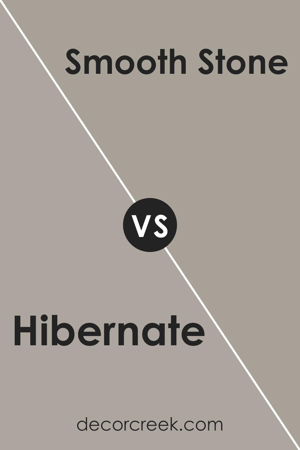
Hibernate SW 9573 by Sherwin Williams vs Smooth Stone SW 9568 by Sherwin Williams
Comparing Hibernate and Smooth Stone, both by Sherwin Williams, reveals intriguing nuances between these sophisticated hues. Hibernate is a deep, enveloping shade that suggests comfort and tranquility, making it an ideal choice for spaces seeking a cozy, introspective atmosphere. Its richer undertones can add a layer of warmth and sophistication, creating a sense of retreat and relaxation in any room.
Smooth Stone, on the other hand, is a lighter, more neutral color. It possesses an airy quality, bringing a sense of openness and serenity to interiors. This versatility allows it to blend seamlessly with various decor styles, from modern minimalist to rustic charm, enhancing the sense of space and light within a room.
When comparing the two, it’s clear that Hibernate offers depth and warmth, perfect for creating a comforting, enclosed feel, while Smooth Stone provides a clean, calm backdrop, ideal for spaces that aim for a bright and uplifting aesthetic. Both hues offer unique possibilities, depending on the desired mood and design objectives.
You can see recommended paint color below:
- SW 9568 Smooth Stone
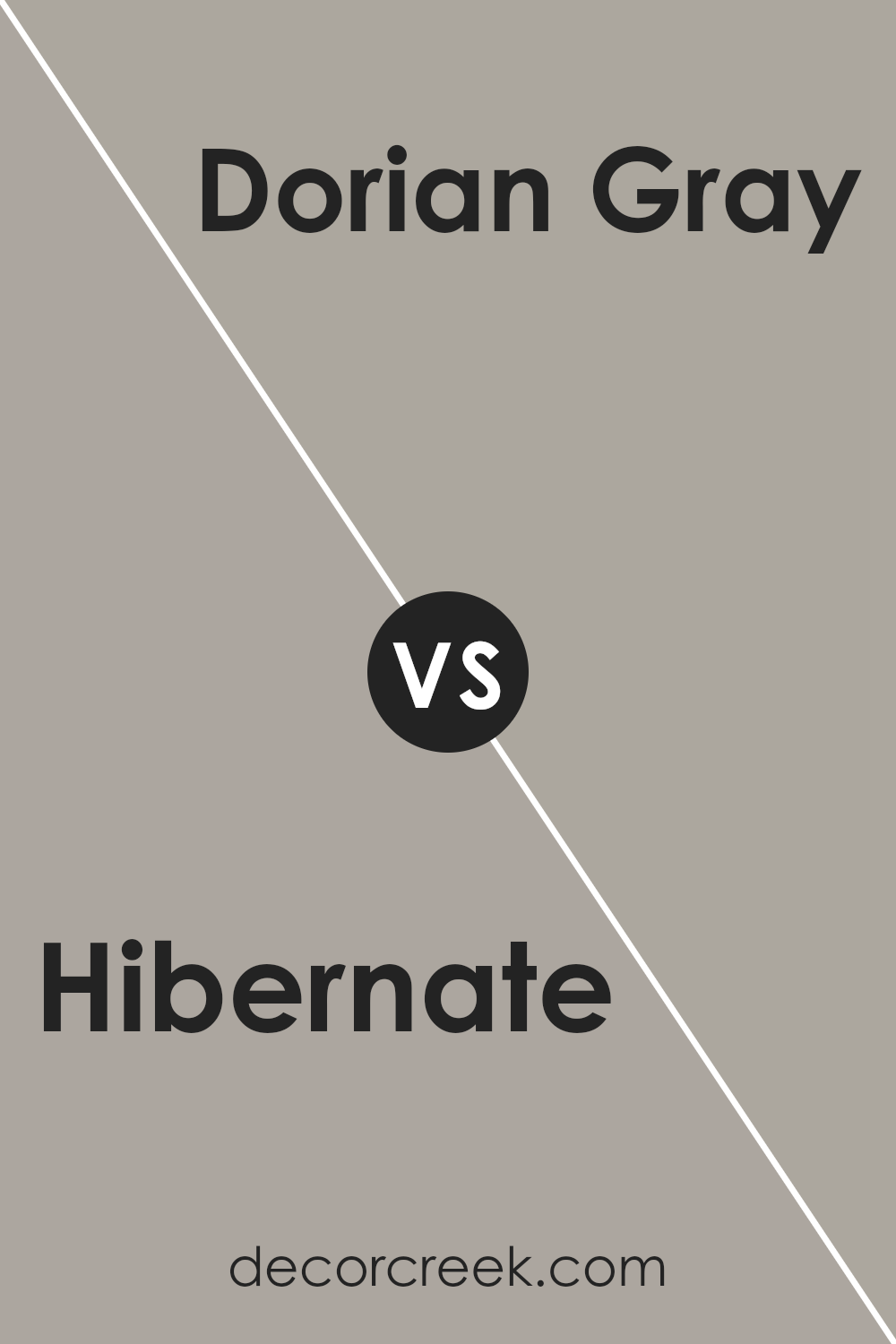
Hibernate SW 9573 by Sherwin Williams vs Dorian Gray SW 7017 by Sherwin Williams
Hibernate and Dorian Gray are two distinct shades from Sherwin Williams that cater to different aesthetic preferences. Hibernate is a deeper, more enveloping color that conjures the serenity and richness of nature in its most tranquil state. Its depth creates a cozy, intimate atmosphere, making it ideal for spaces where warmth and comfort are desired.
On the other hand, Dorian Gray stands out as a versatile neutral with a balanced blend of gray tones.
This color radiates a more subdued elegance, offering a perfect backdrop for a wide range of decor styles. While Hibernate tends to draw you in, creating a sense of enclosure and warmth, Dorian Gray steps back, allowing other elements in the room to take center stage, thanks to its understated yet sophisticated hue.
Both colors, though differing in depth and mood, provide unique opportunities to create inviting, personalized spaces.
You can see recommended paint color below:
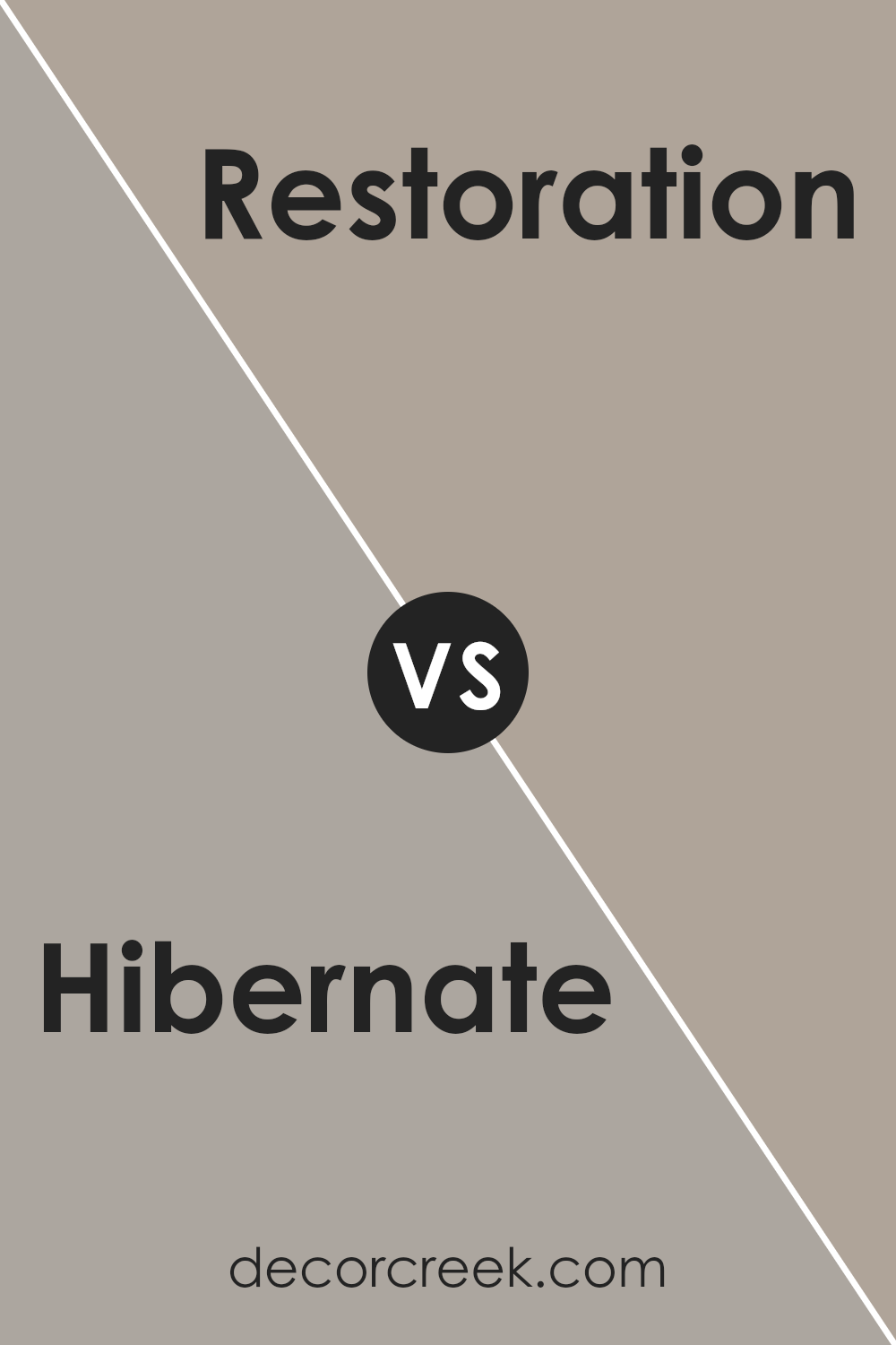
Hibernate SW 9573 by Sherwin Williams vs Restoration SW 9578 by Sherwin Williams
Hibernate and Restoration, both by Sherwin Williams, portray a soothing and warm ambiance yet cater to different aesthetic preferences. Hibernate leans towards a deeper, more enveloping shade of taupe, providing a sense of comfort and solace akin to its namesake.
It evokes a feeling of warmth and coziness, perfect for creating a snug and intimate atmosphere in any space.
On the other hand, Restoration introduces a lighter, more refreshing take on taupe, incorporating subtle gray undertones. This color uplifts a room with a serene and calming effect, offering a breezy and light ambiance that is both modern and timeless.
While Hibernate invites a deeper, more introspective mood, akin to the quietude of winter, Restoration suggests a renewal, reminiscent of early spring mornings.
Both colors, though distinct in their tones, offer versatile backdrops for a range of decorative styles, from the rustic warmth of traditional decors to the sleek lines of modern designs.
You can see recommended paint color below:
- SW 9578 Restoration
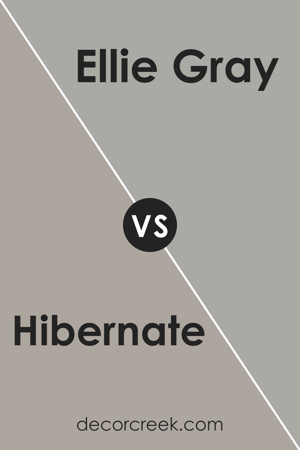
Hibernate SW 9573 by Sherwin Williams vs Ellie Gray SW 7650 by Sherwin Williams
Hibernate and Ellie Gray by Sherwin Williams are two distinct shades that cater to different aesthetic palettes while maintaining a serene and sophisticated vibe. Hibernate is a deeper, cozier color with undertones that suggest a warm, enveloping ambiance.
It’s the kind of color that lends itself well to spaces meant for relaxation and introspection, offering a rich backdrop that feels both comforting and grounded.
Ellie Gray, on the other hand, is a lighter gray that walks the line between subtle warmth and cooler, more neutral gray tones. This versatility makes Ellie Gray an excellent choice for a variety of spaces, providing a calm and collected atmosphere.
It reflects more light, making spaces appear larger and more open, and pairs well with both bright accents and subdued textures.
When comparing the two, Hibernate offers depth and warmth, creating an intimate setting, while Ellie Gray brings a lighter, more airy feel, promoting a sense of tranquility and space. The selection between them would largely depend on the intended mood and size of the room, with Hibernate favoring cozier, more enveloping environments, and Ellie Gray enhancing openness and light.
You can see recommended paint color below:
- SW 7650 Ellie Gray
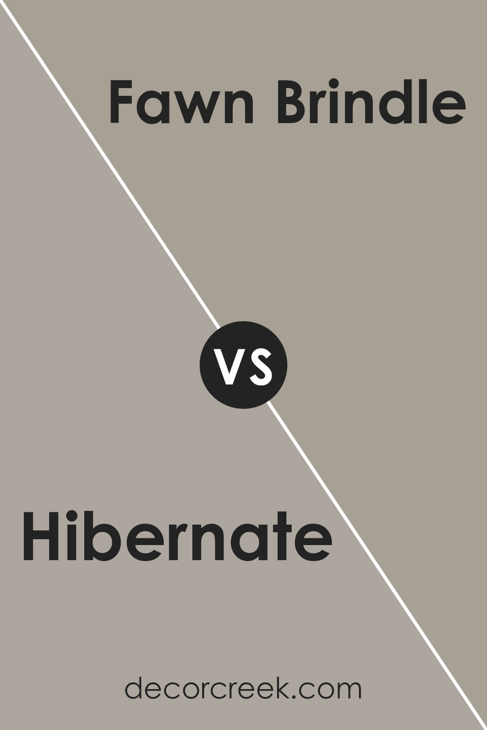
Hibernate SW 9573 by Sherwin Williams vs Fawn Brindle SW 7640 by Sherwin Williams
Hibernate and Fawn Brindle, both by Sherwin Williams, present a sophisticated palette, offering distinct yet complementing hues for versatile interior designs. Hibernate serves as a rich, profound hue that embodies a serene darkness, suggesting an enveloping sense of calm and retreat.
Its depth provides an anchor in spaces, making it an ideal choice for creating focal points or intimate, cozy corners.
In contrast, Fawn Brindle edges towards a lighter, softer gray, carrying an earthy undertone that brings warmth and natural elegance to any room. This color effortlessly balances between gray and brown, making it highly adaptable and suitable for a variety of decorating styles, from modern minimalism to rustic charm.
Together, these colors can create a harmonious blend, with Fawn Brindle offering a gentle lift and brightness against the more subdued, introspective depth of Hibernate, thereby establishing a refined and tranquil ambiance.
You can see recommended paint color below:
- SW 7640 Fawn Brindle
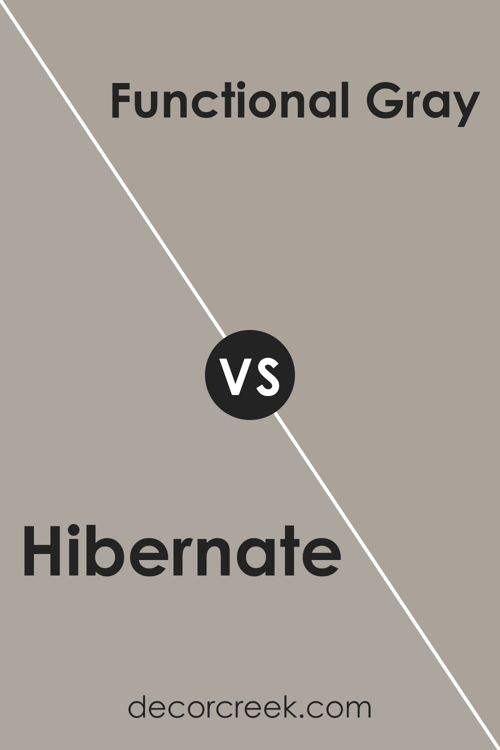
Hibernate SW 9573 by Sherwin Williams vs Functional Gray SW 7024 by Sherwin Williams
Hibernate and Functional Gray by Sherwin Williams are two nuanced colors that offer distinct atmospheres when applied to interior or exterior spaces. Hibernate is a rich, deep hue that leans towards the warmth of earthy tones, imbuing spaces with a cozy, enveloping feeling.
Its depth allows for a striking presence, making it an ideal choice for accent walls or spaces where a touch of sophistication is desired.
In contrast, Functional Gray operates in a more subdued spectrum. It is a versatile, medium gray that balances perfectly between warm and cool tones. This neutrality makes it exceptionally adaptable to various decor styles and color schemes, providing a solid foundation for interiors that aim to strike a balance between contemporary and traditional.
While Hibernate offers a bold and inviting warmth, Functional Gray presents a calm, understated elegance. Both colors carry the quality and depth synonymous with Sherwin Williams paints, yet cater to different aesthetic preferences and functionality within home and office environments.
You can see recommended paint color below:
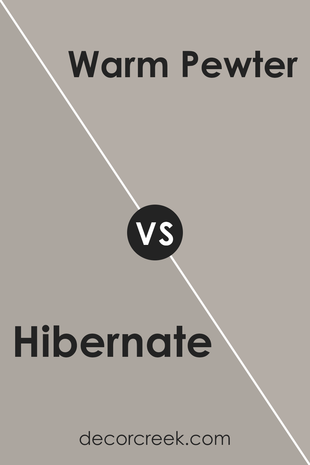
Hibernate SW 9573 by Sherwin Williams vs Warm Pewter SW 9572 by Sherwin Williams
Hibernate and Warm Pewter, both by Sherwin Williams, offer a subtle yet distinct divergence in their hues that can influence the ambiance of any space. Hibernate leans towards a deeper, more enveloping tone. It carries an essence of tranquility and depth, making it perfect for creating cozy, introspective spaces.
The color can imbue a room with a sense of serenity and retreat, reminiscent of the tranquil moments just before dusk.
On the other hand, Warm Pewter sits a shade lighter, offering a more versatile and adaptable palette. It bridges the gap between neutral and statement, bringing warmth into spaces without overwhelming them.
This color can illuminate areas with its understated elegance, providing a soft backdrop that complements a wide range of decor.
Together, these colors can create a harmonious balance between warmth and depth. Warm Pewter can lighten and lift spaces, while Hibernate adds a layer of sophistication and mystery, making them a compelling combination for those looking to blend comfort with style.
You can see recommended paint color below:
- SW 9572 Warm Pewter
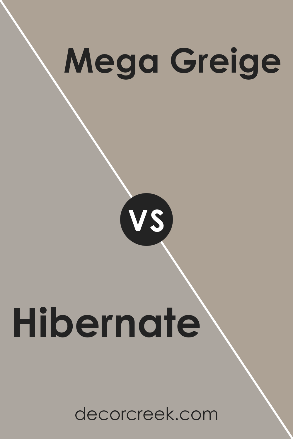
Hibernate SW 9573 by Sherwin Williams vs Mega Greige SW 7031 by Sherwin Williams
Hibernate and Mega Greige by Sherwin Williams are two distinct colors that bring unique atmospheres to spaces. Hibernate, a deep, enveloping hue, suggests a sense of retreat and relaxation. Its richness acts as a backdrop that can either stand out as a focal point or support other colors to shine, offering versatility in design schemes that range from cozy and intimate to bold and sophisticated.
On the other hand, Mega Greige embodies a balance between gray and beige, providing a warm, neutral canvas. This color is incredibly adaptive, functioning well in both modern and traditional settings.
It excels in spaces that crave a touch of warmth without overwhelming the senses, acting as a seamless transition between colors in a palette.
When comparing these two, Hibernate offers depth and drama, inviting a stronger emotional response and a sense of cocooning comfort. Mega Greige, however, champions flexibility and understated elegance, promoting a subtle, harmonious blend with other elements in a room.
Each color serves different design objectives, from creating a bold statement to crafting a nuanced, cohesive space.
You can see recommended paint color below:
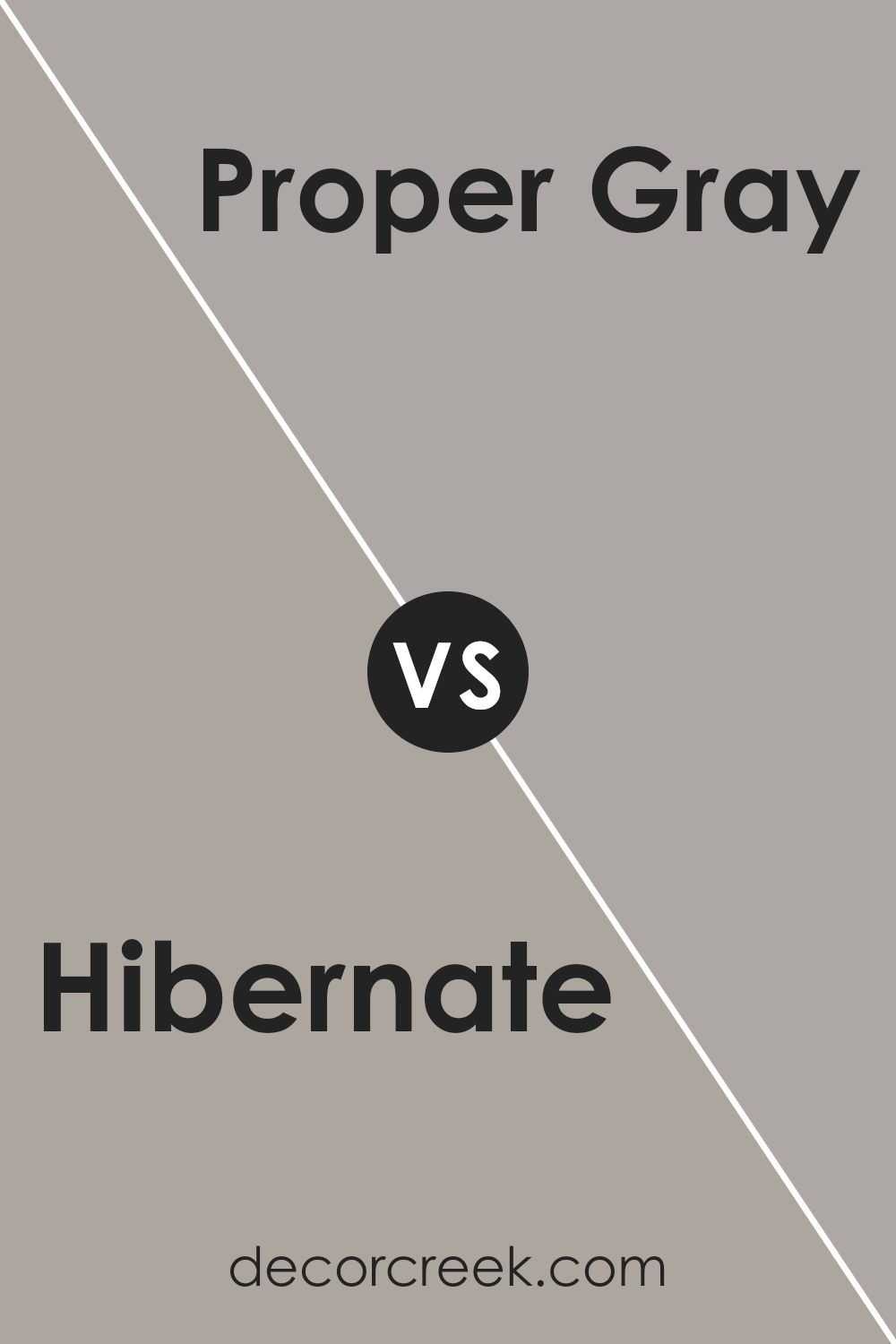
Hibernate SW 9573 by Sherwin Williams vs Proper Gray SW 6003 by Sherwin Williams
Hibernate and Proper Gray, both by Sherwin Williams, offer distinct yet subtly different tones that enhance various spaces with their unique characteristics. Hibernate presents as a deep, comforting gray that carries a touch of warmth, making it an excellent choice for areas requiring a cozy and inviting atmosphere.
Its richness adds depth to walls, creating a sophisticated backdrop that pairs well with both bright and muted accents.
On the other hand, Proper Gray is a lighter, more neutral gray. It provides a crisp, clean look that brightens spaces while maintaining a modern and versatile appeal. Proper Gray works exceptionally well in areas with abundant natural light, reflecting and enhancing the light to make rooms appear more spacious.
While Hibernate offers a moodier aesthetic ideal for creating intimate, restful environments, Proper Gray serves as a seamless neutral foundation, adaptable to various decor styles and preferences.
Together, these colors cater to a broad spectrum of design needs, from creating a statement wall to establishing a serene, minimalist space.
You can see recommended paint color below:
- SW 6003 Proper Gray
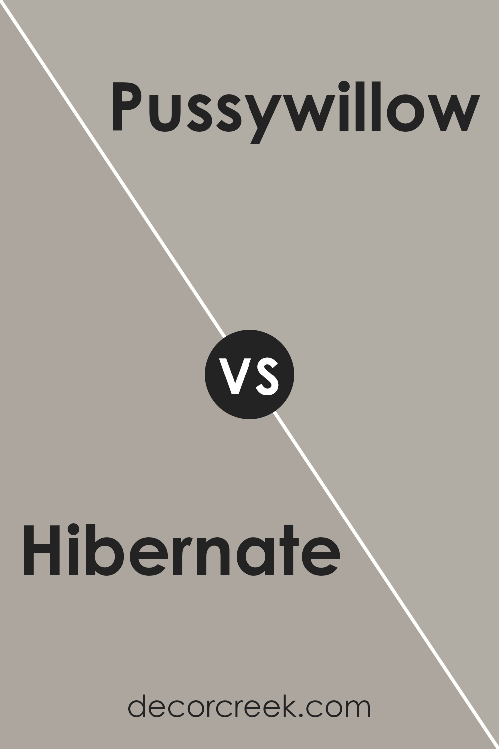
Hibernate SW 9573 by Sherwin Williams vs Pussywillow SW 7643 by Sherwin Williams
Both Hibernate and Pussywillow are sophisticated hues from Sherwin Williams, each offering a unique ambiance for interior spaces, yet they present distinct characteristics. Hibernate is a deep, warm gray with a comforting earthiness that suggests a snug, serene environment, perfect for creating a cozy retreat in living rooms or bedrooms.
Its richness in depth adds a layer of sophistication and can make a bold statement when used as a primary wall color.
On the other hand, Pussywillow stands out as a lighter, more versatile shade. This color straddles the line between gray and beige, with a softness that makes it incredibly adaptable to various decor styles and spaces.
It reflects light beautifully, making spaces appear larger and more open, a trait desirable for small rooms or areas lacking in natural light.
While both colors share a gray base, Hibernate leans towards a darker, moodier palette, offering warmth and depth. Pussywillow, conversely, provides a lighter, more neutral canvas, ideal for a wide range of design aesthetics.
Choosing between them would depend on the desired atmosphere and functionality of the space, with Hibernate bringing a cozy, enveloping feel and Pussywillow offering lightness and flexibility.
You can see recommended paint color below:
- SW 7643 Pussywillow
Conclusion
The article provides a comprehensive overview of Hibernate, a color from Sherwin Williams, highlighting its versatile nature and aesthetic appeal. It emphasizes the paint’s ability to transform spaces into cozy, inviting environments, ideal for both residential and commercial settings.
The analysis suggests that its warm, soothing undertones make it a perfect choice for creating a serene and welcoming atmosphere, adaptable to various design styles and preferences.
Furthermore, the article discusses the technical and practical benefits of choosing Hibernate for interior or exterior projects. It points out its exemplary coverage, durability, and compatibility with a wide range of materials and finishes.
This color is praised for its ability to complement different textures and elements, enhancing the overall aesthetic and feel of a space. Whether used as a statement wall or as part of a harmonious color scheme, Hibernate demonstrates a timeless elegance and flexibility, making it a standout choice for designers and homeowners alike.
Ever wished paint sampling was as easy as sticking a sticker? Guess what? Now it is! Discover Samplize's unique Peel & Stick samples.
Get paint samples