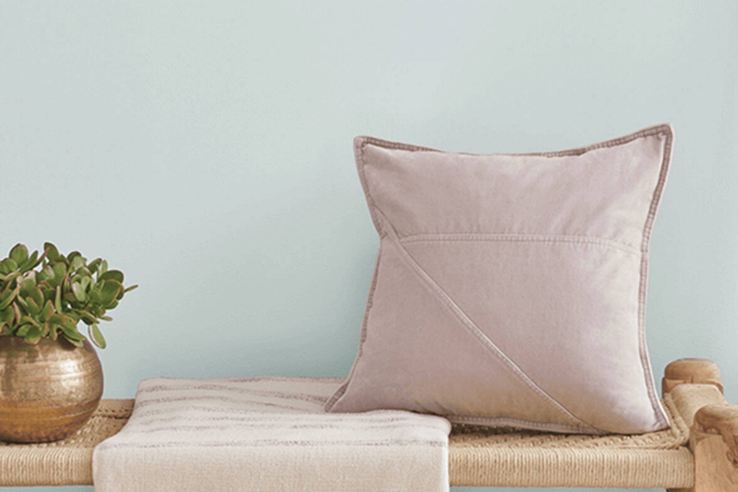
It’s a color that seems to whisper peacefulness and offers a gentle respite from the chaos around us. Imagine a soft, muted blue that draws you in with its soothing presence. That’s what Serenely does for any space.
In my experience, choosing the right color can dramatically affect the ambiance of a room, and Serenely does precisely that by creating an oasis of calm.
It’s perfect for those who seek peace and wish to create an environment that encourages relaxation and reflection. When I painted my walls with Serenely, I felt like I had brought a little piece of serenity into my life.
This shade works magic, harmonizing effortlessly with other tones and adding a touch of elegance without overwhelming the senses.
Whether you’re looking for a fresh start or simply aiming to create a more tranquil space at home, Serenely offers an inviting and peaceful backdrop, helping to cultivate a balanced and serene atmosphere that feels just right.
What Color Is Serenely SW 9632 by Sherwin Williams?
Sherwin Williams’ Serenely (SW 9632) is a soft, muted blue-gray that exudes calm and relaxation. This color is particularly versatile due to its understated nature, making it suitable for a wide range of interior styles. It works well in spaces aiming for a minimalist aesthetic, where its cool undertones can create a sense of openness and simplicity. Serenely is also fitting for Coastal or Nautical themes, as its gentle blue brings to mind the calming effect of the sea and sky.
This color pairs beautifully with natural materials and textures. Light wood tones, such as oak or pine, complement its subtle hue, adding warmth without overwhelming.
Textured textiles like cotton, linen, or wool in neutral or white shades work harmoniously, enhancing the soft, cozy feeling Serenely brings to a space.
Additionally, accentuating with metals like brushed nickel or muted brass can add a touch of modernity and contrast.
In terms of pairings, Serenely can be combined with whites and creams for a fresh, open look, or with deeper navy blues and charcoals for a balanced, grounded feel. It’s an adaptable color that can redefine a room into a peaceful retreat with its refined, laid-back essence.
Is Serenely SW 9632 by Sherwin Williams Warm or Cool color?
Serenely SW 9632 by Sherwin Williams is a soft, gentle hue that brings a calm, peaceful vibe to any room. Its subtle shade resembles a soft blue or gray, making it a versatile choice for homeowners wanting a soothing atmosphere. When used in a living room or bedroom, this color creates a relaxing environment, perfect for unwinding after a long day.
It’s also a great choice for bathrooms, offering a clean, fresh feel.
Its neutral tone allows it to blend well with various decor styles, from modern and minimalist to more classic and traditional settings. Paired with whites, creams, or natural wood tones, it encourages a sense of balance and harmony. This color reflects light softly, which can make spaces appear larger and more open without being overwhelming.
Whether on walls or used as an accent, Serenely SW 9632 adds a touch of calm elegance to a home.
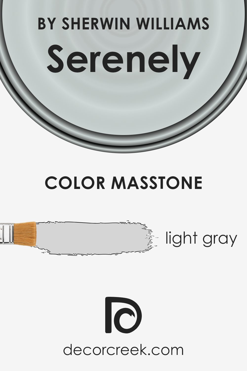
What is the Masstone of the Serenely SW 9632 by Sherwin Williams?
Serenely SW 9632, a light gray shade by Sherwin Williams, offers a gentle, balanced appearance that works well in various home settings. Its masstone of light gray (#D5D5D5) allows it to serve as a versatile backdrop, blending seamlessly with a range of colors and décor styles. This understated hue brings a sense of calm and spaciousness to rooms, making it ideal for creating an inviting and relaxed atmosphere.
In living rooms and bedrooms, Serenely can help achieve a restful environment by providing a neutral and soft canvas that doesn’t overpower furnishings or other decorative elements.
It enhances natural light, making spaces feel bright and airy. In kitchens and bathrooms, it pairs well with both warm and cool tones, adding a touch of modern elegance.
Overall, Serenely’s light gray tone makes it a great choice for homeowners looking for a timeless and adaptable color that harmonizes with their personal style.
How Does Lighting Affect Serenely SW 9632 by Sherwin Williams?
Lighting plays a significant role in how colors appear in a space. The way a color looks can change throughout the day as the lighting changes, and this is true for both natural and artificial light.
Serenely SW 9632 by Sherwin Williams is a soft, muted blue-gray color. Under artificial light, such as incandescent or LED bulbs, this color may take on a warmer or cooler tone. Incandescent lighting tends to bring out warmer tones, so Serenely might appear slightly cozier and less blue. LED lighting, however, can vary.
Some LEDs have a bluish hue, which might enhance the blue aspect of Serenely, while others have a warmer glow that might soften the color.
In natural light, Serenely can look quite different depending on the direction and quality of the sunlight. In north-facing rooms, which often receive soft and cool light, Serenely might appear somewhat grayed out and muted. This is because the light in north-facing rooms lacks the warmth found in southern exposures, so cool colors look cooler.
In a south-facing room, which typically benefits from warm and bright light throughout the day, Serenely will likely feel warm and cheerful.
The constant light brings out the best in cooler shades, making Serenely appear slightly lighter and more vibrant than it might in other lighting conditions.
East-facing rooms get bright, clear light in the morning and then become more shaded. In the morning, Serenely might be more vivid, reflecting the clear light. As the light becomes indirect in the afternoon, the color might seem softer.
West-facing rooms have the opposite lighting, with warmer, more intense light in the late afternoon and evening.
Here, Serenely can feel warmer and cozier in the afternoon as the sun sets, potentially showing more depth and richness in the color compared to the cooler morning light.
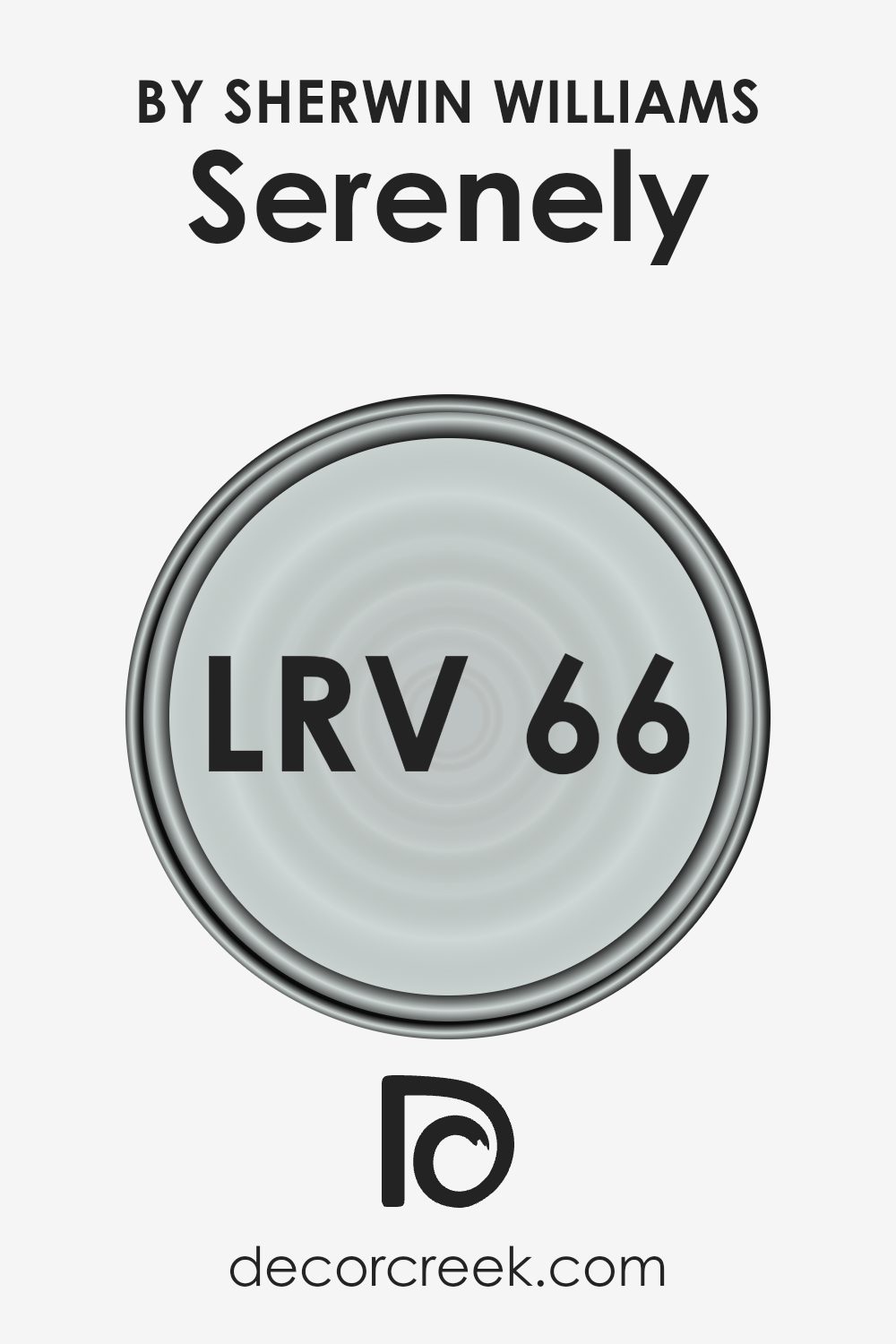
What is the LRV of Serenely SW 9632 by Sherwin Williams?
Light Reflectance Value, or LRV, is a measure that tells us how much light a color reflects. It’s a number from 0 to 100, where 0 means the color absorbs all light (like black), and 100 means the color reflects all light (like white). This measurement helps us understand how light or dark a color will appear when painted on a wall.
Simply put, the higher the LRV, the lighter and more reflective the color will be. This is an important factor to consider when choosing paint colors because it can affect how bright or dim a room feels.
Lighter colors with higher LRVs can make a space feel open and airy, while darker colors with lower LRVs can make a room feel cozy but smaller.
For the color Serenely SW 9632, its LRV is 66.252. This means it falls on the lighter side of the scale, reflecting a fair amount of light. Colors like this can make a room feel brighter and more spacious. When used on the walls, Serenely would likely add a soft, light backdrop that enhances natural light and makes smaller spaces feel larger.
Its LRV suggests it’s a good choice for rooms where you want a bright but not too stark atmosphere. The color would work well in spaces aiming for a light, airy ambiance, helping to create an uplifting environment without being overwhelmingly bright.
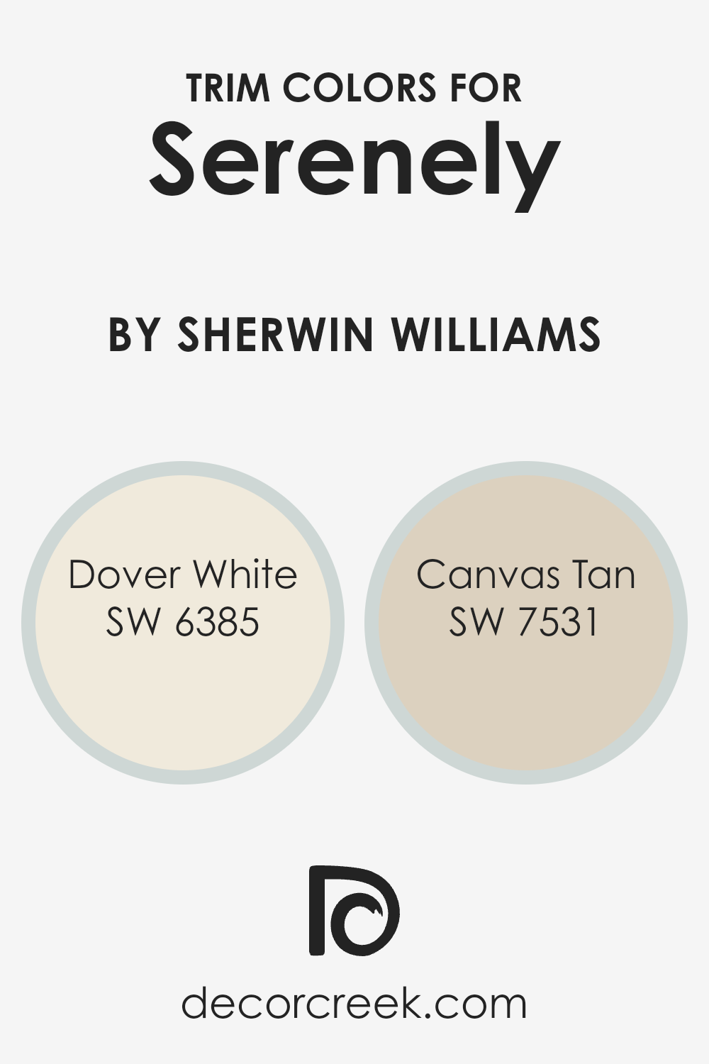
What are the Trim colors of Serenely SW 9632 by Sherwin Williams?
Trim colors are the shades used on the edges, borders, and frames in a room, often providing a contrast to the primary wall color. They highlight architectural features like door frames, window sills, and moldings, adding depth and character to the space. For Serenely by Sherwin Williams, using the right trim colors can enhance its soft, calm presence.
Dover White and Canvas Tan are two excellent choices for this task. These trim colors offer a subtle yet effective way to define spaces and create a cohesive, polished look without overpowering the main color.
Dover White is a warm, creamy white that brings brightness and warmth to any area. It’s versatile and clean, making spaces feel inviting and airy. Canvas Tan, on the other hand, is a warm, muted beige that adds a touch of softness and coziness. Its neutrality complements the gentle tones of Serenely without clashing, ensuring a balanced aesthetic.
Together, these trim colors provide the perfect finish, harmonizing with Serenely to create a comforting and balanced environment.
You can see recommended paint colors below:
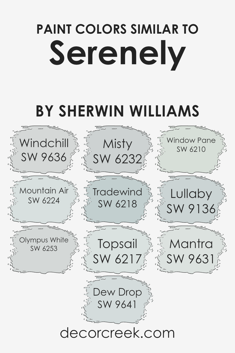
Colors Similar to Serenely SW 9632 by Sherwin Williams
Similar colors are essential for creating harmonious spaces because they help tie different elements together without overwhelming the senses. Colors like Windchill, Mountain Air, Olympus White, Dew Drop, Misty, Tradewind, Topsail, Window Pane, Lullaby, and Mantra, which are akin to Serenely by Sherwin Williams, share calming properties that make them ideal for peaceful environments.
Windchill offers a light and airy touch, evoking the freshness of a cool breeze. Mountain Air whispers tranquility, resembling a gentle sky at dawn. Olympus White brings a soft, pure tone that fits well almost anywhere for a clean look.
Dew Drop feels as refreshing as morning dew on grass, lending a gentle, soothing vibe. Misty suggests the quietness of a fogcovered morning, providing subtle depth. Tradewind invokes memories of light sea breezes with a slight hint of aqua. Topsail delivers a breezy feel, perfect for nautical-themed rooms.
Window Pane offers clarity, akin to looking through a freshly cleaned glass. Lullaby has a muted, gentle touch, ideal for creating restful spaces. Lastly, Mantra provides a still, calming backdrop that’s adaptable to different settings.
Together, these colors create a cohesive palette that’s both restful and versatile, ideal for any quiet setting.
You can see recommended paint colors below:
- SW 9636 Windchill
- SW 6224 Mountain Air
- SW 6253 Olympus White
- SW 9641 Dew Drop
- SW 6232 Misty
- SW 6218 Tradewind
- SW 6217 Topsail
- SW 6210 Window Pane
- SW 9136 Lullaby
- SW 9631 Mantra
How to Use Serenely SW 9632 by Sherwin Williams In Your Home?
Serenely SW 9632 by Sherwin Williams is a calming, light blue paint color that brings a peaceful vibe to any room. Its gentle, understated hue can make spaces feel open and welcoming. In the living room, it pairs wonderfully with neutral furniture like beige or gray, creating a cozy spot for relaxation.
For the bedroom, Serenely can be paired with white or light wood furniture to maintain a restful atmosphere.
In the bathroom, this color complements white fixtures beautifully, giving it a spa-like feel. The soft blue tone is versatile enough to match with various styles, from modern to rustic. In the kitchen, it can brighten up the walls when paired with white cabinets or add a fresh look to a breakfast nook.
Accessories in soft pastels or natural textures, such as light wood, can enhance the overall feel. Serenely SW 9632 truly adds a refreshing touch to home interiors.
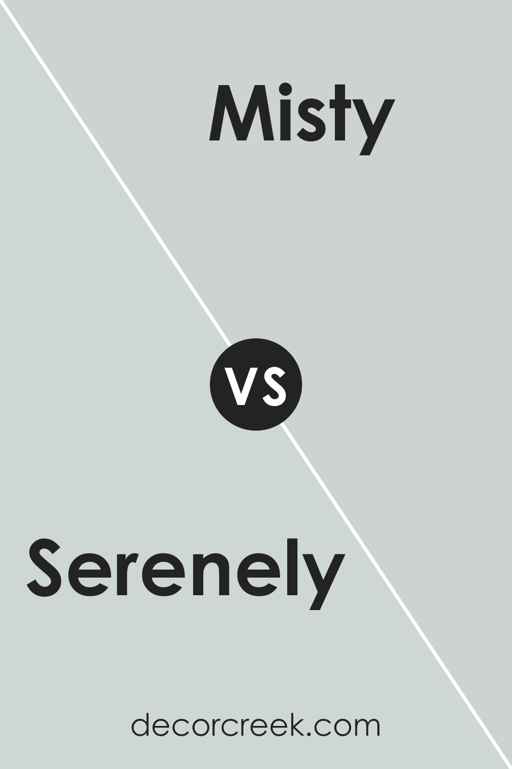
Serenely SW 9632 by Sherwin Williams vs Misty SW 6232 by Sherwin Williams
Serenely SW 9632 and Misty SW 6232 by Sherwin Williams are both soothing colors but offer distinct vibes. Serenely is a light, muted green with soft undertones that create a calming atmosphere. It can make a space feel fresh and peaceful, often reminding people of nature. Misty, on the other hand, is a light blue-gray shade.
It has a cool, airy quality that can make a room feel open and breezy. While both colors are light and calming, Serenely leans towards a warmer, earthy feel due to its green hue, whereas Misty gives off a cooler, more airy vibe.
Serenely might work well in spaces where you want a subtle touch of the outdoors, and Misty is great for areas where you desire a light and airy feel. Both colors are versatile and can be used in various spaces to create relaxing environments.
You can see recommended paint color below:
Serenely SW 9632 by Sherwin Williams vs Mantra SW 9631 by Sherwin Williams
Serenely SW 9632 and Mantra SW 9631 are two colors from Sherwin Williams that offer a gentle touch to any space. Serenely is a soft, light blue with hints of gray, lending a calming and airy feel to a room. It’s perfect for creating a peaceful environment, whether used in a bedroom or a living area.
It’s calming without being too cold, making it versatile for various design styles.
Mantra SW 9631, on the other hand, is also a light blue but carries a slightly warmer tone with subtle undertones of green. This gives Mantra a bit more warmth and can add a cozy, inviting feel to a space.
Both colors are light and easy on the eyes, but Mantra’s warmth can make a room feel more comforting, while Serenely’s coolness offers a fresh, clean aesthetic. Both choices are excellent for achieving a relaxed atmosphere in your home.
You can see recommended paint color below:
- SW 9631 Mantra
Serenely SW 9632 by Sherwin Williams vs Mountain Air SW 6224 by Sherwin Williams
Serenely SW 9632 and Mountain Air SW 6224 are both soothing colors by Sherwin Williams, each offering a unique feel. Serenely is a soft, light blue with a hint of gray. It creates a calm and peaceful atmosphere, perfect for spaces where you want a relaxing vibe. Think of a clear sky just after sunrise.
On the other hand, Mountain Air is a pale blue-green shade, offering a cool and refreshing feel. It’s like a gentle breeze on a crisp morning. This color works well in rooms where you want to evoke a sense of openness and freshness.
Both colors are versatile and can be paired with neutrals or bolder accents. While Serenely has a calming and cozy effect, Mountain Air brings a touch of nature inside, making it ideal for spaces where you want a light and airy feel. Overall, they both bring a peaceful vibe with their gentle hues.
You can see recommended paint color below:
Serenely SW 9632 by Sherwin Williams vs Dew Drop SW 9641 by Sherwin Williams
Serenely and Dew Drop by Sherwin Williams are two soft colors that offer a peaceful vibe. Serenely is a gentle gray-green that feels calm and easy on the eyes. It’s a versatile shade that works well in various settings, balancing both warmth and coolness. On the other hand, Dew Drop is a light blue with a hint of green, creating a fresh and airy feel. This color is more vibrant than Serenely, adding a touch of crispness to a room.
When comparing the two, Serenely offers a more muted, restful atmosphere, making it suitable for spaces where you want a subtle backdrop. Dew Drop, with its slight greenish-blue tone, brings a sense of cleanliness, making it ideal for brightening up a space.
Both colors can complement each other well in different parts of a home, with Serenely used for larger areas and Dew Drop for accents or smaller rooms needing a fresh touch.
You can see recommended paint color below:
- SW 9641 Dew Drop
Serenely SW 9632 by Sherwin Williams vs Topsail SW 6217 by Sherwin Williams
Serenely SW 9632 and Topsail SW 6217 are both soft and calming colors offered by Sherwin Williams, but they have distinct characteristics. Serenely is a gentle and muted teal color. It offers a peaceful and refreshing vibe, ideal for spaces where you want a hint of color without it being overpowering.
On the other hand, Topsail is a light and breezy blue with gray undertones. It is slightly cooler than Serenely and can create a more airy and open atmosphere. Topsail works well in spaces where you desire a subtle touch of color that remains neutral enough to pair with various decor styles.
Both colors can be used to brighten up a room but serve different purposes depending on the mood you want to set. Serenely brings a bit more warmth with its teal hue, while Topsail offers a cool crispness with its soft blue shade.
You can see recommended paint color below:
Serenely SW 9632 by Sherwin Williams vs Windchill SW 9636 by Sherwin Williams
Serenely and Windchill are two different colors from Sherwin Williams, each with its own character and charm. Serenely is a soft, muted shade with a gentle blue-green undertone, creating a calm and soothing atmosphere. It works well in spaces where you want to encourage relaxation and a peaceful vibe. Windchill, on the other hand, has a cooler and more neutral appearance, featuring a light blue hue with hints of gray. This makes it versatile and easy to pair with other colors and decor.
While Serenely has a touch of warmth due to its green influence, Windchill leans more towards a crisp, clean look with its grayish tones. Both colors are light and airy, ideal for making a room feel open and fresh, but Serenely adds a bit more warmth compared to the cool, icy feel of Windchill.
Depending on the mood you want, choose Serenely for a softer look or Windchill for a cooler one.
You can see recommended paint color below:
- SW 9636 Windchill
Serenely SW 9632 by Sherwin Williams vs Window Pane SW 6210 by Sherwin Williams
Serenely SW 9632 and Window Pane SW 6210 are both popular paint colors from Sherwin Williams, each bringing its own appeal to a space. Serenely is a soft, muted green with blue undertones, creating a calming and relaxing atmosphere. It’s a versatile color that can be used in bedrooms or bathrooms to bring a sense of peace to the room.
On the other hand, Window Pane is a light blue with subtle green hints. It has a fresh and airy vibe, making it a great choice for spaces where you want to feel open and bright, such as kitchens or living rooms. Window Pane can make a room feel more expansive due to its lighter tone.
When comparing Serenely to Window Pane, Serenely leans more towards green while Window Pane has a stronger blue influence. Both colors can complement a variety of styles but serve slightly different moods due to their differences in undertone.
You can see recommended paint color below:
Serenely SW 9632 by Sherwin Williams vs Tradewind SW 6218 by Sherwin Williams
Serenely by Sherwin Williams is a soft, muted blue-green color with a calming presence. It evokes a sense of peace and quiet, often reminiscent of the gentle hues of a misty morning or a still lagoon. It’s ideal for creating a soothing atmosphere in spaces like bedrooms or bathrooms.
Tradewind by Sherwin Williams, on the other hand, is a cooler, light blue shade with gray undertones. It feels breezy and refreshing, much like a gentle sea breeze. This color can open up a room visually, making it feel larger and airier.
While both colors share a sense of calmness, Serenely leans more towards the subtle whisper of green, adding warmth and depth. Tradewind, however, carries a crisp freshness with its blue-gray notes. These distinctions make Serenely better suited for more intimate, cozy spaces, while Tradewind works well in areas you want to feel spacious and bright.
You can see recommended paint color below:
Serenely SW 9632 by Sherwin Williams vs Olympus White SW 6253 by Sherwin Williams
Serenely SW 9632 by Sherwin Williams is a soft and calming light blue color. It has a subtle hint of green, reminiscent of a peaceful sea breeze. This color is perfect for creating a soothing and relaxed atmosphere in a room. In contrast, Olympus White SW 6253 is a very light grey with a touch of blue. It is a versatile, understated shade that pairs well with a variety of colors and can serve as a neutral backdrop in any space.
Serenely brings a touch of warmth and comfort with its gentle blue-green tone, making it suitable for bedrooms or living areas where a calming environment is desired. Olympus White, on the other hand, has a crisp, clean quality that’s ideal for modern spaces, lending a sense of openness and brightness.
While Serenely adds a comforting hue with its blue-green undertones, Olympus White offers a fresh and airy feel with its light grey-blue shade.
You can see recommended paint color below:
Serenely SW 9632 by Sherwin Williams vs Lullaby SW 9136 by Sherwin Williams
Serenely SW 9632 and Lullaby SW 9136 are both soft, calming colors by Sherwin Williams, but they have distinct characteristics that set them apart. Serenely is a gentle, muted blue with a hint of green, giving it an airy, coastal feel. It’s a versatile color that can suit a variety of spaces, adding a touch of peacefulness without being overpowering.
On the other hand, Lullaby is a light, soothing blue with a slightly grayer undertone. This makes it ideal for creating a cozy, relaxed atmosphere in bedrooms or living rooms. It’s a classic choice for those who favor neutral settings but want a subtle pop of color.
When comparing the two, Serenely tends to be slightly more vibrant due to its greenish tint, whereas Lullaby leans more towards a classic pastel blue. Both colors are excellent for creating calm spaces but offer their own unique ambiance.
You can see recommended paint color below:
- SW 9136 Lullaby
After learning about SW 9632 Serenely by Sherwin Williams, I feel excited to use this color in client’s home. It’s a soft, calming shade of blue that makes me think of a peaceful day. Imagine looking up at the sky or staring at a calm ocean; that’s what this color feels like to me.
This color is great because it can make any room feel more welcoming. Whether it’s the living room where we watch TV, the kitchen where we cook, or even the bedroom where we sleep, this gentle blue works well everywhere. It’s like giving the room a big, comforting hug.
I also love that this color can go with many other colors. If we have bright furniture, wooden floors, or colorful rugs, SW 9632 Serenely will make them look even better. It’s like having a friend who plays nicely with everyone in the room.
In the end, SW 9632 Serenely by Sherwin Williams is a color that can make any room feel like a cozy place where we can relax and be happy. Whether we’re doing homework, reading a book, or just hanging out with family, this color helps make the room feel just right.
I can’t wait to see how it will brighten up our home!
Ever wished paint sampling was as easy as sticking a sticker? Guess what? Now it is! Discover Samplize's unique Peel & Stick samples.
Get paint samples

