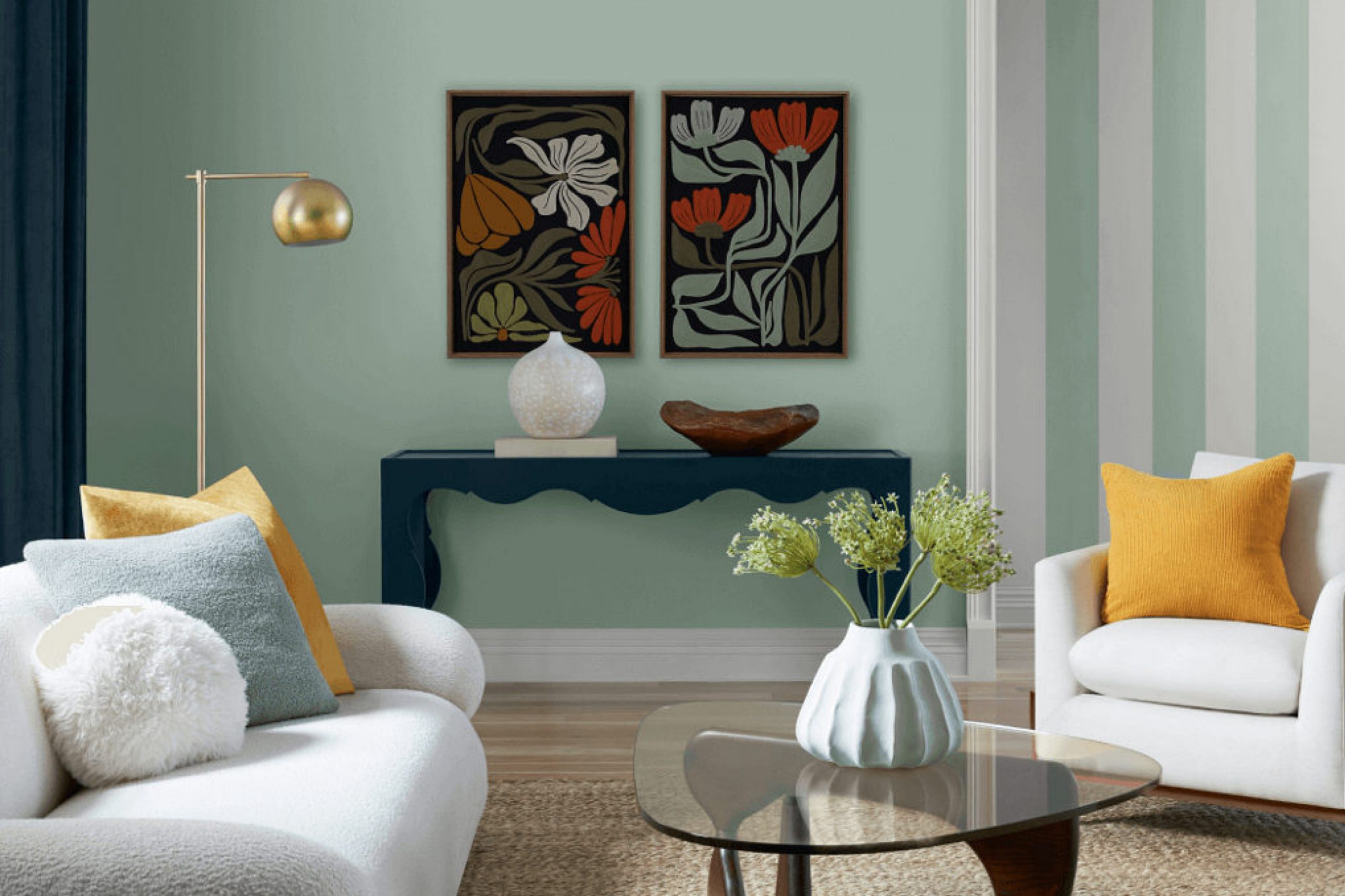
As you explore the unique shades offered by Sherwin Williams, SW 6456 Slow Green stands out as a color that brings a refreshing and serene touch to any space. This shade of green is subtle yet distinctive, offering a whisper of calmness that can enhance the atmosphere of a home or an office. It suggests the early days of spring or the softness of a lush, secluded garden, making it an excellent choice for those wanting to add a natural, peaceful vibe to their surroundings.
Choosing the right color can significantly affect how you feel in your space. Slow Green has a versatile hue that pairs beautifully with both light and dark accents, enabling you to create a variety of moods and styles. Whether you’re looking to repaint a room or just add a few touches of color, SW 6456 Slow Green provides a gentle nudge towards a more relaxed and comfortable environment without overwhelming your senses.
This color can be particularly effective in bedrooms, living rooms, or any areas meant for relaxation. The soft green hue works wonders in spaces that receive a lot of natural light, bringing the outdoors inside in a subtle and elegant way.
If you’re considering a repaint or starting a new decorating project, Slow Green deserves your attention for its ability to create peaceful and inviting spaces.
What Color Is Slow Green SW 6456 by Sherwin Williams?
Slow Green by Sherwin Williams embodies a quiet, reserved shade of green with a muted, subtle feel that leans towards a earthy, natural aesthetic. This color is perfect for adding a fresh yet understated vibe to any space. It has a softness that is versatile for a variety of interior styles, notably Scandinavian for its minimalist, clean approach, rustic for its earthy, grounded ambiance, and modern farmhouse where a touch of gentle color is appreciated.
This shade works beautifully in living spaces where a calm and relaxed atmosphere is desired. It is especially effective in bedrooms and bathrooms where a gentle backdrop supports rest and rejuvenation.
In terms of pairings, Slow Green goes well with natural wood textures such as oak and walnut, which enhance its earthy quality. Linen and cotton fabrics in neutral tones like white, beige, or light gray also complement this green, promoting a light, airy feel to the rooms. For accent materials, consider using rattan or wicker to introduce some texture and add to the organic feel.
Metals such as brushed gold or copper can offer a slight contrast that brings a touch of warmth and luxury without overpowering the subtle elegance of Slow Green. For a cohesive look, blend in ceramics or textured glass to maintain that gentle, grounded vibe throughout the space.
Is Slow Green SW 6456 by Sherwin Williams Warm or Cool color?
Slow Green SW 6456, by Sherwin Williams, is a soothing shade that brings a fresh and calm atmosphere to any home. It’s a muted green that doesn’t overpower a room but instead adds a subtle touch of nature indoors.
This color works wonderfully in spaces that could use a calming element, such as bedrooms and bathrooms, where relaxation is key. The versatility of Slow Green also means it pairs well with various decor styles, from rustic to modern.
It’s excellent for homeowners who want to introduce color into their space without making the room feel smaller or darker. Because of its light and airy feel, Slow Green can help make a small room look bigger and brighter. When used in larger, open spaces, it helps maintain a feeling of continuity and flow. It’s a practical choice for those wanting to refresh their home with a gentle splash of color.
Undertones of Slow Green SW 6456 by Sherwin Williams
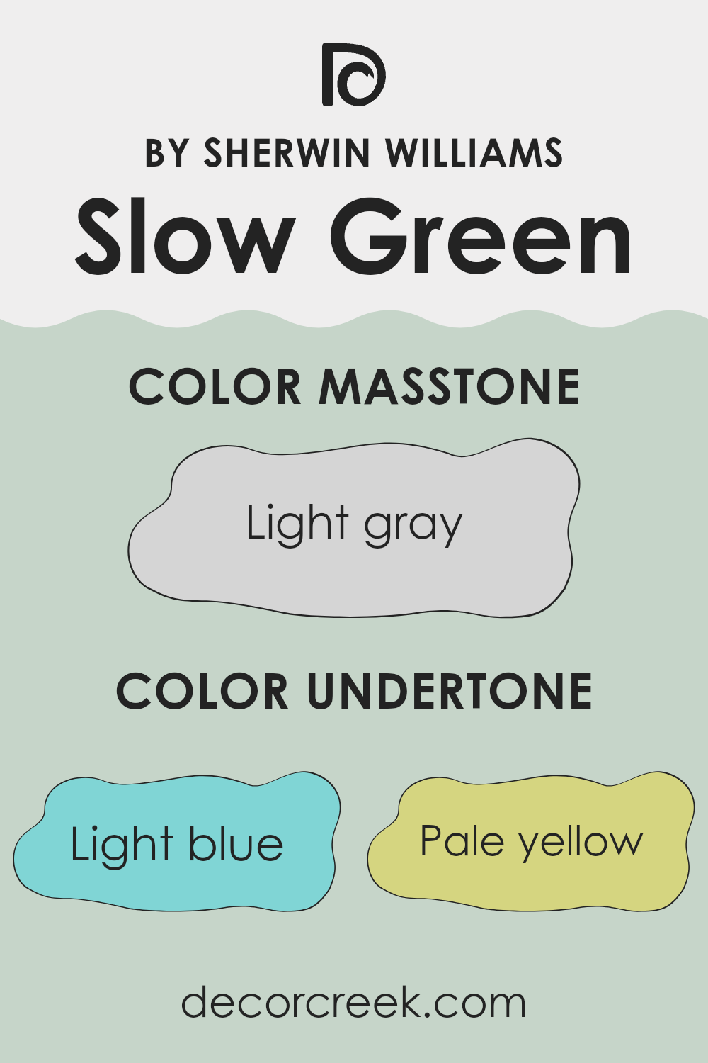
Slow Green is a unique paint color that contains a mix of different undertones, affecting how it looks in various lighting and surroundings. Undertones are subtle colors that sit beneath the surface of the main color. They can be tricky because they influence how the main color appears under different lights and next to other colors.
The undertones of light blue, pale yellow, light purple, mint, lilac, pale pink, and grey in Slow Green make it a versatile choice for interior walls. Each undertone brings its own flavor
– Light blue and mint undertones give a cooler, fresher feel, making the room feel more open and airy.
– Pale yellow and lilac add a touch of warmth, which can make a space feel more welcoming.
– Light purple and pale pink create a soft, almost gentle presence that can soften the overall look of a room.
– The grey undertone helps to balance the color, ensuring it doesn’t lean too much towards any single undertone but remains neutral and easy to pair with various decors.
When applied to walls, Slow Green will look different depending on the room’s lighting and the colors of adjacent walls, floors, and furniture. Natural light can enhance its cooler tones, making the color appear more vibrant, while artificial lighting might highlight the warmer tones, creating a cozier atmosphere. This ability to subtly change its appearance makes Slow Green a flexible and useful color choice for home interiors, adaptable to many styles and spaces.
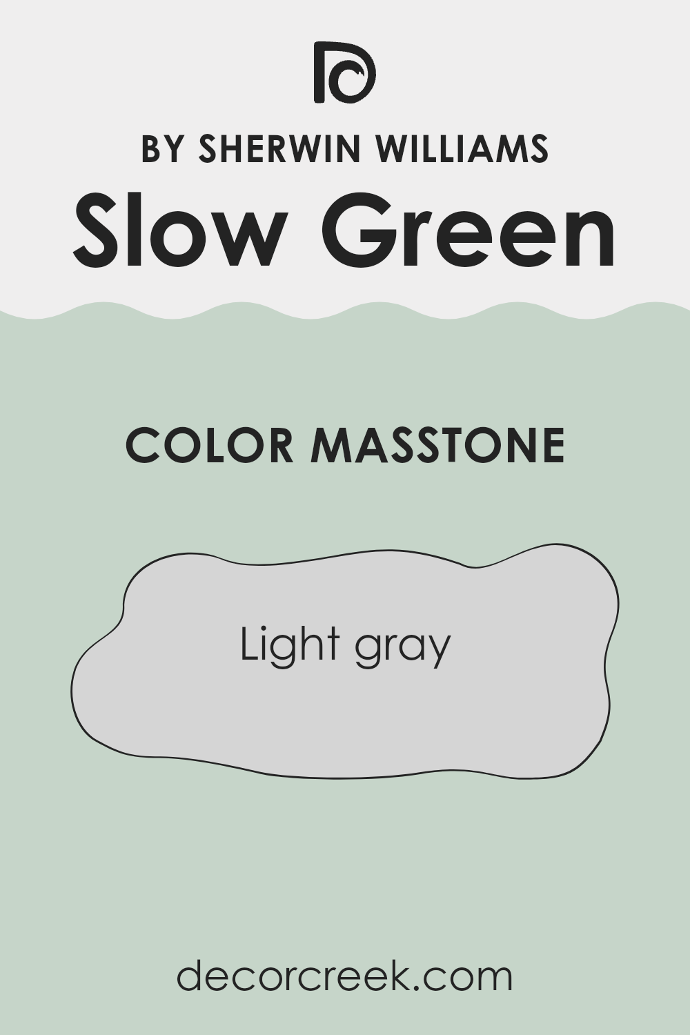
What is the Masstone of the Slow Green SW 6456 by Sherwin Williams?
Slow Green SW 6456 by Sherwin Williams, though named green, actually shows up as a light gray color with the masstone Light Gray (#D5D5D5). This light gray tone is very versatile and neutral, making it an excellent choice for various rooms in a home.
Since it’s not overpowering, it blends easily with different decor styles and furniture colors, ranging from bright and bold to soft and subtle. This color can help make small spaces appear bigger because its light shade reflects more light, enhancing the overall brightness of a room.
It’s also gentle on the eyes, ensuring that spaces feel open and airy rather than cramped. For those looking to create a calm and relaxed atmosphere in their homes, this color can be a good backdrop. It’s effective in bedrooms, living rooms, and bathrooms where you want a clean and fresh look without too much fuss.
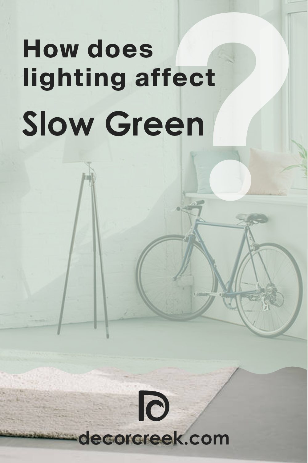
How Does Lighting Affect Slow Green SW 6456 by Sherwin Williams?
Lighting plays a crucial role in how we perceive colors, greatly influencing their appearance in different environments. Each type of light—whether artificial or natural—can alter how colors look within a space.
Consider Slow Green, a color offered by Sherwin Williams. Under artificial light, such as LED or fluorescent bulbs, this shade can appear slightly brighter and more vibrant than in natural light. The coolness or warmth of the bulb can impact this effect; for instance, warm lights may make Slow Green look more muted, while cool lights can enhance its vibrancy.
In contrast, natural light brings out the truest form of Slow Green, but the effect varies depending on the direction the room faces and the time of day. In north-facing rooms, which tend to receive less direct sunlight, Slow Green might take on a more subdued, shadowy appearance. Colors in such rooms can seem cooler, which means this particular green could look a bit more reserved and less lively.
South-facing rooms, in contrast, are blessed with abundant light most of the day. Here, Slow Green will likely appear bright and lively, as the stronger, direct sunlight enhances its natural tones. This setting is ideal for achieving the most accurate and vibrant presentation of the color.
In east-facing rooms, morning light can make Slow Green look soft and welcoming, particularly during sunrise when the light is golden and warm. As the day progresses, the intensity of the sunlight diminishes, altering how the color is perceived.
Finally, in west-facing rooms, the color will undergo a transformation throughout the day. It remains neutral or muted during the morning when the sunlight is less intense, but becomes warmer and more intense by late afternoon and evening as the setting sun casts golden hues through the window.
Understanding these nuances can help in deciding where to apply this particular shade to achieve the desired effect in your decorating projects.
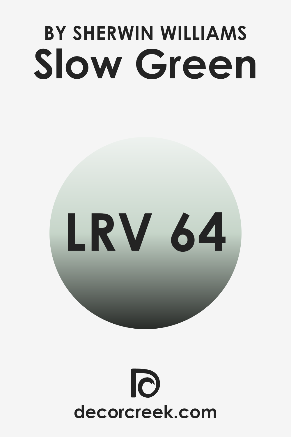
What is the LRV of Slow Green SW 6456 by Sherwin Williams?
LRV, or Light Reflectance Value, is a measure that indicates how much light a paint color reflects back into a room. This value is expressed on a scale where higher numbers mean the color reflects more light. A color with a high LRV makes a room feel brighter because it reflects more light back into the space.
Conversely, colors with lower values absorb more light, making them appear darker and can make a room feel smaller or more enclosed. The LRV for the color Slow Green by Sherwin Williams is approximately 64, which is relatively high. This means it is a color that reflects a good amount of light, helping to make spaces feel airy and more open.
When used on walls, Slow Green can help to visually enlarge a room, making it a great choice for smaller spaces or areas with limited natural light. Its light-reflective properties can also reduce the need for artificial lighting, potentially conserving energy.
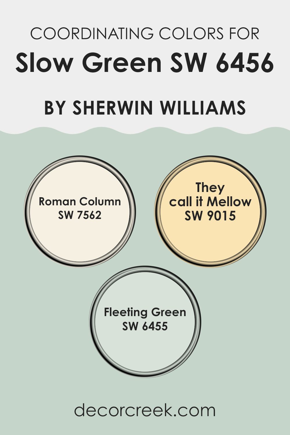
Coordinating Colors of Slow Green SW 6456 by Sherwin Williams
Coordinating colors are selected hues that harmonize well with a primary color to create an aesthetically pleasing color scheme in spaces. They are usually chosen to balance or enhance the main color, used in interior design to bring a theme or a unique visual flow to rooms. For instance, if a soft and subtle green like Slow Green by Sherwin Williams is the primary focus, designers may choose coordinating colors to either contrast or complement this shade.
When partnered with Slow Green, Roman Column SW 7562 is a gentle ivory color that provides a neutral background. It allows bolder colors like Slow Green to stand out while offering a calm, clean canvas that relaxes the eyes.
Then there’s They Call it Mellow SW 9015; a warm yellow inspired by soft sunlight, its cheerful tone perfectly complements the quiet nature of Slow Green, adding warmth to any space without overpowering the soothing green hue. Lastly, Fleeting Green SW 6455 is slightly lighter than Slow Green. Its close similarity brings uniformity and depth to decor, making it ideal for connecting different elements of a room in a cohesive manner. These colors together create a balanced and harmonious look, enhancing the overall aesthetic of an interior space.
You can see recommended paint colors below:
- SW 7562 Roman Column
- SW 9015 They call it Mellow
- SW 6455 Fleeting Green
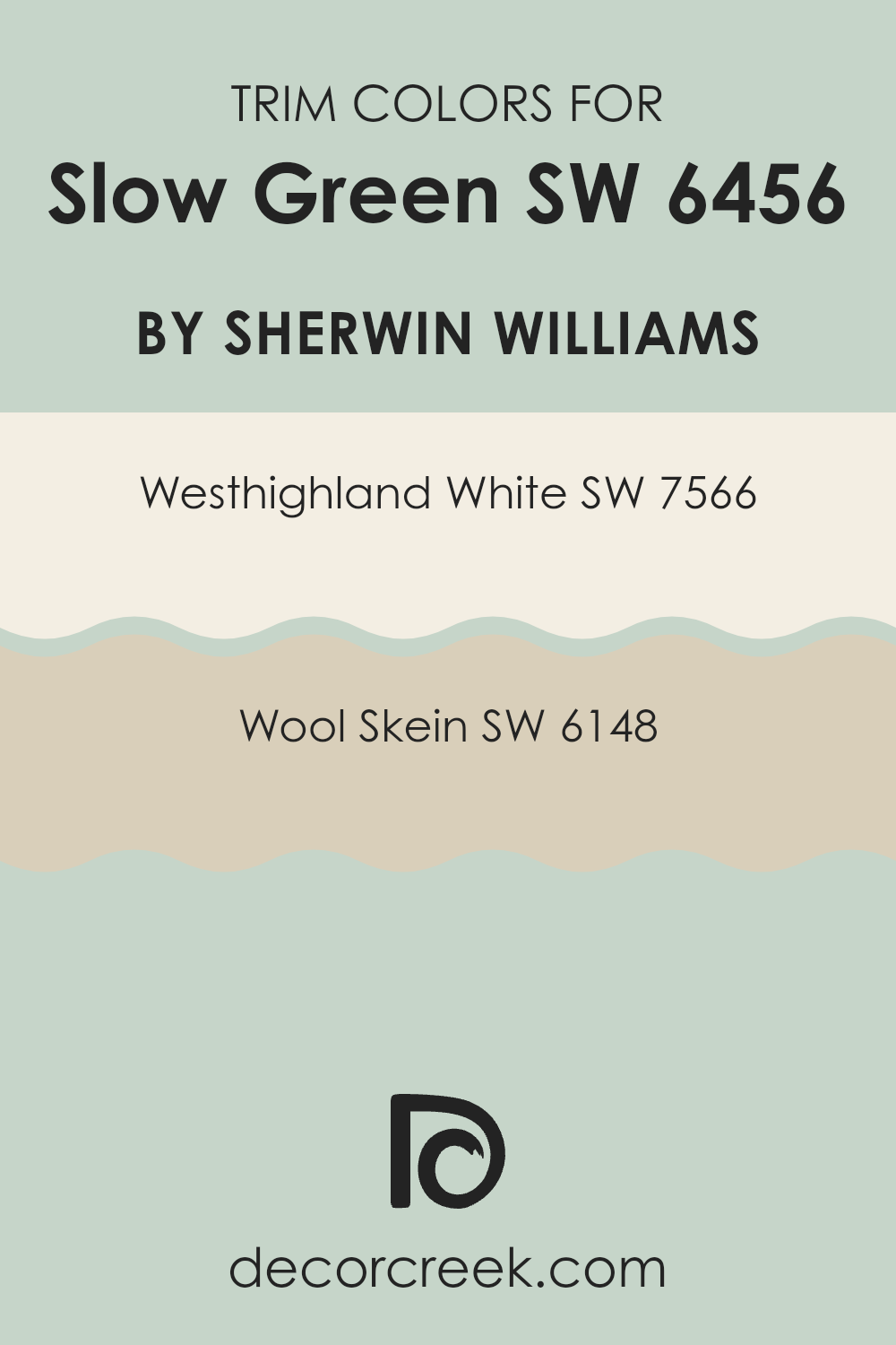
What are the Trim colors of Slow Green SW 6456 by Sherwin Williams?
Trim colors are an essential part of interior or exterior design as they help define and accentuate the architectural details of a space, such as door frames, window frames, and skirtings. By using a contrasting trim color with the main color, in this case, Slow Green, you can outline distinct lines and shapes that add depth and interest to your walls. The trim color can make the primary wall color pop or subtly blend in, depending on the desired aesthetic effect, contributing to a more tailored and finished look in your decor.
The chosen trim colors to complement Slow Green are Westhighland White (SW 7566) and Wool Skein (SW 6148). Westhighland White is a bright but warm white that offers a crisp contrast, making it an excellent choice to highlight the vibrant tones of Slow Green without overwhelming the senses.
On the other hand, Wool Skein is a soft, muted beige with warm undertones, providing a softer transition between the green tones and the trim, ensuring a continuous flow of color that is aesthetically pleasing in settings where a subtle contrast is preferred. Both options cater to different design needs, either by enhancing the vivacity of Slow Green or by offering a smooth color transition.
You can see recommended paint colors below:
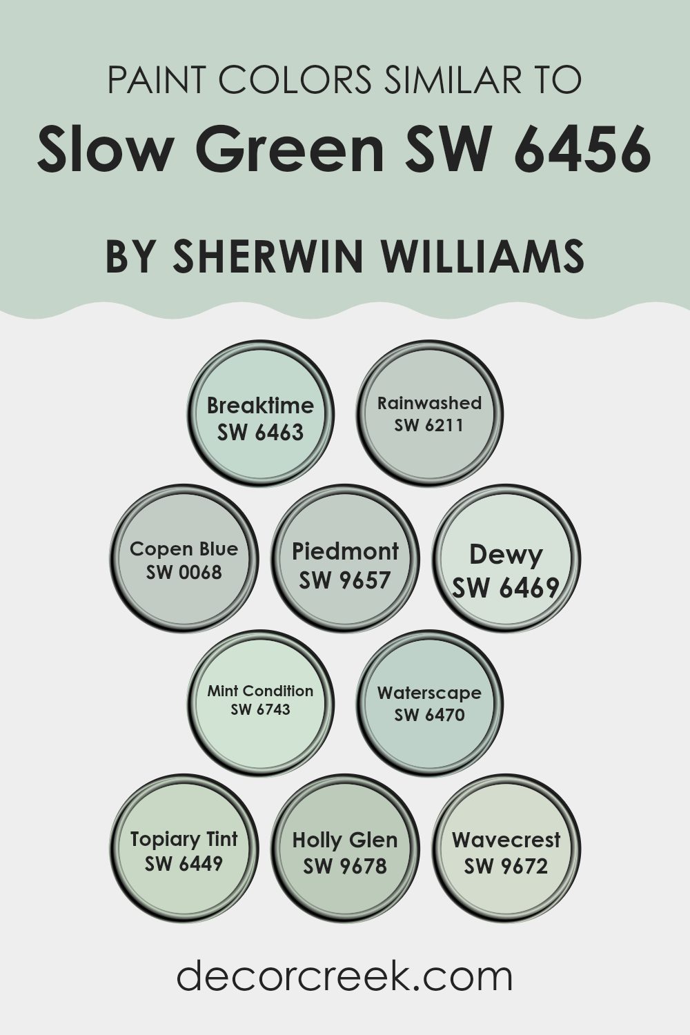
Colors Similar to Slow Green SW 6456 by Sherwin Williams
Choosing similar colors can significantly enhance the cohesion and visual appeal of a space, creating a soothing and harmonious environment. Colors like Breaktime, Rainwashed, and Copen Blue, which share similarities with the mild, refreshing Slow Green, help maintain a theme while adding subtle variations.
These colors work together because they share a common intensity and undercurrent in their hues, which ensures that no single color overpowers another. The continuity provided by similar colors allows for a fluid aesthetic transition from room to room, making the environment feel more integrated and intentionally styled.
For instance, Breaktime introduces a lively spin with its light and airy feel that is perfect for spaces needing a touch of freshness. Similarly, Rainwashed offers a blend of green and blue that mimics a gentle sky after a soft rain, ideal for creating a relaxed atmosphere.
Copen Blue, on the other hand, adds depth with its slightly more pronounced blue tone, enriching a space without overwhelming it. Further down the spectrum, Dewy and Mint Condition provide a hint of vibrancy, yet remain soothing, perfect for invigorating a room while keeping it comfortable. Waterscape and Topiary Tint cater to spaces that celebrate nature, bringing the essence of the outdoors inside with their refreshing greenish tones.
Meanwhile, Holly Glen and Wavecrest both serve well in adding a discreet but engaging character to walls, through their unique but understated shades. These colors, when used together, guarantee a space that feels cohesive, balanced, and inviting.
You can see recommended paint colors below:
- SW 6463 Breaktime
- SW 6211 Rainwashed
- SW 0068 Copen Blue
- SW 9657 Piedmont
- SW 6469 Dewy
- SW 6743 Mint Condition
- SW 6470 Waterscape
- SW 6449 Topiary Tint
- SW 9678 Holly Glen
- SW 9672 Wavecrest
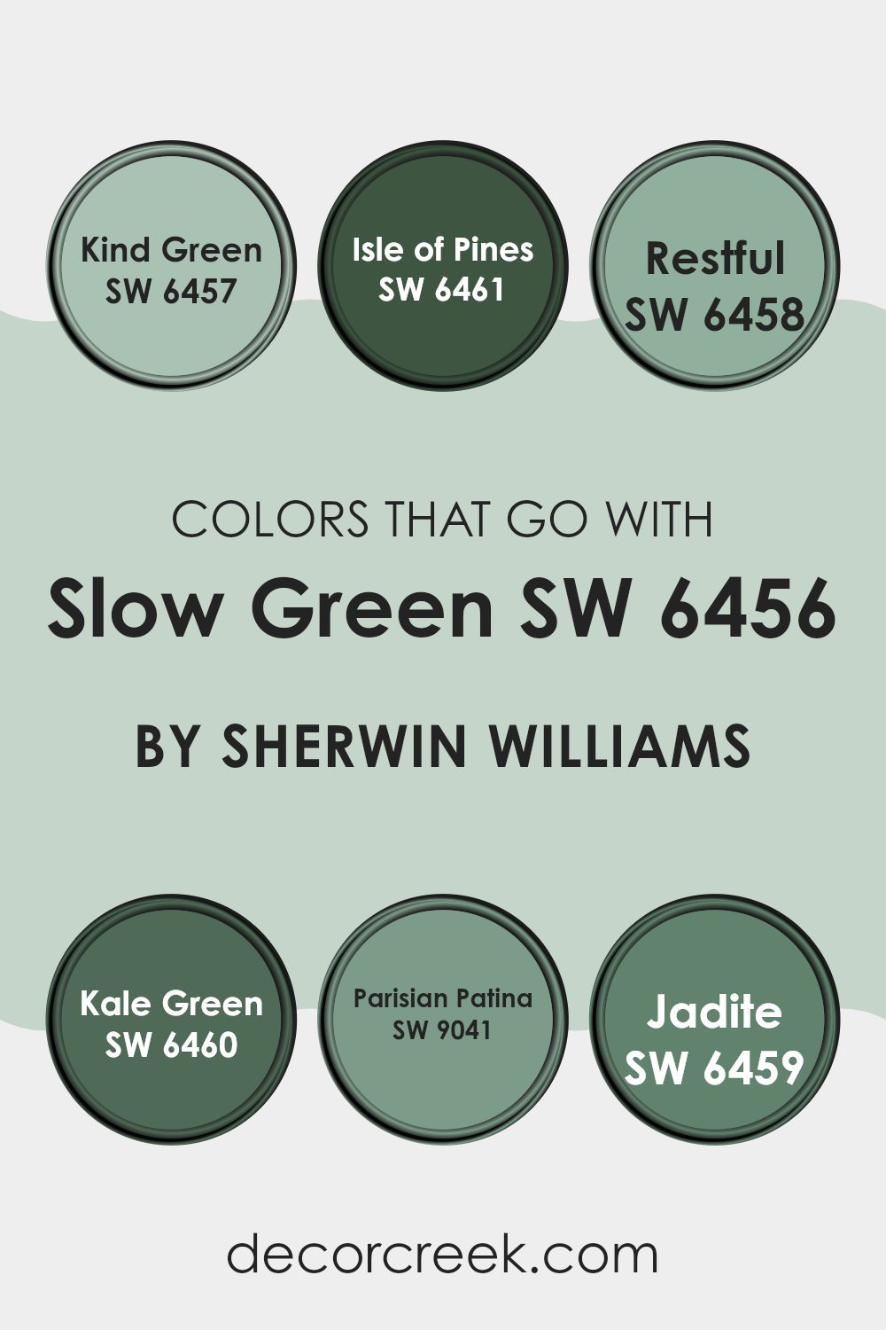
Colors that Go With Slow Green SW 6456 by Sherwin Williams
Choosing harmonizing colors that pair with Slow Green SW 6456 by Sherwin-Williams is crucial because it ensures that the space maintains a cohesive aesthetic, promotes a pleasant mood, and allows the main color to stand out appropriately. These complementary colors provide variety while still creating a unified look that supports the intended design theme.
Kind Green, a shade close to nature, brings a fresh, lively feel to the palette, working as an ideal backdrop for more vibrant tones. Isle of Pines stands as a deeper, fir-inspired hue, which provides depth and grounds lighter tones or features within a room. Restful is a gentle aqua that introduces a light, airy quality, perfect for creating a calming environment.
Kale Green offers a rich, leafy essence, enhancing textures and adding a robust, earthy base that enriches the overall decor. Parisian Patina, with its muted teal influence, adds a hint of classic elegance, making it great for sophisticated accents. Lastly, Jadite, a lighter green with a subtle blue undertone, introduces a soft, refreshing vibe that’s ideal for relaxing spaces. Each of these colors works to support and highlight the beauty of Slow Green, ensuring a stylish yet harmonious space.
You can see recommended paint colors below:
- SW 6457 Kind Green
- SW 6461 Isle of Pines
- SW 6458 Restful
- SW 6460 Kale Green
- SW 9041 Parisian Patina
- SW 6459 Jadite
How to Use Slow Green SW 6456 by Sherwin Williams In Your Home?
Slow Green SW 6456 by Sherwin Williams is a beautiful, soft green paint color that’s perfect for creating a calm and welcoming atmosphere in your home. This soft shade is versatile and works well in nearly any room. You can use it in your living room to create a cozy, inviting space where everyone feels at ease.
It’s also a great choice for bedrooms, as its gentle tones help to promote relaxation and restful sleep. In the kitchen, Slow Green can add a touch of freshness that complements natural wood or white cabinets beautifully. If you want to refresh your bathroom, applying this color can give the space a clean and fresh look.
It pairs well with both light and dark furnishings, making it easy to integrate into your existing decor. Whether you want to paint all the walls or just use it for an accent wall, Slow Green brings a touch of nature indoors, creating a peaceful and stylish environment.
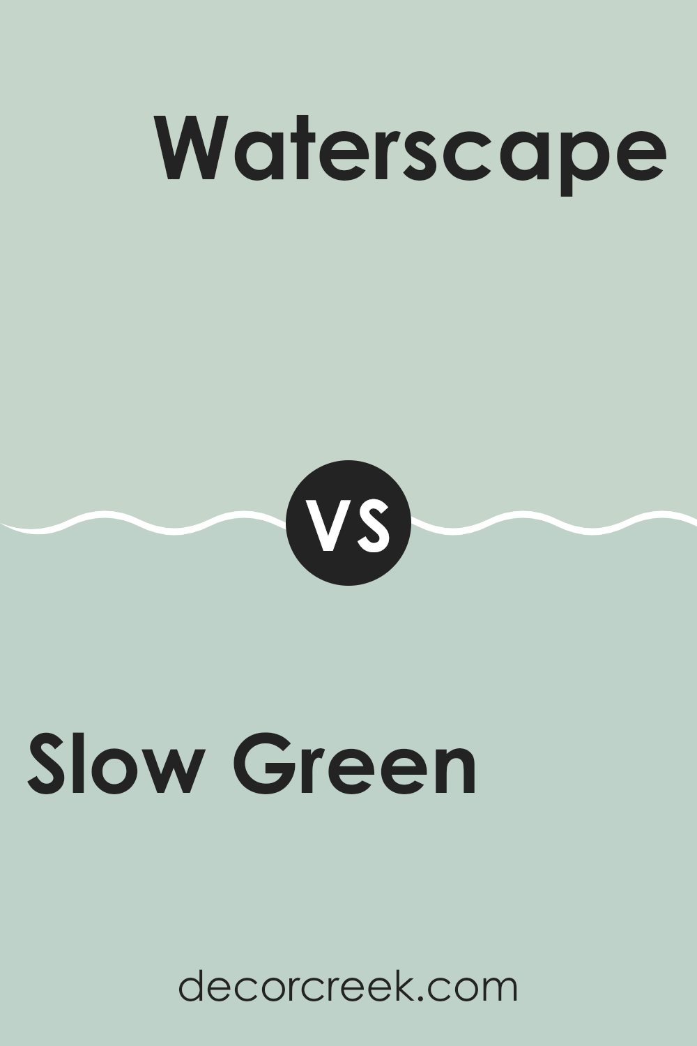
Slow Green SW 6456 by Sherwin Williams vs Waterscape SW 6470 by Sherwin Williams
Slow Green and Waterscape are two distinct colors by Sherwin Williams that each bring a unique feel to a space. Slow Green is a gentle, soothing green that leans towards a natural, earthy tone. It’s almost like the color of pale moss and can work well in spaces meant for relaxation, like a bedroom or a quiet reading nook.
In contrast, Waterscape is a brighter and more vibrant greenish-blue. This lively color reminds one of the clear sky on a sunny day or shallow tropical waters. It’s great for adding a fresh and cheerful touch to areas like bathrooms or kitchens, where a splash of uplifting color can really enhance the mood of the room.
Both colors offer a refreshing palette but serve different moods and settings, with Slow Green providing a calm, grounding atmosphere and Waterscape bringing in a more energetic vibe.
You can see recommended paint color below:
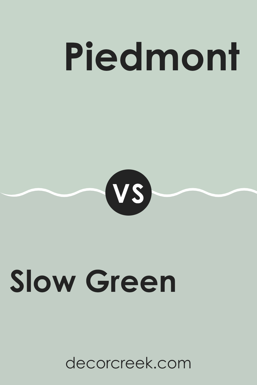
Slow Green SW 6456 by Sherwin Williams vs Piedmont SW 9657 by Sherwin Williams
Slow Green and Piedmont by Sherwin Williams are two distinctly different paint colors. Slow Green is a gentle, muted green that brings a soothing atmosphere to any room, similar to the color of soft sage. It works well in spaces where you want a touch of nature without overwhelming brightness.
On the other hand, Piedmont is a deeper, earthy hue that resembles a mix between taupe and gray. This color is versatile and serves as a strong neutral base, making it easy to pair with a wide range of other colors for interior design.
This deeper tone provides a grounded feeling, suitable for spaces that need a touch of understated elegance without going too dark. Comparatively, Slow Green has a more natural, fresh appeal, while Piedmont offers a sturdier, more subtle backdrop in decor.
You can see recommended paint color below:
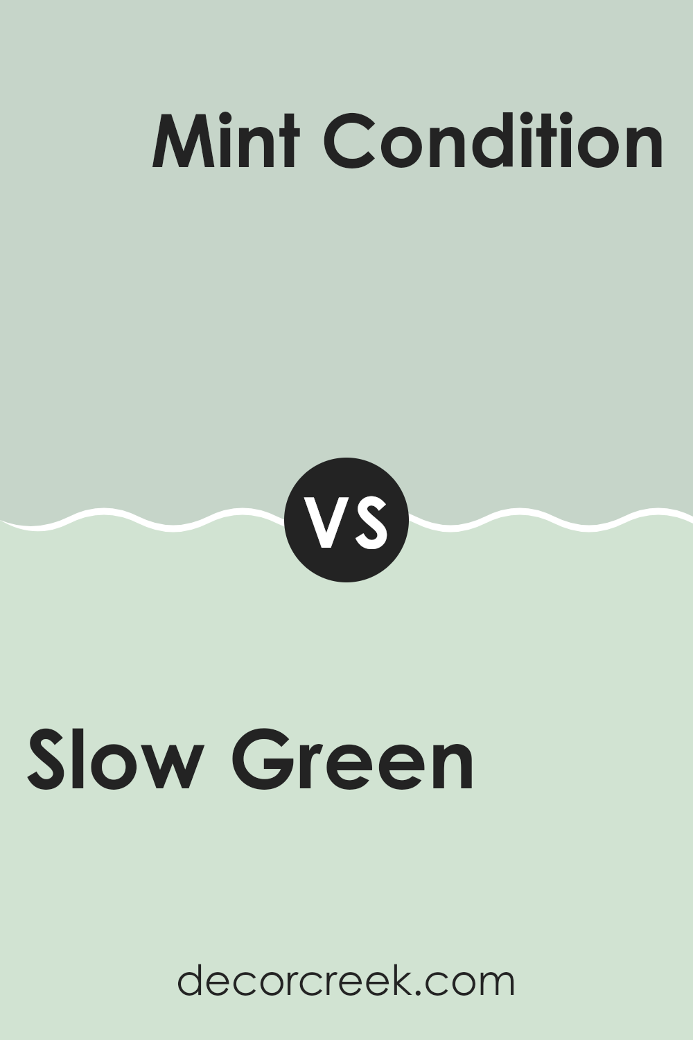
Slow Green SW 6456 by Sherwin Williams vs Mint Condition SW 6743 by Sherwin Williams
Slow Green and Mint Condition are two distinct colors from Sherwin Williams. Slow Green is a subtle, muted sage shade that brings a soft and calming touch to a room. It isn’t bright but has just enough depth to add character without overpowering a space.
On the other hand, Mint Condition is a brighter, more vibrant green. It has a fresher, peppier tone that can make a space feel lively and energetic. This color is great for areas where you want to add a splash of cheerfulness.
While Slow Green works well in environments where you want a natural, understated look, Mint Condition is better suited for spaces that benefit from a pop of color. Both colors can refresh a space but in very different ways — Slow Green by adding a gentle touch of nature, and Mint Condition by introducing a vivid burst of energy.
You can see recommended paint color below:
- SW 6743 Mint Condition
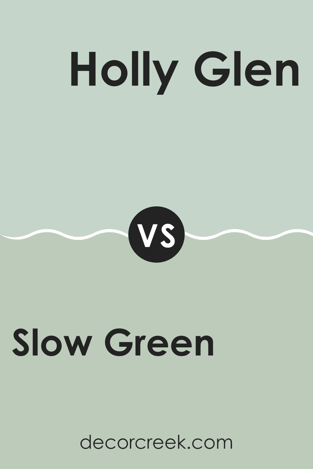
Slow Green SW 6456 by Sherwin Williams vs Holly Glen SW 9678 by Sherwin Williams
Slow Green is a soft, gentle green with a hint of gray, giving it a calm and welcoming vibe. It’s a versatile color that works well in many spaces, making rooms feel fresh without being too bright. On the other hand, Holly Glen is a deeper, more vibrant green.
This color is richer and has a more natural, forest-like feel to it, perfect for creating a cozy and inviting atmosphere in a space. When comparing these two, Slow Green is lighter and more muted, making it easier to match with other colors and decor.
Holly Glen, being bolder, can be a stunning choice for an accent wall or to bring a touch of the outdoors inside. Both colors offer unique aesthetics, but the choice between them depends on whether you prefer a softer backdrop or a more dynamic statement in your decorating.
You can see recommended paint color below:
- SW 9678 Holly Glen
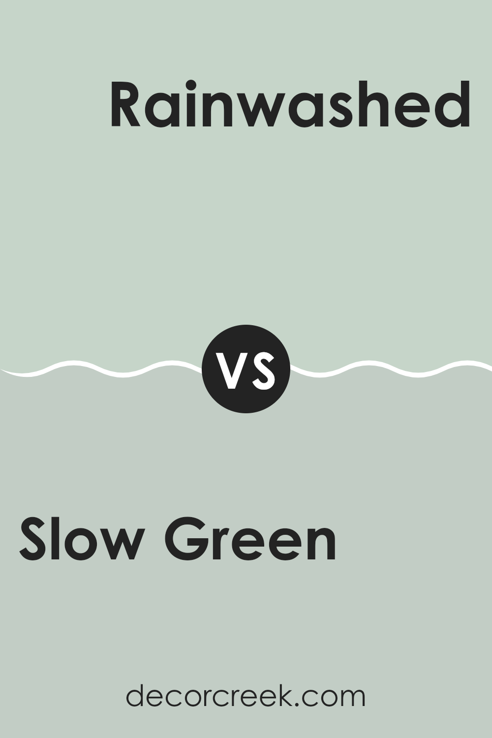
Slow Green SW 6456 by Sherwin Williams vs Rainwashed SW 6211 by Sherwin Williams
Both colors offered by Sherwin Williams, Slow Green and Rainwashed, carry distinct but complementary tones. Slow Green is a muted, earthy green with a subtle hint of gray, giving it a calm and grounded feel. This color works well in spaces meant for relaxation and reflection, like bedrooms or home offices. It matches nicely with both natural wood and light neutrals.
On the other hand, Rainwashed is a lighter, airier color with a blend of green and blue hues. This shade imparts a fresh and open feeling, making it perfect for bathrooms or smaller spaces that benefit from a brighter color to make them appear larger. Rainwashed is excellent for achieving a refreshing atmosphere in any room.
Though each color carries its own unique vibe, they both offer a sense of calmness and can be used together to create a peaceful yet engaging space. Rainwashed could serve as a vibrant contrast to Slow Green’s deeper tone, balancing out the overall palette.
You can see recommended paint color below:
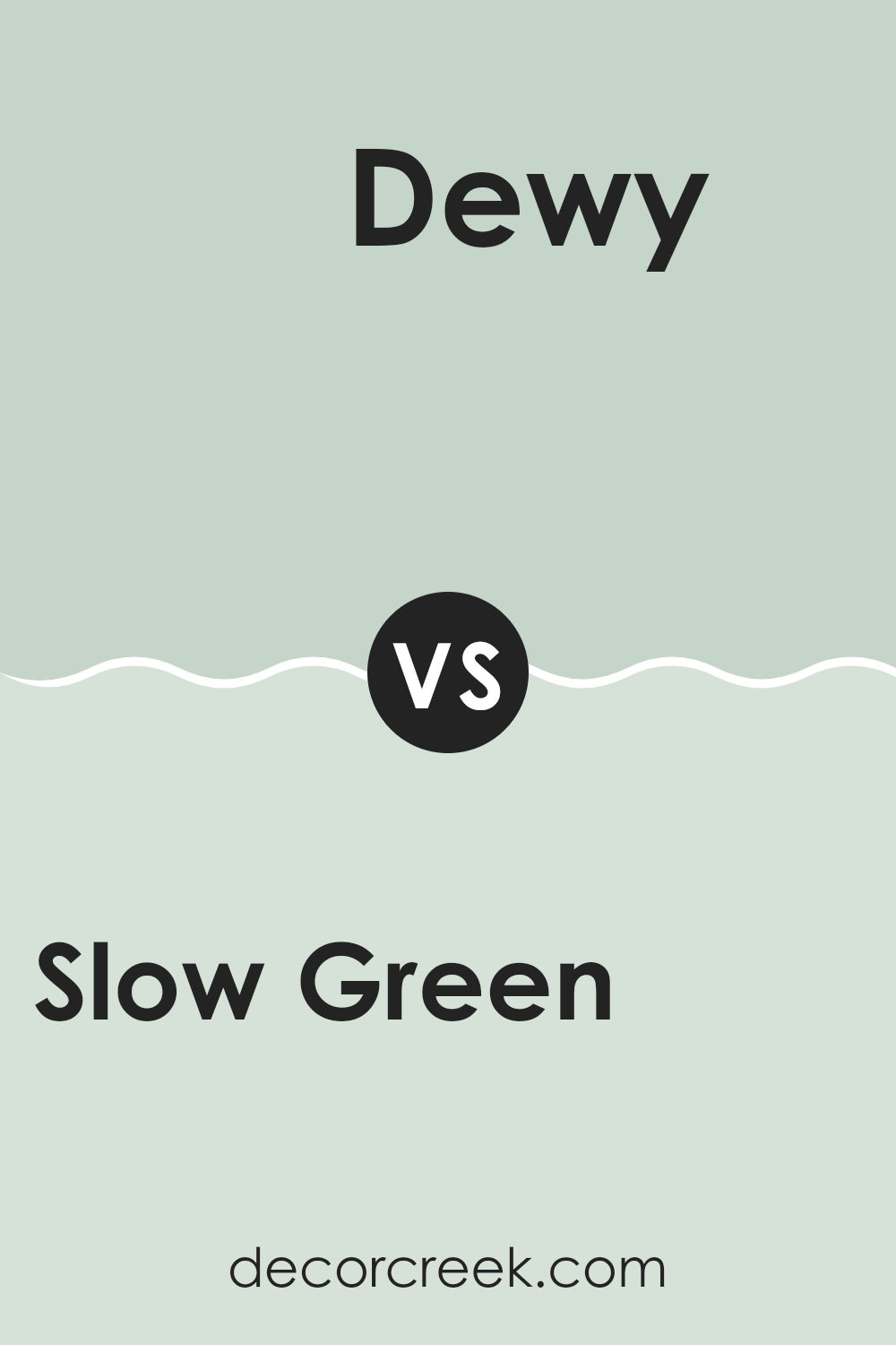
Slow Green SW 6456 by Sherwin Williams vs Dewy SW 6469 by Sherwin Williams
Slow Green and Dewy, both by Sherwin Williams, are beautifully distinct shades of green that can add character and freshness to any room. Slow Green is a deeper, more muted green that brings a sense of calm and grounding to a space.
Its subtle intensity makes it perfect for those looking for a more cozy and less vibrant atmosphere. On the other hand, Dewy is lighter and has a fresh, spring-like quality that seems to brighten a room with its airy feel. Dewy offers a gentle touch of color, ideal for creating a light and refreshing environment.
When comparing these two, Slow Green works well in areas where you want a more understated, warm feel, while Dewy is suitable for spaces that need a soft burst of freshness. Whether choosing between these colors for a full room paint or just an accent wall, they offer unique vibes that can fit different decorative styles and personal preferences.
You can see recommended paint color below:
- SW 6469 Dewy
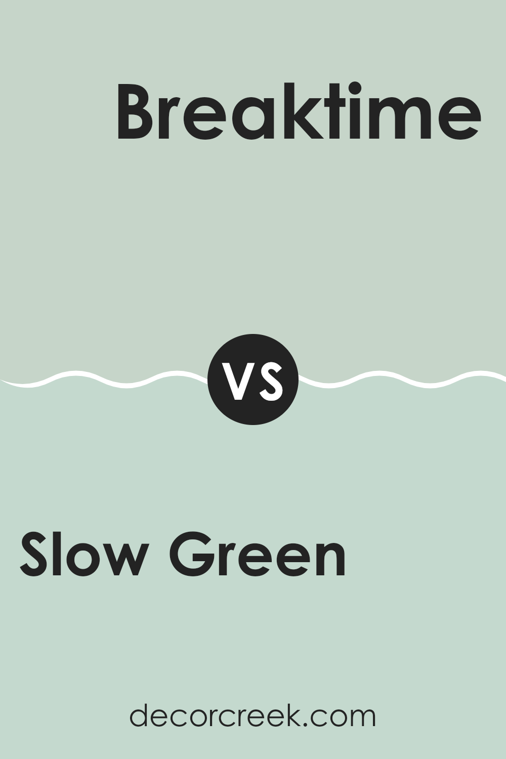
Slow Green SW 6456 by Sherwin Williams vs Breaktime SW 6463 by Sherwin Williams
Slow Green and Breaktime, both from Sherwin Williams, offer unique styles for any room. Slow Green is a soft, subtle green with a gentle, welcoming feel, making it perfect for spaces where relaxation is key, like bedrooms or reading nooks. It brings a fresh and airy vibe without overpowering the room.
On the other hand, Breaktime is a brighter and more vibrant shade of green. This color is lively and brings a splash of cheerfulness to any space, ideal for areas such as kitchens or playrooms where energy and activity are frequent. The vibrancy of Breaktime makes it stand out more compared to the muted tones of Slow Green.
Both colors provide distinct atmospheres: Slow Green sets a calm mood, while Breaktime adds a playful and energetic touch. Choosing between them depends on the room’s purpose and the ambiance you want to achieve.
You can see recommended paint color below:
- SW 6463 Breaktime
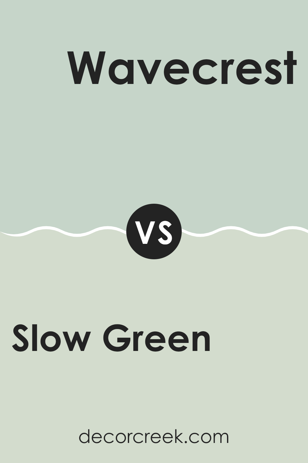
Slow Green SW 6456 by Sherwin Williams vs Wavecrest SW 9672 by Sherwin Williams
Slow Green and Wavecrest, both by Sherwin Williams, are two distinct shades that can create different moods in a space. Slow Green is a soothing, muted green with a soft, almost pastel-like quality. This color is great for rooms where you want a touch of nature without overwhelming the senses. It pairs well with natural materials like wood and stone.
On the other hand, Wavecrest is a lighter and brighter color with a sky blue tone that can make a space feel more open and airy. It’s reminiscent of a clear summer sky and works well in areas that benefit from a sense of freshness and calm, like bathrooms or bedrooms.
While Slow Green brings a gentle warmth to interiors, Wavecrest offers a crisp, refreshing vibe. Both colors provide a peaceful atmosphere but in slightly different ways: Slow Green leans towards a cozy, earthy feel, whereas Wavecrest is cleaner and more uplifting. Whether you choose one or the other depends on the kind of ambiance you’re aiming to achieve in your room.
You can see recommended paint color below:
- SW 9672 Wavecrest
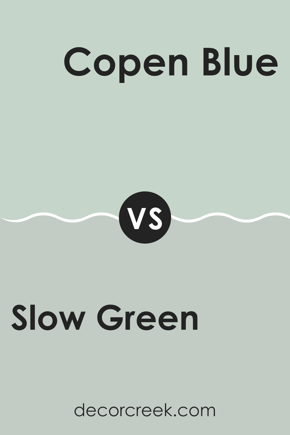
Slow Green SW 6456 by Sherwin Williams vs Copen Blue SW 0068 by Sherwin Williams
Slow Green is a subtle shade that leans towards a soft, muted green, giving off a calming effect that’s perfect for peaceful spaces like bedrooms or reading corners. It’s a gentle color that doesn’t overpower and works well for people looking to create a soothing environment.
Copen Blue, on the other hand, is a richer, deeper blue that suggests a more traditional vibe. This color can make a room feel cozy yet fresh, which is great for living rooms or bathrooms. It has a certain classic charm that pairs well with both modern and rustic decors.
Together, these colors offer a natural, earthy palette that can make any space feel grounded and relaxed. They complement each other well, with Slow Green providing a light backdrop and Copen Blue adding depth and focus. Their subtle tones can work well for a seamless color flow from room to room in a home.
You can see recommended paint color below:
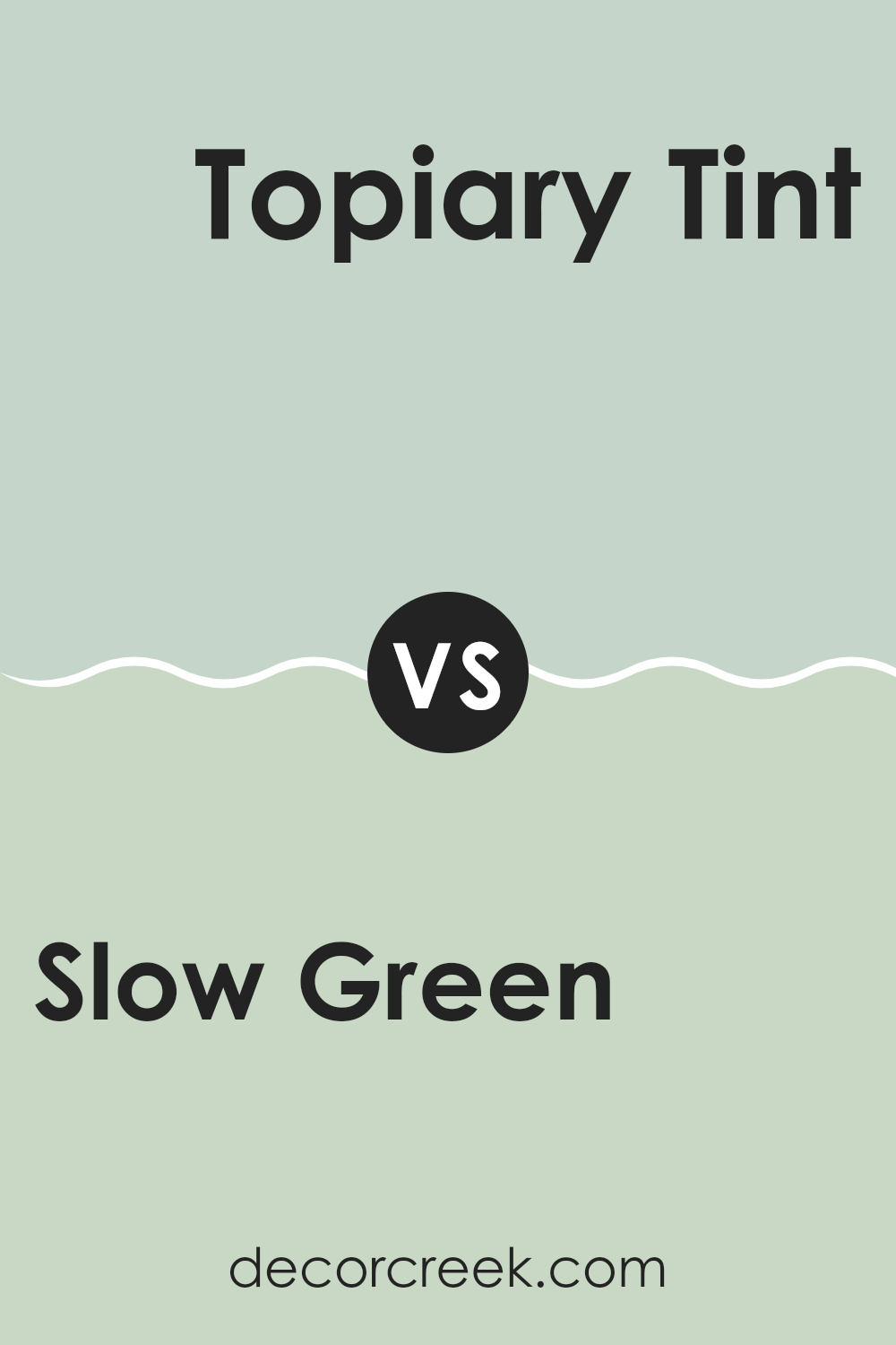
Slow Green SW 6456 by Sherwin Williams vs Topiary Tint SW 6449 by Sherwin Williams
Slow Green and Topiary Tint are both green hues by Sherwin Williams, but they have different vibes. Slow Green is a deeper, muted green that leans towards a sage. This color is calm and subtle, making it great for spaces where you want a touch of nature but with a soft, understated feel. It pairs well with lighter colors and wood tones.
Topiary Tint, on the other hand, is lighter and brighter. It’s closer to what you might think of as a classic, fresh green, reminiscent of new leaves or grass. This makes it more vibrant and energizing compared to Slow Green.
If you’re choosing between the two for a room, think about the mood you want. Slow Green works well in a cozy, quiet area, while Topiary Tint could be better for a more lively and active space. Both offer a natural feel, but the impact of their color intensity differs significantly.
You can see recommended paint color below:
- SW 6449 Topiary Tint
As I finish up writing about SW 6456 Slow Green, I can share that this paint color is really something special. Sherwin Williams has created a shade of green that feels just right, whether you’re painting a living room or a bedroom. What makes Slow Green stand out is how calming it feels. It’s not too bright or too dark, making it perfect for places where you just want to relax.
I found that Slow Green matches well with lots of different colors. You can pair it with whites for a clean and simple look, or add colors like soft pinks or blues to make it more interesting. It’s really easy to work with, and I think it can make any room look more beautiful without trying too hard.
Overall, Slow Green by Sherwin Williams is a great choice if you’re thinking about adding a new splash of color to your home. It’s gentle on the eyes and creates a warm, inviting environment. Whether you want to paint a whole room or just one wall as a feature, this color could be the perfect pick.
So if you’re looking for a new paint color, Slow Green is definitely worth considering!
Ever wished paint sampling was as easy as sticking a sticker? Guess what? Now it is! Discover Samplize's unique Peel & Stick samples.
Get paint samples

