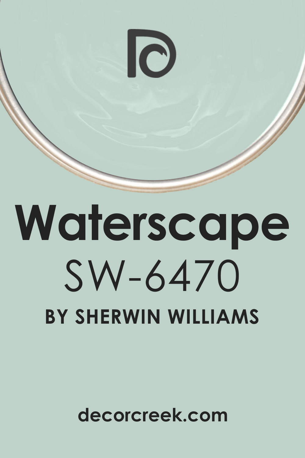
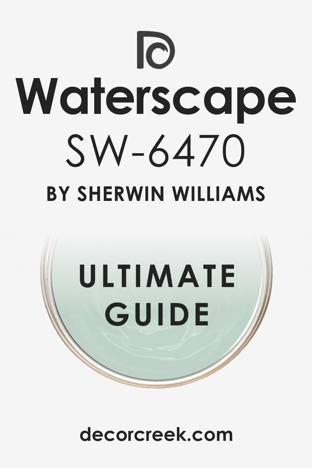
In the realm of paints, Sherwin-Williams’ colors have long stood out for their versatility, depth, and richness. Among these is a color known as SW 6470 Waterscape – a soothing hue that draws viewers into a world of tranquil seas and serene waters.
This article aims to delve into the beauty of SW 6470 Waterscape, its undertones, coordinating colors, the effect of lighting on it, and more. Let’s dive into the calming world of this shade.
What Color Is SW 6470 Waterscape? Is It a Warm or Cool Color?
SW 6470 Waterscape, in essence, is a mid-tone green color. It captures the beauty and tranquillity of a calm sea or a quiet pond, projecting a sense of peace and tranquillity.
As Hextoral says, while green is often categorized as a cool color, SW 6470 Waterscape has a balanced quality that straddles the line between cool and warm. Its innate versatility allows it to blend seamlessly into a variety of design themes and styles.
Ever wished paint sampling was as easy as sticking a sticker? Guess what? Now it is! Discover Samplize's unique Peel & Stick samples.
Get paint samples

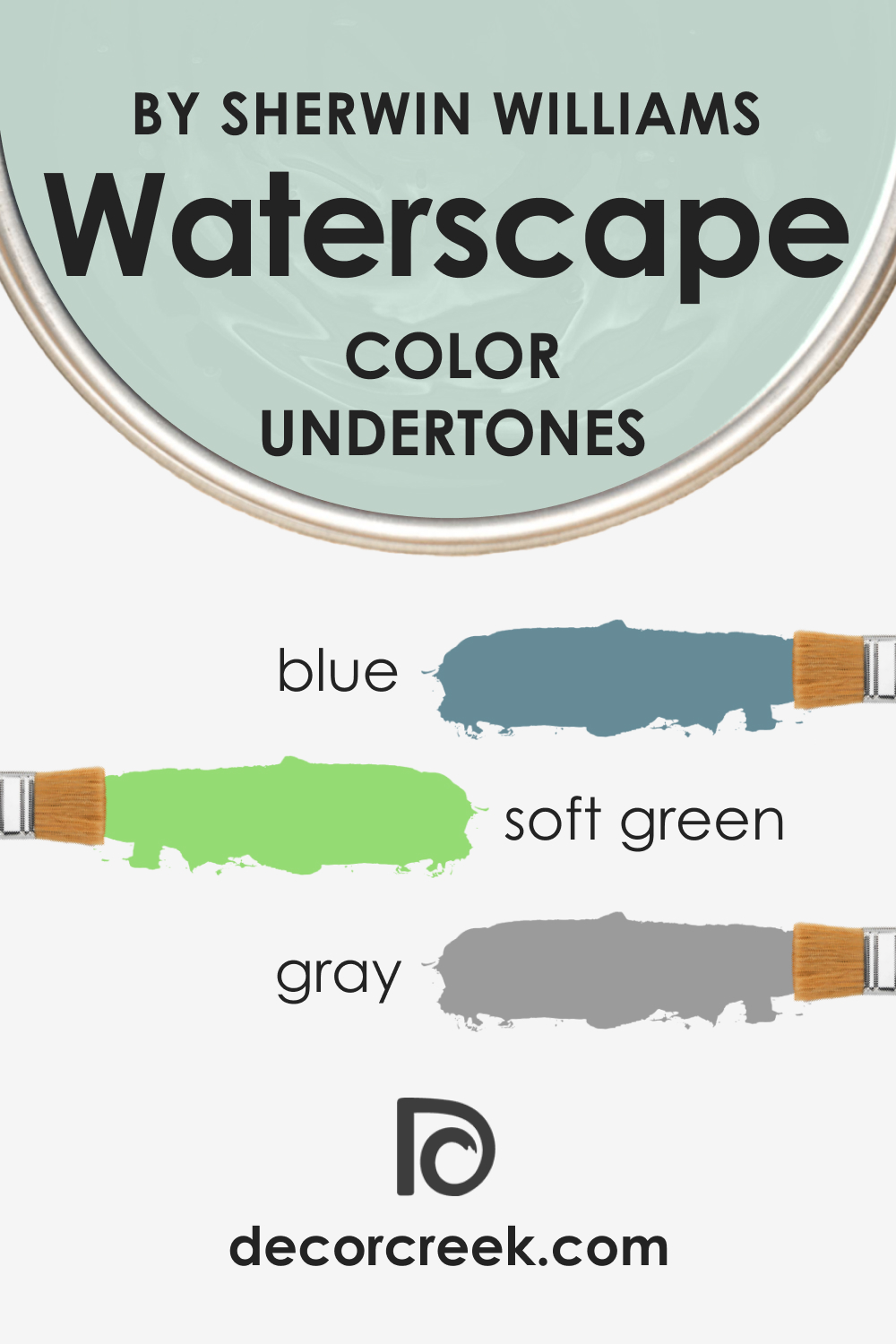
Undertones of SW 6470 Waterscape Paint Color
This color may seem to be simple, but in fact, it’s pretty complex due to the multiple undertones. To use SW Waterscape correctly, you should be aware that this hue contains the following undertones deep inside:
- Blue: One of the main undertones of SW 6470 Waterscape is blue. This tone enhances the depth of the color, giving it a serene and tranquil undertone that is reminiscent of a peaceful ocean.
- Gray: Another subtle undertone of this color is gray, which provides a balanced, neutral quality that allows it to work well with a broad range of colors and designs.
- Soft Green: A soft green undertone is also present, adding a touch of natural freshness and vitality that invokes feelings of rejuvenation and growth.
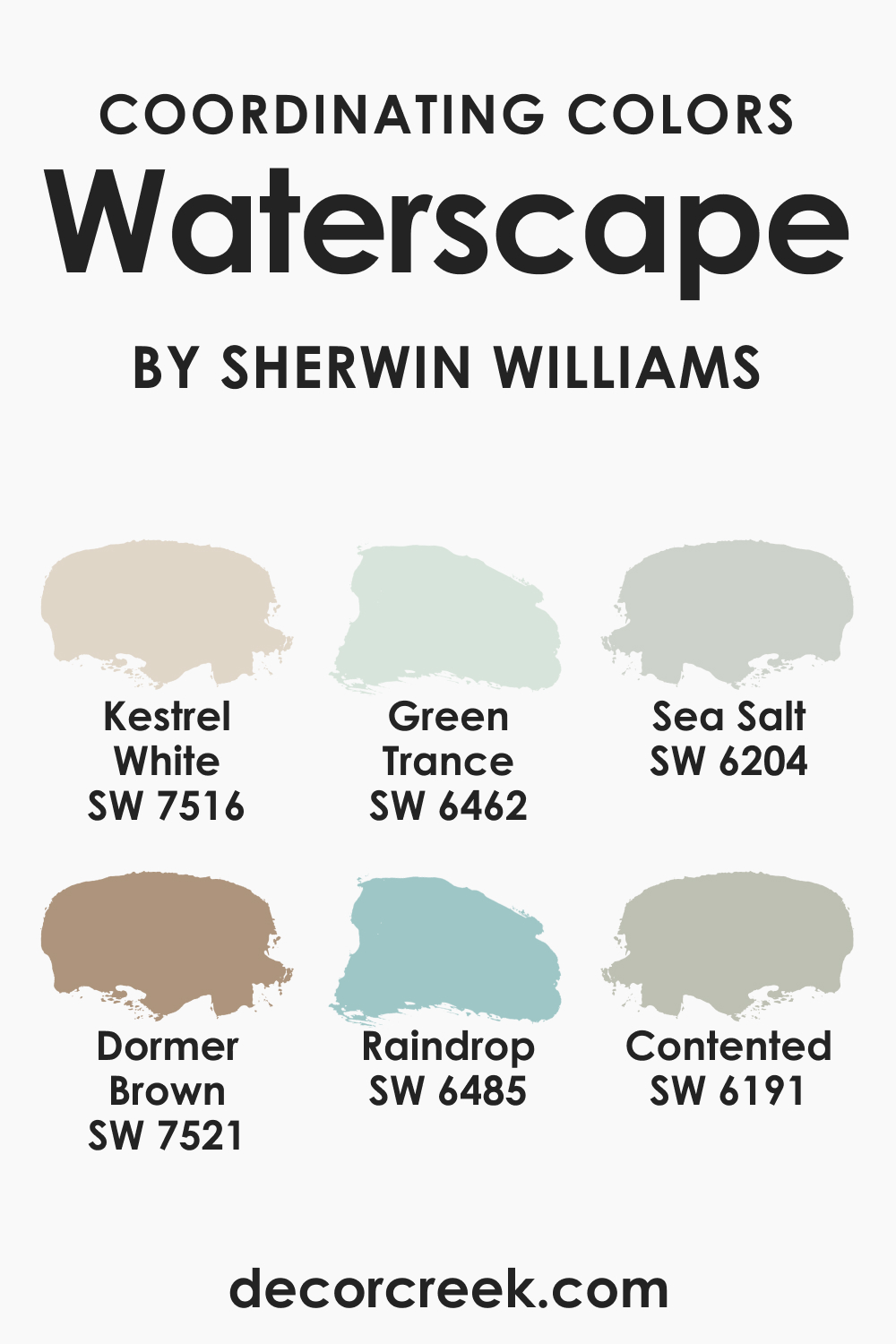
Coordinating Colors of SW 6470 Waterscape
To coordinate such a complex hue as SW Waterscape, you must know what coordinating colors will be suitable for this purpose. Below, you can find several suggestions:
- SW 6462 Green Trance : This color is a slightly darker shade of green that enhances the depth of SW 6470 Waterscape.
- SW 7516 Kestrel White : Kestrel White offers a clean, crisp contrast to the soothing tranquility of Waterscape.
- SW 7521 Dormer Brown : A rich, earthy tone, Dormer Brown adds warmth and grounding to the calming qualities of Waterscape.
To expand on this palette, here are three more colors that harmonize with SW Waterscape:
- SW 6485 Raindrop : This is a softer, more pastel shade of blue that enhances the peaceful quality of SW Waterscape.
- SW 6204 Sea Salt : This is a gentle, light gray-green color that complements the tranquillity of SW Waterscape.
- SW 6191 Contented : This color is a warm gray-green that creates a comfortable and soothing environment when combined with SW Waterscape.
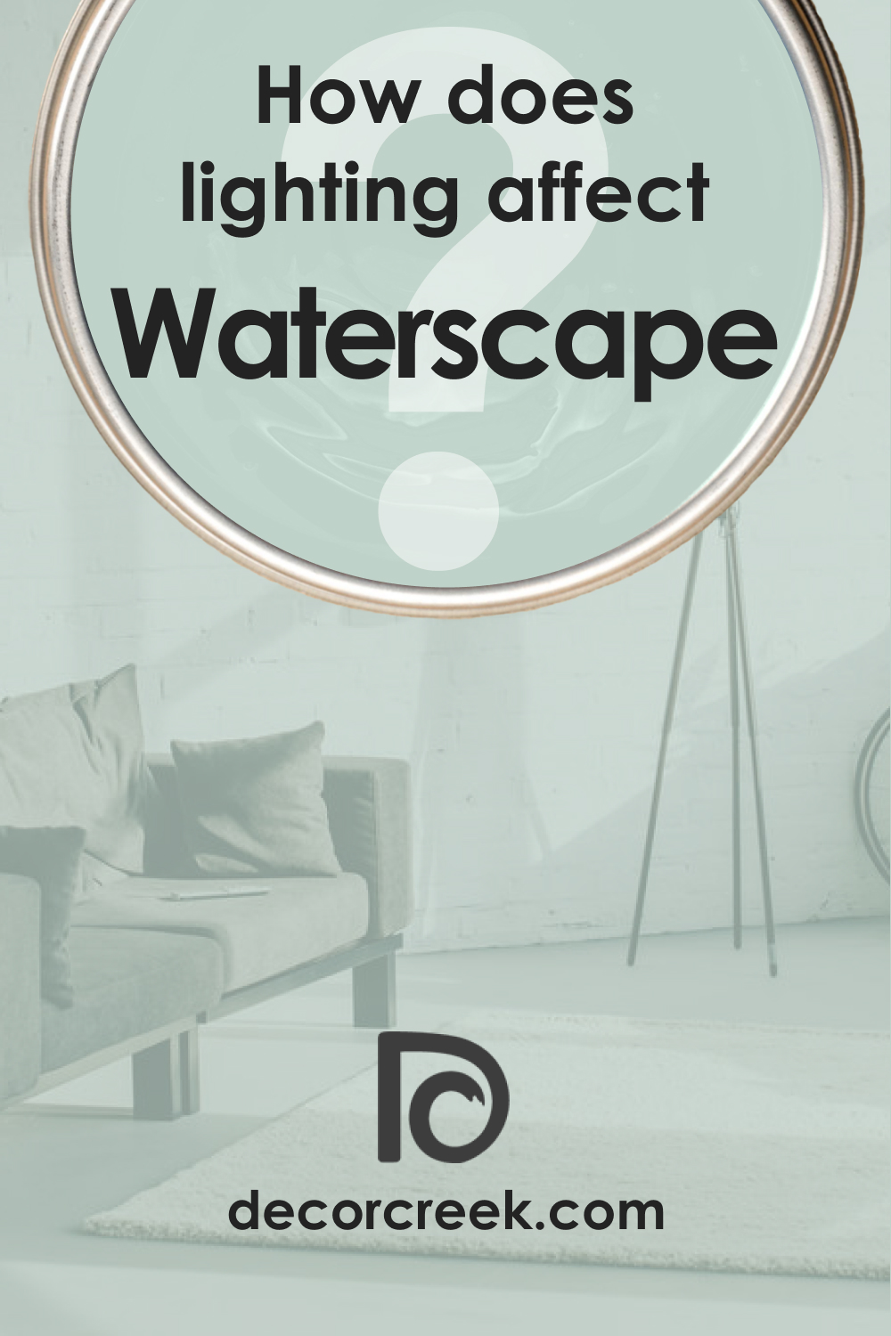
How Does Lighting Affect SW 6470 Waterscape Paint Color?
Lighting plays a crucial role in how we perceive color, and SW 6470 Waterscape is no exception. In a well-lit environment, SW Waterscape can appear brighter and more vibrant, with its green undertones becoming more noticeable. It exudes a fresh, welcoming vibe, reminiscent of a sunlit meadow or a bright, clear sea.
In contrast, under dimmer, softer lighting, the color can appear more subdued, with its gray undertones becoming more prominent. The result is a color that is tranquil, soothing, and peaceful, evoking an evening sea or a quiet, moonlit lake.
Therefore, considering the lighting of your space is vital when working with this color.
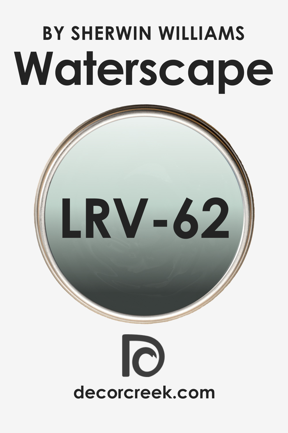
LRV of SW 6470 Waterscape Paint Color
LRV, or Light Reflectance Value, refers to the amount of light a color reflects. The LRV for SW 6470 Waterscape is 62. This means it reflects a significant amount of light, making it a relatively light color.
An LRV of 62 allows SW Waterscape to be versatile, meaning it can be used in spaces with different lighting conditions – from spaces with abundant natural light to rooms that rely heavily on artificial lighting.
Having a relatively high LRV, SW Waterscape can also help to make small spaces seem larger and more open while still providing enough depth of color to add character and interest. This is particularly beneficial in areas such as apartments or smaller rooms where space is at a premium.
LRV – what does it mean? Read This Before Finding Your Perfect Paint Color
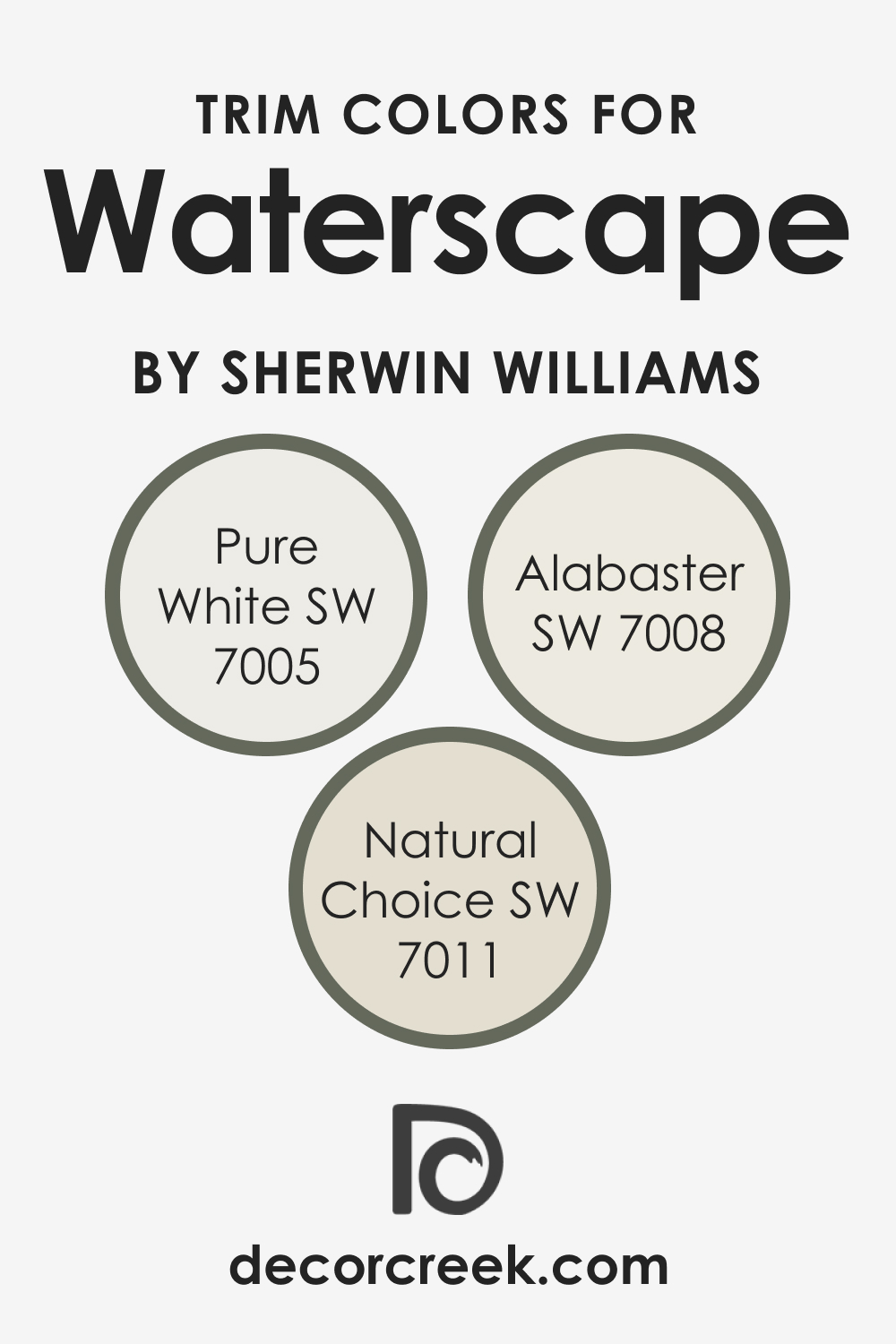
Trim Colors of SW 6470 Waterscape
Pairing SW Waterscape with the right trim color can elevate your space to new heights. White is a traditional trim color due to its versatility and ability to work with most hues. For SW Waterscape, it will work too. Here are three shades of white from Sherwin-Williams that pair beautifully with SW Waterscape:
- SW 7005 Pure White : This is a crisp, clean white that offers a striking contrast to the tranquility of SW Waterscape.
- SW 7008 Alabaster : Alabaster is a warmer, creamy white that complements the serene undertones of SW Waterscape.
- SW 7011 Natural Choice : This is a soft, warm white that harmonizes with the balanced qualities of SW Waterscape.
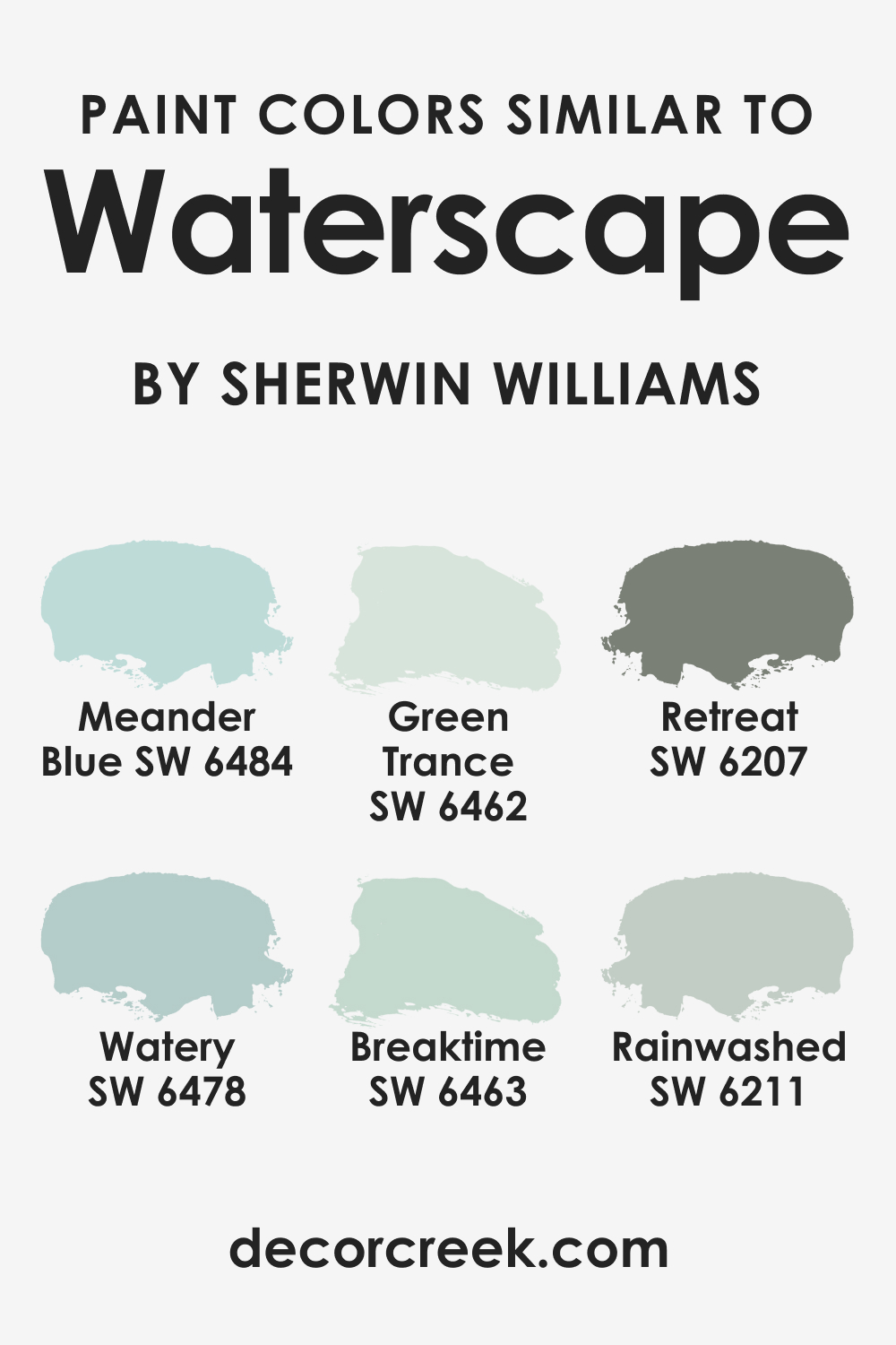
Colors Similar to SW 6470 Waterscape
If you are not satisfied with how SW Waterscape works in your home, consider one of the alternative colors instead:
- SW 6463 Breaktime : This is a slightly more muted shade of blue-green, reminiscent of Waterscape but with a softer touch.
- SW 6478 Watery : Watery is a lighter, more ethereal blue-green that carries the same peaceful vibe as Waterscape.
- SW 6484 Meander Blue : This color shares the serene qualities of Waterscape but leans a bit more towards blue.
- SW 6211 Rainwashed : Rainwashed is a softer, more muted blue-green that echoes the tranquil, soothing qualities of Waterscape.
- SW 6207 Retreat
- SW 6462 Green Trance
As for other paint brands (except for Sherwin-Williams), you might want to check out the following colors that read similar to SW Waterscape:
Colors That Go With SW 6470 Waterscape
To achieve a harmonious and good-looking palette in your home, you should combine colors correctly so that each hue pairs with others well. For SW Waterscape, we suggest several colors that can create a lovely and balanced appearance:
- SW 6218 Tradewind : This is a soft, cool blue that creates a serene and tranquil environment with Waterscape.
- SW 6179 Artichoke : This is a deeper, earthier green that provides a beautiful contrast to the calmness of SW Waterscape.
- SW 6169 Sedate Gray : This is a calm, soothing gray that harmonizes beautifully with Waterscape.
- SW 7668 March Wind : This is a warm, neutral gray that complements the balanced qualities of Waterscape.
You might also want to check out a few additional hues to have at hand should you decide to make your interior palette more varied:
- SW 6223 Still Water
- SW 6504 Sky High
- SW 7616 Breezy
- SW 7614 St. Bart’s
- SW 6214 Underseas
- BM Aegean Teal 2136-40
- SW 7014 Eider White
- SW 7005 Pure White
How to Use SW 6470 Waterscape In Your Home?
If you are not sure where in your home this hue may work best, read this short yet informative guide below. Here we explain in what rooms this lovely aquatic hue will do its best!?
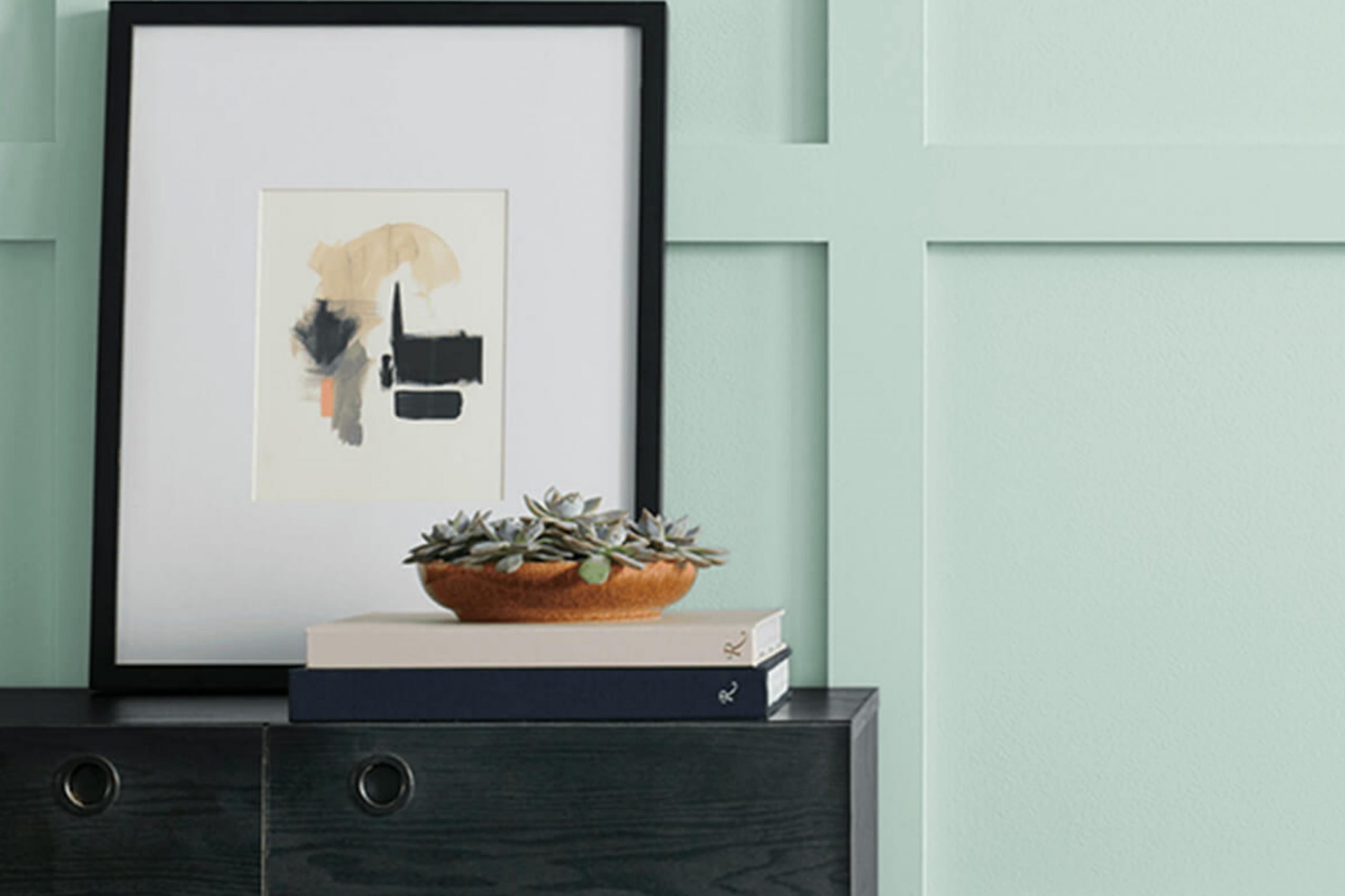
The bedroom is a space for relaxation and tranquillity, and SW 6470 Waterscape lends itself beautifully to creating this atmosphere. Paint the walls with Waterscape to create a serene environment, reminiscent of a calm sea or a peaceful garden.
Paired with warm, neutral bedding and dark wood furniture, SW Waterscape can transform your bedroom into a peaceful oasis. The addition of light, airy window treatments can enhance the light, soothing feel of the room.
For a more contemporary twist, consider using SW Waterscape on a feature wall behind the bed. This approach allows the color to serve as a backdrop for artwork or other focal points. Paired with a crisp white ceiling and trim, this approach can create a stylish, modern bedroom environment.
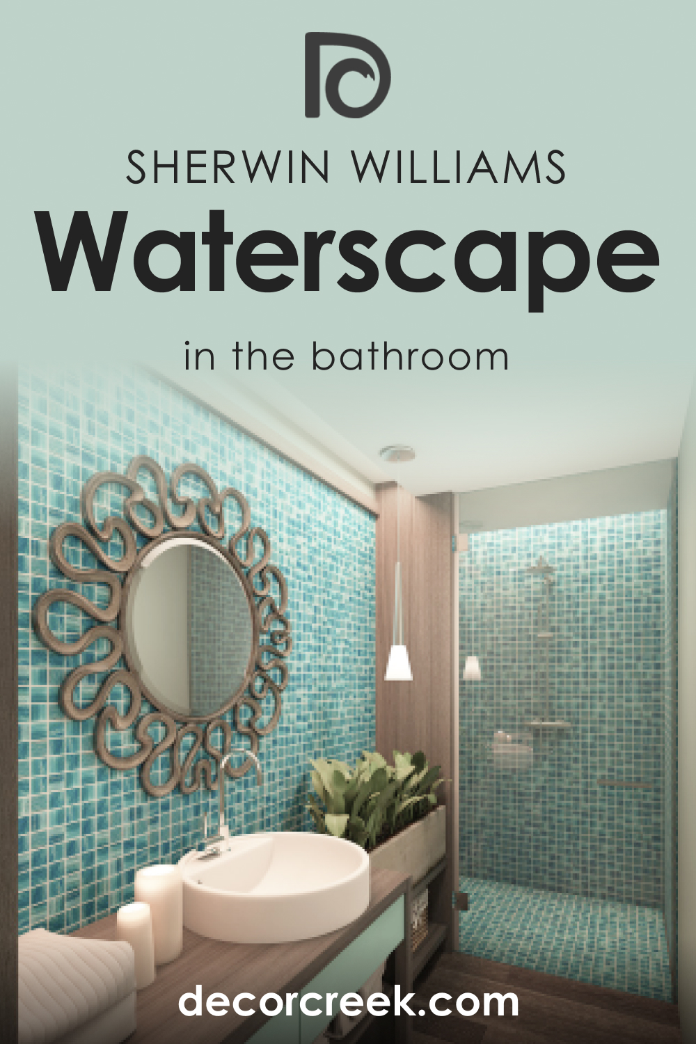
How to Use SW 6470 Waterscape in the Bathroom?
Bathrooms are often a place for relaxation and rejuvenation, making SW 6470 Waterscape an excellent color choice. Its soothing tones can turn a simple bathroom into a spa-like retreat. For a classic look, pair SW Waterscape with crisp white fixtures and light-colored flooring. Add plants or other natural elements to enhance the peaceful, calming vibe.
Alternatively, for a more modern look, consider painting the lower half of the walls with SW Waterscape and the upper half with a light, neutral color such as SW 7005 Pure White. This creates a balance of color and neutrality that feels fresh and contemporary.
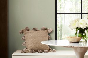
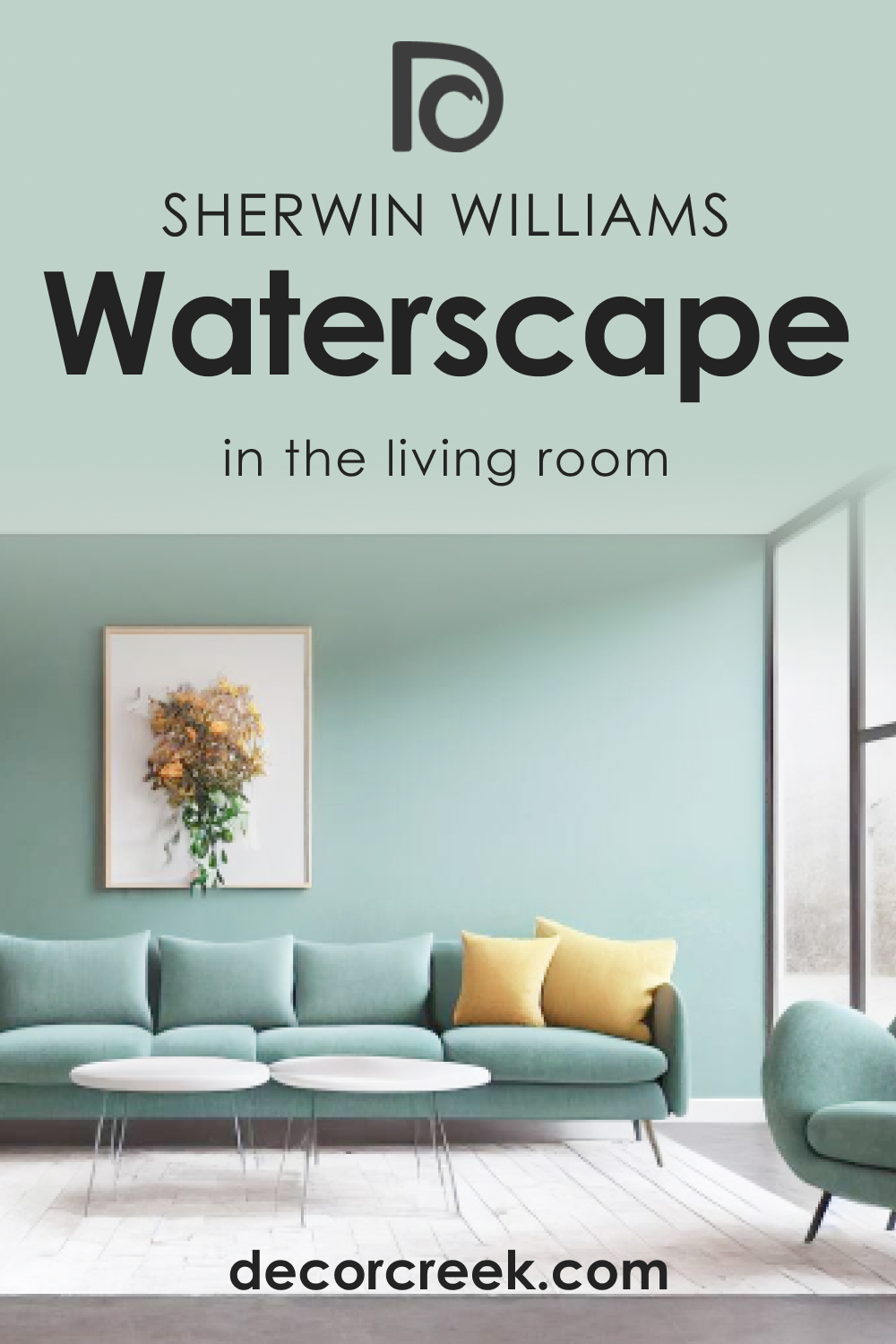
How to Use SW 6470 Waterscape in the Living Room?
The living room is a space for relaxation and socialization, and SW Waterscape’s balanced tones make it a great choice for creating a welcoming, comfortable atmosphere. Apply SW Waterscape on all walls for a calm, enveloping feel. Pair it with neutral furnishings, natural wood tones, and soft textiles to create a cozy and inviting space.
For a more contemporary feel, consider using SW Waterscape as a feature wall color, perhaps behind a media center or fireplace. Pair it with neutral walls and modern furnishings for a sleek, sophisticated look.
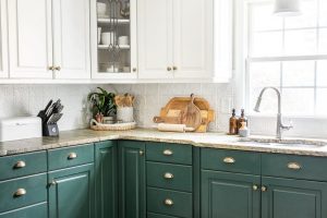
How to Use SW 6470 Waterscape in the Kitchen?
SW Waterscape can bring a sense of freshness and vitality to the kitchen. For a classic look, consider painting the walls with Waterscape and pairing it with white cabinetry and light countertops. The color can bring a sense of nature into the space, reminiscent of fresh herbs or a calming seascape.
For a more modern aesthetic, consider using SW Waterscape on the lower cabinets, paired with light upper cabinets and sleek, modern hardware. This approach brings a touch of color to the space without overwhelming it.

How to Use SW 6470 Waterscape for an Exterior?
SW 6470 Waterscape is an excellent choice for an exterior paint color. Its balanced tones make it versatile enough to work well with various architectural styles and exterior materials.
For a traditional look, consider pairing SW Waterscape with crisp white trim and dark shutters. The result is a home that feels welcoming and harmonious, nestled comfortably into its surroundings.
For a more contemporary look, consider pairing SW Waterscape with a darker gray trim and sleek, modern details. This creates a striking contrast that feels fresh and modern while still maintaining a sense of tranquility and balance.

Comparing SW Waterscape With Other Colors
Here you can read how SW Waterscape compares to other colors. This will help you better see this color’s unique features and understand how LRVs and undertones work, making colors unique.
SW 6470 Waterscape vs SW 6471 Hazel
SW 6471 Hazel is a slightly darker, more saturated green than SW 6470 Waterscape. While Waterscape evokes a sense of calm, serene waters, Hazel feels more like a lush, vibrant forest. SW Waterscape’s balanced tones make it more versatile, while Hazel’s richer color provides more depth and intensity.
SW 6470 Waterscape vs SW 6472 Composed
SW 6472 Composed is a cooler, more blue-leaning color than SW 6470 Waterscape. While SW Waterscape feels like a calm sea or a tranquil pond, Composed feels like a cool, deep ocean. Both colors evoke a sense of tranquility and peace, but their different undertones can create different moods in a space.
SW 6470 Waterscape vs SW 6488 Grand Canal
SW 6488 Grand Canal is a significantly darker, more saturated blue-green than SW 6470 Waterscape. SW Grand Canal evokes the depth and mystery of a deep, secluded waterway, while SW Waterscape feels more light, fresh, and open.
While both colors have a calming effect, their different levels of saturation can dramatically affect the feel of a room.
SW 6470 Waterscape vs SW 6480 Lagoon
SW 6480 Lagoon is a much darker, more intense blue than SW 6470 Waterscape. While SW Waterscape is light and soothing, SW Lagoon is deep and striking, evoking the richness and mystery of a hidden lagoon. SW Lagoon can make a strong, bold statement, while Waterscape is more subtle and versatile.
SW 6470 Waterscape vs SW 6464 Aloe
SW 6464 Aloe is a lighter, more muted green than SW 6470 Waterscape. While SW Waterscape feels tranquil and soothing, Aloe has a fresher, more invigorating feel. Aloe’s lighter, more subtle color makes it ideal for creating a bright, airy space, while Waterscape’s deeper tone provides more depth and interest.
SW 6470 Waterscape vs SW 6483 Buoyant Blue
SW 6483 Buoyant Blue is a vibrant, medium-toned blue, significantly different from SW 6470 Waterscape. While SW Waterscape evokes a sense of serene waters and tranquil seas, Buoyant Blue is reminiscent of a bright, sunny sky.
Buoyant Blue is an energizing, uplifting color, while Waterscape provides a calming, relaxing atmosphere.
Conclusion
SW 6470 Waterscape is a beautifully balanced color that offers a sense of tranquillity and peace. Its unique blend of undertones makes it versatile enough to work in various spaces and lighting conditions, and its high LRV makes it an excellent choice for creating a light, open feel in any room.
Whether you’re looking for a soothing bedroom color, a tranquil bathroom hue, a welcoming living room shade, or a fresh kitchen color, Waterscape is a choice that is sure to impress.
Ever wished paint sampling was as easy as sticking a sticker? Guess what? Now it is! Discover Samplize's unique Peel & Stick samples.
Get paint samples
Frequently Asked Questions
⭐What type of room is best suited for the paint color SW 6470 Waterscape?
Waterscape is a versatile color that works well in a variety of rooms, including bedrooms, bathrooms, living rooms, and kitchens. Its soothing tone can create a tranquil atmosphere in any space.
⭐What are the undertones of the paint color SW 6470 Waterscape?
Waterscape is a unique blend of green, blue, and gray undertones. This balanced mix gives it a soothing, tranquil quality that can adapt to various design styles and moods.
⭐What colors coordinate well with SW 6470 Waterscape?
Several colors coordinate well with Waterscape, including both warm and cool tones. Some excellent options are SW 6462 Green Trance, SW 7516 Kestrel White, SW 7521 Dormer Brown, SW 6218 Tradewind, SW 6212 Quietude, and SW 6179 Artichoke.
⭐How does the lighting affect the appearance of the paint color SW 6470 Waterscape?
The appearance of SW Waterscape can change depending on the lighting. In natural light, its blue and green undertones might be more noticeable, whereas in artificial light, its gray undertones may become more prominent.
⭐What are some similar colors to SW 6470 Waterscape?
If you like Waterscape but want to explore similar options, consider colors like SW 6463 Breaktime, SW 6478 Watery, SW 6484 Meander Blue, SW 6207 Retreat, SW 6462 Green Trance, and SW 6211 Rainwashed. These colors share Waterscape's tranquil vibe but have slightly different hues.