Choosing a color for your space is more than just selecting a shade; it’s about setting a mood, creating a feeling, and defining a lifestyle. Among the vast spectrum of colors offered by Sherwin-Williams, SW 6461 Isle of Pines stands as a true representative of the lush, tranquil, and refreshing energy of nature.
This color evokes the vibrancy of greenery, promising to bring an element of the outdoors into your living space.
What Color Is SW 6461 Isle of Pines? Is It a Warm Or Cool Color?
SW 6461 Isle of Pines is a deep, rich green color that brings to mind the thick foliage of a tropical rainforest or an evergreen pine forest. As Hextoral says, It stands on the cooler side of the color spectrum, reflecting calmness and serenity.
Though cool in undertones, its depth and richness give it a hint of warmth, making it an excellent choice for a variety of spaces and lighting situations.

Ever wished paint sampling was as easy as sticking a sticker? Guess what? Now it is! Discover Samplize's unique Peel & Stick samples.
Get paint samples

Undertones of SW 6461 Isle of Pines Paint Color
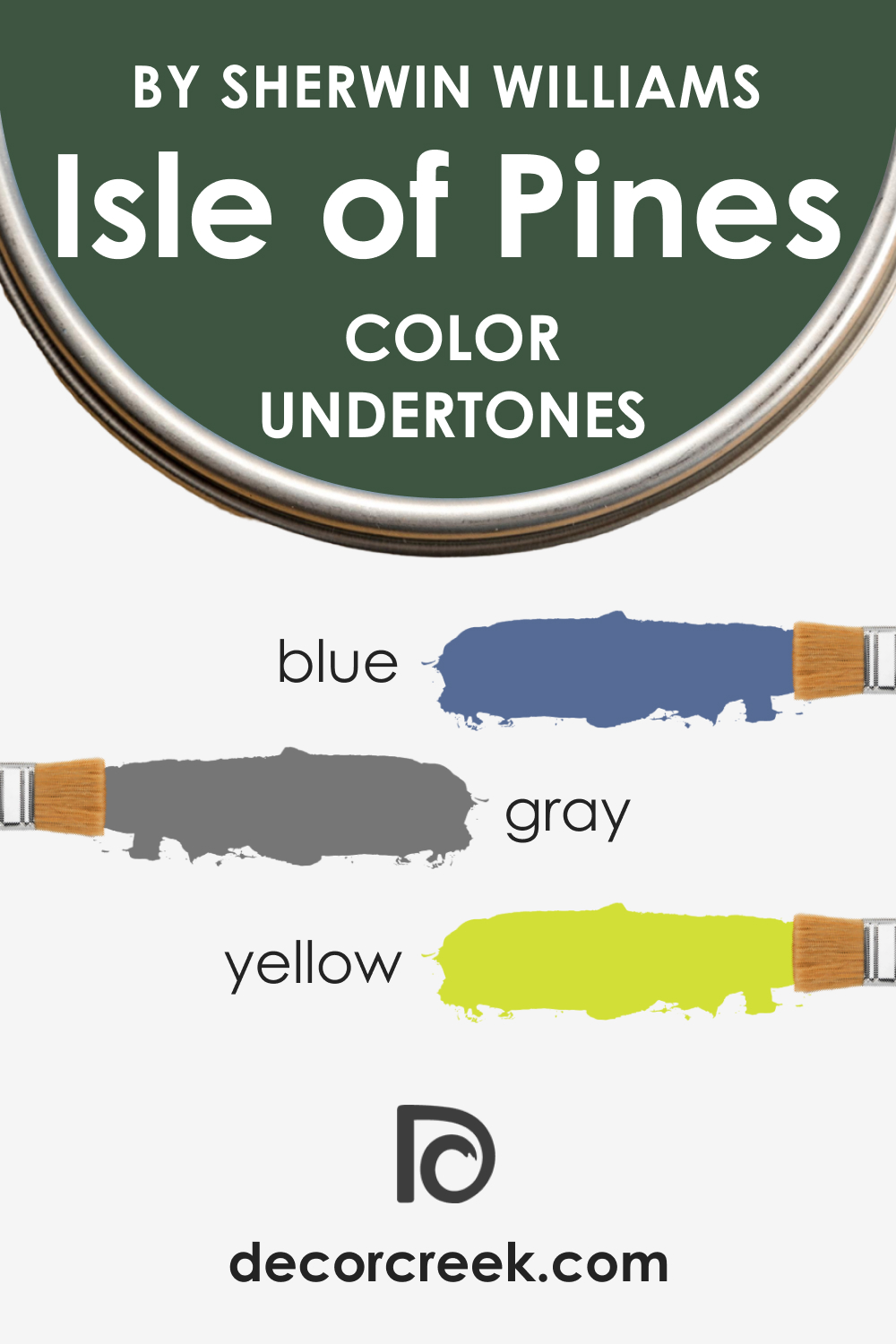
When you know what undertones a color has, you can tell in advance how it may read in your space. SW Isle of Pines can be considered a complex color due to multiple undertones it has:
- Blue: The blue undertone in the Isle of Pines gives the color its cool, calming effect, making it a suitable choice for spaces where relaxation is key.
- Grey: The grey undertone adds a certain depth to the color, allowing it to act as a dark neutral in many spaces.
- Yellow: An undertone of yellow adds a subtle warmth to this cool color, which makes it versatile and adaptable to various styles and spaces.
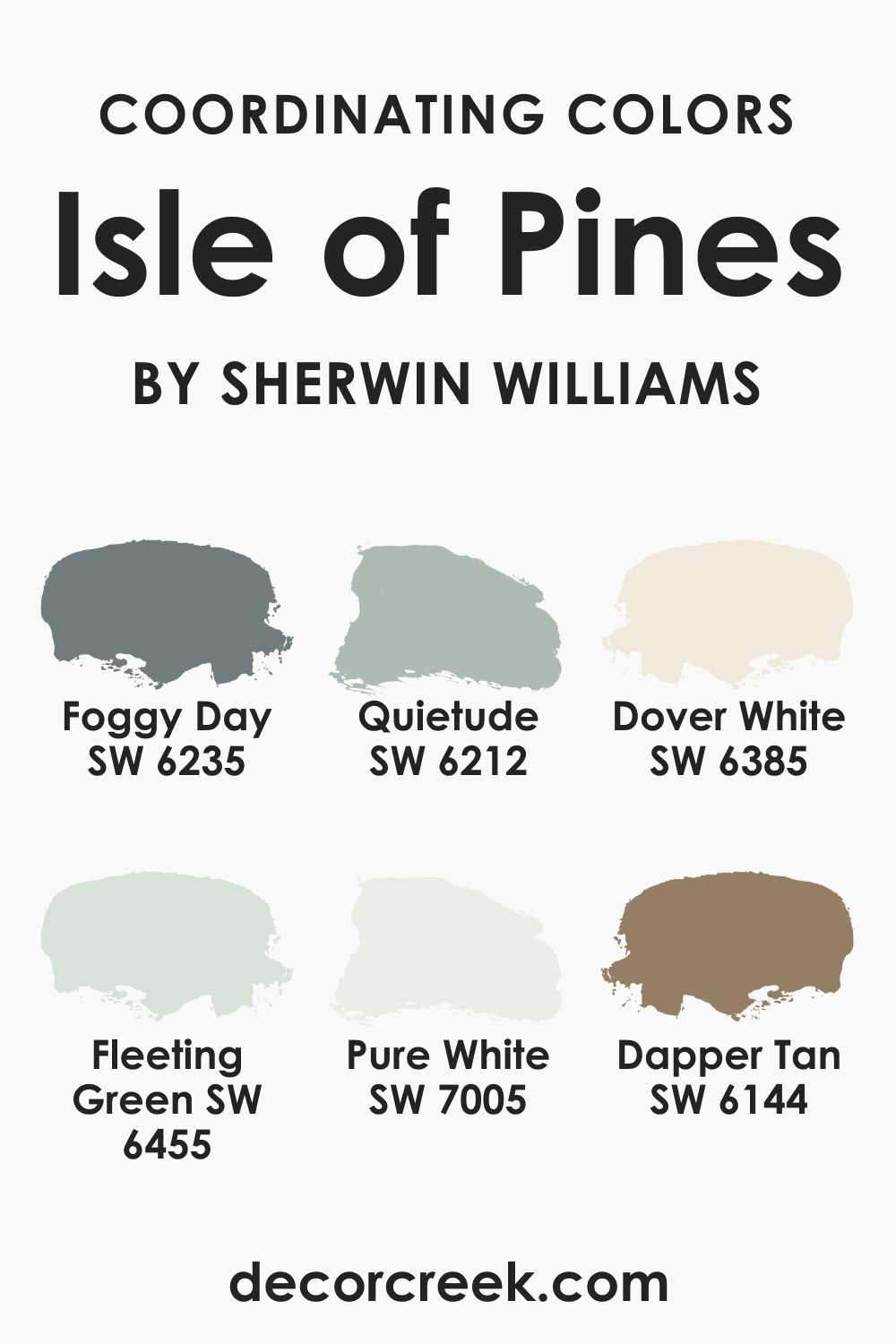
Coordinating Colors of SW 6461 Isle of Pines
To make a color work, you must know how to coordinate it. For SW Isle of Pines, we recommend the following colors for the best coordination:
- SW 6455 Fleeting Green : A softer, lighter green that can provide a balanced contrast to the boldness of SW Isle of Pines.
- SW 7005 Pure White : A crisp, clean white that can bring out the vibrant richness of the Isle of Pines, enhancing its lushness.
- SW 6144 Dapper Tan : A neutral tan that offers a soothing balance to the lively nature of SW Isle of Pines.
To bring in more variety while maintaining harmony, consider these additional colors:
- SW 6235 Foggy Day : This subtle, cool gray complements the cool undertones of SW Isle of Pines.
- SW 6212 Quietude : A muted, medium-toned blue-green that pairs well with the lushness of SW Isle of Pines.
- SW 6385 Dover White : A warm, creamy white that offers a gentle contrast to the intensity of SW Isle of Pines.
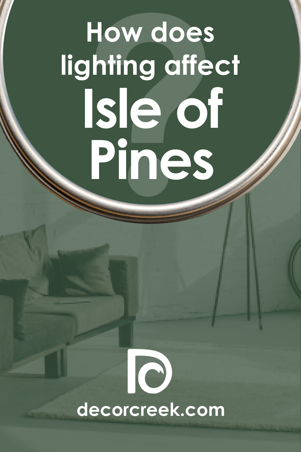
How Does Lighting Affect SW Isle of Pines Paint Color?
Lighting can significantly influence how SW 6461 Isle of Pines appears in space. In natural light, the color’s richness and vibrancy become more pronounced, allowing its green undertones to shine truly. It can appear lighter and more vibrant during the day, especially in spaces with large windows or skylights.
In artificial light, the color can take on a deeper, more muted tone. Warm lighting can bring out the subtle warmth of its yellow undertone, making the color appear cozier and more inviting. On the other hand, cool lighting can enhance its blue undertone, giving it a more serene and tranquil feel. Thus, the lighting in a space can effectively ‘tune’ SW Isle of Pines to match the desired mood or atmosphere.
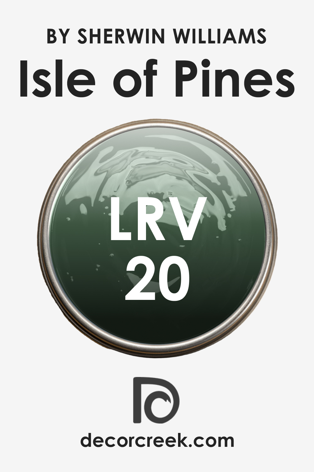
LRV of SW 6461 Isle of Pines Paint Color
The Light Reflectance Value (LRV) of paint color is a measurement of how much light the color reflects. SW 6461 Isle of Pines has an LRV of 20, indicating that it’s a relatively dark color.
Dark colors with low LRVs can make a space feel smaller or more intimate, which can be perfect for creating cozy, focused spaces. However, when using such colors, it’s important to balance them with lighter elements to avoid making the space feel overly enclosed or dark.
The low LRV of SW Isle of Pines also means the color has a strong presence. This can be used to create a focal point in a room or to add depth and richness to a space. The low LRV also enhances the color’s versatility, allowing it to pair well with both light and dark shades, depending on the desired effect.
LRV – what does it mean? Read This Before Finding Your Perfect Paint Color
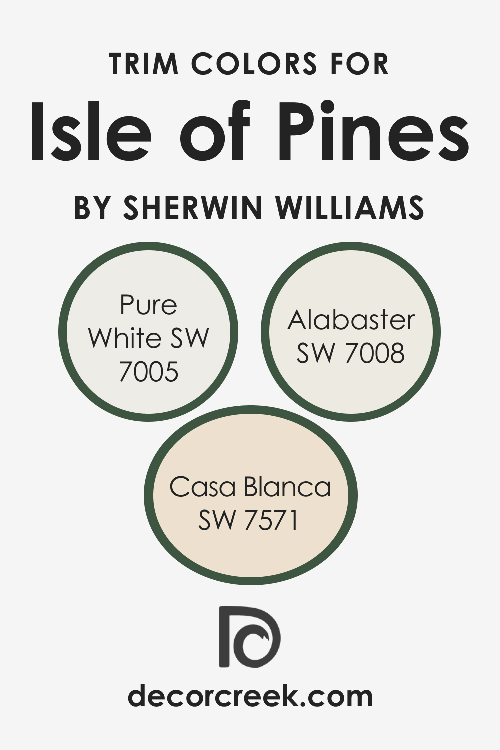
Trim Colors for SW 6461 Isle of Pines
White is traditionally the optimal trim color due to its versatility and ability to work with most colors on the color wheel. You just need to know what shade of white to use to get the right effect. For such a complex hue as SW Isle of Pines, we recommend the following trim colors:
- SW 7005 Pure White : A classic choice for trims, its crisp, bright character provides a striking contrast to the lush Isle of Pines.
- SW 7008 Alabaster : This creamy, off-white color adds a softer contrast, warming up spaces where SW Isle of Pines is dominant.
- SW 7571 Casa Blanca : A slightly warmer shade of white that can bring out the subtle warmth in SW Isle of Pines, making spaces feel cozier.
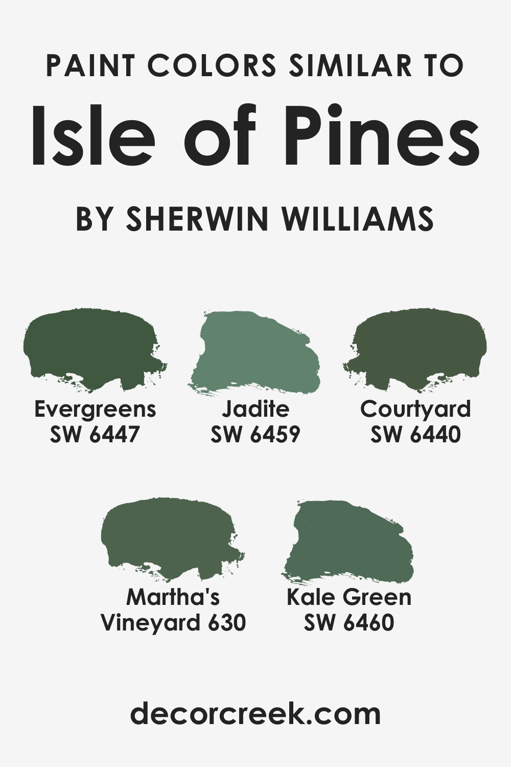
Colors Similar to SW 6461 Isle of Pines
If you are not sure whether SW Isle of Pines is a suitable color for your home, consider using one of the alternative hues instead. For example, you might want to check out one of these:
- SW 6459 Jadite : A slightly lighter and less intense green but with similar cool undertones.
- SW 6460 Kale Green : A color with similar depth but a slightly more yellow undertone, making it warmer.
- SW 6447 Evergreens
- SW 6440 Courtyard
- BM Martha’s Vineyard (630)
Colors That Go With SW 6461 Isle of Pines
To ensure your interior will have a good-looking and balanced palette, you should know what colors will pair best and what colors must never be used together. For SW Isle of Pines, consider the following paint colors if you want to make this rich green look fabulous!
- SW 6171 Chatroom : A warm, muted gray that can provide a soothing counterpoint to Isle of Pines.
- SW 9132 Acacia Haze : A soft, earthy green that can create a serene and natural palette with Isle of Pines.
- SW 6258 Tricorn Black : A deep black that can add drama and sophistication when paired with Isle of Pines.
- SW 7669 Summit Gray : A medium-dark gray that can provide a modern, industrial contrast to Isle of Pines.
- SW 6252 Ice Cube : A cool, light blue-gray that can provide a fresh, airy contrast to the intensity of Isle of Pines.
- SW 6259 Spatial White : A warm, soft white that can lighten and balance the richness of Isle of Pines.

How to Use SW 6461 Isle of Pines in Various Rooms?
SInce colors may read differently in distinct rooms, knowing how the color you choose may show itself is a must! Below, you can read how SW Isle of Pines can display itself on your interior walls in different rooms.
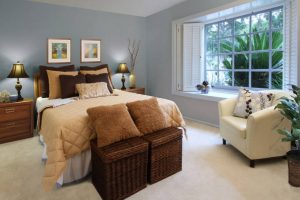
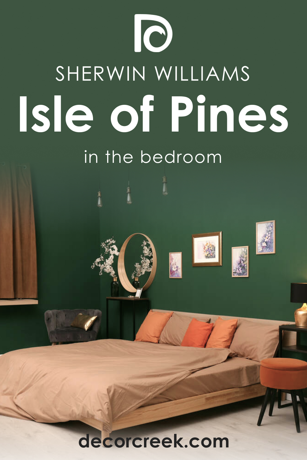
SW 6461 Isle of Pines in the Bedroom
The tranquil and soothing nature of SW Isle of Pines makes it an excellent choice for bedrooms. It can be used on an accent wall behind the headboard to create a focal point, or it can be used on all walls to create a cocooning effect. Complement it with soft, neutral furnishings, and use a crisp white like SW 7005 Pure White for the trim and ceiling to maintain a fresh, airy feel.
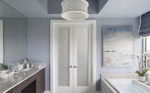
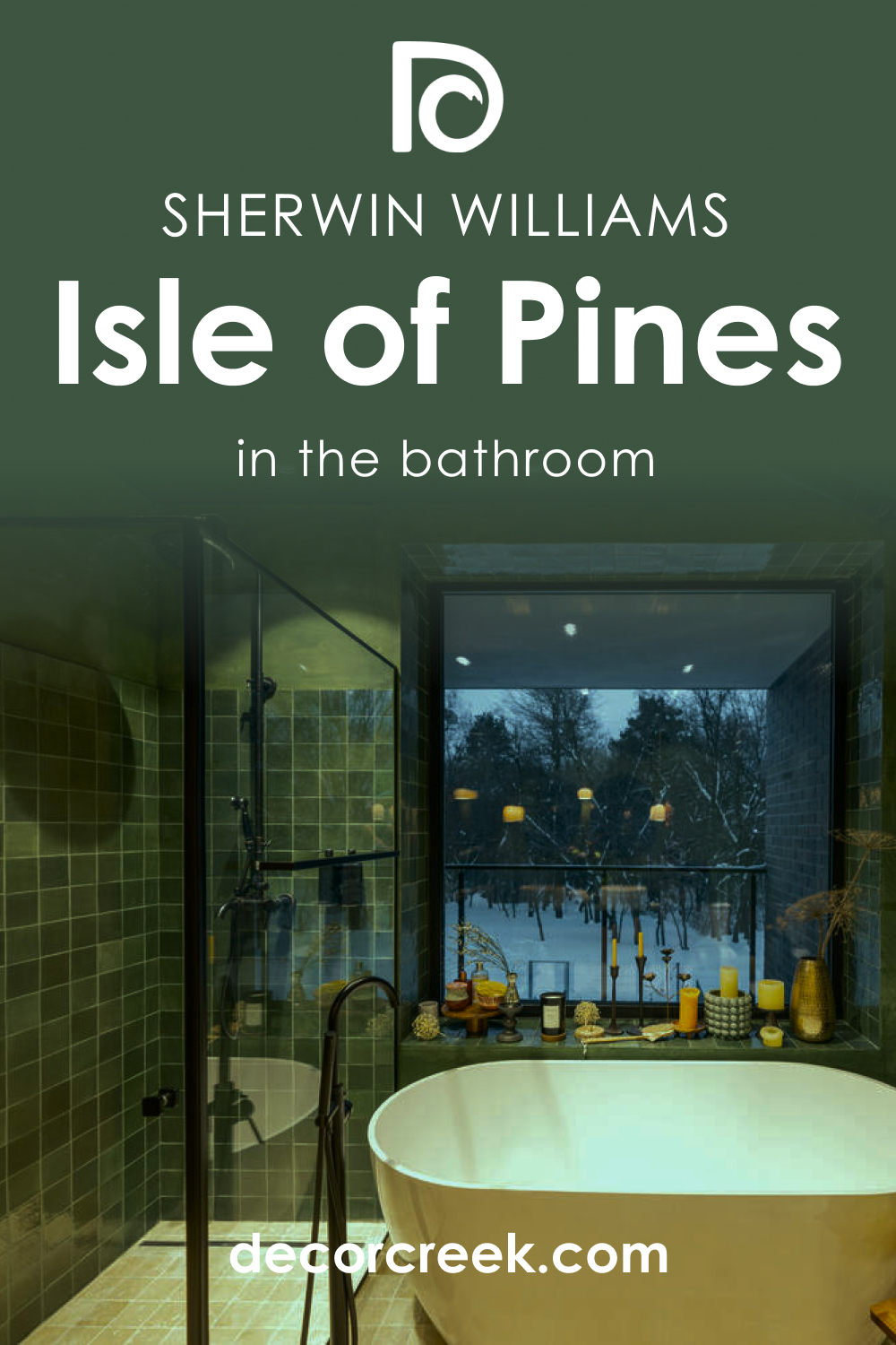
SW 6461 Isle of Pines in the Bathroom
For bathrooms, SW Isle of Pines can create a spa-like atmosphere. Consider pairing it with cool-toned tiles and fixtures, and use a softer white like SW 7008 Alabaster for the trim to create a serene, relaxing space.
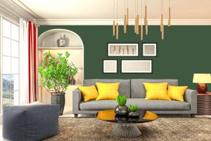
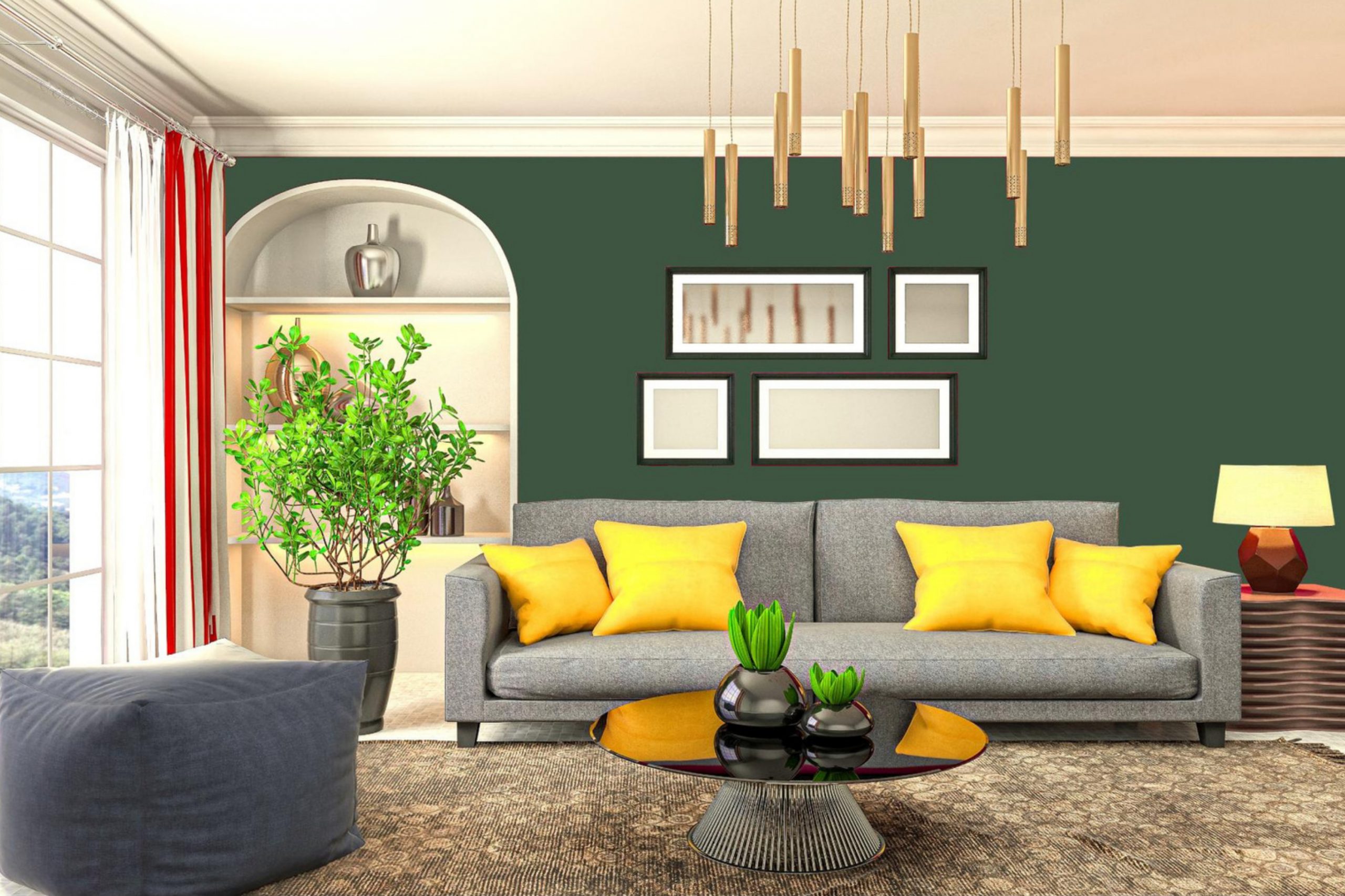
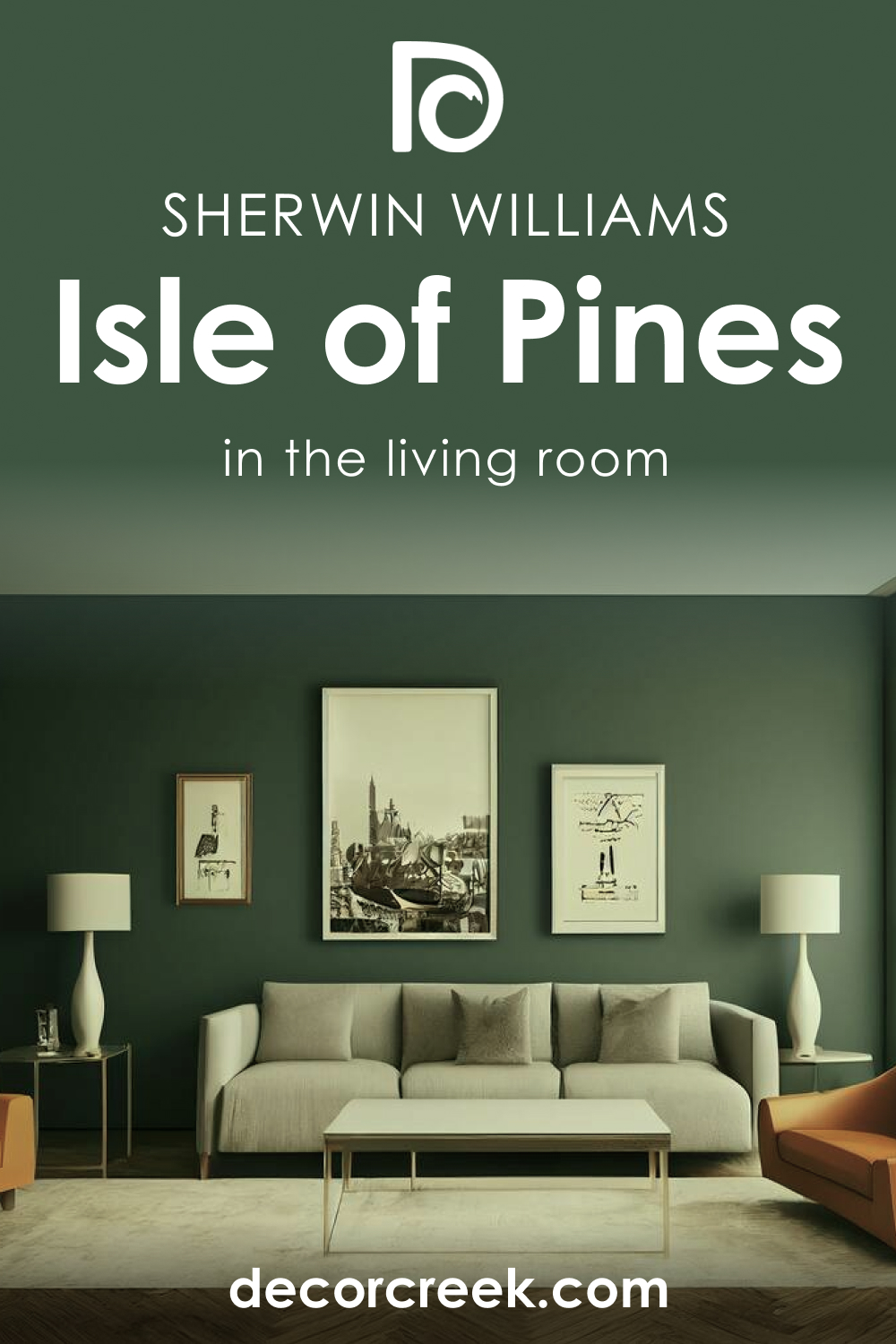
SW 6461 Isle of Pines in the Living Room
In living rooms, Isle of Pines can be used to create a vibrant, inviting atmosphere. Use it on a feature wall or to highlight architectural elements such as fireplaces or built-in shelves. Balance the color with neutral furnishings and accents in warm wood tones.
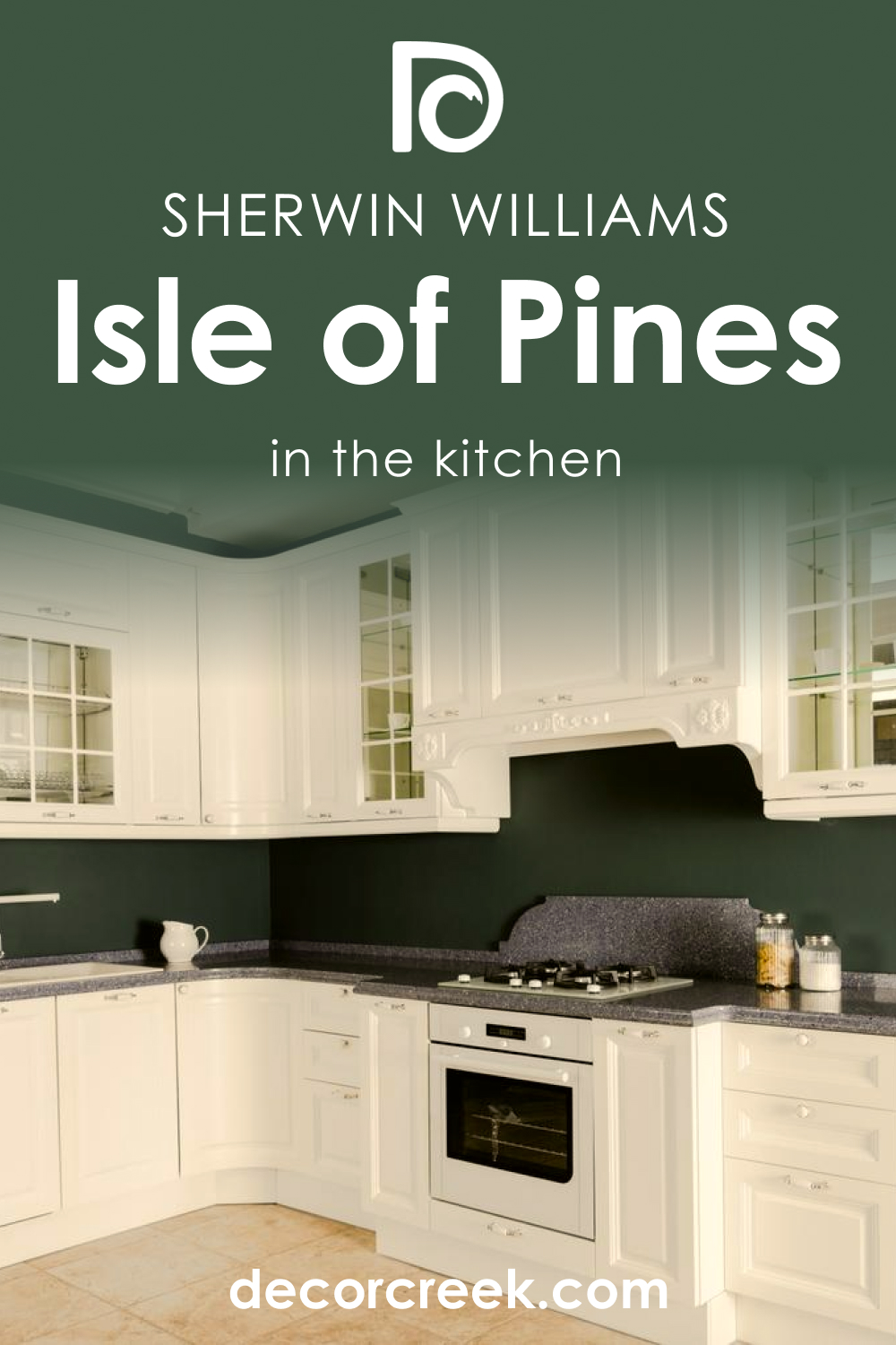
SW 6461 Isle of Pines in the Kitchen
SW Isle of Pines can bring a pop of color to a kitchen, whether it’s used on the walls, the cabinets, or as a backsplash. Pair it with crisp white countertops and a warm white like SW 7571 Casa Blanca for the walls and trim to create a fresh, lively space.
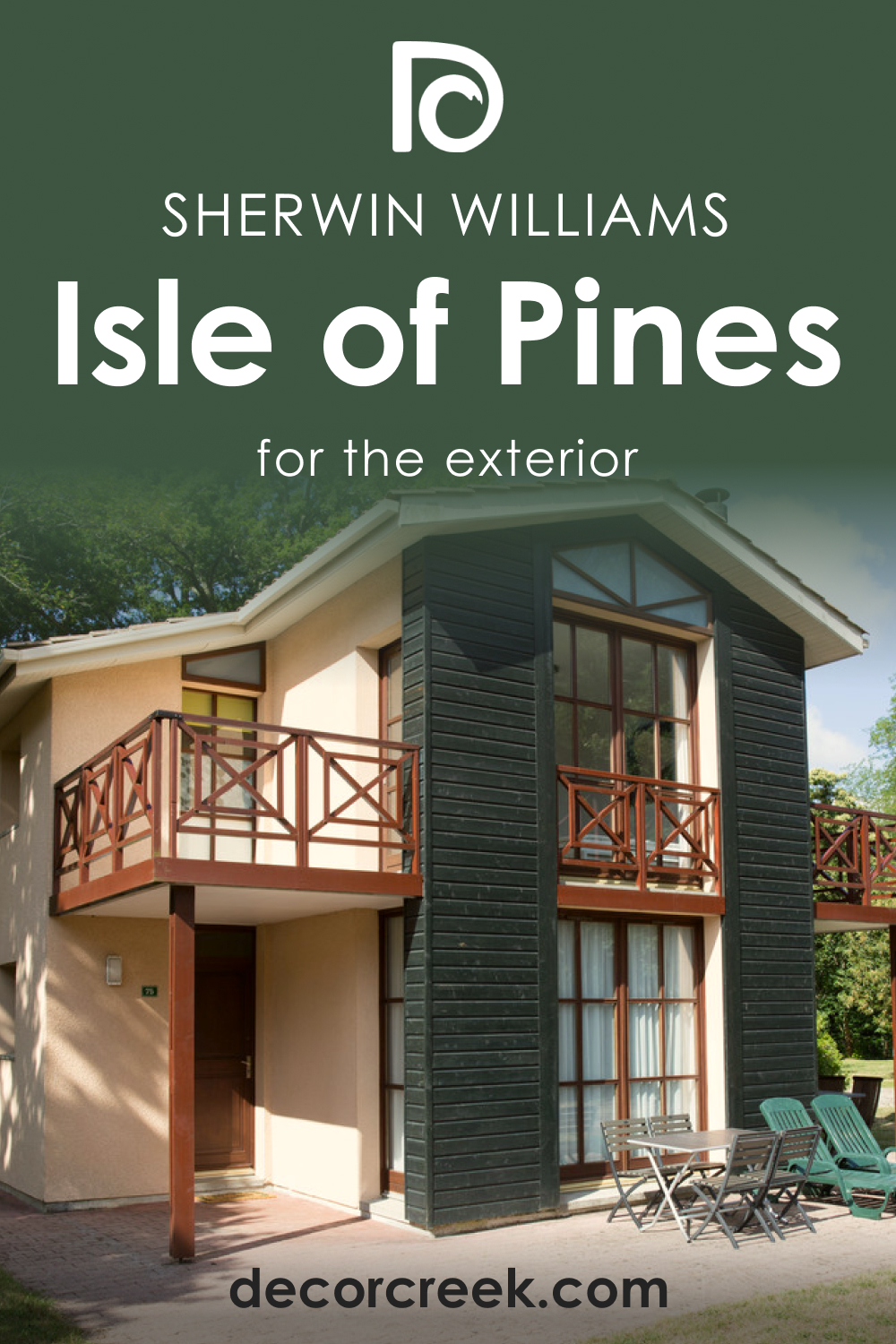
SW 6461 Isle of Pines for the Exterior
For exteriors, Isle of Pines can create a striking, unique look. It’s particularly well-suited to natural, woodsy settings, where it can blend harmoniously with the surrounding greenery. Use a crisp, bright white like SW 7005 Pure White for the trim to provide contrast and highlight the home’s architectural features.
Comparing SW 6461 Isle of Pines With Other Colors
Here you can see how the Isle of Pines color may work in different rooms of your home and what can help you to highlight its beauty.
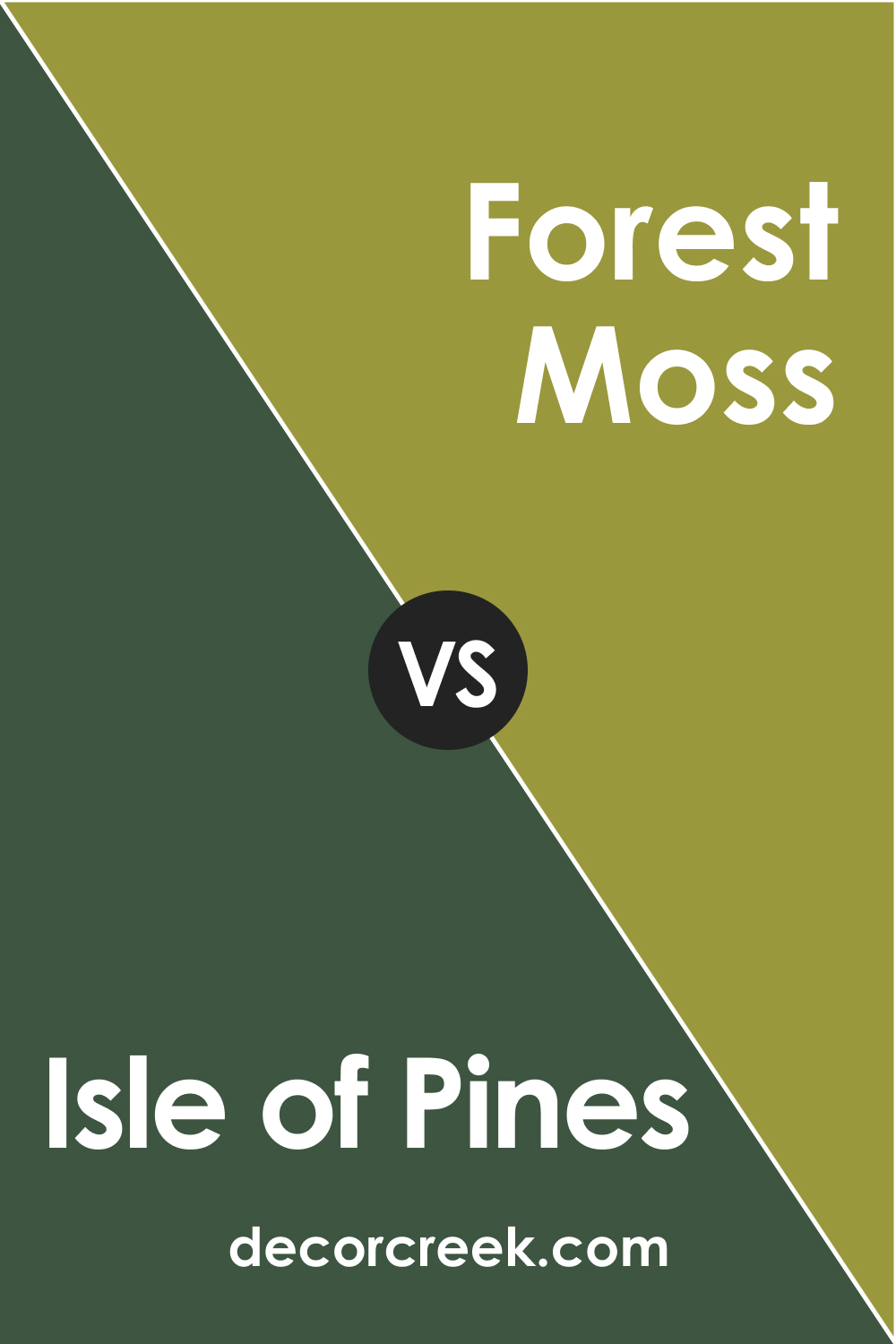
SW 6461 Isle of Pines vs Benjamin Moore’s Forest Moss (2146-20)
BM Forest Moss is a darker, more saturated green compared to Isle of Pines. It leans towards a traditional or rustic aesthetic, while SW Isle of Pines has a more versatile appeal. However, both colors carry a deep connection to nature and evoke a sense of tranquility and depth.
SW 6461 Isle of Pines vs Behr’s Botanical Garden (PPU11-21)
Botanical Garden is a slightly lighter and more yellow-toned green. While it still carries the vibrancy of nature, it has a sunnier, more energetic feel compared to the cooler, more tranquil Isle of Pines.

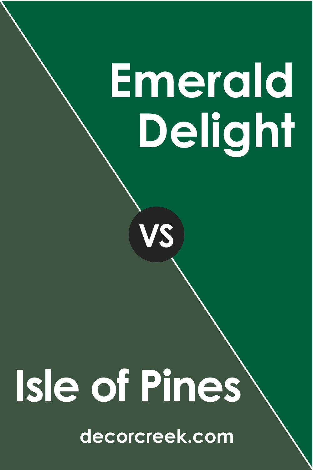
SW 6461 Isle of Pines vs Dulux’s Emerald Delight 1
Emerald Delight 1 is a more saturated and intense color, leaning more toward jewel tones. It’s a stronger, more statement-making color compared to the slightly more subdued Isle of Pines.
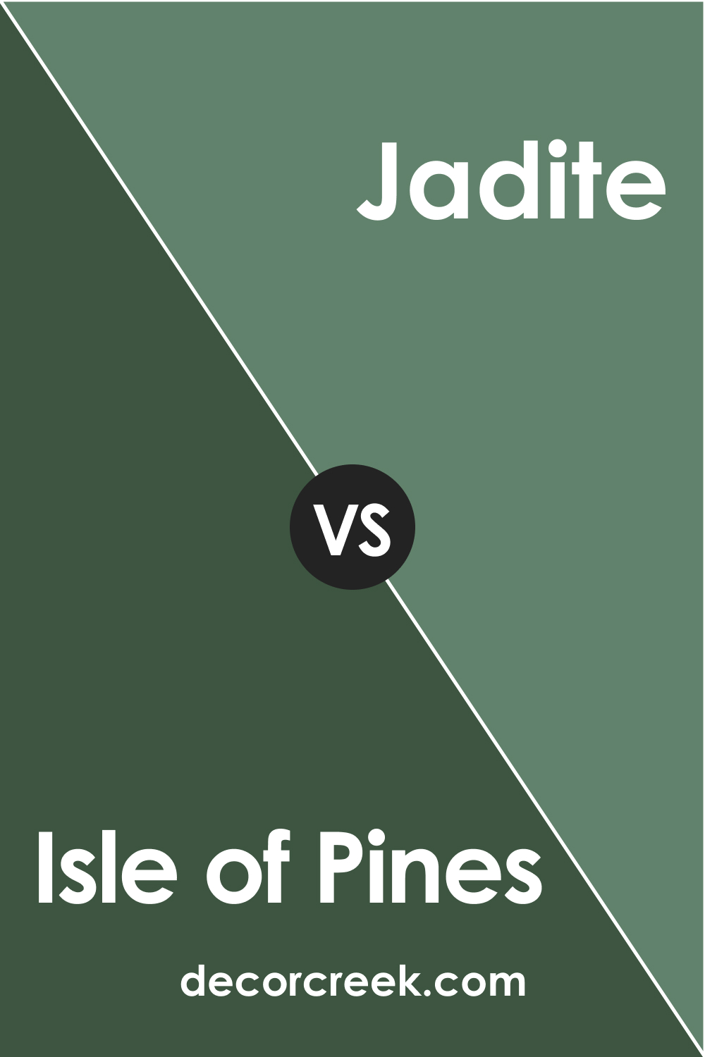
SW 6461 Isle of Pines vs Sherwin-Williams’ Jadite (SW6459)
SW Jadite is a lighter, softer green with similar cool undertones. It has a more casual, beachy vibe compared to the lush, rich feel of Isle of Pines.
Conclusion
SW 6461 Isle of Pines is a vibrant, rich green that can bring a touch of nature’s tranquility into your space. It’s a versatile color that works well in a variety of rooms and lighting situations and pairs well with a range of other colors. Whether you’re looking for a bold feature wall, a relaxing bedroom color, or a unique exterior color, Isle of Pines could be a perfect choice.
Ever wished paint sampling was as easy as sticking a sticker? Guess what? Now it is! Discover Samplize's unique Peel & Stick samples.
Get paint samples
Frequently Asked Questions
⭐What type of rooms is SW 6461 Isle of Pines best suited for?
SW Isle of Pines is a versatile color that works well in a variety of rooms. Its soothing, natural hue makes it great for bedrooms, living rooms, bathrooms, and even kitchens. The color also makes a striking choice for exteriors.
⭐What are the best colors to pair with SW 6461 Isle of Pines?
SW Isle of Pines pairs well with a range of colors, depending on the look you're going for. Light neutrals such as SW 7005 Pure White, SW 6144 Dapper Tan, and SW 6385 Dover White provide a balanced contrast. For a more vibrant look, consider pairing it with other greens like SW 6455 Fleeting Green or blues like SW 6212 Quietude.
⭐How does lighting affect the look of SW 6461 Isle of Pines?
Like all paint colors, Isle of Pines can look different depending on the lighting. In natural light, the color's richness and vibrancy become more pronounced. In artificial light, the color can take on a deeper, more muted tone. Warm lighting can bring out its subtle warmth, while cool lighting can enhance its tranquility.
⭐What are some similar colors to SW 6461 Isle of Pines?
Some similar colors within the Sherwin-Williams palette include SW 6459 Jadite, SW 6460 Greens, and SW 6721 Ionian. These colors share a similar depth and richness but have slight differences in their undertones.
⭐What does the Light Reflectance Value (LRV) of 8 mean for SW 6461 Isle of Pines?
The Light Reflectance Value (LRV) is a measure of how much light a color reflects. An LRV of 8 means that Isle of Pines is a relatively dark color. This can make spaces feel smaller or more intimate, but when balanced with lighter elements, it can add depth and richness to a space.