Choosing the right paint color for your room can be a big decision, and you naturally want it to be perfect. That’s why it’s crucial to consider all aspects of a color like SW 7604 Smoky Blue by Sherwin Williams before you decide. I’ve put in the research and want to share what I’ve learned with you to help make your choice a little easier.
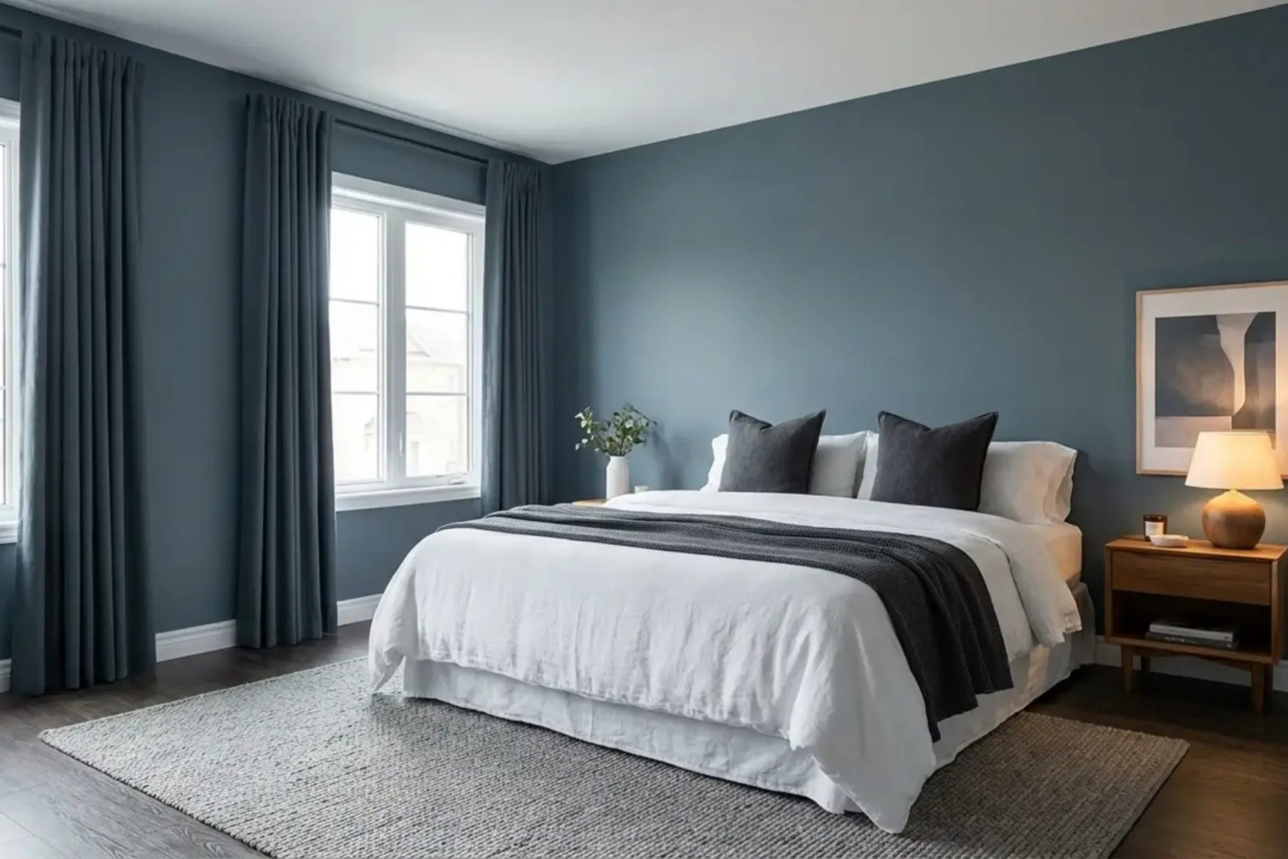
First, let’s talk about the character of Smoky Blue. Its unique blend of blue with a gray undertone gives it a flexible quality that works beautifully in various settings and lighting conditions. You’ll find that in rooms with plenty of natural light, Smoky Blue takes on a vibrant, lively tone, whereas in less lit areas, it adopts a more subtle and soothing presence.
Another aspect to consider is the type of finish that will complement your room. Whether you choose a matte, eggshell, or gloss finish can greatly impact the overall look. Each finish interacts differently with light and can shift the appearance of Smoky Blue.
Moreover, understanding the surrounding colors in your decor and how they interact with Smoky Blue is crucial. This color pairs well with crisp whites, soft creams, and even bold hues, depending on the ambiance you aim to create. Recognizing these interactions will assist you in making a choice that truly enhances your room.
Is Smoky Blue SW 7604 Right for My Home?
Smoky Blue is a subtle shade that reminds me of a dusky evening sky. It strikes a beautiful balance between blue and gray, making it adaptable yet distinctly impactful. This color has a soft and muted vibe, which makes it perfect for creating a cozy yet stylish atmosphere in a home.
I find that Smoky Blue works exceptionally well in a variety of interior styles. It is particularly striking in modern and contemporary rooms where its understated elegance really shines. However, it also brings a unique charm to rustic and shabby chic decor, providing a cool contrast to natural wood finishes and softer, textured fabrics.
In terms of materials, Smoky Blue pairs wonderfully with a wide range. It looks stunning with natural wood, from pine to oak, which can warm up its cool tones. Metallic finishes, like brushed nickel or aged copper, also complement this color beautifully, adding a touch of luxury without overpowering the room. For textures, I love seeing this color with linen or chunky wool textiles; they enhance its cozy feel and add depth to the room.
Overall, I find Smoky Blue to be a lovely choice for anyone looking to add a dash of stylish charm to their interiors without going too bold. It’s easy to work with and blends naturally with many design elements.
decorcreek.com
What are the right undertones of Smoky Blue SW 7604 ?
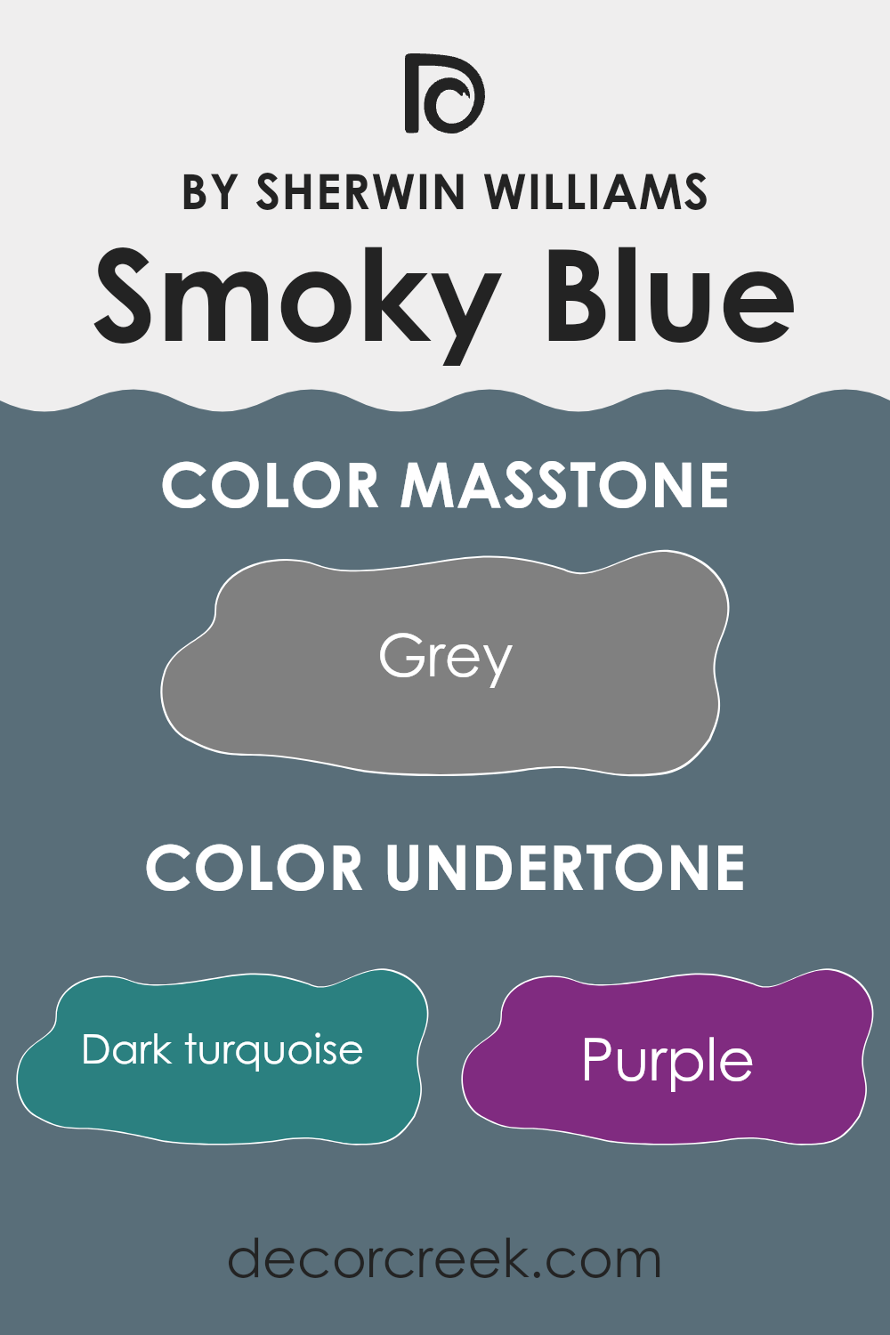
Smoky Blue SW 7604 by Sherwin Williams is a flexible paint color that can appear differently depending on its surroundings due to its complex undertones. Undertones are subtle colors that lie beneath the surface of what we initially perceive. They can significantly influence the overall hue and feeling a color imparts. For instance, undertones can either warm up or cool down a color, or even change its character under different lighting conditions.
Smoky Blue appears primarily as a soft, moody blue to the eye, but it has hidden depths composed of various undertones. These include shades like dark turquoise, purple, navy, and others such as olive and lilac. Each of these undertones can impact how Smoky Blue behaves on interior walls.
In a room with natural light, the blue and navy undertones might become more prominent, giving the walls a calm, collected feel. However, under artificial lighting, the purple or dark turquoise undertones might emerge, adding a touch of unexpected depth and moodiness to the room. The variety in undertones makes Smoky Blue a dynamic choice for interior walls, as it can shift and adapt to different decor styles and lighting conditions. This quality allows the color to fit well with a wide range of furnishings and accessories, making it an excellent choice for creating an inviting interior.
decorcreek.com
Best Coordinating Colors to use with Smoky Blue SW 7604 by Sherwin Williams this year.
Coordinating colors are shades that complement each other and create a harmonious look when used together in interior design or fashion. When using a primary color like Smoky Blue by Sherwin Williams, choosing the right coordinating colors can greatly enhance the overall aesthetic of a room. These selected shades ensure that each room feels balanced and visually appealing. Coordinating colors can vary dramatically, from contrasting hues that create a bold statement to subtle tones that offer a gentle blending effect.
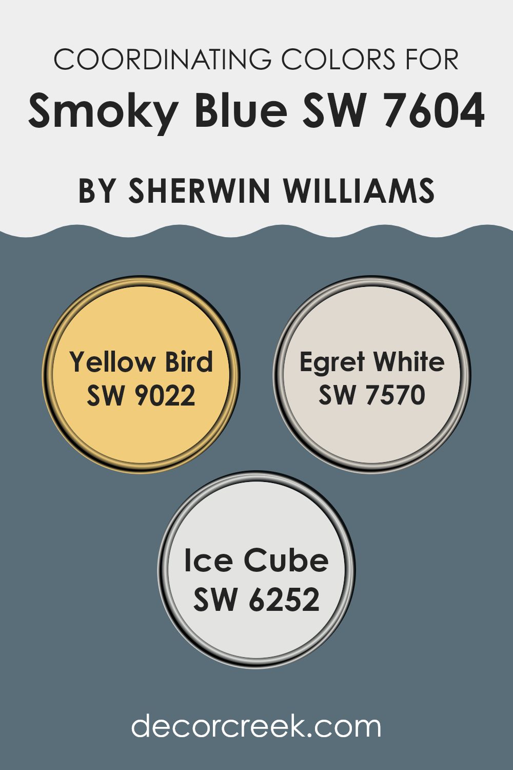
For Smoky Blue, a beautiful coordinating color is Yellow Bird SW 9022, which introduces a playful and bright energy to the calmness of Smoky Blue, perfect for adding a dash of cheer in rooms that require a bit more life and vibrancy.
Another coordinating color is Egret White SW 7570, a clean and neutral tone that can help to soften larger areas and provide a restful backdrop to the more pronounced shades of Smoky Blue. Finally, Ice Cube SW 6252 offers a light and airy blue that complements the deeper Smoky Blue, ideal for creating a sense of continuity and flow within a room, especially in a setting looking to maintain a cool color palette. These coordinating colors work together to provide a balanced visual experience that enhances the overall appeal of any room.
You can see recommended paint colors below:
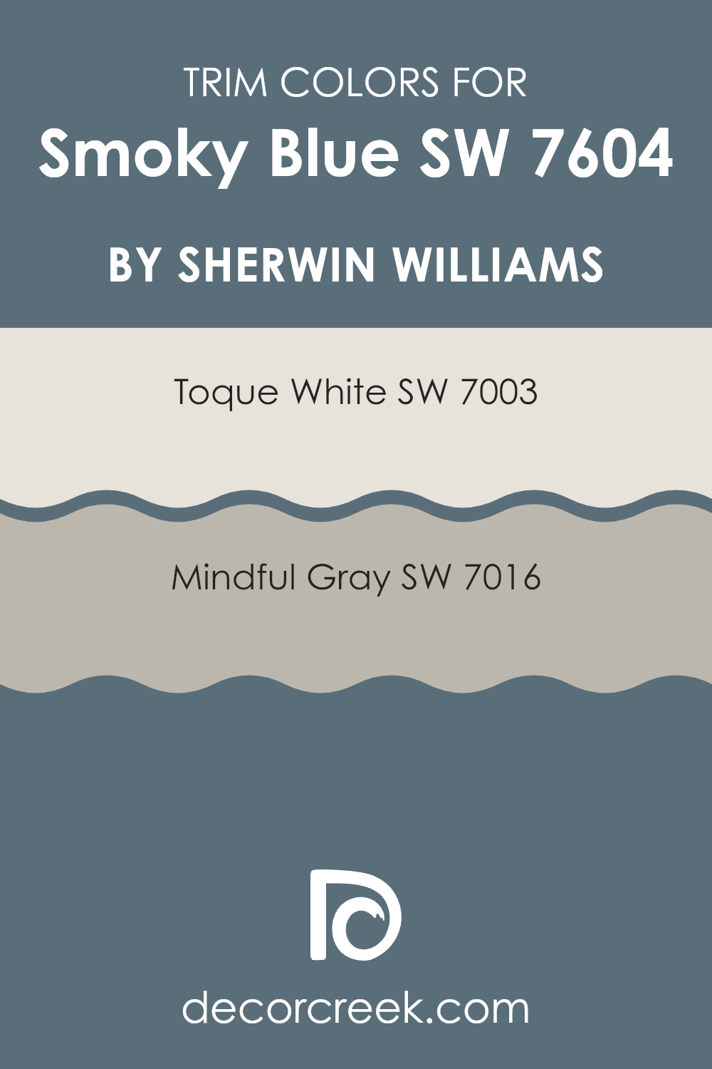
Trendy Trim Colors of Smoky Blue SW 7604 by Sherwin Williams to use this year.
Trim colors are essential for complementing a main paint color, like Smoky Blue by Sherwin Williams, by providing a contrasting or cohesive border that enhances architectural details and helps define the room. Using trim colors like Toque White and Mindful Gray can help highlight Smoky Blue’s unique tones, ensuring it stands out beautifully or blends smoothly within a room.
Toque White is a very light gray, almost white shade that works brilliantly to create a clean, crisp border that can make the rich tones of Smoky Blue stand out. On the other hand, Mindful Gray offers a softer, warmer gray option that harmonizes well with Smoky Blue, providing a more subtle transition from the walls to other elements in the room.
Both Toque White and Mindful Gray are flexible trim options that can adapt to various decor styles and preferences. Toque White acts as a bright, fresh frame that draws the eye and can make a room feel more open and airy. Mindful Gray, with its warmer undertones, pairs well with a broader spectrum of colors and provides a soothing, cohesive look without making the contrast too stark. These choices allow homeowners to either highlight specific features or create a seamless flow within their living rooms, depending on their individual taste and styling needs.
You can see recommended paint colors below:
- SW 7003 Toque White
- SW 7016 Mindful Gray
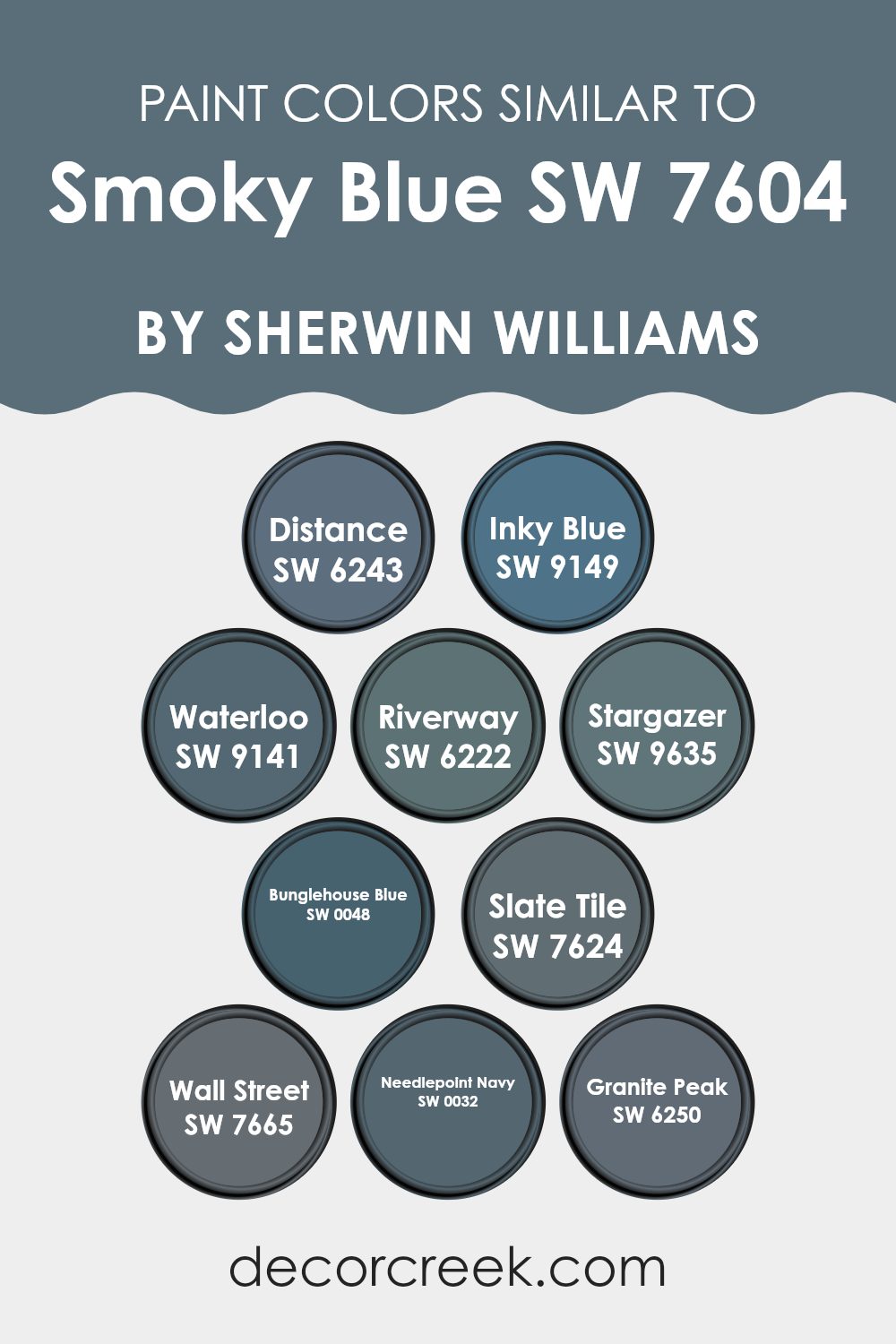
Evergreen Colors Similar to Smoky Blue SW 7604 by Sherwin Williams
Similar colors play a crucial role in creating a harmonious and cohesive look in any room. When colors like SW 6243 – Distance or SW 9149 – Inky Blue are used together, they create a smooth visual flow. These shades are variations of Smoky Blue, each adding its unique twist but maintaining a familial tie that makes blending them together visually pleasing. Using similar colors helps avoid abrupt transitions between shades, which can often make a room feel disjointed or cluttered.
For example, SW 9141 – Waterloo is a dusky, deep blue that gives a calm and grounded feeling, making it a great option for a relaxing room like a study or bedroom. On the other hand, SW 6222 – Riverway is a touch more vibrant, adding a lively but still reserved splash of color, perfect for bringing some life to a kitchen or bathroom without overpowering it.
Similarly, SW 9635 – Stargazer offers a slightly powdery blue that can brighten a room subtly. Then there are darker tones like SW 0048 – Bunglehouse Blue, which provide a bold, almost navy appeal, great for accent walls or furniture. SW 7624 – Slate Tile steps back toward a more neutral blue, providing flexibility in decorating without straying too far from the foundational palette.
Following this, SW 7665 – Wall Street is an elegant near-charcoal blue, ideal for creating a sense of grounding in a room. Another related tone is SW 0032 – Needlepoint Navy, which boasts a robust and traditional navy hue, excellent for both traditional and contemporary rooms. Lastly, SW 6250 – Granite Peak wraps up the array, offering a dark, stony blue that’s adaptable for various applications, from exterior areas to interior accents. Each of these colors, though distinct, shares a commonality with Smoky Blue, allowing them to work together naturally to achieve a visually appealing environment.
You can see recommended paint colors below:
- SW 6243 Distance
- SW 9149 Inky Blue
- SW 9141 Waterloo
- SW 6222 Riverway
- SW 9635 Stargazer
- SW 0048 Bunglehouse Blue
- SW 7624 Slate Tile
- SW 7665 Wall Street
- SW 0032 Needlepoint Navy
- SW 6250 Granite Peak
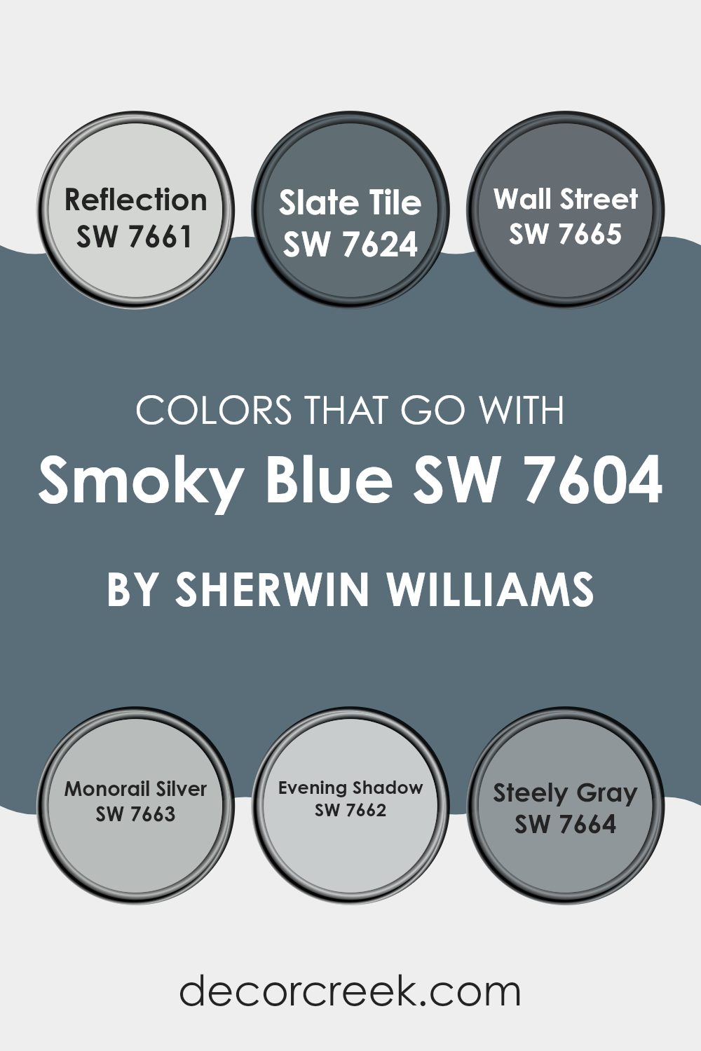
Colors that Go With Smoky Blue SW 7604 by Sherwin Williams
When decorating with Smoky Blue SW 7604 by Sherwin Williams, the choice of complementary colors is essential to creating a harmonious room. The right combination can balance the cool, deep tones of Smoky Blue, ensuring that rooms feel inviting and well-coordinated. These suggested matching colors work well because they share similar saturation and undertones that harmonize without clashing, enhancing the overall aesthetic of any room.
For instance, Reflection SW 7661 is a lighter, almost silvery gray that works beautifully as a contrast to the darker Smoky Blue, making rooms appear brighter and more open. Nearby on the color palette, Slate Tile SW 7624 offers a deeper gray that echoes the depth of Smoky Blue, providing a strong yet balanced visual impact, especially in areas demanding a bolder look.
Wall Street SW 7665 adds a touch of more formal, darker gray, ideal for creating a professional or dramatic vibe. Monorail Silver SW 7663, a mid-tone cool gray, offers a softer alternative perfect for complementing the boldness of Smoky Blue without overpowering it. Evening Shadow SW 7662, which is slightly lighter than Monorail Silver, introduces a subtle variation in shade that can help in breaking monotony in larger rooms. Lastly, Steely Gray SW 7664 stands out as a flexible neutral that pairs well with almost any color, including Smoky Blue, ensuring fluid transitions and cohesive styling across different rooms. By carefully selecting these colors, you can set up a visually appealing environment that feels coherent and thoughtfully designed.
You can see recommended paint colors below:
- SW 7661 Reflection
- SW 7624 Slate Tile
- SW 7665 Wall Street
- SW 7663 Monorail Silver
- SW 7662 Evening Shadow
- SW 7664 Steely Gray
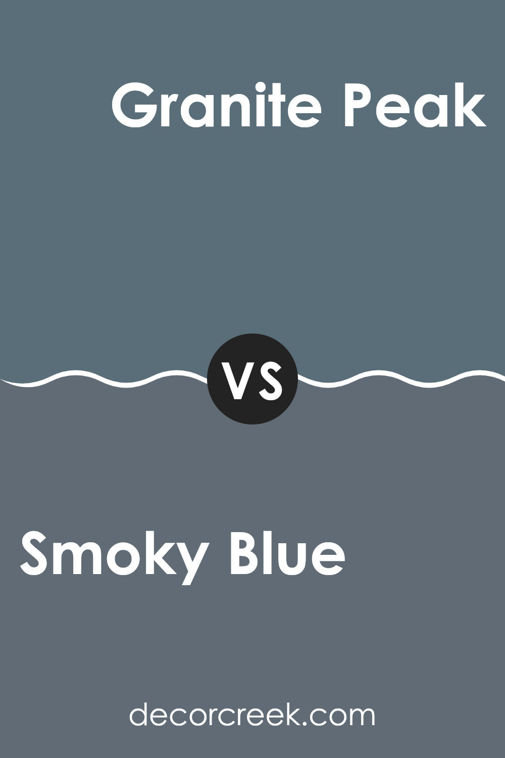
Smoky Blue SW 7604 by Sherwin Williams vs Granite Peak SW 6250 by Sherwin Williams
Smoky Blue and Granite Peak, both by Sherwin Williams, offer unique shades for different moods and settings. Smoky Blue is a soft, muted blue with a hint of gray, making it a gentle and soothing choice for rooms where you want a calm atmosphere.
It’s ideal for bedrooms or bathrooms where you need a peaceful vibe. On the other hand, Granite Peak is a much darker, steel blue that leans towards charcoal. This color adds a bold touch and is great for making a statement, whether on an accent wall or in a room like a home office or dining room.
While Smoky Blue reflects light and can make a room feel larger, Granite Peak absorbs light, creating a cozier and more enclosed feeling. Both colors work well in modern decor but serve very different purposes depending on the look and feel you want to achieve.
You can see recommended paint color below:
- SW 6250 Granite Peak
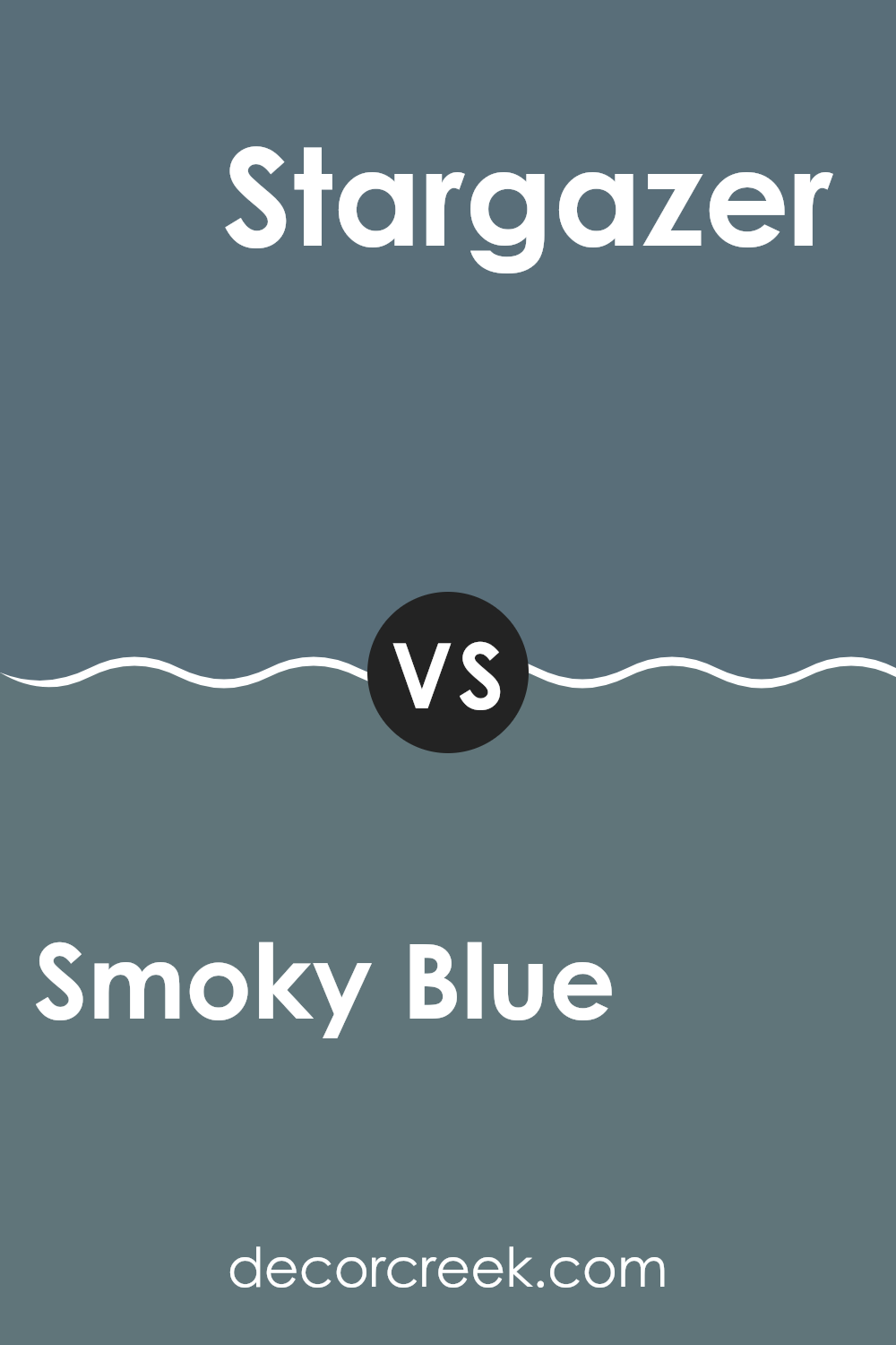
Smoky Blue SW 7604 by Sherwin Williams vs Stargazer SW 9635 by Sherwin Williams
Smoky Blue SW 7604 and Stargazer SW 9635, both by Sherwin Williams, offer distinct tones for different moods and settings. Smoky Blue is a deeper, muted shade of blue with gray undertones, making it a great choice for creating a settled and inviting atmosphere in a room. It works well in areas where calm and focus are desired, such as bedrooms or offices.
On the other hand, Stargazer stands out as a lighter, airy blue with a gentle and fresh vibe. It is ideal for rooms that you want to feel open and light, such as kitchens, bathrooms, or smaller rooms that could benefit from a sense of expanded room. This color reflects more light, adding a subtle brightness to any area.
Choosing between Smoky Blue and Stargazer depends on the effect you want to achieve. Smoky Blue suits more subdued, cozy decor, while Stargazer is perfect for creating a breezy, open feel.
You can see recommended paint color below:
- SW 9635 Stargazer
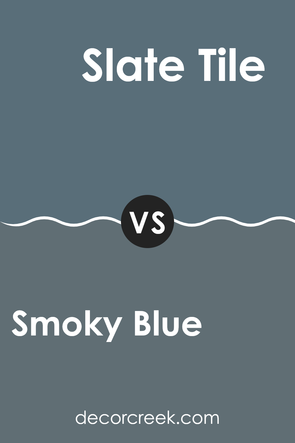
Smoky Blue SW 7604 by Sherwin Williams vs Slate Tile SW 7624 by Sherwin Williams
Smoky Blue and Slate Tile, both offered by Sherwin Williams, have distinct vibes. Smoky Blue has a lighter, airier feel to it, making it a great choice for creating a relaxed and welcoming room. Its gentle blue tone carries a hint of grey, offering a soft backdrop that’s easy to match with a variety of decor styles and colors.
On the other hand, Slate Tile steps in with a deeper, more pronounced shade. This color leans toward a darker blue-grey, making it a strong choice when you want to add some drama or a striking feature to a room.
This bolder hue can really make white trims or furniture stand out, giving a room a more anchored and defined appearance. Both colors work well in different settings depending on the mood you want to set, from calm and cozy with Smoky Blue to bold and impactful with Slate Tile.
You can see recommended paint color below:
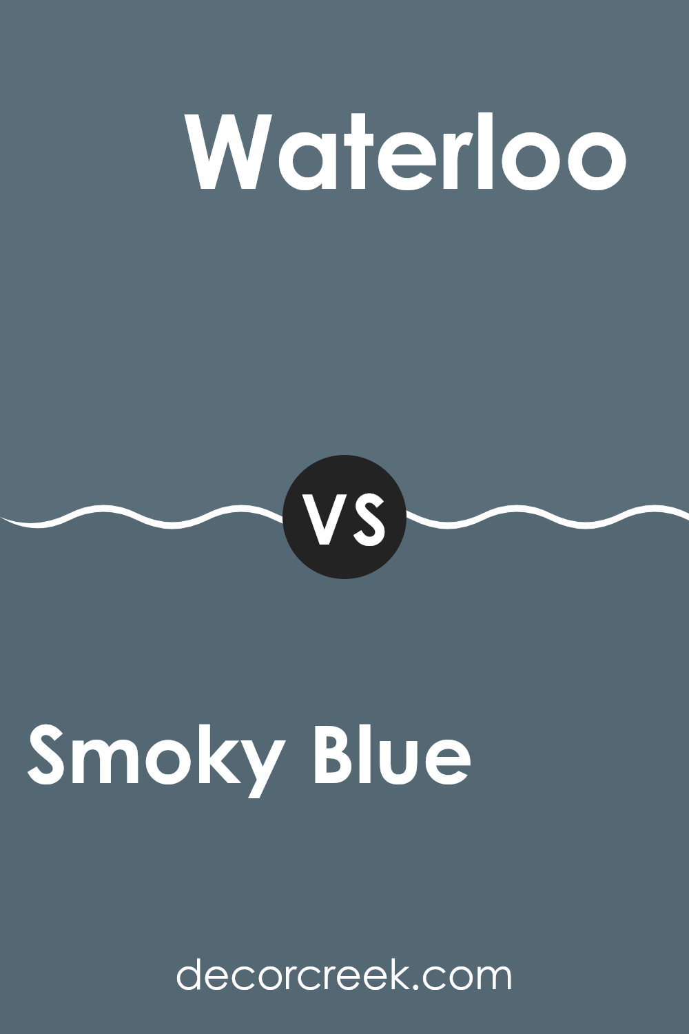
Smoky Blue SW 7604 by Sherwin Williams vs Waterloo SW 9141 by Sherwin Williams
Smoky Blue and Waterloo, both from Sherwin Williams, offer distinct shades that cater to different tastes and design needs. Smoky Blue has a gentle, muted appearance that adds a calm and cozy atmosphere to any room, perfect for creating a peaceful room. It’s not too bold, making it a smart pick for those who want a hue that’s easy on the eyes but still adds character.
In contrast, Waterloo presents a deeper, more intense color. This darker blue has a strong presence and can give a room a more defined personality. It’s ideal for those looking to make a statement or highlight a specific area with a touch of drama.
While Smoky Blue is subtle and more understated, Waterloo stands out with its bolder and richer tone. Choosing between them depends on whether you prefer a softer backdrop (Smoky Blue) or a striking feature wall (Waterloo).
You can see recommended paint color below:
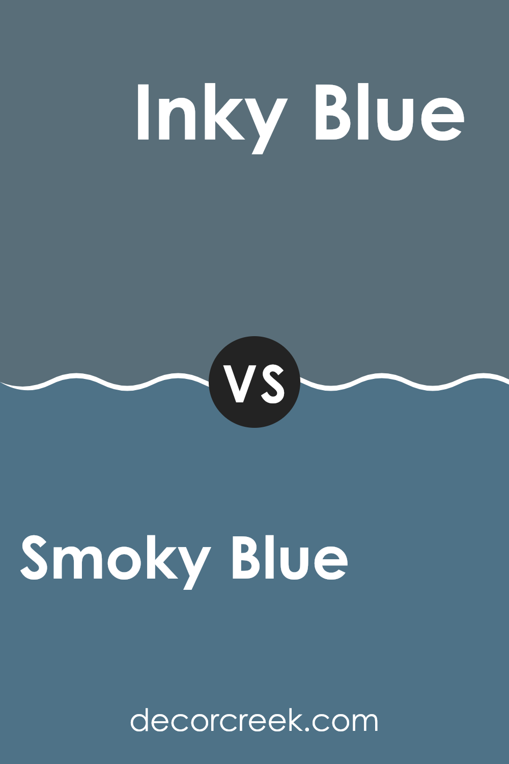
Smoky Blue SW 7604 by Sherwin Williams vs Inky Blue SW 9149 by Sherwin Williams
Smoky Blue and Inky Blue are both colors by Sherwin Williams but have distinct tones. Smoky Blue is a softer, more muted shade that has a grayish undertone. This makes it very adaptable for decorating as it can blend well with many other colors and is quite neutral. It’s a good choice for a calm and understated look in a room.
In contrast, Inky Blue is much darker and resembles the deep blue of the ocean at twilight. It’s a strong color that makes a bold statement when used in a room. With its deep blue hue, it can add depth and interest to a room, ideal for creating a focal point.
While both colors are blue, Smoky Blue offers a lighter, airier feel, perfect for creating a relaxed setting, whereas Inky Blue provides drama and intensity, suitable for a striking impact in a room. Each has its unique appeal, depending on the desired effect in interior decorating.
You can see recommended paint color below:
- SW 9149 Inky Blue
Smoky Blue SW 7604 by Sherwin Williams vs Needlepoint Navy SW 0032 by Sherwin Williams
Smoky Blue and Needlepoint Navy are both interesting colors from Sherwin Williams. Smoky Blue is a lighter, gentle grayish-blue that has a calming effect. It’s great for a peaceful vibe in places like bedrooms and living rooms.
On the other hand, Needlepoint Navy is a much darker, richer blue. This color feels more like a traditional navy with a strong presence, perfect for making statements in rooms like dining areas or on kitchen cabinets.
While both portray varying shades of blue, Smoky Blue comes off more subtle and muted, whereas Needlepoint Navy offers a bolder look that can anchor a room. Each has its uses depending on the mood you want to create and the room you’re decorating.
You can see recommended paint color below:
Smoky Blue SW 7604 by Sherwin Williams vs Bunglehouse Blue SW 0048 by Sherwin Williams
Smoky Blue and Bunglehouse Blue by Sherwin Williams are two distinct shades that offer unique vibes for different rooms. Smoky Blue is a soft, muted blue with a hint of gray that makes it very adaptable and easy on the eyes. This color works well in bedrooms or living areas where you want a calm and welcoming atmosphere.
On the other hand, Bunglehouse Blue is a deeper, richer blue with a more prominent presence. It leans slightly toward navy, making it a strong choice for statement walls or accent areas that you want to stand out. This shade is perfect for creating a bold look in rooms like home offices or dining rooms.
Both colors are flexible and can pair well with various decor styles, but their impact is quite different based on how dark and intense you want your room to feel. Whether you want a gentle backdrop or a striking focal point, these blues offer lovely options.
You can see recommended paint color below:
- SW 0048 Bunglehouse Blue
Smoky Blue SW 7604 by Sherwin Williams vs Riverway SW 6222 by Sherwin Williams
Smoky Blue and Riverway, both by Sherwin Williams, present unique shades, each setting a distinct mood. Smoky Blue is a subdued blue-gray that adds a calm, gentle feel to rooms, making it perfect for creating a peaceful environment without overpowering the area it adorns. It’s adaptable and works well in almost any room, enhancing the decor without demanding attention.
On the other hand, Riverway is a deeper, more vibrant shade. It draws more attention and is bolder compared to Smoky Blue. This color leans toward a teal blue, introducing a lively and dynamic vibe that can make a statement in a room. Riverway is ideal for adding a punch of color and personality, great for feature walls or furniture pieces.
In summary, while Smoky Blue is subtle and low-key, Riverway stands out more and brings energy to a room. Choosing between them depends on whether you want a backdrop that blends in or a focal point that stands out.
You can see recommended paint color below:
- SW 6222 Riverway
Smoky Blue SW 7604 by Sherwin Williams vs Distance SW 6243 by Sherwin Williams
Main Color – Smoky Blue is a subtle shade of blue-gray that offers a calming and neutral backdrop in any room. This color is gentle and soft on the eyes, making it a great choice for areas where you want to relax. It pairs nicely with both lighter shades for a peaceful look or can complement darker colors for a bit more depth.
Second Color – Distance is a deeper, more intense blue-gray compared to Smoky Blue. This color adds a stronger character to the room and can make a room feel more enclosed yet cozy. It’s especially effective in creating a focal point or accenting smaller areas without overpowering them.
Both colors bring their unique touch to interiors. While Smoky Blue keeps things light and airy, Distance adds a dash of drama without being too bold. Depending on the mood you’re aiming for, each color has its charm, either brightening a room or giving it a cozy, sheltered feel.
You can see recommended paint color below:
Smoky Blue SW 7604 by Sherwin Williams vs Wall Street SW 7665 by Sherwin Williams
Smoky Blue and Wall Street are two distinct colors offered by Sherwin Williams, each bringing its own unique vibe to a room. Smoky Blue is a gentle, soft blue with a grayish tint, making it calming and easy to match with different decor styles. It’s quite adaptable and emits a fresh yet understated feel, perfect for creating a relaxing atmosphere in rooms like bedrooms or living rooms.
On the other hand, Wall Street is a deeper, stronger gray that almost borders on charcoal. It gives off a more formal and bold look, suitable for modern and minimalist rooms. This color is excellent for adding drama or accentuating features in a room without overpowering the senses.
In essence, Smoky Blue works well for a light and airy feel, while Wall Street is ideal for making a strong and confident statement in a room. Both colors have their appeal, depending on what mood or style you are aiming for in your decorating project.
You can see recommended paint color below:
- SW 7665 Wall Street
Wrapping up my thoughts on SW 7604 Smoky Blue by Sherwin Williams, it’s clear that this paint color is a fantastic choice for anyone looking to add a touch of calm and beauty to their home. Smoky Blue has a unique ability to create a cozy and welcoming atmosphere in any room, making it perfect for places where you relax, like the living room or bedroom.
The color is like the sky on a cloudy day and can make your walls look stunning. It pairs well with many other colors, from bright whites to soft grays, and even bold colors like mustard or coral if you’re feeling adventurous. This makes it really easy to use no matter what your home looks like now or what kinds of furniture and decorations you have.
Whether you’re just freshening up a single room or wanting to give your whole house a new vibe, Smoky Blue provides just the right balance of warmth and coolness. It’s not just about making your room look good; it’s about creating a place where you feel good. That’s what makes SW 7604 Smoky Blue by Sherwin Williams a winner in my book. If you’re thinking about painting, definitely consider this beautiful blue; it might just be what your home needs.
decorcreek.com
Ever wished paint sampling was as easy as sticking a sticker? Guess what? Now it is! Discover Samplize's unique Peel & Stick samples.
Get paint samples

