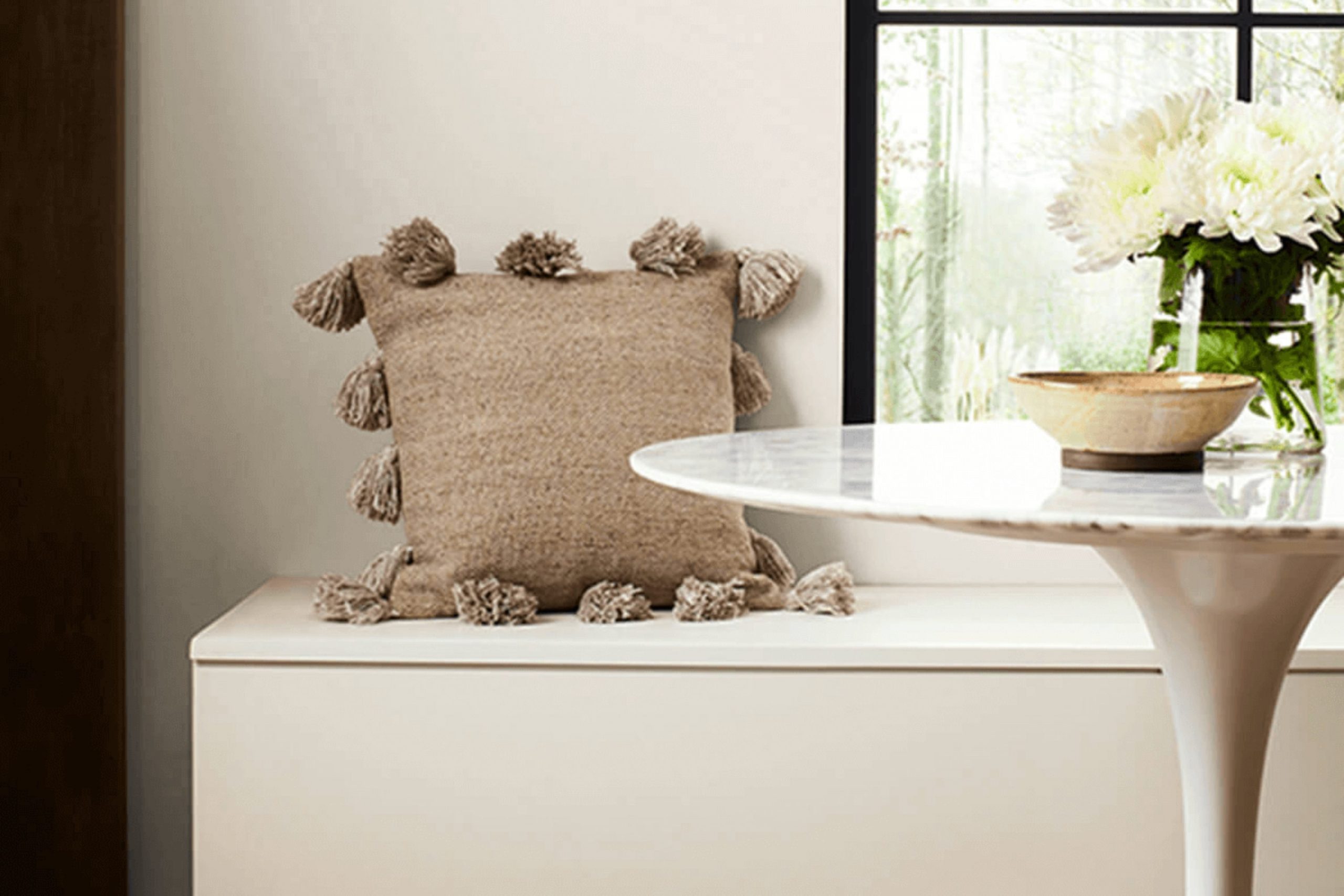
If you’re considering Sherwin Williams’ SW 7570 Egret White for a painting project, here are a few essential tips and details that might help you make an informed decision. When I selected this paint color for my studio, its subtle warmth provided a calming canvas, ideally suited for a variety of furnishings and decor styles. Egret White is not a stark white; instead, it carries a softness that can effectively brighten a room while maintaining a cozy ambiance.
Understanding how it behaves in different lighting conditions is crucial. Throughout the day, Egret White changes subtly. The color tends to feel warmer under natural light, perfect for creating a welcoming room. Under artificial lighting, it might appear slightly cooler, making it a flexible option for evening settings.
Before finalizing this shade for your walls, consider sampling it in the specific room you plan to update. Paint a large patch on the wall and observe it at various times of the day. This approach helped me see the true potential of Egret White in my own room.
By going through these steps, you can confidently determine if SW 7570 Egret White aligns with your aesthetic desires and practical needs for your next redecoration project.
Is Egret White SW 7570 Right for My Home?
I recently had the chance to use Egret White by Sherwin Williams in my home redesign and I must say, it’s a beautifully subtle shade of white that carries a slight warmth. This color is not stark or cold, making it incredibly flexible and a great choice for a cozy yet fresh look.
Egret White works wonders in various interior styles, from modern minimalism to rustic farmhouse. Its understated warmth makes it an excellent backdrop for styles that rely heavily on natural materials. In my living room, I paired it with rich wooden furnishings and soft, light linen curtains, which really made the room feel inviting.
This shade also pairs beautifully with smoother textures like ceramic, subtle metals like brushed nickel, and natural materials such as jute or wool. In my kitchen, I chose to mix Egret White walls with smooth marble countertops and terracotta floor tiles, which created a seamless blend of elegance and comfort.
From my experience, this color is particularly effective in rooms that get a fair amount of natural light, as the light plays wonderfully with its warm undertones. If you’re looking for a white that’s both easy to work with and guaranteed to enhance your room with a soft, clean look, I definitely recommend considering Egret White. In my home, it has proven to be a delightfully adaptable base that supports a wide range of decorative styles and colors.
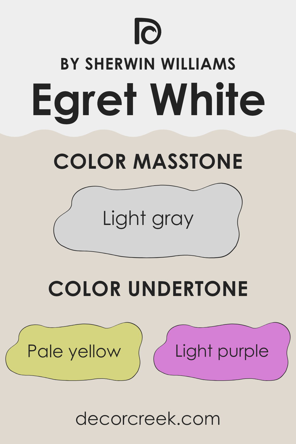
What are the right undertones of Egret White SW 7570 ?
Egret White by Sherwin Williams is a flexible paint color with a base that might appear simply white at first glance. But looking closer, it holds a mix of subtle undertones that influence its overall appearance in different lighting conditions. These undertones include pale yellow, light purple, light blue, pale pink, mint, lilac, and grey. Each undertone contributes to how the color presents itself and can alter the feeling of the room it’s used in.
In general, undertones can heavily affect our perception of color. For instance, a white paint with yellow undertones might give off a warmer feel, which is perfect for creating a cozy atmosphere in a room. On the other hand, blue undertones might make a room feel cooler, which can be useful for a more refreshing vibe.
When Egret White is applied to interior walls, its complex undertones play with the light, shifting subtly throughout the day. The grey undertone helps to stabilize and soften the brightness of the white, making it less stark and more welcoming. In sunlight, the pale yellow or light blue might become more noticeable, adding a gentle hint of color that enhances the room without taking over.
On cloudy days, the lilac or mint undertones might peek through, adding a soft, gentle splash of color to the walls. This nuanced interplay of undertones makes Egret White a good choice for those wanting a bit more complexity than plain white, as it works well with different styles and decor, providing a light, clean backdrop with a hint of depth.
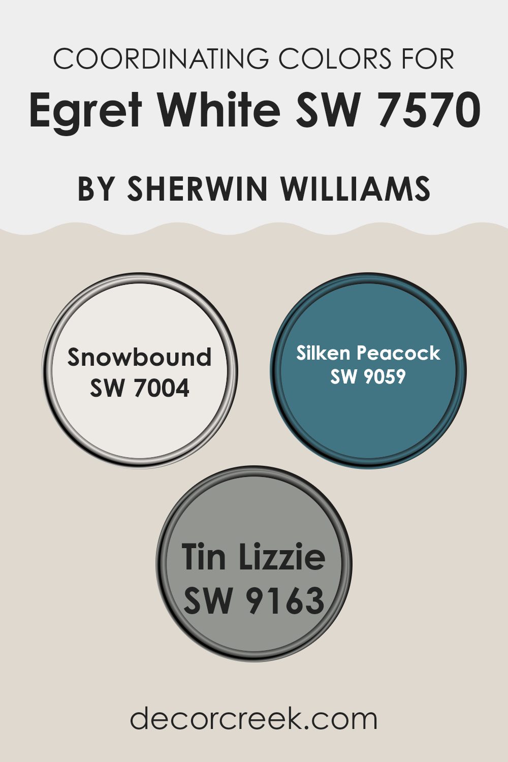
Best Coordinating Colors to use with Egret White SW 7570 by Sherwin Williams this year.
Coordinating colors are those that complement each other and create a harmonious look when used together in interior design. This concept is often utilized to enhance the aesthetic appeal of a room, making it feel more put together and visually appealing. One such primary color that can be paired with coordinating hues is Egret White by Sherwin Williams. This shade of white can act as a perfect backdrop for bolder or more subtle colors, depending on the desired effect.
Snowbound (SW 7004) is a clean and bright off-white with a touch of grey that works wonderfully with Egret White. It provides a subtle contrast that is neither too stark nor overpowering, making it ideal for creating a light and airy feeling in a room. Silken Peacock (SW 9059) offers a bold, deep teal, adding a dramatic flair and a splash of color.
This can be used for accent walls or decor items to energize the room. Lastly, Tin Lizzie (SW 9163) is a soft grey that adds a calm and neutral tone. It works especially well in rooms seeking a muted yet inviting atmosphere, pairing nicely with both Snowbound and Egret White to create a modern, cohesive look.
You can see recommended paint colors below:
- SW 7004 Snowbound
- SW 9059 Silken Peacock
- SW 9163 Tin Lizzie
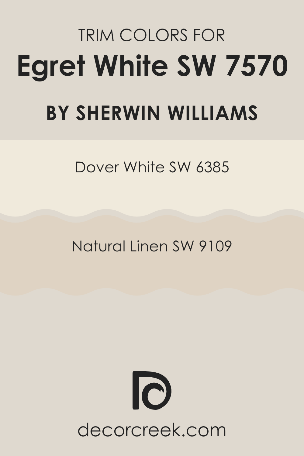
Trendy Trim Colors of Egret White SW 7570 by Sherwin Williams to use this year.
Trim colors are essential in interior design as they help to frame and define the rooms within a home, making architectural details pop and providing a refined finish to the interiors. When paired with a soft and neutral shade like Egret White (SW 7570) by Sherwin-Williams, choosing the right trim color can enhance the overall aesthetics without feeling too strong against the primary hue.
For instance, Dover White (SW 6385) and Natural Linen (SW 9109) are both excellent choices for trims when using Egret White, as they add a subtle contrast that highlights the walls effectively while maintaining the room’s airy feel.
Dover White (SW 6385) is a warm, creamy white that gives a soft edge to door frames, window trims, and baseboards, creating a seamless but noticeable transition against the lighter background of Egret White. Natural Linen (SW 9109), on the other hand, is a warmer, beige color that offers a slightly bolder frame, enriching the natural undertones of Egret White and ensuring the walls stand out clearly. These choices are important for giving any room a complete, polished look, emphasizing the beauty of its design elements.
You can see recommended paint colors below:
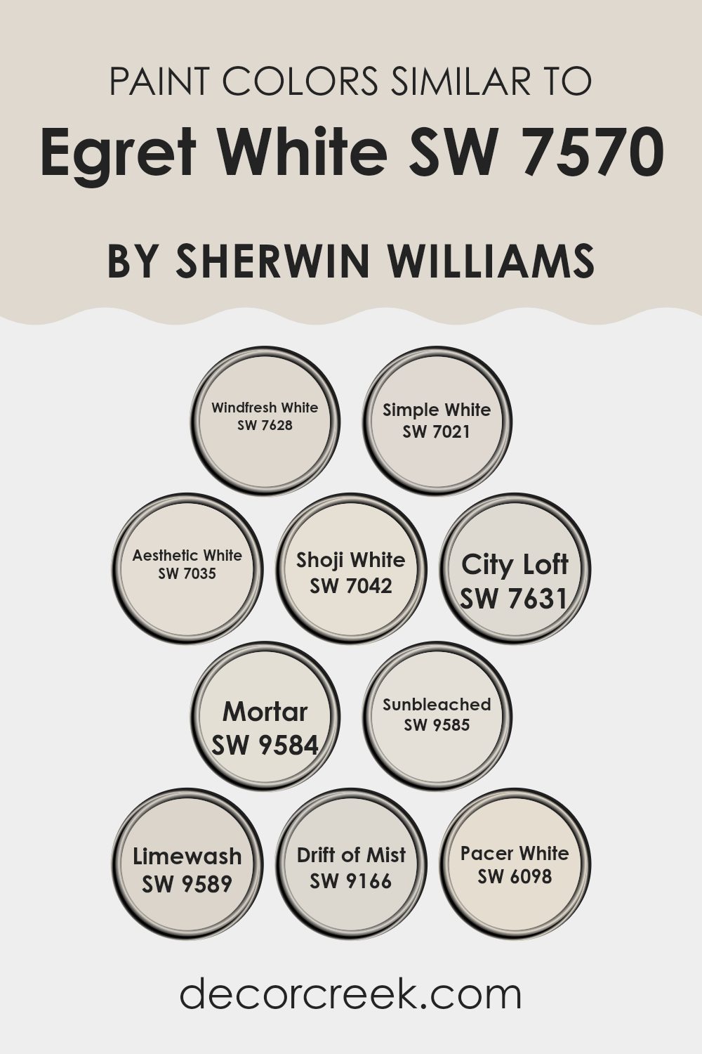
Evergreen Colors Similar to Egret White SW 7570 by Sherwin Williams
Using similar colors in your home can create a soothing and cohesive environment, promoting a sense of continuity and calm. Colors that are akin to each other, like the shades often used with Egret White, blend seamlessly, allowing rooms to flow together harmoniously. This technique is particularly useful in open layouts or homes with an open floor plan, where different living areas are visible from one another. The subtle variations in similar hues can be used to define different zones while maintaining a unified look overall.
For instance, Windfresh White has a cool, airy feel which brings a lightness to any room, while Simple White offers a touch of warmth, suitable for areas meant to be cozy and welcoming. Aesthetic White steps in as a soft backdrop, offering a muted canvas that pairs well with brighter colors or acts as a standalone neutral.
Shoji White brings a slightly more pronounced tone that still holds onto that refreshing simplicity. Moving along the palette, City Loft has an urban touch with its slightly grayer hue, making it ideal for modern rooms. Mortar contrasts subtly as a solid, grounding color that doesn’t take over visually. Sunbleached offers a hint of creaminess, perfect for creating a gentle, inviting feel.
Limewash, with its whisper of soft grey, is perfect for those looking for a touch of refined elegance without straying too far from the white spectrum. Drift of Mist is airy and light, providing a feather-light touch of color, while Pacer White rounds off the list with its slightly more pronounced presence, giving a clean but distinct finish. Each of these colors holds its own character but shares a common lineage that ties them back to a clean and coherent aesthetic.
You can see recommended paint colors below:
- SW 7628 Windfresh White
- SW 7021 Simple White
- SW 7035 Aesthetic White
- SW 7042 Shoji White
- SW 7631 City Loft
- SW 9584 Mortar
- SW 9585 Sunbleached
- SW 9589 Limewash
- SW 9166 Drift of Mist
- SW 6098 Pacer White
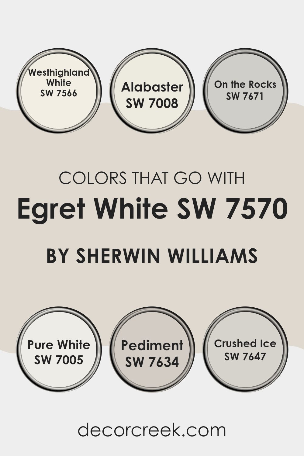
Colors that Go With Egret White SW 7570 by Sherwin Williams
Choosing complementing colors for Egret White SW 7570 by Sherwin Williams is important for achieving a harmonious and appealing interior. These colors set a gentle and welcoming tone across various rooms, enhancing the primary shade without overpowering it. For instance, Westhighland White SW 7566 is a warm and inviting shade, slightly creamier than Egret White, which helps create a cozy atmosphere. Then, Alabaster SW 7008 offers a slightly off-white tone that brings a subtle contrast, adding depth and interest to rooms that primarily use Egret White.
On the other hand, On the Rocks SW 7671 is a cool gray that provides a crisp, clean look when combined with Egret White, perfect for modern rooms that favor a minimalistic approach. Pure White SW 7005 is the ultimate neutral, brighter and more straightforward, which helps brighten areas and make them appear larger.
Pediment SW 7634 presents a more earthy, natural gray, offering a gentle contrast and a touch of complexity to the simple beauty of Egret White. Lastly, Crushed Ice SW 7647 is another light gray but with slightly warmer undertones, ensuring rooms feel inviting yet current when paired with Egret White. Together, these colors provide flexible and visually pleasing options for any home or interior, making decorating a more enjoyable and stress-free process.
You can see recommended paint colors below:
- SW 7566 Westhighland White
- SW 7008 Alabaster
- SW 7671 On the Rocks
- SW 7005 Pure White
- SW 7634 Pediment
- SW 7647 Crushed Ice
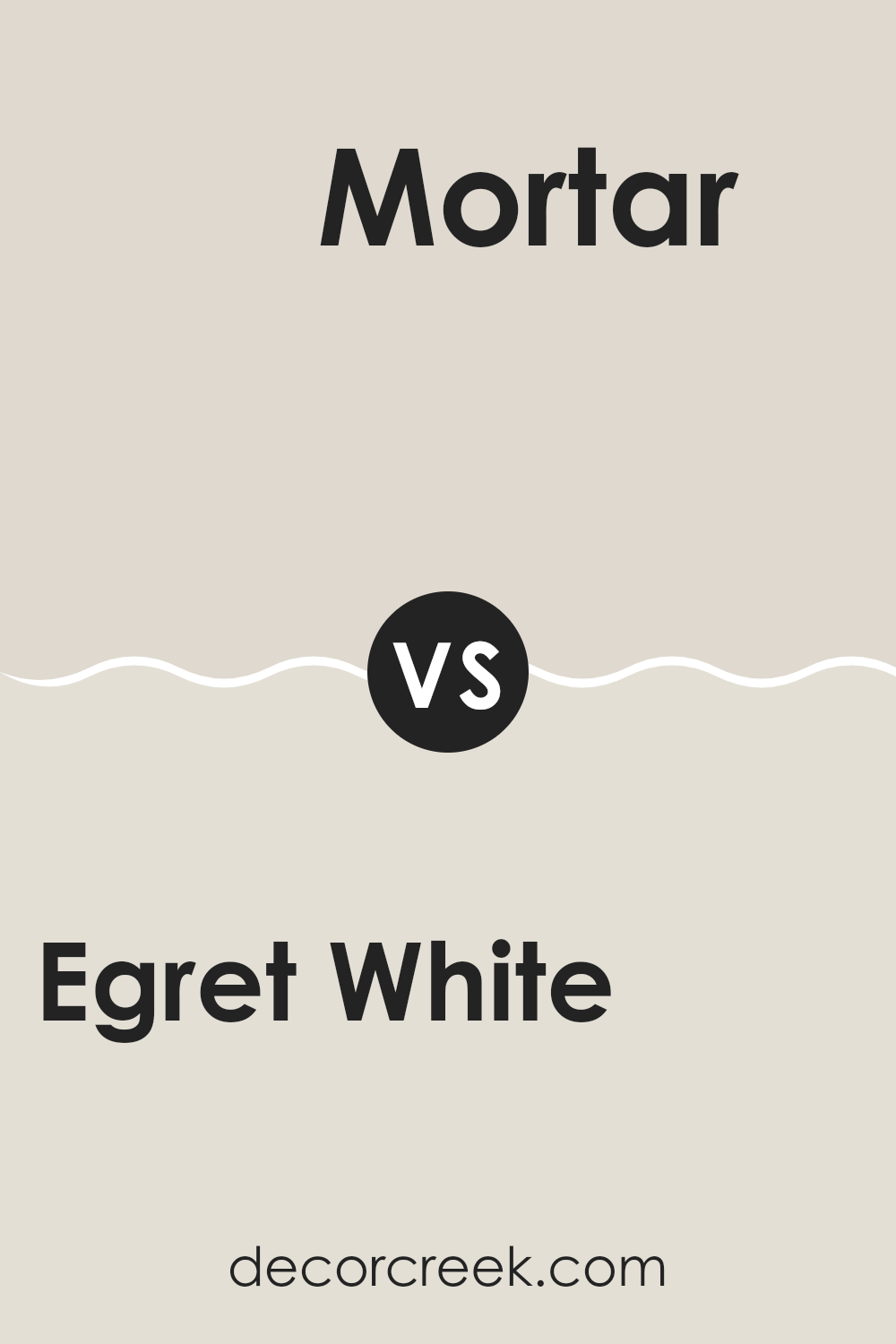
Egret White SW 7570 by Sherwin Williams vs Mortar SW 9584 by Sherwin Williams
Egret White by Sherwin Williams is a light and airy color with a creamy base that can brighten up any room. It has a subtle warmth to it, making it perfect for rooms where you want a cozy yet fresh feel. On the other hand, Mortar by Sherwin Williams is a much darker shade.
This color has a deep, rich tone, resembling the color of wet cement. It’s great for adding drama or accentuating architectural details in a room. While Egret White provides a gentle backdrop that can make a room feel larger and more open, Mortar is ideal for creating a bold statement or a cozy corner.
Together, these colors could work well if you want to balance light and shadow in your decor, using Egret White on most walls with Mortar as an accent.
You can see recommended paint color below:
Egret White SW 7570 by Sherwin Williams vs Pacer White SW 6098 by Sherwin Williams
Egret White and Pacer White are both colors from Sherwin Williams that lend a calm and clean feel to any room. Egret White leans into a very light gray tone, providing an almost ethereal vibe, perfect for making small rooms appear bigger and brighter.
In contrast, Pacer White has a warmer undertone, subtly nudging it toward beige. This warmth makes it excellent for rooms where a cozy, inviting feel is desired. Both colors offer flexibility and can complement various decor styles, whether modern or traditional.
Choosing between them typically comes down to the desired mood and lighting of the room. Egret White shines in well-lit, airy rooms, while Pacer White is ideal for areas with softer, more muted lighting.
You can see recommended paint color below:
Egret White SW 7570 by Sherwin Williams vs Drift of Mist SW 9166 by Sherwin Williams
Egret White and Drift of Mist by Sherwin Williams are two neutral paint colors, but they have some key differences. Egret White is a warm shade with a creamy base that gives a soft, welcoming vibe to any room. It’s excellent for rooms where you want a cozy and inviting atmosphere.
On the other hand, Drift of Mist is a cooler tone, leaning more toward a light gray. This color is perfect for modern rooms as it provides a clean, fresh look that pairs well with various decor styles. It’s a flexible choice for those who prefer a more subtle backdrop.
Both colors are light enough to make small rooms appear larger and can brighten up darker areas. They work well in different settings, whether traditional or contemporary, but the choice between the two often comes down to personal preference for a warmer or cooler undertone.
You can see recommended paint color below:
Egret White SW 7570 by Sherwin Williams vs Simple White SW 7021 by Sherwin Williams
Egret White and Simple White are two shades from Sherwin Williams, each offering a unique take on white. Egret White has a warm undertone that gives it a soft, creamy appearance. It’s ideal for rooms where you want a cozy, welcoming feel. This color works well in living rooms or bedrooms, adding a subtle hint of warmth to the decor.
On the other hand, Simple White is cooler with a slightly more neutral base. This makes it a great choice for a modern look or for areas that get a lot of sunlight, as it helps balance the brightness without making the room feel cold. Simple White suits utilitarian rooms like kitchens and bathrooms well, where a clean, crisp appearance is often desired.
Both colors are flexible, but your choice might depend on the mood you’re trying to achieve and the natural light in your room.
You can see recommended paint color below:
Egret White SW 7570 by Sherwin Williams vs Windfresh White SW 7628 by Sherwin Williams
Egret White and Windfresh White are two paint colors by Sherwin Williams that both offer a fresh, clean look but with subtle differences. Egret White has a warmer tone, which gives it a cozy and welcoming feel. It leans more toward a creamy off-white rather than a pure white, making it great for rooms where you want a soft and subtle ambiance.
On the other hand, Windfresh White is cooler and closer to a true white. This color reflects more light, making it ideal for rooms that you want to feel brighter and more open. Its neutral tone works well in modern settings or when you want other colors in the room to stand out.
Both colors are flexible and can be used in many settings, from living rooms to bedrooms, but the choice between them depends on the atmosphere you want to create. Egret White is best for a warm, inviting room, while Windfresh White suits a crisp, clean look.
You can see recommended paint color below:
Egret White SW 7570 by Sherwin Williams vs Sunbleached SW 9585 by Sherwin Williams
Egret White and Sunbleached are two paint colors by Sherwin Williams that have their unique shades and vibes. Egret White is a soft, warm white with a hint of beige, making it very flexible and easy to use in any room to create a cozy, welcoming feel. It’s especially good in rooms that need a gentle touch of warmth without feeling too intense.
On the other hand, Sunbleached is a much lighter color that leans more toward gray with a very muted, almost pastel-like quality. This color is ideal for rooms that get a lot of sunlight, as it reflects light beautifully, making rooms appear brighter and more open.
While Egret White adds a subtle warmth, Sunbleached offers a cool, light feel. These differences make each color suitable for specific moods and settings. Choosing between them would depend on the kind of atmosphere you want to create in your room.
You can see recommended paint color below:
Egret White SW 7570 by Sherwin Williams vs Limewash SW 9589 by Sherwin Williams
Egret White and Limewash by Sherwin Williams are two distinct shades that can significantly impact the feel of a room. Egret White is a soft, warm white with a slight creamy tone, making it feel cozy and inviting.
It’s excellent for brightening up rooms without feeling sterile, as its warmth adds a subtle, comforting vibe to any area. On the other hand, Limewash is a much cooler tone with gray influences. It resembles the look of traditional lime washes, providing a clean and modern feel that pairs well with minimalist or contemporary decor.
While both colors are neutral, they each set a different mood due to their underlying tones. Egret White leans toward a soothing warmth, ideal for living rooms or bedrooms, whereas Limewash offers a sharp, fresh look, better suited for modern kitchens and bathrooms.
You can see recommended paint color below:
Egret White SW 7570 by Sherwin Williams vs Aesthetic White SW 7035 by Sherwin Williams
The two colors Egret White and Aesthetic White by Sherwin Williams are quite similar but have subtle differences that affect how they can be used in decorating. Egret White has a warm undertone, which gives off a cozy and inviting feel. This makes it perfect for living rooms or bedrooms where you want a comforting environment. It is a bit lighter, reflecting more light and making rooms appear slightly more open and airy.
On the other hand, Aesthetic White is a little more neutral, with a hint of gray that cools its tone slightly compared to Egret White. This quality makes Aesthetic White flexible and effective for rooms where you don’t want color to dominate but prefer a clean, subtle backdrop. It works very well in modern settings or places that aim for a minimalist look. Aesthetic White does well in areas that get lots of natural light, as it maintains its character without warming up too much.
Both colors can help freshen up a room, but your choice might depend on the atmosphere you’re aiming to create—warm and cozy or cool and understated.
You can see recommended paint color below:
Egret White SW 7570 by Sherwin Williams vs City Loft SW 7631 by Sherwin Williams
Egret White and City Loft are two popular paint colors from Sherwin Williams, each offering a fresh, clean backdrop for a room but with subtle differences in undertones and brightness. Egret White is a soft white that leans toward a warm creaminess.
This warmth gives it a cozy feel, perfect for living rooms or bedrooms where comfort is key. On the other hand, City Loft has a slightly grayer tint, making it a cooler color. This cooler undertone allows City Loft to act as a modern neutral that can blend seamlessly into various decor styles while maintaining a clean and airy vibe.
Despite their differences, both colors reflect a lot of light, making them excellent choices for making rooms appear larger and more open. When deciding between the two, consider if you prefer a warmer, inviting feel (Egret White) or a cooler, more contemporary look (City Loft).
You can see recommended paint color below:
Egret White SW 7570 by Sherwin Williams vs Shoji White SW 7042 by Sherwin Williams
Egret White and Shoji White are two popular paint colors from Sherwin Williams that each provide a unique take on white. Egret White is a softer, warmer hue with a creamy undertone, making it a great choice for a cozy and inviting atmosphere in rooms like living areas or bedrooms. It’s particularly good if you’re aiming for a gentle, understated backdrop that complements many decor styles.
On the other hand, Shoji White has a slightly grayer base, giving it a cooler, more neutral appearance. This color is excellent for creating a crisp, clean look in areas such as kitchens or modern bathrooms. It balances well with both bright and dark accents, making it flexible for different themes and accessories.
When deciding between the two, consider the mood and functional use of your room. Egret White’s warmth is ideal for relaxed, welcoming environments, while Shoji White’s neutral tone offers a sleek, contemporary vibe, perfect for a more minimalist aesthetic.
You can see recommended paint color below:
After giving SW 7570 Egret White by Sherwin Williams a thorough review, I can confidently say that it’s a fantastic paint choice for anyone looking to brighten up their home. Egret White is more than just a simple white.
It has a hint of gray that gives it a cool, soft look, making it perfect for creating a calm and inviting atmosphere in any room. This color is especially great for small rooms because the light shade can make them appear bigger and more open. It also pairs well with all sorts of colors, so it’s easy to find decorations and furniture that look great with it.
What I really loved about using Egret White is how it brought a fresh and clean feeling to my rooms, almost like a new beginning. Whether I was painting the bedroom, living room, or even the kitchen, this color helped in making the room look neat and well-kept. Plus, it’s not just beautiful; it’s practical too. The quality of Sherwin Williams paint means it goes on smooth and lasts a long time, so you won’t need to worry about repainting any time soon.
In short, SW 7570 Egret White is a reliable and pretty choice that works well in almost any home. Whether you’re painting a whole room or just an accent wall, this color is sure to make your home look lovely.

Ever wished paint sampling was as easy as sticking a sticker? Guess what? Now it is! Discover Samplize's unique Peel & Stick samples.
Get paint samples

