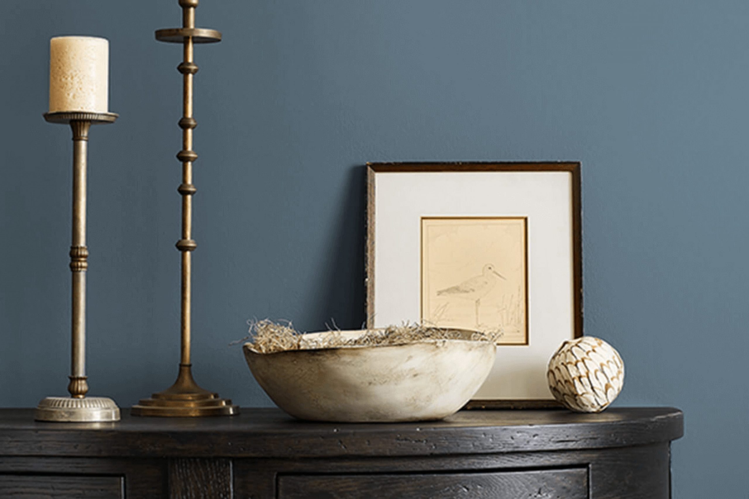
I recently had the pleasure of using SW 0032 Needlepoint Navy by Sherwin Williams for a project, and I must say, the experience was quite enlightening. If you are considering a new color for your area, you might want to consider this shade. Needlepoint Navy is a deeply rich blue that carries a subtle hint of refined quality, making it a perfect fit for various areas, whether you’re aiming for a classic or contemporary look.
This particular navy hue offers a comforting consistency that works wonders in providing a grounded atmosphere, without overpowering the room’s other elements. If you have concerns about darker colors making your area feel too enclosed, Needlepoint Navy might change your mind. It pairs beautifully with crisp whites and natural wood tones, which help to balance the darkness of the navy and bring a refreshing contrast to the overall palette.
Moreover, using Needlepoint Navy can help you achieve a sense of calm and focus, which is especially desirable in areas like home offices or reading nooks. Its adaptable nature extends to exteriors as well, where it can deliver a striking and durable finish that stands the test of time and elements.
Whether you’re repainting a room or looking for an accent wall that really pops, consider giving Needlepoint Navy a shot.
What Color Is Needlepoint Navy SW 0032 by Sherwin Williams?
Needlepoint Navy by Sherwin Williams is a rich, deep blue that emits a classic and crisp feeling, perfect for adding depth and elegance to any room. This shade combines the enduring quality of navy blue with a hint of brightness that keeps it from looking too dark in small areas.
This color is exceptionally adaptable when it comes to interior design styles. It works wonderfully in traditional settings, offering a backdrop that highlights antique furniture and classic art pieces. In modern and contemporary homes, Needlepoint Navy adds a striking contrast when paired with clean lines and minimalist decor. It’s also ideal for nautical themes, where it complements whites and reds, providing a maritime feel without being overly themed.
Needlepoint Navy pairs well with a variety of materials and textures. It looks stunning against natural wood, whether it’s a light oak or a darker walnut, bringing out the warm tones of the wood. Metallic finishes like brushed nickel or chrome stand out against this deep blue, adding a touch of luxury. For a cozy feel, combine it with soft fabrics like velvet or wool in lighter colors such as gray, cream, or pale pink to create a balanced and inviting area.
In conclusion, Needlepoint Navy is a dynamic and flexible color that can help create a striking yet cozy environment, suitable for multiple decorating styles and easily paired with a wide range of materials and textures.
Is Needlepoint Navy SW 0032 by Sherwin Williams Warm or Cool color?
Needlepoint Navy SW 0032 by Sherwin-Williams is a rich, deep blue hue that adds a strong and classic touch to any room. This color can create a striking impact in a mostly neutral palette, working well as an accent wall or on cabinetry.
It’s also flexible enough to be used in a variety of rooms, from bedrooms to home offices, lending a crisp and enduring look. When used in small areas, Needlepoint Navy can make the area feel cozier, while in larger rooms, it can help define areas within the area.
Due to its deep tone, it’s best paired with good lighting, either natural or artificial, to prevent it from making a room appear too dark. Complementing this navy with lighter colors like whites or soft grays can help maintain a balanced and inviting atmosphere. In terms of furnishings, it pairs beautifully with both modern and traditional pieces, making it an adaptable choice for many homes.
Undertones of Needlepoint Navy SW 0032 by Sherwin Williams
Needlepoint Navy is a rich, dark blue paint color that can significantly shape the atmosphere in any room. This color, like all colors, has several undertones, which are subtle hints of other colors that appear under different lighting conditions. Understanding these undertones is crucial because they can alter the color’s appearance and the overall feel of an area.
The undertones in Needlepoint Navy include lighter and darker shades across various color families: gray, navy, purple, and even green and brown. These undertones contribute to the color appearing more complex and vibrant. For example, in bright natural light, the gray undertone might make the Navy color appear softer, while in dimmer, artificial lighting, the green or brown undertones could make it look more grounded and muted.
When used on interior walls, Needlepoint Navy’s diverse undertones allow it to adapt to different styles and settings. It can create a cozy, enclosed feel in a small room or add depth and drama to a larger area. Depending on the lighting and surrounding colors, it can show more of its blue, green, or purple sides, offering adaptable styling options. These characteristics make Needlepoint Navy a dynamic choice for interior designs aiming for a deep, multi-layered look.

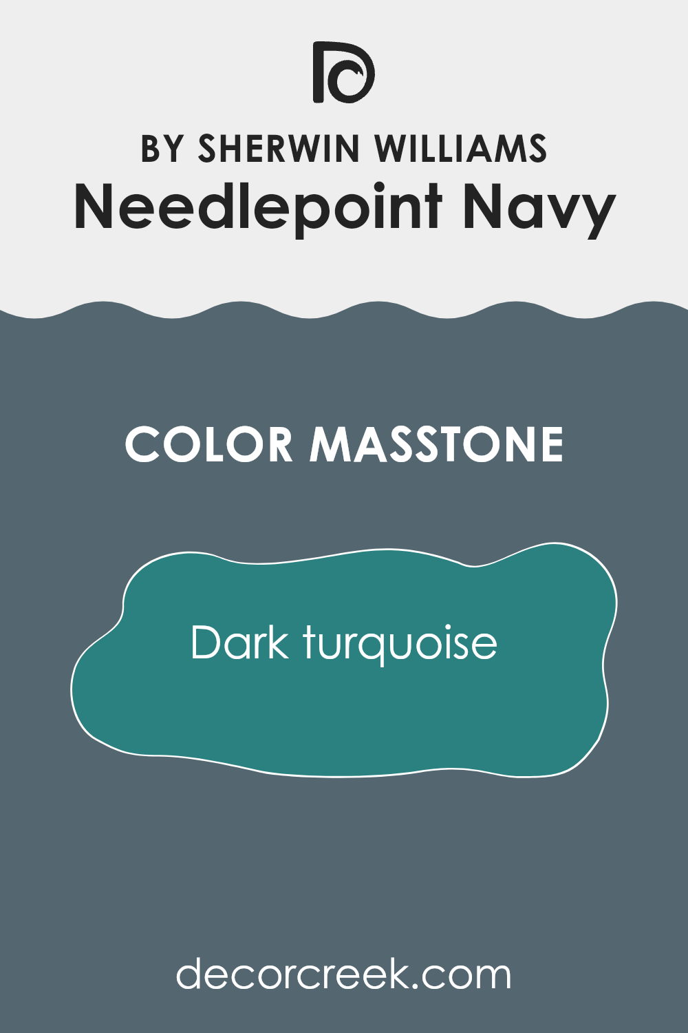
What is the Masstone of the Needlepoint Navy SW 0032 by Sherwin Williams?
Needlepoint Navy SW 0032, crafted by Sherwin Williams, features a masstone similar to dark turquoise, indicated as #2B8080. This unique shade, a blend of green and blue, adds a distinct character to any room.
Its dark base brings a sense of depth to areas, making it ideal for creating a cozy and inviting atmosphere. In homes, this color works well in various settings. In a living room or den, it can act as a striking backdrop that highlights decor and furniture, adding a calm but impactful visual appeal.
In bedrooms, the darker tone helps foster a restful environment, ideal for relaxation and sleep. Because of its muted yet rich hue, Needlepoint Navy pairs well with a range of complementary colors like soft creams, warm yellows, or even bright whites, offering adaptable styling options. This allows homeowners to tailor their areas to personal tastes while maintaining an inviting aesthetic.
How Does Lighting Affect Needlepoint Navy SW 0032 by Sherwin Williams?
Lighting plays a crucial role in how we perceive colors. The type of light and its intensity can significantly impact the appearance of a color. Needlepoint Navy is a deep, rich blue that illustrates how drastically lighting can change the way we see a color.
In natural light, this blue tends to appear vibrant and striking. The quality of natural light varies based on the time of day and weather conditions, which means the color can look slightly different in the morning light compared to twilight. Under bright sunlight, the blue will be vivid and true to its hue, making it a striking choice.
Artificial light, such as LED or fluorescent lighting, can alter how Needlepoint Navy looks. LED lights tend to emit a cooler tone, which can make the blue look more profound and darker. Conversely, warmer artificial lights like incandescent bulbs might add a slight richness to the color, making it appear more dynamic.
The orientation of a room can also affect how this shade of blue is perceived. In north-facing rooms, which receive less direct sunlight and tend to have cooler, bluer light, Needlepoint Navy might appear more muted and somber. This makes it ideal for creating a focused or cozy atmosphere.
In south-facing rooms, where the light is warmer and more abundant, the color can look brighter and more lively. This vibrant appearance is great for areas where you want a splash of color that stands out.
East-facing rooms get bright morning light, making the blue look very bold and fresh in the mornings, then gradually more subdued as the day progresses. This dynamic change can be quite enjoyable throughout the day.
West-facing rooms experience the opposite, as they receive the most intense sunlight in the late afternoon. This lighting situation can make Needlepoint Navy appear rich and intense towards the evening, ideal for rooms used predominantly in the afternoon or evening. Overall, the lighting should be considered when choosing where to apply this deep blue color so that it can be fully appreciated in any area.
What is the LRV of Needlepoint Navy SW 0032 by Sherwin Williams?
LRV stands for Light Reflectance Value, which is a measure used to indicate how much light a paint color reflects or absorbs when applied to a surface. This value ranges from 0, which absorbs all light and reflects none, to 100, which reflects all light and absorbs none.
Essentially, the higher the LRV, the lighter the color appears, and the more it can brighten up an area by reflecting more indoor or natural light. Conversely, colors with a low LRV can make an area look darker because they absorb more light.
With an LRV of 12.671, the color Needlepoint Navy is quite dark, absorbing much of the light that hits it rather than reflecting it. This characteristic means that rooms painted in this deep navy shade might feel smaller or more enclosed. However, it can also provide a dramatic and cozy feel, making it suitable for areas where a more intimate atmosphere is desired.
When used in a well-lit area or combined with lighter colors and ample lighting fixtures, it can still make a bold and beautiful impact without excessive effect on the area.

Coordinating Colors of Needlepoint Navy SW 0032 by Sherwin Williams
Coordinating colors are hues that harmoniously blend with each other to create visually appealing designs. They can be contrasting to bring out each other’s vibrancy or similar in tone for a subtle and smooth look. For instance, Needlepoint Navy, a deep and classic navy blue, pairs well with a variety of shades that enhance its rich quality without overpowering it.
One excellent coordinating color for Needlepoint Navy is Steamed Milk SW 7554. This is a soft, creamy white that serves as a gentle backdrop, making it ideal for creating a balanced, relaxing environment. It is light enough to provide a contrast with the dark tones of Needlepoint Navy, yet warm enough to ensure the area feels inviting and cohesive.
Another coordinating color is Orchid SW 0071, which is a muted lavender shade. Orchid works beautifully with Needlepoint Navy because it adds a touch of warmth and lightness to the visual setting, creating areas that feel light and airy. This color combination can effectively enhance a room’s aesthetic by offering a subtle yet impactful blend of dark and light tones.
You can see recommended paint colors below:

What are the Trim colors of Needlepoint Navy SW 0032 by Sherwin Williams?
Trim colors play a vital role in enhancing the visual appeal of wall paint, and this is especially true when using a strong, distinctive shade like Needlepoint Navy by Sherwin Williams. By choosing trim colors such as SW 7037 – Balanced Beige or SW 7036 – Accessible Beige, you allow for a smoother visual transition between the bold navy and the other elements of your area.
These lighter trim shades help frame the deep blue, preventing it from making the area feel too enclosed, while also highlighting architectural details and adding a subtle contrast that defines areas gracefully.
Balanced Beige is a warm neutral that offers a cozy feel to the Navy’s more dramatic tone. It has an adaptability that works well in many different lighting conditions, softening the impact of darker colors. Accessible Beige, on the other hand, is slightly lighter and brings a fresh, airy quality to the room. It complements the navy by providing a gentle backdrop that supports rather than competes with the deeper hue, making the overall aesthetic harmonious and pleasing to the eye.
You can see recommended paint colors below:

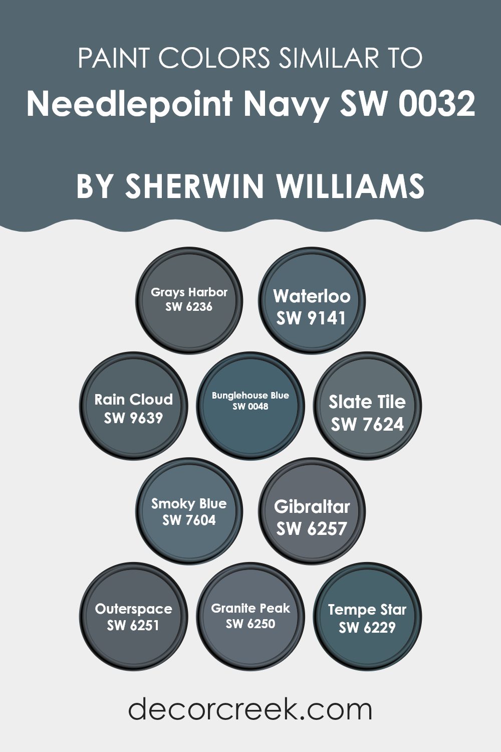
Colors Similar to Needlepoint Navy SW 0032 by Sherwin Williams
Similar colors are vital in design because they create a cohesive and harmonious look, making areas feel more put together. Colors like SW 6236 Grays Harbor and SW 9141 Waterloo offer subtle variations from deep, steely grays to a soft charcoal, providing a backdrop that is both understated and enduring.
These shades work well in areas that aim for a quiet kind of strength in their adornments. Meanwhile, tones such as SW 9639 Rain Cloud and SW 0048 Bunglehouse Blue introduce a slightly lighter, more airy feel while maintaining that strong, grounded presence that pulls an area together.
Further enriching the palette, SW 7624 Slate Tile and SW 7604 Smoky Blue give depth with their bluish-gray hues, ideal for adding a touch of mystery without excessive effect on an area’s overall aesthetic. On the darker end, SW 6257 Gibraltar and SW 6251 Outerspace anchor the surroundings with their robust navy tones, perfect for creating focal points in decor.
Similarly, SW 6250 Granite Peak and SW 6229 Tempe Star offer a very subtle greenish tint, suggesting a touch of nature while keeping the refined palette. All these colors complement each other and can be mixed to achieve a fluid visual experience across different rooms or accents.
You can see recommended paint colors below:
- SW 6236 Grays Harbor
- SW 9141 Waterloo
- SW 9639 Rain Cloud
- SW 0048 Bunglehouse Blue
- SW 7624 Slate Tile
- SW 7604 Smoky Blue
- SW 6257 Gibraltar
- SW 6251 Outerspace
- SW 6250 Granite Peak
- SW 6229 Tempe Star
How to Use Needlepoint Navy SW 0032 by Sherwin Williams In Your Home?
Needlepoint Navy by Sherwin Williams is a rich, deep blue color that offers a classic and adaptable option for home decorating. This shade can be used in various rooms to create a cozy and inviting atmosphere. For instance, painting an accent wall in the living room or dining area with Needlepoint Navy can make the area feel more grounded and distinct.
Additionally, it works well in a bedroom, providing a calm and restful backdrop that contrasts beautifully with light-colored furniture and bedding.
In smaller areas like a powder room or an entryway, covering all walls in this deep navy can add a dramatic flair while still keeping the area looking neat and tidy. Paired with crisp white trim or accessories, Needlepoint Navy stands out and gives any room a fresh, modern look. This color also pairs nicely with wood tones and metallic finishes, offering numerous decor possibilities.
Needlepoint Navy SW 0032 by Sherwin Williams vs Granite Peak SW 6250 by Sherwin Williams
Needlepoint Navy and Granite Peak are two distinct shades offered by Sherwin Williams. Needlepoint Navy is a deep, rich navy blue that has a classic and enduring feel. It is a bold color that works well in areas where a strong, striking presence is desired.
On the other hand, Granite Peak is a more subtle gray tone with blue undertones. This color is cooler and more muted compared to Needlepoint Navy, providing a softer look that is adaptable for many different areas.
While Needlepoint Navy often works best as a statement or focus color due to its depth, Granite Peak is more flexible, serving either as a gentle neutral or a complementary background shade. Both colors offer unique attributes, but their impact and suitability will depend largely on the room’s function and existing decor.
You can see recommended paint color below:

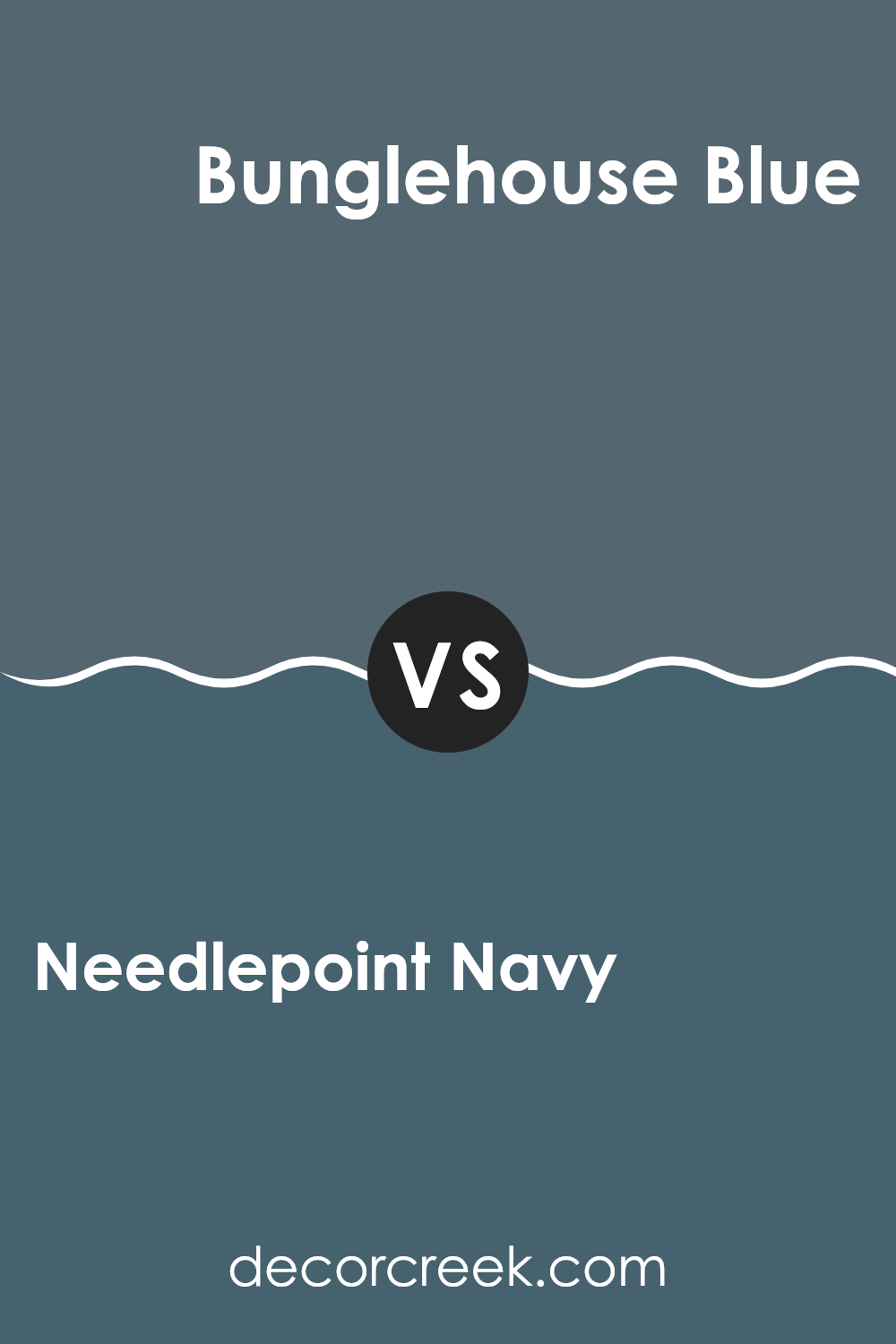
Needlepoint Navy SW 0032 by Sherwin Williams vs Bunglehouse Blue SW 0048 by Sherwin Williams
Needlepoint Navy and Bunglehouse Blue are both rich blue shades from Sherwin Williams, each offering a distinct vibe for areas. Needlepoint Navy is a deep, dark blue with a hint of purple.
This color is perfect for creating a cozy feeling in an area, making it feel warm and inviting. On the other hand, Bunglehouse Blue has a slightly lighter tone, leaning more towards a traditional navy with subtle green undertones.
This makes it ideal for those who want a classic look but with a touch of uniqueness. Both colors work well as accent walls or for cabinetry, and they complement light neutrals or warm wood tones. Choosing between them depends on the atmosphere you’re going for – Needlepoint Navy leans towards a darker, more enveloping feel, while Bunglehouse Blue offers a lighter, more airy blue. They each hold their own in terms of adding depth and interest to an area.
You can see recommended paint color below:
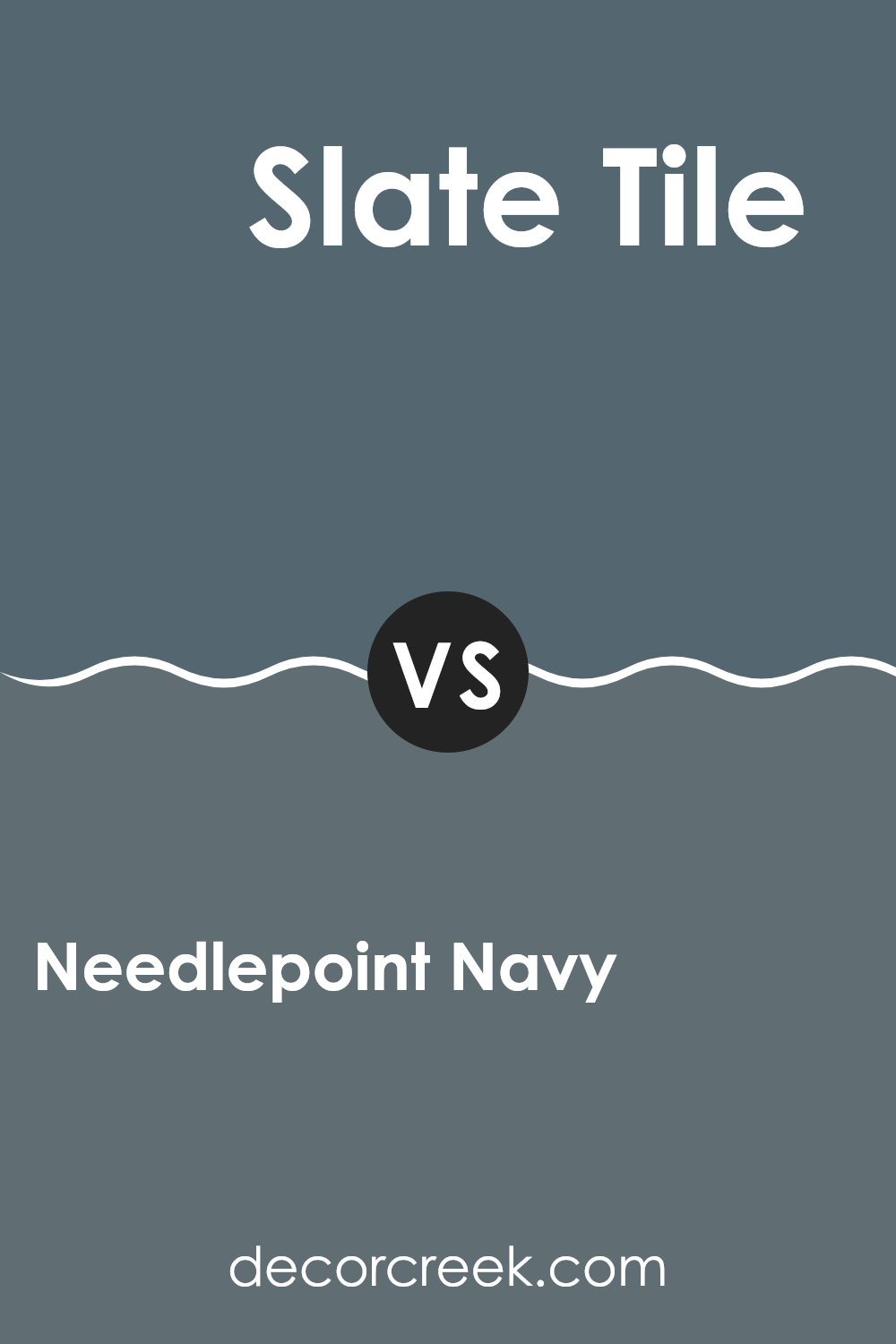
Needlepoint Navy SW 0032 by Sherwin Williams vs Slate Tile SW 7624 by Sherwin Williams
Needlepoint Navy and Slate Tile, both by Sherwin Williams, are distinctive shades of blue that offer unique aesthetics for any area. Needlepoint Navy is a deep, rich blue with a hint of navy that gives it a classic and enduring feel.
It’s perfect for creating a strong and comforting presence in a room. On the other hand, Slate Tile is a cooler tone that leans more towards a grayish-blue. This color is lighter than Needlepoint Navy and carries a more modern vibe, making it ideal for contemporary areas.
Slate Tile’s subtle blue tones can make small areas appear larger and more open. While both colors can be used to generate a calm and welcoming environment, Needlepoint Navy tends to add drama and depth, whereas Slate Tile provides a fresh and airy feel. No matter the choice, each color has the potential to beautifully enhance the aesthetics of a room.
You can see recommended paint color below:
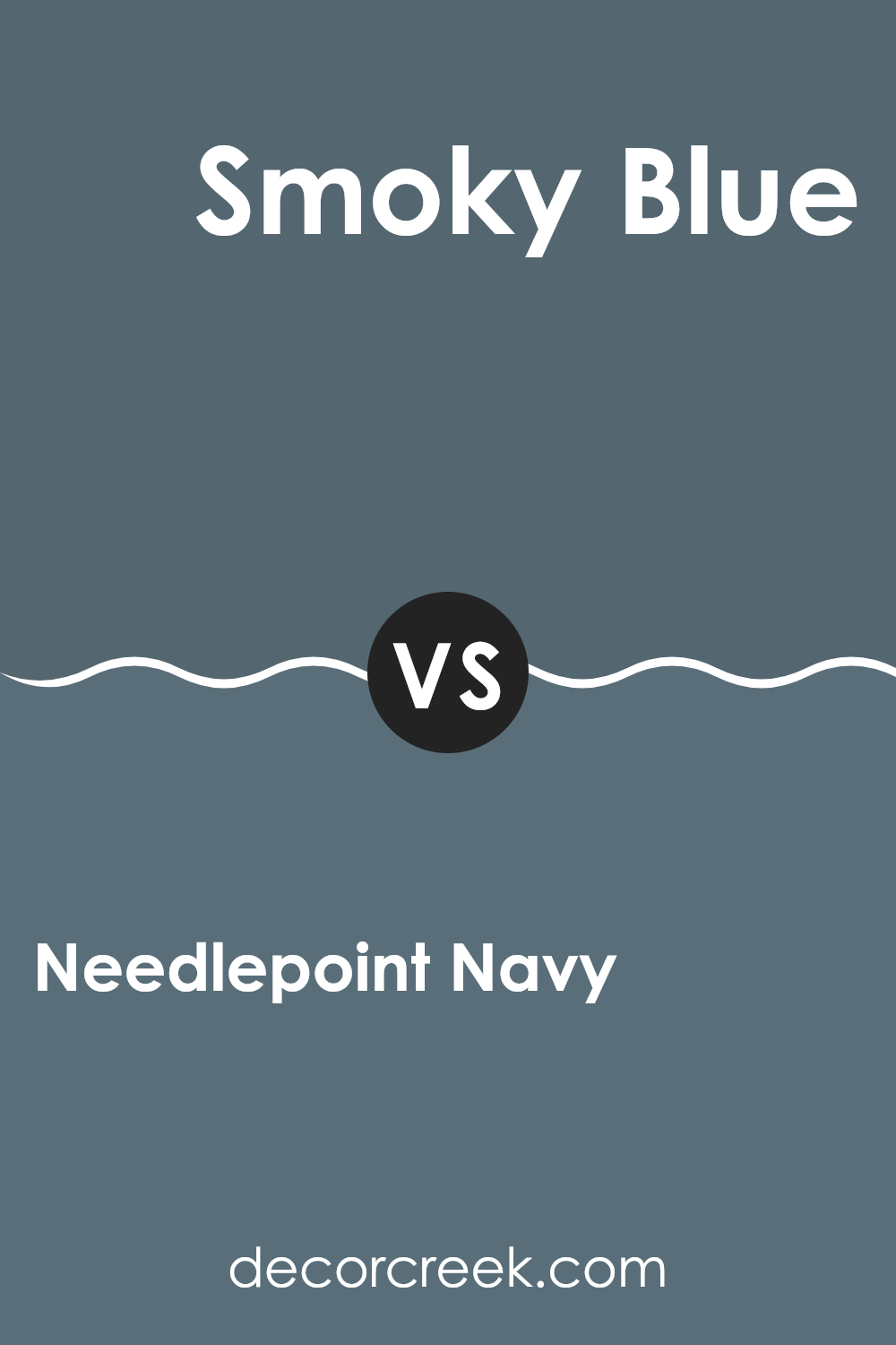
Needlepoint Navy SW 0032 by Sherwin Williams vs Smoky Blue SW 7604 by Sherwin Williams
Needlepoint Navy and Smoky Blue are both cool, soothing colors by Sherwin Williams, but they have distinct tones and atmospheres. Needlepoint Navy is a deep, rich blue with a maritime vibe that feels quite traditional and could be seen as both bold and calming. It’s darker and lends itself well to creating a strong presence in a room, making it ideal for accent walls or furniture.
On the other hand, Smoky Blue is lighter and lends a fresher, airier feel. It’s closer to a grayish-blue that can open up an area and bring a sense of softness. Smoky Blue is adaptable and works well in many areas of a home, adding a gentle touch of color without overpowering the senses.
Comparing the two, Needlepoint Navy offers a more dramatic flair, while Smoky Blue provides a gentler, more laid-back vibe. Both colors can beautifully enhance a home’s decor depending on the mood and style you want to achieve.
You can see recommended paint color below:
Needlepoint Navy SW 0032 by Sherwin Williams vs Gibraltar SW 6257 by Sherwin Williams
Needlepoint Navy and Gibraltar, both by Sherwin Williams, are distinct shades of blue that offer unique vibes for different areas. Needlepoint Navy is a darker, richer blue that lends a bold, classic look to walls or accents in an area. It’s perfect for creating a strong, cozy atmosphere.
On the other hand, Gibraltar is lighter and slightly more muted. It has a softness to it that works well in areas where you want a calming, yet fresh, feel.
Despite both being blues, Needlepoint Navy provides a more dramatic impact, suitable for making a statement or anchoring an area with its depth. Gibraltar, meanwhile, is ideal for a more subdued, gentle vibe that still carries a touch of color vibrancy. Each has its own charm, making them suitable for different interior applications depending on the desired effect and room functionality.
You can see recommended paint color below:

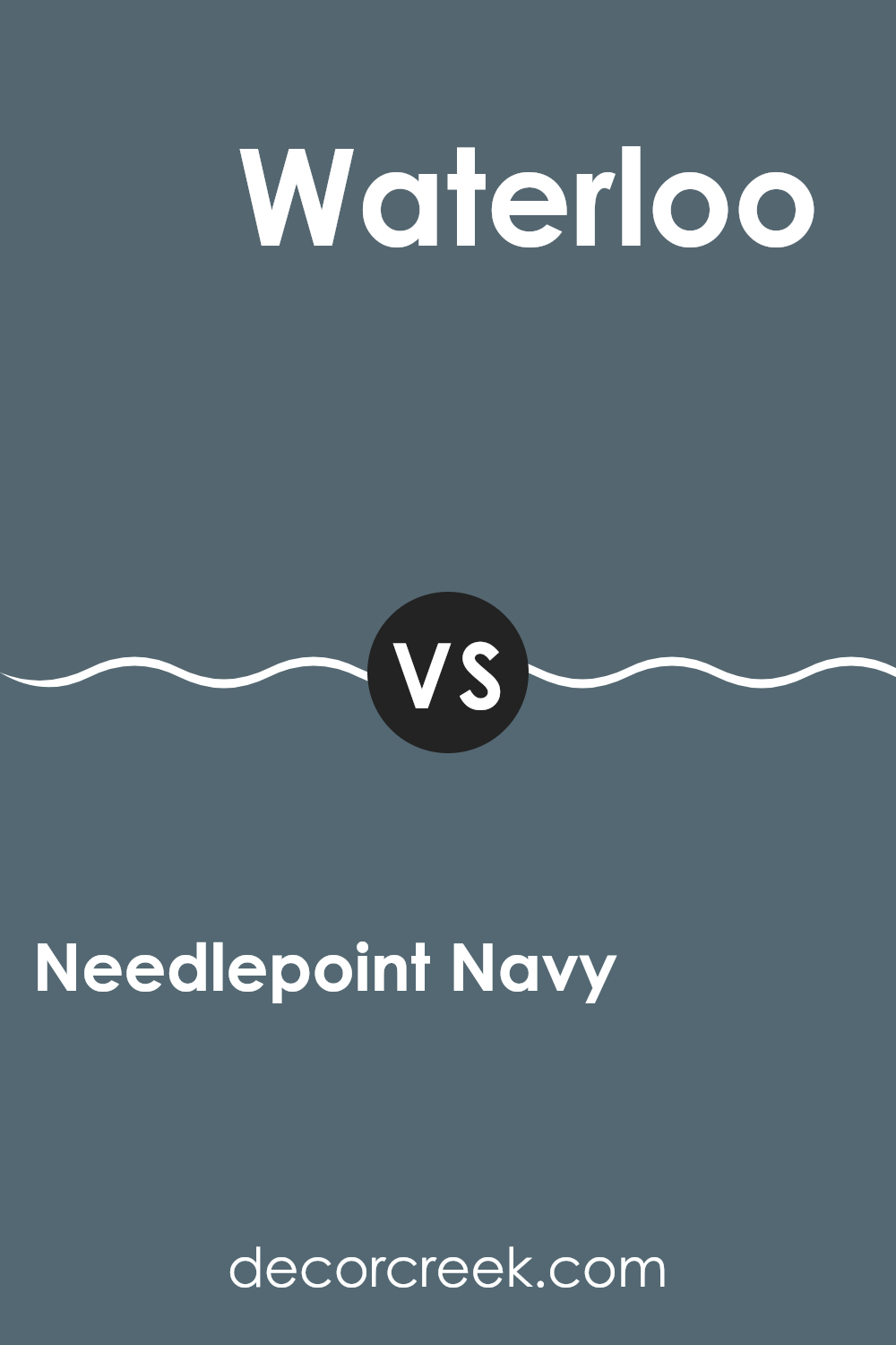
Needlepoint Navy SW 0032 by Sherwin Williams vs Waterloo SW 9141 by Sherwin Williams
Needlepoint Navy and Waterloo by Sherwin Williams are two distinct shades of blue that can bring different vibes to an area. Needlepoint Navy is a deep, rich blue that has a classic feel to it. This color is perfect for creating a strong, confident look in a room. It goes well in areas used for relaxation and focus, like a home office or reading nook.
On the other hand, Waterloo is a softer, more subtle blue with a hint of gray. It’s lighter than Needlepoint Navy, making it a great choice for those wanting a gentler ambiance. Waterloo works wonderfully in bedrooms or bathrooms where a softer, calming effect is desired.
Both colors offer a fresh, clean feel, but the choice between them depends on the mood you want to set: bold and decisive with Needlepoint Navy or soft and gentle with Waterloo.
You can see recommended paint color below:
Needlepoint Navy SW 0032 by Sherwin Williams vs Grays Harbor SW 6236 by Sherwin Williams
Needlepoint Navy and Grays Harbor are both dark shades by Sherwin Williams, but they offer distinct vibes due to their color undertones. Needlepoint Navy, as the name suggests, is a deep navy blue that brings a sense of calm and steadiness to areas, making it great for creating a strong, reassuring presence in a room.
On the other hand, Grays Harbor is a dark gray color with a hint of blue. This color is more neutral and adaptable, giving it the flexibility to blend well with various decor styles and colors. It’s a fantastic option for those wanting a less intense, yet equally impactful dark color.
Both colors are suitable for accent walls or cabinetry and can effectively anchor an area with their dark tones. Choosing between them depends on whether you prefer the richer blue depth of Needlepoint Navy or the softer, more subdued gray-blue of Grays Harbor.
You can see recommended paint color below:

Needlepoint Navy SW 0032 by Sherwin Williams vs Tempe Star SW 6229 by Sherwin Williams
Needlepoint Navy and Tempe Star, both from Sherwin Williams, offer distinctive tones for different moods and areas. Needlepoint Navy is a deep, rich navy blue that brings a strong and classic feel to any room.
It’s perfect if you’re aiming for a more formal or enduring look in your area. On the other hand, Tempe Star is a slightly softer, less intense shade that leans towards a slate blue. This color is great for creating a calming yet inviting atmosphere.
While both colors are in the blue family, Needlepoint Navy is darker and bolder, making a statement wherever it’s used. Tempe Star, being lighter, is easier to pair with a variety of decor styles and doesn’t overwhelm the senses. Whether you’re looking to add a splash of drama or a gentle hue, these colors provide lovely options.
You can see recommended paint color below:

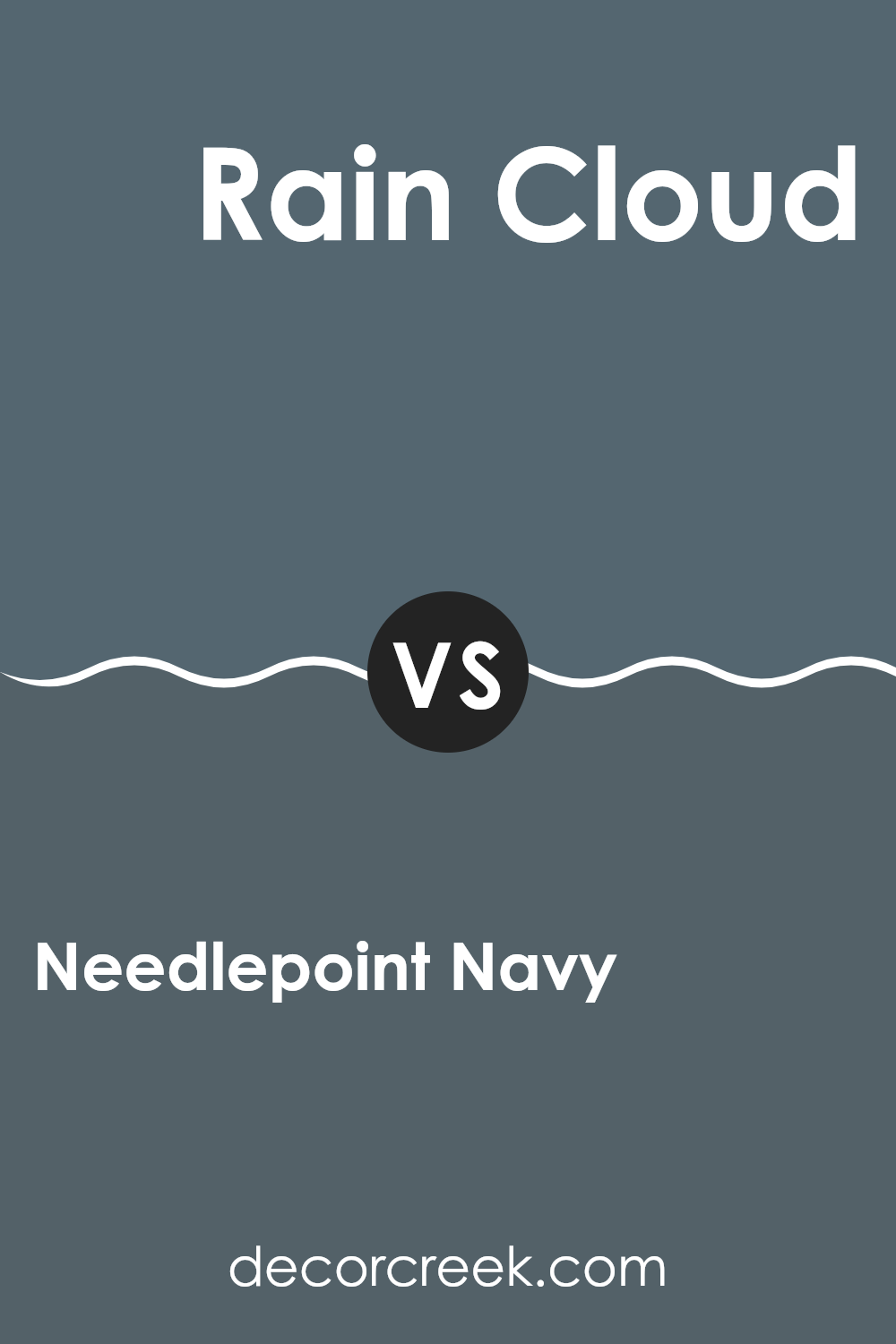
Needlepoint Navy SW 0032 by Sherwin Williams vs Rain Cloud SW 9639 by Sherwin Williams
Needlepoint Navy and Rain Cloud by Sherwin Williams are two distinct colors, each bringing a unique vibe to an area. Needlepoint Navy is a deep, rich blue that adds a bold touch to room walls or furniture. It’s perfect for creating a striking focal point in any area of your home. Despite its strong presence, the color still manages to provide a cozy atmosphere, especially when paired with bright or soft accents.
Rain Cloud, on the other hand, is a lighter, muted gray with subtle blue undertones. It’s more understated when compared to Needlepoint Navy and works exceptionally well for creating a calm and soothing environment. This color is adaptable, blending seamlessly with various decor styles and color schemes. It’s ideal for areas where a subtle, relaxing vibe is desired.
In essence, while Needlepoint Navy stands out and adds drama, Rain Cloud offers a gentle backdrop, perfect for a peaceful setting. Each has its own appeal depending on the mood and style you want to achieve.
You can see recommended paint color below:
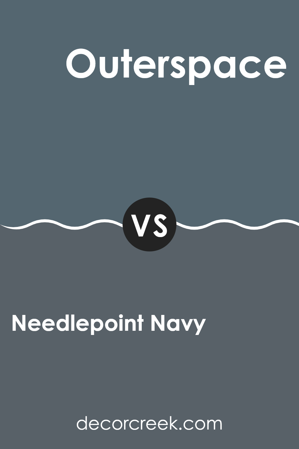
Needlepoint Navy SW 0032 by Sherwin Williams vs Outerspace SW 6251 by Sherwin Williams
Needlepoint Navy and Outerspace by Sherwin Williams are two dark hues that each bring their unique vibe to an area. Needlepoint Navy is a deep blue with a slightly nautical feel, making it perfect for creating a cozy, welcoming atmosphere in places like living rooms or bedrooms. Its richness gives a hint of elegance without being overpowering.
On the other hand, Outerspace is a dark gray that leans slightly towards blue. This color is adaptable and can be used in various settings, from modern kitchens to chic offices. It pairs well with bright colors and metallic accents, offering a balanced backdrop that allows other elements in the room to stand out.
Both Needlepoint Navy and Outerspace are great for adding depth to an area, but Needlepoint Navy gives off a warmer feeling due to its blue base, whereas Outerspace offers a cooler, more neutral palette that works well in a minimalist or contemporary setting. Each color provides a strong foundation for interior design, depending on the mood and style you wish to achieve.
You can see recommended paint color below:
In conclusion, my look into SW 0032 Needlepoint Navy by Sherwin Williams showed me that this paint color is really wonderful. This deep navy shade adds a calm and cozy feel to any room, making it perfect for places where you want to relax like bedrooms or living rooms. I found that it pairs well with many colors, especially whites and creams, which helps to brighten up an area while keeping the feeling of comfort.
Using Needlepoint Navy can make a big difference in how a room looks and feels. For example, painting just one wall with this shade can add a nice touch of color without being too much. It’s also really good at covering up marks and stains, which is helpful for keeping walls looking clean and new.
This color is more than just pretty—it creates a feeling of warmth and safety. If you’re thinking about changing a room in your house, Needlepoint Navy is a great choice because it’s not just stylish but also makes the area feel more welcoming.
After trying out this color and seeing the results, I would definitely recommend it to anyone looking to make their home feel more cozy and stylish. It’s a paint color that truly makes a difference in any home.
Ever wished paint sampling was as easy as sticking a sticker? Guess what? Now it is! Discover Samplize's unique Peel & Stick samples.
Get paint samples

