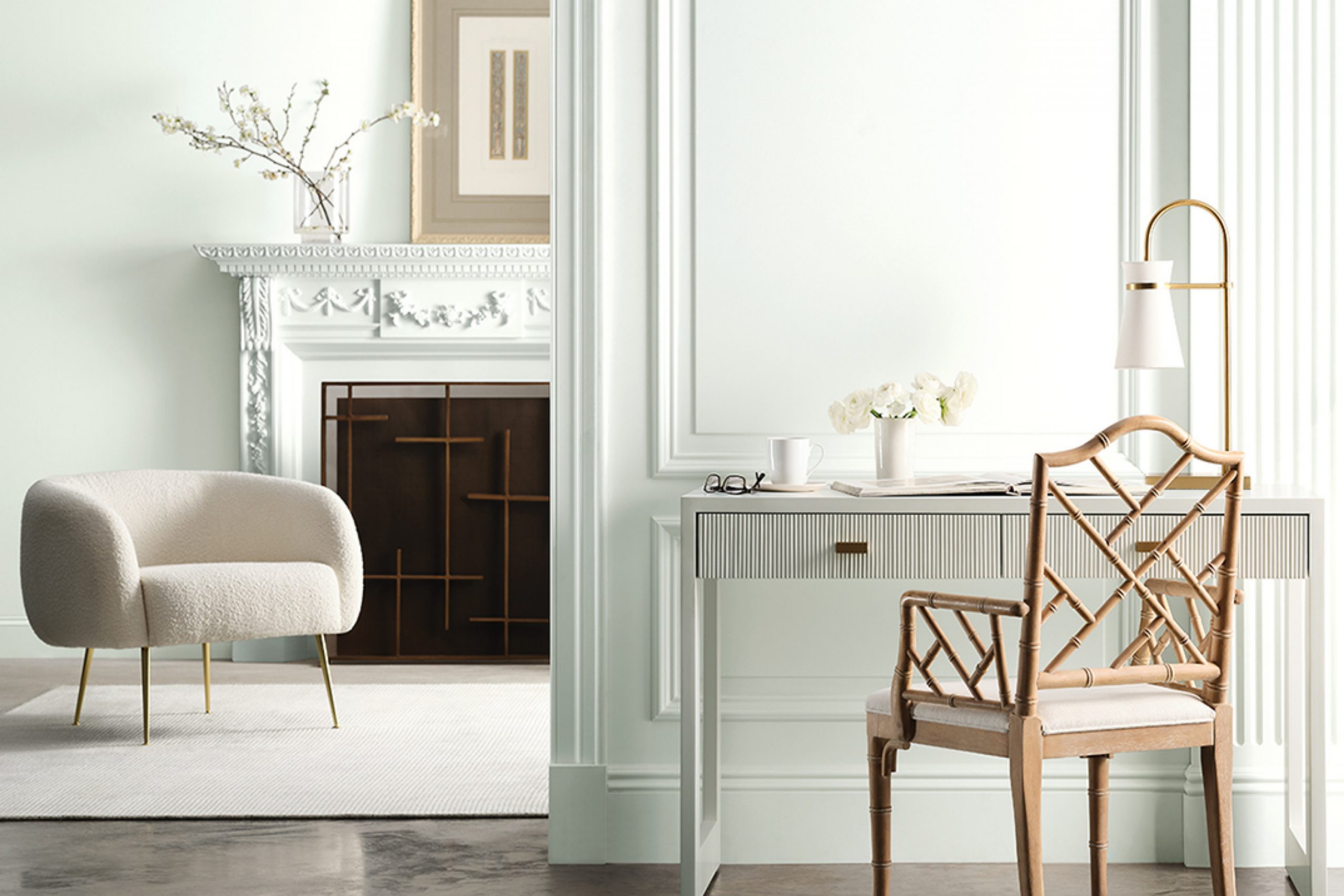
SW 9623 Snowbelt by Sherwin Williams brings that peaceful scene right into your space. This shade captures the essence of those quiet, snow-laden moments, offering a refreshing yet calming presence.
As you apply this color to your walls, you’re gently reminded of open landscapes where everything feels clean and untouched.
The subtlety of Snowbelt allows for a sense of openness and clarity, creating a backdrop that encourages a relaxed atmosphere.
You’re not merely painting a wall; you’re setting a tone—one that promotes serenity and quiet reflection.
Snowbelt’s nuanced undertones make it versatile, effortlessly blending with both modern and traditional decor. It supports bold accents and complements natural textures, making your room feel both inviting and refined.
With every glance, you’re reminded of the possibilities that arise from a fresh start. SW 9623 Snowbelt is there to provide both simplicity and sophistication, transforming your space into a peaceful haven.
What Color Is Snowbelt SW 9623 by Sherwin Williams?
Snowbelt by Sherwin Williams is a calming and gentle shade that falls within the cool gray spectrum. It has subtle blue undertones, which give it a fresh and airy feel.
This color works well in spaces where you want a quiet and restful atmosphere, such as bedrooms or living rooms. Its coolness can create a sense of openness, making smaller spaces feel more spacious.
This color fits beautifully with Scandinavian and modern interior designs. In a Scandinavian setting, Snowbelt’s softness can enhance the natural light, complementing the simplicity and functionality characteristic of this style.
For modern interiors, it provides a clean backdrop that highlights sleek lines and minimalist decor. When it comes to pairing with materials, Snowbelt looks great alongside natural wood tones, such as light oak or birch, which bring warmth to balance the coolness.
It also complements metal accents like matte black or brushed nickel, adding a touch of elegance. For textures, consider using soft cotton or linen fabrics to enhance the cozy vibe.
Wool throws or large knit cushions can add depth and comfort, while incorporating glass or ceramic accessories can reflect light and add interest to the room. Overall, this color is versatile and works well with a variety of materials and styles.

Is Snowbelt SW 9623 by Sherwin Williams Warm or Cool color?
Snowbelt SW 9623 by Sherwin-Williams is a soft, neutral color that can greatly influence the look and feel of a home.
It’s a versatile white shade that pairs well with almost any decor style, from modern to traditional. Snowbelt’s light tone helps reflect natural light, making rooms appear larger and more open. This can be particularly beneficial in smaller spaces or areas with limited sunlight.
Its subtle hue provides a fresh, clean backdrop that allows furniture, artwork, and other decorative elements to stand out without clashing. This color works well in living rooms, kitchens, or bedrooms, adding a sense of brightness and freshness. It can also be used in bathrooms for a crisp, clean look.
Because of its neutral base, Snowbelt SW 9623 complements a wide range of colors, making it easy to match with accent walls, fabrics, and furnishings.
Overall, it’s a practical choice for creating a harmonious and inviting atmosphere in any home.
Undertones of Snowbelt SW 9623 by Sherwin Williams
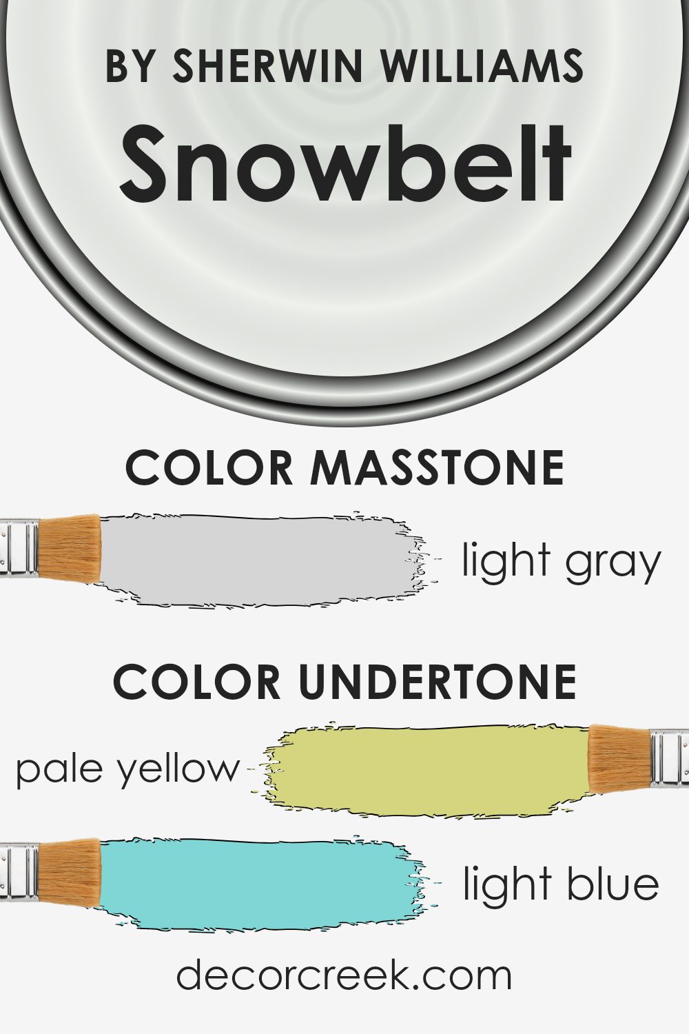
Snowbelt by Sherwin Williams, with the color code SW 9623, is a versatile shade with a range of subtle undertones, including pale yellow, light blue, light purple, mint, pale pink, lilac, and grey. These undertones can change the perception of the color under different lighting conditions, impacting the overall feel of a room.
Undertones are the quiet hues hiding beneath the main color. They can make colors appear warmer or cooler, depending on the surrounding light and other colors in the space.
For instance, a room with lots of natural light might make Snowbelt’s pale yellow undertone more noticeable, adding warmth to the space. In contrast, artificial lighting with cool tones might highlight the light blue and grey undertones, giving the walls a cooler appearance.
The presence of various undertones allows Snowbelt to adapt and blend with various styles and palettes.
The light purple, mint, and lilac undertones provide subtle touches of color, contributing to a balanced environment.
The paint can look fresh and lively when the pale pink and mint undertones are prominent, or soft and calm with a focus on the lilac and grey. This adaptability makes Snowbelt a great choice for home interiors, offering flexibility and harmony across different rooms and settings.
What is the Masstone of the Snowbelt SW 9623 by Sherwin Williams?
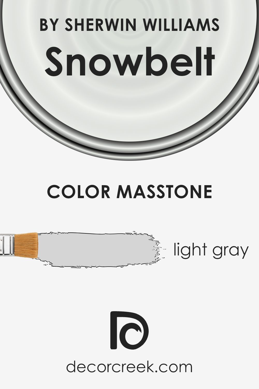
Sherwin Williams’ Snowbelt SW 9623 is a light gray color with a masstone of #D5D5D5.
This soft, neutral shade is very versatile and works well in many different areas of a home. Light gray colors like Snowbelt can make any room feel brighter and more open.
They reflect natural light, which helps small spaces appear larger and more inviting. This shade easily coordinates with many other colors, making it a great base for various color schemes.
Whether paired with bold accent colors like navy or more muted tones like beige, Snowbelt can create a cohesive look throughout a home. Its light gray tone is calming without being too cold, so it can be used in living rooms, bedrooms, or kitchens to create a pleasant atmosphere.
Snowbelt is also modern and timeless, making it suitable for both contemporary and traditional spaces.
How Does Lighting Affect Snowbelt SW 9623 by Sherwin Williams?
Lighting plays a crucial role in how colors appear in a space. The color Snowbelt SW 9623 by Sherwin Williams can look different based on the type of light it is in and the room’s orientation.
In natural light, Snowbelt SW 9623 may display its true color, which is a muted, subtle hue. However, the direction that natural light enters the room affects how it looks. In a north-facing room, which typically receives cool, soft light, Snowbelt can appear slightly cooler and more subdued.
This means it might show hints of gray or blue tones more prominently, giving the space a calm, understated appearance.
In a south-facing room, which benefits from bright, direct sunlight throughout the day, Snowbelt will appear warmer.
The consistent light can bring out any warm undertones in the paint, making it look more inviting and potentially a bit lighter. East-facing rooms get bright, warm light in the morning and cooler, shadowy light in the afternoon.
In these rooms, Snowbelt might seem warmer and slightly brighter in the morning. Throughout the afternoon, the cooler light might bring out its cooler aspects, giving a more balanced appearance over the course of the day.
West-facing rooms receive warm light in the afternoon and evening. In these spaces, Snowbelt can shift from a neutral tone to a warmer one as the day progresses.
The warm afternoon light can highlight its cozy undertones, making it feel welcoming and comfortable.In artificial lighting, Snowbelt’s appearance also shifts.
Cool white artificial lighting might make it look cooler and more neutral, while warm white or yellow-toned lighting can emphasize any warm undertones, making the color seem cozier. It’s crucial to test a sample in your specific lighting conditions to see how this paint color works in your space, as light dramatically alters color perception.

What is the LRV of Snowbelt SW 9623 by Sherwin Williams?
LRV, which stands for Light Reflectance Value, measures the amount of visible light a color reflects. It is an important factor to consider when choosing paint colors because it affects the brightness and mood of a room.
The LRV scale runs from 0 to 100, where 0 indicates absolute black, absorbing all light, and 100 indicates pure white, reflecting all light. Colors with higher LRV values reflect more light, making spaces feel larger and brighter. In contrast, colors with lower LRV values absorb more light, creating a cozier, more intimate atmosphere.
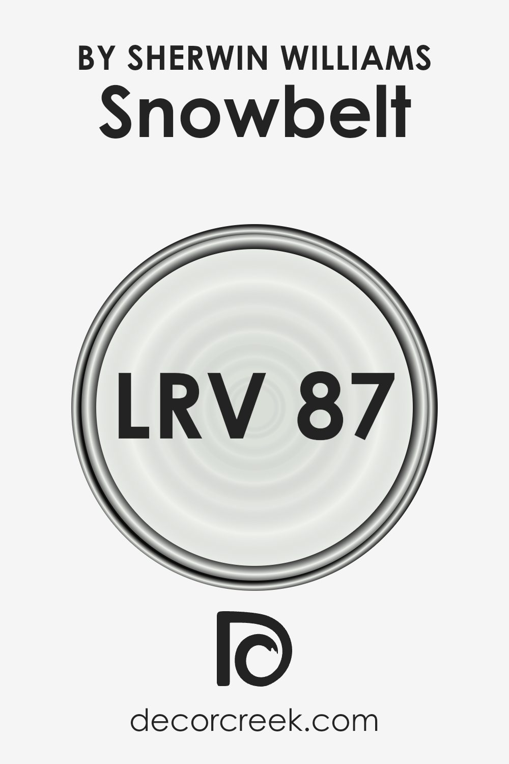
For the color Snowbelt, the LRV is 87.167, which means it reflects a significant amount of light. This high LRV makes Snowbelt a very bright and airy color, ideal for spaces you want to feel open and spacious.
When used on walls, Snowbelt can help maximize natural light, making rooms appear more illuminated and cheerful. This makes it an excellent choice for smaller rooms or areas that don’t get much sunlight.
Additionally, because it reflects so much light, Snowbelt pairs well with both light and dark furnishings, providing a versatile backdrop that won’t overpower other elements in the room.
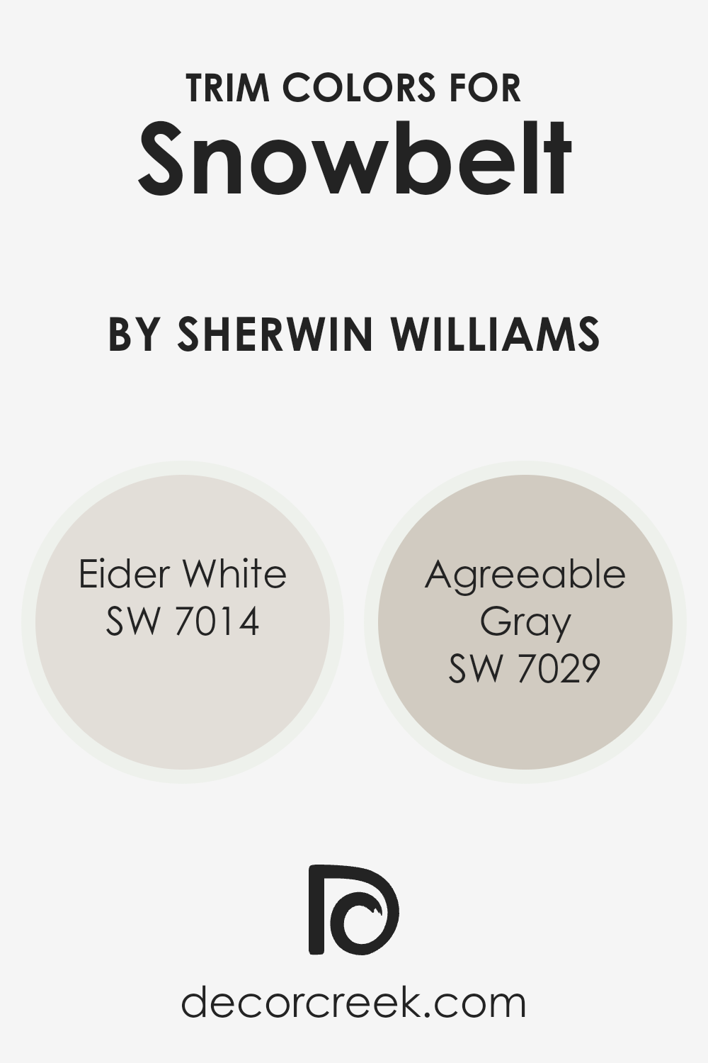
What are the Trim colors of Snowbelt SW 9623 by Sherwin Williams?
Trim colors refer to the shades used to accentuate or outline architectural elements like windows, doors, and baseboards, providing contrast or harmony with the primary wall color.
For Snowbelt SW 9623 by Sherwin Williams, trim colors are important as they enhance the overall look by adding depth and distinction. Snowbelt, being a soft and muted hue, benefits from trim colors that complement its natural charm.
Eider White, a versatile, light, and airy shade, adds a subtle brightness that pairs well with Snowbelt without overwhelming it. Meanwhile, Agreeable Gray, known for its warm, neutral tone, introduces a gentle contrast that enriches the visual appeal of Snowbelt, balancing the space elegantly.
Eider White is off-white with a hint of gray that gives it a contemporary feel, making spaces feel open and clean without being stark.
Its pleasing nature allows it to blend seamlessly with a variety of colors, perfect for a trim that subtly enhances without stealing focus. Agreeable Gray, on the other hand, is a warmer, taupe-like gray that exudes coziness and sophistication.
This color harmonizes well with both warm and cool palettes, ensuring it stands out with a gentle presence as trim while maintaining a cohesive look with the Snowbelt hue.
By selecting these trim colors, the goal is not just to define spaces but to create an inviting and cohesive environment that feels both modern and timeless.
You can see recommended paint colors below:
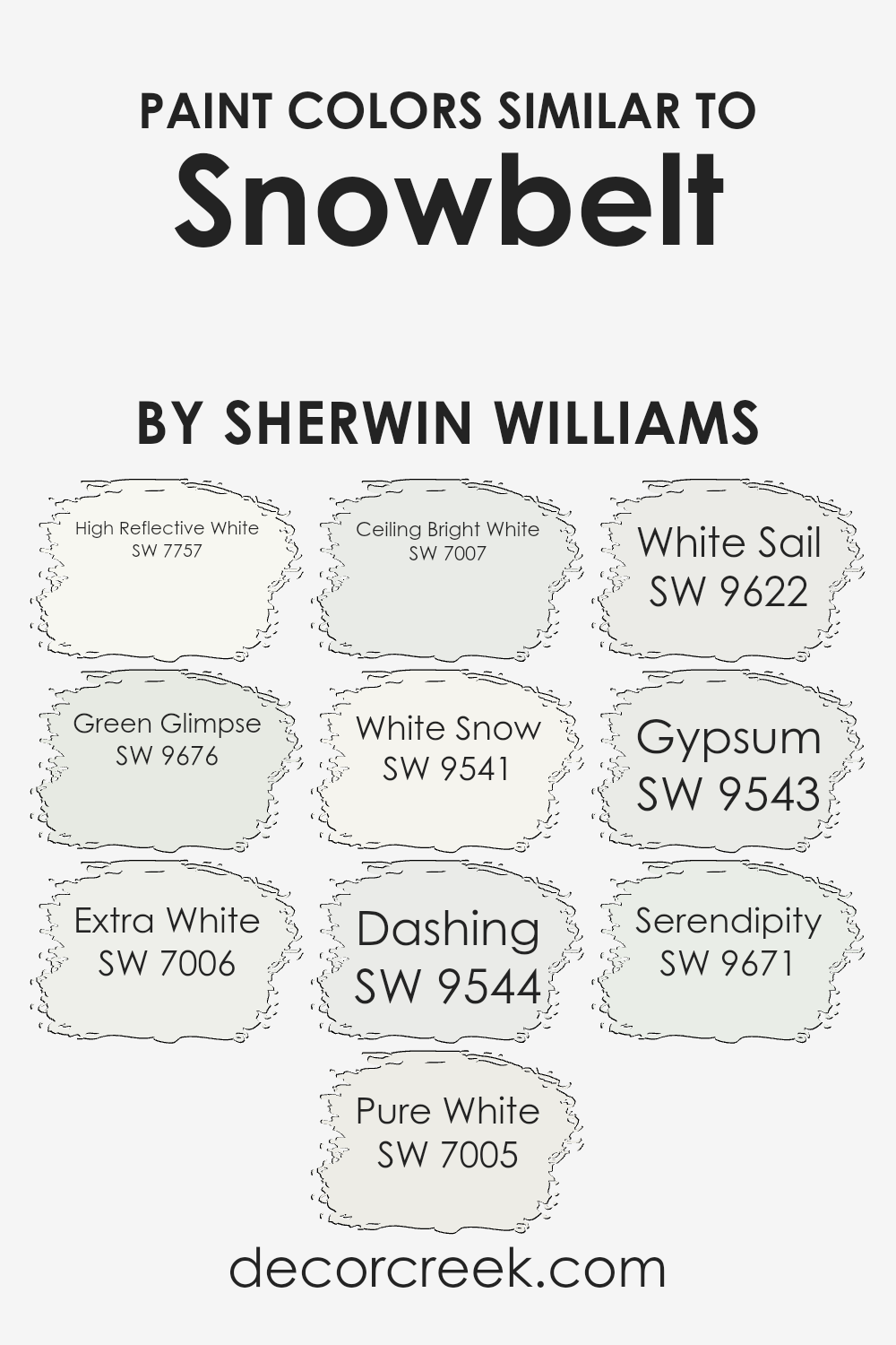
Colors Similar to Snowbelt SW 9623 by Sherwin Williams
Colors play a crucial role in setting the mood and atmosphere of a space, and using similar colors can create a sense of harmony and cohesiveness.
For example, if you’re working with a color like Snowbelt by Sherwin Williams, choosing similar shades can enhance the overall aesthetic without clashing. High Reflective White (SW 7757) is incredibly bright and clean, perfect for creating a fresh backdrop. Green Glimpse (SW 9676) adds a soft, subtle touch of nature without being overwhelming.
Extra White (SW 7006) offers a crisp, modern look that’s ideal for minimalist designs, while Pure White (SW 7005) gives a warm, inviting feel, functioning well in cozy settings.
Ceiling Bright White (SW 7007) is tailored for ceilings, providing a neutral canvas that complements the rest of the room. White Snow (SW 9541) shares a cool undertone that’s great for creating a wintry, calming environment.
With a hint of depth, Dashing (SW 9544) works well as an accent color. White Sail (SW 9622) evokes a breezy, nautical vibe that feels invigorating. Gypsum (SW 9543) offers a soft, earthy finish that pairs beautifully with natural materials.
Finally, Serendipity (SW 9671) adds a gentle pop of color, perfect for those who want a touch of vibrancy without going overboard.
Together, these shades work seamlessly to create a balanced and inviting space.
You can see recommended paint colors below:
- SW 7757 High Reflective White
- SW 9676 Green Glimpse
- SW 7006 Extra White
- SW 7005 Pure White
- SW 7007 Ceiling Bright White
- SW 9541 White Snow
- SW 9544 Dashing
- SW 9622 White Sail
- SW 9543 Gypsum
- SW 9671 Serendipity
How to Use Snowbelt SW 9623 by Sherwin Williams In Your Home?
Snowbelt SW 9623 by Sherwin Williams is a versatile and appealing paint color choice for any home.
This soft, neutral hue can be used to create a calm and inviting atmosphere in various rooms. Whether applied in the living room, bedroom, or kitchen, its subtle tone works well with both modern and traditional décor.
In a living room, Snowbelt SW 9623 can be paired with bold-colored furniture and accessories to add a touch of elegance without overpowering the space. In a bedroom, using this shade on the walls can produce a soothing environment, making it an ideal retreat for relaxation. It also complements metallic accents and dark wood tones beautifully.
For those updating their kitchen or dining room, this color gives a clean and fresh look, enhancing the space’s natural light.
Its neutrality provides great flexibility in choosing other decorative elements, making it easy for homeowners to switch up their style over time.
Snowbelt SW 9623 by Sherwin Williams vs White Snow SW 9541 by Sherwin Williams
Snowbelt SW 9623 and White Snow SW 9541 by Sherwin Williams are both soft and versatile white shades, yet they have distinct characteristics.
Snowbelt is a slightly warmer white with a hint of beige or cream, giving it a cozy and comforting feel.
While both colors can complement a variety of décor styles, Snowbelt might be more appealing in traditional or rustic settings, whereas White Snow is likely to suit contemporary or minimalist designs.
Choosing between the two will depend on the mood and style you wish to achieve in your space.
You can see recommended paint color below:

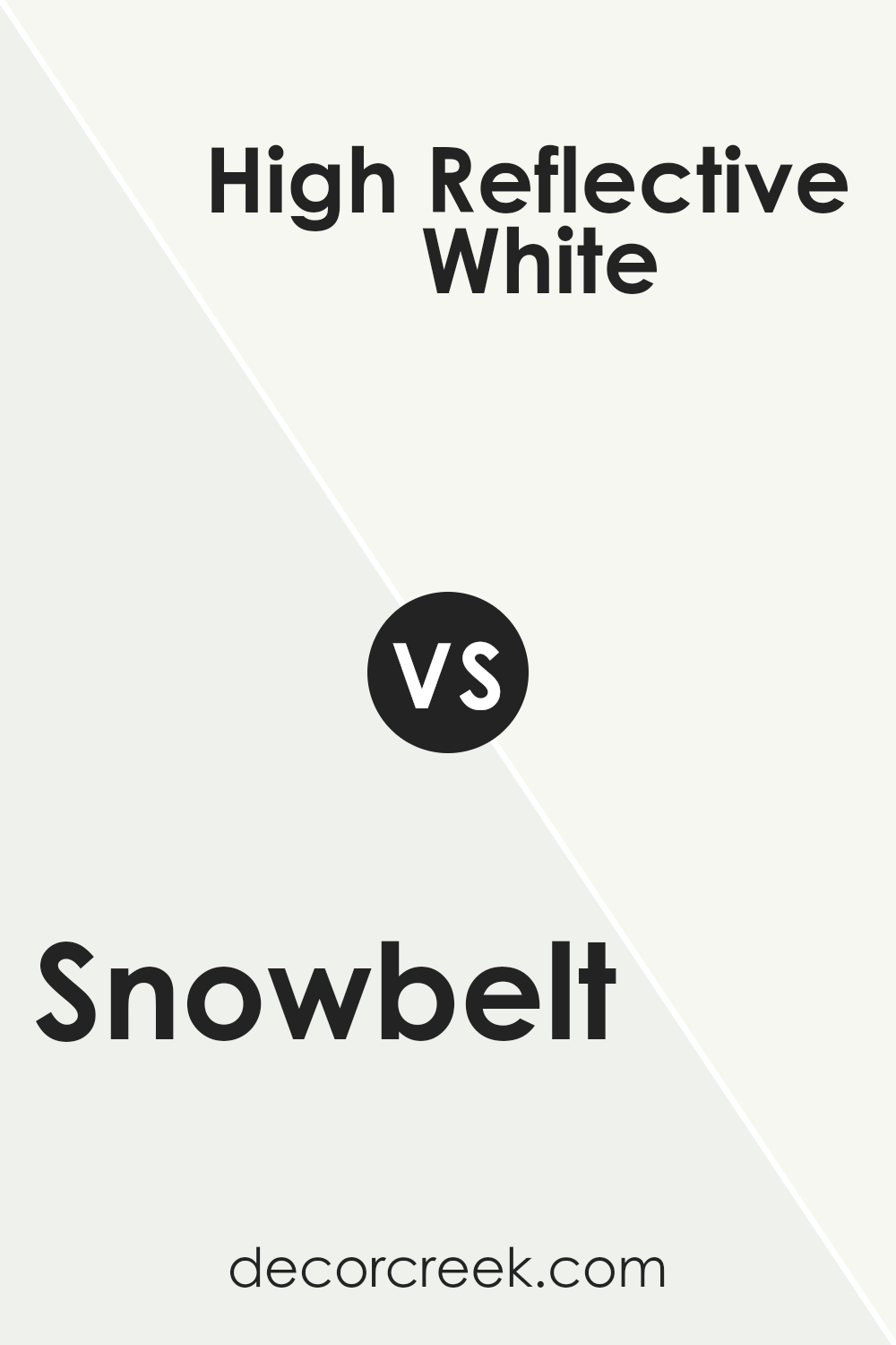
Snowbelt SW 9623 by Sherwin Williams vs High Reflective White SW 7757 by Sherwin Williams
Snowbelt (SW 9623) and High Reflective White (SW 7757) by Sherwin Williams are both white shades, but they have distinct characteristics.
Snowbelt is a soft, off-white color with a subtle gray undertone, offering a cozy and warm feeling. It is versatile and works well in both modern and traditional spaces. On the other hand, High Reflective White is a pure and bright white without any noticeable undertones, making it one of the brightest whites available.
This color is ideal for creating a clean, crisp look and making spaces feel open and airy. While Snowbelt provides a touch of warmth and softness, High Reflective White delivers maximum brightness and clarity.
Both can be paired with different color schemes, but their effects on the mood of a room are unique—Snowbelt adds comfort and warmth, whereas High Reflective White enhances brightness and cleanliness.
You can see recommended paint color below:
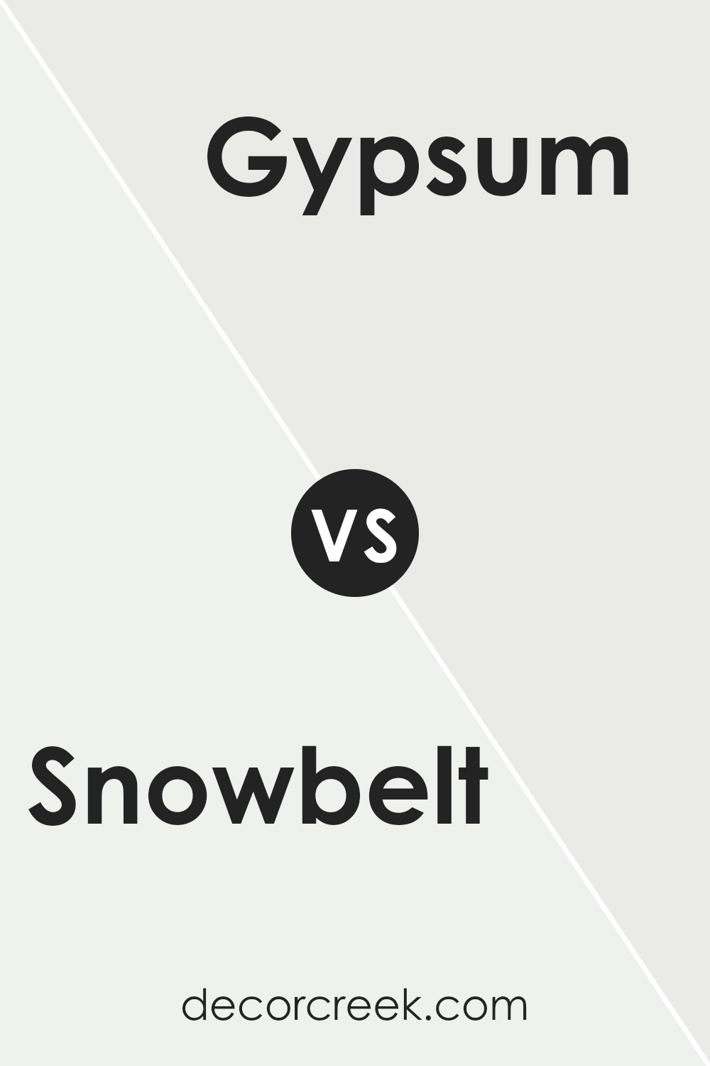
Snowbelt SW 9623 by Sherwin Williams vs Gypsum SW 9543 by Sherwin Williams
Snowbelt and Gypsum, both by Sherwin Williams, are soft and neutral tones that bring a calm feeling to any space.
Snowbelt is a gentle white with a hint of warmth, making it an excellent choice for creating a cozy atmosphere. It’s a versatile color that works well in various settings, whether it’s a bedroom or a living room.
On the other hand, Gypsum is also a white but leans slightly cooler. It provides a clean, crisp look that can open up a space, giving it a fresh, airy feel. When comparing the two, Snowbelt offers a more inviting warmth, while Gypsum projects a cooler freshness.
Both can serve as great backgrounds for other colors, allowing furnishings and accents to stand out. Whether you prefer the warmth of Snowbelt or the coolness of Gypsum, either choice can enhance the look and feel of your home.
You can see recommended paint color below:
Snowbelt SW 9623 by Sherwin Williams vs Pure White SW 7005 by Sherwin Williams
Snowbelt SW 9623 and Pure White SW 7005 by Sherwin Williams are both light and versatile colors, but they have distinct differences.
Snowbelt is a soft, off-white shade with a subtle hint of warm gray, which gives it a cozy and inviting feel. It’s perfect for creating a space that feels warm and welcoming without being too dark.
On the other hand, Pure White is a classic, bright white. It doesn’t have strong undertones, which makes it an excellent choice for a clean and fresh look.
Pure White is versatile and works well in both modern and traditional spaces. It can make a room feel airy and open.
While Snowbelt adds a touch of softness, Pure White offers a crisp and pristine appearance. Choosing between the two depends on whether you prefer the warmth and coziness of Snowbelt or the bright and fresh look of Pure White.
You can see recommended paint color below:
Snowbelt SW 9623 by Sherwin Williams vs Dashing SW 9544 by Sherwin Williams
Snowbelt and Dashing by Sherwin Williams are two distinct colors, each bringing its own vibe to a space.
Snowbelt is a cool, muted color with soft gray undertones that give it a calm and understated elegance. It creates a feeling of openness and works well in spaces you want to feel airy and light. In contrast, Dashing is a richer color with deeper brown tones. It’s warm and earthy, adding coziness and depth to a room.
While Snowbelt can serve as a neutral backdrop, ideal for highlighting other design elements, Dashing commands attention, making it perfect for accent walls or areas where you want to create a sense of warmth and intimacy.
When used together, Snowbelt can balance the boldness of Dashing, ensuring spaces feel inviting yet spacious. Both colors complement different styles but harmonize beautifully for a cohesive look.
You can see recommended paint color below:
Snowbelt SW 9623 by Sherwin Williams vs Ceiling Bright White SW 7007 by Sherwin Williams
Snowbelt and Ceiling Bright White, both from Sherwin Williams, are excellent choices for different purposes.
Snowbelt is a soft, muted white with subtle gray undertones, adding a gentle and calming touch to any room. It’s versatile and can complement various color schemes, providing a cozy backdrop. Ceiling Bright White, on the other hand, is a purer, more traditional white.
It’s crisp and clean, ideal for ceilings as the name suggests, but also great for creating a fresh, spacious feel in any room.
This bright white reflects more light, making spaces appear larger and more open.
When comparing the two, Snowbelt offers warmth and subtlety, while Ceiling Bright White provides clarity and brightness.
Depending on your needs, Snowbelt can soften a space, while Ceiling Bright White can illuminate and enhance openness. Both have their strengths, making them suitable for different design goals.
You can see recommended paint color below:
Snowbelt SW 9623 by Sherwin Williams vs Extra White SW 7006 by Sherwin Williams
Snowbelt and Extra White, both by Sherwin Williams, are two different shades of white paint with distinct characteristics. Snowbelt is soft and warm, featuring subtle undertones that give it a cozy and inviting appearance.
It’s an excellent choice for creating a comfortable and welcoming space in any room.On the other hand, Extra White is a crisp, clean white that has a fresh and modern look. It provides a bright and airy feel, making spaces appear larger and more open.
Its lack of noticeable undertones allows it to pair well with almost any color, offering versatility in design choices.
While Snowbelt offers a touch of warmth, Extra White is more straightforward and pure. Whether you’re looking for coziness or clarity, these colors offer different vibes that can enhance the look and feel of your space according to your preference.
You can see recommended paint color below:
Snowbelt SW 9623 by Sherwin Williams vs Serendipity SW 9671 by Sherwin Williams
Snowbelt (SW 9623) and Serendipity (SW 9671) by Sherwin Williams are two distinct colors that create different moods. Snowbelt is a soft, muted shade of white with a hint of gray, making it feel crisp and clean.
It’s perfect for creating a bright, airy environment without the harshness of a pure white. On the other hand, Serendipity leans towards a gentle pink hue. It adds warmth and a subtle pop of color to a space, making it feel cozy and inviting.
While Snowbelt can be used in various settings for a neutral backdrop, Serendipity is great for adding a touch of warmth to bedrooms or living rooms.
Choosing between them depends on the atmosphere you want to create: Snowbelt for a calm, neutral space, and Serendipity for a comforting, warm feel. Both colors bring their unique charm to any room.
You can see recommended paint color below:
- SW 9671 Serendipity

Snowbelt SW 9623 by Sherwin Williams vs Green Glimpse SW 9676 by Sherwin Williams
Snowbelt SW 9623 and Green Glimpse SW 9676 by Sherwin Williams offer two distinct vibes for a space. Snowbelt is a soft, cool white with a slight hint of gray, making it a versatile choice that can brighten a room while maintaining a subtle elegance.
It’s great for a clean, airy look and works well in spaces where you want a neutral backdrop.
In contrast, Green Glimpse is a gentle, muted green that adds a touch of nature indoors. It has a calming and soothing presence, perfect for creating a peaceful environment. This color pairs well with natural wood tones and other earthy accents, bringing a sense of freshness to a room.
Together, these two colors can create a harmonious environment. Snowbelt’s neutrality allows it to complement the soft nature of Green Glimpse, making them a suitable pairing for different areas of a home, adding both lightness and a bit of character.
You can see recommended paint color below:
- SW 9676 Green Glimpse
Snowbelt SW 9623 by Sherwin Williams vs White Sail SW 9622 by Sherwin Williams
Snowbelt and White Sail, both by Sherwin Williams, are subtle and elegant shades of white. Snowbelt is a slightly cooler white, with a touch of gray that gives it a crisp, refined look.
It’s a perfect choice for spaces where you want to create a clean and modern atmosphere. It pairs well with bold accents, as it doesn’t overshadow other colors but rather complements them.
On the other hand, White Sail is warmer and a bit softer.
It has a hint of creaminess, which brings warmth and coziness to any room. This shade is ideal for making a space feel inviting and comfortable. It blends seamlessly with both traditional and contemporary decor, offering versatility.
Together, Snowbelt and White Sail can be used to create a wonderful balance in any home.Where Snowbelt offers sleekness, White Sail provides warmth, allowing you to design spaces that feel both fresh and welcoming.
You can see recommended paint color below:
After reading about SW 9623 Snowbelt by Sherwin Williams, I can say this paint color is like a cool, cozy blanket for your walls. When you think of snow, you picture something white and peaceful, and that’s what this color brings into a room.
It’s a soft white that isn’t too bright, so it feels comfortable and inviting rather than cold and stark. If I were painting a room, SW 9623 Snowbelt would be a great choice because it works well with many other colors. You can think of it like a blank canvas for decorating.
Whether you want bold colors or gentle, light shades, Snowbelt can handle them all. This makes it handy for any room in the house, from the kitchen to the bedroom.
When I stand back and look at Snowbelt, it reminds me of how much I love the cozy feeling of a fresh snowfall during winter. It’s calming and makes a room feel fresh.
If someone wanted to make a room feel bigger or more open, or if they just wanted a peaceful place to relax, I would definitely suggest SW 9623 Snowbelt.
It’s perfect for anyone looking for a nice change without too much fuss.

Ever wished paint sampling was as easy as sticking a sticker? Guess what? Now it is! Discover Samplize's unique Peel & Stick samples.
Get paint samples

