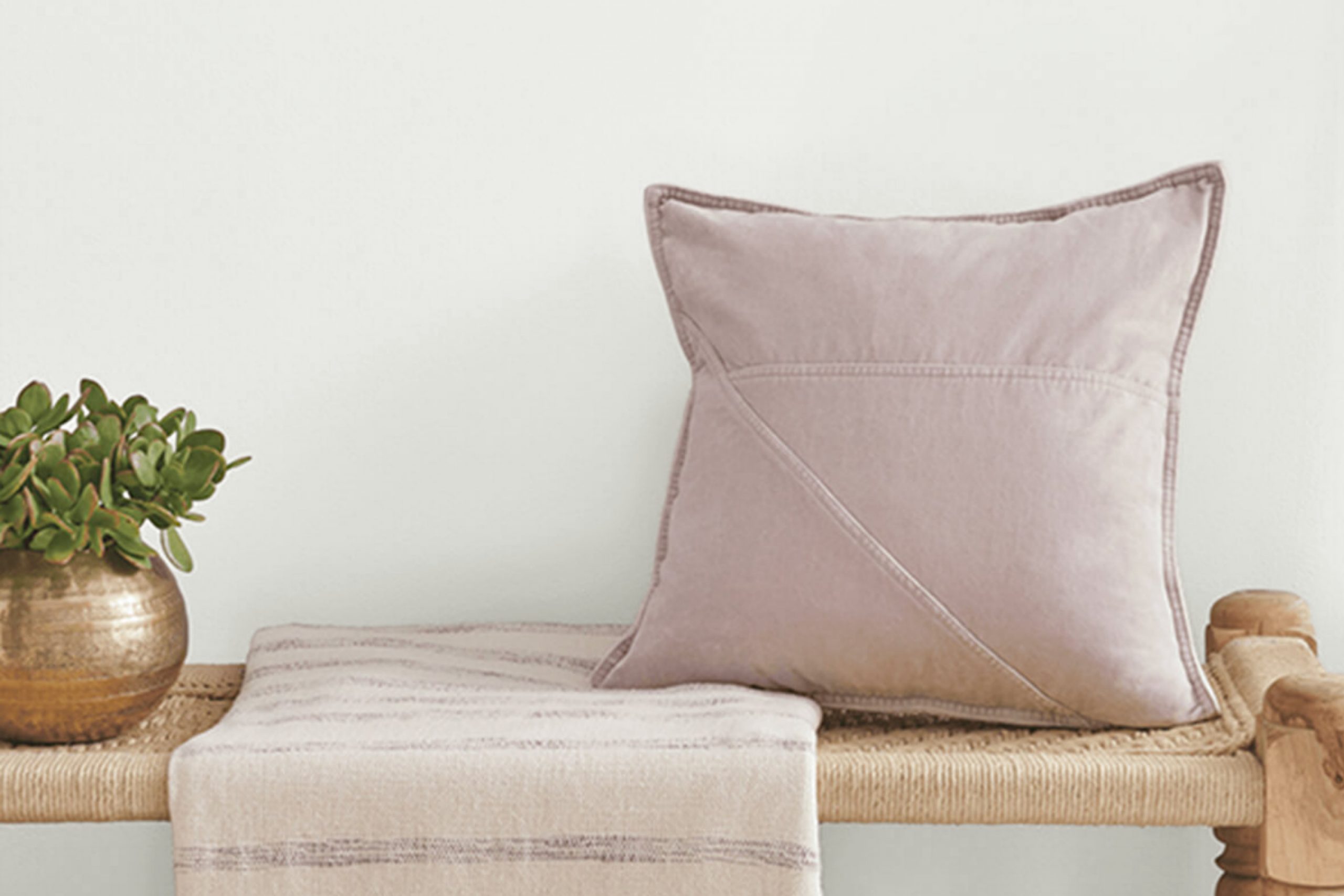
When you think about finding the perfect shade of white for your space, it’s important to consider how it will interact with the light, the mood it sets, and how it complements other elements in your room.
SW 9622 White Sail by Sherwin Williams caught my attention because of its soft, clean look. It’s a white that doesn’t feel too stark; it manages to be both welcoming and versatile.
Whether planning to refresh a living room, brighten up a kitchen, or create a peaceful bedroom retreat, this shade has a way of making spaces feel open and airy without being cold or impersonal.
I appreciated how White Sail works well in different lighting conditions. Natural light enhances its brightness, while artificial lighting brings out its warmth.
Connecting different aspects of a room—be it sleek furniture, vibrant artwork, or natural textures—White Sail provides a harmonious backdrop. Its adaptability is remarkable; it pairs nicely with both bold and neutral colors, making it a fantastic choice for anyone wanting flexibility in their decor.
It’s a shade I find beautifully balances simplicity and sophistication, ensuring a timeless look for your home.
What Color Is White Sail SW 9622 by Sherwin Williams?
White Sail by Sherwin Williams is a soft, warm white with subtle undertones that bring a gentle touch to any interior space.
It’s a versatile shade that works well in a variety of design styles. In coastal or beach-themed interiors, White Sail can evoke a fresh and airy feel, complementing the natural light and creating a relaxed atmosphere.
In modern or minimalist spaces, it offers a clean backdrop that allows both bold and neutral accents to stand out.
This color is a great choice for traditional interiors as well, where its warmth can enhance the coziness of classic furnishings. In Scandinavian-style rooms, White Sail pairs beautifully with natural materials like light woods, wool, and linen, emphasizing simplicity and functionality.
White Sail also matches nicely with textures such as rattan, wicker, and other natural fibers, making it a fitting option for bohemian spaces.
Its understated elegance allows it to work alongside a mix of patterns and textures, from smooth, polished surfaces to more rustic, aged finishes.
Whether on walls, trim, or cabinetry, White Sail provides a harmonious foundation that integrates seamlessly with your home’s aesthetic.
Is White Sail SW 9622 by Sherwin Williams Warm or Cool color?
White Sail (SW 9622) by Sherwin Williams is a versatile paint color that can make a big impact in homes.
Its soft, off-white shade offers a clean and fresh look, making spaces feel bright and airy. Because of its neutral tone, White Sail works well with a wide range of other colors, allowing homeowners to easily change furniture or decor without worrying about clashing.
In living rooms, White Sail can help create a welcoming and open atmosphere. It reflects natural light, making rooms feel larger and more inviting. In bedrooms, it provides a calming backdrop, ideal for rest and relaxation. Its subtle warmth adds coziness, without feeling too cold or sterile.
For kitchens and bathrooms, White Sail offers a timeless and pure look that pairs well with both modern and traditional styles.
It’s also great for highlighting architectural details like moldings or trim, enhancing the overall appearance of any room.
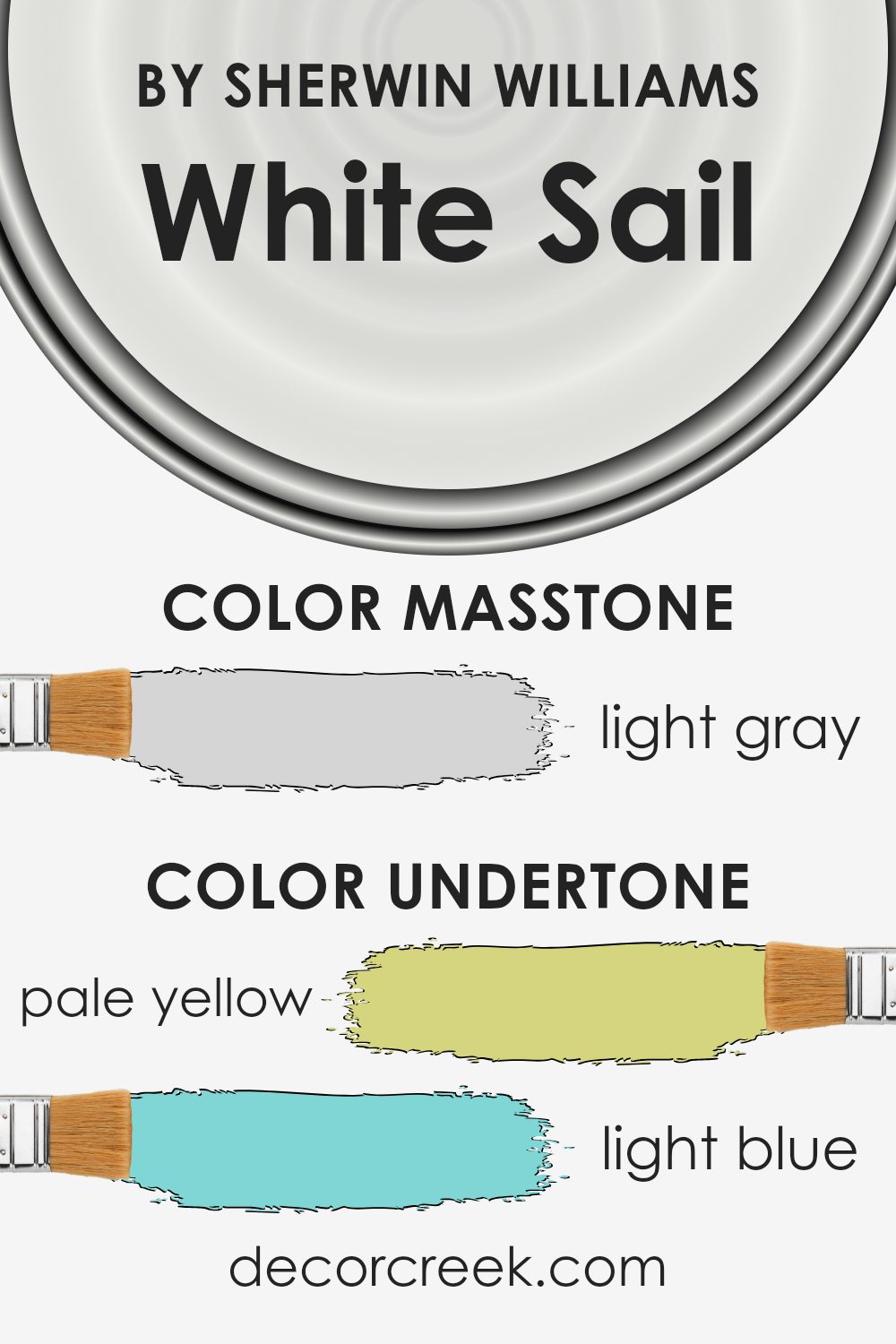
Undertones of White Sail SW 9622 by Sherwin Williams
White Sail (SW 9622) by Sherwin Williams is a versatile and pleasing paint color with a gentle, neutral base that complements many interior designs.
The undertones of this color include pale yellow, light blue, light purple, mint, pale pink, lilac, and grey.
These undertones can subtly change how the color appears, depending on the lighting and surrounding colors in a room.
Undertones significantly influence our perception of paint colors because they add depth and variation. For instance, natural or artificial lighting can make these undertones more pronounced or subdued.
In bright daylight, the light blue and mint undertones might become more noticeable, creating a cooler, fresher feel. Under warmer artificial lighting, pale yellow or pale pink undertones may come forward, adding warmth and coziness to the space.
When White Sail is applied to interior walls, the faint lilac and light purple undertones can create a slightly soothing and gentle effect, especially if the room has complementary decor or furniture.
The grey undertone balances the other colors, ensuring the overall feel remains neutral and versatile. This makes it suitable for different rooms and styles, accommodating a wide range of color schemes while maintaining its friendly and inviting character.
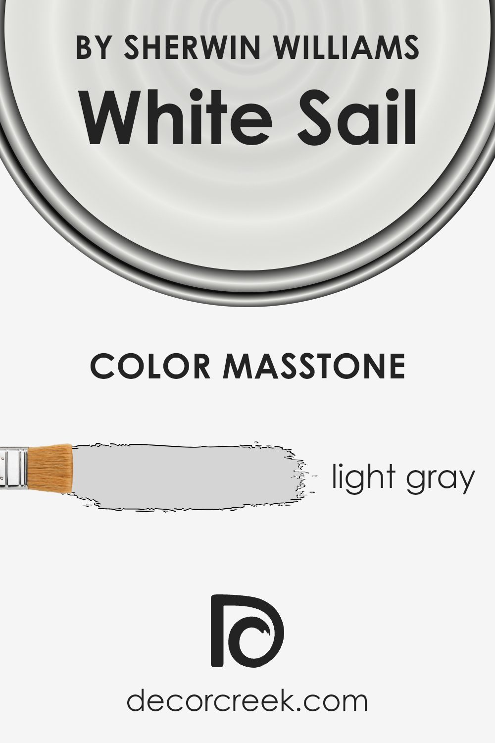
What is the Masstone of the White Sail SW 9622 by Sherwin Williams?
White Sail (SW 9622) by Sherwin Williams is a light gray color with a masstone of #D5D5D5.
This soft shade can bring a clean and fresh look to any room. Its light gray tone doesn’t overwhelm spaces, making it a great choice for those who want a neutral backdrop.
White Sail creates an airy and open feel, especially in smaller rooms, as it reflects light well.
When used on walls, it can make a room look more spacious without feeling too cold or sterile.
It pairs well with both warm and cool accents, offering flexibility in decorating. You can match it with bright colors for a pop, or keep things simple with other neutrals for a calming effect.
Furniture in wood tones or metals looks great against this color too, adding depth and contrast. Overall, White Sail works well to support various styles and preferences in home design.
How Does Lighting Affect White Sail SW 9622 by Sherwin Williams?
Lighting plays a crucial role in how we perceive colors. Different light sources can change how a color appears, influencing its warmth, saturation, and overall tone. The way a paint color looks can shift dramatically between natural daylight and artificial lighting due to differences in color temperature and intensity.
The color White Sail by Sherwin Williams is a soft, slightly warm white. In natural daylight, White Sail generally appears crisp and clean. However, the direction of the natural light significantly affects its appearance. In north-facing rooms, which receive cooler and slightly bluish light, White Sail might appear a bit grayer and less warm, because the cool light dampens its warm undertones.
Conversely, in south-facing rooms, which benefit from direct, warm sunlight, White Sail might look much warmer and softer. The natural, bright lighting enhances its warm undertones, making the space feel cozy and inviting.
In east-facing rooms, the light is warm and yellowy in the morning but becomes cooler and more neutral as the day progresses.
This can mean that White Sail appears warmer earlier in the day, and then takes on a more neutral or even slightly cooler tone later. In contrast, west-facing rooms receive warm, golden light in the late afternoon and evening.
During these times, White Sail can look very warm and rich, especially as the setting sun casts its golden hues. Under artificial lighting, the way White Sail looks will depend on the type of bulbs used. Incandescent and warm LED bulbs will accentuate its warmth, giving it a cozy glow.
On the other hand, cool fluorescent lights might make it look more neutral or even a bit stark, diminishing its warm undertones. Therefore, considering the type of lighting in your space is essential to understand how White Sail, like any color, will truly appear.
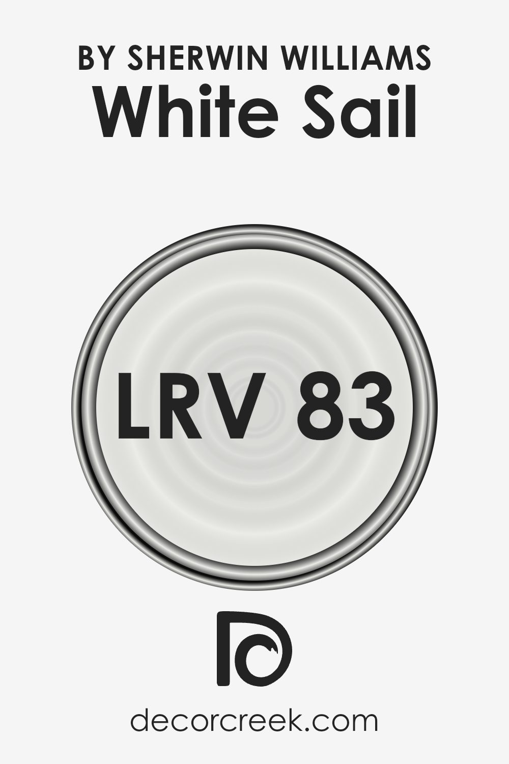
What is the LRV of White Sail SW 9622 by Sherwin Williams?
Light Reflectance Value, or LRV, is a measurement used to express how much light a color reflects. The scale ranges from 0, which represents absolute black and absorbs all light, to 100, which is pure white and reflects all light.
A higher LRV means more light is reflected, which can make spaces feel brighter and more open. Conversely, colors with a lower LRV absorb more light, creating a cozier, more intimate ambiance.
LRV is particularly helpful when choosing paint colors for interiors, as it affects both the brightness of a room and the perception of color in different lighting conditions.
White Sail has an LRV of 82.88, putting it on the higher end of the scale. This means it reflects a significant amount of light, contributing to a bright and airy feel in any room where it is used.
Rooms painted with this color will appear larger and more open, which is advantageous in smaller spaces or areas lacking natural light. The high LRV ensures the color retains its brightness throughout the day, whether in natural sunlight or artificial lighting.
This makes it a versatile choice for both residential and commercial spaces, offering the ability to maintain a clean and inviting atmosphere.
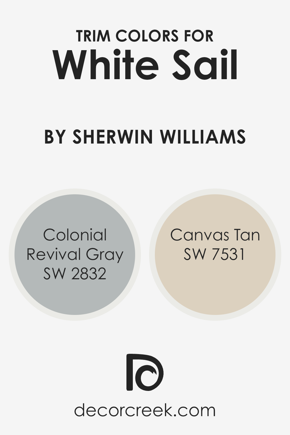
What are the Trim colors of White Sail SW 9622 by Sherwin Williams?
Trim colors are the finishing touches that enhance the overall look and feel of a space, acting as accents that either complement or contrast the main wall color.
When it comes to White Sail by Sherwin Williams, selecting the right trim colors can greatly impact the overall aesthetics of a room. It’s important to choose trim colors that not only add definition and crispness to the space but also harmonize well with the soft, neutral tones of White Sail.
Trims can emphasize architectural details and create visual interest, bringing depth and dimension to a room. Colonial Revival Gray, with its subtle, timeless elegance, can provide a soft contrast against White Sail.
This gray shade is gentle and understated, making it an excellent choice for adding a quiet sense of refinement. On the other hand, Canvas Tan offers a warm, inviting touch. Its light, earthy tone complements White Sail beautifully, enhancing the natural brightness and warmth of a room without overpowering it.
Both colors, when used as trim, contribute to creating a balanced and visually appealing interior.
You can see recommended paint colors below:
- SW 2832 Colonial Revival Gray
- SW 7531 Canvas Tan
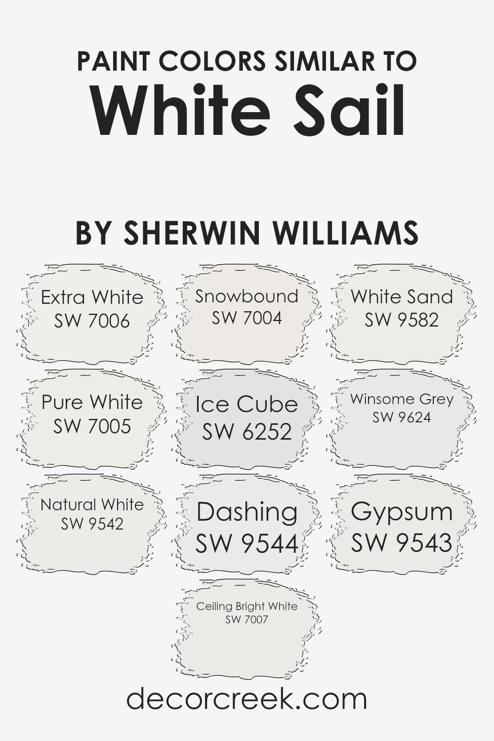
Colors Similar to White Sail SW 9622 by Sherwin Williams
When choosing colors like those similar to White Sail by Sherwin Williams, it’s essential to focus on subtle differences that can create distinct effects in a space.
These colors, though alike, highlight the unique qualities each shade brings to a room. SW 7006, Extra White, offers a bright and clean feel, making spaces look fresh and open.
SW 7005, Pure White, provides a soft and gentle appearance that can help a room feel more welcoming. SW 9542, Natural White, has slight warmth which adds comfort and coziness.
On the other hand, SW 7007, Ceiling Bright White, is ideal for ceilings, enhancing the perception of height and openness.
SW 7004, Snowbound, leans towards a slightly warmer tone, providing a peaceful backdrop. SW 6252, Ice Cube, presents a cooler undertone which is perfect for a modern and sleek look. SW 9544, Dashing, adds a hint of sophistication with its subtle and muted presence.
For something with a touch of earthiness, SW 9582, White Sand, brings warmth without overwhelming the senses. SW 9624, Winsome Grey, infuses a gentle grey that promotes elegance, and SW 9543, Gypsum, rounds out the palette with its timeless and neutral quality.
Each of these colors can shape a different mood, enhancing the ambiance in your space.
You can see recommended paint colors below:
- SW 7006 Extra White
- SW 7005 Pure White
- SW 9542 Natural White
- SW 7007 Ceiling Bright White
- SW 7004 Snowbound
- SW 6252 Ice Cube
- SW 9544 Dashing
- SW 9582 White Sand
- SW 9624 Winsome Grey
- SW 9543 Gypsum
How to Use White Sail SW 9622 by Sherwin Williams In Your Home?
White Sail SW 9622 by Sherwin Williams is a soft, neutral white that can easily brighten up a living space.
Its gentle tone works well in various areas of the home, providing a fresh and clean look without feeling too stark. In the living room, this color can make the space feel more open and inviting, while in the bedroom, it creates a calming atmosphere perfect for relaxation.
Homeowners can use White Sail on walls to create a cohesive backdrop that pairs well with different styles of furniture and décor.
It’s versatile enough to work with both modern and traditional pieces. In the kitchen, White Sail can make the room look more spacious and clean, especially when paired with light countertops and cabinetry.
Because it’s a neutral shade, you can easily add pops of color through accents like pillows, artwork, or rugs, allowing for flexibility in personalizing your home.
White Sail SW 9622 by Sherwin Williams vs Dashing SW 9544 by Sherwin Williams
White Sail SW 9622 by Sherwin Williams is a soft, gentle color with a light and airy feel. It’s a versatile shade that fits well in many spaces, providing a clean and fresh look.
It’s a pale, almost off-white hue with subtle undertones that can adapt to various styles and lighting conditions, creating a bright and open atmosphere.
On the other hand, Dashing SW 9544 by Sherwin Williams presents a more bold and striking appearance. It’s a deeper, richer shade that adds character and warmth to a room. Dashing is a color that makes a statement and works well as an accent or feature wall, offering a sense of coziness and depth.
Both colors serve different purposes: White Sail is perfect for those seeking a bright and subtle backdrop, while Dashing suits those aiming for a more intense, yet inviting, environment. Each color enhances spaces in its unique way.
You can see recommended paint color below:
White Sail SW 9622 by Sherwin Williams vs Winsome Grey SW 9624 by Sherwin Williams
White Sail SW 9622 and Winsome Grey SW 9624 by Sherwin Williams offer two distinct looks for a space.
White Sail is a bright, clean shade that brings a sense of openness and light to a room. It’s a versatile color that pairs well with many other colors and styles, making it a popular choice for creating a fresh and airy atmosphere.
On the other hand, Winsome Grey SW 9624 is a soft, muted grey that adds depth and a touch of coziness to any area. This color is ideal for those looking to introduce a bit of contrast without being too bold. It creates a calm and relaxed environment, perfect for living rooms or bedrooms.
While White Sail focuses on brightness and simplicity, Winsome Grey offers warmth and subtlety.
Both colors can complement each other well in a home, with White Sail used for larger spaces and Winsome Grey providing an accent or highlight.
You can see recommended paint color below:
- SW 9624 Winsome Grey
White Sail SW 9622 by Sherwin Williams vs Gypsum SW 9543 by Sherwin Williams
White Sail SW 9622 and Gypsum SW 9543 by Sherwin Williams are both soft, versatile whites, but they differ subtly. White Sail is a muted, slightly warm white that feels cozy and inviting.
It works well in spaces where a gentle, comfortable atmosphere is desired. In contrast, Gypsum is a cooler white with hints of gray, giving it a more modern and crisp feel. This makes Gypsum a great choice for minimalist or contemporary settings where a clean, fresh look is preferred.
Despite their differences, both colors have the ability to brighten a space and can be paired with a variety of other colors. White Sail complements warmer tones, enhancing the warmth and coziness of a room. Gypsum, on the other hand, pairs beautifully with cooler colors, highlighting their crispness.
Both colors are excellent choices for walls, ceilings, or trim, depending on the mood you want to create.
You can see recommended paint color below:
White Sail SW 9622 by Sherwin Williams vs Natural White SW 9542 by Sherwin Williams
White Sail SW 9622 by Sherwin Williams and Natural White SW 9542 have subtle differences that can change the feel of a room. White Sail SW 9622 is a slightly cooler white, adding a crisp and clean look to spaces.
It pairs well with modern decor, offering a fresh backdrop without overwhelming other colors. Natural White SW 9542 is a warmer white, which brings a cozy and welcoming vibe to interiors.
It’s ideal for spaces where warmth and comfort are priorities, such as living rooms or bedrooms. This color provides a soft, gentle atmosphere while still maintaining brightness.
Both shades are versatile, but the choice between them depends on whether you prefer the refreshing, cool touch of White Sail or the inviting warmth of Natural White.
Each color serves as a great base, allowing furnishings and accents to stand out.
You can see recommended paint color below:
White Sail SW 9622 by Sherwin Williams vs White Sand SW 9582 by Sherwin Williams
White Sail SW 9622 and White Sand SW 9582 by Sherwin Williams are both soft, neutral shades, yet they bring different feels to a space.
White Sail is a classic white that offers a clean, crisp look. It reflects a lot of light, making rooms feel bright and airy, ideal for spaces where you want to emphasize spaciousness.
In contrast, White Sand has a warmer, beige undertone, which gives it a cozy feel. This slight warmth can make a space feel more inviting and comfortable, perfect for areas like living rooms or bedrooms where a comforting atmosphere is desired.
Both colors work well as backdrops in a variety of settings, but the choice between them depends on whether you prefer the freshness of a whiter tone or the warmth of a sandy hue.
Ultimately, White Sail suits modern, minimalist styles, while White Sand enhances warm, homely environments with its subtle beige tint.
You can see recommended paint color below:
White Sail SW 9622 by Sherwin Williams vs Extra White SW 7006 by Sherwin Williams
White Sail SW 9622 and Extra White SW 7006 are both shades of white by Sherwin Williams, but they offer different feels and uses for a space.
White Sail is a softer, warm white with subtle gray undertones. This makes it versatile and ideal for creating a cozy, inviting atmosphere without appearing too stark.
In contrast, Extra White is a crisp, pure white with cooler undertones. It works well in modern spaces, adding brightness and a clean, fresh look. While White Sail is great for areas where you want to showcase warmth and a gentle aura, Extra White suits spaces where you want a bright, sharp accent.
Both colors reflect light beautifully, but their slightly different undertones can change the mood of a room, making White Sail feel more relaxed and gentle, and Extra White more vibrant and contemporary.
These distinctions help in choosing the right shade for any given environment.
You can see recommended paint color below:

White Sail SW 9622 by Sherwin Williams vs Ceiling Bright White SW 7007 by Sherwin Williams
White Sail (SW 9622) by Sherwin Williams is a soft, off-white color that carries a warm undertone. It provides a gentle and inviting feel, making it suitable for spaces where you want a cozy and welcoming atmosphere.
This color tends to complement a variety of other shades, from muted earth tones to vibrant accents, due to its neutrality and slight warmth.
On the other hand, Ceiling Bright White (SW 7007) is a clean and crisp white that is often used for ceilings to create an open and airy feel. It reflects light well, making spaces seem brighter and more spacious. Unlike White Sail, Ceiling Bright White lacks the warm undertones, appearing more pure and stark.
This color works well in modern settings where a fresh and uncluttered look is desired. While both are versatile, the main difference lies in White Sail’s warmth versus Ceiling Bright White’s cool purity.
You can see recommended paint color below:
White Sail SW 9622 by Sherwin Williams vs Snowbound SW 7004 by Sherwin Williams
White Sail (SW 9622) and Snowbound (SW 7004) are both popular white paint colors by Sherwin Williams, but they have distinct differences. White Sail is a softer, warmer white with subtle undertones of beige, giving it a more creamy appearance.
It creates a cozy and inviting atmosphere, making it excellent for living areas and bedrooms where you want a touch of warmth.
On the other hand, Snowbound is a cooler white with faint hints of gray. Its crisper look makes it ideal for spaces that require a fresh and clean feel, such as kitchens or bathrooms. Snowbound’s slight gray undertone can help balance bright sunlight in a room, preventing it from looking too stark.
Choosing between these two whites depends on the mood you want to set in your room. White Sail adds warmth, while Snowbound offers a chic, modern vibe. Both are versatile, but their subtle differences make them suitable for different purposes.
You can see recommended paint color below:
White Sail SW 9622 by Sherwin Williams vs Pure White SW 7005 by Sherwin Williams
White Sail SW 9622 and Pure White SW 7005, both by Sherwin Williams, are subtle yet distinct shades of white. White Sail SW 9622 has a soft, airy quality with a slight hint of warmth.
This makes it a good choice for spaces where you want a welcoming and relaxed feel. It can suit rooms that need a touch of softness without straying too far from a classic white.
On the other hand, Pure White SW 7005 is a cleaner, more neutral white. It has a crisp appearance, making it ideal for modern, minimalist designs where you want a clean and bright look. Pure White pairs well with almost any other color, given its neutrality.
In essence, if you’re looking for warmth and a slightly softer white, White Sail is the choice. For a cleaner and sharper white, Pure White fits the bill. Both colors, depending on the lighting and setting, can offer different vibes to your space.
You can see recommended paint color below:
White Sail SW 9622 by Sherwin Williams vs Ice Cube SW 6252 by Sherwin Williams
White Sail SW 9622 is a soft, pleasant white shade from Sherwin Williams that adds brightness and a clean look to any room.
It is versatile and works well with both modern and traditional decor.
This color creates a light and airy feel, making spaces seem more open and welcoming. Ice Cube SW 6252, on the other hand, is a cool, pale gray with a hint of blue. This color has a calming effect and pairs nicely with cool-toned furnishings and accents.
It brings a subtle touch of color compared to plain white, adding some depth to a room. When comparing the two, White Sail is perfect for those who want a classic, crisp white that’s neutral, while Ice Cube offers a touch of cool color for a more relaxed atmosphere.
Both colors are great choices, depending on whether you’re aiming for a traditional or a slightly colored, modern feel.
You can see recommended paint color below:
After talking so much about SW 9622 White Sail by Sherwin Williams, I can say that it’s a really neat color. Imagine a soft, gentle white that feels like fresh sheets or a fluffy cloud.
This color is super friendly because it can get along with almost any other color you have in mind. You could use it on your bedroom walls or even your living room, and it will make everything look bright and clean.
It’s like having a blank canvas that lets other colors or decorations in your room stand out nicely. If you’re someone who likes to change how your room looks with different pillows or paintings, SW 9622 White Sail is a good choice because it matches everything.
It’s a fantastic color for people who like calm and gentle colors. It may not jump out and scream for attention, but it quietly makes everything look better.
Using SW 9622 White Sail is like having a friend who’s always there to support you and make you feel comfortable.
Whether it’s for a big room or a small corner, it’s a color you can trust to keep things looking nice and bright. So if you’re thinking about changing your room’s paint, this color can surely be a great pick!
Ever wished paint sampling was as easy as sticking a sticker? Guess what? Now it is! Discover Samplize's unique Peel & Stick samples.
Get paint samples

