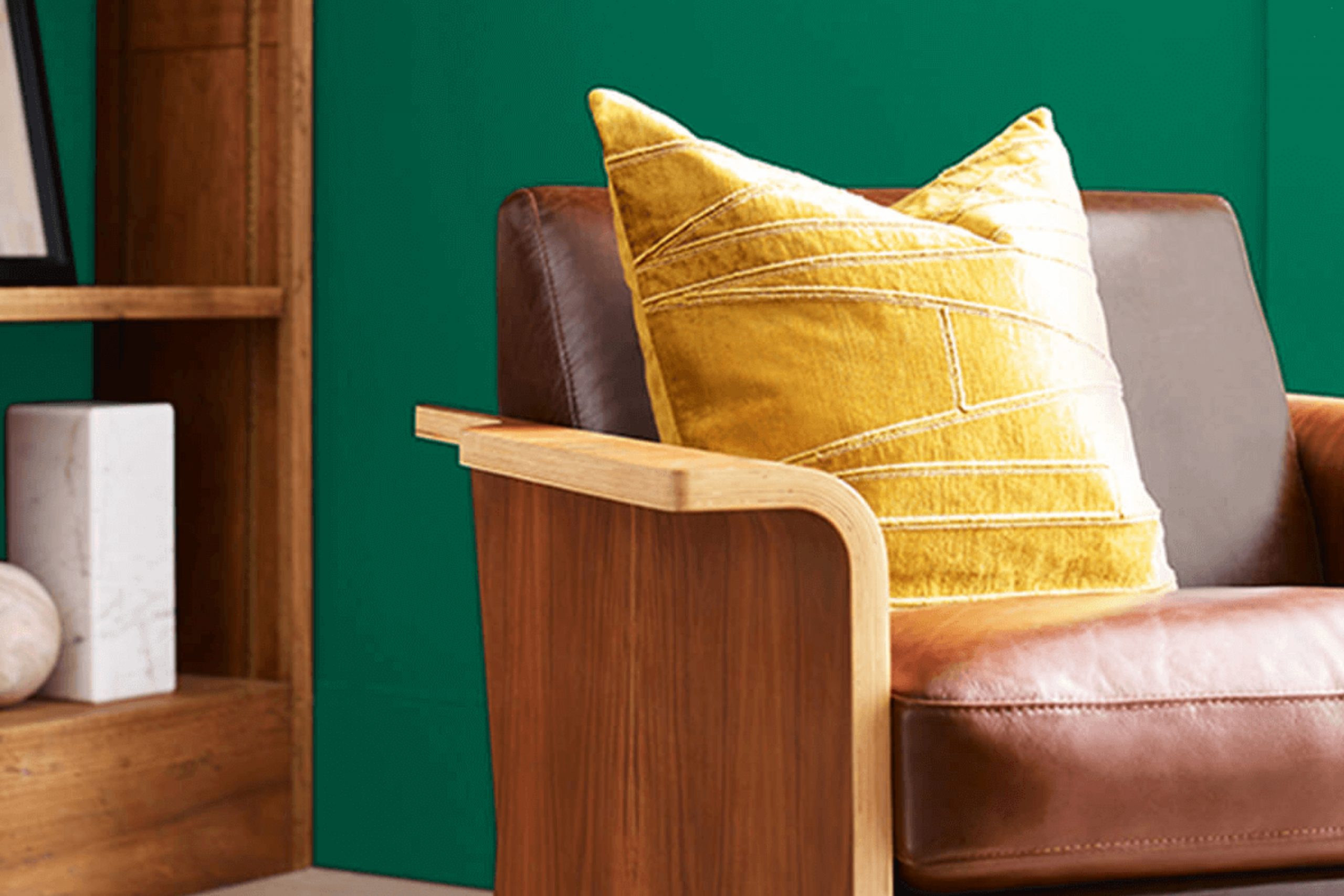
Imagine the feeling of standing by the ocean, the gentle waves lapping at your feet, and a cool breeze carrying the scent of salt in the air. That’s the essence of Sherwin Williams’ SW 6755 Starboard. This color captures the calm and refreshing spirit of coastal life, bringing it into your home in a way that’s both soothing and invigorating. The lively, yet calming shade of blue-green provides a perfect balance, making any room feel welcoming and fresh.
When you add this color to your walls, whether it’s a living room, bedroom, or a study, it creates a sense of renewal and energy. It’s like bringing a piece of the sea and sky indoors. Compliment it with soft neutrals or pair it with brighter colors to make your room feel personalized and vibrant.
Every time you walk into a room painted in SW 6755 Starboard, it’s as if you’re being gently reminded of the natural beauty of ocean views and open skies. It’s a flexible color that whispers calm and yet, it has a lively heart.
Using Starboard in your home is like adding a touch of nature’s own palette to your daily life—a constant, calming presence that keeps your environment peaceful and inviting.
What Color Is Starboard SW 6755 by Sherwin Williams?
Starboard SW 6755 by Sherwin Williams is a vibrant green hue reminiscent of fresh leaves and lush gardens. Its lively and refreshing nature makes it a standout choice for those looking to bring a splash of natural energy into their interiors. This color works exceptionally well in areas that aim for a lively and energetic feel, such as kitchens, bathrooms, and living rooms. It’s perfect for coastal, bohemian, and modern farmhouse styles, where a touch of nature is appreciated.
In coastal designs, Starboard pairs beautifully with whites and soft grays, echoing the natural colors of the sea and sand. In bohemian rooms, it complements earthy tones, creating a relaxed and inviting atmosphere. Modern farmhouse interiors benefit from its fresh contrast against rustic wood textures and classic neutral palettes.
When it comes to materials, Starboard shines alongside natural wood, wicker, and rattan, enhancing their organic feel. It pairs well with crisp white accents and metals like brushed nickel or brass for a balanced aesthetic. Textures such as linen and cotton in upholstery, along with jute or sisal rugs, enhance its natural appeal. Whether you want a lively feature wall or vibrant cabinetry, Starboard creates an energized and welcoming environment.
Is Starboard SW 6755 by Sherwin Williams Warm or Cool color?
Starboard by Sherwin Williams (SW 6755) is a refreshing shade of green that can bring a sense of calm and freshness to any room. It’s a color that can brighten up your home without being overpowering. In living rooms, it can create a warm and welcoming atmosphere, making the room feel more inviting and cozy.
In bedrooms, Starboard offers a soothing backdrop, promoting relaxation and peace, which can help improve sleep quality. When used in kitchens, it adds a lively yet calming feel, making the room pleasant to cook and dine in. This shade of green pairs well with natural wood tones and neutral colors, allowing it to fit effortlessly with various styles and decors.
If you’re looking to add some color to your home but want to keep things subtle and stylish, Starboard is a great choice. It’s flexible and works well in many rooms, offering a gentle touch of color that feels both natural and polished.
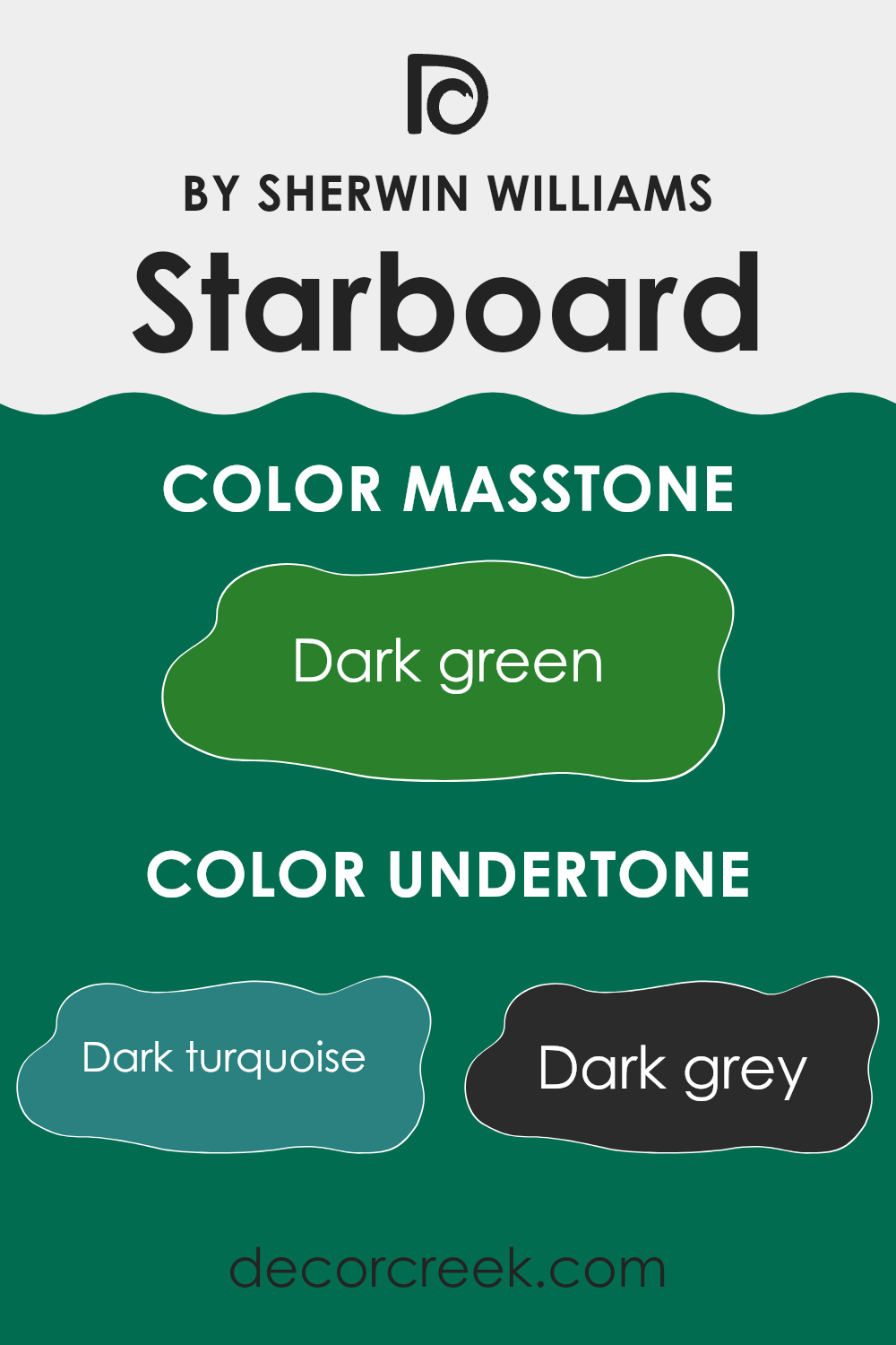
Undertones of Starboard SW 6755 by Sherwin Williams
Starboard by Sherwin Williams is a complex and flexible color that can shift its appearance depending on its undertones and the surrounding environment. The color contains a range of undertones including dark turquoise, dark grey, navy, green, light turquoise, olive, grey, brown, purple, light green, and mint. These undertones can affect how the color appears in various lighting situations and in combination with other colors.
For example, the presence of dark turquoise and light turquoise lends a cool and refreshing feel to the color, making it suitable for creating a calming room. The navy and dark grey undertones can add depth and richness, providing a more grounded look. Green and olive undertones introduce a nature-inspired vibe, creating an earthy environment, especially when paired with plants or wooden accents.
On interior walls, Starboard’s mix of undertones allows it to coordinate well with a wide array of furnishings and decor. In natural light, it might lean towards its lighter mint and turquoise side, offering a fresh and airy atmosphere. In dimmer conditions, the deeper navy and grey undertones could become more prominent, giving the room a cozier and more intimate feel. These adaptable characteristics make Starboard a flexible choice for many different interior settings.
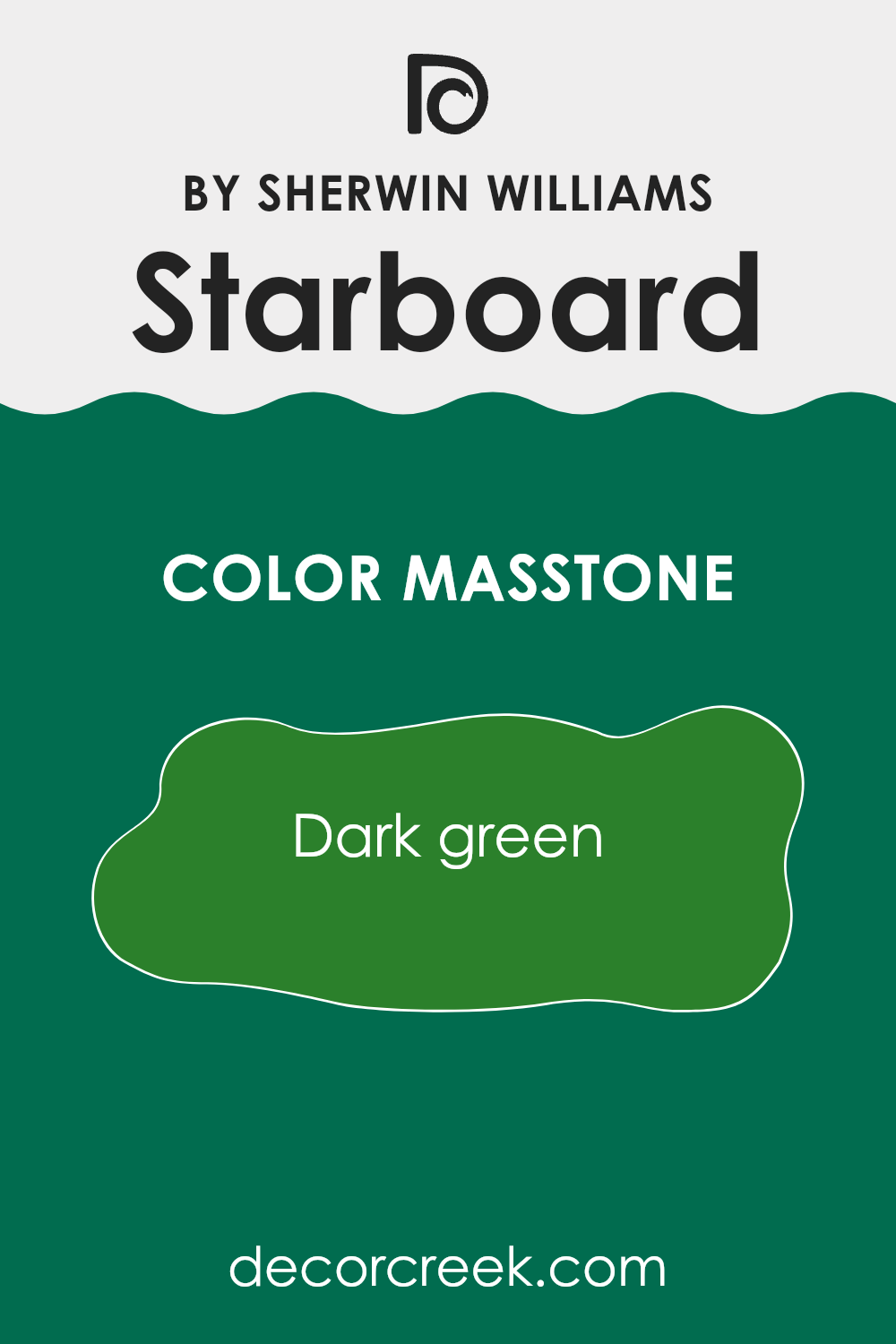
What is the Masstone of the Starboard SW 6755 by Sherwin Williams?
Starboard SW 6755 by Sherwin Williams is a rich dark green that can bring a natural, refreshing feel into a home. This shade is reminiscent of deep forests and lush landscapes, offering a calming vibe. When used in living areas, it can promote a relaxed atmosphere, providing a room to unwind after a busy day.
In a kitchen or dining room, this green might encourage a sense of comfort and warmth, making mealtime more inviting. It pairs well with natural woods or neutral colors, allowing it to stand out without being too strong in a room.
This color works well in a study or home office, where its deep hue can help create a focused and peaceful environment. For those who want a bold choice in bathrooms or bedrooms, the dark green creates a cozy, intimate area. Additionally, when light interacts with the color, it adds more depth, bringing a dynamic aspect to the decor.
How Does Lighting Affect Starboard SW 6755 by Sherwin Williams?
Lighting plays a significant role in how we perceive colors in a given area. It can change the way a color looks and feels, creating different moods and atmospheres. One such color, Starboard (SW 6755) by Sherwin Williams, is a type of blue-green that can vary widely under different lighting conditions.
In natural light, Starboard can appear fresh and vibrant. However, the direction of the natural light makes a difference. In north-facing rooms, where the light is cooler and more consistent throughout the day, Starboard may lean more towards the blue side, appearing cooler and a bit more muted. In a south-facing room, with warmer, stronger light, the color can look brighter and more vivid, bringing out the green tones. This makes the room feel warmer and more inviting.
In east-facing rooms, where the sun is abundant in the morning but fades in the afternoon, Starboard may appear brighter and more energetic in the morning light, but as the day goes on, it can begin to appear more subdued or cooler. Conversely, in a west-facing room, Starboard will likely seem muted in the morning but become more lively and saturated in the afternoon and early evening as the sun sets and the light warms up.
Artificial lighting also has a substantial impact. Under warm incandescent or LED lights, Starboard can appear warmer and more towards the greenish spectrum, while under cool fluorescent lights, it might look sharper and more blue. If you use mixed lighting, the color might change as the windows cast natural light and lamps add a warmer glow.
Thus, when choosing Starboard, consider the room’s lighting direction and plan your artificial lighting to achieve your desired effect. Lighting can make the same paint color look entirely different from one room to another.
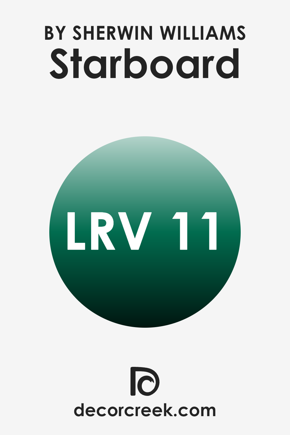
What is the LRV of Starboard SW 6755 by Sherwin Williams?
Light Reflectance Value, or LRV, is a measurement that expresses the amount of visible and usable light that reflects from a painted surface when it is illuminated by a light source. The scale ranges from 0, which represents absolute black and no light reflection, to 100, which indicates pure white and maximum light reflection. Simply put, LRV tells you how light or dark a color will appear once it’s on the wall.
The higher the LRV, the more light a color will reflect and thus appear lighter, while lower LRVs indicate less light reflection and a generally darker appearance. LRV is critical in interior design, as it influences how a color may brighten or darken a rm, affecting the room’s overall mood and ambiance.
For the color Starboard SW 6755 by Sherwin Williams, the LRV is 10.927, indicating it is a fairly dark color. This means Starboard will absorb most of the light that hits it, reflecting only a small amount. As a result, this color can create a cozy and intimate atmosphere in a room, but it might also make the room feel smaller or more enclosed if used excessively in a small room with little natural light. When employed in larger areas or rooms with abundant natural or artificial lighting, this color can add depth and elegance without being too strong. It’s ideal for accent walls or areas where a more subdued and strong color is desired.
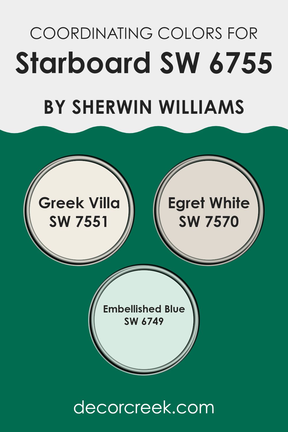
Coordinating Colors of Starboard SW 6755 by Sherwin Williams
Coordinating colors are shades that complement each other, creating a harmonious look when used together in a room. They work by balancing and enhancing the main color without overpowering it. When looking at the paint color Starboard by Sherwin Williams, certain shades like Greek Villa, Egret White, and Embellished Blue work well together because they share a common tone or temperature, making them fit naturally alongside each other.
Greek Villa is a warm, soft white with a touch of cream, making it a perfect neutral base. It provides a gentle contrast without pulling attention away from the main palette. Egret White is a light and airy grayish off-white that adds a bit more depth.
It blends easily with other colors, making areas feel open yet cozy. Embellished Blue is a rich, calming shade with hints of teal. It adds a pop of color that ties the neutral tones together, creating a cohesive and inviting environment. By combining these shades, you create a well-coordinated color scheme that brings harmony and balance to any room, making it feel welcoming and put-together.
You can see recommended paint colors below:
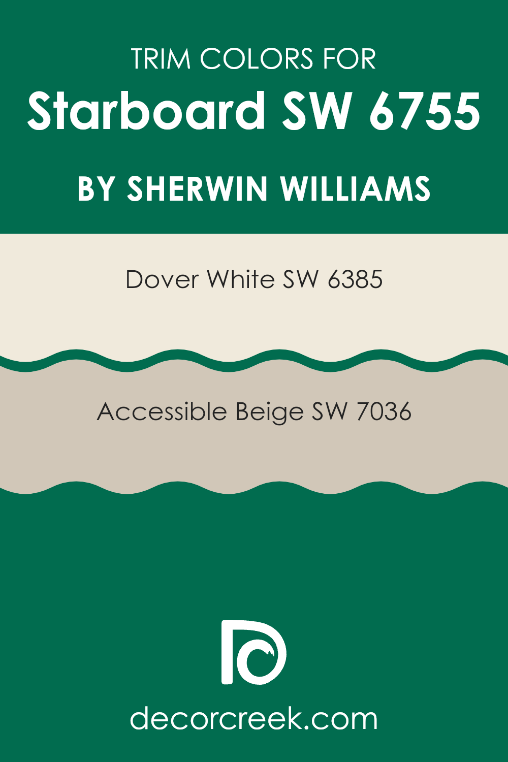
What are the Trim colors of Starboard SW 6755 by Sherwin Williams?
Trim colors refer to the hues used on the edges and extensions of a room, such as baseboards, moldings, and window frames, to provide emphasis and contrast to the primary wall color. Using trim colors like Dover White and Accessible Beige can significantly enhance the overall appearance of a room by creating a polished and cohesive look.
These colors help define the architecture of a room, drawing attention to its unique features and providing a crisp, clean outline that contrasts or complements the main wall color. Dover White, a warm and classic white, adds a clean and fresh feel without being too stark.
It’s ideal for areas where a soft, inviting finish is desired. Accessible Beige, on the other hand, is a neutral color with a hint of warmth, creating a cozy and welcoming ambiance that subtly complements a variety of other colors. Both of these trim colors offer versatility and can bring out the best in the main colors like Starboard, making them important choices in achieving a harmonious and appealing interior design.
You can see recommended paint colors below:
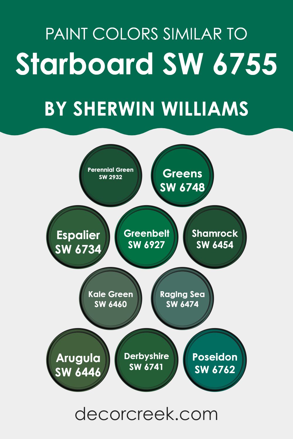
Colors Similar to Starboard SW 6755 by Sherwin Williams
Similar colors are important because they create harmony and balance in a room. They can complement a main color, like Starboard by Sherwin Williams, and help maintain a cohesive look. Similar colors often share the same undertones and saturation, allowing them to blend seamlessly with the main color instead of causing stark contrasts. This can enhance the mood of a room by creating a more unified and calming environment.
Take for example some colors similar to Starboard. SW 2932 Perennial Green evokes the fresh vibrancy of new garden leaves, offering a lively touch. SW 6748 Greens provides a natural, earthy green that reminds one of lush grass.
SW 6734 Espalier has a subtle, muted green, like leafy vines basking in the sun. SW 6927 Greenbelt offers a deeper, forest-like green, bringing outdoor vibes inside. SW 6454 Shamrock is a rich, traditional green, reminiscent of classic Irish landscapes. SW 6460 Kale Green offers a deeper tone, similar to the shade of hearty kale leaves. SW 6474 Raging Sea adds an intriguing blue-green depth, like a storm-touched ocean. SW 6446 Arugula is a bold and spicy green, much like the leafy vegetable it is named after.
SW 6741 Derbyshire presents a calm and balanced green, drawing from pastoral English countryside scenes. SW 6762 Poseidon is a deeper blue-green hue, bringing in the mystery and depth of oceanic tones. Together, these colors work beautifully with Starboard, crafting a harmonious and visually appealing palette.
You can see recommended paint colors below:
- SW 2932 Perennial Green
- SW 6748 Greens
- SW 6734 Espalier
- SW 6927 Greenbelt
- SW 6454 Shamrock
- SW 6460 Kale Green
- SW 6474 Raging Sea
- SW 6446 Arugula
- SW 6741 Derbyshire
- SW 6762 Poseidon
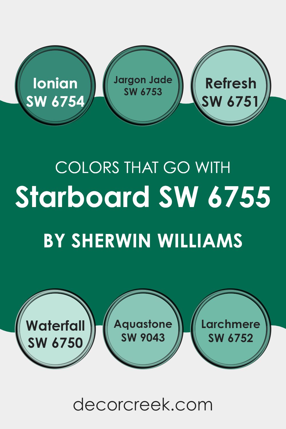
Colors that Go With Starboard SW 6755 by Sherwin Williams
The colors that pair with Starboard SW 6755 by Sherwin Williams are carefully chosen to create harmony and balance in any room. Each color brings its unique qualities, making them important in setting the desired mood and atmosphere. SW 6754 – Ionian is a vibrant blue-green that adds a fresh, lively feel, working well to energize a room.
SW 6753 – Jargon Jade is a deeper green, offering a rich, calm undertone that’s perfect for adding depth and warmth. When combined, these colors create a well-rounded palette that can enhance both modern and traditional settings.
SW 6751 – Refresh is a light, airy green that adds a touch of brightness, ideal for opening up areas and creating a feeling of openness. SW 6750 – Waterfall is a gentle blue-green that soothes, making it a perfect partner for creating a calm and peaceful environment.
SW 9043 – Aquastone brings a subtle, muted green that blends seamlessly with both bold and subtle accents. Lastly, SW 6752 – Larchmere is a medium teal that offers a classic appeal, tying these colors together beautifully. Together, these colors complement Starboard SW 6755 by enhancing its depth while adding diverse tones that can adjust to any design style or need.
You can see recommended paint colors below:
- SW 6754 Ionian
- SW 6753 Jargon Jade
- SW 6751 Refresh
- SW 6750 Waterfall
- SW 9043 Aquastone
- SW 6752 Larchmere
How to Use Starboard SW 6755 by Sherwin Williams In Your Home?
Starboard SW 6755 by Sherwin Williams is a charming blue-green color that can add a fresh touch to any home. It’s perfect for someone looking to introduce a coastal vibe or simply wanting to brighten up their living room.
This color works wonderfully in living rooms, kitchens, or bathrooms. If your kitchen cabinets are white or light wood, painting the walls Starboard can provide a lovely contrast. In the living room, you can use it to create an accent wall that becomes a focal point. Pair it with neutral furniture for a balanced look.
Additionally, using Starboard in a bathroom can create a spa-like atmosphere, calming anyone who enters. Because it’s a flexible shade, it also blends well with various styles, from modern to traditional. Accessories like cushions or vases in the same color can tie the room together, making it inviting and harmonious.
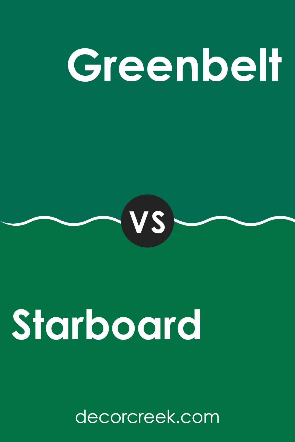
Starboard SW 6755 by Sherwin Williams vs Greenbelt SW 6927 by Sherwin Williams
Starboard SW 6755 by Sherwin Williams is a fresh, crisp green with a hint of blue, giving it a cool and calming feel. It’s flexible, making it suitable for various rooms, from living rooms to bedrooms, where a touch of nature is desired.
On the other hand, Greenbelt SW 6927 is a more vibrant and lively green. It has a warm undertone, which makes it feel energetic and bright. This makes it a great choice for areas where a pop of color is needed, like an accent wall or a kitchen.
While Starboard feels more soothing and softer, Greenbelt stands out with its boldness and energy. Both colors bring a sense of the outdoors inside, but they do so in their own unique ways. Starboard is ideal for those seeking a calming effect, while Greenbelt is perfect for adding a lively touch to any room.
You can see recommended paint color below:
- SW 6927 Greenbelt
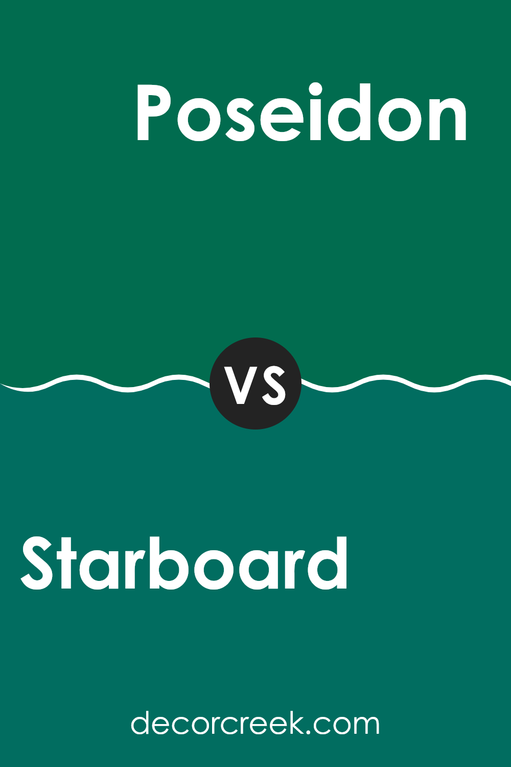
Starboard SW 6755 by Sherwin Williams vs Poseidon SW 6762 by Sherwin Williams
Starboard SW 6755 and Poseidon SW 6762 by Sherwin Williams are two distinct shades of green that bring different feels to a room. Starboard is a lighter, more muted green that has a fresh and airy vibe. It feels like a gentle breeze or a walk through a garden on a sunny day, making it great for areas where you want a calm and refreshing atmosphere.
On the other hand, Poseidon is darker and richer, like the deep sea. It carries a stronger, more dramatic presence that can make a room feel cozy and intimate. This shade is ideal for creating a bold statement or for areas where you want a warm and inviting feel.
Both colors can add nature-inspired elements to a home, but Starboard’s lightness is more uplifting, while Poseidon’s depth brings a sense of intensity and warmth. Each has its own unique charm, depending on your style and mood preferences.
You can see recommended paint color below:
- SW 6762 Poseidon
Starboard SW 6755 by Sherwin Williams vs Greens SW 6748 by Sherwin Williams
Starboard SW 6755 and Greens SW 6748 by Sherwin Williams are both vibrant green shades, but they offer different vibes. Starboard SW 6755 is a fresh, lively green that brings to mind images of lush greenery and a sense of the outdoors. It’s bright without being overpowering, making it a great choice for areas where you want to feel energized and connected to nature.
On the other hand, Greens SW 6748 is a slightly deeper shade. It offers a more mellow and grounded feeling compared to the lighter Starboard. This color can add warmth to a room, creating a relaxed and inviting atmosphere.
Both colors work well in various settings, but Starboard is better for energizing areas like kitchens or playrooms, while Greens might work in a living room or bedroom where a more restful ambiance is preferred.
You can see recommended paint color below:
- SW 6748 Greens
Starboard SW 6755 by Sherwin Williams vs Kale Green SW 6460 by Sherwin Williams
Starboard SW 6755 by Sherwin Williams is a vibrant, energetic green with a bright, fresh feeling. It resembles the color of healthy, lush grass and is perfect for areas that want to invoke a sense of nature and activity.
In contrast, Kale Green SW 6460 by Sherwin Williams is a darker, more muted shade of green. It brings to mind leafy greens or a walk through a dense forest, offering a more grounded and earthy vibe. While Starboard is lively and bold, Kale Green is more subdued and calming.
The two colors can complement each other well; Starboard can be used as an accent while Kale Green can serve as the main color to create balance and contrast in a room. Both add a touch of the outdoors but offer different moods: one invigorates while the other provides a sense of relaxation.
You can see recommended paint color below:
- SW 6460 Kale Green
Starboard SW 6755 by Sherwin Williams vs Espalier SW 6734 by Sherwin Williams
Starboard SW 6755 and Espalier SW 6734 are both shades of green by Sherwin Williams, but they offer different vibes. Starboard SW 6755 is a more intense, bold green with a slightly cooler tone. It’s vibrant and lively, making it great for areas where you want energy and freshness.
On the other hand, Espalier SW 6734 is a softer, warmer green. It feels more subdued and calming, making it suitable for areas where you want a more relaxed atmosphere. While Starboard might be eye-catching and is perfect for a feature wall adding some zest, Espalier provides a gentle backdrop, ideal for entire rooms without being too strong on the senses.
Both colors bring the essence of nature indoors, but in distinct ways – one with exuberance and the other with subtlety. Depending on the mood you wish to create, you can choose between the brightness of Starboard and the mellow tone of Espalier.
You can see recommended paint color below:
- SW 6734 Espalier
Starboard SW 6755 by Sherwin Williams vs Shamrock SW 6454 by Sherwin Williams
Starboard SW 6755 and Shamrock SW 6454 are both greens by Sherwin Williams, but they have distinct vibes. Starboard is a rich, deep green that’s almost like a dark forest. It’s strong and makes a bold statement in any room, giving a cozy, grounded feel.
On the other hand, Shamrock is a lighter, brighter green with a hint of freshness, reminiscent of springtime and new growth. It brings energy and light to a room, creating a lively and refreshing atmosphere.
While Starboard feels more mature and intimate, Shamrock is vibrant and invigorating. Choosing between them depends on the mood you want in your area. If you want a warm, snug environment, the first choice is ideal. For a cheerful and revitalizing feel, the latter is perfect. Both can be beautiful in different settings, adding unique character to your decor.
You can see recommended paint color below:
Starboard SW 6755 by Sherwin Williams vs Derbyshire SW 6741 by Sherwin Williams
Starboard SW 6755 and Derbyshire SW 6741 from Sherwin Williams are both shades of green, but they have different vibes. Starboard is a fresh, lively green that gives off a cheerful and energetic feel. It’s reminiscent of bright grassy fields or new leaves in spring, bringing a sense of nature indoors.
Derbyshire, on the other hand, is a richer, deeper green that suggests maturity and stability. It has an earthy, grounded quality, similar to lush forests or dark moss. While Starboard can brighten up a room with its vibrant tone, Derbyshire adds depth and creates a cozy atmosphere.
The two colors can work together to balance a room—Starboard adding a burst of brightness while Derbyshire provides a calming contrast. Whether using them separately or in tandem, these greens each offer a unique touch to any home decor.
You can see recommended paint color below:
- SW 6741 Derbyshire
Starboard SW 6755 by Sherwin Williams vs Raging Sea SW 6474 by Sherwin Williams
Starboard SW 6755 and Raging Sea SW 6474 by Sherwin Williams are both shades of green, yet they bring different vibes to a room. Starboard is a bright and bold green, giving off an energizing and lively feel.
It’s the kind of color that catches the eye and can make a room feel fresh and vibrant. On the other hand, Raging Sea is a more muted, deeper green with blue undertones. This color provides a more grounded, calming atmosphere, reminiscent of natural, earthy tones.
Together, these colors can complement each other well depending on the desired mood. For a room that needs energy and brightness, Starboard is a great choice. Meanwhile, for a relaxed and cozy area, Raging Sea might be more suitable. Whether used separately or together, both colors offer a unique touch to any environment, allowing flexibility in home design.
You can see recommended paint color below:
- SW 6474 Raging Sea
Starboard SW 6755 by Sherwin Williams vs Perennial Green SW 2932 by Sherwin Williams
Starboard SW 6755 and Perennial Green SW 2932 by Sherwin Williams are two green shades but with distinct personalities. Starboard is a lighter, brighter green that evokes a sense of freshness and brightness. It resembles the color of young leaves in spring, providing a lively and energizing feel to areas.
It’s a great choice for areas where you want to bring in a touch of nature and openness, such as kitchens or playrooms. On the other hand, Perennial Green is a deeper, richer hue. It brings a more grounded and cozy feeling to a room, making it suitable for places where you desire a comfortable and relaxing atmosphere, like bedrooms or living rooms.
While Starboard injects a burst of energy, Perennial Green offers a touch of warmth. Choosing between these two colors depends on whether you want an invigorating vibe or a calm, nurturing environment. Both colors bring in elements of nature but cater to different moods.
You can see recommended paint color below:
- SW 2932 Perennial Green
Starboard SW 6755 by Sherwin Williams vs Arugula SW 6446 by Sherwin Williams
Starboard SW 6755 and Arugula SW 6446 by Sherwin Williams are both beautiful shades of green, but they each have their unique charm. Starboard is a bright, fresh green that reminds you of a lush, grassy field on a sunny day. It has a light and cheerful quality that can really brighten up a room.
On the other hand, Arugula is a deeper, more muted green. It resembles the leafy vegetable it’s named after and brings a sense of nature into your home. Arugula has an earthy tone, making it feel more grounded and calming compared to the vibrant Starboard.
Both colors are great for adding a touch of nature indoors, but they serve different moods. Starboard is perfect for areas where you want to feel energized and refreshed, while Arugula works well in areas where you want to relax and unwind.
You can see recommended paint color below:
After considering everything about SW 6755 Starboard by Sherwin Williams, I find it to be a truly special color. Imagine a calm day at the beach with the sky and sea showing off different shades of blue and green. That’s what this color reminds me of. It’s like bringing a piece of nature into your home, making rooms feel fresh and comforting.
When I looked at how it works in different rooms, I saw that SW 6755 Starboard can make a small room feel more open and an open room feel inviting. It works well with different styles, so whether you like modern furniture or something more classic, this color can be a great choice. You can use it on one wall to make it stand out or paint the whole room to give it a new look.
I think this color can make your home feel welcoming and cozy. It’s like a friendly hug from your walls. If you’re thinking of choosing a new paint color, I recommend considering SW 6755 Starboard. It’s a color that feels alive and at home at the same time. That balance is why I believe it could make any room feel special.
Ever wished paint sampling was as easy as sticking a sticker? Guess what? Now it is! Discover Samplize's unique Peel & Stick samples.
Get paint samples

