Discovering the perfect shade of green can be a real challenge when decorating, but SW 6454 Shamrock by Sherwin-Williams might just be the color you need. Perfect for adding a hint of nature’s vibrancy, this particular green is bold and clear without overwhelming a space.
It reflects a classic charm that works beautifully in kitchens, bathrooms, and study areas, complementing both modern and traditional designs.
Whether you’re aiming to refresh an old piece of furniture or thinking about an accent wall, Shamrock adds a fresh and lively touch. It pairs well with neutral tones like white, beige, and gray, allowing you to create a balance that feels both refreshing and well-planned.
If you’re looking for a green that stands out but also works harmoniously within various design schemes, consider Shamrock for your next project.
This color can give your space a lively lift and bring a sense of freshness wherever it’s used.
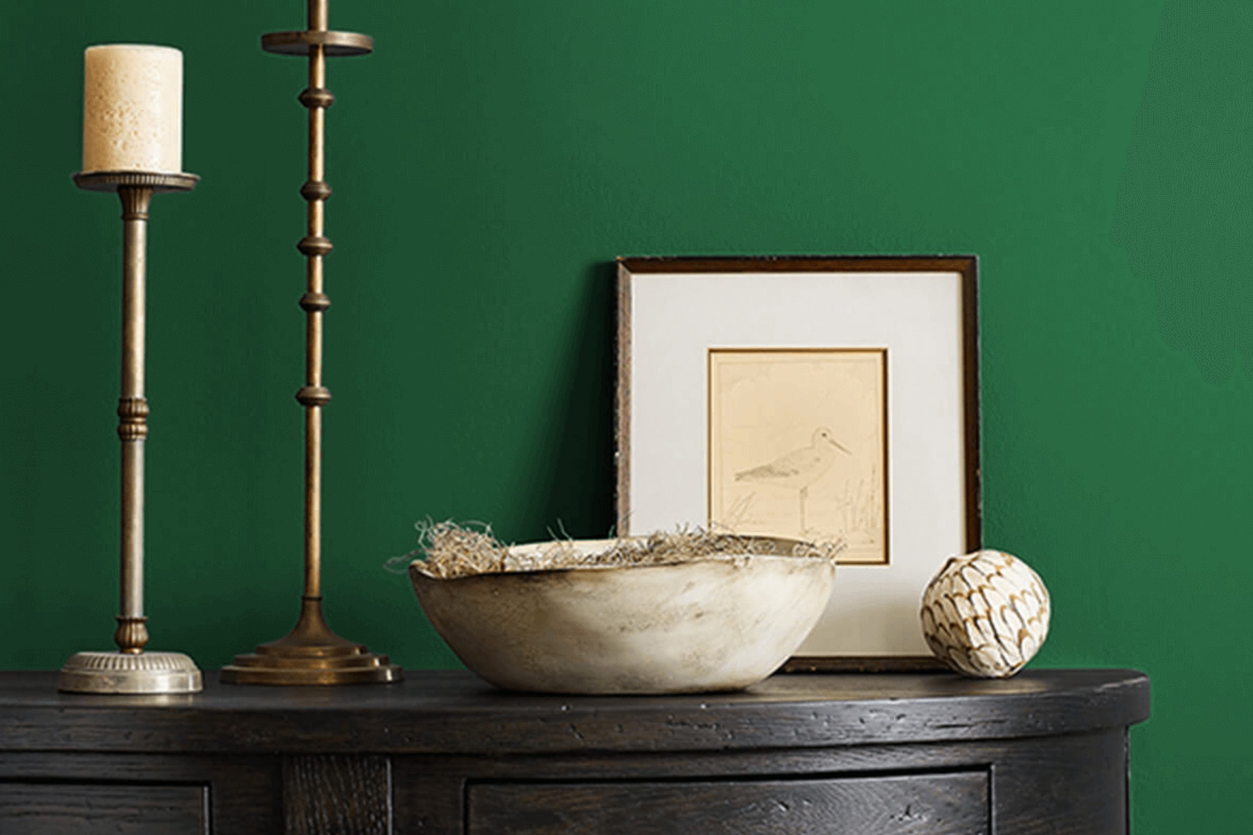
What Color Is Shamrock SW 6454 by Sherwin Williams?
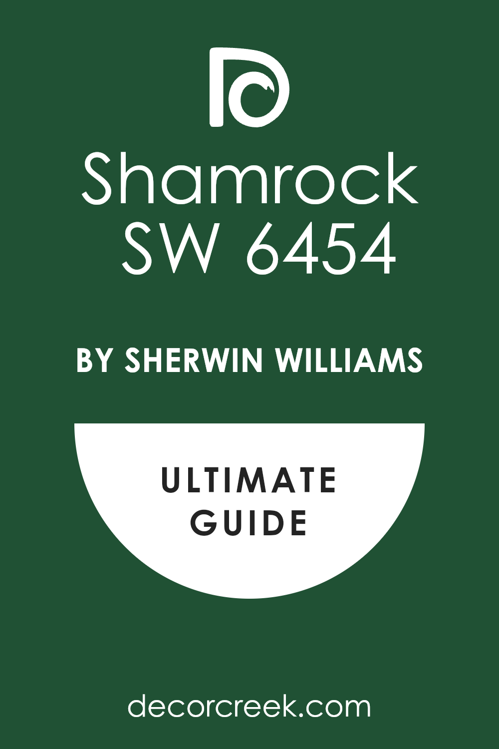
Shamrock by Sherwin Williams is a vibrant green shade that exudes energy and freshness. This color, with its bright and lively hue, has the power to inject vitality into any space, making it feel alive and inviting. The intensity of this green is reminiscent of lush foliage during spring, providing a natural and uplifting atmosphere.
This lively green is versatile in terms of interior design, fitting perfectly with styles that aim to incorporate elements of nature. It works wonderfully in rustic settings where the goal is to mimic the outdoors. Using materials like unfinished wood, linen, and stone can complement its earthy qualities.
Additionally, Shamrock pairs beautifully with botanical themes, enhancing floral or plant-heavy decor.
The color is also a great choice for modern and contemporary spaces that seek a pop of color to break the monotony of neutral palettes. In these environments, pairing it with sleek materials like glass, polished metals, and glossy finishes can create a striking contrast. Moreover, Shamrock can add a playful touch to eclectic interiors, where its brightness can be balanced with mixed textures and vibrant patterns.
Soft furnishings, colorful ceramics, and artisan fabrics all work well with this dynamic green, allowing it to shine while contributing to a cohesive look.
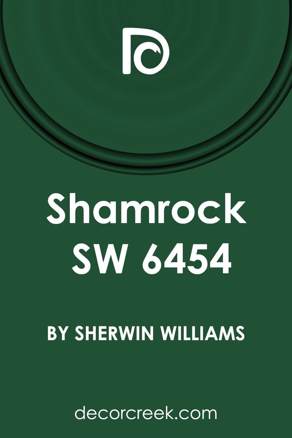
Is Shamrock SW 6454 by Sherwin Williams Warm or Cool color?
Shamrock by Sherwin Williams is a vibrant and bold green that can bring a fresh energy to any home. When used in interior spaces, this lively color can make a room feel lively and active, ideal for spaces where you want to inspire creativity and brightness such as playrooms or home offices. Because of its intensity, it’s best to use it selectively or as an accent wall to avoid overwhelming a space. Shamrock harmonizes well with neutral colors such as whites, grays, and tans, which can help balance its vibrancy. In smaller doses, such as on trim or in decorative accessories, it adds a pop of color without dominating the room. This shade is also great for exterior use, like on front doors or shutters, providing a welcoming splash of color that stands out against more subdued exterior colors. Overall, Shamrock is a perfect choice for adding vitality and a touch of nature’s freshness to any home environment.
Undertones of Shamrock SW 6454 by Sherwin Williams
ShamrockSW 6454 is a vibrant color that brings a lively touch to interior spaces. This color has various undertones, including dark green, navy, dark turquoise, brown, olive, purple, and grey. These undertones are subtle hints of other colors that can be seen under different lighting conditions and can greatly influence the overall appearance of the paint.
Undertones play a crucial role in how we perceive color. They can make a color look cooler or warmer depending on their hue.
For example, a grey undertone might make a color appear cooler, while a brown undertone could give it a warmer feel. Understanding these undertones helps in selecting color schemes that coordinate well with furniture and decorations in a room.
In interior walls, the undertones of ShamrockSW 6454 have a unique effect. The dark green undertone enhances a natural, fresh vibe, making it perfect for spaces that aim for a nature-inspired look. The hints of navy and dark turquoise can give a feeling of depth, enriching the room’s dimension.
On the other hand, touches of brown and olive provide a grounding effect, which can make larger spaces feel cozier. The purple undertone adds a subtle richness, enhancing the complexity of the green, while the grey can help balance brighter elements in the décor.
In conclusion, the mix of undertones in ShamrockSW 6454 allows for versatile use in various design themes, from earthy and grounded to vibrant and deep. This adaptability makes it a favorable choice for many who want to add a splash of color to their interiors.
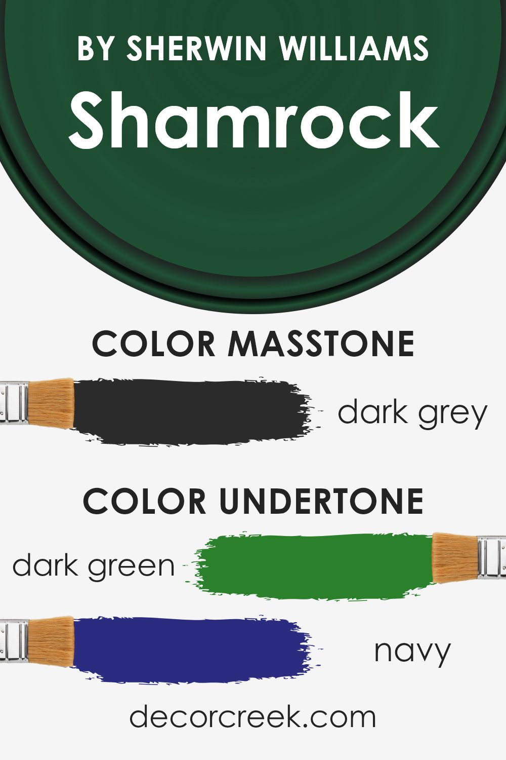
What is the Masstone of the Shamrock SW 6454 by Sherwin Williams?
ShamrockSW 6454 by Sherwin Williams showcases a masstone of dark grey (#2B2B2B), a rich and versatile hue with a deep, almost charcoal color. This dark grey tone makes it a popular choice for interior spaces looking for a bold yet neutral backdrop. Its dark nature allows it to stand out when used on feature walls, providing a solid, grounding effect that can enhance the ambiance of a room.
In homes, this shade can be particularly effective in areas that benefit from a more anchored, cozy feel, such as living rooms or bedrooms. When combined with lighter colors, the dark grey enables contrasting design elements to pop, making it ideal for highlighting art, furniture, or decor.
Moreover, this color works well in various lighting conditions, maintaining its depth and intrigue whether under natural sunlight or artificial light.
Overall, its ability to pair well with bright accents or serve as a standalone statement makes it a flexible option for home decorating.
How Does Lighting Affect Shamrock SW 6454 by Sherwin Williams?
Lighting plays a crucial role in how colors appear in a space, influencing mood and perception. Different lighting conditions can make the same color look entirely different. For instance, a color like Shamrock by Sherwin Williams might change significantly under various light sources.
In artificial light, such as LED or incandescent bulbs, Shamrock can appear brighter or more muted depending on the type of bulb. LED lights, which can have cooler tones, might make Shamrock look sharper and more vibrant, whereas incandescent bulbs, which often give off a warmer glow, could make the color appear cozier and slightly darker.
In natural light, Shamrock will change appearance throughout the day. Morning light tends to be gentle and warm, making the green fresh and lively. As the day progresses and the light becomes brighter and more direct, the color might look more intense and rich.
The direction a room faces also affects how Shamrock looks:
- North-facing rooms – These rooms get less direct sunlight, which might make Shamrock appear darker and more subdued. In these settings, the color might lean towards a richer, deeper green.
- South-facing rooms – These rooms receive ample sunlight, brightening Shamrock to its truest, most vibrant green. The ample natural light can make the room feel lively and fresh.
- East-facing rooms – In the morning, east-facing rooms are filled with warm sunlight, making Shamrock look bright and cheerful. As the day goes on, the intensity of the light diminishes, and the color might appear softer and more shadowed.
- West-facing rooms – Afternoons and evenings are when west-facing rooms shine, with golden light potentially making Shamrock glow warmly and invitingly, whereas it might seem cooler and more subdued in the morning.
Understanding these nuances can help in deciding paint colors for specific rooms based on their orientation and the type of artificial lighting used, ensuring the desired mood and aesthetic are achieved.
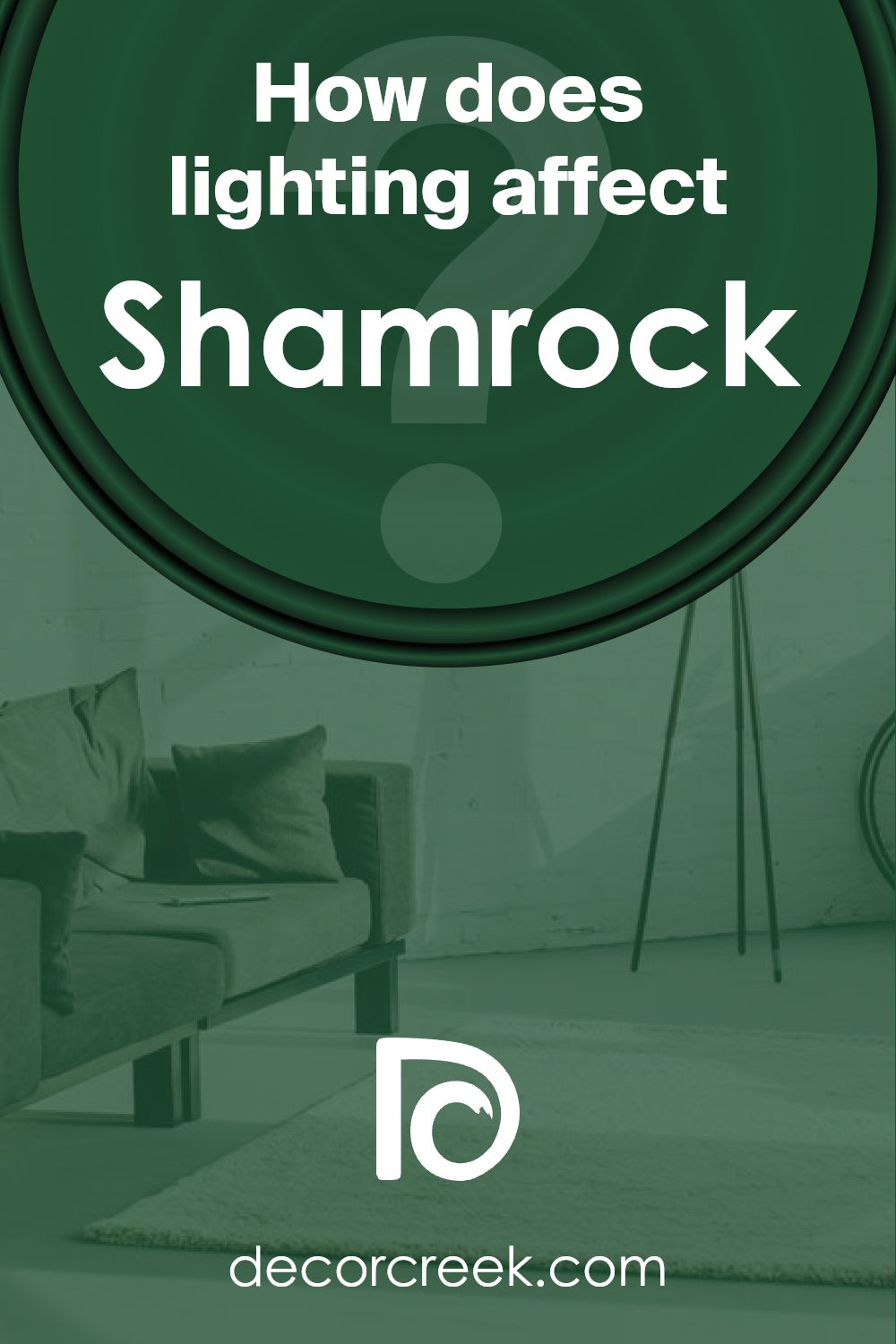
What is the LRV of Shamrock SW 6454 by Sherwin Williams?
Light Reflectance Value (LRV) measures the percentage of light a paint color reflects back into a room, running from zero, which is pure black, to highest reflectance possible, just below 100, pure white. This value is crucial when deciding on a paint color because it affects how light or dark a color feels in a space. A higher LRV means the color reflects more light, making spaces feel more open and airy. Conversely, a lower LRV suggests that a color absorbs more light, which can make a room feel cozier or smaller, and is an essential consideration especially in rooms that do not receive much natural light.
Taking the LRV of Shamrock, which is just over 6, it is clear that this is a fairly dark shade. This low LRV indicates that it absorbs most of the light, rather than reflecting it. This could make it an excellent choice for creating a moody or dramatic effect in a space.
However, it’s advisable to use it in a room that gets plenty of natural light or has adequate lighting fixtures to ensure the room doesn’t feel too dark. When applied to walls, the deep, dark green color can bring richness and depth to the decor but may make a small room feel even smaller.
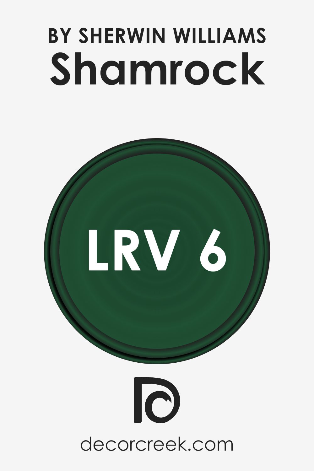
Coordinating Colors of Shamrock SW 6454 by Sherwin Williams
Coordinating colors refer to a set of colors that work well together to create a harmonious and pleasing visual effect when used in conjunction with each other in decor or design. These colors complement the main color by enhancing its aesthetics without overpowering it. They can be used for accents, backgrounds, or larger areas, depending on the desired impact. Essentially, they assist in rounding out the color palette to ensure that the spaces feel balanced.
For instance, when using a vibrant color like Shamrock, a rich and lively hue, coordinating colors like SW 7639 – Ethereal Mood, SW 6441 – White Mint, and SW 7637 – Oyster White are excellent choices. Ethereal Mood is a subtle gray that adds a soothing touch and can act as a calm backdrop or counterbalance against stronger colors.
White Mint offers a hint of refreshing green that is paler and softer, perfect for bringing light into a space while still maintaining a link to the green family. Oyster White, on the other hand, is a soft, warm white with an understated elegance, ideal for creating a neutral space that supports and enhances other colors without clashing or contrasting too sharply. Together, these colors can create visually appealing and cohesive spaces.
You can see recommended paint colors below:
- SW 7639 Ethereal Mood (CHECK A SAMPLE)
- SW 6441 White Mint (CHECK A SAMPLE)
- SW 7637 Oyster White (CHECK A SAMPLE)
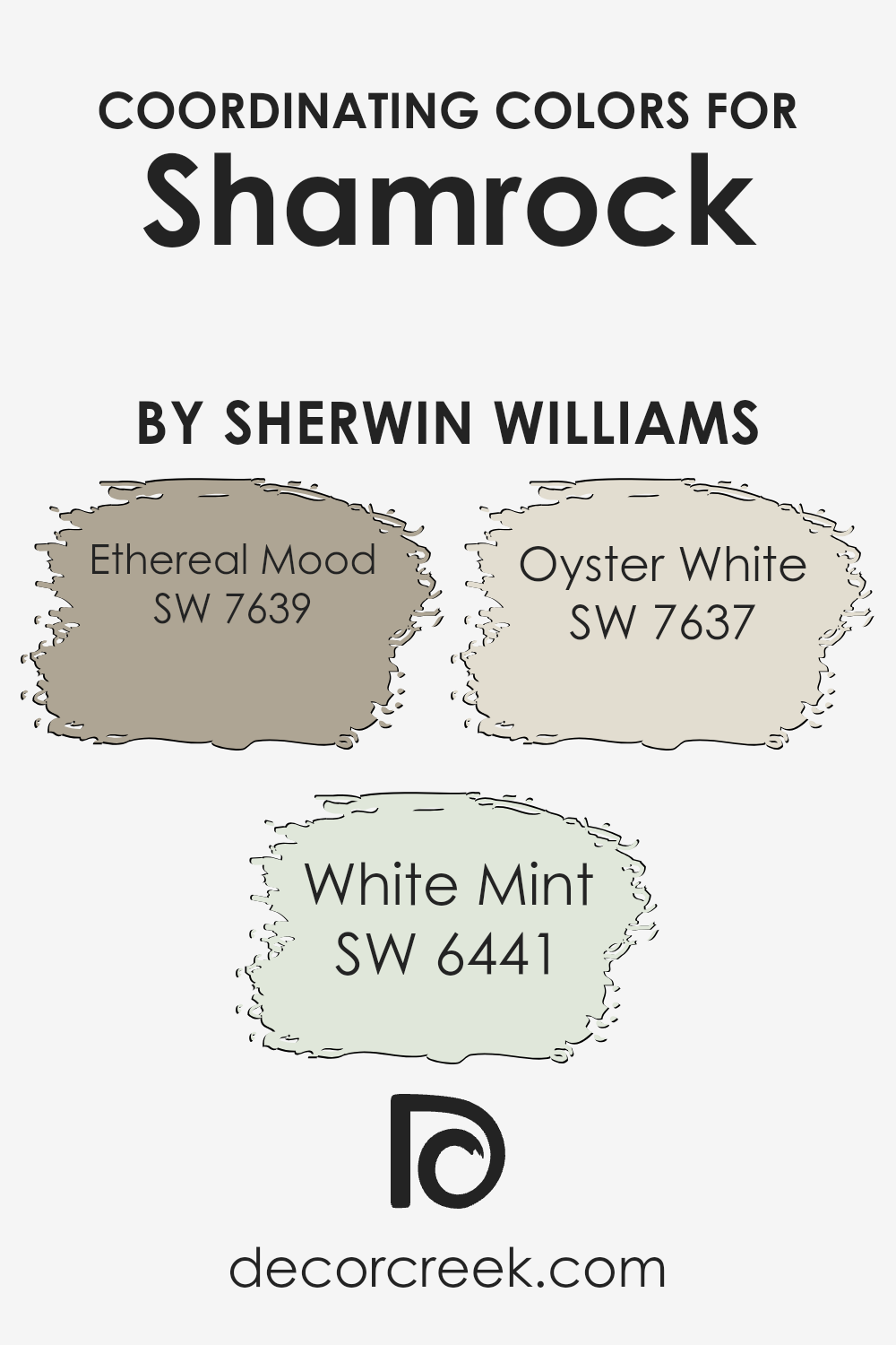
What are the Trim colors of Shamrock SW 6454 by Sherwin Williams?
Trim colors are used to frame, highlight, and define different sections of a room or building’s exterior such as windows, doors, and edges where walls meet ceilings, or even baseboards. When using Shamrock by Sherwin Williams, a deep and lush green hue, selecting neutral trim colors can balance the vibrancy of the green, ensuring the area doesn’t feel overwhelming and maintains a welcoming, cohesive appearance.
SW 7012 – Creamy, a soft, warm white, and SW 7016 – Mindful Gray, a calm, light gray, are excellent choices for trim as they subtly contrast with robust colors like Shamrock, providing a clean and refined finish to the overall color scheme.
SW 7012 – Creamy offers a gentle warmth that can soften the boldness of Shamrock while illuminating corners and edges, enhancing natural light in a room. Alternatively, SW 7016 – Mindful Gray serves as a neutral backdrop, its understated elegance making it particularly effective in spaces that aim for a modern and grounded look. Together, both trim options support a balanced visual flow when paired with strong primary colors, ensuring the space feels both inviting and well-coordinated.
You can see recommended paint colors below:
Colors Similar to Shamrock SW 6454 by Sherwin Williams
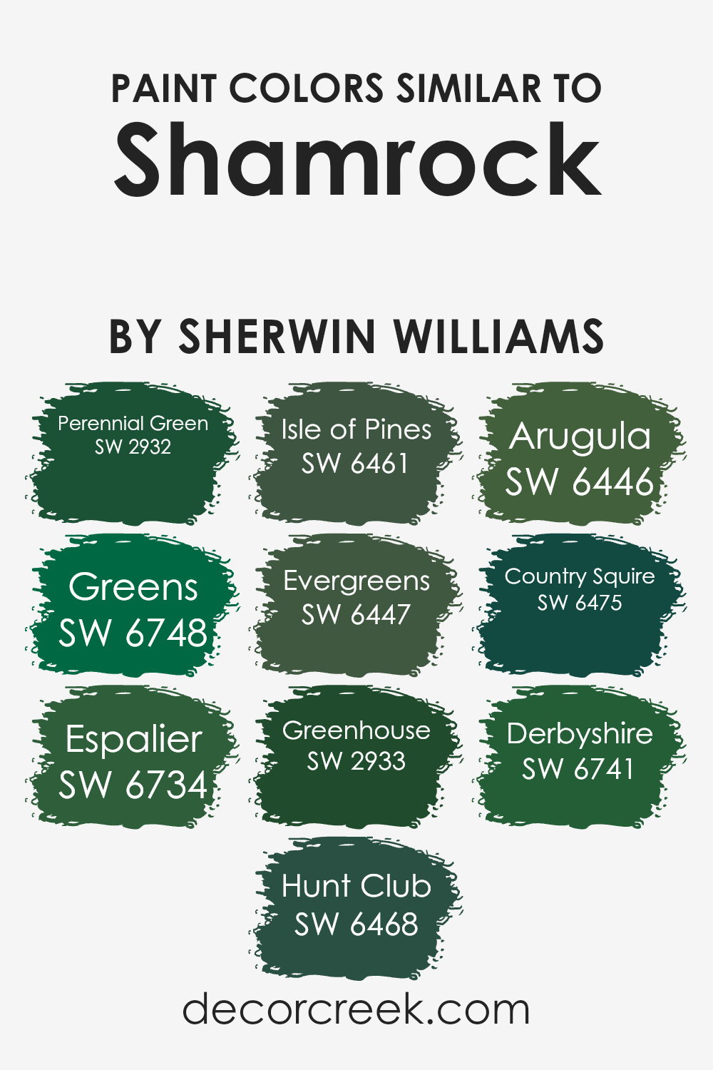
Similar colors play a crucial role in design by creating a cohesive and harmonious look. Choosing color variations like those related to Shamrock SW 6454 by Sherwin Williams helps to maintain a theme without monotonous repetition, allowing each space or element to have its subtle distinctions while still tying the overall design together. For instance, when using a series of greens, subtle variations can highlight architectural details, textiles, or artwork, lending depth and dimension to interiors or exteriors.
One such color is Perennial Green SW 2932, which is a fresh and vibrant green that brings a sense of lively energy to any space. Greens SW 6748 has a vivid, leafy tone that exudes freshness, ideal for invigorating spaces. Espalier SW 6734 leans more towards a mossy green, giving a touch of nature and grounding.
Hunt Club SW 6468 is darker, reminiscent of dense forest foliage and provides a striking contrast or backdrop. Isle of Pines SW 6461 offers a deep, pine forest green which works well in areas meant to feel cozy and sheltered. Evergreens SW 6447 captures the essence of classic evergreen hues, perfect for creating a timeless environment.
Greenhouse SW 2933 brings to mind the lush, dense colors seen under a canopy of trees, enriching and enlivening spaces. Arugula SW 6446 introduces a more subtle, subdued green that fits in softly with other elements. Country Squire SW 6475 imparts a bold, robust teal-green that stands out with sophistication, and Derbyshire SW 6741 features a rich, emerald tone that serves as a profound and majestic presence in a color palette. Each of these colors, while sharing a kinship with Shamrock, brings its unique flavor, opening up several possibilities for blending and accenting in both indoor and outdoor spaces.
You can see recommended paint colors below:
- SW 2932 Perennial Green
- SW 6748 Greens (CHECK A SAMPLE)
- SW 6734 Espalier (CHECK A SAMPLE)
- SW 6468 Hunt Club (CHECK A SAMPLE)
- SW 6461 Isle of Pines (CHECK A SAMPLE)
- SW 6447 Evergreens (CHECK A SAMPLE)
- SW 2933 Greenhouse
- SW 6446 Arugula (CHECK A SAMPLE)
- SW 6475 Country Squire (CHECK A SAMPLE)
- SW 6741 Derbyshire (CHECK A SAMPLE)
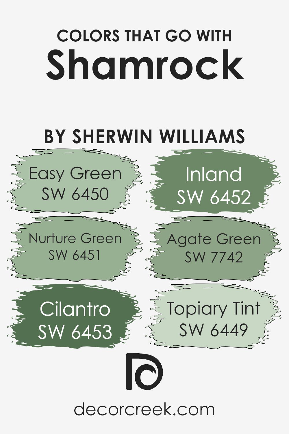
Colors that Go With Shamrock SW 6454 by Sherwin Williams
Choosing complementary colors for Shamrock SW 6454 by Sherwin Williams can greatly enhance the visual appeal of any space. These colors help create a cohesive look, ensuring that the room feels harmonious and well-planned. For example, Easy Green SW 6450 offers a subtle, muted tone that can soften the boldness of Shamrock, making the space feel welcoming without overpowering it. On the other hand, Nurture Green SW 6451 provides a slightly richer hue that complements Shamrock’s vibrancy, ideal for adding depth to your decor.
Cilantro SW 6453 adds a refreshing touch with its lively and fresh shade, perfect for areas that benefit from a splash of invigorating color. Inland SW 6452, which leans towards a greyish tone, acts as a great neutral that balances the intensity of Shamrock.
Meanwhile, Agate Green SW 7742, with a touch of underlying blue, offers a cool contrast that can make Shamrock stand out even more. Lastly, Topiary Tint SW 6449 is the lightest and can act as a soothing backdrop, allowing Shamrock to be the star of the show. These color relationships ensure that the chosen space is visually interesting and feels intentionally designed.
You can see recommended paint colors below:
- SW 6450 Easy Green (CHECK A SAMPLE)
- SW 6451 Nurture Green (CHECK A SAMPLE)
- SW 6453 Cilantro (CHECK A SAMPLE)
- SW 6452 Inland (CHECK A SAMPLE)
- SW 7742 Agate Green (CHECK A SAMPLE)
- SW 6449 Topiary Tint (CHECK A SAMPLE)
How to Use Shamrock SW 6454 by Sherwin Williams In Your Home?
Shamrock SW 6454 by Sherwin Williams is a vibrant green paint that can add a lively and fresh look to any room in your home. This shade is perfect if you’re looking to add a splash of color and energy. It works great in spaces like the kitchen or a children’s playroom, where its bright, cheerful vibe can inspire creativity and happiness.
You can also use it in small doses, such as for a single accent wall or on cabinets, to add a fun pop of color without overwhelming the space.
Additionally, Shamrock pairs well with neutral colors like white or gray, which can help balance its intensity. Using it in your home can be a simple yet effective way to refresh your living space and make it more enjoyable. Whether you choose to paint an entire room or just add a few green touches, Shamrock can make your home look more lively and inviting.
Shamrock SW 6454 by Sherwin Williams vs Greenhouse SW 2933 by Sherwin Williams
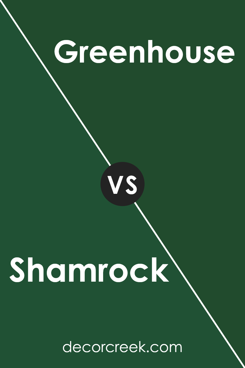
Shamrock SW 6454 and Greenhouse SW 2933, both by Sherwin Williams, offer two distinct green shades perfect for various decorating styles. Shamrock presents a vibrant, lively green that can brighten up spaces and add a touch of energy. This color is great for spaces like kitchens or playrooms where you want to inject a fun and cheerful atmosphere.
On the other hand, Greenhouse is a deeper, more muted green, resembling a rich forest shade. It’s ideal for creating a cozy and comfortable ambiance, making it suitable for areas like living rooms or bedrooms where a calming effect is desired.
While Shamrock is energizing and bold, Greenhouse provides a more grounded and natural feel. Depending on the mood you’re aiming to set in a room, either color can be an excellent choice. The key difference lies in their intensity and the type of environment they help create.
You can see recommended paint color below:
- SW 2933 Greenhouse
Shamrock SW 6454 by Sherwin Williams vs Derbyshire SW 6741 by Sherwin Williams
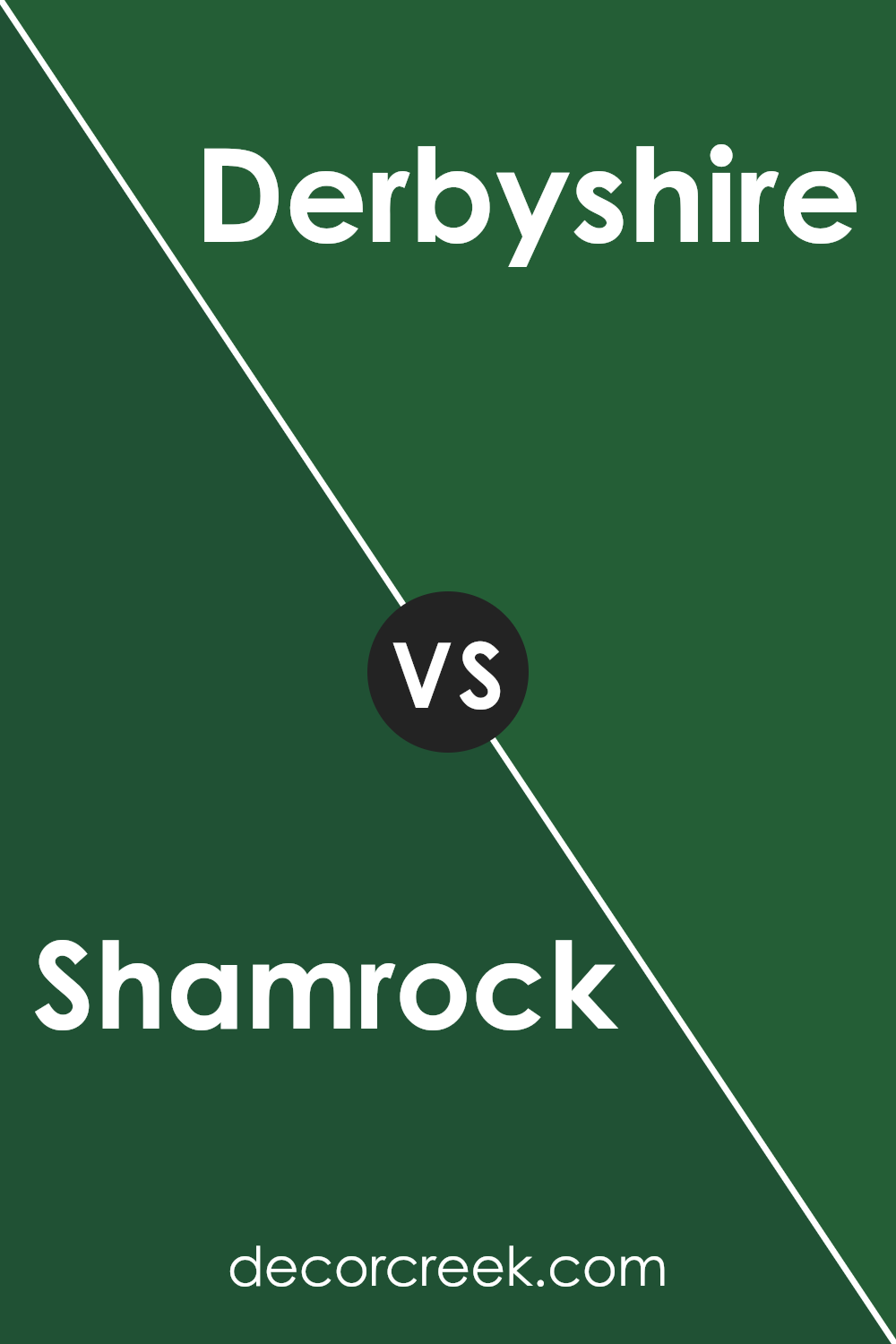
Shamrock SW 6454 and Derbyshire SW 6741 by Sherwin Williams are both shades of green but with distinct vibes. Shamrock is a bright, lively green, like fresh spring leaves. It’s vibrant and makes spaces feel energetic and refreshing. On the other hand, Derbyshire is a much deeper, forest green.
It’s a stronger, bolder color, reminiscent of thick, dense foliage. Derbyshire can make a room feel cozy and enveloped, due to its darker tone.
Both colors can freshen up a space, but in different ways: Shamrock adds more light and cheer, while Derbyshire offers depth and a sense of shelter. Whether you choose one over the other depends on the mood you want to set in your room.
You can see recommended paint color below:
- SW 6741 Derbyshire (CHECK A SAMPLE)
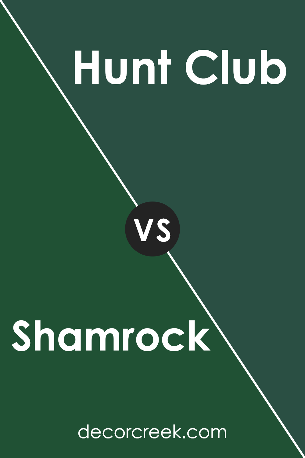
Shamrock SW 6454 by Sherwin Williams vs Hunt Club SW 6468 by Sherwin Williams
Shamrock SW 6454 and Hunt Club SW 6468, both by Sherwin Williams, are two distinct shades that can change the feel of any room. Shamrock is a bright and cheerful green, offering a lively vibe that can lighten up spaces. It’s especially good for creating a fresh and inviting environment in areas like kitchens or studies.
On the other hand, Hunt Club is a deeper, richer green. This color has an earthy feel, making it ideal for settings where you’d like a more grounded and cozy atmosphere, such as living rooms or bedrooms. Despite being darker, it doesn’t overpower a room but rather adds a strong sense of calm and warmth.
Both colors offer unique qualities without being overwhelming, and choosing between them depends on the mood you wish to set in your space. Shamrock brings energy and brightness, while Hunt Club provides depth and warmth.
You can see recommended paint color below:
- SW 6468 Hunt Club (CHECK A SAMPLE)
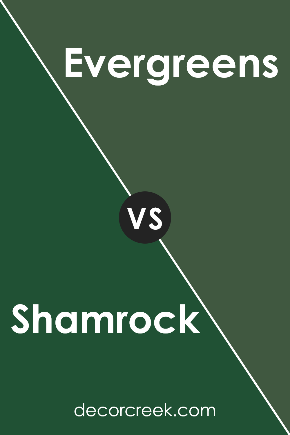
Shamrock SW 6454 by Sherwin Williams vs Evergreens SW 6447 by Sherwin Williams
Shamrock SW 6454 and Evergreens SW 6447, both by Sherwin Williams, present distinct green hues well-suited for various decorating styles. Shamrock offers a vibrant, lively green that brings a fresh and energetic feel to spaces. It’s a great choice for creating a cheerful and inviting atmosphere, perfect for kitchens, playrooms, or any area that benefits from a splash of brightness.
On the other hand, Evergreens is a deeper, more muted green. It has an earthy quality that can give a room a grounded, more reserved look. This color works well in spaces aimed at relaxation and focus, like home offices or libraries, where its darker shade helps to foster concentration.
In summary, while Shamrock energizes with its brighter tone, Evergreens provides a more subdued and calming environment with its richer, darker green. Both colors offer unique vibes and can significantly influence the mood and style of a room.
You can see recommended paint color below:
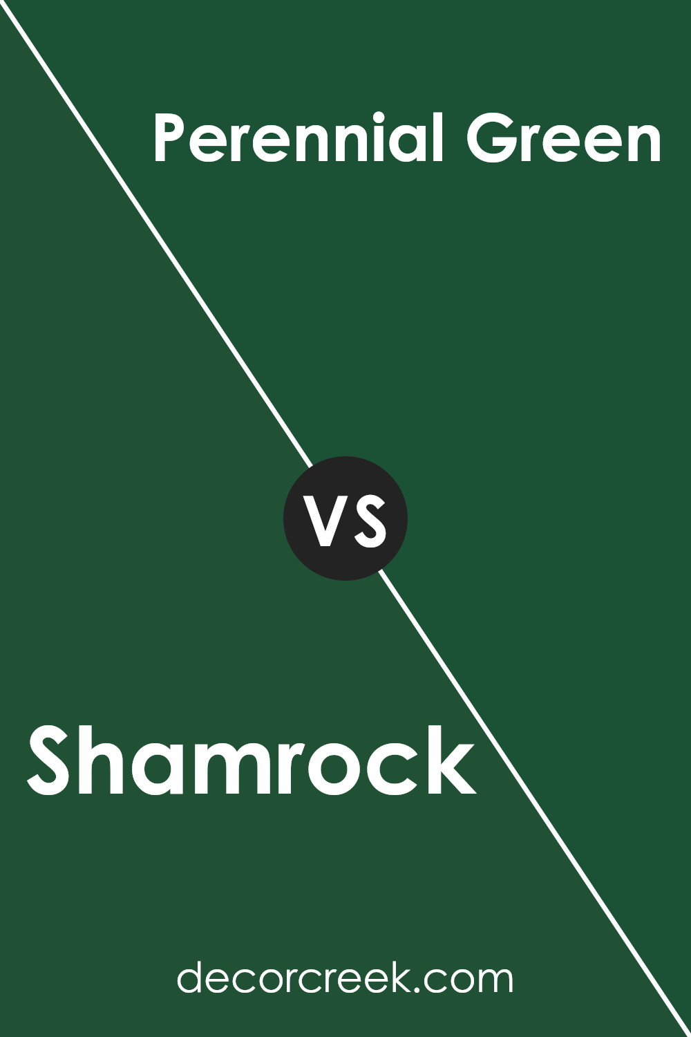
Shamrock SW 6454 by Sherwin Williams vs Perennial Green SW 2932 by Sherwin Williams
Shamrock SW 6454 by Sherwin Williams is a vivid, bright green with a lively feel that reminds you of fresh spring leaves or a lush, well-tended garden. This color has a refreshing quality that can energize a space, making it great for areas where you want to add a sense of vitality and freshness.
Perennial Green SW 2932, on the other hand, is a deeper, more subdued green. It hints at the richness of evergreen forests and has a grounding effect, ideal for spaces where a relaxed and cozy atmosphere is desired. This color works well in areas meant for relaxation or reflection, as its darker tone provides a comforting sense of stability and calm.
While both colors share a base in green, Shamrock has a more vibrant, eye-catching look, whereas Perennial Green leans towards a more reserved and cozy feel. Each offers unique possibilities depending on the mood you want to set in your room.
You can see recommended paint color below:
- SW 2932 Perennial Green
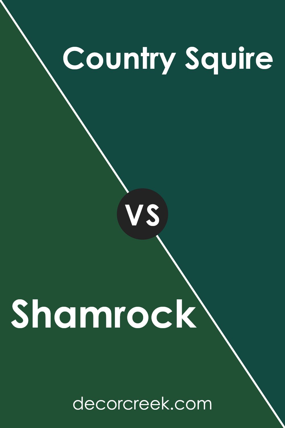
Shamrock SW 6454 by Sherwin Williams vs Country Squire SW 6475 by Sherwin Williams
The color Shamrock SW 6454 by Sherwin Williams and Country Squire SW 6475 by Sherwin Williams are both vibrant, rich shades of green, but they each have distinct vibes. Shamrock is a brighter, more energetic green. It’s similar to the fresh color you’d see in spring leaves. This makes it a great choice for spaces where you want to add a lively and cheerful touch.
On the other hand, Country Squire is a deeper, more subdued green. It’s reminiscent of a dense forest or the classic green found in English country estates. This color is perfect for settings where you seek a more grounded, calming feel.
Both colors offer their unique appeal, depending on the atmosphere you wish to create. Shamrock might be more suited for a playroom or creative space, stimulating excitement and freshness. Country Squire would work better in a library or study, where its richer depth encourages focus and a sense of quiet stability.
In summary, whether you choose the lively Shamrock or the dignified Country Squire depends on the mood you aim to set in your room.
You can see recommended paint color below:
- SW 6475 Country Squire (CHECK A SAMPLE)
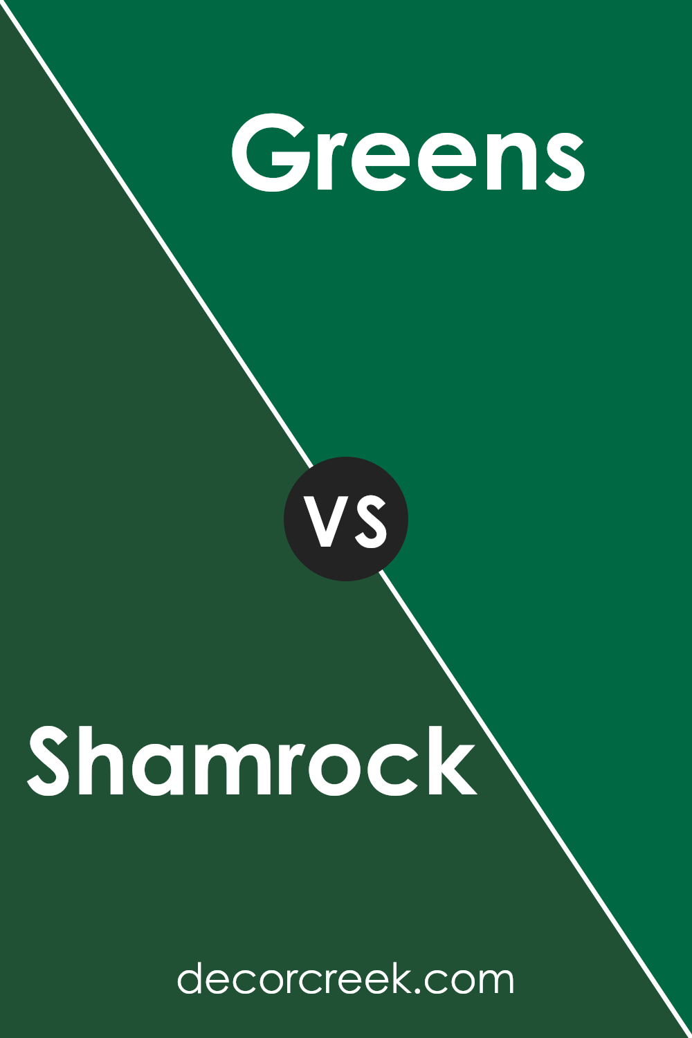
Shamrock SW 6454 by Sherwin Williams vs Greens SW 6748 by Sherwin Williams
Shamrock and Greens by Sherwin Williams are both lively shades that belong to the green family. However, Shamrock leans towards a mid-tone, vibrant green that mimics the fresh, lively look of spring leaves. It’s bold and can add a cheerful pop of color in spaces that need some brightening up.
On the other hand, Greensis deeper and richer, providing a more grounded and earthy vibe.
This color is excellent in areas where a calm yet distinct green is desired. The two colors can work well together in the same room or space, with Shamrock offering a brighter focal point and Greens serving as a strong background or accent. Suitable for different tastes, Shamrock creates an energetic atmosphere, while Greens offers a more subdued, yet still lively feel.
You can see recommended paint color below:
- SW 6748 Greens (CHECK A SAMPLE)
Shamrock SW 6454 by Sherwin Williams vs Arugula SW 6446 by Sherwin Williams
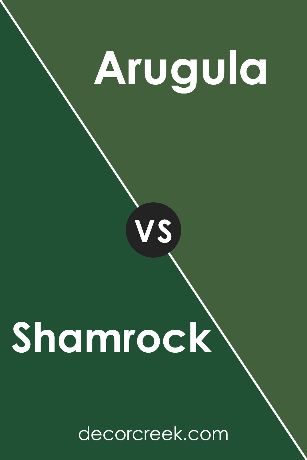
Shamrock SW 6454 and Arugula SW 6446 by Sherwin Williams are two distinct shades of green. Shamrock is a vibrant and bright green with a refreshing feel that can liven up a space. It brings to mind the lushness of green fields in spring. This color works well in areas that need a pop of energy and cheerfulness.
On the other hand, Arugula is a deeper, more subdued green. It has darker, earthier tones that suggest a more grounded and calm atmosphere. This color is great for creating a cozy and inviting space, suitable for rooms where relaxation is key.
Both colors offer unique vibes and can be used to set different moods in a room, depending on what atmosphere you want to achieve. Shamrock brings more vitality and brightness, while Arugula offers a quieter, more natural feel. Using them together could also provide a nice contrast, balancing energized and restful spaces.
You can see recommended paint color below:
Shamrock SW 6454 by Sherwin Williams vs Espalier SW 6734 by Sherwin Williams
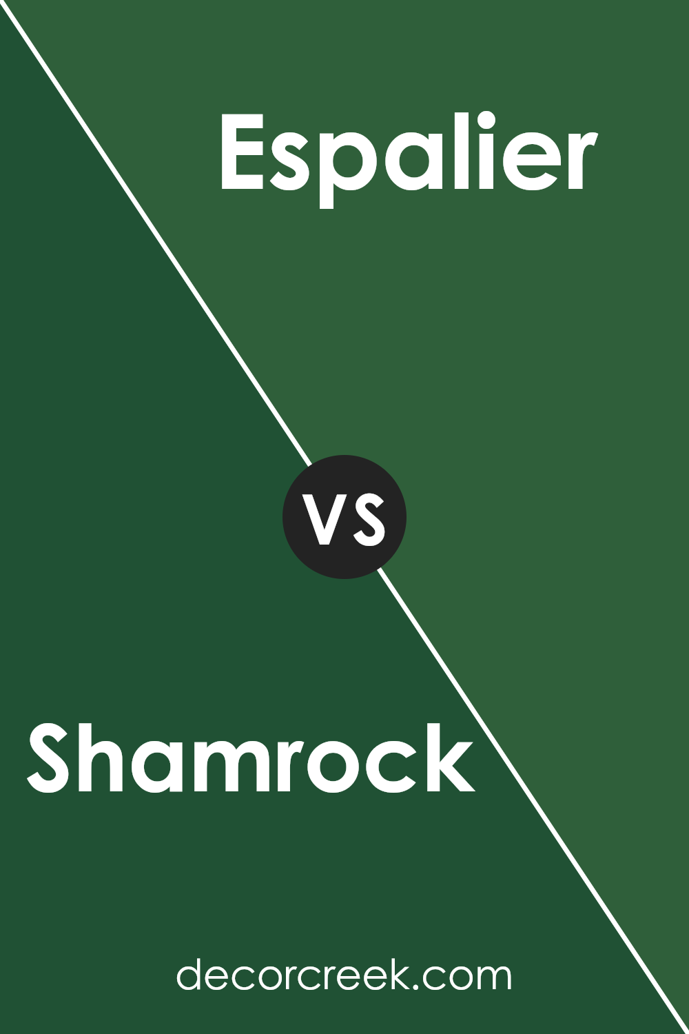
Shamrock SW 6454 and Espalier SW 6734 are both green colors by Sherwin Williams, but they have distinct shades that set them apart. Shamrock is a brighter, more vibrant green, somewhat similar to the color of fresh grass. It’s lively and cheerful, making it a great choice for spaces where you want to add energy and a touch of nature’s freshness.
On the other hand, Espalier is a deeper, almost teal green. This color has more blue in it, giving it a cooler feel compared to Shamrock. It’s a color that can bring a sense of calm and depth to a room, often used in spaces where a more subdued, yet still colorful ambiance is desired.
Both colors can refresh a space but in different ways; Shamrock with its brighter tones energizes a room, while Espalier, being cooler and deeper, provides a more relaxed atmosphere. Depending on what feeling you want to achieve in a room, either could be a perfect choice.
You can see recommended paint color below:
- SW 6734 Espalier (CHECK A SAMPLE)
Shamrock SW 6454 by Sherwin Williams vs Isle of Pines SW 6461 by Sherwin Williams
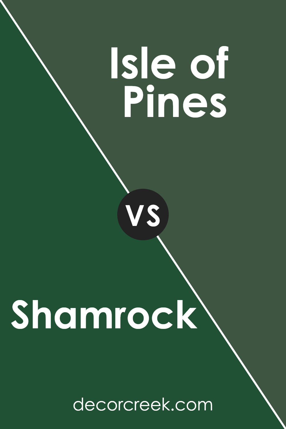
Shamrock SW 6454 and Isle of Pines SW 6461 are both green paints from Sherwin Williams, but they offer different vibes because of their shades. Shamrock is a brighter, more vibrant green. It’s the kind of color that adds a cheerful and lively feel to a room, making it stand out. On the other hand, Isle of Pines is a deeper, richer green. This shade is more muted and subtle compared to Shamrock, giving a more grounded and calm feeling.
These colors could be used in different spaces depending on what atmosphere you’re aiming to create. If you want a room to feel more energetic and lively, Shamrock would be a great choice. However, if you’re going for a more relaxed and cozy setting, then Isle of Pines would be a better fit.
In terms of coordinating with other colors, Shamrock might work well with light neutrals to keep its vibrancy in check, while Isle of Pines could pair beautifully with both dark and light colors for a harmonious look.
You can see recommended paint color below:
Conclusion
Shamrock SW 6454 by Sherwin Williams is a vibrant green shade that breathes life and energy into any space. It’s perfect for adding a pop of color where it’s needed most, whether in a lively living room or a playful children’s room. This shade pairs well with neutral tones, allowing its vividness to stand out, yet it can also hold its own alongside bolder colors for a more dynamic and cheerful palette.
For those interested in refreshing their home’s look, Shamrock SW 6454 offers a lively and refreshing feel, making spaces feel rejuvenated. It’s also a great choice for exterior uses, like front doors or shutters, providing a welcoming touch that’s both stylish and noticeable. Incorporating this color can make a home feel both modern and cozy, proving it’s a versatile choice for anyone looking to update their surroundings.
Ever wished paint sampling was as easy as sticking a sticker? Guess what? Now it is! Discover Samplize's unique Peel & Stick samples.
Get paint samples


