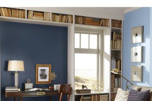
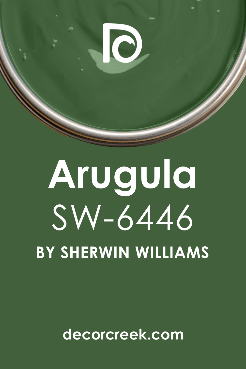
Sherwin-Williams SW 6446 Arugula is an intriguing paint color that is both bold and elegant. It captures the intensity of nature and brings a lush, verdant feel to any space it graces.
SW Arugula, with its sophistication and adaptability, can transform a room from the ordinary to the extraordinary.
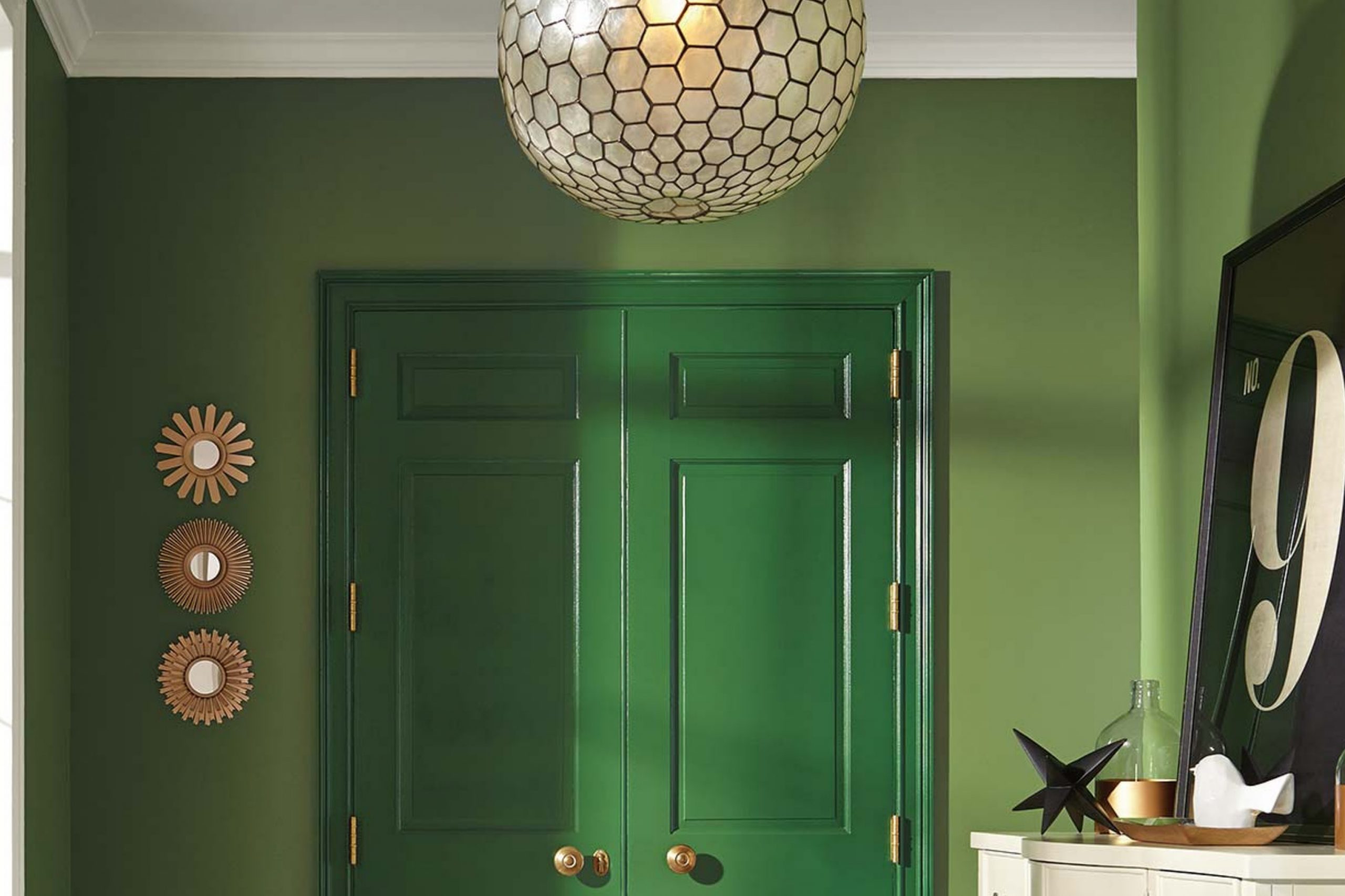
What Color Is SW 6446 Arugula? Is It a Warm Or Cool Color?
SW Arugula is a rich, deep green that has a natural and earthy feel to it. As Hextoral says, it’s a lush, forest-like hue that seems to bring the outdoors inside. It’s considered a warm color due to the slight yellow undertones it carries.
These yellow undertones help add warmth and depth to the color, preventing it from appearing too cold or sterile.
Ever wished paint sampling was as easy as sticking a sticker? Guess what? Now it is! Discover Samplize's unique Peel & Stick samples.
Get paint samples
Undertones of SW 6446 Arugula Paint Color
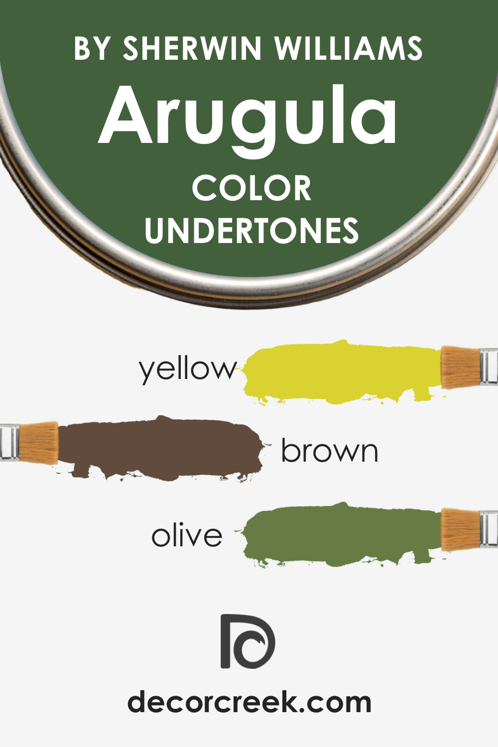
SW Arugula has an intriguing blend of undertones that add to its depth and character. Here are the three most prominent undertones:
- Yellow: A subtle yellow undertone gives Arugula a warm feel, distinguishing it from cooler greens.
- Brown: A faint brown undertone adds richness and depth to the color, giving it a grounded, earthy feel.
- Olive: The olive undertone in Arugula adds a sense of sophistication and organic elegance.
Coordinating Colors of SW 6446 Arugula
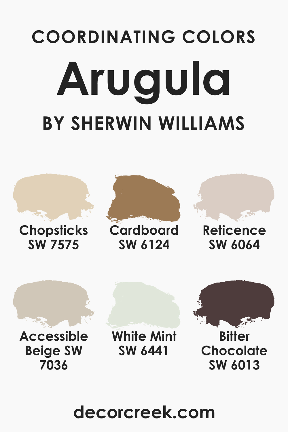
SW Arugula pairs beautifully with a range of colors. Here are a few coordinating colors, along with a brief description of each:
- SW 6441 White Mint (CHECK A SAMPLE): This lighter, minty hue offers a fresh and crisp contrast to the deep Arugula.
- SW 6124 Cardboard (CHECK A SAMPLE): A rich, warm neutral that brings out the warm undertones of Arugula.
- SW 7575 Chopsticks (CHECK A SAMPLE): This muted, earthy color complements the organic feel of Arugula.
In addition, here are two more colors that work well with SW Arugula:
- SW 7036 Accessible Beige (CHECK A SAMPLE): A warm and adaptable neutral that harmonizes well with the richness of Arugula.
- SW 6064 Reticence (CHECK A SAMPLE): A muted olive tone that enhances Arugula’s natural feel.
How Does Lighting Affect SW 6446 Arugula Paint Color?
Like all colors, lighting plays a significant role in how SW Arugula is perceived. In strong, direct sunlight, the Arugula color can appear brighter and more vibrant. The green undertones become more pronounced in this light.
In softer, indirect light, the color becomes deeper, and the warm, brown undertones become more noticeable, lending a cozy and inviting feel to the space.
LRV of SW 6446 Arugula Paint Color
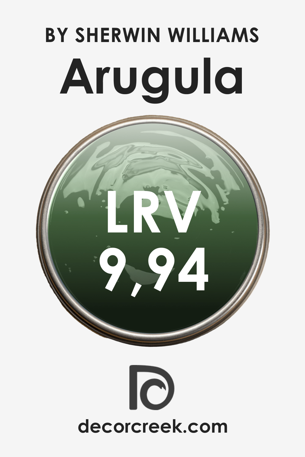
The Light Reflectance Value (LRV) of SW Arugula is 9.94. The LRV scale ranges from 0 (absolute black) to 100 (pure white), and this value indicates how much light a color reflects. With an LRV of 9.94, SW Arugula is on the darker end of the scale, reflecting a relatively small amount of light.
This doesn’t mean, however, that it will make a room feel small or gloomy. Instead, its low LRV contributes to its depth and richness. Darker colors like SW Arugula are excellent for creating a cozy, intimate atmosphere. They can add drama and impact to a space, making it feel more defined and sophisticated.
LRV – what does it mean? Read This Before Finding Your Perfect Paint Color
Trim Colors of SW 6446 Arugula
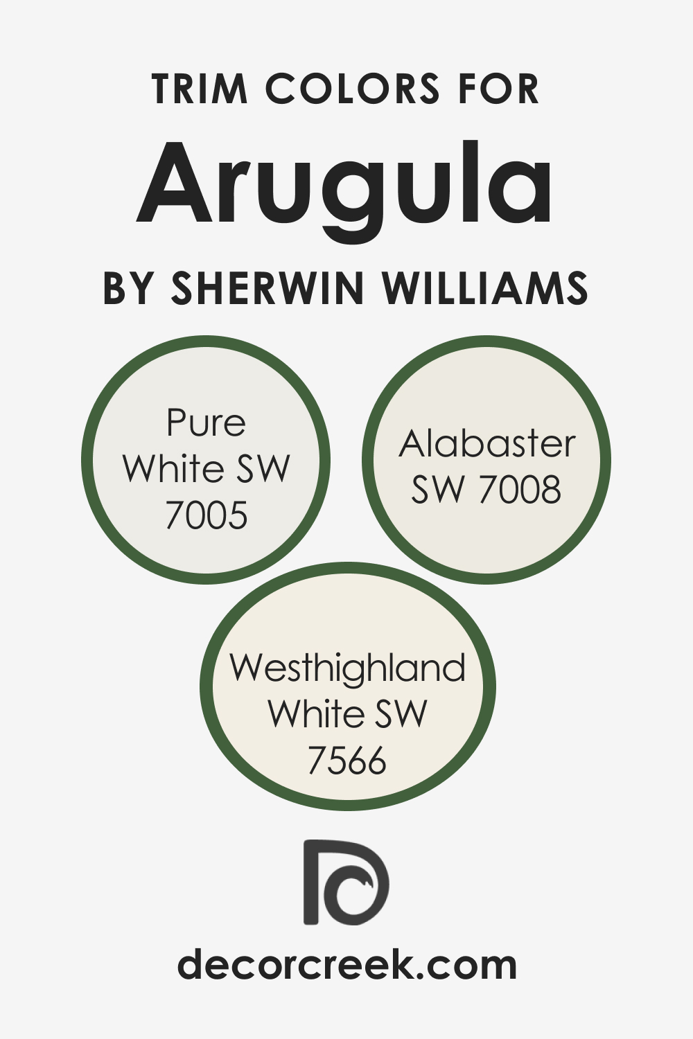
White is a traditional trim color that works well with most hues you can use on your walls. SW Arugula pairs beautifully with lighter, neutral trim colors. Here are a few options you might want to consider:
- SW 7005 Pure White (CHECK A SAMPLE): This clean and crisp white provides a stark contrast to the depth of the Arugula color, making it pop.
- SW 7008 Alabaster (CHECK A SAMPLE): A slightly warmer white, Alabaster softens the transition from the bold Arugula while still providing ample contrast.
- SW 7566 Westhighland White (CHECK A SAMPLE): A subtle, creamy white that harmonizes with the warm undertones of SW Arugula.
Colors Similar to SW 6446 Arugula
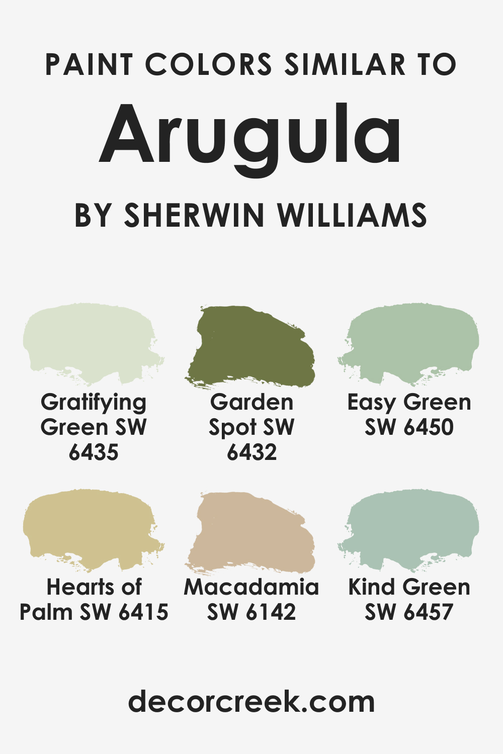
If you’re drawn to the earthy, organic feel of SW Arugula but are looking for a slightly different hue from the same brand, consider this similar color by Sherwin-Williams:
Also, you might find the following alternative colors suitable to be used instead of SW Arugula:
- SW 6450 Easy Green (CHECK A SAMPLE)
- SW 6435 Gratifying Green (CHECK A SAMPLE)
- SW 6142 Macadamia (CHECK A SAMPLE)
- SW 6415 Hearts of Palm (CHECK A SAMPLE)
- SW 6432 Garden Spot (CHECK A SAMPLE)
- SW 6457 Kind Green (CHECK A SAMPLE)
Colors That Go With SW 6446 Arugula
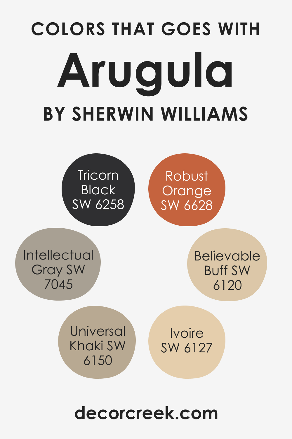
SW Arugula’s rich depth and complexity make it a versatile color that pairs well with many hues. Here are six colors that go well with SW Arugula:
- SW 6258 Tricorn Black (CHECK A SAMPLE): For a bold, dramatic contrast.
- SW 6150 Universal Khaki (CHECK A SAMPLE): A neutral khaki to enhance Arugula’s earthiness.
- SW 6120 Believable Buff (CHECK A SAMPLE): A warm buff color to bring out the warmth in Arugula.
- SW 7045 Intellectual Gray (CHECK A SAMPLE): A mid-tone gray that complements the depth of the Arugula.
- SW 6338 Robust Orange (CHECK A SAMPLE): A vibrant orange for a daring and energetic contrast.
- SW 6127 Ivoire (CHECK A SAMPLE): A soft ivory to provide a gentle contrast and lighten the mood.
How to Use This Color In Your Home?
SW Arugula is pretty versatile and can work well in many rooms and spaces. Below, we describe how exactly this vivid and nature-inspired hue may read in common areas of your house or apartment, as well as in more private spaces.
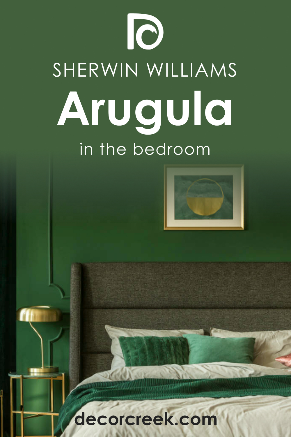
How to use SW 6446 Arugula in the Bedroom?
SW Arugula can create a serene, relaxing ambiance in a bedroom. Its rich, deep green is calming and grounding, reminiscent of a peaceful forest retreat. Consider using Arugula on an accent wall behind your bed to create a stunning backdrop. Pair it with warm, light neutrals on the remaining walls and bedding to keep the space feeling bright and open.
In a larger bedroom, don’t be afraid to use SW Arugula on all the walls. Its warmth and depth can make the room feel cozy and inviting. Pair it with light-colored furniture and textiles to add contrast and prevent the room from feeling too heavy.
Rich wood tones also work beautifully with Arugula, enhancing its organic feel.
How to use SW 6446 Arugula in the Bathroom?
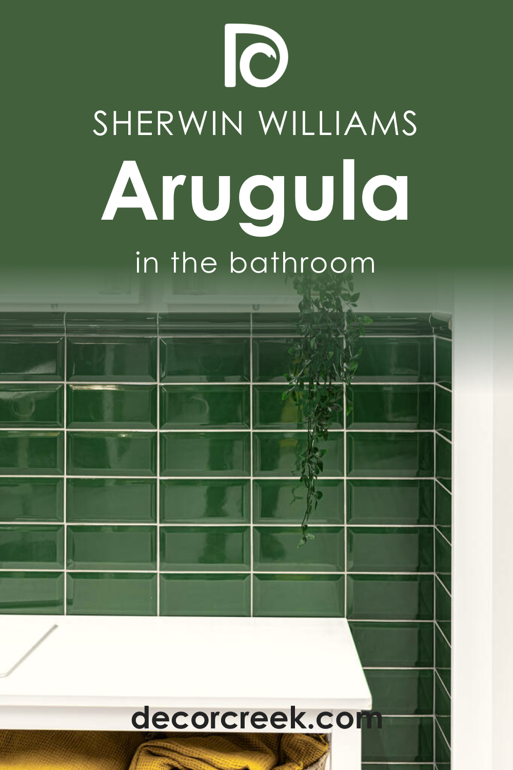
In a bathroom, SW Arugula can create a spa-like atmosphere. The earthy green brings a sense of nature and tranquility to the space. Consider pairing Arugula with light-colored tiles and fixtures to balance its depth.
Warm metals, like brass or copper, also pair beautifully with SW Arugula, enhancing its warmth and adding a touch of elegance.
If your bathroom has plenty of natural light, SW Arugula can make the space feel lush and vibrant. For bathrooms with less natural light, consider using Arugula on a feature wall or as an accent color. This will bring in the richness of the color without overwhelming the space.
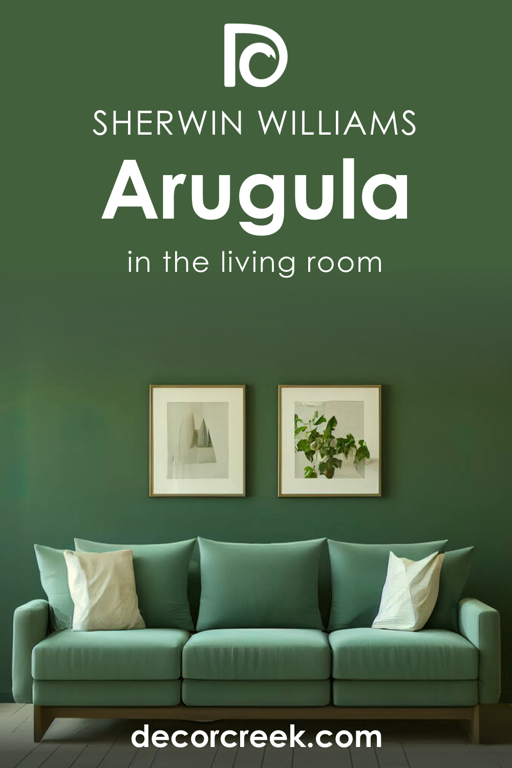
How to use SW 6446 Arugula in the Living Room?
SW Arugula is a fantastic color for a living room. Its warm, earthy undertones make the space feel inviting and comfortable – perfect for entertaining or relaxing. Consider using Arugula on a feature wall to create a focal point in the room.
Balance its depth with lighter tones on the remaining walls and furniture. Natural wood elements, warm neutrals, and tactile fabrics like linen or leather work beautifully with SW Arugula.
If your living room has large windows or lots of natural light, Arugula can help bring a bit of the outdoors inside. Its natural green hue can make the space feel fresh and vibrant. Use it alongside natural materials like wood, stone, or jute to enhance the organic feel.
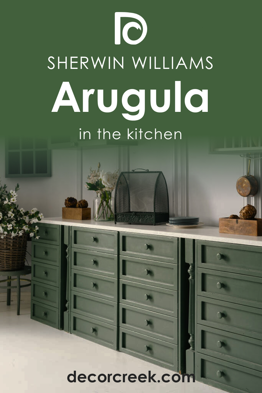
How to use SW 6446 Arugula in the Kitchen?
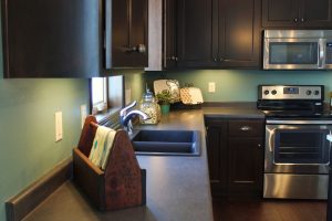
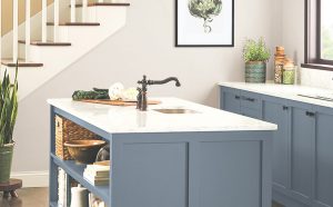
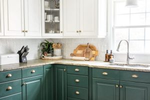
SW Arugula can add a dash of personality and depth to a kitchen. If you have white cabinets, consider using Arugula as a backsplash color. It will add a pop of color without overwhelming the space. For a bolder look, Arugula can be used on lower cabinets or a kitchen island. It pairs beautifully with warm wood countertops and brass hardware.
In a larger kitchen, SW Arugula can be used on the walls to add depth and interest. It’s a great way to bring an earthy, organic feel to the space. Pair it with light-colored cabinets and open shelving to prevent the room from feeling too dark.
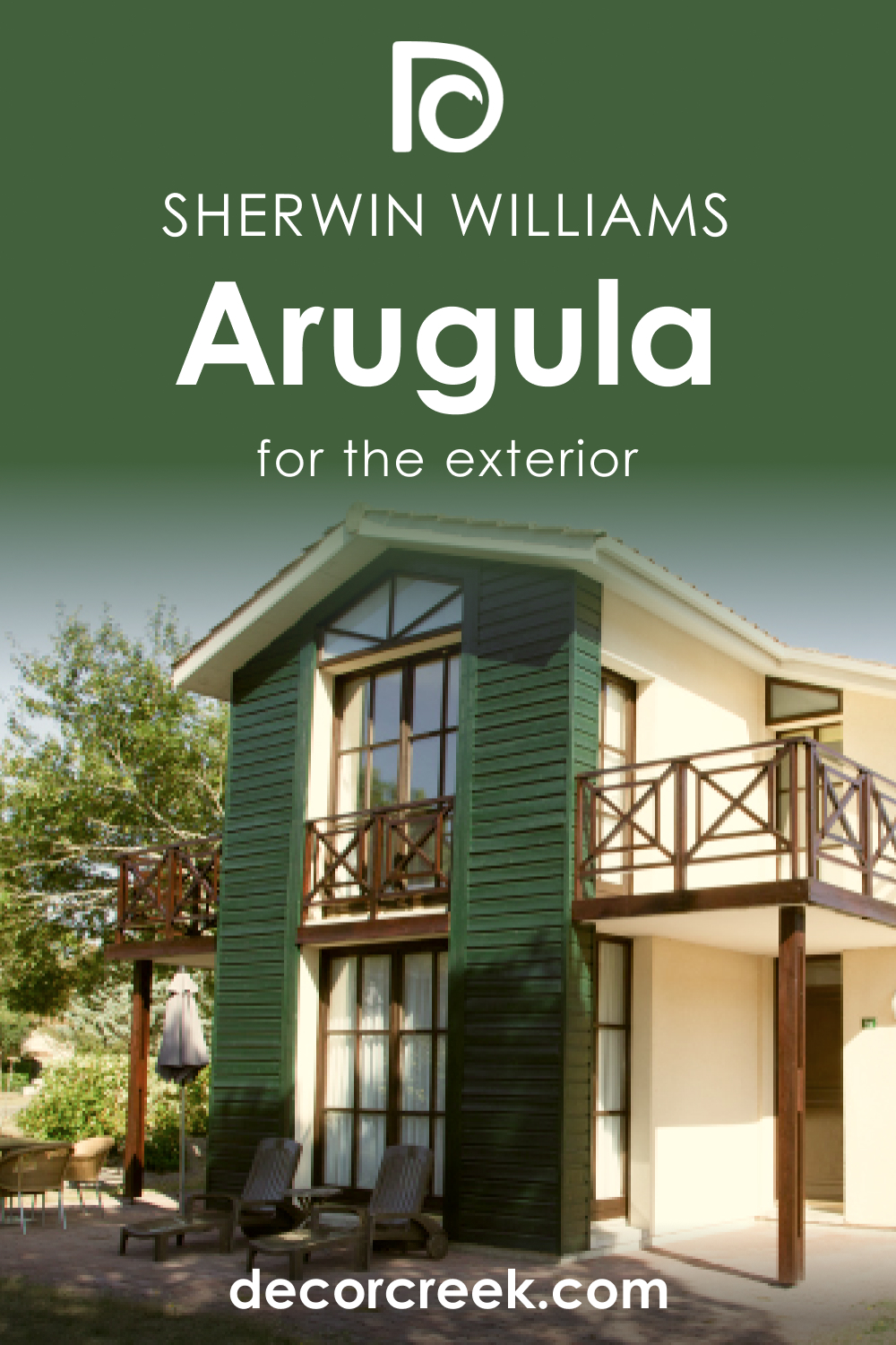
How to use SW 6446 Arugula for an Exterior?
SW Arugula is an excellent choice for an exterior paint color. It’s deep and lush, echoing the tones of nature, and it holds up well in various lighting conditions. Consider pairing Arugula with crisp white trim for a timeless look.
It also looks stunning when used on exterior doors or shutters for a pop of sophisticated color. If you have a lot of natural elements in your landscape, like mature trees or a lush garden, SW Arugula can help tie your home to its surroundings.
It also pairs beautifully with natural stone or wood. For a modern look, consider pairing Arugula with black or charcoal gray accents.
Comparing SW Arugula With Other Colors
To help you better see the difference between SW Arugula and several alternative colors, as well as different hues, we compare this green hue with a few paint colors that look either nearly the same or distinctly.
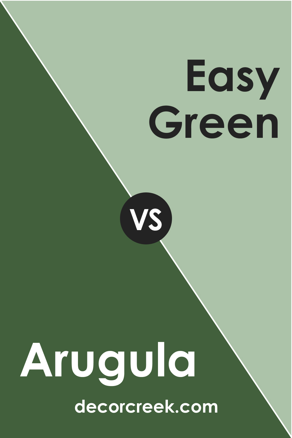
SW 6446 Arugula vs SW 6450 Easy Green
When comparing SW Arugula and SW Easy Green (CHECK A SAMPLE), you’ll notice significant differences despite being in the green family. Arugula, with its rich, earthy depth, is a much darker shade than Easy Green. The latter is a light and vibrant green, carrying an airy and fresh undertone, much like the first sprouts of spring.
It holds a higher LRV value than Arugula, making it a better choice for smaller spaces or rooms needing a burst of fresh energy. Easy Green could be considered the more youthful sibling of the two.
SW 6446 Arugula vs SW 6435 Gratifying Green
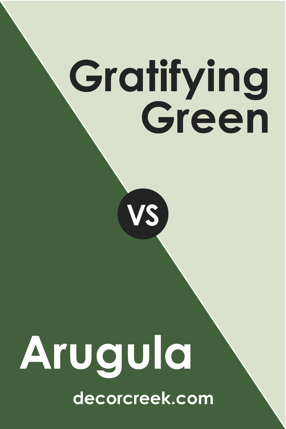
SW Gratifying Green (CHECK A SAMPLE) is another light, bright green, but it carries slightly more subdued undertones than Easy Green. It’s a balancing shade – neither too loud nor too soft. When compared to SW Arugula, Gratifying Green appears significantly lighter and a touch more grayish.
This gives it a more neutral, adaptable characteristic than the robust Arugula.
SW 6142 Arugula vs SW 6142 Macadamia
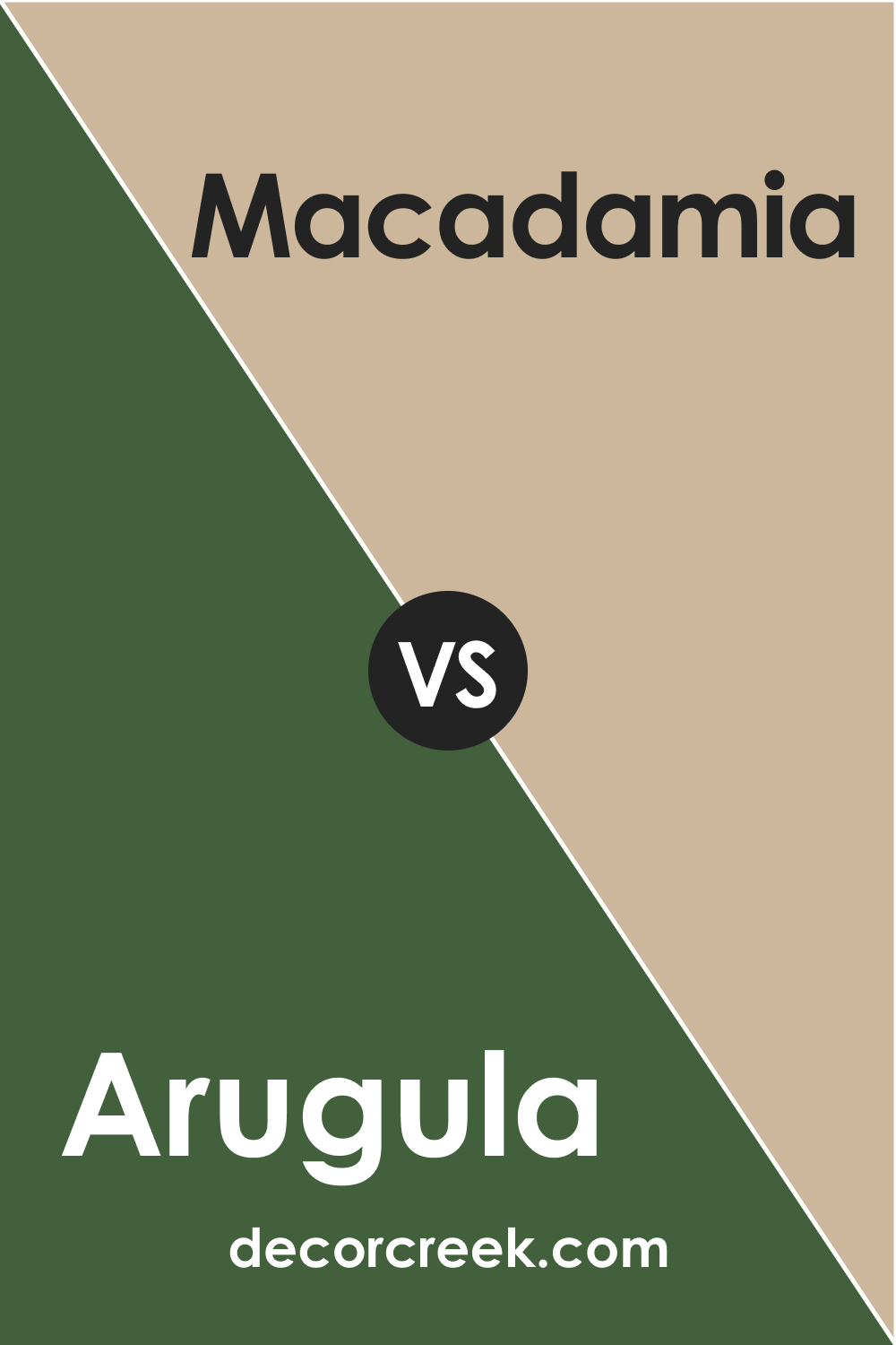
Macadamia (CHECK A SAMPLE) is a warm neutral, leaning into the beige spectrum rather than green. It’s lighter than SW Arugula and carries a hint of tan. The contrast between SW Arugula and Macadamia is striking – one is a rich, deep green, the other a soft, light beige. Despite their differences, they could complement each other well.
SW 6446 Arugula vs SW 6415 Hearts of Palm
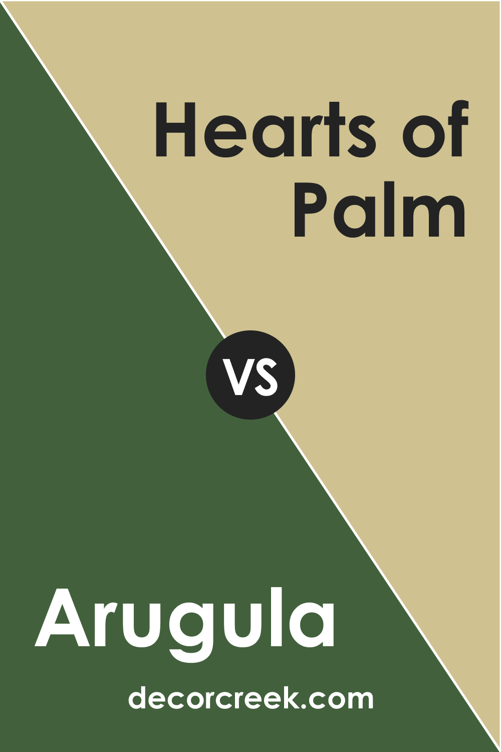
SW Hearts of Palm (CHECK A SAMPLE) is a lighter, more yellow-tinged green compared to Arugula. It has a bright, tropical feel to it that invokes images of palm trees and sunny days. While SW Arugula is deep and warm, SW Hearts of Palm is lighter and sunnier.
Both are nature-inspired, but while Arugula is reminiscent of a deep forest, Hearts of Palm is more akin to a sunny beachside landscape.
SW 6446 Arugula vs SW 6445 Garden Spot
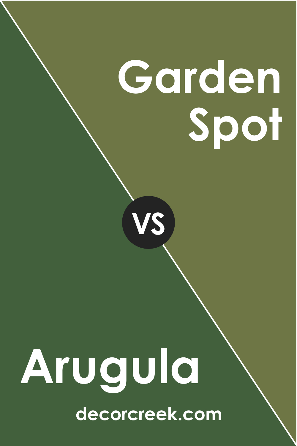
SW Garden Spot (CHECK A SAMPLE) is a mid-tone, muted green shade. It’s lighter than Arugula but carries a similar earthy quality. The difference lies in SW Garden Spot’s more grayish undertone, which gives it a softer, more muted appearance.
In contrast, Arugula’s richness makes it a more substantial color, offering a deeper, more intense backdrop.
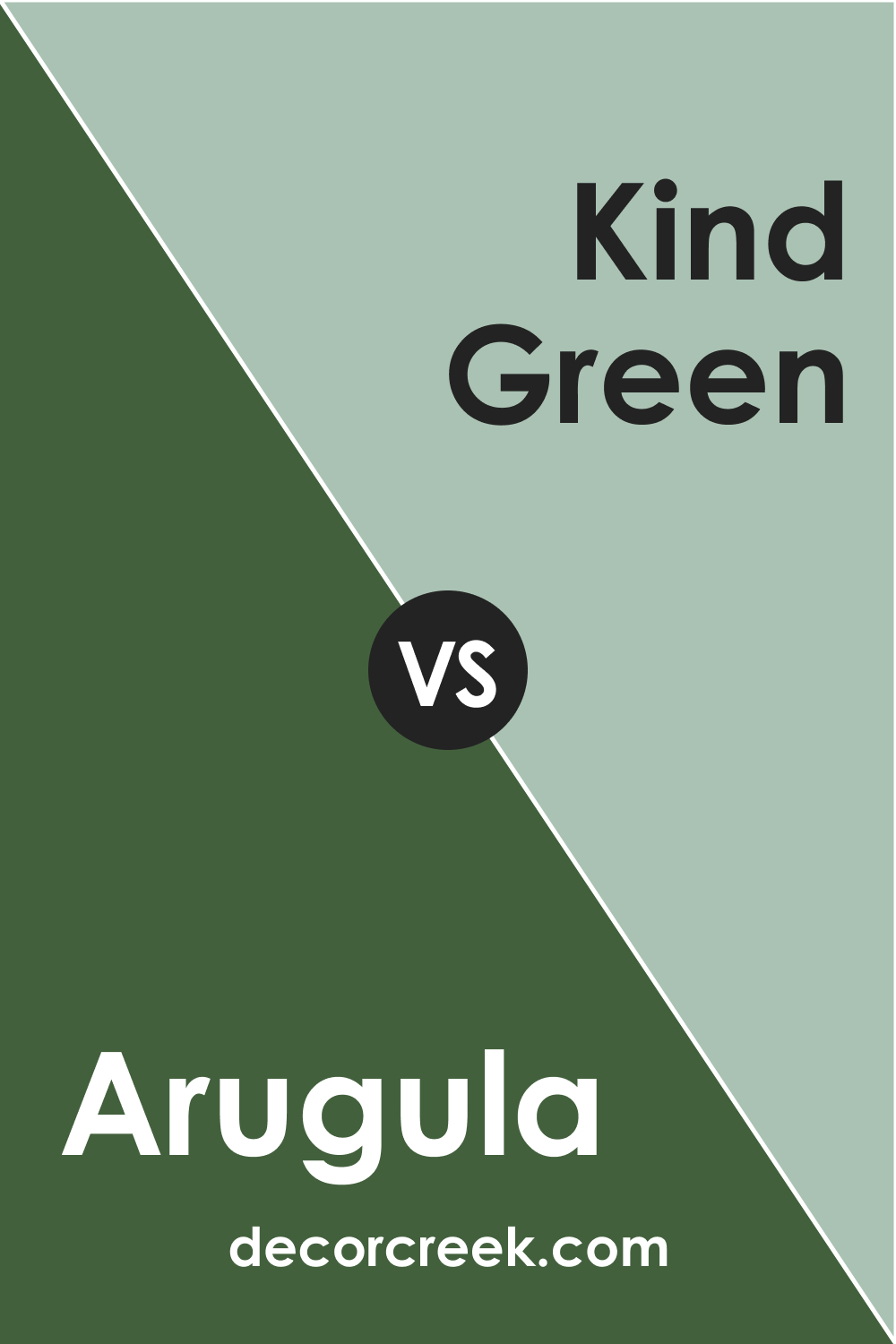
SW 6446 Arugula vs SW 6457 Kind Green
SW Kind Green (CHECK A SAMPLE) is a light green that leans towards the cooler spectrum compared to Arugula. It’s also much lighter and has a softer appearance. If you’re looking for a soothing, soft green, SW Kind Green might be an excellent choice for you.
In contrast, SW Arugula is a more intense, warmer color. It carries an earthy depth that Kind Green lacks, making it a more assertive choice.
Conclusion
Sherwin-Williams SW 6446 Arugula is a versatile and sophisticated paint color. Its rich, earthy green hue and warm undertones make it a wonderful choice for various applications, from creating an inviting living room to adding character to a kitchen.
Whether used as a statement color or a subtle accent, SW Arugula brings a touch of nature and depth into any space.

Ever wished paint sampling was as easy as sticking a sticker? Guess what? Now it is! Discover Samplize's unique Peel & Stick samples.
Get paint samples
Frequently Asked Questions
⭐What kind of rooms or settings works well with Sherwin-Williams SW 6446 Arugula?
SW Arugula is a versatile color that can be used in many settings. Its warm undertones and natural feel make it a good fit for living rooms, bedrooms, bathrooms, kitchens, and even exteriors. It works particularly well in spaces where you want to create a serene, relaxing atmosphere or bring a touch of nature indoors.
⭐What are some good coordinating colors for Sherwin Williams SW 6446 Arugula?
SW Arugula pairs beautifully with many colors. It works well with crisp whites, warm neutrals, and natural wood tones. For a more dramatic contrast, consider pairing it with deeper colors like Tricorn Black or Robust Orange.
⭐Is Sherwin-Williams SW 6446 Arugula a warm or cool color?
SW Arugula is a warm color. It has a rich, earthy green hue with warm undertones that give it a cozy and inviting feel.
⭐What is the Light Reflectance Value (LRV) of Sherwin Williams SW 6446 Arugula?
The LRV of Arugula is 9.94. This means it's a relatively dark color that absorbs more light than it reflects. It can make small spaces feel smaller but can add depth and coziness to larger rooms.
⭐Can I use Sherwin Williams SW 6446 Arugula for exterior paint?
Absolutely! Arugula is a great choice for exterior paint. It's a deep, lush color that holds up well in various lighting conditions and pairs well with natural stone, wood, and crisp white trim.


