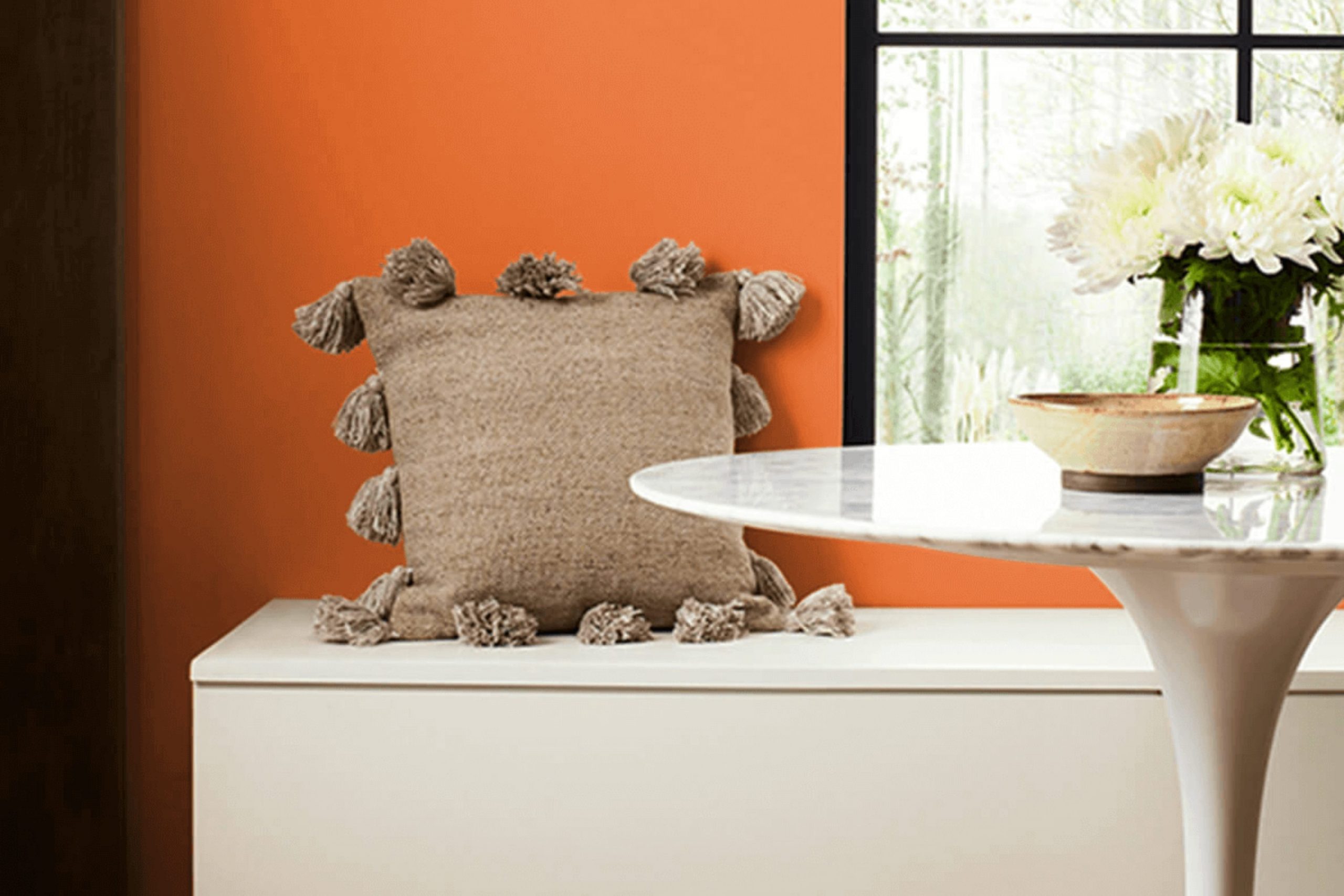
When considering new colors for a room, SW 6886 Invigorate by Sherwin Williams always comes to mind. Invigorate is a lively and energetic shade of orange that instantly brightens any room. It feels warm and cheerful, reminding me of a vibrant sunset or the lively energy of a summer day. This shade has the unique ability to create an atmosphere that is both welcoming and energizing.
Using Invigorate in a room can change the environment, making it feel innovative and full of life. Whether you’re painting an entire room or just an accent wall, this color can change the room dramatically. It’s perfect for areas where you need a boost of energy, like a kitchen or office, but it can also work wonderfully in living areas to create a warm, inviting atmosphere. Pair it with neutral tones to balance its brightness or with blues and greens for a bold, dynamic look.
In my experience, Invigorate never fails to impress. It’s an adaptable color that lends warmth and enthusiasm to any setting, making it an excellent choice for those who want to add a touch of vibrancy and positivity to their home.
What Color Is Invigorate SW 6886 by Sherwin Williams?
Invigorate SW 6886 by Sherwin-Williams is a bright, energetic orange that can make any room feel lively and cheerful. This color stands out with its warm and vibrant tone, making it perfect for areas where you want a burst of energy. It works exceptionally well in modern and eclectic interiors, bringing a playful and bold touch to the room.
Invigorate pairs beautifully with neutral colors, like soft grays and whites, which help balance its intensity. It also complements dark, earthy tones like deep browns or greens, providing a striking contrast. When it comes to materials, this color looks great alongside natural elements like wood, as well as metal finishes such as brass or copper, which highlight its warmth.
Incorporating different textures can enhance the appeal of Invigorate in your room. For example, soft textiles like plush rugs or velvet cushions can add comfort and chicness, while smooth surfaces such as glossy tiles or polished countertops provide a sleek contrast.
Using Invigorate in areas like kitchens, dining areas, or creative studios can make these rooms feel inviting and stimulating, boosting mood and creativity. Overall, Invigorate SW 6886 is a lively color choice that can add a sense of fun and energy to your home.
decorcreek.com
Is Invigorate SW 6886 by Sherwin Williams Warm or Cool color?
Invigorate (SW 6886) by Sherwin Williams is a vibrant and energizing color choice for home interiors. This shade, a warm and lively mix of red and orange, adds a burst of energy to any room. Whether used as a feature wall or in decorative elements, it can create a welcoming and dynamic environment.
When applied in living rooms or kitchens, Invigorate can stimulate conversation and social interaction, thanks to its lively hue. In a dining area, it can enhance the appetite, making meals more enjoyable. Pairing it with neutral tones like whites or grays can balance its boldness, while using it with complementary colors like deep greens or blues can make a striking visual impact.
Invigorate works well with natural light, where it can bring warmth and brightness to a room. Overall, this color choice is ideal for those looking to add a lively and cheerful touch to their home decor.
Undertones of Invigorate SW 6886 by Sherwin Williams
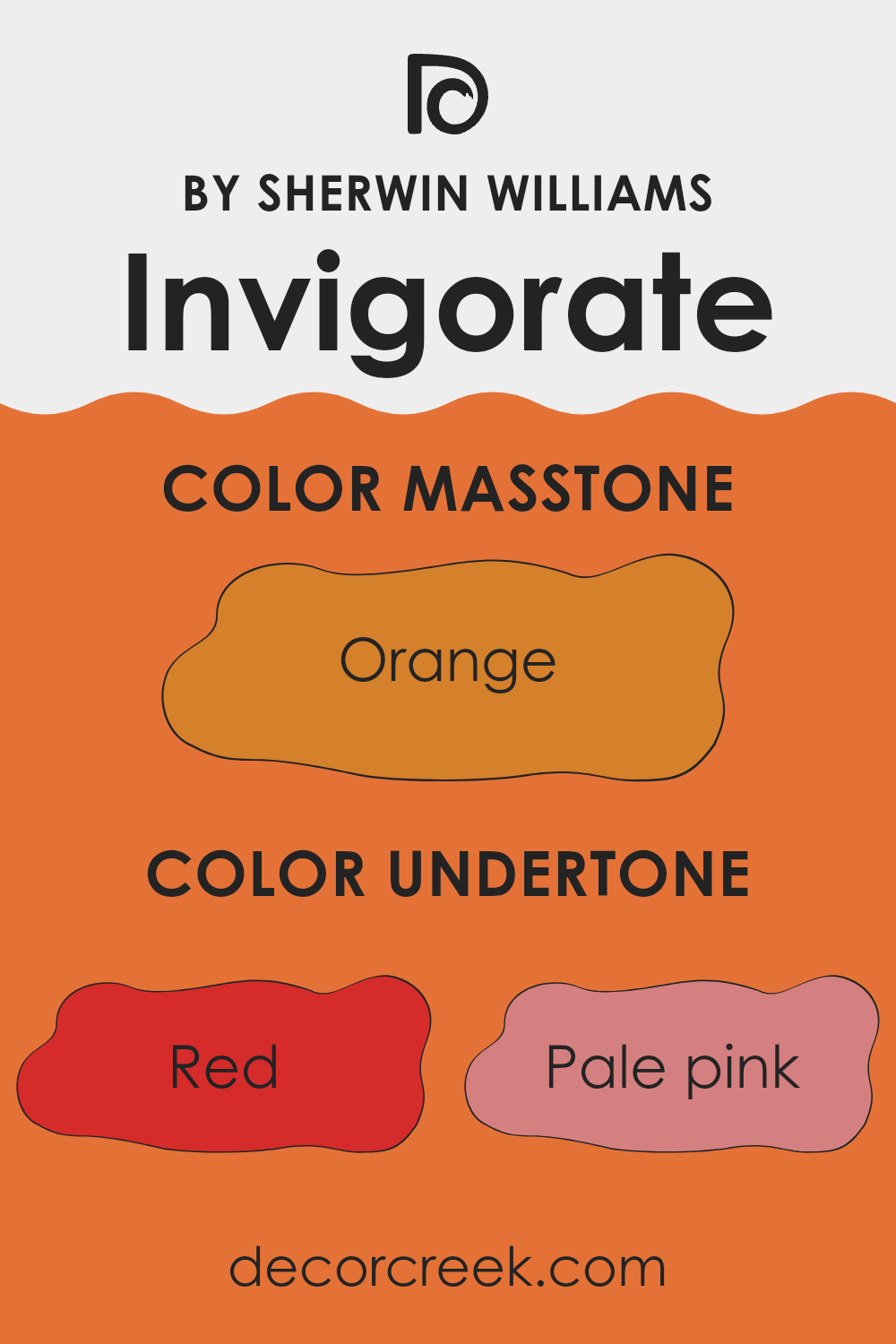
Invigorate SW 6886 by Sherwin Williams has a rich and complex character due to its undertones. Understanding these undertones can change how we perceive this color in a room. This color combines many elements: the warmth of red and pink, the earthiness of brown, and the brightness of yellow.
The red and pale pink undertones give the color a lively and spirited feel. They can make a room more vibrant and energetic, which is good for rooms where people gather, like living rooms or kitchens. Yellow and pale yellow bring a hint of sunshine, adding warmth and friendliness to the paint. On the other hand, the olive and brown hues root the color with a depth that can add comfort and stability.
The hints of grey and mint give the paint a balanced coolness, which can be calming. Light green adds freshness, while purple offers a touch of richness. Together, these undertones make this color flexible.
In a room, they can help create a welcoming yet lively atmosphere, ensuring the room feels dynamic without being too intense. Understanding these undertones helps in choosing complementary decor and accents, resulting in a more cohesive design. Overall, these undertones make Invigorate a flexible choice for different interior styles.
What is the Masstone of the Invigorate SW 6886 by Sherwin Williams?
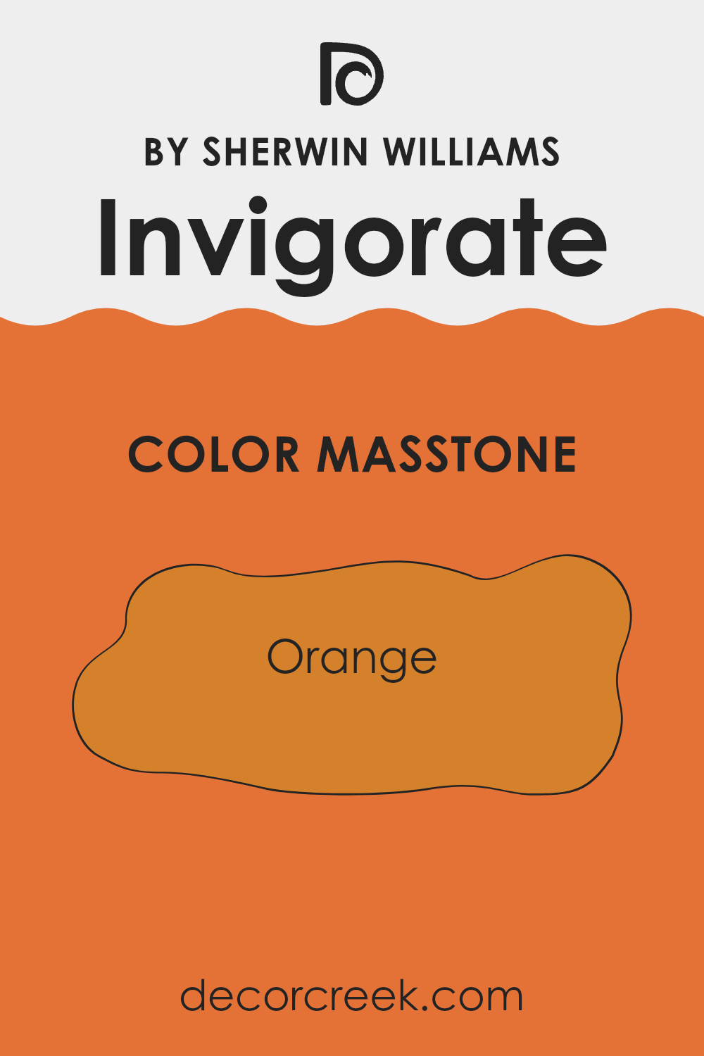
Invigorate (SW 6886) by Sherwin Williams is a warm and lively shade of orange, marked by its masstone of #D5802B. This vibrant hue can add a cheerful and energetic vibe to any home. When used in living rooms or kitchens, it creates a welcoming and cozy atmosphere, making rooms feel inviting and full of life. Orange is known for its ability to stimulate conversation and inspire creativity, so this color is perfect for areas where family and friends gather.
In smaller rooms or areas with limited natural light, Invigorate can open up the room, bringing in a sense of warmth and brightness. This shade pairs well with neutral tones like beige or light gray, which can balance its intensity.
Additionally, it goes well with dark woods and earth tones, enhancing the natural feel of the decor. Invigorate can serve as a striking accent wall or be used for decorative accessories, adding a pop of color without feeling too intense.
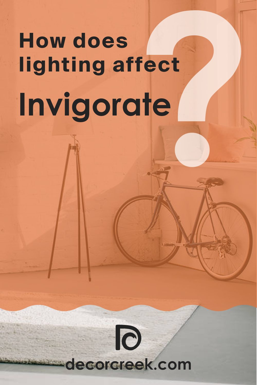
How Does Lighting Affect Invigorate SW 6886 by Sherwin Williams?
Lighting plays a crucial role in how we perceive colors. Different light sources can change the way a color looks, affecting its brightness and undertone. Sherwin Williams’ Invigorate SW 6886 is a warm, golden-orange hue. Its appearance shifts noticeably under various lighting conditions.
Under natural light, Invigorate tends to display its true color more accurately. In rooms with natural lighting, you often see the richness and warmth of the color. However, depending on the direction your room faces, Invigorate may appear different.
In north-facing rooms, the light is cooler and often indirect, which might make Invigorate appear slightly dimmer or less vibrant. The cool light can tone down some of the warmth, giving it a more muted appearance.
In south-facing rooms, where the light is warm and direct for most of the day, Invigorate will shine with its full vibrancy. The warm light enhances its golden tones, making it appear more luminous and bright.
East-facing rooms receive warm, yellow-orange light in the morning but become cooler and more neutral as the day progresses. In the morning, Invigorate will look its brightest and most saturated, while in the afternoon, it may soften.
In west-facing rooms, the opposite occurs. Mornings can appear more subdued as the light is indirect and cooler. By the afternoon and evening, as the sunlight warms up, the color may seem more intense and comforting, highlighting the room’s coziness.
Under artificial lighting, such as LED or incandescent lights, Invigorate’s appearance depends on the light bulb’s warmth. Warm lighting will enhance its golden hues, while cooler artificial lights could make it appear more subdued. Choosing the right lighting for this color depends on the mood you want to create and how much you wish to emphasize the color’s warmth.
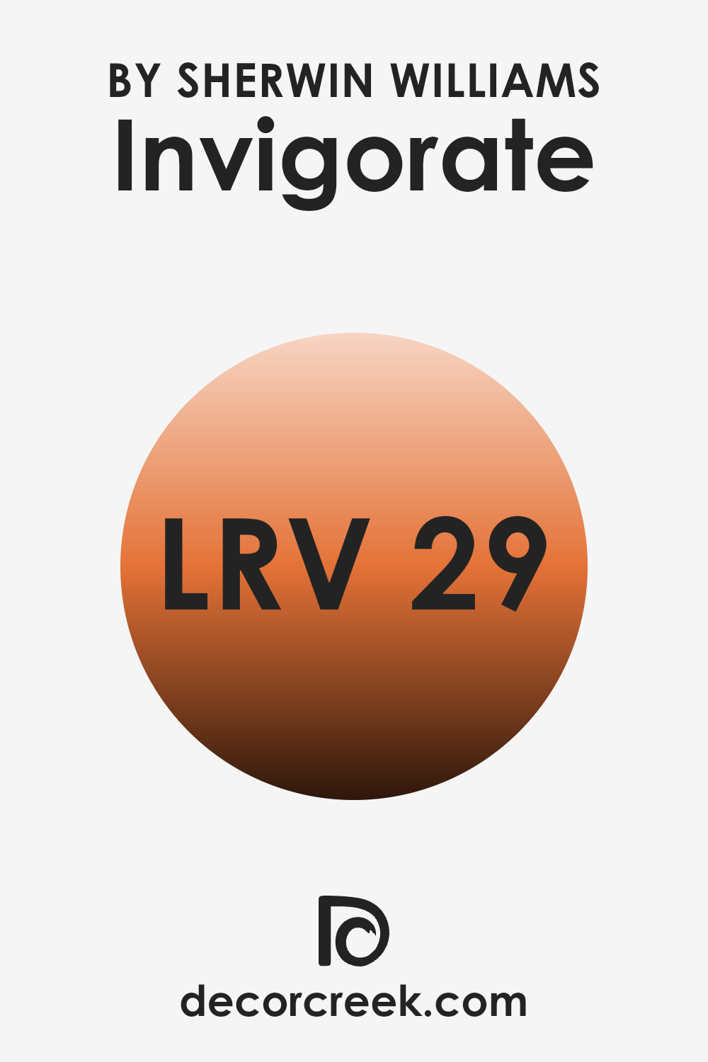
What is the LRV of Invigorate SW 6886 by Sherwin Williams?
LRV stands for Light Reflectance Value, which is a measure of how much light a paint color reflects. It’s a number on a scale from 0 to 100, where 0 is absolute black, meaning it absorbs all light, and 100 is pure white, reflecting all light. An LRV near 0 means a color is darker and absorbs more light, leading to a cozier, more intimate feel in a room.
Conversely, a color with a high LRV will reflect more light, making a room feel brighter and more open. Understanding the LRV of a paint helps you predict how it will interact with light in your room, which can affect the mood and perception of the interior.
For Invigorate (SW 6886) by Sherwin Williams, the LRV is 28.742. This means it falls on the darker side of the scale. While not extremely dark, it absorbs more light than it reflects.
This can make a room painted in this color feel warm and enveloping rather than light and airy. Its relatively low LRV means it won’t bounce a lot of light back into the room, so it would work well in rooms where you want to create a more grounded and cozy atmosphere. It’s a color that can add a sense of warmth and richness to a room without being excessively dark.
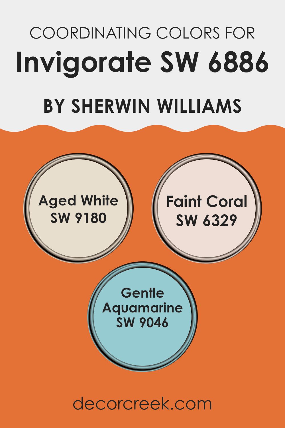
Coordinating Colors of Invigorate SW 6886 by Sherwin Williams
Coordinating colors are hues that complement or enhance each other when used together in design. They work by creating visual harmony, ensuring that the different elements in a room or on an object look cohesive. When working with these colors alongside Invigorate by Sherwin Williams, it’s important to choose shades that balance its energy while adding depth and interest. Invigorate is a bold and vibrant color, and finding the right coordinating colors can help soften its liveliness while maintaining an inviting atmosphere.
Aged White (SW 9180) is a soft and subtle neutral with a slight warmth that can blend seamlessly with the energetic Invigorate. It provides a calming backdrop that can help tone down brighter hues. Faint Coral (SW 6329) offers a delicate pinkish hue, adding a touch of warmth and charm without dominating the palette.
It pairs well with Invigorate, offering a bit of playful elegance. Gentle Aquamarine (SW 9046) introduces a refreshing and soft touch of aqua, bringing a hint of coolness that beautifully offsets the warmth of Invigorate. Together, these colors provide a well-rounded and balanced palette for any room, allowing different elements to shine while maintaining a cohesive look.
You can see recommended paint colors below:
- SW 9180 Aged White
- SW 6329 Faint Coral
- SW 9046 Gentle Aquamarine
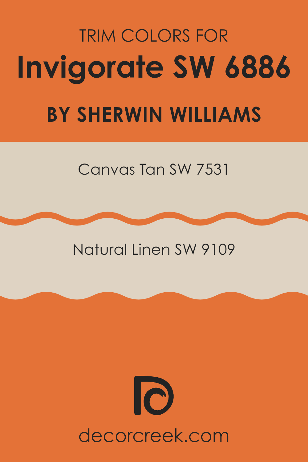
What are the Trim colors of Invigorate SW 6886 by Sherwin Williams?
Trim colors are the shades used on the edges or frames of walls, doors, and windows to highlight or complete the overall look of a room. They act as a bridge between the walls and the accents, helping to pull the design together. In the case of using Invigorate SW 6886 by Sherwin Williams as the main wall color, choosing the right trim color can help enhance its warm and lively character.
Using softer, neutral trim colors like SW 7531 Canvas Tan or SW 9109 Natural Linen can provide a gentle contrast to Invigorate, toning down its boldness while maintaining a balanced and inviting atmosphere. These trim colors soften the vibrant, dynamic nature of Invigorate, creating a sense of continuity and understated elegance without feeling too strong against the main color’s energy.
Canvas Tan SW 7531 is a warm, neutral shade that brings a subtle, welcoming feel, complementing the main color without overshadowing it. It’s flexible, providing a neutral backdrop that enhances the natural light within a room. Meanwhile, Natural Linen SW 9109 is slightly more muted, offering an earthy undertone that pairs well with Invigorate.
This shade conveys a sense of quiet elegance, bringing in warmth and a hint of texture. Both colors allow Invigorate to shine while offering a cohesive, harmonious look that is both vibrant and inviting. By using these trim colors, the overall design feels curated and balanced, making the room feel complete and pleasant.
You can see recommended paint colors below:
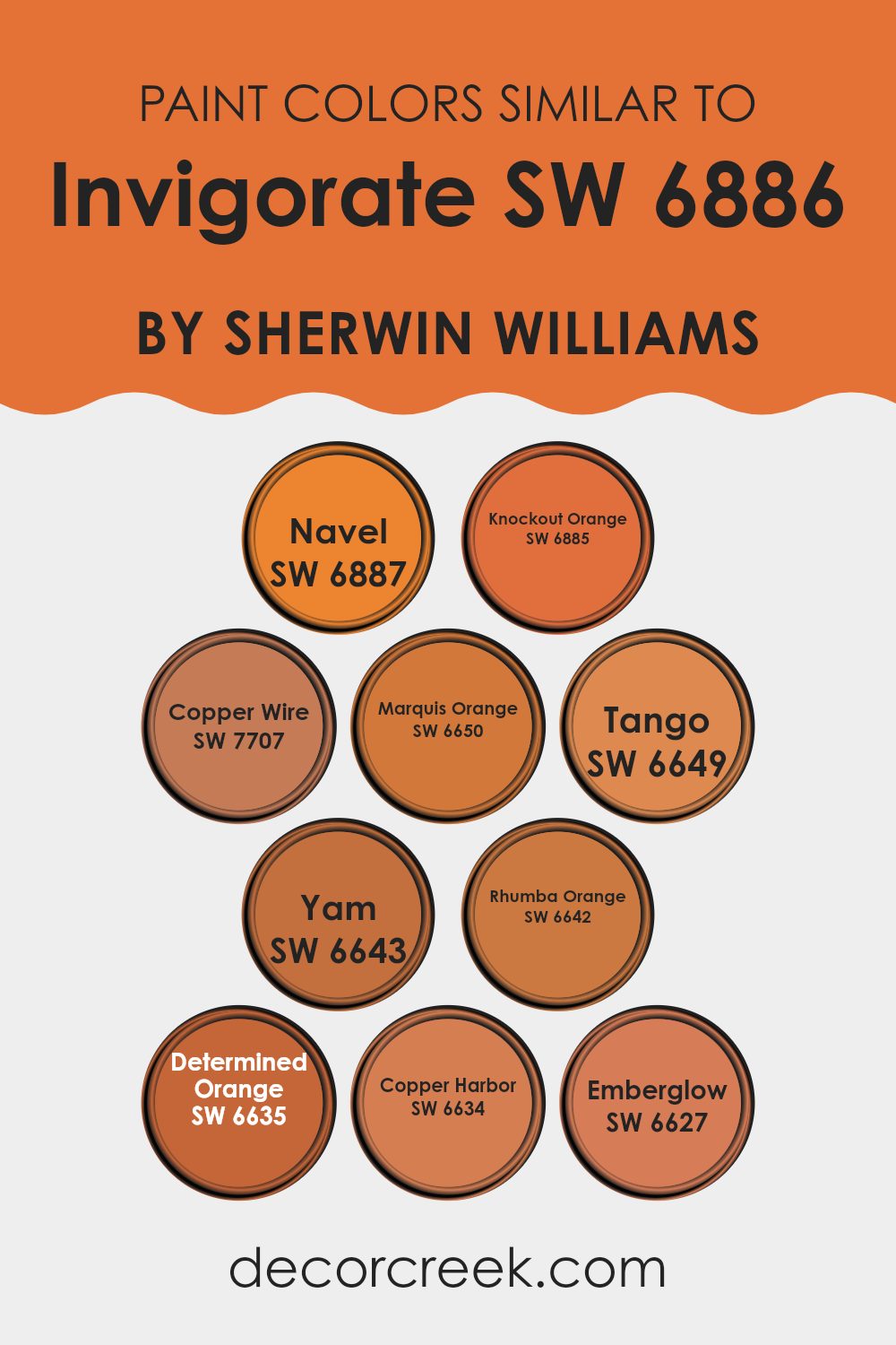
Colors Similar to Invigorate SW 6886 by Sherwin Williams
Similar colors are crucial for creating a cohesive and harmonious design. They help in achieving a balance because they share common hues, which allows them to blend well together without clashing. For example, using colors like SW 6887 Navel, a warm, rich shade reminiscent of ripe oranges, can add a bold statement to any room while still complementing SW 6886 Invigorate. SW 6885 Knockout Orange, with its vibrant and energetic tone, can enhance an interior by adding a punch of brightness that draws attention.
SW 7707 Copper Wire, a muted copper shade, offers a subtler contrast yet pairs well with more intense colors for a refined touch. Meanwhile, SW 6650 Marquis Orange and SW 6649 Tango present lively, fresh options with their vivid, sunlit feel. SW 6643 Yam and SW 6642 Rhumba Orange bring in a cozy and friendly atmosphere, with their earthy orange-brown tones adding warmth.
SW 6635 Determined Orange can ground a design with its robust and confident presence, providing a stunning backdrop or accent. Lastly, SW 6634 Copper Harbor and SW 6627 Emberglow evoke feelings of comfort and warmth, with their burnt orange shades creating a welcoming and inviting environment.
You can see recommended paint colors below:
- SW 6887 Navel
- SW 6885 Knockout Orange
- SW 7707 Copper Wire
- SW 6650 Marquis Orange
- SW 6649 Tango
- SW 6643 Yam
- SW 6642 Rhumba Orange
- SW 6635 Determined Orange
- SW 6634 Copper Harbor
- SW 6627 Emberglow
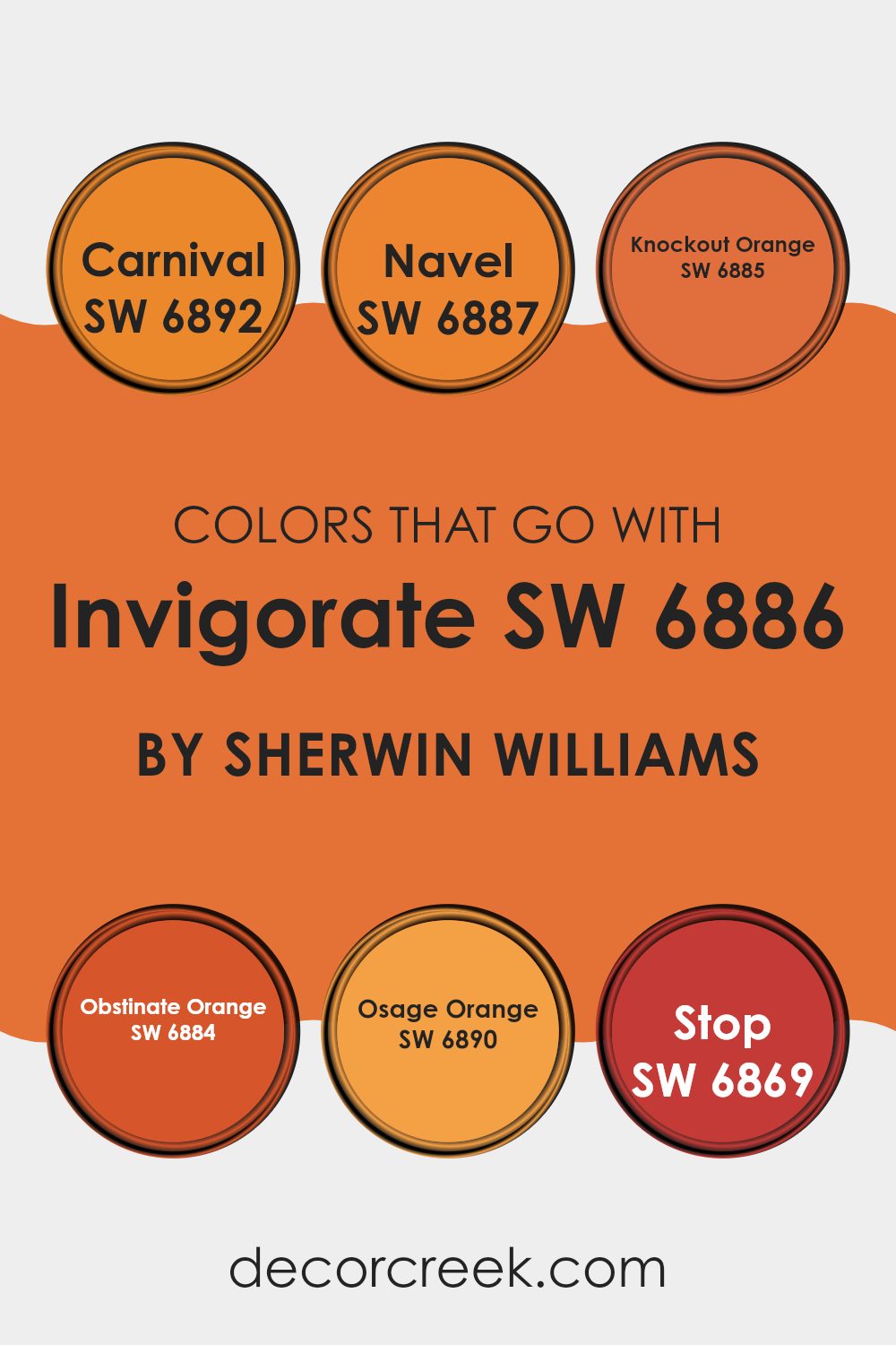
Colors that Go With Invigorate SW 6886 by Sherwin Williams
Invigorate SW 6886 by Sherwin Williams is a warm, energetic shade that brings a lively atmosphere to any room. Choosing colors to pair with it can boost its vibrancy or create a balanced look. With bold tones like these, it’s important to consider color harmony because it defines the mood and energy of the room.
For example, SW 6892 – Carnival is a playful, bright color that adds a fun pop and works beautifully with Invigorate. Similarly, SW 6887 – Navel provides a rich, golden orange that complements the warmth of Invigorate, blending seamlessly to enrich the room’s look.
Colors like SW 6885 – Knockout Orange bring a bold, slightly muted orange into the mix, balancing out the vibrancy of Invigorate without losing the lively feel. SW 6884 – Obstinate Orange has a deeper, more fiery tone, offering a strong contrast that highlights Invigorate’s brightness. SW 6890 – Osage Orange introduces a softer, more muted orange, creating a subtle transition between the bold hues. Meanwhile, SW 6869 – Stop is a striking, intense red that makes a strong statement when paired with Invigorate. Using these colors thoughtfully allows for a dynamic and cohesive design that’s full of life and energy.
You can see recommended paint colors below:
- SW 6892 Carnival
- SW 6887 Navel
- SW 6885 Knockout Orange
- SW 6884 Obstinate Orange
- SW 6890 Osage Orange
- SW 6869 Stop
How to Use Invigorate SW 6886 by Sherwin Williams In Your Home?
Invigorate SW 6886 by Sherwin Williams is a warm, rich shade of orange that can add energy and vibrancy to any room. This color is perfect for areas where you want to encourage conversation and warmth, such as the living room or dining area. Paired with neutral tones like beige or soft white, Invigorate can create a cozy and inviting atmosphere.
In the kitchen, this color can bring a lively and cheerful touch, making it a welcoming place for family gatherings. Used as an accent wall, it can highlight features like a fireplace or artwork, drawing attention to a focal point in the room.
In bedrooms, Invigorate can be paired with calming colors like grey or creamy white to balance its boldness, creating a balance between relaxation and warmth. Accessories like cushions, rugs, or curtains in this color can refresh the room without feeling too intense. With its energizing quality, Invigorate offers flexible use throughout the home.
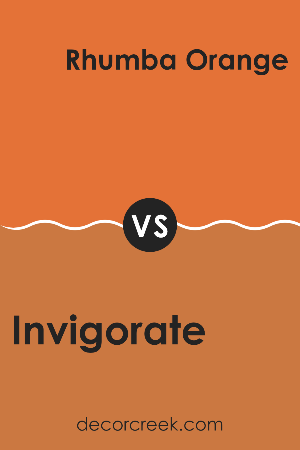
Invigorate SW 6886 by Sherwin Williams vs Rhumba Orange SW 6642 by Sherwin Williams
Invigorate SW 6886 and Rhumba Orange SW 6642 are two vibrant colors by Sherwin Williams, each bringing a different feel to a room. Invigorate is a bold yellow with hints of orange that radiates energy and cheerfulness, perfect for rooms where you want to encourage a lively atmosphere.
In contrast, Rhumba Orange is a rich, warm orange tone that adds warmth and coziness to a room. While Invigorate might remind you of sunshine and freshness, Rhumba Orange brings a sense of comfort, similar to a sunset or autumn leaves.
Both colors can make statements, but Invigorate tends to stand out more with its brightness, whereas Rhumba Orange offers a more grounded warmth. Choosing between them would depend on whether you want the room to feel more invigorating and fresh with the yellow tones or comforting and warm with the deeper orange hue.
You can see recommended paint color below:
- SW 6642 Rhumba Orange
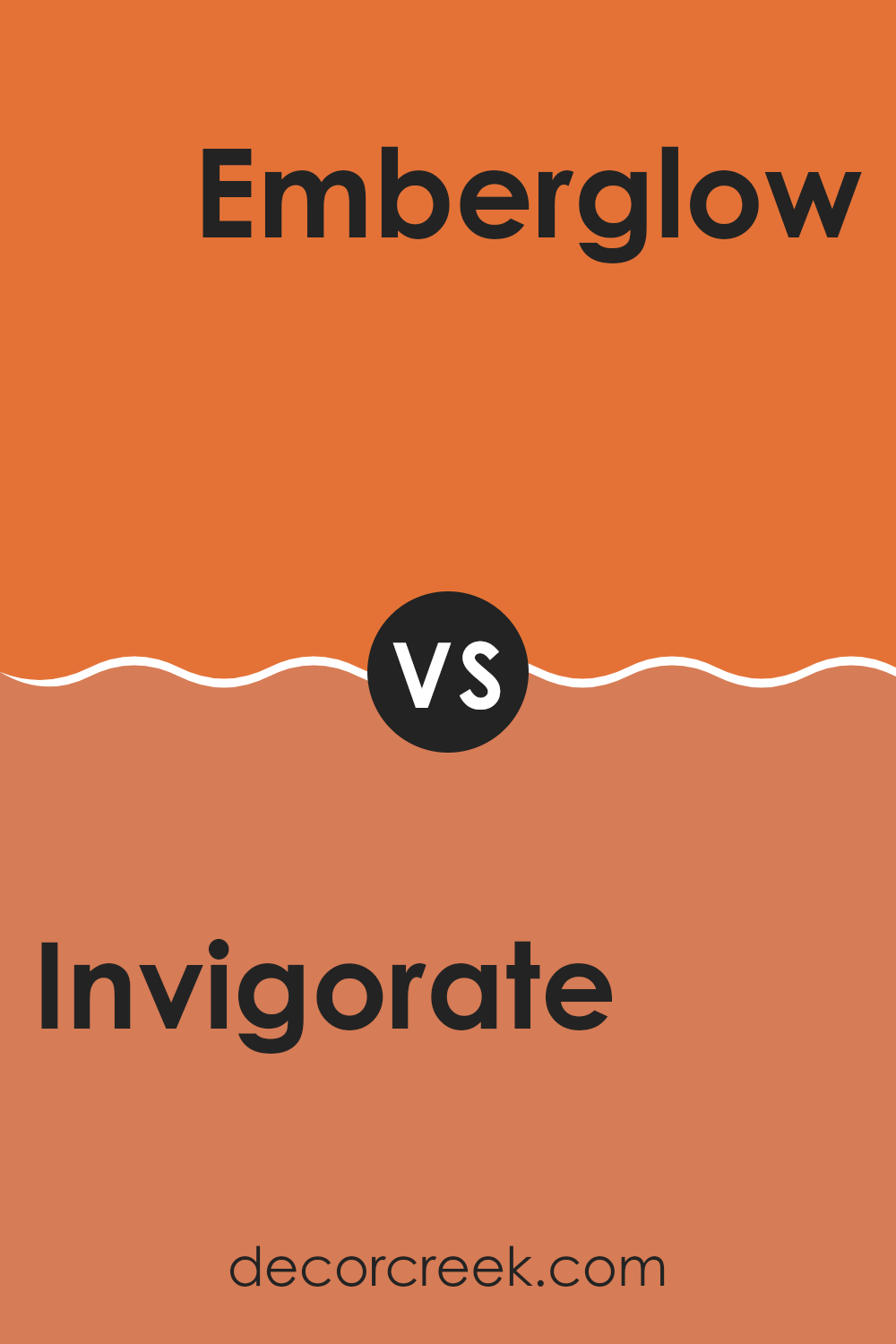
Invigorate SW 6886 by Sherwin Williams vs Emberglow SW 6627 by Sherwin Williams
Invigorate SW 6886 and Emberglow SW 6627 are both vibrant colors from Sherwin Williams, but each has its unique personality. Invigorate is a bright and cheerful yellow with hints of orange. It brings energy and warmth into a room, making it feel lively and welcoming. This color is great for areas where you want to feel uplifted and inspired, like kitchens or playrooms.
On the other hand, Emberglow is a rich, warm orange-red. It has an earthy and cozy feel, perfect for creating a snug and inviting atmosphere. Emberglow works well in living rooms or dining areas where you aim for a comforting environment.
While both colors are warm, Invigorate leans more towards yellow tones, making it sunnier and more refreshing. Emberglow’s deeper orange hue gives it a more relaxed and earthy vibe, ideal for rooms where you want warmth but also a sense of calm.
You can see recommended paint color below:
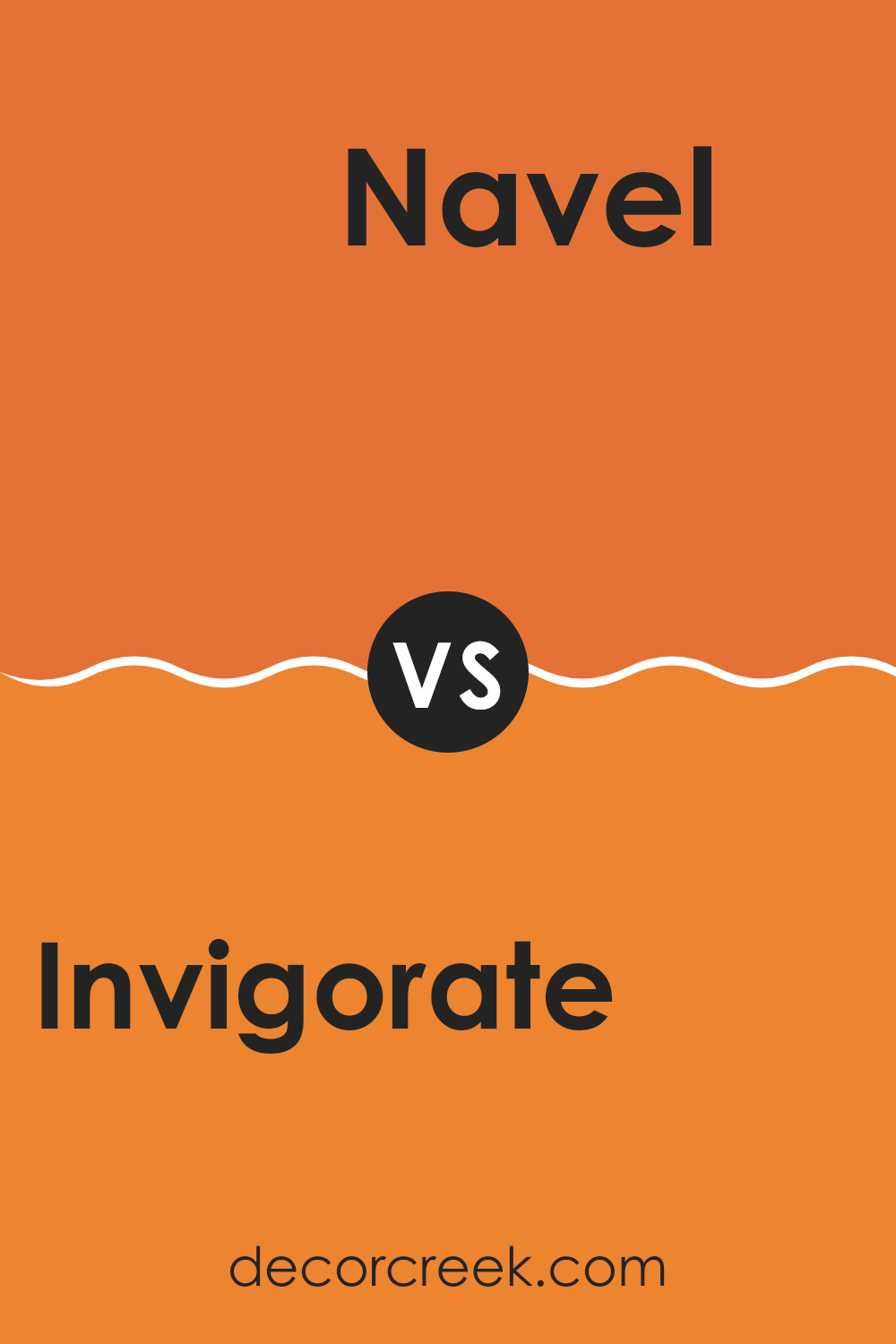
Invigorate SW 6886 by Sherwin Williams vs Navel SW 6887 by Sherwin Williams
Invigorate SW 6886 and Navel SW 6887 are both warm, vibrant colors by Sherwin Williams, yet they have distinct personalities. Invigorate SW 6886 is a lively, optimistic shade of yellow-orange that brings energy and brightness to a room. It’s ideal for creating an uplifting atmosphere in rooms that need a touch of cheerfulness.
On the other hand, Navel SW 6887 is a deeper, richer orange with more earthiness and a slightly muted tone. It retains warmth and has a cozy feel, making it suitable for rooms where you want a bit of drama without feeling too intense. Navel’s deeper hue is perfect for accent walls or areas that benefit from a warm, inviting look.
In summary, if you’re looking for energy and light, go for Invigorate. If you want a warm, welcoming vibe, Navel is your color. Both colors can add unique and delightful touches to any interior.
You can see recommended paint color below:
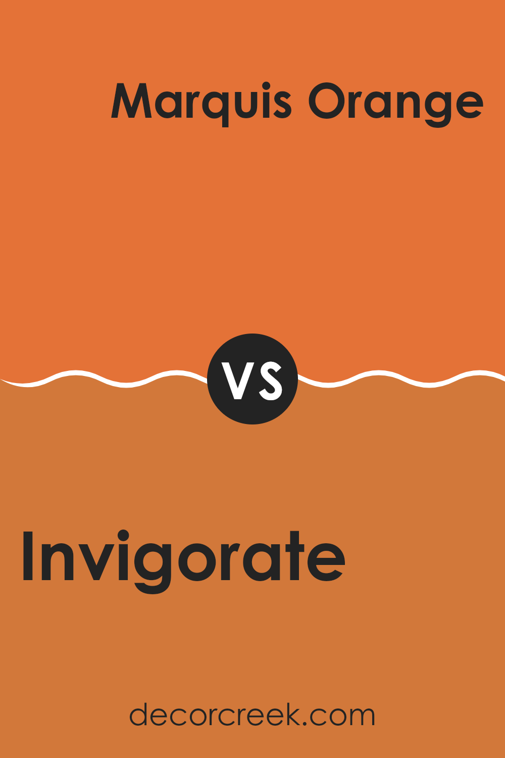
Invigorate SW 6886 by Sherwin Williams vs Marquis Orange SW 6650 by Sherwin Williams
Invigorate (SW 6886) is a bright, lively yellow with a hint of orange, making it a cheerful and energetic choice for any room. It’s perfect if you want to create a warm, friendly atmosphere. In contrast, Marquis Orange (SW 6650) is a deep, rich orange that leans more towards a burnt, earthy tone.
While Invigorate is more about bright sunshine and energy, Marquis Orange brings warmth with a touch of refined elegance. Invigorate can make smaller rooms feel larger due to its brightness, while Marquis Orange offers a cozy, comforting feel, ideal for larger rooms that need a bit of intimacy.
When paired together, Invigorate can be used as an accent to brighten up the more grounded tone of Marquis Orange. Both colors offer unique vibes: one is all about vibrancy and cheer, while the other provides depth and warmth.
You can see recommended paint color below:
- SW 6650 Marquis Orange
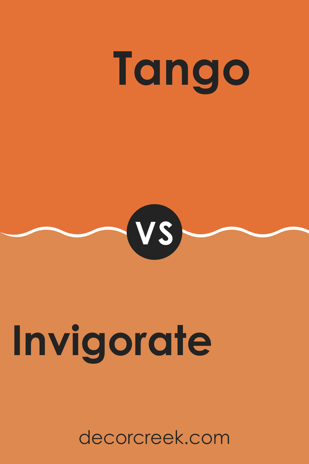
Invigorate SW 6886 by Sherwin Williams vs Tango SW 6649 by Sherwin Williams
Invigorate (SW 6886) and Tango (SW 6649) by Sherwin Williams are both vibrant colors, but they have different tones and moods. Invigorate is a bold, sunny yellow with a warm undertone, making it perfect for adding energy and brightness to a room. It can make rooms feel cheerful and lively.
On the other hand, Tango is a strong, energetic orange-red. This color is intense and full of life, bringing warmth and a sense of excitement to any room. It might work well in rooms where you want to encourage social interaction and creativity.
While both colors are vibrant, Invigorate leans towards a sunnier, more playful feel, whereas Tango has a deeper, richer intensity. Choosing between them depends on the atmosphere you want to create: Invigorate for cheerfulness and light, or Tango for warmth and vibrancy. Both colors can make a statement, but evoke different emotions and energy in a room.
You can see recommended paint color below:
- SW 6649 Tango
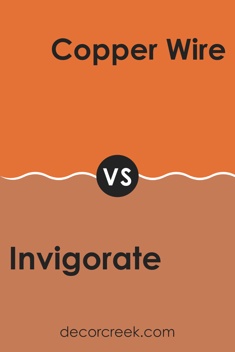
Invigorate SW 6886 by Sherwin Williams vs Copper Wire SW 7707 by Sherwin Williams
Invigorate SW 6886 by Sherwin Williams is a bright and energetic yellow with a hint of orange. It feels sunny, cheerful, and warm, making rooms feel lively and vibrant. It’s great for adding a pop of color and lifting the mood in a room.
On the other hand, Copper Wire SW 7707 is a rich, warm brown with orangey-red undertones. It brings feelings of warmth and earthiness, like the glow of copper metal. This color works well to create cozy and inviting rooms, often adding a touch of refined character.
Comparing the two, Invigorate is more vivid and energetic, perfect for rooms that need a boost of energy. Copper Wire is more subdued and earthy, offering a comfortable and grounded feel. Together, they can create a balanced look, with Invigorate adding excitement and Copper Wire providing a solid, warm foundation.
You can see recommended paint color below:
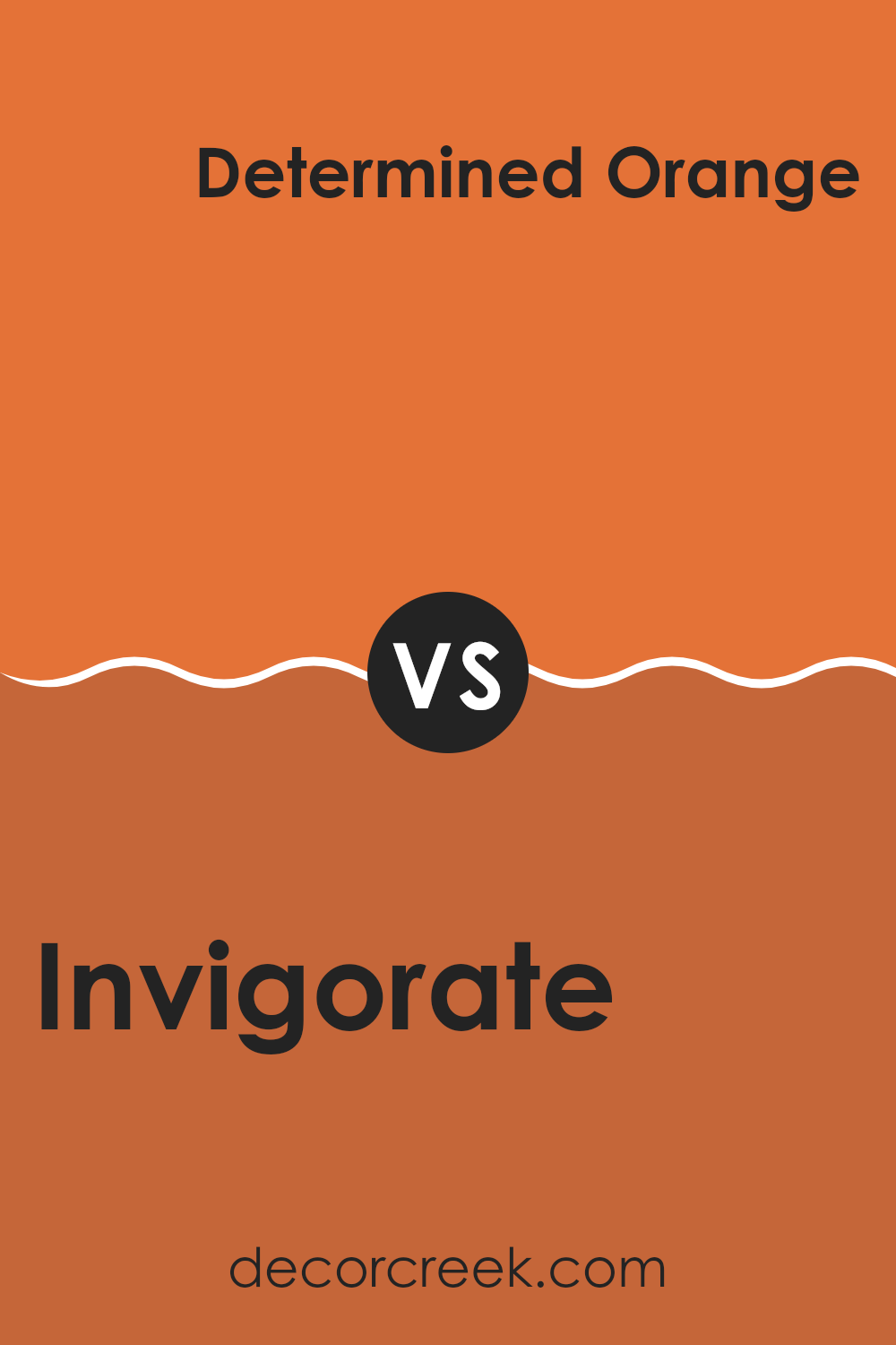
Invigorate SW 6886 by Sherwin Williams vs Determined Orange SW 6635 by Sherwin Williams
Invigorate SW 6886 and Determined Orange SW 6635 are vibrant, energetic colors from Sherwin Williams that add warmth and character to rooms. Invigorate is a bright, sunny yellow with a touch of warmth, reminiscent of a fresh lemon or sunflower. It’s cheerful and can light up any room, making it a great choice for areas meant to inspire energy and positivity, like kitchens or playrooms.
On the other hand, Determined Orange is a bold and spirited shade of orange. It carries a deeper, richer tone with hints of red, resembling a ripe pumpkin or sunset. This shade is powerful and can create a cozy, inviting atmosphere, perfect for dining rooms or living areas where you want to encourage interaction and enthusiasm.
While both colors are lively and warm, Invigorate’s brightness makes it more playful, whereas Determined Orange’s depth gives it a more robust and grounded feel. Together, they can complement each other well in a palette, balancing brightness with warmth.
You can see recommended paint color below:
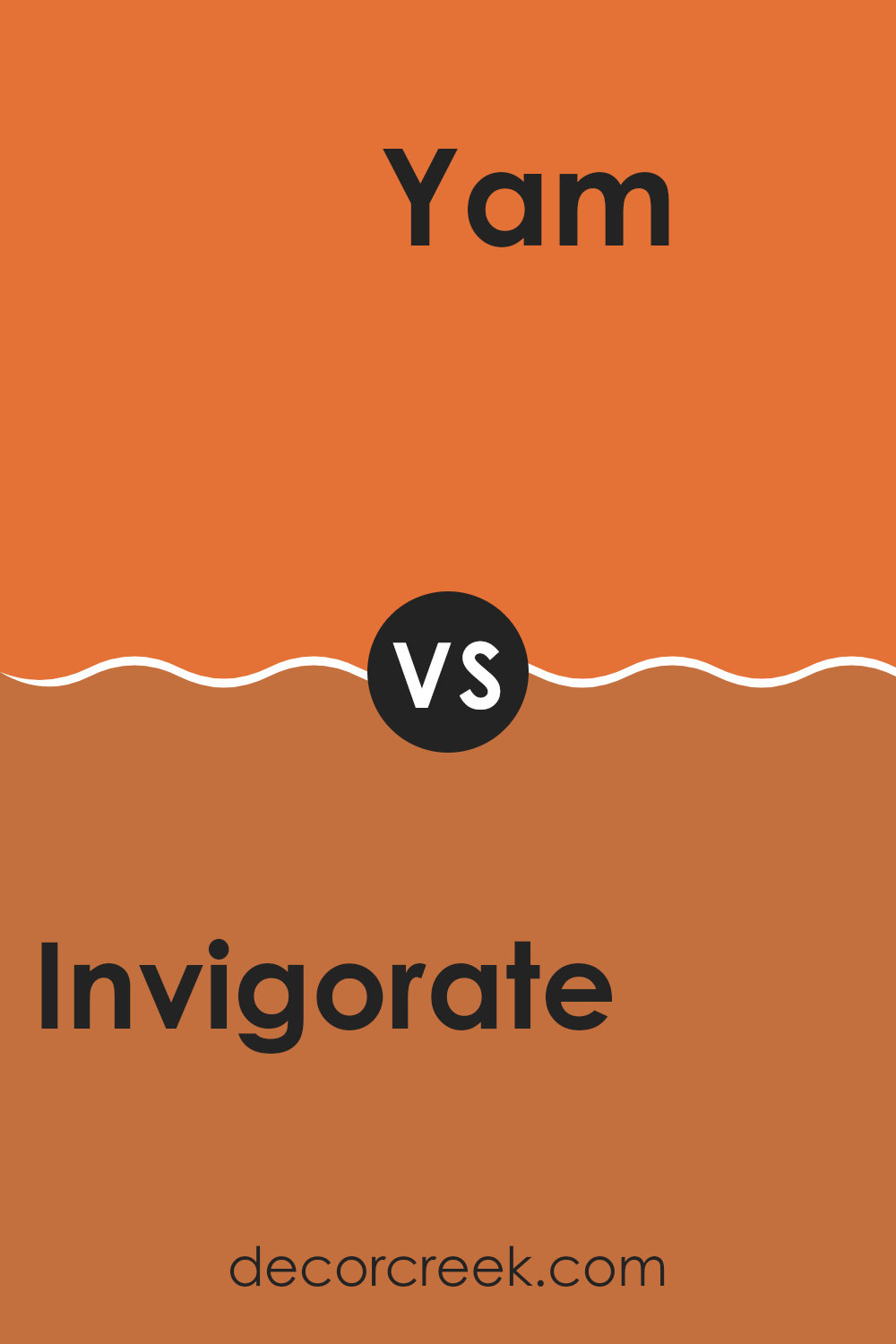
Invigorate SW 6886 by Sherwin Williams vs Yam SW 6643 by Sherwin Williams
Invigorate (SW 6886) and Yam (SW 6643) by Sherwin Williams are both warm colors that bring energy and coziness to interiors, but they have distinct characteristics. Invigorate is a vibrant, bold orange with a hint of red. It’s lively and can brighten up any area, making it ideal for accent walls or rooms where a boost of energy is desired. This color can create a cheerful and dynamic atmosphere.
On the other hand, Yam is a softer, more muted orange with a slight earthiness to it. It leans more toward a subtle and warm tone reminiscent of autumn leaves or a cozy sweater. Yam can add warmth and comfort to a room without feeling too intense, making it more adaptable for larger rooms or interiors that aim for a welcoming and calm vibe.
When choosing between the two, consider how much energy or softness you want to add to your surroundings.
You can see recommended paint color below:
- SW 6643 Yam
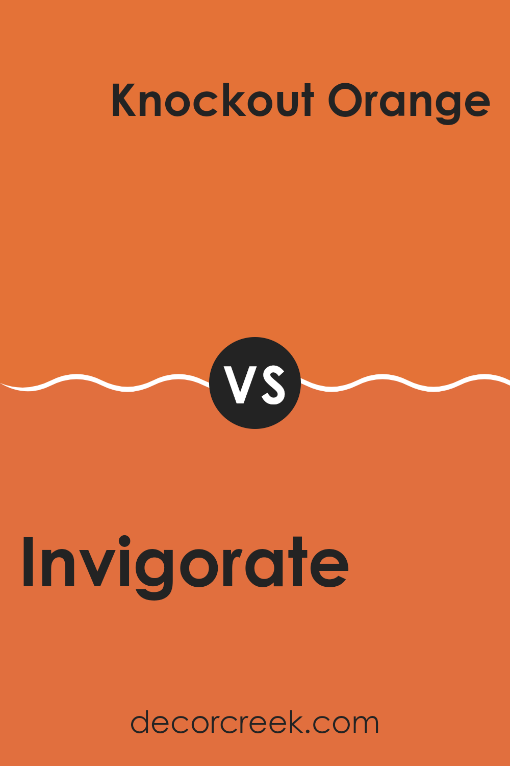
Invigorate SW 6886 by Sherwin Williams vs Knockout Orange SW 6885 by Sherwin Williams
Invigorate SW 6886 and Knockout Orange SW 6885 are vibrant colors by Sherwin Williams, but they have their own unique characteristics. Invigorate is a lively and bright yellow with a hint of orange, making it warm and energetic. It is great for creating a cheerful atmosphere in a room, adding a burst of sunshine and positivity.
On the other hand, Knockout Orange is a bold and vivid hue, leaning more towards a strong orange. It exudes confidence and excitement, perfect for making a strong statement. This shade can add a touch of boldness and liveliness wherever it is used.
While both colors are bright and upbeat, Invigorate brings a softer, sunnier feel with its yellow tones, whereas Knockout Orange is more intense and striking. Choosing between these two would depend on whether you want the warmth of sunlit yellow or the bold intensity of bright orange. Both are great for adding energy to your interior.
You can see recommended paint color below:
- SW 6885 Knockout Orange
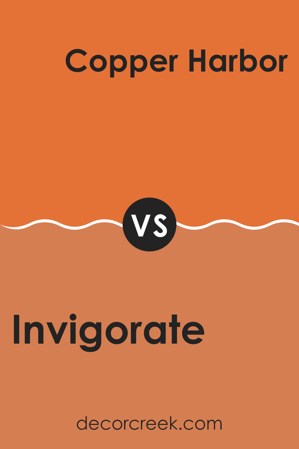
Invigorate SW 6886 by Sherwin Williams vs Copper Harbor SW 6634 by Sherwin Williams
Invigorate SW 6886 and Copper Harbor SW 6634 are two vibrant colors from Sherwin Williams that bring different moods to a room. Invigorate is a bold, energizing yellow with a touch of warmth.
It can make a room feel lively and cheerful, perfect for areas where you want to boost energy like kitchens or playrooms. On the other hand, Copper Harbor is a rich, burnt orange color. It has an earthy, cozy feel that can make a room feel welcoming and warm, ideal for living rooms or dining areas.
While Invigorate brings a bright pop of color, Copper Harbor offers a deeper, more grounded hue. Using them together can create a dynamic and balanced look, with Invigorate adding brightness and Copper Harbor providing warmth. Both colors are flexible and can be paired with neutral tones for a stylish contrast.
You can see recommended paint color below:
After reading about SW 6886 Invigorate by Sherwin Williams, I have a clear picture of what this color is all about. Invigorate is a really lively shade of orange. It’s bright and energetic, making any room it’s used in feel warm and welcoming. This cheerful color can remind you of sunny days or a big glass of fresh orange juice.
The paint has a knack for bringing a sense of happiness and excitement. It’s like having a dance party for your eyes! If you use Invigorate in a room, it can make that room feel much more cheerful and full of life. This could be a great addition to a living room or a playroom, where you want people to feel happy and active.
Choosing Invigorate is about bringing a punch of color to your world. Thinking about how this color could make a room in your house feel more lively is exciting. It’s amazing what a little bit of color can do to lift your mood and brighten your day. So, if you’re ever looking to make things more upbeat, Invigorate might just be the perfect shade for you.
Ever wished paint sampling was as easy as sticking a sticker? Guess what? Now it is! Discover Samplize's unique Peel & Stick samples.
Get paint samples

