Black
Black Blue
Blue Brown
Brown Gray
Gray Green
Green Neutral
 Orange
 White
White Yellow
If you’re considering a fresh coat of paint for your home, let me introduce you to HC-134 Tarrytown Green by Benjamin Moore. Choosing the right shade can sometimes feel challenging, but I found that Tarrytown Green offers a unique blend of warmth and elegance. This color is part of the Historical Collection, which is known for its deep roots in American heritage, providing colors that truly stand the test of time.
In using Tarrytown Green, I noticed that it brings a lush, soothing presence to any room. It’s an adaptable color — rich enough to make a statement yet subdued enough to act as a neutral. This shade works beautifully in various settings, enhancing the decor without dominating it. Whether you aim to refresh your living room, bedroom, or kitchen, Tarrytown Green suits both contemporary and traditional styles, complementing wood finishes and a range of textiles.
In my experience, Tarrytown Green not only enriches the aesthetic of a room but also improves the ambiance, making it feel more grounded and inviting.
If you are on the lookout for a color that balances both charm and depth, you might want to consider this classic hue.
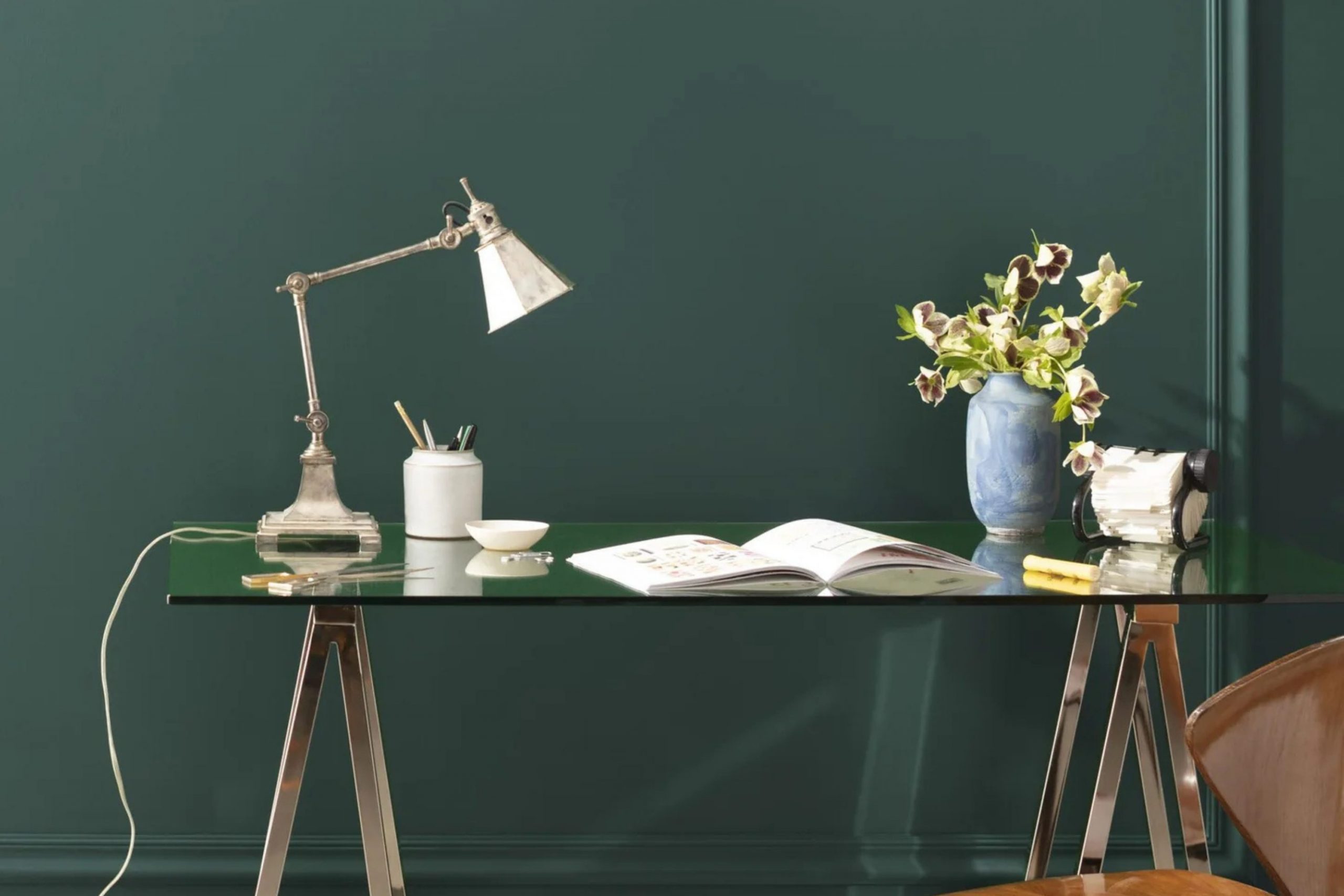
What Color Is Tarrytown Green HC-134 by Benjamin Moore?
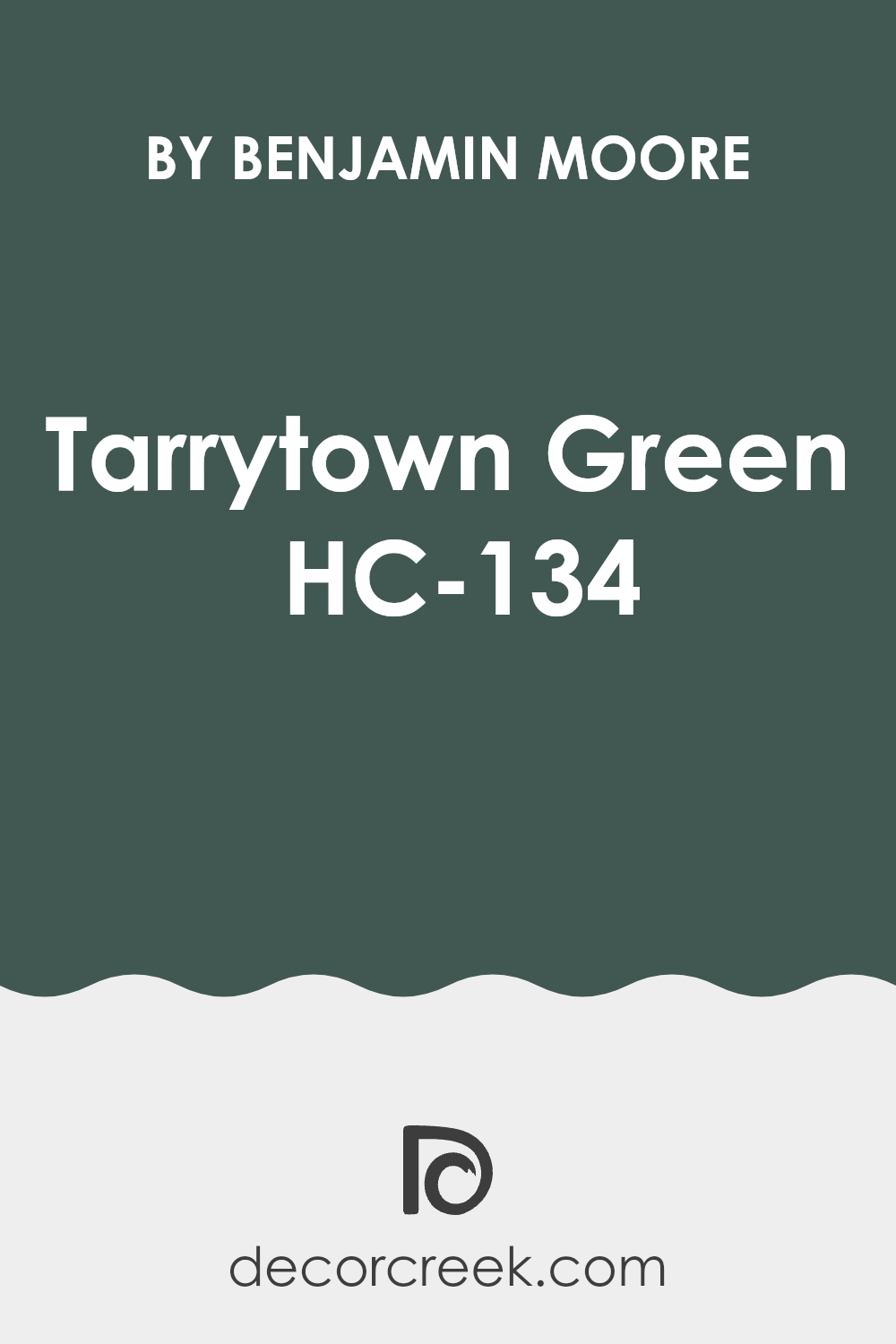
Tarrytown Green is a rich, deep shade of green with subtle hints of gray, making it an adaptable and warm option for interior rooms. Produced by Benjamin Moore, this color offers a cozy feel that complements a variety of decorating styles, particularly rustic, traditional, and modern themes. Its earthy tone helps create a welcoming atmosphere in any room, making it a great choice for living areas, bedrooms, and studies.
The color works exceptionally well with natural materials such as wood, which accentuates its earthiness. Pairing Tarrytown Green with furniture or features in oak, walnut, or pine enhances its warm undertones. For a more textured look, combining it with materials like leather, wool, or linen adds depth and interest. These pairings not only bring out the best in Tarrytown Green but also contribute to a cohesive and cozy interior.
Metals like brass and copper are also great matches for Tarrytown Green. These metallic tones contrast beautifully with the deep green, bringing a touch of warmth and shine to the room. Use metal accents in light fixtures, frames, or decor pieces to create a balanced and inviting room. This color offers a striking backdrop that highlights and complements a wide range of materials and textures, allowing for flexibility in your decor choices.
decorcreek.com
Is Tarrytown Green HC-134 by Benjamin Moore Warm or Cool color?
Tarrytown Green by Benjamin Moore is a unique and rich shade of green that brings a touch of nature into any home. This color has a deep, earthy tone that works well in both traditional and modern settings. It’s perfect for those looking to add a bit of warmth and coziness to their room.
When used on walls, Tarrytown Green can make a room feel more grounded and comfortable. It pairs beautifully with natural elements like wood or stone, enhancing the overall homey feel of a room.
This shade works well in various rooms, including living areas, kitchens, and bedrooms, offering an adaptable backdrop for different decor styles. Whether combined with neutral furniture or brighter accents, Tarrytown Green supports a wide range of design choices. Its lush quality can also help to hide marks or smudges, making it a practical choice for busy households. Overall, integrating Tarrytown Green into a home can create a welcoming atmosphere and bring new life to any room.
Undertones of Tarrytown Green HC-134 by Benjamin Moore
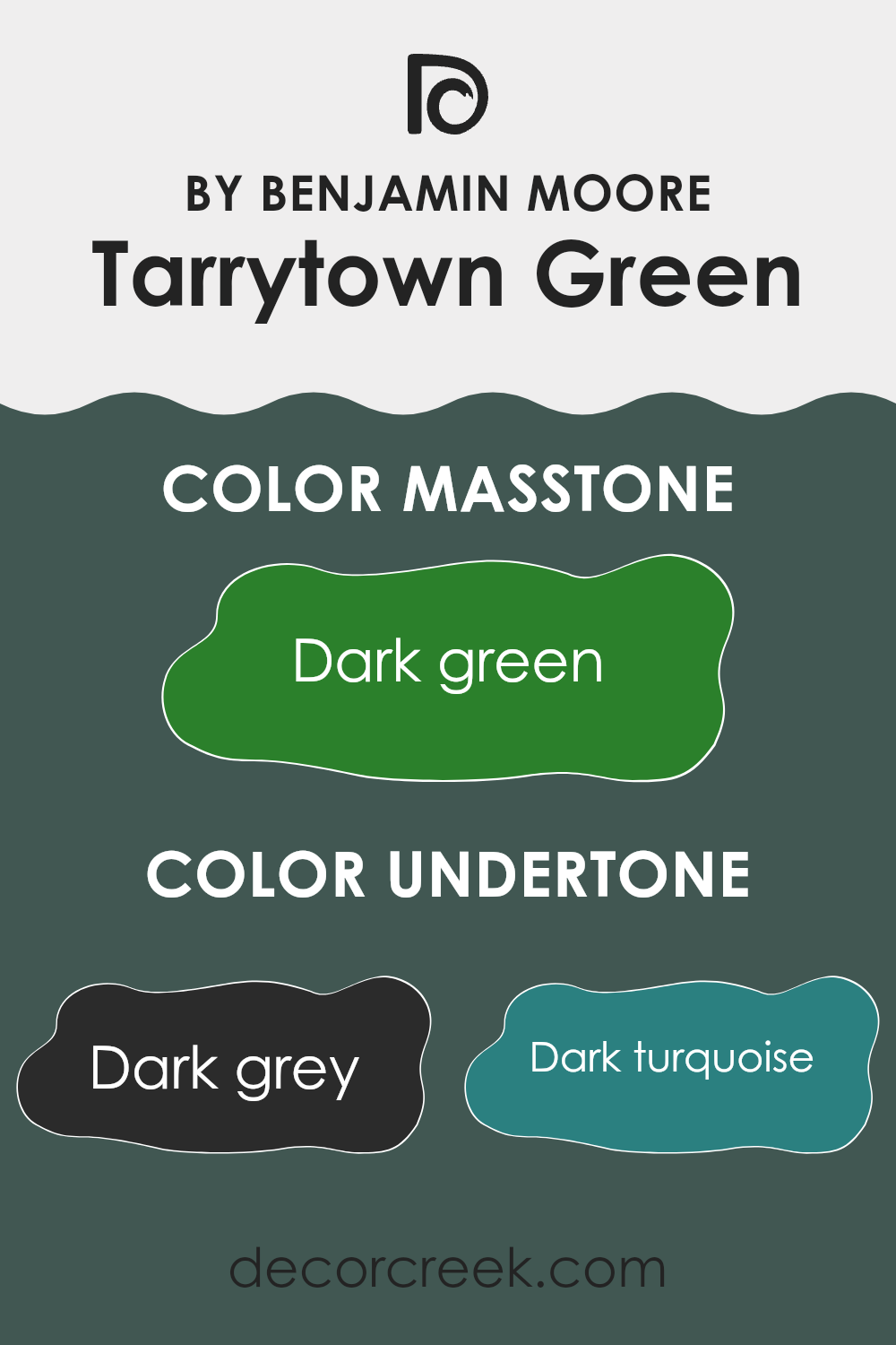
Tarrytown Green is a unique color that goes beyond just plain green. This shade by Benjamin Moore is complex because of its many undertones, including dark grey, dark turquoise, navy, olive, brown, grey, purple, green, light turquoise, light green, and mint. Each undertone plays a role in how we perceive the color, subtly influencing its appearance and the feel it brings to a room.
In general, undertones can change the way a color looks depending on the light and surrounding colors. For instance, in natural light, Tarrytown Green might appear fresher and more vivid due to its green and light turquoise undertones. In artificial lighting, its darker undertones like navy and dark grey might become more noticeable, giving it a richer, deeper look.
When used on interior walls, the effect of Tarrytown Green’s undertones can make a room feel more dynamic and layered. Depending on the room’s lighting and decor, this color can shift from feeling cozy and warm due to its brown and olive undertones to feeling more lively and vibrant because of its hints of light green and mint. This ability to change tone can make Tarrytown Green an adaptable choice for many rooms, fitting different settings and styles while providing a lively backdrop that enhances the overall aesthetic of a room.
decorcreek.com
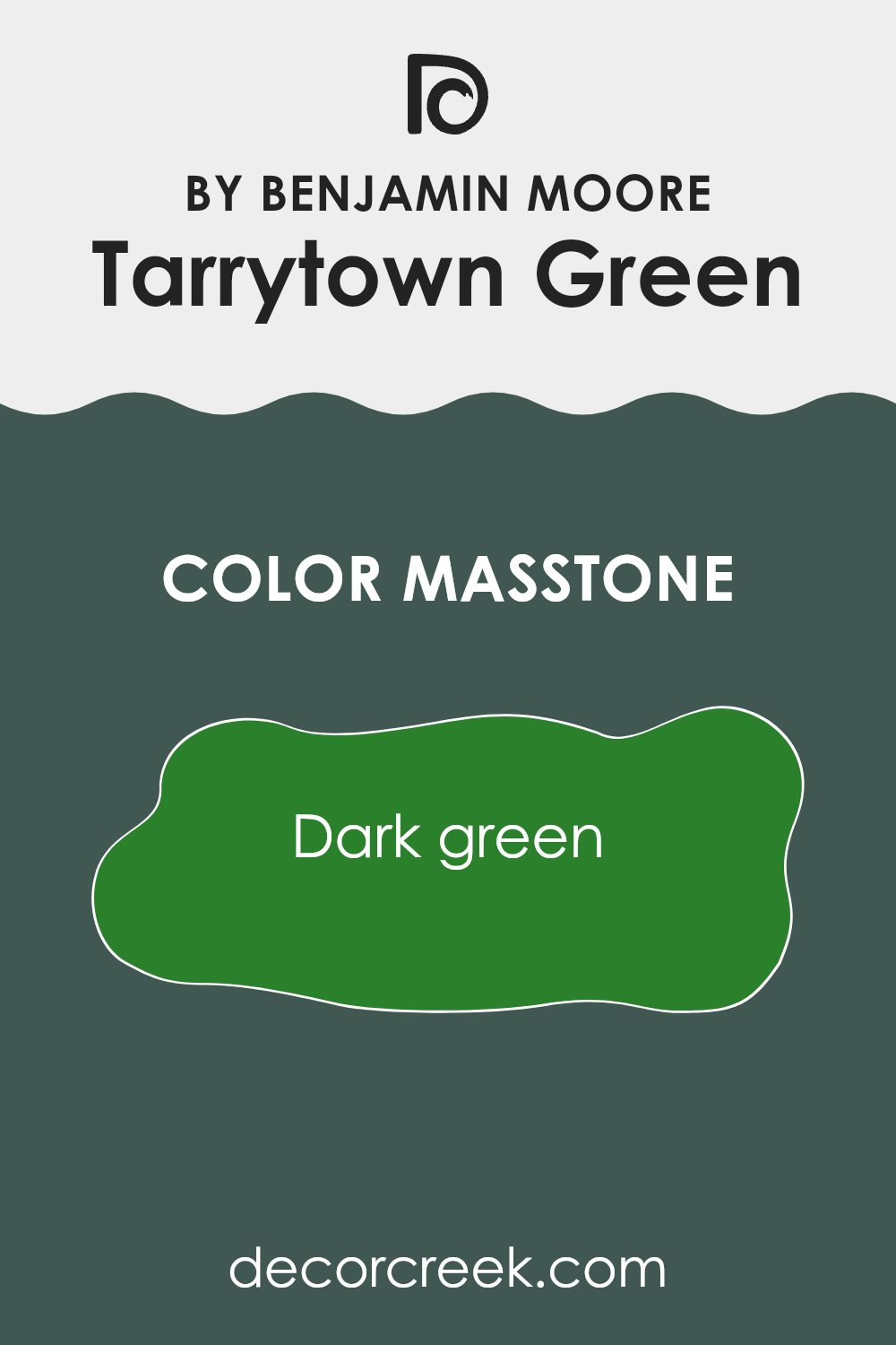
What is the Masstone of the Tarrytown Green HC-134 by Benjamin Moore?
Tarrytown Green is a deep, rich green shade that makes any room in your home feel cozy and inviting. When you use this color on your walls, it brings the calm of nature indoors. It works especially well in rooms that get a lot of natural light, as the daylight enhances the lush green tones, creating a lively yet comfortable atmosphere.
If you’re considering this color for smaller rooms, it can also be a great choice, but you should pair it with lighter colors in your decor to keep the room from feeling too closed in. In larger areas, Tarrytown Green makes a bold statement and can be used to cover all walls or just one as an accent.
Additionally, this shade pairs well with natural materials like wood or stone, which help to balance its depth with lighter and textured elements, making any room feel grounded and well-composed. Whether in a bedroom, living room, or a study, this green creates a welcoming and fresh environment.
decorcreek.com
How Does Lighting Affect Tarrytown Green HC-134 by Benjamin Moore?
Lighting plays a crucial role in how colors appear in different environments. This is especially true for paint colors on walls, such as the shade known as Tarrytown Green. This color can look different in artificial light and natural light.
In artificial light, Tarrytown Green tends to appear more subdued and slightly darker. This is because most artificial lighting lacks the full spectrum of light found in natural sunlight, leading to a less vibrant appearance. The green may lean more towards a deep, rich tone, especially under warm yellow or muted lights, which enhance the color’s depth.
In natural light, Tarrytown Green may show its true colors more effectively, reflecting the sunlight’s broader spectrum. Natural light generally makes the color look more lively and dynamic. Depending on the time of day, the green can shift from a lighter, more refreshing shade to a deeper, more wooded tone.
The direction your room faces also affects how Tarrytown Green looks:
- North-facing rooms: These rooms get less direct sunlight, which can make Tarrytown Green appear darker and more shaded. The color might look a bit more classic and muted.
- South-facing rooms: With abundant sunlight, Tarrytown Green will likely shine vividly in these rooms. The more intense light can enhance the color, making it appear brighter and more inviting throughout the day.
- East-facing rooms: Morning light is cooler and will highlight Tarrytown Green with a crisp light in the morning, which then transitions to softer and warmer in the afternoon. This shift can make the color feel quite fresh and lively in the morning but more grounded towards the evening.
- West-facing rooms: Evening light in these rooms is warmer, which can make Tarrytown Green look richer and more intense. During sunset, the color might pick up some golden hues, adding warmth to the overall appearance.
Overall, the appearance of Tarrytown Green can significantly shift based on the type of light and the room’s orientation, offering various moods and atmospheres depending on the setting and time of day.
decorcreek.com
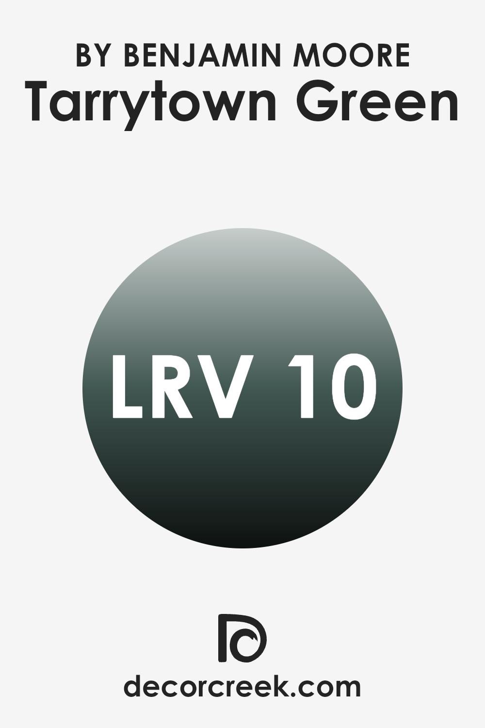
What is the LRV of Tarrytown Green HC-134 by Benjamin Moore?
LRV stands for Light Reflectance Value, which measures the amount of light a paint color reflects back into a room. LRV values range from 1 to 99, with lower numbers indicating that the color absorbs more light and appears darker, while higher numbers show that a paint color is lighter and reflects more light.
Understanding LRV is essential when choosing paint colors because it helps predict how light or dark a color will look on the walls in different lighting conditions. Colors with low LRV can make a room feel cozier and more intimate, while higher LRV colors can help make a smaller room seem larger and more open.
With an LRV of 9.71, Tarrytown Green is on the darker end of the scale, meaning it will absorb more light than it reflects. This characteristic means that in rooms with less natural light, this color can appear almost black or very dark green, significantly affecting the ambiance of the room. It is best used in well-lit areas or rooms where a darker color is desired to create a dramatic or cozy feel. The low LRV also means that lighting choices and accessories should be carefully considered to ensure the room doesn’t become too dark.
decorcreek.com
Coordinating Colors of Tarrytown Green HC-134 by Benjamin Moore
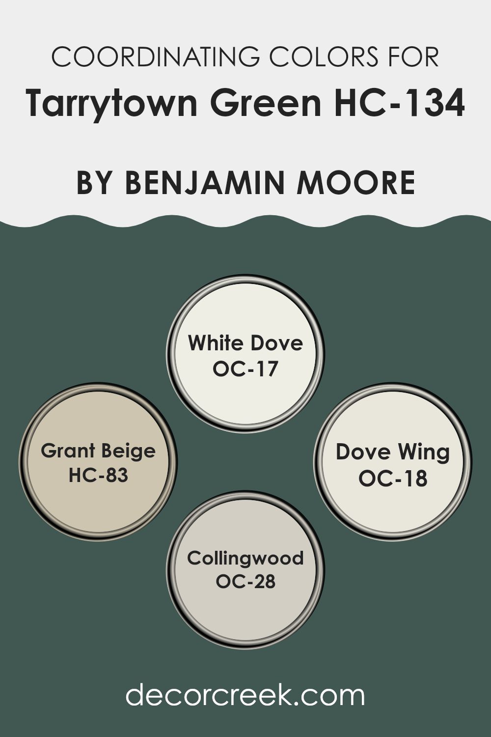
Coordinating colors are shades that complement each other well and can be used together to create a harmonious look in any room. When selected carefully, they enhance the main color, adding depth and character to the overall design.
For example, when working with a bold color like a deep, lush green, it’s effective to choose coordinating colors that balance and support its intensity without being too bold. This principle ensures that the main color stands out, while the coordinating shades bring out its best features.
One coordinating color is White Dove OC-17, a soft and creamy white that is perfect for trim and ceilings, offering a gentle contrast that makes the green pop. Grant Beige HC-83 adds a warm, neutral background that pairs well with more vibrant colors, providing a calming effect and preventing the green from dominating the room.
Dove Wing OC-18 is another soft white with a hint of gray, excellent for creating a subtle differentiation in areas like open floor plans. Lastly, Collingwood OC-28, a light gray with warm undertones, beautifully complements the deeper green tones, ensuring the room feels airy and balanced. These coordinating colors help achieve a polished and pleasing aesthetic.
You can see recommended paint colors below:
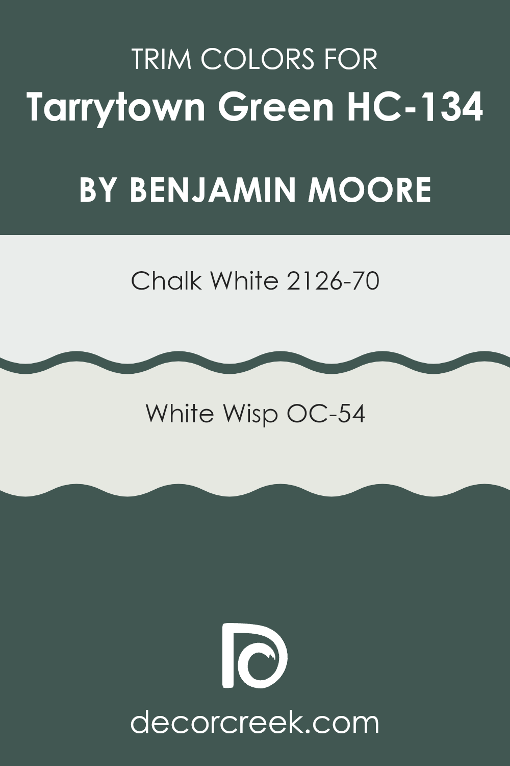
What are the Trim colors of Tarrytown Green HC-134 by Benjamin Moore?
Trim colors are specifically chosen paint hues used to highlight or outline the architectural details and edges such as door frames, window frames, skirtings, and moldings of a room. When paired correctly, trim colors can enhance the main wall color, drawing attention to the craftsmanship of the room and creating a pleasing contrast that defines each area distinctly.
For instance, using trim colors like Chalk White (2126-70) or White Wisp (OC-54) with a rich shade like Tarrytown Green by Benjamin Moore can enhance the overall aesthetic of a room without being too bold. These lighter trim colors neatly frame the green, giving a clean, finished look that makes the wall color stand out more impressively.
Chalk White (2126-70) is a pure, bright white that brings a fresh and crisp outline to any color it accompanies, perfect for making Tarrytown Green pop while adding a sense of brightness to the room. White Wisp (OC-54), on the other hand, offers a softer, almost ethereal white with a hint of gray, providing a subtle contrast that is gentle yet effective in highlighting the depths of darker colors.
This softer white can help in softening the intensity of Tarrytown Green, delivering a modern and pleasing atmosphere that enhances both the trim and the wall color harmoniously. Selecting the right trim color is crucial as it impacts how the primary color is perceived and how cohesive the overall decor appears.
You can see recommended paint colors below:
- 2126-70 Chalk White
- OC-54 White Wisp
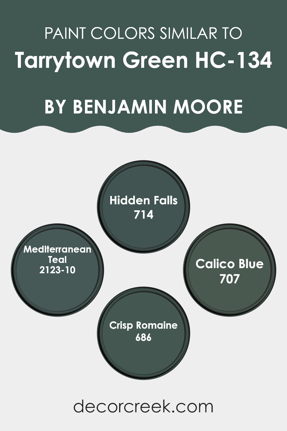
Colors Similar to Tarrytown Green HC-134 by Benjamin Moore
Similar colors play a significant role in creating a harmonious and cohesive look in any room. By using shades that are closely related on the color wheel, such as those similar to Tarrytown Green, an atmosphere of unity and flow is achieved, making the environment feel consistent and thoughtfully put together.
These similar colors often share underlying tones that seamlessly blend with each other, allowing for a smooth transition from one area of a room to another without any jarring contrasts. This technique can be especially helpful in open floor plans where multiple rooms are visible from each other, providing a way to link different areas together while still offering slight variations in color to define separate zones.
Hidden Falls is a deeper hue that leans into a rich, shadowy version of Tarrytown Green, ideal for accentuating rooms that need a touch of drama. Mediterranean Teal, on the other hand, offers a vibrant twist with its blue-green vibrancy that injects life and character into the surroundings.
For a softer approach, Calico Blue is perfect; it maintains the calm feel of Tarrytown Green while introducing a gentle, airy quality that is soothing to the eye. Lastly, Crisp Romaine brings a lively, fresh dimension that echoes the natural world, making it great for rooms that benefit from a burst of vitality. Together, these shades support and complement the base color, enhancing the overall aesthetic without dominating it.
You can see recommended paint colors below:
- 714 Hidden Falls
- 2123-10 Mediterranean Teal
- 707 Calico Blue
- 686 Crisp Romaine
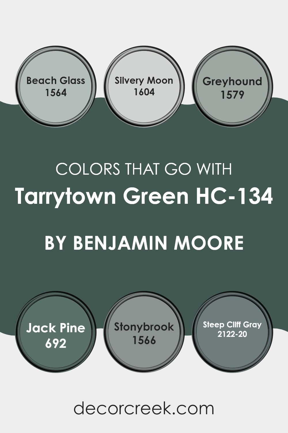
Colors that Go With Tarrytown Green HC-134 by Benjamin Moore
Colors that complement Tarrytown Green HC-134 by Benjamin Moore play a crucial role in creating a harmonious and visually appealing environment. Choosing the right colors to accompany Tarrytown Green can bring balance to a room, accentuate architectural features, and reflect the homeowner’s personal style. When coordinated well, these colors enhance the atmosphere of a room, making it more inviting and comfortable.
For instance, 1564 – Beach Glass is a subtle blend of blue and green that provides a gentle contrast to Tarrytown Green, offering a refreshing aquatic feel to the room. It is soft enough to be soothing yet distinctly colorful to add visual interest. Similarly, 1604 – Silvery Moon is a muted gray with a hint of luminosity that mimics the glow of moonlight.
This color works well in rooms that need a light, airy feel without being too bold. Next, 1579 – Greyhound presents a deeper gray tone that can ground the lightness of Tarrytown Green, providing a solid, earthy foundation for any room. The hue is understated, making it easy to pair with vibrant or muted decorations.
Another great companion, 692 – Jack Pine, offers a deeper look into the green spectrum, echoing the depth of forests and enhancing the naturalistic aesthetic of a room. 1566 – Stonybrook bridges the gap between blue and green, creating a unique teal shade that recalls the depths of ocean waters, ideal for adding a touch of mystery and depth.
Lastly, 2122-20 – Steep Cliff Gray, with its bold and dark facade, can create a striking contrast, perfect for accent walls or furniture, providing a dramatic backdrop that allows Tarrytown Green to stand out visually. Each of these colors supports Tarrytown Green in creating a cohesive and appealing palette, making any decorating project a success.
You can see recommended paint colors below:
- 1564 Beach Glass
- 1604 Silvery Moon
- 1579 Greyhound
- 692 Jack Pine
- 1566 Stonybrook
- 2122-20 Steep Cliff Gray
How to Use Tarrytown Green HC-134 by Benjamin Moore In Your Home?
Tarrytown Green by Benjamin Moore is a rich, deep green paint shade that offers a warm and cozy feel to any room. It’s perfect for adding a touch of earthiness to your home. This color works well in a variety of areas throughout the house.
For example, you could paint your living room walls with it to give the room a cozy, inviting feel. It’s also a great choice for bedrooms, where it can help create a relaxed, comfortable atmosphere.
Additionally, Tarrytown Green can be used on kitchen cabinets for a chic, updated look. It pairs beautifully with natural wood, white, and metallic accents, making it adaptable to different home styles. If you’re not ready to commit to painting an entire room, consider using it for an accent wall or on furniture pieces like a bookshelf or a dresser. This can add a splash of color and personality without being too bold. Tarrytown Green is a practical choice for anyone looking to add some warmth and natural vibes to their home.
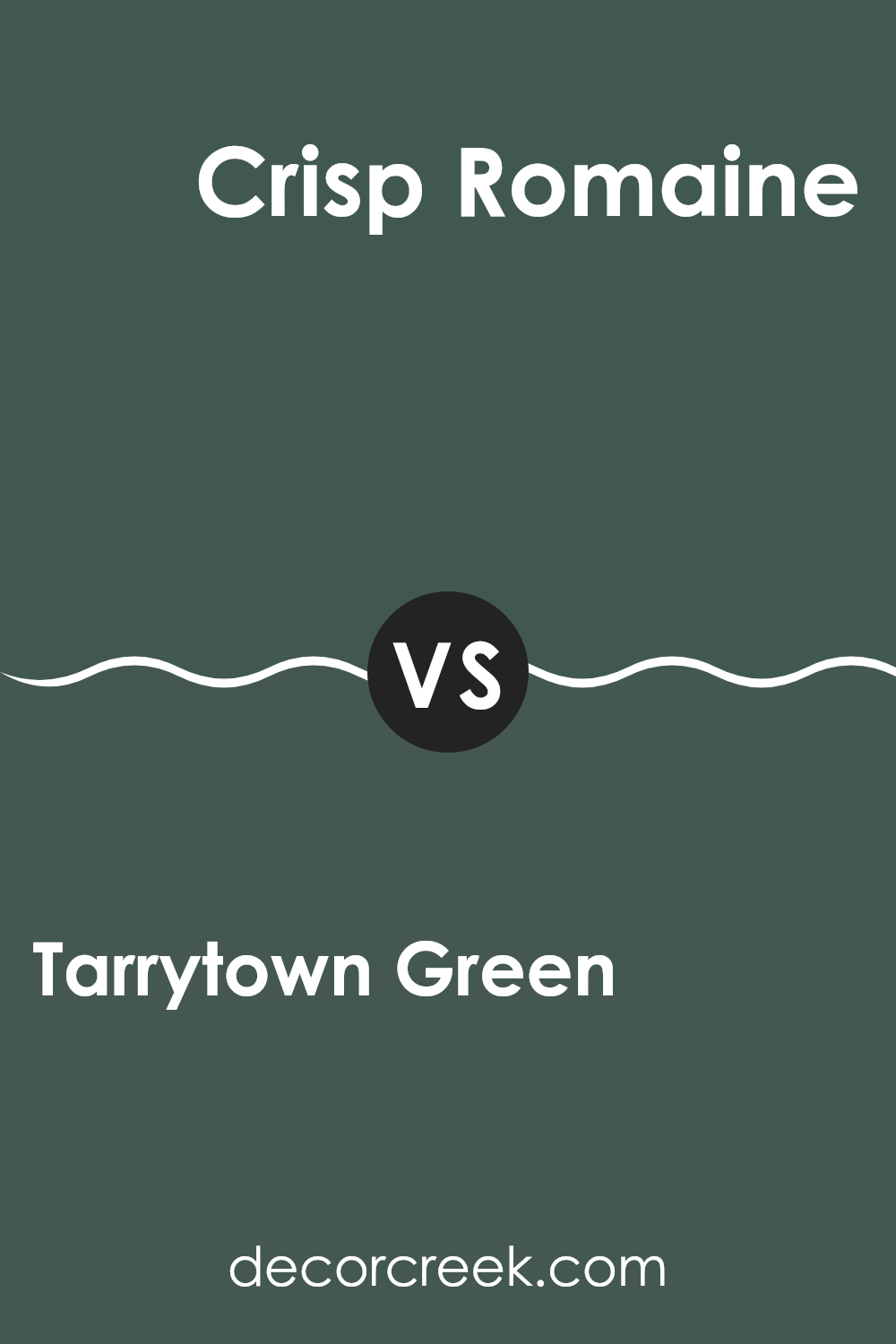
Tarrytown Green HC-134 by Benjamin Moore vs Crisp Romaine 686 by Benjamin Moore
Tarrytown Green and Crisp Romaine by Benjamin Moore are both unique shades of green but have different vibes. Tarrytown Green is a deep, muted green with a hint of gray, giving it a rich and grounding feel. It works well in rooms that aim for a cozy and inviting atmosphere.
On the other hand, Crisp Romaine is a lighter, fresher green. This color is more vibrant and lively, perfect for brightening up a room or adding a touch of freshness to a room. Crisp Romaine could work well in kitchens or bathrooms where a clean, fresh look is desired.
While Tarrytown Green leans towards a more traditional or classic look, Crisp Romaine offers a more youthful and energetic appeal. Both colors can bring nature indoors, but the choice between them depends on the mood and style you want to achieve.
You can see recommended paint color below:
- 686 Crisp Romaine
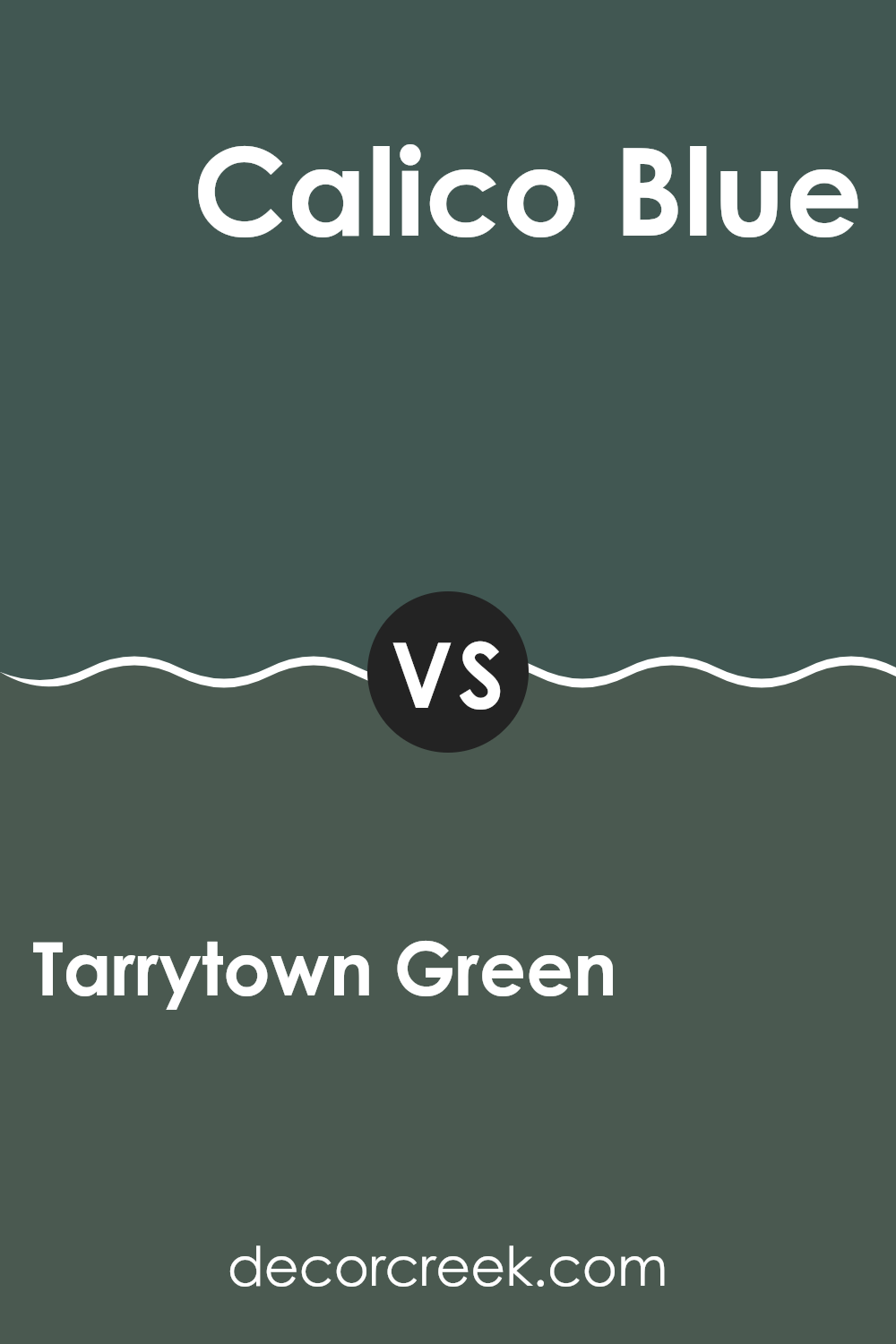
Tarrytown Green HC-134 by Benjamin Moore vs Calico Blue 707 by Benjamin Moore
Tarrytown Green is a deep, muted green with hints of earthy gray, creating a cozy and grounded feeling, perfect for rooms where you want a touch of nature without being too bold. It works well in both well-lit and dim rooms, adapting to different lighting with its rich, soothing tones.
On the other hand, Calico Blue is a gentle, soft blue with a slightly gray undertone, giving it a calm and inviting presence. It’s ideal for creating a relaxed atmosphere in rooms like bedrooms or bathrooms, where a soothing effect is desired.
When comparing the two, Tarrytown Green leans more towards a natural, forest-like appeal, best suited for entryways or studies, while Calico Blue offers a lighter, airier feel, making it better for personal rooms. Both colors offer unique vibes and can be paired with various decor styles, from rustic to modern.
You can see recommended paint color below:
- 707 Calico Blue
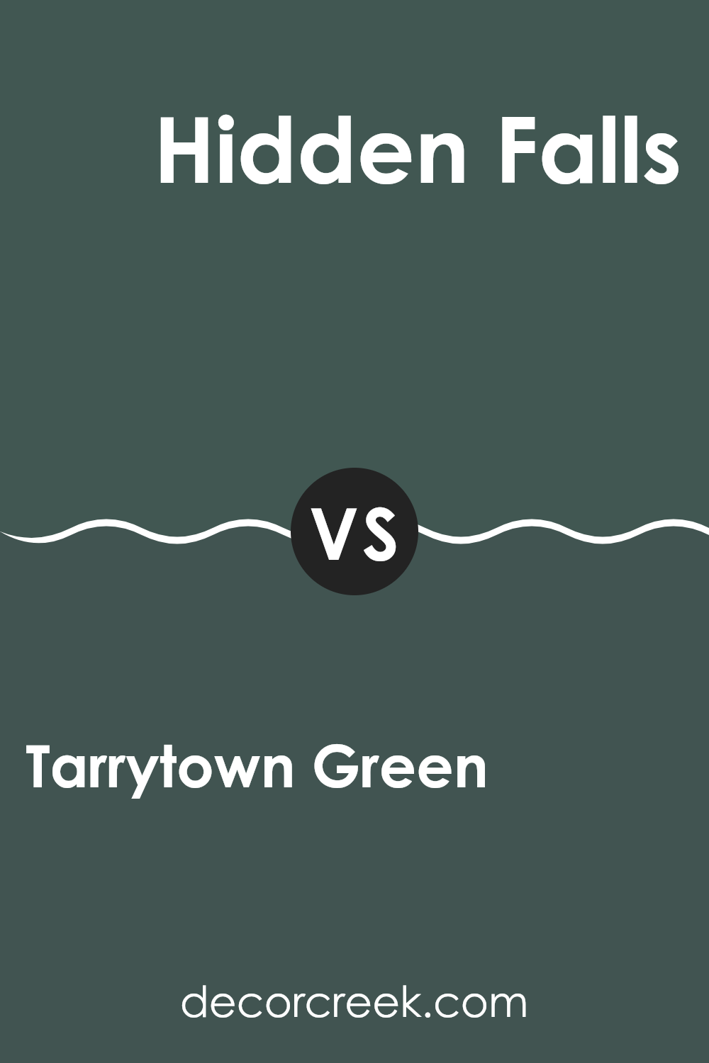
Tarrytown Green HC-134 by Benjamin Moore vs Hidden Falls 714 by Benjamin Moore
Tarrytown Green is a deep, muted shade of green with hints of gray, making it an adaptable choice for rooms where you want a cozy and grounded atmosphere. It pairs well with natural materials like wood and stone.
Hidden Falls is a darker, more dramatic green with strong blue undertones. This color can create a striking effect in a room, catching the eye and giving a sense of depth and richness. It’s perfect for accent walls or areas where you want to make a bold statement.
Both colors offer unique qualities that can enhance the look of a home. Tarrytown Green leans towards a more classic appeal, suitable for common areas and bedrooms. Hidden Falls, on the other hand, stands out as a more intense choice, ideal for rooms where you want to add a bit of drama or luxury.
You can see recommended paint color below:
- 714 Hidden Falls
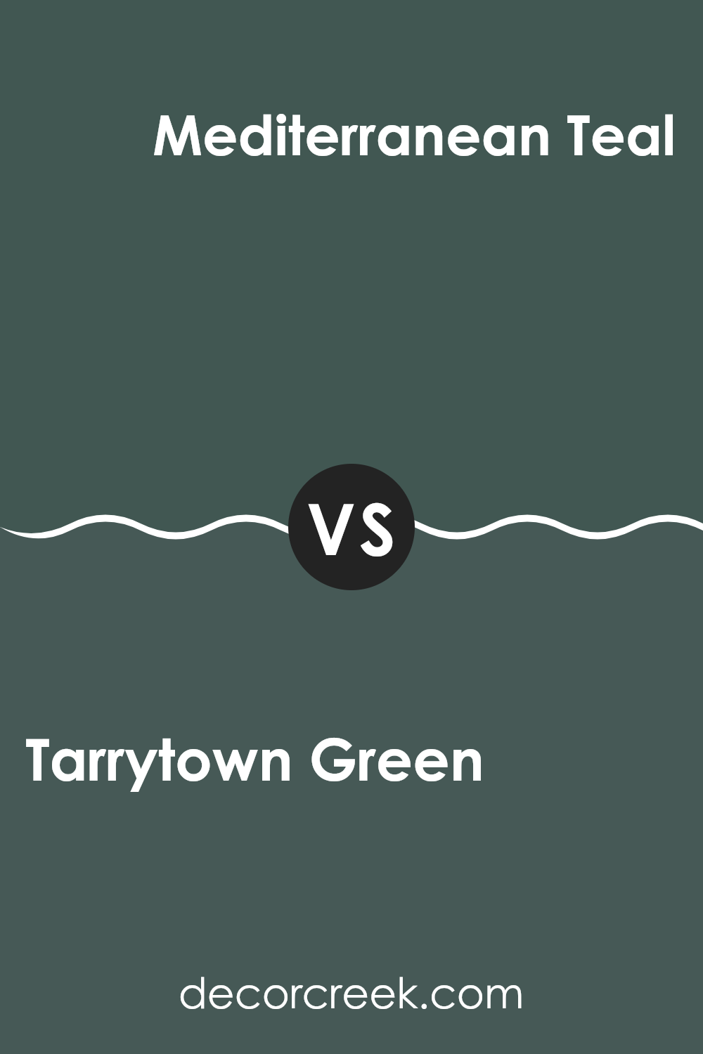
Tarrytown Green HC-134 by Benjamin Moore vs Mediterranean Teal 2123-10 by Benjamin Moore
Tarrytown Green is a deep, muted green with a grayish tone, giving it a subtle and calming feel. It is adaptable, working well in rooms that aim for a classic look with a modern twist. This color provides a grounded atmosphere, making it suitable for both living areas and bedrooms, where a touch of understated elegance is desired.
On the other hand, Mediterranean Teal is a bolder and more vibrant color. It has a vivid blue-green hue that stands out and brings energy to a room. This color is perfect for making a statement, whether it’s on an accent wall or in a bathroom, and it pairs nicely with bright whites and grays for a refreshing contrast.
Both colors offer distinct vibes – Tarrytown Green for a more laid-back, earthy feel, and Mediterranean Teal for a punch of liveliness and brightness. Your choice between them would depend on the mood you aim to set in your room.
You can see recommended paint color below:
- 2123-10 Mediterranean Teal
In conclusion, HC-134 Tarrytown Green by Benjamin Moore is a paint that I really like. It has a lovely green color that makes any room feel cozy and welcoming. This paint isn’t just beautiful; it’s also strong and hides marks or scratches well, which is great for busy areas like living rooms or hallways.
It’s amazing how a simple coat of Tarrytown Green can make a place look new and refreshed. Plus, it works well with many other colors and decorations, making it easy to use when you want to change your room’s look without too much trouble.
Whether you’re painting a small piece of furniture or all the walls in a room, this color does a wonderful job of making everything look nicer. I’m really glad I learned about HC-134 Tarrytown Green because it’s a color that can make anyone’s home feel more warm and inviting.
decorcreek.com
Ever wished paint sampling was as easy as sticking a sticker? Guess what? Now it is! Discover Samplize's unique Peel & Stick samples.
Get paint samples