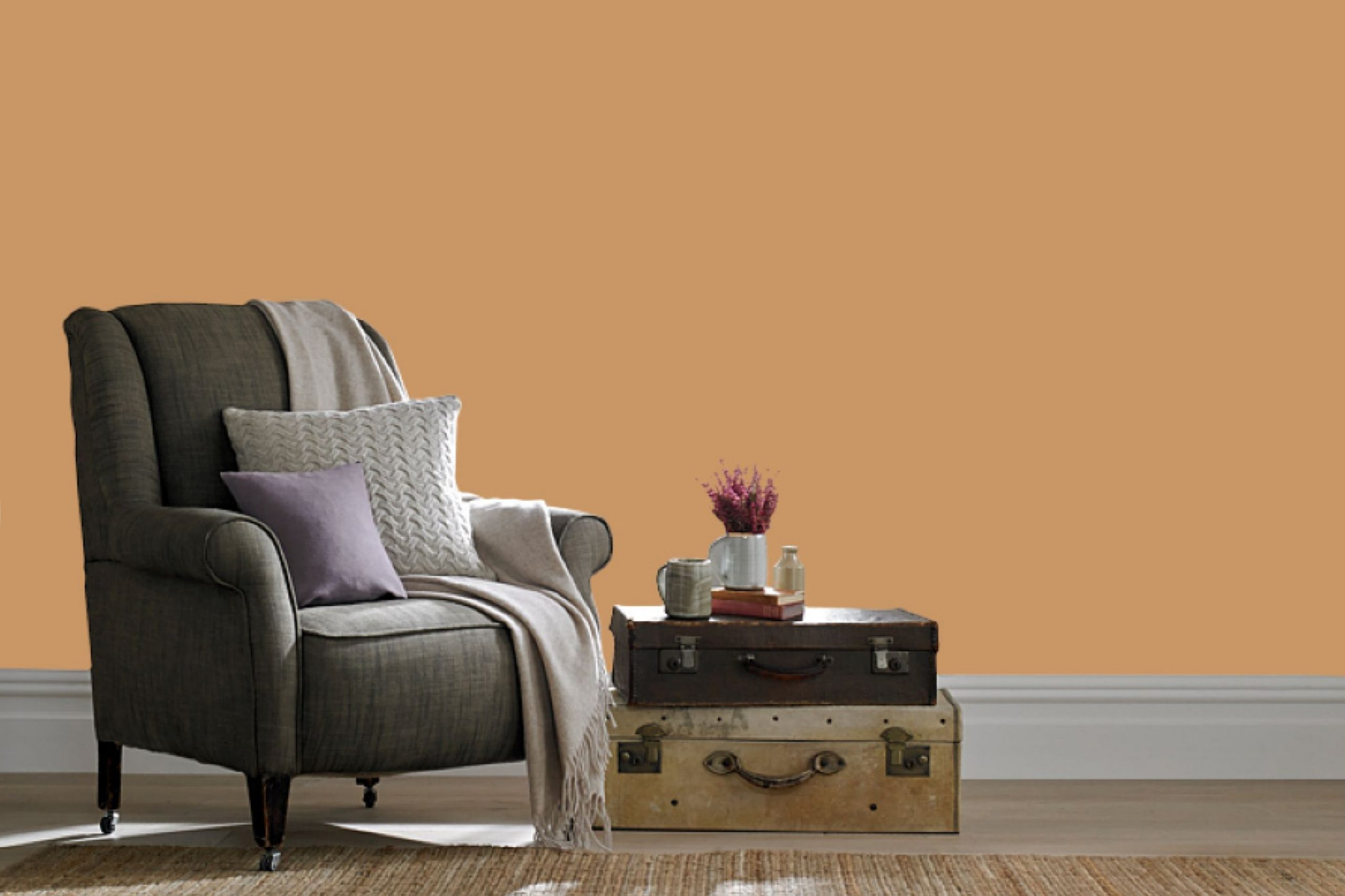
I have always been drawn to colors that offer a sense of calm and warmth, and that’s precisely what SW 6116 Tatami Tan brings into any room. This Sherwin-Williams shade is like a warm hug, creating an inviting and cozy atmosphere. It doesn’t demand attention but gently enriches the environment with its soft, earthy tone.
Tatami Tan is the kind of color that makes you feel at home, perfect for living rooms or bedrooms where you want a sense of comfort and relaxation. It works beautifully in areas where you seek balance and peace. The color is flexible enough to complement various styles, blending seamlessly with both modern and traditional aesthetics.
I appreciate how Tatami Tan pairs well with a range of other colors. It serves as a perfect backdrop to highlight bolder hues or to support neutral elements, lending itself to creative expression without being too intense. Whether you’re painting entire rooms or creating an accent wall, Tatami Tan stands out by fitting in.
Reviewing color options can be intense, but Tatami Tan simplifies that choice by being an all-around excellent option. Its ability to create a warm and inviting room makes it a lasting favorite in my book.
What Color Is Tatami Tan SW 6116 by Sherwin Williams?
Tatami Tan (SW 6116) by Sherwin Williams is a warm, earthy color that brings a soft, inviting feel to any room. This shade is reminiscent of natural fibers and sandy landscapes, offering a cozy and grounded atmosphere. It works particularly well in interior styles that emphasize natural elements, such as Scandinavian, rustic, or bohemian designs.
In these styles, the warmth of Tatami Tan complements light-colored woods, such as oak or pine, enhancing the organic feel of the room. Additionally, it pairs nicely with materials like rattan, jute, and wicker. These textures add depth and interest while maintaining a neutral palette.
Tatami Tan’s subtle hue serves as an excellent backdrop for other warm shades, such as terracotta, mustard, or olive, creating a harmonious and cohesive look. For a more modern approach, consider pairing it with crisp white trim or accents in black or charcoal for contrast.
Furthermore, Tatami Tan can be beautifully highlighted with soft textiles like linen or cotton in neutral tones. Using different textures, such as knitted throws or woven baskets, enhances the coziness of the room. Overall, this color is flexible and adaptable, making it a lovely choice for a calm and inviting home environment.
Is Tatami Tan SW 6116 by Sherwin Williams Warm or Cool color?
Tatami Tan by Sherwin Williams is a warm, earthy color that can add a cozy feel to any home. This shade is reminiscent of natural elements, which helps it create a welcoming atmosphere. It’s great for living rooms or bedrooms where comfort and relaxation are key.
The neutral tone of Tatami Tan allows it to work well with a variety of decor styles, from modern to rustic. It pairs nicely with other neutral tones, such as creams and browns, but can also act as a backdrop for more vibrant hues like teal or burnt orange.
In a small room, Tatami Tan can make the room feel more spacious because of its lightness while still providing a sense of warmth. It’s a flexible color that can fit well into different parts of the home, providing a consistent look that is neither too bold nor too pale.
Undertones of Tatami Tan SW 6116 by Sherwin Williams
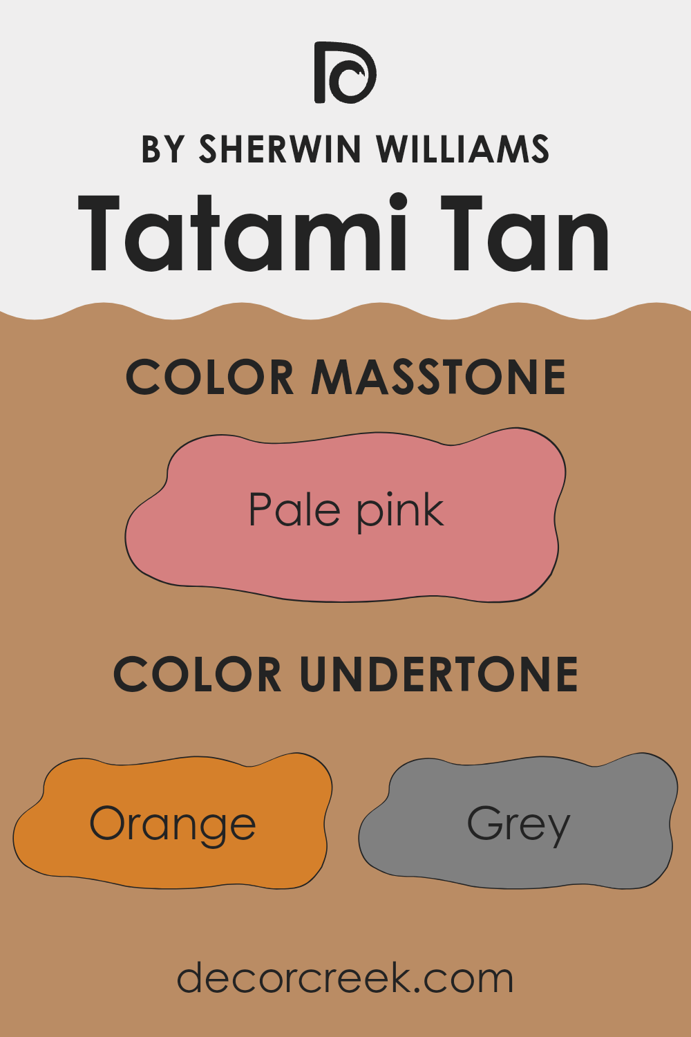
Tatami Tan by Sherwin Williams is a flexible paint color with complex undertones that can change how it looks depending on its surroundings. The undertones include shades like orange, grey, pale yellow, olive, and others, which can all subtly shift the overall appearance of the paint.
The orange and pale yellow undertones can lend a warm and welcoming feel to a room, making it cozy under natural sunlight. The grey in the mix gives the color a muted, calm appearance, which softens the warmth and keeps it from feeling too vivid. Olive undertones add an earthy quality, grounding the color and making it feel more natural and organic.
These undertones affect how Tatami Tan looks on your walls, often making it appear different depending on the lighting used. In a room with bright or warm lighting, the color may lean more towards the yellow and orange, giving the area a sunnier atmosphere. Conversely, in darker or cooler lighting conditions, the grey and olive undertones could be more pronounced, giving the paint a more subdued look.
Overall, Tatami Tan is a flexible and neutral choice that can adapt to different environments, creating a balanced look with its undertones influencing its final appearance.
What is the Masstone of the Tatami Tan SW 6116 by Sherwin Williams?
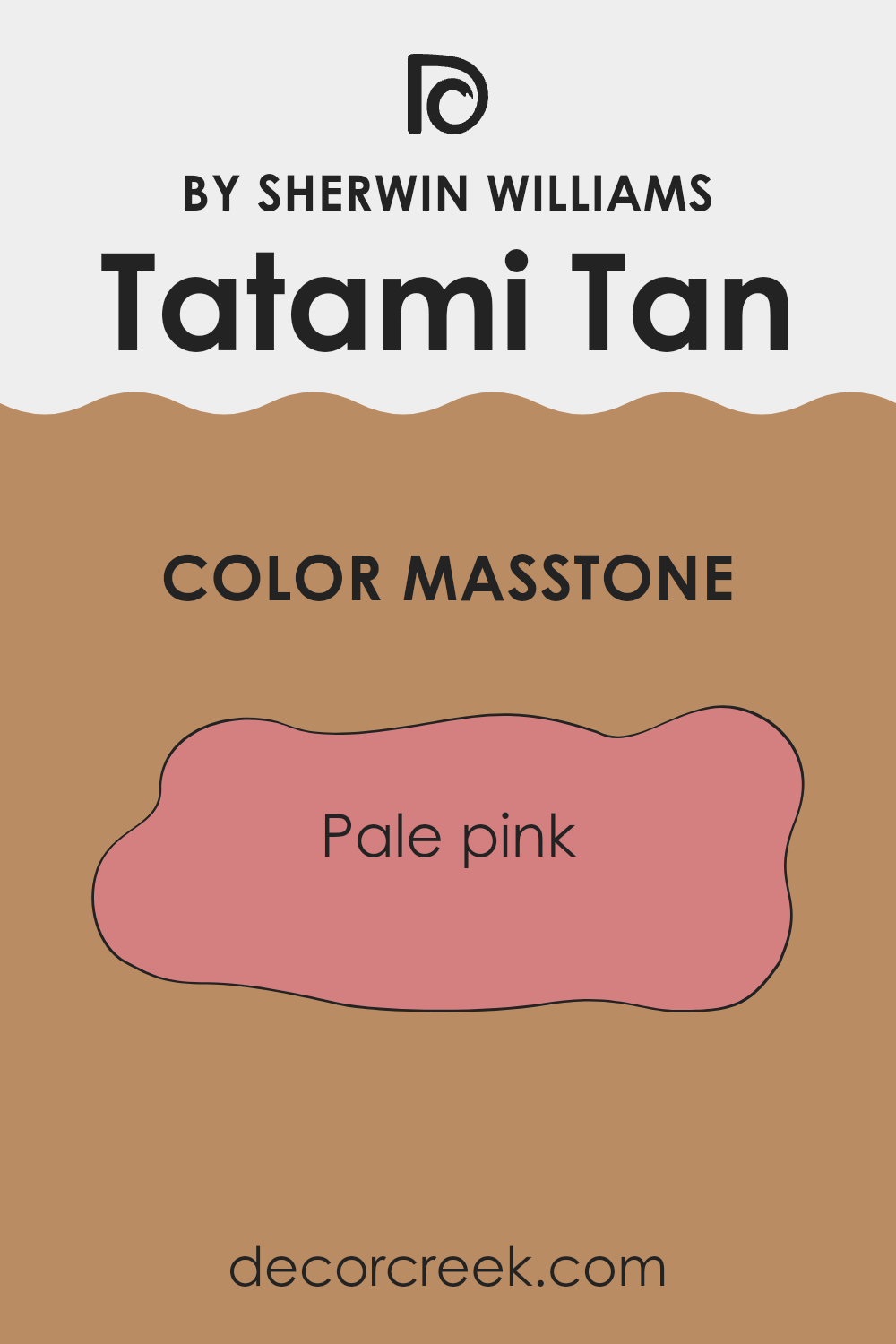
Tatami Tan by Sherwin Williams is a soft, muted color that brings a warm, welcoming feel to any room. Its masstone, which leans towards a pale pink (#D58080), adds a subtle touch of warmth, making it feel cozy and inviting.
This gentle pink hue affects how the color works in homes by providing a soft backdrop that complements different interior styles. It can help create a relaxed and comfortable atmosphere, perfect for living rooms or bedrooms.
The pale pink undertone of Tatami Tan adds a bit of personality and depth without being too intense, making it a flexible choice for those looking to add a touch of color without going too bold. It pairs well with neutral tones, natural wood finishes, and even bolder colors for contrasting accents.
Overall, this color can help make a room feel more intimate and restful, ideal for creating a homey and pleasant environment.
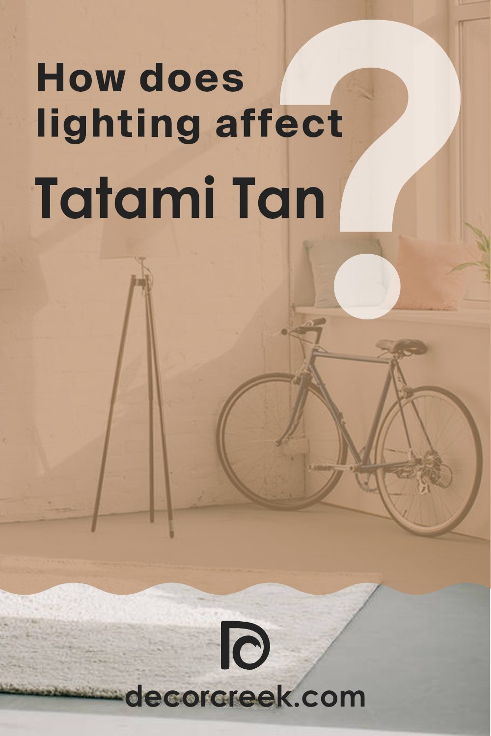
How Does Lighting Affect Tatami Tan SW 6116 by Sherwin Williams?
Lighting plays a crucial role in how we perceive colors in a room. It affects the mood, appearance, and functionality of a room. Tatami Tan by Sherwin Williams is a warm neutral color that can appear differently based on lighting conditions.
In natural light, colors can appear more vibrant and true to their actual hue. Natural lighting changes throughout the day, affecting how Tatami Tan looks. In artificial light, especially with incandescent bulbs, Tatami Tan may appear warmer due to the yellow undertones of the light. LED and fluorescent lighting can make it look cooler, altering the perception of its natural warmth.
In a north-facing room, which receives cooler and more consistent light, Tatami Tan might appear a bit muted and slightly greyer than its actual tone. This is because the cold light from the north doesn’t enhance warm tones as much. It’s best to pair it with warm accents to maintain a cozy feel.
In a south-facing room, where the light is warm and bright for most of the day, Tatami Tan will look its warmest and be more vibrant. The natural light here enhances the warmth in the paint, making the room feel comfortable and inviting.
East-facing rooms receive bright, warm light in the morning, which can bring out the warm undertones of Tatami Tan beautifully. However, as the day progresses and natural light becomes cooler, the color may seem slightly more neutral or grey.
In west-facing rooms, the lighting changes from dim in the morning to warm and golden in the afternoon and evening. Tatami Tan will lighten up as the day goes on, appearing brighter and richer in the afternoon. The warm evening light enhances its natural tones, making the room feel cozy.
Understanding these lighting effects helps in choosing complementary colors and decor to make Tatami Tan work beautifully in any room orientation.
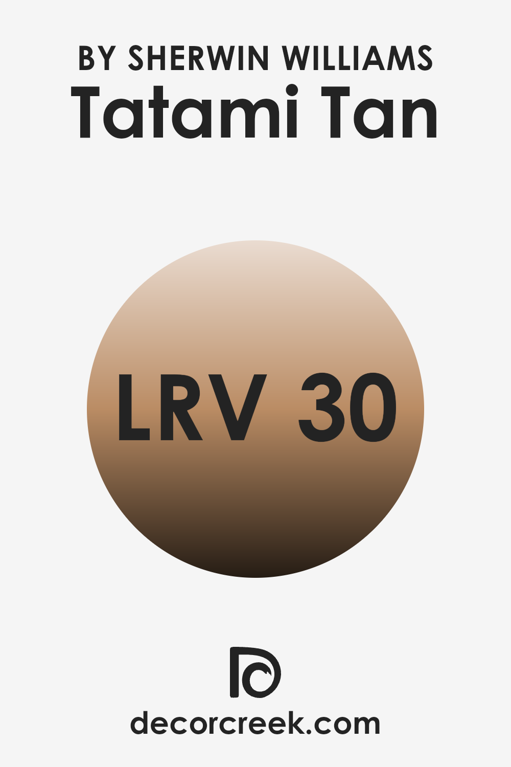
What is the LRV of Tatami Tan SW 6116 by Sherwin Williams?
LRV stands for Light Reflectance Value, and it measures the amount of light a color reflects. It’s a scale from 0 to 100, with 0 being completely black, which reflects no light at all, and 100 being pure white, which reflects all light. The LRV of a color can affect how bright or dark it appears when painted on walls.
A low LRV means the color will absorb more light, making a room feel cozier and perhaps a bit smaller. A high LRV, on the other hand, will reflect more light back into the room, making it feel larger and more open.
For the color Tatami Tan with an LRV of 30.262, this means it’s on the darker side of the spectrum. It absorbs a good bit of light, so when used on walls, it can create a warm and inviting atmosphere but may also make the room feel more intimate or even a bit smaller. This color won’t reflect a lot of light, so it might be best suited for areas where you want a snug and comfortable feel rather than a bright and airy one. Since this tan color has a relatively low LRV, it’s important to consider the amount of natural or artificial light in the room to ensure it doesn’t feel too dark.
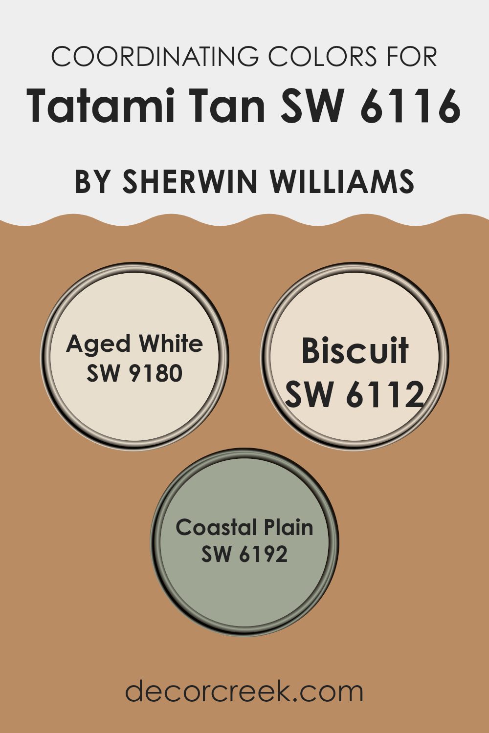
Coordinating Colors of Tatami Tan SW 6116 by Sherwin Williams
Coordinating colors are those that complement or enhance a particular shade to create a harmonious and visually appealing palette. These colors are selected based on their ability to work well together, providing balance and cohesion to a room. For a color like Tatami Tan by Sherwin Williams, which is warm and earthy, coordinating colors add depth and versatility to its use. These colors can be used together in a room to create a well-rounded and aesthetically pleasing design that feels intentional and cohesive.
Aged White (SW 9180) is a soft, creamy white that pairs beautifully with Tatami Tan. This color offers a gentle brightness that adds lightness to a room while maintaining warmth. Biscuit (SW 6112) is another excellent companion, providing a neutral backdrop that leans slightly warm, enhancing the cozy and inviting feel you want in a room.
It works well to ground the palette without overpowering. Coastal Plain (SW 6192) introduces a lovely muted green, offering a touch of coolness that complements the warmer tones and adds a refreshing contrast. Together, these shades create a balanced and inviting environment that feels grounded and welcoming.
You can see recommended paint colors below:
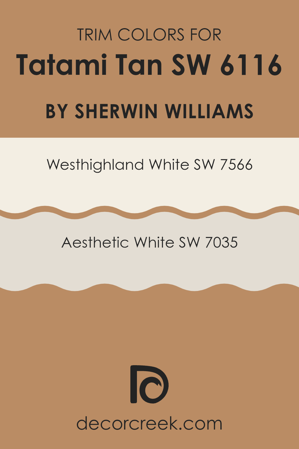
What are the Trim colors of Tatami Tan SW 6116 by Sherwin Williams?
Trim colors play a crucial role in interior design, as they emphasize the architectural details of a room and provide contrast to the main wall color. For Tatami Tan by Sherwin Williams, choosing the right trim colors can make a big difference. SW 7566 – Westhighland White and SW 7035 – Aesthetic White are both excellent choices for creating a harmonious and polished look with Tatami Tan.
Westhighland White is a warm, creamy white that adds a subtle brightness to the room, while Aesthetic White is a soft, muted white with a slight hint of gray that complements warmer tones like Tatami Tan beautifully. Together, these trim colors can enhance the overall appearance of a room, highlighting the gentle, earthy qualities of Tatami Tan while adding depth and interest.
Westhighland White and Aesthetic White are both ideal for creating a clean finish that frames Tatami Tan splendidly. Westhighland White’s warm undertones work seamlessly with Tatami Tan, offering a crisp, yet cozy feel. Aesthetic White, on the other hand, has a more calming presence with its subtle gray tones, making it perfect for adding a touch of sophistication to any room painted with Tatami Tan.
These trim colors not only enhance the aesthetics of the wall color but also contribute to the overall ambiance, adding visual continuity and ensuring that the design is cohesive. The careful selection of trim colors like these enhances the room, making it inviting and visually appealing without overpowering the main color theme.
You can see recommended paint colors below:
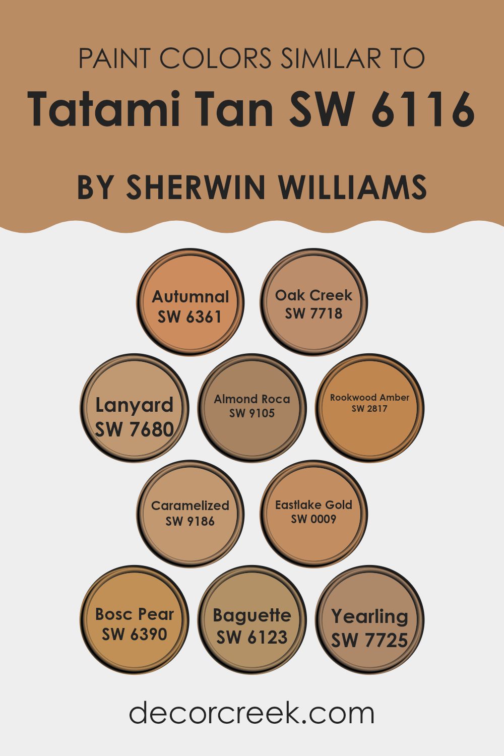
Colors Similar to Tatami Tan SW 6116 by Sherwin Williams
Similar colors play a crucial role in design by creating harmony and balance within a room. When used alongside Tatami Tan, colors like Autumnal bring a warm, rusty hue that evokes a sense of coziness reminiscent of fallen leaves. Oak Creek offers a grounded, earthy tone that complements Tatami Tan by adding depth and stability. Lanyard is a soft, neutral shade that can easily blend with Tatami Tan, enhancing its subtle elegance without being too intense. Almond Roca provides a creamy, light brown contrast that warms up a room while maintaining a natural feel.
Further, Rookwood Amber adds a rich, golden undertone that can brighten and uplift a room when combined with Tatami Tan. Caramelized, with its sweet, honeyed presence, enhances the warm vibe by adding a touch of sweetness. Eastlake Gold provides a vibrant and cheerful touch that can illuminate a room.
Bosc Pear’s mellow, yellow-green shade introduces a hint of freshness that pairs well with Tatami Tan’s neutral base. Baguette, another neutral, offers a toasted, buttery tone that merges seamlessly with Tatami Tan. Lastly, Yearling, a soft beige, brings a gentle warmth, ensuring the overall palette feels inviting and comfortable. These similar colors work together to create a unified, cohesive atmosphere.
You can see recommended paint colors below:
- SW 6361 Autumnal
- SW 7718 Oak Creek
- SW 7680 Lanyard
- SW 9105 Almond Roca
- SW 2817 Rookwood Amber
- SW 9186 Caramelized
- SW 0009 Eastlake Gold
- SW 6390 Bosc Pear
- SW 6123 Baguette
- SW 7725 Yearling
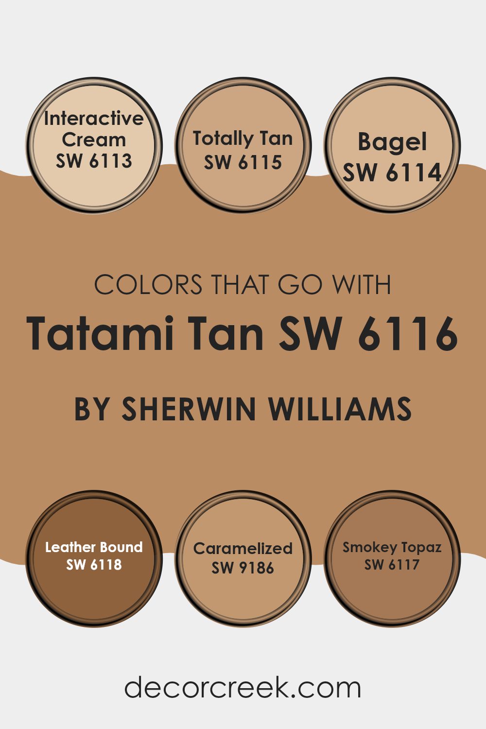
Colors that Go With Tatami Tan SW 6116 by Sherwin Williams
Colors that pair well with Tatami Tan SW 6116 by Sherwin-Williams are important because they help create a cohesive and harmonious look in a room. When you choose colors that complement Tatami Tan, they can enhance the warmth and inviting feel of a room. These colors work together to create a balanced and pleasing aesthetic.
For example, SW 6113 – Interactive Cream is a soft and gentle hue that brightens up a room while maintaining a cozy atmosphere. SW 6115 – Totally Tan is a rich, earthy shade that adds depth and comfort, complementing the natural undertones of Tatami Tan.
SW 6114 – Bagel has a warm, toasty tone that adds a welcoming feel, making it a perfect match for a room where you want to feel relaxed. SW 6118 – Leather Bound is a deep, luxurious color that provides a strong contrast, adding a touch of elegance and grounding the lighter shades. SW 9186 – Caramelized brings in a touch of sweetness and richness, enhancing a room’s warm and inviting vibe.
Lastly, SW 6117 – Smokey Topaz offers a bit of drama with its smoky, muted allure, providing a refined depth. Together, these colors create a beautiful palette that enhances the natural beauty of Tatami Tan.
You can see recommended paint colors below:
- SW 6113 Interactive Cream
- SW 6115 Totally Tan
- SW 6114 Bagel
- SW 6118 Leather Bound
- SW 9186 Caramelized
- SW 6117 Smokey Topaz
How to Use Tatami Tan SW 6116 by Sherwin Williams In Your Home?
Tatami Tan by Sherwin Williams is a warm, neutral paint color that can bring a cozy feel to your home. It’s a soft, earthy shade with hints of beige and brown. This color works well in living rooms or bedrooms, offering a comforting and inviting atmosphere. It pairs nicely with both modern and traditional styles.
You can use Tatami Tan on walls to create a calm backdrop for your furniture and decor. It matches well with whites and creams, making it easy to add accents or other colors through accessories like pillows or curtains. This neutral tone is flexible, so it can also be used in hallways or dining rooms for a seamless transition between areas.
Tatami Tan can be used to warm up areas that might otherwise feel too cold or sterile. It gives off a natural, organic vibe, perfect for creating a homey, welcoming environment.
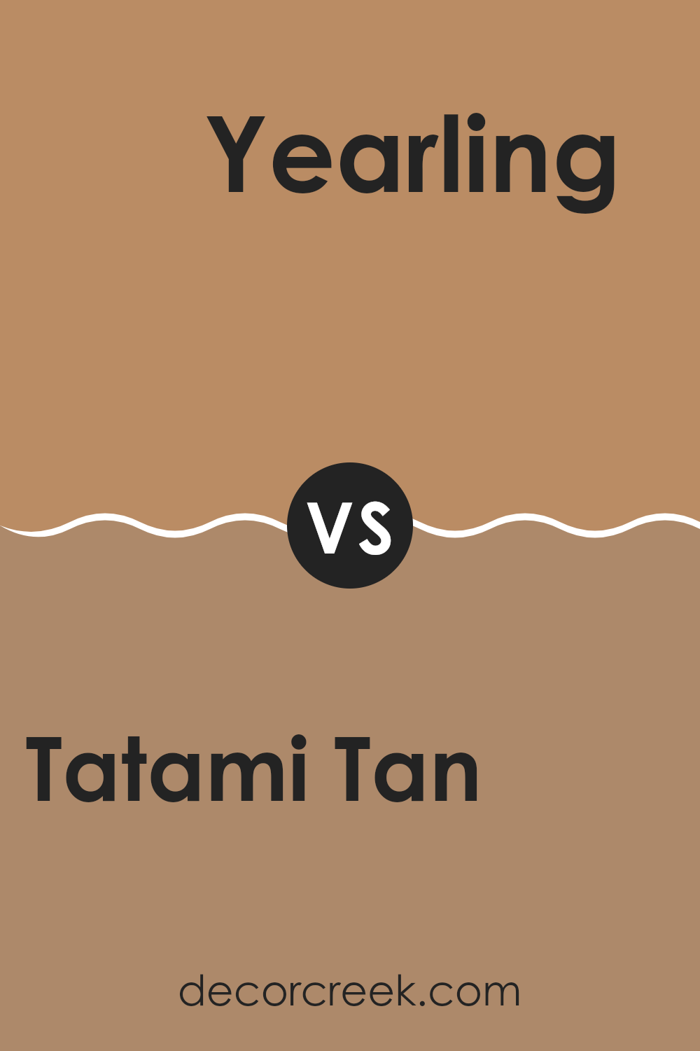
Tatami Tan SW 6116 by Sherwin Williams vs Yearling SW 7725 by Sherwin Williams
Tatami Tan SW 6116 by Sherwin Williams is a warm, neutral beige that offers a cozy and inviting feel. It’s a flexible color that works well in many rooms, providing a soft backdrop that doesn’t overpower other design elements.
Yearling SW 7725, also by Sherwin Williams, is a gentle, muted yellow that adds a touch of warmth and cheer without being too bold or bright. While Tatami Tan sets a calming, neutral tone, Yearling introduces a soft hint of color, making it ideal for those who want a slight infusion of warmth and sunlight into their room.
Together, these colors can create a harmonious environment with Tatami Tan grounding the setting and Yearling offering a sunny accent. Whether used separately or together, both colors contribute to a pleasing and balanced atmosphere in a home.
You can see recommended paint color below:
- SW 7725 Yearling
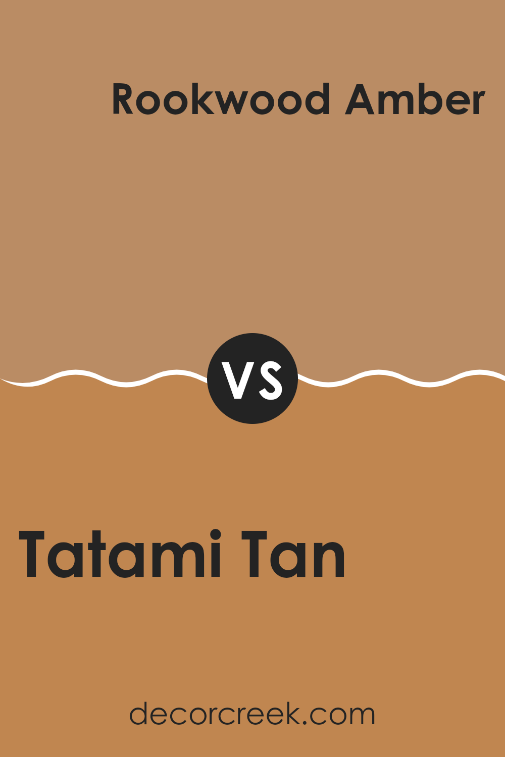
Tatami Tan SW 6116 by Sherwin Williams vs Rookwood Amber SW 2817 by Sherwin Williams
Tatami Tan (SW 6116) by Sherwin Williams is a warm, earthy beige. It has a calming and neutral vibe, making it flexible for various areas. This color can make a room feel cozy and inviting without being too intense. It’s a great background color that can complement both warm and cool accents.
On the other hand, Rookwood Amber (SW 2817) is a rich, golden hue with an amber tone. It’s more intense and vibrant than Tatami Tan. Rookwood Amber gives a room a bold and lively feel, adding warmth and energy. This color can be used as an accent wall or in a room where you want to create a warm, welcoming atmosphere.
While Tatami Tan offers a subtle and neutral backdrop, Rookwood Amber adds warmth and a pop of color. Both colors can bring warmth but do so in different ways, with Tatami Tan being more understated and Rookwood Amber making a statement.
You can see recommended paint color below:
- SW 2817 Rookwood Amber
Tatami Tan SW 6116 by Sherwin Williams vs Oak Creek SW 7718 by Sherwin Williams
Tatami Tan SW 6116 by Sherwin Williams is a warm, earthy beige that creates a cozy and inviting atmosphere. It has subtle yellow undertones, making it feel comforting and natural. This color works great in living rooms, bedrooms, or areas where you want a relaxing vibe.
Oak Creek SW 7718, on the other hand, is a deeper, richer shade with strong brown undertones. It feels more grounded and bold compared to Tatami Tan. Oak Creek adds depth and can make a statement in any room. It’s ideal for accent walls, dining rooms, or places where you want a more dramatic presence.
When used together, Tatami Tan can provide a soft backdrop, highlighting the rich character of Oak Creek. These colors complement each other well and create a harmonious look, with Tatami Tan offering warmth and Oak Creek adding strength and contrast.
You can see recommended paint color below:
- SW 7718 Oak Creek
Tatami Tan SW 6116 by Sherwin Williams vs Bosc Pear SW 6390 by Sherwin Williams
Tatami Tan SW 6116 and Bosc Pear SW 6390, both by Sherwin Williams, are warm and inviting colors, yet they offer different vibes. Tatami Tan is a soft, earthy beige that creates a cozy and welcoming environment. It has subtle, neutral undertones making it flexible for any room, ensuring a calm and grounded atmosphere.
On the other hand, Bosc Pear SW 6390 is a warm, golden yellow. This shade is cheerful and lively, bringing a burst of sunshine into a room. It’s a bold and happy color that can make a room feel more energetic and open.
While Tatami Tan provides a subtle and soothing backdrop, Bosc Pear adds a vibrant and dynamic touch. Pairing them can create an interesting balance, with Tatami Tan offering a neutral base and Bosc Pear providing a pop of color. Both colors can enhance the mood of a room in their unique ways.
You can see recommended paint color below:
- SW 6390 Bosc Pear
Tatami Tan SW 6116 by Sherwin Williams vs Almond Roca SW 9105 by Sherwin Williams
Tatami Tan (SW 6116) by Sherwin Williams is a warm, earthy beige with subtle yellow undertones that make it feel cozy and inviting. It’s a flexible color that works well in living rooms, bedrooms, and other rooms where you want to create a welcoming atmosphere. This shade pairs nicely with natural materials like wood and can complement both traditional and modern decor styles.
On the other hand, Almond Roca (SW 9105) by Sherwin Williams is a slightly darker beige with a hint of brown, giving it a richer and more grounded feel. It offers a bit more depth compared to Tatami Tan, making it an excellent choice for accent walls or areas where you want to add a touch of contrast. Almond Roca can add warmth and character to a room, making it feel more intimate and cozy.
Both colors are neutral and flexible, but they have distinct differences in undertone and depth. Tatami Tan is lighter and brighter, ideal for larger, open areas, while Almond Roca provides a deeper and more intimate atmosphere.
You can see recommended paint color below:
Tatami Tan SW 6116 by Sherwin Williams vs Autumnal SW 6361 by Sherwin Williams
Tatami Tan SW 6116 by Sherwin Williams is a warm, neutral shade that offers a calming presence. It has soft, earthy undertones which make it an excellent choice for creating a comfortable and cozy atmosphere. This color works wonderfully in living rooms or bedrooms, where a relaxed and inviting environment is desired.
Autumnal SW 6361 by Sherwin Williams, on the other hand, is a richer, more vibrant color. It carries a hint of warmth, reminiscent of fall leaves. This hue is bolder than Tatami Tan, making it suitable for accent walls or areas where a splash of color and energy is needed.
While Tatami Tan is subtle and understated, ideal for main walls, Autumnal brings in a lively touch. Pairing Tatami Tan with Autumnal can create a balanced palette, combining calmness with a bit of warmth and vitality, making areas feel both cozy and lively.
You can see recommended paint color below:
Tatami Tan SW 6116 by Sherwin Williams vs Baguette SW 6123 by Sherwin Williams
Tatami Tan SW 6116 and Baguette SW 6123, both by Sherwin Williams, are warm and inviting colors. Tatami Tan is a soft, muted beige with a subtle green undertone. It feels balanced and creates a cozy, natural vibe, making it flexible for many rooms.
In contrast, Baguette is a deeper, richer shade with a golden tone. This color adds warmth and depth, reminiscent of a warm baked loaf or golden sands. While Tatami Tan works beautifully as a neutral backdrop, Baguette can make a statement and add a sense of richness to a room.
They both bring warmth to a room but in different ways: Tatami Tan with its understated presence and Baguette with its bold warmth. Together, they can complement each other well, with Tatami Tan providing a gentle balance and Baguette offering a dash of color and energy.
You can see recommended paint color below:
- SW 6123 Baguette
Tatami Tan SW 6116 by Sherwin Williams vs Caramelized SW 9186 by Sherwin Williams
Tatami Tan SW 6116 by Sherwin Williams is a warm, neutral color that offers a cozy feel. It’s like a soft beige with a hint of earthiness, making it flexible for various rooms. This color can work well in living rooms or bedrooms, creating a welcoming environment.
Caramelized SW 9186, on the other hand, is a richer and deeper color. It has more brown in it compared to Tatami Tan, giving it a bold presence. Caramelized can add depth to a room and works well as an accent wall or in areas where you want a bit more drama.
When you compare the two, Tatami Tan is softer and more subtle, great for creating a relaxed, easygoing atmosphere. Caramelized is stronger and more intense, suitable for rooms where you want the color to stand out more. Both are warm and inviting but differ in intensity and the kind of vibe they bring to a room.
You can see recommended paint color below:
- SW 9186 Caramelized
Tatami Tan SW 6116 by Sherwin Williams vs Lanyard SW 7680 by Sherwin Williams
Tatami Tan SW 6116 by Sherwin Williams is a warm, earthy beige that gives a room a welcoming and cozy vibe. It’s a flexible color that works well as a neutral backdrop, making areas feel comfortable and grounded. Its warm tones make it perfect for living rooms or bedrooms where you want a sense of relaxation.
On the other hand, Lanyard SW 7680 by Sherwin Williams is a darker and richer color that carries a bit more weight. It’s a taupe with brown undertones, providing a sense of depth and richness. Lanyard can make a room feel more intimate and cozy, especially in areas like dens or offices where you want a snug feeling.
While Tatami Tan is lighter and more airy, Lanyard gives a room a more refined and dramatic look. Both colors can pair well with other neutral shades or contrasting accents for different effects in your home.
You can see recommended paint color below:
- SW 7680 Lanyard
Tatami Tan SW 6116 by Sherwin Williams vs Eastlake Gold SW 0009 by Sherwin Williams
Tatami Tan SW 6116 and Eastlake Gold SW 0009 are both warm colors by Sherwin Williams that offer distinct vibes. Tatami Tan is a neutral, soft brown with a hint of green, giving it an earthy feel. It creates a cozy and calm atmosphere, working well as a base color in homes. It pairs nicely with natural materials and is flexible in different lighting.
Eastlake Gold, on the other hand, is a rich, golden-yellow hue that introduces warmth and energy to a room. Its bold presence can brighten a room and is often used as an accent to add a pop of color. It can be used in dining areas or living rooms to create an inviting and lively environment.
While Tatami Tan is more subdued and subtle, Eastlake Gold is vibrant and expressive. Together, they can balance each other: Tatami Tan grounding rooms and Eastlake Gold adding cheerful accents.
You can see recommended paint color below:
- SW 0009 Eastlake Gold
In my opinion, SW 6116 Tatami Tan by Sherwin Williams is a pretty neat color. It’s like a warm, soft shade of beige that can make any room feel cozy and inviting. When I think about using it at home, I can imagine how it would make my living room feel extra comfortable, especially if it’s combined with some nice furniture and decorations.
Tatami Tan reminds me of the feeling of warmth and calmness, like when you’re wrapped up in a fluffy blanket or sitting by a fireplace. It’s not too bright and not too dull, just right in the middle. This makes it a good choice for lots of different rooms, whether it’s a bedroom, a family room, or even a kitchen.
Also, one of the nicest things about this color is how well it goes with other colors. It can match nicely with darker colors like deep greens or blues, but it also looks great with lighter colors. So, if I wanted to mix it up a bit, Tatami Tan would still fit in.
Overall, I think Tatami Tan is a friendly and easygoing color that can make rooms feel more welcoming and comfortable. It’s like a hug in a color, which is why I’d consider it for my walls.
Ever wished paint sampling was as easy as sticking a sticker? Guess what? Now it is! Discover Samplize's unique Peel & Stick samples.
Get paint samples

