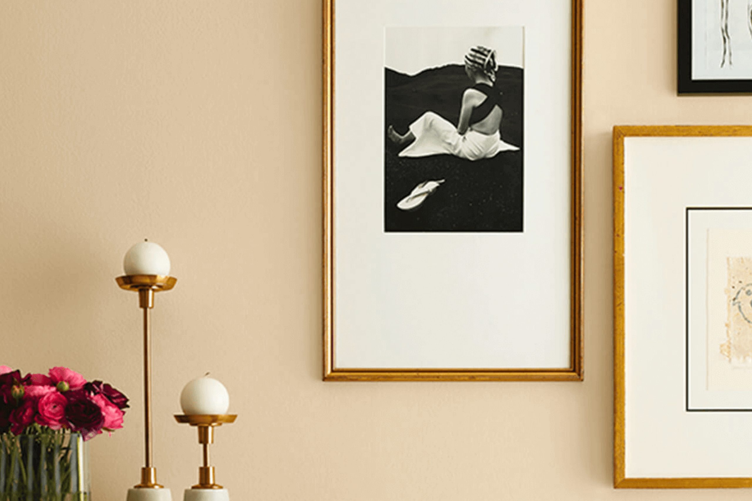
Toasted Pine Nut, SW 7696 by Sherwin Williams, is a hue that brings warmth and comfort into a room. It’s a soft, welcoming beige with just the right hint of a toasted hue that adds depth without being too strong. This color feels like a hug from your favorite blanket on a chilly day. When I see this shade on the walls, it brings a cozy and inviting atmosphere into any room. It’s not just a color; it’s a feeling that says home.
Perfect for living rooms, bedrooms, or any place you want to feel more at ease, Toasted Pine Nut adapts beautifully to different settings. Its gentle tone works wonders with various styles, from traditional to modern minimalist designs.
The versatility is part of what makes it special; whether paired with brighter accents or subtle earth tones, it fits right in with ease. Imagine sitting in a room painted in this shade, feeling calm and relaxed, as the warmth of the color wraps around you.
It truly creates a soothing environment where you can unwind and feel at peace.
What Color Is Toasted Pine Nut SW 7696 by Sherwin Williams?
Toasted Pine Nut by Sherwin Williams is a warm, earthy color with a blend of beige and soft brown undertones. It creates a cozy and inviting atmosphere, making rooms feel comfortably lived-in. This color is highly adaptable and works well in various interior styles, from rustic and farmhouse to modern and transitional. Its neutral yet rich tone offers a perfect backdrop that doesn’t dominate the room, allowing other design elements to stand out.
Toasted Pine Nut pairs beautifully with a range of materials and textures. For a rustic or farmhouse style, it complements natural wood finishes wonderfully, like oak or cherry, adding depth and warmth to the room. It also pairs nicely with metal accents, such as wrought iron or brushed nickel, providing an exciting contrast that enhances its warmth.
For a more modern setting, consider using it with sleek materials like glass, polished concrete, or steel, which highlight the color’s cozy essence against their cool, smooth finishes. Soft textiles, such as linen, wool, or cotton in neutral or muted tones, blend seamlessly with this color, adding to a harmonious, comfortable environment.
In summary, Toasted Pine Nut is a flexible choice that brings warmth and inviting vibes to any interior.
Is Toasted Pine Nut SW 7696 by Sherwin Williams Warm or Cool color?
Toasted Pine Nut SW 7696 by Sherwin Williams is a warm, inviting color that can create a cozy atmosphere in any home. This soft, earthy shade brings to mind natural materials and suits a variety of interior styles. In living rooms, Toasted Pine Nut can make the room feel welcoming and comfortable. Its gentle tones work well with natural wood furniture and neutral textiles, highlighting their warmth.
In kitchens, this color pairs beautifully with both light and dark cabinets, adding depth without overpowering the room. It can make a room feel larger and more open, yet intimate. When used in bedrooms, Toasted Pine Nut encourages relaxation, providing a restful backdrop for personal decor and textiles.
This flexible color can suit an array of palettes, from modern to rustic, and works seamlessly with accents in greens, blues, and deep reds. Toasted Pine Nut is a great choice for those looking to evoke a sense of homely comfort.
Undertones of Toasted Pine Nut SW 7696 by Sherwin Williams
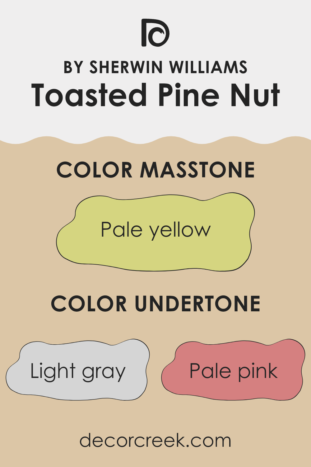
Toasted Pine Nut by Sherwin Williams is a warm and inviting color with several underlying tones that affect how it appears in different settings. The color itself is a soft, beige-like hue, but its undertones add to its flexibility.
The light gray and gray undertones give it a neutral base, which helps it blend well with a variety of other colors and makes it adaptable to changing lighting conditions. This means in areas with lots of natural light, the gray undertones might be more pronounced, creating a cooler feel.
The pale pink and orange undertones add a touch of warmth, making the color feel cozy and inviting, perfect for living rooms or bedrooms where comfort is key. These undertones can also lend a subtle richness to the color, making it feel more dynamic than a flat beige.
The light purple and lilac hints bring a slight elegance and can create a calming atmosphere, while the mint and light blue tones can add a refreshing quality, making it great for bathrooms or kitchens.
Finally, the yellow and olive hints add a dash of earthiness, grounding the color and helping it fit well in rooms that highlight natural materials and textures. Overall, these undertones make Toasted Pine Nut flexible and appealing for many interior design styles.
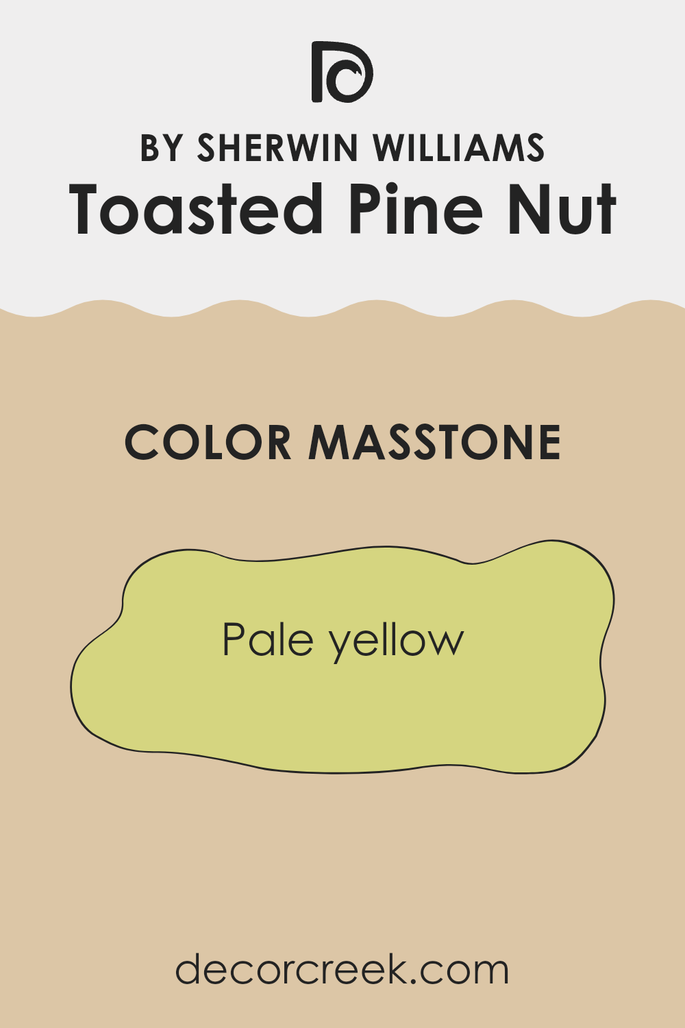
What is the Masstone of the Toasted Pine Nut SW 7696 by Sherwin Williams?
Toasted Pine Nut (SW 7696) by Sherwin Williams is a warm, inviting shade of pale yellow (#D5D580) that brings a cheerful and lively vibe to home interiors. Its masstone, or main color appearance, is soft and subtle, which means it doesn’t overpower a room but adds a gentle touch of warmth.
This makes it an excellent choice for rooms like living rooms, kitchens, or bedrooms. The pale yellow hue catches natural light beautifully, creating a cozy and welcoming atmosphere.
It can make smaller rooms feel more open and airy, while offering a comforting backdrop in larger areas. When combined with other colors, Toasted Pine Nut works well with earthy tones, whites, or even soft grays, adding to its flexibility. This color is perfect for those looking to brighten their home with a cozy and inviting look without being too bold or intense.
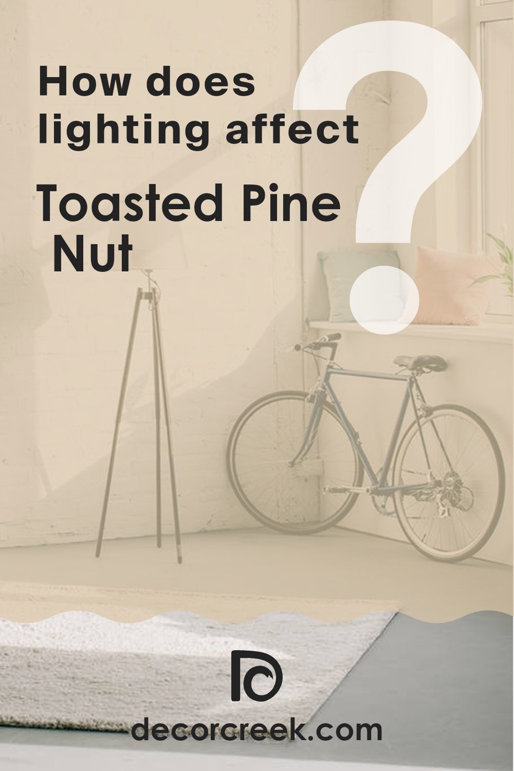
How Does Lighting Affect Toasted Pine Nut SW 7696 by Sherwin Williams?
Lighting plays a major role in how we perceive colors, as different types of lighting can change the appearance of a color. The color Toasted Pine Nut SW 7696 by Sherwin Williams, like any other color, can look quite different under various lighting conditions.
In natural light, colors tend to look brightest and most true to their original hue. However, natural light changes throughout the day. In a north-facing room, which receives indirect sunlight throughout the day, colors can appear cooler and slightly muted. Toasted Pine Nut might look more subdued or grayish, as the light may not bring out its warmth fully.
In south-facing rooms, which receive direct sunlight for most of the day, Toasted Pine Nut can appear much warmer and more saturated. The direct sunlight can highlight its undertones, making the color appear more vibrant. Southern light enhances the warmer tones in the color, bringing out its rich, creamy qualities.
East-facing rooms get soft, warm light in the morning and cooler light as the day progresses. In the morning, Toasted Pine Nut may appear warm and inviting, perfect for starting the day. As the light becomes cooler later on, the color might appear a bit more subdued.
West-facing rooms have the opposite effect, receiving cooler light in the morning and warmer, more intense light in the afternoon and evening. In the morning, the color can look cooler or more neutral. As the day goes on and the sunlight becomes warmer, it can take on a richer and more golden appearance.
Artificial lighting also affects how Toasted Pine Nut appears. Under incandescent lighting, which is warm and yellow, this color can look more warm and rich. Under fluorescent lighting, which is cooler and sometimes has a greenish tint, it can appear less warm and more neutral.
Overall, the appearance of Toasted Pine Nut changes significantly depending on the type of lighting, which affects its warmth, depth, and vibrancy.
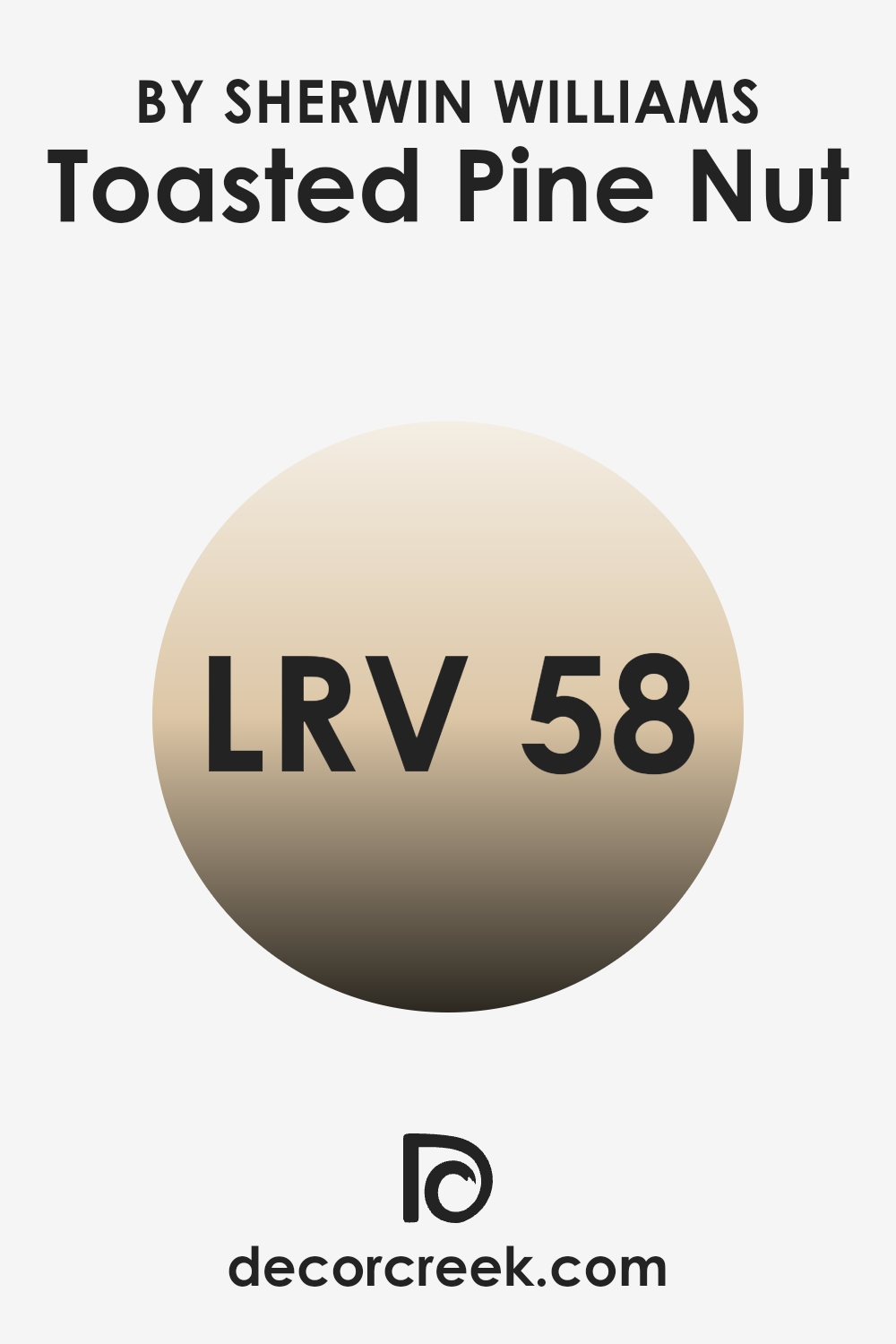
What is the LRV of Toasted Pine Nut SW 7696 by Sherwin Williams?
LRV stands for Light Reflectance Value, which is a measure of how much light a paint color reflects. The scale ranges from 0 to 100, with 0 being absolute black, which absorbs all light, and 100 being absolute white, which reflects all light. Understanding the LRV of a paint color helps determine how it will look in different lighting conditions. High LRV colors tend to make a room feel brighter and more open because they reflect more light.
Conversely, low LRV colors absorb more light, making a room feel cozier or smaller. With an LRV of 58.491, Toasted Pine Nut is considered a mid-tone color, meaning it balances between absorbing and reflecting light. It doesn’t overpower a room but provides a comfortable amount of brightness.
The LRV of Toasted Pine Nut means that this color can be useful in a variety of settings. It reflects enough light to keep a room feeling fresh without creating a stark or overly bright atmosphere. This makes it an excellent choice for rooms where a warm, inviting ambiance is preferred.
In rooms with lots of natural light, the color will appear lighter and more airy, while in darker rooms, it maintains its warmth and depth without making the room feel too enclosed. Toasted Pine Nut’s LRV value allows it to work well with both artificial and natural lighting, making it a flexible option for different parts of a home.
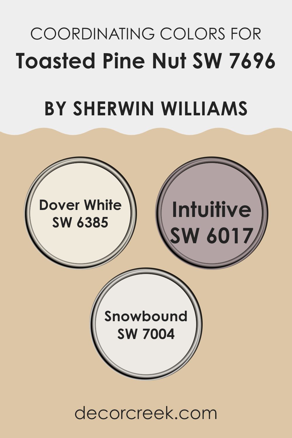
Coordinating Colors of Toasted Pine Nut SW 7696 by Sherwin Williams
Coordinating colors are hues that complement and enhance a primary color, creating a balanced and pleasing color scheme. When matching colors with Toasted Pine Nut by Sherwin Williams, the choice of coordinating colors plays a significant role in achieving harmony in a room. To create a cohesive look, different shades are selected that either contrast or support the primary color without overpowering it.
Such a selection can affect the overall mood and style of a room, adding depth and interest. For instance, a warm neutral like Toasted Pine Nut can be beautifully paired with both light and slightly bold colors to balance the color palette in a room.
Dover White, a warm creamy white, pairs perfectly with Toasted Pine Nut, softening the room and providing a light, airy feel. Intuitive, a muted violet, adds a touch of gentle color that blends well, offering a subtle hint of personality and charm. Snowbound, a cool white, works well to contrast with the warmer tones of Toasted Pine Nut, lending a crisp, clean effect to the area. Altogether, these colors work together, allowing the main hue to stand out while creating a cohesive and visually appealing setting.
You can see recommended paint colors below:
- SW 6385 Dover White
- SW 6017 Intuitive
- SW 7004 Snowbound
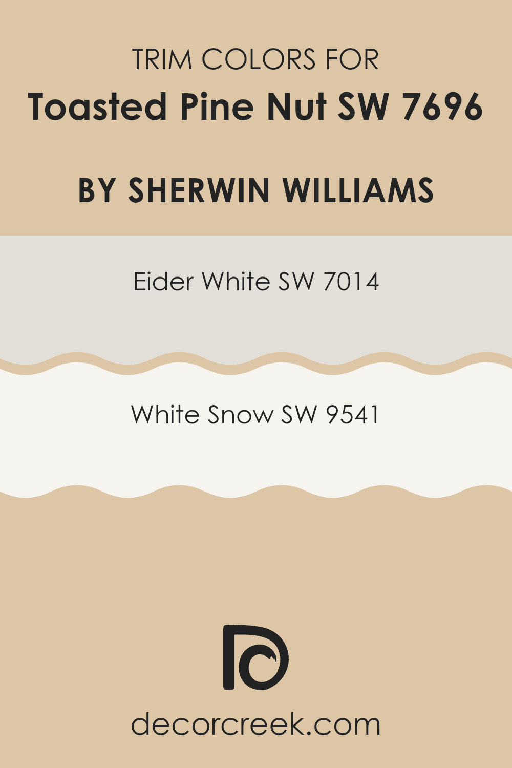
What are the Trim colors of Toasted Pine Nut SW 7696 by Sherwin Williams?
Trim colors help define and enhance a room by providing contrast or gentle balance to the main wall color. When using Toasted Pine Nut by Sherwin Williams, selecting the right trim color is important to achieve the desired look. For instance, Eider White (SW 7014) is a soft off-white shade with a hint of gray.
It can provide a gentle contrast against the warm, neutral tone of Toasted Pine Nut, creating a clean and fresh look in the room. Eider White offers a subtle brightness that complements the warmth of Toasted Pine Nut without overpowering it.
On the other hand, White Snow (SW 9541) offers a crisp and cool white option for trim, making it ideal for those who want a strong contrast. It can highlight the depth and richness of the main wall color, while still maintaining a classic and lasting appeal.
These choices for trim color are important as they define edges, add depth to the room, and set the overall tone and balance throughout the room. Proper trim color can effectively frame the walls and complete the look, making it essential to choose wisely with Toasted Pine Nut.
You can see recommended paint colors below:
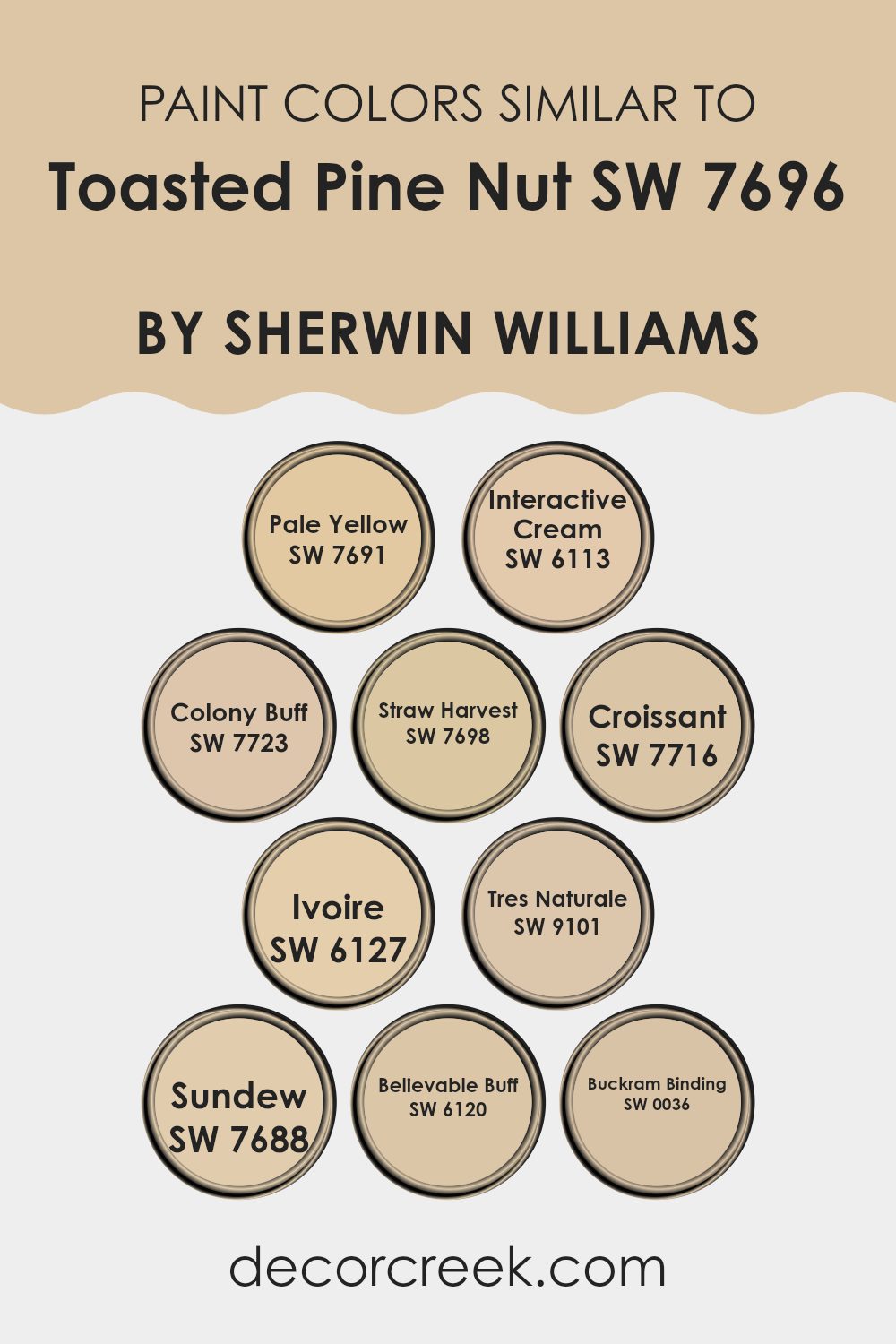
Colors Similar to Toasted Pine Nut SW 7696 by Sherwin Williams
Similar colors to Toasted Pine Nut by Sherwin Williams play an important role in creating cohesive and harmonious rooms. These colors work well together because they share underlying tones and warmth, which allows them to complement each other beautifully. When used in a room, they can create a sense of balance and unity, making the area feel inviting and well-coordinated.
For example, Pale Yellow offers a sunny touch, bringing a soft brightness without feeling too intense. Interactive Cream adds a bit of warmth with its creamy undertones, perfect for cozy environments.
Colony Buff offers a gentle, earthy feel, while Straw Harvest provides a deeper, rustic warmth, both ideal for a comfortable and welcoming atmosphere. Croissant is a warm, buttery hue with a hint of richness, and Ivoire’s delicate off-white shade works as a subtle backdrop. Tres Naturale offers a neutral base that is both lasting and flexible.
Sundew introduces a sunny, golden warmth, and Believable Buff is a reliable dusty tone that works well in many rooms. Finally, the classic nature of Buckram Binding brings a touch of traditional charm to any interior. Using these similar colors can help you create a setting that feels balanced and visually appealing without clashing or feeling disjointed.
You can see recommended paint colors below:
- SW 7691 Pale Yellow
- SW 6113 Interactive Cream
- SW 7723 Colony Buff
- SW 7698 Straw Harvest
- SW 7716 Croissant
- SW 6127 Ivoire
- SW 9101 Tres Naturale
- SW 7688 Sundew
- SW 6120 Believable Buff
- SW 0036 Buckram Binding
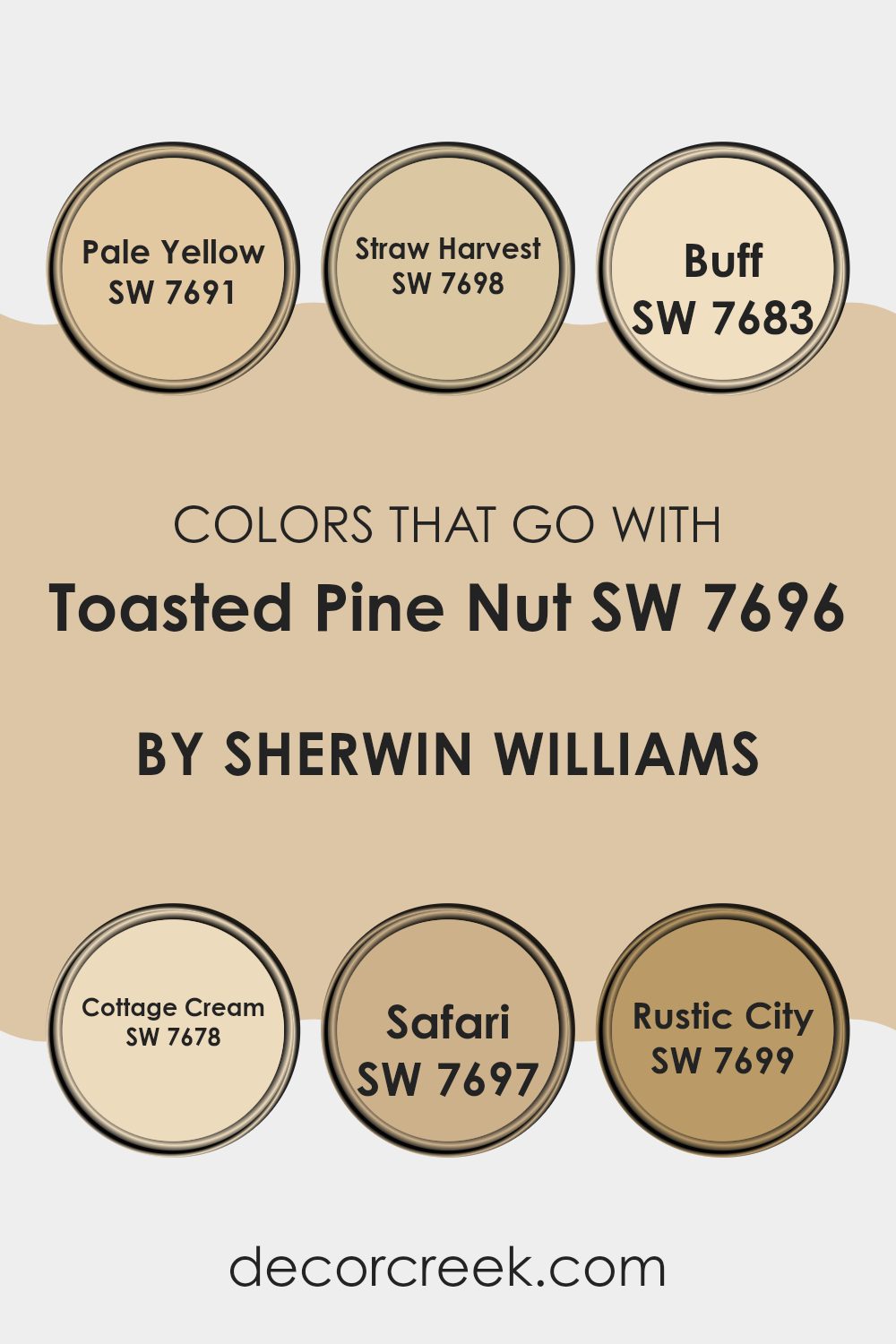
Colors that Go With Toasted Pine Nut SW 7696 by Sherwin Williams
When decorating a room using Toasted Pine Nut SW 7696 from Sherwin Williams, it’s important to choose colors that support its warm, earthy tones. Colors like SW 7691 Pale Yellow can lighten the room with its soft and breezy feel, adding a cheerful touch to the neutral base of Toasted Pine Nut. Another good companion is SW 7698 Straw Harvest, a slightly deeper yellow that adds warmth and comfort, enriching the cozy atmosphere.
SW 7683 Buff, with its soft beige notes, provides a subtle contrast, creating a harmonious backdrop that works well in various rooms. SW 7678 Cottage Cream is another soft hue, offering a creamy undertone that softens the boldness of Toasted Pine Nut, making it perfect for a peaceful setting.
SW 7697 Safari offers a darker contrast that balances the lighter shades, creating a grounding effect while maintaining a natural aesthetic. If seeking a more robust accent, SW 7699 Rustic City provides a rich and deep hue, adding depth and interest.
These colors all work together to create a welcoming environment by balancing warm hues with complementary tones, ensuring the room feels connected and cohesive. Using these colors alongside Toasted Pine Nut creates a well-rounded palette that brings warmth and comfort into any room.
You can see recommended paint colors below:
- SW 7691 Pale Yellow
- SW 7698 Straw Harvest
- SW 7683 Buff
- SW 7678 Cottage Cream
- SW 7697 Safari
- SW 7699 Rustic City
How to Use Toasted Pine Nut SW 7696 by Sherwin Williams In Your Home?
Toasted Pine Nut by Sherwin Williams is a warm, neutral color that can add a cozy feeling to any home. It’s a great choice for living rooms, bedrooms, or even kitchens if you want to create a welcoming atmosphere.
This shade can work well as a wall color, providing a soft backdrop that complements many styles and furniture pieces. Use it in the living room to make the room feel inviting and comfortable, or paint it in a bedroom to give a restful and calming vibe.
Pair Toasted Pine Nut with natural wood tones or white trim for a classic look. It also works beautifully with other neutrals, like soft grays or beiges, to create a unified feel throughout your home. For a pop of color, add accessories in muted blues or greens. This flexible color can really tie a room together, making it a popular choice for many homeowners.
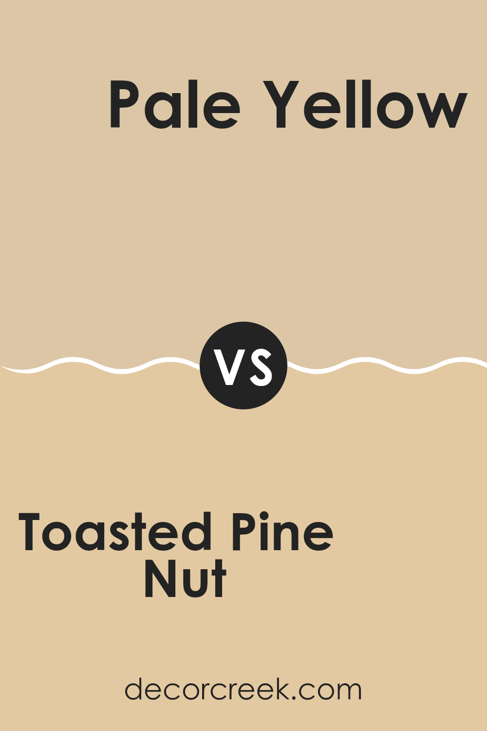
Toasted Pine Nut SW 7696 by Sherwin Williams vs Pale Yellow SW 7691 by Sherwin Williams
Toasted Pine Nut SW 7696 is a warm, neutral shade by Sherwin Williams with a natural, earthy feel. It’s a soft beige with subtle undertones that make it cozy and inviting, perfect for living areas like the living room or bedroom. This color pairs well with both deeper accents and lighter tones, adding a quiet elegance to any room.
In contrast, Pale Yellow SW 7691 is a gentle, light yellow that brings brightness and cheerfulness to a room. It’s an excellent choice for kitchens, bathrooms, or any area where you want to add a bit of sunshine and positivity. This color works well with whites and other pastels, creating a fresh, airy atmosphere.
While Toasted Pine Nut gives a room a calming and grounded appearance, Pale Yellow adds a touch of vibrancy and energy. Together, these colors can complement each other by balancing warmth and light in a design scheme.
You can see recommended paint color below:
- SW 7691 Pale Yellow
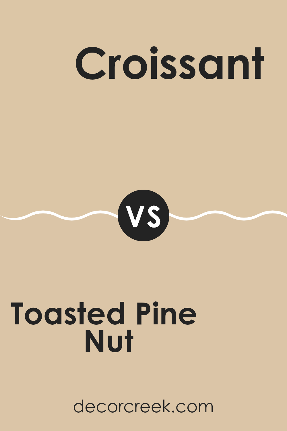
Toasted Pine Nut SW 7696 by Sherwin Williams vs Croissant SW 7716 by Sherwin Williams
Toasted Pine Nut SW 7696 and Croissant SW 7716 are both warm, neutral colors by Sherwin Williams, but they offer distinct vibes. Toasted Pine Nut is a soft, light beige with a hint of warmth, making it suitable for various rooms.
It feels welcoming and cozy, perfect for living areas or bedrooms where you want a calm atmosphere. On the other hand, Croissant is slightly darker with a richer undertone, resembling the color of baked bread. This makes it feel a bit more grounded and cozy, ideal for rooms like kitchens or dining areas.
While both colors are earthy and neutral, Toasted Pine Nut is better suited for areas that need light and openness, whereas Croissant works well in rooms that can support a bit more depth and richness. Both colors pair beautifully with wood accents and natural finishes, enhancing their warm, welcoming character.
You can see recommended paint color below:
- SW 7716 Croissant
Toasted Pine Nut SW 7696 by Sherwin Williams vs Buckram Binding SW 0036 by Sherwin Williams
Toasted Pine Nut (SW 7696) and Buckram Binding (SW 0036) from Sherwin Williams are both warm, neutral shades, but they offer different vibes. Toasted Pine Nut is a soft beige with a slightly warm undertone. It’s adaptable and works well in many rooms, adding warmth without being too strong. It’s a great backdrop that feels cozy and welcoming.
In contrast, Buckram Binding is a richer cream color and has a more distinct yellow undertone. This makes it feel brighter and sunnier, adding a touch of cheerfulness to a room. While both colors bring warmth, Buckram Binding is more vivid, making it a good choice if you want something a little more pronounced.
Together, these colors can be used for a harmonious look, with Toasted Pine Nut on walls and Buckram Binding on trim or accents. Both provide a neutral base for various decorating styles.
You can see recommended paint color below:
- SW 0036 Buckram Binding
Toasted Pine Nut SW 7696 by Sherwin Williams vs Straw Harvest SW 7698 by Sherwin Williams
Toasted Pine Nut SW 7696 and Straw Harvest SW 7698 by Sherwin Williams are both warm, earthy tones, but they offer different vibes. Toasted Pine Nut is a soft, creamy beige that feels cozy and inviting. It works well as a neutral backdrop for various interior settings, providing a warm, comfortable atmosphere. This color pairs nicely with both cool and warm accents, making it quite adaptable.
On the other hand, Straw Harvest is a bit richer and more golden. It has a warm, sunny feel that can brighten up a room, making it feel cheerful and lively. This color is great for adding a touch of warmth and can complement wooden elements beautifully.
When deciding between the two, consider the mood you want to create. Toasted Pine Nut offers a softer, more muted look, while Straw Harvest brings more energy and brightness to a room. Both can enhance a room with their unique warmth.
You can see recommended paint color below:
- SW 7698 Straw Harvest
Toasted Pine Nut SW 7696 by Sherwin Williams vs Believable Buff SW 6120 by Sherwin Williams
Toasted Pine Nut (SW 7696) by Sherwin Williams is a soft and warm beige with subtle earthy tones. This color brings a cozy and inviting feel to a room. It works well with various color palettes, making it suitable for both traditional and modern designs.
On the other hand, Believable Buff (SW 6120) is a lighter beige with a hint of yellow. It creates a bright and cheerful atmosphere, bringing a sense of warmth and openness to a room. This color can make rooms feel larger and more airy due to its lighter tone.
Both colors offer a warm and neutral backdrop, but Toasted Pine Nut is slightly deeper and more grounded, while Believable Buff is light and optimistic. Depending on the mood you wish to create, Toasted Pine Nut can offer a more intimate feeling, whereas Believable Buff provides a sunny and uplifting ambiance.
You can see recommended paint color below:
Toasted Pine Nut SW 7696 by Sherwin Williams vs Tres Naturale SW 9101 by Sherwin Williams
Toasted Pine Nut (SW 7696) and Tres Naturale (SW 9101) by Sherwin Williams are warm, earthy tones. Toasted Pine Nut is a rich, soft beige with subtle warmth that gives areas a cozy and welcoming feel. It’s adaptable, suiting both modern and traditional settings. Tres Naturale is a bit lighter, carrying a hint of creamy taupe. It offers a fresh, neutral backdrop, enhancing brightness while maintaining warmth.
Both colors work well in living areas, bedrooms, or kitchens, but the choice depends on the desired atmosphere. Toasted Pine Nut’s deeper hue adds richness, making it great for more intimate rooms.
Tres Naturale, being lighter, can make rooms appear larger and more open. When paired together, they create a harmonious look, with Tres Naturale balancing Toasted Pine Nut’s depth. Ultimately, their subtle differences allow for complementary or standalone use, depending on your design needs.
You can see recommended paint color below:
- SW 9101 Tres Naturale
Toasted Pine Nut SW 7696 by Sherwin Williams vs Sundew SW 7688 by Sherwin Williams
Toasted Pine Nut SW 7696 and Sundew SW 7688 are both warm, inviting colors by Sherwin Williams, but they have distinct differences. Toasted Pine Nut is a soft, medium beige with a subtle warmth, making it adaptable for many rooms. It’s a comforting color that fits well in living rooms or bedrooms, creating a cozy and welcoming atmosphere.
On the other hand, Sundew SW 7688 is a lighter, creamier color with more yellow undertones. It brings a light, airy feel to a room, perfect for rooms where you want to enhance natural light. While Toasted Pine Nut offers a richer, more grounded feel, Sundew adds a crisp, clean brightness.
Overall, if you’re looking for a warmer, more subdued backdrop, Toasted Pine Nut is a great choice. If you prefer a sunnier, brighter feel, Sundew is ideal. Both colors pair well with natural textures and wood accents, adding warmth and comfort to an area.
You can see recommended paint color below:
- SW 7688 Sundew
Toasted Pine Nut SW 7696 by Sherwin Williams vs Interactive Cream SW 6113 by Sherwin Williams
Toasted Pine Nut SW 7696 by Sherwin Williams is a warm, earthy beige color with a subtle hint of gray, which gives it a flexible and cozy feel. This main color is perfect for creating a neutral backdrop that can suit various decor styles. It has an inviting tone that adds warmth to any room, making it ideal for living rooms or bedrooms.
On the other hand, Interactive Cream SW 6113 by Sherwin Williams is a lighter, creamy beige with a slightly yellowish undertone. It provides a bright and airy feel, making rooms appear larger and more open. This second color works well in areas where you want to enhance natural light and create a cheerful atmosphere, such as kitchens or bathrooms.
When compared, Toasted Pine Nut has a deeper, more muted appearance, while Interactive Cream offers a lighter, more luminous feel. Both colors are flexible but suit different moods and lighting.
You can see recommended paint color below:
Toasted Pine Nut SW 7696 by Sherwin Williams vs Ivoire SW 6127 by Sherwin Williams
Toasted Pine Nut (SW 7696) and Ivoire (SW 6127), both by Sherwin Williams, are warm and inviting colors, but they have distinct characteristics. Toasted Pine Nut is a soft, neutral beige with warm undertones, making it a flexible choice that pairs well with a variety of decor styles. It has a comforting, cozy feel and works well in living rooms, kitchens, or any area where you want warmth and neutrality.
On the other hand, Ivoire is a lighter, creamy yellow. It has a brighter, sunnier disposition compared to the more muted Toasted Pine Nut. Ivoire can add a cheerful and fresh look to a room, making it ideal for rooms like kitchens or bathrooms where you want a bit more light and vibrancy.
Both colors complement each other well; you could use Toasted Pine Nut as a main wall color with accents in Ivoire, or vice versa, creating a harmonious yet dynamic look.
You can see recommended paint color below:
- SW 6127 Ivoire
Toasted Pine Nut SW 7696 by Sherwin Williams vs Colony Buff SW 7723 by Sherwin Williams
Toasted Pine Nut SW 7696 and Colony Buff SW 7723, both from Sherwin Williams, are warm, inviting shades, but they have distinct differences. Toasted Pine Nut is a creamy beige with subtle undertones that create a cozy and comforting atmosphere. It’s flexible and can easily blend with a variety of decor styles, from rustic to modern.
On the other hand, Colony Buff is a softer, more muted yellow. It has a gentle, sunny vibe that’s perfect for bringing a touch of warmth and light to a room without feeling too bold. Colony Buff is great for rooms where you want a hint of color that still reads as neutral.
Both colors work well in living rooms, bedrooms, or any area where you want to create a welcoming feel. Toasted Pine Nut’s richness is ideal for a grounded look, while Colony Buff’s brightness can make a room feel open and airy.
You can see recommended paint color below:
- SW 7723 Colony Buff
After learning about SW 7696 Toasted Pine Nut by Sherwin Williams, I see why this paint color is quite special. It’s a warm and cozy shade that reminds me of the color of peanut butter or a light tan. Imagine a room painted in this color, and it feels inviting and comfortable, like a hug. It’s the kind of color that makes a house feel like a home, not too dark and not too bright, just right.
What I really like is how this color can be used in different rooms and go well with just about anything. Whether someone uses it in the living room with a cool sofa or in the kitchen with shiny appliances, it fits in perfectly.
It doesn’t shout for attention but instead brings everything together in a nice way. It’s great for people who want a color that is simple yet makes everything look better. SW 7696 Toasted Pine Nut is also easy on the eyes. It’s a color that you won’t get tired of quickly, so it’s a good choice if you want a paint color that lasts a long time.
In the end, this color by Sherwin Williams is great because it helps make any house feel cozy and welcoming without being too flashy or stark.
Ever wished paint sampling was as easy as sticking a sticker? Guess what? Now it is! Discover Samplize's unique Peel & Stick samples.
Get paint samples

