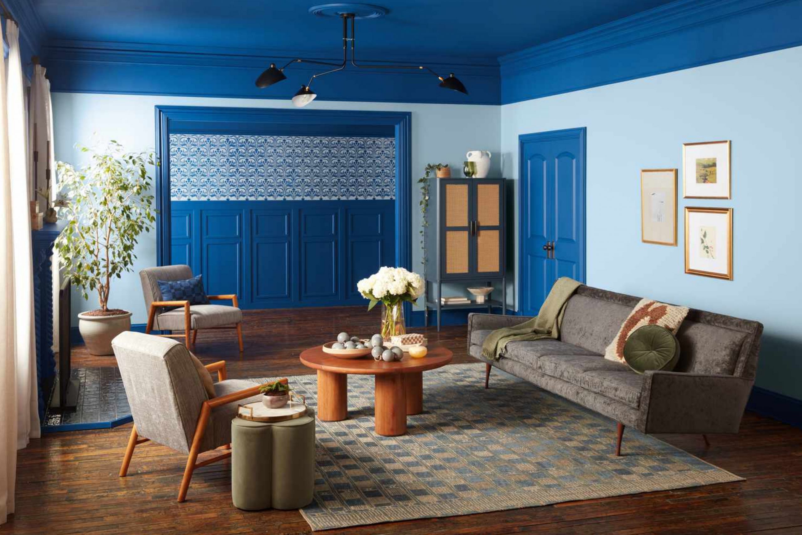
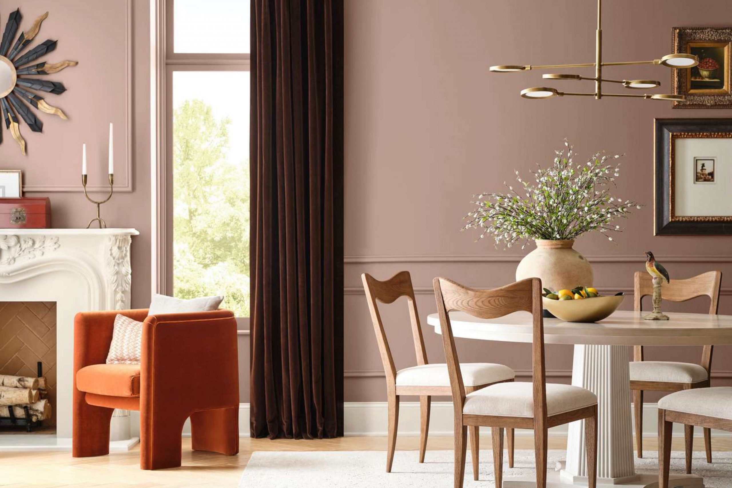
Fall makes everything feel different. The air is cooler, the light is softer, and my thoughts turn to things that feel warm and rich. This is the season when I want every room to feel like it’s giving you a hug. And paint is one of the easiest ways to make that happen. You don’t need to change everything—just one wall, or one room, and it changes how the whole place feels.
This list has the 41 trendy paint colors for fall this year that I’ve been reaching for over and over again. These colors remind me of spiced tea, red trees, and fresh baked bread.
I use them in bedrooms, dining rooms, even front doors. Whether you love deep reds or cozy golds, you’ll find something here that feels just right.
Why I Trust Rich Paint Colors for Fall
Every season has its own feeling, but fall is the one I want to wrap up in. Bright whites and cool grays work great in spring or summer, but when the days get shorter, I start reaching for colors that feel warmer and deeper. Rich paint colors help a room feel more grounded. They make people want to stay longer, sit closer, and breathe slower.
I’ve found that these kinds of colors work better than candles or throw blankets. They change the feeling of the room from the moment you walk in. They don’t shout—they stay with you. That’s why every fall, I turn to this kind of palette. It just feels right.
My Way of Choosing Fall Colors That Feel Just Right
When I’m picking a fall paint color, I don’t start with a color wheel—I start with how I want the room to feel. Do I want it to feel cozy? Safe? A little bold? That’s the first thing I think about. Then I look at how much natural light the room gets, what kind of furniture is staying, and what people do in that room.
If it’s a place to relax, I go for softer browns and golden tones. If it’s where people gather, like a kitchen or dining room, I might go for deeper reds or spiced orange. I test the color on the wall and check it in the morning, afternoon, and evening.
That’s how I know it works. It has to feel good all day.
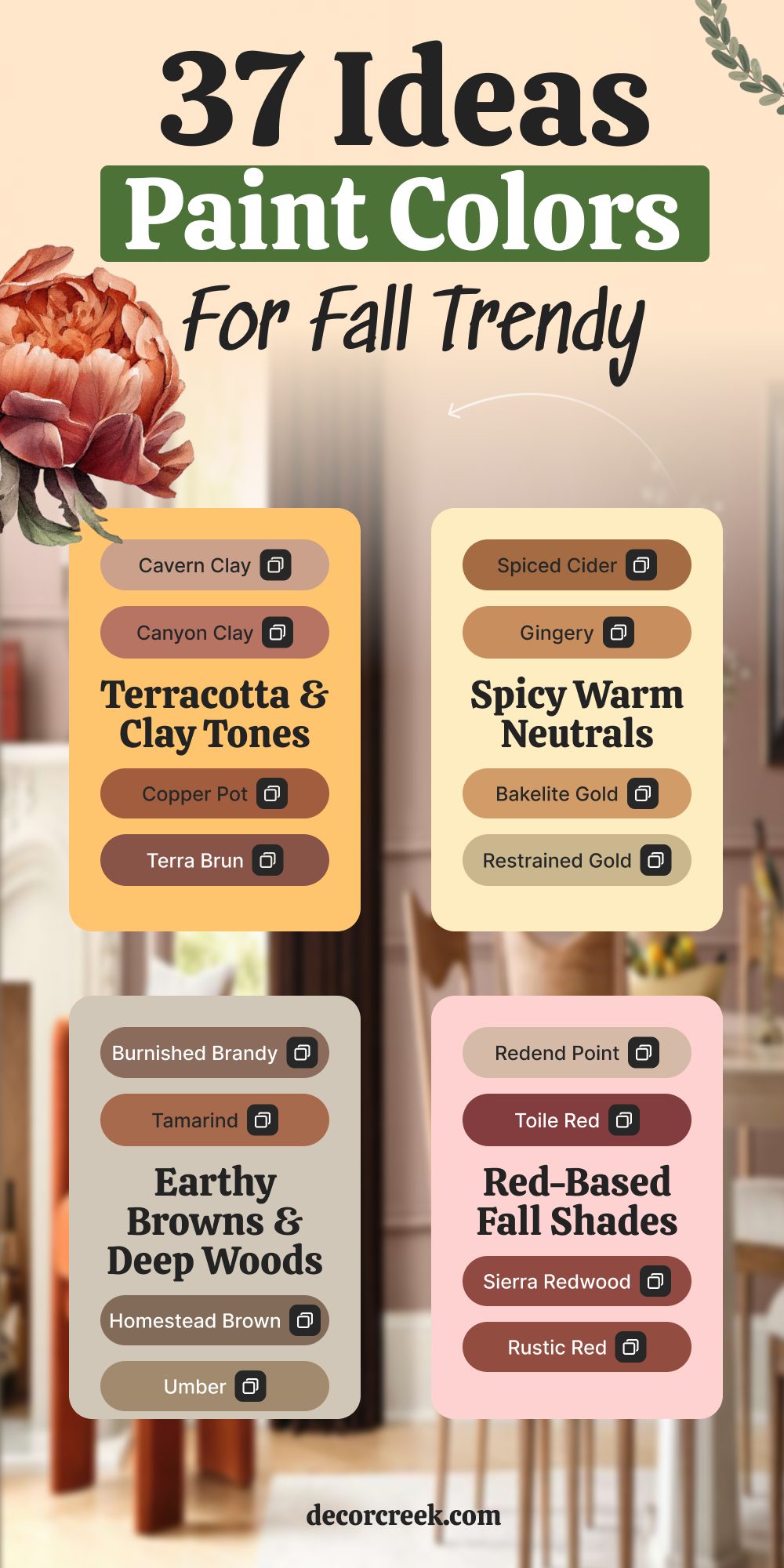
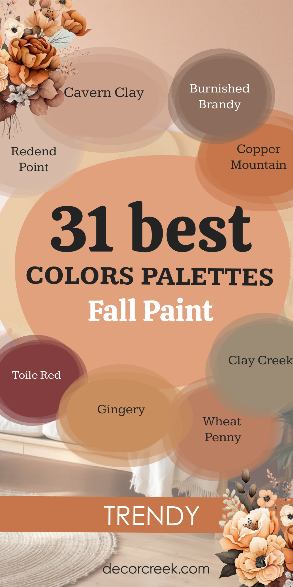
37 Trendy Paint Colors for Fall 2026
Terracotta & Clay Tones
These are the colors I reach for when I want the room to feel grounded and warm right away. They remind me of dry leaves, old pottery, and the kind of earth you want to walk barefoot on. Terracotta and clay tones bring a soft strength into a room—they don’t scream for attention, but you feel them. I love using them in rooms that get natural light or have wood tones.
They make any room feel steady and full. If you’re not sure where to start with fall colors, this is a great place.
Cavern Clay SW 7701
Cavern Clay is a soft, sunbaked orange that reminds me of old pottery and fall hikes. It feels warm and steady, like something that’s been there a long time. This shade brings instant comfort to a room.
My recommend: Use it on an accent wall in a room with soft lighting and natural textures like wood or jute.
🎨 Check out the complete guide to this color right HERE 👈

Canyon Clay SW 6054
Canyon Clay is rich and grounded, like dry earth at sunset. It has a quiet beauty that doesn’t need much else to shine. I love how it makes the roomfeel still and strong.
My recommend: Try it in a hallway or dining room paired with light tan or oatmeal-colored decor.
Copper Pot SW 7706
Copper Pot is a spicy, burnt orange with a cozy glow. It feels bold without being too bright, and it adds life to quiet rooms. There’s something cheerful about it, even on cloudy days.
My recommend: Great for mudrooms, powder rooms, or anywhere you want warmth in a small dose.
Terra Brun SW 6048
Terra Brun is deep and earthy with a slight reddish tint. It has a strong, collected look that works well in calm, thoughtful rooms. This is one of those colors that helps you feel grounded.
My recommend: Use it in a bedroom or den with lots of texture—think blankets, leather, and soft light.
Copper Mountain SW 6356
Copper Mountain is like the spark in a campfire—bright but soft. It brings a burst of warmth to any room, especially during colder months. I love how lively it feels without being loud.
My recommend: Use this on a statement wall in your kitchen or entry, especially paired with copper or brass accents.
🎨 Check out the complete guide to this color right HERE 👈

Clay Creek SW 7729
Clay Creek is a mix of mossy green and brown clay. It feels like something pulled from nature, quiet but full of depth. This is one of my favorites for earthy fall rooms.
My recommend: Beautiful in kitchens or even lower cabinets. It also works well in laundry rooms with soft whites.
Oak Leaf Brown SW 7715
Oak Leaf Brown is dark, rich, and full of fall. It reminds me of dried leaves and old trees. There’s something very honest about this shade.
My recommend: I love this on interior doors or trim when the walls are soft beige or tan.
🎨 Check out the complete guide to this color right HERE 👈

Spicy Warm Neutrals
These are the shades that feel like a warm drink in your hands. They’re not too dark, not too bright—just warm enough to make the whole room feel softer. I use these colors in bedrooms, kitchens, and any place where comfort matters most. They work especially well when you want color without anything too bold.
These spicy neutrals mix beautifully with warm metals, natural wood, and creamy whites. They’re the quiet stars of a cozy home.
Spiced Cider SW 7702
Spiced Cider is warm like a mug of tea on a cool day. It has orange and brown mixed in, making it cozy without being too dark. This color makes rooms feel full of life and comfort.
My recommend: Use it in a kitchen or dining room where people gather—it makes everyone feel at home.
🎨 Check out the complete guide to this color right HERE 👈

Gingery SW 6363
Gingery is soft and warm, like fresh gingerbread from the oven. It has a reddish glow that adds quiet joy to any room. I love how welcoming it feels.
My recommend: Great for breakfast nooks or bedrooms with cream or ivory bedding.
Bakelite Gold SW 6368
Bakelite Gold has a deep, honeyed look that feels rich and steady. It’s bold, but in a grounded way. It gives a nice golden glow to any room, especially in the afternoon light.
My recommend: Use it on cabinetry or in a dining room with darker woods and warm lights.
Restrained Gold SW 6129
Restrained Gold is smooth and golden with a soft touch. It doesn’t take over a room—it lifts it gently. I love how it works in both big and small rooms.
My recommend: Beautiful in living rooms with soft light and layered textiles like velvet or corduroy.
Pennywise SW 6349
Pennywise is a warm coppery tone that reminds me of fallen leaves and crisp mornings. It’s gentle, but it still stands out in a room. This one brings charm wherever it goes.
My recommend: Works well in entryways or powder rooms—adds charm in a small room.
Persimmon SW 6339
Persimmon is fruity and fun, with a little orange and a little pink. It feels playful, but not too bright. It makes the room feel happy and full.
My recommend: I’ve used this in a little girl’s bedroom and even on painted chairs—it’s lovely.
Autumnal SW 6361
Autumnal is brown with a soft orange glow—just like the name says, it feels like fall. It’s warm, steady, and gives a room a gentle hug. I always smile when I see it.
My recommend: Use it in a family room or study. It’s warm enough to feel cozy but strong enough to hold its own.
🎨 Check out the complete guide to this color right HERE 👈
Earthy Browns & Deep Woods
These are the colors that hold the room together. They feel like solid wood, leather, and old books. I go to these deep browns when I want a room to feel settled and safe. They’re especially good in rooms where people rest or focus—offices, bedrooms, living rooms.
These tones also bring a beautiful contrast when paired with soft fabrics or lighter accents.
I use them when I want the walls to feel strong but calm.
Burnished Brandy SW 7041
Burnished Brandy is deep, rich, and a little red underneath. It feels like old wood, warm blankets, and cozy evenings. It’s one of my favorite go-to browns.
My recommend: Perfect for living rooms, studies, or entryways with darker floors and classic furniture.
Tamarind SW 7538
Tamarind is brown with a reddish heart—it feels like something between dessert and a warm coat. It’s strong but soft. I love how it brings calm to a room.
My recommend: I love using it in dining rooms with warm lighting and gold frames.
Homestead Brown SW 7515
Homestead Brown feels like history. It’s a solid, deep brown that makes a room feel safe and lived in. It’s not flashy—it’s faithful.
My recommend: Great for bedrooms with white bedding and wood furniture.
🎨 Check out the complete guide to this color right HERE 👈

Umber SW 6146
Umber is deep and soft all at once. It brings a strong, quiet feeling to a room without making it feel heavy. I trust it when I want the room to feel still.
My recommend: Beautiful on lower walls or wainscoting. Also works on cabinets.
Rugged Brown SW 6068
Rugged Brown is dark, earthy, and strong. It reminds me of fresh soil and rainy mornings. It makes a room feel deep and grounded.
My recommend: Works well in dens, offices, or even media rooms with cozy lighting.
Sable SW 6083
Sable is like a warm blanket in color form. It’s dark, smooth, and rich without feeling cold. I use this when I want the walls to hold the room together.
My recommend: Try it on a feature wall in a room with white curtains or upholstery.
Moroccan Brown SW 6060
Moroccan Brown is warm and deep with a reddish glow. It’s got personality without being too bright. This one adds style and comfort in equal parts.
My recommend: I use it in dining rooms with copper accents and heavy drapes.
Golden Hues & Harvest Yellows
These shades remind me of late afternoon sun and golden fields. They brighten the room without being too yellow, and they carry a cozy glow that feels right in fall. I love how these colors make smaller rooms feel happier and bigger rooms feel warmer.
They mix well with warm wood, rust, and even dark green.
If a room feels a little cold, these colors bring it back to life.
Goldenrod SW 6677
Goldenrod is bright and full, but not too loud. It’s cheerful in a strong way—like a pumpkin pie on the table. It brings energy and warmth to any room.
My recommend: Use it in a small powder room or as a surprise inside a cabinet or closet.
🎨 Check out the complete guide to this color right HERE 👈

Armagnac SW 6354
Armagnac is a rich, deep golden-brown. It reminds me of soft leather and warm drinks. There’s a glow to it that makes everything around it feel richer.
My recommend: I like this in kitchens or living rooms that need a little lift.
🎨 Check out the complete guide to this color right HERE 👈
Wheat Penny SW 7705
Wheat Penny is soft and golden with a little orange in it. It’s like toast with honey—warm, simple, and comforting. This is a shade that makes people smile.
My recommend: Lovely for kitchens, mudrooms, or laundry areas where you want comfort.
Status Bronze SW 7034
Status Bronze is darker with golden hints. It feels like rich caramel or polished wood. It adds quiet strength to any room.
My recommend: Beautiful on built-ins, front doors, or accent furniture.
🎨 Check out the complete guide to this color right HERE 👈

Red-Based Fall Shades
These are the boldest of the group, and some of my favorites for fall. They feel like falling leaves, red apples, and thick blankets. These colors carry a sense of comfort and history—they’re strong, but not too bright. I use them in dining rooms, front doors, and even bedrooms when I want something dramatic but warm.
Red tones can bring energy to a room while still feeling deep and full.
These are the shades I choose when I want people to feel something the moment they walk in.
Redend Point SW 9081
Redend Point is a soft reddish-pink with a gentle earthy tone. It feels smooth and modern but still warm and cozy. I love how peaceful it feels.
My recommend: Works everywhere—from bedrooms to bathrooms. It’s easy to live with.
🎨 Check out the complete guide to this color right HERE 👈

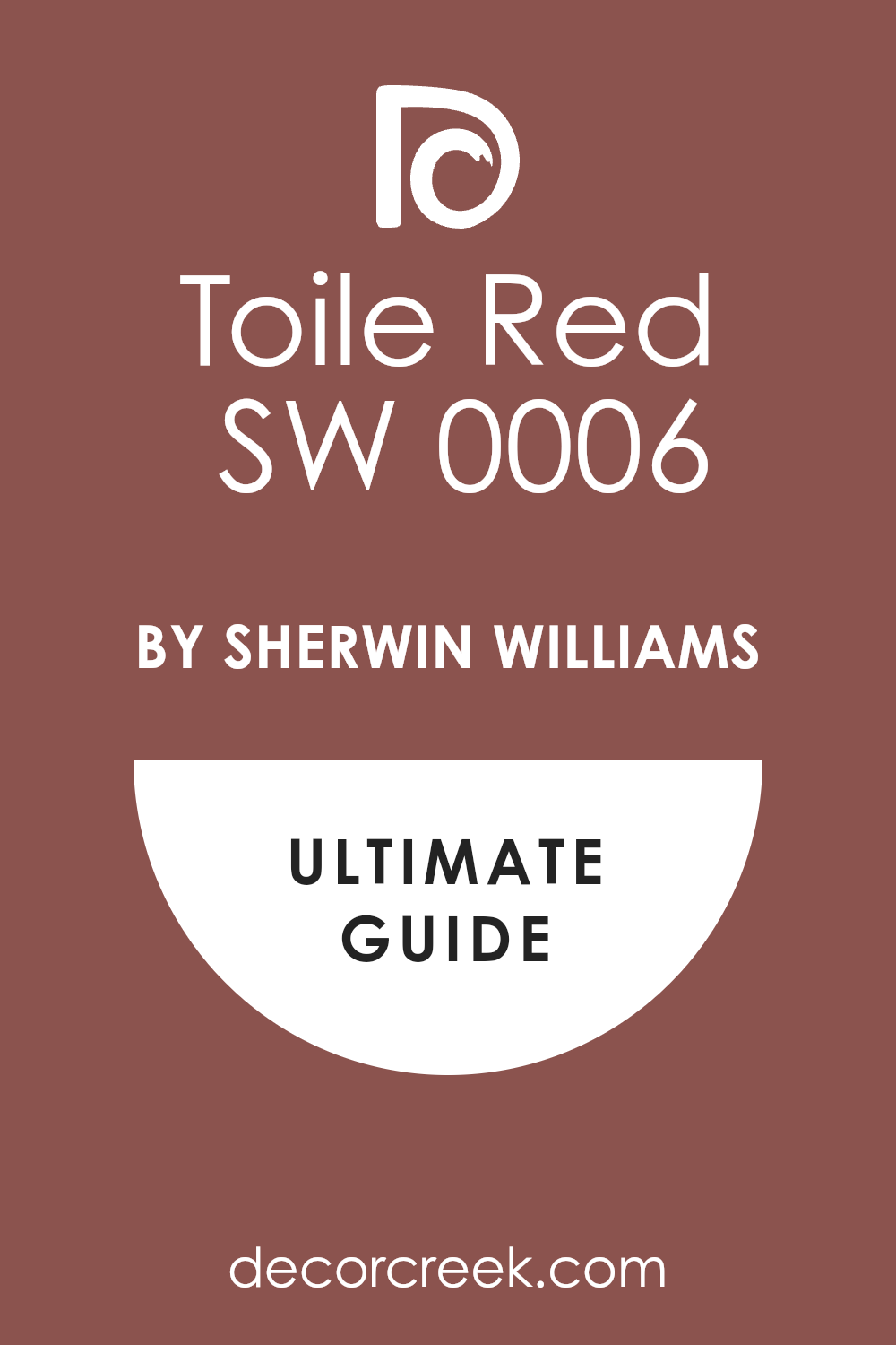
Toile Red SW 0006
Toile Red is classic, strong, and full of heart. It brings drama in a graceful way. It reminds me of old painted wood and heirloom linens.
My recommend: Perfect for formal dining rooms or traditional entryways.
🎨 Check out the complete guide to this color right HERE 👈
Sierra Redwood SW 7598
Sierra Redwood is deep and quiet, like a forest in fall. It’s red, but not too sharp. It feels settled and rich.
My recommend: Great for living rooms with a fireplace or dark floors.
Rustic Red SW 7593
Rustic Red has that barn-red charm I always love. It’s bold but feels familiar and soft. It makes a room feel full.
My recommend: I love using this on doors or exterior trim.
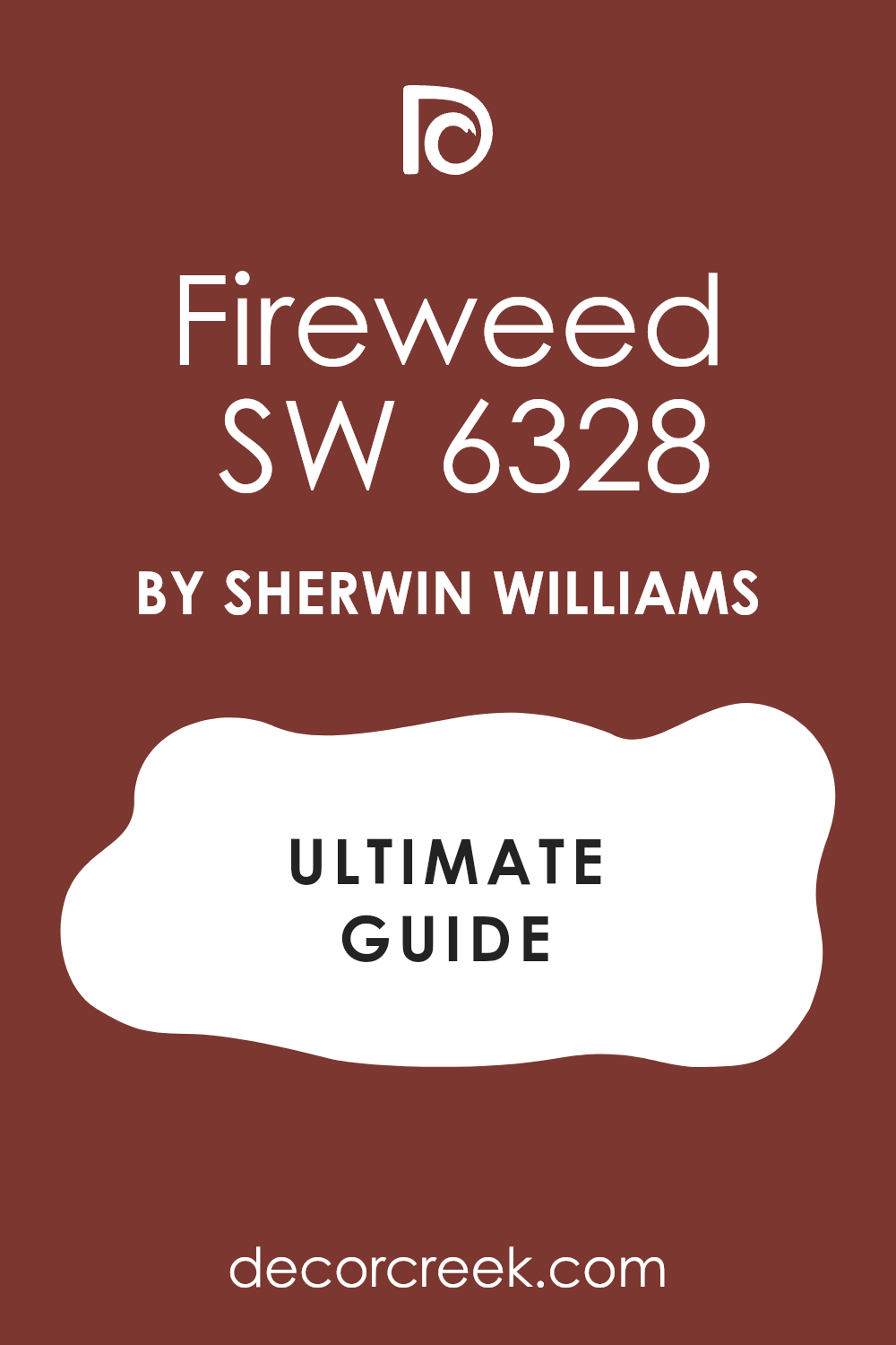
Fireweed SW 6328
Fireweed is a strong, deep red with a dark base. It feels full of story, like an old velvet chair in a quiet room.
My recommend: Try it in a bedroom or reading nook with soft lighting.
Fiery Brown SW 6055
Fiery Brown mixes red and brown in a bold, fall-ready way. It’s strong, passionate, and steady. It helps a room feel warm in every season.
My recommend: Use it in dining rooms or entryways with darker decor.
Red Theatre SW 7584
Red Theatre is a deep red that brings drama the second it’s on the wall. It’s bold but still classic. It’s the kind of color people remember.
My recommend: Only use it where you want attention—maybe a front door or dramatic wall.
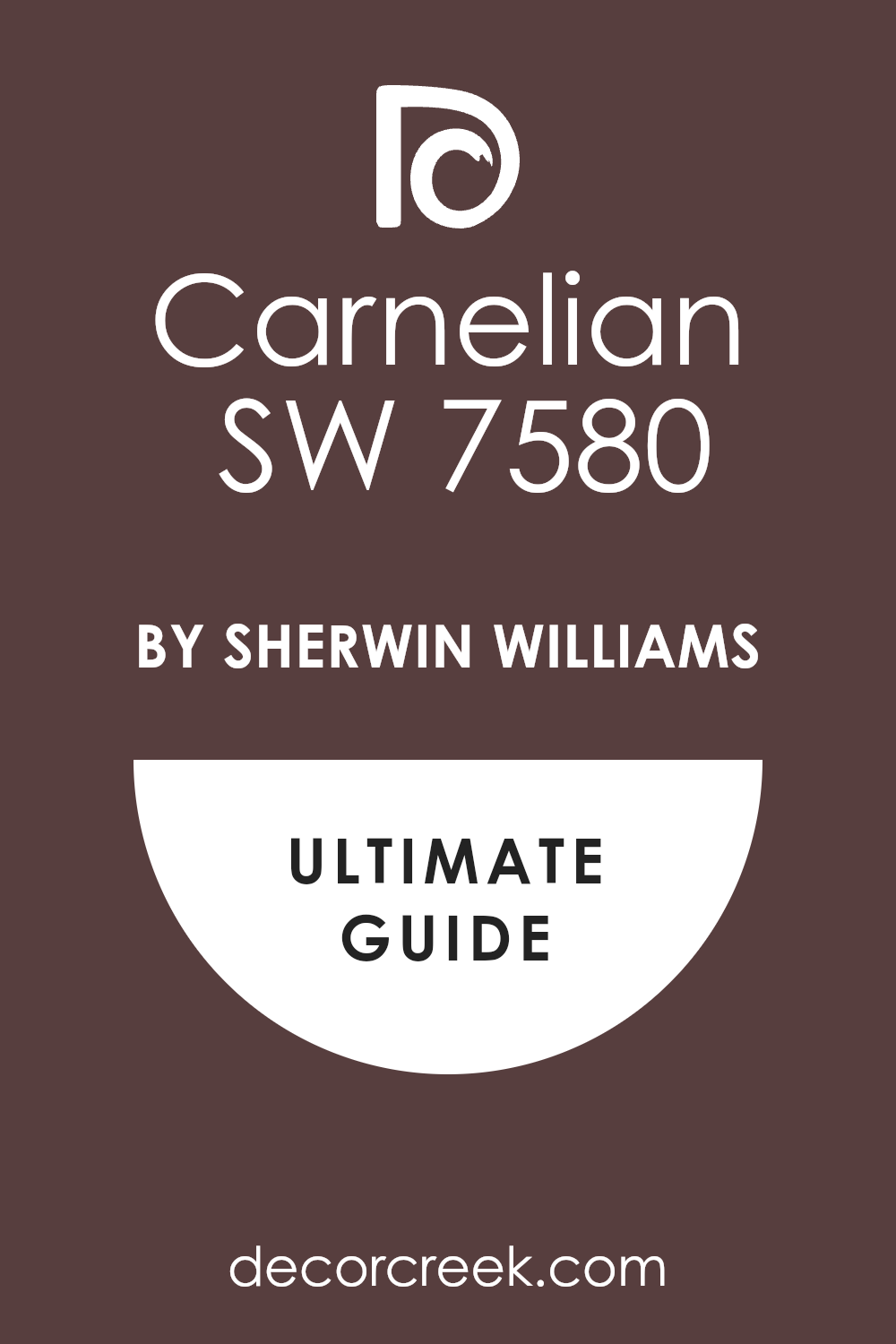
Carnelian SW 7580
Carnelian is warm, dark, and comforting. It has hints of red and brown, like fallen leaves and dark wood. It feels strong but still soft.
My recommend: Great for guest rooms, paired with creamy white and wood.
🎨 Check out the complete guide to this color right HERE 👈
Best Fall Paint Color Palettes for a Cozy Home
Redend Point SW 9081
Redend Point feels like warm clay mixed with soft rose petals. I always reach for it when I want a room to feel gentle but still full of character. It works well with soft creams, dusty browns, and even deeper reds. Redend Point looks beautiful in bedrooms, especially with linen sheets and soft lighting. I’ve also used it in bathrooms where it brings in that quiet, warm glow.
The key rule of this color for fall: don’t overthink it—it goes with more than you’d expect.
🎨 Check out the complete guide to this color right HERE 👈
Cavern Clay SW 7701
Cavern Clay brings the feeling of sun-dried earth into your home. It’s bold in a peaceful way, like orange touched by nature. This shade pairs so nicely with gold, tan, and soft greens. Cavern Clay works best in the rooms with wood or rattan—it makes them feel even warmer. I love using it on living room walls or even a dining room ceiling.
The key rule of this color for fall: let it have room to shine with natural textures.
Burnished Brandy SW 7041
Burnished Brandy is deep and smooth, like a piece of polished walnut. I use it when a room needs depth but still wants to feel friendly. It mixes beautifully with creams, brass, and terracotta accents. Burnished Brandy works especially well in rooms with low lighting—it glows instead of disappearing. It’s also one of my favorite front door colors in the cooler months.
The key rule of this color for fall: balance it with soft, warm neutrals.
Copper Mountain SW 6356
Copper Mountain is the color of glowing embers. It’s lively, warm, and always brings energy to a room. I love pairing it with beige, oak wood, and darker reds. Copper Mountain works best in kitchens, entries, or small rooms that need a spark. It looks even better in candlelight or golden afternoon sun.
The key rule of this color for fall: use it when the room feels a little sleepy—it will wake it up.
🎨 Check out the complete guide to this color right HERE 👈
Toile Red SW 0006
Toile Red is strong and elegant, like an old velvet chair. It brings a rich tone to any room, especially when paired with wood and cream. I like it in formal dining rooms or entryways where it adds a lasting first impression. Toile Red also looks beautiful next to antique furniture or vintage gold frames. It’s a bold choice, but in fall, it feels completely right.
The key rule of this color for fall: keep the rest of the palette simple—it leads the room.
🎨 Check out the complete guide to this color right HERE 👈
Gingery SW 6363
Gingery is soft, warm, and full of charm. It reminds me of ginger cookies and cinnamon tea. I love using this color in kitchens or reading nooks—it feels safe and cozy. Gingery pairs best with creams, golden browns, and natural wood. It makes the room feel gentle without being boring.
The key rule of this color for fall: use it where you want people to stay a while.
Wheat Penny SW 7705
Wheat Penny looks like golden toast with a hint of copper. It brings comfort and glow to any room. I like it in kitchens, breakfast areas, or even home offices. Wheat Penny pairs nicely with warm whites, soft black, and burnt orange. It always adds a little life without being too bright.
The key rule of this color for fall: let it catch the morning light—it’s magic.
Rustic Red SW 7593
Rustic Red is deep and familiar, like the outside of an old barn. It’s bold but never too much. I love this color for entry doors, cozy dens, or even a fireplace wall. Rustic Red looks beautiful with dark woods, creamy whites, and warm lighting. It feels like autumn leaves and old family stories.
The key rule of this color for fall: don’t be afraid of its strength—it invites people in.
Clay Creek SW 7729
Clay Creek brings the outdoors inside in the best way. It’s a soft brown-green that feels strong and steady. I’ve used this color in kitchens, mudrooms, and even bedrooms. Clay Creek pairs perfectly with soft whites, bronze metals, and tan fabrics. It has a natural ease that never feels too much.
The key rule of this color for fall: let it sit next to natural textures—stone, wood, or clay.
Restrained Gold SW 6129
Restrained Gold is gentle and golden, like autumn light through thin curtains. It’s soft but warm enough to give the room personality. I like it on walls in family rooms or on painted furniture. Restrained Gold works best with other soft tones—browns, creams, and dusty reds. It never shouts, but always adds a quiet beauty.
The key rule of this color for fall: it belongs where people gather and relax.
Autumnal SW 6361
Autumnal is the color of dry leaves and old sweaters. It’s a little orange, a little brown, and always warm. I use it in living rooms or hallways where people pass through often. Autumnal pairs beautifully with warm white, beige, and natural leather. It makes the room feel lived-in and loved.
The key rule of this color for fall: use it when the room needs warmth without too much color.
🎨 Check out the complete guide to this color right HERE 👈
Goldenrod SW 6677
Goldenrod is cheerful and steady. It’s yellow with a soft brown base that keeps it grounded. I like it in entryways, small bathrooms, or anywhere that could use a smile. Goldenrod pairs nicely with warm grays and dusty reds. It adds just enough pop without being silly.
The key rule of this color for fall: use it like sunshine—just enough to brighten the room.
🎨 Check out the complete guide to this color right HERE 👈
Persimmon SW 6339
Persimmon is happy and full of life. It’s a little pink, a little orange, and always full of personality. I’ve used this on accent furniture, powder rooms, and even a kitchen island. Persimmon looks best with clean whites, gold, and soft natural wood. It brings charm in a simple, sweet way.
The key rule of this color for fall: don’t be afraid to play—it makes people smile.
Sierra Redwood SW 7598
Sierra Redwood is a deep, rich red that feels classic and bold. It reminds me of worn brick and old fireplaces. I like using it in living rooms, libraries, or entry halls. Sierra Redwood pairs well with soft lighting, golden metals, and vintage fabrics. It wraps the room in warmth like a thick coat.
The key rule of this color for fall: let it speak first—then keep everything else soft.
Fireweed SW 6328
Fireweed is dark and full of depth. It’s red, but almost shadowed—like dried berries or old velvet. I love this in bedrooms and dining rooms where you want a little mood. Fireweed pairs beautifully with creams, soft browns, and gold. It feels like a quiet evening in October.
The key rule of this color for fall: it needs soft light and cozy textures.
🎨 Check out the complete guide to this color right HERE 👈
Bakelite Gold SW 6368
Bakelite Gold feels like melted caramel. It’s strong, warm, and makes a room glow. I love this in kitchens, hallways, and even bathrooms. Bakelite Gold pairs best with dark woods and soft whites. It brings a gentle energy that’s just right for fall.
The key rule of this color for fall: let it shine where people walk through—it leaves a feeling behind.
Sable SW 6083
Sable is deep brown with softness underneath. It feels like leather, chocolate, and thick blankets. I use this when I want a room to feel grounded and safe. Sable pairs well with pale neutrals, soft gold, and burnt orange. It gives the room a steady, full feeling.
The key rule of this color for fall: give it contrast to let it breathe.
Umber SW 6146
Umber is a quiet brown with natural strength. It makes a room feel still and thoughtful. I love using it in home offices or reading corners. Umber works best with textured fabrics and warm lights. It holds a room together without needing attention.
The key rule of this color for fall: it’s for rooms that want to feel deep and soft.
Armagnac SW 6354
Armagnac is like maple syrup in color form. It’s golden-brown, sweet, and rich without being heavy. I like it in kitchens and dining areas where people gather. Armagnac pairs nicely with creams, copper, and soft reds. It feels warm in the best way.
The key rule of this color for fall: use it where food, light, and conversation meet.
🎨 Check out the complete guide to this color right HERE 👈
Tamarind SW 7538
Tamarind is a warm brown with just a hint of red. It feels full and cozy, like a big fall sweater. I use it in living rooms and dens where people want to sink in. Tamarind pairs well with soft oranges, natural wood, and beige. It makes the whole room feel like it’s holding you.
The key rule of this color for fall: layer it with texture—it loves company.
Final Thoughts on Fall 2026 Paint Trends
This year’s fall colors feel like home. They’re warm, rich, and full of heart. Every time I use one of these shades, the room changes—not in a big flashy way, but in a way that makes people smile, sit down, and stay longer. That’s what I always want from a fall palette. It’s not about being trendy just to follow a list. It’s about making the room feel like it belongs to this season.
Whether you go for deep reds, soft golds, or grounded browns, the right paint color can do something special. It can make the room feel closer. It can make dinner feel longer and mornings feel slower.
Fall gives us a reason to pull things in, make them warmer, and spend more time where we feel good. These 41 colors help you do just that—and I think that’s why they work.
