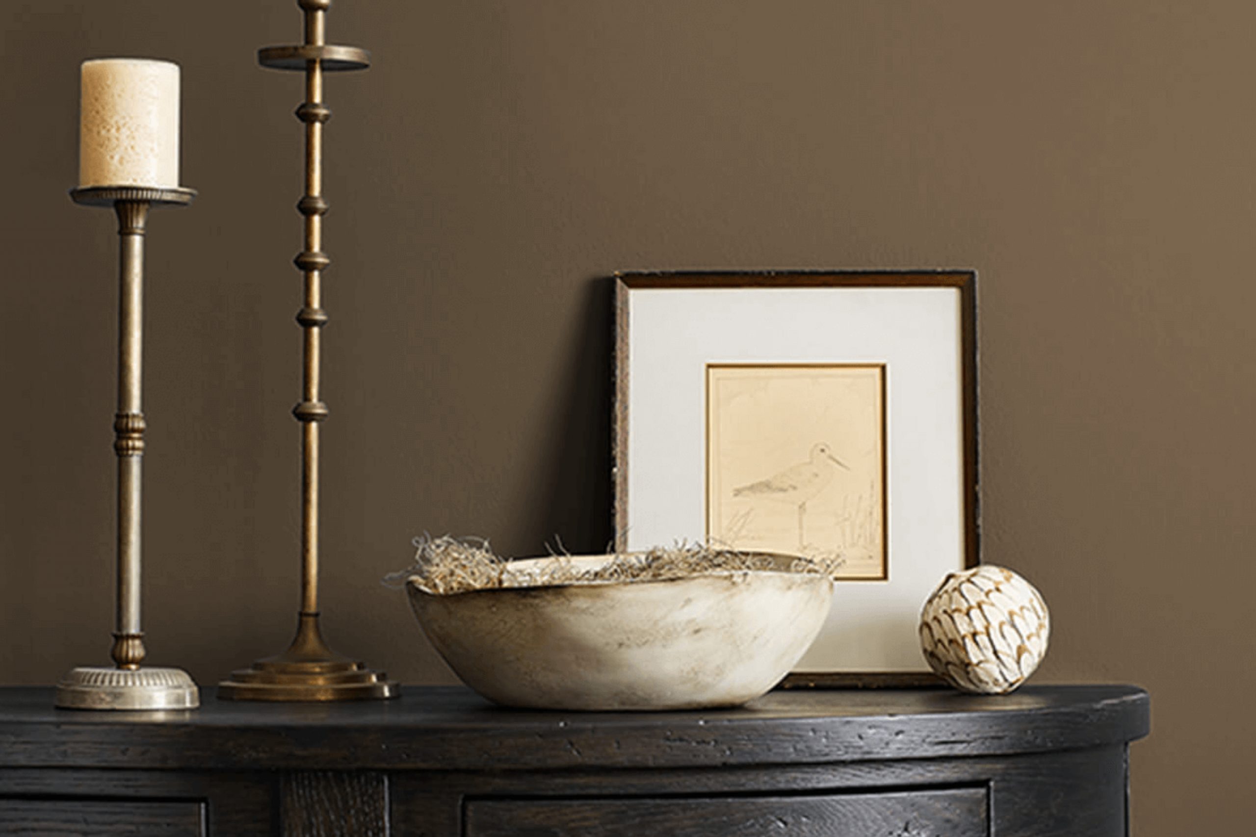
You’re standing in front of a blank wall, feeling the need for something more—a color that speaks, offering warmth without overwhelming. That’s when you consider SW 7034 Status Bronze by Sherwin-Williams. This shade steps in with an earthy elegance that seems just right for turning a room into a welcoming retreat. It’s not just another brown; it’s a blend of bronze that nudges the edges of sophistication.
There’s a comfort this color brings—a solid, grounding note that feels both cozy and classy. You might find yourself imagining it as a backdrop for cherished photos or as a calming presence in a busy space.
It pairs beautifully with natural materials, echoing the tones of wood and stone, creating a seamless flow throughout your home.
When you think about updating your space, SW 7034 Status Bronze offers a balance—the richness of bronze with the subtleness that complements rather than competes.
It’s an ideal choice for those seeking a timeless look that still feels modern. Whether it’s for your living room, bedroom, or even a home office, this color becomes a canvas for personal expression, allowing your décor to shine without losing its calm center.
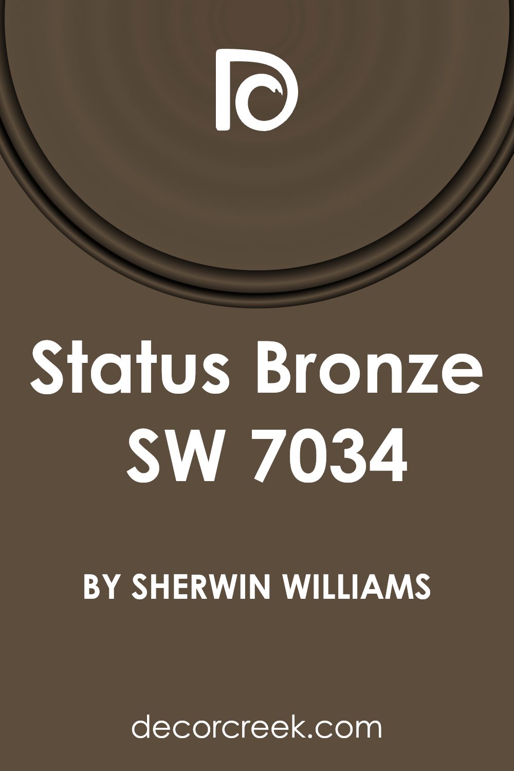
What Color Is Status Bronze SW 7034 by Sherwin Williams?
Status Bronze (SW 7034) by Sherwin Williams is a warm, earthy color that brings a sense of coziness to any space. This shade is a blend of brown and gray with a subtle green undertone, making it versatile yet distinctive. It works best in interiors that aim for a natural or organic feel. You might find it perfect for rustic, farmhouse, or traditional styles, where its warmth can enhance wood and other natural finishes.
In a rustic setting, Status Bronze complements reclaimed wood, stone fireplaces, and aged metals, creating a harmonious connection with natural elements. In a more modern space, it can add depth to minimalist designs, especially when paired with simple shapes and clean lines.
For materials, consider pairing it with natural textures like wool, linen, or burlap for an inviting look. Leather furniture or bronze metal accents will also enhance its warmth and create a cozy atmosphere. Additionally, use it against white or cream walls to make it stand out, or pair it with other soft earth tones for a soothing palette.
Overall, Status Bronze is a versatile color that can help create a grounded and inviting atmosphere, making it a great choice for living rooms, bedrooms, or any space where comfort is key.
Is Status Bronze SW 7034 by Sherwin Williams Warm or Cool color?
Status Bronze SW 7034 by Sherwin Williams is a versatile color that brings warmth and richness to home interiors. It is a medium brown shade with subtle undertones of red, giving it a reddish-brown appearance. This color can create a cozy and inviting atmosphere in living rooms, dining areas, or bedrooms.
It works well with natural elements like wood and stone, enhancing their natural beauty. When paired with lighter neutrals, Status Bronze can be the perfect accent, adding depth and interest to a room.
It complements greens, blues, and warm tones like gold and rust, allowing for flexibility in decor choices.
Because of its earthy nature, it can also tie in elements from the outdoors, creating a seamless flow from outside to inside. Overall, Status Bronze is a great choice for those looking to add warmth and a touch of nature-inspired color to their home spaces.
Undertones of Status Bronze SW 7034 by Sherwin Williams
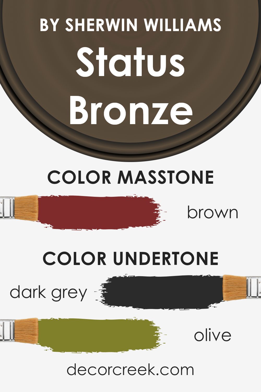
Status Bronze SW 7034 is a complex color that brings together a variety of undertones, which influence how we perceive it. These undertones include dark gray, olive, dark green, purple, navy, and several others, ranging from dark to pale shades.
Undertones can significantly affect how a color appears, depending on lighting and surrounding colors. For instance, in a room with natural light, you might notice more of the green and olive tones, giving the space a warm and earthy feel.
When applied to interior walls, these undertones can create a dynamic backdrop. The dark gray and olive undertones offer a neutral grounding effect, making it easy to match with different decor styles.
Meanwhile, the hints of purple and navy can bring an unexpected pop of depth, adding layers to the room’s aesthetic.
The presence of red and orange undertones might add warmth and energy, while pink and pale pink provide subtle softness. In dim lighting, the darker undertones might stand out more, making the room feel cozy and intimate. The versatility of these undertones makes Status Bronze a flexible choice for interiors, adapting to various environmental cues and enhancing the overall ambiance of a space without overpowering it.
What is the Masstone of the Status Bronze SW 7034 by Sherwin Williams?
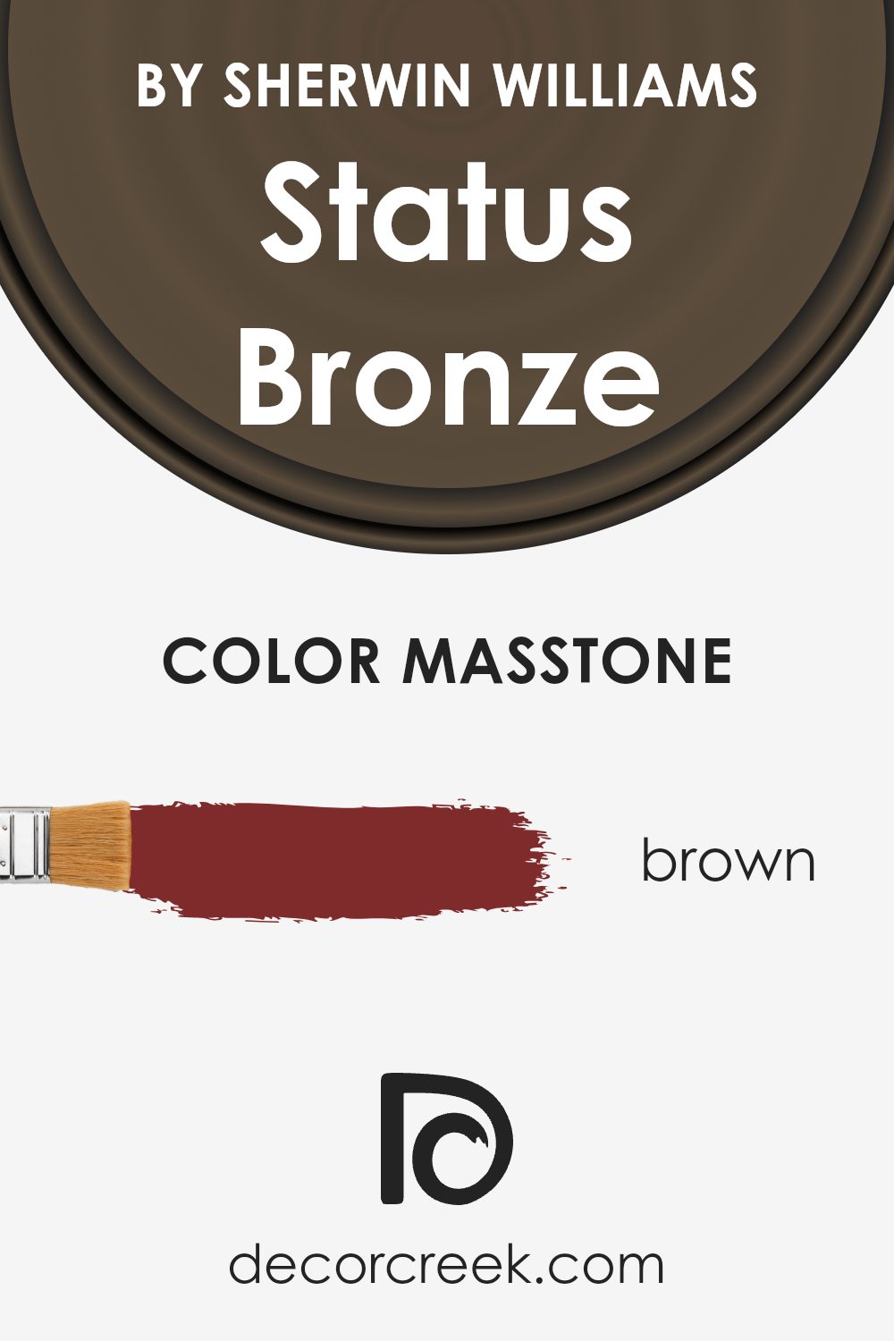
Status Bronze SW 7034 by Sherwin Williams is a deep brown shade that brings warmth to a space, thanks to its rich masstone of Brown (#802B2B). This deep color creates a cozy and inviting atmosphere in homes. Brown tones like these are known for their grounding effect, making rooms feel more secure and comfortable.
When used on walls, Status Bronze can make a large room feel more intimate and snug. It’s a versatile color that pairs well with neutral accents such as creams and beiges, which can lighten the overall look. Additionally, it combines nicely with metallics like gold and brass, adding a touch of elegance.
The warm undertones of Status Bronze can also enhance natural materials like wood, bringing out their richness. It is an excellent choice for living rooms, libraries, or any space where a touch of warmth and comfort is desired.
How Does Lighting Affect Status Bronze SW 7034 by Sherwin Williams?
Lighting plays a crucial role in how we perceive colors. The type and direction of light can change the appearance of paint colors, making them look different at various times of the day. Status Bronze (SW 7034) by Sherwin Williams is a color that can shift its appearance significantly depending on lighting conditions.
In artificial light, Status Bronze tends to take on a warmer and cozier feel. Incandescent bulbs, which emit a yellowish light, can enhance the warmer tones, making the color richer and more comforting.
On the other hand, fluorescent lights, which are cooler and bluer, might make Status Bronze appear slightly muted or dull. LED lighting can vary greatly depending on its warmth (measured in Kelvin), so it can either warm up or cool down the look of this color.
In natural light, the direction and intensity of sunlight throughout the day can produce different effects.
In north-facing rooms, where the light is more consistent but cooler and slightly blue, Status Bronze might appear more subdued, with its earthy tones becoming more pronounced. In south-facing rooms, which receive the most intense and warmest light, the color may look brighter and slightly more golden, accentuating its warm undertones.
East-facing rooms receive cool morning light and warm afternoon light. In the morning, the blue undertones of the light might make Status Bronze look cooler, while in the afternoon, it will warm up as the light turns more yellow.
West-facing rooms, conversely, are brighter and warmer in the afternoon. Under this light, Status Bronze will appear deeper and more inviting in the late afternoon and evening hours.
Overall, for a true sense of color in your home, it’s important to test paint samples in various lighting conditions throughout the day to ensure it meets your expectations.
What is the LRV of Status Bronze SW 7034 by Sherwin Williams?
The Light Reflectance Value (LRV) is a measure that tells us how much light a color reflects. It is expressed on a scale from 0 to 100, where 0 indicates absolute black, reflecting no light, and 100 represents pure white, reflecting all light. LRV helps in understanding how a paint color will look and behave in a room.
A color with a high LRV will reflect more light, making a space seem brighter and larger, while a color with a low LRV will absorb more light, creating a cozy and intimate atmosphere.
For homeowners or designers, knowing the LRV can be crucial in choosing the right color, especially in areas with limited natural light.
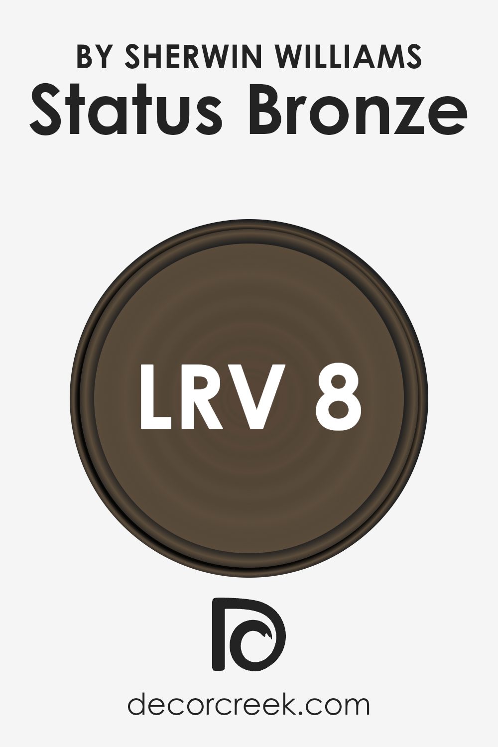
The LRV of 7.959 for this particular color means it reflects a small amount of light.
This low LRV makes it a very dark color that can create a snug and dramatic look when used on walls. It’s ideal for rooms where you want to add depth or a sense of enclosure.
In spaces with ample lighting, both natural and artificial, this color can create a rich and bold statement. However, in rooms with minimal lighting, it can make the space appear smaller or cave-like. Therefore, this color might be well-suited for accent walls or specific areas where a moodier, intense vibe is desired.
Coordinating Colors of Status Bronze SW 7034 by Sherwin Williams
Coordinating colors are shades that complement or enhance each other when used together in a space. They work by providing balance and visual harmony, ensuring that the overall look is pleasing to the eye. In the case of Status Bronze SW 7034 by Sherwin Williams, its coordinating colors help to add depth and character to a room.
The idea is to mix these colors in a way that highlights each hue’s unique qualities while ensuring that they work together seamlessly.
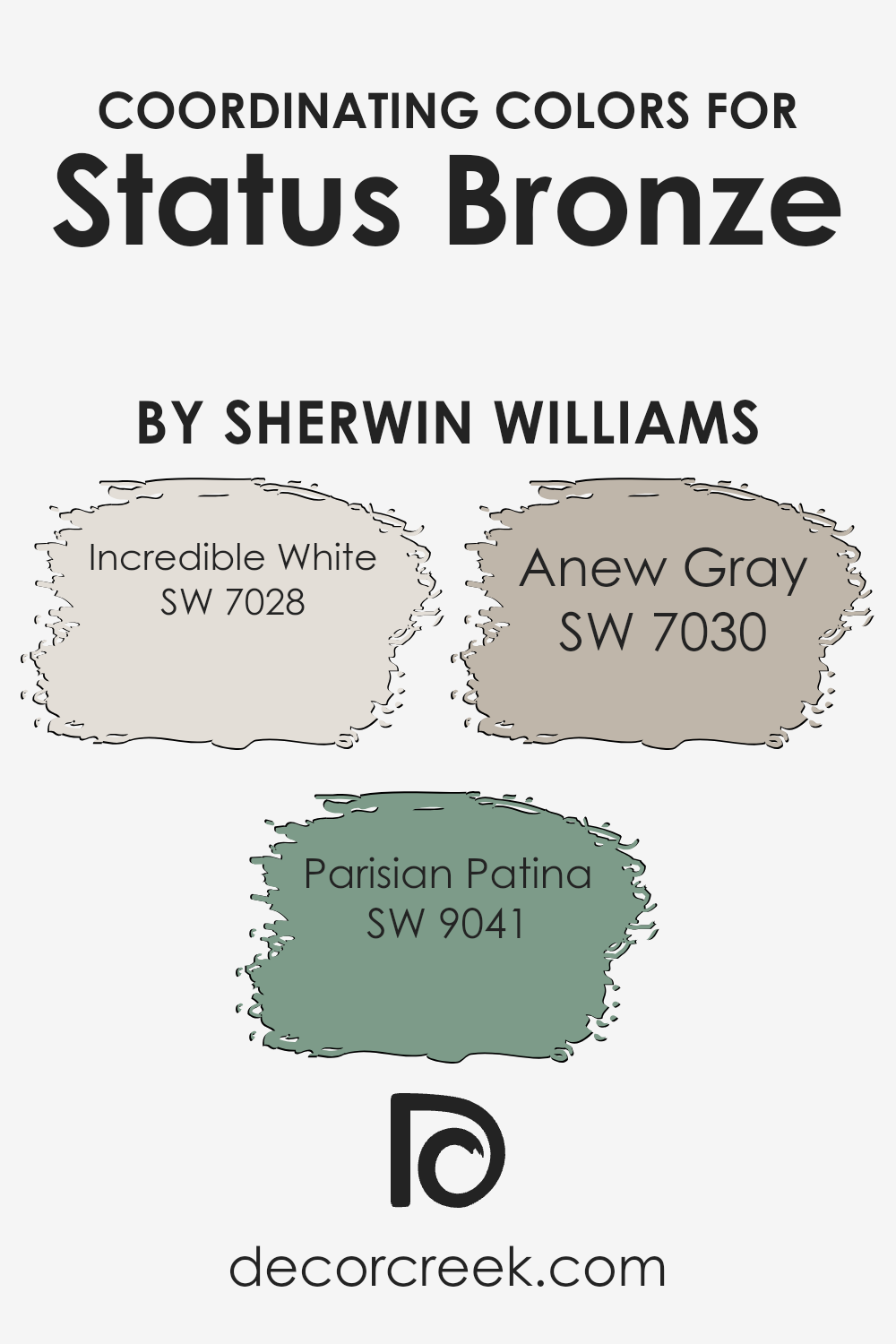
One of the coordinating colors for Status Bronze is Incredible White SW 7028. This is a soft, warm white that brings a fresh and clean feel to any room. It lightens up the space without being too stark or harsh. Another coordinating color is Parisian Patina SW 9041, which introduces a soft greenish-blue hue.
It adds a peaceful and gentle touch, bringing a sense of calmness to balance the warmth of Status Bronze. Finally, Anew Gray SW 7030 is a medium-toned gray that provides a neutral backdrop. It is neither too cool nor too warm, making it versatile enough to tie together the other colors without overpowering them. Together, these colors create a harmonious and inviting environment.
You can see recommended paint colors below:
- SW 7028 Incredible White
- SW 9041 Parisian Patina
- SW 7030 Anew Gray
What are the Trim colors of Status Bronze SW 7034 by Sherwin Williams?
Trim colors are the shades used to highlight the edges and borders of walls, doors, and windows in a room. They are important because they can frame specific areas, create visual structure, and balance the main color of the walls.
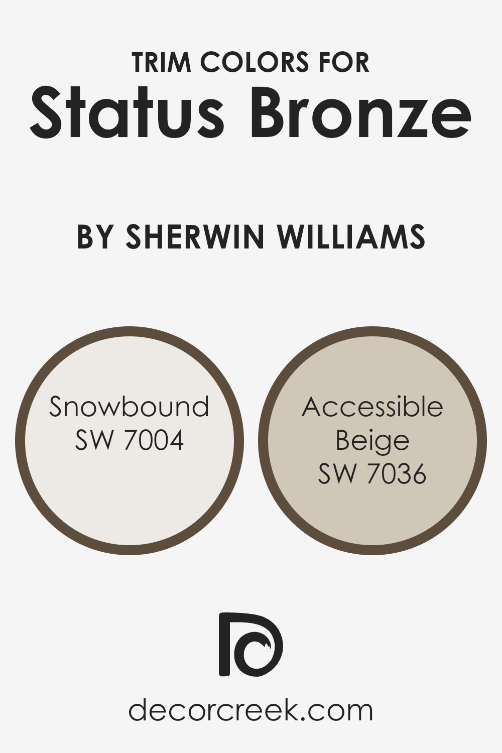
In the case of Sherwin-Williams’ shade Status Bronze SW 7034, using trim colors like Snowbound SW 7004 and Accessible Beige SW 7036 can enhance its warm, inviting look. Snowbound, a subtle off-white with a hint of warmth, provides a crisp, clean outline to accentuate the darker tones of Status Bronze without overpowering it.
On the other hand, Accessible Beige offers a light, neutral contrast that blends well without drawing too much attention from bronze walls while still providing enough definition to make architectural details stand out.
Snowbound SW 7004 is a versatile soft white that works wonderfully as a trim color, offering enough warmth to prevent spaces from feeling too stark or cold. It’s a go-to choice for a clean, fresh look around windows and doors.
Accessible Beige SW 7036, meanwhile, is a warm beige that adds effortless elegance to any area.
With its muted and subtle nature, it helps transition from the richness of the bronze to the softer elements in the room, ensuring a balanced, cohesive design throughout the space. These trim colors serve to define spaces while maintaining harmony with the dominant color on the walls.
You can see recommended paint colors below:
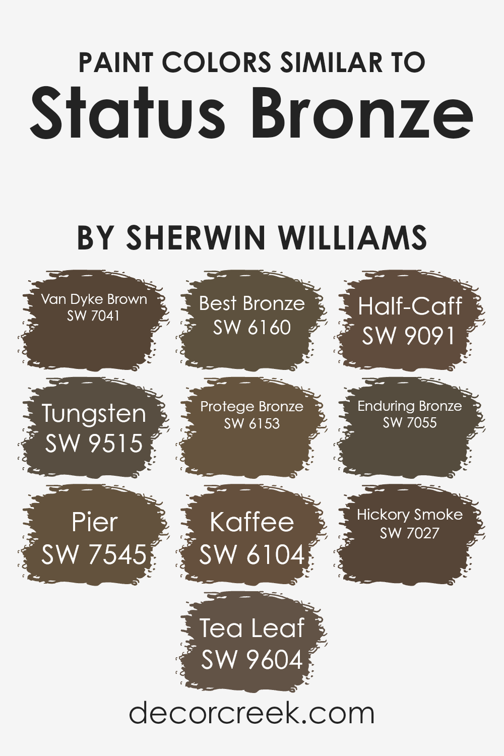
Colors Similar to Status Bronze SW 7034 by Sherwin Williams
Similar colors play a crucial role in design and decoration because they provide harmony and balance to a space. When colors are similar, they have a subtle kinship that can create a soothing and cohesive look. Status Bronze by Sherwin Williams is a warm, earthy tone that pairs beautifully with other gentle colors.
Van Dyke Brown is a rich, deep shade that adds a touch of depth, while Tungsten offers a smooth, grayish tone with a hint of warmth. Pier provides a cool, neutral balance with its subtle gray undertones, and Tea Leaf brings in a hint of nature with a soft, muted green touch.
Best Bronze and Protege Bronze are both variations that have a warm, brownish base, adding consistency and flow to any design scheme. Kaffee is a comforting, coffee-inspired color that echoes the familiar, cozy vibe we all love, while Half-Caff lightens things up with a softer, creamier note.
Enduring Bronze combines strength and subtlety with its deep, resilient brown, offering stability in any room. Hickory Smoke introduces a touch of coolness, with its soft, smoky gray tone.
Together, these colors serve as complementary allies for Status Bronze, ensuring that each room feels well-thought-out and inviting, with each shade quietly supporting the others for a unified and welcoming environment.
You can see recommended paint colors below:
- SW 7041 Van Dyke Brown
- SW 9515 Tungsten
- SW 7545 Pier
- SW 9604 Tea Leaf
- SW 6160 Best Bronze
- SW 6153 Protege Bronze
- SW 6104 Kaffee
- SW 9091 Half-Caff
- SW 7055 Enduring Bronze
- SW 7027 Hickory Smoke
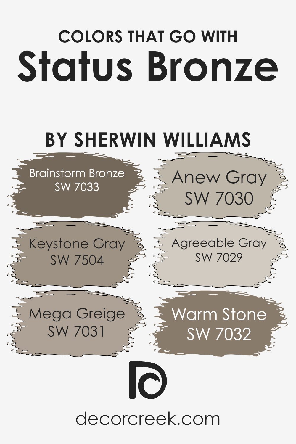
Colors that Go With Status Bronze SW 7034 by Sherwin Williams
Colors that pair with Status Bronze SW 7034 by Sherwin Williams are important because they create a balanced and cohesive look in a space, making it feel more unified and inviting. The right combination of colors can bring out the best in each hue, allowing them to enhance one another.
Status Bronze is a rich, earthy tone that works well with warmer neutrals and greiges because these colors share similar undertones, creating harmony within the room. This balance is essential whether you’re aiming for a cozy living room or a professional office setting.
The goal is to create an atmosphere that’s both comfortable and aesthetically pleasing, making you feel at ease in the space.
SW 7033 Brainstorm Bronze is a deep, substantial color that complements Status Bronze with its similar intensity, while SW 7504 Keystone Gray offers a softer, subdued tone that gently balances out the warmth.
SW 7031 Mega Greige is a neutral hue that adds depth to a room without overwhelming it, while SW 7030 Anew Gray provides a light, fresh contrast to the richness of Status Bronze. SW 7029 Agreeable Gray is a popular choice for its versatility and calming presence, perfect for keeping everything in harmony.
Lastly, SW 7032 Warm Stone brings in an earthier aspect, rounding out the palette by enhancing the natural elements in the space.
By using these colors together, you create an atmosphere where each shade plays a distinct and meaningful role.
You can see recommended paint colors below:
- SW 7033 Brainstorm Bronze
- SW 7504 Keystone Gray
- SW 7031 Mega Greige
- SW 7030 Anew Gray
- SW 7029 Agreeable Gray
- SW 7032 Warm Stone
How to Use Status Bronze SW 7034 by Sherwin Williams In Your Home?
Status Bronze (SW 7034) by Sherwin Williams is a warm, deep color that can add a cozy feel to any room. It’s a rich shade that works well as an accent color or base for a space that needs a bit of warmth. You can use Status Bronze in your living room to create a welcoming atmosphere, making it a perfect backdrop for your furniture and décor.
Pair it with neutral colors like beige or cream to balance the room, giving it a harmonious look. In the bedroom, this color can make the space feel intimate and snug, creating a restful environment.
You can also use it in a study or home office to add depth and create a focused, comfortable workspace.
Whether on an accent wall or throughout a room, Status Bronze brings a touch of warmth and richness to any area in the home.
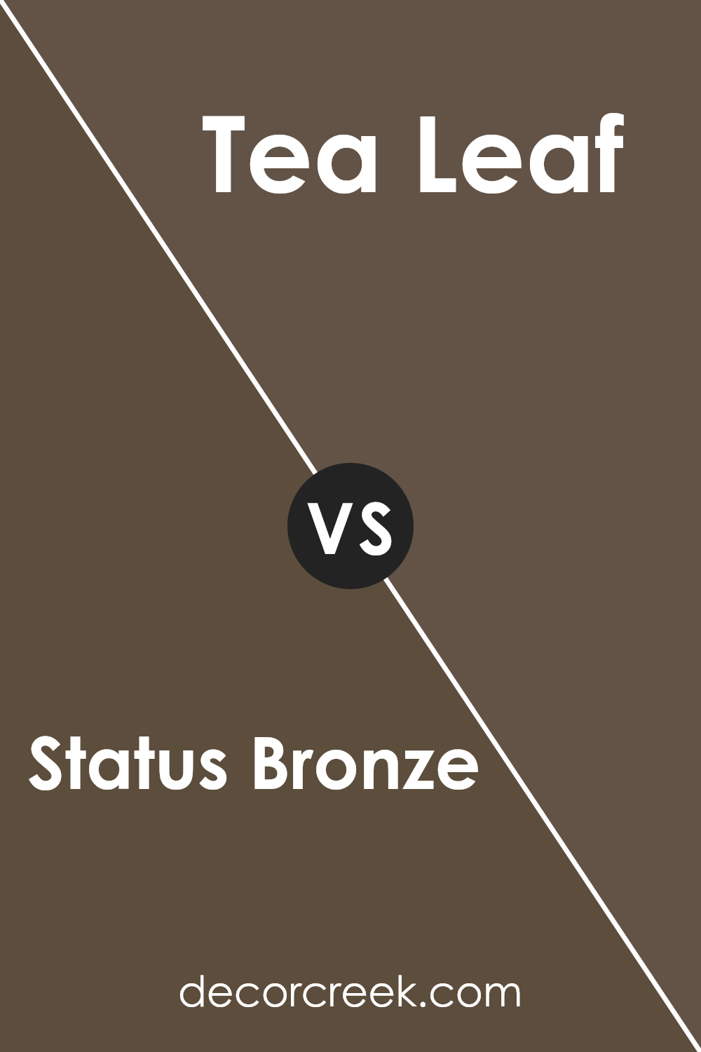
Status Bronze SW 7034 by Sherwin Williams vs Tea Leaf SW 9604 by Sherwin Williams
Status Bronze SW 7034 and Tea Leaf SW 9604 are two distinct colors offered by Sherwin Williams. Status Bronze is a warm, earthy brown with hints of bronze, providing a grounding and classic feel to any space. It works well in both traditional and contemporary settings, adding depth and warmth to a room.
Tea Leaf, on the other hand, is a softer, muted green that brings a sense of freshness and calm. It evokes the natural beauty of foliage and is perfect for creating a soothing environment. This color pairs nicely with neutral tones or other natural colors, making it versatile for various design styles.
When compared, Status Bronze is richer and more robust, ideal for adding a cozy touch, while Tea Leaf offers a lighter, refreshing vibe that can make a space feel open and airy. Both colors have unique characteristics, making them suitable for different moods and design preferences.
You can see recommended paint color below:
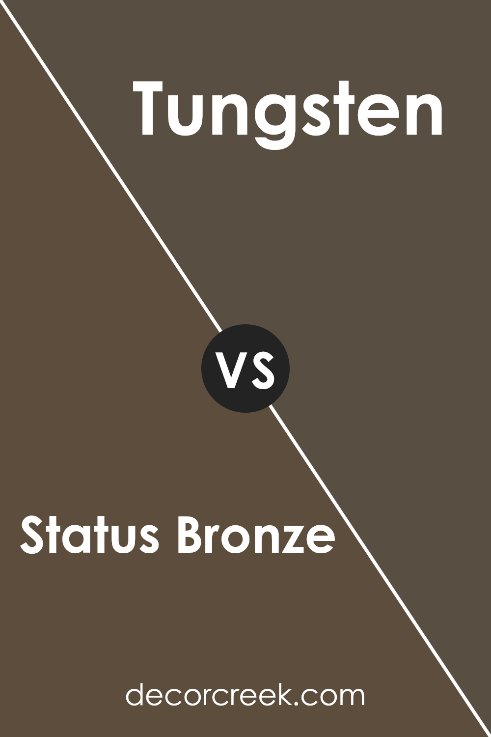
Status Bronze SW 7034 by Sherwin Williams vs Tungsten SW 9515 by Sherwin Williams
Status Bronze SW 7034 and Tungsten SW 9515 by Sherwin Williams offer distinct moods and applications. Status Bronze is a warm, earthy color with brown and gold tones that add a cozy, grounded feel to a space. It works well in rooms where you want to create a warm and inviting atmosphere, like living rooms or dining areas.
In contrast, Tungsten is a cool, deep gray that has a more modern, sleek vibe. It provides a calm and neutral background, making it a good choice for spaces where you want a clean, understated look, such as offices or contemporary living spaces.
Both colors can be used effectively, depending on whether you prefer the warmth and comfort of bronze or the cool, modern feel of gray.
You can see recommended paint color below:
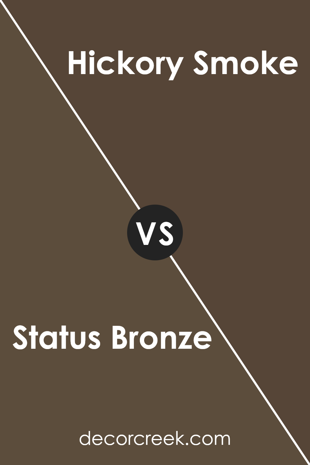
Status Bronze SW 7034 by Sherwin Williams vs Hickory Smoke SW 7027 by Sherwin Williams
Status Bronze and Hickory Smoke are two unique colors by Sherwin Williams that bring different vibes to a space. Status Bronze is a warm, earthy tone with hints of both brown and gray. It’s a versatile color that can add a cozy touch to a room, making it feel grounded and inviting.
On the flip side, Hickory Smoke is a cooler, neutral gray. It has a crisp and modern feel, making it suitable for creating a clean and fresh look. While Status Bronze can sometimes be seen as more traditional and perfect for adding warmth, Hickory Smoke is more understated and sleek.
Together, they can be used to balance a space—Status Bronze bringing warmth and depth, while Hickory Smoke offers a contemporary and airy atmosphere. Both colors complement each other well, making them a good pair for a harmonious and well-rounded design.
You can see recommended paint color below:
- SW 7027 Hickory Smoke
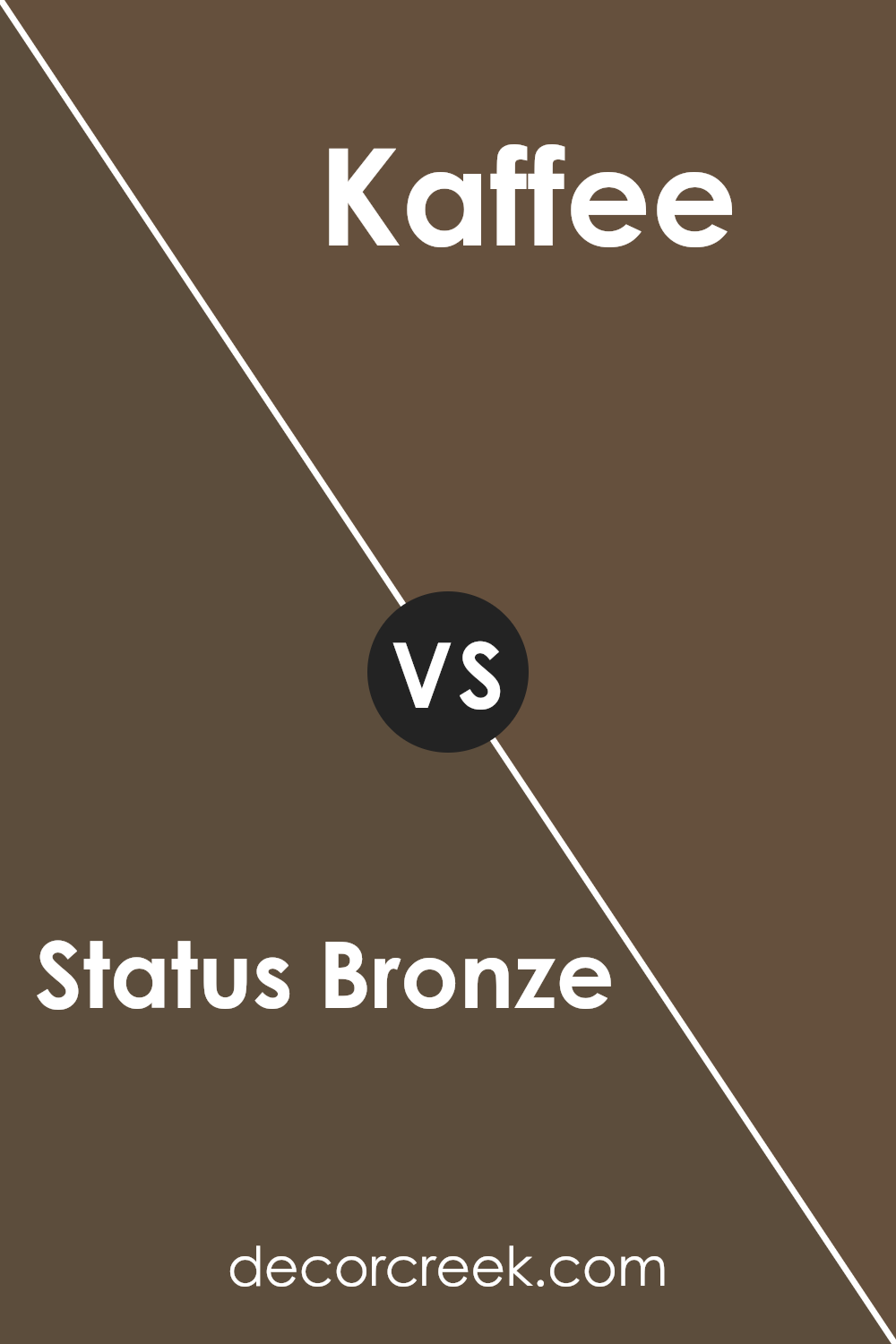
Status Bronze SW 7034 by Sherwin Williams vs Kaffee SW 6104 by Sherwin Williams
Status Bronze and Kaffee are two warm and earthy colors by Sherwin Williams. Status Bronze is a muted bronze with slight green undertones, giving it a versatile and balanced feel. It can be used in both traditional and modern settings. Its understated nature makes it a great backdrop, adding subtle warmth without being overpowering.
On the other hand, Kaffee is a rich, deep brown with warm tones. It exudes coziness and is perfect for creating a snug, inviting space. This color works well in areas where you want to accentuate comfort, such as living rooms or bedrooms.
While both these colors share warmth, Status Bronze has a more neutral vibe, whereas Kaffee leans into a darker, more enveloping hue. Status Bronze can open up a space with its softer tone, while Kaffee adds depth and dimension, offering a cozy, intimate atmosphere.
You can see recommended paint color below:
- SW 6104 Kaffee
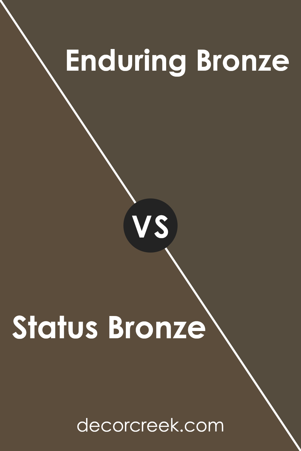
Status Bronze SW 7034 by Sherwin Williams vs Enduring Bronze SW 7055 by Sherwin Williams
Status Bronze (SW 7034) and Enduring Bronze (SW 7055) are two rich, earthy shades from Sherwin Williams that add warmth and character to any space. Status Bronze is a warm, medium brown with subtle golden undertones. It brings a cozy and welcoming feel to a room, making it ideal for living areas or spaces where you want a comfortable atmosphere.
On the other hand, Enduring Bronze is a bit darker and has a more robust brown tone. It conveys a strong, stable presence and works well in areas you want to feel grounded and secure. It can be a great choice for accent walls or exterior surfaces where a bold statement is desired.
Both colors have a natural, organic quality, but Status Bronze leans towards a softer, lighter ambiance, while Enduring Bronze offers deeper, more intense depth. Depending on your design goals, you can choose between the warmth of Status Bronze or the richness of Enduring Bronze.
You can see recommended paint color below:
- SW 7055 Enduring Bronze
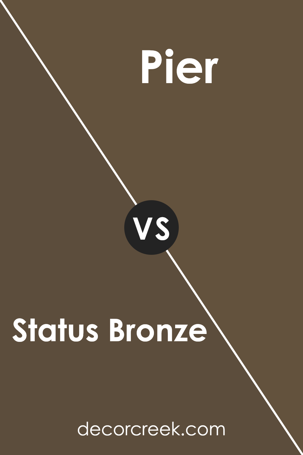
Status Bronze SW 7034 by Sherwin Williams vs Pier SW 7545 by Sherwin Williams
Status Bronze SW 7034 and Pier SW 7545 by Sherwin Williams are both elegant, earthy colors. Status Bronze is a warm, medium brown with subtle green undertones. It has a cozy, welcoming feel, bringing a sense of comfort and richness to any space. On the other hand, Pier is a softer, cooler gray with a hint of earthy brown. It is more subdued and calming, offering a neutral backdrop that complements many styles.
When you compare them, Status Bronze stands out with its warmer, more pronounced presence, making it a great choice for spaces where you want to add warmth and depth. Pier, being cooler and more muted, is ideal for creating a relaxed, understated atmosphere.
Both colors work well in interiors, but their impact will vary depending on the lighting and other colors in the room. Status Bronze might be better in living spaces, while Pier can enhance bedrooms and bathrooms.
You can see recommended paint color below:
- SW 7545 Pier
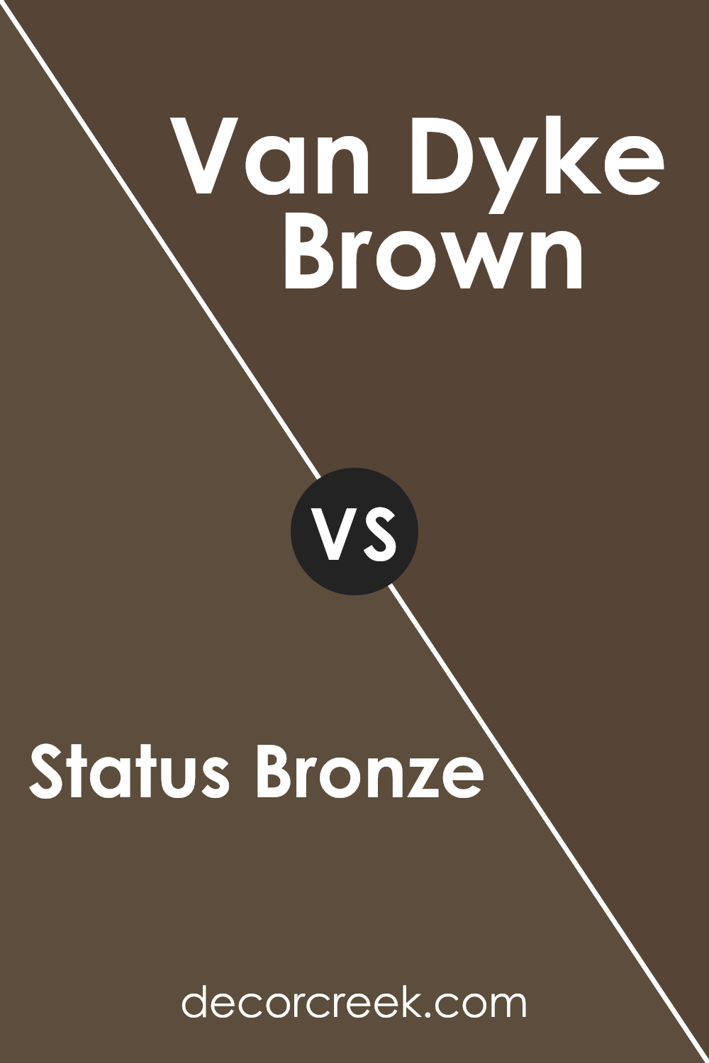
Status Bronze SW 7034 by Sherwin Williams vs Van Dyke Brown SW 7041 by Sherwin Williams
Status Bronze SW 7034 and Van Dyke Brown SW 7041, both by Sherwin Williams, are earthy tones, but they have different vibes. Status Bronze is a warm, medium brown with golden undertones, giving it a more welcoming and inviting feel. It feels like the color you’d find in a cozy living room, creating a comforting space.
On the other hand, Van Dyke Brown is a deeper, richer brown with a cooler undertone. It feels more like a classic, sophisticated choice, suitable for a study or an accent wall to add depth.
When paired, these colors can work together to balance warmth and richness. Status Bronze might be used to soften a room, while Van Dyke Brown can provide contrast and add some drama to a space.
Both colors lend a natural look, but Status Bronze will feel more relaxed, while Van Dyke Brown carries a classic tone.
You can see recommended paint color below:
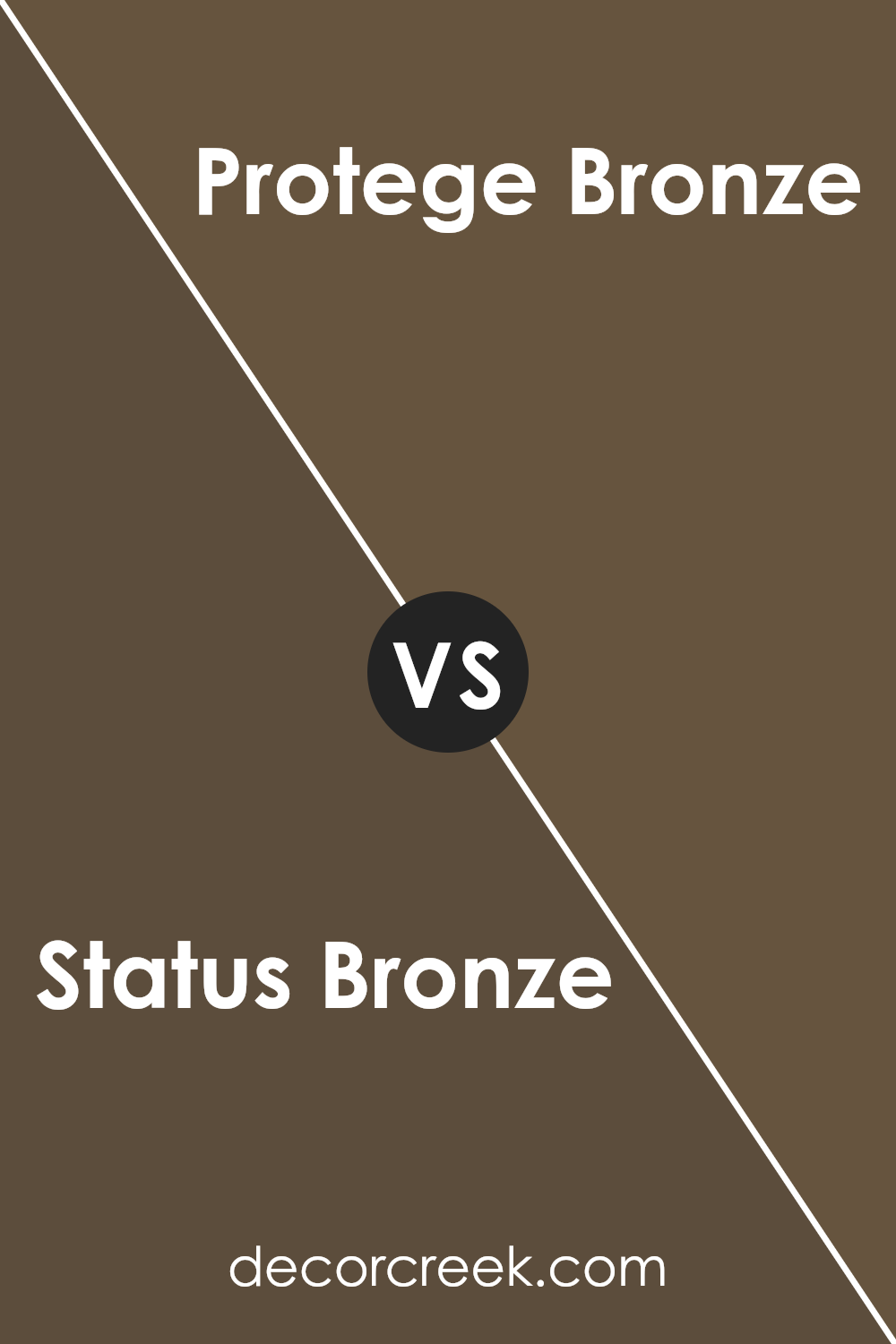
Status Bronze SW 7034 by Sherwin Williams vs Protege Bronze SW 6153 by Sherwin Williams
Status Bronze (SW 7034) and Protege Bronze (SW 6153) by Sherwin Williams are two similar yet distinct colors. Status Bronze is a warm, medium-toned brown with gray undertones, creating a balanced and neutral feel. It’s versatile, making it suitable for various spaces and styles.
In contrast, Protege Bronze is slightly darker and richer, offering a deeper brown with subtle hints of green. This gives it an earthy feel, perfect for adding warmth and coziness to a room.
While both colors belong to the bronze family, Status Bronze provides a more muted and understated look, whereas Protege Bronze brings a stronger, more pronounced presence. They both work well in living rooms, kitchens, or even as exterior colors but can create different atmospheres. Mixing them with lighter shades or natural materials can highlight their beauty, making any space feel inviting and grounded.
You can see recommended paint color below:
- SW 6153 Protege Bronze
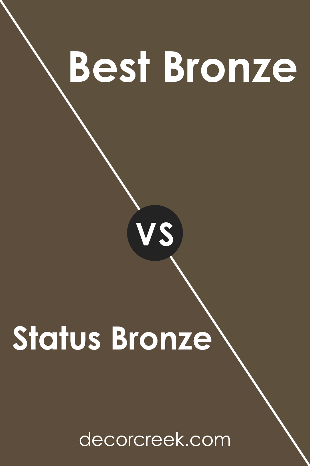
Status Bronze SW 7034 by Sherwin Williams vs Best Bronze SW 6160 by Sherwin Williams
Status Bronze SW 7034 and Best Bronze SW 6160 are two popular colors from Sherwin Williams, but they offer distinct looks. Status Bronze is a medium brown with a subtle gold undertone. It has a warm and rich appearance, making it a great choice for adding coziness to a space. It’s versatile enough to be used in living rooms or cozy dining areas, creating an inviting atmosphere.
On the other hand, Best Bronze is slightly darker and has more green in its undertone. This gives it a stronger earthy feel compared to Status Bronze. It’s ideal for spaces where you want a bit more drama and depth, like an accent wall or study.
Best Bronze feels slightly bolder, with a hint of natural elegance.
Both colors are excellent for creating warmth, but their undertones make them suitable for different moods and settings. Consider what kind of atmosphere you want, and choose accordingly.
You can see recommended paint color below:
- SW 6160 Best Bronze
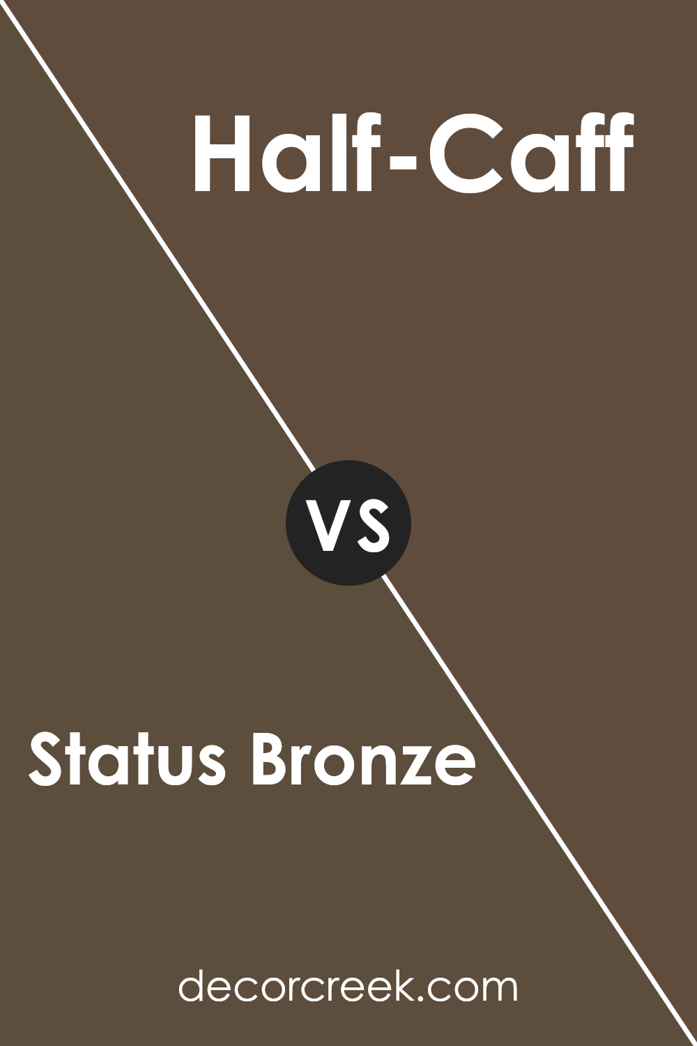
Status Bronze SW 7034 by Sherwin Williams vs Half-Caff SW 9091 by Sherwin Williams
Status Bronze and Half-Caff are both paint colors by Sherwin Williams with distinct qualities. Status Bronze is a warm, earthy tone with a brownish-gold appearance. It lends a rich and cozy feel to a room, perfect for creating an inviting atmosphere.
On the other hand, Half-Caff offers a lighter and more muted shade of brown. It is softer and has a relaxed, calming presence.
When comparing the two, Status Bronze is ideal for spaces where you want to add depth and richness. It can make a bold statement, especially when used as an accent wall or in a room with plenty of light. Half-Caff, being lighter, can make a space feel larger and more open.
It works well in rooms where you want a subtle backdrop without overwhelming the other elements in the design. Both colors can be used to create warm and welcoming environments, but they serve different purposes depending on the desired mood and effect.
You can see recommended paint color below:
- SW 9091 Half-Caff
Conclusion
It’s a warm, rich color that reminds me of a gentle hug from the sun or a cozy evening by a campfire. This shade can make any room in a house feel warm and friendly, like a big welcome for everyone who steps in.
Status Bronze is not too dark and not too light, which means it fits in many different places like living rooms, kitchens, or even bedrooms.
It has a special way of standing out while still making sure everything else in the room looks just right. I think it’s a really clever choice for people who want their walls to add some warmth and coziness to their homes.
When I imagine a room painted with Status Bronze, I picture happy family gatherings, friends laughing and sharing stories, and a peaceful place to relax after a busy day.
It’s like the color gives a big, warm smile to anyone who sees it. Overall, choosing SW 7034 Status Bronze is like picking a friendly companion to be part of your home.

Ever wished paint sampling was as easy as sticking a sticker? Guess what? Now it is! Discover Samplize's unique Peel & Stick samples.
Get paint samples

