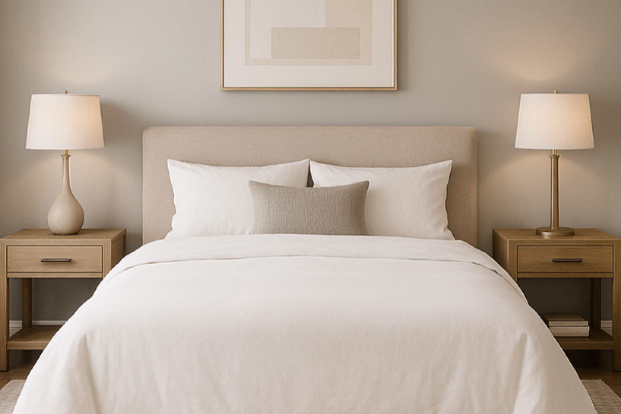
If you’re looking to refresh your space with a versatile and sophisticated color, let me introduce you to Sherwin Williams’ SW 0054 Twilight Gray. My first encounter with this shade was during a weekend project, where I was on a quest to find a timeless gray that would fit perfectly with various decorations and styles in my home. Twilight Gray stood out as a unique, neutral gray with just the right balance of cool and warm tones, making it exceptionally adaptable for any room.
This gray has the ability to subtly shift its mood depending on the lighting, adding depth and interest without overpowering the space. It blends seamlessly with other colors, providing a stunning backdrop for both bold statement pieces and softer, more understated decor. Whether you’re updating a living room, bedroom, or even the kitchen, Twilight Gray offers a fresh, modern feel that is both calming and inviting.
Using Twilight Gray in your redecorating plans can give your home a refreshed look while maintaining a classic feel that won’t go out of style.
I found it to be the perfect solution for my decorating dilemmas, and I believe it can be an excellent choice for anyone hoping to achieve a chic and cohesive space.
What Color Is Twilight Gray SW 0054 by Sherwin Williams?
Twilight Gray by Sherwin Williams is a versatile and soothing gray tone that comfortably balances between a genuine gray and a hint of warmth, making it highly adaptable for various interior styles. This color is particularly effective in creating a cozy, inviting atmosphere without feeling too heavy or overwhelming.
Its neutrality makes it an excellent choice for minimalist spaces, contemporary settings, or even traditional rooms looking for a modern twist. What distinguishes Twilight Gray is its ability to act as a perfect backdrop for a wide range of materials and textures.
In rooms with rich wooden elements like hardwood floors or wooden furniture, this color grounds the natural textures without overpowering them. It also pairs wonderfully with metal accents, such as stainless steel or brass, highlighting their sheen and adding a touch of elegance.
The soothing quality of Twilight Gray makes it ideal for soft textiles like velvet or linen, adding layers of comfort to any space. It is also a popular choice for kitchens and bathrooms where you need a color that combines well with marble or tile.
Ultimately, Twilight Gray offers a charming and unimposing base that complements a variety of decor styles and preferences, enhancing the overall feel of a home while keeping a chic, cohesive look.
Is Twilight Gray SW 0054 by Sherwin Williams Warm or Cool color?
Twilight Gray is a versatile paint color from Sherwin Williams, perfect for adding a neutral, calming touch to any room in your home. This shade of gray manages to strike a perfect balance, neither too dark nor too light, making it an excellent choice for those looking to create a cozy yet modern space.
Its neutrality means it can pair well with a wide variety of colors, from bold and bright hues to softer pastels, allowing for flexible design choices. This color works well in rooms that get a lot of natural light, as the light brings out the subtle depth and dimension of the gray, preventing it from looking flat.
For smaller or darker spaces, pairing Twilight Gray with lighter colors for trim or furnishings can help make the room appear bigger and brighter. Overall, it’s a practical color choice that can help create a pleasant and inviting atmosphere in your home.
Undertones of Twilight Gray SW 0054 by Sherwin Williams
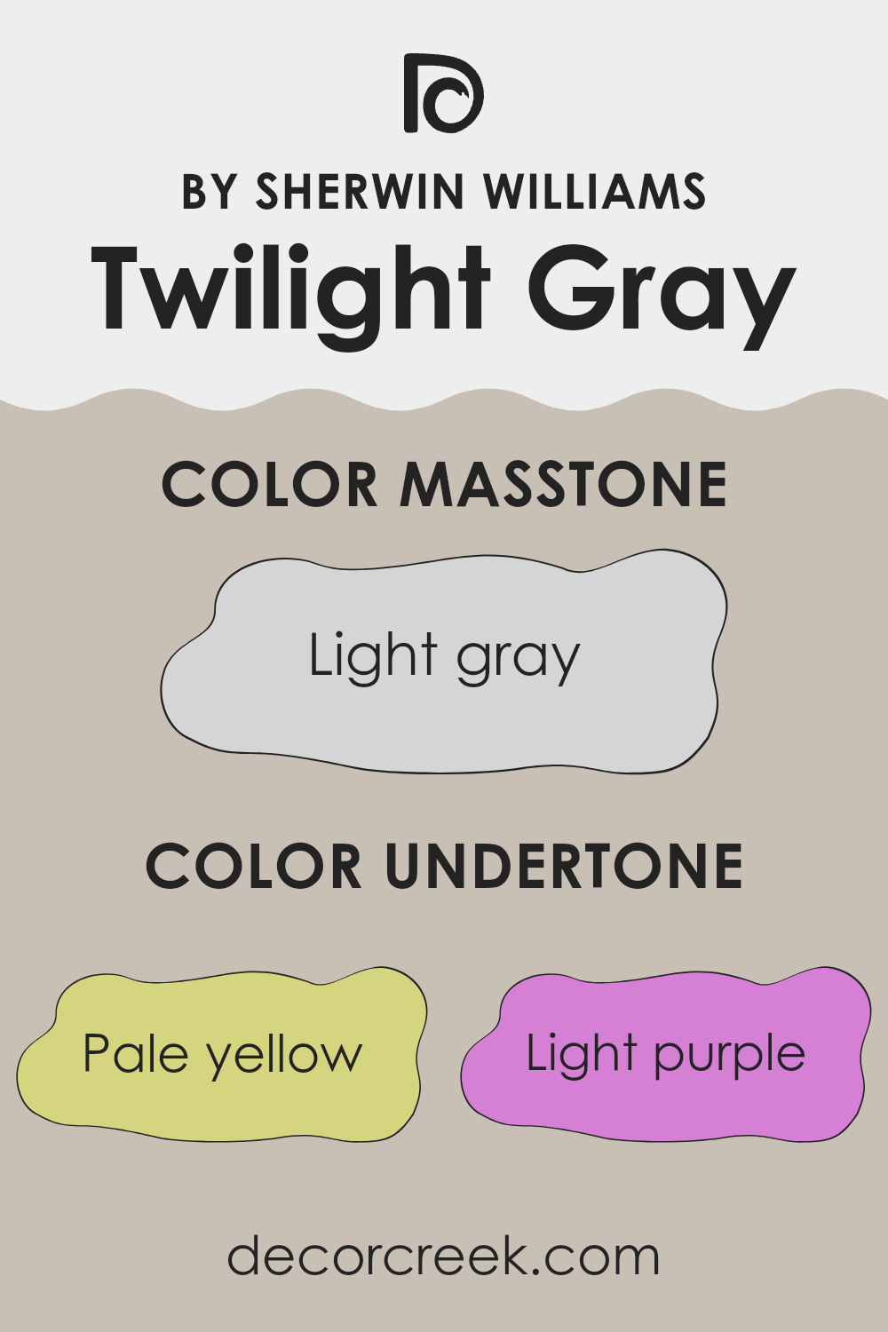
Twilight Gray is a unique, versatile color that can create different moods and looks in a room, depending on the light and surroundings. The undertones in this shade are varied, from pale yellow and light purple to light blue, pale pink, mint, lilac, and gray. Each of these undertones can subtly influence the main color, changing how it appears under different lighting conditions.
Undertones are important because they can change the perception of a color. For example, a gray with a pale yellow undertone might look warmer, more welcoming, while a gray with a lilac undertone might seem cooler and more subdued. This makes picking the right color more challenging but also more rewarding once you find the perfect match for your space.
When Twilight Gray is used on interior walls, these undertones come into play, influenced by the room’s lighting and furnishings. In natural daylight, the light blue and mint undertones might make the walls feel fresh and airy. In artificial light, the pale pink or lilac could make the space feel cozy and calm.
This color, with its complex undertone blend, can shift in mood from morning to evening and room to room, making it an excellent choice for those who enjoy a dynamic interior that adjusts with the day’s rhythm. This adaptability makes it ideal for living spaces, bedrooms, and even home offices, providing a neutral yet rich backdrop for various decor styles.
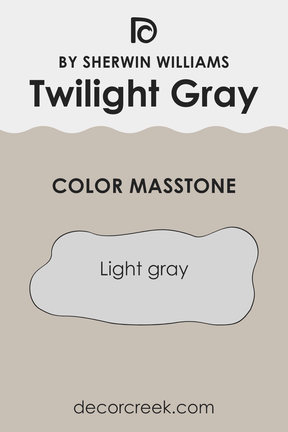
What is the Masstone of the Twilight Gray SW 0054 by Sherwin Williams?
Twilight Gray SW 0054 by Sherwin Williams is a light gray color with a hexadecimal code of #D5D5D5. This shade is gentle and neutral, making it an excellent choice for various spaces in a home.
Its lightness contributes to an airy feel, which can make smaller rooms appear larger and more open. Because it’s not overpowering, it pairs well with almost any other color, offering flexibility in design choices whether you want to accent with bolder colors or keep a monochrome palette. This color works well in living rooms, bedrooms, and kitchens because it provides a clean backdrop that highlights other decor elements.
Additionally, its simplicity helps to create a calming atmosphere, which is perfect for areas where you want to relax. Twilight Gray is also practical as it tends to hide minor imperfections on walls better than darker colors, which can make maintenance a bit easier.
How Does Lighting Affect Twilight Gray SW 0054 by Sherwin Williams?
Lighting plays a critical role in how we perceive colors in our surroundings. Different types of light can change the way a color looks, affecting both its intensity and hue. Twilight Gray is a versatile color that can appear differently depending on whether it’s under natural or artificial light.
In artificial lighting, Twilight Gray tends to look slightly warmer. This is because most indoor lights cast a yellow tone, softening the color and making it feel more cozy and inviting. Under fluorescent lights, however, it might look a bit cooler and more austere, as these often emit a bluish light.
Natural light, on the other hand, brings out the truest form of Twilight Gray. In sunlight, the color can reveal subtle undertones and variations, making it appear more dynamic. The quality and angle of natural light also affect how this color looks. For example, in north-faced rooms, which receive less direct sunlight, Twilight Gray can look somewhat cooler and more shadowy. This can create a calm, understated atmosphere.
In south-faced rooms, where sunlight is abundant for most of the day, the color can look lighter and more vibrant. This makes the room feel brighter and more lively. East-faced rooms see bright morning light, which makes Twilight Gray appear crisp and fresh in the mornings but potentially shadowy as the day progresses. Conversely, in west-faced rooms, the color may look softer and muted in the mornings, but it will warm up and become more pronounced with the golden hues of the setting sun.
Understanding these variations can help you decide where to apply this color effectively in your home, depending on the mood and atmosphere you wish to create in each space.
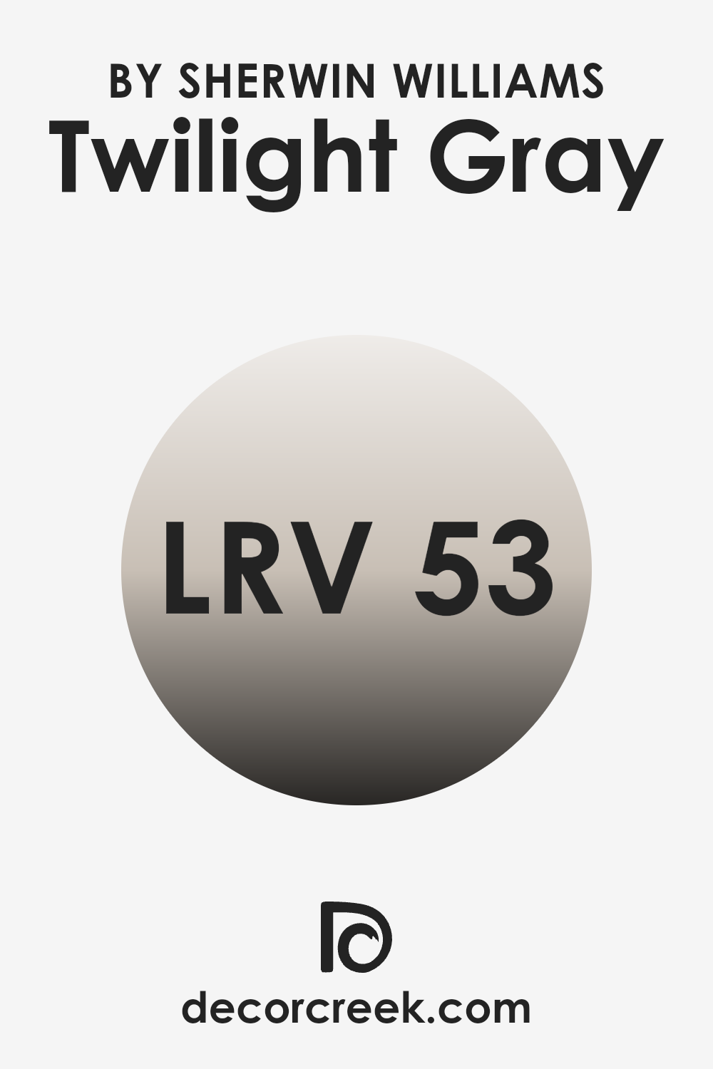
What is the LRV of Twilight Gray SW 0054 by Sherwin Williams?
LRV stands for Light Reflectance Value and is a measure used to indicate the amount of visible and usable light that reflects from or absorbs into a painted surface. A higher LRV means that the color reflects more light, making it appear lighter, while a lower LRV means it absorbs more light, making it appear darker.
LRV is a helpful metric for designers and homeowners because it helps predict how colors will look under different lighting conditions. For example, colors with a higher LRV can make a room feel more open and airy, while colors with a lower LRV can give a room a cozier or more enclosed feel.
In the case of Twilight Gray, with an LRV of 52.746, the shade falls in the mid-range of the scale. This means it neither reflects an extremely high amount of light nor absorbs too much, giving it a balanced quality that works well in various lighting situations. This versatility makes Twilight Gray a practical choice for rooms that experience changing light throughout the day. It won’t feel overly bright in significant sunlight nor too dark in dimmer conditions, maintaining a steady appearance that’s easy on the eyes regardless of natural light variations.
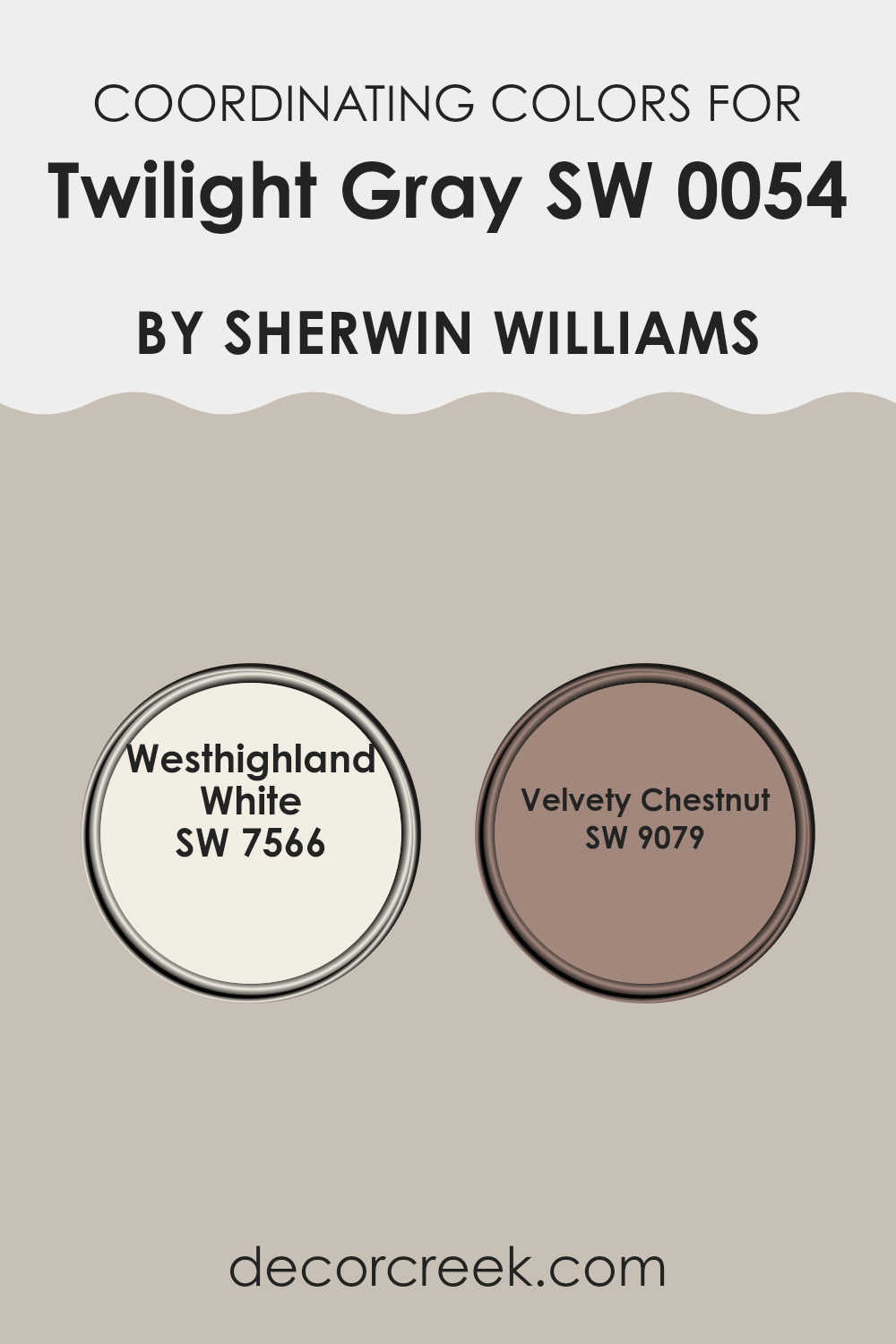
Coordinating Colors of Twilight Gray SW 0054 by Sherwin Williams
Coordinating colors are hues that complement each other and create a visually harmonious palette when used together in interior design. They can be based on contrasting colors, which are opposite each other on the color wheel, or analogous colors, which are next to each other on the color wheel. For Twilight Gray by Sherwin Williams, the coordinating colors can enhance the main shade by adding depth and interest to the design of a room. For example, using colors that contrast nicely with Twilight Gray can make details pop, while closer, subtler shades can create a gentle, cohesive look.
One of the coordinating colors for Twilight Gray is Westhighland White (SW 7566). This is a clean, bright white that acts as a perfect counterbalance to the deeper, more muted tone of Twilight Gray. It’s ideal for trim, ceilings, and accents that you want to stand out crisply against more subdued colors.
Another great complementary color is Velvety Chestnut (SW 9079), which is a rich, warm brown shade. This color adds a touch of warmth and natural elegance, providing a stunning contrast that is neither too stark nor too overpowering. Together, these colors work to create environments that are both welcoming and visually appealing.
You can see recommended paint colors below:
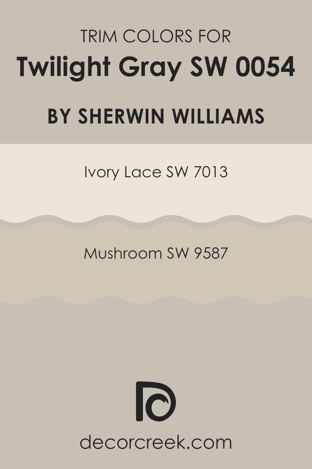
What are the Trim colors of Twilight Gray SW 0054 by Sherwin Williams?
Trim colors are essentially highlight colors used to accentuate key architectural details like door frames, window sills, baseboards, and crown moldings in a space. They play a crucial role in defining the overall look and feel of a room by creating visual boundaries and contrasts that make wall colors and features stand out. For Twilight Gray by Sherwin Williams, a well-chosen trim color can enhance the depth and appeal of this neutral and adaptable shade, emphasizing its understated elegance without overpowering it.
Ivory Lace (SW 7013) is a warm, soft white that can provide a gentle contrast against the coolness of Twilight Gray, giving a space a clean and inviting look. The subtly creamy tone of Ivory Lace helps to soften the edges and corners of a room, making it feel more cohesive.
Mushroom (SW 9587), on the other hand, is a rich, earthy beige that offers a stronger contrast and adds a hint of natural warmth to the rooms. This color can enhance the depth of Twilight Gray, creating a more defined and grounded aesthetic that enriches the overall ambiance. Together, both these trim colors offer fantastic choices for complementing Twilight Gray and can be selected based on the desired impact and warmth in the room design.
You can see recommended paint colors below:
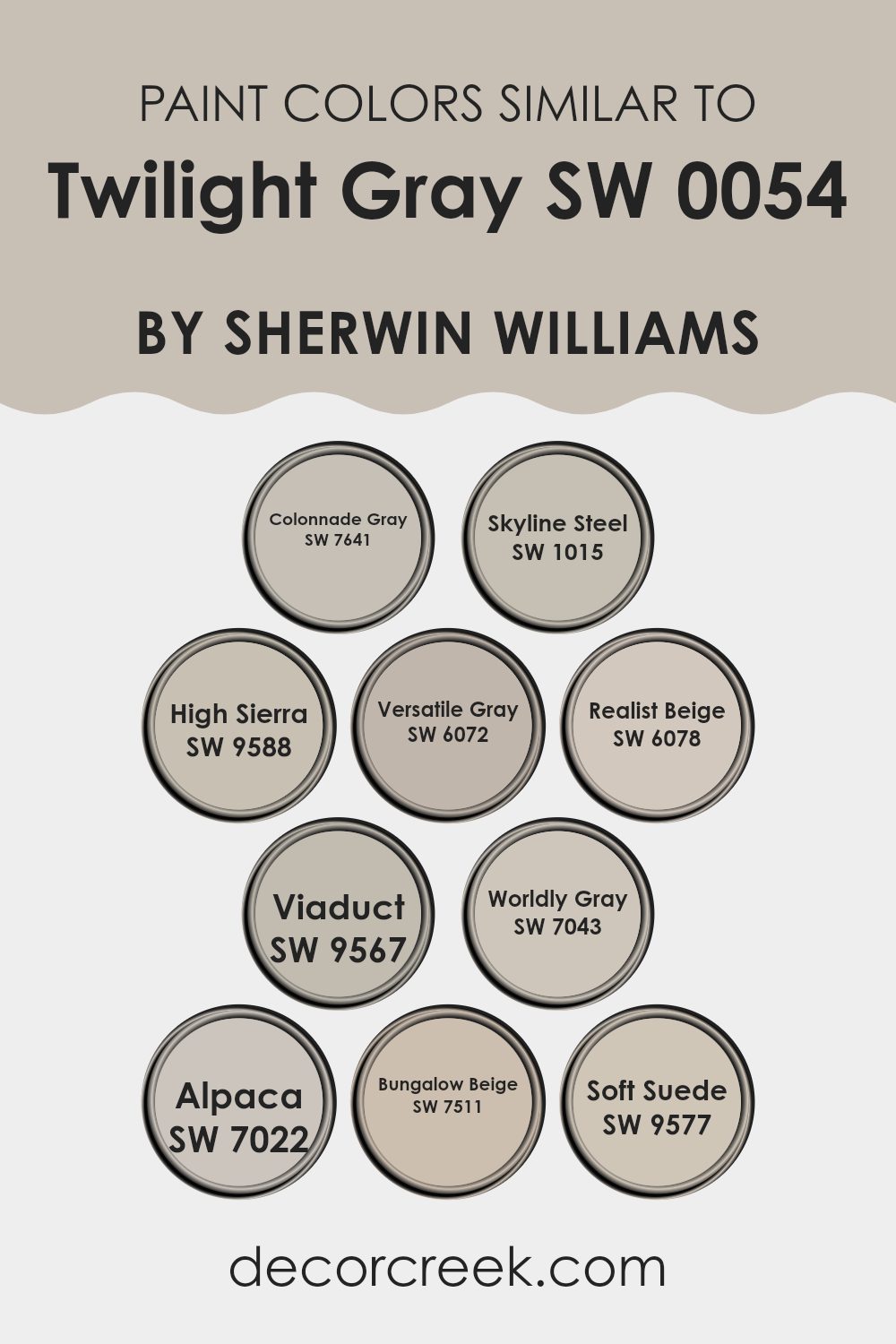
Colors Similar to Twilight Gray SW 0054 by Sherwin Williams
Using similar colors in a design scheme can ensure a harmonious and visually cohesive environment. When colors like Twilight Gray by Sherwin Williams and its related shades are employed, they naturally create a sense of continuity and balance, which can make the space more visually appealing and comfortable. Subtle color differences can add depth and complexity to the design, allowing each room or space to have its unique character while maintaining an overarching unity.
For example, Colonnade Gray is a gentle gray with a warm undertone that complements Twilight Gray, giving a clean and inviting feel. Skyline Steel, slightly lighter, offers a soft backdrop that is elegantly understated. High Sierra provides a richer, earthier tone that can anchor a space with its robust hue.
Versatile Gray, true to its name, adapts easily, blending seamlessly with a variety of color palettes. Realist Beige introduces a subtle hint of warmth, making it ideal for creating cozy environments. Viaduct, another interesting hue, leans towards a deeper gray, giving weight and depth to the color scheme. Worldly Gray adds a touch of sophistication without being overpowering, and Alpaca offers a muted, plush appearance that pairs beautifully with other neutral tones. Bungalow Beige is soft and light, providing a crisp, clean look that’s always in style.
Finally, Soft Suede brings a rich, creamy color into the mix, introducing a subtle contrast while maintaining the overall soothing palette. Each of these colors can independently make a statement or work in perfect harmony to create inviting and polished spaces.
You can see recommended paint colors below:
- SW 7641 Colonnade Gray
- SW 1015 Skyline Steel
- SW 9588 High Sierra
- SW 6072 Versatile Gray
- SW 6078 Realist Beige
- SW 9567 Viaduct
- SW 7043 Worldly Gray
- SW 7022 Alpaca
- SW 7511 Bungalow Beige
- SW 9577 Soft Suede
How to Use Twilight Gray SW 0054 by Sherwin Williams In Your Home?
Twilight Gray SW 0054 by Sherwin Williams is a versatile paint color that you can use in various ways in your home. Its balanced shade of gray provides a neat and clean look, making it an excellent choice for living spaces. This color works well in both brightly lit and dimly lit rooms, reflecting enough light to keep the space feeling open yet cozy.
You can use Twilight Gray in your living room or bedroom as it creates a calm backdrop that complements various decor styles and colors. In kitchens and bathrooms, this shade offers a fresh and clean aesthetic, providing a neutral canvas that allows fixtures and accessories to stand out.
Furthermore, Twilight Gray is ideal for painting cabinets or accent walls, adding a subtle yet impactful touch to your design without overwhelming the space. By choosing Twilight Gray for your walls or furniture, you can achieve a modern yet timeless appeal that enhances your home and works beautifully with countless decorating styles.
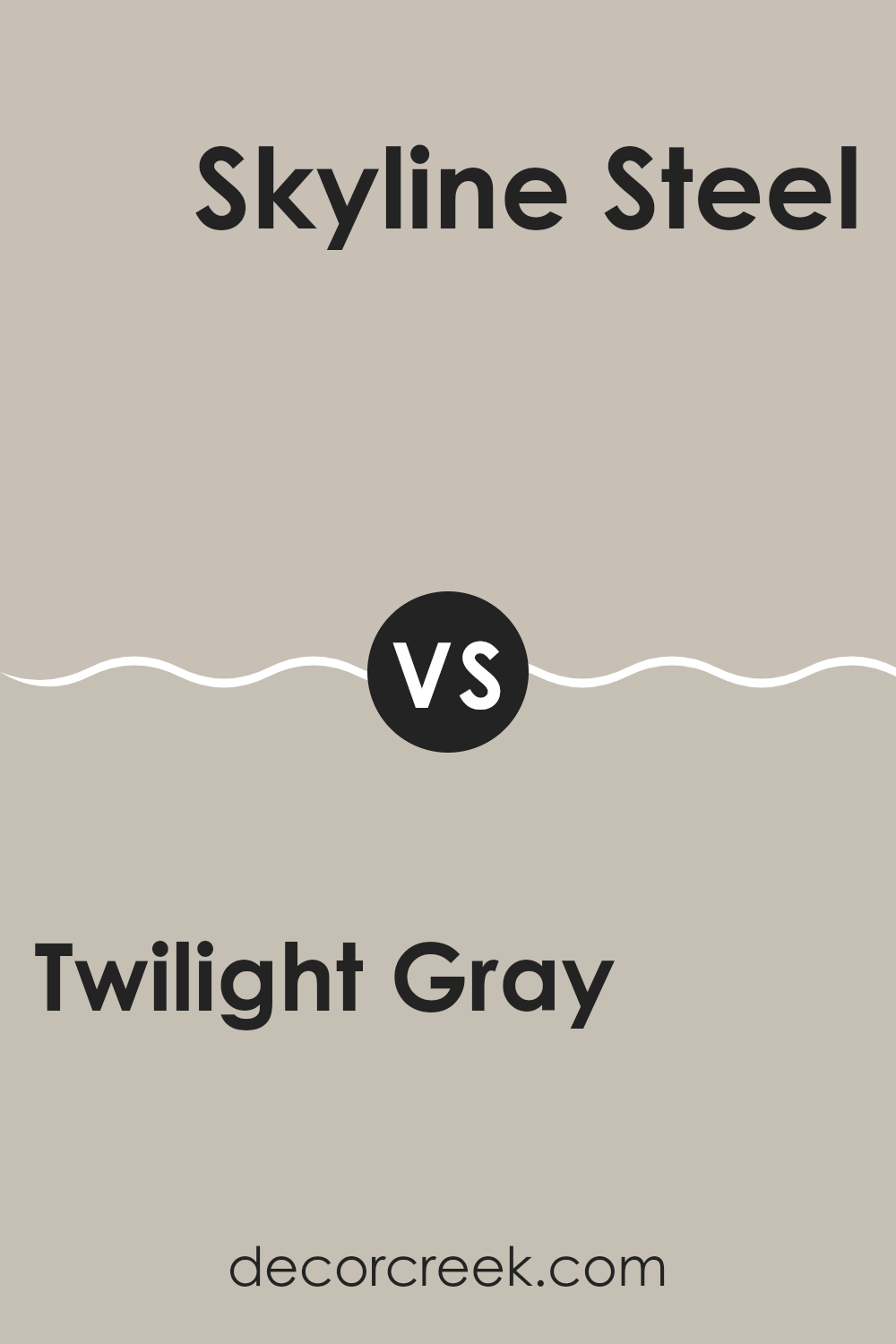
Twilight Gray SW 0054 by Sherwin Williams vs Skyline Steel SW 1015 by Sherwin Williams
Twilight Gray and Skyline Steel, both by Sherwin Williams, offer distinct shades for various decorating needs. Twilight Gray presents itself as a darker, richer hue that can make any space feel cozy and grounded.
Its deep tones are perfect for creating a focal point in a room or for adding depth when used on accent walls. On the other hand, Skyline Steel is lighter and more subtle. This color can brighten up a space while maintaining a neutral and versatile backdrop, suitable for any room looking to achieve a modern and airy feel.
While Twilight Gray adds drama and weight to a design, Skyline Steel keeps things light and fresh. Both colors work well in different contexts, depending on the desired effect – comforting and strong with Twilight Gray, or clean and open with Skyline Steel.
You can see recommended paint color below:
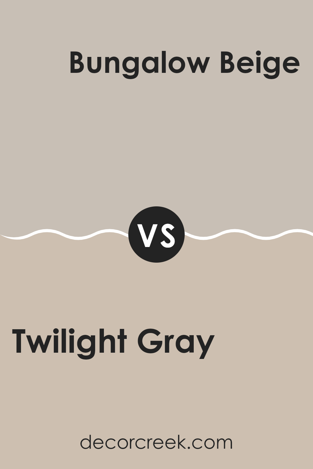
Twilight Gray SW 0054 by Sherwin Williams vs Bungalow Beige SW 7511 by Sherwin Williams
Twilight Gray and Bungalow Beige by Sherwin Williams are two neutral colors that serve distinct purposes in home decor. Twilight Gray is a deep, muted gray with cool undertones. It works well in spaces where you want to create a calm, understated elegance. This color is versatile and pairs beautifully with brighter colors for a balanced look.
On the other hand, Bungalow Beige is a warm beige shade that brings a cozy and welcoming feel to any room. Its warmth makes it perfect for living areas and bedrooms where a soft, inviting atmosphere is desired. Bungalow Beige also matches well with various wood finishes and other warm tones.
When used together, these colors can complement each other nicely, with Twilight Gray providing a grounding effect and Bungalow Beige adding a touch of warmth, making them ideal for creating a harmonious space.
You can see recommended paint color below:
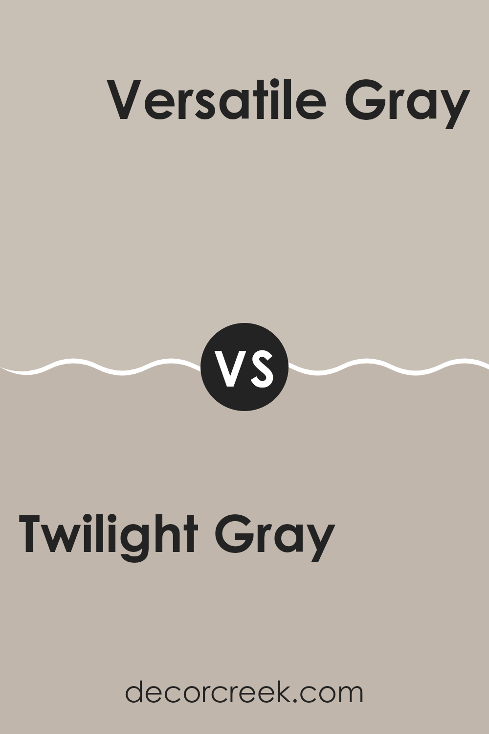
Twilight Gray SW 0054 by Sherwin Williams vs Versatile Gray SW 6072 by Sherwin Williams
Twilight Gray by Sherwin Williams is a deep, moody gray with blue undertones, giving it a cooler feel that brings a calm and collected vibe to any space. It leans towards a darker shade, making it ideal for creating a cozy, intimate atmosphere in areas like living rooms or bedrooms.
This color works well in spaces that benefit from a touch of formality and depth. Versatile Gray, also by Sherwin Williams, is lighter and warmer compared to Twilight Gray. As its name suggests, it is quite flexible in blending with a variety of decor styles and other colors.
With hints of beige, it offers a softer, welcoming feel, which makes it perfect for common areas like kitchens and hallways where a light, airy presence is desired. In summary, Twilight Gray is better for a bold, striking look, while Versatile Gray suits a lighter, more airy aesthetic.
You can see recommended paint color below:
Twilight Gray SW 0054 by Sherwin Williams vs High Sierra SW 9588 by Sherwin Williams
Twilight Gray and High Sierra are both paint colors by Sherwin Williams, each creating a different mood in a space. Twilight Gray is a classic, subtle gray shade that serves as a soft backdrop in any room.
It’s light enough to boost brightness in a space while providing a gentle contrast with white trim or furniture for a clean look. On the other hand, High Sierra is a deeper gray that leans towards taupe, offering a warmer feel. This color is great for adding a cozy atmosphere to rooms, like living areas or bedrooms, where a touch of warmth is desired.
It’s perfect for making large rooms feel more inviting. In comparing both, Twilight Gray is better for those who prefer a lighter, airier vibe, while High Sierra suits those looking for warmth and a hint of earthiness in their decor.
You can see recommended paint color below:
Twilight Gray SW 0054 by Sherwin Williams vs Realist Beige SW 6078 by Sherwin Williams
Twilight Gray and Realist Beige, both by Sherwin Williams, offer distinct tones for different decorating needs. Twilight Gray is a medium gray with a balanced blend of warm and cool undertones. This shade is versatile, providing a solid, neutral base that works well in various spaces, from modern living rooms to cozy bedrooms. It serves as a strong backdrop, allowing colors and decor items to stand out.
On the other hand, Realist Beige is a warm beige color that offers a more inviting and cozy feel, making it ideal for spaces where comfort is a priority, like living rooms or bedrooms. It has a softness that pairs well with many color schemes, particularly with earthy, natural tones.
While both colors are neutral, Twilight Gray leans towards a sleek and more defined look, whereas Realist Beige tends towards creating a warm, welcoming ambiance. Choosing between them would depend on the mood and style you’re aiming for in a room.
You can see recommended paint color below:
Twilight Gray SW 0054 by Sherwin Williams vs Soft Suede SW 9577 by Sherwin Williams
The Twilight Gray and Soft Suede by Sherwin Williams are both distinct yet neutral colors. Twilight Gray brings a cool, muted gray tone that acts as an excellent backdrop in spaces that favor a modern and understated look. This gray is versatile, fitting well in many rooms, from kitchens to bedrooms, adding a touch of quiet elegance without overpowering the space.
In contrast, Soft Suede introduces a warmer, richer hue reminiscent of its namesake. This color tends to inject more warmth and coziness into a room, making it ideal for living areas or bedrooms where you want to create a comforting and inviting atmosphere. Its subtle, earthy richness pairs well with a variety of decor schemes, particularly those incorporating organic materials and textures.
When deciding between the two, consider the mood and tone you wish to set for your room. Twilight Gray can feel more contemporary and sleek, while Soft Suede tends to lean towards a homey and welcoming charm. Either choice provides a strong foundation for various design styles.
You can see recommended paint color below:
- SW 9577 Soft Suede
Twilight Gray SW 0054 by Sherwin Williams vs Viaduct SW 9567 by Sherwin Williams
Twilight Gray and Viaduct, both from Sherwin Williams, offer distinctive yet subtle hues for home decor. Twilight Gray is a balanced, medium gray that provides a stable and calming backdrop to any space. It tends to bring a classic, timeless feel, making it great for areas where you want a touch of refinement without being too bold.
On the other hand, Viaduct is darker and cooler, leaning slightly towards a charcoal tone. This color has a more contemporary vibe and could be perfect for creating striking contrasts, especially in modern settings or as an accent wall. While its darkness could make smaller rooms feel a bit tighter, it also adds a dramatic flair that can enhance larger, well-lit spaces.
Both colors work well in various lighting conditions, with Twilight Gray showing less variation in appearance, maintaining its neutral charm throughout the day. In contrast, Viaduct might exhibit more depth as natural light changes, highlighting its cooler undertones. Ideal pairings might include brighter whites or soft pastels to offset their respective intensities.
You can see recommended paint color below:
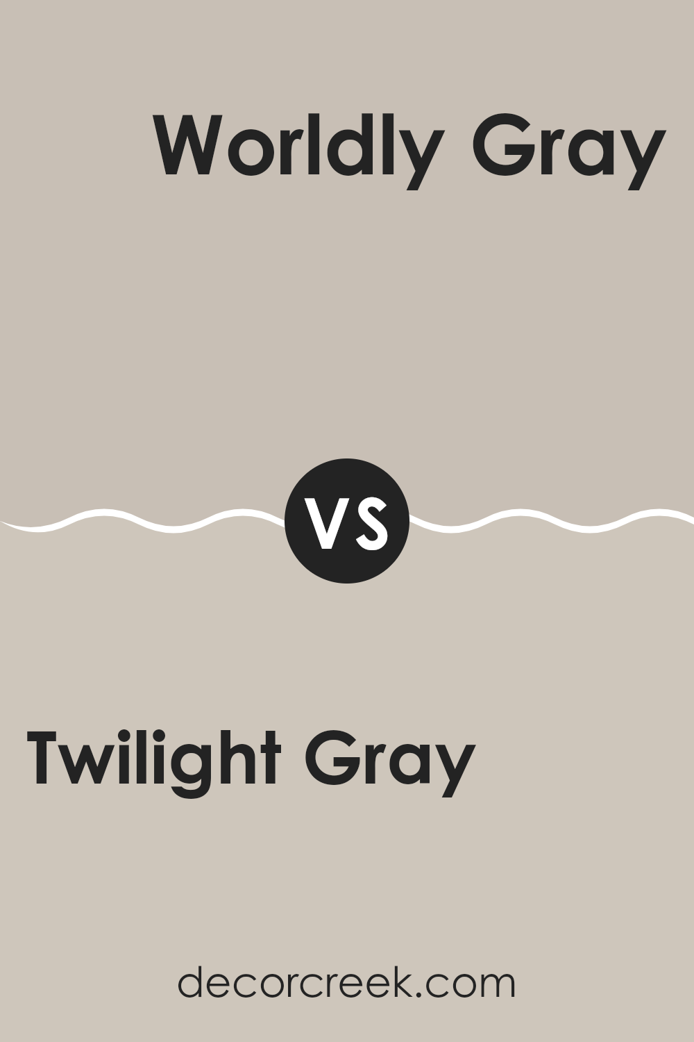
Twilight Gray SW 0054 by Sherwin Williams vs Worldly Gray SW 7043 by Sherwin Williams
Twilight Gray and Worldly Gray by Sherwin Williams are two distinct shades that can freshen up any space, yet they bring unique tones to the table. Twilight Gray presents as a darker, moodier shade, which can give a room a cozy, grounded feeling. It’s perfect for creating a snug, inviting atmosphere in areas like living rooms or bedrooms where comfort is key.
On the other hand, Worldly Gray is noticeably lighter and leans towards a warmer spectrum. This color works well in spaces that aim for a neutral background, offering a soft, versatile backdrop that is easy on the eyes. It pairs well with various decor styles and enhances the brightness of rooms that get ample natural light.
Both colors provide neutral options but serve different moods and preferences. While Twilight Gray sets a richer, deeper tone, Worldly Gray offers a gentle warmth, making both colors great choices depending on the needs and intended feel of your space.
You can see recommended paint color below:
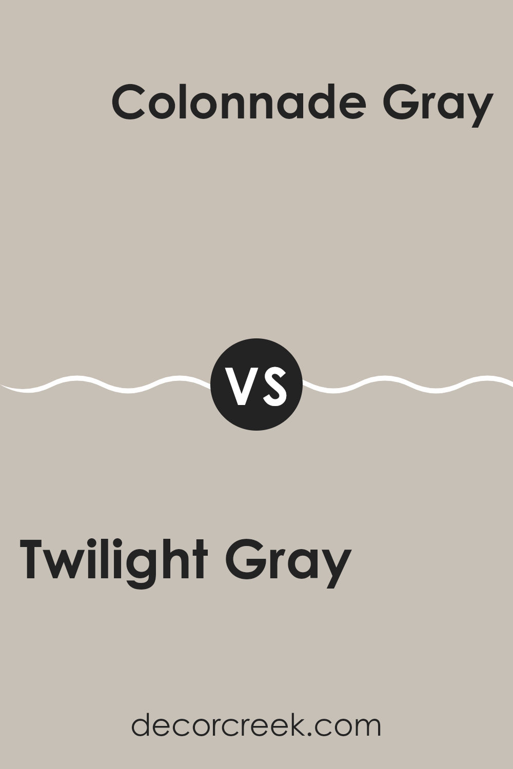
Twilight Gray SW 0054 by Sherwin Williams vs Colonnade Gray SW 7641 by Sherwin Williams
Twilight Gray and Colonnade Gray by Sherwin Williams are both stylish gray shades, but they have distinct tones that set them apart. Twilight Gray presents as a deeper, almost charcoalesque gray that provides a strong and classic feel to any room. It’s a perfect choice if you’re looking for a color that adds a bold statement without overpowering your space.
On the other hand, Colonnade Gray is lighter and carries a softer, more subtle gray tone. This color works wonderfully in spaces that aim for a gentle and inviting atmosphere. Its lighter hue makes it an excellent option for smaller rooms or areas with less natural light, as it can help make a space feel larger and more open.
In summary, while both colors offer the calm and neutral qualities of gray, Twilight Gray leans towards a darker, more pronounced gray whereas Colonnade Gray offers a lighter, more airy touch.
You can see recommended paint color below:
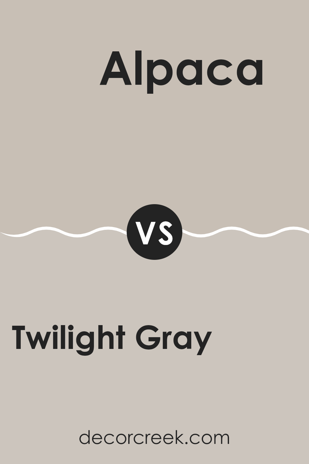
Twilight Gray SW 0054 by Sherwin Williams vs Alpaca SW 7022 by Sherwin Williams
Twilight Gray and Alpaca by Sherwin Williams are two distinct colors that can change the feel of a space. Twilight Gray is a deep, almost charcoal-like color with rich blue undertones. This makes it an ideal choice for those looking to create a strong, bold statement in a room. It works well in spaces that benefit from a darker, more pronounced color which can give a room a cozy, anchored feel.
On the other hand, Alpaca is a much lighter shade, offering a soft blend of greige (gray and beige) with slight violet undertones. This color is very versatile and provides a soothing backdrop, perfect for rooms intended to have a calm and inviting atmosphere. It’s particularly effective in areas that receive a lot of natural light, as the color shifts and adapts subtly throughout the day.
In conclusion, while both colors offer unique possibilities, Twilight Gray adds drama and depth, whereas Alpaca creates a light, airy space. The choice between them would depend on the mood and functionality desired in the room.
You can see recommended paint color below:
In conclusion, SW 0054 Twilight Gray by Sherwin Williams is a fantastic choice if you are looking to paint a room in your house. This color can make any room feel cozy and inviting, which is really nice when you want to relax or have friends over. Twilight Gray isn’t too dark or too light, so it’s perfect for places like the living room or your bedroom. It also looks good with many different colors of furniture, which means you don’t have to buy new stuff to match your walls.
One of the best things about Twilight Gray is that it’s not just a plain gray. It has a mix of blue tones that gives it a unique warmth. This makes it easy to live with day in and day out. Whether the room gets a lot of sunlight or not much, this paint can handle it and still look great.
Lastly, applying this paint is also pretty straightforward. You can do it yourself or get a little help. It covers the walls easily and doesn’t make a big mess. So, if you’re thinking of giving a room a fresh look, SW 0054 Twilight Gray is a color that should be at the top of your list!
Ever wished paint sampling was as easy as sticking a sticker? Guess what? Now it is! Discover Samplize's unique Peel & Stick samples.
Get paint samples

