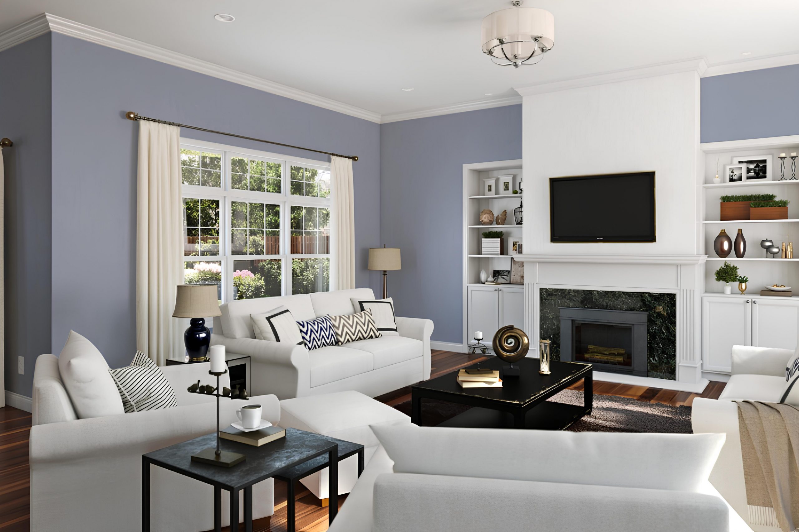
If you are seeking a unique and rich color for your next painting project, let me introduce you to SW 6542 Vesper Violet by Sherwin Williams. This color is not your typical violet. It carries a depth that can add a sophisticated flair to any space, blending the calmness of blue with a gentle touch of red to create a subtle yet impactful violet.
Vesper Violet can seamlessly fit into various parts of your home, whether you want to create a statement wall in your living room, a serene backdrop in your bedroom, or add a touch of personality to your kitchen cabinets. It maintains a beautiful balance, being bold enough to make a statement yet subdued enough not to overwhelm a space.
In my experience, this color works wonderfully with softer whites and neutral tones, which helps highlight its richness without clashing. If you’re considering a color that can add both warmth and depth, Vesper Violet might just be the perfect choice.
Let’s see how it can transform the energy of your living spaces, offering a twist on classic elegance with its soothing yet vibrant hues.
What Color Is Vesper Violet SW 6542 by Sherwin Williams?
Vesper Violet, a hue from Sherwin Williams, is a rich and muted purple with a gray undertone that gives it a subtle yet distinct presence. This color is versatile enough to work in various interior styles, particularly in modern and contemporary homes, as well as in traditional settings for those looking to add a touch of modernity.
This shade is particularly effective when aiming to create a cozy and inviting atmosphere. Its depth enhances the room, providing a backdrop that conveys both warmth and style without overpowering the space.
It pairs exceptionally well with natural materials like wood and leather, bringing out their warm tones and adding a rustic touch. Textures such as velvet and silk also go well with Vesper Violet, lending an air of understated luxury and comfort to spaces like living rooms or bedrooms. Metal accents in brushed nickel or chrome are also excellent companions for Vesper Violet, adding a sleek, clean contrast that aligns seamlessly with more contemporary decor.
This color works wonderfully in spaces intended for relaxation and introspection, like reading nooks or home offices. The versatility of Vesper Violet makes it easy to use in various applications, from an accent wall to a full room or even just as a pop of color through decor items such as pillows and throws.
Is Vesper Violet SW 6542 by Sherwin Williams Warm or Cool color?
Vesper Violet by Sherwin Williams is a unique paint color that adds a subtle, cozy feel to any room in the house. This shade of purple is soft and muted, making it a practical choice for spaces that are meant to have a calm and inviting atmosphere, such as bedrooms or reading nooks.
It pairs wonderfully with neutral tones like whites and grays, creating a refreshing and clean look. In rooms with plenty of natural light, Vesper Violet looks bright and airy, while in spaces with less light, it can give off a warmer and more intimate vibe.
This versatility means it can be used in various ways, from a full-room color to an accent wall. Moreover, it can complement a range of decor styles from modern to traditional as it adds a touch of color without being too bold or overpowering. This allows homeowners to enjoy a stylish home environment that isn’t overwhelming but still holds visual interest.
Undertones of Vesper Violet SW 6542 by Sherwin Williams
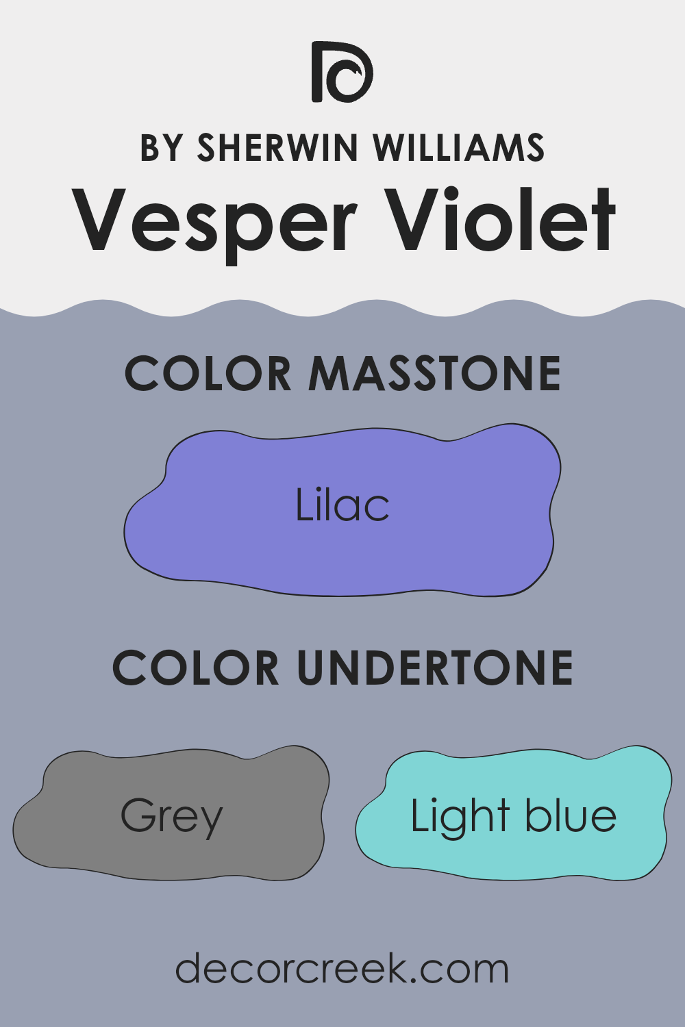
Vesper Violet is a unique paint color that includes a variety of undertones which can influence how it appears in different settings. Undertones are subtle colors that lurk beneath the surface of the main color and can alter the overall impression of that color. The undertones in Vesper Violet include shades of grey, light blue, light purple, and others such as mint, pale pink, and light gray. These undertones play a significant role in defining the character and mood of the painted space.
When Vesper Violet is used on interior walls, the undertones influence how the color interacts with light and other elements in the room. For instance, in a room with natural light, the light blue and light purple undertones can make the walls appear slightly cooler, adding a calm and gentle feel to the space. In artificial light, the grey undertones might become more prominent, giving the room a more grounded atmosphere.
In combination with different décor, the undertones in Vesper Violet can either stand out or blend in, adding to the versatility of this color. For example, pairing it with soft yellows or pale pink decor can highlight its warmer undertones, creating a welcoming and cozy space. On the other hand, using decor with hints of dark blue or navy can draw out the cooler undertones, making the space feel more formal.
Overall, the way we see Vesper Violet can vary greatly depending on its surroundings, lighting, and how it is used in coordination with other colors and materials in a room. Its array of undertones makes it adaptable and suited to creating varied atmospheres in home interiors.
What is the Masstone of the Vesper Violet SW 6542 by Sherwin Williams?
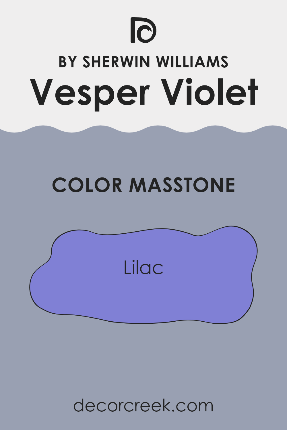
Vesper Violet, with a masstone close to Lilac (#8080D5), is a subtle and appealing shade of purple. This color brings a gentle and cheerful atmosphere to any room, making it perfect for creating a welcoming space in homes. When used on walls, Vesper Violet can make a room feel slightly larger and more open because of its light and airy quality.
It pairs well with various decor styles, from modern to traditional, and complements both dark and light furniture. This versatility makes it an excellent choice for living rooms and bedrooms, where a touch of color that’s not too overwhelming is often desired.
Additionally, this shade is quite effective in enhancing natural light, which can help in areas of the home that receive less sunlight. Overall, Vesper Violet offers a practical and pretty option for home decorating, bringing a fresh and lively feel to interiors without being too bold or overpowering.
How Does Lighting Affect Vesper Violet SW 6542 by Sherwin Williams?
Lighting plays a crucial role in how we perceive colors in our environment. Different light sources can drastically change the appearance of a color. Each type of light, whether artificial or natural, has its unique characteristics that can alter how a color looks.
Vesper Violet is a distinctive shade that can appear differently under various lighting conditions. In artificial light, such as that from LED bulbs or fluorescent lighting, this color tends to look more saturated and vibrant. The purplish hue might become more pronounced under cooler light, giving the room a more lively and rich feel.
On the other hand, under natural sunlight, the color can look softer and more subdued. This softer appearance allows it to blend naturally with the surroundings during the day, providing a calm atmosphere to any space.
When considering how Vesper Violet behaves in rooms facing different directions, lighting at various times of the day has a significant impact. In a north-facing room, the light tends to be cooler and more consistent throughout the day. Here, Vesper Violet might appear slightly more shadowy and muted, giving a peaceful feeling to the room.
In a south-facing room, where sunlight is most direct and warmest, the color can look very dynamic and vivid, pulling out the warmer tones in the paint. The color brightens up significantly and adds a cheerful energy to the space.
East-facing rooms receive the most light in the morning when the sunlight is cooler. Here, Vesper Violet will look bright and fresh in the morning but could lose some vibrancy as the day progresses. Conversely, in a west-facing room, the color will change throughout the day, starting milder in the morning and becoming dramatically vibrant and warm in the evening light.
In summary, Vesper Violet’s appearance can vary widely depending on the light it is exposed to, and thoughtful consideration of room orientation and lighting sources can maximize its aesthetic impact.

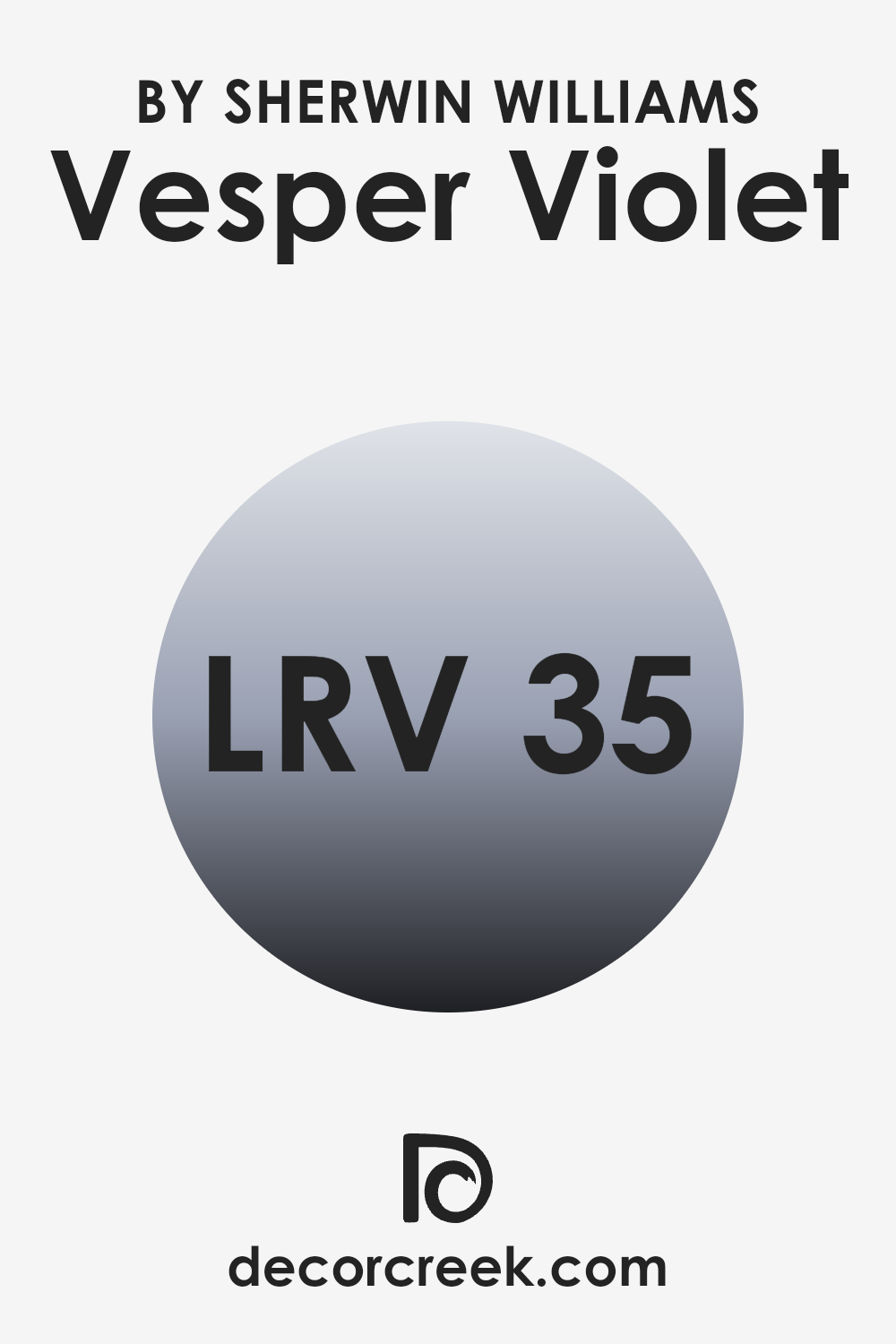
What is the LRV of Vesper Violet SW 6542 by Sherwin Williams?
LRV stands for Light Reflectance Value, which is a measure of the percentage of light a paint color reflects from or absorbs into a painted surface. Essentially, it tells you how light or dark a color will look on a wall based on how much light it reflects. High LRV paints are lighter and reflect more light, making rooms feel more spacious and brightly lit. Conversely, colors with lower LRVs are darker, absorbing more light, which can make spaces appear smaller and cozier.
The LRV of Vesper Violet, which is 35.183, is on the lower end of the scale, indicating that it is quite a deep color. This means that when used on walls, Vesper Violet will absorb more light, giving the room a denser, more enveloped feel.
In rooms with less natural light or smaller spaces, this color might make the area feel more confined. However, for a room seeking a more grounded or intimate atmosphere, this shade could potentially be an excellent choice. Proper lighting will play a crucial role in how this color is perceived in any given space.
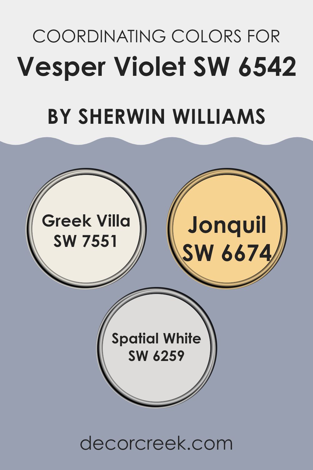
Coordinating Colors of Vesper Violet SW 6542 by Sherwin Williams
Coordinating colors are shades that complement each other and work harmoniously when used together in a space. By selecting a main color like Vesper Violet, you can enhance its appearance and atmosphere by choosing other colors that either contrast or complement it subtly. The technique relies on understanding the color wheel and how different hues interact, ensuring a balanced and visually appealing result in your decorating scheme.
One such coordinating color is Greek Villa, a soft, warm white with a hint of creaminess that provides a gentle backdrop to the more pronounced tones of Vesper Violet. It’s ideal for creating a sense of openness and light in a room.
Jonquil, on the other hand, is a vibrant yellow that brings a cheerful brightness, offering a lively contrast that can energize a space featuring Vesper Violet. Meanwhile, Spatial White is a clean, crisp shade that offers a refreshing and slightly cooler counterpoint to warmer hues. It can help to refresh the visual palette and keep the overall vibe light and airy. Together, these colors complement Vesper Violet beautifully by providing balance, contrast, and a cohesive look.
You can see recommended paint colors below:
- SW 7551 Greek Villa
- SW 6674 Jonquil
- SW 6259 Spatial White
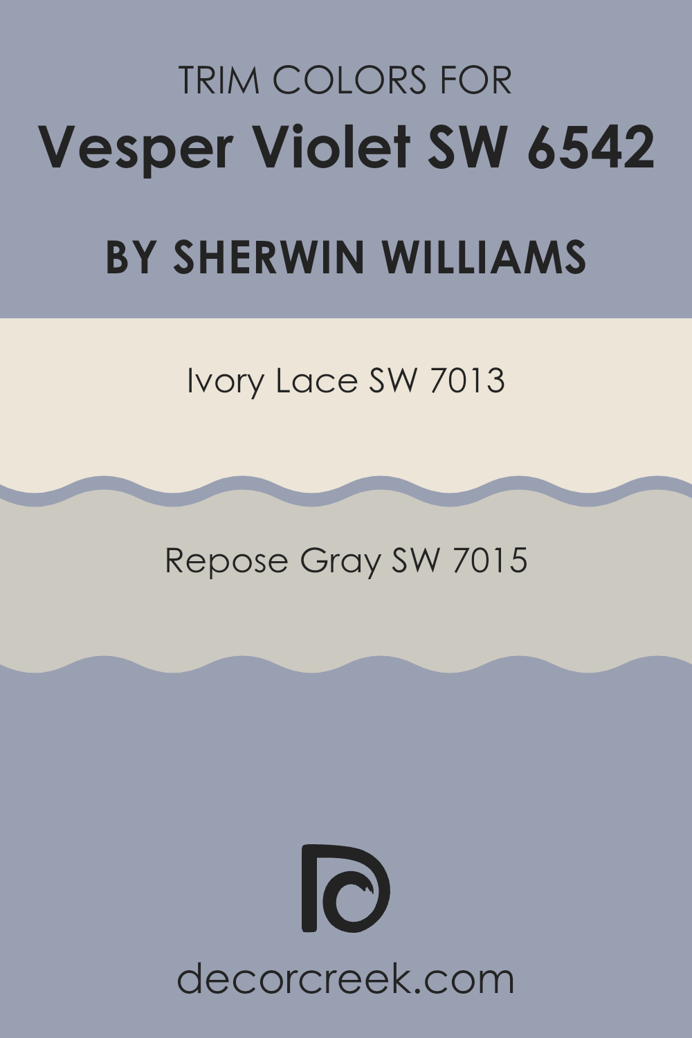
What are the Trim colors of Vesper Violet SW 6542 by Sherwin Williams?
Trim colors are specifically chosen hues used to accentuate or complement the primary color of a space, typically found on elements like moldings, door frames, and window sills. Choosing the right trim color can refine the overall aesthetic of a room, making color features pop and creating a finished look.
For the shade Vesper Violet by Sherwin Williams, using trim colors like Ivory Lace and Repose Gray can add a subtle contrast that enhances the depth and richness of the violet without overpowering it. Properly selected trim colors help in defining spaces clearly and can make the wall color appear more distinct and polished.
Ivory Lace, a soft off-white with a warm undertone, offers a gentle brightness that can lighten the intensity of Vesper Violet, providing a delicate border that highlights the walls with a clean, crisp finish. On the other hand, Repose Gray is a neutral, light gray that provides a contemporary balance; its understated elegance complements deeper hues well, ensuring that the vibrant violet stands out without clashing. Both colors support the main shade subtly, each adding their unique character to the space while maintaining harmony throughout the décor.
You can see recommended paint colors below:
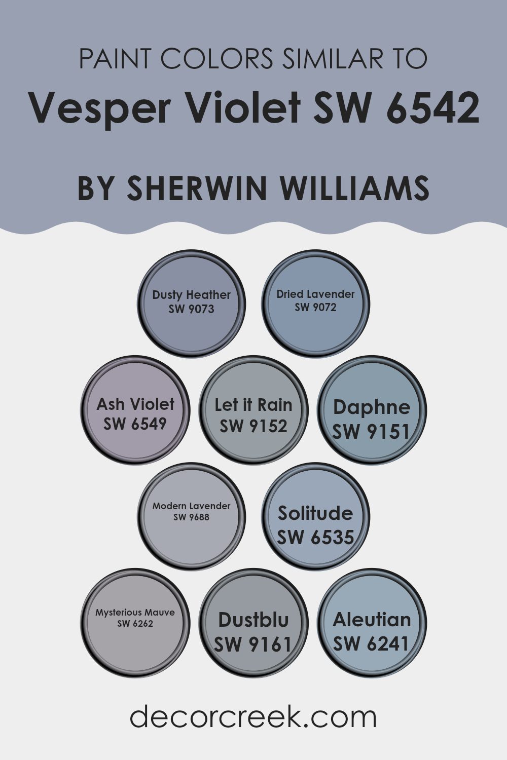
Colors Similar to Vesper Violet SW 6542 by Sherwin Williams
Using similar colors in a design scheme, like those related to Vesper Violet by Sherwin Williams, plays an essential role in creating a cohesive and harmonious look. Most colors akin to Vesper Violet encompass warm and soft tones of purple that blend effortlessly with each other to provide subtle variation without drastic contrasts. These colors work well together because they share a similar saturation and lightness, making them easy to use in decorating, as they tend to complement each other rather than compete for attention.
For instance, Dusty Heather is a muted purple that conveys a sense of gentle calmness, ideal for relaxed spaces. Similarly, Dried Lavender offers a slightly subdued purple hint, reminiscent of lavender fields, perfect for creating a soothing atmosphere.
Ash Violet is deeper, adding a touch of mystery without overwhelming, and Let it Rain is a unique blend that pulls in a gray tone, providing a cool and refreshing feel. Daphne, on the other hand, leans towards a lighter, airier purple, great for brightening up a space. Modern Lavender is vibrant, providing a contemporary twist on traditional lavender hues.
Solitude is another purple-based shade that lends a muted, understated elegance to interiors. Mysterious Mauve stirs a bit more intensity into the mix, giving depth to any room it graces. Dustblu is a soft transition into the blues, maintaining a subtle tie to its purple relatives.
Lastly, Aleutian brings in a blend of blue and gray with a hint of purple, offering versatility in its use alongside other hues. Each of these colors supports one another, building a refined palette that allows for creative yet unified interior expressions.
You can see recommended paint colors below:
- SW 9073 Dusty Heather
- SW 9072 Dried Lavender
- SW 6549 Ash Violet
- SW 9152 Let it Rain
- SW 9151 Daphne
- SW 9688 Modern Lavender
- SW 6535 Solitude
- SW 6262 Mysterious Mauve
- SW 9161 Dustblu
- SW 6241 Aleutian
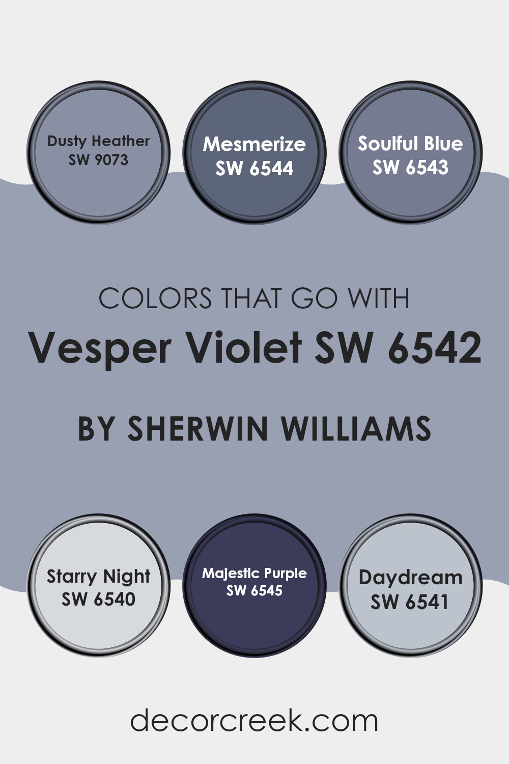
Colors that Go With Vesper Violet SW 6542 by Sherwin Williams
Selecting complementary colors for Vesper Violet SW 6542 by Sherwin Williams is crucial as it helps create a harmonious and visually appealing palette for any space. When colors like Dusty Heather, Mesmerize, Soulful Blue, Starry Night, Majestic Purple, and Daydream are matched with Vesper Violet, they enhance the depth and character of the primary color, offering versatile design options. These pairings are not just visually striking but also allow for a balanced look, ensuring that spaces feel coherent and thoughtfully designed.
Dusty Heather and Mesmerize are both gentle and subtle colors. Dusty Heather presents a soft, muted tone that works beautifully as a neutral backdrop, allowing Vesper Violet to shine. On the other hand, Mesmerize offers a slightly deeper tone, which complements the richness of Vesper Violet without overpowering it.
Soulful Blue and Starry Night align closer to the cool-toned spectrum, with Soulful Blue providing a light, airy feel that contrasts nicely against the deeper violet, and Starry Night bringing a more dramatic, deep blue that pairs well with the intensity of Vesper Violet for a bolder look.
Majestic Purple and Daydream, with their own unique shades, also play their roles effectively. Majestic Purple amplifies the lush, regal feel of Vesper Violet, while Daydream, a lighter and dreamy shade, offers a calm and refreshing counterpoint, ensuring that the overall design remains balanced and pleasing to the eye.
You can see recommended paint colors below:
- SW 9073 Dusty Heather
- SW 6544 Mesmerize
- SW 6543 Soulful Blue
- SW 6540 Starry Night
- SW 6545 Majestic Purple
- SW 6541 Daydream
How to Use Vesper Violet SW 6542 by Sherwin Williams In Your Home?
Vesper Violet SW 6542 by Sherwin Williams is a unique shade of purple that can add a beautiful touch of personality to any room. This color is soft enough to be versatile yet distinct enough to make a statement.
It’s perfect for creating a cozy corner in a bedroom or adding some character to a living room. You can use Vesper Violet on one wall as a focal point or paint the whole room to give it a fresh, new look. This color pairs well with light grays, creams, and even some blues, making it easy to match with existing furniture and decor.
If you feel creative, you can also use Vesper Violet for painting furniture pieces like a bookshelf or a nightstand for a pop of color. Adding accessories like cushions or curtains in similar shades can tie the look together, creating a stylish and cohesive space.
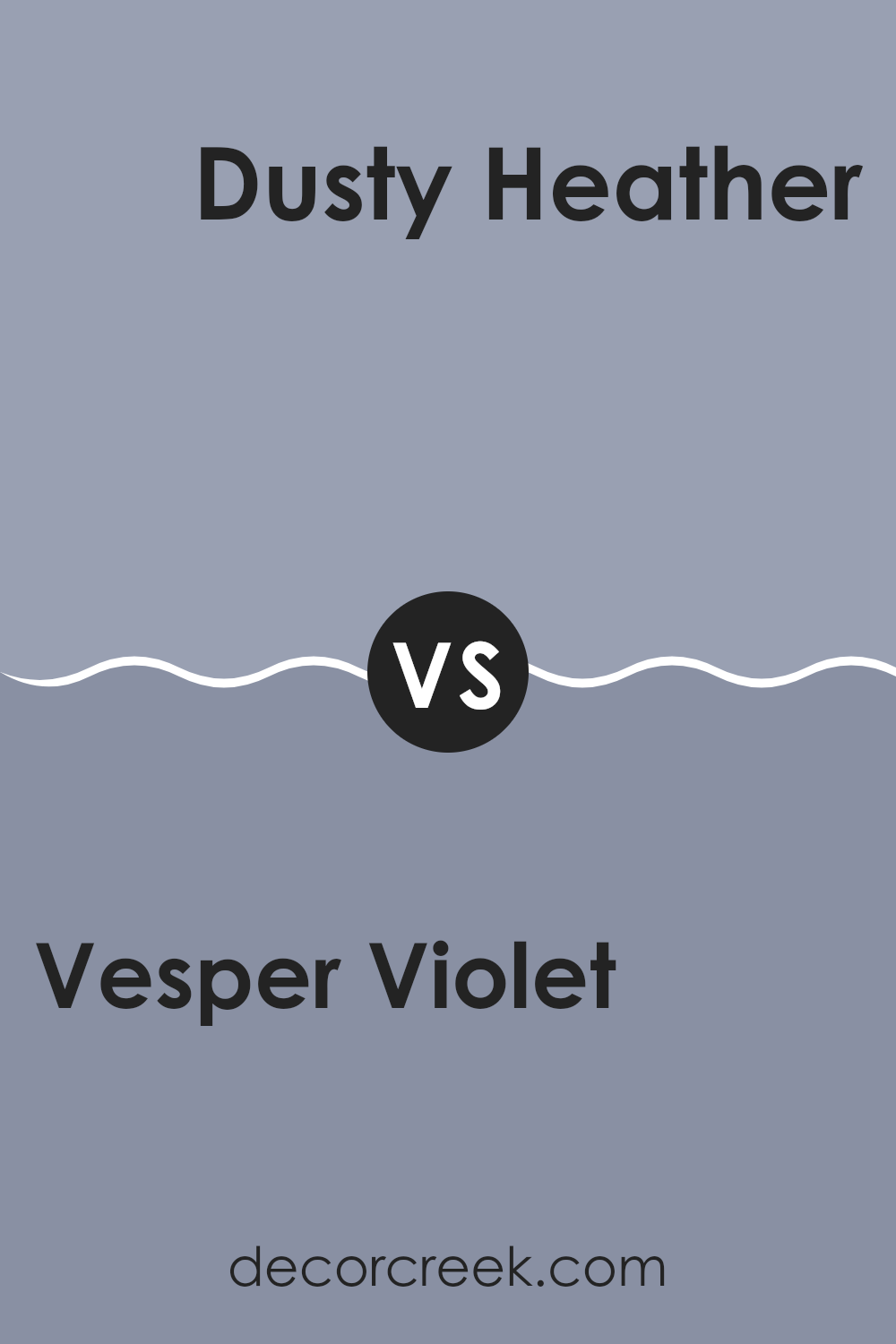
Vesper Violet SW 6542 by Sherwin Williams vs Dusty Heather SW 9073 by Sherwin Williams
Vesper Violet is a deep, rich purple with a regal feel to it. It’s a color that stands out due to its intensity and depth, making it a great choice for those who want to add a strong, dramatic touch to their space. On the other hand, Dusty Heather is a softer, muted purple.
This shade leans towards a more understated, gentle appearance and is great for creating a cozy and welcoming atmosphere. It works excellently in areas where you want a touch of color without overwhelming the space.
When comparing the two, Vesper Violet brings a bold statement, while Dusty Heather offers a softer, more subdued look. Both can add a unique character to rooms but serve different moods and themes depending on what you are looking to achieve in your decorating project.
You
can see recommended paint color below:
- SW 9073 Dusty Heather
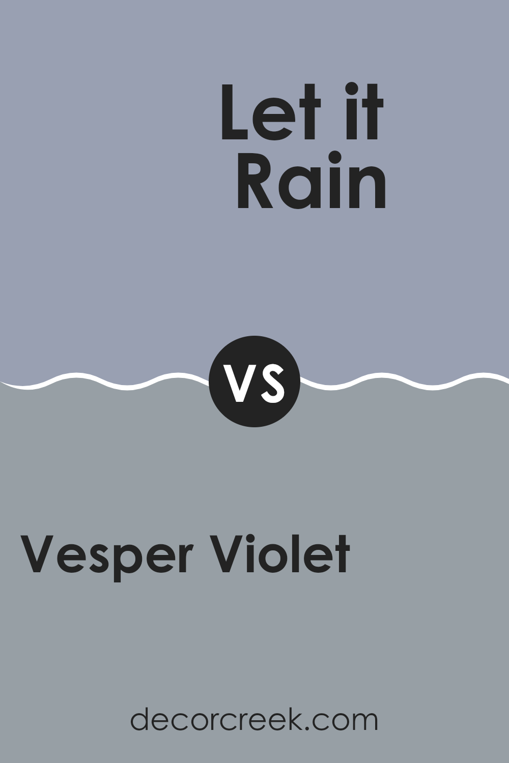
Vesper Violet SW 6542 by Sherwin Williams vs Let it Rain SW 9152 by Sherwin Williams
Vesper Violet is a deep and slightly muted purple that gives off a cozy and inviting feeling, perfect for spaces where calm and comfort are valued. It holds a warm undertone, making it an excellent choice for living rooms or bedrooms where a touch of elegance is desired without being too bold.
On the other hand, Let it Rain is a cool, dusky blue with subtle gray undertones that suggest a soothing and gentle vibe. This color works beautifully in bathrooms or bedrooms, lending a soft, calming atmosphere that’s ideal for relaxation.
Overall, Vesper Violet is warmer and richer, creating a more enveloping feel, while Let it Rain is cooler and lighter, offering a fresh, airy quality. Both colors are versatile, but each brings its own unique mood to a space, with Vesper leaning towards a comforting warmth and Let it Rain promoting a feeling of soft freshness.
You can see recommended paint color below:
- SW 9152 Let it Rain
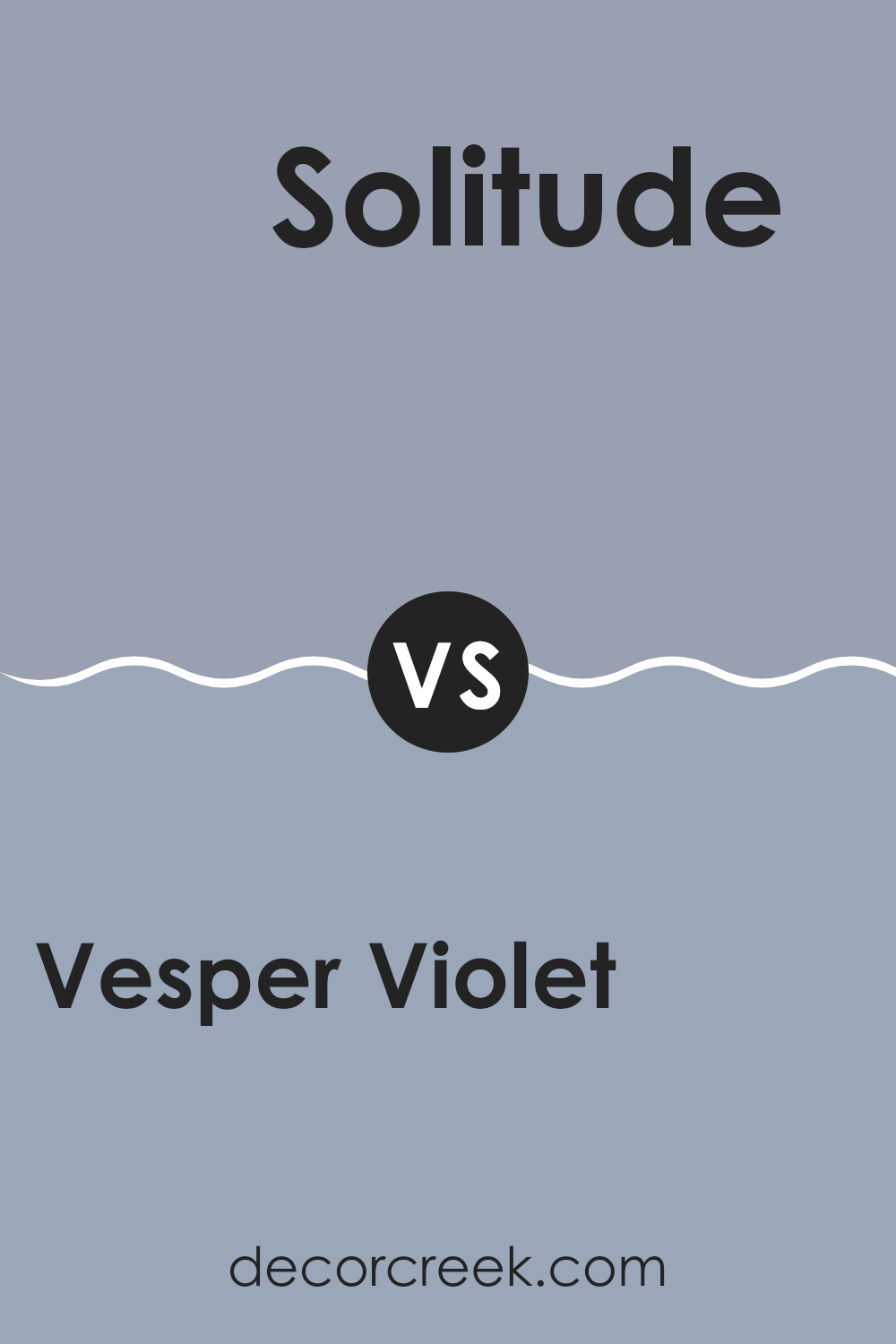
Vesper Violet SW 6542 by Sherwin Williams vs Solitude SW 6535 by Sherwin Williams
Vesper Violet and Solitude are two distinct paint colors by Sherwin Williams, each bringing its own unique vibe to a space. Vesper Violet is a deep, rich purple that adds a bold and cozy feel to any room.
It’s perfect for creating a strong statement wall or for use in a bedroom to create a cozy, enveloping atmosphere. On the other hand, Solitude is a lighter, soft gray-blue tone that gives off a calm and refreshing feeling, making it ideal for bathrooms or kitchens where a clean, airy feel is desired.
While Vesper Violet tends to make a room feel warmer and more enclosed, Solitude opens up a space, making it appear larger and more inviting. Both colors are versatile but serve very different purposes depending on the mood you want to set in your room.
You can see recommended paint color below:
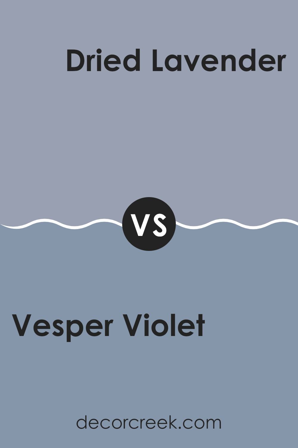
Vesper Violet SW 6542 by Sherwin Williams vs Dried Lavender SW 9072 by Sherwin Williams
Vesper Violet and Dried Lavender are two distinct shades from Sherwin Williams that offer unique twists on purple. Vesper Violet leans toward a deep, blueish purple, providing a rich and bold look. It’s the kind of color that would make a statement whether used for an accent wall or a cozy reading nook. It has a certain depth that adds character to spaces, large or small.
On the other hand, Dried Lavender is a softer, more muted purple with grey undertones. This color is much lighter compared to Vesper Violet, giving off a calm and gentle vibe. It’s perfect for bedrooms or other areas where you want a soothing atmosphere.
Both colors are beautiful in their own right, but they serve different purposes. Vesper Violet is more dramatic and eye-catching, while Dried Lavender is subtle and relaxing. Your choice between them would depend on the mood you want to create in your space.
You can see recommended paint color below:
- SW 9072 Dried Lavender
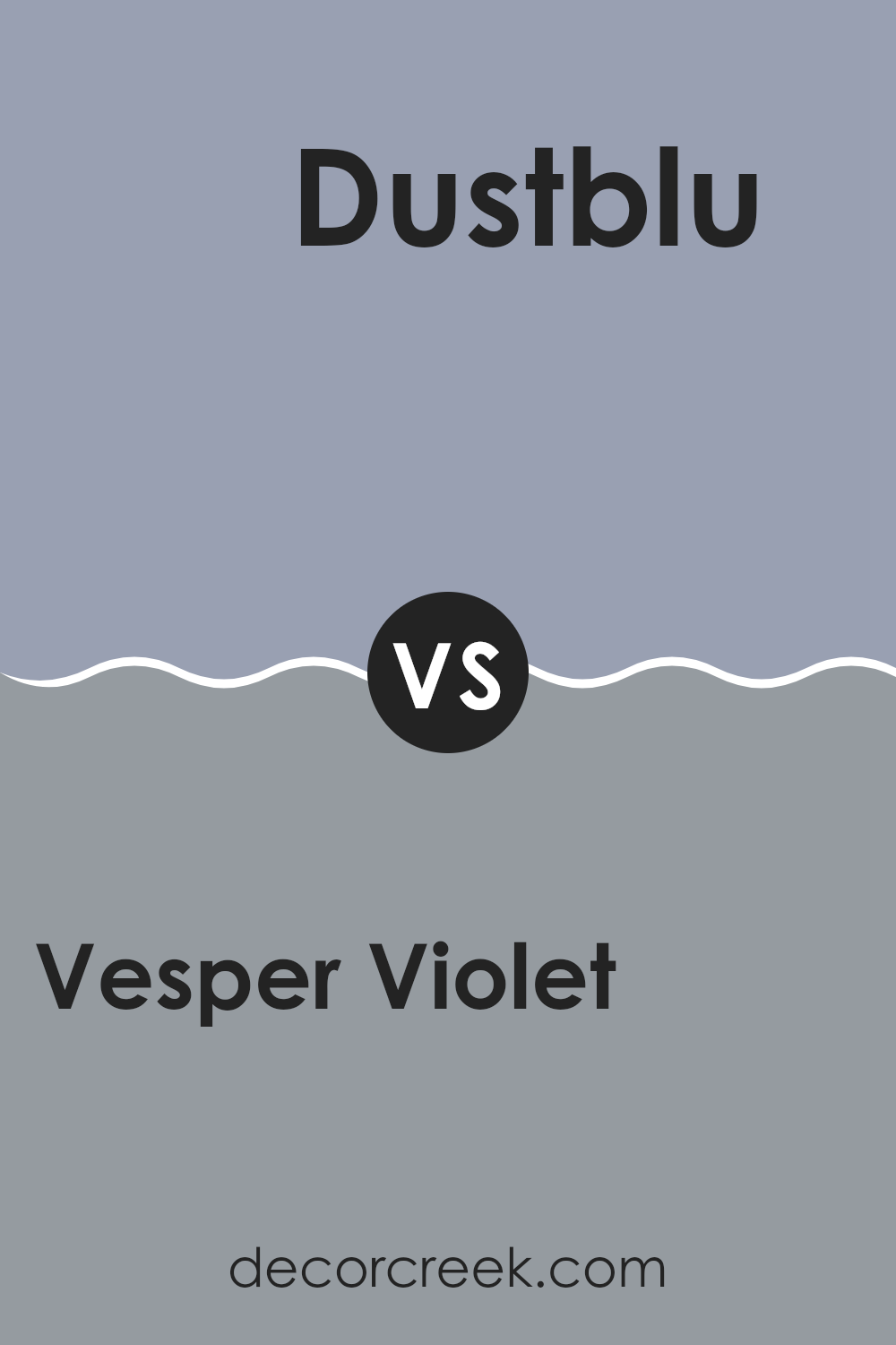
Vesper Violet SW 6542 by Sherwin Williams vs Dustblu SW 9161 by Sherwin Williams
Vesper Violet and Dustblu are two distinct colors from Sherwin Williams with their unique appeal. Vesper Violet is a deep, rich purple that brings a strong presence to a room, offering a feeling of coziness and comfort.
It works well in spaces where a touch of drama is desired, like a bedroom or a study. On the other hand, Dustblu is a muted blue with gray undertones, giving it a soft and soothing appearance. This color is more understated and is excellent for creating a calm and relaxing environment, perfect for bathrooms or living areas.
While Vesper Violet adds depth and intensity, Dustblu is ideal for a lighter, airier feel. Both colors provide beautiful options for interior spaces, but their uses and the atmospheres they create are very different.
You can see recommended paint color below:
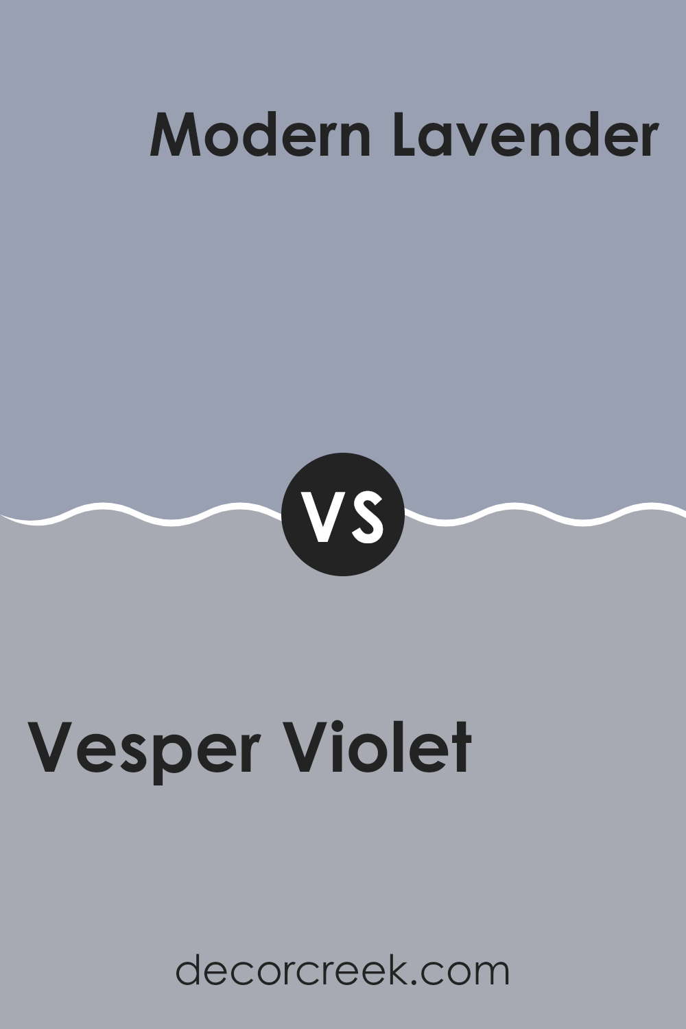
Vesper Violet SW 6542 by Sherwin Williams vs Modern Lavender SW 9688 by Sherwin Williams
Vesper Violet and Modern Lavender, both by Sherwin Williams, offer unique takes on purple. Vesper Violet is a deeper, richer purple, giving off a cozy and somewhat traditional vibe. It’s the kind of color that works well in spaces meant to feel warm and inviting, like living rooms or bedrooms.
On the other hand, Modern Lavender is lighter and has a fresher, airy feel to it. This color is great for spaces that aim to feel open and light, such as bathrooms or small offices. While Vesper Violet seems to draw in walls for a snug feel, Modern Lavender tends to open up a space, making it feel larger.
Depending on the room and the mood you want to create, both colors have their advantages. Vesper Violet offers depth and warmth, whereas Modern Lavender brings a breezy and refreshing touch.
You can see recommended paint color below:
- SW 9688 Modern Lavender
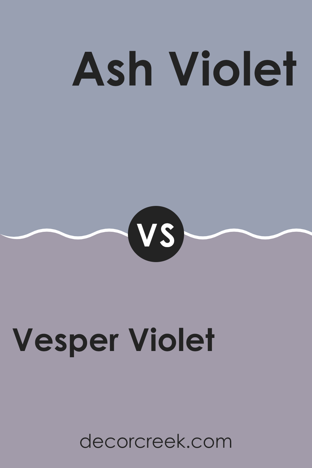
Vesper Violet SW 6542 by Sherwin Williams vs Ash Violet SW 6549 by Sherwin Williams
Vesper Violet and Ash Violet are two distinct shades by Sherwin Williams. Vesper Violet presents as a deeper, more robust purple, giving off a strong, vivid vibe that can make a statement in any space.
It’s bold and can add a lot of character to a room, great on an accent wall or even for furniture pieces that need a pop of color. On the other hand, Ash Violet has a softer, more muted tone. It leans towards a subtle gray with hints of purple, making it more understated and ideal for those who prefer colors that aren’t too loud.
This color is perfect for achieving a calm and gentle environment, suitable for bedrooms or areas where you want a relaxed feel. Together, these colors offer different possibilities depending on the mood and atmosphere you want to create, whether dynamic and vibrant or soft and soothing.
You can see recommended paint color below:
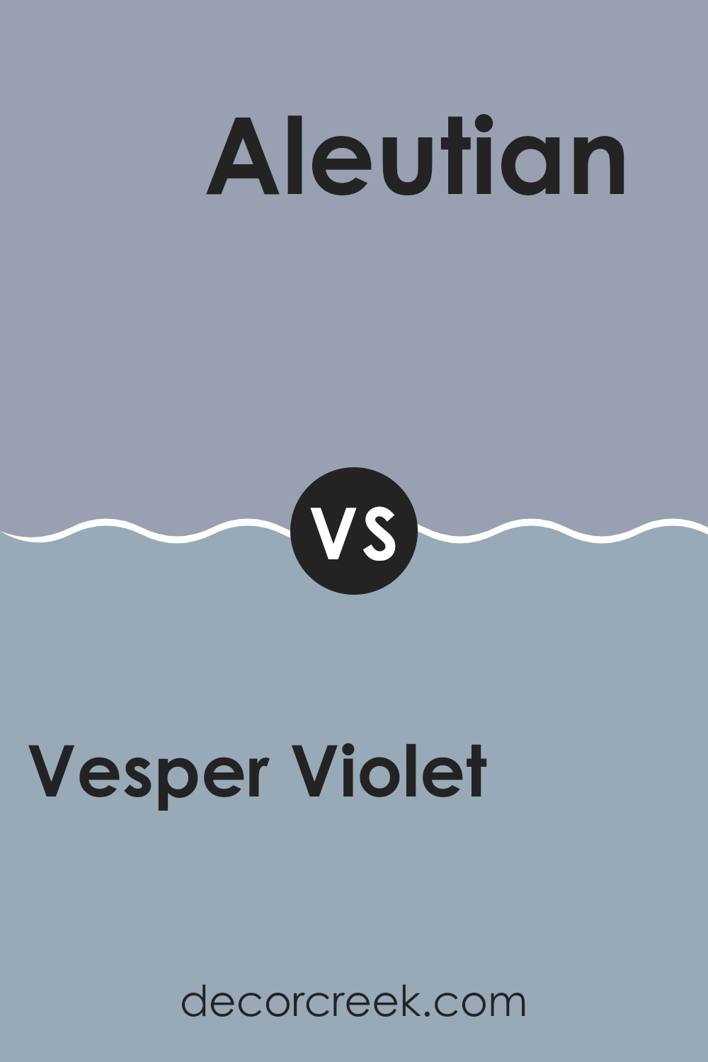
Vesper Violet SW 6542 by Sherwin Williams vs Aleutian SW 6241 by Sherwin Williams
Vesper Violet is a deep, muted blue with hints of purple, giving it a cozy and moody feel. It’s a great choice if you’re looking for a color that adds a rich and calm atmosphere to a room. On the other hand, Aleutian is a lighter, softer shade of blue with gray undertones. It has a gentle and calming presence, making it ideal for creating a relaxed and peaceful space.
While Vesper Violet tends to create a more enclosed and intimate vibe, perfect for spaces like bedrooms or reading nooks, Aleutian is more versatile and can brighten up various areas, including kitchens and bathrooms, without overwhelming them.
Choosing between these two depends on the mood you want to set and the size of your room. Vesper Violet works well in larger or well-lit areas to prevent it from making the space feel too dark, whereas Aleutian can make smaller spaces appear bigger and more open.
You can see recommended paint color below:
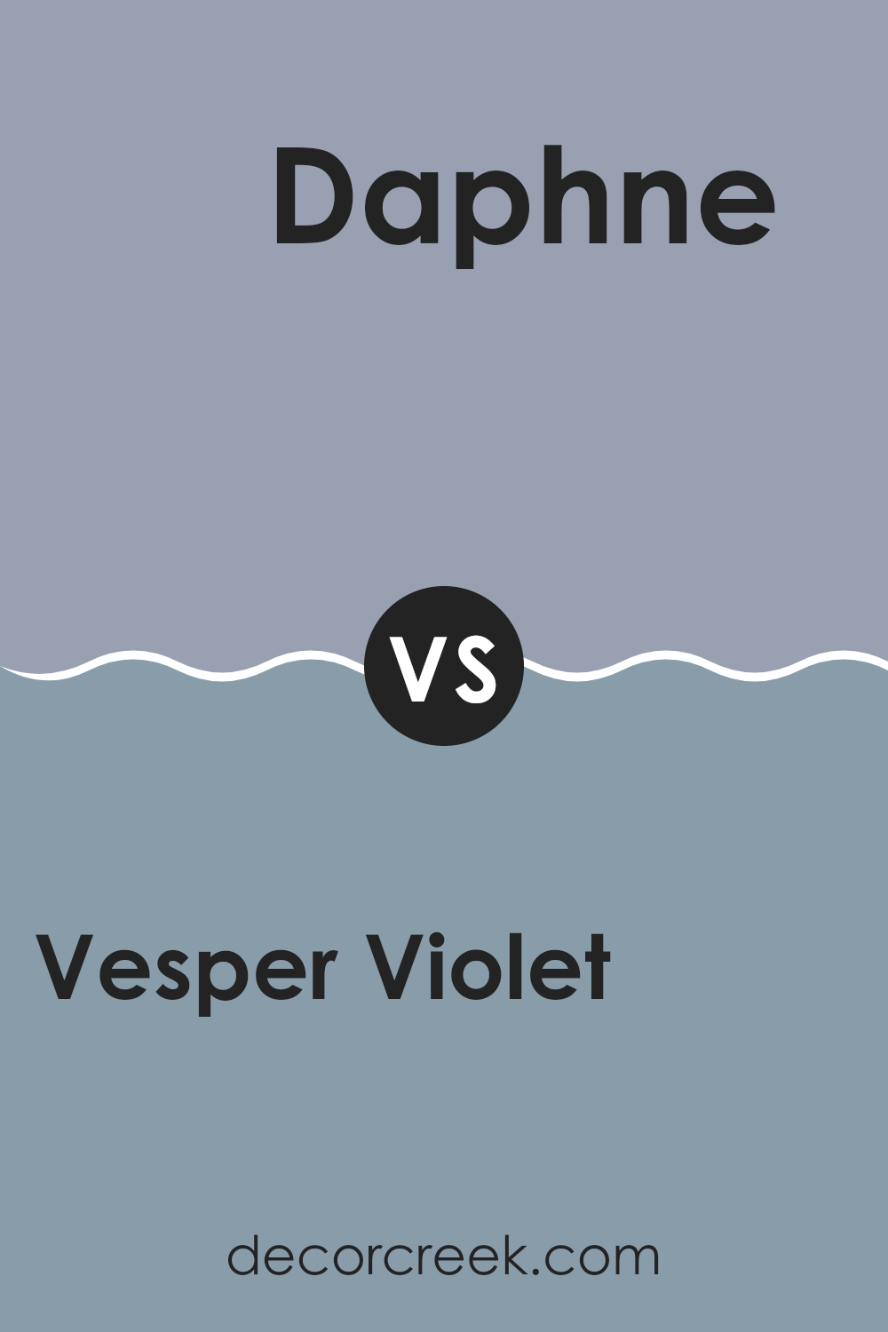
Vesper Violet SW 6542 by Sherwin Williams vs Daphne SW 9151 by Sherwin Williams
Vesper Violet and Daphne by Sherwin Williams are two distinct colors with their own unique appeals. Vesper Violet is a deep, rich purple with a strong presence that creates a sense of depth in any space. Its bold tone works well in areas where a statement is desired, and it pairs nicely with bright whites or soft grays for a balanced look.
On the other hand, Daphne is a lighter shade that leans towards a soothing seafoam green. It’s much more subdued compared to Vesper Violet and offers a refreshing vibe, perfect for creating a calm and inviting atmosphere. Daphene is versatile enough to be used in various settings, from kitchens to bedrooms, bringing a light and airy feel to the environments.
Overall, Vesper Violet is ideal for those looking for a dramatic touch, while Daphne suits spaces that aim for a gentle, refreshing look. Each color has its charm and serves different design needs effectively.
You can see recommended paint color below:
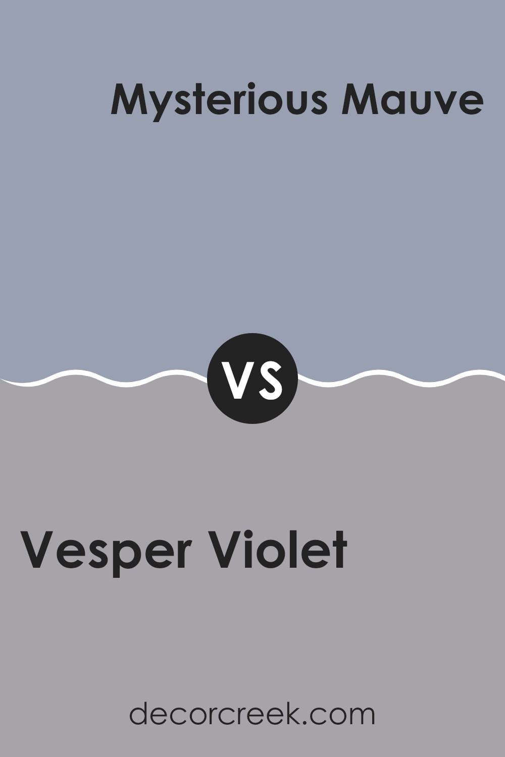
Vesper Violet SW 6542 by Sherwin Williams vs Mysterious Mauve SW 6262 by Sherwin Williams
Vesper Violet and Mysterious Mauve, both by Sherwin Williams, are unique shades that show how varied purple tones can be. Vesper Violet is a deeper purple with strong blue undertones. This color gives off a more reserved, yet rich feel, making it perfect for creating a cozy, inviting space. It works well in bedrooms or living areas where you want a touch of drama without overpowering the room.
On the other hand, Mysterious Mauve is lighter and leans more towards a soft lavender with subtle gray undertones. This gives it a gentle and calming effect, suitable for spaces where you want a relaxed vibe, like bathrooms or small reading nooks.
Both colors provide distinct atmospheres and can anchor a room in different ways based on their unique hues and the feelings they generate. While Vesper Violet makes a statement, Mysterious Mauve is more laid back.
You can see recommended paint color below:
- SW 6262 Mysterious Mauve
Conclusion
In summary, SW 6542 Vesper Violet by Sherwin Williams is a unique and charming paint color. It’s a deep, soft purple that reminds me of a calm evening. This color can add a touch of playfulness to any room without being too bright or bold. It works well in bedrooms because it has a calming effect, which can help you relax and get ready for bed.
Vesper Violet is also great for adding some personality to living rooms and dining areas. It pairs nicely with lots of other colors, like light yellows or soft whites, which means it’s easy to find decorations and furniture that look good with it. Plus, it has a gentle, warm feeling, making any room feel cozy and inviting.
After learning about SW 6542 Vesper Violet, I think it’s a wonderful choice if you want to make a room more beautiful in a subtle way. It’s definitely a color that can make your home feel more special and enjoyable for everyone.

Ever wished paint sampling was as easy as sticking a sticker? Guess what? Now it is! Discover Samplize's unique Peel & Stick samples.
Get paint samples

