Creating a welcoming and aesthetically pleasing environment goes beyond mere furniture and decorations. Indeed, the color palette holds a significant key to enhancing the overall ambiance of a room. One such color that speaks volumes about elegance and sophistication is SW 6535 Solitude from Sherwin-Williams.
The name ‘Solitude’ beautifully encapsulates the essence of this exquisite shade. This article offers an in-depth analysis of the color, its undertones, how it works with other hues, and its various applications.

What Color Is SW 6535 Solitude?
SW 6535 Solitude is a tranquil, medium-dark shade of blue. Reminiscent of a clear sky just after twilight, it captures the essence of serenity, thereby giving its name apt justice. This exquisite shade of blue is not only soothing to the eyes but also carries a subtle vibrancy that never fails to make a statement.
However, the beauty of Solitude is not one-dimensional. The depth of this color unveils a multi-layered personality, reflective of a calm and peaceful ocean. It carries a rich elegance that adds depth to any space. Whether used as an accent or the main theme, Solitude can bring a sense of calm and sophistication to your space.

Ever wished paint sampling was as easy as sticking a sticker? Guess what? Now it is! Discover Samplize's unique Peel & Stick samples.
Get paint samples

Is It a Warm Or Cool Color?
SW 6535 Solitude belongs to the cool color family. Cool colors tend to evoke feelings of calm and tranquility, making Solitude an ideal choice for bedrooms, bathrooms, or any space meant for relaxation. Its inherent coolness also gives the illusion of enlarging the space, making it appear more spacious.
Undertones of SW 6535 Solitude
Undertones play a significant role in how we perceive color. They subtly affect the overall look and feel of the color, sometimes pulling it towards a different color spectrum. Understanding the undertones of colors like SW Solitude enables us to match it more effectively with other colors, thereby creating a cohesive color scheme.
- Gray Undertone: SW 6535 Solitude carries a subtle gray undertone that enhances its depth and sophistication. This undertone balances the inherent vibrancy of blue, ensuring that the color doesn’t overwhelm the space.
- Green Undertone: A subtle hint of green makes Solitude a versatile hue, pairing beautifully with a variety of other colors. This undertone breathes life into the color, ensuring that it doesn’t fall flat.
- Purple Undertone: The undertone of purple brings a touch of warmth to this cool hue, ensuring a well-rounded color profile.

Coordinating Colors of SW 6535 Solitude
Coordinating colors are those that work harmoniously with the primary color, creating a cohesive, pleasing color scheme. Understanding which colors coordinate well with SW Solitude can help to create an aesthetically pleasing color palette.
- SW 6525 Rarified Air: A light and airy blue, Rarified Air is the perfect counterpart to the depth of Solitude, providing a breezy contrast.
- SW 6385 Dover White: Dover White is a soft, warm, off-white shade that pairs beautifully with the coolness of Solitude, offering a well-rounded color balance.
- SW 6127 Ivoire: Ivoire is a warm, creamy beige color that brings out the subtle warmth of Solitude’s purple undertone.
Additional coordinating colors include:
- SW 7043 Worldly Gray: A versatile gray that adds a modern touch when paired with Solitude.
- SW 6252 Ice Cube: This cool-toned light blue complements Solitude by enhancing its cool undertones.
- SW 7029 Agreeable Gray: A neutral gray that harmonizes beautifully with the depth of Solitude.

How Does Lighting Affect SW 6535 Solitude?
Lighting can dramatically impact how we perceive color. In natural light, SW 6535 Solitude showcases its vibrant, tranquil side, reflecting the blue hues with stunning clarity. In artificial lighting, the gray undertone of Solitude becomes more pronounced, lending the color a more neutral feel.

LRV of SW 6535 Solitude
The Light Reflectance Value (LRV) of color measures the amount of light the color reflects. SW 6535 Solitude has an LRV of 38, placing it in the middle of the scale. This means it strikes a balance between reflecting and absorbing light, making it a versatile choice for rooms of various sizes and lighting conditions.
A higher LRV would mean color is light, reflecting more light and visually expanding a space. On the other hand, a lower LRV means a color is dark, absorbing more light and creating a sense of coziness. With an LRV of 38, Solitude is dark enough to add depth and interest to a room but light enough not to make a space feel closed in.

LRV – what does it mean? Read This Before Finding Your Perfect Paint Color
Trim Colors of SW 6535 Solitude
Trim colors are used to highlight architectural features and add depth to a room. Choosing the right trim color for SW 6535 Solitude can enhance its visual impact and tie together the overall color scheme. You might want to try the following options in particular:
- SW 7006 Extra White: This crisp white adds a clean, fresh touch when used as trim for Solitude, accentuating its cool tones.
- SW 7008 Alabaster: A subtler white, Alabaster adds a warm contrast to Solitude without being too stark.
- SW 7551 Greek Villa: This off-white with subtle beige undertones beautifully complements Solitude, especially in rooms with warm lighting.

Colors Similar to SW 6535 Solitude
Understanding similar colors is important as it provides options and alternatives, particularly if Solitude is slightly off from the color vision you have in mind. Some similar colors include:
- Behr Cloudberry
- BM New Hope Gray
- PPG Inevitable
- Valspar Wave Goodbye
All these colors carry soothing tranquility, with slight variations in undertones and depth, and can be used as SW 6535 Solitude’s substitutes.

Colors That Go With SW 6535 Solitude
Knowing which colors go well with Solitude not only helps in creating a harmonious color palette but also allows for greater creativity in decor and design. By exploring different combinations, you can create an atmosphere that suits your personal style and preferences. Speaking of SW Solitude, this color will look good if you pair it with one of the following paint colors:
- SW 7710 Brandywine
- SW 9175 Deep Forest Brown
- SW 9136 Lullaby
- SW 6004 Mink
- SW 7005 Pure White
- SW 9153 Moonlit Orchid

How to Use SW 6535 Solitude In Your Home?
SW Solitude is an incredibly versatile color that can be used in various spaces and can fit several interior design styles. Its tranquil nature makes it an excellent choice for bedrooms and bathrooms, while its sophistication lends itself beautifully to formal living spaces.
Its versatility can be highlighted in contemporary, modern, coastal, and even traditional settings. Check out how it may read in your home!
How to Use SW 6535 Solitude In Bedrooms?
In bedrooms, SW 6535 Solitude can create a serene and cozy ambiance. It can be the perfect backdrop for a contemporary room when combined with light furnishings and warm wood tones. The color can also add depth to a traditional bedroom, working well with rich textures like velvet or brocade. For coastal-inspired bedrooms, it can mirror the depths of the ocean, especially when paired with crisp whites and sandy tones.
As a feature wall, Solitude can focus on particular elements in the room, such as an upholstered headboard or a beautiful piece of artwork. Additionally, when used on the ceiling, it can add an unexpected pop of color and create a dramatic effect. Pairing Solitude with softer, lighter colors for bedding and draperies can help balance its deep tone.

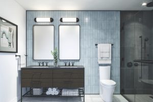
How to Use SW 6535 Solitude In Bathrooms?
In bathrooms, SW 6535 Solitude can create a spa-like atmosphere, contributing to a space where one can relax and rejuvenate. Using this color on the walls can evoke feelings of tranquility that one typically associates with the calm of a deep ocean or serene nighttime sky.
If your bathroom has ample natural light, Solitude can be an exceptionally captivating color choice, reflecting the light beautifully and adding depth to the space. Pair it with crisp white towels, a light-colored vanity, and chrome or brushed nickel fixtures for a clean and modern aesthetic.
On the other hand, for a more traditional or vintage look, consider pairing Solitude with gold or brass fixtures.

How to Use SW 6535 Solitude in the Living Room?
In the living room, SW 6535 Solitude can work wonders by adding sophistication and depth. It can create a calm, soothing environment perfect for relaxation or deep conversations. To make the room feel more expansive, consider painting the walls and molding in Solitude and using lighter colors for the furniture and decor.
This color also works great in a modern living room setting when combined with sleek, metallic accents and minimalist furniture. For a traditional aesthetic, pair Solitude with rich woods, classic furniture shapes, and antique accents. Regardless of the style, this rich, deep color provides a versatile backdrop that can adapt to changing trends and personal tastes.

How to Use SW 6535 Solitude for an Exterior?
For the exterior of your home, SW 6535 Solitude can create a striking and timeless impression. This dark, deep hue is an excellent choice for various home styles, including traditional, modern, and coastal.
In a traditional setting, Solitude can be paired with white or cream trims to create a classic contrast. For a modern look, pair it with metal accents and minimalist landscaping. In a coastal setting, Solitude can beautifully mirror the deep blues of the ocean or evening sky. Regardless of your home style, this color creates a statement that sets your home apart.

How to Use SW 6535 Solitude in the Kitchen?
In a kitchen, SW 6535 Solitude can create a captivating and inviting atmosphere. This rich, deep blue is a strong enough color to stand on its own, but it can also beautifully complement other elements in a kitchen, such as stainless steel appliances or wooden countertops.
To achieve a modern look, use Solitude on the walls and pair it with white or light-colored cabinets and sleek, stainless steel appliances. For a more traditional kitchen, consider using Solitude on the lower cabinets or an island, and pair it with a lighter color on the upper cabinets and warm wood tones.

How to Use SW 6535 Solitude for the Kitchen Cabinets?
Using SW 6535 Solitude for kitchen cabinets can offer a dramatic and stylish statement. The deep, navy hue can provide a striking contrast against light-colored walls or countertops, offering a unique spin on the traditional kitchen aesthetic.
For a contemporary look, consider pairing Solitude cabinets with a light, neutral wall color, stainless steel appliances, and sleek hardware. For a more traditional aesthetic, consider combining Solitude cabinets with warm wood tones, classic hardware, and a light-colored backsplash.
Whether you opt for a full set of Solitude cabinets or just an island, this versatile color is sure to make your kitchen stand out.

Comparing SW 6535 Solitude With Other Colors
Comparing different colors is crucial in various aspects, especially in interior design and any field where visual aesthetics play a significant role. Comparing colors can help us understand how different colors interact with each other. Also, in design, using the right color combinations can make a space or object more visually appealing. You can check out how SW Solitude may read compared to other colors.
SW 6535 Solitude vs. SW 6258 Tricorn Black
SW Tricorn Black is a deep, true black color that’s often used for striking contrast or to create a dramatic, sophisticated atmosphere. Compared to Tricorn Black, SW 6535 Solitude has a softer, more approachable vibe. While both are deep, bold colors, Solitude’s deep navy hue offers a sense of calm and tranquility that the stark Tricorn Black may not.

SW 6535 Solitude vs. SW 7006 Extra White
SW Extra White is a crisp, bright white color that brings a clean and refreshing feel to any space. Compared to Extra White, Solitude is a much deeper and moodier tone. The cool, serene navy blue of Solitude offers a stark contrast to Extra White’s bright purity. When used together, these colors can create a balanced and harmonious aesthetic, with Solitude adding depth and Extra White providing lightness and space.

SW 6535 Solitude vs. SW 7008 Alabaster
SW Alabaster is a warm, slightly off-white hue that’s often used to create a cozy and inviting atmosphere. Compared to Alabaster, Solitude is a much deeper, cooler tone. While Solitude’s navy blue offers a sense of calm and tranquility, Alabaster’s warm tone provides a comforting and nurturing feel. Both colors complement each other well and can create a balanced and comforting atmosphere when used together.

SW 6535 Solitude vs. SW 7641 Collonade Gray
SW Colonnade Gray is a light to medium warm gray with a subtle taupe undertone. Compared to Collonade Gray, Solitude is much deeper and richer in tone. Solitude’s cool navy blue offers a striking contrast to Collonade Gray’s warmer, lighter tone. However, both colors are highly versatile and can work well together to create a balanced, sophisticated color palette.

SW 6535 Solitude vs. SW 6204 Sea Salt
SW Sea Salt is a light, muted green with gray undertones that can bring a tranquil, beachy vibe to any space. Compared to Sea Salt, Solitude is much deeper and moodier. While Solitude’s navy blue can bring depth and drama, Sea Salt offers a light, airy feel. When used together, these colors can evoke feelings of a peaceful seaside landscape, with Solitude representing the deep sea and Sea Salt, the misty seafoam.

SW 6535 Solitude vs. SW 7016 Mindful Gray
SW Mindful Gray is a medium gray with a slight purplish undertone. This color is seen as versatile and neutral, fitting well in many spaces. Compared to Solitude, Mindful Gray is lighter and less intense. Solitude’s deep, navy blue provides a serene contrast to Mindful Gray’s balanced neutrality.
When paired together, they can create a harmonious and sophisticated color scheme, with Solitude adding a touch of bold drama.

Conclusion
Sherwin-Williams’ SW 6535 Solitude is a rich, deep navy blue color that brings a sense of calm, tranquility, and sophistication to any space. It is a versatile color that can work well in various settings, from creating a serene atmosphere in bedrooms and bathrooms to providing a striking contrast in kitchens and living rooms. Moreover, it can be used to enhance the exterior of a home, making a bold and timeless statement.
Solitude pairs beautifully with various colors, from bright whites and warm neutrals to other deep hues. Its adaptability also spans different design styles, fitting seamlessly into modern, traditional, coastal, and many other aesthetics.
Regardless of where or how it’s used, SW 6535 Solitude adds depth, sophistication, and a sense of calm to any design scheme, making it a valuable color choice for homeowners and designers alike.

Ever wished paint sampling was as easy as sticking a sticker? Guess what? Now it is! Discover Samplize's unique Peel & Stick samples.
Get paint samples
Frequently Asked Questions
⭐What type of rooms would be best suited for SW 6535 Solitude?
Solitude is a versatile color that can be used in any room. It's perfect for creating a calm and serene atmosphere in bedrooms and bathrooms. In living rooms and kitchens, it can add depth and sophistication. It can also provide a bold, timeless statement on the exterior of a home.
⭐What color combinations work well with SW 6535 Solitude?
Solitude pairs beautifully with a range of colors. For a crisp and modern look, pair it with bright whites like SW 7006 Extra White. For a warmer, more traditional feel, consider pairing it with neutrals or light grays like SW 7641 Collonade Gray or SW 7016 Mindful Gray. For a bold, dramatic look, it can be paired with deep hues like SW 6258 Tricorn Black.
⭐What design styles can SW 6535 Solitude fit into?
Solitude fits seamlessly into a variety of design styles. Its deep, sophisticated tone can work well in both modern and traditional settings. In a coastal style, it can evoke the tranquility of the deep sea, especially when paired with lighter, sandy tones.
⭐How does SW 6535 Solitude look under different lighting conditions?
Like all colors, Solitude can appear differently under various lighting conditions. Under natural daylight, it's a deep, rich navy blue. Under artificial light, depending on the type of light (warm or cool), Solitude can appear either slightly brighter or even deeper.
⭐Can SW 6535 Solitude be used for exteriors?
Yes, Solitude can be used for the exterior of homes. Its deep, bold hue makes a timeless statement and can suit a variety of home styles, from traditional to modern to coastal. When used on an exterior, Solitude can provide a striking contrast against lighter trim colors.