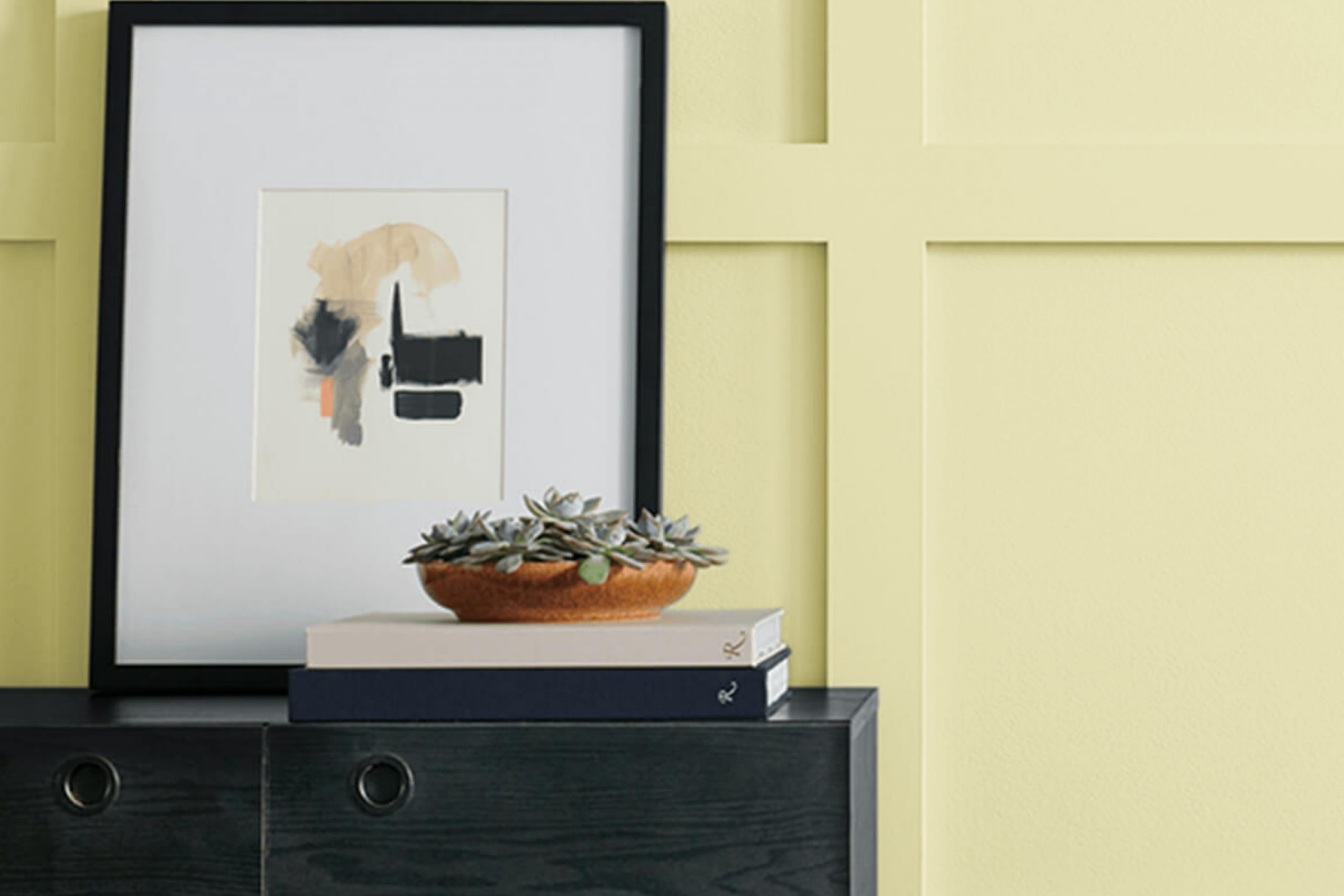
If you’re looking for a fresh, vibrant color to brighten up your area, SW 9668 Wild Lime by Sherwin Williams might just be the perfect pick. This shade is a lively green that brings a touch of nature’s energy indoors. It’s not just any green; it has a zesty quality that makes it stand out, giving a room an instant lift.
Applying SW 9668 Wild Lime can be a great way to add some personality to different areas of your home. Whether it’s a splash of color in the kitchen or a calming backdrop in your study, this color works wonderfully in rooms where you spend a lot of time and want to feel invigorated. It pairs well with both light and dark hues, allowing you flexibility in your decor choices.
Moreover, using SW 9668 Wild Lime can be a clever way to highlight specific areas of your home. Perhaps it could bring out the best in your favorite art pieces or make your furniture pop. It’s a color that invites creativity and refreshes your surroundings without overpowering them.
Consider giving SW 9668 Wild Lime a try if you’re ready for a change that’s both bold and refreshing.
What Color Is Wild Lime SW 9668 by Sherwin Williams?
Wild Lime by Sherwin Williams is a vibrant and punchy green that brings a burst of energy into any room. This lively shade has a youthful vibe and projects freshness and vitality, making it perfect for adding a touch of fun to an area. With its vivid tone, it works well in spots that benefit from a splash of brightness, such as kitchens, playrooms, or creative workspaces.
This color pairs beautifully with natural materials and textures. Wood, in its various finishes, complements the green, grounding it and adding warmth to the environment. Adding elements like wicker or rattan can enhance the organic feel of the room, while metals, particularly in matte black or brushed nickel, offer a modern contrast that makes the green pop even more.
In terms of interior styles, Wild Lime fits wonderfully with modern and contemporary themes due to its bold and fresh appeal. It also has a place in eclectic decorating schemes where its brightness can be balanced with other strong colors and patterns. For those who prefer a more down-to-earth vibe, pairing it with large plants and natural textures can create a lively yet cozy green retreat. All in all, Wild Lime is adaptable, allowing you to mix and match with various elements to reflect your personal style.
Is Wild Lime SW 9668 by Sherwin Williams Warm or Cool color?
Wild Lime by Sherwin Williams is a vibrant and lively paint color that brings a fresh burst of energy to any room. This shade of green is bright and playful, making it a great choice for areas where you want to add a pop of color. Because of its boldness, it works well in places that could use a little lift, such as kitchens, playrooms, or entryways.
In a home setting, Wild Lime can help make a small or dimly lit room feel more open and cheerful. When used on an accent wall, it can be a striking focal point, drawing the eye and adding interest to the room. However, because it’s quite a strong color, it’s important to balance it with more neutral tones like whites or soft greys.
This ensures that the room doesn’t feel overpowering. Overall, Wild Lime is perfect for adding a bit of fun and freshness to your home, whether you’re looking to jazz up a single room or create a lively theme throughout your house.
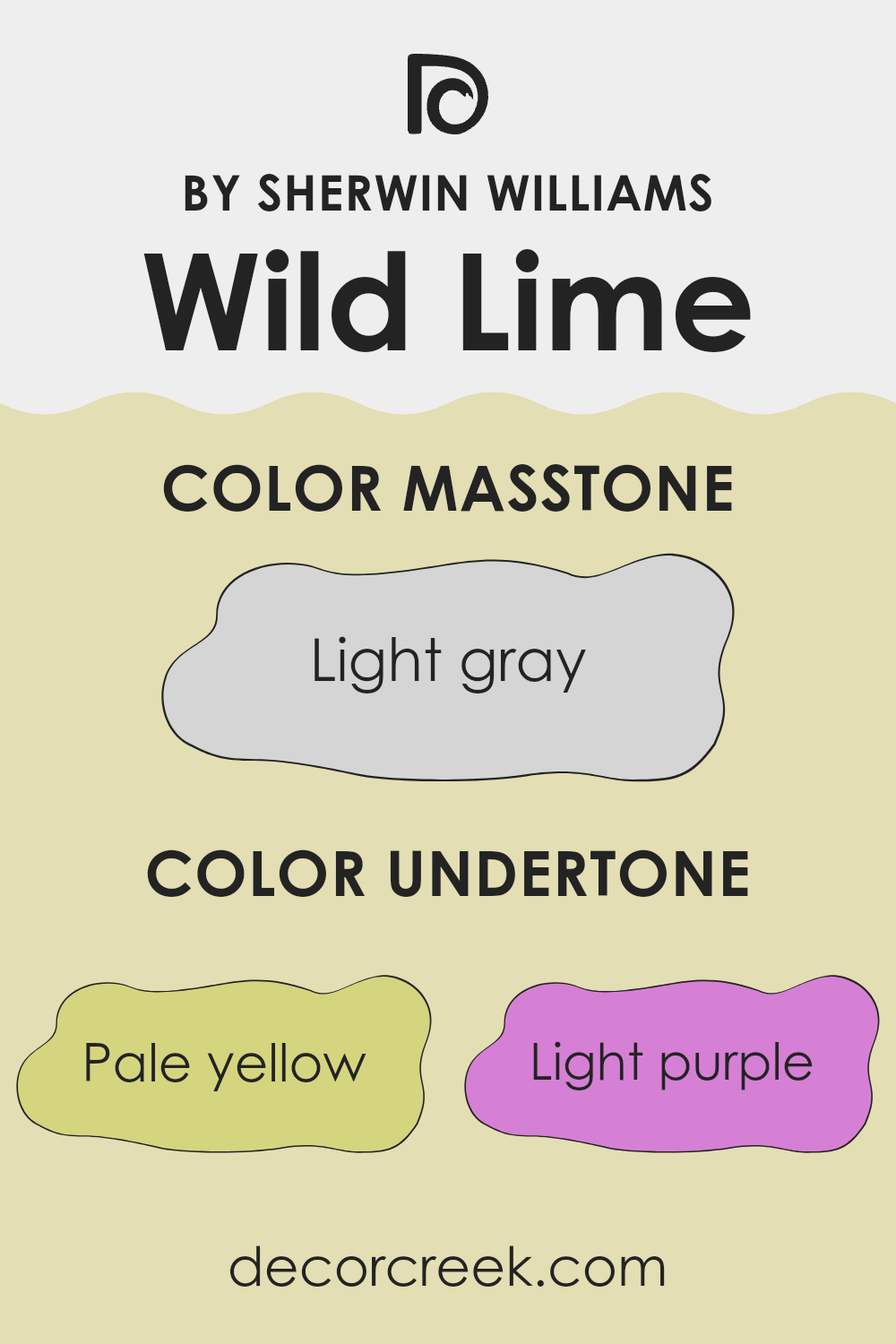
Undertones of Wild Lime SW 9668 by Sherwin Williams
The color Wild Lime has a variety of undertones that subtly influence the way it appears in different settings. These include pale yellow, light purple, light blue, pale pink, mint, lilac, and grey. Undertones are subdued hues that are mixed into the main color to give it depth and complexity.
Understanding undertones is essential because they can significantly affect the perception of color. For instance, a color with grey undertones might look slightly muted, while one with pale yellow undertones could appear warmer. Depending on the lighting and surrounding colors, these underlying tones come to the forefront or recede, changing the color’s appearance.
When Wild Lime is used on interior walls, its undertones play a key role in influencing the ambiance of the room. The light purple and lilac undertones can give a soothing feel to an area, making it ideal for a bedroom or bathroom. In contrast, the pale yellow and light blue undertones could create a refreshing and energizing vibe, suitable for a kitchen or living room. The mint undertone adds freshness, which is perfect for rooms meant to feel airy and open.
Pale pink undertones provide a soft, subtle influence that can make the room feel gentle and welcoming. In contexts like a child’s room or a cozy reading nook, this undertone can enhance comfort and warmth.
Overall, the specific mix of undertones in Wild Lime makes it a flexible color, capable of either energizing a room or providing a comforting atmosphere, depending on how it’s used and what other colors it’s paired with. The right choice of furniture and decorations can accentuate or balance these undertones to achieve the desired effect in any interior.
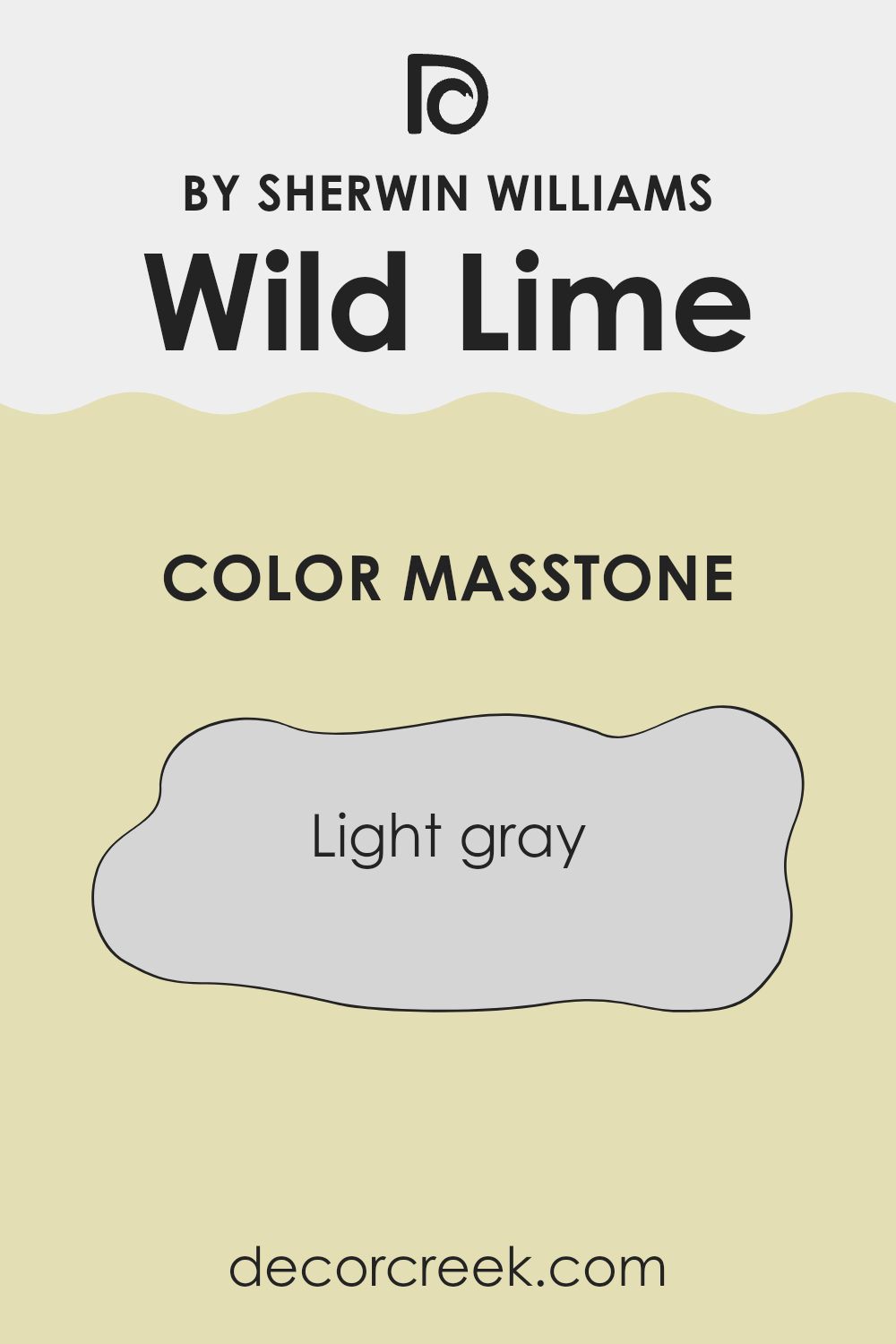
What is the Masstone of the Wild Lime SW 9668 by Sherwin Williams?
Wild Lime SW 9668 by Sherwin Williams masstone is Light gray (#D5D5D5), a simple and adaptable color that complements various home styles. As a light gray, it brings a fresh and clean feel to any room, easily blending with various decor elements.
This makes it a great choice for living rooms where you want a neutral backdrop that won’t clash with furniture and accessories. In smaller areas like bathrooms or corridors, its lightness helps to make them appear larger and more open.
Additionally, its understated quality means it works well in bedrooms, providing a calm and neutral background that can support relaxation and sleep. It’s also practical, hiding minor wall imperfections and maintaining a consistent look even under different lighting conditions. Hence, its flexibility in application makes it a reliable choice for both modern and traditional homes.
How Does Lighting Affect Wild Lime SW 9668 by Sherwin Williams?
Lighting plays a crucial role in how we perceive colors. Different light sources can significantly change the appearance of a color, affecting both its intensity and hue. For instance, a brightly colored wall might appear different under the warm glow of a sunset, the cool shade of a cloudy day, or the steady illumination from a light bulb.
Take the color Wild Lime by Sherwin Williams as an example. This vibrant, energetic lime green can look different depending on the lighting conditions it’s under. In natural light, Wild Lime tends to radiate and brighten up a room, showing off its true vividness.
Meanwhile, under artificial light, such as fluorescent or LED bulbs, the color can either maintain its lively green hue or shift slightly depending on the color temperature of the light (warmer lights might make it look more yellowish, while cooler lights keep it green).
In terms of room orientation, lighting can further influence the appearance of Wild Lime:
- North-faced rooms: These rooms typically receive less direct sunlight, so Wild Lime might appear softer and more subdued, potentially leaning towards a cooler tone due to the indirect, natural light.
- South-faced rooms: These rooms enjoy abundant sunlight, making Wild Lime appear brighter and truer to its original vibrant hue, potentially enhancing its vivacious quality.
- East-faced rooms: Morning light is ideal for this color, where the early sunlight can make it look lively and fresh. As the day progresses and natural light decreases, the color may appear calmer.
- West-faced rooms: Evening sunlight can make Wild Lime glow warmly in west-facing rooms. During the afternoons, when sunlight is at its peak, the color will likely be very vibrant and dynamic.
Understanding how lighting affects colors like Wild Lime can help in making informed decisions in interior design, allowing the use of natural and artificial light to highlight the best qualities of a color.

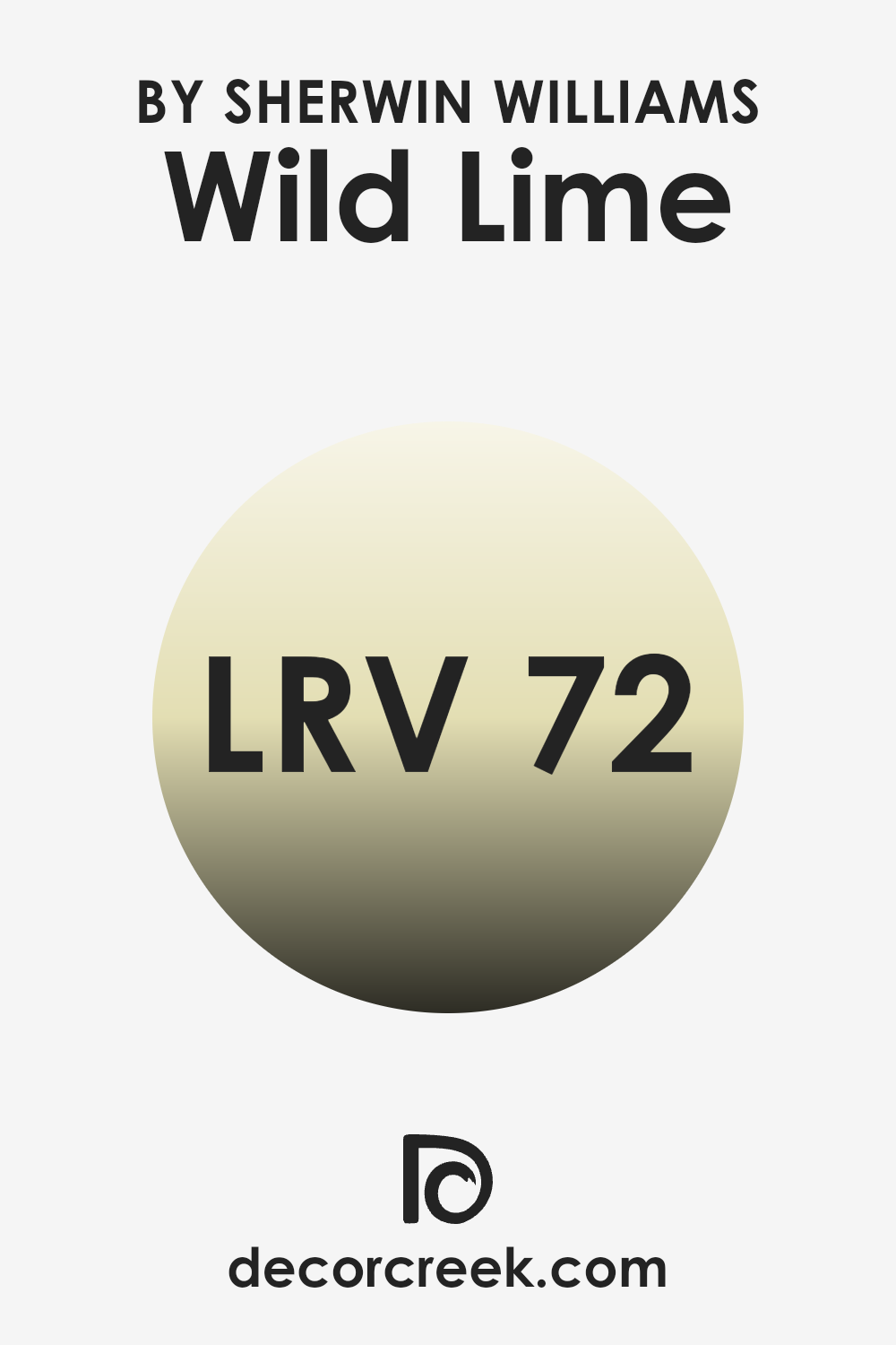
What is the LRV of Wild Lime SW 9668 by Sherwin Williams?
Light Reflectance Value (LRV) is a measure that tells us how much light a color reflects back into a room. It’s important because it impacts how light or dark a color appears once it’s painted on the walls. Typically, higher LRV numbers mean the color looks lighter, making rooms feel more open and airy.
Conversely, lower LRV values mean the color absorbs more light, giving a richer but darker appearance that can make rooms appear smaller or cozier. With an LRV of 71.926, Wild Lime is relatively light and thus will reflect a lot of light back into the room.
This makes it a good choice for smaller rooms or areas without much natural light, as it can help make the room feel brighter and more open. The brightness of this color can also influence mood, potentially energizing the environment and making it feel lively and refreshing. Such a high LRV can be particularly effective in areas intended for relaxation and casual use, where a light and refreshing atmosphere is beneficial.
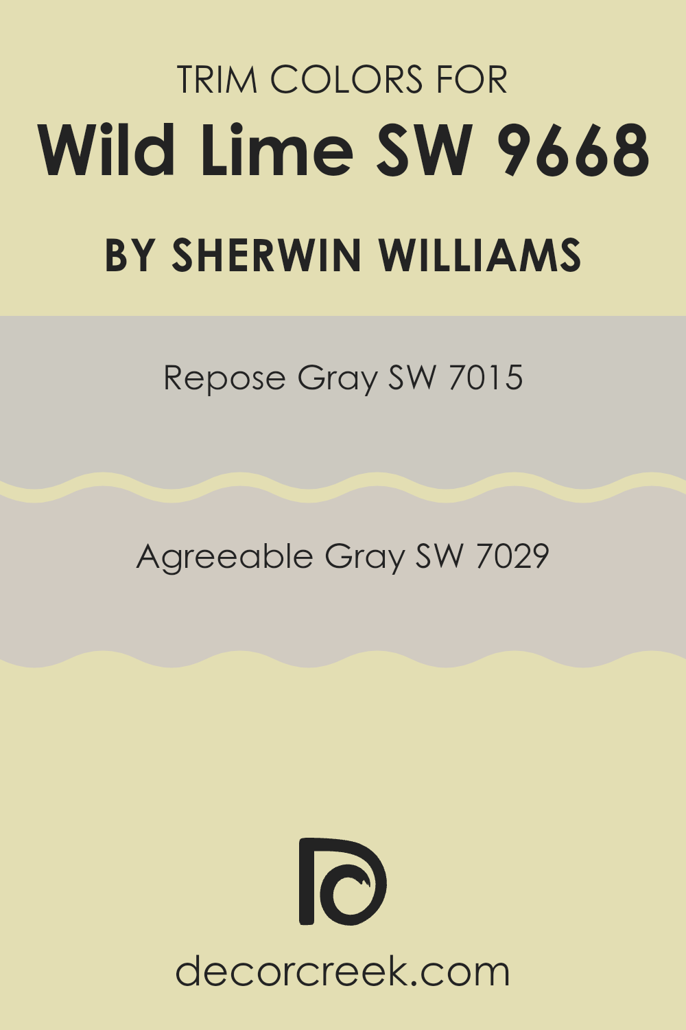
What are the Trim colors of Wild Lime SW 9668 by Sherwin Williams?
Trim colors are specifically chosen paint colors used to accentuate or complement the main color on walls, creating a visual frame or boundary that enhances the overall aesthetic of a room. When it comes to a vibrant shade like Wild Lime by Sherwin Williams, selecting the right trim colors is crucial because they can either balance the boldness of the main color or further define architectural details within the room.
For this lively hue, both Repose Gray and Agreeable Gray are excellent choices for trim as they provide a subtle, neutral backdrop that allows the brightness of Wild Lime to stand out prominently without overpowering the senses. These grays help in maintaining a clean and orderly look, especially in areas that aim for a cheerful yet grounded atmosphere.
Repose Gray is a light, warm gray that carries an understated adaptability, making it a perfect counterbalance to the vividness of Wild Lime. It’s soft enough to blend smoothly with other colors yet possesses enough presence to highlight baseboards, molding, or doorframes effectively. Agreeable Gray, on the other hand, is a slightly deeper shade that also leans towards warm tones.
It offers a slightly stronger contrast against Wild Lime, which can be particularly useful in areas where more definition is desired around window frames or corners. Both colors share the ability to complement Wild Lime without competing for attention, providing a pleasant visual flow throughout the room.
You can see recommended paint colors below:
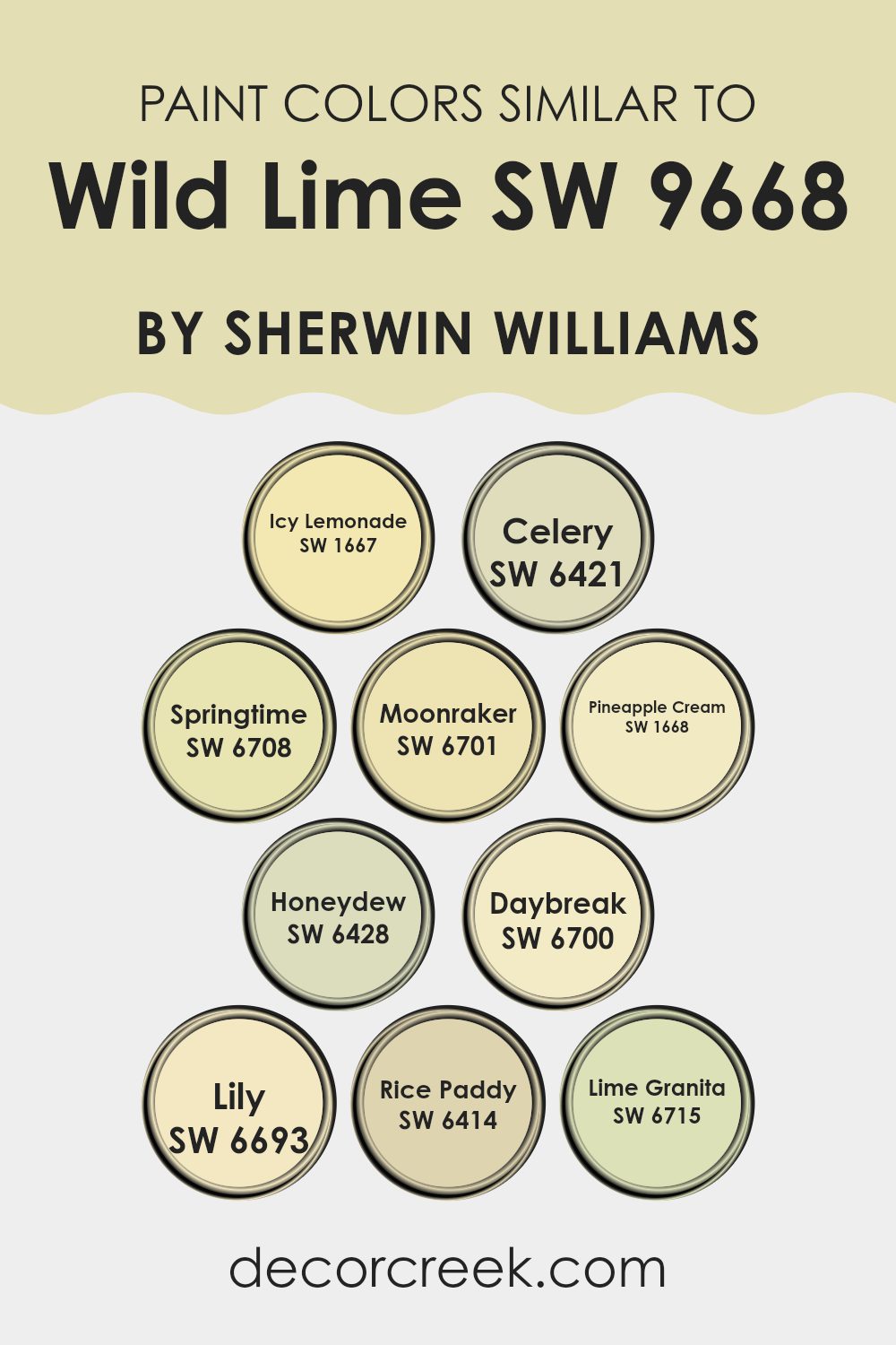
Colors Similar to Wild Lime SW 9668 by Sherwin Williams
Understanding the importance of using similar colors in decorating can significantly enhance the harmony and balance of a room. Colors that have a close relationship on the color wheel, such as those similar to Wild Lime by Sherwin Williams, contribute to a cohesive look, making the environment feel seamlessly put together.
These similar hues, ranging from lemony yellows to soft greens, work together by creating subtle differences that add depth while maintaining a unified atmosphere. This is particularly useful in design schemes aiming for a gentle and inclusive visual flow without the harsh contrasts that more diverse color palettes might introduce.
For example, Icy Lemonade introduces a fresh and zesty hint, very light and almost effervescent, perfect for bringing a breezy feel to an area. Celery, on the other hand, has a more subdued and earthy tone, grounding designs with its soft green essence. Springtime and Moonraker offer vibrant yet soft green and yellow hues, respectively, bringing a cheerful brightness to any room.
Pineapple Cream lends a slightly creamier feel to the yellow spectrum, enhancing rooms with a whisper of gentleness. Honeydew provides a muted green, akin to Celery but with a touch more vibrancy, ideal for peaceful environments. Daybreak and Lily skew towards a more yellow palette, bringing sunny vibes that are both refreshing and uplifting.
Rice Paddy steps back into the calmness of a more traditional green, providing a stronger connection to natural elements. Lastly, Lime Granita serves as a bolder, more pronounced relative of Wild Lime, perfect for accent points that need just a touch more vibrancy to make a statement. Through these similar colors, designers can achieve a gradient effect that allows for variety in design while keeping the overall feel light and harmonious.
You can see recommended paint colors below:
- SW 1667 Icy Lemonade
- SW 6421 Celery
- SW 6708 Springtime
- SW 6701 Moonraker
- SW 1668 Pineapple Cream
- SW 6428 Honeydew
- SW 6700 Daybreak
- SW 6693 Lily
- SW 6414 Rice Paddy
- SW 6715 Lime Granita
How to Use Wild Lime SW 9668 by Sherwin Williams In Your Home?
Wild Lime SW 9668 by Sherwin Williams is a vibrant and fresh color that can really brighten up your home. This lively green shade is perfect if you’re looking to add some energy and cheer to any room. You can use it in various ways like painting an accent wall in your living room to bring a splash of brightness.
It’s also great for kitchens or dining areas where its cheerful vibe can create a welcoming atmosphere for family meals and gatherings. If painting a whole room or wall seems too much, you can still incorporate Wild Lime by using it on smaller elements such as doors, furniture, or even as a border with other colors.
Pairing it with neutral shades like white or light grays can balance its vibrancy, making your room feel lively yet not too intense. Adding this color through accessories like cushions, vases, or lampshades is another subtle way to bring its fresh energy into your living area.
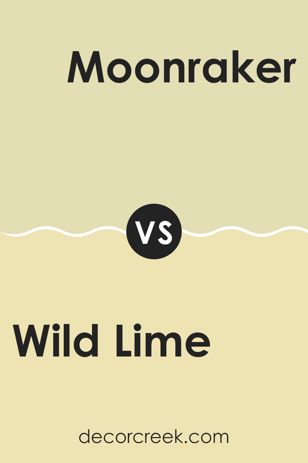
Wild Lime SW 9668 by Sherwin Williams vs Moonraker SW 6701 by Sherwin Williams
Wild Lime is a vibrant and energetic green with a noticeable brightness, ideal for rooms where you want to add some liveliness. It’s bold and can instantly brighten up an area, making it feel fresh and alive. This color works well when you want to inject a sense of fun or enthusiasm into your décor.
On the other hand, Moonraker is a softer, muted green with a hint of grey. This color is much more subdued compared to Wild Lime and offers a calm and gentle ambiance. Moonraker is perfect for those who prefer a more laid-back vibe in their room.
It’s great for achieving a relaxing atmosphere without creating an overpowering effect. While both colors are green, Wild Lime stands out with its luminosity, whereas Moonraker provides a quieter and more understated presence.
You can see recommended paint color below:
Wild Lime SW 9668 by Sherwin Williams vs Honeydew SW 6428 by Sherwin Williams
Wild Lime and Honeydew, both by Sherwin Williams, are vibrant and fresh colors, but they offer different vibes for your room. Wild Lime is a bold, bright green with a punchy, energetic feel. It stands out in an area and can make a strong statement, perfect for bringing a lively and refreshing atmosphere anywhere.
On the other hand, Honeydew is a much softer, more subtle green. It’s lighter and carries a gentle, calming quality, which makes it great for creating a relaxed environment. While Wild Lime could be ideal for accent walls or areas where you want to draw attention, Honeydew works beautifully in rooms where you want a more understated, soothing presence.
Both colors are green, but the intensity and mood they set are quite distinct—Wild Lime being more dynamic and Honeydew offering a quieter, softer touch.
You can see recommended paint color below:
Wild Lime SW 9668 by Sherwin Williams vs Springtime SW 6708 by Sherwin Williams
Wild Lime and Springtime by Sherwin Williams are both vibrant, cheerful colors, each with their own unique character. Wild Lime is a bold, lively green that packs a punch and is sure to draw attention in any room. It’s a shade that brings energy and zest, reminiscent of fresh, tart limes.
On the other hand, Springtime is a softer, more muted green with a noticeable hint of yellow. This color feels light and airy, perfect for creating a relaxing but happy atmosphere in rooms that get lots of sunshine.
While Wild Lime might be the go-to for an accent wall or an area that needs a dynamic splash, Springtime works well as a soothing backdrop for just about any room, promoting a more laid-back vibe. Each color can brighten up a room, but the choice between them depends on whether you want a color that stands out sharply or blends gently.
You can see recommended paint color below:
Wild Lime SW 9668 by Sherwin Williams vs Pineapple Cream SW 1668 by Sherwin Williams
The main color, Wild Lime, is a vibrant and lively shade that brings a touch of energy to any area. It has a bold, bright green hue that stands out and catches the eye, making it perfect for places where you want to create a lively and exciting atmosphere.
On the other hand, Pineapple Cream is more subtle and gentle. This color has a soft, creamy yellow tone that offers a warm and welcoming feel. It’s ideal for creating a cozy and comfortable environment, such as in a living room or bedroom.
When comparing the two colors, Wild Lime is more intense and attention-grabbing, while Pineapple Cream provides a calming and soothing effect. Both are great choices depending on the mood you want to set in your room.
You can see recommended paint color below:
- SW 1668 Pineapple Cream
Wild Lime SW 9668 by Sherwin Williams vs Lime Granita SW 6715 by Sherwin Williams
The two colors, Wild Lime and Lime Granita by Sherwin Williams, are vibrant greens that can brighten up any area. Wild Lime is a deeper, more saturated hue, resembling the lush greenness of a dense forest. It’s bold and eye-catching, making it a strong choice for a focal point in a room.
On the other hand, Lime Granita is lighter and fresher, reminiscent of the color of lime sherbet. It’s a cheerful color that tends to open up an area, making it feel airy and more spacious.
While both colors share a green base, Wild Lime offers depth and intensity, whereas Lime Granita provides a sense of lightness and freshness. The right choice between them depends on the mood or effect you’re aiming for in your area. Wild Lime works well in a room that could use a touch of drama, while Lime Granita is perfect for creating a relaxed, refreshing vibe.
You can see recommended paint color below:
Wild Lime SW 9668 by Sherwin Williams vs Rice Paddy SW 6414 by Sherwin Williams
Wild Lime and Rice Paddy are two distinctive colors from Sherwin Williams. Wild Lime is a bright and vibrant shade, offering a lively, fresh, and almost electric feel to any area. This bold lime green really stands out and is perfect for adding a dose of energy to a room.
In contrast, Rice Paddy is much more subdued. It’s a soft, calming green with a hint of earthiness. This color provides a gentle and soothing touch, making it ideal for creating a relaxed and welcoming atmosphere. When comparing the two, Wild Lime is more striking and might be best for an accent wall or decorative details, as its intensity could be intense if used extensively.
Rice Paddy, on the other hand, is easier to use in large doses and can comfortably coat the walls of a room without feeling too strong. Whether you choose Wild Lime for its vividness or Rice Paddy for its soothing nature depends on the mood and feel you want for your area.
You can see recommended paint color below:
Wild Lime SW 9668 by Sherwin Williams vs Icy Lemonade SW 1667 by Sherwin Williams
The two colors, Wild Lime and Icy Lemonade, both by Sherwin Williams, offer bright and cheerful hues, but they have distinct tones that can create different atmospheres in an area. Wild Lime is a bold and vibrant green that brings energy and a sense of freshness wherever it’s used. It’s the kind of color that can make a statement in a room, attracting immediate attention due to its lively nature.
On the other hand, Icy Lemonade is a softer tone, leaning more towards a pale yellow. This color is much more subtle compared to Wild Lime and provides a lighter, airy feel. It can brighten up an area without feeling too strong, giving a gentle nod to sunshine and summer days.
Both colors are great for adding a splash of cheerfulness, but the choice between them depends on how much you want the color to stand out. Wild Lime suits a more daring decorator, while Icy Lemonade is ideal for those seeking a gentler color uplift.
You can see recommended paint color below:
Wild Lime SW 9668 by Sherwin Williams vs Celery SW 6421 by Sherwin Williams
Wild Lime and Celery are two distinct green shades by Sherwin Williams, each offering a unique vibe. Wild Lime is a vibrant, energetic green, much bolder and brighter. It stands out in an area and brings a lively, dynamic feel to any room. This color is great for spots where you want to add a punch of vitality and cheer.
On the other hand, Celery is a softer, more muted green. It has a calming effect, making it perfect for areas where you want to relax, like bedrooms or bathrooms. This shade is more subdued, providing a gentle backdrop that’s easy on the eyes.
Both colors lend a touch of nature to a room but in different ways. Wild Lime seems to shout with freshness, while Celery whispers calmness. Choosing between them depends on the atmosphere you want to create—vibrant and lively or soft and soothing.
You can see recommended paint color below:
Wild Lime SW 9668 by Sherwin Williams vs Lily SW 6693 by Sherwin Williams
Wild Lime by Sherwin Williams is a vibrant, energizing green shade that brings a bold burst of color to any area. It’s a lively hue that can make a room feel fresh and full of life. On the other hand, Lily by Sherwin Williams is a soft, cheerful yellow that offers a light and airy feel. This shade is perfect for creating a friendly, welcoming atmosphere in any room.
Both colors are great for adding personality to your surroundings, but they serve different moods and settings. Wild Lime is more dynamic and stands out, making it suitable for areas that aim to stimulate and energize, such as a playroom or a creative workspace.
Lily, with its gentle yellow tone, is better suited for spots where you want to relax and unwind, like a bedroom or a cozy nook. Overall, whether you choose Wild Lime or Lily depends on the kind of environment you want to create. Each hue has its unique charm and can significantly influence the look and feel of a room.
You can see recommended paint color below:
- SW 6693 Lily
Wild Lime SW 9668 by Sherwin Williams vs Daybreak SW 6700 by Sherwin Williams
Wild Lime and Daybreak are both vibrant shades from Sherwin Williams, but they bring different energy to an area due to their hues. Wild Lime is a bold, bright green that feels fresh and lively. It’s perfect for adding a splash of vitality to a room, making spots feel invigorated and energetic. This shade could be a great choice for a playroom or a creative zone, where it will boost the overall mood.
On the other hand, Daybreak is a cheerful, sunny yellow. This shade is light and airy, providing a sense of happiness and optimism. It’s well-suited for kitchens or breakfast nooks, where the morning light can enhance its brightness.
Daybreak can help to make a small or dim area feel more open and welcoming. Both of these hues are dynamic and can breathe life into a home, but the choice between them depends on the kind of energy and atmosphere you want to create.
You can see recommended paint color below:
Concluding on the paint SW 9668 Wild Lime by Sherwin Williams, I find it a wonderful choice for anyone looking to brighten up their room with a fresh and lively shade. This lime tone is vibrant without being too loud, making it a perfect pick for bedrooms, play areas, or even living rooms where you spend a lot of time with family and friends. It has a way of adding energy and fun to any wall it’s painted on.
The shade is also very forgiving, which means it doesn’t show dirt easily—a big plus if you have kids or pets around. From my experience, SW 9668 Wild Lime works really well if you pair it with light or dark furniture, and it also goes well with various decor styles, whether you prefer things modern or a bit more traditional.
Overall, Sherwin Williams’ SW 9668 Wild Lime is an excellent choice if you’re thinking of giving a room a makeover that needs a touch of cheer without going overboard. It’s simple enough that if you’re planning to paint yourself, you won’t find it too difficult.
I recommend giving it a try if you want something new and fun but still pretty easy to work with!

Ever wished paint sampling was as easy as sticking a sticker? Guess what? Now it is! Discover Samplize's unique Peel & Stick samples.
Get paint samples

