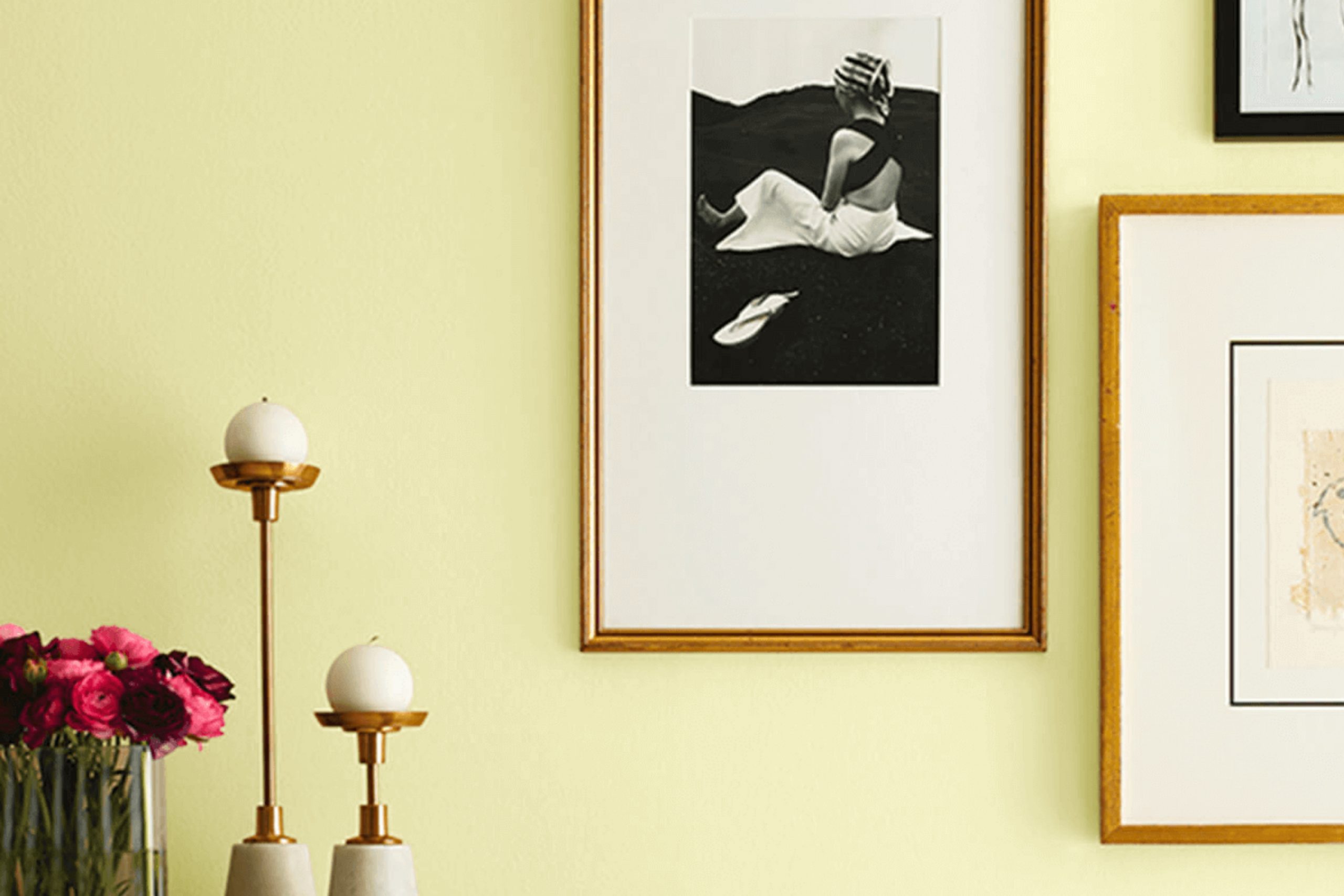
Whenever I paint a room, I’m always on the lookout for colors that bring warmth and cheer. That’s why I was drawn to Sherwin Williams’ SW 6708 Springtime. It’s more than just a color—it’s like having a piece of lush, vibrant nature inside your home. When I see Springtime, I think of fresh green leaves and the first buds of spring flowers. It’s lively, but not too bold, and it brings a sense of life and renewal to any room.
I noticed how seamlessly it fits into different types of interiors. Whether your home is modern, traditional, or eclectic, Springtime adds a refreshing touch without clashing with existing decor. Its green hues act as a neutral base, giving you the freedom to pair it with a variety of other colors, patterns, and textures.
The best part is how it changes with the light. During the day, with natural sunlight, it feels bright and airy. In the evening, with softer lighting, it turns cozy and inviting. Using this color, I managed to refresh dull corners into delightful rooms, creating a welcoming atmosphere that makes everyone feel at home.
It’s surprising how a simple change in color can uplift a room, turning it into a haven of calm and positivity.
What Color Is Springtime SW 6708 by Sherwin Williams?
Springtime SW 6708 by Sherwin Williams is a cheerful and light green color that brings the fresh and airy feeling of spring into any room. This color is vibrant yet soft, making it a great choice for areas where you want to create a lively yet welcoming atmosphere.
Springtime works wonderfully in a variety of interior styles, especially those that emphasize natural elements and a relaxed vibe. It is perfect for cottage-style homes, where you want to infuse rooms with a cozy and inviting feel. The color is also well-suited for transitional or modern farmhouse interiors, adding a touch of freshness without overpowering other design elements.
When it comes to materials and textures, Springtime pairs beautifully with natural woods, such as oak or pine. These woods complement the organic feel of the color and add warmth to the room. It also works well with simple white or cream accents to maintain a clean and bright look.
For textiles, consider using cotton or linen fabrics to enhance the natural and light atmosphere. Jute rugs or wicker furniture can also highlight the green hues while adding interesting textures. Accessories in warm metallic tones like brass or gold give a subtle contrast and can add a touch of depth and interest.

Is Springtime SW 6708 by Sherwin Williams Warm or Cool color?
Springtime SW 6708 by Sherwin Williams is a soft, light green color that brings a fresh and airy feel to any home. This shade can create a lively and cheerful atmosphere, making it perfect for rooms that need a touch of brightness. It works well in living rooms, kitchens, or even bedrooms, where it can help create a sense of renewal and energy.
Because it is a soft green, it pairs well with neutral colors like whites and creams, or even with natural materials like wood, which can enhance the feeling of freshness and connection to nature.
Springtime SW 6708 can make rooms feel larger and more open, as the light tone reflects natural light. This color is especially effective in areas with plenty of windows or good lighting, as it can enhance the overall brightness of the room, giving it a warm and inviting vibe.
Undertones of Springtime SW 6708 by Sherwin Williams
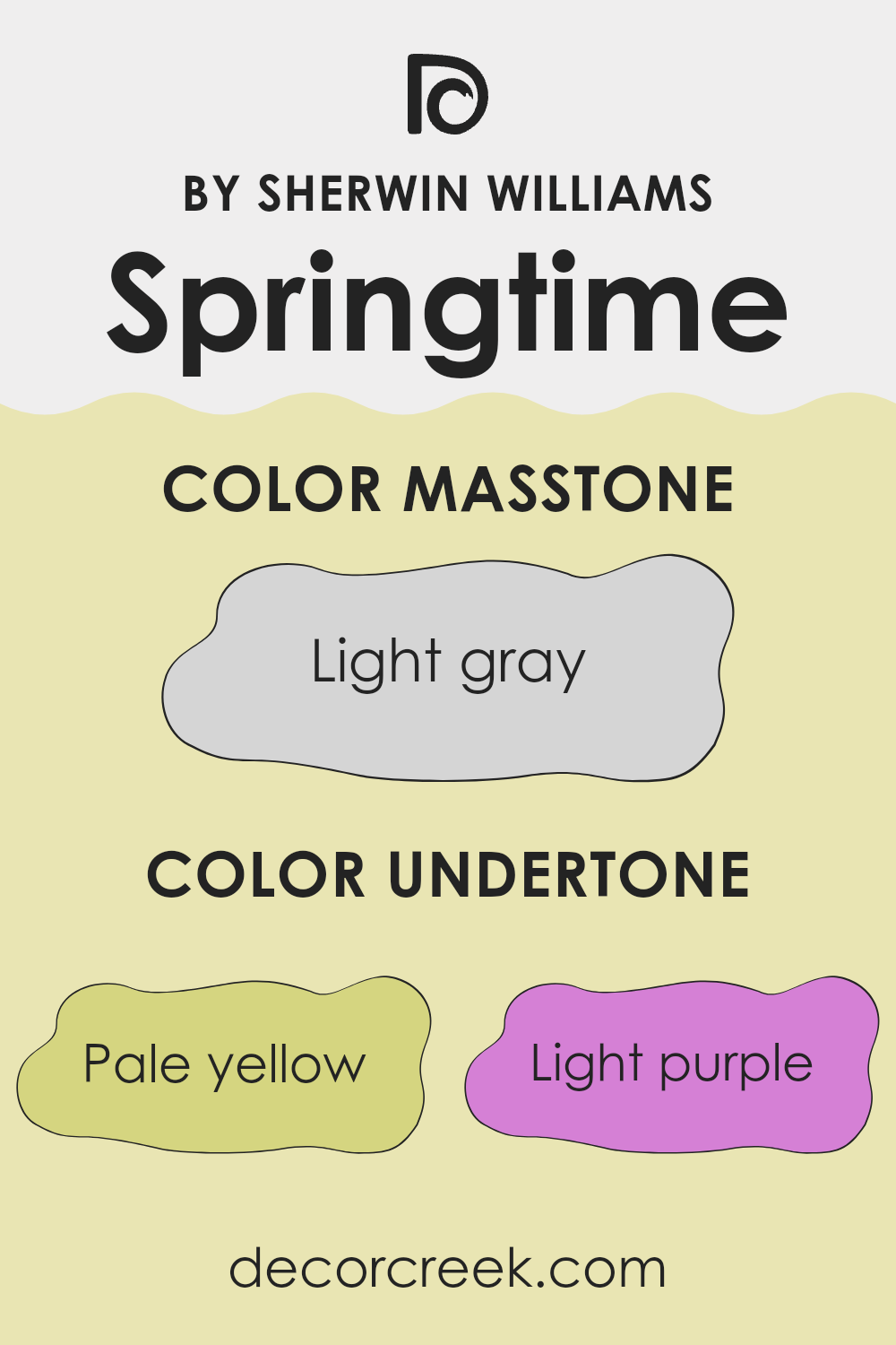
Springtime by Sherwin Williams is a complex color with several undertones that subtly influence how we perceive it. Understanding undertones is essential because they can dramatically affect a color’s appearance in different lighting and with surrounding colors. Undertones are the underlying colors within the main shade that can either enhance or alter the dominant color.
For Springtime, the undertones include pale yellow, light purple, light blue, pale pink, mint, lilac, and grey. These undertones combine to create a color that feels fresh and lively. The pale yellow and mint add warmth and a hint of nature, making the paint feel welcoming and cheerful.
Light blue and grey undertones introduce a cool aspect, balancing the warmth and providing a sense of calm. Light purple, lilac, and pale pink bring a subtle elegance and jovial touch, adding depth to the color scheme.
When used on interior walls, these undertones come together to make Springtime adaptable. The color can suit various styles depending on the lighting and other elements in the room. It can be bright and energetic in natural light, while appearing softer and more subdued under artificial lighting, offering a pleasant backdrop that complements a variety of design choices.
What is the Masstone of the Springtime SW 6708 by Sherwin Williams?
Springtime SW 6708 by Sherwin Williams is a color that brings a fresh and airy feel to any home. Its masstone is a light gray (#D5D5D5), which provides a neutral and flexible backdrop. This shade of light gray is gentle and soft, making it ideal for maintaining a relaxed and open atmosphere.
In living rooms, Springtime SW 6708 can help create a sense of spaciousness, making rooms feel larger and more welcoming. This color works especially well in living rooms and bedrooms, where people usually prefer a calming environment. Because light gray is neutral, it easily pairs with many other colors, allowing homeowners to introduce bolder accents through furniture, art, or textiles without clashing.
Moreover, this shade is flexible, complementing different styles, from modern to traditional. It reflects natural light well, enhancing the brightness indoors, especially in rooms with ample sunlight. This adaptable, light gray tone can subtly tie together various elements in a home, making it a popular choice.
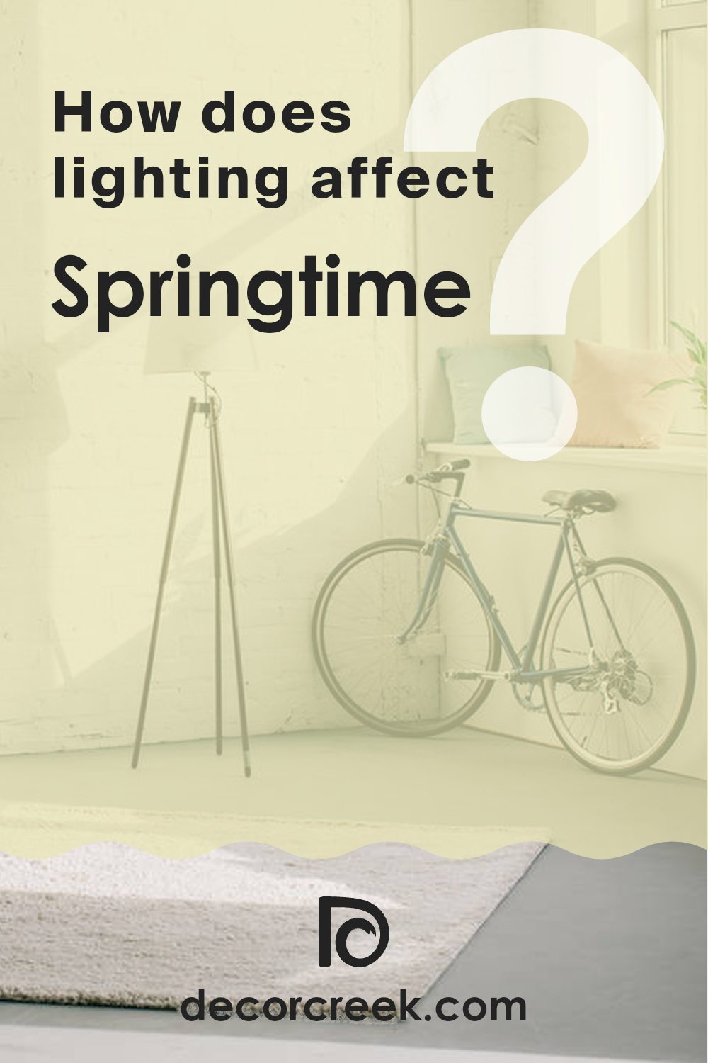
How Does Lighting Affect Springtime SW 6708 by Sherwin Williams?
Lighting plays a big role in how we see and experience colors. The color Springtime SW 6708 by Sherwin Williams is a light, fresh green with a hint of yellow. It can look different depending on the lighting in a room, which can change throughout the day.
In natural light, the time of day and the direction a room faces can alter how this color looks. In a north-facing room, which typically has cooler and softer light, Springtime might appear a bit more muted and less yellow. Northern light can make colors seem a little bluish, so the color may seem more subdued.
In contrast, a south-facing room receives warm and bright light for most of the day. Here, Springtime SW 6708 tends to look more vibrant and warm because the light enhances the yellow undertones. Colors often appear more intense in southern light, making this shade feel brighter and lively.
In east-facing rooms, the light is warm and yellow in the morning but turns cooler later in the day. In the morning, Springtime might look very fresh and warm with its yellow tones highlighted, while later in the day, it might appear slightly cooler and paler.
West-facing rooms receive warmer, orange-toned light in the afternoon and early evening. In such rooms, Springtime can look quite warm and lively when the sun is setting, with the color’s yellow undertones coming to the forefront.
Under artificial lighting, the type of bulb used can also impact this color. Incandescent lights can make Springtime appear warmer due to their yellowish glow, while fluorescent lights might cool it down a bit, making it seem more muted. LED lighting can vary, but a warm LED might highlight its yellow hint, whereas a cool LED could make it look softer and more neutral.
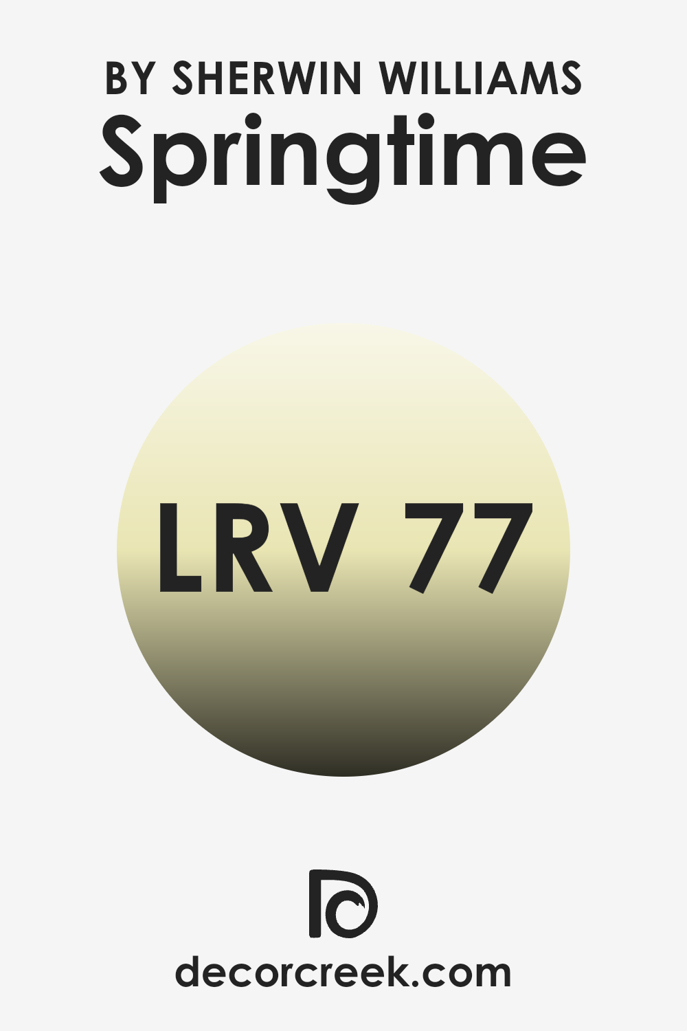
What is the LRV of Springtime SW 6708 by Sherwin Williams?
Light Reflectance Value, or LRV, is a measure of how much light a color reflects. It is expressed as a number between 0 and 100, with 0 being absolute black, which absorbs all light, and 100 being pure white, which reflects all light. The LRV of a color helps to understand its brightness and how it will affect the illumination of a room.
When you choose paint with a higher LRV, it means the color will reflect more light, making a room feel brighter and more open. Conversely, colors with lower LRV absorb more light, often making rooms feel more cozy and intimate.
For Springtime by Sherwin Williams, with an LRV of 76.639, this means it is a light and airy color. It reflects a significant amount of light, which can help a room feel larger and more welcoming. This high reflectance is particularly useful for areas that might lack natural light, as it can bounce artificial light around the interior more effectively.
The LRV value implies that Springtime will maintain its soft, refreshing appearance under various lighting conditions, enhancing the lightness of a room without overpowering it.
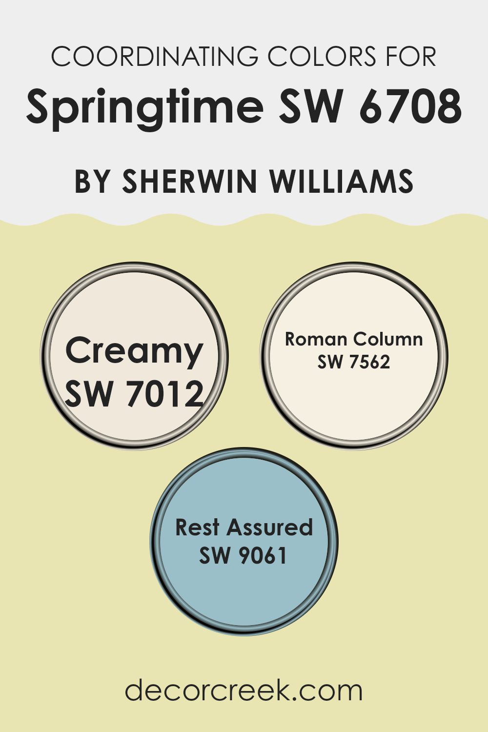
Coordinating Colors of Springtime SW 6708 by Sherwin Williams
Coordinating colors are carefully chosen shades that work well together to create a visually pleasing and harmonious room. They complement a primary color, like Sherwin Williams’ Springtime, adding depth and balance to the overall look. The trick to choosing coordinating colors is to find those that enhance the main hue without overpowering it. When you use them together, the colors should play off one another, providing an appealing contrast or a seamless blending, depending on the desired effect for the interior.
For instance, SW 7012 Creamy is a warm, soft off-white that adds a touch of coziness, making rooms feel inviting and light. It pairs beautifully with the fresh hue of Springtime, highlighting its subtle vibrancy.
On the other hand, SW 7562 Roman Column brings a more muted, sandy tone into play, offering a refined backdrop that complements the bright energy of Springtime without clashing. Lastly, SW 9061 Rest Assured introduces a gentle blue, giving a calming counterpoint to the green tones. Together, these coordinating colors can create a balanced and inviting atmosphere where every shade supports the other, making interiors feel cohesive and comfortable.
You can see recommended paint colors below:
- SW 7012 Creamy
- SW 7562 Roman Column
- SW 9061 Rest Assured
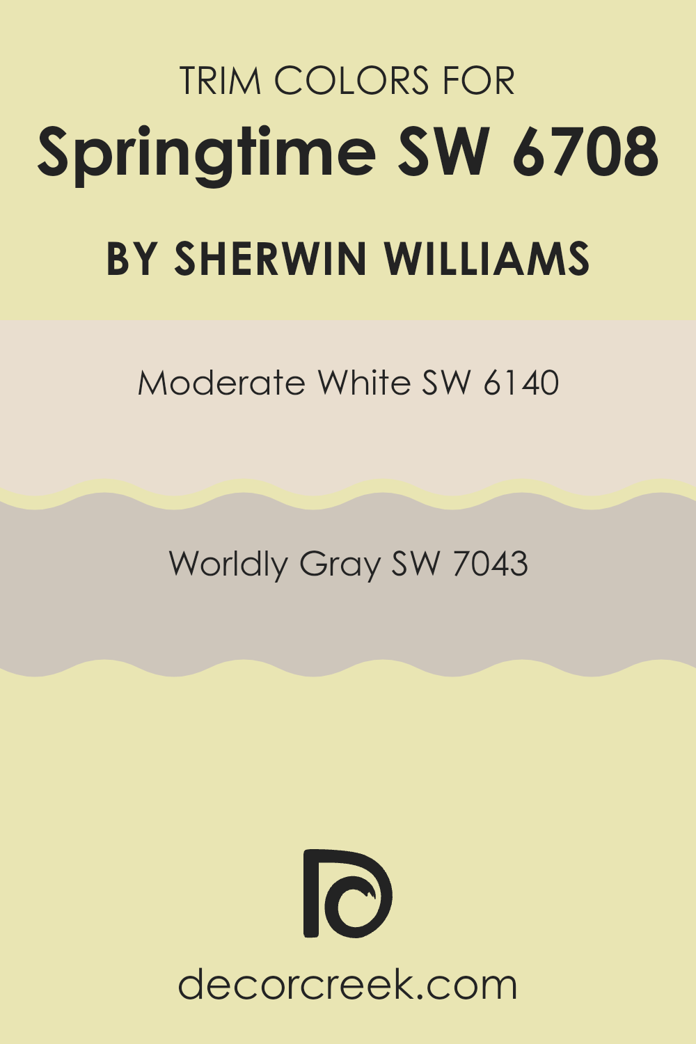
What are the Trim colors of Springtime SW 6708 by Sherwin Williams?
Trim colors play a crucial role in accentuating and highlighting the main color of a room or a building’s exterior. With this in mind, an excellent choice for trim colors that complement Sherwin Williams’ Springtime SW 6708 are SW 6140 – Moderate White and SW 7043 – Worldly Gray. These trim colors help in defining the edges of walls, windows, and doors, making them stand out and providing a finished look to any decor.
Trim colors can break the monotony by adding contrast or subtlety, depending on the look you are going for. Using trim color effectively can enhance the overall aesthetic appeal and make the central color theme more pronounced and lively.
SW 6140 – Moderate White is a soft, warm white that gently complements the more vibrant tones of the main color. It’s neither too stark nor too creamy, providing just the right amount of warmth without feeling too strong. On the other hand, SW 7043 – Worldly Gray is a refined, mid-tone gray that pairs beautifully by offering a subtle contrast.
This shade serves as a neutral backdrop that can gracefully enhance the cheerfulness of Springtime SW 6708. Using these trim colors can offer a balanced and harmonious setting perfect for both modern and traditional styles.
You can see recommended paint colors below:
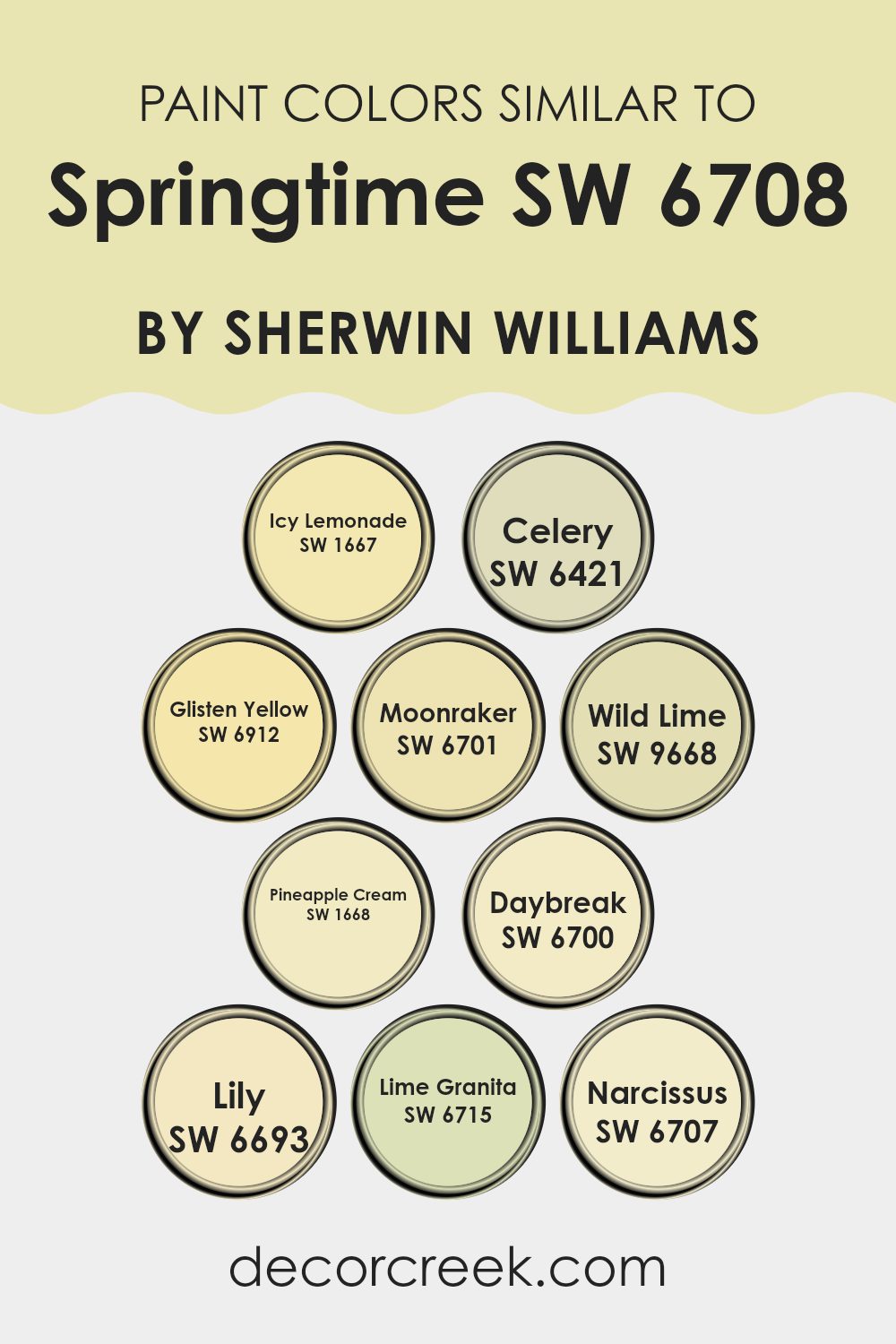
Colors Similar to Springtime SW 6708 by Sherwin Williams
Using similar colors can create a harmonious and cohesive atmosphere, making them a key aspect of any design or decor. Colors like SW 1667 – Icy Lemonade, with its soft, refreshing yellow, and SW 6912 – Glisten Yellow, which offers a bright, cheerful vibe, work well together to evoke the freshness of spring. SW 6421 – Celery provides a subtle green with earthy undertones, complementing spring’s natural elements.
These tones can be used to reflect the gentle renewal of nature, as they harmonize without clashing, creating a pleasant and gentle environment. The smooth, subtle touch of SW 6701 – Moonraker, a muted yellow, adds warmth, while the bold SW 9668 – Wild Lime brings a pop of lively green. SW 1668 – Pineapple Cream introduces a creamy yellow that adds softness.
The delicate hue of SW 6700 – Daybreak mirrors the first light of dawn with its pale brightness. SW 6693 – Lily and SW 6715 – Lime Granita bring a natural lushness, playing on the vibrancy of spring leaves. Finally, the soft glow of SW 6707 – Narcissus wraps up the palette with a gentle, sunlit yellow, creating a balanced and refreshing design palette that is welcoming and soothing.
You can see recommended paint colors below:
- SW 1667 Icy Lemonade
- SW 6421 Celery
- SW 6912 Glisten Yellow
- SW 6701 Moonraker
- SW 9668 Wild Lime
- SW 1668 Pineapple Cream
- SW 6700 Daybreak
- SW 6693 Lily
- SW 6715 Lime Granita
- SW 6707 Narcissus
Colors that Go With Springtime SW 6708 by Sherwin Williams
Springtime SW 6708 by Sherwin Williams is a fresh and lively shade of green that perfectly embodies the feeling of rejuvenation and growth seen in spring. It pairs beautifully with a palette of greens that enhance its vibrancy and bring the essence of nature into a room. SW 9031 Primavera is a soft, warm color that provides a gentle grounding effect, adding warmth and richness to the palette.
SW 6713 Verdant is a lush, vibrant green that brings a burst of nature’s verve, echoing the flourishing landscapes of spring. These complementary colors help create a lively and fresh atmosphere in any room, reflecting the vibrant energy of springtime.
SW 6711 Parakeet is a playful, bright green that adds a cheerful touch, while SW 6710 Melange Green offers a subtle and muted contrast, ideal for balancing stronger shades. SW 6709 Gleeful is a bright, happy green that captures the joy and energy of young leaves and fresh grass. Finally, SW 6712 Luau Green is a deep and rich tone that adds depth and interest to the mix, making the overall palette feel more dynamic and robust. Together, these colors create a harmonious and lively environment that echoes the essence of spring’s renewal and vitality.
You can see recommended paint colors below:
- SW 9031 Primavera
- SW 6713 Verdant
- SW 6711 Parakeet
- SW 6710 Melange Green
- SW 6709 Gleeful
- SW 6712 Luau Green

How to Use Springtime SW 6708 by Sherwin Williams In Your Home?
Springtime SW 6708 by Sherwin Williams is a fresh, light green paint color that brings the essence of spring into your home. It can be used to create a lively and refreshing atmosphere in various rooms. In the living room, this color can brighten the room, making it feel inviting and open.
Pair it with neutral or white furniture to enhance the fresh vibe. In the kitchen, Springtime can add a touch of freshness that complements natural wood finishes and stainless steel appliances. In bedrooms, this color promotes a relaxing and soft environment, ideal for unwinding.
You can match it with pastel-colored decor or bedding for a cohesive look. Bathrooms painted in Springtime feel clean and refreshing, a great start to your day. Consider using this color on an accent wall or even on furniture pieces to add a pop of color without making the room feel too bold.
Springtime SW 6708 by Sherwin Williams vs Narcissus SW 6707 by Sherwin Williams
Springtime SW 6708 and Narcissus SW 6707 by Sherwin Williams are two colors that fall in the yellow spectrum but have distinct differences. Springtime is a cheerful, bright yellow that evokes the fresh and lively energy of spring.
It’s like the color of sunshine and can bring warmth and happiness to a room. On the other hand, Narcissus is slightly softer and has a smoother, mellow hue. It carries a hint of pastel, making it less intense than Springtime.
While both colors can brighten up a room, Springtime is more vibrant, ideal for creating a lively environment. Narcissus, with its gentler tone, can bring a peaceful and welcoming feeling. These colors can complement each other well, with Springtime acting as the standout color and Narcissus serving to soften and balance the overall look. Both are excellent choices for adding warmth to your home.
You can see recommended paint color below:
- SW 6707 Narcissus
Springtime SW 6708 by Sherwin Williams vs Lime Granita SW 6715 by Sherwin Williams
Springtime (SW 6708) and Lime Granita (SW 6715) by Sherwin Williams are both lively greens, but they have distinct characteristics. Springtime is a softer, pastel green, bringing to mind fresh growth and new beginnings. It’s light and calming, perfect for creating a fresh, airy feel in a room.
On the other hand, Lime Granita is a bolder, more vibrant green with a hint of yellow. This color is energetic and fun, making it great for adding a splash of color and life to any room.
While Springtime might be well-suited for bedrooms or living areas where relaxation is key, Lime Granita could work well in an office, kitchen, or playroom, where a bit of zing and energy can be appreciated. Both colors can work beautifully depending on the mood and feeling you want to create in your room.
You can see recommended paint color below:
Springtime SW 6708 by Sherwin Williams vs Daybreak SW 6700 by Sherwin Williams
Springtime (SW 6708) and Daybreak (SW 6700) are two vibrant shades by Sherwin Williams. Springtime is a cheerful, light green that brings to mind budding leaves and fresh growth. It’s a bright, lively color ideal for rooms that need a touch of nature and energy. Daybreak, on the other hand, is a softer yellow-green. It’s more peaceful but still has a sunny, cheerful disposition.
While both colors bring a sense of nature and freshness, Springtime leans more towards a pure green, making it feel more like a true part of the outdoors. Daybreak carries a hint of warmth due to its yellow undertone, making it warmer and softer.
In a room, Springtime might energize and invigorate, while Daybreak could provide a more relaxed, cozy atmosphere. Both are great for brightening interiors, but the choice between them depends on whether you want a bold or gentle feel.
You can see recommended paint color below:
Springtime SW 6708 by Sherwin Williams vs Glisten Yellow SW 6912 by Sherwin Williams
Springtime and Glisten Yellow by Sherwin Williams are both vibrant colors that bring a cheerful and lively feel to any room.
Springtime is a soft, light green that resembles the fresh, new leaves of spring. It has a peaceful and gentle presence, making it ideal for creating a relaxed atmosphere. This color pairs well with other soft pastels and neutrals, making it flexible for various design themes.
On the other hand, Glisten Yellow is a bright, sunny shade that exudes energy and warmth. It’s a bold choice that adds a splash of cheerfulness to any interior. This color works well in rooms where you want to evoke happiness and positivity.
While both colors capture the essence of spring in their own ways, Springtime offers a more muted, gentle approach, whereas Glisten Yellow is all about bold energy and brightness. They can be used together to create a dynamic contrast or separately to enhance different moods.
You can see recommended paint color below:
- SW 6912 Glisten Yellow
Springtime SW 6708 by Sherwin Williams vs Wild Lime SW 9668 by Sherwin Williams
Springtime SW 6708 and Wild Lime SW 9668 are two lively colors from Sherwin Williams, each bringing its own charm. Springtime is a soft, fresh green that’s light and airy, reminiscent of new leaves and blooming gardens. It’s a flexible color that adds a gentle touch to any room, making interiors feel open and inviting.
On the other hand, Wild Lime is bolder and more vibrant. This color speaks of energy and fun, with its bright lime hue that stands out and makes a statement. It’s perfect for an accent wall or a lively piece of furniture, adding a pop of excitement wherever it goes.
While Springtime offers a calm and gentle ambiance, Wild Lime injects vigor and zest. Choosing between them depends on the mood you want to create: peaceful and fresh with Springtime, or lively and dynamic with Wild Lime.
You can see recommended paint color below:
- SW 9668 Wild Lime
Springtime SW 6708 by Sherwin Williams vs Celery SW 6421 by Sherwin Williams
Springtime SW 6708 and Celery SW 6421 by Sherwin Williams are two distinct shades of green. Springtime is a brighter, more vibrant green, reminiscent of fresh, new leaves. It’s lively and brings a sense of renewal and energy to a room, making it ideal for a cheerful and invigorating environment.
On the other hand, Celery is a softer, muted green with a hint of yellow, resembling the subtle color of a celery stalk. It offers a more subdued and calming atmosphere, perfect for rooms where a soothing and relaxed feeling is desired.
While Springtime is ideal for making a bold, energetic statement in a room, Celery provides a gentle backdrop that complements a variety of decor styles. Both colors bring nature indoors, but they differ in intensity and mood. Springtime energizes, while Celery nurtures a peaceful setting.
You can see recommended paint color below:
Springtime SW 6708 by Sherwin Williams vs Moonraker SW 6701 by Sherwin Williams
Springtime (SW 6708) and Moonraker (SW 6701) are two colors by Sherwin Williams that bring a sense of warmth and freshness. Springtime is a light and cheerful yellow with a hint of green, making it feel like a burst of sunshine or a fresh spring breeze. It’s perfect for rooms needing an uplifting touch.
On the other hand, Moonraker is a softer, more subdued yellow. It has a creamy undertone that gives it a gentle, peaceful presence. Moonraker can work well in rooms where a bright color might feel too strong but where a hint of warmth is still desired.
While both colors are part of the yellow family, Springtime stands out with its vibrant, lively quality, while Moonraker offers a more subtle and mellow tint. Choosing between them depends on whether you prefer the energetic vibe of Springtime or the soothing nature of Moonraker.
You can see recommended paint color below:
Springtime SW 6708 by Sherwin Williams vs Icy Lemonade SW 1667 by Sherwin Williams
Springtime is a cheerful and fresh light green color often associated with new growth and renewal. It’s great for creating a lively and vibrant atmosphere in a room. It can open up interiors and bring a sense of nature indoors, making it ideal for living rooms, kitchens, or even nurseries.
On the other hand, Icy Lemonade is a soft, pastel yellow with a gentle and sunny feel. This color is cozy and inviting, reminiscent of a sunny day. It is perfect for rooms where you want to introduce warmth without being too bold. It can make a room feel welcoming and comfortable, working well in bedrooms, hallways, or dining areas.
Both colors are bright and light but bring different feelings. Springtime offers an energetic, nature-inspired vibe, while Icy Lemonade brings warmth and a touch of cheerfulness. They can be used individually or together for a fresh, harmonious look.
You can see recommended paint color below:
Springtime SW 6708 by Sherwin Williams vs Lily SW 6693 by Sherwin Williams
Springtime (SW 6708) by Sherwin Williams is a cheerful and bright yellow with a fresh, lively feel. It’s reminiscent of new blooms and sunny days, adding warmth and positivity to a room. This color can make a room feel more open and inviting.
On the other hand, Lily (SW 6693) is a softer, more muted yellow. It has a gentle and quiet appearance, without the bold intensity of Springtime. Lily can add a subtle warmth to an area without feeling too strong. It’s suitable for creating a relaxed and cozy atmosphere.
Both colors bring their own charm to a room. Springtime is great for a lively and energetic feel, while Lily fits rooms that need a softer and more calming mood. The choice between them can depend on the mood and use you want for the room.
You can see recommended paint color below:
- SW 6693 Lily
Springtime SW 6708 by Sherwin Williams vs Pineapple Cream SW 1668 by Sherwin Williams
Springtime SW 6708 and Pineapple Cream SW 1668 are two delightful colors by Sherwin Williams. Springtime is a soft, fresh green that exudes the feeling of new growth and renewal, reminiscent of budding leaves in the spring.
It’s light and airy, perfect for creating a room that feels vibrant and lively. On the other hand, Pineapple Cream SW 1668 is a warm, sunny yellow that gives off a gentle, cheerful vibe. It’s like having a bit of sunshine inside your home, brightening up rooms with its cozy, welcoming nature.
Both colors are light and uplifting, but they offer different moods. Springtime adds a touch of nature and freshness, making it ideal for rooms where you want to feel revitalized. Pineapple Cream, with its creamy undertones, can warm up a room and make it feel more inviting. Together, these colors can create a charming and balanced environment in any setting.
You can see recommended paint color below:
- SW 1668 Pineapple Cream
After spending some time learning about the paint color SW 6708 Springtime by Sherwin Williams, I’ve come to understand why it’s such a delightful choice for anyone looking to refresh a room. Springtime is a gentle green, almost like the new leaves you see when winter goes away and everything begins to grow again. It’s a color that brings a touch of nature inside, making rooms feel fresh and lively.
When I think about using Springtime, I picture a bright room where you can feel happy and calm. It’s like standing in a field with the sun shining and a light breeze blowing. This color is nice because it can work well with lots of other colors.
You can mix it with white for a clean look or with other light colors for a playful feel. Springtime is great for places where you want to feel awake and cheerful, like a kitchen or a living room. In the end, using SW 6708 Springtime is like bringing bits of the outside world into your home.
It helps make a room feel new and full of life, which is something we all need sometimes. I’m excited to see how this color can brighten up any place that needs a touch of cheerfulness and warmth.

Ever wished paint sampling was as easy as sticking a sticker? Guess what? Now it is! Discover Samplize's unique Peel & Stick samples.
Get paint samples

