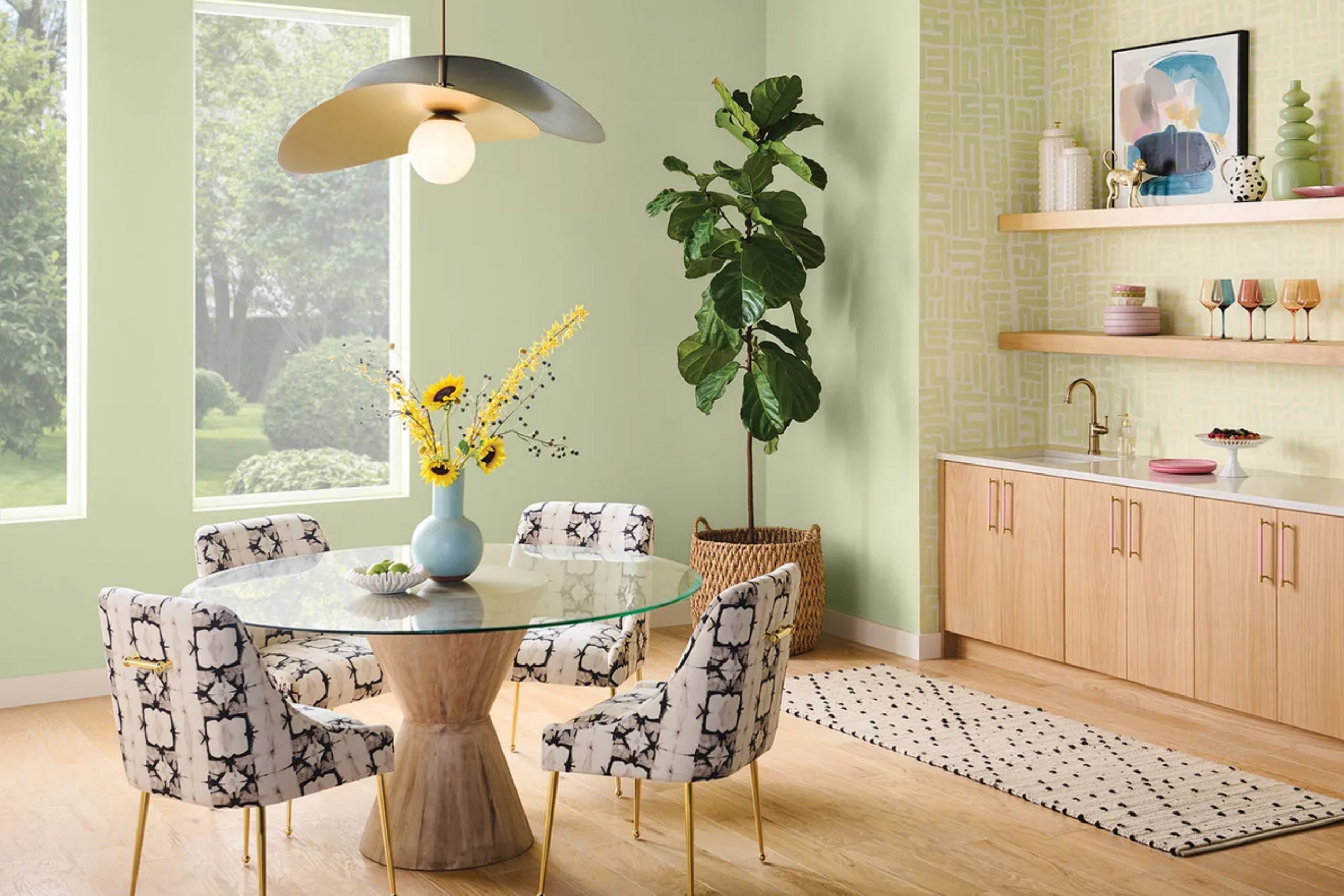
When you first come across SW 6428 Honeydew by Sherwin Williams, you’re greeted by a color that feels like a breath of fresh air. It’s a shade of green that is both soothing and uplifting, reminiscent of a morning walk through a dewy garden. This color doesn’t shout for attention but invites you to relax in its gentle hue.
Honeydew is soft and the perfect choice if you want to create a calming room in your home. It works beautifully in a variety of settings, whether you’re painting a cozy bedroom, a refreshing living room, or a welcoming kitchen. The subtlety of this color allows it to pair effortlessly with whites, creams, and even darker greens to create depth and interest.
You might notice how Honeydew can change throughout the day, capturing different moods as the light shifts. In the morning, it might feel crisp and energizing, while in the evening, it takes on a warmer, more comforting tone. Whether you’re aiming for a modern look or a classic vibe, Honeydew adapts with ease.
Choosing Honeydew is about bringing a piece of nature indoors, creating an environment that nurtures peace and balance. It’s a flexible color that whispers rather than shouts, making your room feel open and welcoming.
What Color Is Honeydew SW 6428 by Sherwin Williams?
Honeydew by Sherwin Williams is a gentle, fresh shade of green with hints of pastel tones. This color brings a light and airy feel to any room, making rooms look larger and more inviting. It works well in interior styles such as Scandinavian, modern farmhouse, and coastal themes. Its soft green undertone complements natural elements and creates a soothing environment.
Honeydew pairs beautifully with natural materials like wood, wicker, and rattan, enhancing its fresh aesthetic. These materials, with their organic textures, bring warmth and balance to the soft green, creating a harmonious blend in any room. Textured fabrics like linen and cotton in neutral tones can complement this color, adding a touch of comfort and coziness.
For a more vibrant look, Honeydew can be paired with brighter accents such as coral or navy blue, which pop against its subtle background. Incorporating metallic elements like brushed brass or copper can also add a modern twist to the room. Honeydew is an ideal choice for bedrooms, bathrooms, and kitchens, anywhere a calm and clean atmosphere is desired. Whether used on walls, furniture, or accent pieces, this shade brings a refreshing and welcoming look to any home.

Is Honeydew SW 6428 by Sherwin Williams Warm or Cool color?
Honeydew SW 6428 by Sherwin Williams is a refreshing and light green paint color that brings a sense of calm and freshness to any room. Its soft hue can make areas feel open and airy, perfect for creating a welcoming atmosphere in homes.
Good for living rooms and bedrooms, Honeydew has a subtle vibrancy that works well when paired with white accents or light wood furnishings. This color reflects natural light beautifully, contributing to a brighter appearance in rooms with ample sunlight.
For those looking to use this color in their interiors, it pairs nicely with neutral tones, adding just the right amount of color without feeling too strong. Additionally, it complements plant life well, making it an excellent choice for rooms with lots of greenery. Whether used on a feature wall or throughout an entire room, Honeydew adds a touch of nature’s peace and freshness to living areas.
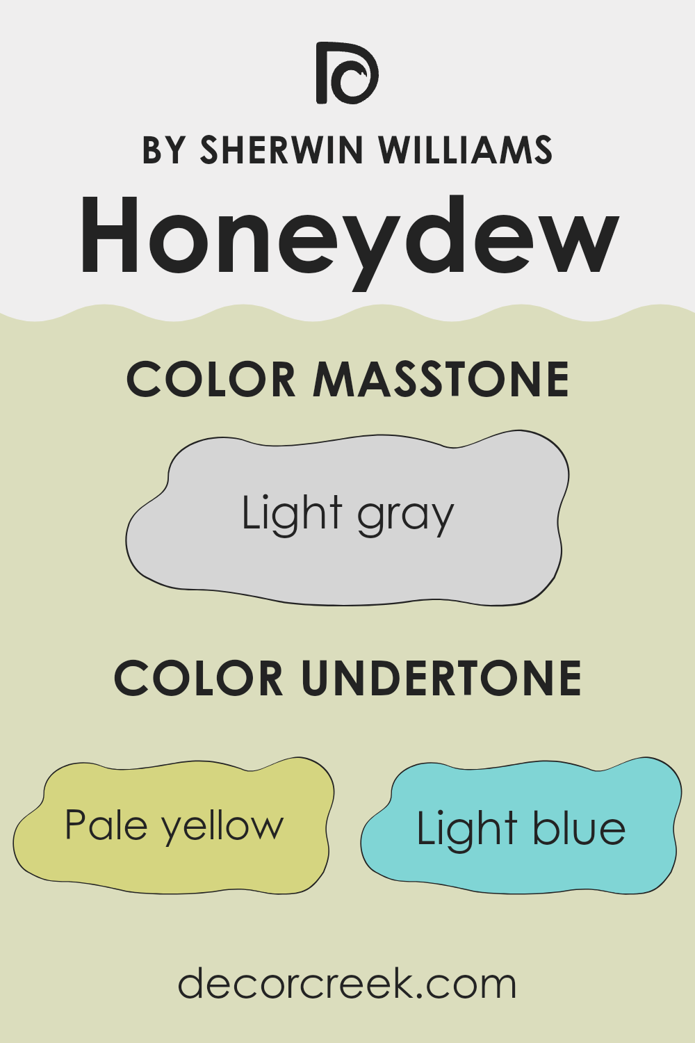
Undertones of Honeydew SW 6428 by Sherwin Williams
Honeydew SW 6428 by Sherwin Williams is a complex color with several subtle undertones. These undertones include pale yellow, light blue, light purple, mint, pale pink, lilac, and grey. Each undertone can change how we see and feel about the color.
The pale yellow undertone gives a hint of warmth, adding a soft brightness, which is particularly evident in sunlight. The light blue and mint tones bring a sense of freshness and coolness, making the color soothing. They calm the overall appearance, which can help create a relaxing atmosphere in a room.
The light purple and lilac undertones add a dash of elegance and can make the color appear slightly more refined or regal, while the pale pink undertone brings a gentle, inviting warmth. Finally, the grey undertone balances these shades, offering a grounding, neutral quality that makes the color adaptable and easy to pair with other tones.
When used on interior walls, these undertones can make a room feel open and airy. The mix of warmth and coolness helps the color adapt to different lighting conditions, looking fresh in natural light and cozy under artificial lighting. With such varied undertones, the color can change slightly depending on surrounding colors and the light in the room, offering versatility in home design.
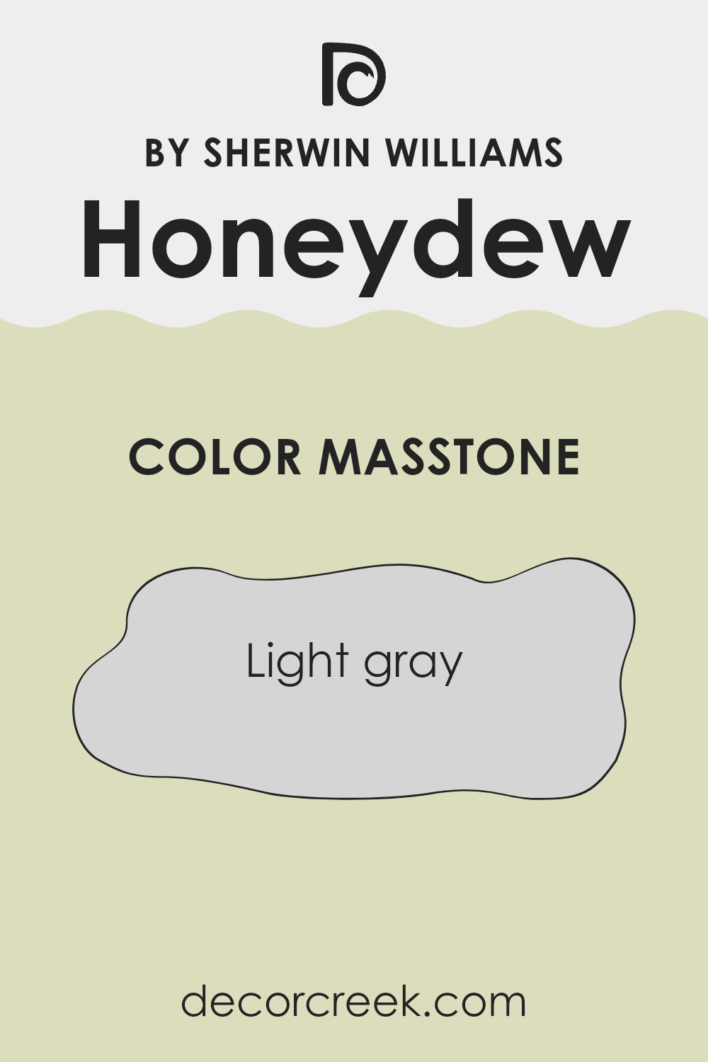
What is the Masstone of the Honeydew SW 6428 by Sherwin Williams?
Honeydew SW 6428 by Sherwin Williams has a refreshing green hue with a light gray masstone (#D5D5D5). This means that the color has a subtle hint of gray mixed in, which helps it to feel softer and more muted.
In a home, this color works well because the gray undertone makes the green less vibrant and more neutral. This makes it a flexible choice for different rooms, effortlessly adapting to various settings. It can create a calm and gentle atmosphere, perfect for living rooms, bedrooms, or bathrooms.
The softened green can add a touch of nature without being too bold, making it easy to pair with other colors and materials. It complements whites, soft browns, and natural wood tones, adding a fresh yet calm feel. The light gray masstone also helps it work well in various lighting conditions, from sunny rooms to more shaded areas, maintaining a balanced look.
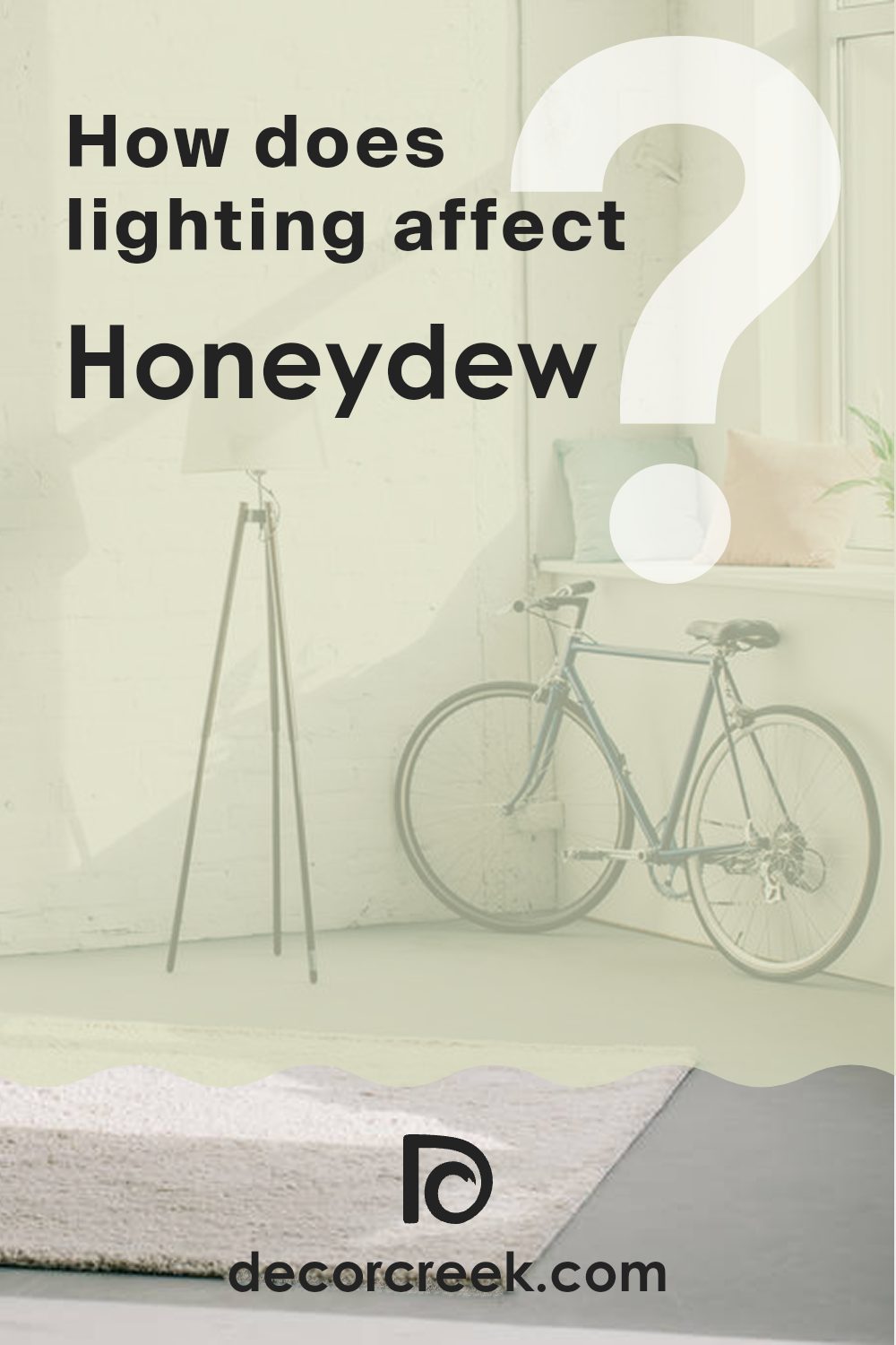
How Does Lighting Affect Honeydew SW 6428 by Sherwin Williams?
Lighting plays a significant role in how we perceive colors, affecting their brightness and tone. When it comes to paint colors like Sherwin Williams’ Honeydew (SW 6428), understanding how lighting impacts its appearance can help in choosing the best rooms for its use.
In natural light, Honeydew can show subtle variations. It is a soft, muted green that tends to feel light and airy. In north-facing rooms, which often get cooler and consistent light, Honeydew might appear a bit cooler and more muted. The green hue will still be present, but it may feel softer and less vibrant.
In south-facing rooms, Honeydew can look warmer and more lively. These rooms receive more direct sunlight throughout the day, which can enhance the color’s warmth and make it seem more vivid. Honeydew’s light green tone will shine more prominently, giving a warm, inviting feeling.
East-facing rooms benefit from abundant morning light, which is warm and bright. This can make Honeydew seem fresh and slightly warm in the early parts of the day. However, as the sun moves away in the afternoon, the color might appear cooler and more shaded, resembling its look in a north-facing room.
West-facing rooms receive warmer light in the afternoon and early evening. During these times, Honeydew will appear richer and more saturated. The green hue will pop more, giving the room a cozy and welcoming atmosphere as the day winds down.
Under artificial lighting, the type of bulb used makes a difference. Warm incandescent bulbs can enhance Honeydew’s warmth, while cooler LED or fluorescent lights might make it appear more muted or cooler. Matching artificial lighting with the room’s color scheme and its natural light exposure is important for achieving the desired effect of Honeydew in any room.
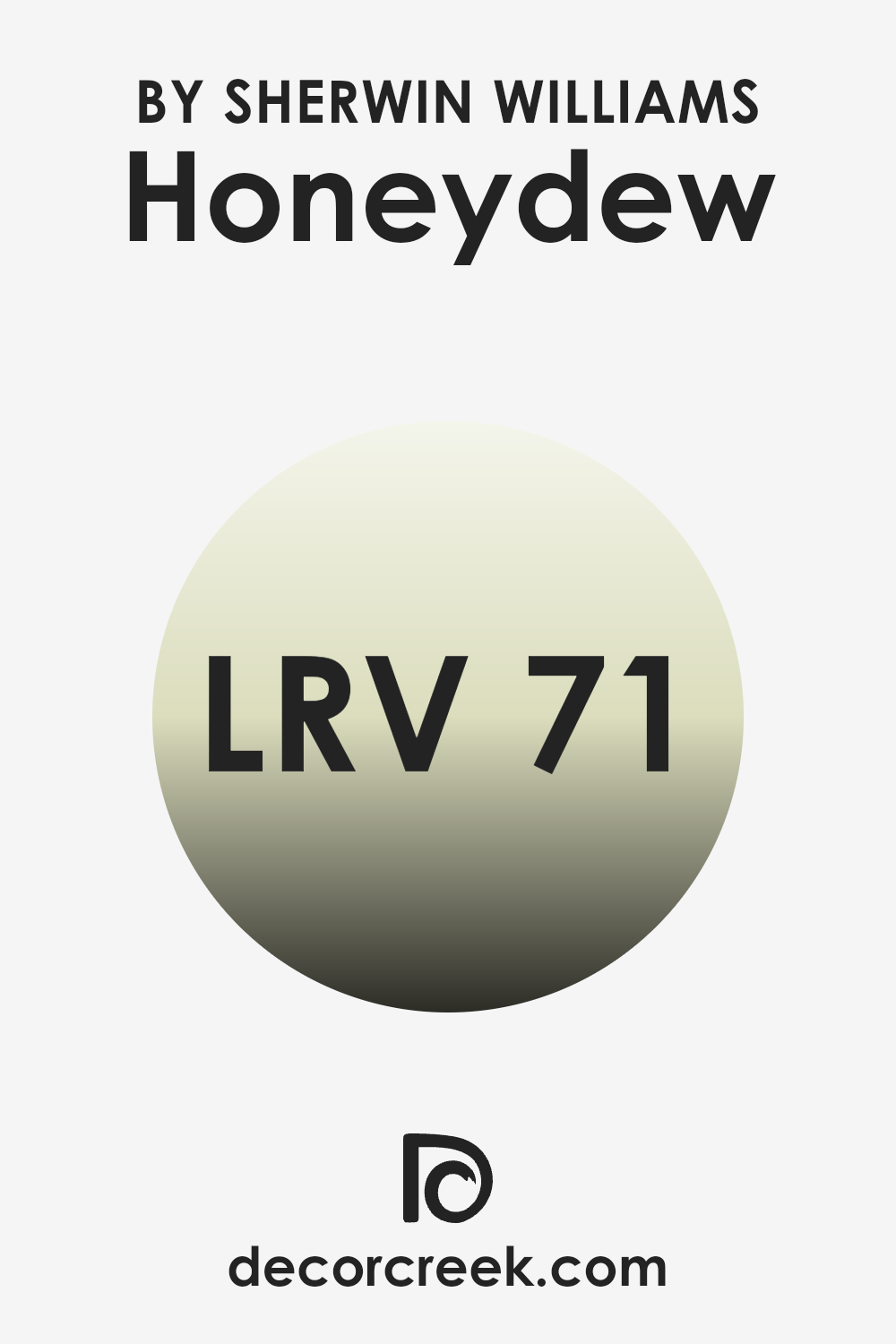
What is the LRV of Honeydew SW 6428 by Sherwin Williams?
LRV stands for Light Reflectance Value, which is a number that shows how much light a color reflects. It ranges from 0, which is pure black and reflects no light, to 100, which is pure white and reflects all light. The LRV of a color is important because it affects how the color will look once it’s painted on walls and exposed to light.
A color with a high LRV, like above 70, will reflect a lot of light and can make a room feel larger and brighter, whereas a color with a low LRV will absorb more light and create a cozier, more intimate feeling.
For Honeydew by Sherwin Williams, which has an LRV of 70.697, this means the color will reflect a generous amount of light. It’s great for making a room feel airy and open. The soft, light hue of Honeydew can help brighten dim rooms and is ideal for areas that could use a light boost or places where you want a crisp and refreshing look.
With its high LRV, this color can make a room feel more expansive and enhance natural lighting, making it a good choice for smaller rooms or zones without many windows.
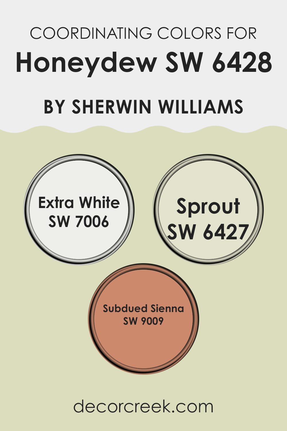
Coordinating Colors of Honeydew SW 6428 by Sherwin Williams
Coordinating colors are hues that complement each other and create a harmonious look when used together in a room. For the soft, refreshing shade of Honeydew by Sherwin Williams, great coordinating colors include Extra White, Sprout, and Subdued Sienna. Honeydew’s light green tint offers a calming backdrop, perfect for various settings.
Extra White (SW 7006) pairs beautifully with Honeydew, providing a clean and crisp contrast. It’s a pure white that helps to emphasize the soothing feel of Honeydew while adding brightness to a room. Sprout (SW 6427) shares a similar light-green tone with Honeydew but carries a slightly warmer undertone, which creates a cohesive and natural feel.
When these two are used together, they enhance the calming vibe of an interior. On the other hand, Subdued Sienna (SW 9009) offers a warm, earthy tone that brings depth and richness. Its muted brown-red shade grounds the room, making it feel more inviting and cozy against the soft greens. Combining Honeydew with these coordinating colors allows for a balanced look that is both fresh and welcoming.
You can see recommended paint colors below:
- SW 7006 Extra White
- SW 6427 Sprout
- SW 9009 Subdued Sienna
What are the Trim colors of Honeydew SW 6428 by Sherwin Williams?
Trim colors are the paints used for the edges, frames, and details of walls, like the borders around windows, doors, and baseboards. These colors play a key role in the overall look of a room by providing subtle accents and helping to define the area. When using a soft, fresh shade like Honeydew by Sherwin Williams as the main wall color, selecting the right trim color can enhance the overall effect, adding depth to the decor.
A careful choice of trim can either highlight architectural features or create a gentle transition between different areas of a home. It’s essential that trim colors not only complement the wall color but also stand out enough to make the design cohesive and pleasant to the eye.
Aesthetic White (SW 7035) by Sherwin Williams is an off-white with a hint of warmth that maintains a neutral appearance, making it a good partner for Honeydew by adding brightness and a soft finish to trim surfaces. On the other hand, Mindful Gray (SW 7016) offers a medium gray tone that provides a bit more contrast and a dash of refinement without feeling too strong.
Both colors are adaptable and blend gracefully with most decor styles, bringing out the best qualities of Honeydew. Whether you choose the gentle touch of Aesthetic White or the subtle drama of Mindful Gray, your choice of trim color can significantly influence the room’s character and style.
You can see recommended paint colors below:

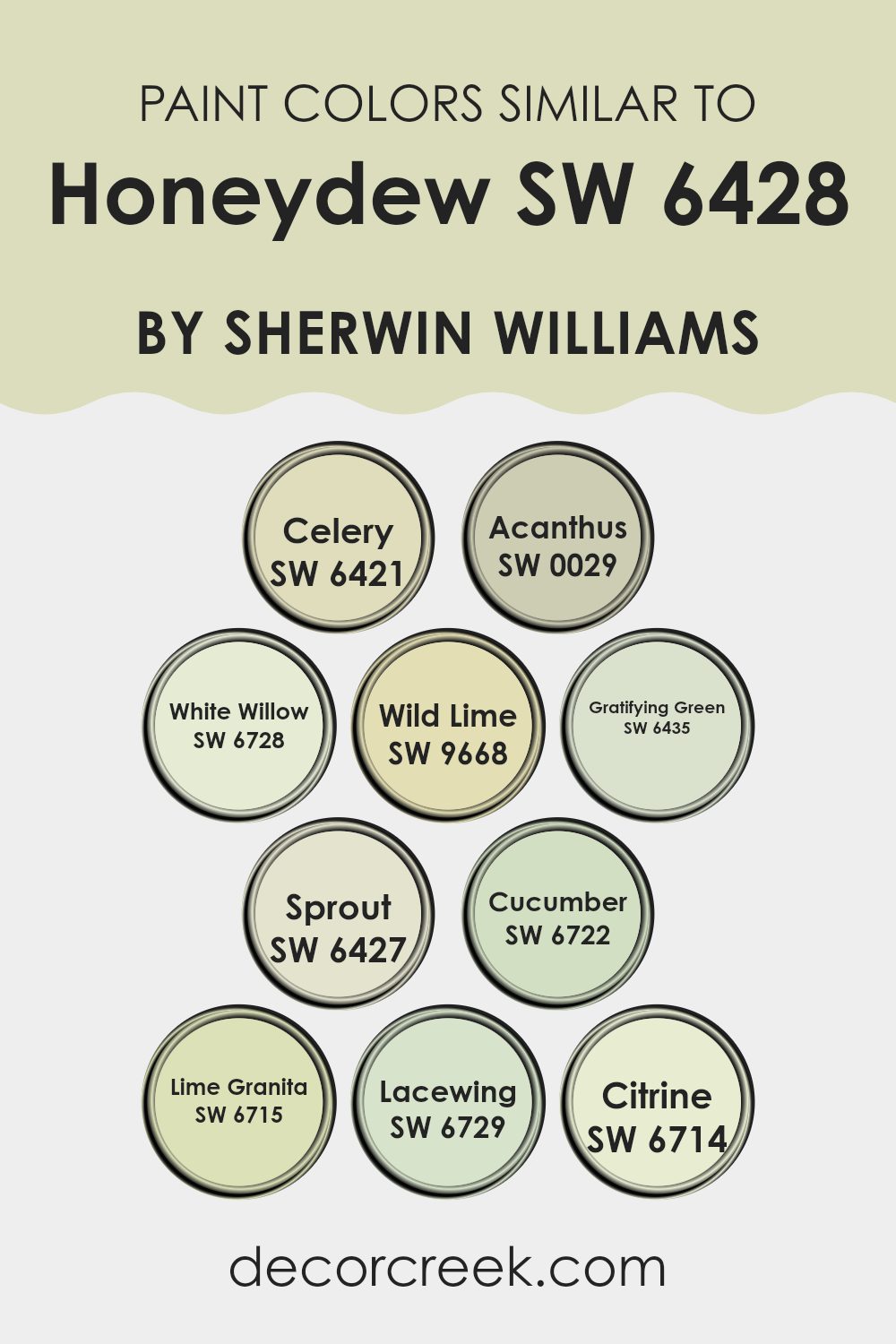
Colors Similar to Honeydew SW 6428 by Sherwin Williams
Similar colors are crucial in design because they create harmony and balance within a room. When you use colors that are close together on the color wheel, like those similar to Honeydew, they provide a cohesive and calming effect. These shades work well together because they share a common undertone, making transitions smooth and pleasing to the eye.
For example, they might all share a yellow or green base, which ties them together into a unified palette. Using a variety of these colors can add depth and interest to a room without feeling too strong, allowing for a peaceful and inviting atmosphere.
Celery is a muted green that brings in a touch of nature without feeling too strong. Acanthus is a deep, earthy green that anchors a room with its rich tones. White Willow carries a soft, pastel-like look that brightens the area. Wild Lime is a lively, zesty green that adds a pop of cheer. Gratifying Green is fresh and energizing, offering a clean and vibrant look. Sprout is a gentle, pale green that adds a soft touch of color. Cucumber has a crisp and refreshing feel, like a cool breeze.
Lime Granita is bold and energetic, perfect for accent pieces. Lacewing presents a bright yet soothing green, while Citrine, with its lemony tint, adds a fun, playful vibe. Together, these colors enhance the Honeydew shade by providing complementary options that enrich a room naturally.
You can see recommended paint colors below:
- SW 6421 Celery
- SW 0029 Acanthus
- SW 6728 White Willow
- SW 9668 Wild Lime
- SW 6435 Gratifying Green
- SW 6427 Sprout
- SW 6722 Cucumber
- SW 6715 Lime Granita
- SW 6729 Lacewing
- SW 6714 Citrine
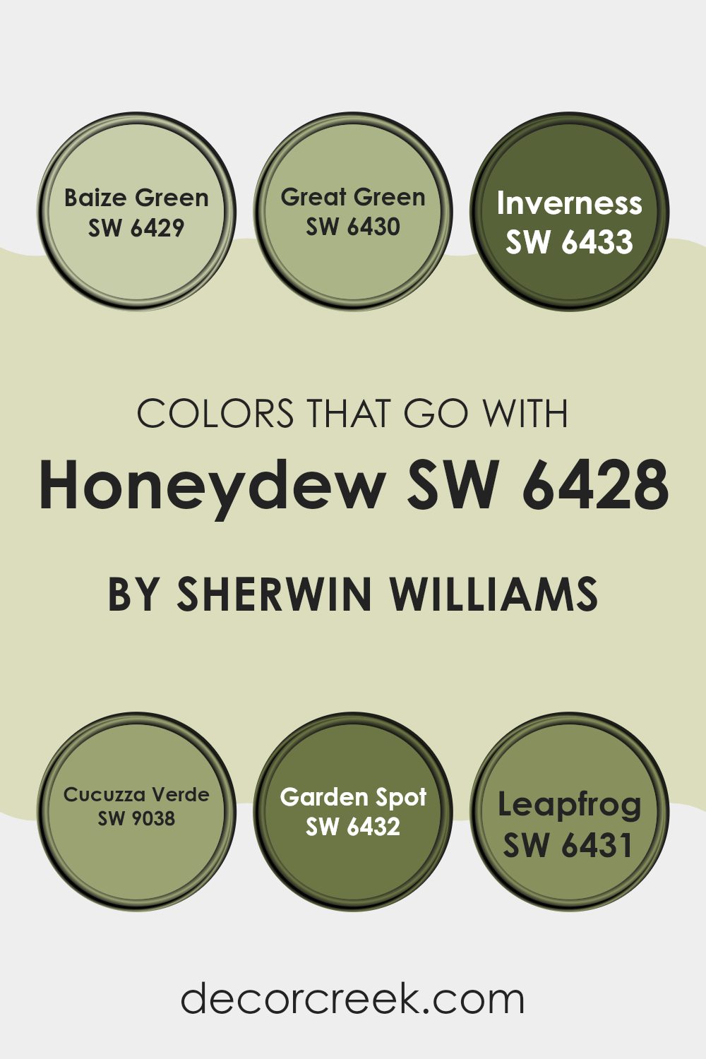
Colors that Go With Honeydew SW 6428 by Sherwin Williams
When choosing colors to pair with Honeydew SW 6428 by Sherwin Williams, it’s important to consider how these hues complement each other to create a harmonious room. Honeydew is a soft, delicate green that offers a calming effect. To highlight its peaceful nature, pairing it with other greens like Baize Green SW 6429 and Great Green SW 6430 can create a cohesive and refreshing atmosphere.
Baize Green has a slightly more muted tone, adding depth without becoming too strong. Great Green is a vivid, lively shade that brings an energetic touch. These colors blend well to keep a natural and balanced look.
Moving on, Inverness SW 6433 and Cucuzza Verde SW 9038 are great companions for Honeydew. Inverness is a strong, deep green that acts as a perfect accent, grounding a room while still being in harmony with Honeydew’s soft shade. Cucuzza Verde provides a fresh and crisp feel, enhancing the overall lightness and brightness.
Lastly, consider Garden Spot SW 6432 and Leapfrog SW 6431 for additional layers. Garden Spot is a warm, earthy green that feels welcoming and grounding, while Leapfrog is a playful, vibrant green that adds a fun, dynamic element. Together, these colors create a room that feels cohesive and inviting, where every hue supports the flow.
You can see recommended paint colors below:
- SW 6429 Baize Green
- SW 6430 Great Green
- SW 6433 Inverness
- SW 9038 Cucuzza Verde
- SW 6432 Garden Spot
- SW 6431 Leapfrog
How to Use Honeydew SW 6428 by Sherwin Williams In Your Home?
Honeydew SW 6428 by Sherwin Williams is a soft, muted green with a touch of yellow, creating a fresh and open vibe. This color works well in rooms where you want to bring a sense of lightness and nature indoors.
It’s perfect for living rooms or bedrooms, where the gentle hue can help create a calming atmosphere. Paint an accent wall using Honeydew to bring a splash of color without making the room feel too strong. It pairs beautifully with white or cream to enhance its subtle warmth, offering a clean look.
In kitchens, this color can add a delicate touch that complements wooden or natural elements, creating a cozy, welcoming room. Additionally, Honeydew can be used in bathrooms to bring a soothing, spa-like feel, especially when paired with soft blues or grays. Its flexible nature ensures that it fits well with various styles, from modern to traditional, enhancing the overall mood of your home.
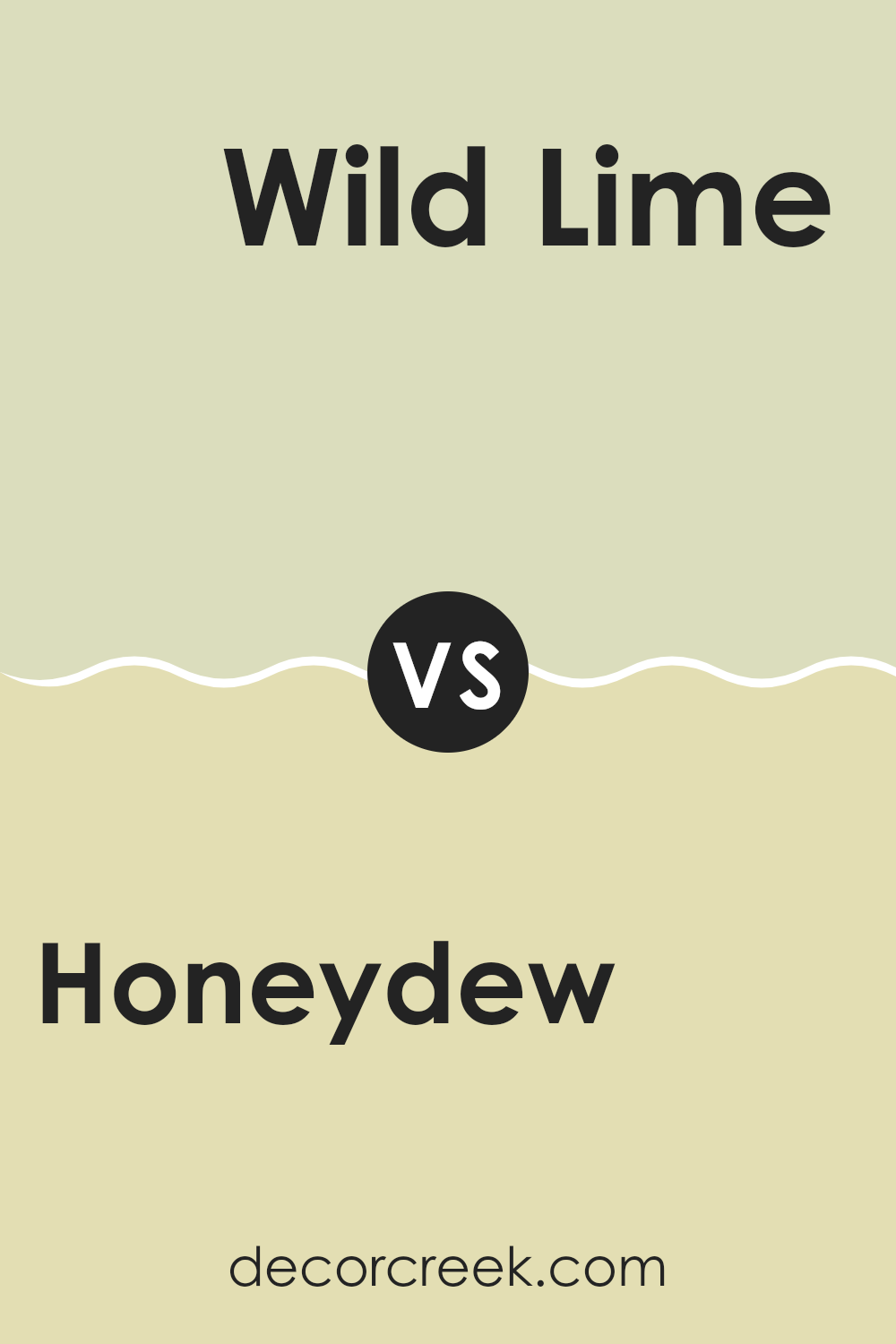
Honeydew SW 6428 by Sherwin Williams vs Wild Lime SW 9668 by Sherwin Williams
Honeydew and Wild Lime by Sherwin Williams are two distinct shades of green that offer different vibes. Honeydew is a soft, light green with a calm and gentle appearance. It’s perfect for creating a relaxing atmosphere that feels fresh without feeling too strong. This color works well in areas where a subtle touch of nature is desired, like bedrooms or bathrooms.
On the other hand, Wild Lime is a vibrant and energetic green. It’s bright and full of life, making it an excellent choice for rooms where you want to add energy and personality. This shade is great for accent walls, kitchens, or any area where a lively burst of color can uplift the mood.
When used together, Honeydew can act as a neutral backdrop, allowing Wild Lime to stand out as an accent. This pairing provides a balance of calm and energy, suiting various home styles and preferences.
You can see recommended paint color below:
- SW 9668 Wild Lime
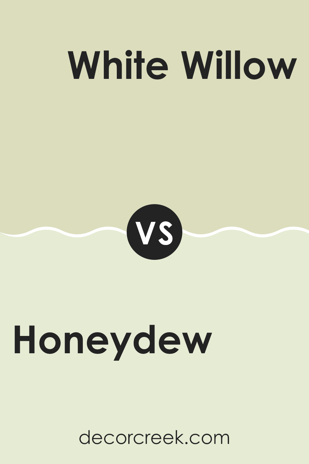
Honeydew SW 6428 by Sherwin Williams vs White Willow SW 6728 by Sherwin Williams
Honeydew (SW 6428) by Sherwin Williams offers a soft, muted green with a hint of warmth, reminiscent of the pale flesh of a honeydew melon. It provides a calming and fresh aesthetic, bringing a touch of nature indoors. This color works well in rooms that aim for relaxation and comfort, such as bedrooms or living areas.
In contrast, White Willow (SW 6728) is a lighter, more neutral green. This shade leans towards a fresh, open feel, making it flexible for various settings. It brightens up rooms without becoming too strong, ideal for dining rooms or kitchens where a sense of openness and cleanliness is desired.
Both colors are soothing and suitable for creating a peaceful atmosphere, but Honeydew adds more warmth, while White Willow maintains a crisp, refreshing edge. Choosing between them depends on whether you want a cozier ambiance or a brighter, invigorating vibe.
You can see recommended paint color below:
- SW 6728 White Willow
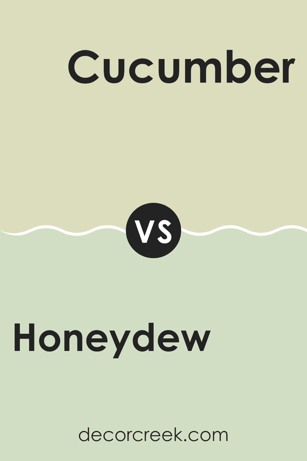
Honeydew SW 6428 by Sherwin Williams vs Cucumber SW 6722 by Sherwin Williams
Honeydew and Cucumber are two refreshing and lively shades by Sherwin Williams. Honeydew is a soft, light green with a slightly yellow undertone, reminiscent of the inside of a honeydew melon. It brings a sense of lightness and openness to a room, making it great for creating a calm and inviting atmosphere.
On the other hand, Cucumber is a more vibrant and true green, resembling the fresh crispness of a cucumber’s skin. It is brighter and more energetic compared to the gentle subtlety of Honeydew.
When you use Honeydew in a room, it gives you a fresh and airy feel, suitable for areas where you want to unwind, like a bedroom or living room. Cucumber, being more vivid, is perfect for adding a splash of color and life, making it suitable for kitchens or zones where you want to feel awake and energized. Together, these colors can complement each other well, with Honeydew providing a soft backdrop and Cucumber adding lively touches.
You can see recommended paint color below:
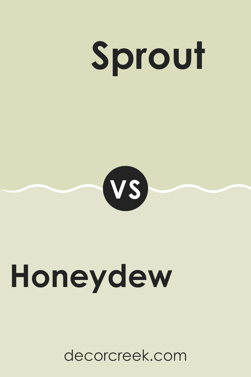
Honeydew SW 6428 by Sherwin Williams vs Sprout SW 6427 by Sherwin Williams
Honeydew SW 6428 and Sprout SW 6427 by Sherwin Williams are both lovely shades of green, but they have distinct differences. Honeydew is a light, fresh, and soft green. It brings to mind the gentle color of honeydew melon, making rooms feel open and refreshing. It’s a great choice for areas where you want a light and uplifting atmosphere.
Sprout SW 6427 is slightly darker than Honeydew. It’s a mellow, soothing green that feels a touch more earthy. Sprout has a bit more presence, making it suitable for rooms where you want a bit more color without feeling too strong. It pairs well with natural materials and earth tones, highlighting a natural feel.
Both colors can work together beautifully or stand alone, depending on the mood you want to set. Honeydew is more about bright freshness, while Sprout offers a calming, natural vibe.
You can see recommended paint color below:
- SW 6427 Sprout
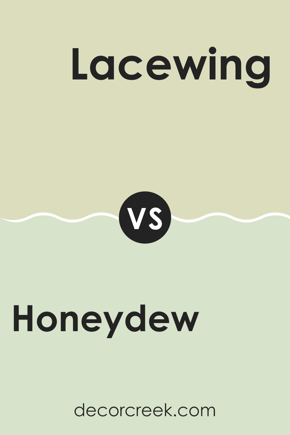
Honeydew SW 6428 by Sherwin Williams vs Lacewing SW 6729 by Sherwin Williams
Honeydew (SW 6428) and Lacewing (SW 6729), both by Sherwin Williams, are fresh and light colors that bring a sense of the outdoors inside your home. Honeydew is a soft, pale green with a hint of warmth, reminiscent of the light green flesh of a honeydew melon. It’s a gentle color that can make any room feel open and airy.
Lacewing, on the other hand, has a brighter and more vibrant green hue. It resembles new grass and carries a lively and energetic vibe. Lacewing can add a pop of color to a room, making it suitable for lively areas like kitchens or kids’ playrooms.
While both colors are in the green family, Honeydew gives off a more muted and calming effect, making it perfect for bedrooms or study areas. Lacewing, with its brighter tone, is ideal for rooms where you want to create a cheerful and invigorating atmosphere.
You can see recommended paint color below:
- SW 6729 Lacewing
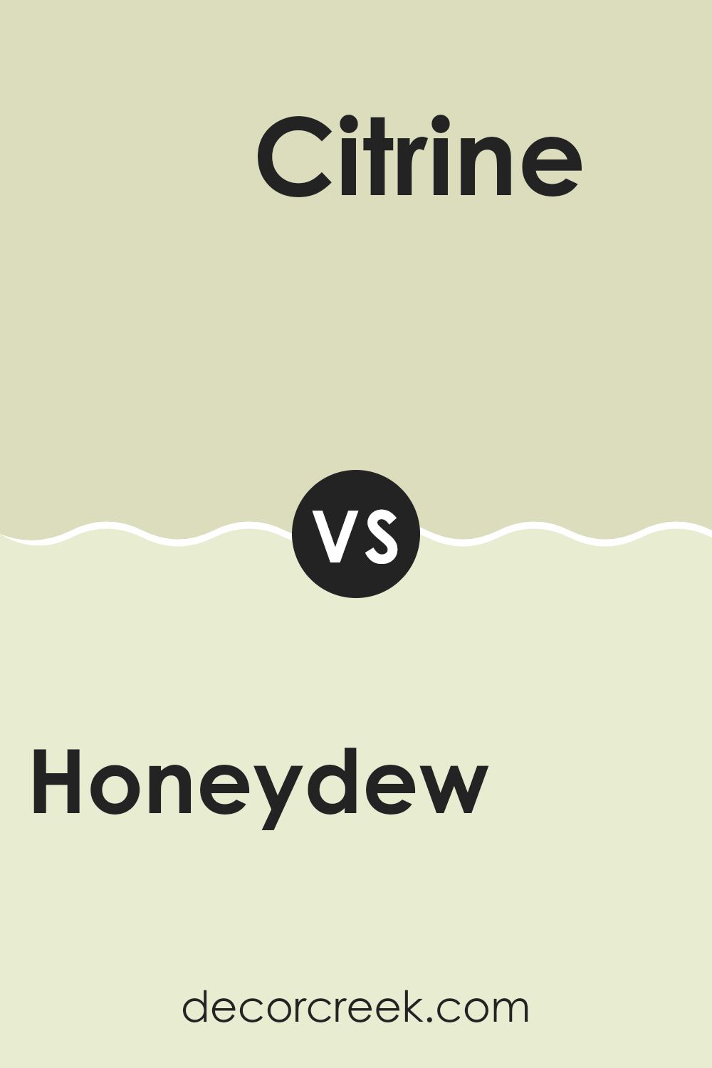
Honeydew SW 6428 by Sherwin Williams vs Citrine SW 6714 by Sherwin Williams
Honeydew and Citrine, both from Sherwin Williams, offer distinct vibes. Honeydew is a soft, pale green with a hint of freshness, making rooms feel light and airy. It’s like a gentle breeze, calming and easy on the eyes. Because of its lightness, it works well as a neutral backdrop, complementing various styles and colors in a room.
Citrine, on the other hand, is a bold and vibrant yellow-green. It brings energy and brightness, adding a lively touch wherever it’s used. Citrine is more assertive and can be a great choice for accent walls or rooms that need a pop of color.
While Honeydew provides a subtle and refreshing feel, Citrine brings enthusiasm and a touch of boldness. Together, they can create a harmonious balance of calmness and energy, but their application would depend on the mood you want to set in your area.
You can see recommended paint color below:
- SW 6714 Citrine
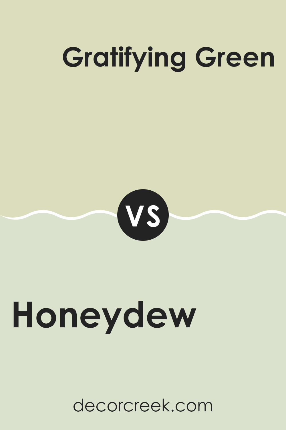
Honeydew SW 6428 by Sherwin Williams vs Gratifying Green SW 6435 by Sherwin Williams
Honeydew SW 6428 by Sherwin Williams is a soft, light green with a hint of warmth, reminiscent of the pale green inside of a honeydew melon. It’s fresh and airy, making rooms feel open and bright. It’s an adaptable color that pairs well with whites and other light tones.
Gratifying Green SW 6435, on the other hand, is a richer, deeper green. It has more saturation, offering a more grounded and nature-inspired feel. While Honeydew is light and airy, Gratifying Green brings a bit of depth and coziness to a room.
Both colors evoke nature, but in different ways. Honeydew gives a gentle nod to the freshness of spring, while Gratifying Green is more vibrant, like a lush forest. Choosing between them depends on whether you want a room to feel light and open or have a strong, earthy atmosphere. Both can create a welcoming environment, suiting various styles and tastes.
You can see recommended paint color below:
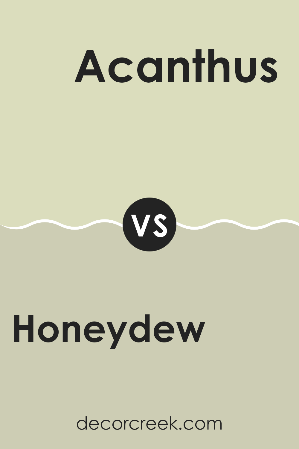
Honeydew SW 6428 by Sherwin Williams vs Acanthus SW 0029 by Sherwin Williams
Honeydew (SW 6428) by Sherwin Williams is a light, fresh, and soft green hue with a hint of yellow, resembling the pale flesh of the honeydew melon. It is reminiscent of spring and brings a sense of calm and nature into a room. It’s a perfect choice for those wanting to create a gentle and airy atmosphere, making it suitable for bedrooms or living rooms where relaxation and softness are desired.
In contrast, Acanthus (SW 0029) is a richer, deeper green with more pronounced earthy undertones. This shade often evokes a sense of history and sophistication, suitable for more traditional or formal areas like a study or dining room. The color is named after the Acanthus plant, known for its classic, leafy design often found in architectural details.
While both colors bring green into interior areas, Honeydew offers a light and breezy feel, whereas Acanthus provides warmth and depth with its stronger, more grounded tone.
You can see recommended paint color below:
- SW 0029 Acanthus
Honeydew SW 6428 by Sherwin Williams vs Celery SW 6421 by Sherwin Williams
Honeydew SW 6428 and Celery SW 6421 by Sherwin Williams are both gentle green hues, but they have distinct differences. Honeydew is a light, pastel green with a hint of softness, reminiscent of the inside of a honeydew melon. It’s soothing and brings a fresh, airy feel to a room.
Celery, on the other hand, is slightly darker and carries a bit more warmth, similar to the color of fresh celery stalks. It has a more grounded and earthy tone compared to the breezier vibe of Honeydew.
When used in a room, Honeydew can make a room feel light and spacious, while Celery adds a touch of natural warmth and comfort. Both colors work well with neutral tones and can be paired with natural materials for a harmonious look. Choosing between them depends on whether you prefer a lighter, more ethereal atmosphere or a slightly warmer, cozy environment.
You can see recommended paint color below:
Honeydew SW 6428 by Sherwin Williams vs Lime Granita SW 6715 by Sherwin Williams
Honeydew SW 6428 and Lime Granita SW 6715 are two bright and refreshing colors from Sherwin Williams. Honeydew is a soft, light green with a touch of yellow, creating a soothing and open feel. It brings to mind the pale green of a melon, feeling calm and fresh, perfect for rooms where you want a light and clean look.
On the other hand, Lime Granita is a more vibrant and lively shade of green with a noticeable yellow undertone. This color has more energy and brightness, making it great for adding a pop of color to a room.
While Honeydew is subtle and understated, Lime Granita is bold and attention-grabbing. Honeydew is ideal for creating a peaceful atmosphere, while Lime Granita works well for accent walls or areas where you want to inject some lively color. Both colors can complement each other if used thoughtfully in a design scheme.
You can see recommended paint color below:
When I think about SW 6428 Honeydew by Sherwin Williams, I imagine a cheerful and refreshing color that can brighten up any room. It’s a light green shade that makes me feel like I’m surrounded by nature, even when I’m indoors. This color reminds me of the first days of spring when everything feels new and full of life.
In rooms where I want to feel relaxed and happy, like the living room or bedroom, Honeydew is an excellent choice. It brings a gentle energy that makes me feel at ease. When paired with whites or light browns, this color creates a nice, comforting environment.
What I love most about Honeydew is how it can work in different parts of the house. It can make a kitchen feel welcoming, a bathroom feel fresh, and a hallway inviting. It’s gentle and soft, never too bright or intense, which makes it a safe choice for many homes.
Honeydew feels like a little touch of the outdoors inside the house. It helps keep the rooms looking fresh and lively. In my opinion, it’s a wonderful color that can make any home feel like a happier place. Every time I see it, I feel a little more cheerful and a lot more at home.

Ever wished paint sampling was as easy as sticking a sticker? Guess what? Now it is! Discover Samplize's unique Peel & Stick samples.
Get paint samples

