If you’re considering a fresh look for your room, you may want to check out SW 6240 Windy Blue by Sherwin Williams. Before you decide to repaint your room with this color, there are a few things you should consider.
First, Windy Blue can vary dramatically under different lighting conditions. It’s always smart to test it on a small area of your wall to see how the color changes throughout the day. I learned this the hard way when I painted my kitchen without testing and the color looked different than I expected.
Also, think about the mood you want to create. Windy Blue has a soothing quality that works really well in bedrooms or bathrooms where you want to foster a calm atmosphere. However, it might not be the best choice if you’re looking for something that energizes a room, like a home office or workout room.
Lastly, consider the colors and style of your existing décor. Windy Blue pairs beautifully with soft neutrals and can be a great contrast to natural wood elements. If your furniture and decorations lean towards bold or warm tones, this shade might clash, so matching your current setup is key. Armed with this knowledge, selecting the right paint color should be a smoother process, and you’ll be more likely to end up with a result you love.
Is Windy Blue SW 6240 Right for My Home?
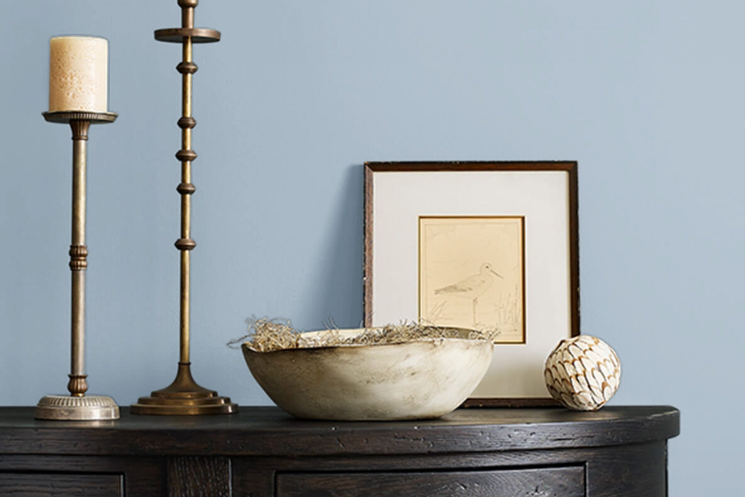
When I think about the color Windy Blue by Sherwin Williams, I picture a soft, soothing blue with just a hint of gray. It’s one of those adaptable colors that naturally brings a fresh and airy feel to any room. I find that it has a comforting presence, making it perfect for rooms where I want to relax and unwind.
In terms of interior styles, Windy Blue shines in modern and minimalist designs because it pairs beautifully with clean lines and simple forms. It also works wonderfully in coastal or beach-themed decor, giving off that light, breezy vibe that’s so essential to those settings. I’ve used it in bedrooms and bathrooms, and it always adds a gentle, calming touch.
I love matching Windy Blue with various materials and textures to really bring out its beauty. Natural wood, whether light oak or rich walnut, complements the blue and keeps the room feeling grounded. Linen and cotton fabrics in white or beige also look amazing with this color, adding to the airy quality of the room. For a bit of contrast, I sometimes introduce elements like brushed metals or glass, which enhance the modern feel of the room without overpowering the gentle charm of Windy Blue.

decorcreek.com
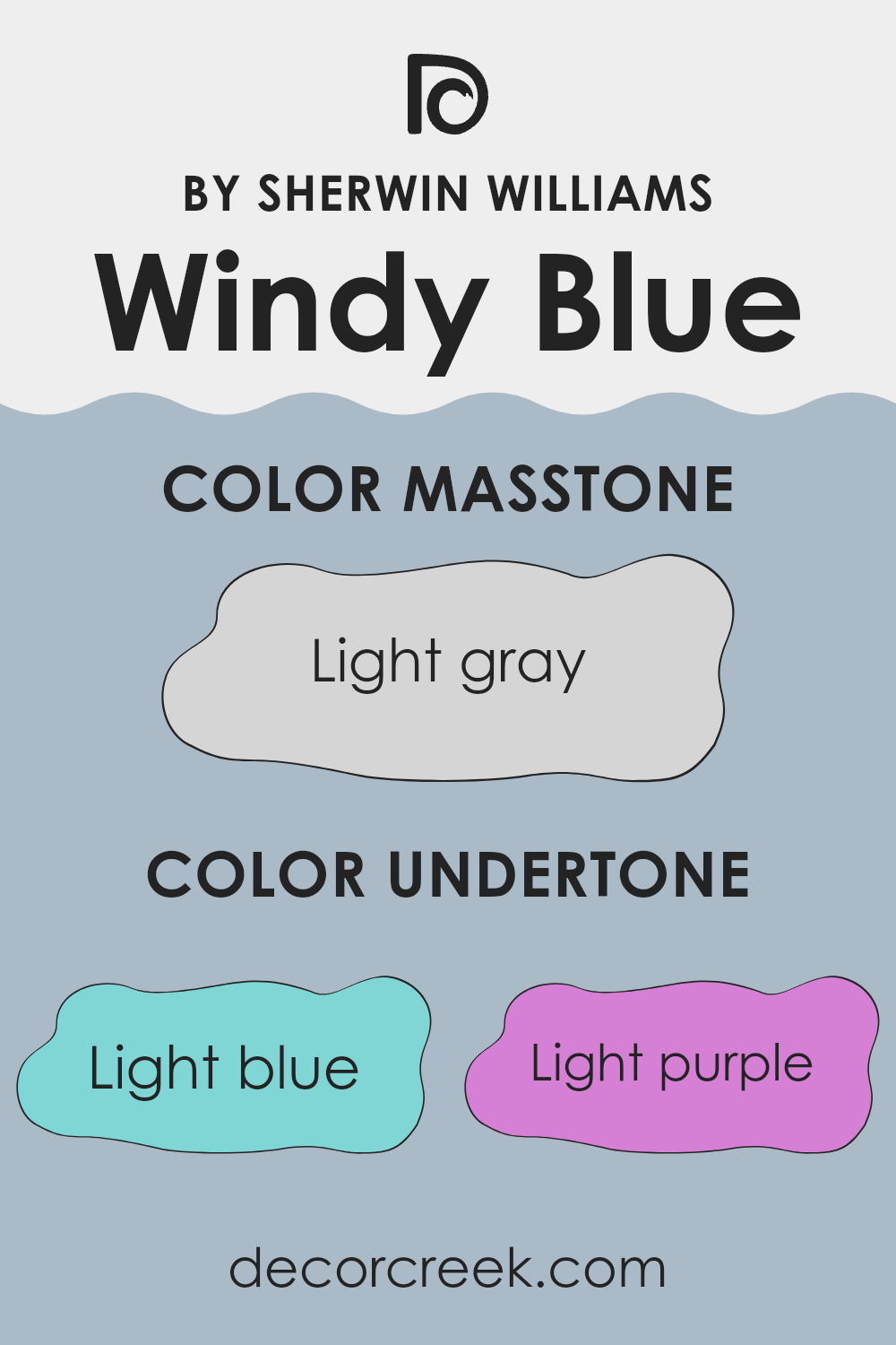
What are the right undertones of Windy Blue SW 6240 ?
Windy Blue has a fascinating mix of undertones that can subtly influence the overall feel of a room. Undertones are secondary colors that lie beneath the surface of the primary color, affecting how it appears under different lighting conditions and when placed next to other colors.
Windy Blue’s undertones include light blue, light purple, lilac, pale yellow, mint, gray, and pale pink. Each undertone brings its own nuance to the primary blue shade, making it adaptable and unique.
For instance, light blue and lilac undertones can add a slightly cool and calm feel, ideal for creating a relaxing atmosphere in bedrooms or bathrooms. On the other hand, the hint of pale yellow and mint might make the color appear fresher and more vibrant, which is great for living areas or rooms intended to feel more welcoming and lively.
The gray and pale pink undertones provide a subtle complexity that softens the overall look, making the color more flexible and easier to match with various decor styles and other colors. When used on interior walls, Windy Blue can perform differently based on the room’s lighting and surrounding colors.
Natural light tends to bring out the cooler undertones, whereas artificial lighting might highlight the warmer ones, such as pale yellow or pink, making the room feel cozier. Choosing a color like Windy Blue with its rich array of undertones offers homeowners flexibility and an opportunity to create rooms that feel personalized and responsive to the specific characteristics of their home environments.
decorcreek.com
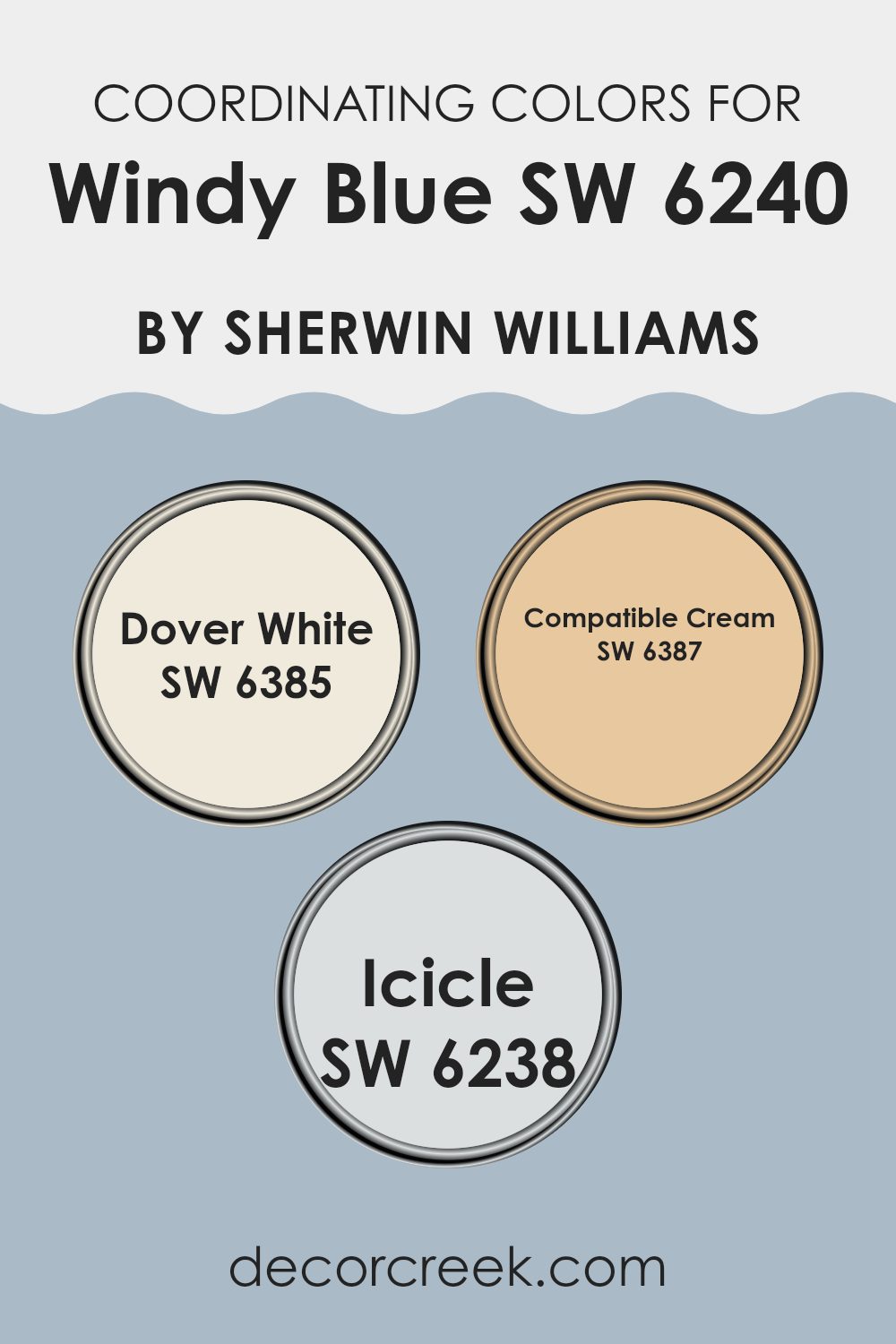
Best Coordinating Colors to use with Windy Blue SW 6240 by Sherwin Williams this year.
Coordinating colors are those that harmonize well with a primary color, enhancing the overall aesthetic of a room without overpowering the main hue. For instance, when using a color like Windy Blue, which is a soft, gentle blue, coordinating shades such as Dover White, Compatible Cream, and Icicle can be chosen to create a balanced and pleasing palette. These color combinations work by either complementing the existing undertones in the primary color or by providing a neutral backdrop that allows the main color to stand out.
Dover White is a warm, creamy white that brings a soft brightness to rooms, making it an ideal companion for the cooler tones of Windy Blue. It provides a subtle contrast that highlights the depth of the blue without clashing.
On the other hand, Compatible Cream offers a richer, more yellow-based tone that adds warmth and depth, working particularly well in creating a cozy and inviting atmosphere when paired with the calming effects of Windy Blue. Lastly, Icicle is a very light, almost frosty blue that echoes the coolness of Windy Blue, helping to maintain a sense of cohesion while slightly intensifying the primary color’s vibrancy and freshness.
You can see recommended paint colors below:
- SW 6385 Dover White
- SW 6387 Compatible Cream
- SW 6238 Icicle
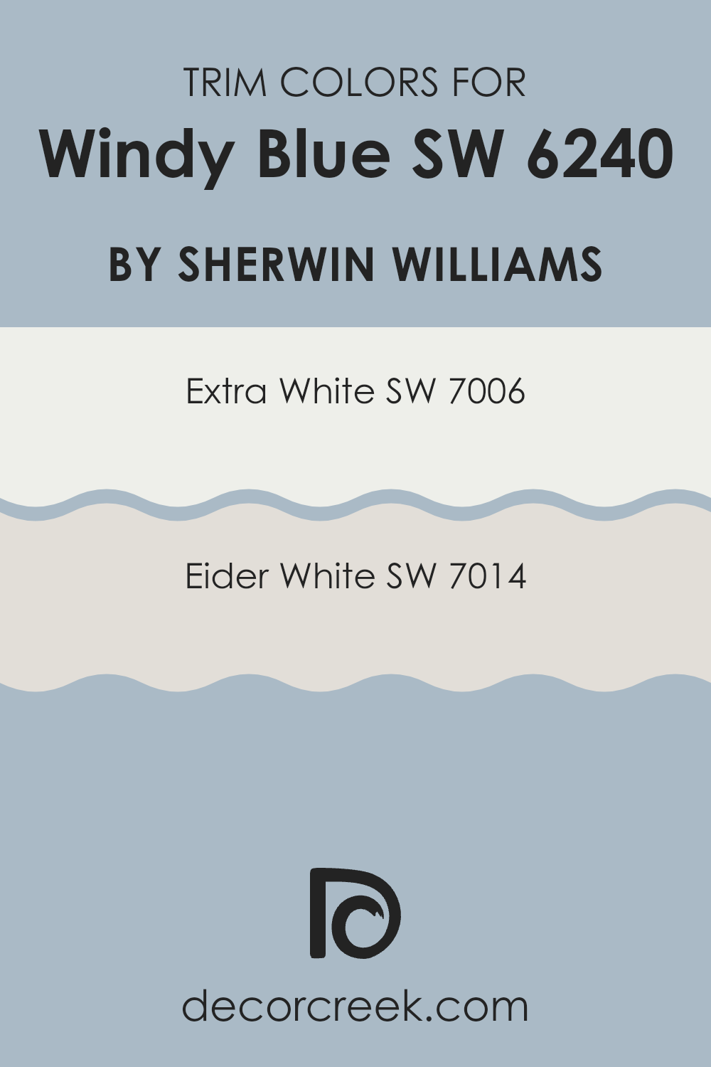
Trendy Trim Colors of Windy Blue SW 6240 by Sherwin Williams to use this year.
Trim colors are selected to complement or contrast the main color used on walls or exteriors to define architectural features and enhance the overall appeal of a room. For Windy Blue, choosing the right trim color is crucial as it helps in outlining doors, windows, and other elements, making them stand out while also bringing cohesiveness to the design.
When you pair Windy Blue with trim colors like Extra White or Eider White from Sherwin Williams, you ensure that the subtler tones of the blue are highlighted effectively, giving a fresh and clean look to your room.
Extra White, SW 7006, is a bright and pure white shade that offers a crisp contrast to Windy Blue, making it ideal for creating a bold, fresh look. It reflects light well, making rooms appear larger and more open. Eider White, SW 7014, on the other hand, has a softer and warmer tone with gray undertones. This color is perfect if you want a gentle transition from the calming tones of Windy Blue, adding a touch of warmth to the surroundings without overpowering the main hue. Using either of these colors as trim options can greatly influence the feel and aesthetics of the room, enhancing the beauty of Windy Blue.
You can see recommended paint colors below:
- SW 7006 Extra White
- SW 7014 Eider White
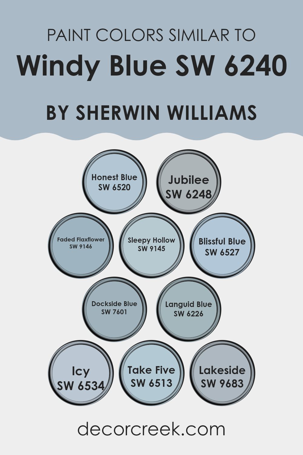
Evergreen Colors Similar to Windy Blue SW 6240 by Sherwin Williams
Choosing similar colors can greatly enhance the cohesiveness and aesthetic appeal of a room. For instance, colors like Honest Blue, Jubilee, and Faded Flaxflower work well together because they share a harmonious balance, creating a soothing and consistent look without sharp contrasts.
Honest Blue has a rich vibrancy that adds depth, while Jubilee offers a more muted tone that complements rooms seeking subtlety. Faded Flaxflower, on the other hand, is lighter, bringing a gentle hint of color that ties in beautifully with the others.
Sleepy Hollow and Blissful Blue are other great examples; both imbue a calmness ideal for relaxation areas like bedrooms or cozy nooks. Sleepy Hollow carries a duskier tone, perfect for a more grounded feeling, and Blissful Blue has just enough brightness to lift the spirits without being too intense.
Colors such as Dockside Blue and Languid Blue are slightly more intense, yet they still maintain the overall theme, providing options for those wanting a bit more personality in their color choices.
Meanwhile, shades like Icy, Take Five, and Lakeside offer a refreshing take on similar hues, each contributing a unique vibe while maintaining the visual flow throughout the room. These colors can effectively tie together various elements in a room, making it look well-thought-out and pleasing to the eye.
You can see recommended paint colors below:
- SW 6520 Honest Blue
- SW 6248 Jubilee
- SW 9146 Faded Flaxflower
- SW 9145 Sleepy Hollow
- SW 6527 Blissful Blue
- SW 7601 Dockside Blue
- SW 6226 Languid Blue
- SW 6534 Icy
- SW 6513 Take Five
- SW 9683 Lakeside
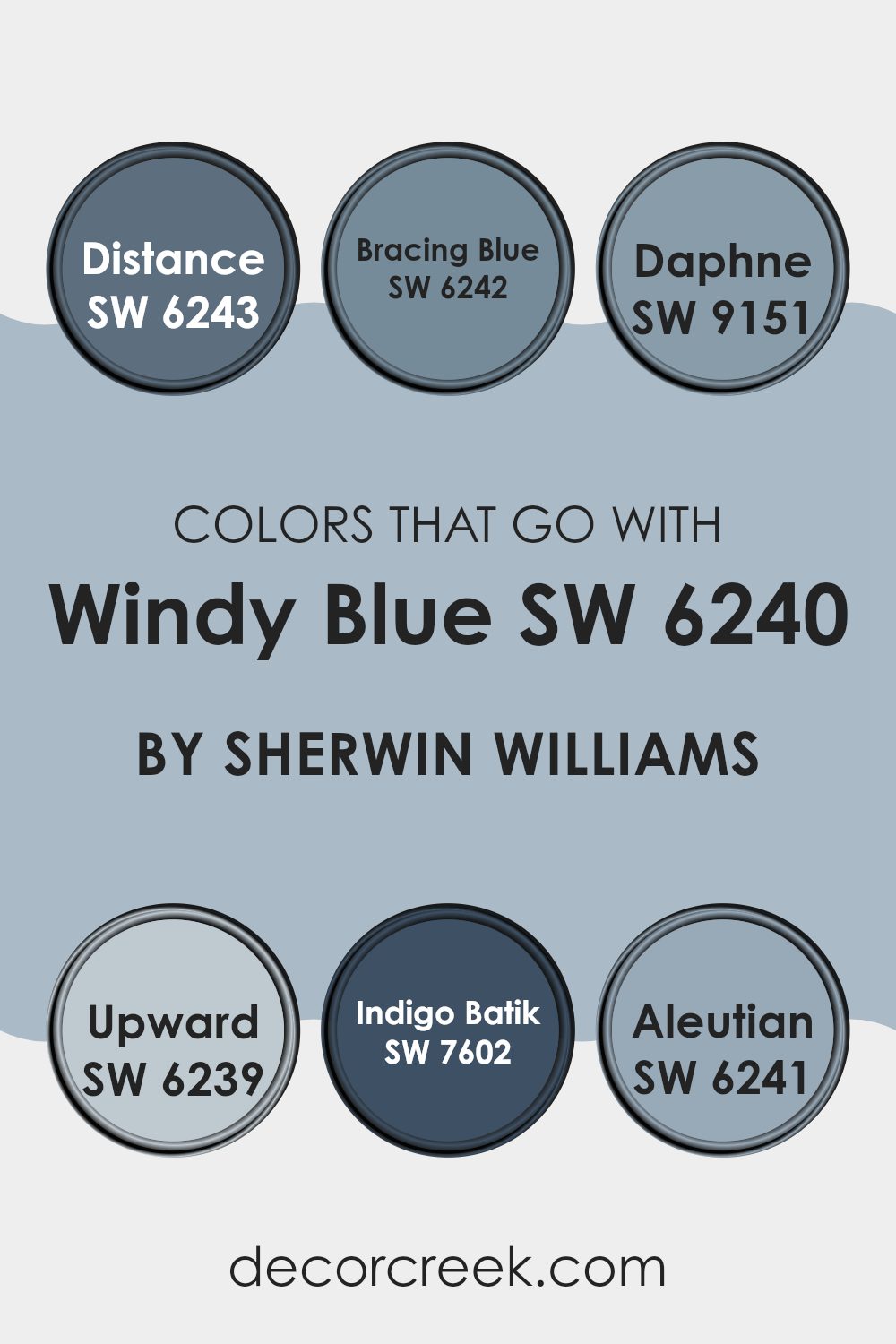
Colors that Go With Windy Blue SW 6240 by Sherwin Williams
Choosing the right colors to complement Windy Blue SW 6240 by Sherwin Williams can greatly enhance the aesthetic of any room, making it important to select shades that harmonize well. Colors like SW 6243 – Distance and SW 6242 – Bracing Blue are perfect as they offer a darker contrast while maintaining a cohesive look with Windy Blue.
Distance brings a deep, reflective blue that adds a sense of depth to the room, offering a strong anchor for lighter accents. Bracing Blue, a slightly lighter yet equally profound blue, provides a smooth transition between Windy Blue and more intense shades, setting a calm, inviting atmosphere.
Other compatible colors include SW 9151 – Daphne, SW 6239 – Upward, SW 7602 – Indigo Batik, and SW 6241 – Aleutian, each adding its unique flair. Daphne is a richer, more vibrant shade that injects energy and personality into a room. Upward, on the other hand, is much lighter and offers a subtle lift, creating a refreshing feel when paired with Windy Blue.
Indigo Batik brings a traditional charm with its deep navy tone, pairing wonderfully with wooden furniture and natural textures. Lastly, Aleutian introduces a slightly grayish tone, soft and easy on the eyes, perfect for achieving a balanced, harmonious look. These colors collectively create a diverse palette that allows for flexible design options suited to various tastes and settings.
You can see recommended paint colors below:
- SW 6243 Distance
- SW 6242 Bracing Blue
- SW 9151 Daphne
- SW 6239 Upward
- SW 7602 Indigo Batik
- SW 6241 Aleutian
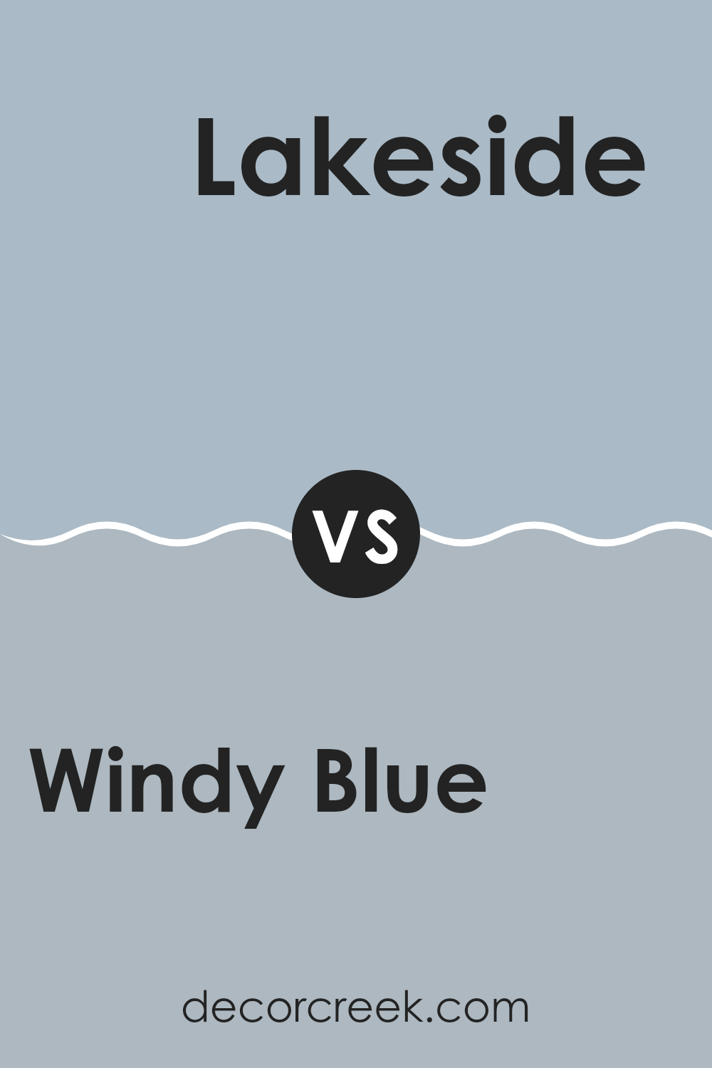
Windy Blue SW 6240 by Sherwin Williams vs Lakeside SW 9683 by Sherwin Williams
Windy Blue and Lakeside are both calming shades from Sherwin Williams, but they have distinct tones. Windy Blue is lighter and carries a subtle, fresh feel, reminiscent of a clear sky on a breezy day.
It is adaptable enough to be used in various rooms, creating a relaxed and airy atmosphere. On the other hand, Lakeside is a deeper blue with a greener undertone, resembling the deep waters of a lake or the shaded areas of a forest.
This color can bring a grounded, natural feel to rooms, making it ideal for areas where a touch of nature is desired. Although both colors are inspired by natural elements and can create peaceful environments, their intensity and undertones offer different aesthetic impacts and mood settings in a room.
You can see recommended paint color below:
- SW 9683 Lakeside
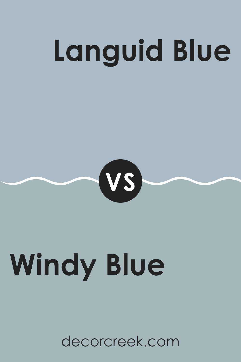
Windy Blue SW 6240 by Sherwin Williams vs Languid Blue SW 6226 by Sherwin Williams
Windy Blue and Languid Blue, both by Sherwin Williams, are distinct yet harmonious shades. Windy Blue presents a slightly lighter and cooler tone, which makes it ideal for creating a fresh, airy feel in a room.
It has a subtle vibrancy that can brighten rooms without being too intense. In contrast, Languid Blue offers a deeper, slightly warmer hue. This color can add a hint of coziness to a room, making it perfect for areas where a calm, relaxing atmosphere is desired, like bedrooms or reading nooks.
Both colors pair well with neutral and wood tones, although Windy Blue might be better suited for well-lit areas to enhance its light-reflective qualities, while Languid Blue works well in rooms with controlled lighting to enhance its depth. Overall, choosing between these two depends on the desired mood and the specific characteristics of the room.
You can see recommended paint color below:
Windy Blue SW 6240 by Sherwin Williams vs Faded Flaxflower SW 9146 by Sherwin Williams
Both Windy Blue and Faded Flaxflower are calming and soothing colors by Sherwin Williams, but they have distinct personalities. Windy Blue is a muted blue with a subtle gray undertone, giving it a cool, calming feel that’s perfect for creating a peaceful room in homes. It works well in areas like bedrooms or bathrooms where you want to promote relaxation.
In contrast, Faded Flaxflower has a more subdued presence. This color is a soft gray with hints of blue, leaning toward a lighter, airier feel. It is ideal for rooms that you want to feel open and bright, such as kitchens or living rooms.
While both colors can effectively enhance a room with their gentle hues, Windy Blue sets a cooler, more reserved tone compared to Faded Flaxflower’s light and uplifting vibes. The choice between them would depend on the mood you’re aiming to set in your room.
You can see recommended paint color below:
Windy Blue SW 6240 by Sherwin Williams vs Jubilee SW 6248 by Sherwin Williams
Windy Blue and Jubilee, both from Sherwin Williams, offer subtle yet distinct tones for any room. Windy Blue has a soft, airy feel, resembling the lightest parts of the sky on a clear day.
It has a gentle, refreshing vibe that works well in bedrooms or bathrooms to create a calm atmosphere. On the other hand, Jubilee is a touch deeper, leaning toward a muted lavender-gray. This color is adaptable, fitting nicely in a living room or an office, where it provides a quietly modern look without being too bold.
Both colors are light enough to make small rooms appear larger and can be complemented with a variety of decor styles. While Windy Blue gives a breath of fresh air, Jubilee offers a hint of modernity, making each ideal for creating a unique yet understated aesthetic.
You can see recommended paint color below:
- SW 6248 Jubilee
Windy Blue SW 6240 by Sherwin Williams vs Take Five SW 6513 by Sherwin Williams
Windy Blue and Take Five, both by Sherwin Williams, are distinct shades of blue. Windy Blue is a soft, muted blue with a hint of gray. It’s an adaptable color that works well in many settings, giving a calm and gentle feel without being too bright.
On the other hand, Take Five is a lighter and more vibrant blue. This color has a fresher, more energetic feel, making it a great choice for rooms where you want a cheerful and inviting atmosphere. While Windy Blue leans toward a subdued, classic appearance, Take Five offers a more lively and fresh look.
Depending on the mood and style you want to achieve, either color could be a great choice for your room, with Windy Blue providing a more understated backdrop and Take Five bringing a brighter energy.
You can see recommended paint color below:
- SW 6513 Take Five
Windy Blue SW 6240 by Sherwin Williams vs Dockside Blue SW 7601 by Sherwin Williams
Windy Blue and Dockside Blue, both by Sherwin Williams, are similar yet distinct shades of blue. Windy Blue is a softer, lighter blue with a calm and gentle look.
It has a muted tone that is very adaptable, working well in rooms where you want a sense of calm without being too bold. On the other hand, Dockside Blue is deeper and has a stronger presence. It leans slightly toward a slate blue, making it a great choice for areas where you want to introduce more color, but still keep things fairly subdued.
This color can make a statement in a room without being too intense. Both colors lend themselves well to being used in a variety of decorating styles, from casual to more formal rooms, though Dockside Blue might be slightly more commanding due to its depth.
You can see recommended paint color below:
- SW 7601 Dockside Blue
Windy Blue SW 6240 by Sherwin Williams vs Blissful Blue SW 6527 by Sherwin Williams
Windy Blue and Blissful Blue, both by Sherwin Williams, offer distinct vibes for any room. Windy Blue has a more subtle, soft appearance, offering a calm and soothing atmosphere that’s perfect for a cozy setting. It works well in rooms like bedrooms or offices where you want to promote peace without making too dramatic a statement.
On the other hand, Blissful Blue has a slightly brighter and more vibrant tone. This makes it a great choice for livelier areas such as kitchens or kids’ rooms, where a cheerful and energizing effect is desired. Blissful Blue stands out a bit more than Windy Blue, making it a better option when you want something with a little more presence.
Both colors bring their unique flair, and your choice depends on the mood you aim to set in your room. Windy Blue is great for a reserved, subtle look, while Blissful Blue adds a touch of cheerful brightness.
You can see recommended paint color below:
Windy Blue SW 6240 by Sherwin Williams vs Honest Blue SW 6520 by Sherwin Williams
Windy Blue and Honest Blue, both by Sherwin Williams, are unique shades that really stand out. Windy Blue has a light, breezy feel, lending a gentle and subtle vibe to a room. It’s quite muted, making it perfect for creating a calm, relaxed atmosphere in rooms. It works wonderfully in bedrooms or bathrooms where you want a soft backdrop.
On the other hand, Honest Blue is brighter and more vibrant. This color pops more, giving a cheerful boost to any area. It’s a great choice for places where you want to add a splash of energy like a kid’s room or a play area.
Both colors are blue, but while Windy Blue leans toward a softer, dustier hue, Honest Blue goes the route of clarity and vividness. Depending on what feeling you want to convey in your room – whether it’s a soothing quietness or a lively spark – choosing between these two can make a big difference.
You can see recommended paint color below:
Windy Blue SW 6240 by Sherwin Williams vs Icy SW 6534 by Sherwin Williams
Windy Blue and Icy are both soothing paint colors from Sherwin Williams, but they serve slightly different vibes in a room. Windy Blue has a subtle gray tone, making it a soft, soothing blue that’s easy on the eyes.
It’s excellent for creating a calm and mild atmosphere in a room, ideal for bedrooms or quiet study areas. On the other hand, Icy leans toward a brighter, more vibrant blue with a hint of freshness like a clear winter sky. This color is perfect for making smaller rooms appear larger and more open.
Both colors can freshen up a room, but Windy Blue offers a gentler touch, while Icy brings a crisper, more energizing feel. Depending on the feel you want for your room, you can choose the muted, gentle tones of Windy Blue or the lively, fresh feel of Icy.
You can see recommended paint color below:
- SW 6534 Icy
Windy Blue SW 6240 by Sherwin Williams vs Sleepy Hollow SW 9145 by Sherwin Williams
Windy Blue and Sleepy Hollow, both from Sherwin Williams, have distinct tones that set different moods for a room. Windy Blue is a soft, light blue with a gentle, calming effect. It brings to mind a clear blue sky on a breezy day, making it perfect for creating a relaxed atmosphere in rooms like bedrooms or bathrooms.
On the other hand, Sleepy Hollow is a deeper, more intense blue with hints of gray. This color has a stronger presence and can make a bold statement when used in interior rooms. It works well in areas where you want to add depth and interest, such as dining rooms or accent walls.
Both colors can be used effectively to beautify a home, but the choice between them depends on the desired impact. Windy Blue offers a lighter, airier feel, while Sleepy Hollow provides a more dramatic and moody tone. Combining both can also create a pleasing balance, using Windy Blue for a soothing backdrop and Sleepy Hollow for striking highlights.
You can see recommended paint color below:
In conclusion, SW 6240 Windy Blue by Sherwin Williams is like a breath of fresh air for any room. As I looked into this paint color, I learned that it’s not just blue—it’s a soothing, calm kind of blue that can make a room feel cozy and peaceful. It reminds you of a clear sky on a sunny day or the soft waves of the ocean.
This color works beautifully in bedrooms and bathrooms where you need a relaxing atmosphere. It’s also great in living rooms or study areas where you don’t want anything too bright or distracting. What’s really cool is how well it pairs with many other colors—like white, gray, and even some fun colors like yellow or pink.
So, if you’re thinking about giving your room a new look, Windy Blue could be the perfect choice. It adds just the right touch of color without making everything too loud or hard to decorate around. Whether you want a place that feels cozy or a little bit more grown-up, this color can help you create that feeling. Imagine having a room that feels like a hug every time you walk in—that’s what Windy Blue can do!

decorcreek.com
Ever wished paint sampling was as easy as sticking a sticker? Guess what? Now it is! Discover Samplize's unique Peel & Stick samples.
Get paint samples

