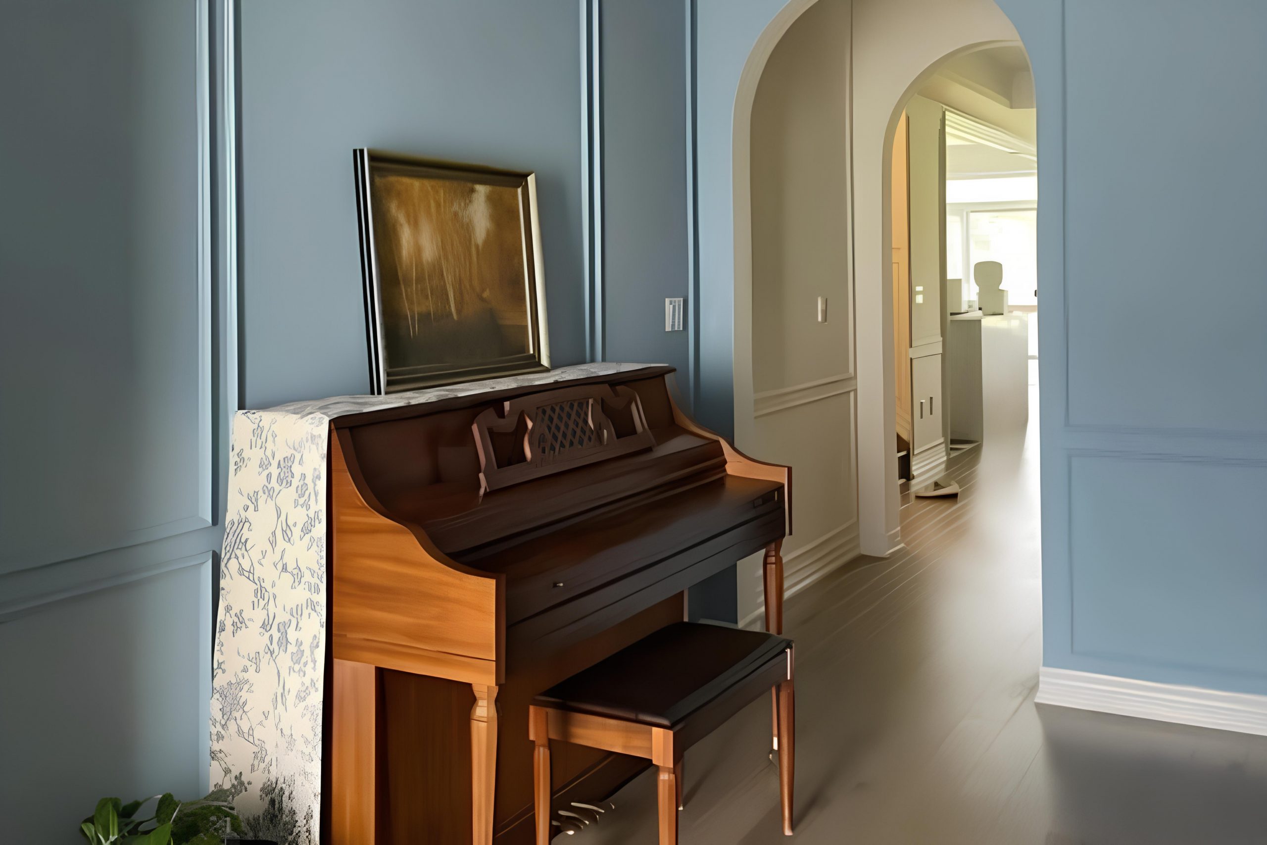
When I first came across SW 9146 Faded Flaxflower by Sherwin Williams, I felt an immediate sense of calm and warmth. This color brings a beautiful touch of serenity to any space. Its gentle blue hue seems to be kissed by a hint of gray, making it both soothing and approachable. I have always been drawn to colors that offer a tranquil atmosphere, and Faded Flaxflower perfectly fits the bill.
Using this color in my home felt like introducing a breath of fresh air into my surroundings. It works harmoniously in both living spaces and bedrooms, creating an inviting mood that makes every corner feel welcoming.
Whether paired with soft neutral tones or contrasted with deeper shades, Faded Flaxflower finds a way to stand out and blend in simultaneously—like a soft whisper that gets heard.
For me, it was more than just a paint color; it became a canvas for moments of rest and reflection in my daily life.
If you enjoy environments that feel gentle and relaxed, where you can unwind effortlessly, then Faded Flaxflower might become a favorite for you too.
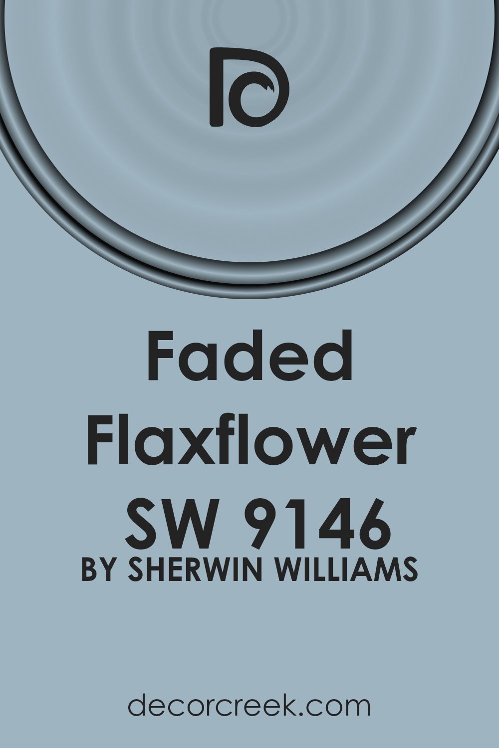
What Color Is Faded Flaxflower SW 9146 by Sherwin Williams?
Faded Flaxflower by Sherwin Williams is a soft, muted shade of blue that exudes a gentle and calming vibe. It’s reminiscent of a clear sky just after dawn, offering a sense of quiet and peace. This light, powdery blue can bring subtle color into a space without being overwhelming.
In terms of interior styles, Faded Flaxflower works beautifully in coastal and cottage-themed homes where its soft tone enhances an airy and open atmosphere. Its soothing hue also fits well in traditional and country-style interiors, bringing a touch of color while remaining understated.
This color pairs well with natural materials like light woods, rattan, and wicker, which complement its gentle, organic feel. Whitewashed or distressed furniture enhances its subtlety, while adding character to the room. Crisp white trim or furniture accents provide a clean contrast, making the blue appear fresh and inviting.
Textiles in linen, cotton, and wool add texture and warmth, working harmoniously with this calming shade. Throw pillows or curtains in neutral tones or soft blues can add layers and depth without overpowering the space.
Metal finishes such as brass or brushed nickel can also complement the color, adding a hint of elegance and shine.
Is Faded Flaxflower SW 9146 by Sherwin Williams Warm or Cool color?
Faded Flaxflower by Sherwin Williams is a soft, muted shade of blue with subtle hints of gray. This color is gentle on the eyes, bringing a sense of calmness and relaxation to a room. Its understated nature makes it versatile and easy to pair with other colors and materials.
In spaces like living rooms or bedrooms, it creates a cozy atmosphere, making these areas feel inviting and comfortable. When used in kitchens or bathrooms, it can add a touch of freshness without overwhelming the space.
This shade works well with both modern and traditional styles, allowing homeowners to incorporate it into a variety of design aesthetics. Pairing Faded Flaxflower with white or cream creates a clean, crisp look, while combining it with natural wood tones adds warmth and earthiness. Overall, this color is a flexible choice for those looking to add a gentle touch to their home decor.
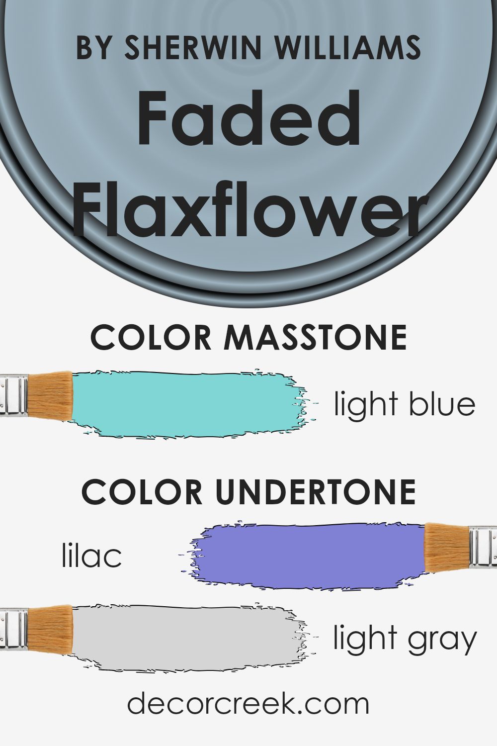
Undertones of Faded Flaxflower SW 9146 by Sherwin Williams
Faded Flaxflower (SW 9146) by Sherwin Williams is a paint color with rich undertones that can dramatically change its look based on the lighting and surroundings. Undertones are subtle colors found beneath the main color, affecting how we perceive it. In the case of Faded Flaxflower, these include lilac, light gray, mint, light purple, grey, pale yellow, pale pink, turquoise, blue, light turquoise, and dark turquoise.
These undertones can make the paint appear differently throughout the day. For instance, in a room with lots of natural light, the blue or turquoise undertones might become more noticeable, giving the walls a cooler look.
In contrast, under artificial lighting, such as warm LED bulbs, the pale yellow and pale pink undertones could make the color feel warmer and cozier.
When applied to interior walls, these undertones allow Faded Flaxflower to adapt to its environment. In a living room with wooden furniture, the mint and grey undertones might bring out an earthy, calm vibe. In a bedroom, the soft lilac and light purple hues can contribute to a soothing atmosphere.
This adaptability makes Faded Flaxflower an engaging and versatile choice for various spaces, offering a different mood depending on the context.
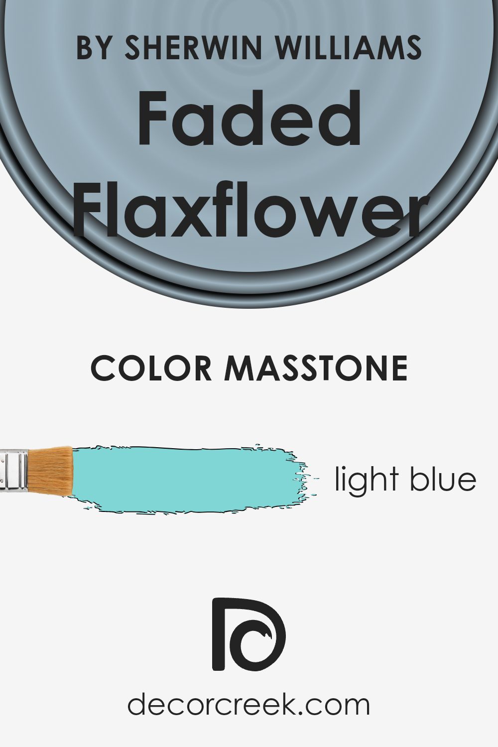
What is the Masstone of the Faded Flaxflower SW 9146 by Sherwin Williams?
Faded Flaxflower, with its light blue masstone, is a gentle and refreshing color choice for homes. This hue offers a calming effect, making it an ideal option for bedrooms, bathrooms, or any space where you want to create a relaxed atmosphere.
The light blue tone can make smaller rooms feel more open and airy, enhancing the sense of space. Additionally, it pairs well with various color schemes, matching effortlessly with neutral shades like whites and grays, as well as bolder colors.
This versatility makes it a flexible choice for different interior styles, from modern to traditional. In living rooms or kitchens, it can add a touch of freshness, helping these areas feel more inviting. Natural light can enhance Faded Flaxflower’s brightness, while artificial lighting can warm it up, making the room feel cozy during the evening. Overall, this color can bring a soft and pleasant vibe to any home.
How Does Lighting Affect Faded Flaxflower SW 9146 by Sherwin Williams?
Lighting plays a crucial role in how we see and experience colors. Different light sources, whether natural or artificial, can significantly alter the appearance of a color. Faded Flaxflower (SW 9146) by Sherwin Williams, a soft and calming blue, provides a good example of how lighting affects color perception.
In natural light, the quality of light can vary throughout the day and affect how Faded Flaxflower appears. In north-facing rooms, the light tends to be cool and consistent, bringing out the calmness of Faded Flaxflower.
As north-facing rooms receive less direct sunlight, the blue undertones in the color may become more pronounced, giving the space a slightly cooler feel.
In south-facing rooms, the light is warmer and more direct. This warm light can soften the blue tones in Faded Flaxflower, making the room appear brighter and more welcoming. The natural light can highlight any subtle variations in the color, adding depth and interest to the space.
East-facing rooms get bright, crisp morning light, which can make Faded Flaxflower look vibrant and fresh. As the day progresses and the light shifts, the color may appear softer and more subdued. The changing light throughout the day can give the room a dynamic feel.
In west-facing rooms, the light is softer in the morning and becomes intense and warm in the late afternoon. Faded Flaxflower can look muted at first, but as the day goes on and the warm tones of the light hit the walls, the color can take on a richer hue.
Under artificial lighting, the appearance of Faded Flaxflower depends on the type of bulbs used. Cool white bulbs can make the color appear crisp and more blue, while warm yellow bulbs can give it a softer, almost pastel look. The type of artificial lighting you choose will influence whether the space feels cooler or cozier with Faded Flaxflower on the walls.
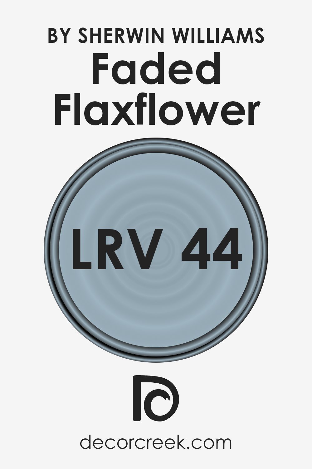
What is the LRV of Faded Flaxflower SW 9146 by Sherwin Williams?
Light Reflectance Value (LRV) is a measure that indicates how much light a color reflects. It is represented as a number from 0 to 100. A value of 0 means the color is absolute black and absorbs all light, while a value of 100 means it is pure white and reflects all light.
LRV helps you understand how bright or dark a color will appear in a room. The higher the LRV, the more light a color will reflect back into the room, making the space feel brighter and more open.
Conversely, lower LRV values mean the color absorbs more light, resulting in a cozier and sometimes darker ambiance. When selecting paint colors for your walls, considering the LRV can help in achieving the desired lighting effect in your space.
For Faded Flaxflower by Sherwin Williams, which has an LRV of 43.6, the color falls in the middle of the spectrum. This means it neither reflects too much light nor absorbs too much, providing a balanced look.
Faded Flaxflower will not overpower a room with brightness but will not make it feel too dark either. It is a versatile choice for spaces where you want a moderate level of brightness without the starkness of a lighter color or the depth of a darker shade.
This balance makes it suitable for a variety of settings, as it allows both light and shadows to play nicely within the room, contributing to a neutral, calming environment.
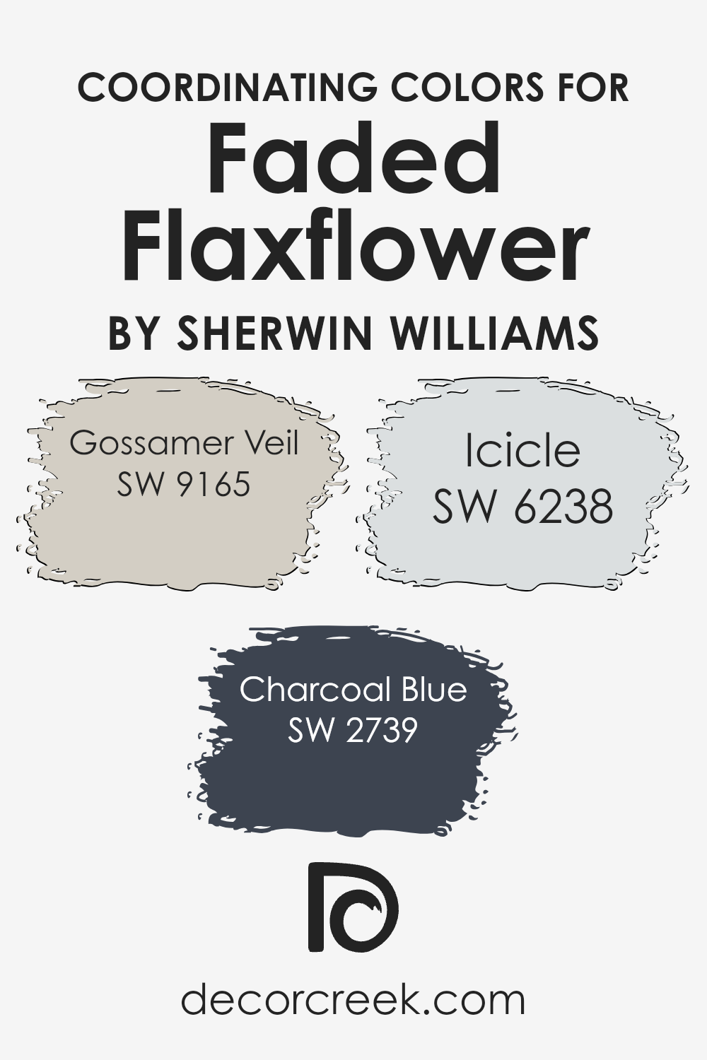
Coordinating Colors of Faded Flaxflower SW 9146 by Sherwin Williams
Coordinating colors are hues that are chosen to complement each other, creating a harmonious and balanced look in a space. These colors work together seamlessly, enhancing the visual appeal of a room by providing contrast or a smooth transition from one shade to another.
For Faded Flaxflower by Sherwin Williams, some excellent coordinating colors include Gossamer Veil, Charcoal Blue, and Icicle. Each of these colors interacts with Faded Flaxflower to provide a distinct atmosphere and style.
Gossamer Veil is a soft, warm gray that almost has a hint of beige, adding warmth and a touch of elegance when paired with Faded Flaxflower. Charcoal Blue, on the other hand, is a deep, rich blue with gray undertones, adding depth and sophistication to any space.
Its boldness makes it a great contrast to the softer Faded Flaxflower, resulting in a balanced and dynamic look. Icicle, a very light, cool gray, offers a fresh, airy feel. It brightens up the room and provides a subtle cool contrast to the warmer tones of Faded Flaxflower, making the overall palette feel complete and well-rounded.
Each color brings its own character, enhancing the overall design in unique ways.
You can see recommended paint colors below:
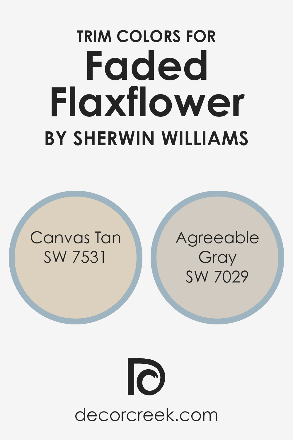
What are the Trim colors of Faded Flaxflower SW 9146 by Sherwin Williams?
Trim colors are accent hues used to highlight or contrast with the main color of a space. They serve to define and emphasize the architectural features like baseboards, moldings, and window frames. Using trim colors effectively can enhance the overall aesthetic and balance of a room.
For Faded Flaxflower, a soft and muted blue from Sherwin-Williams, using the right trim colors can add depth and dimension, while ensuring the room feels complete and harmonious.
Canvas Tan (SW 7531) is a warm, delicate beige that offers a gentle contrast to the cool tones of Faded Flaxflower. Its neutral warmth complements the blue, creating a welcoming, balanced environment. Meanwhile, Agreeable Gray (SW 7029) is a versatile greige that combines gray and beige undertones, providing a subtle yet sophisticated boundary that pairs beautifully with Faded Flaxflower.
This trim color brings a calm and cohesive look that helps connect the walls with other elements in the room, such as furniture and decor.
You can see recommended paint colors below:
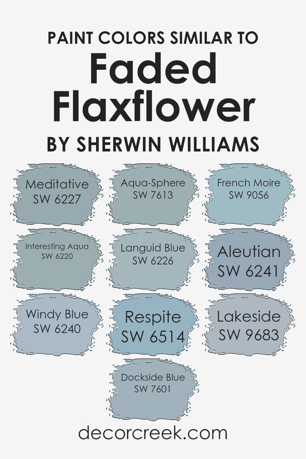
Colors Similar to Faded Flaxflower SW 9146 by Sherwin Williams
Similar colors play an important role in design because they help create a cohesive and harmonious look. When you use colors that are close in tone, such as those similar to Faded Flaxflower, it can tie a space together, making it comforting and easy on the eyes.
SW 6227 Meditative is a calming blue with soft undertones, bringing a sense of calmness. SW 6220 Interesting Aqua offers a hint of green, adding a fresh and lively touch to the palette. SW 6240 Windy Blue is a deeper shade that brings a sense of depth and tranquility to a room.
Adding SW 7601 Dockside Blue, you find a hint of gray mixed in, which grounds the color scheme beautifully. SW 7613 Aqua-Sphere is a pale blue with a crisp, airy feel, perfect for brightening spaces. SW 6226 Languid Blue has a slightly muted presence, offering quiet elegance.
For a pop of life, SW 6514 Respite is cool and pleasing to the eye. SW 9056 French Moire is a very soft blue, adding subtle texture, while SW 6241 Aleutian is a muted yet rich blue, introducing warmth.
Finally, SW 9683 Lakeside provides a darker contrast, anchoring the lighter colors around it and adding balance. Together, these colors work harmoniously, creating a peaceful and inviting environment.
You can see recommended paint colors below:
- SW 6227 Meditative
- SW 6220 Interesting Aqua
- SW 6240 Windy Blue
- SW 7601 Dockside Blue
- SW 7613 Aqua-Sphere
- SW 6226 Languid Blue
- SW 6514 Respite
- SW 9056 French Moire
- SW 6241 Aleutian
- SW 9683 Lakeside
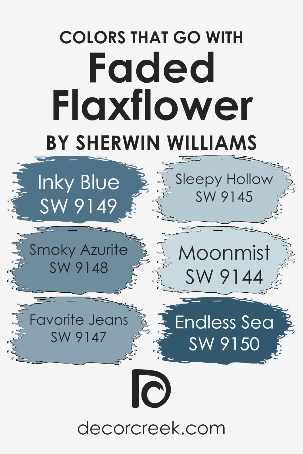
Colors that Go With Faded Flaxflower SW 9146 by Sherwin Williams
Choosing colors to match Faded Flaxflower SW 9146 by Sherwin Williams is important because harmony in color combinations can make a space feel more inviting and balanced. Faded Flaxflower is a soft blue that pairs well with various shades, enhancing the overall aesthetic of a room.
Colors like SW 9149 – Inky Blue, a deep and rich blue, adds depth and intensity, making it ideal for feature walls or accent pieces. SW 9148 – Smoky Azurite, with its soft, muted tone, complements Faded Flaxflower to create a cozy atmosphere, perfect for living areas.
SW 9147 – Favorite Jeans is a relaxed, medium blue that adds warmth and comfort, ideal for family rooms or bedrooms. SW 9145 – Sleepy Hollow, a dusty green, introduces a calming natural element, perfect for kitchens or bathrooms. SW 9144 – Moonmist brings a light, airy feel with its gentle gray tone, good for creating a subtle backdrop.
Finally, SW 9150 – Endless Sea, a bold, vibrant blue, can be used to create a focal point that draws attention without overpowering the room.
Together, these colors create a cohesive and inviting environment that enhances the beauty of Faded Flaxflower.
You can see recommended paint colors below:
- SW 9149 Inky Blue
- SW 9148 Smoky Azurite
- SW 9147 Favorite Jeans
- SW 9145 Sleepy Hollow
- SW 9144 Moonmist
- SW 9150 Endless Sea
How to Use Faded Flaxflower SW 9146 by Sherwin Williams In Your Home?
Faded Flaxflower SW 9146 by Sherwin Williams is a lovely soft blue shade. It’s perfect for creating a calming atmosphere in your home. You can use it in various rooms to bring a gentle touch of color without being too bold. In the bedroom, it works well on the walls to help create a peaceful place for relaxing and sleeping.
In the living room, it pairs nicely with neutral furniture and decor, adding a subtle pop of color that feels fresh and inviting. It’s also a great choice for a bathroom, where it can add a clean and cool feel to the space. Try using white or light gray accents with Faded Flaxflower for a harmonious look.
For a more vibrant effect, you can add some yellow or green decor pieces, which will stand out against this soft blue background. Overall, it’s a versatile color that can help make your home feel cozy and welcoming.
Faded Flaxflower SW 9146 by Sherwin Williams vs Languid Blue SW 6226 by Sherwin Williams
Faded Flaxflower SW 9146 and Languid Blue SW 6226 are two soothing colors by Sherwin Williams, each bringing its own unique charm to a space. Faded Flaxflower is a soft, muted blue with subtle gray undertones, creating a gentle and calming look.
It evokes a sense of lightness and is perfect for creating a refreshing atmosphere in any room. On the other hand, Languid Blue has a deeper, more pronounced blue shade with hints of green. This gives it a richer and more classic feel, adding depth to a space.
While Faded Flaxflower is airy and understated, Languid Blue offers a slightly bolder statement, making it ideal for feature walls or areas where you want a bit more color presence. Both colors can be paired with neutral tones to maintain a peaceful ambiance, but they shine differently, offering a wide range of options for home decor.
You can see recommended paint color below:
- SW 6226 Languid Blue

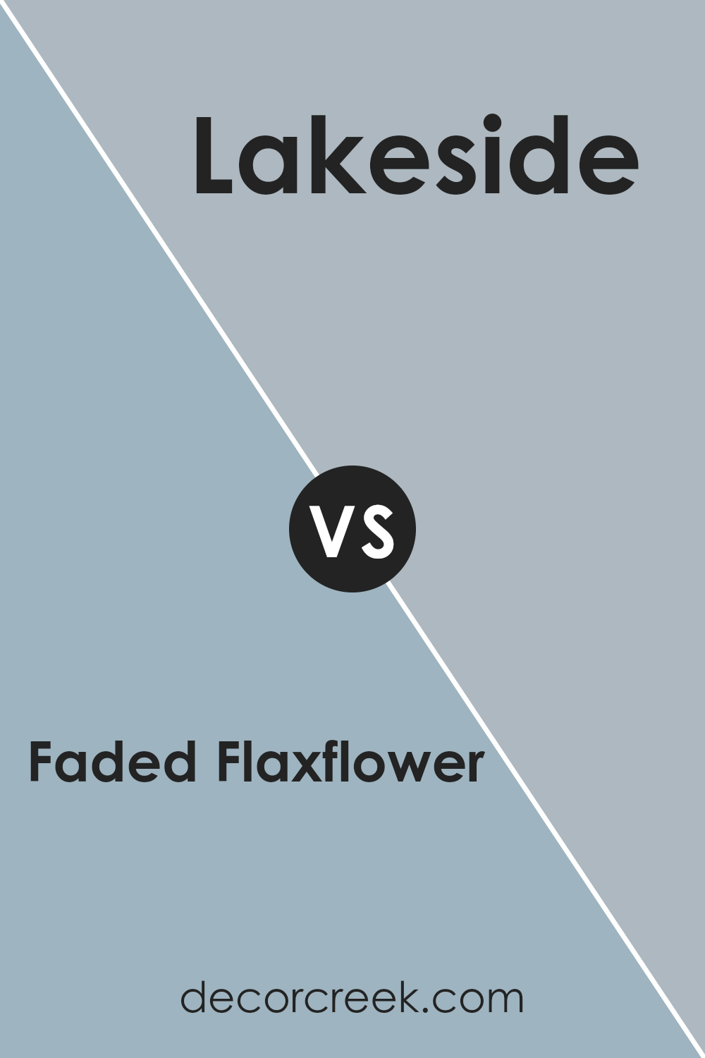
Faded Flaxflower SW 9146 by Sherwin Williams vs Lakeside SW 9683 by Sherwin Williams
Faded Flaxflower (SW 9146) and Lakeside (SW 9683) are both soft, calming blue colors offered by Sherwin Williams, but they carry distinct qualities. Faded Flaxflower is a muted, dusky blue with a hint of gray, giving it a tender and cozy feel.
It’s a versatile color that works well in both casual and formal settings. This subtle shade adds a gentle elegance to a space, making it a great choice for bedrooms or living areas where a peaceful atmosphere is desired.
In contrast, Lakeside is a richer blue with green undertones, bringing to mind the vibrant hues of nature. It’s slightly more vivid than Faded Flaxflower and can add a touch of energy to a room. It works beautifully in rooms where a refreshing, invigorating atmosphere is wanted, such as kitchens or bathrooms. Both colors are soothing, yet their different undertones allow them to create unique moods in any space.
You can see recommended paint color below:
- SW 9683 Lakeside
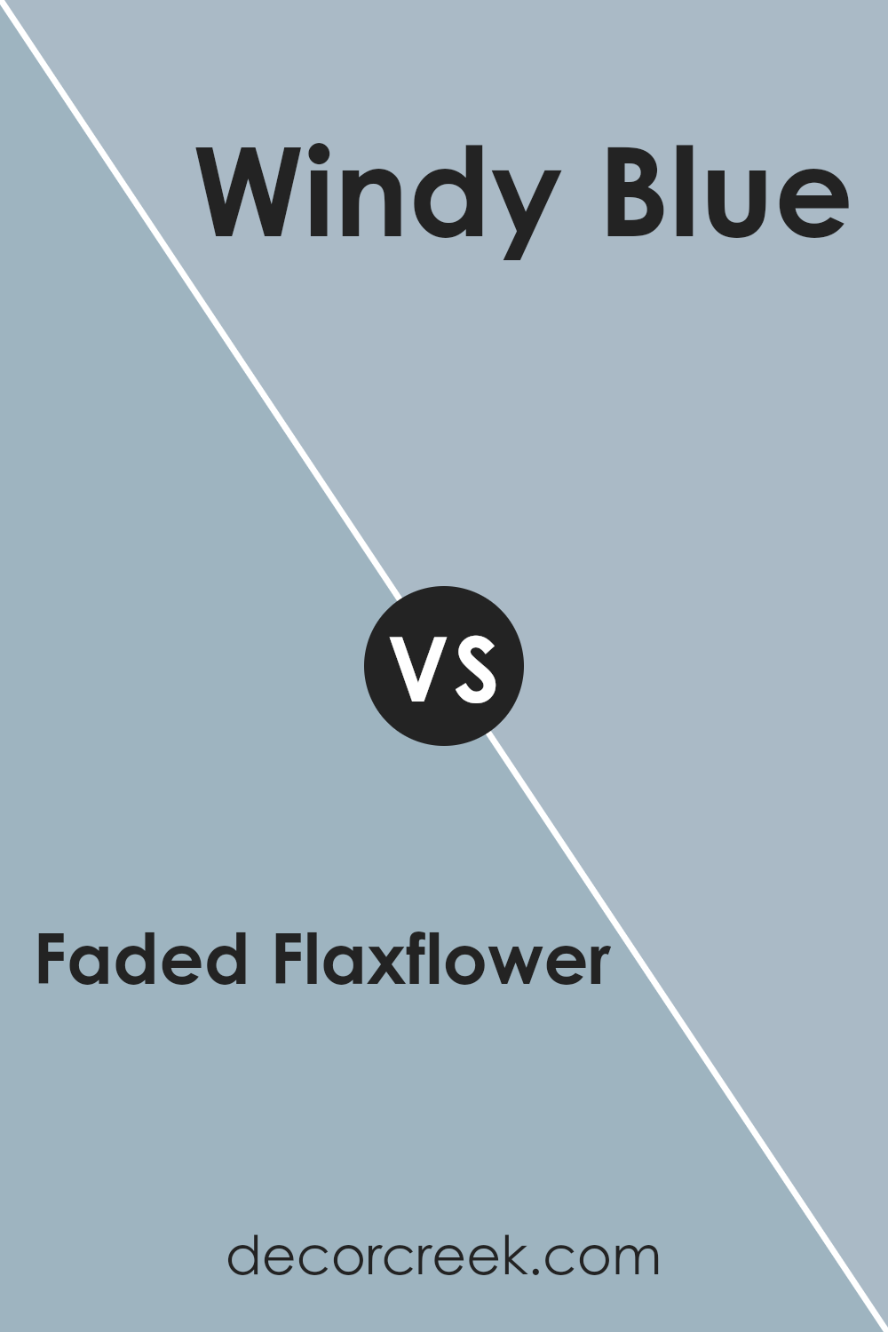
Faded Flaxflower SW 9146 by Sherwin Williams vs Windy Blue SW 6240 by Sherwin Williams
Faded Flaxflower SW 9146 and Windy Blue SW 6240 by Sherwin Williams are two unique shades of blue. Faded Flaxflower is a gentle, muted blue with slight gray undertones. It’s a soft color that feels calm and understated, making it a great choice for spaces where you want a soothing atmosphere.
On the other hand, Windy Blue is a bit more vibrant and has a hint of warmth, making it feel more lively. While both are blues, the main difference is in their tones; Faded Flaxflower leans toward a cooler, more subtle hue, whereas Windy Blue has an energetic, inviting feel.
These colors could complement each other well, with Faded Flaxflower providing a neutral backdrop and Windy Blue adding a touch of color to a room. Both colors offer their own charm and can fit nicely into a variety of design styles.
You can see recommended paint color below:
Faded Flaxflower SW 9146 by Sherwin Williams vs Dockside Blue SW 7601 by Sherwin Williams
Faded Flaxflower SW 9146 and Dockside Blue SW 7601 are two distinct colors by Sherwin Williams with their own unique appeal. Faded Flaxflower, a soft periwinkle, combines hints of gray and blue, making it easy on the eyes. This color works well in spaces aiming for a gentle, cozy feel. It’s a versatile choice for both walls and accents, adding a touch of calmness without being too bold.
On the other hand, Dockside Blue is a deeper blue, rich and more pronounced. It’s ideal for creating a strong focal point in a room. Its depth can add drama to a space while still retaining a comforting vibe. This color is particularly effective as an accent wall or in spaces where you want a splash of boldness.
Both colors can enhance the atmosphere of a room, but while Faded Flaxflower is subtle and airy, Dockside Blue offers a more vibrant and intense presence.
You can see recommended paint color below:
Faded Flaxflower SW 9146 by Sherwin Williams vs Aqua-Sphere SW 7613 by Sherwin Williams
Faded Flaxflower (SW 9146) and Aqua-Sphere (SW 7613) are both beautiful blues by Sherwin Williams, but they have distinct characteristics. Faded Flaxflower is a muted, soft blue with hints of gray, making it a versatile choice for many spaces.
It pairs well with neutral tones, creating a calm and relaxed atmosphere. Aqua-Sphere, on the other hand, is a brighter, more vibrant blue with a slight hint of green. It can add a touch of freshness and vitality to a room.
While Faded Flaxflower feels more understated and subtle, Aqua-Sphere brings a lively and refreshing feel. Faded Flaxflower is perfect for spaces where you want to create a cozy and intimate mood, whereas Aqua-Sphere works well in areas where you want to energize and brighten up the space. Both colors can be used creatively in home design, but the choice between them depends on the desired mood and style.
You can see recommended paint color below:
Faded Flaxflower SW 9146 by Sherwin Williams vs French Moire SW 9056 by Sherwin Williams
Faded Flaxflower SW 9146 and French Moire SW 9056, both by Sherwin Williams, are soothing and gentle shades, but they have distinct differences. Faded Flaxflower is a soft, muted blue with hints of gray, giving it a calm and neutral feel. It works well in spaces where you want a subtle touch of color without overwhelming the room.
French Moire, on the other hand, is a bit bolder, with more depth and richness. It combines blue and gray but leans slightly more toward the elegant side. This color can add character to a space while still maintaining a subdued mood.
While Faded Flaxflower is more understated, making it versatile for various uses, French Moire offers a touch more drama, suitable for feature walls or accent areas. Both colors are excellent choices depending on whether you want a quiet or slightly more pronounced look.
You can see recommended paint color below:
- SW 9056 French Moire
Faded Flaxflower SW 9146 by Sherwin Williams vs Interesting Aqua SW 6220 by Sherwin Williams
Faded Flaxflower SW 9146 by Sherwin Williams is a subtle, soft blue with hints of lavender. It’s calming and muted, ideal for creating a peaceful environment. This color works well in bedrooms or living spaces where a relaxed vibe is desired. It pairs beautifully with whites and grays, adding a touch of color without overwhelming the senses.
On the other hand, Interesting Aqua SW 6220 is a livelier aqua with green undertones. It’s brighter and more vibrant than Faded Flaxflower, bringing energy and freshness to a room. This color is great for spaces where you want to feel uplifted and inspired, like kitchens or bathrooms.
It complements whites and sandy or earthy tones, offering a light-hearted contrast.
While Faded Flaxflower is quiet and soothing, Interesting Aqua stands out with its cheerful and refreshing feel. Both colors can highlight different aspects depending on the mood you wish to create in your space.
You can see recommended paint color below:
Faded Flaxflower SW 9146 by Sherwin Williams vs Meditative SW 6227 by Sherwin Williams
Faded Flaxflower SW 9146 by Sherwin Williams is a gentle, light blue with a hint of lavender. It creates a calm and airy feel in any space, making it perfect for bedrooms or bathrooms where you want a soft, relaxing atmosphere. The color is subtle and can work well with both warm and cool color palettes.
On the other hand, Meditative SW 6227 by Sherwin Williams is a deeper, richer blue with gray undertones. This color feels more grounded and can provide a sense of calm with a touch of elegance. It works well in spaces where you want to create a soothing yet sophisticated environment, such as living rooms or studies.
Both colors are peaceful and calming, but Faded Flaxflower offers a lighter, more delicate touch, while Meditative provides a deeper, more grounded presence. They can be combined well, with Faded Flaxflower as an accent to Meditative’s boldness.
You can see recommended paint color below:
- SW 6227 Meditative
Faded Flaxflower SW 9146 by Sherwin Williams vs Aleutian SW 6241 by Sherwin Williams
Faded Flaxflower and Aleutian are both soft and calming colors by Sherwin Williams, but they offer different vibes. Faded Flaxflower SW 9146 is a gentle, muted shade of blue, almost like a whisper of color that brings a quiet, subtle presence to a room. It feels light and airy, making spaces feel open and soothing.
On the other hand, Aleutian SW 6241 is a bit deeper and has a slightly gray undertone. It adds a touch of warmth along with its blue tone, which can make a space feel more cozy and grounded. This color works nicely in rooms where you want to create a comforting and inviting atmosphere.
Both colors are versatile and pair well with a range of other shades. However, if you’re looking for a lighter, more ethereal hue, Faded Flaxflower might be the choice. If you’d prefer a color that feels a bit more anchored, consider Aleutian.
You can see recommended paint color below:
Faded Flaxflower SW 9146 by Sherwin Williams vs Respite SW 6514 by Sherwin Williams
Faded Flaxflower SW 9146 and Respite SW 6514 are two beautiful colors from Sherwin Williams, each offering a unique vibe. Faded Flaxflower is a soft, muted blue with hints of gray, providing a calming and subtle backdrop that feels soothing and gentle. It’s perfect for creating a relaxed and understated atmosphere in any room.
On the other hand, Respite is a slightly richer blue with a tad more vibrancy. It carries a cheerful and refreshing aura, making spaces feel lively yet still comforting. While Faded Flaxflower leans towards a more neutral tone, Respite adds a bit of brightness without being overpowering.
Both colors can complement a variety of decor styles, but Faded Flaxflower might pair better with muted, earthy accents, whereas Respite can harmonize beautifully with both neutral and bold highlights. Each brings its own charm, ideal for different personal tastes and room settings.
You can see recommended paint color below:
- SW 6514 Respite
Conclusion
After writing everything about SW 9146 Faded Flaxflower by Sherwin Williams, I really see why this color is special. It’s like a gentle morning sky just before the sun is fully up. This blue is not too loud and not too quiet, making it a good choice for many walls and spaces. Imagine painting your room with it and feeling relaxed, kind of like being hugged by a soft blanket.
This color matches well with other colors too. If you add whites or creams, it looks very calm and peaceful. Pairing it with darker shades makes it stand out even more. It’s a color that feels both fresh and calming.
For kids, it sort of feels like the sky in a peaceful cartoon, the kind where the sun is always bright. Grown-ups might think of it as the color of a beach morning, where everything is calm and ready for a new day. When looking to freshen up rooms or finding that perfect color for a space, Faded Flaxflower can add a touch of calmness and cheer. It’s like painting your world in a gentle shade that looks really pleasing.
Ever wished paint sampling was as easy as sticking a sticker? Guess what? Now it is! Discover Samplize's unique Peel & Stick samples.
Get paint samples

