As I reflect on my journey with home decor, I recognize how much colors influence our living areas. Today, I’d like to introduce you to a shade that has brought a soothing calm to my home: SW 6226 Languid Blue by Sherwin Williams. Its subtle tones remind me of a peaceful sky on a clear, gentle morning.
This particular hue has a way of softening the light in a room, creating a calm and welcoming atmosphere that instantly relaxes anyone who walks in. Choosing the right paint color can often feel like too much with so many options out there, but Languid Blue stands out for its adaptable nature.
It works beautifully in a variety of settings, whether it’s enhancing the quiet corner of a study or adding a breath of fresh air to a busy kitchen. I’ll share with you how this color can become a graceful backdrop in your home, influencing the mood and aesthetic of your interiors with its understated elegance.
Let’s look into how Languid Blue can help you create an area that feels both refined and comforting.
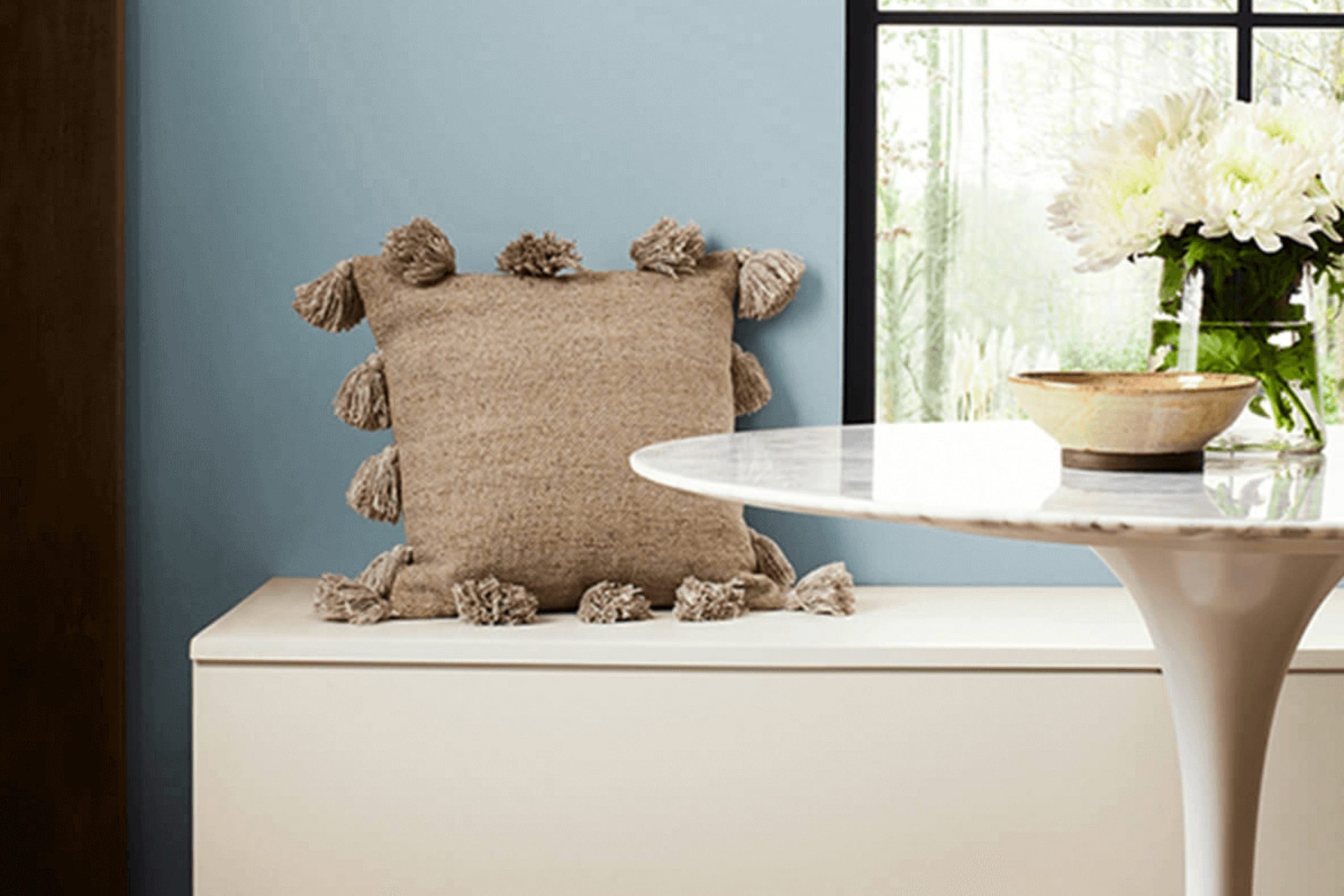
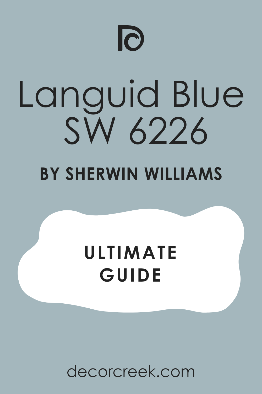
What Color Is Languid Blue SW 6226 by Sherwin Williams?
Languid Blue is a gentle, slightly muted shade that lends a soft and calming feel to any area. This color belongs to a cooler palette, with a hint of gray that makes it adaptable and subtle. It’s perfect for creating a relaxed atmosphere without overpowering the senses, making it ideal for bedrooms, bathrooms, and even living areas where a touch of calm is desired.
In terms of interior styles, Languid Blue works wonderfully in modern and minimalist designs due to its clean and straightforward vibe. It also has a place in coastal and Scandinavian decor, where light hues and natural light play a crucial role in the overall aesthetic. Its coolness can balance well with the warm textures of wood and linen commonly found in these styles, providing a lovely contrast.
Pairing materials and textures with Languid Blue should focus on enhancing its laid-back nature. Soft, fluffy fabrics like cotton or wool throws and drapes bring out its cozy aspect, while natural wood and stone elements can ground the airiness of the hue. For a more polished look, incorporate metals like brushed nickel or silver, which complement its cool tones nicely.
Ideal for those aiming for a fresh, airy look, Languid Blue is a charming choice that pairs well with a wide range of materials to create a comfortable and inviting environment.
Is Languid Blue SW 6226 by Sherwin Williams Warm or Cool color?
Languid Blue by Sherwin Williams is a soft, gentle shade of blue that brings a calm and relaxing vibe to any area in the house. This color is ideal for creating a peaceful environment, perfect for bedrooms or bathrooms where a restful atmosphere is key.
Since it’s a lighter blue, it has the advantage of making small areas appear bigger and brighter. It pairs well with white trim and lighter wood furniture for a fresh, airy feel. In living rooms, adding accessories like cushions or rugs in warmer tones can balance the coolness of Languid Blue, providing a cozy, welcoming area.
The adaptability of this shade also allows for its use in more dynamic ways, such as on kitchen cabinets for a splash of color without overpowering the senses. Overall, Languid Blue is great for those looking to inject a hint of color into their home without overpowering the existing decor.
Undertones of Languid Blue SW 6226 by Sherwin Williams
Languid Blue is a subtle yet beautiful shade that contains a complex mix of undertones. Understanding these undertones can greatly affect how we perceive this color in various settings. Undertones are secondary colors that influence the main hue, either cooling it down, warming it up, or adding depth.
For Languid Blue, undertones such as light gray and grey give it a neutral base, making it adaptable and easy to match with various decor styles. These gray shades prevent the color from feeling too bold, ensuring it remains calm and muted. The lilac and light purple undertones add a hint of playfulness and can slightly alter the blue to appear more vibrant under different lighting conditions.
Hints of mint and light turquoise introduce a refreshing vibe, suggesting a match with more lively, youthful themes or areas aiming for a fresh feel. In contrast, the pale pink and pale yellow undertones can subtly warm up the area, making the blue feel softer and more welcoming.
When applied to interior walls, Languid Blue displays these traits prominently. In natural light, it might lean towards its cooler undertones like turquoise and mint, making an area feel airy and open. In artificial lighting, warmer undertones might become more noticeable, making the area feel cozy and inviting.
The choice of lighting and decor can thus highlight different aspects of Languid Blue, allowing for a customizable ambiance in your area or home. This adaptable nature makes Languid Blue a popular choice for those looking to paint their walls with a color that balances both subtlety and richness.
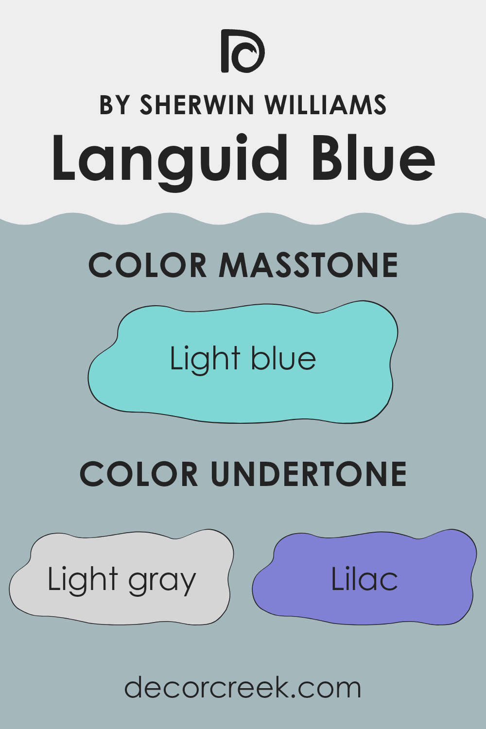
What is the Masstone of the Languid Blue SW 6226 by Sherwin Williams?
Languid Blue has a light blue masstone that brings a fresh and airy vibe into any home. This color is easy on the eyes and helps create a relaxed atmosphere in areas like bedrooms and bathrooms where calmness is key.
Its light blue shade pulls in hints of sky and water, making it ideal for rooms with lots of natural light, enhancing the open, breezy feel. It’s an adaptable color that works beautifully with both modern and traditional decor, allowing it to fit seamlessly into various interior styles.
Due to its softness, it pairs well with darker blues, grays, and whites, providing a balanced look that isn’t too bold or overpowering. This makes it a great choice for anyone looking to freshen up their area without making drastic changes. A room painted with Languid Blue looks neat and tidy, offering a soothing backdrop that’s perfect for unwinding after a long day.

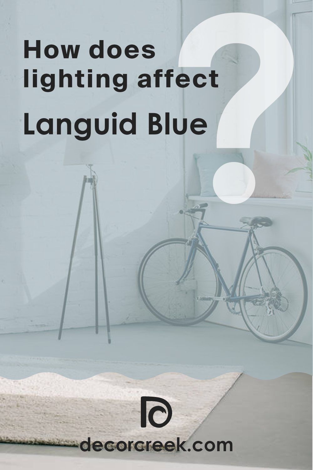
How Does Lighting Affect Languid Blue SW 6226 by Sherwin Williams?
Lighting plays a crucial role in how we perceive colors in an area. Different light sources, whether natural or artificial, can make a color look different across various conditions. For instance, the color Languid Blue by Sherwin Williams can appear subtly different depending on the lighting and the directionality of a room.
In artificial light, Languid Blue might lean towards a slightly more gray tone—cool and calm. Fluorescent lighting can bring out its crisp, clean nature, while incandescent bulbs, which emit a warmer glow, might soften the color, making it appear more muted and calming.
Natural light affects colors dynamically as it changes from dawn to dusk. In an area facing north, Languid Blue typically appears more true to its cool tone throughout the year, as northern light tends to be cooler and more consistent, creating a steady appearance of the color. This consistent exposure often provides a subtle and persistent blue that isn’t overly bright, maintaining a gentle balance throughout the day.
Conversely, in south-facing areas that receive more intense, direct sunlight throughout the day, Languid Blue can light up vibrantly. The color may look brighter and more pronounced under this bright light. This directional exposure can make the most of Languid Blue, enhancing its refreshing qualities during the day when sunlight is strongest.
East-facing areas capture the morning sunlight, which can make Languid Blue look soft and gentle in the morning while turning cooler and more shadowed as the day progresses. The initial brighter tone in the morning shifts as the natural light fades, showing off the adaptability of the color.
In west-facing areas, the color experiences the opposite effect compared to east-facing areas. Morning light in these areas is dimmer, making the color appear more muted, but as the sun sets, the vibrant, warm light of the evening can illuminate Languid Blue, giving it a stunning, glowing appearance that evolves throughout the day.
Overall, whether in a north, south, east, or west-facing area, and under artificial or natural light, Languid Blue can adapt beautifully, showcasing a range of blues and grays that fit the mood and lighting of any area.
What is the LRV of Languid Blue SW 6226 by Sherwin Williams?
LRV stands for Light Reflectance Value, which measures the percentage of light a paint color reflects back into a room once it’s applied to the walls. Essentially, it tells you how light or dark a color will look depending on how much light it can bounce back into the area. Higher LRV values mean the color is lighter and reflects more light, making an area feel brighter and more open. Conversely, lower LRV values mean the color is darker and absorbs more light, which can make an area feel cozier but smaller.
The LRV for Languid Blue, which is 45.625, places it in a mid-range category where it neither reflects light excessively nor absorbs it heavily. This moderate LRV helps the color maintain a balanced appearance under different lighting conditions, making it adaptable for use in various areas regardless of their size or natural light availability.
In areas with ample lighting, Languid Blue will appear more vibrant and lively, whereas in areas with less natural light, it will present a more subdued and calm appearance. This adaptability makes it a practical choice for homeowners looking to achieve a balanced aesthetic without the color overpowering the area.

Coordinating Colors of Languid Blue SW 6226 by Sherwin Williams
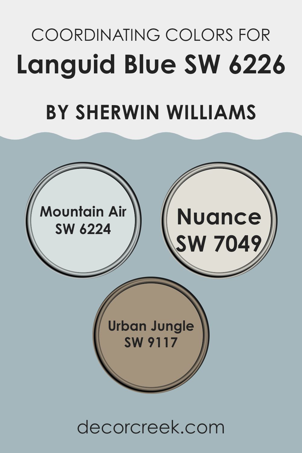
Coordinating colors are shades that complement or enhance each other when used together in a decorating scheme. In the case of Languid Blue by Sherwin Williams, a soft and gentle hue, its coordinating colors are chosen specifically to create a pleasing color palette that brings out its unique qualities while maintaining harmony in the area. Selecting the right coordinating colors helps in achieving a balanced look that can easily blend with different design themes and personal tastes.
Mountain Air (SW 6224) by Sherwin Williams is a crisp and airy color that provides a refreshing contrast to the calming Languid Blue, giving a lift to any area without overpowering it. Nuance (SW 7049) is a subtle, neutral shade that works as an adaptable background, allowing Languid Blue to stand out while providing a quiet grounding effect.
Urban Jungle (SW 9117) offers a deeper, earthier counterpoint, creating an engaging visual depth that complements the lighter tones of Languid Blue. These coordinating colors work together to enhance the overall aesthetic appeal, providing options for accent walls, trims, and accessories that can harmonize with the central theme established by Languid Blue.
You can see recommended paint colors below:
- SW 6224 Mountain Air (CHECK A SAMPLE)
- SW 7049 Nuance (CHECK A SAMPLE)
- SW 9117 Urban Jungle (CHECK A SAMPLE)
What are the Trim colors of Languid Blue SW 6226 by Sherwin Williams?
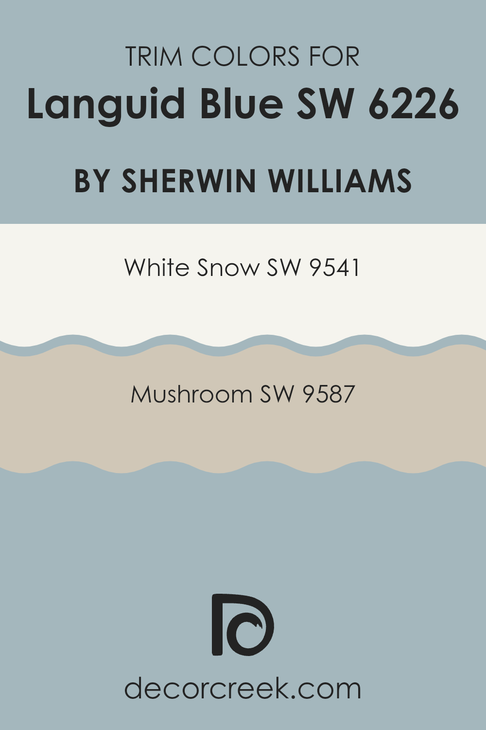
Trim colors are vital in interior decorating as they offer a distinctive boundary between the wall color and other architectural features, enhancing both aesthetic appeal and visual flow. Choosing the right trim color can make a significant difference in how a paint like Languid Blue is perceived in an area.
Applying a trim color such as SW 9541 – White Snow can give a fresh and clean look, drawing attention to the subtle tones in Languid Blue. Conversely, using SW 9587 – Mushroom as a trim gives a warmer, grounding contrast, which can make the blue appear more prominent and striking.
White Snow, SW 9541, is a crisp white shade that reflects light beautifully, making areas appear larger and more open. It pairs wonderfully with cooler tones, ensuring that the walls stand out. Mushroom, SW 9587, on the other hand, is a neutral, earthy tone that provides a soft, natural contrast without becoming too strong for the primary color. This color can help in creating a cozy and welcoming atmosphere, grounding the vibrant blue with its subtle, warm hues.
You can see recommended paint colors below:
Colors Similar to Languid Blue SW 6226 by Sherwin Williams
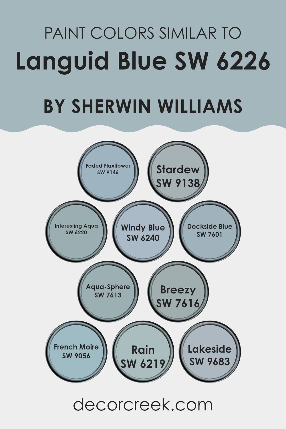
Using similar colors in design provides a subtle and harmonious look that can effectively tie different elements together without overpowering the senses. Choosing hues that resemble each other helps create a cohesive atmosphere in any area, maintaining a consistent theme throughout. For example, colors similar to Languid Blue offer a variety of shades that contribute to a fluid and smooth visual experience.
Faded Flaxflower is a somewhat muted variation that leans towards a slightly grayer tone, providing a gentle and understated alternative. Close to this subtle expression is Stardew which presents a dustier, almost pastel-like quality for a calming effect in any setting. Interesting Aqua gives a slightly more vibrant appeal but stays true to the coolness of the blue spectrum, working wonderfully in areas that need a touch of brightness.
Windy Blue and Dockside Blue introduce more intensity to their environments, incorporating a deeper and more pronounced blue that commands attention without being too strong. Aqua-Sphere and Breezy offer a refreshing touch with their slightly green-tinted blue, hinting at oceanic themes that are perfect for bathrooms and relaxed areas.
French Moire goes elegant with its highly diluted blue that almost whispers color into the area. Rain is another gentle color, very soft and almost like a morning sky, while Lakeside rounds it all off with its cheerfully light and airy feel that reminds one of clear, refreshing water scenes. All these colors work together to provide a variety of options within the same family, making decor decisions flexible yet harmonious.
You can see recommended paint colors below:
- SW 9146 Faded Flaxflower (CHECK A SAMPLE)
- SW 9138 Stardew (CHECK A SAMPLE)
- SW 6220 Interesting Aqua (CHECK A SAMPLE)
- SW 6240 Windy Blue (CHECK A SAMPLE)
- SW 7601 Dockside Blue (CHECK A SAMPLE)
- SW 7613 Aqua-Sphere (CHECK A SAMPLE)
- SW 7616 Breezy (CHECK A SAMPLE)
- SW 9056 French Moire (CHECK A SAMPLE)
- SW 6219 Rain (CHECK A SAMPLE)
- SW 9683 Lakeside
Colors that Go With Languid Blue SW 6226 by Sherwin Williams
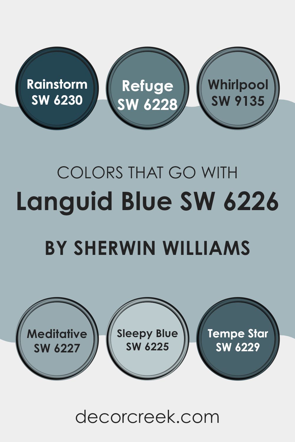
Choosing complementary colors for Languid Blue SW 6226 by Sherwin Williams is essential for creating a harmonious and appealing area. When colors like SW 6230 – Rainstorm, SW 6228 – Refuge, SW 9135 – Whirlpool, SW 6227 – Meditative, SW 6225 – Sleepy Blue, and SW 6229 – Tempe Star are paired with Languid Blue, they enhance the overall aesthetic and mood of an area. These matching shades can help to balance the cool tones of Languid Blue, offering a range of possibilities for design and decoration that can suit various tastes and areas.
Rainstorm SW 6230 is a deep, moody blue with a hint of green, adding depth and intensity to any color scheme. Refuge SW 6228, on the other hand, is a darker blue that provides a strong sense of calm and solidity. Whirlpool SW 9135 is lighter and more vibrant, adding a splash of energy and freshness.
Meditative SW 6227 is similar to Languid Blue but darker, which helps in creating a subtle yet impactful contrast. Sleepy Blue SW 6225 is a soft, gentle blue that offers a light and airy feel, perfect for creating a relaxed environment. Lastly, Tempe Star SW 6229 is a bold navy that can serve as an excellent accent or focus color, providing a striking statement against the lighter tones of Languid Blue. Each of these colors works in its own way to complement and enhance the beauty and adaptable nature of Languid Blue, making it easier for you to craft the perfect decor.
You can see recommended paint colors below:
- SW 6230 Rainstorm (CHECK A SAMPLE)
- SW 6228 Refuge (CHECK A SAMPLE)
- SW 9135 Whirlpool (CHECK A SAMPLE)
- SW 6227 Meditative (CHECK A SAMPLE)
- SW 6225 Sleepy Blue (CHECK A SAMPLE)
- SW 6229 Tempe Star (CHECK A SAMPLE)
How to Use Languid Blue SW 6226 by Sherwin Williams In Your Home?
Languid Blue from Sherwin-Williams is a gentle and soothing shade of blue that can bring a calm atmosphere to any area in your home. This color works well in rooms where you want to relax, like bedrooms or bathrooms.
It pairs beautifully with soft whites or light gray tones, which can help to create a clean and airy feel. You might consider painting an entire area in Languid Blue or using it on just one accent wall for a subtle touch of color.
It’s also a great choice for furniture pieces or kitchen cabinets if you’re looking for a subtle pop of color. Additionally, it complements natural materials like wood and stone, making it adaptable for various decorating styles. Whether you’re updating your living area or just want a fresh look, Languid Blue offers a peaceful vibe that’s easy to live with.
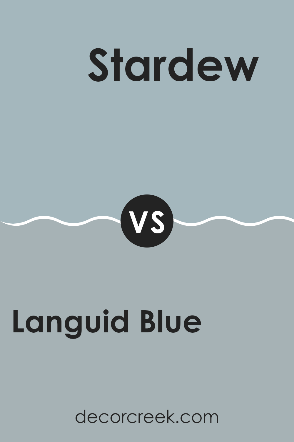
Languid Blue SW 6226 by Sherwin Williams vs Stardew SW 9138 by Sherwin Williams
Languid Blue and Stardew, both from Sherwin Williams, share a calming blue base, but they have distinct tones and moods. Languid Blue has a more muted, soft grey undertone, giving it a subtle and gentle feel.
It’s ideal for creating a relaxed, soothing atmosphere in areas like bedrooms or bathrooms. On the other hand, Stardew has a slightly brighter, more airy feel with hints of green, making it feel fresher and somewhat uplifting.
This makes Stardew a great choice for areas where a light, refreshing vibe is desired, such as kitchens or living areas. Both colors work well in a modern home setting, but their different undertones could influence the choice depending on the room’s function and the ambiance you want to achieve.
You can see recommended paint color below:
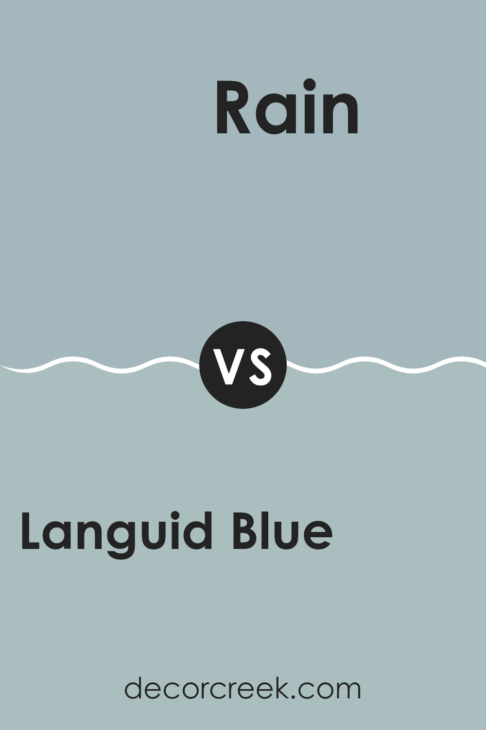
Languid Blue SW 6226 by Sherwin Williams vs Rain SW 6219 by Sherwin Williams
Languid Blue and Rain are two appealing colors made by Sherwin Williams. Languid Blue is a soft, muted blue with a slight hint of gray. This color gives a gentle, soothing touch to any area, making it perfect for creating a relaxed atmosphere.
On the other hand, Rain is a slightly darker shade that blends gray and blue tones, leaning more towards a stormy sky appearance. This color can add a bit more depth and moodiness to an area compared to the lighter, airier feel of Languid Blue.
Both colors work well in areas where you want a peaceful vibe, but your choice would depend on how light or moody you want the area to feel. Languid Blue lightens an area more, while Rain offers a deeper, more grounded look.
You can see recommended paint color below:
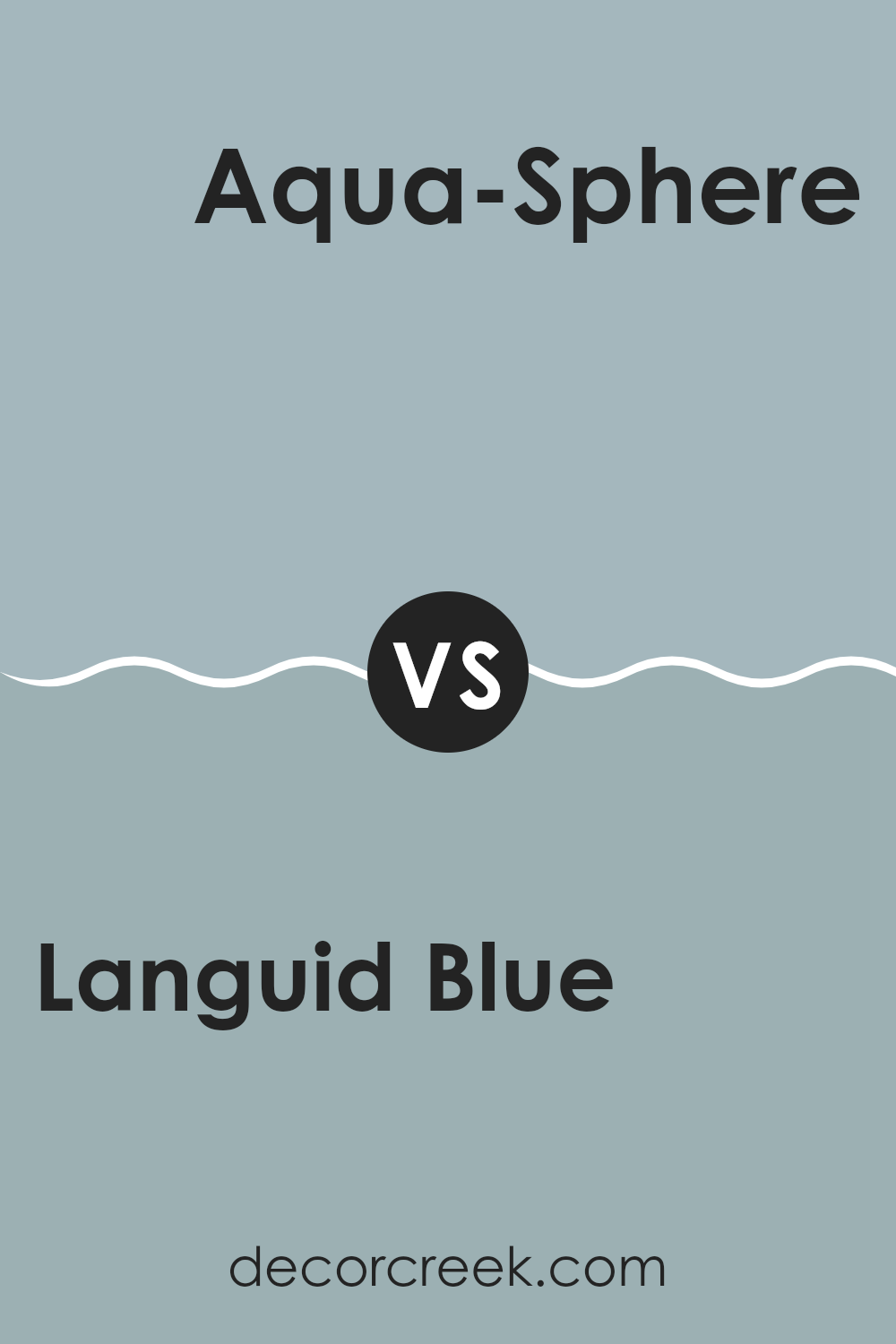
Languid Blue SW 6226 by Sherwin Williams vs Aqua-Sphere SW 7613 by Sherwin Williams
Languid Blue and Aqua-Sphere, both from Sherwin Williams, offer unique shades of blue that are quite distinct from each other. Languid Blue presents a subtle, soft blue with a hint of gray. This color can be seen as calm and gentle, making it perfect for a peaceful bedroom or a quiet office area.
On the other hand, Aqua-Sphere is a stronger, more vibrant blue with a noticeable green undertone. It is more lively and could be ideal for areas like bathrooms or kitchens where a fresh, energetic feel is desired.
While Languid Blue leans towards a muted tone that blends easily with other colors, Aqua-Sphere stands out more and could be a focal point in any area. Both colors provide a cool and refreshing feel but in different strengths and vibes, depending on how bright and energetic you want your area to feel.
You can see recommended paint color below:
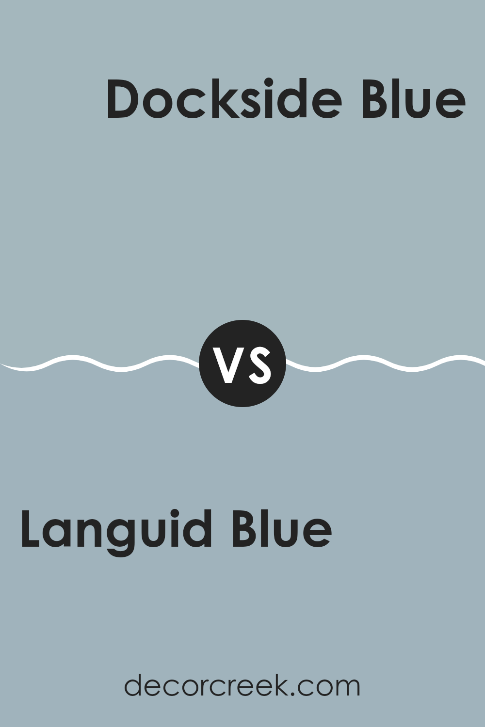
Languid Blue SW 6226 by Sherwin Williams vs Dockside Blue SW 7601 by Sherwin Williams
Languid Blue and Dockside Blue, both by Sherwin Williams, present subtle yet distinguishable differences in their blue tones. Languid Blue is a gentle, soft blue with a muted, almost grayish undertone that gives it a calm and soothing feel, perfect for creating a relaxed atmosphere in areas like bedrooms or bathrooms.
On the other hand, Dockside Blue has a brighter, more vibrant look. It carries a slight hint of green, making it appear fresher and slightly more energetic than Languid Blue.
This makes Dockside Blue ideal for areas where a lively but still peaceful environment is desired, such as kitchens or casual living areas. Both colors offer a way to bring the essence of peacefulness into your home, each in its uniquely appealing shade of blue.
You can see recommended paint color below:
Languid Blue SW 6226 by Sherwin Williams vs Windy Blue SW 6240 by Sherwin Williams
Languid Blue and Windy Blue are both soothing shades offered by Sherwin Williams, yet they present distinct tones. Languid Blue is a soft, gentle baby blue with a hint of gray. It gives a light and airy feel to areas, making it excellent for creating a relaxed and inviting atmosphere. This color works particularly well in bedrooms or bathrooms where a calming effect is desired.
On the other hand, Windy Blue is a deeper shade that leans towards a grayish-blue, resembling the color of a stormy sky. It’s slightly bolder than Languid Blue and offers an impactful yet still subdued aesthetic. This makes it suitable for areas that you want to feel cozy and protected, such as living rooms or dining areas.
Both colors are adaptable, but the choice between them depends on the specific mood or style you want to achieve in your area. Languid Blue is lighter and fresher, while Windy Blue brings a more profound and sheltered feeling.
You can see recommended paint color below:
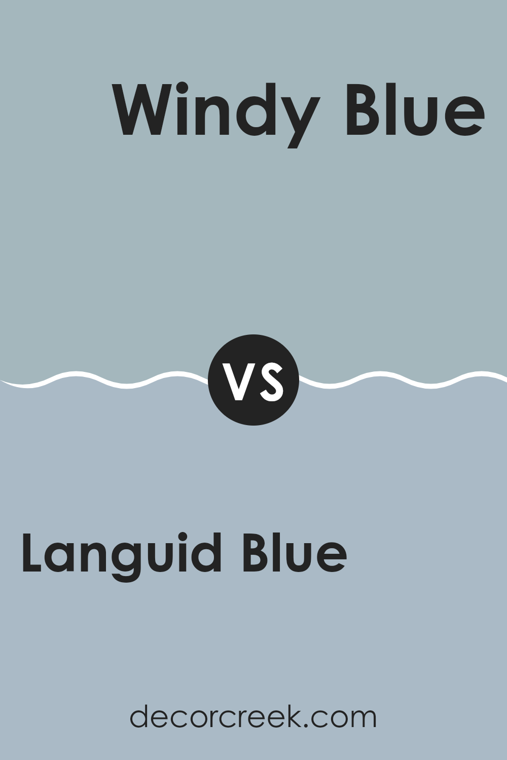
Languid Blue SW 6226 by Sherwin Williams vs Interesting Aqua SW 6220 by Sherwin Williams
Languid Blue and Interesting Aqua are both soothing colors by Sherwin Williams, but they bring different vibes to an area. Languid Blue is a soft, muted blue with a hint of gray, giving it a calm, relaxed feel that’s great for creating a peaceful atmosphere in areas like bedrooms or bathrooms.
On the other hand, Interesting Aqua is also a soft color but leans towards green, adding a touch of freshness that brightens up an area more actively than Languid Blue.
This makes it a good choice for areas where you want a peaceful yet slightly more energetic feel, such as kitchens or living areas. Both colors are adaptable, but your choice might depend on the type of mood you want to set and the area you are decorating.
You can see recommended paint color below:
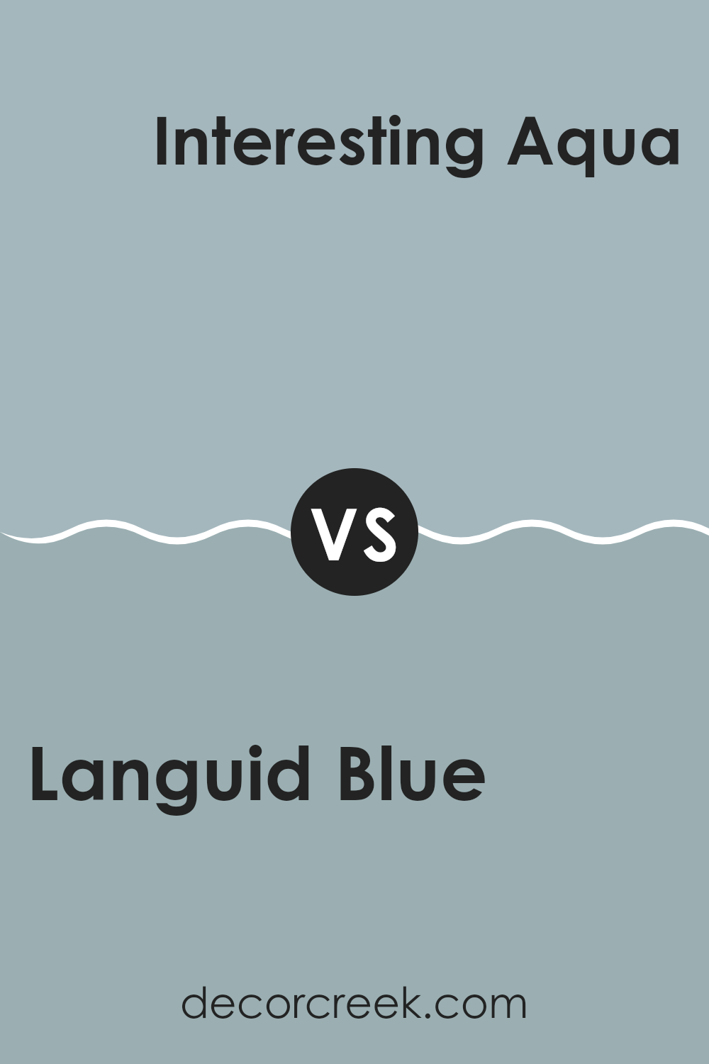
Languid Blue SW 6226 by Sherwin Williams vs Lakeside SW 9683 by Sherwin Williams
Languid Blue and Lakeside are both soothing shades from Sherwin Williams, but they offer distinct vibes for an area. Languid Blue is a soft, muted blue with a gentle gray undertone.
It tends to calm an area, providing a relaxed feel that’s ideal for places you want to unwind, like bedrooms or bathrooms. On the other hand, Lakeside is a deeper, more vibrant blue. It has the lively, refreshing feel of a day by the lake, making it great for energetic areas or as a striking accent wall that draws attention.
Both colors work well in homes aiming for a refreshing feel, yet their impact differs depending on where and how they’re used. Choosing between them can come down to the mood you’re aiming to create – either calm and subdued or bright and dynamic.
You can see recommended paint color below:
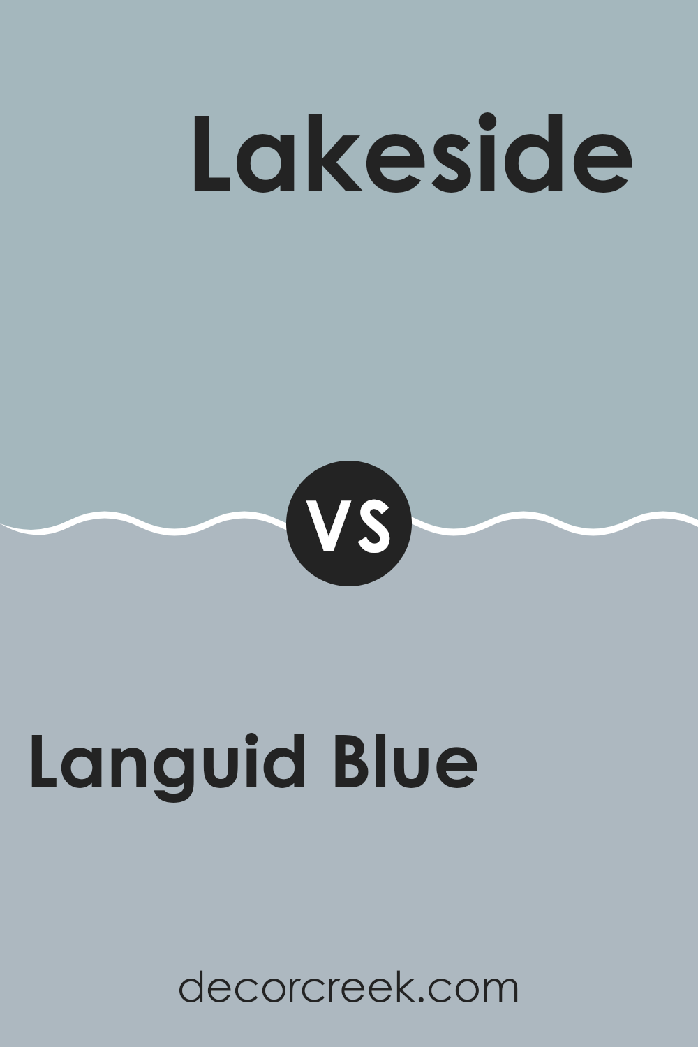
Languid Blue SW 6226 by Sherwin Williams vs French Moire SW 9056 by Sherwin Williams
Languid Blue is a soothing light blue that has a soft and gentle vibe. It’s great for creating a relaxed and calm atmosphere in any area. It gives off a fresh and airy feeling, kind of like a pleasant, mild day under clear skies.
On the other hand, French Moire leans towards a deeper, more saturated teal. This color is more striking and can make a bold statement in your area. It combines well with both light and dark accents which can help balance out the intensity of the color.
While both colors share a blue base, Languid Blue is much lighter and subtle compared to the boldness of French Moire. Languid Blue works nicely in a bedroom or a bathroom where you want to keep things light and breezy. Meanwhile, French Moire could be perfect for more active areas like a living room or dining room, where its depth can add a splash of character and drama.
You can see recommended paint color below:
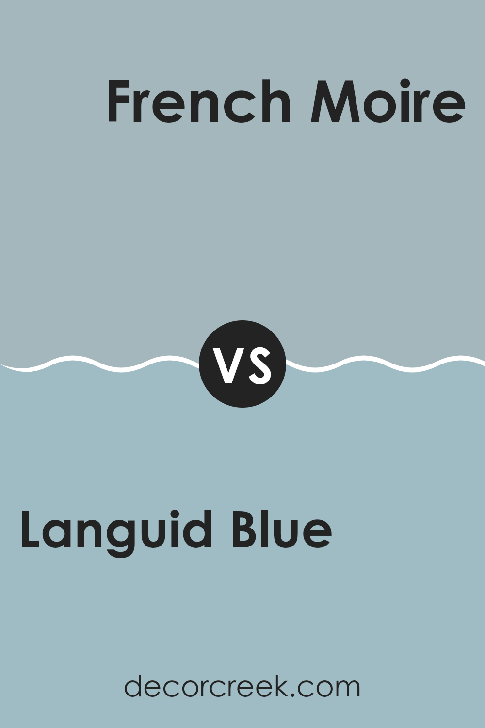
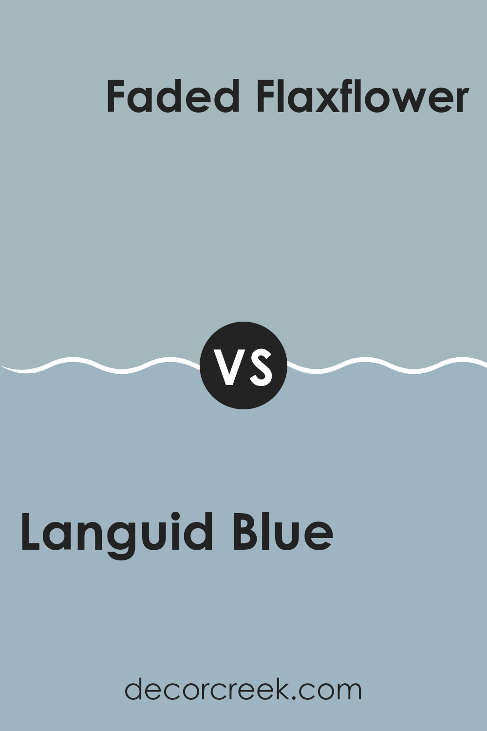
Languid Blue SW 6226 by Sherwin Williams vs Faded Flaxflower SW 9146 by Sherwin Williams
Languid Blue is a soft, calm sort of blue that resembles a clear sky on a sunny day, giving a soothing feel to any area. Its subtle brightness can make an area appear more open and light. In contrast, Faded Flaxflower is a greyish blue that leans towards an understated pastel tone. This color is incredibly adaptable and goes well with a variety of decor styles, often used to create a cozy and inviting atmosphere.
Both colors share a bluish base, but the intensity and undertones set them apart. Languid Blue is clearer and brighter, making it a good choice for areas where you want to add a dash of cheerfulness without overpowering the area. On the other hand, Faded Flaxflower works well in areas where you prefer a more muted, subdued color scheme that still retains hints of character and warmth.
The decision between these two would largely depend on the mood you aim to set in your area and how the natural light interacts with the paint at different times of the day.
You can see recommended paint color below:
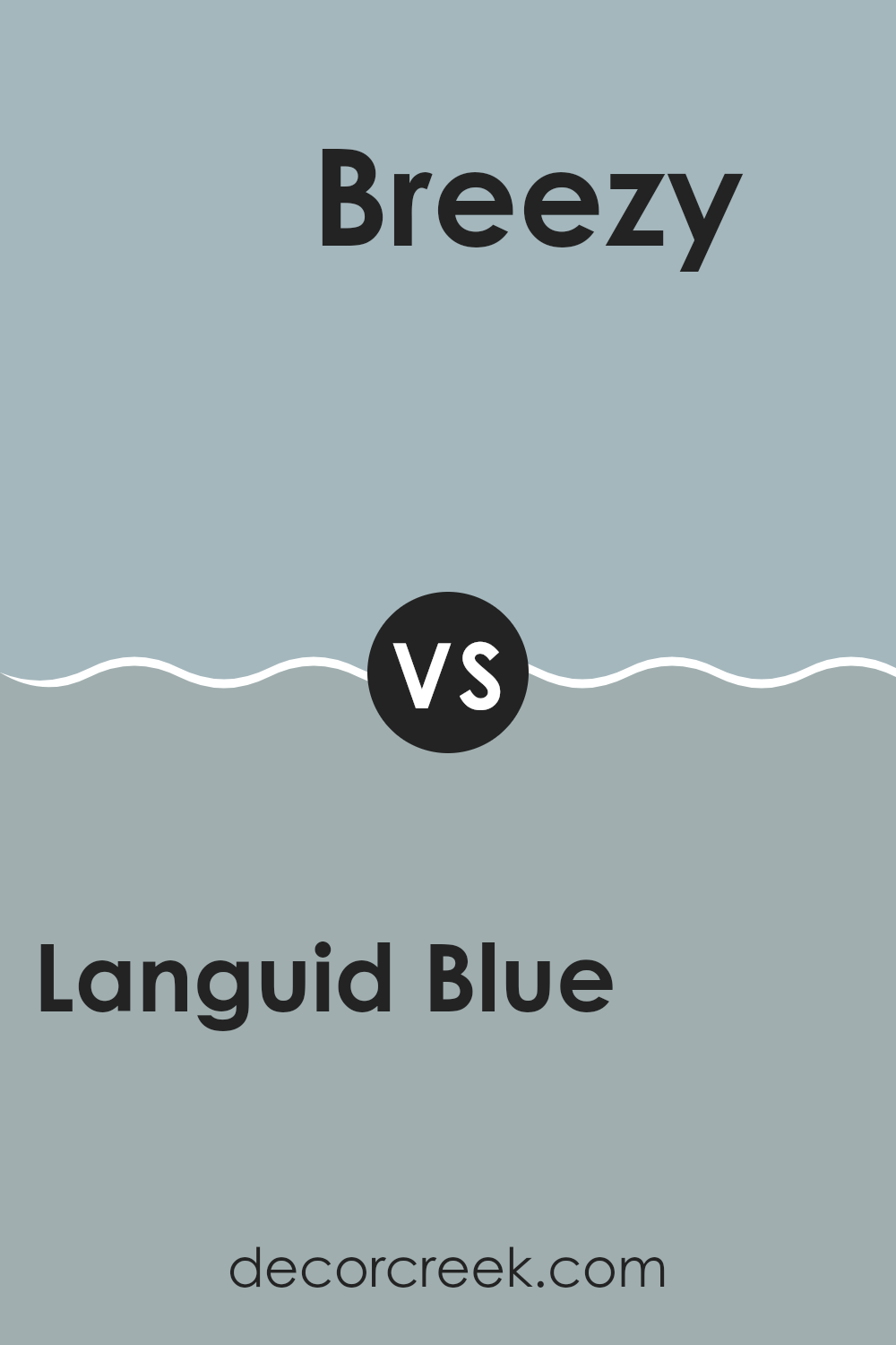
Languid Blue SW 6226 by Sherwin Williams vs Breezy SW 7616 by Sherwin Williams
Languid Blue and Breezy are both paint colors from Sherwin Williams, each bringing its own unique vibe to an area. Languid Blue is a deeper, more subdued shade that can remind you of a calm sea or a soft twilight sky. This color tends to draw in a feeling of quiet and relaxation, making it perfect for bedrooms or cozy reading nooks where you want a peaceful atmosphere.
On the other hand, Breezy is lighter and has a more airy feel to it, almost like a clear, sunny day. It’s a fresh color that brings a lively and open sense to any room. Ideal for living rooms or kitchens, Breezy can help make an area feel more spacious and welcoming.
Both colors have their charm and can be used effectively depending on the mood you want to set in your room. Whether you go for the depth of Languid Blue or the lightness of Breezy, each color offers a unique way to beautify your home.
You can see recommended paint color below:
After looking closely at SW 6226 Languid Blue by Sherwin Williams, I’ve learned quite a lot about this unique color of paint. Languid Blue is a soft, calm blue that reminds you of the sky on a clear day. It’s not too bright but has just enough color to make an area feel cozy and peaceful. People like using this color in bedrooms because it helps create a relaxing atmosphere, perfect for sleeping.
What’s really great about Languid Blue is that it matches well with many other colors. You can pair it with light colors like white or beige to keep things light and airy, or combine it with darker colors like gray or navy blue for a more dramatic look. Whether you want your area to feel like a sunny day or a quiet evening, Languid Blue can help you achieve the mood you’re looking for.
To wrap it up, Languid Blue is a beautiful choice if you want to add a touch of calmness to any area. It’s easy to see why this color is a favorite for many—it’s pretty, calming, and can be used in so many different ways.
If you’re thinking about adding a new color to your area, Languid Blue could be just the right one!
Ever wished paint sampling was as easy as sticking a sticker? Guess what? Now it is! Discover Samplize's unique Peel & Stick samples.
Get paint samples


