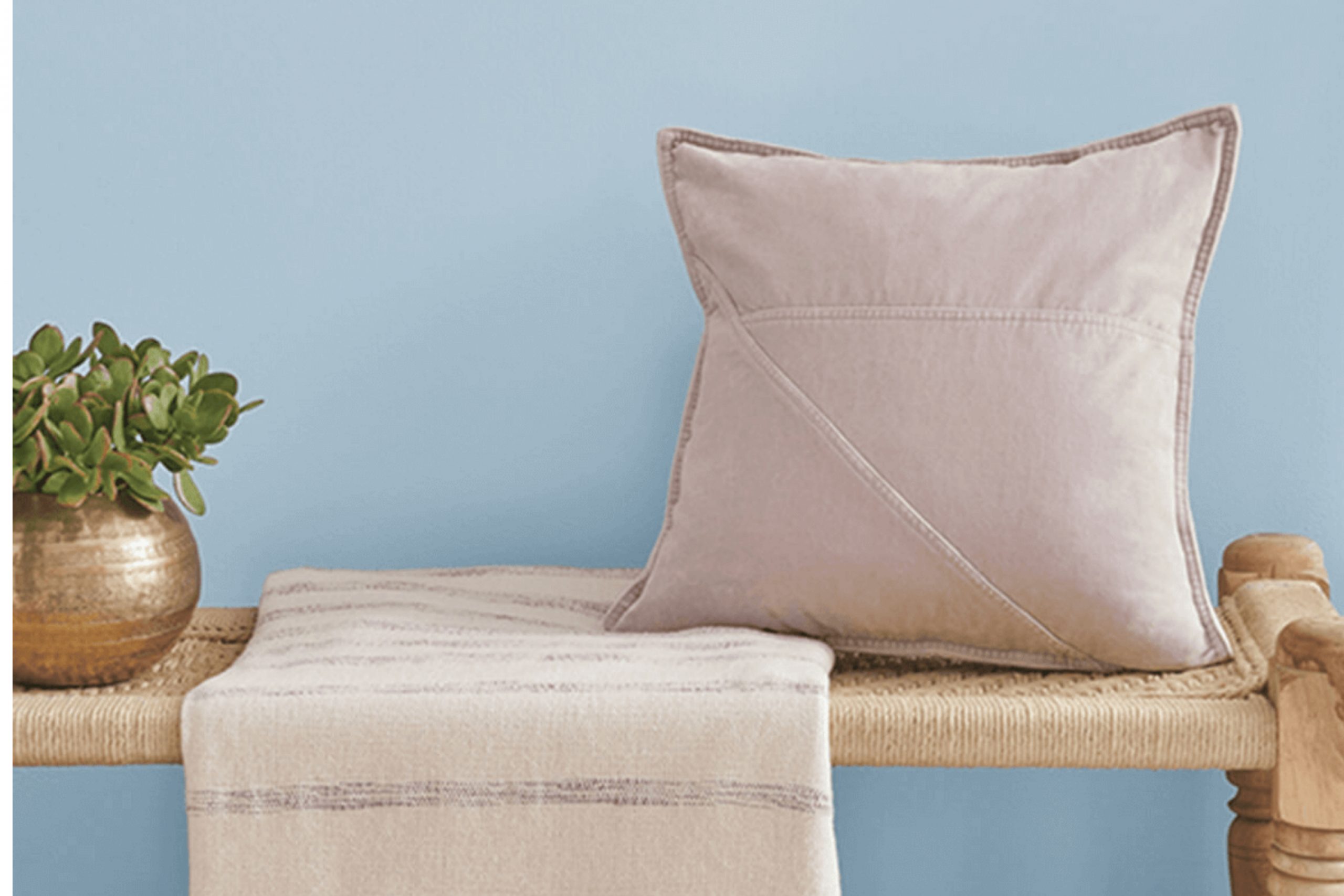
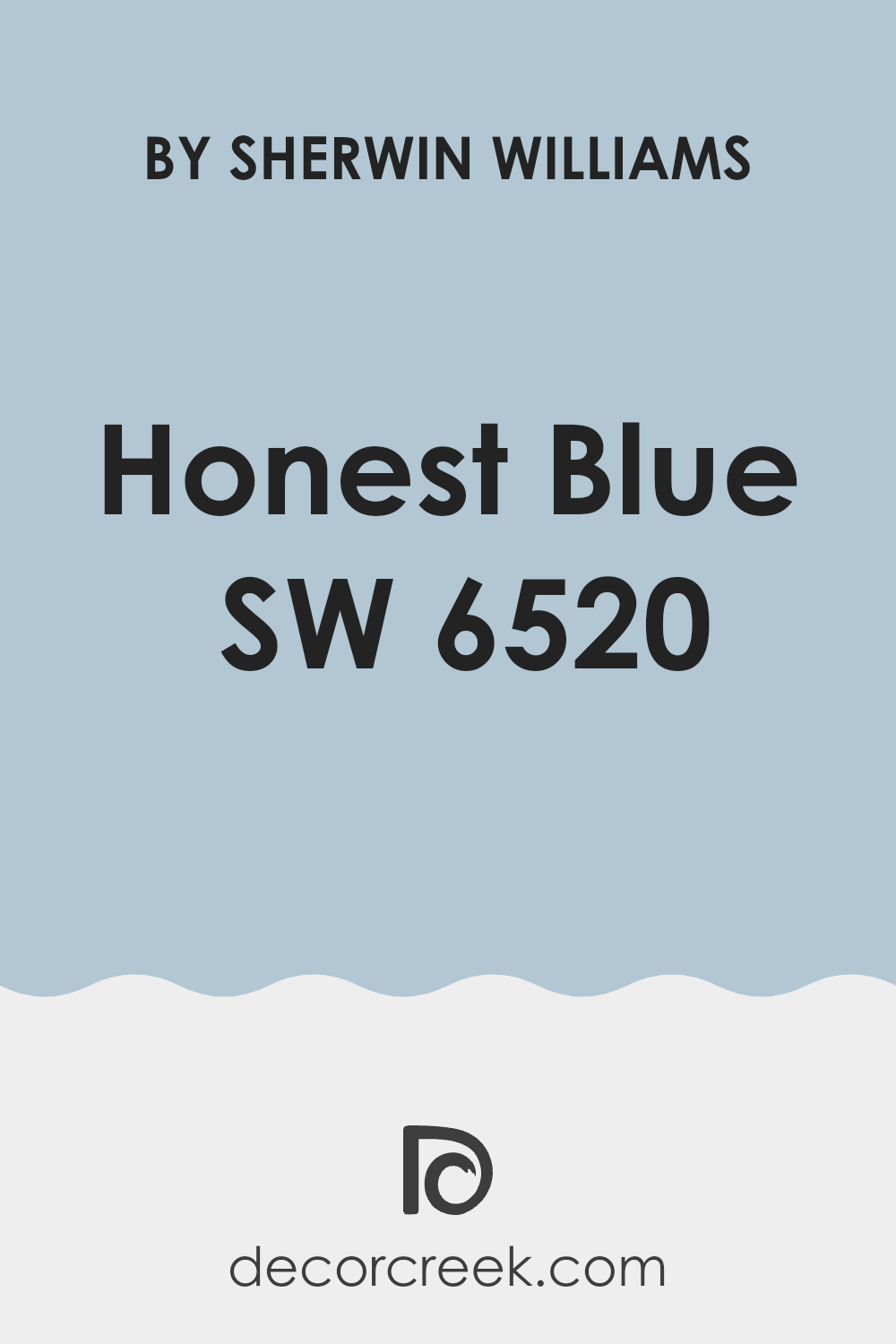
Thinking about adding some color? SW 6520 Honest Blue by Sherwin Williams is a soft, welcoming blue that makes any room feel bright and cozy at the same time.
When you use Honest Blue, you add a breath of fresh air to your home, providing a calm backdrop that complements both modern and traditional decor. Whether you’re updating your living room, bathroom, or even a small reading nook, Honest Blue offers a balanced blend of warmth and coolness, adapting beautifully to different lighting conditions and furnishings.
This color particularly shines when paired with crisp whites or soft neutrals, allowing you to create a space that feels both grounded and uplifting. So, if you’re looking for a change that feels like a gentle breeze through your home, Honest Blue could be the perfect choice for you.
What Color Is Honest Blue SW 6520 by Sherwin Williams?
Honest Blue by Sherwin Williams is a refreshing and vibrant shade of blue. It has a clean and crisp vibe, making it an excellent choice for creating energetic spaces. This color has a medium tone that strikes a balance between being too dark or too light, making it versatile for various decorating projects.
This shade works wonderfully in modern and contemporary interior styles, bringing a lively spirit to living rooms, kitchens, and even bathrooms. It also fits well in coastal-themed rooms, where it mirrors the soothing tones of the sea and sky.
When it comes to pairing Honest Blue with materials and textures, it goes beautifully with natural wood, helping the wood’s warm tones stand out. The contrast with brushed steel or metallic finishes is striking, offering a modern look that’s both fresh and inviting. For a softer approach, textiles like cotton or linen in white or light neutral colors can create a comfortable and airy feel. Accessories and decorations in sandy beige or sunny yellow also blend harmoniously with Honest Blue, echoing a cheerful, beachy vibe.
For those who appreciate a lively yet not overwhelming atmosphere, Honest Blue is a charming choice that works well across various applications and styles.
Is Honest Blue SW 6520 by Sherwin Williams Warm or Cool color?
Honest Blue SW 6520 by Sherwin Williams is a vibrant and fresh shade that can make any room in the house feel more welcoming and lively. This particular blue has a brightness that adds a cheerful touch, making it perfect for spaces like kitchens or bathrooms where you want to foster a clean and refreshing atmosphere. It can also be used in bedrooms or living rooms to bring a sense of calm without being too dark or overpowering.
This versatility means you can mix Honest Blue with various decors and themes, from modern minimalism to more rustic or coastal styles. For example, pairing this blue with light woods and white accents creates a breezy, airy feel, while using it alongside darker furniture or fabrics can provide a pleasing contrast that really makes the color pop.
Overall, Honest Blue works well in homes because it provides a pleasant backdrop that is both interesting and easy to match with other design elements, enhancing the overall aesthetic of any room without being too demanding in terms of coordinating colors.
Undertones of Honest Blue SW 6520 by Sherwin Williams
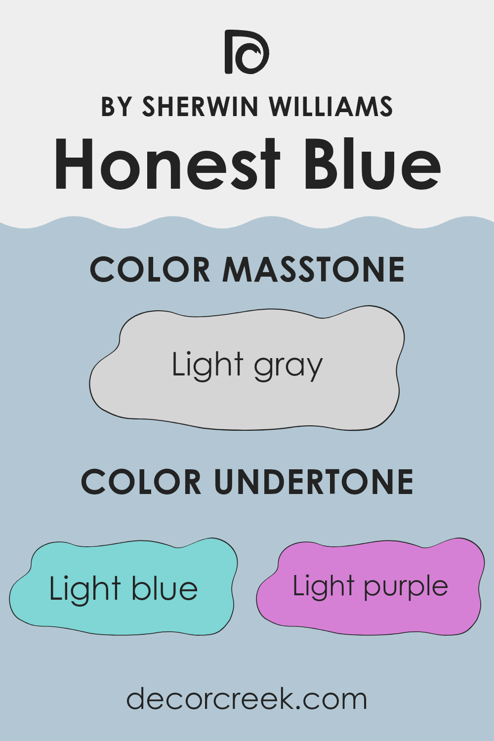
Honest Blue by Sherwin Williams is a versatile paint color that can look different depending on its surroundings. The undertones of a color are subtle hues mixed into the main color, which can influence how it appears in various lights and settings. For Honest Blue, these undertones include light blue, light purple, lilac, pale yellow, mint, pale pink, and grey.
These undertones play a key role in how we perceive the color. For example, light blue and mint can make it feel cooler and more refreshing, while pale yellow and pale pink can give it a warmer, softer look. Lilac and light purple add a slight mystical feel, which can be quite appealing. Grey helps to balance the saturation, ensuring that the color doesn’t overwhelm the space.
When used on interior walls, Honest Blue tends to adapt to the room’s lighting and furnishings. In a room with natural light and minimal decor, the cooler undertones like light blue and mint might stand out, creating a calm and inviting atmosphere. In spaces with warmer lighting and wood furniture, the pale yellow and pale pink undertones might make the walls seem cozier. If the room has modern decor with metallic or glass elements, the grey undertone can help in blending these aspects seamlessly.
Overall, the mixed undertones in Honest Blue make it a flexible choice for many different styles and settings, affecting how the color is ultimately perceived and enjoyed.
What is the Masstone of the Honest Blue SW 6520 by Sherwin Williams?
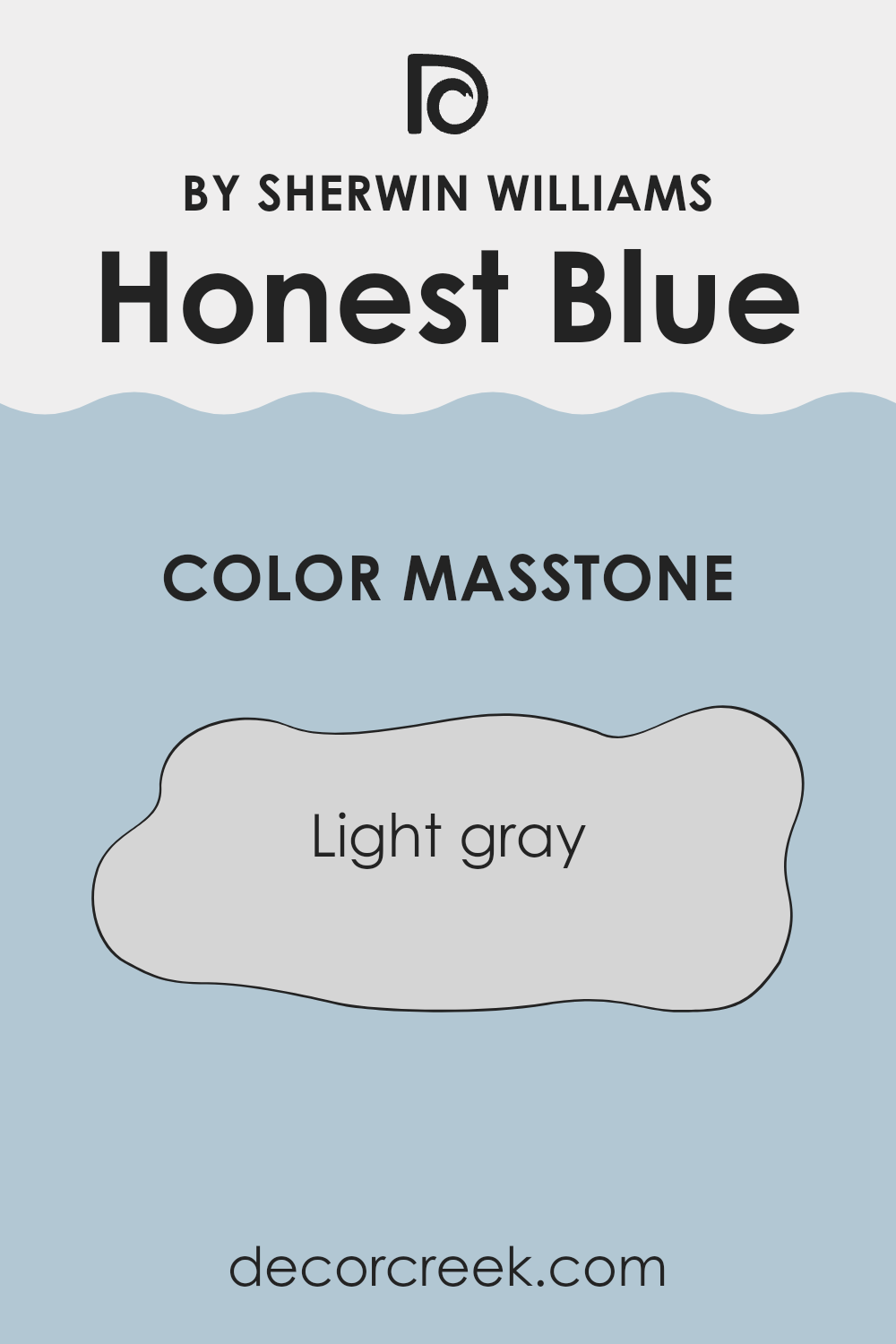
Honest Blue SW 6520 by Sherwin Williams has a masstone of light gray, identified by the hex code #D5D5D5. This light gray tone affects how the color looks and feels in home settings. It adds a soft, gentle touch to walls, making the space appear brighter and more open.
Since light gray is a neutral hue, it pairs well with various decor styles and colors, from bold and vivid to subtle and muted. This versatility means that it can be used in many areas of a home, such as living rooms, bedrooms, and kitchens, without overpowering the space.
Furthermore, this particular shade of light gray helps hide minor wall imperfections and is forgiving with marks and stains, making it a practical choice for busy households. Overall, the light gray masstone of Honest Blue SW 6520 offers a fresh, clean look that can refresh any room.
How Does Lighting Affect Honest Blue SW 6520 by Sherwin Williams?
Lighting plays a crucial role in how we perceive colors. Different types of light can change the way a color looks. For instance, Honest Blue, a vibrant shade of blue by Sherwin Williams, can appear differently under various lighting conditions.
In artificial light, such as LED or fluorescent lighting, Honest Blue might look brighter and more vivid.
Artificial lighting can enhance the blue tones, making the color appear more dynamic and lively. This is beneficial in spaces that need a pop of color or where you want the room to feel more energetic.
In natural light, the appearance of Honest Blue can fluctuate throughout the day depending on the light’s intensity and angle.
Natural light generally brings out the truest version of the color, but it can also soften the blue, making it look more subtle and gentle.
The direction a room faces also affects how Honest Blue is perceived:
1. North-facing rooms – These rooms often get less direct sunlight, which can make colors look slightly cooler and more shadowed. Honest Blue in a north-facing room may thus appear a bit darker and more muted.
2. South-facing rooms – These rooms receive ample sunlight, brightening and enhancing colors. Here, Honest Blue will look vibrant and lively, with its true blue tones shining through brightly.
3. East-facing rooms – These rooms receive morning light, which is gentle and warm. Honest Blue here can look very welcoming and fresh in the morning, but might lose some vibrancy as the day progresses and the natural light diminishes.
4. West-facing rooms – In these rooms, the color will experience softer light in the morning and more intense, warmer light in the late afternoon and evening. This means Honest Blue may appear calm in the morning but become more striking and dramatic towards the evening.
Understanding how lighting affects colors like Honest Blue can help in deciding where to use this hue most effectively in your home, ensuring you get the desired mood and effect in each room.
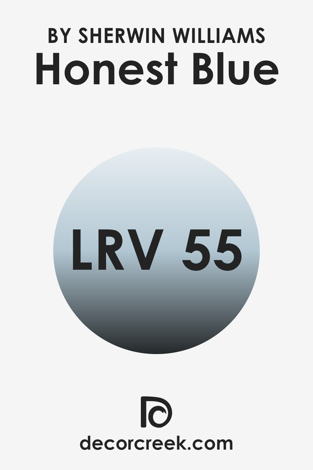
What is the LRV of Honest Blue SW 6520 by Sherwin Williams?
LRV stands for Light Reflectance Value, and it measures the percentage of light a paint color reflects back into a room. This value plays a critical role in determining how light or dark a color looks once it’s applied to the walls.
A higher LRV means the color reflects more light, making the room appear brighter and more open, whereas a lower LRV means less light is reflected, resulting in a darker, more enclosed feel to the space. This value helps in deciding which color might work best based on how much natural or artificial light a room receives.
For the color Honest Blue with an LRV of 54.87, it’s in the mid-range, which means it neither reflects too much light, nor does it absorb a lot of light. It’s a balanced choice that won’t drastically darken a room but won’t brighten it significantly either. In a room with ample lighting, this color would appear more vibrant and true to its shade, while in a less lit area, it could look a bit more subdued. This LRV is quite versatile as it allows this shade of blue to be used in various lighting situations without losing too much of its character.
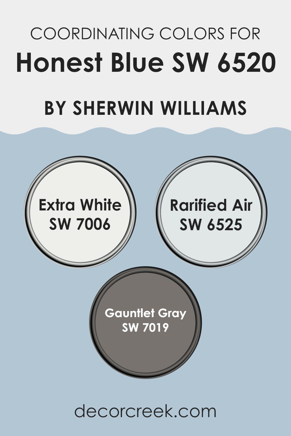
Coordinating Colors of Honest Blue SW 6520 by Sherwin Williams
Coordinating colors are selected shades that complement a main color, creating a harmonious look in any space. They work by balancing the visual appeal, either by enhancing the primary color or by offering a contrasting but pleasing aesthetic. In the case of Honest Blue by Sherwin Williams, a fresh and lively shade, selecting the right coordinating colors is essential for achieving a cohesive décor scheme.
Starting with Extra White, this color acts as a crisp and clean background that allows Honest Blue to shine vibrantly. It serves as an excellent choice for trim, ceilings, or even as a dominant wall color in a room where Honest Blue features as an accent.
Moving onto Rarified Air, this is a light and airy blue that offers a subtle contrast to the deeper tones of Honest Blue. It provides a soothing effect and is perfect for creating a breezy and light-filled atmosphere. Lastly, Gauntlet Gray offers a robust complement to the cooler blues. This shade provides a grounding effect with its rich, earthy tones, making it ideal for furniture pieces or accent walls that help balance the overall brightness of Honest Blue and its lighter counterparts.
You can see recommended paint colors below:
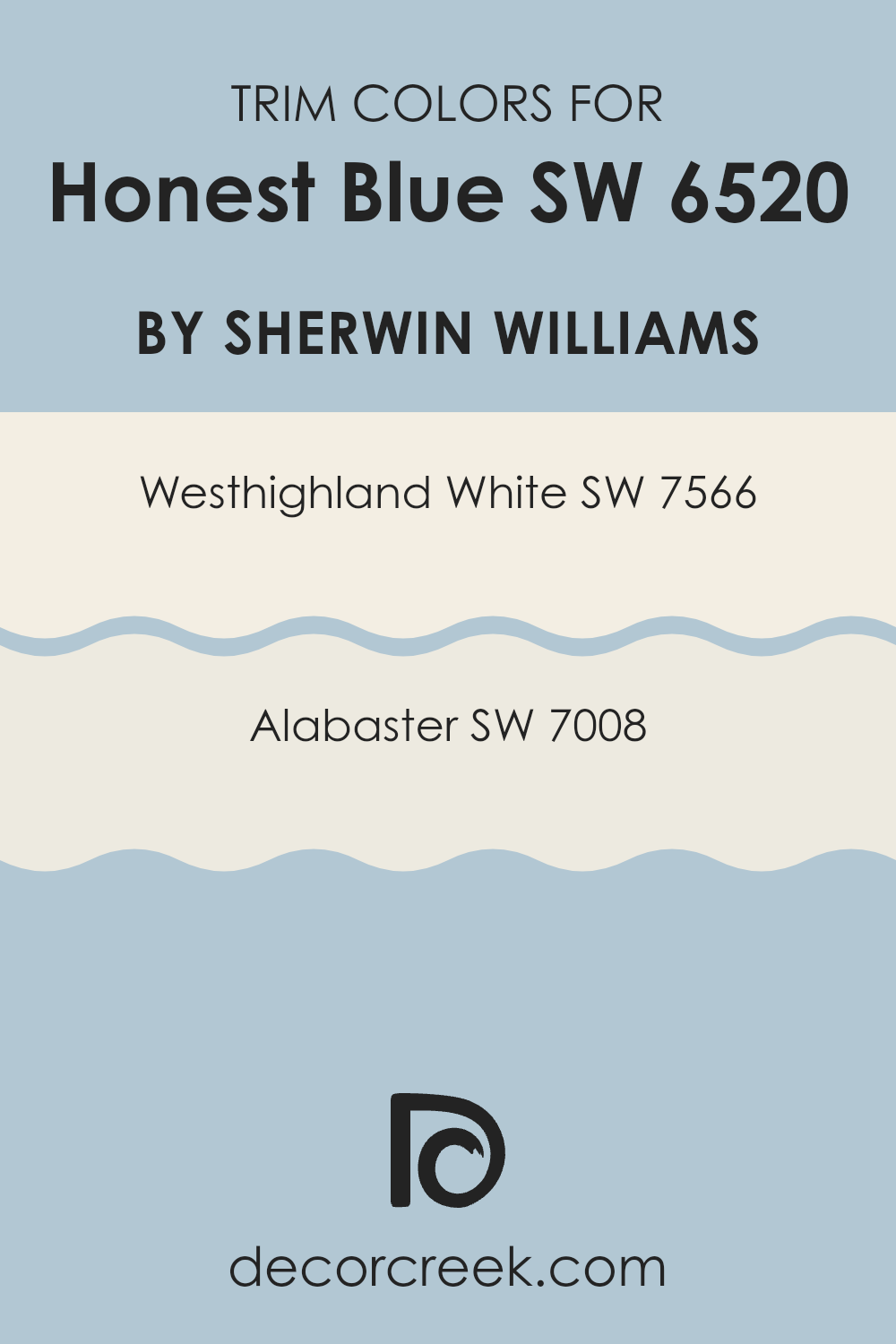
What are the Trim colors of Honest Blue SW 6520 by Sherwin Williams?
Trim colors are essential components in painting and decoration, serving as complementary hues that highlight and frame the main color on walls, emphasizing architectural details such as door frames, moldings, and baseboards. Selecting an appropriate trim color can greatly enhance the visual dynamics and aesthetic appeal of a space.
For Honest Blue, a vivid blue shade by Sherwin Williams, using trim colors such as Westhighland White and Alabaster provides a crisp, clean contrast that allows the primary blue to stand out vibrantly.
Westhighland White SW 7566 is a warm, neutral white that has a certain brightness without being overwhelming, making it an excellent choice for trim as it brings a light, airy feel to the combination with bolder hues like Honest Blue. Furthermore, Alabaster SW 7008 offers a slightly different take with its soft, creamy quality slightly toned down compared to pure white.
This hue adds a subtle richness to the trim, softening the transitions between colors and providing a gentle yet effective enhancement to the overall color scheme. This thoughtful palette pairing ensures that both the main wall color and trims are displayed to their best advantage, ensuring a balanced and refined finish.
You can see recommended paint colors below:
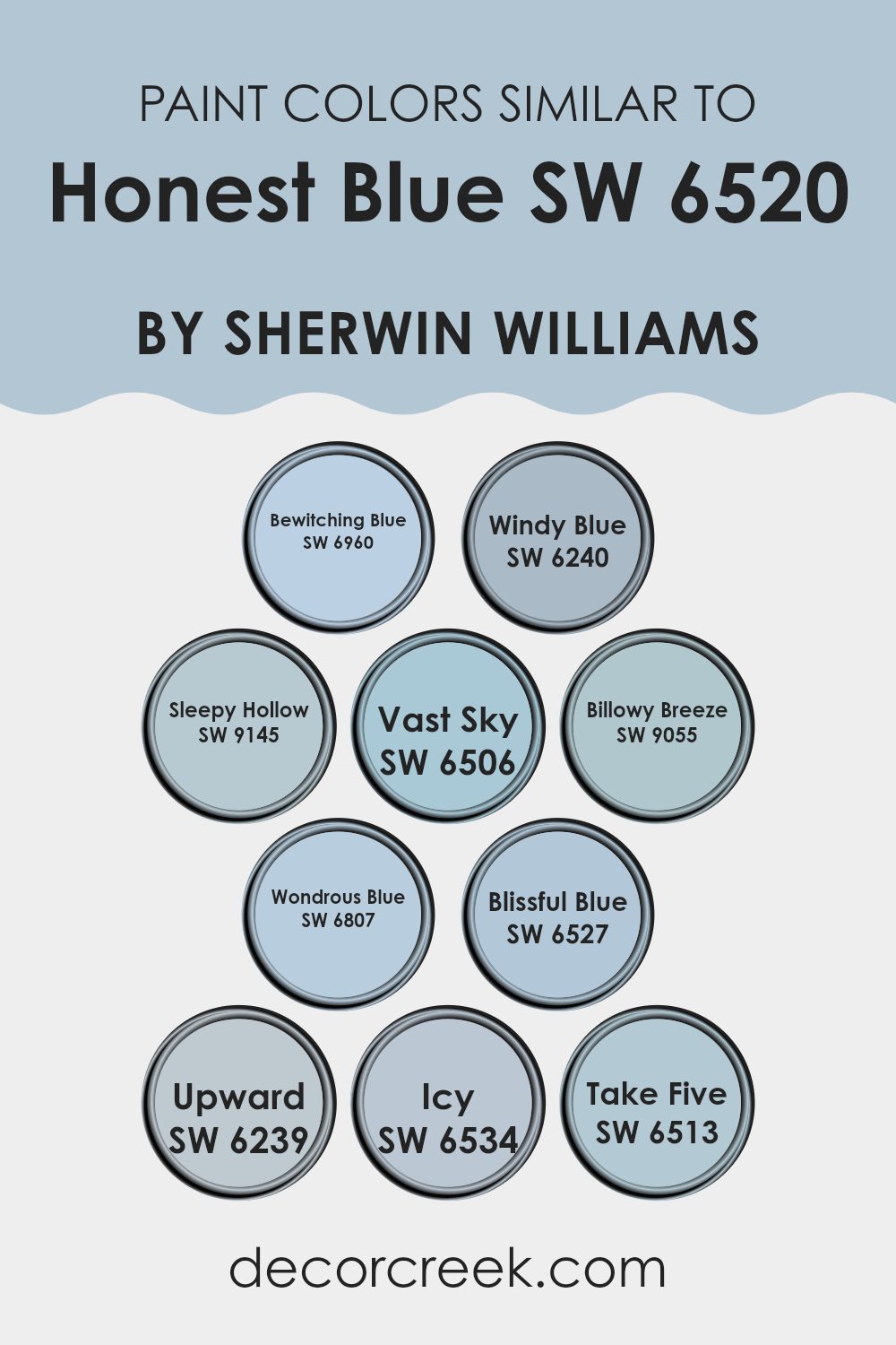
Colors Similar to Honest Blue SW 6520 by Sherwin Williams
Similar colors play a crucial role in interior design by creating a cohesive and harmonious atmosphere. By using shades like SW 6960 – Bewitching Blue, a deep, enchanting blue, or SW 6240 – Windy Blue, which carries a lighter, airier tone, one can achieve a balanced visual flow in any room. For instance, SW 9145 – Sleepy Hollow has a subtle dusky quality that works beautifully in spaces intended for relaxation, whereas SW 6506 – Vast Sky, with its clear and open blue, is ideal for brightening spaces and giving them a fresh look.
Additionally, colors like SW 9055 – Billowy Breeze provide a soft, gentle blue that pairs well with more vibrant hues to soften overall aesthetics. In contrast, SW 6807 – Wondrous Blue offers a vivid, dynamic shade that can add a splash of cheerfulness to any area. For those who prefer subtlety, SW 6527 – Blissful Blue offers a muted, soothing option, while SW 6239 – Upward is a pale, lifting blue that can make smaller rooms feel more expansive.
The cool, frost-like appearance of SW 6534 – Icy is perfect for creating a calm, collected feel, and SW 6513 – Take Five presents a relaxed, laid-back blue, great for creating a casual, inviting environment. These similar hues can significantly impact the overall aesthetic and mood of a space while allowing for personal style expression.
You can see recommended paint colors below:
- SW 6960 Bewitching Blue
- SW 6240 Windy Blue
- SW 9145 Sleepy Hollow
- SW 6506 Vast Sky
- SW 9055 Billowy Breeze
- SW 6807 Wondrous Blue
- SW 6527 Blissful Blue
- SW 6239 Upward
- SW 6534 Icy
- SW 6513 Take Five
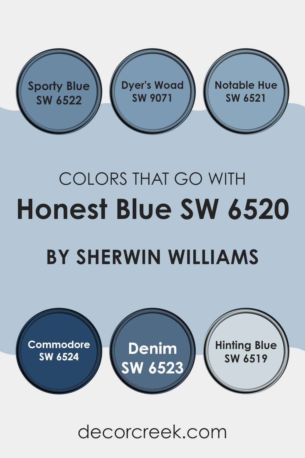
Colors that Go With Honest Blue SW 6520 by Sherwin Williams
Choosing the right accompanying colors for Honest Blue SW 6520 by Sherwin Williams is crucial as it ensures that the space feels harmonious and aesthetically pleasing. Colors like SW 6522 – Sporty Blue and SW 9071 – Dyer’s Woad offer a slightly varied hue that can create a dynamic yet cohesive look.
Sporty Blue is a lively, vibrant shade that adds a dash of energy to any room, while Dyer’s Woad provides a deeper, more intense backdrop, which is perfect for accent walls or furniture. These colors work together by balancing intensity and brightness, bringing a fresh dynamic to the space.
Further enhancing the palette, colors such as SW 6521 – Notable Hue, SW 6524 – Commodore, and SW 6523 – Denim complement Honest Blue by offering a range from lighter to darker tones. Notable Hue is a lighter, softer blue that can help in achieving a more gentle contrast that is soothing to the eyes. On the other hand, Commodore is a dark, rich navy that adds depth and drama, perfect for creating a focal point in a room.
Denim bridges these options by providing a versatile, moderate blue that works beautifully in various settings. Lastly, SW 6519 – Hinting Blue is a very subtle, almost neutral blue that can be used to softly lighten up spaces without overwhelming with color. Together, these colors ensure a balanced, coherent, and aesthetically rich environment, enhancing the overall feel and functionality of any room.
You can see recommended paint colors below:
- SW 6522 Sporty Blue
- SW 9071 Dyer’s Woad
- SW 6521 Notable Hue
- SW 6524 Commodore
- SW 6523 Denim
- SW 6519 Hinting Blue
How to Use Honest Blue SW 6520 by Sherwin Williams In Your Home?
Honest Blue SW 6520 by Sherwin Williams is a vibrant and refreshing shade of blue that brings a cheerful atmosphere to any room. It’s a perfect choice for those looking to add a pop of color without overwhelming the space.
If you’re thinking about using this color in your home, it works beautifully in bedrooms as it creates a lively yet cozy environment, conducive to relaxation and sleep. In the living room, Honest Blue can be used on an accent wall to highlight a specific area or to complement art pieces and décor.
This shade also does wonders in bathrooms, giving them a clean and brisk feel. For those who love DIY projects, painting old furniture such as a bookshelf or a nightstand in Honest Blue can instantly refresh the piece and add a fun twist to any room. Pair it with lighter shades like whites or soft grays for a balanced look, or go bold with contrasting colors like mustard yellow for more dynamism.
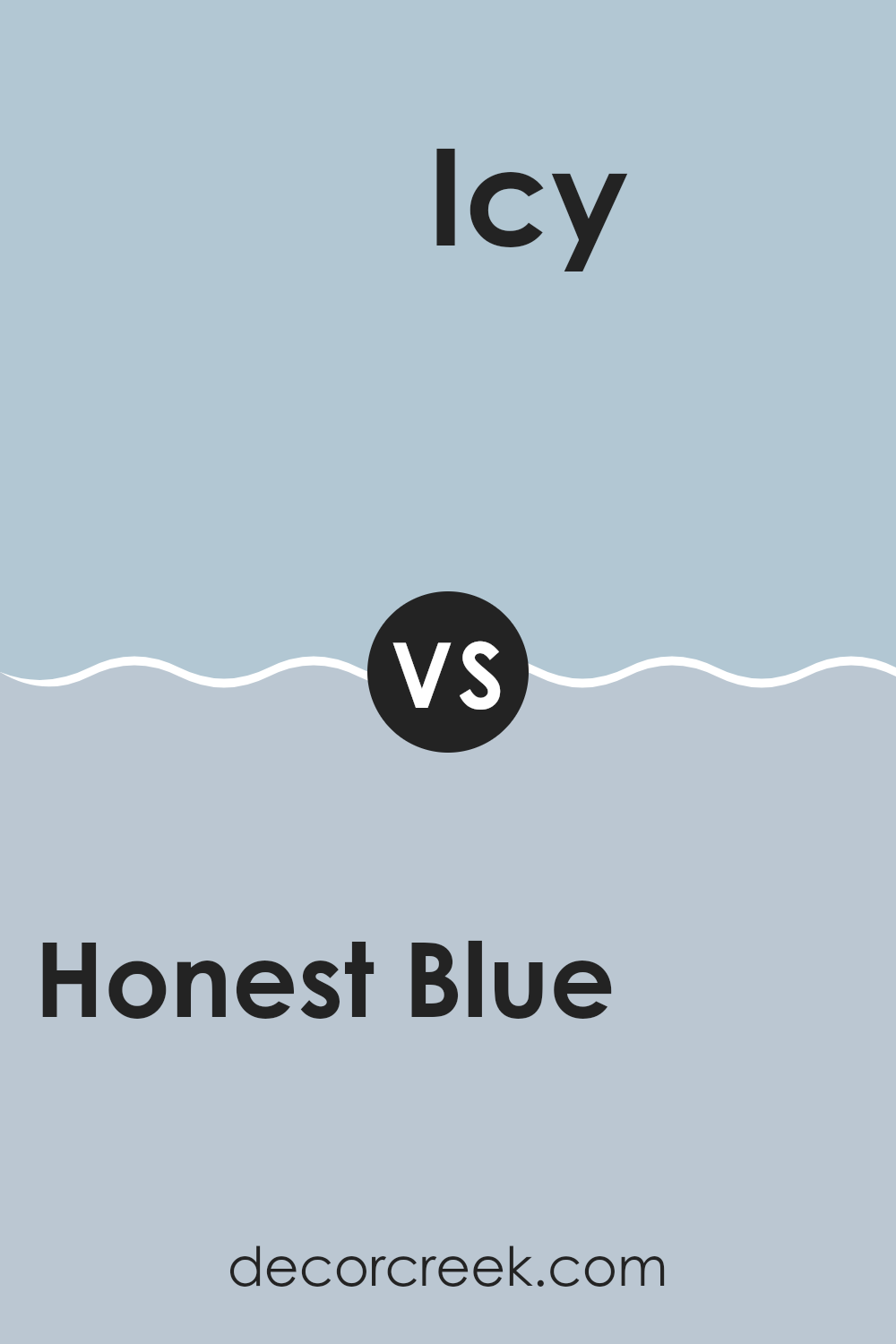
Honest Blue SW 6520 by Sherwin Williams vs Icy SW 6534 by Sherwin Williams
Honest Blue and Icy, both by Sherwin Williams, are distinct shades of blue with their unique characteristics. Honest Blue is a vibrant and somewhat deep blue that brings a lively and cheerful atmosphere to any space.
It adds a sense of energy and can make a room feel more inviting. On the other hand, Icy is a lighter and cooler blue that offers a fresh and clean look, perfect for creating a calm and refreshing environment. It tends to make spaces feel more open and airy.
While Honest Blue is better suited for areas where a punch of color is desired, Icy works well in spaces that aim for a subtle, soothing feel. Therefore, your choice between them would depend on the mood and atmosphere you want to achieve in your space.
You can see recommended paint color below:
Honest Blue SW 6520 by Sherwin Williams vs Bewitching Blue SW 6960 by Sherwin Williams
Honest Blue and Bewitching Blue by Sherwin Williams are both stunning but have distinct vibes. Honest Blue is a lighter shade that brings a calm and friendly atmosphere to any room. It’s perfect for creating a relaxed space, whether it’s a cozy reading nook or a bright office.
On the other hand, Bewitching Blue has a much darker and richer tone. This color provides a dramatic flair and works well in spaces that aim for a more profound and striking look, like a dining room or an accent wall in a bedroom.
Both colors can refresh and add character to a space, though Honest Blue leans towards a gentle, welcoming feeling while Bewitching Blue goes for bold and impressive. They could even complement each other if used in the same area or as contrasting elements in your decor.
You can see recommended paint color below:
- SW 6960 Bewitching Blue

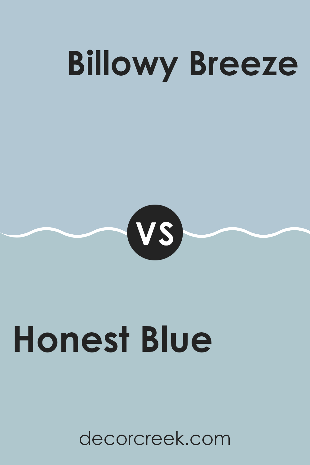
Honest Blue SW 6520 by Sherwin Williams vs Billowy Breeze SW 9055 by Sherwin Williams
Honest Blue is a vibrant shade that adds a refreshing pop of color to any space. It has a rich tone that grabs attention and can liven up areas that need a touch of brightness. This color works well in living rooms or bedrooms where a lively, yet not overpowering, atmosphere is desired.
On the other hand, Billowy Breeze is a lighter, softer blue. It gives a more relaxed and airy feel, making it perfect for creating a calm and inviting environment. This color is ideal for bathrooms or small spaces as it helps to make them appear larger and more open.
Both colors are versatile and can work beautifully in a variety of settings. Honest Blue is more bold and energetic, while Billowy Breeze provides a gentle backdrop that can easily be combined with other hues. The choice between them depends on the mood you want to set in your space.
You can see recommended paint color below:
- SW 9055 Billowy Breeze
Honest Blue SW 6520 by Sherwin Williams vs Blissful Blue SW 6527 by Sherwin Williams
Honest Blue and Blissful Blue by Sherwin Williams are two distinct shades that can enhance different moods in a room. Honest Blue is a deep, rich blue with a hint of green undertone, making it stand out and add a bold touch to spaces. It’s perfect for creating a strong focal point in a room.
In contrast, Blissful Blue is much lighter and softer, almost hinting at a sky blue. This makes it ideal for a calm and relaxing atmosphere, suitable for bedrooms or bathrooms where you want a gentle, soothing vibe.
While Honest Blue tends to draw attention, Blissful Blue blends smoothly into a space, providing a light and airy feel. Both colors, though different, offer unique possibilities for decorating and can complement various decor styles depending on the desired impact and ambiance.
You can see recommended paint color below:
- SW 6527 Blissful Blue
Honest Blue SW 6520 by Sherwin Williams vs Vast Sky SW 6506 by Sherwin Williams
“Honest Blue” and “Vast Sky” by Sherwin Williams are both shades of blue, but they have distinct differences. “Honest Blue” is a deeper, more pronounced blue. It’s the kind of color that stands out on a wall, providing a strong background that could complement lighter tones or function as the focal point in a room. This darker blue can make furniture and artwork pop against it.
On the other hand, “Vast Sky” is lighter and more subtle. It has a gentle, airy quality, reminiscent of a clear sky on a sunny day. This lighter blue works well in spaces that aim to feel open and bright. It’s perfect for creating a relaxed atmosphere in areas like bedrooms or bathrooms.
In summary, “Honest Blue” offers a bold, striking vibe, while “Vast Sky” gives off a calm, open feeling. When choosing between them, consider the mood and function of the room you are decorating.
You can see recommended paint color below:
- SW 6506 Vast Sky
Honest Blue SW 6520 by Sherwin Williams vs Take Five SW 6513 by Sherwin Williams
“Honest Blue” and “Take Five” are two distinct shades from Sherwin Williams. Honest Blue is a vibrant and rich blue with a depth that feels like a classic navy. It stands out as a strong color that can make any space feel more alive.
On the other hand, Take Five is a much softer shade. It leans towards a light, soothing blue, almost like a gentle sky on a clear day. This color is great for creating a relaxed and welcoming atmosphere in a room.
While Honest Blue adds a punch of color and can be the main focus of a design, Take Five works well as a neutral, blending easily with other colors and decor elements. These two blues, each with their own unique character, offer varied options for those looking to refresh their walls or accents.
You can see recommended paint color below:
- SW 6513 Take Five
Honest Blue SW 6520 by Sherwin Williams vs Sleepy Hollow SW 9145 by Sherwin Williams
Honest Blue and Sleepy Hollow are both blue paint colors by Sherwin Williams, each with its unique charm. Honest Blue has a vibrant and lively tone, making it perfect for spaces where you want to add a splash of energy.
Its brightness can make small rooms feel larger and more inviting. On the other hand, Sleepy Hollow is a deeper, muted blue with hints of gray. This color is ideal for creating a cozy and relaxed atmosphere, suitable for bedrooms or quiet study areas. Sleepy Hollow’s subtle undertones can help in making a room feel more grounded and calm.
When used in decor, Honest Blue works well in playrooms or creative spaces, while Sleepy Hollow is better suited for places where peace and rest are priorities. Both shades offer different vibes, either refreshing or soothing, depending on what is needed in a space.
You can see recommended paint color below:
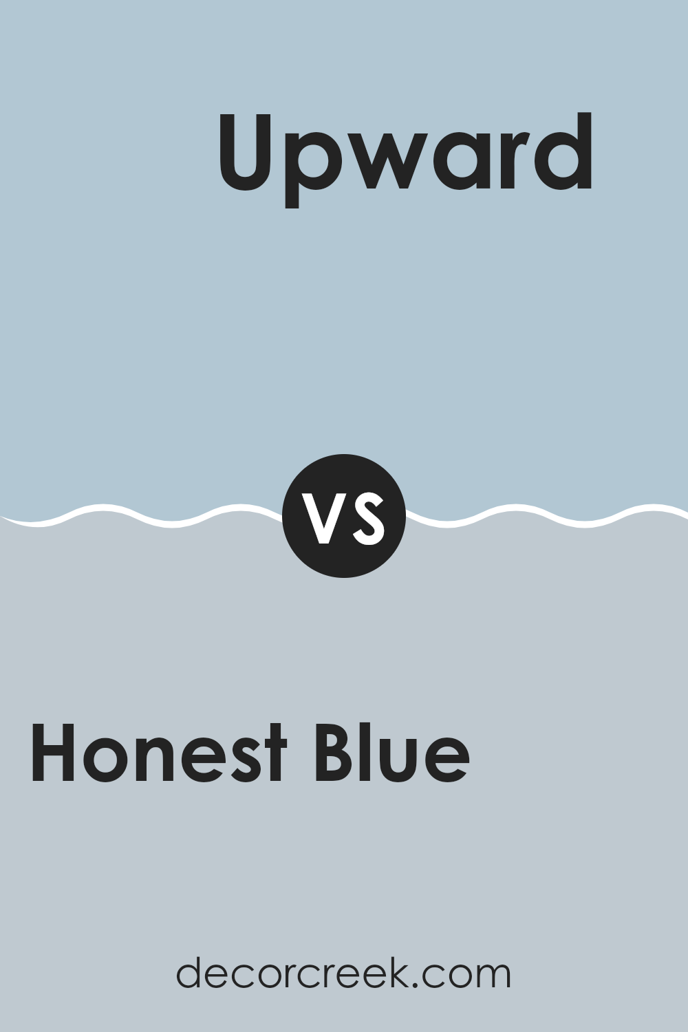
Honest Blue SW 6520 by Sherwin Williams vs Upward SW 6239 by Sherwin Williams
Honest Blue and Upward are both soothing shades by Sherwin Williams, but they bring different vibes to a space. Honest Blue has a stronger, more pronounced presence. It carries a depth that’s closer to navy but remains vibrant enough to feel lively rather than overpowering. Its richness makes it a great choice for areas where a bold statement is desired, such as accent walls or furniture pieces.
On the other hand, Upward has a lighter, airier quality. It leans more towards a sky blue and feels more open and calming. This makes it perfect for bedrooms, bathrooms, or other places where a restful atmosphere is key. It pairs well with soft whites and neutral tones, enhancing its subtle charm without stealing the show.
Together, Honest Blue and Upward can create a balanced and dynamic color scheme, suitable for those looking to combine boldness with calmness in their decor.
You can see recommended paint color below:
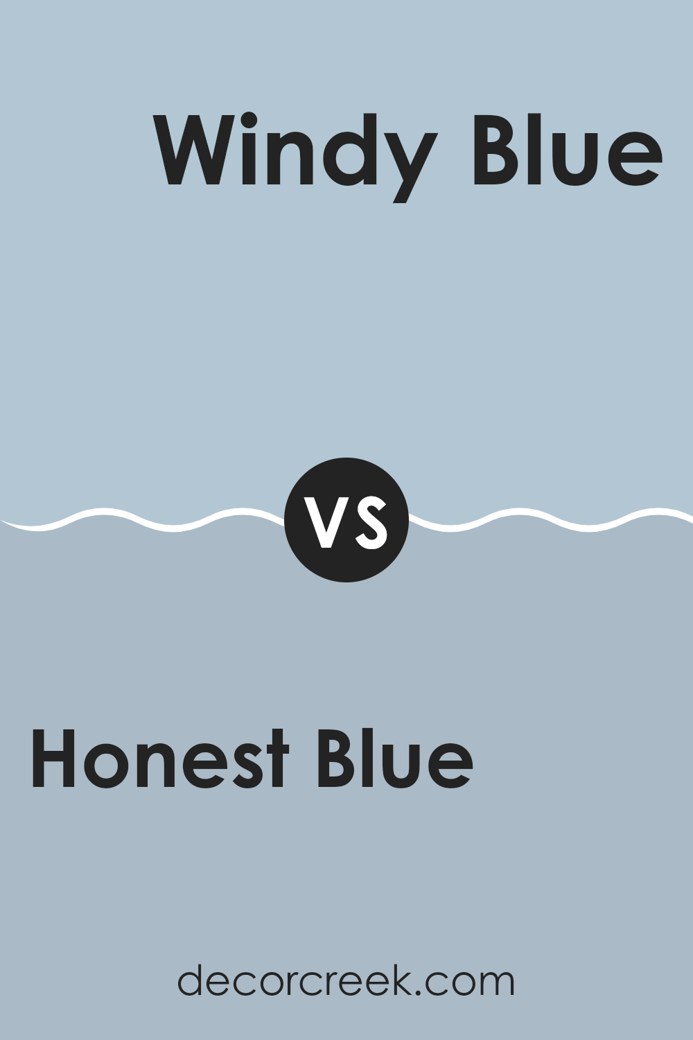
Honest Blue SW 6520 by Sherwin Williams vs Windy Blue SW 6240 by Sherwin Williams
Honest Blue and Windy Blue by Sherwin Williams are two distinct shades that both offer a calming feel but in different ways. Honest Blue is a robust and fuller blue that brings richness to any space. It has a noticeable presence, making it perfect for a room where you want to add a touch of brightness while keeping things feeling grounded.
Windy Blue, on the other hand, is lighter and has a more subdued appearance. This color leans towards a softer, more muted blue, almost hinting at a grayish tone. It is ideal for creating a gentle and relaxed atmosphere in spaces that benefit from a lighter touch of color, such as bathrooms or bedrooms.
Both colors have their unique characteristics: Honest Blue is more vibrant and can make a strong statement, whereas Windy Blue is quieter and blends more smoothly with a variety of decor styles. Choosing between them depends on the mood and feel you’re aiming to achieve in your space.
You can see recommended paint color below:
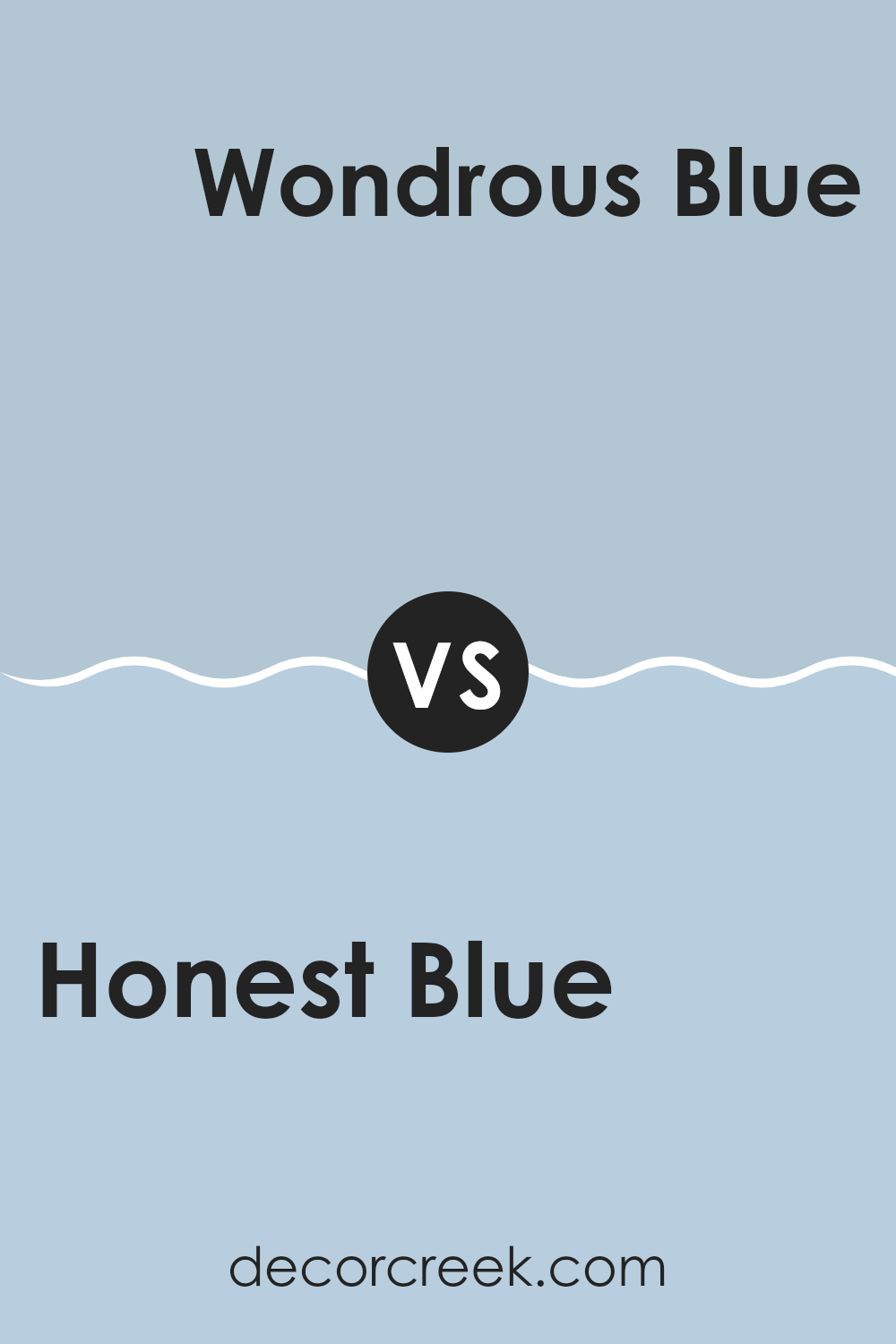
Honest Blue SW 6520 by Sherwin Williams vs Wondrous Blue SW 6807 by Sherwin Williams
Honest Blue and Wondrous Blue, both by Sherwin Williams, offer unique shades for different decorating needs. Honest Blue is a calm, subdued blue with a touch of gray, making it a great choice for a peaceful and subtle backdrop in any room. It’s particularly good for creating a soothing environment, like in bedrooms or quiet study areas.
On the other hand, Wondrous Blue is a brighter and more vibrant shade. This color stands out more and adds a cheerful pop of blue that is lively and refreshing. It’s excellent for areas where you want to add energy and a playful mood, such as in a kid’s room or a creative space.
While Honest Blue provides a gentle, muted presence, Wondrous Blue brings a dynamic burst that can make a space feel more energetic and fun. Choosing between them depends on the atmosphere you’re aiming to achieve—cozy and subdued or bright and lively.
You can see recommended paint color below:
- SW 6807 Wondrous Blue
As I wrap up my thoughts on SW 6520 Honest Blue by Sherwin Williams, I have to say, this paint color really makes a room feel happy and calm. Honest Blue is not too bright or too dark, it’s just right for giving a cozy vibe to any room, be it a bedroom, a bathroom, or even a kitchen. It’s like looking up at a clear sky on a sunny day, which always lifts my mood.
I’ve noticed that this blue goes well with lots of other colors. Whether you pair it with whites for a fresh and clean look, or with yellows for a more fun and lively atmosphere, it works nicely. It’s kind of like wearing a blue shirt that goes with almost any pants or shoes you choose.
What’s really great is that this color keeps its charm all day long, looking cheerful in the morning light and still cool and lovely in the evening. It doesn’t shout for attention, but gently fills the room with a pleasant feeling.
I’d recommend Honest Blue to anyone looking to give their home a friendly and peaceful touch without making things too bold or flashy. It’s perfect for making any corner of your home feel special. I’m really glad I got to tell you about this neat color, and I think it could make any room better just by being on the walls.
Ever wished paint sampling was as easy as sticking a sticker? Guess what? Now it is! Discover Samplize's unique Peel & Stick samples.
Get paint samples

