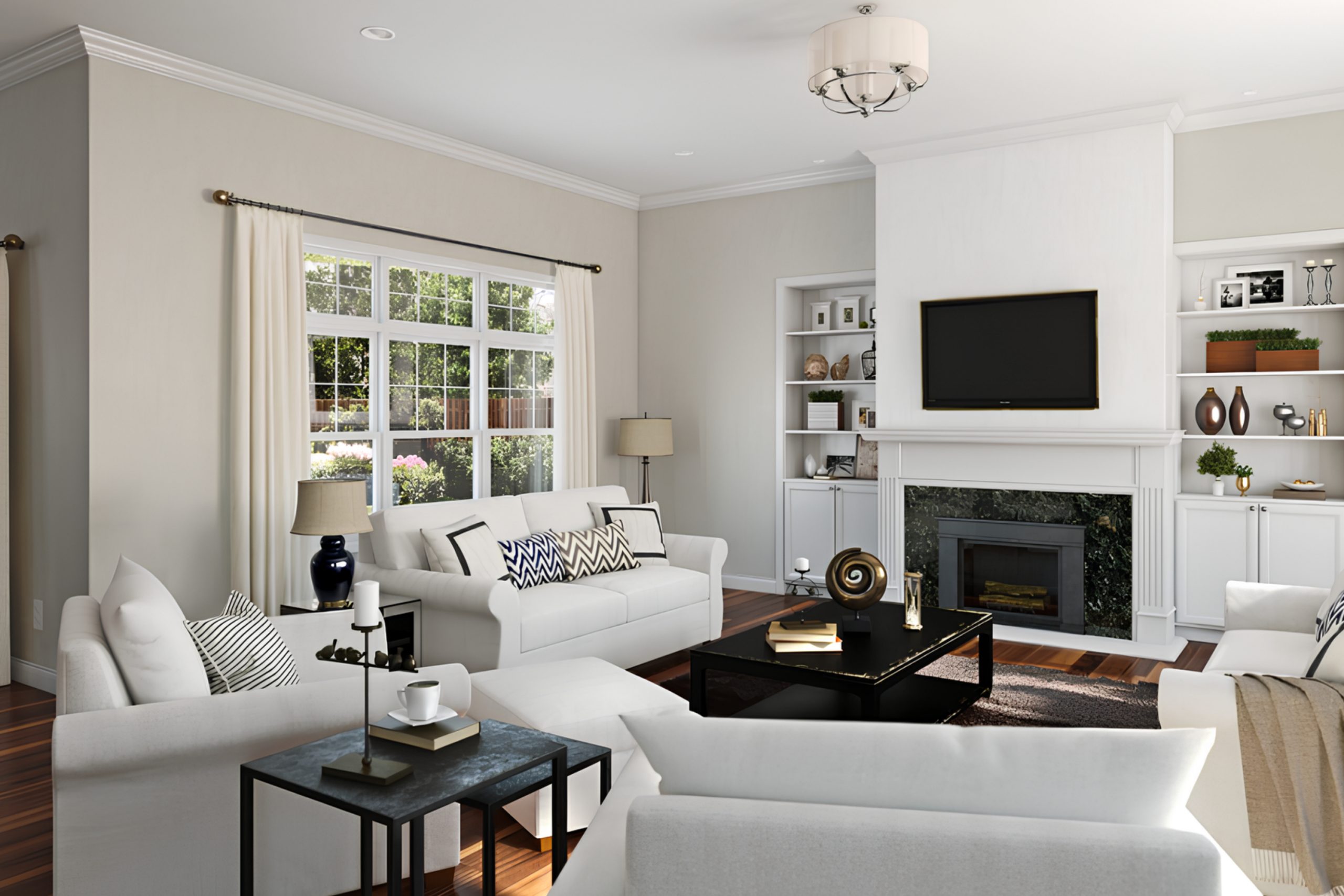
As you look to refresh a space in your home, consider the serene and subtle charm of SW 9628 Winter Walk by Sherwin Williams. This color offers a sense of calm and simplicity that can transform an ordinary room into a peaceful retreat. Imagine soft, muted gray tones that mimic a quiet, wintry day, providing a neutral backdrop that complements any style or decor.
Winter Walk is not just another shade of gray; its unique blend captures the quiet moments of winter, offering a soft, grounding presence in any room. Perfect for living areas, bedrooms, or even a cozy reading nook, this color pairs beautifully with soft whites and rich textures, allowing your decorative elements to shine.
Using Winter Walk in your home can help you create a space that feels both spacious and inviting. It’s a color that doesn’t demand attention but instead sets a tone of understated elegance.
Whether you’re painting a whole room or adding an accent wall, Winter Walk provides a versatile foundation for your home’s aesthetic.
What Color Is Winter Walk SW 9628 by Sherwin Williams?
Winter Walk by Sherwin Williams is a soft, muted gray color that brings a subtle warmth and richness to any space. This color has a unique blend of gray with gentle brown undertones, making it versatile and easy to pair with a variety of decor styles and colors. It shines particularly well in minimalist or Scandinavian-inspired interiors, as its understated elegance complements the clean lines and natural materials common in these themes.
Winter Walk works beautifully with materials like light woods, helping to highlight their natural grain and warm tones. It also pairs well with metallic accents such as brushed nickel or soft brass, adding a gentle contrast without overpowering the space. For textiles, think of pairing this paint with soft, cozy fabrics like linen or wool to enhance its naturally warm feeling.
This color is particularly effective in living rooms, bedrooms, and kitchens where its calming presence helps to establish a relaxed and inviting atmosphere. It also serves well in spaces that receive a lot of natural light, as the light enhances the depth of the color, bringing out its complex undertones. It’s an excellent choice if you’re looking for a color that is both easy on the eyes and versatile enough to complement a range of interior design styles.

Is Winter Walk SW 9628 by Sherwin Williams Warm or Cool color?
Winter Walk by Sherwin Williams is a subtle, cool gray paint color that offers a fresh and airy feel to any room in the house. Its light and almost silvery tones make it an excellent choice for spaces where you want to create a clean and open atmosphere. This color works well in both small and large rooms, reflecting natural light beautifully and enhancing the sense of space.
When used in living areas, Winter Walk provides a neutral backdrop that complements various decor styles, from modern to traditional. In bedrooms, it adds a gentle, calming feel, making it easier to relax. This color is also ideal for bathrooms and kitchens, where it can help create a crisp, clean environment.
Moreover, because of its neutral tone, Winter Walk pairs well with a wide range of accent colors, from bold blues to warm terracottas, allowing for versatility in decorating. This makes it effortless to incorporate into existing home designs or when planning a new decor scheme.
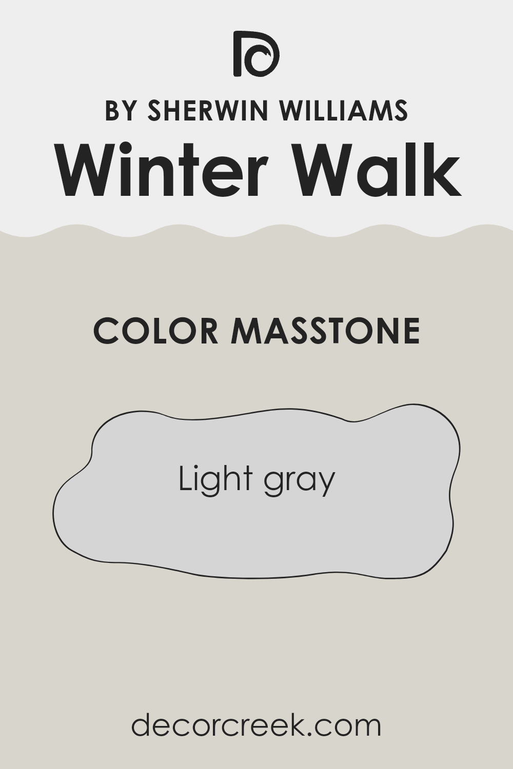
What is the Masstone of the Winter Walk SW 9628 by Sherwin Williams?
Winter Walk (SW 9628) by Sherwin Williams is a light gray color with a masstone that matches the hexadecimal code #D5D5D5. This neutral shade offers a clean and subtle backdrop for any room in the home.
Its lighter tone makes spaces look more open and airy, effectively enhancing natural light in a room. This color is versatile, fitting well with a variety of decor styles, from modern to classic. It’s gentle on the eyes, which helps in creating a relaxed atmosphere perfect for living rooms or bedrooms.
Moreover, it’s practical for high-traffic areas like hallways and kitchens, as its lightness masks small imperfections and day-to-day wear. Winter Walk’s adaptability with other colors allows homeowners to pair it with bright accents or keep a more monochromatic and understated palette, depending on their taste. Thus, this light gray shade can work beautifully in many different home settings.
How Does Lighting Affect Winter Walk SW 9628 by Sherwin Williams?
Lighting plays a critical role in how we perceive colors in a space. It can change how a color looks depending on whether it’s illuminated by natural sunlight or artificial lighting. Let’s discuss the color Winter Walk by Sherwin Williams and see how it varies under different light conditions.
Winter Walk is a subtle and versatile color that can appear differently based on the light it’s exposed to. Under artificial lighting, such as LED or fluorescent lights, this color may look slightly cooler, giving it a crisp appearance. This can be ideal for modern living spaces or bathrooms where you often find brighter artificial lights.
The cooler undertones in these lights can enhance the freshness of the Winter Walk color, making the space feel clean and bright.In natural lighting, Winter Walk can vary significantly throughout the day. Natural light tends to bring out the truest version of colors. During midday when the light is brightest, the color may appear lighter and more vibrant. Towards sunset, as natural light dims and gets warmer, the color could take on a softer, warmer tone which adds a cozy atmosphere to the room.
As for the orientation of rooms, lighting and color perception can change:
– North-facing rooms: These rooms get less direct sunlight, which can make Winter Walk appear slightly more shadowy and cool, potentially a good match for creating a calm feel in a bedroom or study.
– South-facing rooms: Here, the color can show its brightest and warmest during the day when sunlight is most direct, making the room feel lively and airy.
– East-facing rooms: Expect Winter Walk to look bright and cheery in the morning with the rising sun but it will grow cooler as the day progresses.
– West-facing rooms: This color will be cooler in the morning and become warmly illuminated by the evening light, providing a tranquil environment perfect for living rooms to relax in after work.
Overall, the appearance of Winter Walk by Sherwin Williams is quite dependent on the lighting conditions, which can make it a particularly flexible choice for many spaces.

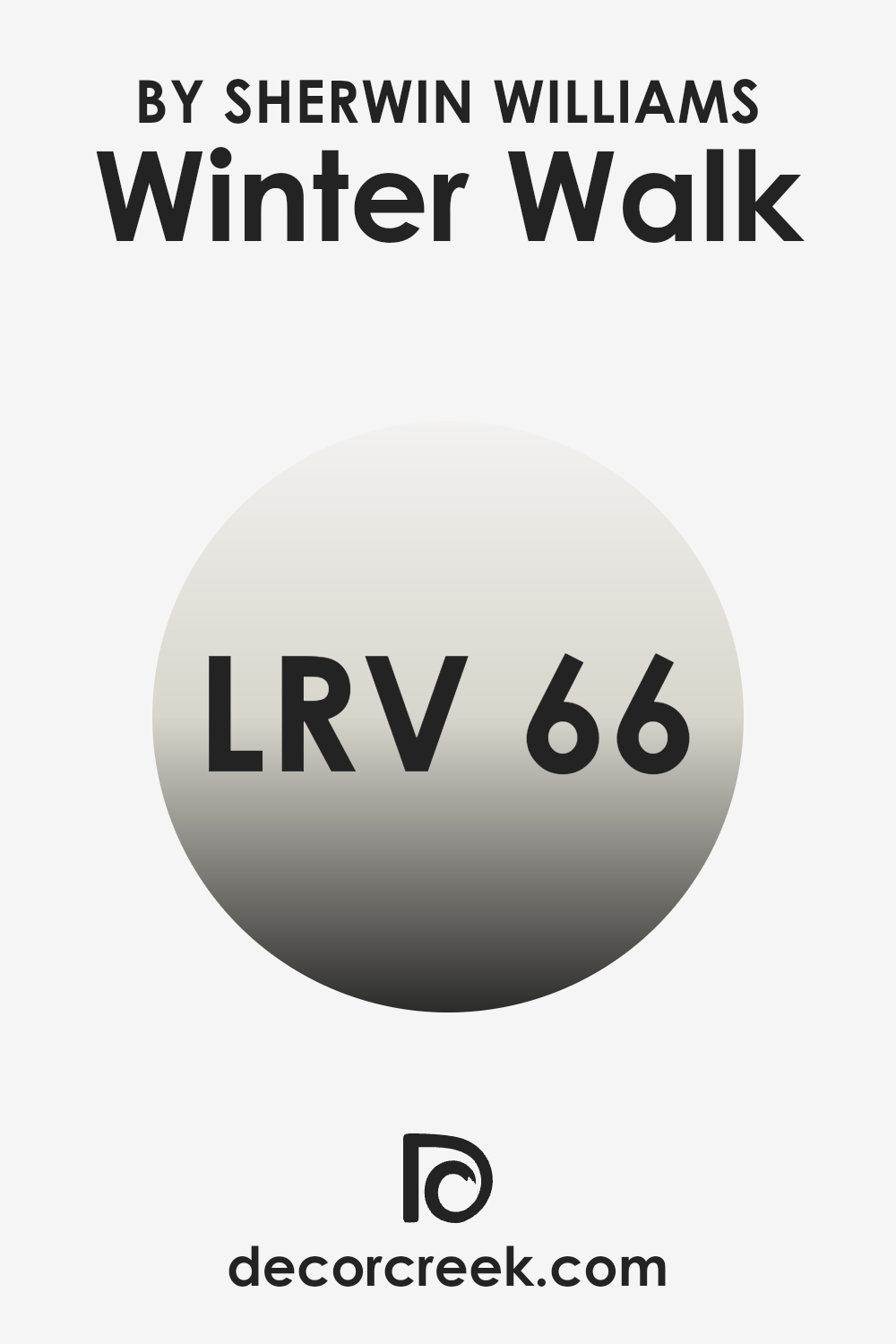
What is the LRV of Winter Walk SW 9628 by Sherwin Williams?
Light Reflectance Value (LRV) measures the amount of light a paint color reflects or absorbs. Paint colors with a high LRV, like Winter Walk with an LRV of 66.377, reflect more light, making a room appear brighter and more open.
In contrast, colors with a low LRV can make a space feel smaller and darker because they absorb more light. Essentially, the LRV helps you understand how light or dark a color will look on your walls, which can be crucial in deciding the mood and feel of a room.
A paint color like Winter Walk with an LRV of 66.377 is on the lighter side of the scale, indicating it is a fairly light color but not extremely bright. This makes it a good choice for spaces that you want to feel airy and open without being overly stark or bright. The moderately high LRV means it will help in making a smaller or dimly-lit room feel more spacious and well-lit.
It’s a practical choice that can help enhance natural light in the space, making it feel welcoming and comfortable.
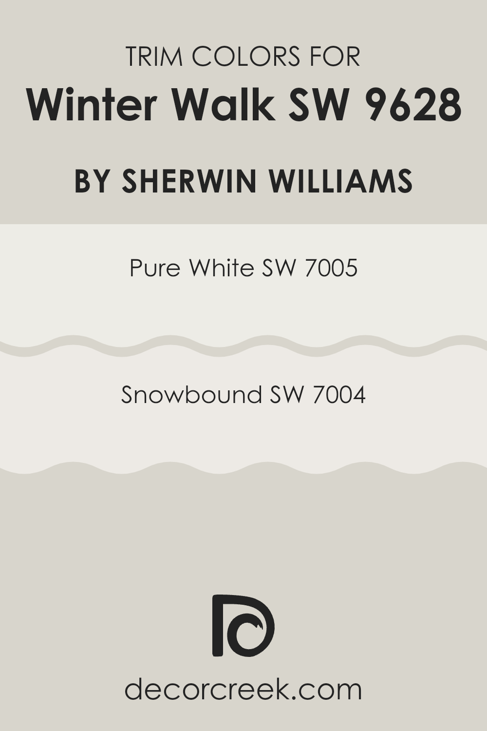
What are the Trim colors of Winter Walk SW 9628 by Sherwin Williams?
Trim colors in home decor act as a framing detail for your walls, accentuating the primary colors used in a room and highlighting architectural features like doors, windows, and moldings. Choosing the right trim color can make a significant difference in the overall look of a space, either by creating contrast or by subtly blending with the wall colors.
For the color Winter Walk by Sherwin Williams, using a trim color like Pure White or Snowbound can provide a clean and crisp border that complements the main hue without overpowering it. These shades are particularly effective in maintaining a fresh and light atmosphere, important for maintaining balance and visual appeal in a space.
Pure White (SW 7005) is a clean and bright shade that offers a stark, clear cut contrast to deeper tones, making it an excellent choice for trims that really need to stand out. It’s ideal for bringing a sense of freshness and clarity to a room, highlighting the neat lines and edges of the design.
On the other hand, Snowbound (SW 7004) is a softer white with slightly gray undertones, providing a gentler transition between the wall color and the trim. This color is less stark than Pure White, making it perfect for those who prefer a more subtle contrast and a harmonious blend between colors.
You can see recommended paint colors below:
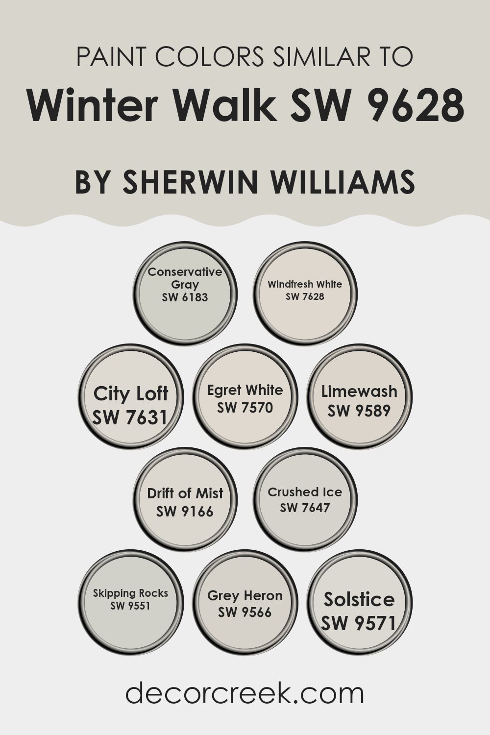
Colors Similar to Winter Walk SW 9628 by Sherwin Williams
Choosing coordinating colors can be a simple way to achieve a harmonious look in your home. Colors like SW 6183 – Conservative Gray and SW 7628 – Windfresh White, for example, pair subtly to create a backdrop that is both understated and inviting. Conservative Gray offers a muted, almost nostalgic tone that has the warmth of faded photographs, while Windfresh White is crisp and clean, reflecting the light beautifully to make spaces feel more open.
Additionally, colors such as SW 7631 – City Loft and SW 7570 – Egret White can be used to further enhance the soft palette. City Loft offers a soft, gentle gray that works well in spaces that seek a hint of modernity without overpowering, and Egret White adds a slightly creamy touch that contrasts smoothly with darker hues.
Then, there’s SW 9589 Limewash and SW 9166 Drift of Mist, which provide a nearly ethereal feel when applied. Limewash is a pale, grayish white that mimics the timeless appeal of aged lime walls, whereas Drift of Mist is a light, airy gray with the power to widen smaller rooms dramatically.
Other similar colors include SW 7647 Crushed Ice and SW 9551 Skipping Rocks, each offering a unique take on neutral grays that support a variety of decorative aims. Crushed Ice is a very light gray that can verge on silvery, excellent for soft reflections, while Skipping Rocks has a sturdier feel, reminiscent of pebbles on a beach, grounding the color scheme.
To add more depth, SW 9566 Grey Heron and SW 9571 Solstice can be introduced. Grey Heron gives a slightly more pronounced gray shade that hints at the plumage of its namesake, suitable for accent walls or furniture pieces, whereas Solstice has a warmth that recalls the low, cozy sun of winter days. These colors work in sync to create cohesive and inviting spaces, softened by their close relation in shade and saturation.
You can see recommended paint colors below:
- SW 6183 Conservative Gray
- SW 7628 Windfresh White
- SW 7631 City Loft
- SW 7570 Egret White
- SW 9589 Limewash
- SW 9166 Drift of Mist
- SW 7647 Crushed Ice
- SW 9551 Skipping Rocks
- SW 9566 Grey Heron
- SW 9571 Solstice
How to Use Winter Walk SW 9628 by Sherwin Williams In Your Home?
Winter Walk SW 9628 by Sherwin Williams is a gentle gray color that brings a calm and cozy feel to any room. It’s ideal for those looking to create a soothing space at home without it becoming too cold or dull. This color works well in areas like the living room or bedroom where you want to relax and feel at ease.
Since it’s a neutral shade, Winter Walk pairs beautifully with various interior styles, from modern to traditional. It can be used on walls to set a peaceful backdrop and goes well with bolder colors in decorations or furniture, like blues and greens, to add a soft contrast. If you prefer a subtle look, you can match it with whites or other light grays.
For those who want to add a bit of character to smaller spaces such as a bathroom or an entryway, Winter Walk serves as an excellent base color, giving the illusion of more space while maintaining a cozy vibe. You can also consider using it on cabinets or shelves to give them a fresh, updated look without overwhelming the room.
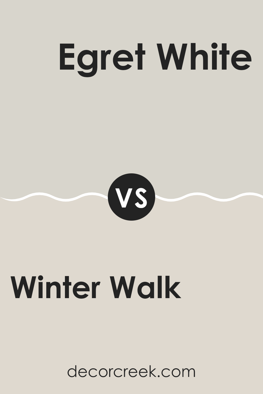
Winter Walk SW 9628 by Sherwin Williams vs Egret White SW 7570 by Sherwin Williams
Winter Walk and Egret White are two paint colors offered by Sherwin Williams that can freshen up any space but in subtly different ways. Winter Walk is a cool, soft gray that has a very subtle hint of blue.
This makes it ideal for creating a peaceful and inviting atmosphere, suitable for spaces like bedrooms or living areas where comfort is key. In contrast, Egret White leans towards a warm off-white with a touch of beige, giving it a gentle and welcoming presence.
This color is perfect for those looking to brighten a room while maintaining a cozy and neutral tone. While both colors are excellent for creating light and airy environments, Winter Walk offers a cooler tint, whereas Egret White provides a warmer, more neutral base. Each has its unique appeal depending on the mood and style you wish to achieve in your space.
You can see recommended paint color below:
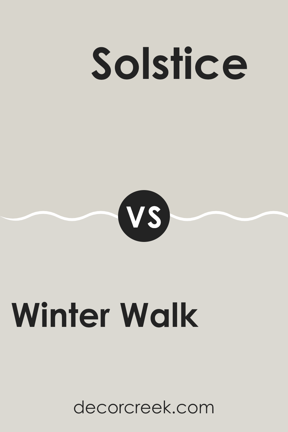
Winter Walk SW 9628 by Sherwin Williams vs Solstice SW 9571 by Sherwin Williams
Winter Walk and Solstice by Sherwin Williams are two distinct colors each bringing a unique mood to any space. Winter Walk is a soft, gentle gray that feels like a quiet, cloudy day. It’s perfect for creating a calm, subtle backdrop in rooms where you want to relax without making the space feel too cold or stark.
On the other hand, Solstice has a warmer tone, veering towards taupe. This color is inviting and cozy, making it an excellent choice for living areas or bedrooms where a touch of warmth is desired without overpowering the room with too much color intensity.
When comparing these two colors, Winter Walk offers a cooler, more neutral canvas, potentially making a room feel more open and airy. Solstice, with its touch of warmth, can make a space feel more enclosed and personal. Each color has its own charm, depending on the atmosphere you want to create.
You can see recommended paint color below:
- SW 9571 Solstice
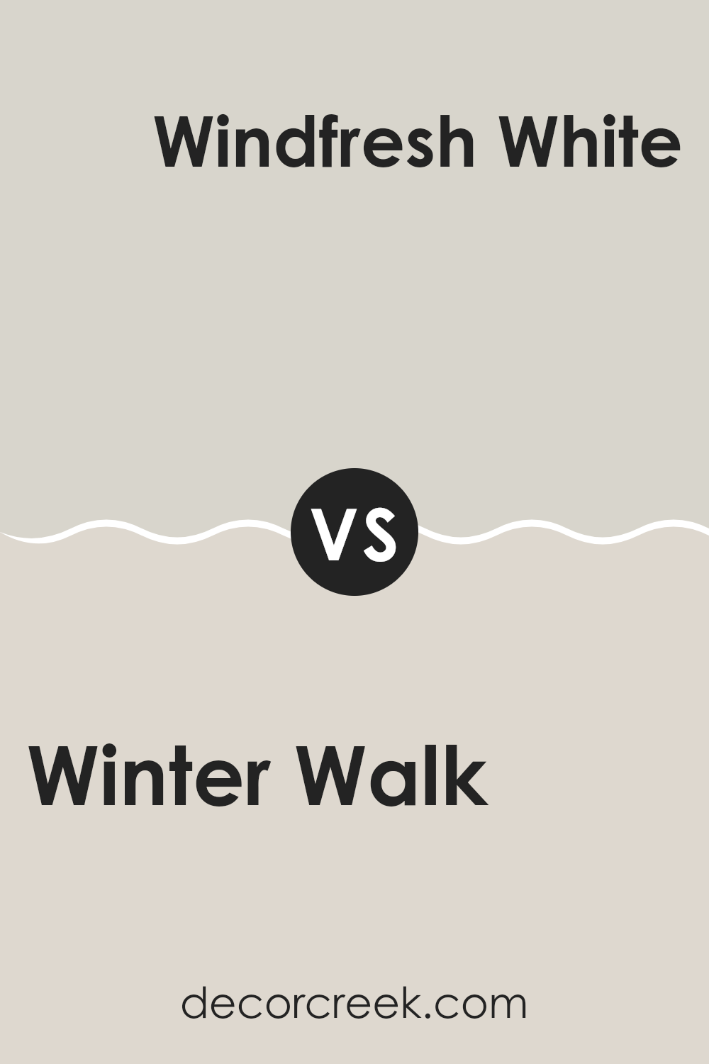
Winter Walk SW 9628 by Sherwin Williams vs Windfresh White SW 7628 by Sherwin Williams
Winter Walk and Windfresh White are two distinct shades offered by Sherwin Williams. Winter Walk has a deep, rich gray tone with a hint of blue, creating a calm, cozy atmosphere in a space. This color is ideal for those who prefer a stronger, yet neutral backdrop that adds some character without overwhelming the room.
On the other hand, Windfresh White is much lighter, presenting itself as a clean, bright white with slight gray undertones. This color is great for making smaller spaces appear larger and more open, providing a fresh and airy feel.
Both colors work well in various settings, but while Winter Walk tends to set a moodier tone perfect for creating a snug environment, Windfresh White is better suited for enhancing natural light and achieving a crisp, modern look. Whether you choose the deeper tones of Winter Walk or the light, refreshing shade of Windfresh White depends on the specific atmosphere you want to achieve in your space.
You can see recommended paint color below:
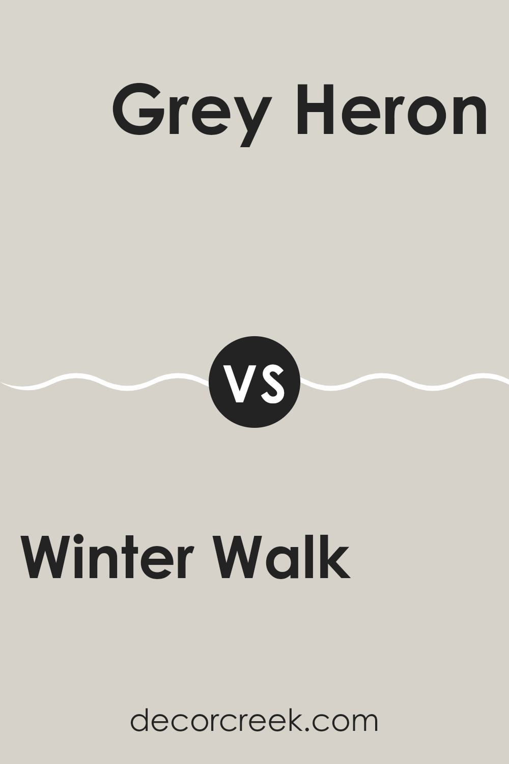
Winter Walk SW 9628 by Sherwin Williams vs Grey Heron SW 9566 by Sherwin Williams
“Winter Walk” and “Grey Heron” by Sherwin Williams are both cool tones but have distinct vibes. “Winter Walk” has a dusty blue undertone, giving it a fresh, clean look ideal for creating a calming atmosphere in spaces like bedrooms or bathrooms. It resembles a clear, wintery sky and pairs well with soft whites and natural woods.
On the other hand, “Grey Heron” leans more towards a true grey. This color has a slightly darker, more grounded appearance, making it suitable for areas that require a bit more formality or gravity, like office spaces or modern living rooms. It works beautifully with bolder colors, acting as a neutral backdrop that allows other hues to stand out.
Both colors offer unique styles and can be used effectively depending on the mood and function of the room. “Winter Walk” offers a lighter, airier feel, while “Grey Heron” provides a more solid, anchoring effect.
You can see recommended paint color below:
Winter Walk SW 9628 by Sherwin Williams vs City Loft SW 7631 by Sherwin Williams
Winter Walk and City Loft, both by Sherwin Williams, are subtle and elegant neutrals, but they bring distinct vibes to a space. Winter Walk has a cooler tone that resembles a soft, light gray with subtle hints of blue, making it a great choice for a calm and soothing environment. It’s the kind of color that can make a room feel more open and airy, particularly in spaces with less natural light.
On the other hand, City Loft offers a warmer shade of light beige-gray that feels inviting and cozy. This color is versatile and pairs well with a variety of decor styles, adding a touch of warmth to any room without overwhelming it with color.
Both colors are light enough to work in small or large spaces and can easily complement different types of furniture and accessories. Whether you choose the cooler tones of Winter Walk or the warmer hues of City Loft, each offers a unique yet subtle backdrop for your living spaces.
You can see recommended paint color below:

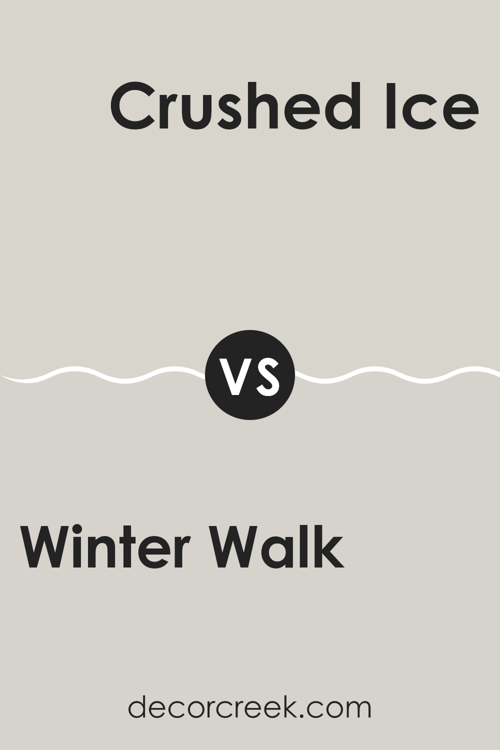
Winter Walk SW 9628 by Sherwin Williams vs Crushed Ice SW 7647 by Sherwin Williams
Winter Walk and Crushed Ice from Sherwin Williams are two subtle colors that offer distinct tones for different moods and settings. Winter Walk has a gentle, warm beige hue that brings a cozy, inviting feel to any room.
It’s perfect for spaces where you want a touch of warmth without overwhelming brightness. On the other hand, Crushed Ice is a light gray color that provides a clean and fresh look. It is excellent for modern spaces as it offers a neutral backdrop that pairs well with almost any decor.
This color can help brighten up a space while keeping things calm and understated. Both colors are versatile, but while Winter Walk adds a hint of warmth, Crushed Ice gives a crisp, cool ambiance. Choosing between them depends on the atmosphere you want to create in your space.
You can see recommended paint color below:
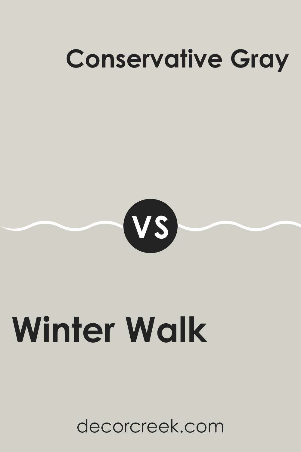
Winter Walk SW 9628 by Sherwin Williams vs Conservative Gray SW 6183 by Sherwin Williams
“Winter Walk” and “Conservative Gray” by Sherwin Williams are both subtle, neutral colors, but they bring unique vibes to any space. “Winter Walk” is a cooler tone that gives a fresh and airy feel, making it great for creating a peaceful, calm environment.
It reflects light beautifully, which can help make small rooms appear more spacious. On the other hand, “Conservative Gray” leans towards a warmer gray. This color offers a cozy feeling and works well in spaces where you want to add a bit of warmth without overwhelming the area with darker colors.
It pairs excellently with both light and dark furnishings, making it quite versatile for different decor styles. In summary, while both colors are gray, “Winter Walk” is cooler and lighter, whereas “Conservative Gray” is warmer and can add a subtle hint of warmth to a room.
You can see recommended paint color below:
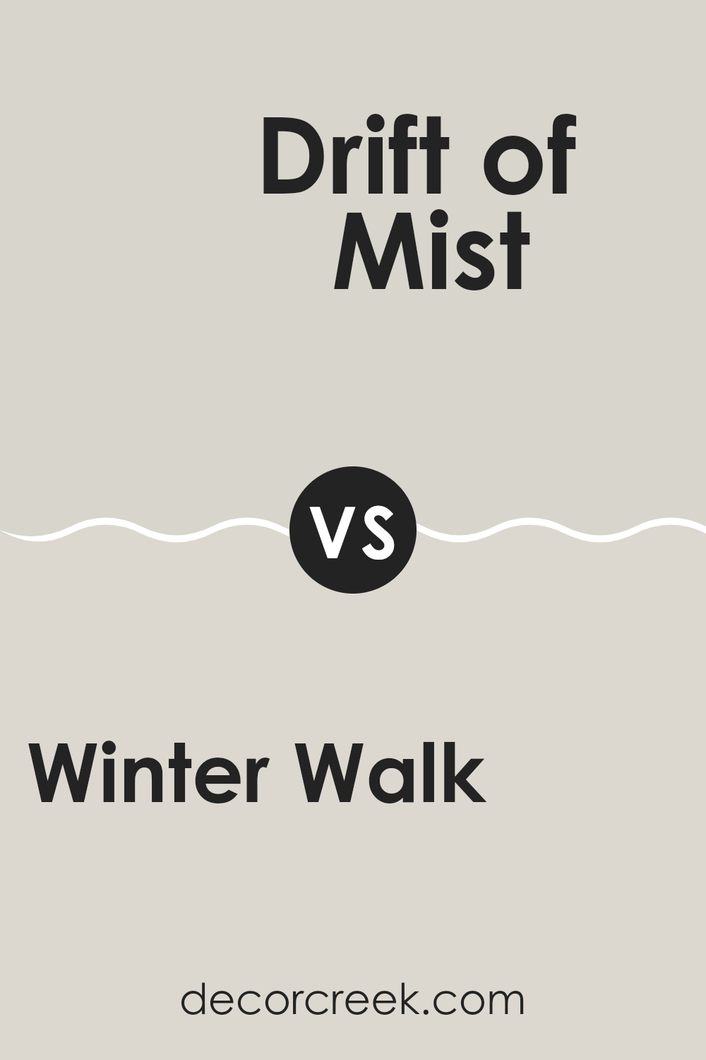
Winter Walk SW 9628 by Sherwin Williams vs Drift of Mist SW 9166 by Sherwin Williams
Winter Walk and Drift of Mist, both by Sherwin Williams, present subtly different tones that could influence the feel of a room. Winter Walk has a gentle gray shade that leans slightly toward blue, giving it a fresh, cool undertone. This color is perfect for creating a calm, composed atmosphere in spaces such as bedrooms and bathrooms, where you want a crisp, clean vibe.
On the other hand, Drift of Mist is also a light gray, but it has a warmer beige undertone, making it feel cozier and more inviting. This makes it ideal for living areas, hallways, and kitchens, where a touch of warmth can make the spaces feel more welcoming.
When comparing these two colors, think about the effect you want to achieve in your space. If you prefer cooler tones that offer a sense of calmness, Winter Walk is a great choice. For those looking for something that gives off a little warmth, Drift of Mist will do the trick. Both colors are versatile enough to work well in a variety of decorating styles.
You can see recommended paint color below:
Winter Walk SW 9628 by Sherwin Williams vs Limewash SW 9589 by Sherwin Williams
Winter Walk and Limewash, both from Sherwin Williams, offer distinct moods for interior spaces. Winter Walk is a deep, rich gray that carries a strong presence, making it ideal for creating a cozy and grounded atmosphere. It’s a color that pairs well with various decor styles, providing a steady, calming influence in a room.
Limewash, on the other hand, is much lighter, featuring a gentle, creamy off-white tone. This color is perfect for brightening up a space and giving it a fresh, airy feel. It works great in smaller rooms or areas with limited natural light, as it helps to make spaces appear larger and more open.
Together, these colors could work well in a complementary fashion. Winter Walk could anchor the space on accent walls or trim, while Limewash could fill the room with lightness on larger wall areas. This combination allows for a balanced, inviting environment.
You can see recommended paint color below:
Winter Walk SW 9628 by Sherwin Williams vs Skipping Rocks SW 9551 by Sherwin Williams
“Winter Walk” and “Skipping Rocks” are two colors by Sherwin Williams that offer subtle yet distinct tones suitable for creating calm and pleasant spaces. “Winter Walk” is a soft gray that leans towards a cool undertone, offering a fresh and clean look. It’s an excellent choice for modern spaces, as it brings a sense of calm without making the room feel cold.
On the other hand, “Skipping Rocks” is also a light gray, but with a warmer, almost beige undertone. This color is perfect for those who want a neutral backdrop that feels cozy and welcoming. It pairs well with a wide range of decor styles, from rustic to contemporary, making it very versatile.
Both colors are light enough to make small rooms appear larger and airy, yet have enough saturation to stand out as deliberate choices in a color scheme. Whether you choose the cooler “Winter Walk” or the warmer “Skipping Rocks” depends on the mood and style you want to achieve in your space.
You can see recommended paint color below:
In wrapping up my thoughts on SW 9628 Winter Walk by Sherwin Williams, I really think it’s a super cool paint color! It reminds me of soft winter mornings when everything is quiet and covered in a light layer of frost. It’s like the fluffy white parts of a snowman mixed with cloudy skies. This color can make any room in your house feel calm and cozy, just like when you’re wrapped up in a warm blanket.
It’s perfect for rooms where you like to chill out, read books, or play games. It’s kind of like having a little bit of winter magic inside your home, but without the cold! If you’re thinking about giving your room a new look, Winter Walk is a friendly and calming choice. It works really well in bedrooms, living rooms, and even bathrooms, making them look clean and fresh.
So if you ask me, going with SW 9628 Winter Walk is a fantastic idea. It will make your room feel new and refreshing, plus it’s like bringing a piece of the peaceful winter indoors! If you like the idea of having a room that’s calm, bright, and happy, I’d definitely say give this color a go.
Ever wished paint sampling was as easy as sticking a sticker? Guess what? Now it is! Discover Samplize's unique Peel & Stick samples.
Get paint samples

