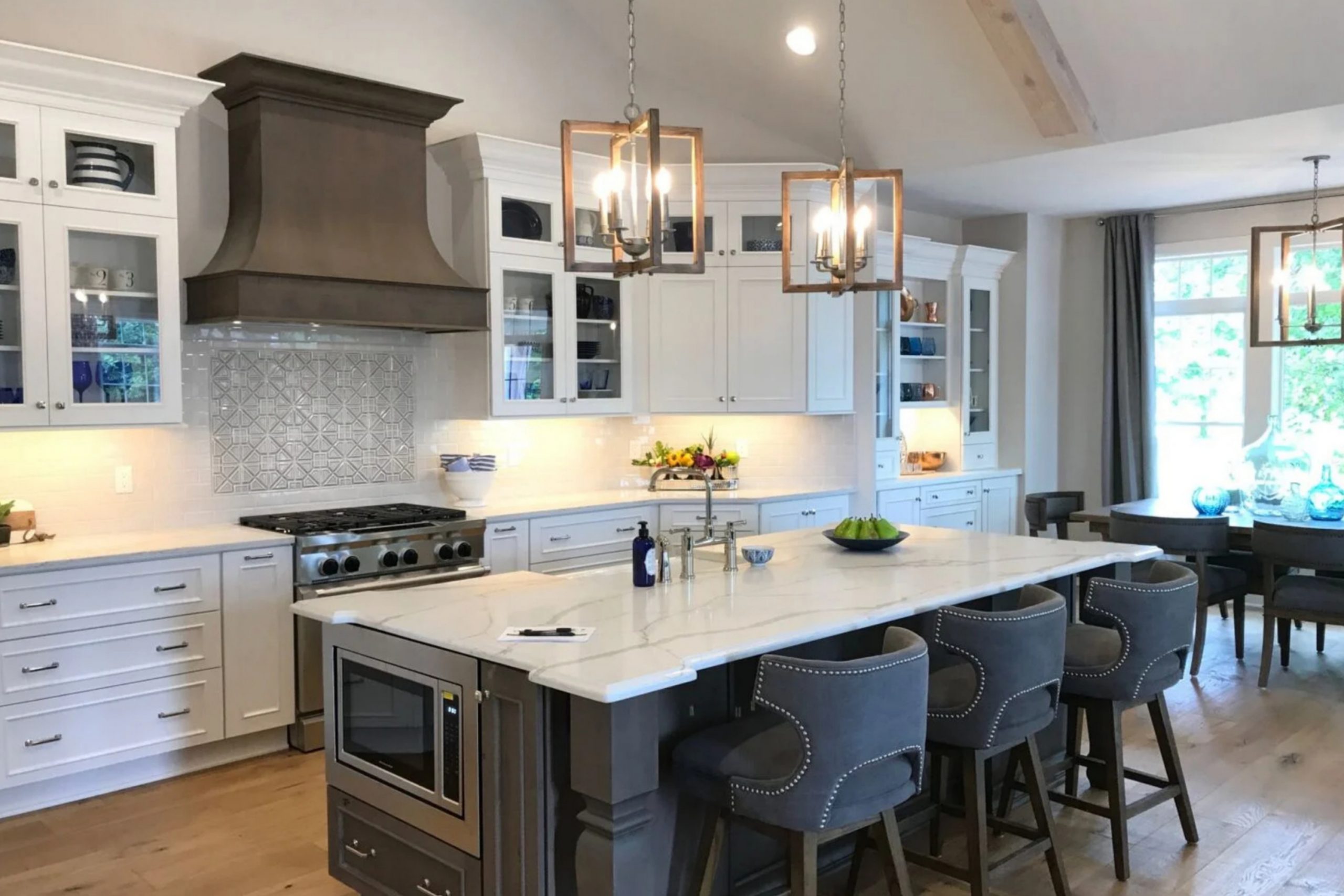
If you just think about walking into a room where the walls seem to breathe with a calming freshness. That’s the feeling Windfresh White by Sherwin Williams creates in a space. This color is not just white; it has a subtle quality that makes it different from ordinary shades. You might notice how it gently brightens a room without overwhelming the senses. It’s like stepping into a light, airy field on a cool day.
Windfresh White offers a clean and refreshing backdrop that works wonderfully with a variety of decor styles. It doesn’t scream for attention, yet it holds its own, elegantly blending with both contemporary and classic designs.
You might appreciate how it complements wooden textures, vibrant art pieces, or colorful upholstery. In your home, this shade can be the perfect canvas, highlighting your personal touches while maintaining its charm.
It’s interesting how such a simple color can evoke a sense of serenity and spaciousness. In an environment filled with hustle and bustle, having a room painted in Windfresh White can make it feel like your personal retreat. You might find it perfect for any room where you want to foster a sense of calm and clarity, allowing you to unwind and enjoy.
What Color Is Windfresh White SW 7628 by Sherwin Williams?
Windfresh White (SW 7628) by Sherwin Williams is a versatile and subtle off-white paint color. It is a soft, inviting shade that can create a light and airy atmosphere in any room. This color has a gentle warmth to it, making spaces feel cozy without being too yellow or too stark.
It works beautifully in a variety of interior styles, from modern and minimalist to classic and traditional. Its neutral nature allows it to function well in both contemporary and rustic settings.
In a modern style, Windfresh White can be used on walls to provide a clean backdrop that highlights sleek furniture and bold artwork. For a traditional setting, it complements wood tones, adding a touch of brightness to darker furnishings.
When it comes to materials and textures, Windfresh White pairs well with natural elements like wood and stone, enhancing their inherent textures. It also looks great alongside metal fixtures and accessories, which can provide a striking contrast.
This color works effectively with soft textiles such as wool and cotton, helping to create a cozy and inviting environment. Whether used in living rooms, bedrooms, or kitchens, Windfresh White brings a fresh look and timeless appeal to any space.
Is Windfresh White SW 7628 by Sherwin Williams Warm or Cool color?
Windfresh White SW 7628 by Sherwin Williams is a versatile paint color that provides a soft, inviting atmosphere in a home. This shade is a light, muted white with subtle undertones of gray and beige, making it a popular choice for those seeking a neutral backdrop.
It offers a fresh, clean look that brightens up any space without overpowering it. This color works well in living rooms, kitchens, and bedrooms, giving each room a welcoming feel.
The gentle warmth in Windfresh White helps to create a cozy environment, which makes it ideal for both modern and traditional settings. Its neutral nature allows it to pair smoothly with various accents and furniture styles, enabling homeowners to easily change décor without requiring a new paint job. Whether used on walls, trim, or cabinets, this color enhances natural light, making rooms feel bigger and more open while maintaining a comfortable ambiance.
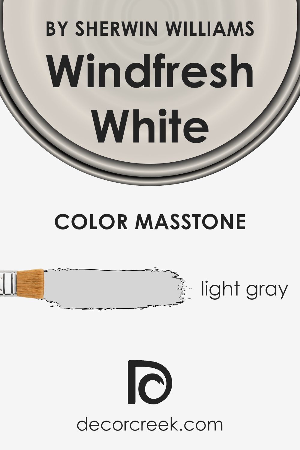
What is the Masstone of the Windfresh White SW 7628 by Sherwin Williams?
Windfresh White (SW 7628) by Sherwin Williams has a masstone of light gray (#D5D5D5). This gentle light gray hue gives a subtle and calming presence in homes. Because it’s a neutral color, it helps create a soothing environment that pairs well with many other colors. The light gray masstone makes the color versatile, ideal for almost any room in the house.
In living rooms or bedrooms, it acts as a blank canvas that complements both warm and cool tones. It works beautifully with wooden furniture, metallic accents, or colorful decor, adding balance to the space. In kitchens and bathrooms, it can make the area feel clean and open, enhancing natural light.
Windfresh White’s light gray undertone also makes it a great choice for small spaces, as it doesn’t overwhelm but instead creates an airy feeling. Its neutrality is friendly and adaptable, making it a popular choice among homeowners looking for a classic yet modern look.
How Does Lighting Affect Windfresh White SW 7628 by Sherwin Williams?
Lighting dramatically influences how colors appear, whether in natural or artificial settings. The color Windfresh White SW 7628 by Sherwin Williams is an example of a versatile color that can look different based on the lighting conditions in your home.
In natural light, colors can look brighter and more vibrant. Windfresh White, a soft and neutral color, takes on subtle variations depending on the direction the light is coming from. In north-facing rooms, where the light tends to be cooler and less intense, Windfresh White might appear a bit muted or less warm, highlighting any cool undertones it may have. This can create a calm and balanced look in the room.
In south-facing rooms, where the light is warmer and more abundant, Windfresh White can appear warmer and more inviting. The warm natural light brings out the creamy aspects of this color, making the room feel more lively and welcoming.
East-facing rooms get warm, yellowish light in the morning and cooler, bluish light in the afternoon. In these rooms, Windfresh White may appear warmer in the morning, complementing the glowing sunlight, while taking on a more neutral or cooler tone as the day progresses.
West-facing rooms receive cooler light in the morning and warm, intense light in the evening. Windfresh White might seem more neutral during the day and transition to a cozy, warm look as the evening approaches, when the sunlight becomes more golden and deep.
Under artificial light, the effects vary based on the type of bulb used. Warm incandescent or LED lights can enhance the warm aspects of Windfresh White.
In contrast, cooler fluorescent lighting might emphasize any cooler tones, possibly making the room feel more neutral or slightly muted, similar to the lighting condition in a north-facing room. Therefore, selecting proper lighting helps achieve the desired effect when using Windfresh White.
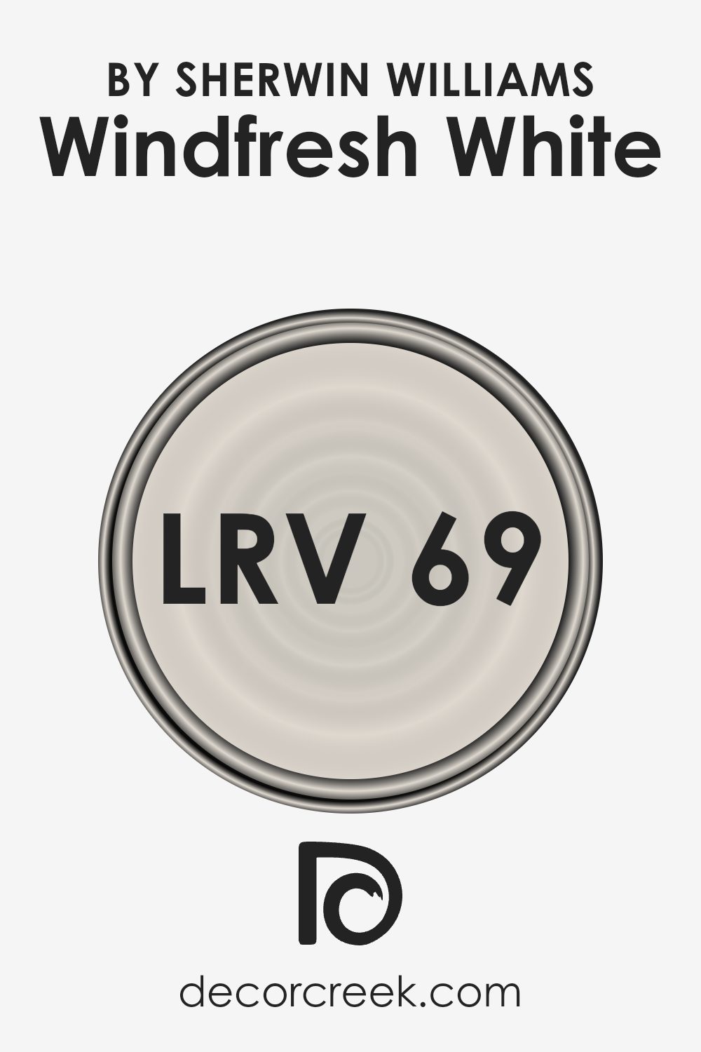
What is the LRV of Windfresh White SW 7628 by Sherwin Williams?
Light Reflectance Value (LRV) is a measure of how much light a color reflects. It is a percentage, where 0 means no light is reflected (pure black), and 100 means all light is reflected (pure white). So, when considering paint, LRV can tell you how bright or dark a color will appear.
Higher LRV numbers mean a color reflects more light, making a room feel brighter and more open. Lower LRV numbers mean the color absorbs more light, which can make spaces feel smaller and cozier.
For the color Windfresh White, which has an LRV of 69.18, it reflects a good amount of light. This means it would bright up a space pretty well without making it feel too stark or washed out. Windfresh White would work well in rooms where you want to keep things light and airy, like living rooms or bedrooms, because it bounces a lot of natural light around. It can help make a room feel more open and spacious, especially if the room doesn’t get a lot of natural light to begin with.
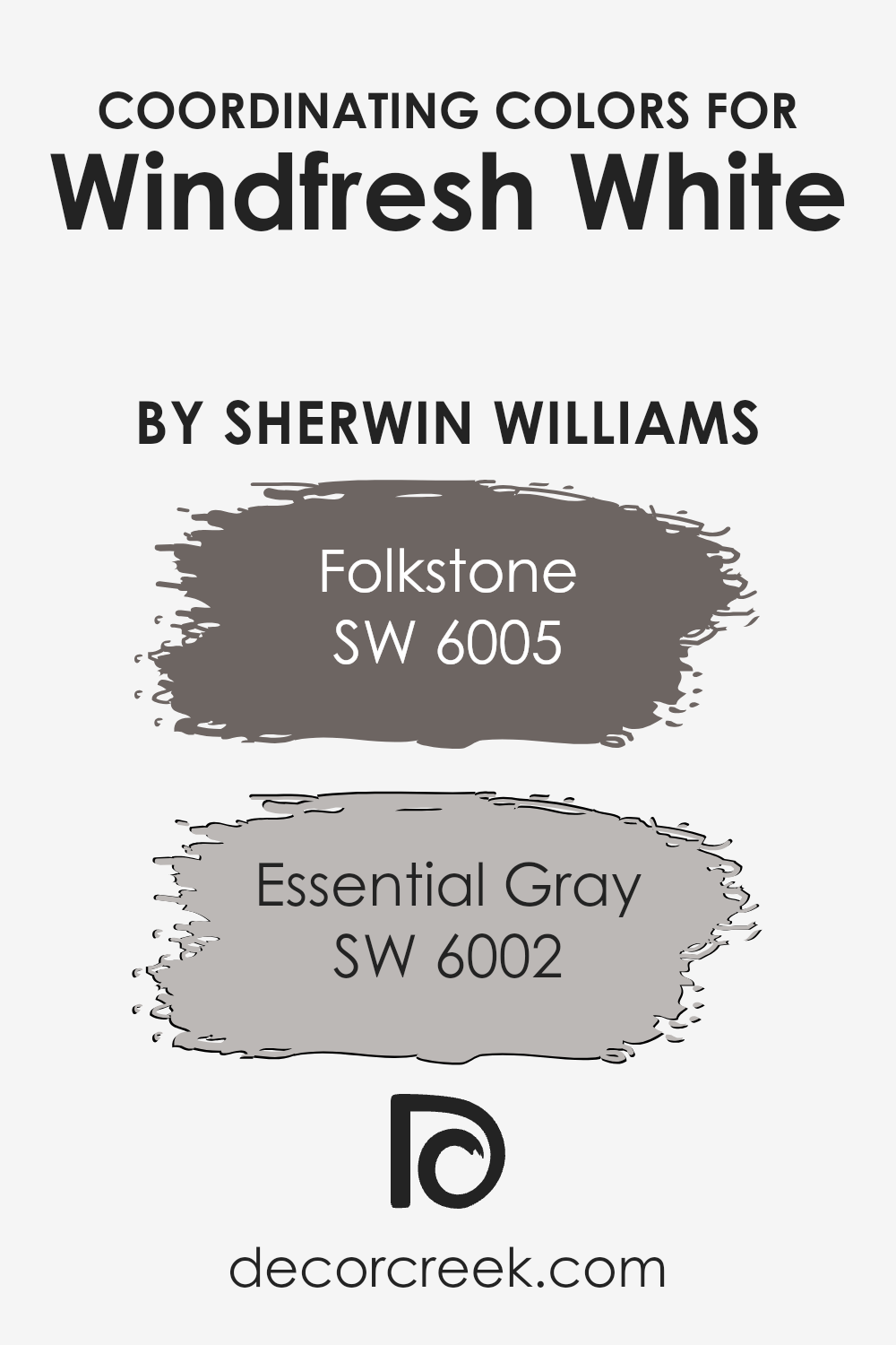
Coordinating Colors of Windfresh White SW 7628 by Sherwin Williams
Coordinating colors are hues that go well together and create a harmonious look in a space. They can complement or contrast with each other, but their main purpose is to enhance the overall color scheme of a room. When choosing colors to go with Windfresh White by Sherwin Williams, it’s important to consider tones that work seamlessly with its soft and welcoming appearance. Folkstone and Essential Gray are great choices that pair beautifully with this white.
Folkstone, a warm gray, has a subtle depth that can add a sense of comfort and coziness to a room. Its balanced mix of gray and warmth makes it versatile and suitable for various styles. Essential Gray is a lighter gray with cool undertones that offer a refreshing feel.
It can bring a peaceful touch while maintaining a modern and clean ambiance. Both of these grays work excellently with Windfresh White, allowing you to create a cohesive yet visually interesting space without overwhelming it. Combining these colors can lead to an inviting and well-coordinated environment.
You can see recommended paint colors below:
- SW 6005 Folkstone
- SW 6002 Essential Gray
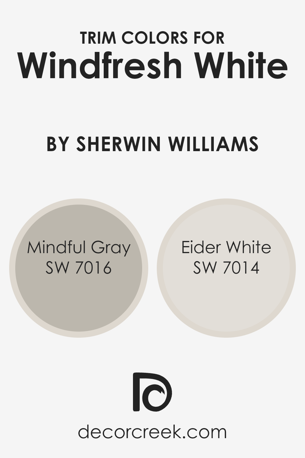
What are the Trim colors of Windfresh White SW 7628 by Sherwin Williams?
Trim colors are the colors used on the moldings, baseboards, and window frames in a room, and they play an important role in highlighting and defining spaces. For a wall color like Windfresh White by Sherwin Williams, trim colors can enhance the overall look and feel of the room. Choosing the right trim color can make the walls stand out more and give the room a well-finished appearance.
When using a light and airy color like Windfresh White, it is important to select trim colors that complement and add dimension to the space, ensuring that everything works together harmoniously.
Mindful Gray (SW 7016) and Eider White (SW 7014) are excellent choices for trim colors alongside Windfresh White. Mindful Gray is a warm, soft gray that adds subtle contrast without feeling harsh or overpowering. It can make the room feel cozy and inviting. Meanwhile, Eider White is a very light grayish-white with a hint of warmth, providing a gentle transition between the walls and trim.
Using Eider White as a trim color helps to maintain a clean and bright look, keeping the focus on the openness of the room. Both colors work well to frame Windfresh White, making them ideal selections to achieve a balanced and pleasing result.
You can see recommended paint colors below:
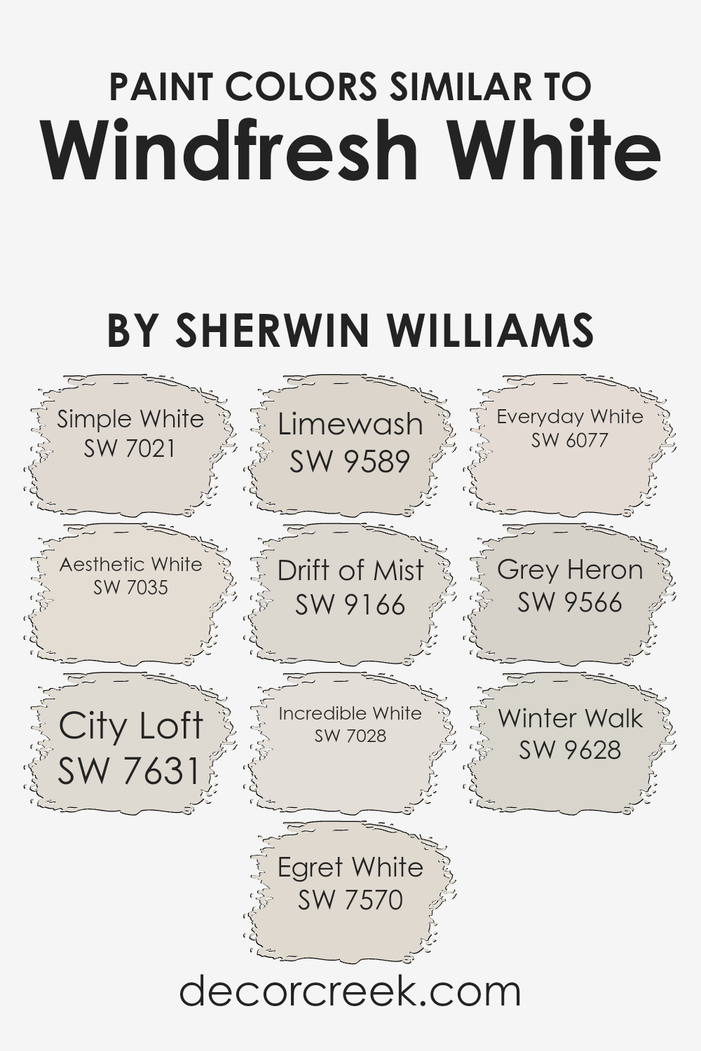
Colors Similar to Windfresh White SW 7628 by Sherwin Williams
Similar colors are key in design because they create harmony and balance in a space. They are colors that share the same undertones, making them work well together by preventing any one color from standing out awkwardly. Windfresh White by Sherwin Williams has several colors that are closely related to it and can be used interchangeably to achieve a similar calming effect.
Simple White is a soft, clean shade that provides a perfect backdrop without making a room look too stark. Aesthetic White carries warm undertones, offering a cozy and inviting feel to any space. City Loft is a light, neutral hue that adds a touch of elegance without being overpowering.
Egret White is another neutral with a hint of warmth, making it versatile for any room. Limewash, with its subtle rustic charm, gives walls a textured and aged appearance. Drift of Mist has a light and airy quality, making rooms feel open and fresh. Incredible White is slightly brighter, infusing spaces with a crisp and clean vibe.
Everyday White offers a subdued touch, perfect for creating a peaceful environment. Grey Heron adds a slight grey tint, perfect for adding a bit of depth and Winter Walk, with a cool undertone, evokes the calmness of a winter morning. Each of these colors works alongside Windfresh White to create soothing and cohesive designs.
You can see recommended paint colors below:
- SW 7021 Simple White
- SW 7035 Aesthetic White
- SW 7631 City Loft
- SW 7570 Egret White
- SW 9589 Limewash
- SW 9166 Drift of Mist
- SW 7028 Incredible White
- SW 6077 Everyday White
- SW 9566 Grey Heron
- SW 9628 Winter Walk
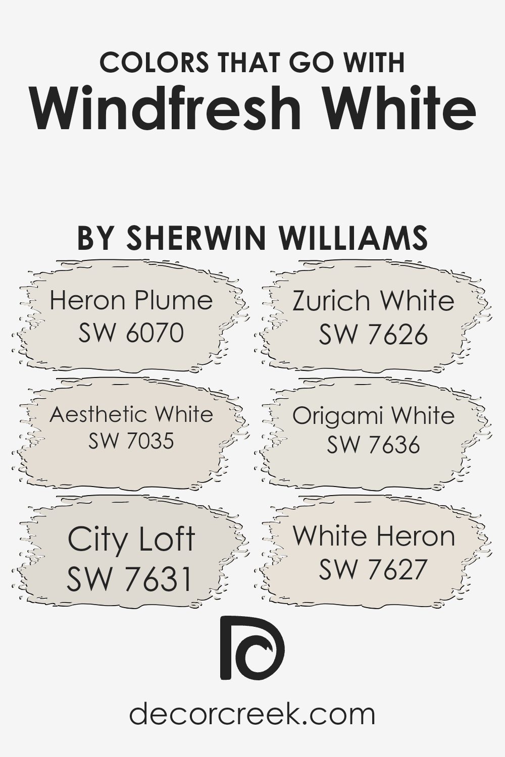
Colors that Go With Windfresh White SW 7628 by Sherwin Williams
Windfresh White SW 7628 by Sherwin Williams is a versatile color that works beautifully in a variety of settings. Its soft and subtle nature makes it an excellent backdrop or complement to a variety of other colors. Choosing colors that go well with Windfresh White is important because they help create a harmonious and cohesive space while enhancing the overall ambiance.
Pairing it with other shades like Heron Plume SW 6070 adds a graceful, gentle contrast. Heron Plume has a touch of warmth, which brings out the creamy undertones in Windfresh White, offering a gentle balance. Aesthetic White SW 7035 is another subtle companion, with just enough depth to add dimension without overpowering the room.
City Loft SW 7631 has a slightly cooler and more modern feel, which works when you want a crisp and clean look while still maintaining warmth. Zurich White SW 7626 stays close to Windfresh White’s nature, providing a seamless flow with just a hint more brightness. Origami White SW 7636, on the other hand, offers a delicate and calming addition, adding a light and airy touch to spaces.
Finally, White Heron SW 7627 brings in a slightly warmer undertone, which can create an inviting and cozy atmosphere, perfect for living spaces. Together, these colors complement Windfresh White beautifully, enhancing the overall style of any room.
You can see recommended paint colors below:
- SW 6070 Heron Plume
- SW 7035 Aesthetic White
- SW 7631 City Loft
- SW 7626 Zurich White
- SW 7636 Origami White
- SW 7627 White Heron
How to Use Windfresh White SW 7628 by Sherwin Williams In Your Home?
Windfresh White by Sherwin Williams is a versatile and neutral paint color that can be a great choice for any home. It offers a soft, clean look without being too bright or stark, making it perfect for creating a welcoming atmosphere.
Using Windfresh White on the walls can open up a room, making it feel spacious and airy. It’s a perfect backdrop that allows furniture and decor to stand out, providing a clean slate for any style, whether modern, traditional, or eclectic.
This color is ideal for living rooms, bedrooms, and kitchens, as it complements both warm and cool tones. Pair it with dark wood furniture for contrast or with lighter pieces and textures for a cohesive look. Adding splashes of color with accessories, like pillows and artwork, can give your space a personalized touch. Windfresh White is an excellent choice for a fresh, timeless look throughout your home.
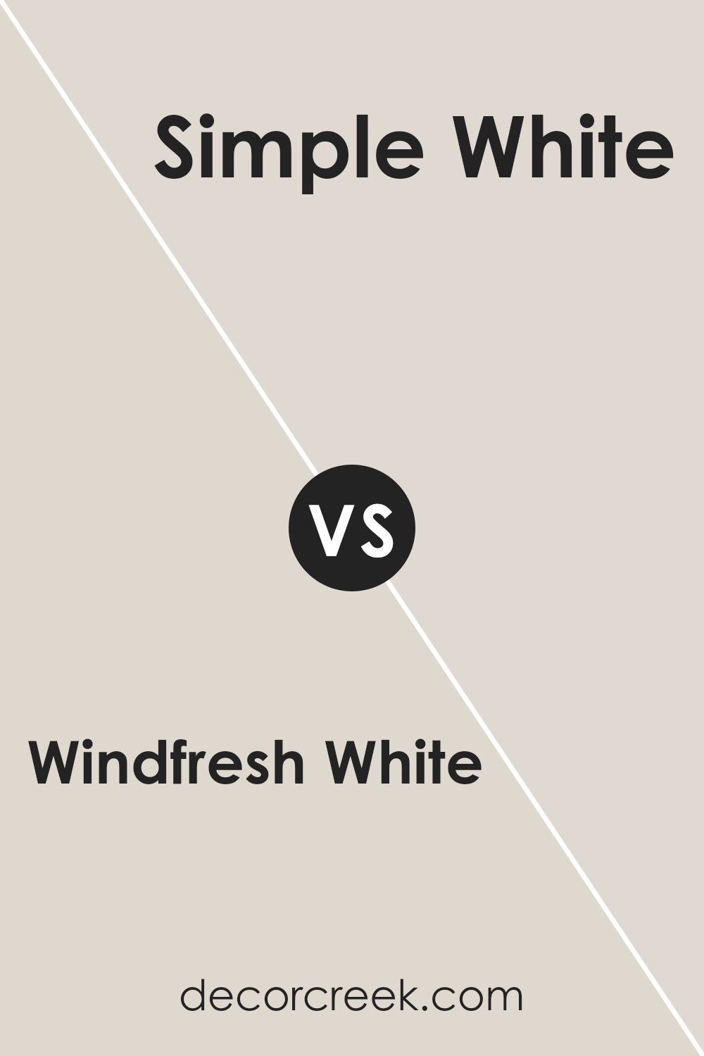
Windfresh White SW 7628 by Sherwin Williams vs Simple White SW 7021 by Sherwin Williams
Windfresh White SW 7628 and Simple White SW 7021 by Sherwin Williams are both popular choices for neutral, light-colored paints, each offering a unique feel. Windfresh White has a soft, creamy undertone that gives a room a warm, inviting atmosphere.
It’s perfect for creating a welcoming and cozy space. In contrast, Simple White is very clean and bright with a pure, almost crisp appearance. It brings more of a fresh and airy feel to a room.
When comparing, Windfresh White works well if you want a bit more warmth, while Simple White is great for modern and minimalist designs with its straightforward brightness. Both colors serve as excellent backdrops, making them versatile for different styles. Your choice between the two would depend on whether you’d prefer your space to feel extra bright and white or slightly warmer and softer.
You can see recommended paint color below:
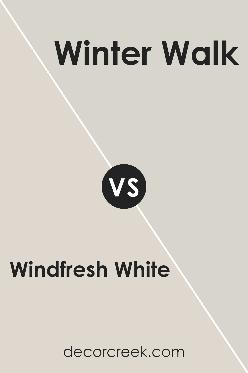
Windfresh White SW 7628 by Sherwin Williams vs Winter Walk SW 9628 by Sherwin Williams
Windfresh White (SW 7628) and Winter Walk (SW 9628) are both popular colors by Sherwin Williams, each offering a distinct feel. Windfresh White is a light, airy color that brings brightness and a clean look to any space. It’s versatile and can be used in various settings, making it a go-to choice for those who want a fresh atmosphere.
On the other hand, Winter Walk is slightly cooler and has subtle gray undertones. It provides a more muted, calm ambiance, which can be perfect for creating a cozy and relaxing environment. While Windfresh White enhances light and openness, Winter Walk offers a more subdued and comfortable vibe.
Choosing between these two colors depends on the mood you want to set in your space: Windfresh White for a brighter, more open feel, or Winter Walk for a softer, more calming effect.
You can see recommended paint color below:
- SW 9628 Winter Walk
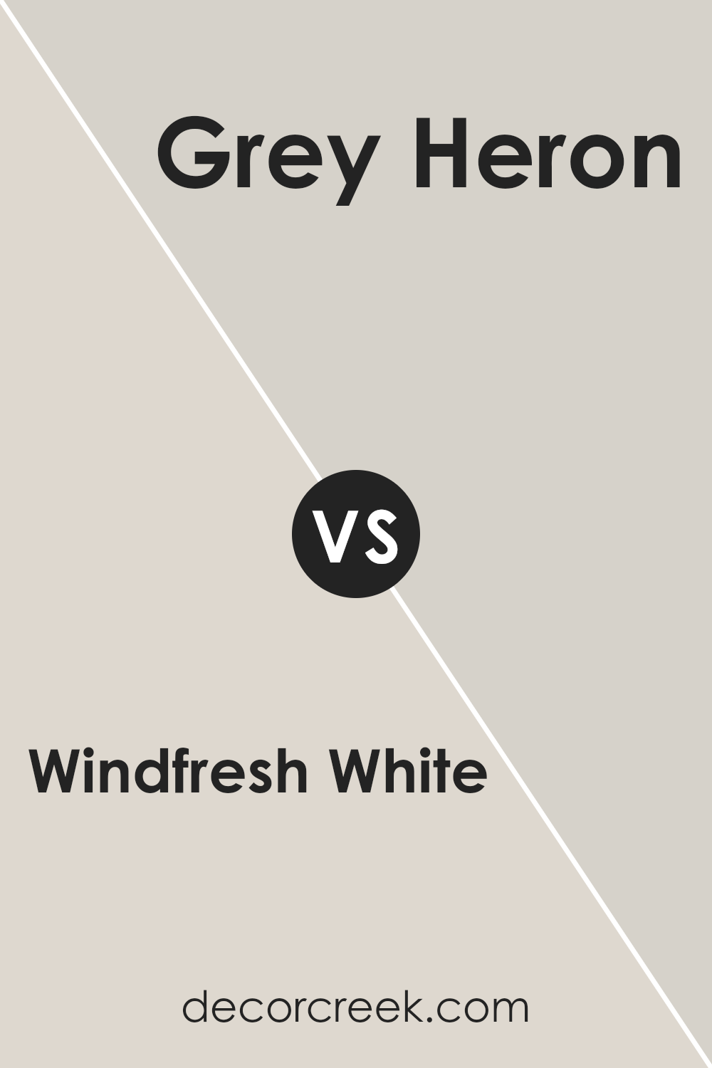
Windfresh White SW 7628 by Sherwin Williams vs Grey Heron SW 9566 by Sherwin Williams
Windfresh White (SW 7628) and Grey Heron (SW 9566) by Sherwin Williams are both versatile colors but convey different moods in a space. Windfresh White is a soft, warm white with hints of beige, making it an excellent choice for creating a welcoming and airy atmosphere. It’s perfect for spaces where you want a clean look without feeling too stark.
On the other hand, Grey Heron is a subtle, muted grey with a touch of warmth, providing a calm and modern feel. It’s a versatile shade that pairs well with various colors and can add depth to a room without overpowering it.
While Windfresh White keeps a space bright and open, Grey Heron offers a more grounded and cozy ambiance. Both colors work well together, with Windfresh White serving as the primary backdrop and Grey Heron adding accents through furniture, trim, or feature walls.
You can see recommended paint color below:
- SW 9566 Grey Heron
Windfresh White SW 7628 by Sherwin Williams vs Egret White SW 7570 by Sherwin Williams
Windfresh White (SW 7628) and Egret White (SW 7570) by Sherwin Williams are both popular neutral shades, offering subtle differences that can influence a room’s feel. Windfresh White is a soft, warm white that leans slightly towards taupe, providing a cozy and inviting backdrop for interiors. It works well in spaces where you desire a touch of warmth without being too overpowering.
On the other hand, Egret White is slightly cooler and has a hint of gray. This gives it a more muted and sophisticated appearance. It is ideal for rooms where you want a calm and understated look, complementing both modern and traditional furnishings.
Both colors are versatile, but the choice between them depends on the mood you want to create. Windfresh White adds warmth and works well in sunny spaces, while Egret White’s cooler tone pairs beautifully with a variety of color schemes and materials.
You can see recommended paint color below:
Windfresh White SW 7628 by Sherwin Williams vs City Loft SW 7631 by Sherwin Williams
Windfresh White (SW 7628) and City Loft (SW 7631) are both versatile, neutral colors offered by Sherwin Williams, but they each bring a distinct character to a space. Windfresh White is a soft, inviting shade that leans toward a warm white, making it perfect for creating a light, airy atmosphere. It’s great for open areas where you want a clean but cozy feel.
City Loft, on the other hand, has a bit more depth, with an undertone of gray that gives it a slightly cool edge compared to Windfresh White. This makes City Loft an excellent choice if you’re looking to add a hint of modernity to your interior. It works well in spaces where you want a neutral backdrop with a bit more substance and contrast.
Together, these colors offer a nice balance depending on the mood and style you’re aiming for, with Windfresh White being softer and City Loft providing a touch more sophistication.
You can see recommended paint color below:
Windfresh White SW 7628 by Sherwin Williams vs Aesthetic White SW 7035 by Sherwin Williams
Windfresh White (SW 7628) and Aesthetic White (SW 7035) by Sherwin Williams are both soft, neutral colors, but they have distinct characteristics. Windfresh White is a light, airy shade with a hint of gray, which makes it feel clean and refreshing. It works well in spaces where you want a bright, neutral backdrop that isn’t stark white.
Aesthetic White, on the other hand, is a warm, off-white color with beige undertones. This makes it feel cozier and more inviting compared to Windfresh White. It’s a great choice for spaces where you want to add a touch of warmth while still maintaining a light and open feel.
While Windfresh White leans cooler, making it ideal for modern settings, Aesthetic White’s warmth suits traditional or transitional styles. Both are versatile, but the choice depends on whether you want a cooler, crisper atmosphere or a warmer, more welcoming vibe.
You can see recommended paint color below:
Windfresh White SW 7628 by Sherwin Williams vs Everyday White SW 6077 by Sherwin Williams
Windfresh White SW 7628 and Everyday White SW 6077 are both popular neutral colors from Sherwin Williams, but they have distinct differences. Windfresh White is a soft, muted off-white with slightly cool undertones. It can give a room a fresh and airy feel, making it ideal for spaces where you want a light and open atmosphere.
On the other hand, Everyday White SW 6077 is warmer, with a hint of beige. This color feels cozy and inviting, suitable for areas where you want a more comforting and warm ambiance. While Windfresh White leans more towards a crisp, clean look, Everyday White can add a touch of warmth without being overtly creamy.
Both colors are versatile and can complement a variety of styles, but your choice depends on whether you prefer a cooler or warmer white in your space.
You can see recommended paint color below:
Windfresh White SW 7628 by Sherwin Williams vs Drift of Mist SW 9166 by Sherwin Williams
Windfresh White and Drift of Mist are two popular colors by Sherwin Williams, both offering subtle, neutral tones that work well in a variety of settings. Windfresh White is a soft, warm white that gives a clean, crisp look to any space. It’s versatile and pairs well with both cool and warm colors, making it an excellent choice for walls, ceilings, and trim work.
On the other hand, Drift of Mist is a light gray with a touch of warmth. It is slightly darker than Windfresh White and can add more depth to a room. This color fits in well with modern and traditional designs and tends to complement wood tones beautifully.
Both colors are excellent for creating a calm and inviting atmosphere in your home. Windfresh White is perfect for brightening up spaces, while Drift of Mist adds a bit of character without being overwhelming. Choosing between them depends on whether you prefer a brighter look or a hint of gray.
You can see recommended paint color below:
Windfresh White SW 7628 by Sherwin Williams vs Limewash SW 9589 by Sherwin Williams
Windfresh White and Limewash by Sherwin Williams are both neutral colors, but they offer different vibes for a room. Windfresh White is a soft, off-white color with a hint of warmth. It’s versatile and can make any space feel light and open. It works well in areas where you want a clean and airy look.
Limewash, on the other hand, is a more earthy, muted color with subtle green undertones. It brings a touch of nature indoors and adds a cozy feeling to a room. While Windfresh White can act as a blank canvas that complements various other colors, Limewash adds a bit more character and works great in spaces where you want a touch of warmth without being too bold.
Both colors can effectively brighten a space, but Windfresh White tends to reflect light more, while Limewash offers a subdued, relaxed atmosphere. Depending on your design needs, either color could be a great choice.
You can see recommended paint color below:
- SW 9589 Limewash
Windfresh White SW 7628 by Sherwin Williams vs Incredible White SW 7028 by Sherwin Williams
Windfresh White SW 7628 by Sherwin Williams is a light, airy color with a hint of warmth. It creates a fresh and clean look, ideal for brightening up spaces and making a room feel open. It’s versatile, making it suitable for walls, ceilings, and trim.
Incredible White SW 7028, also by Sherwin Williams, is similarly light but has a subtle gray undertone. This gives it a slightly cooler appearance compared to Windfresh White. It’s a great choice if you want something that still feels bright but adds a touch of sophistication and neutrality.
Both colors are excellent for creating a bright atmosphere, yet they offer different vibes. Windfresh White has a breezy feel, while Incredible White brings a bit more depth with its gray undertone. Depending on your preference for warm or cool tones, you can choose between the warmth of Windfresh White and the soft, cooler look of Incredible White.
You can see recommended paint color below:
Conclusion
After spending time learning about SW 7628 Windfresh White by Sherwin Williams, I’ve come to think of it as more than just a color. It is a gentle shade that feels welcoming and comfortable, like a soft hug for your home. This paint color is bright and clean, making any room look fresh and lively.
Imagine a color that can make a room look bright without being too harsh. That’s what Windfresh White does. It’s like a gentle whisper, adding just the right amount of brightness. It’s a great choice for walls because it goes well with so many other colors. Whether you have bright blue furniture or dark wooden tables, Windfresh White helps everything look good together.
What I also like about this color is how it changes slightly with the light. In the morning sun, it feels warm and inviting. Later, with evening lights, it remains calm and restful. This makes it perfect for all times of the day.
In conclusion, if you want a color that feels friendly and can work anywhere in your house, Windfresh White is a wonderful choice. It makes any home feel happy and cozy, and that’s something we all want.

Ever wished paint sampling was as easy as sticking a sticker? Guess what? Now it is! Discover Samplize's unique Peel & Stick samples.
Get paint samples

