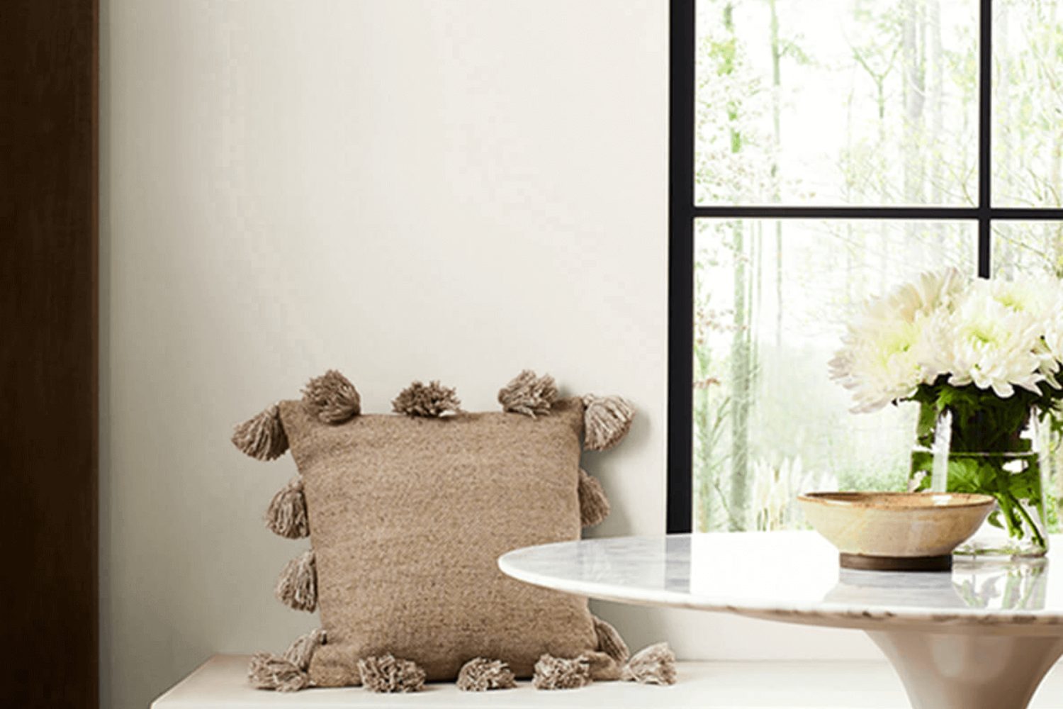
When it comes to choosing the perfect paint color for your space, it can often feel overwhelming with so many options available. However, one shade that has consistently stood out for its versatility and appealing neutrality is City Loft (7631) by Sherwin Williams.
This color is a soft, warm gray that strikes a delicate balance between a cozy, inviting atmosphere and a modern, sophisticated look. Its unique ability to adapt to different lighting conditions and complement various decor styles makes it a top choice for homeowners and interior designers alike.
City Loft is particularly favored for its understated elegance that doesn’t overpower a room but rather enhances its features. Whether you’re updating your living room, bedroom, or kitchen, this paint color offers a serene backdrop that can easily be accented with a range of colors and textures.
Moreover, its neutral base serves as an ideal canvas for showcasing art, furniture, and personal collections without causing visual clutter.
Choosing the right paint color is crucial in achieving the desired ambiance in your home, and City Loft provides a harmonious balance that is both inviting and stylish. If you’re on the lookout for a paint color that combines warmth with contemporary appeal, City Loft by Sherwin Williams might just be the perfect fit for your project.
What Color Is City Loft SW 7631 by Sherwin Williams?
City Loft is a neutral paint color from Sherwin Williams that brings a sense of calm and sophistication to any room. This color has a warm undertone, making it versatile and inviting. It’s like the soft, light gray of morning mist, providing a tranquil backdrop that can enhance various decor styles and elements within a living space.
This particular shade is especially fitting for modern and minimalist interiors, where its understated elegance can create a clean, airy feel. However, it’s also rich enough to work in traditional settings, adding a contemporary twist without overwhelming the room’s character. Its neutrality allows it to act as a canvas for bolder accents or to stand alone for a subtle, refined look.
City Loft pairs beautifully with natural materials, such as wood, which can add warmth and texture against its serene palette. Leather accents or furniture can introduce richness, contrasting nicely with its lightness, while metallic finishes like brass or copper can inject a touch of glamour.
In terms of textures, softer fabrics like linen or chunky wool throws can soften the space, making it more inviting and comfortable.
This color supports a wide range of interior styles and blends harmoniously with many materials and textures, offering endless possibilities for creating spaces that feel personalized and cohesive.
Is City Loft SW 7631 by Sherwin Williams Warm or Cool color?
City Loft by Sherwin Williams is a unique and versatile color that brings a light and airy feel to any space in a home. With its soft, neutral tones, it acts as a perfect backdrop, blending seamlessly with various decor styles, from modern to traditional.
This color has a way of opening up rooms, making them appear more spacious and inviting. Its understated elegance allows for endless creativity, encouraging the use of bold accents or subtle textures in furnishings and accessories without overwhelming the space.
Homeowners love using City Loft because it adapts well to natural lighting, subtly changing tones throughout the day to create a dynamic yet tranquil environment. Whether applied in a sunny kitchen or a cozy living room, it enhances the sense of comfort and serenity. Moreover, its neutrality promotes continuity, enabling a smooth transition between rooms, which is essential in open-floor plans. This adaptability makes it not just a color choice but a smart investment in creating a timeless and cohesive home environment.
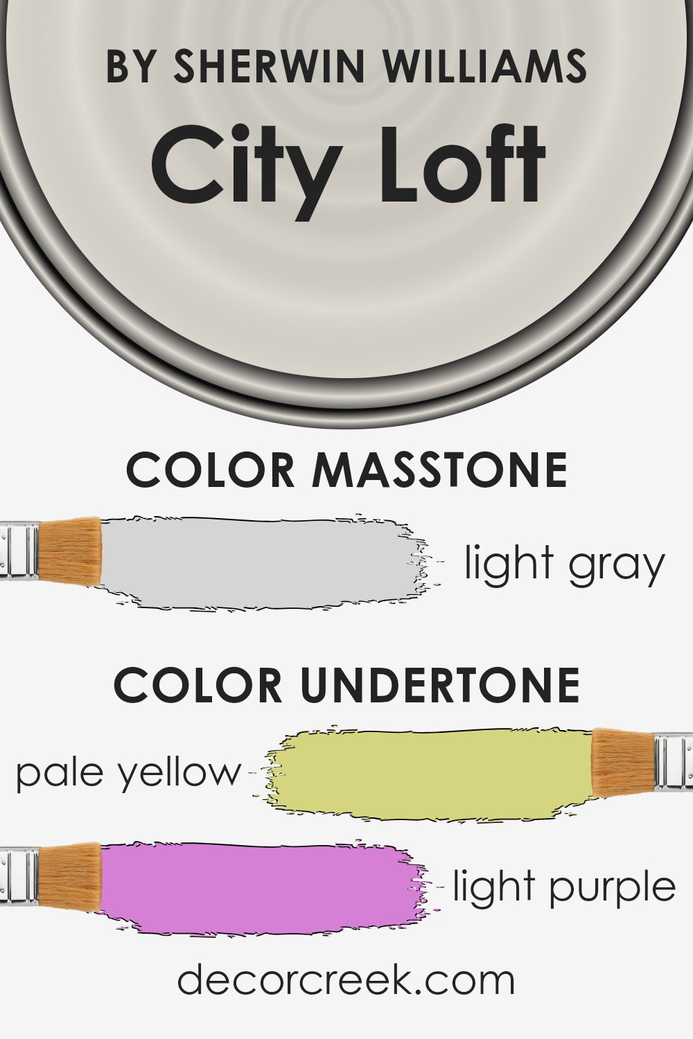
Undertones of City Loft SW 7631 by Sherwin Williams
City Loft is a versatile paint color that carries a mix of subtle undertones, ranging from pale yellow to lilac, including hints of light purple, light blue, pale pink, mint, and grey. These undertones play a crucial role in how we perceive the color because they can shift in appearance under different lighting conditions.
For instance, in a room flooded with sunlight, the pale yellow or light blue might become more pronounced, giving the space a brighter, more airy feel. Conversely, in a space with less natural light, the grey or lilac undertones might come forward, creating a more subdued and cozy atmosphere.
The blend of these undertones means that City Loft can adapt to various interior styles and complement a wide range of decor. On interior walls, the effect of these undertones becomes even more pronounced. The light and airy qualities can make small rooms feel more spacious, while the warmer hints of pink and yellow can add a subtle cozy glow to the space.
The cooler undertones, like mint and light blue, can help to create a calming and refreshing environment, ideal for bedrooms or bathrooms. In essence, the unique mix of undertones allows City Loft to be a highly adaptable color, capable of evoking different moods and styles depending on its setting and the accompanying decor. This makes it a go-to choice for those looking to strike a balance between warmth and coolness in their interior spaces.
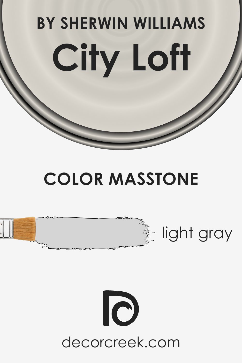
What is the Masstone of the City Loft SW 7631 by Sherwin Williams?
City LoftSW 7631 by Sherwin Williams has a masstone of light gray (#D5D5D5), a subtle and versatile color tone. This tone is great for homes because it creates a calm and soothing atmosphere, making spaces feel more open and airy. Its lightness reflects natural light beautifully, brightening up rooms and giving the illusion of more space. This makes it an excellent choice for smaller homes or areas with limited light.
Additionally, the light gray color can act as a neutral backdrop, allowing homeowners to experiment with various decor styles and color schemes. Whether you favor bold colors or prefer softer hues, this shade complements them all without overpowering the space. It’s particularly effective in modern and minimalist designs, where its simplicity can be a key feature, yet it also fits seamlessly into traditional settings.
Moreover, City Loft’s gentle tone can hide minor imperfections on walls better than stark white, making it a practical and stylish choice for everyday living. Its versatility and subtle elegance make it a go-to color for anyone looking to refresh their home’s appearance.
How Does Lighting Affect City Loft SW 7631 by Sherwin Williams?
Lighting plays a crucial role in how we perceive colors in our homes or any space. The same paint color can look different throughout the day or in various rooms because of the light. Let’s take a light, versatile gray color as our example to illustrate this point.
- In artificial light, the warmth or coolness of the bulbs can significantly affect how colors appear. Cool LED lights may bring out the more subtle blue or green undertones in the gray, making it look crisper and more modern. Warm incandescent bulbs, on the other hand, can soften the color, highlighting beige or warmer tones, and making the room feel cozy.
- Natural light changes the game entirely. Our sample gray color will transform depending on the direction of the room’s windows and the time of day. In north-faced rooms, light tends to be cooler and more consistent throughout the day. Here, the color may lean towards its cooler undertones, maintaining a more consistent appearance but possibly feeling a bit more austere.
- In south-faced rooms, abundant in warm, bright sunlight for most of the day, the color can warm up significantly, revealing any subtle warmth it possesses, making the room feel light and airy. This is where the color shines bright, feeling welcoming and cozy.
- East-faced rooms catch the morning sun, which is warmer and golden. Early in the day, our chosen gray will glow warmly, feeling inviting. As the day progresses, the light shifts and becomes cooler, making the color appear more neutral by afternoon.
- West-faced rooms experience the opposite effect. The later in the day it goes, the warmer the color becomes as it basks in the sunset’s glow. This means the color can transition from a neutral, true gray in the morning to a softer, warmer hue by evening.
Therefore, when choosing colors like our gray example for your space, consider the room’s orientation and the type of light it receives. This understanding will help you anticipate how the color will interact with the changing light, ensuring you achieve the desired mood and feel in your room at any time of the day.
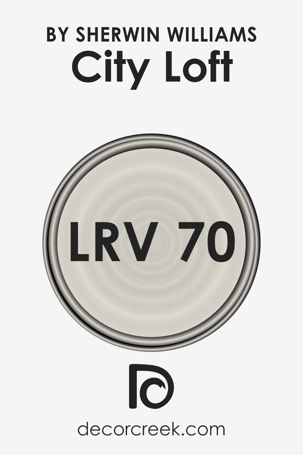
What is the LRV of City Loft SW 7631 by Sherwin Williams?
The LRV of City Loft (SW 7631) is 70.468, putting it on the lighter end of the scale. This means it has a good capacity to reflect light, making spaces appear larger and more airy. In rooms with plenty of natural light, this color can enhance the brightness, giving off a soft, luminous effect that can make the room feel more inviting.
In spaces with less natural light, utilizing a color with a high LRV like this can help make the room feel more open and less cramped, as it maximizes the available light. The choice of this specific LRV allows it to be versatile, working well in many different lighting conditions and helping improve the overall feel of the space it is used in.
Coordinating Colors of City Loft SW 7631 by Sherwin Williams
Coordinating colors are a set of hues selected to harmonize within a space, enhancing the overall aesthetic by balancing each other out. The idea is to choose colors that complement the primary color in a scheme, in this case, City Loft by Sherwin Williams, to create a cohesive and visually appealing environment.
These can range from contrasting shades that add a pop of color to subtle tones that create a soothing atmosphere. Importantly, the selection is rooted in achieving a balanced look that reflects one’s personal style while ensuring each color contributes positively to the space.
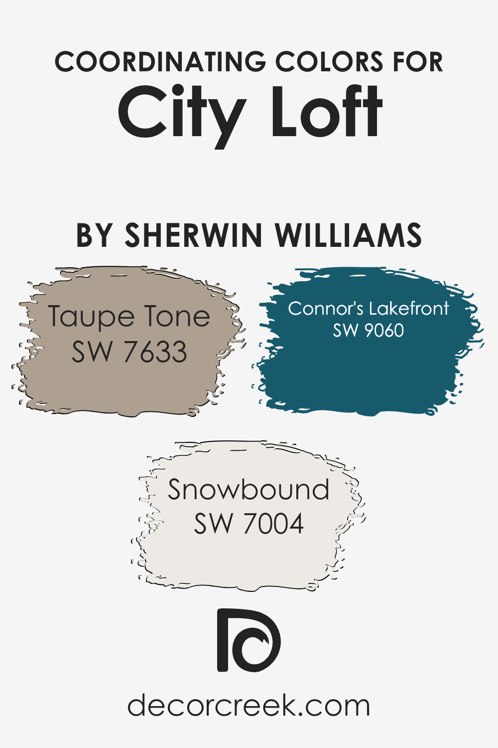
- For the City Loft shade, colors such as Taupe Tone, Snowbound, and Connor’s Lakefront serve as excellent coordinating colors.
- Taupe Tone is a warm, earthy neutral that brings a sense of calm and elegance to a room. It pairs beautifully with City Loft, grounding the space with its depth and warmth.
- Snowbound, on the other hand, is a crisp, clean white with a slight undertone that complements City Loft by providing a sharp contrast that highlights architectural features or trim, brightening the space without overwhelming it.
- Lastly, Connor’s Lakefront offers a serene, muted blue hinting at the natural elegance of a tranquil waterside retreat.
This color adds a subtle hint of color, bridging the gap between the neutrals for a harmonious look. Together, these coordinating colors work in concert to accentuate the beauty of City Loft, creating a welcoming and stylish environment.
You can see recommended paint colors below:
- SW 7633 Taupe Tone
- SW 7004 Snowbound
- SW 9060 Connor’s Lakefront
What are the Trim colors of City Loft SW 7631 by Sherwin Williams?
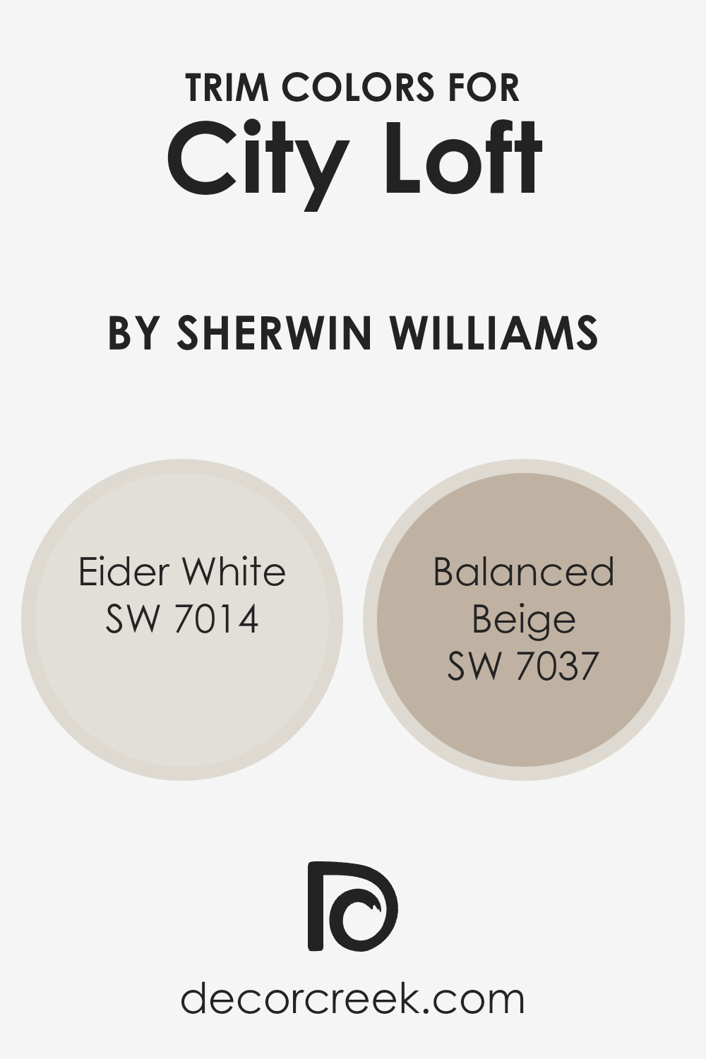
Trim colors are essentially the accents you select for the borders, moldings, and edges of your room, setting off the main wall color for a cohesive or contrasting look that adds depth and character. When you’re working with a versatile neutral like City Loft by Sherwin Williams, choosing the right trim colors is key to defining the vibe of the space.
Eider White and Balanced Beige are two excellent choices for trim, complementing City Loft in ways that can either soften the look for a more soothing atmosphere or add a bit of contrast to highlight architectural features.
Eider White, with its subtle touch of gray, acts like a soft whisper against the slightly deeper hue of City Loft, bringing a light, airy feel to the room that’s both refreshing and modern. On the other hand, Balanced Beige steps in with its warmer, earthy tones to ground the space, creating a welcoming and calm environment that feels effortlessly put together. Both these colors work in harmony with City Loft, ensuring that the final aesthetic is both polished and inviting, making any room feel like home.
You can see recommended paint colors below:
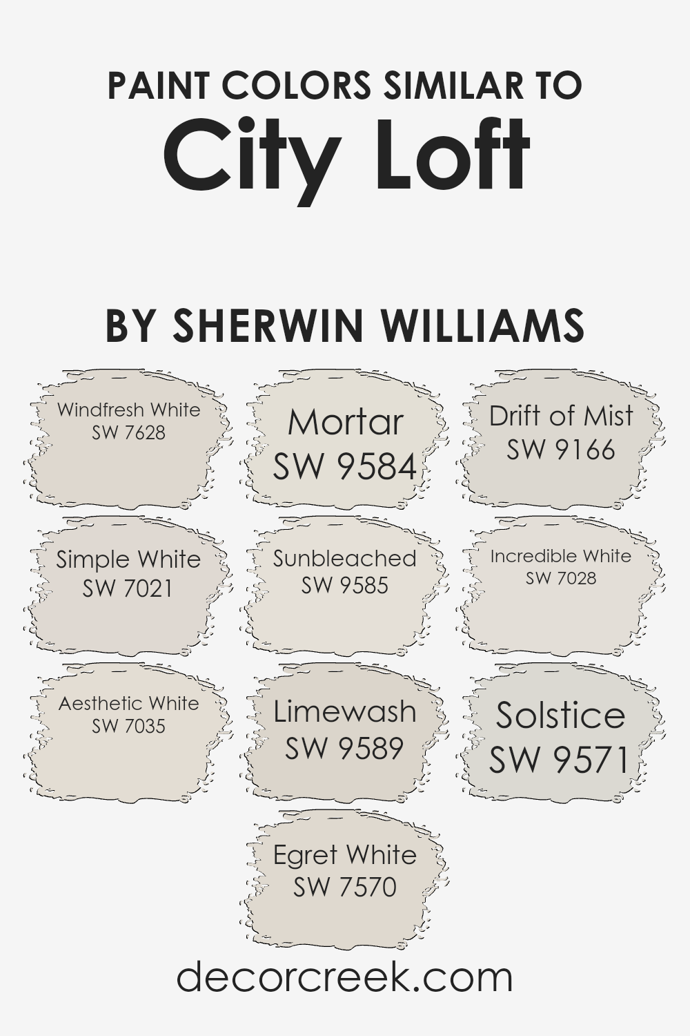
Colors Similar to City Loft SW 7631 by Sherwin Williams
Selecting similar colors can play a crucial role in creating a harmonious and aesthetically pleasing environment, especially when decorating or updating a space.
These colors, akin to City Loft by Sherwin Williams, share a common foundation yet offer subtle differences that can enhance the depth and dimension of an area without creating an overwhelming contrast.
Colors like Windfresh White, Simple White, and Aesthetic White, for instance, provide a clean, crisp backdrop that can make a room feel fresh and inviting. These shades are particularly useful in spaces that aim for a minimalist or modern vibe, as their slight variations play off each other without clashing.
On the other hand, tones like Egret White, Mortar, and Sunbleached introduce a warmer, cozier feel to a room, ideal for creating a more intimate and comfortable atmosphere. Colors such as Limewash, Drift of Mist, Incredible White, Solstice, and even the serene touch of Solstice, contribute not just to the visual appeal but also to the mood of the space.
Each of these colors, while close in spectrum to City Loft, has its unique personality. Egret White, for example, exudes a faint creamy warmth, whereas Drift of Mist offers a delicate, ethereal touch to the surroundings. The key lies in mixing these similar hues to achieve a layered look that is both complex and cohesive, allowing for a space that is rich in depth yet unified in its overall aesthetic.
You can see recommended paint colors below:
- SW 7628 Windfresh White
- SW 7021 Simple White
- SW 7035 Aesthetic White
- SW 7570 Egret White
- SW 9584 Mortar
- SW 9585 Sunbleached
- SW 9589 Limewash
- SW 9166 Drift of Mist
- SW 7028 Incredible White
- SW 9571 Solstice
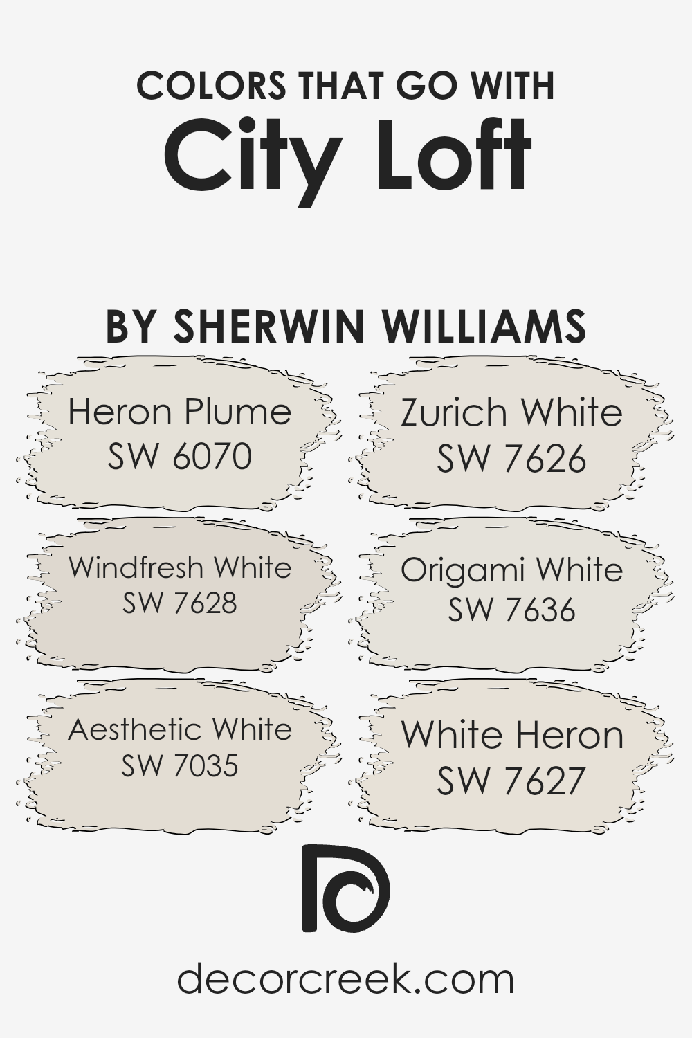
Colors that Go With City Loft SW 7631 by Sherwin Williams
Choosing the right colors to complement City Loft SW 7631 by Sherwin Williams is essential in creating a cohesive and appealing look in any space. Colors that pair well with City Loft, like SW 6070 – Heron Plume, SW 7628 – Windfresh White, and others, have a harmonious connection with City Loft, serving to enhance its warm, neutral base without overwhelming it.
These colors play a crucial role in bringing balance and flexibility to decorative choices, allowing for a range of themes from minimalistic to more elaborate designs. They work by either providing subtle contrasts that add depth and interest or by reinforcing a light and airy feel that enlarges a space visually.
- Heron Plume is a soft, airy color that instills a sense of calm and cleanliness, making it perfect for creating a serene environment.
- Windfresh White, on the other hand, offers a crisp brightness that can freshen up any room, reflecting light beautifully and making spaces appear more expansive.
- Aesthetic White lends a slightly warmer tone that is sophisticated yet inviting, perfect for spaces that aim for a cozy yet refined look.
- Zurich White adds a hint of coolness, giving a modern twist to any palette, while Origami White brings in a delicate balance between warm and cool tones, making it incredibly versatile.
- Lastly, White Heron stands out as a clean, pure hue that adds a crisp finish to the space, ensuring a timeless elegance.
Together, these colors complement City Loft by creating a palette that can adapt to various styles and preferences, enabling a personalized space that feels both unified and inviting.
You can see recommended paint colors below:
- SW 6070 Heron Plume
- SW 7628 Windfresh White
- SW 7035 Aesthetic White
- SW 7626 Zurich White
- SW 7636 Origami White
- SW 7627 White Heron
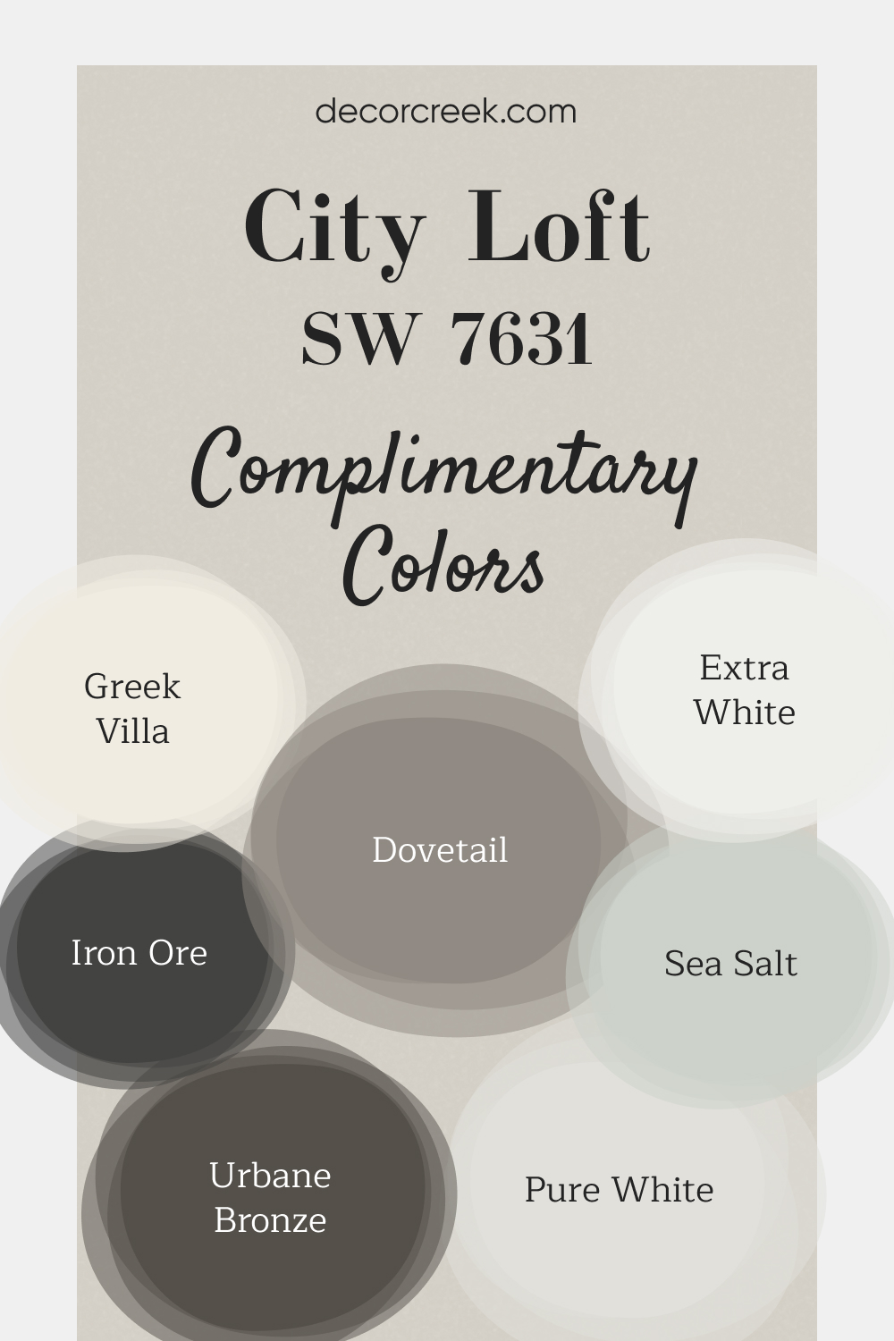
Complimentary Colors for City Loft SW 7631 Paint Color by Sherwin Williams
This paint palette from Sherwin Williams offers a perfect mix of soft neutrals and deep, grounding shades. City Loft provides a light, airy backdrop that works beautifully in any room, while Greek Villa and Pure White bring warm and crisp whites that brighten up the space.
Sea Salt adds a subtle, calming touch, making it ideal for bathrooms or bedrooms where you want a more serene atmosphere. To add contrast, Urbane Bronze and Iron Ore offer deep, bold accents that work well on doors, cabinets, or feature walls.
Dovetail is a versatile gray that can tie the whole look together, and Extra White finishes the palette with a fresh, clean tone that’s perfect for trim or ceilings. This combination allows you to create a cohesive and inviting design throughout your home.
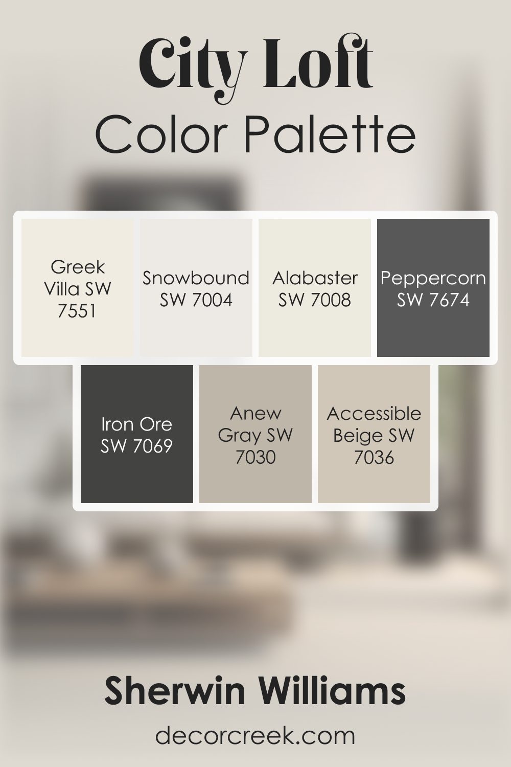
City Loft SW 7631 by Sherwin Williams Color Palette
City Loft has a light, delicate warmth that always makes a room feel soft and peaceful. I love pairing it with Alabaster and Snowbound for a bright, gentle foundation. Accessible Beige and Anew Gray add smooth layers that make the palette feel grounded and natural.
When I want bold contrast, Peppercorn and Iron Ore give the palette rich depth that still feels refined. Greek Villa adds a warm, creamy brightness that blends beautifully with City Loft’s quiet personality.
This palette feels soft, bright, and thoughtfully layered, perfect for creating a warm and inviting home.
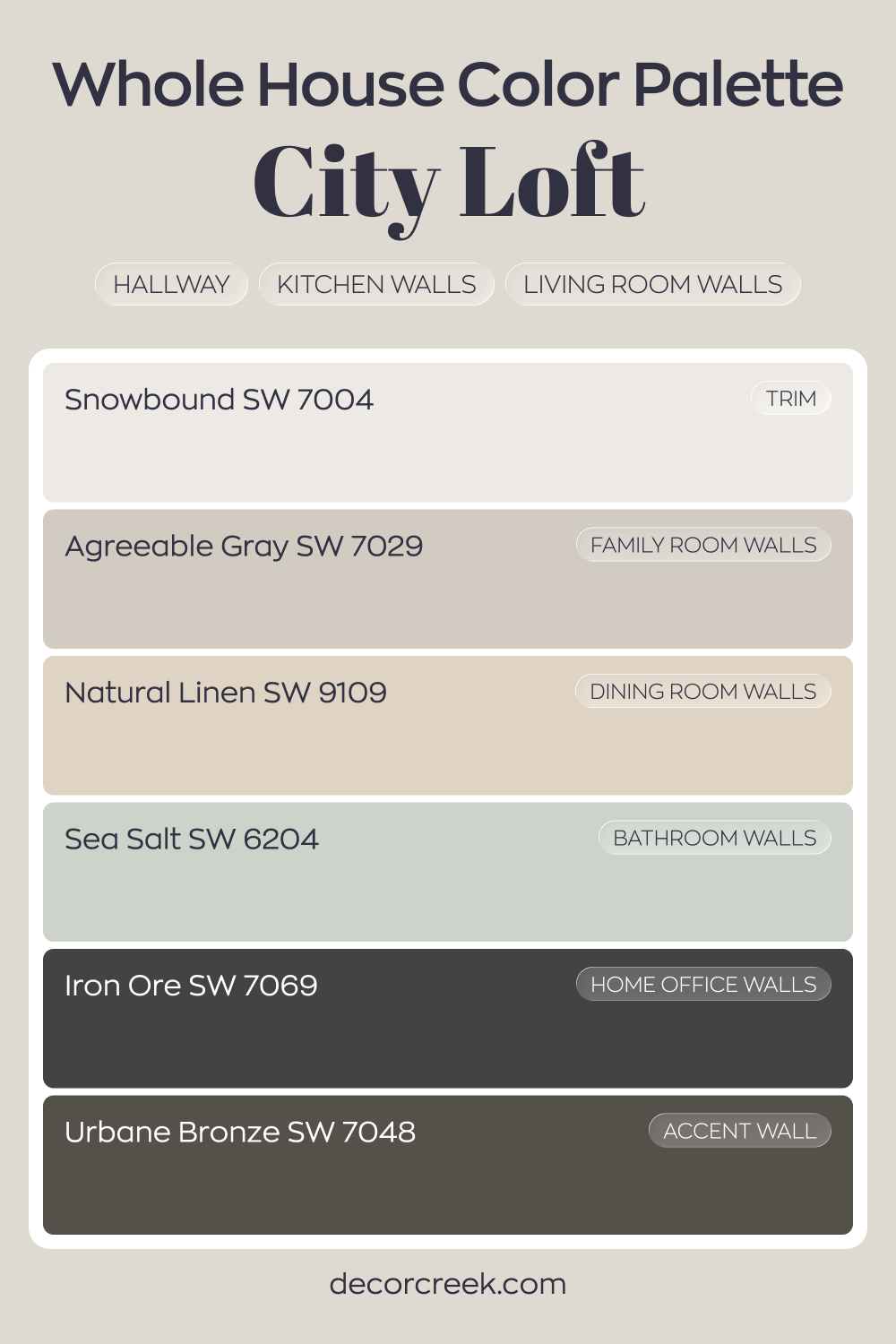
Whole House Paint Color Palette Built Around City Loft SW 7631
City Loft SW 7631 flows through the hallway, kitchen, and living room with a soft greige tone. Snowbound trim keeps the look crisp and defined. Agreeable Gray in the family room adds a gentle shift while staying within the same neutral family.
Natural Linen in the dining room warms the palette, creating a welcoming contrast to the cooler grays. Sea Salt in the bathroom introduces a light green-blue note that freshens the overall feel.
These tones work together for a smooth transition from room to room.
Iron Ore in the house office and Urbane Bronze on an accent wall add strong depth. The darker accents frame the lighter base colors, giving the house balance and structure.
How to Use City Loft SW 7631 by Sherwin Williams In Your Home?
City Loft SW 7631 by Sherwin Williams is a versatile paint color that’s like a breath of fresh air for any home. It’s a light, neutral shade that blends hints of gray and beige, making it perfect for those looking for something not too warm or too cool. This color shines in areas that receive lots of natural light, highlighting the space with a soft, elegant glow. It’s an ideal choice for living rooms and bedrooms, where you want a peaceful, airy feel that’s easy on the eyes.
Moreover, City Loft can serve as a fantastic backdrop for your furniture and decor, allowing your personal style to stand out without competing with the wall color. It works well in modern and traditional homes alike, offering a clean canvas that complements a wide range of furnishings, from colorful pieces to more neutral woods and metals. Whether you’re updating a single room or the entire house, City Loft adds a touch of sophistication and openness, transforming your space into a cozy, inviting haven.
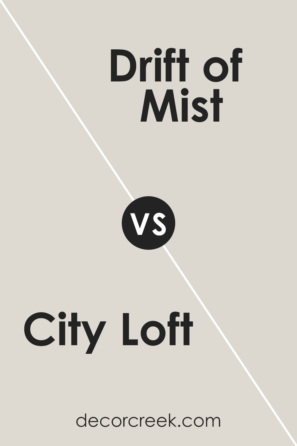
City Loft SW 7631 by Sherwin Williams vs Drift of Mist SW 9166 by Sherwin Williams
City Loft and Drift of Mist are both elegant colors designed to bring a touch of sophistication to any space. City Loft has a warm, inviting tone that leans towards a light beige, offering a cozy atmosphere. It’s perfect for creating a welcoming vibe in a room. On the other hand, Drift of Mist carries a cooler, more neutral undertone. It’s almost like a soft, gentle gray that blends seamlessly into various decor styles, providing a tranquil and serene backdrop.
While City Loft adds warmth, Drift of Mist introduces a calm, soothing effect, making it ideal for spaces where relaxation is key. The choice between them depends on the mood you want to set.
For a more intimate, snug feel, City Loft is your go-to. If you prefer a more open, airy impression, Drift of Mist will do wonders. Both colors work beautifully in well-lit areas, magnifying their beauty with natural light.
You can see recommended paint color below:
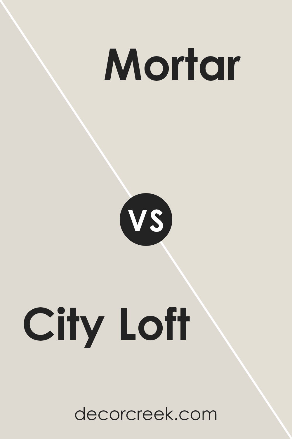
City Loft SW 7631 by Sherwin Williams vs Mortar SW 9584 by Sherwin Williams
City Loft and Mortar are two paint colors offered by Sherwin Williams, each presenting a unique vibe for walls. City Loft has a lighter, airy touch, making spaces feel open and bright. It’s the kind of color that blends well in areas where you want a subtle hint of warmth without overwhelming the room. Think of it as a cozy, soft background that won’t fight for attention with your furniture.
On the other hand, Mortar sits at the other end of the spectrum. It’s a deeper, more grounded color that brings a sense of solidity and earthiness to a space.
It’s perfect for someone looking to add a touch of seriousness or a robust backdrop to their room. Where City Loft whispers, Mortar speaks more assertively, offering a strong foundation that can pair nicely with a wide range of décor, especially if you’re aiming for a statement wall or a moody atmosphere.
Choosing between them boils down to the mood you’re aiming for: the light and easygoing nature of City Loft or the anchored, profound presence of Mortar.
You can see recommended paint color below:
- SW 9584 Mortar
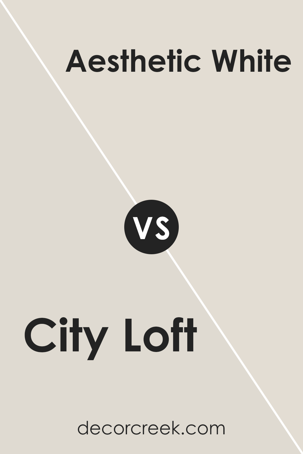
City Loft SW 7631 by Sherwin Williams vs Aesthetic White SW 7035 by Sherwin Williams
City Loft and Aesthetic White are both paint colors by Sherwin Williams, but they offer different vibes. City Loft has a light, warm gray tone that feels cozy and welcoming. It’s a versatile color that can make spaces feel open and airy, perfect for modern and minimalist designs.
On the other hand, Aesthetic White is a soft, off-white color with a hint of beige, giving it a warmer feeling compared to pure white. It’s a great choice for creating a calm and soothing atmosphere in a room.
While both colors are light and can help make a small room appear bigger, Aesthetic White leans towards a warmer palette, making spaces feel more inviting. City Loft, with its gray undertones, offers a more contemporary look. Choosing between them depends on the mood you want to set: City Loft for a sleek, modern feel, and Aesthetic White for a cozy, welcoming space.
You can see recommended paint color below:
City Loft SW 7631 by Sherwin Williams vs Simple White SW 7021 by Sherwin Williams
City Loft and Simple White, both by Sherwin Williams, offer unique shades that can significantly influence the ambiance of a room. City Loft presents a warm neutral tone, which carries a hint of beige, making it an excellent choice for creating a cozy and inviting space. It has the versatility to pair well with various decor styles, from modern to rustic.
On the other hand, Simple White leans towards a clean and classic look. This color is brighter and can help make a room feel more spacious and airy. Simple White is ideal for those seeking a crisp background that allows other elements in the room to stand out.
While both colors are neutrals, City Loft offers warmth, making a room feel more intimate. Simple White, however, provides a stark canvas that can make other colors pop. Depending on the desired effect – be it warmth and coziness or a fresh, open feel – one might choose City Loft for its inviting nature or Simple White for its simplicity and clarity.
You can see recommended paint color below:
- SW 7021 Simple White
City Loft SW 7631 by Sherwin Williams vs Solstice SW 9571 by Sherwin Williams
City Loft and Solstice are two Sherwin Williams colors worth comparing. City Loft has a soft, warm gray vibe that brings a cozy and light feel to any space. It’s the kind of color that blends well with many decor styles, providing a gentle backdrop that’s neither too bold nor too pale.
On the other hand, Solstice steps into the room with a cooler, more muted tone. This color carries a tranquil essence, making it perfect for creating a calm and serene atmosphere.
While City Loft leans towards a neutral warmth, inviting a sense of openness and airiness, Solstice offers a peaceful retreat, echoing the quiet moments of dawn or dusk. Both colors have their unique charm, with City Loft offering a subtle warmth and Solstice providing a calming coolness, making them suitable for different moods and settings.
You can see recommended paint color below:
- SW 9571 Solstice
City Loft SW 7631 by Sherwin Williams vs Egret White SW 7570 by Sherwin Williams
City Loft and Egret White are two calm and appealing colors from Sherwin Williams, and they have their unique shades that stand out for various decor needs. City Loft has a subtle, warm undertone that leans towards a light beige or soft gray, making it versatile for spaces that aim for a cozy yet sophisticated vibe. Its lightness brings an airy feel to rooms, amplifying natural light to make spaces appear larger and more welcoming.
On the other hand, Egret White steps in with a slightly cooler tone, showcasing hints of off-white with a touch of gray. This color is fantastic for those who wish to create a serene and tranquil environment, as it provides a clean, minimalist backdrop that pairs well with almost any decor style, from modern to classic.
When comparing the two, City Loft offers a hint of warmth that’s perfect for adding a cozy touch to living spaces, whereas Egret White leans towards a cleaner, crisper feel ideal for creating a peaceful and calm area. Both colors are beautifully subtle, yet their differences in undertone and warmth can define the mood and style of a room.
You can see recommended paint color below:
City Loft SW 7631 by Sherwin Williams vs Sunbleached SW 9585 by Sherwin Williams
City Loft and Sunbleached are two colors from Sherwin Williams that offer subtle yet distinct vibes to spaces. City Loft is a soft, warm grey that brings a gentle coziness to any room. It’s like a light hug from a cloudy day, offering a neutral backdrop that’s versatile and welcoming. This color works well in spaces where you want a calm and serene atmosphere.
On the other hand, Sunbleached is a much lighter tone, almost hinting at an off-white with a warm undertone. It mimics the look of wood or fabric that has been gently faded by the sun, providing a soft, warm ambiance that feels airy and light. It’s perfect for creating a bright, uplifting space that still feels grounded and cozy.
When comparing these two, City Loft brings more depth and warmth, making a room feel more enclosed and snug. Sunbleached, with its lighter touch, opens up a space, making it feel larger and more inviting. Depending on what mood you’re aiming for in your room, both colors offer fantastic possibilities for creating a welcoming environment, with City Loft leaning towards a more grounded feel, and Sunbleached offering a breath of fresh air.
You can see recommended paint color below:
- SW 9585 Sunbleached
City Loft SW 7631 by Sherwin Williams vs Limewash SW 9589 by Sherwin Williams
City Loft and Limewash are two distinct colors from Sherwin Williams, each bringing its unique vibe to a space. City Loft has a soft, warm comfort to it, very much like being wrapped in a cozy blanket on a cool morning. It’s a light, neutral color with hints of beige and gray, making it super versatile for different rooms and light conditions. It creates a soothing backdrop, perfect for those who want their space to feel open and airy.
In contrast, Limewash offers a much lighter and crisper feel. Think of the first light of dawn, gentle and refreshing. It’s closer to white but with a twist, adding a touch of elegance without going full stark white. This makes it great for adding brightness to a space and giving it a clean, fresh look.
Both colors carry their charm wonderfully. Where City Loft brings warmth and a grounding effect, Limewash offers a breath of fresh air and simplicity. Depending on the mood you’re aiming for in your room, either could be the perfect choice.
You can see recommended paint color below:
- SW 9589 Limewash
City Loft SW 7631 by Sherwin Williams vs Windfresh White SW 7628 by Sherwin Williams
City Loft and Windfresh White are two popular Sherwin Williams paint colors that homeowners often consider for creating a warm and welcoming space. While they may seem similar at first glance, there are subtle yet distinct differences between them.
City Loft has a soft, warm undertone that adds a cozy feel to any room. It’s perfect for spaces where you want a touch of warmth without overwhelming the area with a strong color. On the other hand, Windfresh White is cooler and crisper, offering a more refreshing and clean look.
This color is ideal for those seeking a minimalist or modern aesthetic, as it helps to brighten spaces and create a sense of openness and airiness. While both hues are fairly neutral, City Loft leans towards a beige-gray, making it more inviting, whereas Windfresh White serves more as a true neutral, leaning slightly towards cool tones, making it perfect for a sleek, contemporary vibe.
You can see recommended paint color below:
- SW 7628 Windfresh White
City Loft SW 7631 by Sherwin Williams vs Incredible White SW 7028 by Sherwin Williams
City Loft and Incredible White are two popular shades by Sherwin Williams, each offering a unique charm. City Loft has a light, airy feel to it, almost like the soft glow of morning light in a spacious room. It leans slightly towards a warm undertone, creating a cozy and welcoming atmosphere. Despite its name suggesting urban sophistication, it’s versatile enough to enhance the natural beauty of any space, making rooms look expansive and inviting.
In comparison, Incredible White is a bit cooler, offering a crisp and clean look. This color has a slightly muted vibe, making it perfect for those who prefer a subtle hint of sophistication in their decor.
It acts as a serene backdrop, allowing other elements in the room to stand out. Incredible White is ideal for creating a peaceful and tranquil environment, reflecting elegance in simplicity.
While both colors share a base of neutrality, City Loft brings warmth and an embracing feel, whereas Incredible White offers clarity and a refreshing simplicity. Each paint has its charm, depending on whether you’re aiming for a cozy warmth or a cool, airy feel in your space.
You can see recommended paint color below:
Conclusion
City Loft is a versatile shade by Sherwin Williams that stands out for its unique ability to blend seamlessly into various decor styles. Its neutral tone makes it an excellent choice for anyone looking to refresh their space with a modern yet timeless look.
This color has a special charm that adds a subtle warmth to rooms, creating a cozy and inviting atmosphere. Whether one is aiming for a minimalist vibe or a more layered and textured aesthetic, City Loft provides a solid foundation that complements a wide range of color palettes and design elements.
Moreover, City Loft’s adaptability extends beyond just residential spaces; it’s equally suited for commercial environments seeking a clean and sophisticated backdrop.
Its understated elegance encourages creativity, allowing decorators to introduce bold accessories or artworks without fear of clashing. This paint shade has garnered positive reviews for its ability to brighten up spaces while maintaining a calm and serene ambience. Overall, City Loft by Sherwin Williams is a go-to choice for those looking to strike a balance between contemporary flair and comfortable living.

Ever wished paint sampling was as easy as sticking a sticker? Guess what? Now it is! Discover Samplize's unique Peel & Stick samples.
Get paint samples

