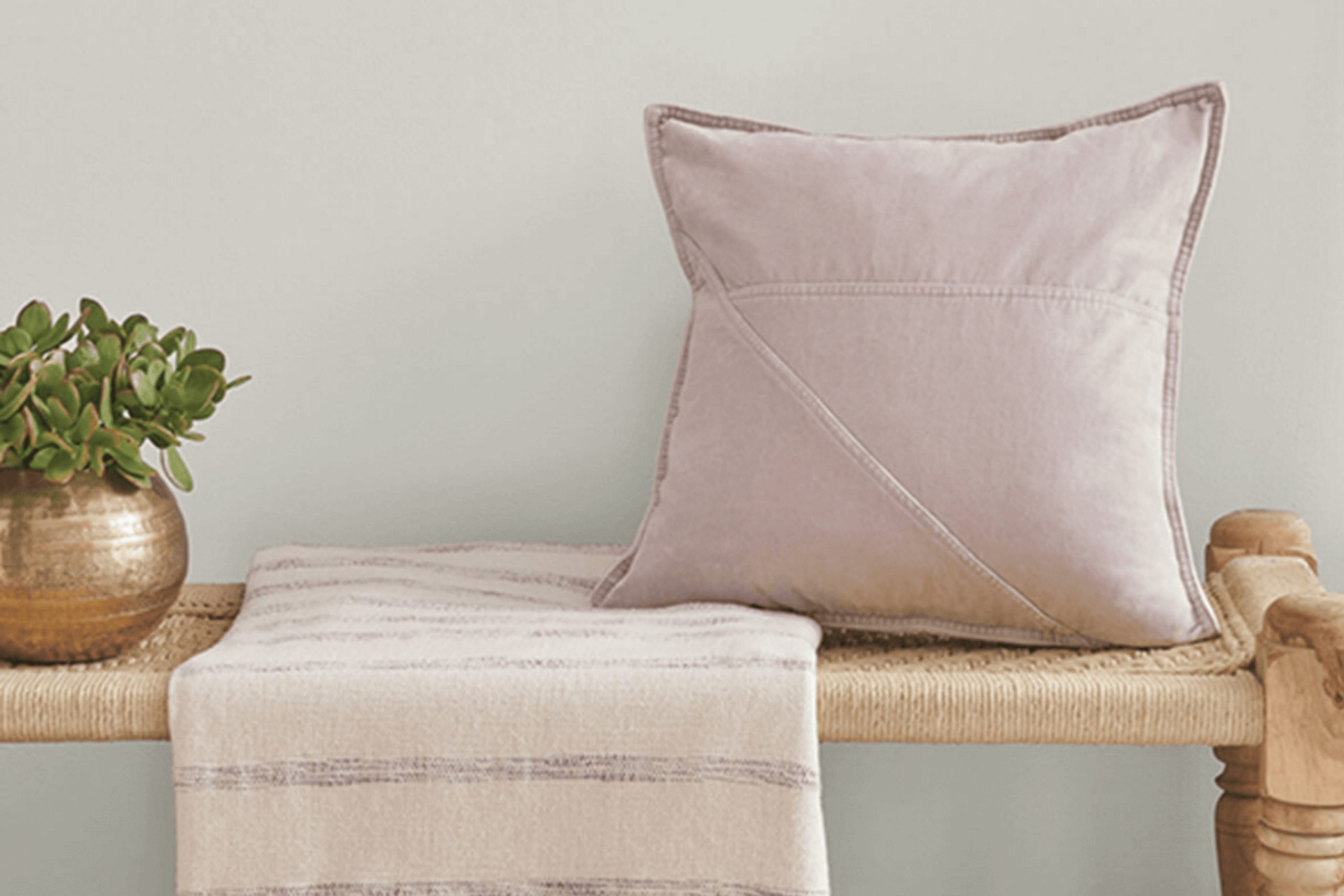
If you’re on the hunt for a paint color that brings a sense of calm and simplicity to your space, Sherwin Williams’ SW 9551 Skipping Rocks might just be your perfect match. Picture the soft gray of smooth stones by a riverside—muted, gentle, yet absolutely grounded and strong in its presence. This color responds amazingly to different lighting, subtly shifting its mood from cool to warm tones, making it incredibly versatile for any room in your home.
This paint isn’t just another gray; its unique blend offers a peaceful backdrop that enhances your existing decor, allowing furniture and artwork to truly pop. Whether you’re looking to refresh your living room, bedroom, or even the kitchen, Skipping Rocks creates a serene foundation that complements wood, metal, and various textiles.
Using Skipping Rocks in your home also means that you’re choosing a backdrop that’s unassuming yet impactful—a quiet anchor in the bustling world. YYS Sherwin Williams included it in their lineup for its ability to support a room’s functionality and style without overwhelming the senses. So if subtle sophistication is what you strive for, consider wrapping your walls with this restful shade.
What Color Is Skipping Rocks SW 9551 by Sherwin Williams?
Skipping Rocks by Sherwin Williams is a fresh and versatile color that sits beautifully between gray and blue. This subtle hue has a calming effect, making it perfect for creating a relaxed atmosphere in any room. With its soft undertone, it’s an ideal choice for those looking to bring a sense of calm without overwhelming a space with bolder colors.
In terms of interior styles, Skipping Rocks is incredibly adaptable. It works exceptionally well in modern and minimalist designs, thanks to its clean and straightforward appeal. However, it can also fit seamlessly into more rustic or coastal themes, where its natural elements are highlighted.
This color pairs wonderfully with bright whites or deep navy, creating contrast or promoting a light, airy feel. When it comes to materials, Skipping Rocks complements natural wood tones like oak and maple, enhancing their warm qualities. Textures such as linen or wool in home textiles work very well with this color, bolstering the comfortable and inviting vibe of a room.
Additionally, metallic finishes, like brushed nickel or copper, bring out the modern edge of the hue, making it an excellent option for kitchen or bathroom fixtures. Overall, Skipping Rocks is a subtle and refreshing color option that blends easily into a variety of decor styles and spaces.
Is Skipping Rocks SW 9551 by Sherwin Williams Warm or Cool color?
Skipping Rocks by Sherwin Williams is a subtle gray paint color that brings a calm and gentle vibe to any room. It’s great for places in the home where you want a peaceful, soft look, such as bedrooms or bathrooms.
Because it’s a neutral color, it pairs well with a wide variety of decor styles and color schemes. This means you can use it as a backdrop and then decorate with other colors you like, whether they are bright and bold or soft and subtle.
The softness of Skipping Rocks makes it a smart choice for small rooms too, as lighter colors can help make spaces feel bigger and more open. It’s also versatile enough to be used in larger areas, providing a cohesive look throughout the home. This paint color works well in both natural and artificial light, maintaining its gentle gray tone beautifully, making it perfect for creating a soothing atmosphere.
Undertones of Skipping Rocks SW 9551 by Sherwin Williams
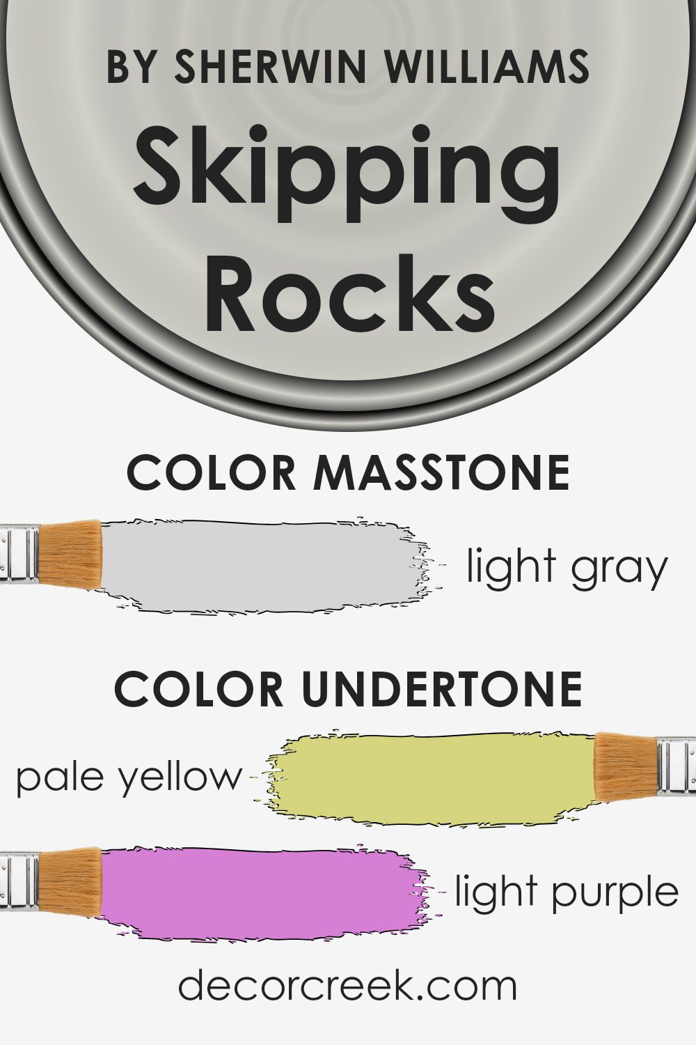
Skipping Rocks is a unique paint color with complex undertones that can subtly influence the overall ambiance of a room. The pale yellow, light purple, light blue, pale pink, mint, lilac, and grey undertones all contribute to its versatility and charm. Understanding these undertones can help you make better-informed decisions about decorating and pairing the color with furniture and accessories.
When we talk about undertones, we’re referring to the hint of color that peeks through the main hue. These underlying tones can significantly impact how we perceive the main color, especially under different lighting conditions.
For instance, pale yellow and mint undertones can make a color feel warmer and more inviting, while grey or light blue undertones might give it a cooler, more subdued appearance. In the context of interior walls, the undertones in Skipping Rocks paint make it adaptable to various decors and styles.
The mix of warm and cool elements allows it to complement a wide range of furnishings. For example, the light purple and lilac undertones might bring out softer, more romantic aspects, ideal for a bedroom. In contrast, the grey and light blue undertones could lend a calm and grounded feel to an office space.
Overall, the unique blend of undertones in Skipping Rocks means this color can both harmonize with brighter, bolder colors and stand on its own as a subtle, defining element of a room’s character. This makes it a practical choice for many homes, adapting effortlessly to different spaces and lighting situations.
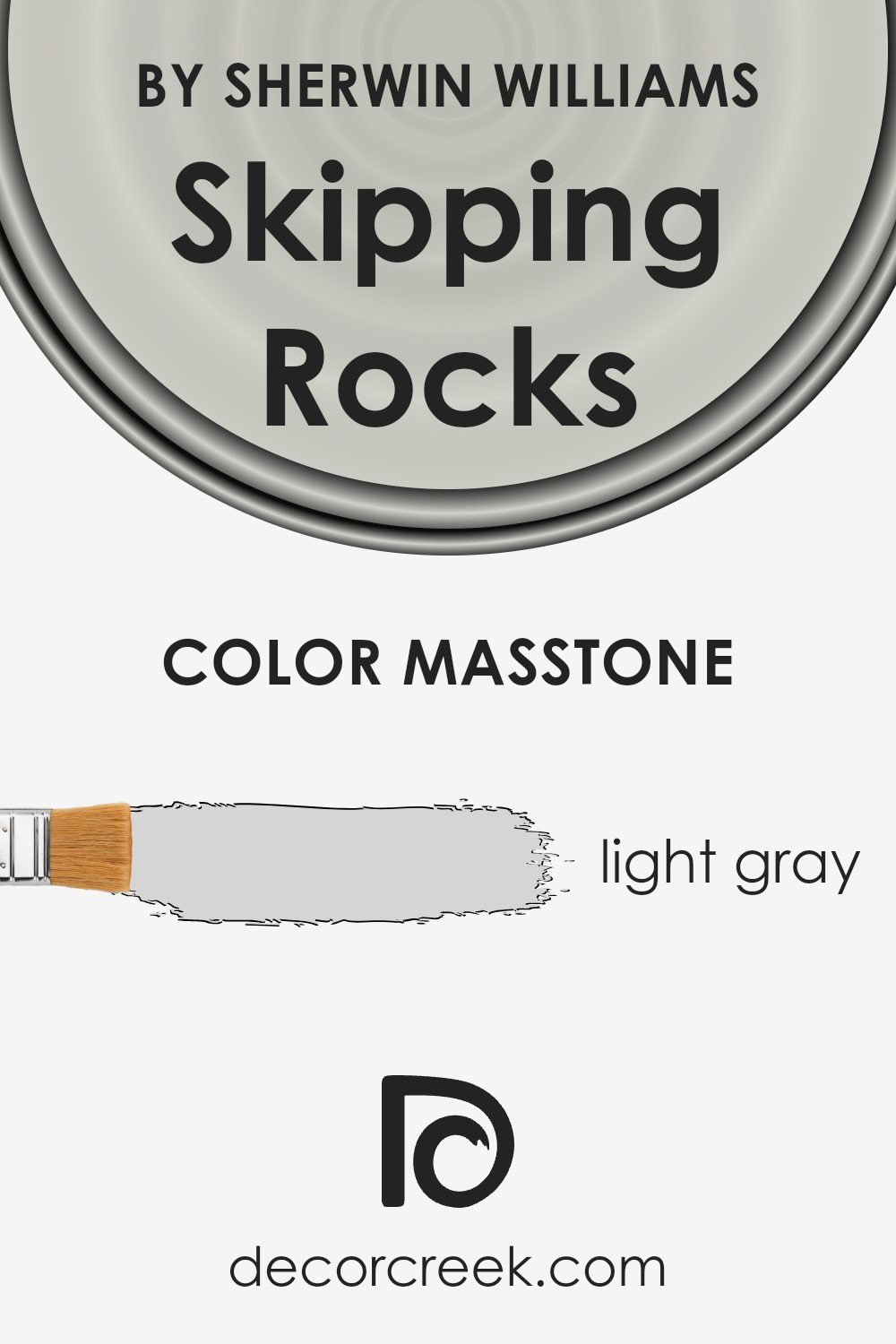
What is the Masstone of the Skipping Rocks SW 9551 by Sherwin Williams?
Skipping Rocks SW 9551 by Sherwin Williams has a masstone of light gray, indicated by the color code #D5D5D5. This particular shade of gray is very subtle and soft, making it an ideal choice for creating a calm and relaxing atmosphere in homes.
The light gray hue blends seamlessly with various decor styles, from modern to traditional, because it doesn’t dominate the space. Instead, it provides a gentle backdrop that complements other colors and elements in a room.
This color is practical too, as it tends to hide minor imperfections better than darker or more vibrant colors would. Furthermore, its neutral tone makes it easy to match with a wide range of furniture colors and materials, from bold and bright textiles to natural wood finishes.
Using light gray like Skipping Rocks throughout a home can help smaller spaces feel larger and brighter, as it reflects more light than darker colors. This versatility and functionality make it a favorite choice for those looking to update their interiors without overwhelming them with color.
How Does Lighting Affect Skipping Rocks SW 9551 by Sherwin Williams?
Lighting plays a crucial role in how we perceive colors in our surroundings. Different light sources can make the same color look different in various environments. Skipping Rocks, a specific paint color, is no exception to these effects.
In artificial light, like from LED or incandescent bulbs, Skipping Rocks tends to look warmer, showing more of its underlying beige tones. This can create a cozy and inviting atmosphere, great for living rooms and bedrooms where soft light is often used.
However, in the stark glare of fluorescent lights, like those often found in offices, the same color might appear slightly flatter and cooler. In natural light, Skipping Rocks reflects the most true-to-tone color, especially in abundant sunlight.
Sunlight provides a full spectrum of light, which helps all the subtle hues in the color to be visible. The result is a richer and fuller appearance of the color, which can look vibrant and fresh.
The orientation of a room also has a significant impact on how Skipping Rocks appears:
1. North-facing rooms: These rooms get less direct sunlight, often resulting in cooler light throughout the day. In these rooms, Skipping Rocks will appear more muted and slightly greyish, giving a calm, soft feel to the space.
2. South-facing rooms : Such rooms benefit from plentiful sunlight most of the day, which makes Skipping Rocks look brighter and more vivid. The warmth of the sun enhances the warm undertones of the color, making spaces feel lively and warm.
3. East-facing rooms: Morning light in east-facing rooms is warm and yellowish, making Skipping Rocks appear warmer and more welcoming in the mornings but cooler and more subdued as the day progresses.
4. West-facing rooms: The evening light that floods west-facing rooms can cast a golden glow, making Skipping Rocks look very warm in the afternoons and evenings, perfect for relaxation at the end of the day.
Understanding these differences can help in choosing the right color for your space depending on its orientation and the type of lighting it receives.
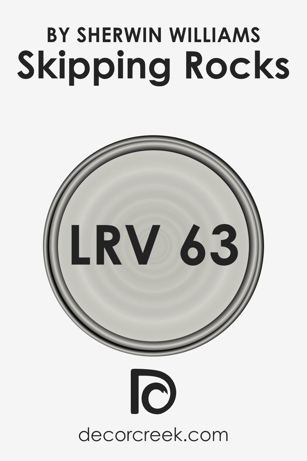
What is the LRV of Skipping Rocks SW 9551 by Sherwin Williams?
LRV stands for Light Reflectance Value, which is a measure of the amount of visible light that a paint color reflects when it is applied to a wall. Essentially, it tells you how light or dark the color will look once it’s on your walls. The higher the LRV, the lighter the color will appear, because it reflects more light back into the room.
Conversely, a lower LRV means the color will appear darker because it absorbs more light. This measurement is very useful when deciding how a new paint color might change the feel of your space, affecting everything from the perceived size of the room to the ambiance.
In the case of the color with an LRV of around 62.824, this is a moderately high value. It means the color is fairly light and will reflect a good amount of light back into the room, making the space feel more open and airy.
For smaller or less naturally lit spaces, using a color with this LRV can help to make the room feel larger and more inviting. Additionally, the lightness of this paint could also provide a neutral backdrop, ideal for highlighting decor and furniture, giving you versatility in designing your space.
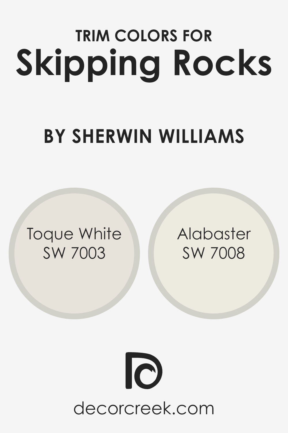
What are the Trim colors of Skipping Rocks SW 9551 by Sherwin Williams?
Trim colors are specific hues selected to enhance or complement the main color used on walls or the exterior of a home. For Skipping Rocks by Sherwin Williams, which is a subtly warm and neutral shade, trim colors like SW 7003 – Toque White and SW 7008 – Alabaster are ideal choices.
These trim colors help to clearly define architectural details and edges, making them more noticeable and giving the space or facade a polished, finished look. The contrast or harmony between the trim and the primary wall color greatly affects the overall aesthetic and can make a room feel more cohesive.
Toque White is a soft, warm white that offers a gentle contrast with richer and darker colors like Skipping Rocks, providing a clean and inviting look. It can lighten up darker spaces without overwhelming the senses.
Alabaster, on the other hand, is a slightly creamier white that brings warmth and a hint of coziness to interiors. This shade pairs beautifully with more muted colors, adding a subtle, creamy highlight to the trims, ultimately softening the overall effect and enriching the visual texture of the space.
You can see recommended paint colors below:
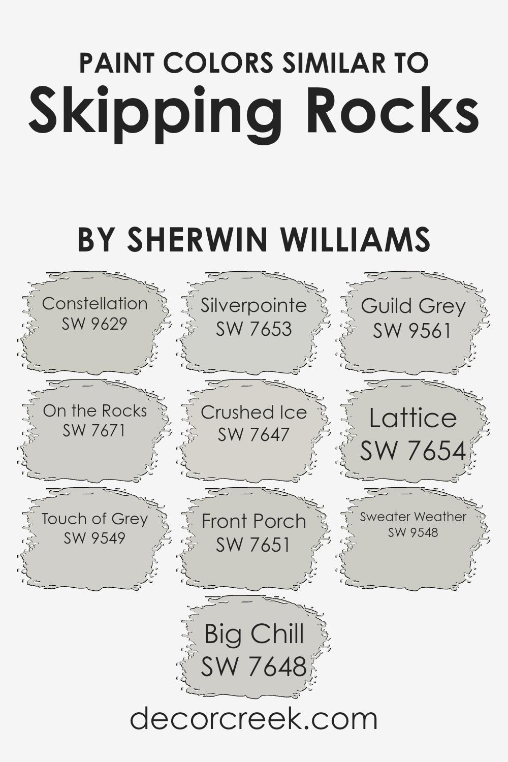
Colors Similar to Skipping Rocks SW 9551 by Sherwin Williams
Similar colors play a vital role in creating a cohesive and harmonious environment in any space. When colors are close in shade and tone, they provide a subtle variation that can enrich a room without overwhelming it with contrast. For example, when decorating with a palette that includes colors like Constellation and On the Rocks, you have a blend of dusky blues and soft grays that complement each other beautifully.
These colors work together seamlessly, enhancing the aesthetic continuity and balance in your decor. This technique of using similar colors can subtly define different areas within an open space while maintaining a unified look.
Each shade within this range has its unique qualities while still aligning closely with its neighbors. Constellation offers a gentle blue that resembles a twilight sky, providing a soothing backdrop. On the Rocks, by contrast, is a muted gray with a hint of warmth, perfect for creating a soft, neutral foundation in any room.
Touch of Grey introduces a slight silvery sheen, catching the light and adding dimension. Big Chill leans towards a cooler gray, offering a fresh, modern feel. Silverpointe is a lighter gray that brings a breezy lightness to spaces. Crushed Ice is another soft gray but with slightly deeper undertones for added warmth.
Front Porch, with its touch of blue undertone, evokes the feeling of an airy, open porch under a clear sky. Guild Grey steps in with a bit of a more pronounced gray tone, making it versatile for accent walls.
Lattice is brighter, combining gray and white for a crisp, clean look. Lastly, Sweater Weather provides a snug, comforting gray that recalls the cozy feel of a well-worn cardigan. Together, these shades provide a fluid transition throughout a home, making it feel cohesive and thoughtfully designed.
You can see recommended paint colors below:
- SW 9629 Constellation
- SW 7671 On the Rocks
- SW 9549 Touch of Grey
- SW 7648 Big Chill
- SW 7653 Silverpointe
- SW 7647 Crushed Ice
- SW 7651 Front Porch
- SW 9561 Guild Grey
- SW 7654 Lattice
- SW 9548 Sweater Weather
How to Use Skipping Rocks SW 9551 by Sherwin Williams In Your Home?
Skipping Rocks SW 9551 by Sherwin Williams is a neutral paint color with a soft, subtle tone, making it perfect for creating a cozy and welcoming atmosphere in your home. Ideal for spaces where you want a touch of calm without overpowering other design elements, this color works well in living rooms, bedrooms, and even bathrooms.
Because of its gentle nature, Skipping Rocks SW 9551 pairs beautifully with bolder colors for a balanced look or can be used alone for a clean and uniform appearance. It’s also a fantastic choice for painting large areas like walls or for highlighting smaller accents like trim or doors to add a gentle contrast. This versatility means you can use it to refresh old furniture or to give your cabinets a new, stylish look.
Adding this color to your home not only updates your space but also provides a subtle backdrop that complements various decor styles, from modern to classic, allowing your personal style to shine.
Skipping Rocks SW 9551 by Sherwin Williams vs On the Rocks SW 7671 by Sherwin Williams
Skipping Rocks and On the Rocks, both by Sherwin Williams, are subtle gray shades that look great in any room. Skipping Rocks is a deeper gray with a slightly earthy tone, making it feel warm and inviting.
On the Rocks is a lighter shade of gray that offers a more neutral and clean appearance. This color can make small spaces seem bigger and reflects more light, making it ideal for dark rooms. Even though both colors belong to the gray family, Skipping Rocks provides a cozier vibe while On the Rocks gives off a fresher, more open feel.
Depending on your room’s size, lighting, and décor style, you can choose between these hues for just the right effect in your home.
You can see recommended paint color below:
Skipping Rocks SW 9551 by Sherwin Williams vs Constellation SW 9629 by Sherwin Williams
Skipping Rocks is a soft, cool grey with subtle blue undertones, providing a calm and gentle vibe to any room. It works well in spaces where you want a clean, airy feel. It pairs beautifully with bright whites or deep blues for a crisp look.
Constellation, on the other hand, leans towards a light, silvery grey with a slight lavender hint. This color is perfect for adding a touch of gentle warmth to a space while maintaining a fresh and light appearance. It’s excellent for rooms seeking a harmonious yet upbeat atmosphere.
Both colors are versatile and can complement a variety of decor styles. Skipping Rocks is slightly cooler, making it ideal for a modern, minimalistic look. Constellation’s hint of lavender provides a warm, inviting feel, great for cozy, intimate spaces. Choosing between them depends on the mood and tone you wish to set in your space.
You can see recommended paint color below:
Skipping Rocks SW 9551 by Sherwin Williams vs Crushed Ice SW 7647 by Sherwin Williams
Skipping Rocks and Crushed Ice by Sherwin Williams are two distinct colors, each offering a unique feel. Skipping Rocks is a deeper, warm-toned gray that brings a cozy and grounding effect to spaces.
It has a touch of earthiness that makes it suitable for rooms where you want a solid, comforting ambiance. On the other hand, Crushed Ice is a lighter gray with cooler undertones. This color is more subtle and brings a fresh, airy feel to a room.
It can make small spaces appear larger and brighter, working well in areas with limited natural light. Both colors are versatile, but while Skipping Rocks adds depth and warmth, Crushed Ice offers a crisp, clean look. Depending on the mood you’re aiming to create, either could be a great choice for your home.
You can see recommended paint color below:
Skipping Rocks SW 9551 by Sherwin Williams vs Silverpointe SW 7653 by Sherwin Williams
Skipping Rocks and Silverpointe are two popular paint choices from Sherwin Williams that offer subtle but distinct tones for interior spaces. Skipping Rocks, which is a deeper hue, provides a solid, earthy essence that resembles the color of wet stones or a cloudy sky just before a storm.
It’s ideal for creating a strong but welcoming vibe in a room. On the other hand, Silverpointe is lighter and leans more towards a soft gray with a hint of silver. This color reflects more light, making it great for smaller rooms or spaces that you want to appear more open and airy.
Overall, while both colors are in the gray family, Skipping Rocks offers a deeper, mood-setting tone, whereas Silverpointe presents a lighter, more refreshing atmosphere.
You can see recommended paint color below:
Skipping Rocks SW 9551 by Sherwin Williams vs Big Chill SW 7648 by Sherwin Williams
Skipping Rocks and Big Chill are two distinct paint colors from Sherwin Williams that offer subtle yet different feels for interior spaces.
Skipping Rocks is a deeper, warmer gray that can make a room feel cozy and grounded. It lends a stable, earthy vibe to a space, making it perfect for areas where you want some calm and comfort, like living rooms or bedrooms.
On the other hand, Big Chill is a lighter, cooler gray that tends to lend a fresher, more open feeling to spaces. Its lighter tone can help small rooms appear a bit larger and more airy, which is ideal for spaces like bathrooms or small offices.
Both colors are versatile and can work well in various lighting conditions, but the choice between them would depend on the atmosphere you’re aiming to create. If you’re looking for warmth, go with Skipping Rocks. For a feeling of openness and light, Big Chill is the better choice.
You can see recommended paint color below:
Skipping Rocks SW 9551 by Sherwin Williams vs Sweater Weather SW 9548 by Sherwin Williams
Skipping Rocks and Sweater Weather are two paint colors from Sherwin Williams that both offer subtle and soothing tones. Skipping Rocks is a lighter, soft gray with a hint of beige, making it a great neutral choice. It reflects light well, making spaces appear larger and more open.
On the other hand, Sweater Weather is a deeper, richer gray that has a comforting, warm undertone. This color is ideal for creating a cozy and welcoming atmosphere in a room. While Skipping Rocks is more versatile and can easily fit into various decor styles, Sweater Weather tends to make a stronger statement with its depth and warmth.
Both colors are excellent for creating a calm and collected space, but your choice between them would depend on the mood you want to set: light and airy with Skipping Rocks or warm and snug with Sweater Weather.
You can see recommended paint color below:
Skipping Rocks SW 9551 by Sherwin Williams vs Lattice SW 7654 by Sherwin Williams
The colors Skipping Rocks and Lattice by Sherwin Williams both offer unique shades for home decor, but they present different vibes and tones. Skipping Rocks is a darker, deeper gray that gives a sense of calmness and steadiness to any space.
It’s a neutral color, great for areas where you want to bring a sense of warmth and coziness without overwhelming the room with too dark a hue. On the other hand, Lattice is a lighter gray that has a subtle touch of blue.
This color brightens up spaces more effectively and can make small rooms appear larger and more open. It’s ideal for giving a fresh, clean look to any area while still maintaining a harmonious, peaceful feel. Both colors work beautifully in modern interiors and can be paired easily with various decor styles, yet each brings its distinct mood and character to environments.
You can see recommended paint color below:
- SW 7654 Lattice
Skipping Rocks SW 9551 by Sherwin Williams vs Front Porch SW 7651 by Sherwin Williams
The color Skipping Rocks, as offered by Sherwin Williams, presents a warm, medium gray tone that carries an earthy and welcoming feel. It’s subdued enough to work well in a variety of spaces, creating a cozy atmosphere without feeling too dark.
On the other hand, Front Porch is a lighter gray that leans towards a cooler, more neutral palette. This color is perfect for those who prefer a fresher, airier feel in their spaces. Since it’s lighter, it can make small rooms appear more spacious and brighter.
Comparing the two, Skipping Rocks provides a richer, deeper background that could be ideal for a relaxed, intimate setting, while Front Porch is great for achieving a crisp, clean look that enhances natural light in any room. Each color offers its unique charm, depending on what mood or style you want to achieve in your decorating space.
You can see recommended paint color below:
Skipping Rocks SW 9551 by Sherwin Williams vs Touch of Grey SW 9549 by Sherwin Williams
Skipping Rocks and Touch of Grey, both from Sherwin Williams, are two appealing yet subtly distinct colors that could both work well in home interiors. Skipping Rocks is a deeper, muted shade of grey that gives off a calmer, more grounded feeling, making it a solid choice for creating a peaceful atmosphere in areas like the living room or bedroom.
On the other hand, Touch of Grey is slightly lighter and carries a fresher vibe, which can be great for enhancing spaces where more light is preferred, such as kitchens or bathrooms. The lighter grey reflects more natural light, potentially making a room feel more open and airy.
Both colors are versatile, fitting nicely within modern decor schemes and pairing well with various furniture styles and finishes. Depending on the mood you want to set or the dimensions of your space, you might opt for the depth of Skipping Rocks or the lightness of Touch of Grey.
You can see recommended paint color below:
Skipping Rocks SW 9551 by Sherwin Williams vs Guild Grey SW 9561 by Sherwin Williams
Skipping Rocks and Guild Grey, both by Sherwin Williams, are distinct yet versatile colors. Skipping Rocks is a soft, light grey that has a subtle warmth to it, making it very adaptable and easy to match with a variety of decor themes. This color works well in spaces where you want to create a bright and airy feel, as it reflects light nicely.
On the other hand, Guild Grey is a deeper grey that carries more weight and presence. It leans slightly towards a slate color, offering a stronger visual impact and a more defined shade compared to Skipping Rocks. This makes Guild Grey ideal for accent walls or rooms where you want a more grounded, striking effect.
Together, these two colors can complement each other beautifully in a space. Skipping Rocks can be used for larger areas or ceilings to keep things light, while Guild Grey can serve as an excellent choice for doors, trim, or even furniture, providing a beautiful contrast and depth to the room.
You can see recommended paint color below:
Wrapping up, SW 9551 Skipping Rocks by Sherwin Williams is a color that really makes any room feel cozy and calm. It’s like a soft gray that sometimes looks a little blue, which reminds me of a peaceful day at the beach with smooth stones and gentle waves. This color works so well in lots of different places in a house, from the living room to the bedroom, because it’s light and doesn’t make spaces feel smaller or darker.
I’ve talked about how easy it is to match SW 9551 with other colors. It looks great with both light colors like white and darker shades like deep blue. This makes it super handy if you like changing your room colors without repainting everything.
Plus, it’s a friendly color for everyone, making places feel warm and welcoming, which is perfect for rooms where family and friends gather. Overall, I think SW 9551 Skipping Rocks is a fantastic choice if you’re looking for a paint color that is light, not too bright, and can help make your home feel more relaxing.
Whether you’re updating your room or just trying something new, this color could be just what you need to create a lovely and inviting atmosphere.
Ever wished paint sampling was as easy as sticking a sticker? Guess what? Now it is! Discover Samplize's unique Peel & Stick samples.
Get paint samples

