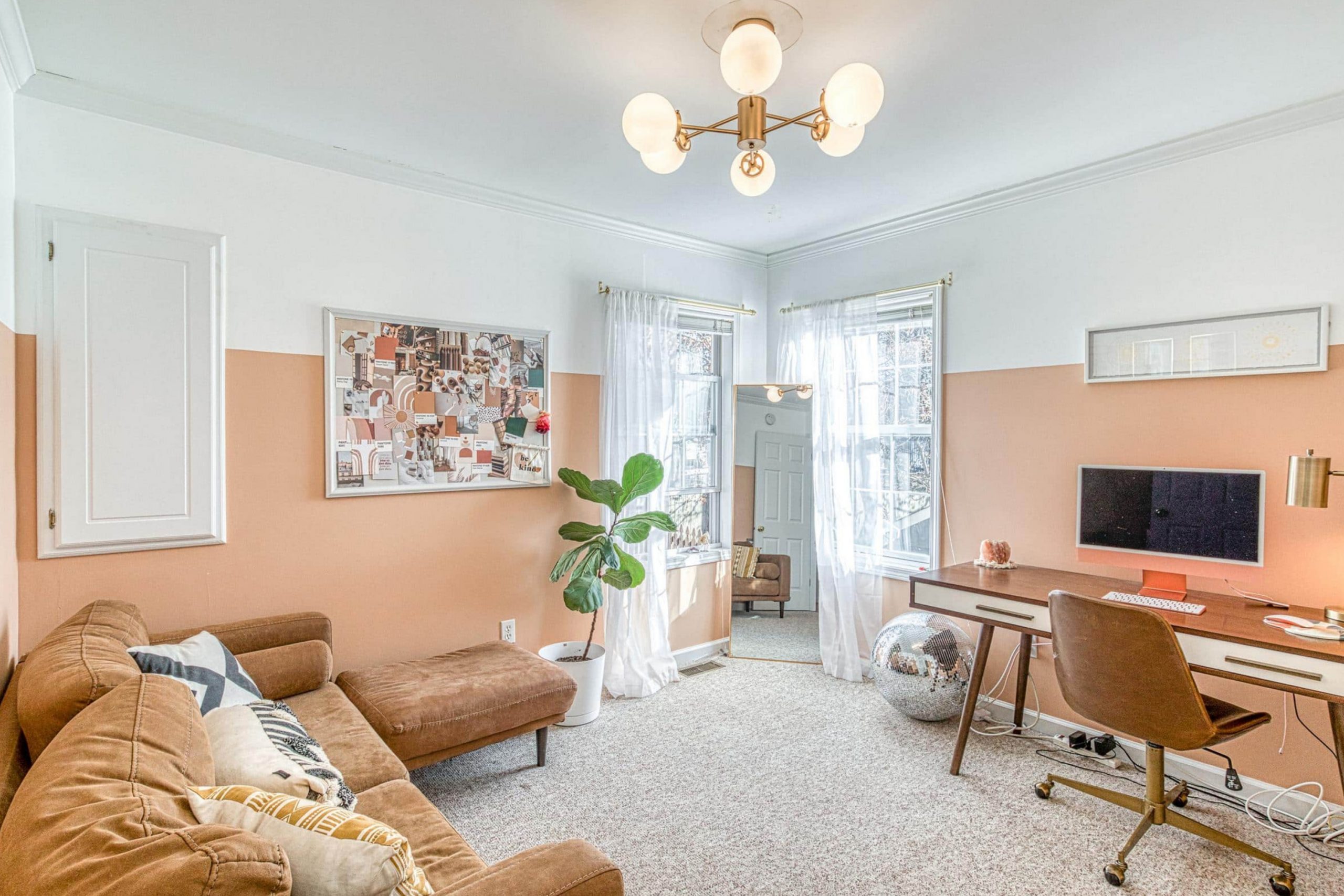
Have you ever seen a color that brightens up your day just by gazing at it? That’s exactly what SW 6639 Avid Apricot by Sherwin Williams does for me. Imagine the soft, vibrant hue of a ripe apricot; it’s warm, inviting, and bursting with cheer. This particular shade has a kind of magic that turns any room into a sunny, energized setting.
I used Avid Apricot in my kitchen, and the change was instant and delightful. It gave the walls a fresh, lively look while evoking a sense of comfort and warmth. The color also pairs beautifully with a wide range of decor, so you have the freedom to mix and match as you like. Whether you opt for contrasting colors to make it pop or soft neutrals for a gentle blend, Avid Apricot adapts effortlessly.
In this article, I’ll share tips on how you can bring this wonderful color into your own home. From paint ideas to decor suggestions, I’ve gathered everything you need to enrich your room with Avid Apricot.
So, if your home could use a lift or you’re simply in love with delightful hues, stick around to see how this apricot shade can work wonders.
What Color Is Avid Apricot SW 6639 by Sherwin Williams?
Avid Apricot is a warm, inviting shade that brings to mind the soft blush of a ripe apricot fruit. This color from Sherwin Williams has a cozy vibrancy that can instantly make a room feel welcoming and bright. With its gentle mix of orange and pink tones, Avid Apricot creates a cheerful atmosphere that’s perfect for living rooms, kitchens, or entryways where a friendly, upbeat vibe is desired.
This shade fits wonderfully in interior styles that lean towards the casual and comfortable, such as modern farmhouse, rustic, or even a bohemian decor scheme. Its inherent warmth makes it a great choice for areas that aim to be both stylish and easygoing.
When it comes to pairing materials and textures with Avid Apricot, you have plenty of delightful options. This color looks stunning when matched with natural wood, from light oak to richer walnut, enhancing the wood’s natural grains. Soft, plush textures like velvet or cotton in neutral tones also work beautifully with this color, providing a soft backdrop that allows Avid Apricot to stand out.
For a refreshing contrast, consider incorporating elements of matte black or dark gray, which will pop against the apricot tones while adding a touch of modern flair. Overall, Avid Apricot is a flexible and cheerful choice that adds a warm, sunny disposition to any room.

Is Avid Apricot SW 6639 by Sherwin Williams Warm or Cool color?
Avid Apricot by Sherwin Williams is a warm, welcoming color that adds a cheerful splash to any room. Its bright, peachy tones make it perfect for areas where you want to create a friendly and inviting atmosphere. This color works especially well in living rooms and kitchens where natural light can enhance its vibrant qualities, making the rooms feel cozy and lively.
Avid Apricot is adaptable enough to pair with both light and dark colors, allowing for various decorating styles. It complements white or light gray, which helps maintain the room’s airy feel, and looks striking next to darker shades like navy or rich browns, adding a dynamic contrast.
This color’s cheerful vibe is ideal for anyone looking to add a sense of warmth to their home without it feeling too bold. It’s particularly suited for families or anyone who enjoys a room that feels both energetic and comfortable. Using Avid Apricot can truly make the home environment feel more welcoming and enjoyable for everyone.
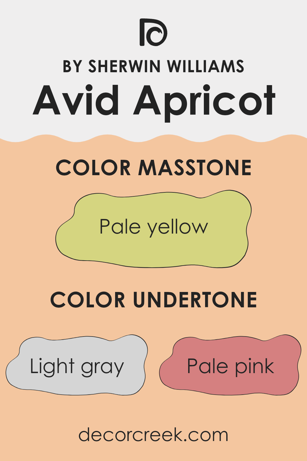
Undertones of Avid Apricot SW 6639 by Sherwin Williams
Avid Apricot is a vibrant, peachy color that can instantly brighten up any room. When selecting a paint color like this, it’s essential to understand the impact of undertones, which are the subtle colors that lie beneath the primary color. These undertones can significantly alter the main color’s appearance under different lighting conditions and when combined with other colors in a room.
This particular shade has a complex mix of undertones, including light gray, pale pink, light purple, mint, yellow, light blue, grey, orange, lilac, light green, and olive. These undertones make the color quite adaptable, yet also challenging to work with because it can look different depending on the surrounding elements.
For example, the light gray and pale pink undertones in Avid Apricot can soften the overall warmth of the color, making it more adjustable and easier to incorporate with modern and minimalist interiors. Shades like light purple and lilac can bring out a slight whimsical feel, perfect for a child’s room or a creative room.
When used on interior walls, the presence of yellow and orange undertones will enhance the warmth, making the room feel more welcoming and cozy. On the other hand, undertones like mint and light green can introduce a refreshing vibe, ideal for kitchens and bathrooms.
It’s also crucial to consider the room’s lighting, as natural and artificial light can change how these undertones come across. In bright sunlight, the yellow and orange may become more pronounced, while in artificial or dimmer light, the cooler undertones might dominate, giving the walls a different feel. Ultimately, the diverse range of undertones in Avid Apricot makes it a unique choice for those wanting to add a burst of energy and personality to their room while keeping the ambiance flexible and engaging.
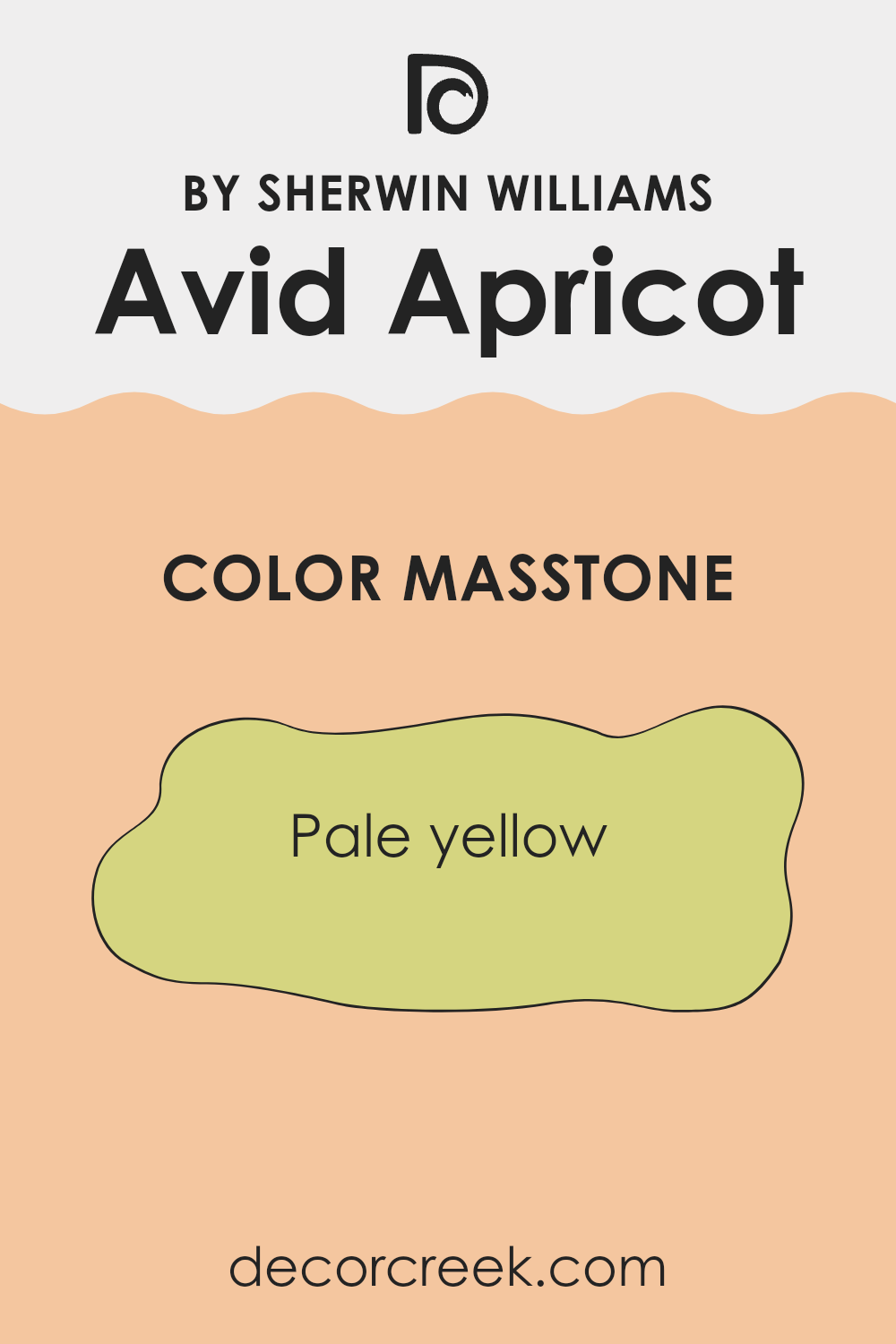
What is the Masstone of the Avid Apricot SW 6639 by Sherwin Williams?
Avid Apricot SW 6639 by Sherwin Williams has a masstone that closely resembles a pale yellow, specifically coded as #D5D580. This light and airy hue brings a subtle brightness to any room, making it feel more open and roomy.
It works particularly well in smaller or dimly lit areas as it helps to reflect any available light, creating a sense of expansion and airiness that can make rooms feel larger than they really are. This shade is also adaptable, easily complementing a variety of decor styles and colors. Whether paired with soft, neutral furnishings or contrasting bold accents, it maintains a gentle backdrop that supports a variety of decorating choices.
Additionally, being a lighter color, it tends not to overpower or dominate a room, making it a good choice for walls, especially in living areas and kitchens where a welcoming, light-filled atmosphere is often desired. This applies for both modern and traditional homes, providing a neat and tidy look while keeping the ambiance light and refreshing.
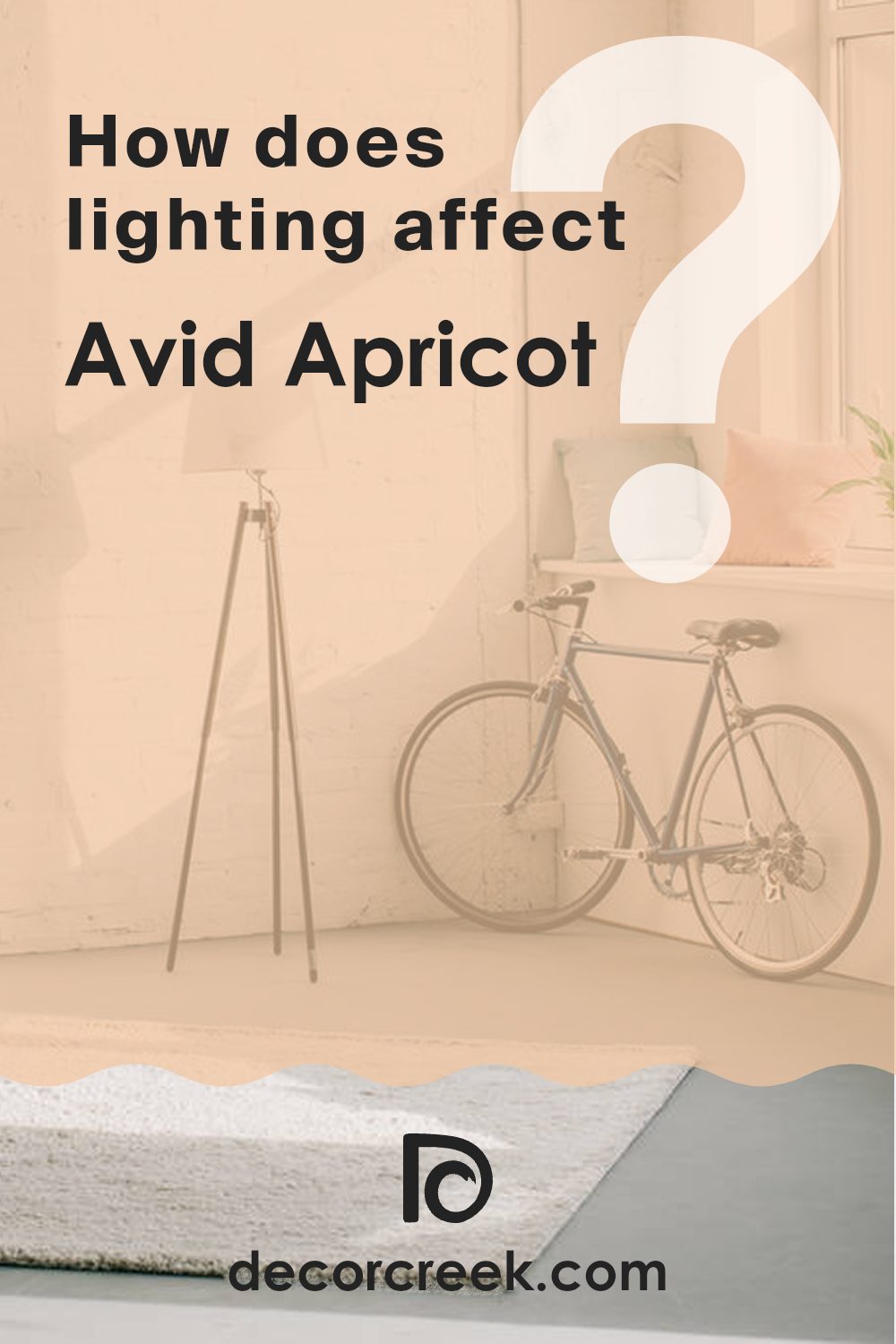
How Does Lighting Affect Avid Apricot SW 6639 by Sherwin Williams?
Lighting plays a crucial role in how we perceive colors. The same color can appear different depending on the type of light it’s under—be it natural sunlight or various forms of artificial light. This interaction is particularly evident with a warm, vibrant shade like Avid Apricot.
In natural light, Avid Apricot radiates warmth and brightness. Natural sunlight enhances its peachy tones, making the color feel lively and sunny. This can help energize a room, especially during the early morning and late afternoon when the sun casts a golden light.
However, in artificial light, the color’s appearance can shift. Under fluorescent lighting, Avid Apricot might look slightly dulled, as such lights typically emit a bluish tone that can subdue warm hues. Conversely, LED or incandescent lighting, which leans towards yellow, will enrich its peachy warmth, giving off a cozy and welcoming glow.
The orientation of a room can also affect how Avid Apricot looks throughout the day:
- North-Faced Rooms: These rooms receive less direct sunlight, making them cooler in tone. In north-faced rooms, Avid Apricot might appear slightly muted and less vibrant. To counteract this, using warm artificial lights can help maintain its rich peach tone.
- South-Faced Rooms: These rooms enjoy abundant sunlight for most of the day, which can really make Avid Apricot shine. The paint will look vivid and distinctly warm, perfect for creating a cheerful and inviting room.
- East-Faced Rooms: Here, the morning light can make Avid Apricot appear very bright and fresh. As the day progresses and the natural light fades, the color will take on a softer quality, still maintaining a natural warmth.
- West-Faced Rooms: In these areas, Avid Apricot will stay subdued during the morning but will come alive with the late afternoon and evening sun, creating a dramatic and cozy atmosphere.
Understanding the light exposure in your room can help you decide if Avid Apricot is the right color for your room, ensuring it looks fantastic at any time of the day.
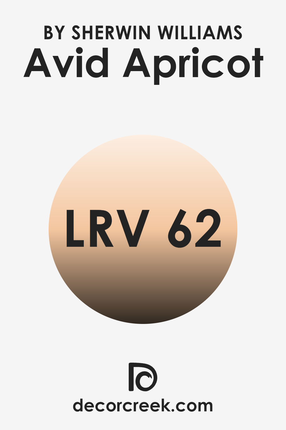
What is the LRV of Avid Apricot SW 6639 by Sherwin Williams?
LRV stands for Light Reflectance Value, a measurement used to describe the amount of visible and usable light that a paint color reflects or absorbs once it’s applied to a wall. In simpler terms, it tells us how light or dark a color will look on a surface. A high LRV means the color reflects more light, making it appear lighter and potentially making the room feel larger and more open.
Conversely, colors with a low LRV absorb more light, which can make them appear darker and can make a room feel smaller or cozier. Considering the LRV of Avid Apricot is 62.316, this color falls into the lighter range of the scale, suggesting it is quite reflective. This makes it a good choice for making a room feel airy and bright.
In rooms with less natural light, Avid Apricot will help brighten the room effectively. Its warm tones can create a welcoming ambience, particularly in living areas and bedrooms where a soft, light hue adds to the relaxed feel of the environment. However, in very brightly lit areas, the color might appear lighter than expected, which is a point to consider when choosing this color for areas flooded with natural light.
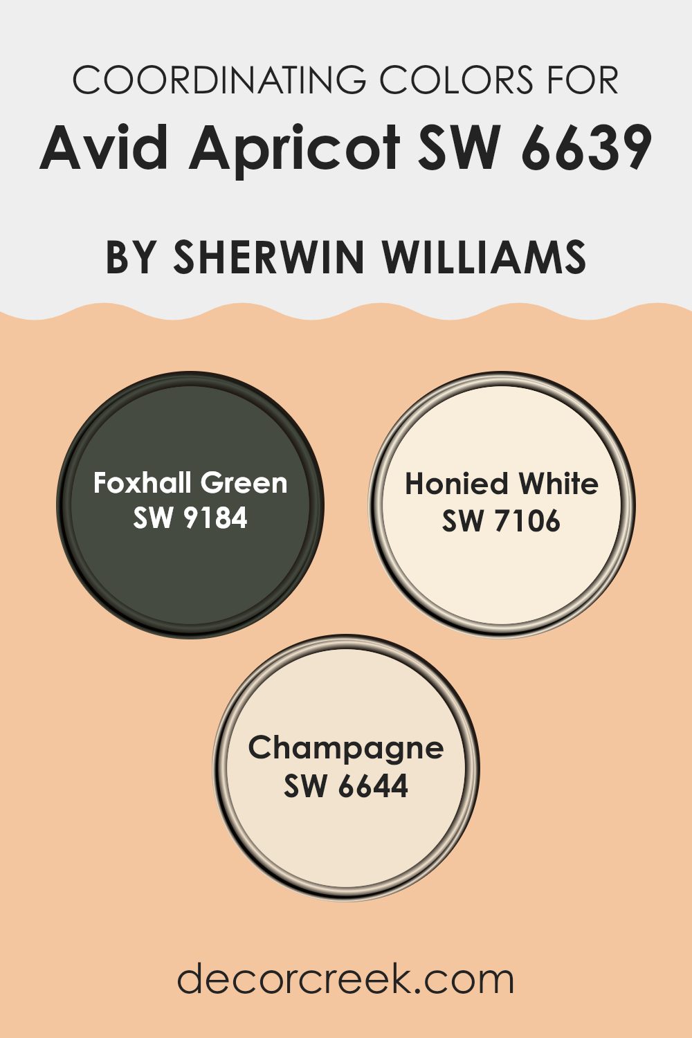
Coordinating Colors of Avid Apricot SW 6639 by Sherwin Williams
Coordinating colors are chosen to complement or enhance the main color in a color scheme, working together to create a visually balanced environment. In the case of Avid Apricot by Sherwin Williams, three colors selected to coordinate well with it are Foxhall Green, Honied White, and Champagne. These shades balance the warm tones of Avid Apricot with their varied hues, offering enough contrast and similarity to blend smoothly in design.
Foxhall Green is a subdued, earthy green that brings a natural, calming influence to the vividness of Avid Apricot. This color can help ground a room, making the room feel more connected to the outdoors. Honied White, as its name suggests, is a soft, warm white with a hint of yellow that echoes the sunny brightness of Avid Apricot, perfect for creating a light and open feel in any room.
Lastly, Champagne is a gentle beige with a slight shimmer, reminiscent of the soft bubbles in a glass of its namesake. It adds a touch of quiet elegance that complements the bolder apricot but with a subtle, understated finish. Together, these coordinating colors work to support and set off the primary color, ensuring a balanced and inviting visual flow.
You can see recommended paint colors below:
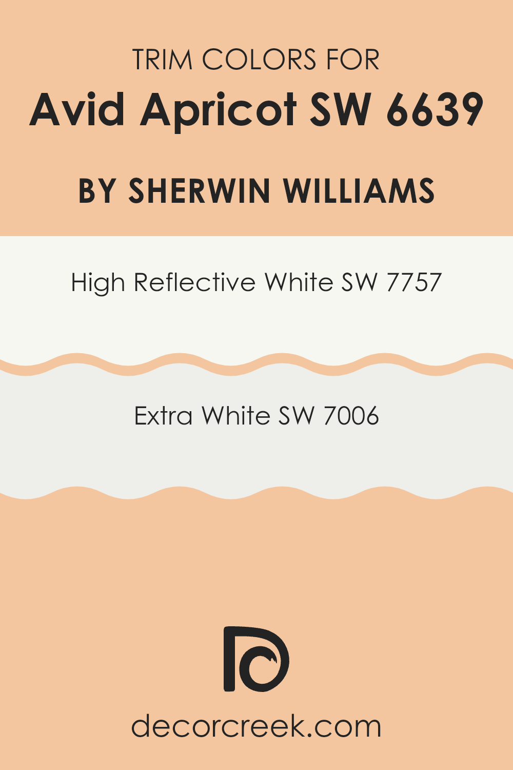
What are the Trim colors of Avid Apricot SW 6639 by Sherwin Williams?
Trim colors are crucial elements in interior and exterior design, as they define and accentuate the architectural features of a room. The right trim color frames walls, windows, and doors, enhancing the overall appeal of a room. For example, when using Avid Apricot SW 6639 by Sherwin Williams, a dynamic and cheerful color, selecting an appropriate trim color helps to balance the exuberance of the apricot hue by adding clean lines and crisp edges.
SW 7757 – High Reflective White and SW 7006 – Extra White are excellent choices for trim when using a lively color like Avid Apricot because they provide a fresh and contrasting look that can make the main color pop while keeping the atmosphere light and open.
Both SW 7757 – High Reflective White and SW 7006 – Extra White serve distinctive purposes when used as trim colors. High Reflective White is a very bright white that is almost mirror-like in its reflectiveness, making it an excellent choice for those who want a stark contrast and a vibrant effect that helps the main color to stand out. On the other hand, Extra White has a slightly softer tone, providing a subtle contrast that complements vibrant colors without overshadowing them. This makes Extra White a great option for adding a smooth and polished finish to any room colored in Avid Apricot.
You can see recommended paint colors below:
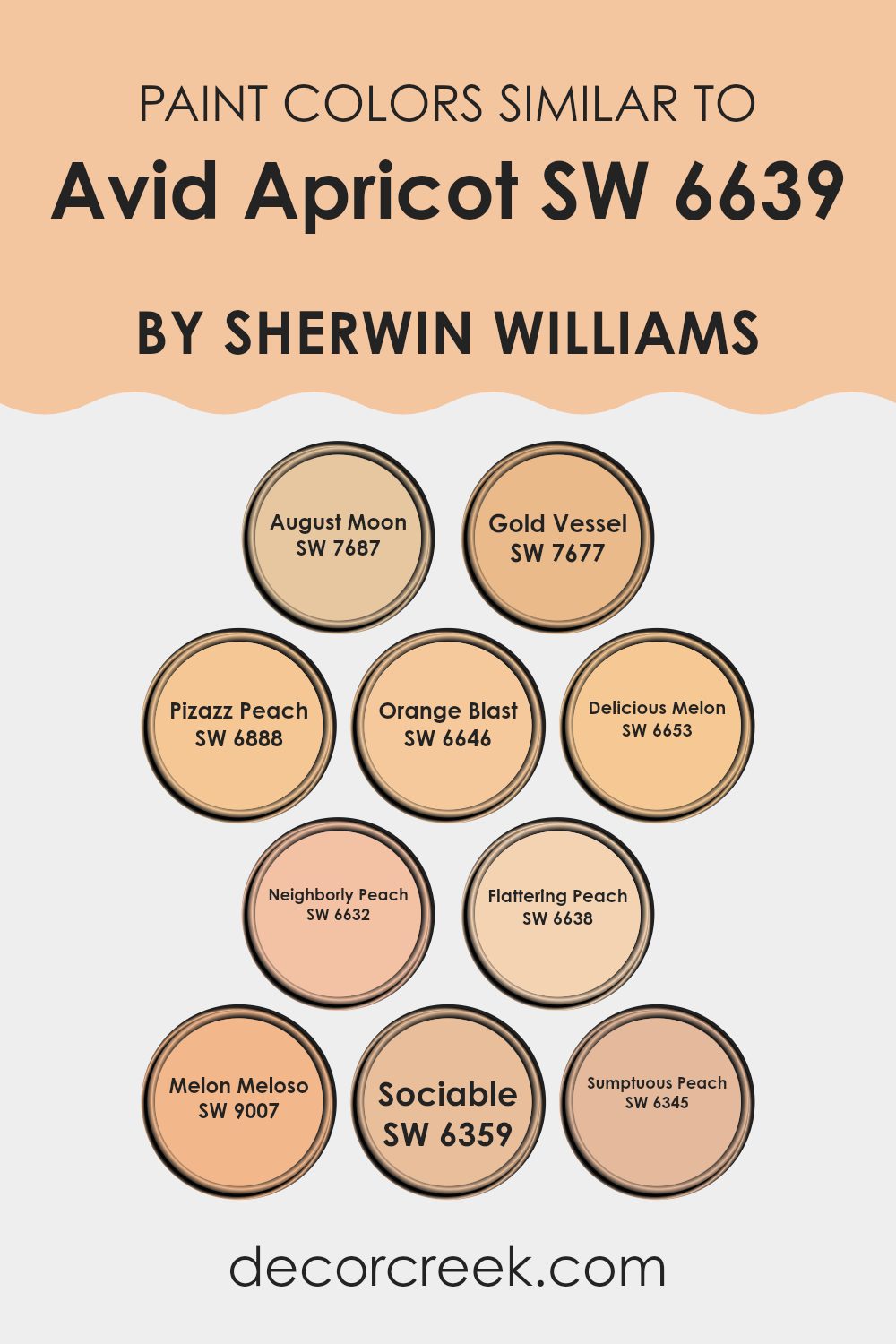
Colors Similar to Avid Apricot SW 6639 by Sherwin Williams
Similar colors in interior design can create a harmonious and cohesive atmosphere, allowing individual elements to blend seamlessly while enhancing the overall aesthetic. By using shades that complement one another, such as the warm tones associated with Avid Apricot by Sherwin Williams, areas can evoke a subtle continuity that is both inviting and comforting.
Colors like August Moon and Gold Vessel are gentle nudges towards a soft, unified look; August Moon brings a dusty orange warmth that pairs well with muted decors, while Gold Vessel offers a slightly deeper gold tone providing a rich backdrop that enriches its surroundings.
On the brighter side, Pizazz Peach and Orange Blast inject more vivid energy into areas. Pizazz Peach, a lively peach hue, adds freshness and vibrancy, giving life to more subdued settings. Orange Blast, on the other hand, is a bold, almost citrus-like color that stands out as an accent, perfect for creating focal points.
Delicious Melon, Neighborly Peach, and Flattering Peach continue this theme of warm and friendly hues; Delicious Melon has a soft, almost creamy feel, perfect for living areas or bedrooms, while Neighborly Peach carries a welcoming vibe, and Flattering Peach offers a gentle, attractive allure.
Melon Meloso, Sociable, and Sumptuous Peach are exceptional for adding softness with a more subtle touch, their understated elegance makes them ideal for creating a calming but stylish environment. Through these nuanced applications of similar colors, designers can craft areas that are both visually appealing and functionally balanced.
You can see recommended paint colors below:
- SW 7687 August Moon
- SW 7677 Gold Vessel
- SW 6888 Pizazz Peach
- SW 6646 Orange Blast
- SW 6653 Delicious Melon
- SW 6632 Neighborly Peach
- SW 6638 Flattering Peach
- SW 9007 Melon Meloso
- SW 6359 Sociable
- SW 6345 Sumptuous Peach
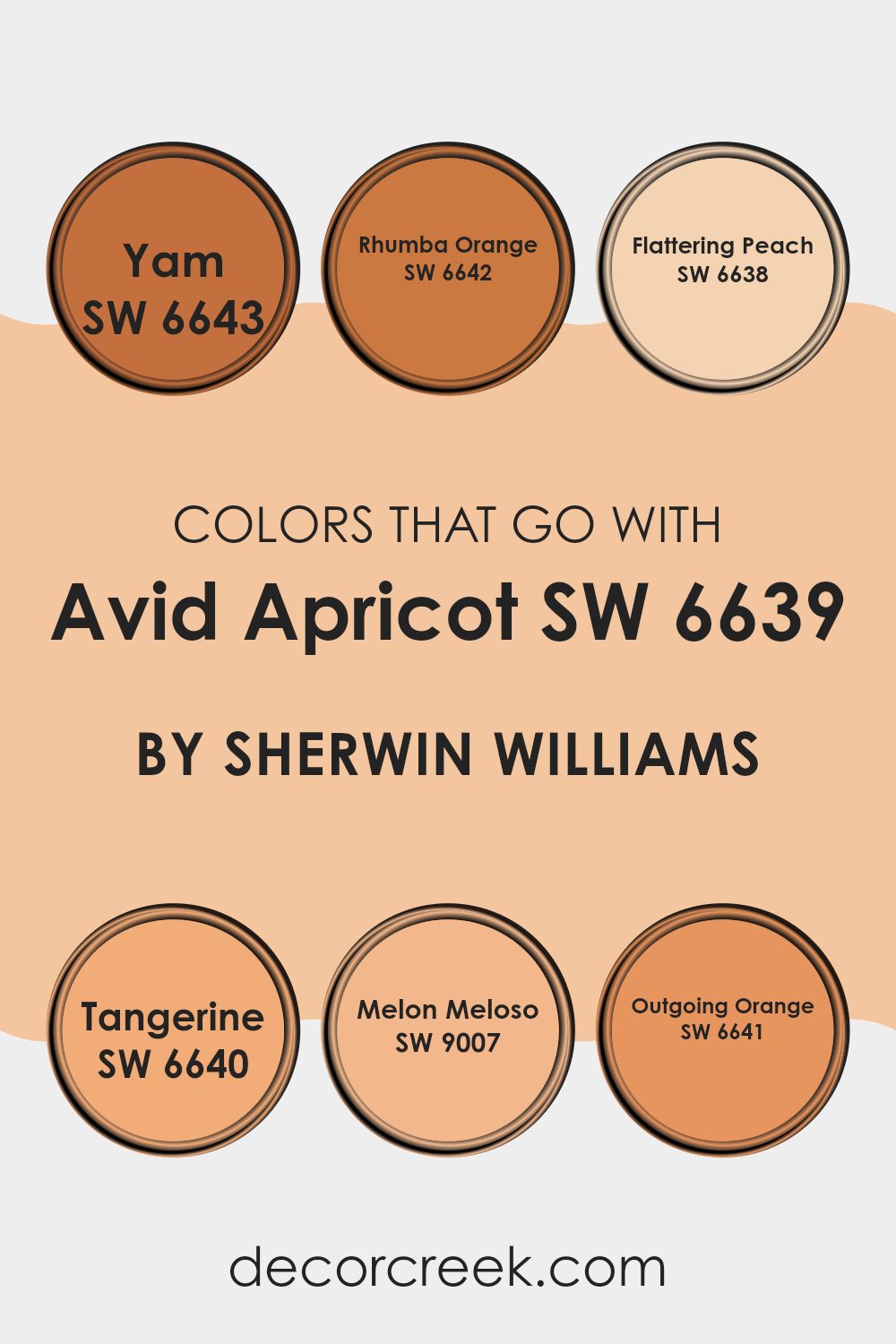
Colors that Go With Avid Apricot SW 6639 by Sherwin Williams
When choosing colors that complement Avid Apricot SW 6639 by Sherwin Williams, it’s important to select hues that harmonize to create a pleasing atmosphere. Avid Apricot is a warm, welcoming color that pairs beautifully with shades that share its vibrant and cozy vibe.
For instance, colors like Yam SW 6643 and Rhumba Orange SW 6642 are great matches because they both carry warm tones that enhance the richness of Avid Apricot. Yam is a deep, earthy orange that provides a grounded feel, while Rhumba Orange is slightly more energetic and bright, which can add a lively contrast while maintaining the warmth in your room.
Other shades such as Flattering Peach SW 6638 and Tangerine SW 6640 also sync well with Avid Apricot, lending subtle variations in intensity and warmth to the ensemble. Flattering Peach is a soft, muted orange that offers a gentle complement to more saturated colors, creating a soft transition in your color palette.
Tangerine, on the other hand, has a bit more punch but still harmonizes because it shares the same sunny, cheerful quality as Avid Apricot. For a slightly different approach, Melon Meloso SW 9007 and Outgoing Orange SW 6641 introduce a playful, fruity twist to the mix.
Melon Meloso is a sweeter, lighter shade that can lighten up a room, while Outgoing Orange is bold and bright, perfect for adding a pop of vivid color that still feels harmonious with the overall warm theme. By choosing any of these colors to partner with Avid Apricot, you can create a room that feels coherent and balanced, yet varied and interesting.
You can see recommended paint colors below:
- SW 6643 Yam
- SW 6642 Rhumba Orange
- SW 6638 Flattering Peach
- SW 6640 Tangerine
- SW 9007 Melon Meloso
- SW 6641 Outgoing Orange
How to Use Avid Apricot SW 6639 by Sherwin Williams In Your Home?
Avid Apricot is a warm, rich color that works wonderfully in homes to create a cozy and inviting atmosphere. This Sherwin Williams paint shade adds a cheerful pop of orange that’s not too overpowering, making it perfect for a variety of rooms.
It’s an excellent choice for a kitchen or dining area where it brings a sunny vibe, enhancing the mood and making meals more enjoyable. In living rooms, Avid Apricot can be paired with soft creams or deep blues for a balanced look, adding a touch of warmth to the decor.
This shade can also be great in a bedroom, offering a gentle, warm backdrop that helps in setting a relaxing mood. Accessories like cushions, lamps, or curtains in contrasting colors like teal or green can complement the apricot walls beautifully. Overall, using Avid Apricot in your home can make areas more welcoming and lively, perfect for those looking for a fresh and cheerful ambiance.
Avid Apricot SW 6639 by Sherwin Williams vs August Moon SW 7687 by Sherwin Williams
Avid Apricot and August Moon, both from Sherwin Williams, offer distinct tones for different moods and settings. Avid Apricot is a vibrant, lively orange, full of energy and warmth. It’s ideal for areas where you want to create a cheerful, inviting atmosphere.
On the other hand, August Moon is a muted olive tone, subdued and adaptable, lending itself well to rooms where a calm, understated elegance is desired. While Avid Apricot stands out and may dominate a room, August Moon works seamlessly as a background hue, complementing other colors easily.
Whether you’re looking to add a pop of color with Avid Apricot or go for a more grounded, neutral look with August Moon, each provides a unique aesthetic.
You can see recommended paint color below:
Avid Apricot SW 6639 by Sherwin Williams vs Neighborly Peach SW 6632 by Sherwin Williams
Avid Apricot and Neighborly Peach, both by Sherwin Williams, offer subtle yet distinct color differences. Avid Apricot has a robust and slightly richer tone, giving it a warmer feel that can make a room cozy and inviting. This color is perfect for living rooms where you want a bit of energy and warmth without dominating the room.
In contrast, Neighborly Peach is lighter and has a softer appearance. It feels fresher and more subtle, making it ideal for creating a relaxing atmosphere in areas like bedrooms and bathrooms. This color reflects light beautifully and can make small rooms appear larger and more open.
Both colors work well for those looking to add a touch of warmth to their interiors, but the choice between them depends on the desired intensity and mood. Avid Apricot stands out more, while Neighborly Peach blends softly into its surroundings.
You can see recommended paint color below:
- SW 6632 Neighborly Peach
Avid Apricot SW 6639 by Sherwin Williams vs Gold Vessel SW 7677 by Sherwin Williams
Avid Apricot is a vibrant, peachy hue that brings a fresh and energetic feel to any room. It’s a bright and cheerful color, perfect for rooms where you want to add a sense of warmth and joy. On the other hand, Gold Vessel is a muted gold tone, which offers a more subtle and understated elegance.
This color works well in areas where you want a touch of refinement without dominating the room with brightness. When comparing these two colors, Avid Apricot stands out as the more lively option, ideal for creating a focal point or adding a playful touch.
Gold Vessel, meanwhile, is better suited for a complementary role, enhancing rooms with a soft and cozy glow. Both colors work well together, with Avid Apricot providing a pop of color and Gold Vessel smoothing out the overall look with its calming presence.
You can see recommended paint color below:
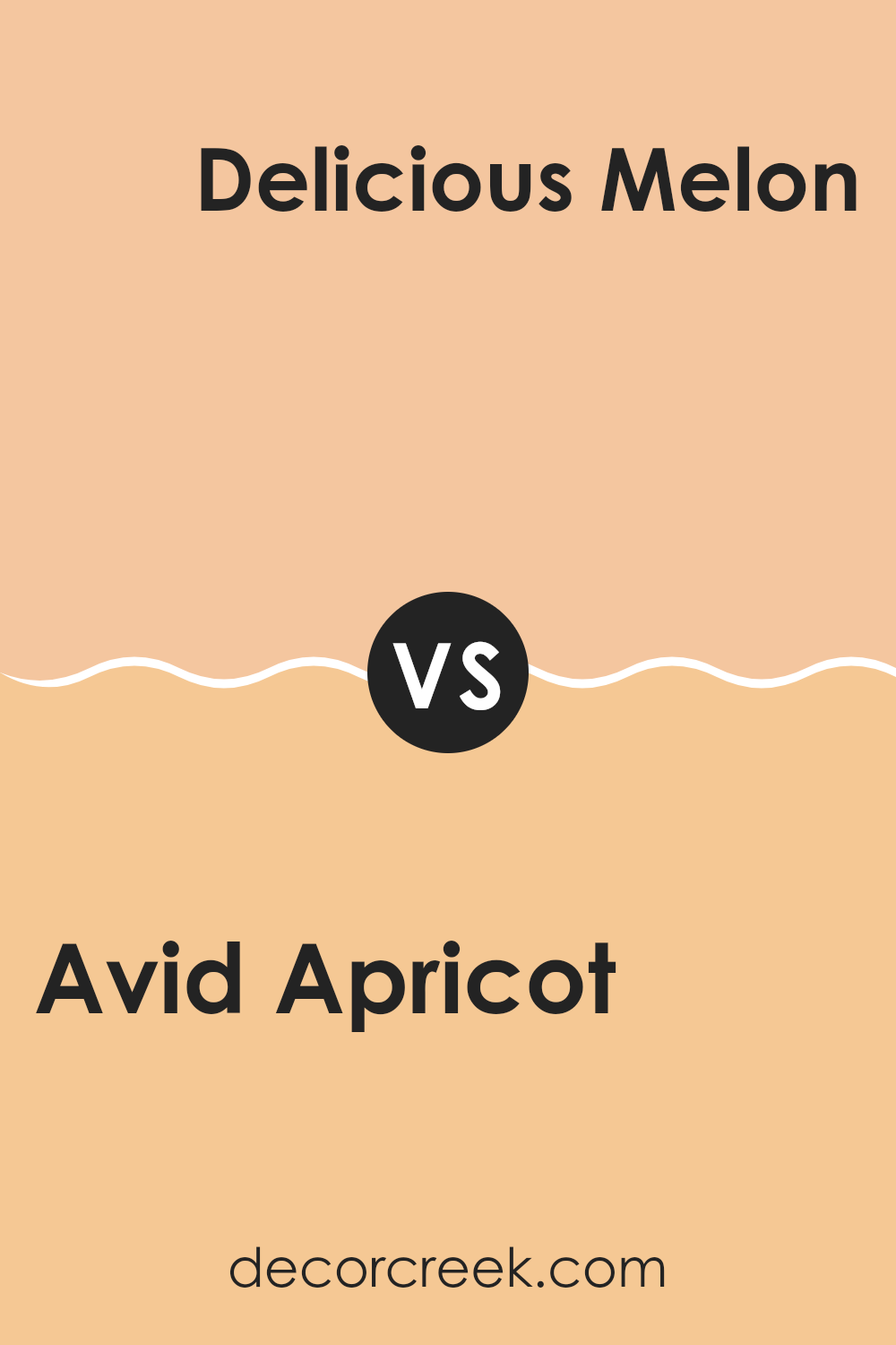
Avid Apricot SW 6639 by Sherwin Williams vs Delicious Melon SW 6653 by Sherwin Williams
Avid Apricot is a lively and warm peach color that brings a feel of cheerfulness and light to any room. It has a youthful vibe, radiating an inviting sense of coziness that can brighten up areas without being too bold.
Delicious Melon, on the other hand, is a slightly softer and paler shade compared to Avid Apricot. It leans more towards a gentle orange-pink, providing a subtle touch of warmth. This color is ideal for those who prefer something soothing yet want to retain a sense of warmth in their decor.
While both colors are warm and can create a welcoming atmosphere, Avid Apricot has a bit more energy due to its deeper saturation. Delicious Melon, being gentler, works well in areas intended for relaxation and calm. Both are great choices for anyone looking to add a touch of warmth and cheer to their home, each in its unique way.
You can see recommended paint color below:
- SW 6653 Delicious Melon
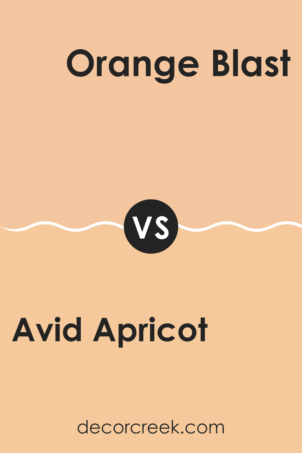
Avid Apricot SW 6639 by Sherwin Williams vs Orange Blast SW 6646 by Sherwin Williams
Avid Apricot and Orange Blast, both by Sherwin Williams, present unique shades of orange, each offering a distinct vibe for interior rooms. Avid Apricot is a softer, more subdued orange. It carries a gentle, peach-like tone that makes it ideal for creating a cozy and welcoming atmosphere in rooms like living areas or bedrooms. This color pairs well with light woods and creamy whites, enhancing a light and airy feel.
In contrast, Orange Blast is a much bolder and vibrant hue. It stands out with its vivid, almost neon-like quality that can instantly energize a room. Perfect for accent walls or areas where you want to make a strong visual impact, this color works well with dark greys, blues, and even metallics to balance its intensity.
Both colors serve different purposes depending on the mood and functionality you want to achieve in a room. Whether you opt for the calming warmth of Avid Apricot or the energetic punch of Orange Blast, each shade brings its unique character to interiors.
You can see recommended paint color below:
- SW 6646 Orange Blast
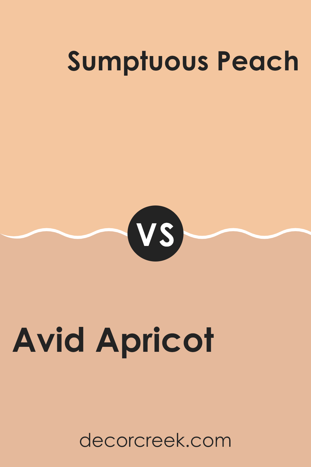
Avid Apricot SW 6639 by Sherwin Williams vs Sumptuous Peach SW 6345 by Sherwin Williams
Avid Apricot and Sumptuous Peach are both warm, inviting shades from Sherwin Williams, but they present subtle differences in their tones. Avid Apricot leans towards a vibrant, energetic orange, offering a fresh and lively feel that can instantly brighten up a room. This color is perfect for creating a cheerful and welcoming atmosphere in any room.
On the other hand, Sumptuous Peach has a softer, more subdued look. It is a gentle blend of orange and pink, resulting in a cozy peach that adds a touch of warmth without overpowering the senses. This color is ideal for those looking to add a mild, soothing presence in their decor, making rooms feel comfortable and relaxed.
While both colors are great for adding warmth, Avid Apricot is bolder, and Sumptuous Peach is softer, giving decorators two distinct choices depending on the mood they want to create.
You can see recommended paint color below:
- SW 6345 Sumptuous Peach
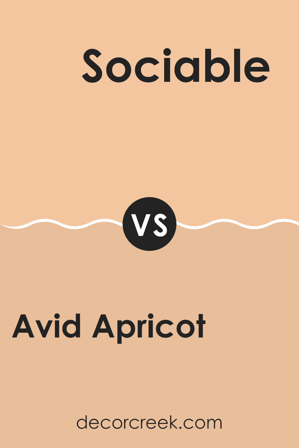
Avid Apricot SW 6639 by Sherwin Williams vs Sociable SW 6359 by Sherwin Williams
Avid Apricot and Sociable are both warm, vibrant colors from Sherwin Williams, but they have distinct tones that set them apart. Avid Apricot is a soft, muted orange that offers a subtle, peach-like feel which makes it quite soothing and perfect for creating a cozy room. It pairs nicely with soft neutrals and can make a room feel welcoming without being too bold.
On the other hand, Sociable is a brighter, more energetic shade of orange. It has a punchier, more vibrant look which can inject life and energy into a room. This color works well in areas where you want to stimulate conversation and activity, such as a kitchen or a lively living room.
Both colors can warm up a room, but Avid Apricot does so in a gentler, more understated way, while Sociable stands out and grabs more attention with its vivacity. Depending on the atmosphere you want to create, either could be a great choice.
You can see recommended paint color below:
Avid Apricot SW 6639 by Sherwin Williams vs Melon Meloso SW 9007 by Sherwin Williams
Avid Apricot and Melon Meloso are both warm and inviting colors from Sherwin Williams, but they have different tones that could affect the atmosphere of a room. Avid Apricot has a stronger orange hue, often associated with a lively and energetic feel. This makes it a great choice for areas where you want to add a sense of enthusiasm and vibrancy.
On the other hand, Melon Meloso is slightly softer, leaning more towards a pinkish-peach shade. It’s a bit more subdued than Avid Apricot, offering a gentle and cozy vibe, perfect for areas where you want a calming and soothing presence without sacrificing warmth.
When deciding between these two, consider the mood you want to set in the room. Avid Apricot can energize a room, like a kitchen or a playroom, while Melon Meloso could be ideal for creating a relaxing room, such as a bedroom or a sitting room. Both colors provide warmth but in unique and subtle ways, making them flexible for various decorating styles.
You can see recommended paint color below:
Avid Apricot SW 6639 by Sherwin Williams vs Pizazz Peach SW 6888 by Sherwin Williams
Avid Apricot and Pizazz Peach, both from Sherwin Williams, are warm and inviting colors, yet they have distinct vibes. Avid Apricot has a soft, muted hue that’s gentle and feels cozy, making it perfect for creating a relaxed atmosphere in areas like living rooms or bedrooms. It pairs well with soft whites or greys for a subtle, welcoming look.
In contrast, Pizazz Peach is much brighter and more vibrant. This color has an energetic, lively feel to it, ideal for areas where you want to add a pop of cheerfulness, such as kitchens, playrooms, or even an accent wall in a creative room. It works well with crisp whites or deep blues for a dynamic contrast.
Both colors offer a touch of warmth, which can make a room feel more inviting, but the choice between them depends on the mood you’re aiming for: calming and subdued with Avid Apricot or bright and cheerful with Pizazz Peach.
You can see recommended paint color below:
- SW 6888 Pizazz Peach
Avid Apricot SW 6639 by Sherwin Williams vs Flattering Peach SW 6638 by Sherwin Williams
Avid Apricot is a lively and bright shade with a dominant orange tone that adds warmth and cheer to any room. It has a vibrant quality that can energize a room while still maintaining a friendly and welcoming vibe. This color works well in areas that benefit from a splash of brightness, such as kitchens and living areas.
Flattering Peach, on the other hand, is closely related to Avid Apricot but with a softer and more subdued feel. It leans more towards a pinkish-orange hue, making it a bit more subtle and gentle. This color is great for creating a cozy and inviting atmosphere, especially in bedrooms or areas where you want a calming effect without sacrificing warmth.
Overall, while both colors share a warm undertone, Avid Apricot is more bold and energetic, and Flattering Peach offers a softer and more relaxed vibe, making them suitable for different types of rooms depending on the desired mood and effect.
You can see recommended paint color below:
- SW 6638 Flattering Peach
After studying and thinking a lot about the paint color “SW 6639 Avid Apricot” by Sherwin Williams, I learned how wonderful this color is for adding a warm and cheerful touch to any room. Avid Apricot is not just a simple orange; it’s soft yet bright, making it perfect for areas where you want to feel happy and active, like a playroom or a kitchen. It’s especially good because it makes small places look bigger and more inviting.
I also found that this color goes really well with lots of other colors. You can pair it with greens, blues, and even grays to create a lovely look. This means you’re not limited to one style; you can mix it up depending on what you like!
So, my final thoughts on Avid Apricot? It’s a fantastic choice if you’re looking to make your home feel warm, welcoming, and fun. It’s a color that will cheer you up just by looking at it. Whether you want to paint a whole room or just one wall, Avid Apricot can really make a difference in your home’s look and feel.
If you are thinking about a new color for your room, Avid Apricot deserves your attention. It could be just the right shade to make your room shine!

Ever wished paint sampling was as easy as sticking a sticker? Guess what? Now it is! Discover Samplize's unique Peel & Stick samples.
Get paint samples

