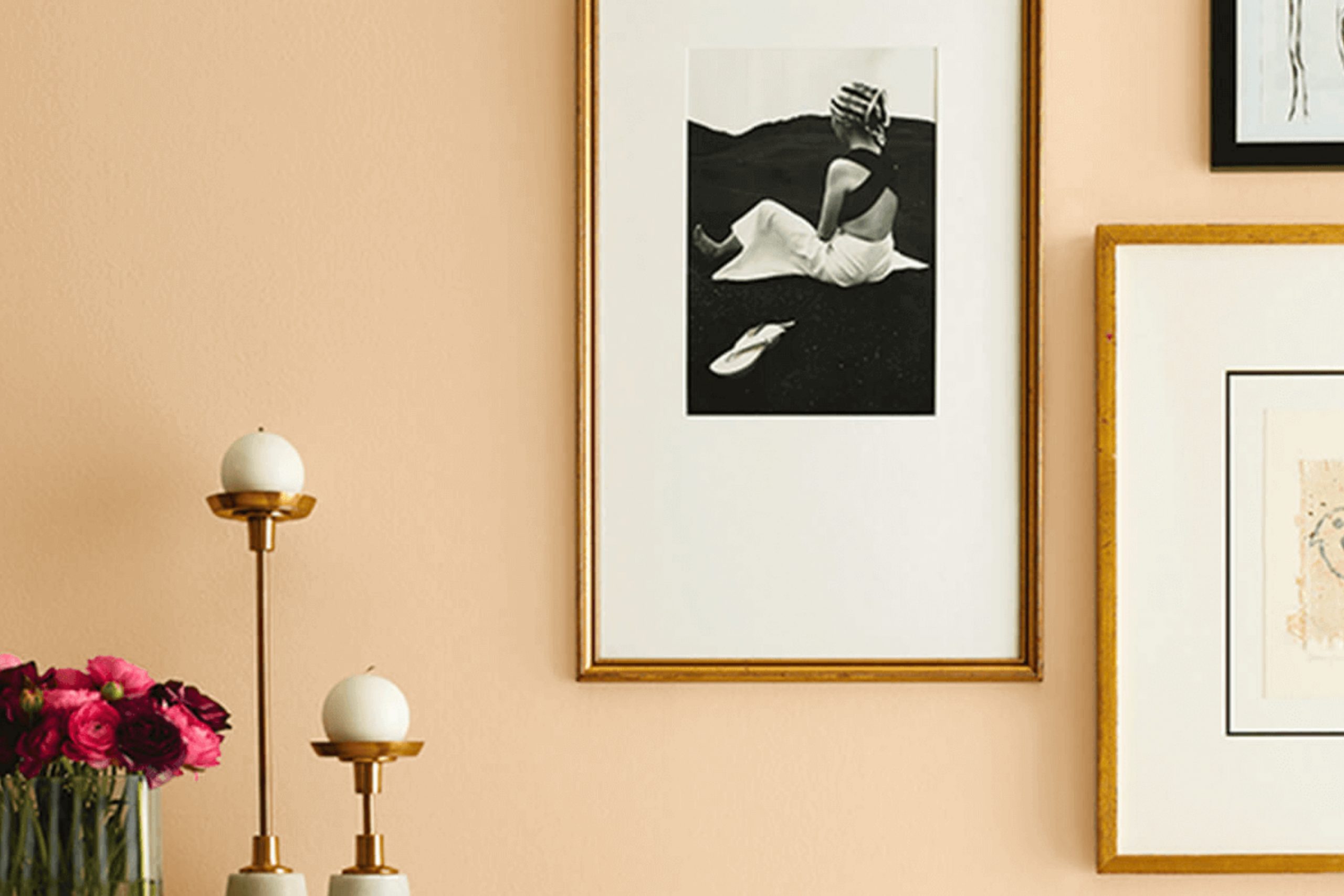
Stepping into the world of color, there’s something uniquely peaceful about SW 7687 August Moon by Sherwin Williams. This hue brings a gentle warmth that feels like a soothing embrace. Imagine the soft glow of a late summer evening, with its tender hints of gold and softness all around. You sense the peaceful calmness of nature winding down and the quiet moments of reflection that come with it.
August Moon combines the perfect balance of warmth and subtlety. It’s a shade that whispers comfort and calm, much like the end of a long, sunny day. You find that this color is flexible, perfectly at home in a cozy living room or as an inviting shade for a welcoming entryway.
As you spend time with this color, you notice how it gently enhances the surroundings, bringing a sense of cohesiveness that isn’t loud or demanding. Using August Moon feels like wrapping yourself in a soft, reassuring blanket. It isn’t just about color; it’s about an experience, a moment of peacefulness that you can bring into everyday life.
In every room you use it, you create a room that invites relaxation and warmth—an ideal sanctuary from the hustle and bustle of the world.
What Color Is August Moon SW 7687 by Sherwin Williams?
August Moon by Sherwin Williams is a warm and inviting color that brings a soft and sunny glow to any room. It’s a golden yellow hue with a gentle brightness that can make areas feel cheerful and welcoming. This color can work beautifully in various interior styles, from casual and cozy to more traditional or rustic settings.
In a farmhouse-style home, August Moon complements the natural wood and worn textures, creating an inviting atmosphere. It also pairs well with bohemian interiors, where vibrant patterns and eclectic decor come to life against such a sunny backdrop. Coastal-themed rooms can benefit too, as this color echoes golden sands and adds warmth without overpowering softer blues and greens.
For materials, August Moon looks fantastic with natural woods, such as oak or pine, as well as with wicker and rattan, which highlight its organic feel. Textures like jute, linen, and burlap enhance its warm undertones, adding depth and comfort to the overall look. When used as an accent wall or main color, it holds up well against white trims and ceilings, providing a fresh, clean contrast.
Whether in a living room, kitchen, or bedroom, August Moon can uplift and enrich a home’s atmosphere with its sunny disposition.
Is August Moon SW 7687 by Sherwin Williams Warm or Cool color?
August Moon (SW 7687) by Sherwin Williams is a soft, warm yellow paint color that brings a welcoming feeling to any room. This gentle hue can brighten up a room without feeling too bold or too strong.
It’s flexible enough to be used in a variety of settings, from living rooms to bedrooms to kitchens. When used on walls, it can make a room feel more open and inviting, adding a sunny touch without being too intense. August Moon works well with both light and dark furnishings, making it easy to incorporate into different interior styles.
Pairing it with neutral colors or natural wood tones can create a cozy atmosphere. This shade also complements other warm colors and can serve as a great backdrop for art and decor. By choosing August Moon, you can create a cheerful and pleasant environment that feels comfortable and inviting for family and guests alike.
Undertones of August Moon SW 7687 by Sherwin Williams
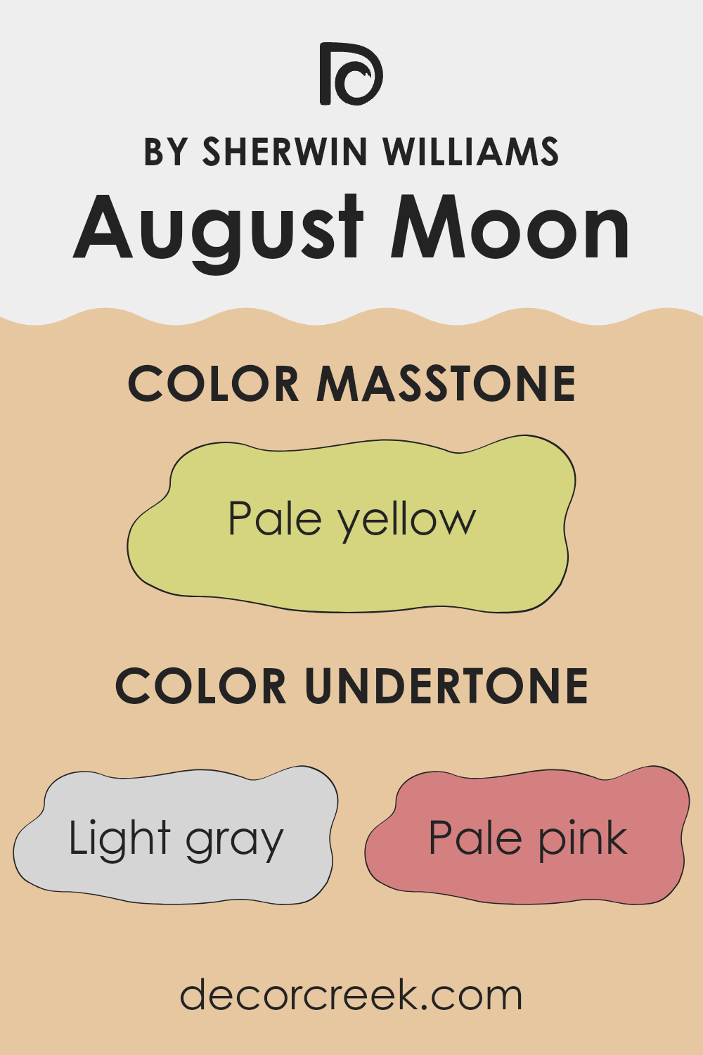
August Moon by Sherwin Williams is a paint color with complex undertones that can change its appearance depending on the lighting and surrounding decor. The main undertones include light gray, pale pink, light purple, mint, light blue, yellow, grey, lilac, orange, light green, and olive. These undertones subtly influence the color’s overall look.
Undertones are the subtle hues beneath the surface color. They can make a paint color appear warmer, cooler, brighter, or duller. For instance, a paint color with a yellow undertone might seem warmer, while one with a blue undertone might appear cooler.
The undertones of August Moon, such as pale pink and light purple, can add a soft, warm feeling to a room. Meanwhile, undertones like mint, light blue, and lilac bring a freshness and calmness. The combination of gray and olive undertones lends a grounded, balanced effect, making the color flexible.
When used on interior walls, the undertones in August Moon can make a room feel inviting and cozy while keeping it light and airy. Depending on the lighting—whether natural or artificial—the color may shift, showing different undertones at various times of the day. This makes the paint a dynamic choice for anyone looking to add interest and warmth to their living room.
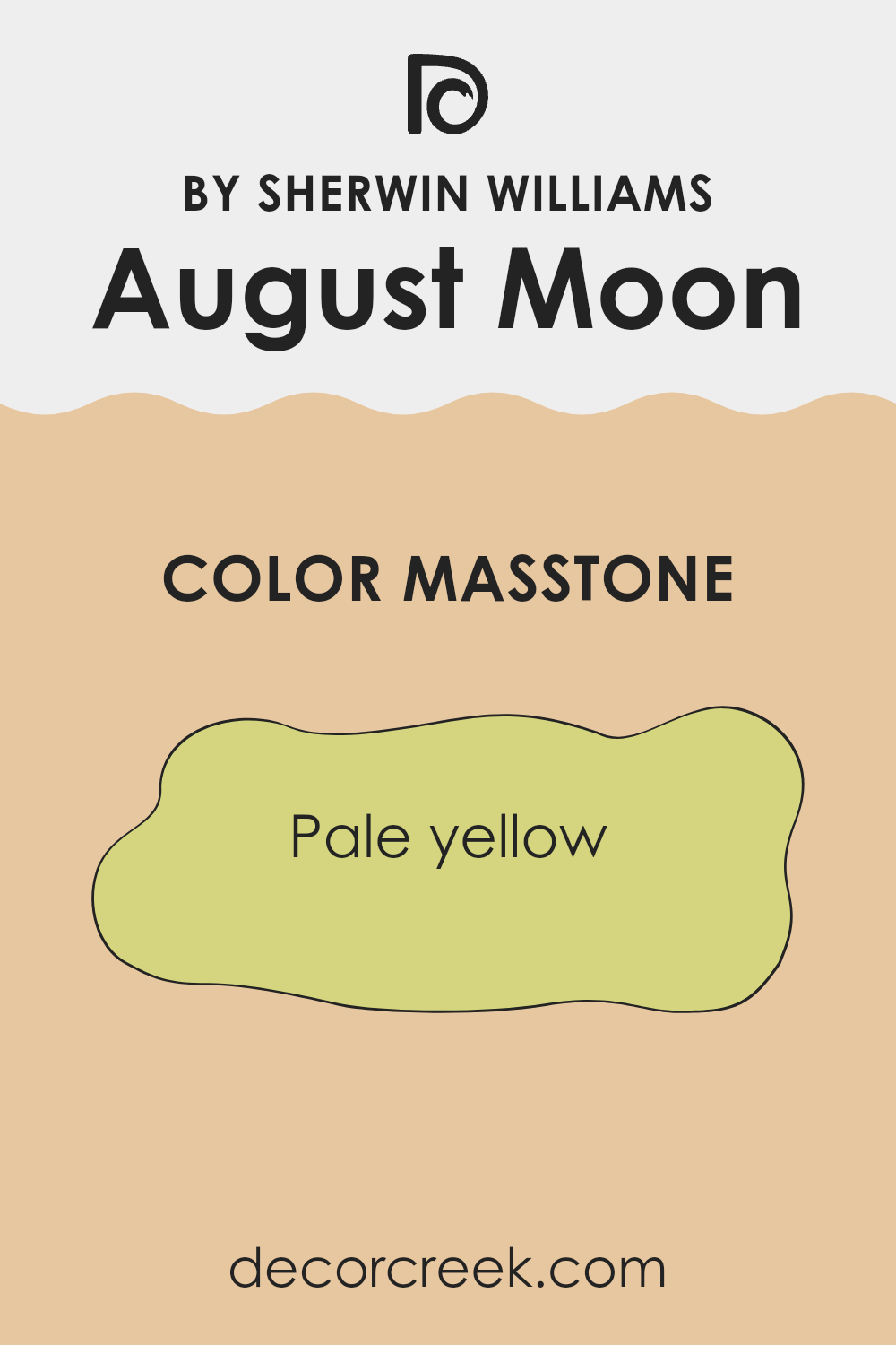
What is the Masstone of the August Moon SW 7687 by Sherwin Williams?
August Moon by Sherwin Williams is a soft and gentle pale yellow. This color brings a sense of warmth and cheerfulness into homes. Its delicate shade makes areas feel inviting without being too strong. The pale yellow hue reflects natural light nicely, which helps brighten rooms and create a welcoming atmosphere. This color works well in kitchens and living areas where a bright and airy feel is desired.
August Moon pairs beautifully with neutral tones like whites, creams, and soft grays, helping to create a balanced look. It can also complement natural wood accents, adding a touch of sunshine to the room. In bedrooms, combining this paint with light blues or soft green tones can offer a cozy, warm feeling.
This color’s gentle nature makes it perfect for any room in the house, helping to create an uplifting and pleasant environment that feels cozy and homey.
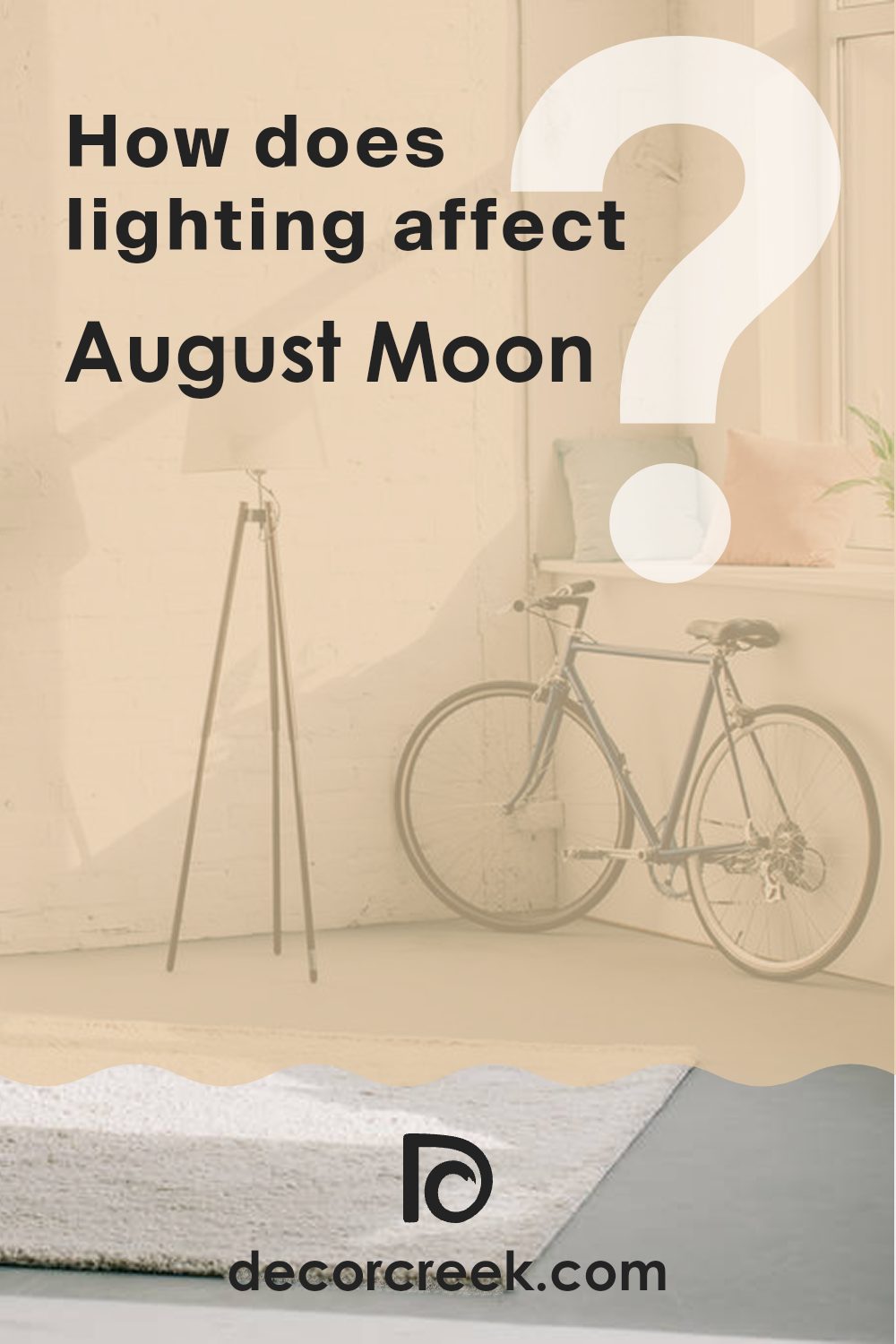
How Does Lighting Affect August Moon SW 7687 by Sherwin Williams?
Lighting greatly affects how we perceive colors. The appearance of a color can change dramatically depending on the light source, such as natural light from windows or artificial light from fixtures.
August Moon by Sherwin Williams is a soft, warm color. In natural light, its appearance can vary based on the direction the light is coming from. In north-facing rooms, where the light is cooler and bluish, August Moon may appear a bit muted or cooler than it actually is. This is because the cool light can soften the yellow tones, giving it a more subdued look.
In south-facing rooms, where the light is warmer and more direct, August Moon will likely feel brighter and more vibrant. The warm natural light enhances the color’s warmth, making it appear more golden and lively.
East-facing rooms get their strongest light in the morning. Early sunlight has a warm quality, which would make August Moon look richer and more inviting in the morning. However, as the sun moves away, the room can cool down, causing the color to lose some of its warmth and intensity.
In west-facing rooms, the light is strongest in the afternoon and early evening. This warm afternoon light can make August Moon appear deeper and more intense as the day progresses.
Under artificial light, the color of August Moon can change depending on the type of bulbs used. Incandescent bulbs emit a warm light that can enhance the yellow tones, making the color feel cozy and welcoming. On the other hand, LED or fluorescent bulbs, which have a cooler light, might tone down the warmth, making the color appear more neutral and flat.
In any room, testing the color at different times of the day and with various lighting will help understand how it will look in various conditions.
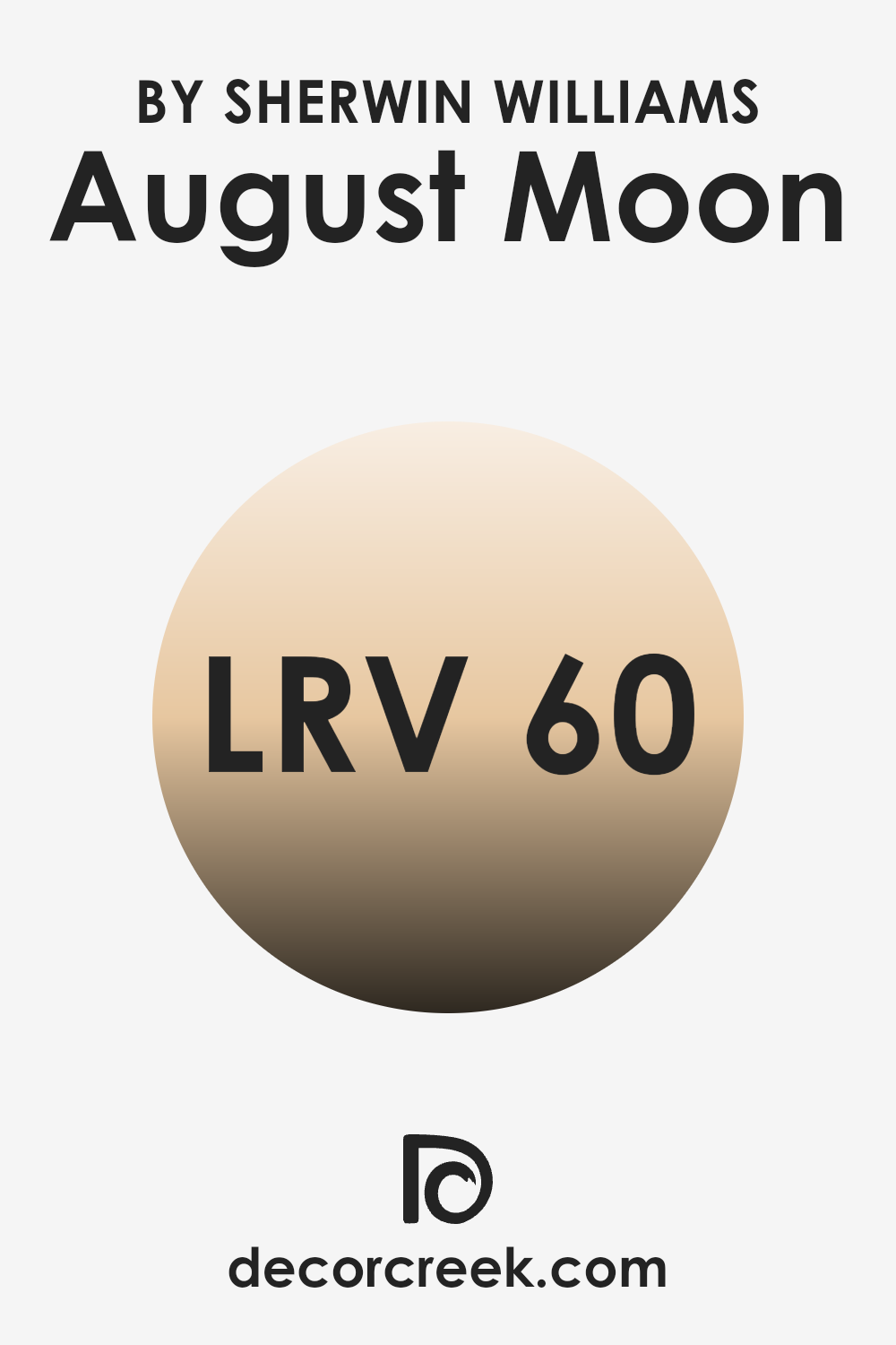
What is the LRV of August Moon SW 7687 by Sherwin Williams?
The Light Reflectance Value, or LRV, is a measure that tells us how much light a color reflects from a surface. On a scale from 0 to 100, 0 represents absolute black, which absorbs all light, while 100 signifies pure white, reflecting all light. The LRV you see on a paint swatch helps you understand how light or dark a color will appear once it’s applied to your walls.
Higher LRV numbers indicate that a paint color will reflect more light, making areas feel brighter and more open. Meanwhile, colors with lower LRV numbers will absorb more light and tend to make a room feel cozier or more intimate.
The LRV of 60.373 for the color August Moon means it has a mid-to-high reflectance. This means that when you paint a room this shade, it will reflect a fair amount of light, contributing to a balanced and airy feel. This makes the color a good choice for areas that you want to feel more open and light without being too stark or overly bright. August Moon will brighten a room, helping to make it appear larger and more inviting, especially in areas with limited natural light. It can offer a pleasant backdrop, complementing a variety of furnishings and enhancing the natural light in a room.
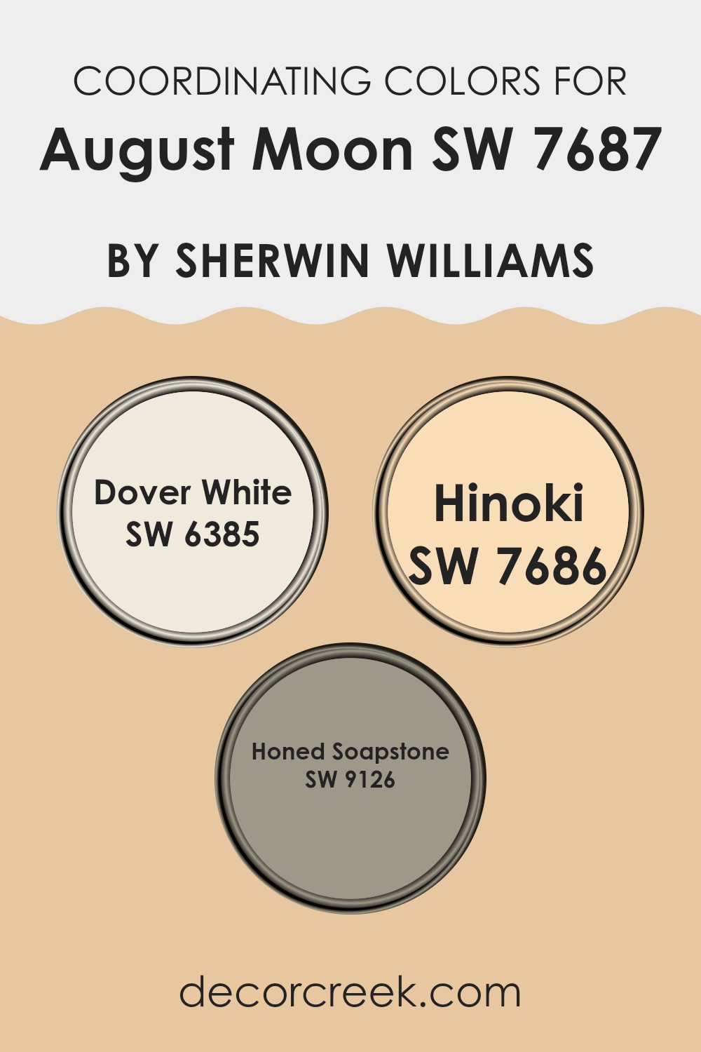
Coordinating Colors of August Moon SW 7687 by Sherwin Williams
Coordinating colors are hues that work well together in a room to create a balanced and pleasing look. They are carefully chosen to complement one another, enhancing the atmosphere of the room. For example, when paired with August Moon by Sherwin Williams, coordinating colors such as Dover White, Hinoki, and Honed Soapstone can help create a cohesive design. August Moon is a warm, muted shade that can set a calm and inviting tone for any room.
Dover White is a soft, creamy white that adds brightness and lightens the overall color scheme without feeling too stark. It can make a room feel open and airy, contrasting nicely with the understated warmth of August Moon. Hinoki is a rich, warm color that adds depth and coziness; it captures the natural essence of wood, making it great for adding a touch of earthiness.
Honed Soapstone offers a subtle gray tone with cool undertones, which can ground the color palette, adding a modern touch. Altogether, these colors work in harmony with August Moon to create a well-balanced and inviting atmosphere, offering a blend of warmth, lightness, and modernity.
You can see recommended paint colors below:
- SW 6385 Dover White
- SW 7686 Hinoki
- SW 9126 Honed Soapstone
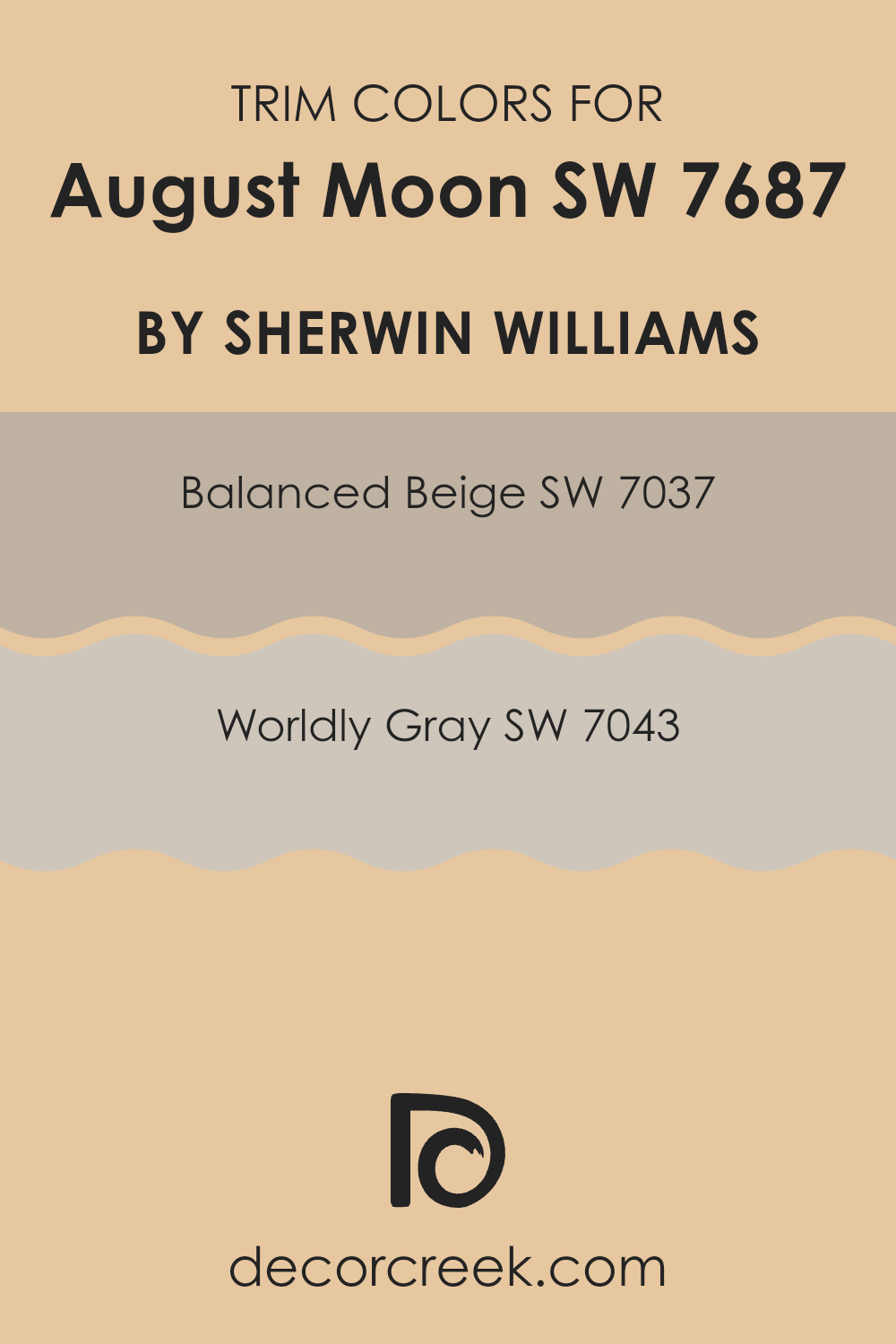
What are the Trim colors of August Moon SW 7687 by Sherwin Williams?
Trim colors serve as the framework or outlines that accentuate the main color of the walls in a room, helping to define the room and add an extra layer of design interest. The choice of trim color can significantly influence the overall perception of a room by providing contrast or harmony with the wall color.
In the case of August Moon by Sherwin Williams, using carefully selected trim colors can enhance its effect. Balanced Beige (SW 7037) offers a warm, neutral tone that can complement the gentle hues of August Moon. Its understated warmth can soften the overall look, making the room feel inviting without being too strong.
Worldly Gray (SW 7043) provides a more subtle, cool contrast to August Moon. This neutral gray is flexible and adds an elegant touch that frames the wall color beautifully. Its cooler undertone balances out the warmth of August Moon, bringing a refined equilibrium to the room.
Together, Balanced Beige and Worldly Gray as trim choices for August Moon enhance its visual appeal, making the room feel welcoming and well-coordinated. The strategic use of trim colors like these can define a room’s aesthetic, highlighting the beauty of the main color while creating a cohesive design statement.
You can see recommended paint colors below:
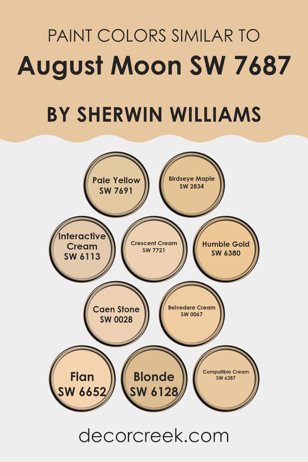
Colors Similar to August Moon SW 7687 by Sherwin Williams
Similar colors play a crucial role in design because they create a harmonious and cohesive look. By using colors that are closely related, you can achieve a balanced and pleasing atmosphere without the risk of clashing tones. For example, August Moon is a warm, soft shade, and similar colors can complement it beautifully.
Pale Yellow is a light, bright hue that brings a sunny touch. Birdseye Maple offers a cozy, honey-like tone that feels inviting. Interactive Cream is a soft, creamy shade that provides a subtle warmth. Crescent Cream delivers a gentle, soothing lightness, while Humble Gold adds a muted, rich glow that feels classic.
Caen Stone is a more robust beige, lending a grounded, earthy feel. Belvedere Cream is smooth and calm, perfect for creating a relaxed backdrop. Flan brings a delightful, warm touch reminiscent of gentle caramel.
Blonde is a soft, golden hue that feels welcoming, and Compatible Cream rounds out the palette with its flexible and neutral charm. Using these colors together can make any room feel comfortable and well-thought-out, connecting areas with a sense of unity and flow. This is especially important in areas where you want people to feel at ease and relaxed.
You can see recommended paint colors below:
- SW 7691 Pale Yellow
- SW 2834 Birdseye Maple
- SW 6113 Interactive Cream
- SW 7721 Crescent Cream
- SW 6380 Humble Gold
- SW 0028 Caen Stone
- SW 0067 Belvedere Cream
- SW 6652 Flan
- SW 6128 Blonde
- SW 6387 Compatible Cream
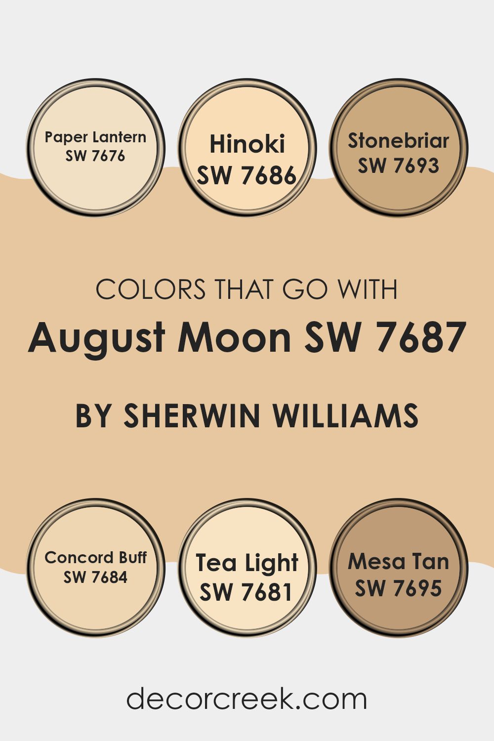
Colors that Go With August Moon SW 7687 by Sherwin Williams
Colors that go with August Moon SW 7687 by Sherwin Williams play a significant role in creating a balanced and harmonious room. The key to achieving this harmony lies in complementing August Moon with other hues that enhance its warmth and subtlety.
August Moon, with its gentle and calming tone, pairs beautifully with colors like SW 7676 Paper Lantern—a light, airy shade that brings a sense of openness. SW 7686 Hinoki is another complementary color, offering a natural, woodsy warmth that blends seamlessly with August Moon, adding a cozy feel to any room.
Further enhancing the palette, SW 7693 Stonebriar offers a grounded, earthy element, which provides an excellent counterbalance to the lighter shades. SW 7684 Concord Buff, with its soft, buttery undertone, adds depth and a touch of elegance without being too strong.
For those looking to lighten things further, SW 7681 Tea Light offers a delicate, almost ethereal brightness that can make areas feel larger and more inviting. Finally, SW 7695 Mesa Tan adds a warm, sunset-like glow that ties the whole palette together, giving a sense of unity and warmth. Together, these colors work in harmony to create inviting and pleasant rooms.
You can see recommended paint colors below:
- SW 7676 Paper Lantern
- SW 7686 Hinoki
- SW 7693 Stonebriar
- SW 7684 Concord Buff
- SW 7681 Tea Light
- SW 7695 Mesa Tan
How to Use August Moon SW 7687 by Sherwin Williams In Your Home?
August Moon SW 7687 by Sherwin Williams is a soft, warm color that brings comfort and coziness to any room. This light yellow shade works well in areas where you want to create a cheerful and inviting atmosphere. You can use August Moon in the living room to make it feel brighter and more welcoming. Pair it with white trim for a clean look, or use natural wood accents for a touch of warmth.
In the kitchen, August Moon can brighten up the room without being too strong. It pairs nicely with both light and dark cabinets, offering a flexible backdrop for various design styles. In bedrooms, this gentle hue helps create a peaceful environment, making it a great choice for restful sleep.
August Moon also works beautifully in hallways or entryways, bringing a sense of openness and friendliness. Overall, this color is a great option for adding warmth and a bit of sunshine to your home.
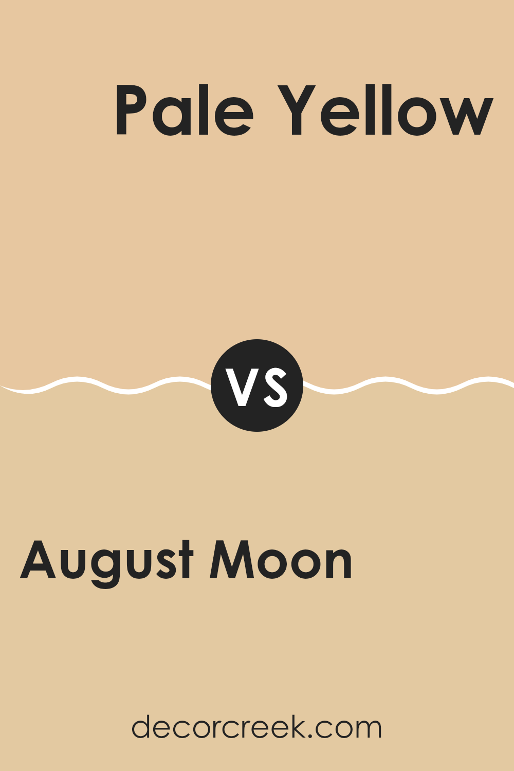
August Moon SW 7687 by Sherwin Williams vs Pale Yellow SW 7691 by Sherwin Williams
August Moon SW 7687 by Sherwin Williams is a warm, gentle yellow that feels cozy and welcoming. It’s perfect for creating a cheerful atmosphere in any room without being too bright. This color, with its subtle glow, can easily bring a sense of warmth and comfort to a room, making it feel inviting and pleasant.
On the other hand, Pale Yellow SW 7691 is a much lighter and softer yellow. It has an airy and fresh feel that can brighten up a room effortlessly. This color is ideal for areas where you want a hint of sunshine without it being overpowering. Pale Yellow tends to open up rooms, making them seem larger and more open.
When comparing these two, August Moon is the choice for those who want warmth and coziness, while Pale Yellow is perfect for a light, refreshing ambiance. Both colors bring their unique charm to a home.
You can see recommended paint color below:
- SW 7691 Pale Yellow
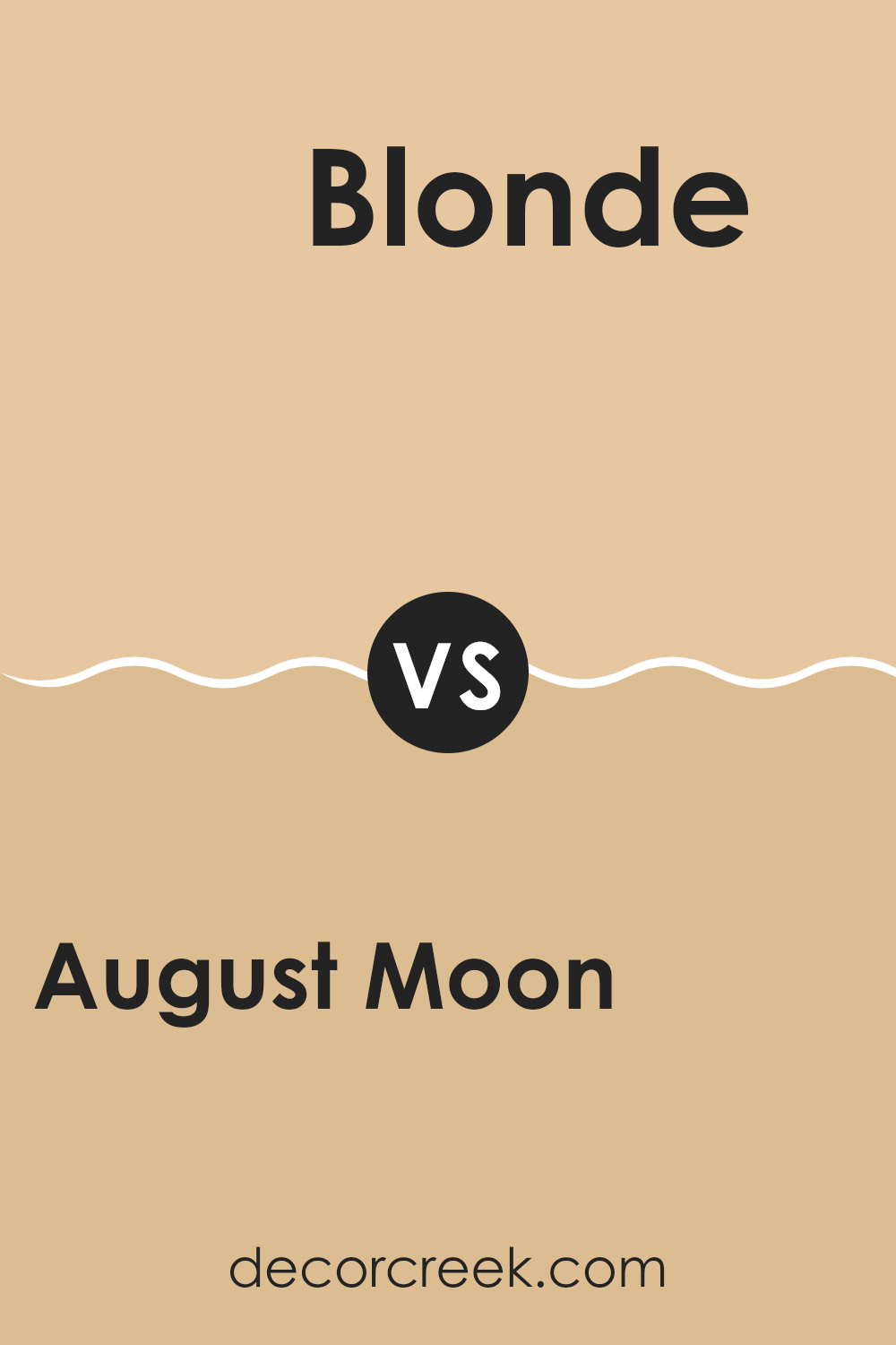
August Moon SW 7687 by Sherwin Williams vs Blonde SW 6128 by Sherwin Williams
“August Moon” and “Blonde” by Sherwin Williams are both warm, inviting colors that bring brightness and comfort to a room, but they differ in tone and impact.
“August Moon” is a soft, muted shade that evokes a sense of calm and relaxation. It’s a pale yellow with a touch of gray, making it feel understated yet friendly. This color is perfect for areas where you want a gentle, soothing atmosphere.
On the other hand, “Blonde” is a warm, sunny hue with a more pronounced golden undertone. It’s a cheerful and vibrant color that adds a splash of energy to any room. “Blonde” is ideal for areas where you want to create a lively and welcoming environment.While both colors bring warmth, “August Moon” offers subtlety and calmness, whereas “Blonde” provides a more vivid and energizing presence, making each suitable for different moods and settings.
You can see recommended paint color below:
- SW 6128 Blonde
August Moon SW 7687 by Sherwin Williams vs Belvedere Cream SW 0067 by Sherwin Williams
August Moon (SW 7687) and Belvedere Cream (SW 0067) by Sherwin Williams are both warm and inviting shades, but they offer different vibes. August Moon is a soft, creamy yellow with subtle warmth that brings a cozy and welcoming feel to a room. It’s a flexible color that works well in various settings, adding a hint of sunshine without being too strong.
On the other hand, Belvedere Cream is a lighter and more neutral cream color. It offers a gentle, classic backdrop that pairs well with many other colors. Belvedere Cream is perfect for creating a light, airy atmosphere and can make a room feel larger and more open.
While August Moon leans towards a more vibrant warmth, Belvedere Cream provides a softer and more subdued option. Both colors are excellent for creating a warm and inviting environment but cater to different tastes and preferences in terms of brightness and neutrality.
You can see recommended paint color below:
- SW 0067 Belvedere Cream
August Moon SW 7687 by Sherwin Williams vs Caen Stone SW 0028 by Sherwin Williams
August Moon SW 7687 by Sherwin Williams is a warm, soft yellow that brings a sunny and cheerful vibe to any room. It can make a room feel cozy and inviting, adding a touch of warmth without being too overpowering.
In contrast, Caen Stone SW 0028 is a neutral beige with a subtle hint of gray, giving it an earthy, grounded feel. This color offers a calm background that pairs well with many other colors, making it a flexible choice for various design styles.
While August Moon can brighten up a room and add a pop of color, Caen Stone serves as a quiet and elegant backdrop. Together, they complement each other well: August Moon adds brightness and energy, while Caen Stone provides balance and stability. These two colors can be used to create a harmonious and appealing environment when combined thoughtfully in a room.
You can see recommended paint color below:
August Moon SW 7687 by Sherwin Williams vs Flan SW 6652 by Sherwin Williams
August Moon SW 7687 is a warm, soft beige color that brings a cozy and inviting feeling to a room. It has a neutral tone, making it easy to match with other colors and perfect for creating a comfortable and welcoming atmosphere.
On the other hand, Flan SW 6652 is a brighter, sunnier shade. It has a slightly bolder presence, with a gentle hint of yellow that adds warmth and cheerfulness to a room. While still considered soft, Flan’s touch of yellow gives it more energy compared to the more muted August Moon.
Both colors provide warmth, but August Moon leans more towards subtlety and softness, making it flexible for any room. Flan, with its sunny undertones, is ideal for areas where you want a boost of brightness and happiness. Use August Moon for a peaceful feel, while Flan can add a cheerful touch, balancing energy with warmth.
You can see recommended paint color below:
- SW 6652 Flan
August Moon SW 7687 by Sherwin Williams vs Crescent Cream SW 7721 by Sherwin Williams
August Moon SW 7687 by Sherwin Williams is a warm, muted green with soft, earthy undertones. It brings a touch of nature indoors, making rooms feel cozy and connected to the environment. It’s a great choice for those who want a subtle color that provides a calming, natural vibe.
Crescent Cream SW 7721, on the other hand, is a gentle, light yellow. It offers a sunny and cheerful atmosphere, perfect for brightening up a room. This creamy yellow reflects light well, so it can make small or dim areas feel more open and inviting.
When comparing the two, August Moon has a soothing, grounded feel, ideal for relaxing areas, while Crescent Cream adds warmth and a bit of cheer, suitable for lively and welcoming rooms. Both colors can complement various decorating styles, but each brings its own unique mood—one grounded in nature, the other bathing the room in light.
You can see recommended paint color below:
August Moon SW 7687 by Sherwin Williams vs Interactive Cream SW 6113 by Sherwin Williams
August Moon (SW 7687) by Sherwin Williams is a gentle, muted shade of beige with subtle warmth, making it a flexible choice for many rooms. It offers a soft, welcoming feel that can easily complement various design styles and other colors.
In contrast, Interactive Cream (SW 6113) is a lighter, richer cream with more prominent yellow undertones, bringing a brighter and sunnier disposition to a room. While August Moon tends to give a calm and cozy ambiance, Interactive Cream adds a touch of brightness and energy.
Both colors are neutral and can be used in a variety of settings, but August Moon leans more towards a subtle, restful tone, while Interactive Cream brings a bit more cheerfulness and vibrancy. When deciding between the two, consider the mood and light in the room. August Moon works well for understated elegance, and Interactive Cream brightens areas delightfully.
You can see recommended paint color below:
August Moon SW 7687 by Sherwin Williams vs Birdseye Maple SW 2834 by Sherwin Williams
August Moon SW 7687 by Sherwin Williams is a soft, warm yellow that brings a cheerful yet subtle glow to a room. It’s a sunny color without being too strong, making it flexible for various rooms. Its gentle tone can brighten up a room while providing a cozy atmosphere.
In contrast, Birdseye Maple SW 2834 by Sherwin Williams is a much lighter and more muted beige with a slight hint of warmth. It’s understated and provides a neutral backdrop, allowing for a calming and balanced feel. This color works well as a base in rooms where other decor elements want to stand out.
While both colors have warm undertones, August Moon is more vibrant, bringing energy and light, whereas Birdseye Maple is more subdued and blends effortlessly with a variety of styles. Together, they can create a harmonious environment that’s both inviting and restful.
You can see recommended paint color below:
August Moon SW 7687 by Sherwin Williams vs Humble Gold SW 6380 by Sherwin Williams
August Moon (SW 7687) and Humble Gold (SW 6380) are both warm hues from Sherwin Williams, yet they offer distinct vibes. August Moon is a soft, muted shade of yellow with earthy undertones, giving a calming and relaxed feel to rooms. It’s flexible and works well in various rooms, from living rooms to bedrooms, providing a gentle backdrop to other colors.
In contrast, Humble Gold is a deeper, richer golden shade. This color brings a bold and lively energy, making it ideal for areas where you want to create a cheerful and inviting atmosphere, such as kitchens or dining rooms. It’s perfect for accent walls or accessories if you want to add a touch of golden warmth without being too strong in the room.
Both colors can complement each other when used thoughtfully within a home, with August Moon offering a more subtle touch and Humble Gold adding a striking pop of color.
You can see recommended paint color below:
August Moon SW 7687 by Sherwin Williams vs Compatible Cream SW 6387 by Sherwin Williams
August Moon SW 7687 by Sherwin Williams is a soft, muted yellow that carries a gentle warmth, almost reminiscent of late summer evenings. It has a mellow tone that brings a sense of calm and comfort to a room, making it ideal for areas like living rooms or bedrooms where relaxation is key.
On the other hand, Compatible Cream SW 6387 by Sherwin Williams is a creamier, richer shade. It has a buttery quality that feels welcoming and cozy. This color can brighten up a room without being overpowering, and it works well in kitchens or dining rooms where you want a friendly, inviting atmosphere.
While both colors are on the warm side of the spectrum, August Moon leans more towards a subtle yellow, whereas Compatible Cream has stronger cream undertones. Choosing between the two depends on whether you want a hint of yellow warmth or a more neutral cream that complements various textures and designs.
You can see recommended paint color below:
- SW 6387 Compatible Cream
In this article, I talked about SW 7687 August Moon, a paint color by Sherwin Williams, and what makes it special. It’s interesting because it reminds me of a late summer evening when the moon is bright and the air is calm. This color feels warm and cozy, like a hug from someone you love.
August Moon is a soft, light yellow color that makes rooms feel happy and welcoming. Imagine a gentle ray of sunshine coming through the window, making everything feel cozy and bright. It’s a color that can make you smile.
This paint is great for different rooms like the living room, bedroom, or even the kitchen. Whether it’s where you play, relax, or eat, it makes each room feel nice and cheerful. It’s like bringing a little piece of the sun inside.
Using August Moon on walls means seeing the rooms in a new way. It adds a touch of warmth and a cheerful brightness that feels just right. I hope you liked learning about this color and how it can make rooms feel better. By bringing home a bit of August Moon, you’re bringing in happiness and warmth to enjoy every day.
Ever wished paint sampling was as easy as sticking a sticker? Guess what? Now it is! Discover Samplize's unique Peel & Stick samples.
Get paint samples

