When fall rolls around, everything changes. The air feels different, the light gets softer, and all I want is to make my home feel warmer and more welcoming. That’s when I start thinking about color. Not just one color—but combinations that work together. The right pair of paint shades can change how a room feels without making it too busy.
Fall is the season for cozy corners, movie nights, and hot drinks, so your home should feel like it fits right in with all of that.
I always go for warm tones, soft contrasts, and colors that remind me of nature.
In this list, I’ve pulled together my favorite fall pairings—ones that work, and feel right, in real homes.
Why I Always Recommend Seasonal Paint Combos
Each season has its own feeling. In fall, I want rooms to feel warm, a little earthy, maybe even nostalgic. Paint color combos help bring that feeling into a room without needing to change your furniture or decor. They make a room feel ready for the season without much effort. I’ve seen how the right mix of two shades—a soft neutral with a deeper tone—can pull everything together.
Whether you’re painting a wall, cabinets, or just a small nook, these combos help your home feel in tune with the season. It’s a simple shift that makes a big difference.
How I Pick the Perfect Fall Paint Pairings
I always start with how I want the room to feel. Do I want it to feel warm and comforting? Or a little moody for the cooler nights? Then I look at how much light the room gets and what’s already in the room. I also think about balance—combining a soft base with a richer accent color. Most of the time, I look to nature for ideas: the color of leaves, warm clay, dusty herbs, or faded skies.
Once I find one color that feels right, I match it with something that either softens it or gives it a bit more depth. That’s when it all comes together.
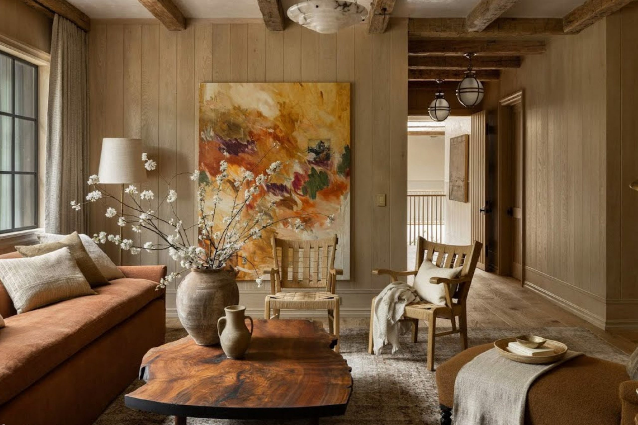
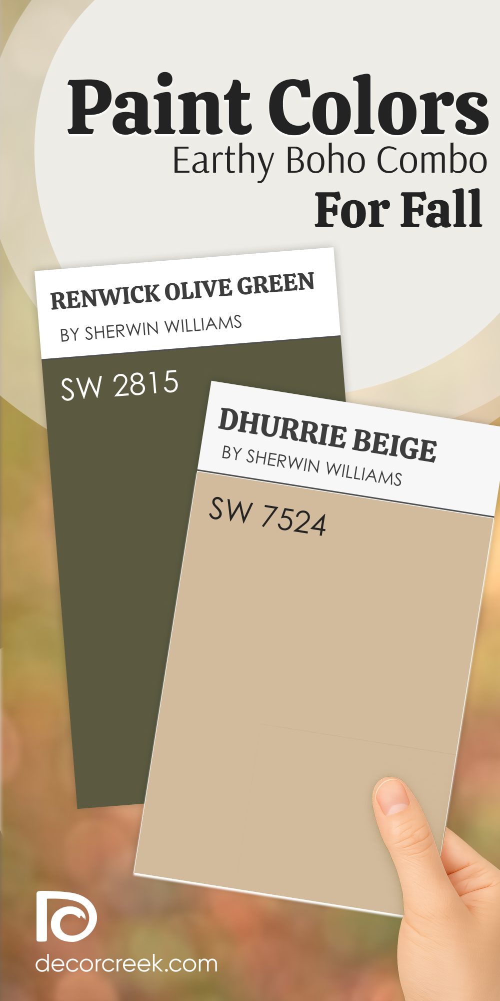
Earthy Boho Paint Color Combo for Fall That Feels Just Right
Renwick Olive Green + Dhurrie Beige
Renwick Olive Green feels grounded and full of character. It brings that earthy, deep vibe that I always reach for in the cooler months. Dhurrie Beige gives it a soft contrast that helps everything feel relaxed and not too heavy. Together, they remind me of handmade pottery, layered throws, and woven rugs.
This combo works beautifully in living rooms, reading corners, or even small dining areas.
It feels natural without being plain. These two colors together make the room feel personal—like something collected over time.

The main rule for combining these colors: keep the finishes raw and textured—think wood, linen, or matte surfaces.
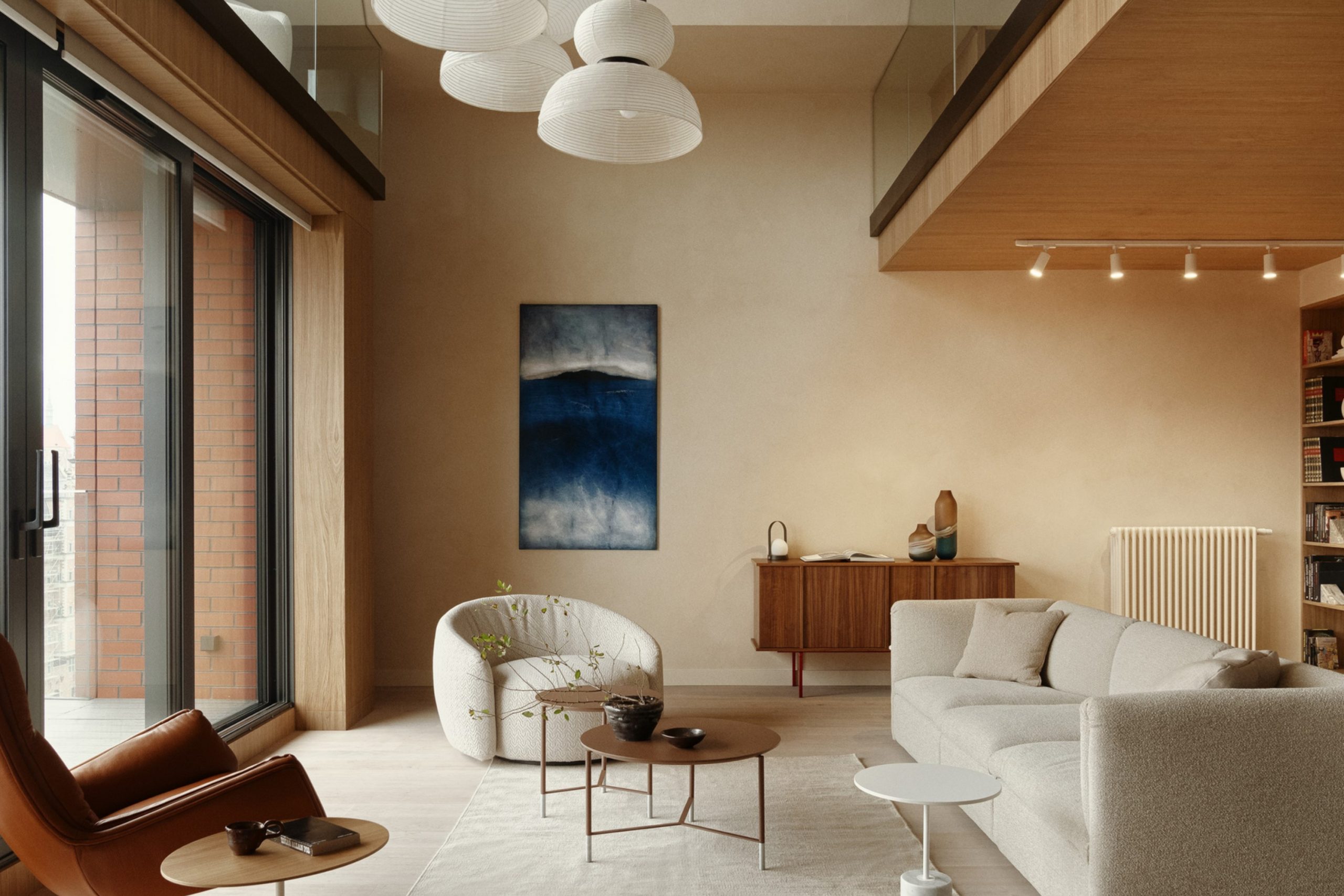
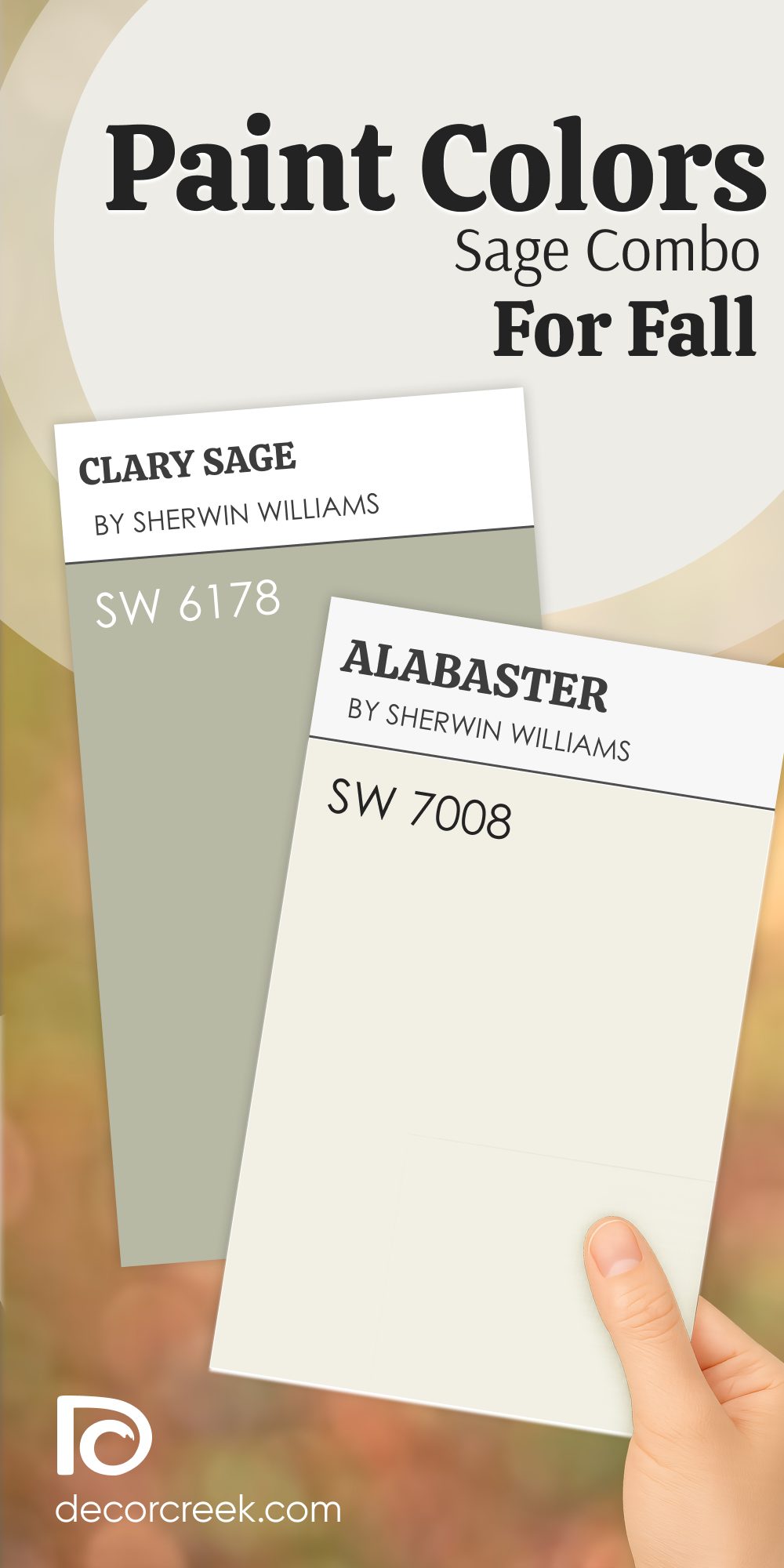
Sage Paint Color Combo for Fall I Keep Coming Back To
Clary Sage + Alabaster
Clary Sage always brings a gentle green that feels right when the weather cools down. It’s soft, but not washed out—it still shows up.

Alabaster gives it just the right bit of light, which keeps things from turning muddy.

This pair works beautifully in kitchens, bathrooms, and small guest rooms.
I’ve even used it in a nursery, and it felt warm but not too sweet. Clary Sage reminds me of dried herbs or fresh eucalyptus, while Alabaster keeps the mood easy and fresh. Together, they’re calming but not boring.
The main rule for combining these colors: add in some warm wood or soft brass to keep things feeling grounded.
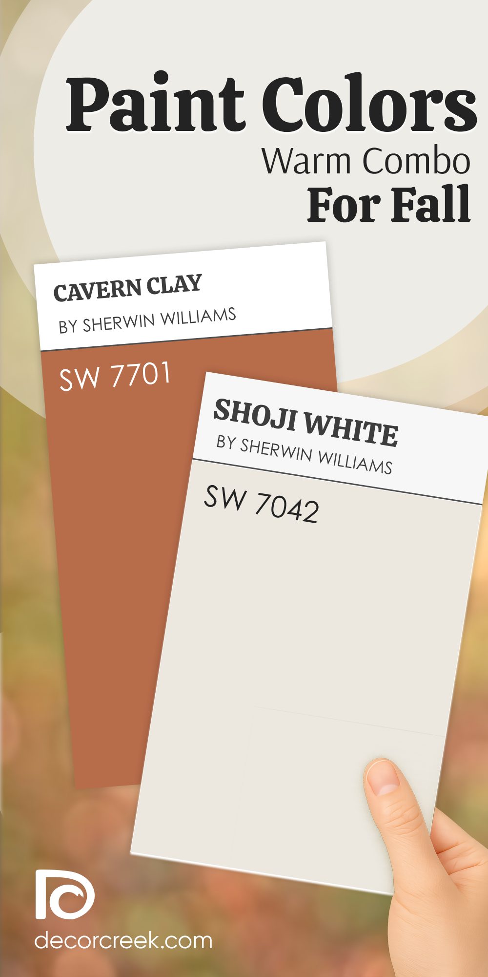
Warm Paint Color Combo for Fall That Makes Every Room Feel Cozy
Cavern Clay + Shoji White
Cavern Clay is one of those rich, baked tones that always makes me think of fall. It brings life and comfort into the room—like wrapping up in your favorite blanket.

Shoji White keeps it from becoming too dark or too orange, giving you room to breathe.

This combo works great in living rooms, family rooms, or any place where people gather.
Cavern Clay has that worn terracotta feel, and Shoji White smooths it out with a creamy softness. These colors feel full of warmth, but never heavy.
The main rule for combining these colors: keep lighting soft and layered so both shades can glow in the evening.
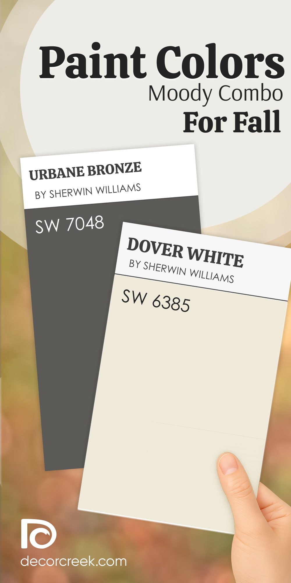
Moody Paint Color Combo for Fall That Sets the Mood Instantly
Urbane Bronze + Dover White
Urbane Bronze is rich, deep, and full of personality—it’s a color I use when I want a room to feel bold but cozy.

Dover White lifts it up just enough so that the room doesn’t feel shut in.

I love this pair for bedrooms, media rooms, or even entryways. Urbane Bronze has this charcoal-meets-brown tone that reminds me of cool nights and lit candles.
Dover White balances it out without stealing the focus. This combo feels stylish but also warm enough for everyday living.
The main rule for combining these colors: keep décor simple and let contrast do the work—it speaks loud enough on its own.
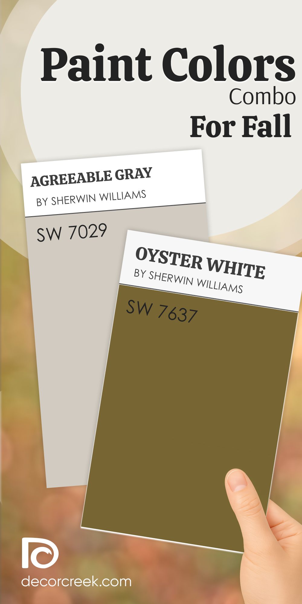
Agreeable Gray Paint Color Combo for Fall That’s Surprisingly Soft
Agreeable Gray + Oyster White
Agreeable Gray is that middle ground between warm and cool—it always feels like a safe place to land.

Oyster White pairs with it beautifully by bringing a creamy edge that softens the overall look. I love using this combo in hallways, open living rooms, or kitchens that need a refresh.

Agreeable Gray has enough depth to feel cozy, but not so much that it darkens the room.
Oyster White keeps the whole look gentle and easy. These two together make a home feel lived in without being too styled.
The main rule for combining these colors: keep things cozy with soft textures like cotton, wool, or velvet.
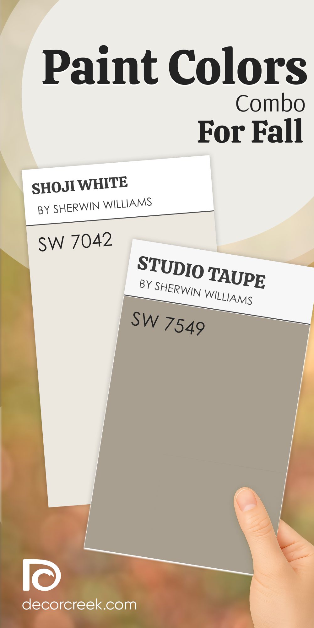
Shoji White Paint Color Combo for Fall I Use in Light-Filled Rooms
Shoji White + Studio Taupe
Shoji White feels like soft daylight—it has this creamy finish that brings quiet warmth.
Studio Taupe is the perfect soft accent to give it just enough depth. Together, they make a room feel thoughtful and comforting. I’ve used this pair in bedrooms, sitting areas, and even kitchens that get good sunlight.

Shoji White holds the light beautifully, and Studio Taupe keeps it from feeling too pale or empty.
These colors make me think of early fall mornings, hot coffee, and soft sweaters.
The main rule for combining these colors: use natural light to your advantage—these shades really shine when the sun hits them.
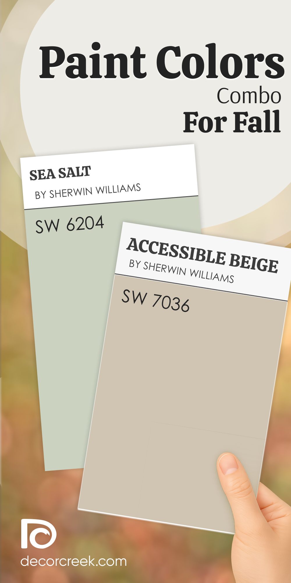
Sea Salt Paint Color Combo for Fall That Brings In That Breezy Balance
Sea Salt + Accessible Beige
Sea Salt brings a soft, airy green-blue tone that always feels light without being cold.

Accessible Beige is warm and comforting—it helps Sea Salt feel more grounded.

This pair works really well in bedrooms, bathrooms, or even entryways where you want a gentle welcome. Sea Salt reminds me of foggy mornings and cool air, while Accessible Beige keeps things from feeling too chilly.
They balance each other in a way that feels relaxed and lived-in.
The main rule for combining these colors: stick to muted accents and avoid bright white—it keeps the mood soft and steady.
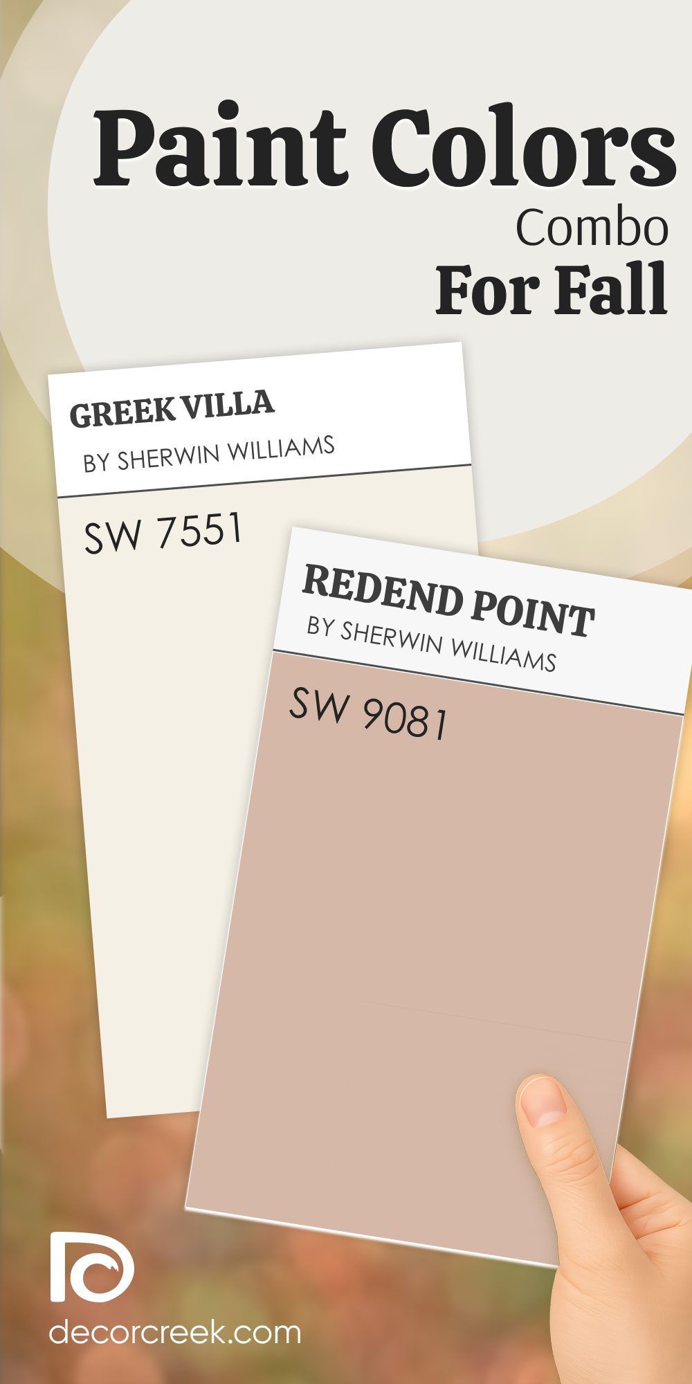
Greek Villa Paint Color Combo for Fall That’s Always a Gentle Classic
Greek Villa + Redend Point
Greek Villa is one of my go-to whites because it has that clean but creamy feel that works anywhere.

Redend Point brings a warm, earthy pink that adds emotion without being too bold. These two together feel inviting, like a room that was always meant to be lived in.

I’ve used this combo in guest rooms, hallways, and even cozy offices.
Greek Villa adds softness, while Redend Point gives personality. They don’t fight for attention—they work together quietly.
The main rule for combining these colors: use soft metals and light woods to keep things feeling fresh and inviting.
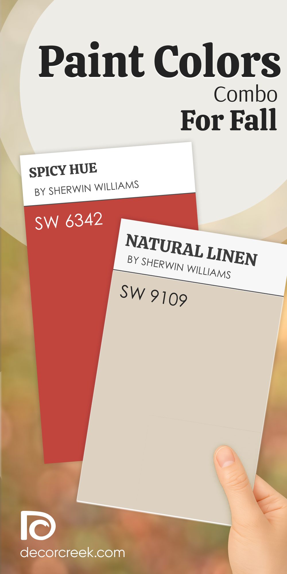
Terracotta Paint Color Combo for Fall That Adds That Natural Warmth
Spicy Hue + Natural Linen
Spicy Hue brings energy and depth—it’s bold and warm, just like fall leaves on a crisp afternoon.

Natural Linen helps cool it down slightly, making it more livable for everyday rooms. I love using this pair in dining rooms, sunrooms, or anywhere that needs a little seasonal punch.

Spicy Hue reminds me of chili powder or baked clay, while Natural Linen feels like your favorite knit sweater.
Together, they make a room feel both alive and comfortable.
The main rule for combining these colors: bring in texture—woven baskets, aged wood, or matte finishes help it feel complete.
My Final Thoughts on Fall Paint Color Combos
Fall is that time of year when your home should feel like a place you want to stay in. Whether it’s raining outside or the leaves are falling, the right color combos make such a big difference. I’ve worked with all of these pairings, and they always help rooms feel more like home. You don’t need big changes—just thoughtful color choices that work with the season.
Think of how you want your room to feel: warm, rich, relaxed, or just a little softer. Pick one pairing that speaks to you, and go with it.
These colors were made for fall, and your home deserves to feel just right.
